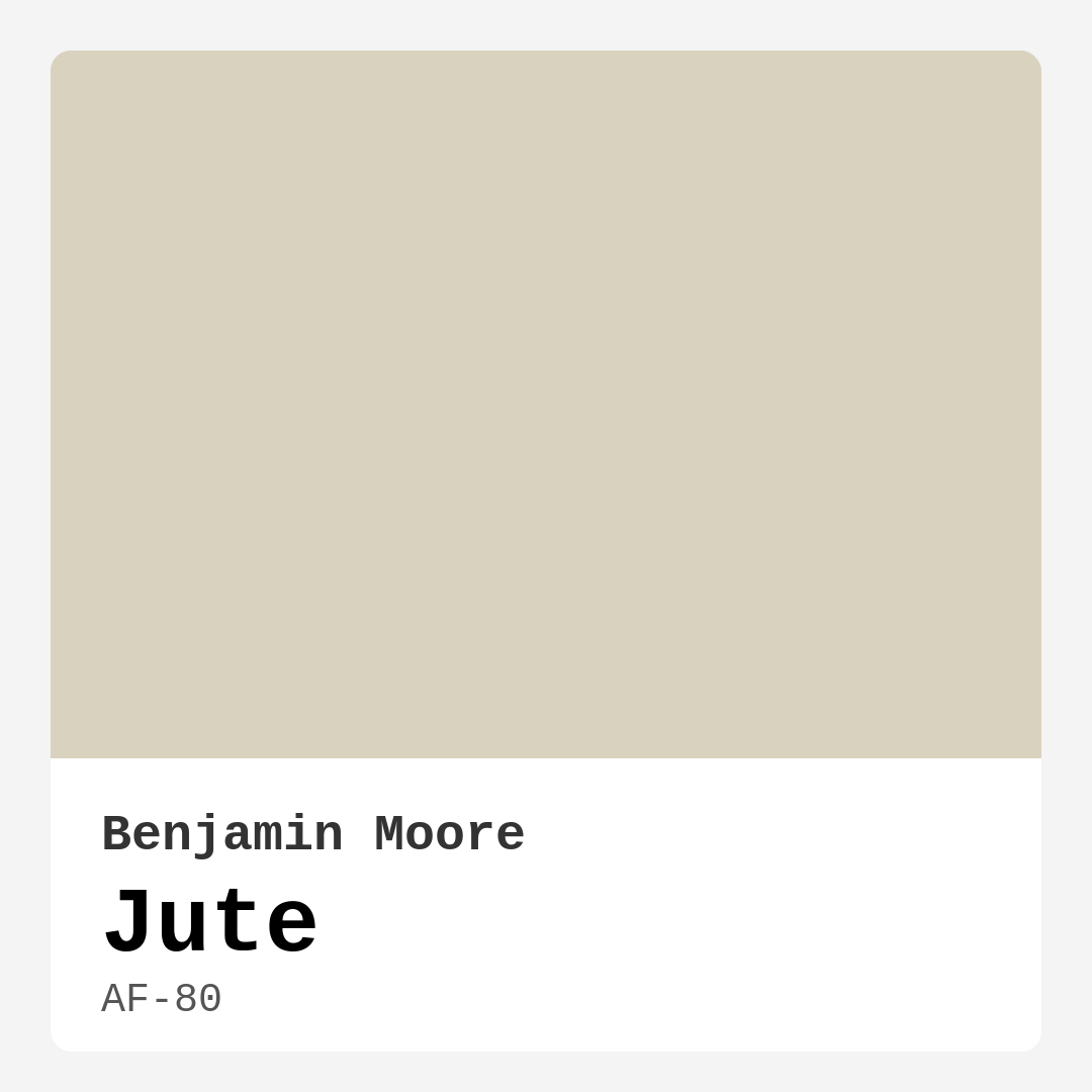
Color Preview & Key Details
| HEX Code | #D9D2BE |
| RGB | 217, 210, 190 |
| LRV | 63.30% |
| Undertone | Yellow and Red |
| Finish Options | Eggshell, Matte, Satin |
Imagine walking into a room that instantly makes you exhale—a space that feels like a warm hug, soft and inviting, yet effortlessly stylish. That’s the magic of Benjamin Moore’s Jute (AF-80). This isn’t just another beige; it’s a carefully balanced greige with whispers of yellow and red undertones, giving it a depth that keeps it from feeling flat or sterile. Whether you’re refreshing a tired living room or designing a serene bedroom, Jute might just be the perfect backdrop for your next project.
Let’s talk about why this color works so well. Jute sits in that sweet spot between warm and neutral, making it incredibly versatile. It’s light enough to keep a room feeling airy (thanks to its 63.30% LRV, meaning it reflects plenty of light), but it’s got just enough pigment to add warmth without veering into “too yellow” or “too pink” territory. That balance is what makes it a favorite for modern farmhouse, Scandinavian, and even eclectic spaces. It plays well with others, whether you’re pairing it with crisp white trim like Benjamin Moore’s White Dove or rich wood accents.
One of the best things about Jute is how it adapts to light. In a sun-drenched room, it glows with a soft, creamy warmth. In spaces with less natural light or under evening lamps, it mellows into a cozy, almost cocoon-like neutral. This chameleon-like quality makes it a safe bet for rooms where lighting changes throughout the day—think living rooms, bedrooms, or home offices. And because it’s a light color, it won’t shrink a space visually, though if you’re painting a very small room, test a swatch first to ensure it doesn’t feel darker than you’d like.
Application is a breeze, even if you’re a DIY beginner. Jute covers well in one to two coats, dries quickly, and is touch-up friendly—a lifesaver if you’ve got kids or pets. It’s available in Matte, Eggshell, and Satin finishes, so you can choose based on your room’s needs. Matte is perfect for low-traffic areas where you want a velvety look, while Eggshell or Satin (with their slight sheen) are better for high-traffic spots like hallways or kitchens, where wipeability matters. And since it’s low-VOC, you won’t have to deal with harsh fumes during or after painting.
Now, let’s talk decor. Jute’s earthy warmth makes it a natural fit for organic textures like linen, jute (yes, the namesake!), and weathered wood. For a modern farmhouse vibe, layer it with black iron fixtures and rustic shelving. Prefer a bohemian feel? Add terracotta pots, macramé, and jewel-toned accents like deep blues or emerald greens—those complementary hues will make Jute sing. In a Scandinavian-inspired space, keep it minimal with pale woods, clean lines, and touches of brass. And if you’re into traditional decor, Jute works beautifully with classic moldings and antique furnishings.
A few pro tips: Always, always test a sample on your wall before committing. Paint a large swatch and observe it at different times of day to see how the undertones shift. If you’re pairing it with trim, White Dove is a flawless match—it’s crisp without being stark. And don’t be afraid to use Jute on furniture or cabinetry for a subtle, sophisticated look.
Of course, no color is perfect for every scenario. Jute’s warmth means it might not be the best choice if you’re aiming for a cool, minimalist gray vibe. And while it’s versatile, it can lean a touch too beige in rooms with lots of warm wood tones unless you balance it with cooler accents. But if you’re after a color that feels timeless, adaptable, and downright inviting, Jute is a winner.
So, is Jute right for your home? If you want a neutral that’s anything but boring—one that brings warmth, versatility, and a touch of understated elegance to your walls—it’s absolutely worth considering. Grab a sample, see how it plays in your space, and get ready to fall in love with a color that feels like home.
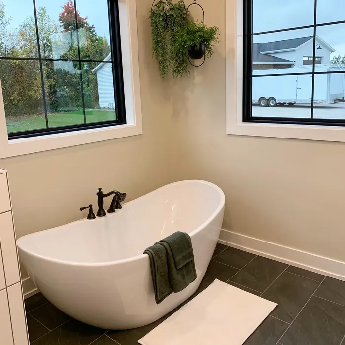
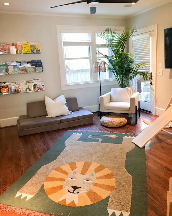
Real Room Photo of Jute AF-80
Undertones of Jute ?
The undertones of Jute are a key aspect of its character, leaning towards Yellow and Red. These subtle underlying hues are what give the color its depth and complexity. For example, a gray with a blue undertone will feel cooler and more modern, while one with a brown undertone will feel warmer and more traditional. It’s essential to test this paint in your home and observe it next to your existing furniture, flooring, and decor to see how these undertones interact and reveal themselves throughout the day.
HEX value: #D9D2BE
RGB code: 217, 210, 190
Is Jute Cool or Warm?
This paint is predominantly warm, which helps to create a welcoming and comforting environment. It pairs beautifully with both warm and cool accents, providing versatility.
Understanding Color Properties and Interior Design Tips
Hue refers to a specific position on the color wheel, measured in degrees from 0 to 360. Each degree represents a different pure color:
- 0° represents red
- 120° represents green
- 240° represents blue
Saturation describes the intensity or purity of a color and is expressed as a percentage:
- At 0%, the color appears completely desaturated—essentially a shade of gray
- At 100%, the color is at its most vivid and vibrant
Lightness indicates how light or dark a color is, also expressed as a percentage:
- 0% lightness results in black
- 100% lightness results in white
Using Warm Colors in Interior Design
Warm hues—such as reds, oranges, yellows, warm beiges, and greiges—are excellent choices for creating inviting and energetic spaces. These colors are particularly well-suited for:
- Kitchens, living rooms, and bathrooms, where warmth enhances comfort and sociability
- Large rooms, where warm tones can help reduce the sense of emptiness and make the space feel more intimate
For example:
- Warm beige shades provide a cozy, inviting atmosphere, ideal for living rooms, bedrooms, and hallways.
- Warm greige (a mix of beige and gray) offers the warmth of beige with the modern appeal of gray, making it a versatile backdrop for dining areas, bedrooms, and living spaces.
However, be mindful when using warm light tones in rooms with limited natural light. These shades may appear muted or even take on an unpleasant yellowish tint. To avoid a dull or flat appearance:
- Add depth by incorporating richer tones like deep greens, charcoal, or chocolate brown
- Use textured elements such as curtains, rugs, or cushions to bring dimension to the space
Pro Tip: Achieving Harmony with Warm and Cool Color Balance
To create a well-balanced and visually interesting interior, mix warm and cool tones strategically. This contrast adds depth and harmony to your design.
- If your walls feature warm hues, introduce cool-colored accents such as blue or green furniture, artwork, or accessories to create contrast.
- For a polished look, consider using a complementary color scheme, which pairs colors opposite each other on the color wheel (e.g., red with green, orange with blue).
This thoughtful mix not only enhances visual appeal but also creates a space that feels both dynamic and cohesive.
Light Temperature Affects on Jute
Natural Light
Natural daylight changes in color temperature as the sun moves across the sky. At sunrise and sunset, the light tends to have a warm, golden tone with a color temperature around 2000 Kelvin (K). As the day progresses and the sun rises higher, the light becomes cooler and more neutral. Around midday, especially when the sky is clear, natural light typically reaches its peak brightness and shifts to a cooler tone, ranging from 5500 to 6500 Kelvin. This midday light is close to what we perceive as pure white or daylight-balanced light.
These shifts in natural light can significantly influence how colors appear in a space, which is why designers often consider both the time of day and the orientation of windows when planning interior color schemes.
Artificial Light
When choosing artificial lighting, pay close attention to the color temperature, measured in Kelvin (K). This determines how warm or cool the light will appear. Lower temperatures, around 2700K, give off a warm, yellow glow often used in living rooms or bedrooms. Higher temperatures, above 5000K, create a cool, bluish light similar to daylight, commonly used in kitchens, offices, or task areas.
Use the slider to see how lighting temperature can affect the appearance of a surface or color throughout a space.


4800K
LRV of Jute
The Light Reflectance Value (LRV) of Jute is 63.30%, which places it in the Light colors category. This means it reflect most of the incident light. Understanding a paint’s LRV is crucial for predicting how it will look in your space. A higher LRV indicates a lighter color that reflects more light, making rooms feel larger and brighter. A lower LRV signifies a darker color that absorbs more light, creating a cozier, more intimate atmosphere. Always consider the natural and artificial lighting in your room when selecting a paint color based on its LRV.
Detailed Review of Jute
Additional Paint Characteristics
Ideal Rooms
Bedroom, Dining Room, Home Office, Living Room, Nursery
Decor Styles
Bohemian, Eclectic, Modern Farmhouse, Scandinavian, Traditional
Coverage
Good (1–2 Coats), Touch-Up Friendly
Ease of Application
Beginner Friendly, Brush Smooth, Fast-Drying, Roller-Ready
Washability
Washable, Wipeable
VOC Level
Eco-Certified, Low VOC
Best Use
Accent Wall, Furniture, Interior Walls, Trim
Room Suitability
Bedroom, Dining Room, Home Office, Living Room, Nursery
Tone Tag
Earthy, Neutral, Warm
Finish Type
Eggshell, Matte, Satin
Paint Performance
Easy Touch-Up, Low Odor, Quick Drying
Use Cases
Best for Modern Farmhouse, Best for Open Concept, Best for Rentals, Classic Favorite
Mood
Cozy, Inviting, Restful
Trim Pairing
Complements Brass Fixtures, Good with Wood Trim, Pairs with White Dove
Jute is a stunning choice for those looking to add a touch of warmth to their home. It’s not just a color; it’s an experience. This muted neutral beautifully complements a variety of decor styles, from rustic to contemporary. When applied, Jute offers a soft glow that transforms spaces without overwhelming them. Its earthy undertones make it a perfect backdrop for bolder accent colors or natural decor elements.
One of the standout features of Jute is its ability to adapt to different lighting conditions. In natural light, it appears warm and inviting, while in artificial light, it takes on a softer, more muted tone. This makes it an ideal choice for spaces that receive varied lighting throughout the day. Plus, it’s easy to work with, allowing for a smooth application whether you’re using a brush or roller.
Pros & Cons of AF-80 Jute
Pros
Cons
Colors that go with Benjamin Moore Jute
FAQ on AF-80 Jute
What types of finishes does Jute come in?
Jute is available in several finishes, including Matte, Eggshell, and Satin. Each finish offers a unique look and feel, allowing you to choose one that best suits your style and the room’s purpose. Matte is great for a subtle look, while Satin provides a slight sheen that can help with washability.
Is Jute suitable for high-traffic areas?
Yes, Jute can be suitable for high-traffic areas, especially when you choose a more durable finish like Eggshell or Satin. These finishes provide better washability and resistance to scuffs, making them ideal for spaces like hallways or living rooms that see a lot of activity.
Comparisons Jute with other colors
Jute AF-80 vs Gossamer Veil SW 9165
| Attribute | Jute AF-80 | Gossamer Veil SW 9165 |
|---|---|---|
| Color Name | Jute AF-80 | Gossamer Veil SW 9165 |
| Color | ||
| Hue | Greige | Greige |
| Brightness | Light | Light |
| RGB | 217, 210, 190 | 211, 206, 196 |
| LRV | 63.30% | 75% |
| Finish Type | Eggshell, Matte, Satin | Eggshell, Matte |
| Finish Options | Eggshell, Matte, Satin | Eggshell, Matte, Satin |
| Ideal Rooms | Bedroom, Dining Room, Home Office, Living Room, Nursery | Bedroom, Dining Room, Entryway, Home Office, Kitchen, Living Room |
| Decor Styles | Bohemian, Eclectic, Modern Farmhouse, Scandinavian, Traditional | Coastal, Farmhouse, Modern, Scandinavian, Transitional |
| Coverage | Good (1–2 Coats), Touch-Up Friendly | Good (1–2 Coats), Touch-Up Friendly |
| Ease of Application | Beginner Friendly, Brush Smooth, Fast-Drying, Roller-Ready | Beginner Friendly, Brush Smooth, Fast-Drying, Roller-Ready |
| Washability | Washable, Wipeable | Washable, Wipeable |
| Room Suitability | Bedroom, Dining Room, Home Office, Living Room, Nursery | Bathroom, Bedroom, Dining Room, Home Office, Living Room |
| Tone | Earthy, Neutral, Warm | Airy, Balanced, Muted, Warm |
| Paint Performance | Easy Touch-Up, Low Odor, Quick Drying | Easy Touch-Up, High Coverage, Low Odor, Quick Drying |
Jute AF-80 vs Heron Plume SW 6070
| Attribute | Jute AF-80 | Heron Plume SW 6070 |
|---|---|---|
| Color Name | Jute AF-80 | Heron Plume SW 6070 |
| Color | ||
| Hue | Greige | Greige |
| Brightness | Light | Light |
| RGB | 217, 210, 190 | 229, 225, 216 |
| LRV | 63.30% | 30% |
| Finish Type | Eggshell, Matte, Satin | Eggshell, Matte, Satin |
| Finish Options | Eggshell, Matte, Satin | Eggshell, Matte, Satin |
| Ideal Rooms | Bedroom, Dining Room, Home Office, Living Room, Nursery | Bedroom, Dining Room, Home Office, Living Room |
| Decor Styles | Bohemian, Eclectic, Modern Farmhouse, Scandinavian, Traditional | Coastal, Modern, Scandinavian, Transitional |
| Coverage | Good (1–2 Coats), Touch-Up Friendly | Good (1–2 Coats) |
| Ease of Application | Beginner Friendly, Brush Smooth, Fast-Drying, Roller-Ready | Beginner Friendly, Brush Smooth, Fast-Drying, Roller-Ready |
| Washability | Washable, Wipeable | Washable, Wipeable |
| Room Suitability | Bedroom, Dining Room, Home Office, Living Room, Nursery | Bedroom, Dining Room, Home Office, Living Room |
| Tone | Earthy, Neutral, Warm | Balanced, Muted, Neutral, Warm |
| Paint Performance | Easy Touch-Up, Low Odor, Quick Drying | Easy Touch-Up, Low Odor, Quick Drying |
Jute AF-80 vs Toque White SW 7003
| Attribute | Jute AF-80 | Toque White SW 7003 |
|---|---|---|
| Color Name | Jute AF-80 | Toque White SW 7003 |
| Color | ||
| Hue | Greige | Greige |
| Brightness | Light | Light |
| RGB | 217, 210, 190 | 231, 226, 218 |
| LRV | 63.30% | 75% |
| Finish Type | Eggshell, Matte, Satin | Eggshell, Matte, Satin |
| Finish Options | Eggshell, Matte, Satin | Eggshell, Matte, Satin |
| Ideal Rooms | Bedroom, Dining Room, Home Office, Living Room, Nursery | Bathroom, Bedroom, Dining Room, Home Office, Kitchen, Living Room |
| Decor Styles | Bohemian, Eclectic, Modern Farmhouse, Scandinavian, Traditional | Coastal, Minimalist, Modern Farmhouse, Transitional |
| Coverage | Good (1–2 Coats), Touch-Up Friendly | Good (1–2 Coats), Touch-Up Friendly |
| Ease of Application | Beginner Friendly, Brush Smooth, Fast-Drying, Roller-Ready | Beginner Friendly, Brush Smooth, Roller-Ready |
| Washability | Washable, Wipeable | Washable, Wipeable |
| Room Suitability | Bedroom, Dining Room, Home Office, Living Room, Nursery | Bathroom, Bedroom, Dining Room, Kitchen, Living Room |
| Tone | Earthy, Neutral, Warm | Neutral, Soft, Warm |
| Paint Performance | Easy Touch-Up, Low Odor, Quick Drying | Easy Touch-Up, High Coverage, Low Odor, Quick Drying |
Jute AF-80 vs Sedate Gray SW 6169
| Attribute | Jute AF-80 | Sedate Gray SW 6169 |
|---|---|---|
| Color Name | Jute AF-80 | Sedate Gray SW 6169 |
| Color | ||
| Hue | Greige | Greige |
| Brightness | Light | Light |
| RGB | 217, 210, 190 | 209, 205, 191 |
| LRV | 63.30% | 24% |
| Finish Type | Eggshell, Matte, Satin | Eggshell, Matte, Satin |
| Finish Options | Eggshell, Matte, Satin | Eggshell, Flat, Matte, Satin |
| Ideal Rooms | Bedroom, Dining Room, Home Office, Living Room, Nursery | Bedroom, Dining Room, Home Office, Living Room |
| Decor Styles | Bohemian, Eclectic, Modern Farmhouse, Scandinavian, Traditional | Farmhouse, Minimalist, Modern, Scandinavian |
| Coverage | Good (1–2 Coats), Touch-Up Friendly | Good (1–2 Coats) |
| Ease of Application | Beginner Friendly, Brush Smooth, Fast-Drying, Roller-Ready | Beginner Friendly, Brush Smooth, Roller-Ready |
| Washability | Washable, Wipeable | Scrubbable, Washable |
| Room Suitability | Bedroom, Dining Room, Home Office, Living Room, Nursery | Bedroom, Entryway, Home Office, Living Room |
| Tone | Earthy, Neutral, Warm | Balanced, Muted, Neutral |
| Paint Performance | Easy Touch-Up, Low Odor, Quick Drying | Easy Touch-Up, High Coverage, Low Odor |
Jute AF-80 vs Pale Oak OC-20
| Attribute | Jute AF-80 | Pale Oak OC-20 |
|---|---|---|
| Color Name | Jute AF-80 | Pale Oak OC-20 |
| Color | ||
| Hue | Greige | Greige |
| Brightness | Light | Light |
| RGB | 217, 210, 190 | 223, 218, 206 |
| LRV | 63.30% | 68.64% |
| Finish Type | Eggshell, Matte, Satin | Eggshell, Matte, Satin |
| Finish Options | Eggshell, Matte, Satin | Eggshell, Matte, Satin |
| Ideal Rooms | Bedroom, Dining Room, Home Office, Living Room, Nursery | Bedroom, Dining Room, Home Office, Living Room, Nursery |
| Decor Styles | Bohemian, Eclectic, Modern Farmhouse, Scandinavian, Traditional | Coastal, Modern Farmhouse, Scandinavian, Traditional, Transitional |
| Coverage | Good (1–2 Coats), Touch-Up Friendly | Good (1–2 Coats), Touch-Up Friendly |
| Ease of Application | Beginner Friendly, Brush Smooth, Fast-Drying, Roller-Ready | Beginner Friendly, Brush Smooth, Roller-Ready |
| Washability | Washable, Wipeable | Scrubbable, Washable |
| Room Suitability | Bedroom, Dining Room, Home Office, Living Room, Nursery | Bedroom, Dining Room, Home Office, Living Room, Nursery |
| Tone | Earthy, Neutral, Warm | Creamy, Muted, Neutral, Warm |
| Paint Performance | Easy Touch-Up, Low Odor, Quick Drying | High Coverage, Low Odor, Quick Drying |
Jute AF-80 vs Natural Cream OC-14
| Attribute | Jute AF-80 | Natural Cream OC-14 |
|---|---|---|
| Color Name | Jute AF-80 | Natural Cream OC-14 |
| Color | ||
| Hue | Greige | Greige |
| Brightness | Light | Light |
| RGB | 217, 210, 190 | 218, 213, 198 |
| LRV | 63.30% | 64.78% |
| Finish Type | Eggshell, Matte, Satin | Eggshell, Matte, Satin |
| Finish Options | Eggshell, Matte, Satin | Eggshell, Matte, Satin |
| Ideal Rooms | Bedroom, Dining Room, Home Office, Living Room, Nursery | Bathroom, Bedroom, Hallway, Home Office, Kitchen, Living Room |
| Decor Styles | Bohemian, Eclectic, Modern Farmhouse, Scandinavian, Traditional | Minimalist, Modern Farmhouse, Rustic, Scandinavian, Transitional |
| Coverage | Good (1–2 Coats), Touch-Up Friendly | Good (1–2 Coats), Touch-Up Friendly |
| Ease of Application | Beginner Friendly, Brush Smooth, Fast-Drying, Roller-Ready | Beginner Friendly, Brush Smooth, Fast-Drying, Roller-Ready |
| Washability | Washable, Wipeable | Highly Washable, Washable |
| Room Suitability | Bedroom, Dining Room, Home Office, Living Room, Nursery | Bedroom, Entryway, Home Office, Kitchen, Living Room |
| Tone | Earthy, Neutral, Warm | Creamy, Earthy, Warm |
| Paint Performance | Easy Touch-Up, Low Odor, Quick Drying | Easy Touch-Up, Low Odor, Quick Drying |
Jute AF-80 vs Ballet White OC-9
| Attribute | Jute AF-80 | Ballet White OC-9 |
|---|---|---|
| Color Name | Jute AF-80 | Ballet White OC-9 |
| Color | ||
| Hue | Greige | Greige |
| Brightness | Light | Light |
| RGB | 217, 210, 190 | 229, 224, 208 |
| LRV | 63.30% | 71.97% |
| Finish Type | Eggshell, Matte, Satin | Eggshell, Matte |
| Finish Options | Eggshell, Matte, Satin | Eggshell, Matte, Satin |
| Ideal Rooms | Bedroom, Dining Room, Home Office, Living Room, Nursery | Bedroom, Dining Room, Home Office, Kitchen, Living Room |
| Decor Styles | Bohemian, Eclectic, Modern Farmhouse, Scandinavian, Traditional | Farmhouse, Minimalist, Modern, Scandinavian, Traditional |
| Coverage | Good (1–2 Coats), Touch-Up Friendly | Good (1–2 Coats), Touch-Up Friendly |
| Ease of Application | Beginner Friendly, Brush Smooth, Fast-Drying, Roller-Ready | Beginner Friendly, Brush Smooth, Fast-Drying, Roller-Ready |
| Washability | Washable, Wipeable | Washable, Wipeable |
| Room Suitability | Bedroom, Dining Room, Home Office, Living Room, Nursery | Bedroom, Dining Room, Home Office, Kitchen, Living Room |
| Tone | Earthy, Neutral, Warm | Creamy, Muted, Warm |
| Paint Performance | Easy Touch-Up, Low Odor, Quick Drying | Easy Touch-Up, Low Odor, Quick Drying |
Jute AF-80 vs Elmira White HC-84
| Attribute | Jute AF-80 | Elmira White HC-84 |
|---|---|---|
| Color Name | Jute AF-80 | Elmira White HC-84 |
| Color | ||
| Hue | Greige | Greige |
| Brightness | Light | Light |
| RGB | 217, 210, 190 | 219, 211, 195 |
| LRV | 63.30% | 64.67% |
| Finish Type | Eggshell, Matte, Satin | Eggshell, Matte, Satin |
| Finish Options | Eggshell, Matte, Satin | Eggshell, Matte, Satin |
| Ideal Rooms | Bedroom, Dining Room, Home Office, Living Room, Nursery | Bathroom, Bedroom, Dining Room, Home Office, Kitchen, Living Room |
| Decor Styles | Bohemian, Eclectic, Modern Farmhouse, Scandinavian, Traditional | Coastal, Modern Farmhouse, Scandinavian, Traditional, Transitional |
| Coverage | Good (1–2 Coats), Touch-Up Friendly | Good (1–2 Coats) |
| Ease of Application | Beginner Friendly, Brush Smooth, Fast-Drying, Roller-Ready | Beginner Friendly, Brush Smooth, Fast-Drying, Roller-Ready |
| Washability | Washable, Wipeable | Highly Washable, Washable |
| Room Suitability | Bedroom, Dining Room, Home Office, Living Room, Nursery | Bathroom, Bedroom, Dining Room, Kitchen, Living Room |
| Tone | Earthy, Neutral, Warm | Creamy, Neutral, Warm |
| Paint Performance | Easy Touch-Up, Low Odor, Quick Drying | High Coverage, Low Odor, Quick Drying |
Jute AF-80 vs Feather Down OC-6
| Attribute | Jute AF-80 | Feather Down OC-6 |
|---|---|---|
| Color Name | Jute AF-80 | Feather Down OC-6 |
| Color | ||
| Hue | Greige | Greige |
| Brightness | Light | Light |
| RGB | 217, 210, 190 | 230, 224, 207 |
| LRV | 63.30% | 73.16% |
| Finish Type | Eggshell, Matte, Satin | Eggshell, Matte, Satin |
| Finish Options | Eggshell, Matte, Satin | Eggshell, Matte, Satin |
| Ideal Rooms | Bedroom, Dining Room, Home Office, Living Room, Nursery | Bedroom, Dining Room, Home Office, Living Room, Nursery |
| Decor Styles | Bohemian, Eclectic, Modern Farmhouse, Scandinavian, Traditional | Contemporary, Farmhouse, Scandinavian, Traditional |
| Coverage | Good (1–2 Coats), Touch-Up Friendly | Good (1–2 Coats) |
| Ease of Application | Beginner Friendly, Brush Smooth, Fast-Drying, Roller-Ready | Beginner Friendly, Brush Smooth, Roller-Ready |
| Washability | Washable, Wipeable | Washable, Wipeable |
| Room Suitability | Bedroom, Dining Room, Home Office, Living Room, Nursery | Bedroom, Dining Room, Living Room, Nursery |
| Tone | Earthy, Neutral, Warm | Creamy, Neutral, Warm |
| Paint Performance | Easy Touch-Up, Low Odor, Quick Drying | Easy Touch-Up, High Coverage, Low Odor |
Jute AF-80 vs Natural Linen 966
| Attribute | Jute AF-80 | Natural Linen 966 |
|---|---|---|
| Color Name | Jute AF-80 | Natural Linen 966 |
| Color | ||
| Hue | Greige | Greige |
| Brightness | Light | Light |
| RGB | 217, 210, 190 | 215, 205, 183 |
| LRV | 63.30% | 59.84% |
| Finish Type | Eggshell, Matte, Satin | Eggshell, Matte, Satin |
| Finish Options | Eggshell, Matte, Satin | Eggshell, Matte, Satin |
| Ideal Rooms | Bedroom, Dining Room, Home Office, Living Room, Nursery | Bedroom, Dining Room, Home Office, Kitchen, Living Room |
| Decor Styles | Bohemian, Eclectic, Modern Farmhouse, Scandinavian, Traditional | Coastal, Minimalist, Modern Farmhouse, Rustic, Traditional |
| Coverage | Good (1–2 Coats), Touch-Up Friendly | Good (1–2 Coats), Touch-Up Friendly |
| Ease of Application | Beginner Friendly, Brush Smooth, Fast-Drying, Roller-Ready | Beginner Friendly, Brush Smooth, Fast-Drying, Roller-Ready |
| Washability | Washable, Wipeable | Highly Washable, Washable, Wipeable |
| Room Suitability | Bedroom, Dining Room, Home Office, Living Room, Nursery | Bedroom, Dining Room, Home Office, Living Room, Nursery |
| Tone | Earthy, Neutral, Warm | Earthy, Neutral, Warm |
| Paint Performance | Easy Touch-Up, Low Odor, Quick Drying | Easy Touch-Up, High Coverage, Low Odor, Quick Drying |
Official Page of Benjamin Moore Jute AF-80