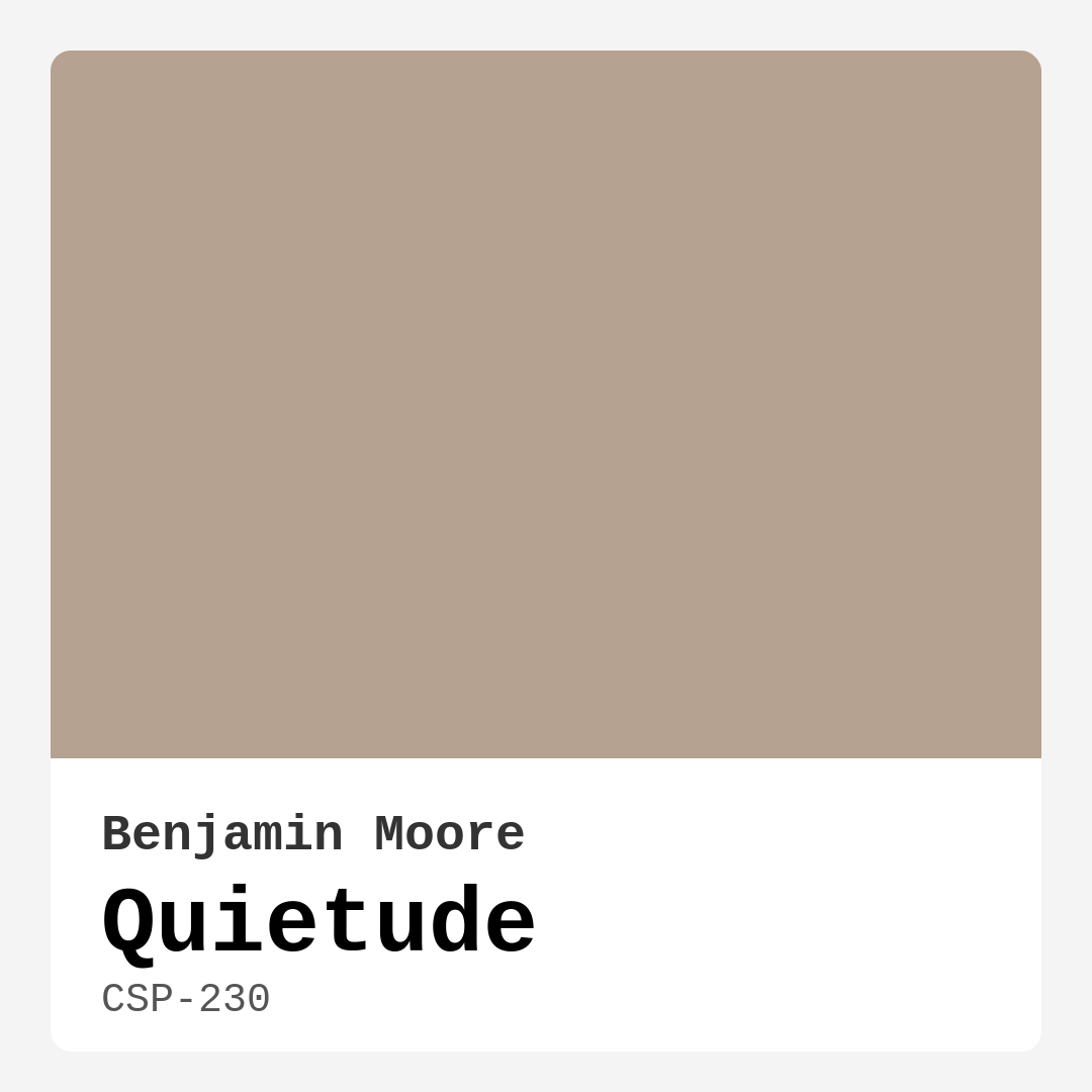
Color Preview & Key Details
| HEX Code | #B5A290 |
| RGB | 181, 162, 144 |
| LRV | 37.90% |
| Undertone | Red |
| Finish Options | Eggshell, Matte, Satin |
Imagine walking into a room that instantly makes you feel at ease, a place where the stresses of the day fade away as soon as you step in. That’s the magic of color, and one hue that captures this feeling beautifully is Quietude by Benjamin Moore. This enchanting paint color, with its soothing and soft presence, embodies tranquility in a way that few others can. If you’re considering a refresh for your home, let’s dive into why Quietude could be the perfect choice for your next project.
Quietude, officially known as CSP-230, is a stunning warm grey with a subtle beige undertone. It’s a medium shade, which means it strikes a balance between light and dark, offering just enough depth without overwhelming a space. The hex code #B5A290 gives you a glimpse of its inviting nature, and with an LRV (Light Reflectance Value) of around 37.90%, it reflects a moderate amount of light. This characteristic makes Quietude a versatile color that works well in both naturally lit and dimmer rooms, maintaining an airy and bright feel.
One of the standout qualities of Quietude is that it creates a cozy atmosphere while still feeling spacious. This is particularly beneficial if you’re working with smaller rooms or areas where you want to foster a sense of openness. Imagine a nursery painted in Quietude, where the warmth envelops you, making it a perfect sanctuary for both you and your little one. Or consider your living room, where gatherings with friends and family are filled with laughter and love, all while being embraced by this calm and inviting hue.
When it comes to application, Quietude shines as a beginner-friendly option. Its smooth application makes it a dream to work with, whether you’re rolling it on or using a brush for detailed work. It dries quickly, which is a blessing if you’re eager to see the transformation of your space. Plus, with its good coverage, you’ll likely find that one to two coats will do the trick, although it’s always wise to apply a second coat for that perfect finish.
In terms of durability, Quietude is a low VOC paint, which means it’s more environmentally friendly and safer for indoor air quality. However, it’s essential to note that while it’s washable, it’s best suited for low to moderate traffic areas. Think about using it in your living room, bedroom, or home office, rather than high-traffic zones. If you’re eyeing it for a hallway or kids’ play area, consider a protective topcoat to ensure the finish stays intact.
Now let’s talk about how to pair this beautiful hue with other colors and decor styles. Quietude is incredibly versatile; it complements a wide range of palettes, making it a favorite among designers and homeowners alike. For a fresh and crisp look, consider pairing it with whites like White Dove or Simply White. This combination not only brightens the space but also enhances the soft elegance of Quietude.
If you lean towards an earthy aesthetic, Quietude works harmoniously with warm tones such as soft greens, muted blues, and warm beiges. Imagine a serene living room with Quietude walls accented by warm wooden furniture and earthy textiles—it’s a comforting retreat that invites relaxation.
And let’s not forget about trim. Quietude pairs beautifully with white trims, particularly those like White Dove, which provide a clean and classic contrast. This pairing emphasizes the warmth of Quietude while adding a touch of sophistication to any room. If you’re feeling bold, you could even opt for darker shades for your trim to create a striking visual impact.
Using Quietude in different decor styles is where it truly shines. Whether your home is modern, Scandinavian, transitional, or farmhouse, this color adapts effortlessly. In a modern setting, it can serve as a tranquil backdrop for bold furnishings, while in a farmhouse interior, it enhances the cozy and rustic elements that make those spaces feel inviting.
When considering the mood this color evokes, think of words like cozy, calm, inviting, and restful. Quietude creates a serene environment that encourages relaxation. Whether it’s a peaceful moment with a cup of tea in your home office or a vibrant family gathering in your living room, this hue envelops you in comfort.
As with any color, there are some potential drawbacks to keep in mind. Quietude can appear darker in smaller spaces, so if you’re working with a tiny room, it’s essential to consider how the light interacts with the color. Additionally, while it provides great coverage, achieving full opacity might require multiple coats.
As you plan your project, don’t hesitate to explore lighter and darker shades to complement Quietude. Colors like Benjamin Moore’s Edgecomb Gray or Sherwin-Williams’ Agreeable Gray can create a beautiful flow throughout your home. You might also consider using darker shades for accents or furniture that harmonize with Quietude; a deep navy or charcoal can create a stunning contrast.
In terms of maintenance, you’ll appreciate how easy Quietude is to touch up. Its low odor and quick-drying properties make the painting process less daunting, especially for those who are new to DIY projects. When it comes to cleaning, remember that while it’s washable, it’s best to be gentle to maintain that smooth, inviting finish.
So, is Quietude right for you? If you’re after a color that exudes warmth and tranquility, and you want a versatile hue that can adapt to various styles and moods, then it’s definitely worth considering. With its soothing presence, Quietude can transform your space into a haven of comfort and calm.
As you embark on your home decor journey, don’t overlook the power of paint, especially a color like Quietude. It’s more than just a backdrop; it’s a canvas for your life, creating an environment where you can genuinely feel at home. Embrace the beauty of Quietude, and let it work its magic in your space.
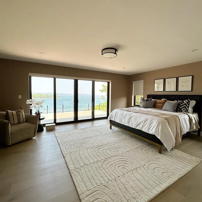
Real Room Photo of Quietude CSP-230
Undertones of Quietude ?
Quietude has a warm beige undertone that softens its appearance, making it more inviting than cooler shades. This subtle warmth allows it to blend seamlessly with other colors, enhancing its versatility in various decor styles.
HEX value: #B5A290
RGB code: 181, 162, 144
Is Quietude Cool or Warm?
Overall, Quietude leans slightly warm, which contributes to its comforting vibe. This warmth makes it an excellent choice for creating a cozy atmosphere, particularly in spaces designed for relaxation.
Understanding Color Properties and Interior Design Tips
Hue refers to a specific position on the color wheel, measured in degrees from 0 to 360. Each degree represents a different pure color:
- 0° represents red
- 120° represents green
- 240° represents blue
Saturation describes the intensity or purity of a color and is expressed as a percentage:
- At 0%, the color appears completely desaturated—essentially a shade of gray
- At 100%, the color is at its most vivid and vibrant
Lightness indicates how light or dark a color is, also expressed as a percentage:
- 0% lightness results in black
- 100% lightness results in white
Using Warm Colors in Interior Design
Warm hues—such as reds, oranges, yellows, warm beiges, and greiges—are excellent choices for creating inviting and energetic spaces. These colors are particularly well-suited for:
- Kitchens, living rooms, and bathrooms, where warmth enhances comfort and sociability
- Large rooms, where warm tones can help reduce the sense of emptiness and make the space feel more intimate
For example:
- Warm beige shades provide a cozy, inviting atmosphere, ideal for living rooms, bedrooms, and hallways.
- Warm greige (a mix of beige and gray) offers the warmth of beige with the modern appeal of gray, making it a versatile backdrop for dining areas, bedrooms, and living spaces.
However, be mindful when using warm light tones in rooms with limited natural light. These shades may appear muted or even take on an unpleasant yellowish tint. To avoid a dull or flat appearance:
- Add depth by incorporating richer tones like deep greens, charcoal, or chocolate brown
- Use textured elements such as curtains, rugs, or cushions to bring dimension to the space
Pro Tip: Achieving Harmony with Warm and Cool Color Balance
To create a well-balanced and visually interesting interior, mix warm and cool tones strategically. This contrast adds depth and harmony to your design.
- If your walls feature warm hues, introduce cool-colored accents such as blue or green furniture, artwork, or accessories to create contrast.
- For a polished look, consider using a complementary color scheme, which pairs colors opposite each other on the color wheel (e.g., red with green, orange with blue).
This thoughtful mix not only enhances visual appeal but also creates a space that feels both dynamic and cohesive.
Light Temperature Affects on Quietude
Natural Light
Natural daylight changes in color temperature as the sun moves across the sky. At sunrise and sunset, the light tends to have a warm, golden tone with a color temperature around 2000 Kelvin (K). As the day progresses and the sun rises higher, the light becomes cooler and more neutral. Around midday, especially when the sky is clear, natural light typically reaches its peak brightness and shifts to a cooler tone, ranging from 5500 to 6500 Kelvin. This midday light is close to what we perceive as pure white or daylight-balanced light.
These shifts in natural light can significantly influence how colors appear in a space, which is why designers often consider both the time of day and the orientation of windows when planning interior color schemes.
Artificial Light
When choosing artificial lighting, pay close attention to the color temperature, measured in Kelvin (K). This determines how warm or cool the light will appear. Lower temperatures, around 2700K, give off a warm, yellow glow often used in living rooms or bedrooms. Higher temperatures, above 5000K, create a cool, bluish light similar to daylight, commonly used in kitchens, offices, or task areas.
Use the slider to see how lighting temperature can affect the appearance of a surface or color throughout a space.


4800K
LRV of Quietude
Quietude has a Light Reflectance Value (LRV) of approximately 48, indicating it reflects a moderate amount of light. This makes it suitable for both light-filled and dimmer spaces, maintaining balance and warmth.
Detailed Review of Quietude
Additional Paint Characteristics
Ideal Rooms
Bedroom, Dining Room, Home Office, Living Room, Nursery
Decor Styles
Farmhouse, Modern, Scandinavian, Transitional
Coverage
Good (1–2 Coats)
Ease of Application
Beginner Friendly, Brush Smooth, Fast-Drying, Roller-Ready
Washability
Spot Clean Only, Washable
VOC Level
Low VOC, Ultra Low VOC
Best Use
Accent Wall, Bedroom, Interior Walls, Living Room
Room Suitability
Bedroom, Home Office, Living Room, Nursery
Tone Tag
Earthy, Muted, Neutral, Warm
Finish Type
Eggshell, Matte, Satin
Paint Performance
Easy Touch-Up, Low Odor, Quick Drying, Scuff Resistant
Use Cases
Best for Modern Farmhouse, Best for Rentals, Best for Selling Your Home, Classic Favorite
Mood
Calm, Cozy, Inviting, Restful
Trim Pairing
Complements Brass Fixtures, Pairs with White Dove, Works with Warm Trim
Quietude is a versatile paint choice that effortlessly adapts to various design schemes. Its soft, muted tone works beautifully in both natural and artificial light, enhancing the ambiance of your home. One of the standout features of this paint is its ability to create a cozy yet spacious feel, making it ideal for both small and large rooms. When applying Quietude, you’ll find it glides smoothly, ensuring an even finish with minimal effort. The color pairs well with whites and earthy accents, creating a harmonious palette that feels both inviting and sophisticated. If you’re looking to refresh your space without overwhelming it, Quietude could be your perfect match.
Pros & Cons of CSP-230 Quietude
Pros
Cons
Colors that go with Benjamin Moore Quietude
FAQ on CSP-230 Quietude
Is Quietude suitable for high-traffic areas?
While Quietude is a beautiful choice, it’s best used in low to moderate traffic areas like bedrooms or living rooms. If you’re considering it for high-traffic zones, you might want to add a protective top coat or choose a paint specifically designed for durability. This will help ensure that the finish remains intact over time.
What colors pair well with Quietude?
Quietude works beautifully with a range of colors. For a fresh look, consider pairing it with crisp whites like White Dove or Simply White. If you’re aiming for a more earthy palette, it complements warm tones like beige, soft greens, and muted blues. You can also experiment with darker shades for trim to create a striking contrast.
Comparisons Quietude with other colors
Quietude CSP-230 vs Repose Gray SW 7015
| Attribute | Quietude CSP-230 | Repose Gray SW 7015 |
|---|---|---|
| Color Name | Quietude CSP-230 | Repose Gray SW 7015 |
| Color | ||
| Hue | Grey | Grey |
| Brightness | Medium | Medium |
| RGB | 181, 162, 144 | 204, 201, 192 |
| LRV | 37.90% | 58% |
| Finish Type | Eggshell, Matte, Satin | Eggshell, Matte, Satin |
| Finish Options | Eggshell, Matte, Satin | Eggshell, Matte, Satin |
| Ideal Rooms | Bedroom, Dining Room, Home Office, Living Room, Nursery | Bedroom, Dining Room, Hallway, Home Office, Living Room |
| Decor Styles | Farmhouse, Modern, Scandinavian, Transitional | Contemporary, Farmhouse, Minimalist, Modern, Transitional |
| Coverage | Good (1–2 Coats) | Good (1–2 Coats), Touch-Up Friendly |
| Ease of Application | Beginner Friendly, Brush Smooth, Fast-Drying, Roller-Ready | Beginner Friendly, Brush Smooth, Fast-Drying, Roller-Ready |
| Washability | Spot Clean Only, Washable | Highly Washable, Washable |
| Room Suitability | Bedroom, Home Office, Living Room, Nursery | Bedroom, Dining Room, Hallway, Home Office, Living Room |
| Tone | Earthy, Muted, Neutral, Warm | Muted, Neutral, Warm |
| Paint Performance | Easy Touch-Up, Low Odor, Quick Drying, Scuff Resistant | Low Odor, Quick Drying, Scuff Resistant |
Quietude CSP-230 vs Light French Gray SW 0055
| Attribute | Quietude CSP-230 | Light French Gray SW 0055 |
|---|---|---|
| Color Name | Quietude CSP-230 | Light French Gray SW 0055 |
| Color | ||
| Hue | Grey | Grey |
| Brightness | Medium | Medium |
| RGB | 181, 162, 144 | 194, 192, 187 |
| LRV | 37.90% | 53% |
| Finish Type | Eggshell, Matte, Satin | Eggshell, Matte, Satin |
| Finish Options | Eggshell, Matte, Satin | Eggshell, Matte, Satin |
| Ideal Rooms | Bedroom, Dining Room, Home Office, Living Room, Nursery | Bedroom, Dining Room, Home Office, Kitchen, Living Room |
| Decor Styles | Farmhouse, Modern, Scandinavian, Transitional | Contemporary, Farmhouse, Modern, Scandinavian, Transitional |
| Coverage | Good (1–2 Coats) | Good (1–2 Coats), Touch-Up Friendly |
| Ease of Application | Beginner Friendly, Brush Smooth, Fast-Drying, Roller-Ready | Beginner Friendly, Brush Smooth, Roller-Ready |
| Washability | Spot Clean Only, Washable | Highly Washable, Washable |
| Room Suitability | Bedroom, Home Office, Living Room, Nursery | Bedroom, Dining Room, Home Office, Kitchen, Living Room |
| Tone | Earthy, Muted, Neutral, Warm | Balanced, Muted, Neutral, Warm |
| Paint Performance | Easy Touch-Up, Low Odor, Quick Drying, Scuff Resistant | Easy Touch-Up, High Coverage, Low Odor |
Quietude CSP-230 vs Wordly Gray SW 7043
| Attribute | Quietude CSP-230 | Wordly Gray SW 7043 |
|---|---|---|
| Color Name | Quietude CSP-230 | Wordly Gray SW 7043 |
| Color | ||
| Hue | Grey | Grey |
| Brightness | Medium | Medium |
| RGB | 181, 162, 144 | 206, 198, 187 |
| LRV | 37.90% | 58% |
| Finish Type | Eggshell, Matte, Satin | Eggshell, Satin |
| Finish Options | Eggshell, Matte, Satin | Eggshell, Flat, Satin |
| Ideal Rooms | Bedroom, Dining Room, Home Office, Living Room, Nursery | Bedroom, Home Office, Kitchen, Living Room |
| Decor Styles | Farmhouse, Modern, Scandinavian, Transitional | Minimalist, Modern, Scandi, Transitional |
| Coverage | Good (1–2 Coats) | Good (1–2 Coats) |
| Ease of Application | Beginner Friendly, Brush Smooth, Fast-Drying, Roller-Ready | Beginner Friendly, Brush Smooth, Fast-Drying, Roller-Ready |
| Washability | Spot Clean Only, Washable | Highly Washable, Washable |
| Room Suitability | Bedroom, Home Office, Living Room, Nursery | Bedroom, Dining Room, Home Office, Living Room |
| Tone | Earthy, Muted, Neutral, Warm | Muted, Neutral, Warm |
| Paint Performance | Easy Touch-Up, Low Odor, Quick Drying, Scuff Resistant | Easy Touch-Up, Low Odor, Scuff Resistant |
Quietude CSP-230 vs Illusive Green SW 9164
| Attribute | Quietude CSP-230 | Illusive Green SW 9164 |
|---|---|---|
| Color Name | Quietude CSP-230 | Illusive Green SW 9164 |
| Color | ||
| Hue | Grey | Grey |
| Brightness | Medium | Medium |
| RGB | 181, 162, 144 | 146, 148, 141 |
| LRV | 37.90% | 24% |
| Finish Type | Eggshell, Matte, Satin | Eggshell, Matte, Satin |
| Finish Options | Eggshell, Matte, Satin | Eggshell, Matte, Satin |
| Ideal Rooms | Bedroom, Dining Room, Home Office, Living Room, Nursery | Bedroom, Dining Room, Home Office, Living Room, Nursery |
| Decor Styles | Farmhouse, Modern, Scandinavian, Transitional | Coastal, Minimalist, Modern, Rustic, Scandinavian |
| Coverage | Good (1–2 Coats) | Good (1–2 Coats), Touch-Up Friendly |
| Ease of Application | Beginner Friendly, Brush Smooth, Fast-Drying, Roller-Ready | Beginner Friendly, Brush Smooth, Fast-Drying, Roller-Ready |
| Washability | Spot Clean Only, Washable | Highly Washable, Washable, Wipeable |
| Room Suitability | Bedroom, Home Office, Living Room, Nursery | Bedroom, Dining Room, Home Office, Living Room, Nursery |
| Tone | Earthy, Muted, Neutral, Warm | Balanced, Earthy, Muted |
| Paint Performance | Easy Touch-Up, Low Odor, Quick Drying, Scuff Resistant | Easy Touch-Up, Low Odor, Quick Drying, Scuff Resistant |
Quietude CSP-230 vs Fawn Brindle SW 7640
| Attribute | Quietude CSP-230 | Fawn Brindle SW 7640 |
|---|---|---|
| Color Name | Quietude CSP-230 | Fawn Brindle SW 7640 |
| Color | ||
| Hue | Grey | Grey |
| Brightness | Medium | Medium |
| RGB | 181, 162, 144 | 167, 160, 148 |
| LRV | 37.90% | 24% |
| Finish Type | Eggshell, Matte, Satin | Eggshell, Matte |
| Finish Options | Eggshell, Matte, Satin | Eggshell, Matte, Satin |
| Ideal Rooms | Bedroom, Dining Room, Home Office, Living Room, Nursery | Bedroom, Dining Room, Hallway, Home Office, Living Room |
| Decor Styles | Farmhouse, Modern, Scandinavian, Transitional | Bohemian, Minimalist, Modern Farmhouse, Transitional |
| Coverage | Good (1–2 Coats) | Good (1–2 Coats) |
| Ease of Application | Beginner Friendly, Brush Smooth, Fast-Drying, Roller-Ready | Brush Smooth, Fast-Drying, Roller-Ready |
| Washability | Spot Clean Only, Washable | Stain Resistant, Washable |
| Room Suitability | Bedroom, Home Office, Living Room, Nursery | Bedroom, Dining Room, Home Office, Living Room |
| Tone | Earthy, Muted, Neutral, Warm | Earthy, Neutral, Warm |
| Paint Performance | Easy Touch-Up, Low Odor, Quick Drying, Scuff Resistant | Easy Touch-Up, Fade Resistant, Low Odor |
Quietude CSP-230 vs Balanced Beige SW 7037
| Attribute | Quietude CSP-230 | Balanced Beige SW 7037 |
|---|---|---|
| Color Name | Quietude CSP-230 | Balanced Beige SW 7037 |
| Color | ||
| Hue | Grey | Grey |
| Brightness | Medium | Medium |
| RGB | 181, 162, 144 | 192, 178, 162 |
| LRV | 37.90% | 44% |
| Finish Type | Eggshell, Matte, Satin | Eggshell, Matte, Satin |
| Finish Options | Eggshell, Matte, Satin | Eggshell, Matte, Satin |
| Ideal Rooms | Bedroom, Dining Room, Home Office, Living Room, Nursery | Bedroom, Dining Room, Home Office, Kitchen, Living Room |
| Decor Styles | Farmhouse, Modern, Scandinavian, Transitional | Contemporary, Minimalist, Modern Farmhouse, Rustic, Transitional |
| Coverage | Good (1–2 Coats) | Good (1–2 Coats), Touch-Up Friendly |
| Ease of Application | Beginner Friendly, Brush Smooth, Fast-Drying, Roller-Ready | Beginner Friendly, Brush Smooth, Roller-Ready |
| Washability | Spot Clean Only, Washable | Washable, Wipeable |
| Room Suitability | Bedroom, Home Office, Living Room, Nursery | Bedroom, Dining Room, Hallway, Kitchen, Living Room |
| Tone | Earthy, Muted, Neutral, Warm | Balanced, Earthy, Warm |
| Paint Performance | Easy Touch-Up, Low Odor, Quick Drying, Scuff Resistant | Easy Touch-Up, High Coverage, Low Odor |
Quietude CSP-230 vs Mushroom SW 9587
| Attribute | Quietude CSP-230 | Mushroom SW 9587 |
|---|---|---|
| Color Name | Quietude CSP-230 | Mushroom SW 9587 |
| Color | ||
| Hue | Grey | Grey |
| Brightness | Medium | Medium |
| RGB | 181, 162, 144 | 208, 199, 183 |
| LRV | 37.90% | 24% |
| Finish Type | Eggshell, Matte, Satin | Eggshell, Satin |
| Finish Options | Eggshell, Matte, Satin | Eggshell, Flat, Matte, Satin |
| Ideal Rooms | Bedroom, Dining Room, Home Office, Living Room, Nursery | Bedroom, Dining Room, Hallway, Home Office, Living Room |
| Decor Styles | Farmhouse, Modern, Scandinavian, Transitional | Bohemian, Contemporary, Modern Farmhouse, Traditional |
| Coverage | Good (1–2 Coats) | Good (1–2 Coats) |
| Ease of Application | Beginner Friendly, Brush Smooth, Fast-Drying, Roller-Ready | Beginner Friendly, Brush Smooth, Roller-Ready |
| Washability | Spot Clean Only, Washable | Highly Washable, Washable |
| Room Suitability | Bedroom, Home Office, Living Room, Nursery | Bedroom, Dining Room, Home Office, Living Room |
| Tone | Earthy, Muted, Neutral, Warm | Earthy, Neutral, Warm |
| Paint Performance | Easy Touch-Up, Low Odor, Quick Drying, Scuff Resistant | Easy Touch-Up, Long Lasting, Low Odor, Scuff Resistant |
Quietude CSP-230 vs Silver Strand SW 7057
| Attribute | Quietude CSP-230 | Silver Strand SW 7057 |
|---|---|---|
| Color Name | Quietude CSP-230 | Silver Strand SW 7057 |
| Color | ||
| Hue | Grey | Grey |
| Brightness | Medium | Medium |
| RGB | 181, 162, 144 | 200, 203, 196 |
| LRV | 37.90% | 66% |
| Finish Type | Eggshell, Matte, Satin | Eggshell, Satin |
| Finish Options | Eggshell, Matte, Satin | Eggshell, Matte, Satin |
| Ideal Rooms | Bedroom, Dining Room, Home Office, Living Room, Nursery | Bedroom, Dining Room, Hallway, Home Office, Living Room |
| Decor Styles | Farmhouse, Modern, Scandinavian, Transitional | Coastal, Minimalist, Modern, Traditional, Transitional |
| Coverage | Good (1–2 Coats) | Good (1–2 Coats), Touch-Up Friendly |
| Ease of Application | Beginner Friendly, Brush Smooth, Fast-Drying, Roller-Ready | Beginner Friendly, Brush Smooth, Roller-Ready |
| Washability | Spot Clean Only, Washable | Highly Washable, Washable |
| Room Suitability | Bedroom, Home Office, Living Room, Nursery | Bathroom, Bedroom, Home Office, Kitchen, Living Room |
| Tone | Earthy, Muted, Neutral, Warm | Balanced, Neutral, Warm |
| Paint Performance | Easy Touch-Up, Low Odor, Quick Drying, Scuff Resistant | Easy Touch-Up, High Coverage, Low Odor |
Quietude CSP-230 vs Cadet SW 9143
| Attribute | Quietude CSP-230 | Cadet SW 9143 |
|---|---|---|
| Color Name | Quietude CSP-230 | Cadet SW 9143 |
| Color | ||
| Hue | Grey | Grey |
| Brightness | Medium | Medium |
| RGB | 181, 162, 144 | 145, 153, 156 |
| LRV | 37.90% | 12% |
| Finish Type | Eggshell, Matte, Satin | Eggshell, Matte, Satin |
| Finish Options | Eggshell, Matte, Satin | Eggshell, Matte, Satin |
| Ideal Rooms | Bedroom, Dining Room, Home Office, Living Room, Nursery | Bathroom, Bedroom, Hallway, Home Office, Kitchen, Living Room |
| Decor Styles | Farmhouse, Modern, Scandinavian, Transitional | Coastal, Industrial, Minimalist, Modern, Scandinavian |
| Coverage | Good (1–2 Coats) | Good (1–2 Coats), Touch-Up Friendly |
| Ease of Application | Beginner Friendly, Brush Smooth, Fast-Drying, Roller-Ready | Beginner Friendly, Brush Smooth, Roller-Ready |
| Washability | Spot Clean Only, Washable | Washable, Wipeable |
| Room Suitability | Bedroom, Home Office, Living Room, Nursery | Bathroom, Bedroom, Hallway, Home Office, Living Room |
| Tone | Earthy, Muted, Neutral, Warm | Balanced, Cool, Muted |
| Paint Performance | Easy Touch-Up, Low Odor, Quick Drying, Scuff Resistant | Easy Touch-Up, High Coverage, Low Odor |
Quietude CSP-230 vs Dovetail SW 7018
| Attribute | Quietude CSP-230 | Dovetail SW 7018 |
|---|---|---|
| Color Name | Quietude CSP-230 | Dovetail SW 7018 |
| Color | ||
| Hue | Grey | Grey |
| Brightness | Medium | Medium |
| RGB | 181, 162, 144 | 144, 138, 131 |
| LRV | 37.90% | 24% |
| Finish Type | Eggshell, Matte, Satin | Eggshell, Matte, Satin |
| Finish Options | Eggshell, Matte, Satin | Eggshell, Matte, Satin |
| Ideal Rooms | Bedroom, Dining Room, Home Office, Living Room, Nursery | Bedroom, Dining Room, Hallway, Home Office, Living Room |
| Decor Styles | Farmhouse, Modern, Scandinavian, Transitional | Minimalist, Modern Farmhouse, Rustic, Transitional |
| Coverage | Good (1–2 Coats) | Good (1–2 Coats), Touch-Up Friendly |
| Ease of Application | Beginner Friendly, Brush Smooth, Fast-Drying, Roller-Ready | Beginner Friendly, Brush Smooth, Roller-Ready |
| Washability | Spot Clean Only, Washable | Washable, Wipeable |
| Room Suitability | Bedroom, Home Office, Living Room, Nursery | Bedroom, Dining Room, Home Office, Living Room |
| Tone | Earthy, Muted, Neutral, Warm | Earthy, Neutral, Warm |
| Paint Performance | Easy Touch-Up, Low Odor, Quick Drying, Scuff Resistant | Easy Touch-Up, Fade Resistant, Low Odor |
Official Page of Benjamin Moore Quietude CSP-230