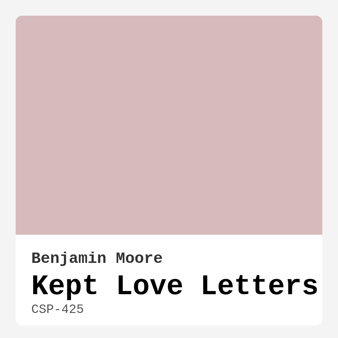
Color Preview & Key Details
| HEX Code | #D6BBBB |
| RGB | 214, 187, 187 |
| LRV | 53.46% |
| Undertone | Red |
| Finish Options | Eggshell, Matte, Satin |
Imagine walking into a room that instantly envelops you in warmth, comfort, and a hint of nostalgia. That’s the magic of Kept Love Letters, a delightful paint color from Benjamin Moore that whispers elegance and charm. If you’ve been on the hunt for that perfect hue that balances subtlety with a touch of romance, you might just have found your match.
Kept Love Letters is a soft, muted pink, reminiscent of vintage stationery, that can transform your space into a cozy haven. With its hex code of #D6BBBB and a Light Reflectance Value (LRV) of 53.46%, this color captures light beautifully, making any room feel more inviting and spacious. But what does this mean for your home? Let’s dive deeper into the possibilities this lovely shade offers.
Starting with its application, Kept Love Letters is incredibly beginner-friendly. Whether you’re a painting pro or just dipping your toes into DIY, you’ll find that this paint applies smoothly, whether you use a brush or roller. It dries quickly, and with a good coverage of 1-2 coats, you’ll be enjoying your new hue sooner rather than later. Plus, it’s washability factor means you can easily wipe away any scuffs or marks, making it practical for high-traffic areas.
Now, let’s talk aesthetics. This color leans on the warm side of the spectrum, with a subtle red undertone that adds depth and character. It creates a cozy, welcoming atmosphere, making it perfect for spaces where you want to unwind or entertain. Think about your living room, a sanctuary for family gatherings, or a bedroom that invites rest after a long day. Kept Love Letters fits seamlessly into those environments.
What about decor styles? This color is a true chameleon. It pairs beautifully with shabby chic, vintage, modern farmhouse, bohemian, and transitional styles. Picture a shabby chic living room with whitewashed furniture and soft textiles; Kept Love Letters will enhance that aesthetic without overwhelming it. Or imagine a modern farmhouse kitchen with brass fixtures; this color can beautifully complement those warm accents, creating a harmonious palette.
In terms of room suitability, Kept Love Letters shines in various settings. It’s particularly effective in living rooms, bedrooms, nurseries, and even dining rooms where a warm, inviting atmosphere is desired. If you’re considering a home office, this shade can provide an energizing yet relaxing backdrop that helps you focus while still feeling cozy.
However, it’s essential to keep in mind that lighting plays a vital role in how this color appears. In natural light, Kept Love Letters emerges soft and gentle, accentuating its romantic qualities. Under artificial light, it may transform slightly, leaning toward a warmer hue that creates an intimate ambiance ideal for evenings. So, test it out in your space at different times of the day to see how it interacts with your existing decor and lighting.
While the pros of this color are abundant, there are a few considerations to keep in mind. Since Kept Love Letters is on the softer side, it may require multiple coats for full coverage, especially if you’re painting over a darker color. And like many colors, it can appear different in various lighting conditions, so always test samples before committing to an entire room. It’s also worth noting that this shade may not be the best fit for very dark rooms; a space that gets ample natural light will allow this color to shine its brightest.
One of the standout qualities of Kept Love Letters is its versatility. It pairs well with a range of complementary shades, such as crisp whites like White Dove and Pure White, which can enhance its warmth while maintaining a fresh look. If you’re feeling adventurous, consider mixing in some greens for an unexpected yet harmonious touch—think plants or accent decor that will pop against this beautiful pink backdrop.
For those looking to explore similar hues, consider Benjamin Moore’s Rosewater or even Sherwin-Williams’ Heartthrob. These shades share the same soft charm while offering variations that might suit your personal taste even more closely.
Now, let’s address the mood this color evokes. Kept Love Letters brings a sense of coziness and tranquility to any space. It’s perfect for creating a restful environment in a bedroom or a calming atmosphere in a nursery. Imagine curling up with a good book in a room painted this delicate hue, surrounded by soft textures and warm lighting. It’s hard not to feel instantly at ease.
As you plan your project, think about how this lovely shade can bring your vision to life. Whether you’re painting an accent wall, dressing up furniture, or refreshing an entire room, Kept Love Letters is a timeless choice that captures the essence of warmth and elegance. With this color, you’re not just choosing paint; you’re curating an atmosphere that tells your story.
Ultimately, Kept Love Letters is more than just a color; it’s a way to create a home that feels inviting, personal, and beautifully styled. So, if you’re ready to embrace a hue that balances warmth and sophistication, why not give this charming pink a try? Your space deserves that cozy glow, and Kept Love Letters is here to make it happen.
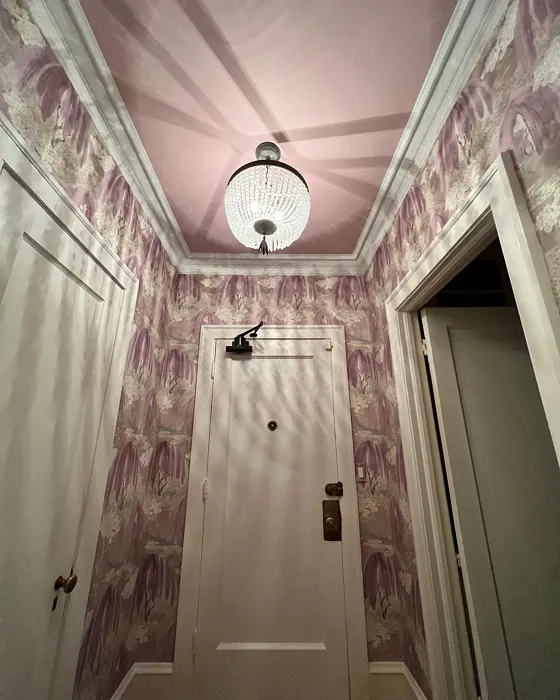
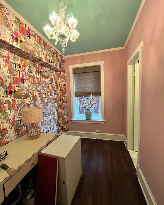
Real Room Photo of Kept Love Letters CSP-425
Undertones of Kept Love Letters ?
The undertones of Kept Love Letters are a key aspect of its character, leaning towards Red. These subtle underlying hues are what give the color its depth and complexity. For example, a gray with a blue undertone will feel cooler and more modern, while one with a brown undertone will feel warmer and more traditional. It’s essential to test this paint in your home and observe it next to your existing furniture, flooring, and decor to see how these undertones interact and reveal themselves throughout the day.
HEX value: #D6BBBB
RGB code: 214, 187, 187
Is Kept Love Letters Cool or Warm?
Kept Love Letters is considered a warm paint color. This characteristic plays a huge role in the overall feel of a room. Warm colors, like this one, tend to create a cozy, inviting, and energetic atmosphere, making them great for social spaces like living rooms and dining rooms. In contrast, cool colors often evoke a sense of calm and serenity, which is why they are popular in bedrooms and bathrooms. The warmth of Kept Love Letters means it will pair beautifully with corresponding decor elements.
Understanding Color Properties and Interior Design Tips
Hue refers to a specific position on the color wheel, measured in degrees from 0 to 360. Each degree represents a different pure color:
- 0° represents red
- 120° represents green
- 240° represents blue
Saturation describes the intensity or purity of a color and is expressed as a percentage:
- At 0%, the color appears completely desaturated—essentially a shade of gray
- At 100%, the color is at its most vivid and vibrant
Lightness indicates how light or dark a color is, also expressed as a percentage:
- 0% lightness results in black
- 100% lightness results in white
Using Warm Colors in Interior Design
Warm hues—such as reds, oranges, yellows, warm beiges, and greiges—are excellent choices for creating inviting and energetic spaces. These colors are particularly well-suited for:
- Kitchens, living rooms, and bathrooms, where warmth enhances comfort and sociability
- Large rooms, where warm tones can help reduce the sense of emptiness and make the space feel more intimate
For example:
- Warm beige shades provide a cozy, inviting atmosphere, ideal for living rooms, bedrooms, and hallways.
- Warm greige (a mix of beige and gray) offers the warmth of beige with the modern appeal of gray, making it a versatile backdrop for dining areas, bedrooms, and living spaces.
However, be mindful when using warm light tones in rooms with limited natural light. These shades may appear muted or even take on an unpleasant yellowish tint. To avoid a dull or flat appearance:
- Add depth by incorporating richer tones like deep greens, charcoal, or chocolate brown
- Use textured elements such as curtains, rugs, or cushions to bring dimension to the space
Pro Tip: Achieving Harmony with Warm and Cool Color Balance
To create a well-balanced and visually interesting interior, mix warm and cool tones strategically. This contrast adds depth and harmony to your design.
- If your walls feature warm hues, introduce cool-colored accents such as blue or green furniture, artwork, or accessories to create contrast.
- For a polished look, consider using a complementary color scheme, which pairs colors opposite each other on the color wheel (e.g., red with green, orange with blue).
This thoughtful mix not only enhances visual appeal but also creates a space that feels both dynamic and cohesive.
Light Temperature Affects on Kept Love Letters
Natural Light
Natural daylight changes in color temperature as the sun moves across the sky. At sunrise and sunset, the light tends to have a warm, golden tone with a color temperature around 2000 Kelvin (K). As the day progresses and the sun rises higher, the light becomes cooler and more neutral. Around midday, especially when the sky is clear, natural light typically reaches its peak brightness and shifts to a cooler tone, ranging from 5500 to 6500 Kelvin. This midday light is close to what we perceive as pure white or daylight-balanced light.
These shifts in natural light can significantly influence how colors appear in a space, which is why designers often consider both the time of day and the orientation of windows when planning interior color schemes.
Artificial Light
When choosing artificial lighting, pay close attention to the color temperature, measured in Kelvin (K). This determines how warm or cool the light will appear. Lower temperatures, around 2700K, give off a warm, yellow glow often used in living rooms or bedrooms. Higher temperatures, above 5000K, create a cool, bluish light similar to daylight, commonly used in kitchens, offices, or task areas.
Use the slider to see how lighting temperature can affect the appearance of a surface or color throughout a space.


4800K
LRV of Kept Love Letters
The Light Reflectance Value (LRV) of Kept Love Letters is 53.46%, which places it in the Light Medium colors category. This means it reflect half of the incident light. Understanding a paint’s LRV is crucial for predicting how it will look in your space. A higher LRV indicates a lighter color that reflects more light, making rooms feel larger and brighter. A lower LRV signifies a darker color that absorbs more light, creating a cozier, more intimate atmosphere. Always consider the natural and artificial lighting in your room when selecting a paint color based on its LRV.
Detailed Review of Kept Love Letters
Additional Paint Characteristics
Ideal Rooms
Bedroom, Dining Room, Hallway, Home Office, Living Room, Nursery
Decor Styles
Bohemian, Modern Farmhouse, Shabby Chic, Transitional, Vintage
Coverage
Good (1–2 Coats), Touch-Up Friendly
Ease of Application
Beginner Friendly, Brush Smooth, Fast-Drying, Roller-Ready
Washability
Highly Washable, Washable, Wipeable
VOC Level
Eco-Certified, Low VOC
Best Use
Accent Wall, Furniture, Interior Walls, Open Concept Spaces, Small Spaces
Room Suitability
Bedroom, Dining Room, Home Office, Living Room, Nursery
Tone Tag
Dusty, Muted, Warm
Finish Type
Eggshell, Matte, Satin
Paint Performance
Easy Touch-Up, Fade Resistant, Low Odor
Use Cases
Best for Low Light Rooms, Best for Rentals, Classic Favorite, Designer Favorite
Mood
Cozy, Inviting, Restful
Trim Pairing
Complements Brass Fixtures, Matches Pure White, Pairs with White Dove
Kept Love Letters is a beautiful shade that strikes a perfect balance between subtle and striking. Its muted pink tone creates a serene backdrop, making it an ideal choice for spaces where relaxation is key, like bedrooms and living rooms. The paint applies smoothly, with a consistency that allows for easy application whether you choose a brush or roller. One of its standout qualities is its versatility; it pairs well with both neutral and bold decor styles, making it a great choice for various rooms in your home.
This paint is particularly effective in smaller spaces, where it can create an illusion of openness and warmth. While it requires at least two coats for optimal coverage, the results are worth the effort. Once applied, it has a soft sheen that reflects light beautifully, enhancing the overall ambiance of your space. Overall, Kept Love Letters is a charming choice for anyone looking to add a touch of warmth and elegance to their home.
Pros & Cons of CSP-425 Kept Love Letters
Pros
Cons
Colors that go with Benjamin Moore Kept Love Letters
FAQ on CSP-425 Kept Love Letters
What rooms work best with Kept Love Letters?
Kept Love Letters is incredibly versatile, making it suitable for a variety of rooms. It’s particularly effective in bedrooms, living rooms, and nurseries due to its warm and calming qualities. You might also consider it for dining rooms or home offices where a welcoming atmosphere is desired. Just ensure that the room has enough natural light to prevent the color from feeling too heavy.
How does Kept Love Letters compare to other shades of pink?
Compared to other pinks, Kept Love Letters is softer and more muted, giving it a timeless quality. While brighter pinks can feel energetic, this shade leans towards a romantic and cozy vibe. It’s less likely to overwhelm a space and can easily blend with various decor styles, making it a standout choice for those looking for a pink with a bit of sophistication.
Comparisons Kept Love Letters with other colors
Kept Love Letters CSP-425 vs Realist Beige SW 6078
| Attribute | Kept Love Letters CSP-425 | Realist Beige SW 6078 |
|---|---|---|
| Color Name | Kept Love Letters CSP-425 | Realist Beige SW 6078 |
| Color | ||
| Hue | Pink | Pink |
| Brightness | Medium | Medium |
| RGB | 214, 187, 187 | 211, 200, 189 |
| LRV | 53.46% | 34% |
| Finish Type | Eggshell, Matte, Satin | Eggshell, Matte, Satin |
| Finish Options | Eggshell, Matte, Satin | Eggshell, Matte, Satin |
| Ideal Rooms | Bedroom, Dining Room, Hallway, Home Office, Living Room, Nursery | Bedroom, Dining Room, Entryway, Home Office, Kitchen, Living Room |
| Decor Styles | Bohemian, Modern Farmhouse, Shabby Chic, Transitional, Vintage | Contemporary, Minimalist, Modern Farmhouse, Rustic, Traditional |
| Coverage | Good (1–2 Coats), Touch-Up Friendly | Good (1–2 Coats), Touch-Up Friendly |
| Ease of Application | Beginner Friendly, Brush Smooth, Fast-Drying, Roller-Ready | Beginner Friendly, Brush Smooth, Fast-Drying, Roller-Ready |
| Washability | Highly Washable, Washable, Wipeable | Washable, Wipeable |
| Room Suitability | Bedroom, Dining Room, Home Office, Living Room, Nursery | Bedroom, Dining Room, Home Office, Kitchen, Living Room |
| Tone | Dusty, Muted, Warm | Earthy, Neutral, Warm |
| Paint Performance | Easy Touch-Up, Fade Resistant, Low Odor | High Coverage, Low Odor, Quick Drying |
Kept Love Letters CSP-425 vs Rosaline Pearl SW 9077
| Attribute | Kept Love Letters CSP-425 | Rosaline Pearl SW 9077 |
|---|---|---|
| Color Name | Kept Love Letters CSP-425 | Rosaline Pearl SW 9077 |
| Color | ||
| Hue | Pink | Pink |
| Brightness | Medium | Medium |
| RGB | 214, 187, 187 | 163, 136, 135 |
| LRV | 53.46% | 69% |
| Finish Type | Eggshell, Matte, Satin | Eggshell, Matte |
| Finish Options | Eggshell, Matte, Satin | Eggshell, Matte, Satin |
| Ideal Rooms | Bedroom, Dining Room, Hallway, Home Office, Living Room, Nursery | Bedroom, Dining Room, Home Office, Living Room |
| Decor Styles | Bohemian, Modern Farmhouse, Shabby Chic, Transitional, Vintage | Bohemian, Contemporary, Modern, Transitional |
| Coverage | Good (1–2 Coats), Touch-Up Friendly | Good (1–2 Coats) |
| Ease of Application | Beginner Friendly, Brush Smooth, Fast-Drying, Roller-Ready | Beginner Friendly, Brush Smooth, Fast-Drying, Roller-Ready |
| Washability | Highly Washable, Washable, Wipeable | Washable, Wipeable |
| Room Suitability | Bedroom, Dining Room, Home Office, Living Room, Nursery | Bedroom, Dining Room, Home Office, Living Room |
| Tone | Dusty, Muted, Warm | Dusty, Muted, Warm |
| Paint Performance | Easy Touch-Up, Fade Resistant, Low Odor | Easy Touch-Up, Fade Resistant, Low Odor |
Kept Love Letters CSP-425 vs Cabbage Rose SW 0003
| Attribute | Kept Love Letters CSP-425 | Cabbage Rose SW 0003 |
|---|---|---|
| Color Name | Kept Love Letters CSP-425 | Cabbage Rose SW 0003 |
| Color | ||
| Hue | Pink | Pink |
| Brightness | Medium | Medium |
| RGB | 214, 187, 187 | 197, 159, 145 |
| LRV | 53.46% | 15% |
| Finish Type | Eggshell, Matte, Satin | Eggshell, Matte, Satin |
| Finish Options | Eggshell, Matte, Satin | Eggshell, Matte, Satin |
| Ideal Rooms | Bedroom, Dining Room, Hallway, Home Office, Living Room, Nursery | Bedroom, Dining Room, Hallway, Living Room, Nursery |
| Decor Styles | Bohemian, Modern Farmhouse, Shabby Chic, Transitional, Vintage | Cottage, Modern Farmhouse, Romantic, Shabby Chic, Vintage |
| Coverage | Good (1–2 Coats), Touch-Up Friendly | Good (1–2 Coats), Touch-Up Friendly |
| Ease of Application | Beginner Friendly, Brush Smooth, Fast-Drying, Roller-Ready | Beginner Friendly, Brush Smooth, Roller-Ready |
| Washability | Highly Washable, Washable, Wipeable | Washable, Wipeable |
| Room Suitability | Bedroom, Dining Room, Home Office, Living Room, Nursery | Bedroom, Dining Room, Hallway, Living Room, Nursery |
| Tone | Dusty, Muted, Warm | Earthy, Muted, Warm |
| Paint Performance | Easy Touch-Up, Fade Resistant, Low Odor | Easy Touch-Up, Low Odor |
Kept Love Letters CSP-425 vs Sashay Sand SW 6051
| Attribute | Kept Love Letters CSP-425 | Sashay Sand SW 6051 |
|---|---|---|
| Color Name | Kept Love Letters CSP-425 | Sashay Sand SW 6051 |
| Color | ||
| Hue | Pink | Pink |
| Brightness | Medium | Medium |
| RGB | 214, 187, 187 | 207, 180, 168 |
| LRV | 53.46% | 64% |
| Finish Type | Eggshell, Matte, Satin | Eggshell, Matte, Satin |
| Finish Options | Eggshell, Matte, Satin | Eggshell, Matte, Satin |
| Ideal Rooms | Bedroom, Dining Room, Hallway, Home Office, Living Room, Nursery | Bedroom, Dining Room, Home Office, Kitchen, Living Room |
| Decor Styles | Bohemian, Modern Farmhouse, Shabby Chic, Transitional, Vintage | Bohemian, Contemporary, Modern Farmhouse, Scandinavian, Transitional |
| Coverage | Good (1–2 Coats), Touch-Up Friendly | Good (1–2 Coats), Touch-Up Friendly |
| Ease of Application | Beginner Friendly, Brush Smooth, Fast-Drying, Roller-Ready | Beginner Friendly, Fast-Drying, Roller-Ready |
| Washability | Highly Washable, Washable, Wipeable | Highly Washable, Washable |
| Room Suitability | Bedroom, Dining Room, Home Office, Living Room, Nursery | Bedroom, Dining Room, Home Office, Kitchen, Living Room |
| Tone | Dusty, Muted, Warm | Earthy, Muted, Warm |
| Paint Performance | Easy Touch-Up, Fade Resistant, Low Odor | Easy Touch-Up, Low Odor, Quick Drying, Scuff Resistant |
Kept Love Letters CSP-425 vs Touch of Sand SW 9085
| Attribute | Kept Love Letters CSP-425 | Touch of Sand SW 9085 |
|---|---|---|
| Color Name | Kept Love Letters CSP-425 | Touch of Sand SW 9085 |
| Color | ||
| Hue | Pink | Pink |
| Brightness | Medium | Medium |
| RGB | 214, 187, 187 | 213, 199, 186 |
| LRV | 53.46% | 66% |
| Finish Type | Eggshell, Matte, Satin | Eggshell, Matte, Satin |
| Finish Options | Eggshell, Matte, Satin | Eggshell, Matte, Satin |
| Ideal Rooms | Bedroom, Dining Room, Hallway, Home Office, Living Room, Nursery | Bathroom, Bedroom, Dining Room, Home Office, Kitchen, Living Room |
| Decor Styles | Bohemian, Modern Farmhouse, Shabby Chic, Transitional, Vintage | Bohemian, Coastal, Contemporary, Modern Farmhouse, Rustic |
| Coverage | Good (1–2 Coats), Touch-Up Friendly | Good (1–2 Coats), Touch-Up Friendly |
| Ease of Application | Beginner Friendly, Brush Smooth, Fast-Drying, Roller-Ready | Beginner Friendly, Brush Smooth, Fast-Drying, Roller-Ready |
| Washability | Highly Washable, Washable, Wipeable | Washable, Wipeable |
| Room Suitability | Bedroom, Dining Room, Home Office, Living Room, Nursery | Bathroom, Bedroom, Dining Room, Home Office, Kitchen, Living Room |
| Tone | Dusty, Muted, Warm | Earthy, Muted, Neutral, Warm |
| Paint Performance | Easy Touch-Up, Fade Resistant, Low Odor | Easy Touch-Up, Low Odor, Quick Drying, Scuff Resistant |
Kept Love Letters CSP-425 vs Pink Shadow SW 0070
| Attribute | Kept Love Letters CSP-425 | Pink Shadow SW 0070 |
|---|---|---|
| Color Name | Kept Love Letters CSP-425 | Pink Shadow SW 0070 |
| Color | ||
| Hue | Pink | Pink |
| Brightness | Medium | Medium |
| RGB | 214, 187, 187 | 222, 195, 185 |
| LRV | 53.46% | 45% |
| Finish Type | Eggshell, Matte, Satin | Eggshell, Matte, Satin |
| Finish Options | Eggshell, Matte, Satin | Eggshell, Matte, Satin |
| Ideal Rooms | Bedroom, Dining Room, Hallway, Home Office, Living Room, Nursery | Bedroom, Dining Room, Home Office, Living Room, Nursery |
| Decor Styles | Bohemian, Modern Farmhouse, Shabby Chic, Transitional, Vintage | Bohemian, Minimalist, Modern Farmhouse, Scandinavian, Traditional |
| Coverage | Good (1–2 Coats), Touch-Up Friendly | Good (1–2 Coats) |
| Ease of Application | Beginner Friendly, Brush Smooth, Fast-Drying, Roller-Ready | Beginner Friendly, Brush Smooth, Fast-Drying, Roller-Ready |
| Washability | Highly Washable, Washable, Wipeable | Washable, Wipeable |
| Room Suitability | Bedroom, Dining Room, Home Office, Living Room, Nursery | Bedroom, Dining Room, Living Room, Nursery |
| Tone | Dusty, Muted, Warm | Muted, Pastel, Warm |
| Paint Performance | Easy Touch-Up, Fade Resistant, Low Odor | Easy Touch-Up, High Coverage, Low Odor |
Kept Love Letters CSP-425 vs Hushed Auburn SW 9080
| Attribute | Kept Love Letters CSP-425 | Hushed Auburn SW 9080 |
|---|---|---|
| Color Name | Kept Love Letters CSP-425 | Hushed Auburn SW 9080 |
| Color | ||
| Hue | Pink | Pink |
| Brightness | Medium | Medium |
| RGB | 214, 187, 187 | 168, 133, 122 |
| LRV | 53.46% | 12% |
| Finish Type | Eggshell, Matte, Satin | Eggshell, Matte, Satin |
| Finish Options | Eggshell, Matte, Satin | Eggshell, Matte, Satin |
| Ideal Rooms | Bedroom, Dining Room, Hallway, Home Office, Living Room, Nursery | Bedroom, Dining Room, Home Office, Living Room |
| Decor Styles | Bohemian, Modern Farmhouse, Shabby Chic, Transitional, Vintage | Contemporary, Modern Farmhouse, Rustic, Transitional |
| Coverage | Good (1–2 Coats), Touch-Up Friendly | Good (1–2 Coats), Touch-Up Friendly |
| Ease of Application | Beginner Friendly, Brush Smooth, Fast-Drying, Roller-Ready | Beginner Friendly, Brush Smooth, Fast-Drying, Roller-Ready |
| Washability | Highly Washable, Washable, Wipeable | Washable, Wipeable |
| Room Suitability | Bedroom, Dining Room, Home Office, Living Room, Nursery | Bedroom, Dining Room, Home Office, Living Room |
| Tone | Dusty, Muted, Warm | Earthy, Muted, Warm |
| Paint Performance | Easy Touch-Up, Fade Resistant, Low Odor | Easy Touch-Up, High Coverage, Low Odor |
Kept Love Letters CSP-425 vs Likeable Sand SW 6058
| Attribute | Kept Love Letters CSP-425 | Likeable Sand SW 6058 |
|---|---|---|
| Color Name | Kept Love Letters CSP-425 | Likeable Sand SW 6058 |
| Color | ||
| Hue | Pink | Pink |
| Brightness | Medium | Medium |
| RGB | 214, 187, 187 | 209, 183, 168 |
| LRV | 53.46% | 61% |
| Finish Type | Eggshell, Matte, Satin | Eggshell, Matte, Satin |
| Finish Options | Eggshell, Matte, Satin | Eggshell, Matte, Satin |
| Ideal Rooms | Bedroom, Dining Room, Hallway, Home Office, Living Room, Nursery | Bedroom, Dining Room, Home Office, Kitchen, Living Room |
| Decor Styles | Bohemian, Modern Farmhouse, Shabby Chic, Transitional, Vintage | Bohemian, Coastal, Contemporary, Modern Farmhouse, Rustic |
| Coverage | Good (1–2 Coats), Touch-Up Friendly | Good (1–2 Coats), Touch-Up Friendly |
| Ease of Application | Beginner Friendly, Brush Smooth, Fast-Drying, Roller-Ready | Beginner Friendly, Brush Smooth, Fast-Drying, Roller-Ready |
| Washability | Highly Washable, Washable, Wipeable | Washable, Wipeable |
| Room Suitability | Bedroom, Dining Room, Home Office, Living Room, Nursery | Bedroom, Dining Room, Home Office, Kitchen, Living Room |
| Tone | Dusty, Muted, Warm | Earthy, Muted, Warm |
| Paint Performance | Easy Touch-Up, Fade Resistant, Low Odor | Easy Touch-Up, Low Odor, Quick Drying |
Kept Love Letters CSP-425 vs Glamour SW 6031
| Attribute | Kept Love Letters CSP-425 | Glamour SW 6031 |
|---|---|---|
| Color Name | Kept Love Letters CSP-425 | Glamour SW 6031 |
| Color | ||
| Hue | Pink | Pink |
| Brightness | Medium | Medium |
| RGB | 214, 187, 187 | 182, 160, 154 |
| LRV | 53.46% | 30% |
| Finish Type | Eggshell, Matte, Satin | Eggshell, Matte, Satin |
| Finish Options | Eggshell, Matte, Satin | Eggshell, Matte, Satin |
| Ideal Rooms | Bedroom, Dining Room, Hallway, Home Office, Living Room, Nursery | Bedroom, Dining Room, Home Office, Living Room |
| Decor Styles | Bohemian, Modern Farmhouse, Shabby Chic, Transitional, Vintage | Bohemian, Classic, Modern, Transitional |
| Coverage | Good (1–2 Coats), Touch-Up Friendly | Good (1–2 Coats) |
| Ease of Application | Beginner Friendly, Brush Smooth, Fast-Drying, Roller-Ready | Beginner Friendly, Brush Smooth, Fast-Drying, Roller-Ready |
| Washability | Highly Washable, Washable, Wipeable | Scrubbable, Washable |
| Room Suitability | Bedroom, Dining Room, Home Office, Living Room, Nursery | Bedroom, Dining Room, Home Office, Living Room |
| Tone | Dusty, Muted, Warm | Balanced, Neutral, Warm |
| Paint Performance | Easy Touch-Up, Fade Resistant, Low Odor | Easy Touch-Up, Low Odor, Quick Drying |
Kept Love Letters CSP-425 vs Temperate Taupe SW 6037
| Attribute | Kept Love Letters CSP-425 | Temperate Taupe SW 6037 |
|---|---|---|
| Color Name | Kept Love Letters CSP-425 | Temperate Taupe SW 6037 |
| Color | ||
| Hue | Pink | Pink |
| Brightness | Medium | Medium |
| RGB | 214, 187, 187 | 191, 177, 170 |
| LRV | 53.46% | 34% |
| Finish Type | Eggshell, Matte, Satin | Eggshell, Matte, Satin |
| Finish Options | Eggshell, Matte, Satin | Eggshell, Matte, Satin |
| Ideal Rooms | Bedroom, Dining Room, Hallway, Home Office, Living Room, Nursery | Bedroom, Dining Room, Home Office, Kitchen, Living Room |
| Decor Styles | Bohemian, Modern Farmhouse, Shabby Chic, Transitional, Vintage | Bohemian, Modern Farmhouse, Rustic, Transitional |
| Coverage | Good (1–2 Coats), Touch-Up Friendly | Good (1–2 Coats), Touch-Up Friendly |
| Ease of Application | Beginner Friendly, Brush Smooth, Fast-Drying, Roller-Ready | Beginner Friendly, Brush Smooth, Fast-Drying, Roller-Ready |
| Washability | Highly Washable, Washable, Wipeable | Highly Washable, Washable |
| Room Suitability | Bedroom, Dining Room, Home Office, Living Room, Nursery | Bedroom, Dining Room, Home Office, Living Room |
| Tone | Dusty, Muted, Warm | Earthy, Neutral, Warm |
| Paint Performance | Easy Touch-Up, Fade Resistant, Low Odor | Long Lasting, Low Odor, Quick Drying, Scuff Resistant |
Official Page of Benjamin Moore Kept Love Letters CSP-425