
Color Preview & Key Details
| HEX Code | #8D8FA1 |
| RGB | 141, 143, 161 |
| LRV | 29.18% |
| Undertone | Blue |
| Finish Options | Eggshell, Matte, Satin |
Imagine walking into a room that feels soothing yet sophisticated, where every corner invites you to relax and unwind. That’s the magic of Faded Violet by Benjamin Moore. This soft, muted hue captures the elegance of a gentle twilight, bringing a calming energy to your space. Whether you’re contemplating a total makeover or just a refreshing accent wall, Faded Violet might just be the perfect choice for your project.
Let’s dive into what makes this color so special. Faded Violet, with its color code CSP-455, sits comfortably on the purple spectrum, but don’t let the name fool you. It’s not a bold, loud shade demanding attention. Instead, it’s a soft whisper of violet mingled with gray that creates a serene atmosphere. With a light reflectance value (LRV) of 29.18%, it balances between absorbing and reflecting light, making it adaptable in various lighting conditions. This means that during the day, it can appear lighter and airier, while in the evening, it transforms into a richer, deeper hue, setting the perfect mood for relaxation.
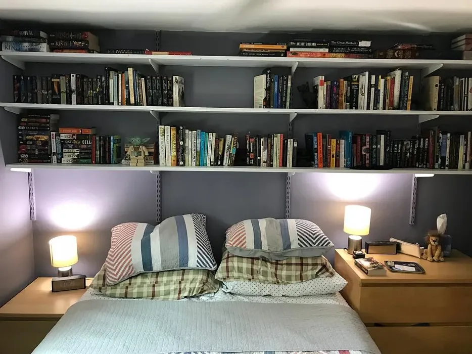
One of the most appealing aspects of Faded Violet is its versatility. It speaks beautifully to modern, transitional, farmhouse, and Scandinavian decor styles. You can easily incorporate this color into different spaces in your home. Picture it in a cozy living room, where it acts as a backdrop for gatherings with friends and family. Or envision it in a bedroom, creating a calming retreat where you can escape the day’s stresses. Faded Violet is also a wonderful choice for a home office or nursery, as it fosters a sense of tranquility that can enhance focus or soothe little ones.
When it comes to application, Faded Violet is a dream to work with. It’s considered beginner-friendly, rolling out smoothly and easily with a brush or roller. Expect good coverage with just one to two coats, which is a huge plus for any DIY project. Plus, it’s touch-up friendly, meaning you can maintain your space without worrying about mismatched patches. Its low VOC content and eco-certification add to its appeal, making it a responsible choice for your home.
Now, let’s talk about the color’s undertones, which are key to its character. Faded Violet leans towards a blue undertone, giving it a cool essence. This is essential to consider when pairing it with other colors or decor elements in your home. For instance, if you have furniture or artwork with warmer tones, Faded Violet can create a striking contrast that adds depth to the room. On the flip side, if you’re working with cooler elements, like silver or soft whites, you’ll find that Faded Violet harmonizes beautifully, creating a cohesive and inviting atmosphere.
If you’re pondering whether this color can work in smaller spaces, the answer is a resounding yes! Faded Violet’s soft tone can create an illusion of depth, making even the coziest nooks feel more expansive. Just be sure to complement it with adequate lighting and thoughtful decor to keep the area feeling open and inviting.
Speaking of decor, let’s explore some of the best ways to pair Faded Violet. For trims, white options like White Dove or Simply White create a fresh, crisp look that enhances the elegance of the violet shade. If you want to make a bolder statement, consider using dark trims to create dramatic contrast. Warm wood finishes can also elevate Faded Violet, adding warmth and richness to the overall design.
Lighting plays a crucial role in how Faded Violet is perceived throughout the day. As the sun moves, the color adapts, revealing different facets of its personality. In bright daylight, it feels soft and airy, perfect for a lively living space. As evening falls, it takes on a deeper, more intimate hue, ideal for winding down after a long day. This dynamic quality is what makes Faded Violet so special—it’s not just a color; it’s a mood.
For those who love to experiment with color, Faded Violet pairs beautifully with a variety of complementary shades. Consider using shades like CSP-70, 1542, or HC-175 to create a harmonious palette that feels both cohesive and vibrant. These shades can be used in accessories, artwork, or even furniture to enhance the overall look.
If you’re still on the fence, let’s address a few potential concerns. Some homeowners worry that Faded Violet might appear darker in low light, which can be true. To combat this, ensure your space is well-lit, and you may want to consider using it in rooms with ample natural light. Another point to note is that precise application is vital to avoid streaks, especially given its muted tone. However, with a little care, you’ll have a stunning finish that brings your vision to life.
As with any color, it’s essential to test Faded Violet in your actual space before committing. Paint a small section of the wall and observe how it looks at different times of the day. This simple step can help you gauge how the color interacts with your existing furniture, flooring, and decor, allowing you to see its true potential.
When you step back and consider the mood you want to create, Faded Violet stands out as a classic favorite that doesn’t overwhelm. Its muted, cool, and dusty tone evokes feelings of coziness and calm, making it ideal for rest areas like bedrooms or nurseries. It’s a color that invites you to breathe easy, relax, and enjoy the beauty of your home.
In conclusion, Faded Violet is more than just a paint color; it’s a versatile choice that can elevate your space, no matter the style or function of the room. Its soft elegance, adaptability, and soothing qualities make it a fantastic option for homeowners looking to create a personalized, beautiful interior. So go ahead, explore this enchanting hue, and watch as it transforms your home into a serene sanctuary.

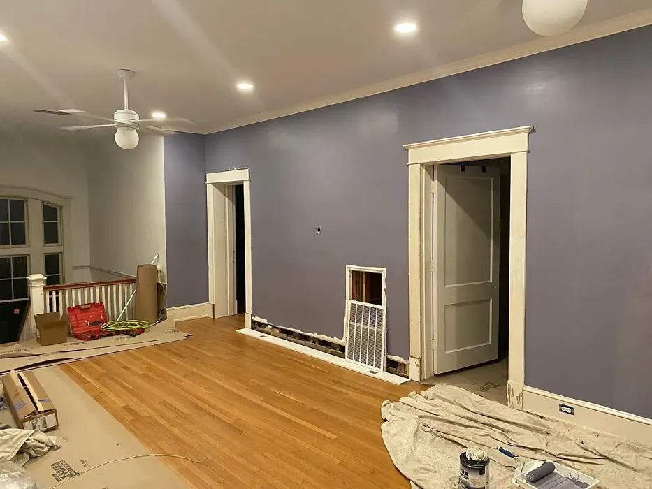
Real Room Photo of Faded Violet CSP-455
Undertones of Faded Violet ?
The undertones of Faded Violet are a key aspect of its character, leaning towards Blue. These subtle underlying hues are what give the color its depth and complexity. For example, a gray with a blue undertone will feel cooler and more modern, while one with a brown undertone will feel warmer and more traditional. It’s essential to test this paint in your home and observe it next to your existing furniture, flooring, and decor to see how these undertones interact and reveal themselves throughout the day.
HEX value: #8D8FA1
RGB code: 141, 143, 161
Is Faded Violet Cool or Warm?
Faded Violet is considered a cool paint color. This characteristic plays a huge role in the overall feel of a room. Cool colors, like this one, tend to create a cozy, inviting, and energetic atmosphere, making them great for social spaces like living rooms and dining rooms. In contrast, warm colors often evoke a sense of calm and serenity, which is why they are popular in bedrooms and bathrooms. The coolth of Faded Violet means it will pair beautifully with corresponding decor elements.
Understanding Color Properties and Interior Design Tips
Hue refers to a specific position on the color wheel, measured in degrees from 0 to 360. Each degree represents a different pure color:
- 0° represents red
- 120° represents green
- 240° represents blue
Saturation describes the intensity or purity of a color and is expressed as a percentage:
- At 0%, the color appears completely desaturated—essentially a shade of gray
- At 100%, the color is at its most vivid and vibrant
Lightness indicates how light or dark a color is, also expressed as a percentage:
- 0% lightness results in black
- 100% lightness results in white
Using Warm Colors in Interior Design
Warm hues—such as reds, oranges, yellows, warm beiges, and greiges—are excellent choices for creating inviting and energetic spaces. These colors are particularly well-suited for:
- Kitchens, living rooms, and bathrooms, where warmth enhances comfort and sociability
- Large rooms, where warm tones can help reduce the sense of emptiness and make the space feel more intimate
For example:
- Warm beige shades provide a cozy, inviting atmosphere, ideal for living rooms, bedrooms, and hallways.
- Warm greige (a mix of beige and gray) offers the warmth of beige with the modern appeal of gray, making it a versatile backdrop for dining areas, bedrooms, and living spaces.
However, be mindful when using warm light tones in rooms with limited natural light. These shades may appear muted or even take on an unpleasant yellowish tint. To avoid a dull or flat appearance:
- Add depth by incorporating richer tones like deep greens, charcoal, or chocolate brown
- Use textured elements such as curtains, rugs, or cushions to bring dimension to the space
Pro Tip: Achieving Harmony with Warm and Cool Color Balance
To create a well-balanced and visually interesting interior, mix warm and cool tones strategically. This contrast adds depth and harmony to your design.
- If your walls feature warm hues, introduce cool-colored accents such as blue or green furniture, artwork, or accessories to create contrast.
- For a polished look, consider using a complementary color scheme, which pairs colors opposite each other on the color wheel (e.g., red with green, orange with blue).
This thoughtful mix not only enhances visual appeal but also creates a space that feels both dynamic and cohesive.
Light Temperature Affects on Faded Violet
Natural Light
Natural daylight changes in color temperature as the sun moves across the sky. At sunrise and sunset, the light tends to have a warm, golden tone with a color temperature around 2000 Kelvin (K). As the day progresses and the sun rises higher, the light becomes cooler and more neutral. Around midday, especially when the sky is clear, natural light typically reaches its peak brightness and shifts to a cooler tone, ranging from 5500 to 6500 Kelvin. This midday light is close to what we perceive as pure white or daylight-balanced light.
These shifts in natural light can significantly influence how colors appear in a space, which is why designers often consider both the time of day and the orientation of windows when planning interior color schemes.
Artificial Light
When choosing artificial lighting, pay close attention to the color temperature, measured in Kelvin (K). This determines how warm or cool the light will appear. Lower temperatures, around 2700K, give off a warm, yellow glow often used in living rooms or bedrooms. Higher temperatures, above 5000K, create a cool, bluish light similar to daylight, commonly used in kitchens, offices, or task areas.
Use the slider to see how lighting temperature can affect the appearance of a surface or color throughout a space.


4800K
LRV of Faded Violet
The Light Reflectance Value (LRV) of Faded Violet is 29.18%, which places it in the Medium colors category. This means it reflect a lot of light. Understanding a paint’s LRV is crucial for predicting how it will look in your space. A higher LRV indicates a lighter color that reflects more light, making rooms feel larger and brighter. A lower LRV signifies a darker color that absorbs more light, creating a cozier, more intimate atmosphere. Always consider the natural and artificial lighting in your room when selecting a paint color based on its LRV.
Detailed Review of Faded Violet
Additional Paint Characteristics
Ideal Rooms
Bedroom, Home Office, Living Room, Nursery
Decor Styles
Farmhouse, Modern, Scandinavian, Transitional
Coverage
Good (1–2 Coats), Self-Priming, Touch-Up Friendly
Ease of Application
Beginner Friendly, Brush Smooth, Roller-Ready
Washability
Spot Clean Only, Washable
VOC Level
Eco-Certified, Low VOC
Best Use
Accent Wall, Cabinets, Furniture, Interior Walls
Room Suitability
Bedroom, Home Office, Living Room, Nursery
Tone Tag
Cool, Dusty, Muted
Finish Type
Eggshell, Matte, Satin
Paint Performance
High Coverage, Low Odor, Quick Drying
Use Cases
Best for Rentals, Best for Small Spaces, Classic Favorite
Mood
Calm, Cozy, Restful
Trim Pairing
Complements Cool Trim, Pairs with White Dove, Works with Warm Trim
Faded Violet is a color that beautifully balances softness and sophistication. Its muted tone makes it a versatile choice for various decor styles, from modern to farmhouse. When applied, it offers a smooth finish that enhances the overall aesthetic of your room. Expect good coverage with just one to two coats, making it a practical choice for DIYers and professionals alike. The color adapts well to different lighting, appearing lighter in bright spaces and darker in dim areas, allowing you to create the perfect atmosphere in your home. Pair it with light or dark furniture for a stunning contrast, and you’ll find it suits both vibrant and neutral palettes effortlessly.
Pros & Cons of CSP-455 Faded Violet
Pros
Cons
Colors that go with Benjamin Moore Faded Violet
FAQ on CSP-455 Faded Violet
Can Faded Violet work in small spaces?
Absolutely! Faded Violet can work wonders in small spaces. Its soft tone creates an illusion of depth, making areas feel more expansive. Just ensure to balance it with adequate lighting and complementary decor to keep the space feeling open and inviting.
What trim colors pair well with Faded Violet?
Faded Violet pairs beautifully with white trims like White Dove or Simply White for a fresh look. For a more dramatic contrast, consider using dark trims, or complement it with warm wood finishes to enhance its elegant vibe.
Comparisons Faded Violet with other colors
Faded Violet CSP-455 vs Dusty Heather SW 9073
| Attribute | Faded Violet CSP-455 | Dusty Heather SW 9073 |
|---|---|---|
| Color Name | Faded Violet CSP-455 | Dusty Heather SW 9073 |
| Color | ||
| Hue | Purple | Purple |
| Brightness | Medium | Medium |
| RGB | 141, 143, 161 | 137, 144, 163 |
| LRV | 29.18% | 30% |
| Finish Type | Eggshell, Matte, Satin | Eggshell, Matte, Satin |
| Finish Options | Eggshell, Matte, Satin | Eggshell, Matte, Satin |
| Ideal Rooms | Bedroom, Home Office, Living Room, Nursery | Bedroom, Home Office, Living Room, Nursery |
| Decor Styles | Farmhouse, Modern, Scandinavian, Transitional | Modern, Rustic, Scandinavian, Transitional |
| Coverage | Good (1–2 Coats), Self-Priming, Touch-Up Friendly | Good (1–2 Coats), Touch-Up Friendly |
| Ease of Application | Beginner Friendly, Brush Smooth, Roller-Ready | Beginner Friendly, Brush Smooth, Roller-Ready |
| Washability | Spot Clean Only, Washable | Washable, Wipeable |
| Room Suitability | Bedroom, Home Office, Living Room, Nursery | Bedroom, Home Office, Living Room, Nursery |
| Tone | Cool, Dusty, Muted | Cool, Dusty, Muted |
| Paint Performance | High Coverage, Low Odor, Quick Drying | Easy Touch-Up, High Coverage, Low Odor |
Faded Violet CSP-455 vs Chaise Mauve SW 6016
| Attribute | Faded Violet CSP-455 | Chaise Mauve SW 6016 |
|---|---|---|
| Color Name | Faded Violet CSP-455 | Chaise Mauve SW 6016 |
| Color | ||
| Hue | Purple | Purple |
| Brightness | Medium | Medium |
| RGB | 141, 143, 161 | 193, 178, 179 |
| LRV | 29.18% | 24% |
| Finish Type | Eggshell, Matte, Satin | Eggshell, Matte, Satin |
| Finish Options | Eggshell, Matte, Satin | Eggshell, Matte, Satin |
| Ideal Rooms | Bedroom, Home Office, Living Room, Nursery | Bedroom, Dining Room, Home Office, Living Room, Nursery |
| Decor Styles | Farmhouse, Modern, Scandinavian, Transitional | Eclectic, Minimalist, Modern, Transitional, Vintage |
| Coverage | Good (1–2 Coats), Self-Priming, Touch-Up Friendly | Good (1–2 Coats) |
| Ease of Application | Beginner Friendly, Brush Smooth, Roller-Ready | Beginner Friendly, Brush Smooth, Fast-Drying, Roller-Ready |
| Washability | Spot Clean Only, Washable | Highly Washable, Washable, Wipeable |
| Room Suitability | Bedroom, Home Office, Living Room, Nursery | Bedroom, Dining Room, Home Office, Living Room, Nursery |
| Tone | Cool, Dusty, Muted | Balanced, Dusty, Muted, Warm |
| Paint Performance | High Coverage, Low Odor, Quick Drying | Easy Touch-Up, Fade Resistant, Low Odor, Quick Drying |
Faded Violet CSP-455 vs Vesper Violet SW 6542
| Attribute | Faded Violet CSP-455 | Vesper Violet SW 6542 |
|---|---|---|
| Color Name | Faded Violet CSP-455 | Vesper Violet SW 6542 |
| Color | ||
| Hue | Purple | Purple |
| Brightness | Medium | Medium |
| RGB | 141, 143, 161 | 153, 160, 178 |
| LRV | 29.18% | 24% |
| Finish Type | Eggshell, Matte, Satin | Eggshell, Satin |
| Finish Options | Eggshell, Matte, Satin | Eggshell, Flat, Satin |
| Ideal Rooms | Bedroom, Home Office, Living Room, Nursery | Bedroom, Home Office, Living Room, Nursery |
| Decor Styles | Farmhouse, Modern, Scandinavian, Transitional | Bohemian, Modern, Scandinavian, Transitional |
| Coverage | Good (1–2 Coats), Self-Priming, Touch-Up Friendly | Good (1–2 Coats), Touch-Up Friendly |
| Ease of Application | Beginner Friendly, Brush Smooth, Roller-Ready | Beginner Friendly, Brush Smooth, Roller-Ready |
| Washability | Spot Clean Only, Washable | Stain Resistant, Washable |
| Room Suitability | Bedroom, Home Office, Living Room, Nursery | Bedroom, Home Office, Living Room, Nursery |
| Tone | Cool, Dusty, Muted | Cool, Dusty, Muted |
| Paint Performance | High Coverage, Low Odor, Quick Drying | Easy Touch-Up, Fade Resistant, Low Odor |
Faded Violet CSP-455 vs Moonlit Orchid SW 9153
| Attribute | Faded Violet CSP-455 | Moonlit Orchid SW 9153 |
|---|---|---|
| Color Name | Faded Violet CSP-455 | Moonlit Orchid SW 9153 |
| Color | ||
| Hue | Purple | Purple |
| Brightness | Medium | Medium |
| RGB | 141, 143, 161 | 148, 145, 148 |
| LRV | 29.18% | 15% |
| Finish Type | Eggshell, Matte, Satin | Eggshell, Matte |
| Finish Options | Eggshell, Matte, Satin | Eggshell, Matte, Satin |
| Ideal Rooms | Bedroom, Home Office, Living Room, Nursery | Bedroom, Home Office, Living Room, Nursery |
| Decor Styles | Farmhouse, Modern, Scandinavian, Transitional | Bohemian, Minimalist, Modern, Transitional |
| Coverage | Good (1–2 Coats), Self-Priming, Touch-Up Friendly | Good (1–2 Coats), Touch-Up Friendly |
| Ease of Application | Beginner Friendly, Brush Smooth, Roller-Ready | Beginner Friendly, Brush Smooth, Roller-Ready |
| Washability | Spot Clean Only, Washable | Spot Clean Only, Washable |
| Room Suitability | Bedroom, Home Office, Living Room, Nursery | Bedroom, Home Office, Living Room, Nursery |
| Tone | Cool, Dusty, Muted | Balanced, Cool, Muted |
| Paint Performance | High Coverage, Low Odor, Quick Drying | Easy Touch-Up, High Coverage, Low Odor |
Faded Violet CSP-455 vs Thistle SW 6283
| Attribute | Faded Violet CSP-455 | Thistle SW 6283 |
|---|---|---|
| Color Name | Faded Violet CSP-455 | Thistle SW 6283 |
| Color | ||
| Hue | Purple | Purple |
| Brightness | Medium | Medium |
| RGB | 141, 143, 161 | 170, 142, 154 |
| LRV | 29.18% | 66% |
| Finish Type | Eggshell, Matte, Satin | Eggshell, Matte, Satin |
| Finish Options | Eggshell, Matte, Satin | Eggshell, Matte, Satin |
| Ideal Rooms | Bedroom, Home Office, Living Room, Nursery | Bedroom, Dining Room, Home Office, Living Room, Nursery |
| Decor Styles | Farmhouse, Modern, Scandinavian, Transitional | Bohemian, Modern, Scandinavian, Vintage |
| Coverage | Good (1–2 Coats), Self-Priming, Touch-Up Friendly | Good (1–2 Coats), Touch-Up Friendly |
| Ease of Application | Beginner Friendly, Brush Smooth, Roller-Ready | Beginner Friendly, Brush Smooth, Fast-Drying, Roller-Ready |
| Washability | Spot Clean Only, Washable | Spot Clean Only, Washable, Wipeable |
| Room Suitability | Bedroom, Home Office, Living Room, Nursery | Bedroom, Home Office, Living Room, Nursery |
| Tone | Cool, Dusty, Muted | Dusty, Muted, Warm |
| Paint Performance | High Coverage, Low Odor, Quick Drying | Easy Touch-Up, Fade Resistant, Long Lasting, Low Odor |
Faded Violet CSP-455 vs Grape Mist SW 6548
| Attribute | Faded Violet CSP-455 | Grape Mist SW 6548 |
|---|---|---|
| Color Name | Faded Violet CSP-455 | Grape Mist SW 6548 |
| Color | ||
| Hue | Purple | Purple |
| Brightness | Medium | Medium |
| RGB | 141, 143, 161 | 197, 192, 201 |
| LRV | 29.18% | 24% |
| Finish Type | Eggshell, Matte, Satin | Eggshell, Matte |
| Finish Options | Eggshell, Matte, Satin | Eggshell, Matte, Satin |
| Ideal Rooms | Bedroom, Home Office, Living Room, Nursery | Bedroom, Home Office, Living Room, Nursery |
| Decor Styles | Farmhouse, Modern, Scandinavian, Transitional | Modern, Rustic, Scandinavian, Transitional |
| Coverage | Good (1–2 Coats), Self-Priming, Touch-Up Friendly | Good (1–2 Coats), Touch-Up Friendly |
| Ease of Application | Beginner Friendly, Brush Smooth, Roller-Ready | Beginner Friendly, Brush Smooth, Roller-Ready |
| Washability | Spot Clean Only, Washable | Washable, Wipeable |
| Room Suitability | Bedroom, Home Office, Living Room, Nursery | Bedroom, Home Office, Living Room, Nursery |
| Tone | Cool, Dusty, Muted | Cool, Muted, Pastel |
| Paint Performance | High Coverage, Low Odor, Quick Drying | Easy Touch-Up, Fade Resistant, Low Odor |
Faded Violet CSP-455 vs Agapanthus SW 9066
| Attribute | Faded Violet CSP-455 | Agapanthus SW 9066 |
|---|---|---|
| Color Name | Faded Violet CSP-455 | Agapanthus SW 9066 |
| Color | ||
| Hue | Purple | Purple |
| Brightness | Medium | Medium |
| RGB | 141, 143, 161 | 187, 197, 222 |
| LRV | 29.18% | 15% |
| Finish Type | Eggshell, Matte, Satin | Eggshell, Matte, Satin |
| Finish Options | Eggshell, Matte, Satin | Eggshell, Matte, Satin |
| Ideal Rooms | Bedroom, Home Office, Living Room, Nursery | Bedroom, Hallway, Home Office, Living Room, Nursery |
| Decor Styles | Farmhouse, Modern, Scandinavian, Transitional | Coastal, Minimalist, Modern, Scandinavian |
| Coverage | Good (1–2 Coats), Self-Priming, Touch-Up Friendly | Good (1–2 Coats), Touch-Up Friendly |
| Ease of Application | Beginner Friendly, Brush Smooth, Roller-Ready | Beginner Friendly, Brush Smooth, Roller-Ready |
| Washability | Spot Clean Only, Washable | Washable, Wipeable |
| Room Suitability | Bedroom, Home Office, Living Room, Nursery | Bedroom, Home Office, Living Room, Nursery |
| Tone | Cool, Dusty, Muted | Airy, Cool, Muted |
| Paint Performance | High Coverage, Low Odor, Quick Drying | Easy Touch-Up, Fade Resistant, Low Odor, Quick Drying |
Faded Violet CSP-455 vs Intuitive SW 6017
| Attribute | Faded Violet CSP-455 | Intuitive SW 6017 |
|---|---|---|
| Color Name | Faded Violet CSP-455 | Intuitive SW 6017 |
| Color | ||
| Hue | Purple | Purple |
| Brightness | Medium | Medium |
| RGB | 141, 143, 161 | 179, 163, 165 |
| LRV | 29.18% | 30% |
| Finish Type | Eggshell, Matte, Satin | Eggshell, Matte, Satin |
| Finish Options | Eggshell, Matte, Satin | Eggshell, Matte, Satin |
| Ideal Rooms | Bedroom, Home Office, Living Room, Nursery | Bedroom, Dining Room, Home Office, Living Room, Nursery |
| Decor Styles | Farmhouse, Modern, Scandinavian, Transitional | Minimalist, Modern, Scandinavian, Transitional |
| Coverage | Good (1–2 Coats), Self-Priming, Touch-Up Friendly | Good (1–2 Coats) |
| Ease of Application | Beginner Friendly, Brush Smooth, Roller-Ready | Beginner Friendly, Brush Smooth, Roller-Ready |
| Washability | Spot Clean Only, Washable | Washable, Wipeable |
| Room Suitability | Bedroom, Home Office, Living Room, Nursery | Bedroom, Dining Room, Home Office, Living Room |
| Tone | Cool, Dusty, Muted | Balanced, Muted, Warm |
| Paint Performance | High Coverage, Low Odor, Quick Drying | Easy Touch-Up, Low Odor, Quick Drying |
Faded Violet CSP-455 vs Veiled Violet SW 6268
| Attribute | Faded Violet CSP-455 | Veiled Violet SW 6268 |
|---|---|---|
| Color Name | Faded Violet CSP-455 | Veiled Violet SW 6268 |
| Color | ||
| Hue | Purple | Purple |
| Brightness | Medium | Medium |
| RGB | 141, 143, 161 | 189, 181, 185 |
| LRV | 29.18% | 24% |
| Finish Type | Eggshell, Matte, Satin | Eggshell, Matte, Satin |
| Finish Options | Eggshell, Matte, Satin | Eggshell, Matte, Satin |
| Ideal Rooms | Bedroom, Home Office, Living Room, Nursery | Bedroom, Home Office, Living Room, Nursery |
| Decor Styles | Farmhouse, Modern, Scandinavian, Transitional | Bohemian, Minimalist, Modern, Transitional |
| Coverage | Good (1–2 Coats), Self-Priming, Touch-Up Friendly | Good (1–2 Coats), Touch-Up Friendly |
| Ease of Application | Beginner Friendly, Brush Smooth, Roller-Ready | Beginner Friendly, Brush Smooth, Fast-Drying, Roller-Ready |
| Washability | Spot Clean Only, Washable | Highly Washable, Washable |
| Room Suitability | Bedroom, Home Office, Living Room, Nursery | Bedroom, Home Office, Living Room, Nursery |
| Tone | Cool, Dusty, Muted | Airy, Cool, Dusty, Muted |
| Paint Performance | High Coverage, Low Odor, Quick Drying | Easy Touch-Up, Fade Resistant, Low Odor, Quick Drying |
Faded Violet CSP-455 vs Gris Morado SW 9156
| Attribute | Faded Violet CSP-455 | Gris Morado SW 9156 |
|---|---|---|
| Color Name | Faded Violet CSP-455 | Gris Morado SW 9156 |
| Color | ||
| Hue | Purple | Purple |
| Brightness | Medium | Medium |
| RGB | 141, 143, 161 | 143, 138, 145 |
| LRV | 29.18% | 20% |
| Finish Type | Eggshell, Matte, Satin | Eggshell, Matte, Satin |
| Finish Options | Eggshell, Matte, Satin | Eggshell, Matte, Satin |
| Ideal Rooms | Bedroom, Home Office, Living Room, Nursery | Bedroom, Dining Room, Home Office, Living Room |
| Decor Styles | Farmhouse, Modern, Scandinavian, Transitional | Contemporary, Minimalist, Modern, Scandinavian |
| Coverage | Good (1–2 Coats), Self-Priming, Touch-Up Friendly | Good (1–2 Coats), Touch-Up Friendly |
| Ease of Application | Beginner Friendly, Brush Smooth, Roller-Ready | Beginner Friendly, Brush Smooth, Fast-Drying, Roller-Ready |
| Washability | Spot Clean Only, Washable | Washable, Wipeable |
| Room Suitability | Bedroom, Home Office, Living Room, Nursery | Bedroom, Dining Room, Home Office, Living Room |
| Tone | Cool, Dusty, Muted | Cool, Muted, Sophisticated |
| Paint Performance | High Coverage, Low Odor, Quick Drying | Easy Touch-Up, Fade Resistant, Low Odor |
Official Page of Benjamin Moore Faded Violet CSP-455