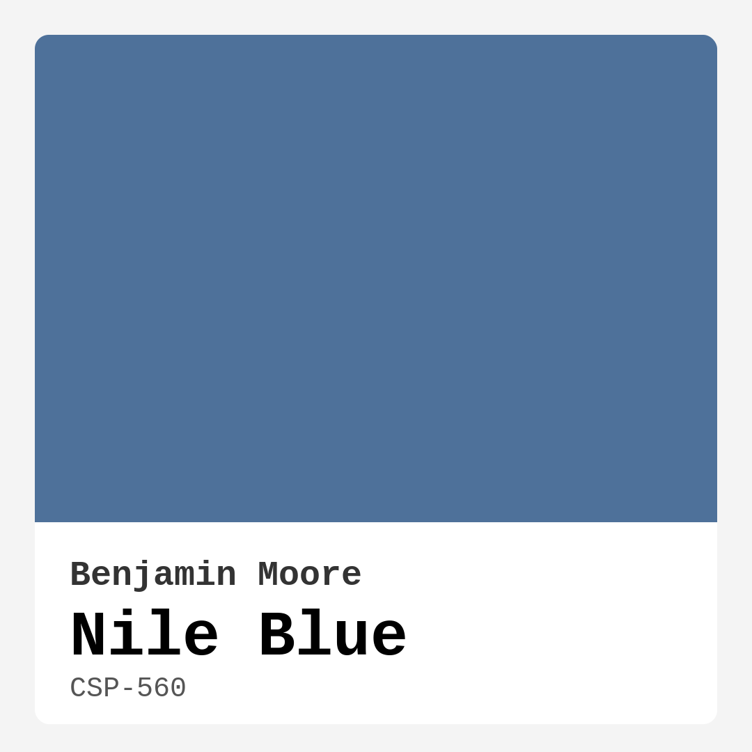
Color Preview & Key Details
| HEX Code | #4E719A |
| RGB | 78, 113, 154 |
| LRV | 18.14% |
| Undertone | Blue |
| Finish Options | Eggshell, Matte, Satin |
If you’re searching for a paint color that effortlessly blends tranquility with sophistication, let me introduce you to Benjamin Moore’s Nile Blue (CSP-560). This captivating shade is more than just a pretty hue—it’s a design tool that can transform your space into a serene retreat or a stylish statement, depending on how you use it. With its rich, muted tone inspired by the calming waters of the Nile, this color brings a sense of balance and elegance to any room. Whether you’re refreshing a bedroom, revamping a home office, or adding depth to a living room, Nile Blue is a versatile choice that won’t disappoint.
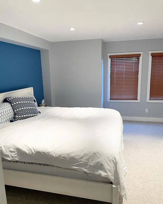
One of the first things you’ll notice about Nile Blue is its depth. With an LRV (Light Reflectance Value) of 18.14%, it sits firmly in the medium-dark category, meaning it absorbs more light than it reflects. This gives it a cozy, intimate feel—perfect for creating a restful atmosphere in bedrooms or a focused vibe in home offices. But don’t let the “dark” tag scare you. In well-lit spaces, this color reveals its true beauty, appearing vibrant yet soft, especially under natural light. Just keep in mind that in low-light rooms, it can lean a bit darker, so pairing it with lighter accents or strategic lighting will help keep the space feeling open and airy.
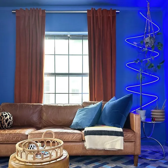
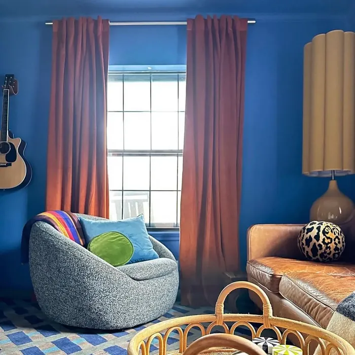
What makes Nile Blue so special is its versatility. It plays well with a range of decor styles, from coastal and Scandinavian to modern and transitional. Imagine it in a breezy, beach-inspired living room with crisp white trim and woven textures—it instantly evokes a relaxed, vacation-ready vibe. Or picture it in a sleek, minimalist home office paired with brass fixtures and warm wood tones for a touch of understated luxury. Even in a bathroom, it creates a spa-like retreat when combined with matte black hardware and lush greenery. The key is balancing its cool undertones with complementary shades. Since it’s a true blue with no strong secondary undertones, it pairs beautifully with warm neutrals, crisp whites, or even pops of its complementary color, orange, for a bold contrast.
When it comes to application, Nile Blue is a dream to work with. It offers excellent coverage—often needing just one or two coats—and dries to a smooth, even finish. Whether you opt for matte, eggshell, or satin, each finish brings out a different dimension of the color. Matte leans into its muted, sophisticated side, while satin adds a subtle sheen that enhances its depth. And because it’s touch-up friendly and highly washable, it’s a practical choice for high-traffic areas or homes with kids and pets. Plus, its low VOC formula means you can paint with peace of mind, knowing it’s a healthier choice for your indoor air quality.
Now, let’s talk about pairing. If you’re using Nile Blue on walls, consider trim colors like Benjamin Moore’s White Dove or Pure White for a clean, classic look. These whites keep the space feeling fresh without clashing with the blue’s cool undertones. For furniture or accent pieces, try pairing it with warm wood tones or brushed brass hardware to add warmth and contrast. If you’re feeling adventurous, introduce small doses of orange—think throw pillows, artwork, or a statement vase—to create a dynamic, eye-catching combo. And if you’re using it in a small space, don’t shy away. Nile Blue can actually make a room feel larger by creating depth, especially when paired with plenty of natural light and reflective surfaces like mirrors or metallic finishes.
A common question I hear is whether Nile Blue works in every room. The answer? Almost. It shines in bedrooms, where its calming vibe promotes relaxation, and in home offices, where it fosters focus without feeling sterile. Living rooms and bathrooms are also great candidates, especially if you’re aiming for a refined, inviting atmosphere. The only spaces I’d approach with caution are tiny, windowless rooms or areas with very little natural light, where it might feel a bit too heavy. But even then, strategic lighting and lighter furnishings can make it work.
So, is Nile Blue right for your project? If you’re drawn to colors that balance serenity with sophistication, the answer is likely yes. It’s a designer favorite for a reason—it’s timeless, adaptable, and effortlessly elevates any space. Before committing, though, I always recommend testing it in your home. Paint a large swatch on the wall and observe it at different times of day. Notice how it interacts with your furniture, flooring, and lighting. You might be surprised by how many ways this one color can transform your space.
At the end of the day, Nile Blue isn’t just a paint color—it’s a mood. It’s the quiet confidence of a well-designed room, the calm of a peaceful retreat, and the subtle drama of a space that feels intentionally curated. Whether you’re painting an accent wall, refreshing a piece of furniture, or giving an entire room a makeover, this shade delivers. So grab a brush, trust your instincts, and let Nile Blue work its magic in your home. You won’t regret it.
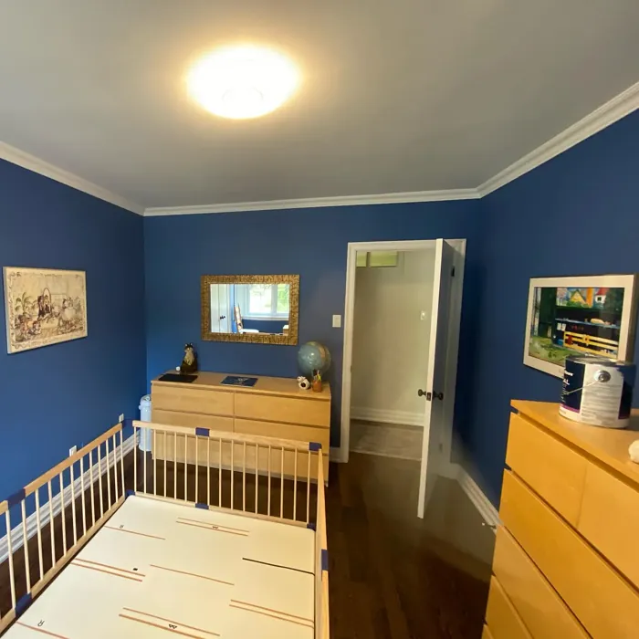
Real Room Photo of Nile Blue CSP-560
Undertones of Nile Blue ?
The undertones of Nile Blue are a key aspect of its character, leaning towards Blue. These subtle underlying hues are what give the color its depth and complexity. For example, a gray with a blue undertone will feel cooler and more modern, while one with a brown undertone will feel warmer and more traditional. It’s essential to test this paint in your home and observe it next to your existing furniture, flooring, and decor to see how these undertones interact and reveal themselves throughout the day.
HEX value: #4E719A
RGB code: 78, 113, 154
Is Nile Blue Cool or Warm?
Nile Blue is predominantly a cool color, reflecting serene, calming vibes. Its cooler nature makes it ideal for creating tranquil spaces, particularly in bedrooms and bathrooms where relaxation is key.
Understanding Color Properties and Interior Design Tips
Hue refers to a specific position on the color wheel, measured in degrees from 0 to 360. Each degree represents a different pure color:
- 0° represents red
- 120° represents green
- 240° represents blue
Saturation describes the intensity or purity of a color and is expressed as a percentage:
- At 0%, the color appears completely desaturated—essentially a shade of gray
- At 100%, the color is at its most vivid and vibrant
Lightness indicates how light or dark a color is, also expressed as a percentage:
- 0% lightness results in black
- 100% lightness results in white
Using Warm Colors in Interior Design
Warm hues—such as reds, oranges, yellows, warm beiges, and greiges—are excellent choices for creating inviting and energetic spaces. These colors are particularly well-suited for:
- Kitchens, living rooms, and bathrooms, where warmth enhances comfort and sociability
- Large rooms, where warm tones can help reduce the sense of emptiness and make the space feel more intimate
For example:
- Warm beige shades provide a cozy, inviting atmosphere, ideal for living rooms, bedrooms, and hallways.
- Warm greige (a mix of beige and gray) offers the warmth of beige with the modern appeal of gray, making it a versatile backdrop for dining areas, bedrooms, and living spaces.
However, be mindful when using warm light tones in rooms with limited natural light. These shades may appear muted or even take on an unpleasant yellowish tint. To avoid a dull or flat appearance:
- Add depth by incorporating richer tones like deep greens, charcoal, or chocolate brown
- Use textured elements such as curtains, rugs, or cushions to bring dimension to the space
Pro Tip: Achieving Harmony with Warm and Cool Color Balance
To create a well-balanced and visually interesting interior, mix warm and cool tones strategically. This contrast adds depth and harmony to your design.
- If your walls feature warm hues, introduce cool-colored accents such as blue or green furniture, artwork, or accessories to create contrast.
- For a polished look, consider using a complementary color scheme, which pairs colors opposite each other on the color wheel (e.g., red with green, orange with blue).
This thoughtful mix not only enhances visual appeal but also creates a space that feels both dynamic and cohesive.
Light Temperature Affects on Nile Blue
Natural Light
Natural daylight changes in color temperature as the sun moves across the sky. At sunrise and sunset, the light tends to have a warm, golden tone with a color temperature around 2000 Kelvin (K). As the day progresses and the sun rises higher, the light becomes cooler and more neutral. Around midday, especially when the sky is clear, natural light typically reaches its peak brightness and shifts to a cooler tone, ranging from 5500 to 6500 Kelvin. This midday light is close to what we perceive as pure white or daylight-balanced light.
These shifts in natural light can significantly influence how colors appear in a space, which is why designers often consider both the time of day and the orientation of windows when planning interior color schemes.
Artificial Light
When choosing artificial lighting, pay close attention to the color temperature, measured in Kelvin (K). This determines how warm or cool the light will appear. Lower temperatures, around 2700K, give off a warm, yellow glow often used in living rooms or bedrooms. Higher temperatures, above 5000K, create a cool, bluish light similar to daylight, commonly used in kitchens, offices, or task areas.
Use the slider to see how lighting temperature can affect the appearance of a surface or color throughout a space.


4800K
LRV of Nile Blue
The Light Reflectance Value (LRV) of Nile Blue is 18.14%, which places it in the Medium Dark category. This means it reflects very little light. Understanding a paint’s LRV is crucial for predicting how it will look in your space. A higher LRV indicates a lighter color that reflects more light, making rooms feel larger and brighter. A lower LRV signifies a darker color that absorbs more light, creating a cozier, more intimate atmosphere. Always consider the natural and artificial lighting in your room when selecting a paint color based on its LRV.
Detailed Review of Nile Blue
Additional Paint Characteristics
Ideal Rooms
Bathroom, Bedroom, Home Office, Living Room
Decor Styles
Coastal, Modern, Scandinavian, Transitional
Coverage
Good (1–2 Coats), Touch-Up Friendly
Ease of Application
Beginner Friendly, Brush Smooth, Roller-Ready
Washability
Highly Washable, Washable
VOC Level
Low VOC
Best Use
Accent Wall, Furniture, Interior Walls
Room Suitability
Bathroom, Bedroom, Home Office, Living Room
Tone Tag
Balanced, Cool, Muted
Finish Type
Eggshell, Matte, Satin
Paint Performance
Easy Touch-Up, Low Odor, Quick Drying
Use Cases
Best for Low Light Rooms, Best for Rentals, Designer Favorite
Mood
Calm, Inviting, Restful
Trim Pairing
Complements Brass Fixtures, Matches Pure White, Pairs with White Dove
Nile Blue is an exceptional choice for anyone looking to incorporate a serene yet sophisticated color into their home. This color stands out due to its versatility; it can be used in various decor styles, from coastal to modern. When applied, it provides a smooth finish that enhances the room’s natural light, making spaces feel more expansive. The paint’s performance is commendable, offering good coverage and a touch-up friendly formula that simplifies maintenance. Whether you’re painting an accent wall or an entire room, Nile Blue delivers a tranquil ambiance that invites relaxation and creativity. This shade is particularly effective in bedrooms and home offices, where a calming environment is essential. If you’re on the hunt for a standout color that combines elegance with ease of use, Nile Blue is undoubtedly worth considering.
Pros & Cons of CSP-560 Nile Blue
Pros
Cons
Colors that go with Benjamin Moore Nile Blue
FAQ on CSP-560 Nile Blue
Can Nile Blue be used in small spaces?
Absolutely! Nile Blue can work wonders in small spaces. Its calming vibe helps to create an illusion of depth, making a room feel more expansive. Just be mindful of the lighting, as it may appear darker in poorly lit areas. Pair it with lighter accents to maximize the airy feel.
Is Nile Blue suitable for exterior use?
While Nile Blue is primarily designed for interior applications, it can be used for exterior accents, provided it’s applied with a suitable exterior primer and topcoat. Just ensure it’s in a shaded area to prevent fading from direct sunlight. Always check the manufacturer’s recommendations for best results.
Comparisons Nile Blue with other colors
Nile Blue CSP-560 vs Naval SW 6244
| Attribute | Nile Blue CSP-560 | Naval SW 6244 |
|---|---|---|
| Color Name | Nile Blue CSP-560 | Naval SW 6244 |
| Color | ||
| Hue | Blue | Blue |
| Brightness | Dark | Dark |
| RGB | 78, 113, 154 | 47, 61, 76 |
| LRV | 18.14% | 4% |
| Finish Type | Eggshell, Matte, Satin | Matte, Satin, Semi-Gloss |
| Finish Options | Eggshell, Matte, Satin | Matte, Satin, Semi-Gloss |
| Ideal Rooms | Bathroom, Bedroom, Home Office, Living Room | Bedroom, Dining Room, Hallway, Home Office, Living Room |
| Decor Styles | Coastal, Modern, Scandinavian, Transitional | Coastal, Industrial, Minimalist, Modern, Traditional |
| Coverage | Good (1–2 Coats), Touch-Up Friendly | Good (1–2 Coats), Self-Priming |
| Ease of Application | Beginner Friendly, Brush Smooth, Roller-Ready | Beginner Friendly, Brush Smooth, Roller-Ready |
| Washability | Highly Washable, Washable | Highly Washable, Washable |
| Room Suitability | Bathroom, Bedroom, Home Office, Living Room | Bedroom, Dining Room, Entryway, Home Office, Living Room |
| Tone | Balanced, Cool, Muted | Cool, Deep, Moody |
| Paint Performance | Easy Touch-Up, Low Odor, Quick Drying | Easy Touch-Up, High Coverage, Low Odor, Scuff Resistant |
Nile Blue CSP-560 vs Sea Serpent SW 7615
| Attribute | Nile Blue CSP-560 | Sea Serpent SW 7615 |
|---|---|---|
| Color Name | Nile Blue CSP-560 | Sea Serpent SW 7615 |
| Color | ||
| Hue | Blue | Blue |
| Brightness | Dark | Dark |
| RGB | 78, 113, 154 | 62, 75, 84 |
| LRV | 18.14% | 12% |
| Finish Type | Eggshell, Matte, Satin | Eggshell, Matte, Satin |
| Finish Options | Eggshell, Matte, Satin | Eggshell, Matte, Satin |
| Ideal Rooms | Bathroom, Bedroom, Home Office, Living Room | Bathroom, Bedroom, Home Office, Living Room |
| Decor Styles | Coastal, Modern, Scandinavian, Transitional | Coastal, Farmhouse, Industrial, Modern |
| Coverage | Good (1–2 Coats), Touch-Up Friendly | Good (1–2 Coats), Touch-Up Friendly |
| Ease of Application | Beginner Friendly, Brush Smooth, Roller-Ready | Beginner Friendly, Brush Smooth, Roller-Ready |
| Washability | Highly Washable, Washable | Highly Washable, Washable |
| Room Suitability | Bathroom, Bedroom, Home Office, Living Room | Bathroom, Bedroom, Home Office, Living Room |
| Tone | Balanced, Cool, Muted | Cool, Deep, Moody |
| Paint Performance | Easy Touch-Up, Low Odor, Quick Drying | Easy Touch-Up, High Coverage, Low Odor |
Nile Blue CSP-560 vs Rain Cloud SW 9639
| Attribute | Nile Blue CSP-560 | Rain Cloud SW 9639 |
|---|---|---|
| Color Name | Nile Blue CSP-560 | Rain Cloud SW 9639 |
| Color | ||
| Hue | Blue | Blue |
| Brightness | Dark | Dark |
| RGB | 78, 113, 154 | 83, 97, 104 |
| LRV | 18.14% | 30% |
| Finish Type | Eggshell, Matte, Satin | Eggshell, Matte, Satin |
| Finish Options | Eggshell, Matte, Satin | Eggshell, Matte, Satin |
| Ideal Rooms | Bathroom, Bedroom, Home Office, Living Room | Bedroom, Dining Room, Home Office, Living Room |
| Decor Styles | Coastal, Modern, Scandinavian, Transitional | Coastal, Contemporary, Minimalist, Scandinavian |
| Coverage | Good (1–2 Coats), Touch-Up Friendly | Good (1–2 Coats), Touch-Up Friendly |
| Ease of Application | Beginner Friendly, Brush Smooth, Roller-Ready | Beginner Friendly, Brush Smooth, Roller-Ready |
| Washability | Highly Washable, Washable | Highly Washable, Washable |
| Room Suitability | Bathroom, Bedroom, Home Office, Living Room | Bedroom, Home Office, Living Room |
| Tone | Balanced, Cool, Muted | Balanced, Cool, Muted |
| Paint Performance | Easy Touch-Up, Low Odor, Quick Drying | Easy Touch-Up, Fade Resistant, Low Odor |
Nile Blue CSP-560 vs Indigo Batik SW 7602
| Attribute | Nile Blue CSP-560 | Indigo Batik SW 7602 |
|---|---|---|
| Color Name | Nile Blue CSP-560 | Indigo Batik SW 7602 |
| Color | ||
| Hue | Blue | Blue |
| Brightness | Dark | Dark |
| RGB | 78, 113, 154 | 62, 80, 99 |
| LRV | 18.14% | 10% |
| Finish Type | Eggshell, Matte, Satin | Matte, Satin |
| Finish Options | Eggshell, Matte, Satin | Eggshell, Flat, Matte, Satin |
| Ideal Rooms | Bathroom, Bedroom, Home Office, Living Room | Bedroom, Dining Room, Home Office, Living Room |
| Decor Styles | Coastal, Modern, Scandinavian, Transitional | Bohemian, Coastal, Contemporary, Modern |
| Coverage | Good (1–2 Coats), Touch-Up Friendly | Good (1–2 Coats), Touch-Up Friendly |
| Ease of Application | Beginner Friendly, Brush Smooth, Roller-Ready | Brush Smooth, Fast-Drying, Roller-Ready |
| Washability | Highly Washable, Washable | Scrubbable, Washable, Wipeable |
| Room Suitability | Bathroom, Bedroom, Home Office, Living Room | Bedroom, Dining Room, Home Office, Living Room |
| Tone | Balanced, Cool, Muted | Cool, Deep, Moody |
| Paint Performance | Easy Touch-Up, Low Odor, Quick Drying | Easy Touch-Up, High Coverage, Low Odor, Quick Drying |
Nile Blue CSP-560 vs Sea Mariner SW 9640
| Attribute | Nile Blue CSP-560 | Sea Mariner SW 9640 |
|---|---|---|
| Color Name | Nile Blue CSP-560 | Sea Mariner SW 9640 |
| Color | ||
| Hue | Blue | Blue |
| Brightness | Dark | Dark |
| RGB | 78, 113, 154 | 67, 74, 84 |
| LRV | 18.14% | 6% |
| Finish Type | Eggshell, Matte, Satin | Eggshell, Matte, Satin |
| Finish Options | Eggshell, Matte, Satin | Eggshell, Matte, Satin |
| Ideal Rooms | Bathroom, Bedroom, Home Office, Living Room | Bedroom, Dining Room, Hallway, Home Office, Living Room |
| Decor Styles | Coastal, Modern, Scandinavian, Transitional | Coastal, Industrial, Minimalist, Modern |
| Coverage | Good (1–2 Coats), Touch-Up Friendly | Good (1–2 Coats) |
| Ease of Application | Beginner Friendly, Brush Smooth, Roller-Ready | Beginner Friendly, Brush Smooth, Roller-Ready |
| Washability | Highly Washable, Washable | Scrubbable, Washable |
| Room Suitability | Bathroom, Bedroom, Home Office, Living Room | Bedroom, Dining Room, Home Office, Living Room |
| Tone | Balanced, Cool, Muted | Cool, Deep, Moody |
| Paint Performance | Easy Touch-Up, Low Odor, Quick Drying | Easy Touch-Up, Low Odor, Quick Drying |
Nile Blue CSP-560 vs Still Water SW 6223
| Attribute | Nile Blue CSP-560 | Still Water SW 6223 |
|---|---|---|
| Color Name | Nile Blue CSP-560 | Still Water SW 6223 |
| Color | ||
| Hue | Blue | Blue |
| Brightness | Dark | Dark |
| RGB | 78, 113, 154 | 74, 93, 95 |
| LRV | 18.14% | 48% |
| Finish Type | Eggshell, Matte, Satin | Eggshell, Matte, Satin |
| Finish Options | Eggshell, Matte, Satin | Eggshell, Matte, Satin |
| Ideal Rooms | Bathroom, Bedroom, Home Office, Living Room | Bedroom, Dining Room, Home Office, Living Room, Nursery |
| Decor Styles | Coastal, Modern, Scandinavian, Transitional | Coastal, Contemporary, Farmhouse, Modern, Rustic |
| Coverage | Good (1–2 Coats), Touch-Up Friendly | Good (1–2 Coats), Touch-Up Friendly |
| Ease of Application | Beginner Friendly, Brush Smooth, Roller-Ready | Beginner Friendly, Brush Smooth, Roller-Ready |
| Washability | Highly Washable, Washable | Highly Washable, Washable |
| Room Suitability | Bathroom, Bedroom, Home Office, Living Room | Bedroom, Dining Room, Home Office, Living Room |
| Tone | Balanced, Cool, Muted | Cool, Earthy, Muted |
| Paint Performance | Easy Touch-Up, Low Odor, Quick Drying | Easy Touch-Up, Fade Resistant, Low Odor |
Nile Blue CSP-560 vs Waterloo SW 9141
| Attribute | Nile Blue CSP-560 | Waterloo SW 9141 |
|---|---|---|
| Color Name | Nile Blue CSP-560 | Waterloo SW 9141 |
| Color | ||
| Hue | Blue | Blue |
| Brightness | Dark | Dark |
| RGB | 78, 113, 154 | 83, 104, 114 |
| LRV | 18.14% | 12% |
| Finish Type | Eggshell, Matte, Satin | Matte, Satin |
| Finish Options | Eggshell, Matte, Satin | Matte, Satin, Semi-Gloss |
| Ideal Rooms | Bathroom, Bedroom, Home Office, Living Room | Bedroom, Dining Room, Hallway, Home Office, Living Room |
| Decor Styles | Coastal, Modern, Scandinavian, Transitional | Coastal, Industrial, Modern, Rustic |
| Coverage | Good (1–2 Coats), Touch-Up Friendly | Good (1–2 Coats), Touch-Up Friendly |
| Ease of Application | Beginner Friendly, Brush Smooth, Roller-Ready | Brush Smooth, Fast-Drying, Roller-Ready |
| Washability | Highly Washable, Washable | Scrubbable, Washable |
| Room Suitability | Bathroom, Bedroom, Home Office, Living Room | Bedroom, Dining Room, Home Office, Living Room |
| Tone | Balanced, Cool, Muted | Balanced, Cool, Muted |
| Paint Performance | Easy Touch-Up, Low Odor, Quick Drying | Easy Touch-Up, Fade Resistant, Low Odor, Quick Drying |
Nile Blue CSP-560 vs Smoky Blue SW 7604
| Attribute | Nile Blue CSP-560 | Smoky Blue SW 7604 |
|---|---|---|
| Color Name | Nile Blue CSP-560 | Smoky Blue SW 7604 |
| Color | ||
| Hue | Blue | Blue |
| Brightness | Dark | Dark |
| RGB | 78, 113, 154 | 89, 110, 121 |
| LRV | 18.14% | 15% |
| Finish Type | Eggshell, Matte, Satin | Eggshell, Matte, Satin |
| Finish Options | Eggshell, Matte, Satin | Eggshell, Matte, Satin |
| Ideal Rooms | Bathroom, Bedroom, Home Office, Living Room | Bathroom, Bedroom, Home Office, Kitchen, Living Room |
| Decor Styles | Coastal, Modern, Scandinavian, Transitional | Coastal, Modern, Scandinavian, Transitional |
| Coverage | Good (1–2 Coats), Touch-Up Friendly | Good (1–2 Coats), Touch-Up Friendly |
| Ease of Application | Beginner Friendly, Brush Smooth, Roller-Ready | Beginner Friendly, Brush Smooth, Roller-Ready |
| Washability | Highly Washable, Washable | Highly Washable, Washable |
| Room Suitability | Bathroom, Bedroom, Home Office, Living Room | Bathroom, Bedroom, Home Office, Living Room |
| Tone | Balanced, Cool, Muted | Cool, Dusty, Muted |
| Paint Performance | Easy Touch-Up, Low Odor, Quick Drying | High Coverage, Low Odor, Quick Drying |
Nile Blue CSP-560 vs Needlepoint Navy SW 0032
| Attribute | Nile Blue CSP-560 | Needlepoint Navy SW 0032 |
|---|---|---|
| Color Name | Nile Blue CSP-560 | Needlepoint Navy SW 0032 |
| Color | ||
| Hue | Blue | Blue |
| Brightness | Dark | Dark |
| RGB | 78, 113, 154 | 84, 102, 112 |
| LRV | 18.14% | 4% |
| Finish Type | Eggshell, Matte, Satin | Matte, Satin, Semi-Gloss |
| Finish Options | Eggshell, Matte, Satin | Matte, Satin, Semi-Gloss |
| Ideal Rooms | Bathroom, Bedroom, Home Office, Living Room | Bedroom, Dining Room, Entryway, Home Office, Living Room |
| Decor Styles | Coastal, Modern, Scandinavian, Transitional | Coastal, Contemporary, Modern Farmhouse, Nautical, Traditional |
| Coverage | Good (1–2 Coats), Touch-Up Friendly | Good (1–2 Coats), Touch-Up Friendly |
| Ease of Application | Beginner Friendly, Brush Smooth, Roller-Ready | Beginner Friendly, Brush Smooth, Fast-Drying, Roller-Ready |
| Washability | Highly Washable, Washable | Scrubbable, Washable |
| Room Suitability | Bathroom, Bedroom, Home Office, Living Room | Bedroom, Dining Room, Home Office, Living Room |
| Tone | Balanced, Cool, Muted | Cool, Deep, Muted |
| Paint Performance | Easy Touch-Up, Low Odor, Quick Drying | Easy Touch-Up, High Coverage, Low Odor, Quick Drying, Stain Resistant |
Nile Blue CSP-560 vs Riverway SW 6222
| Attribute | Nile Blue CSP-560 | Riverway SW 6222 |
|---|---|---|
| Color Name | Nile Blue CSP-560 | Riverway SW 6222 |
| Color | ||
| Hue | Blue | Blue |
| Brightness | Dark | Dark |
| RGB | 78, 113, 154 | 93, 114, 116 |
| LRV | 18.14% | 24% |
| Finish Type | Eggshell, Matte, Satin | Eggshell, Satin |
| Finish Options | Eggshell, Matte, Satin | Eggshell, Matte, Satin |
| Ideal Rooms | Bathroom, Bedroom, Home Office, Living Room | Bathroom, Bedroom, Dining Room, Home Office, Living Room |
| Decor Styles | Coastal, Modern, Scandinavian, Transitional | Coastal, Contemporary, Eclectic, Modern, Rustic |
| Coverage | Good (1–2 Coats), Touch-Up Friendly | Good (1–2 Coats), Touch-Up Friendly |
| Ease of Application | Beginner Friendly, Brush Smooth, Roller-Ready | Beginner Friendly, Brush Smooth, Fast-Drying, Low Splatter, Roller-Ready |
| Washability | Highly Washable, Washable | Highly Washable, Washable |
| Room Suitability | Bathroom, Bedroom, Home Office, Living Room | Bathroom, Bedroom, Home Office, Living Room |
| Tone | Balanced, Cool, Muted | Balanced, Cool, Muted |
| Paint Performance | Easy Touch-Up, Low Odor, Quick Drying | Easy Touch-Up, High Coverage, Low Odor, Quick Drying |
Official Page of Benjamin Moore Nile Blue CSP-560