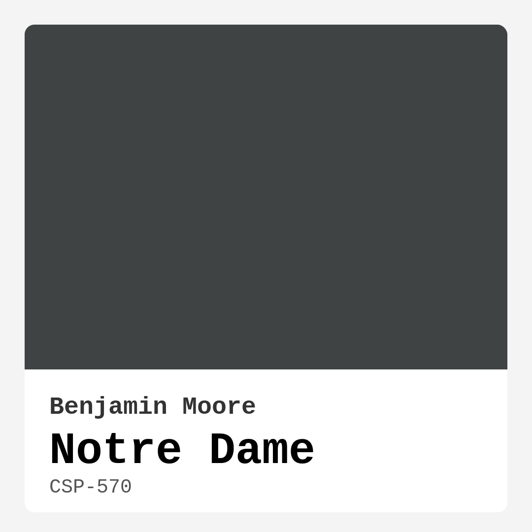
Color Preview & Key Details
| HEX Code | #404343 |
| RGB | 64, 67, 67 |
| LRV | 7.57% |
| Undertone | Blue |
| Finish Options | Eggshell, Matte, Satin |
If you’re searching for a paint color that exudes sophistication while creating a serene and inviting atmosphere, let me introduce you to Benjamin Moore’s **Notre Dame** (CSP-570). This deep gray with subtle blue undertones is one of those rare hues that manages to feel both bold and understated at the same time. Whether you’re refreshing a single room or reimagining your entire home, this shade has the versatility to adapt to your vision while elevating your space with its quiet elegance.
Notre Dame is a chameleon of a color—it shifts ever so slightly depending on the light, revealing its cool blue undertones in natural daylight and taking on a richer, more mysterious depth under artificial lighting. With an LRV (Light Reflectance Value) of just 7.57%, it’s undeniably a dark shade, meaning it absorbs light rather than reflecting it. That makes it perfect for creating intimate, moody spaces that feel cozy rather than cramped. But don’t let the darkness intimidate you—when used thoughtfully, this color can make even small rooms feel intentional and stylish.
One of the biggest strengths of Notre Dame is its adaptability. It plays well with a variety of decor styles, from modern and industrial to classic and contemporary. If you love the sleek, minimalist look, pair it with crisp white trim (Benjamin Moore’s **White Dove** is a perfect match) and clean-lined furniture. For a more industrial vibe, let it contrast against exposed brick or black metal accents. And if your taste leans traditional, it serves as a refined backdrop for rich wood tones and plush textiles. The blue undertones keep it feeling fresh and modern, while the depth of the gray ensures it never looks flat or dull.
When it comes to application, Notre Dame is as user-friendly as they come. It’s brush-smooth, roller-ready, and fast-drying, with excellent coverage that usually only requires one or two coats. The finish options—matte, eggshell, or satin—each bring out different qualities in the color. Matte will emphasize its velvety richness, making it ideal for walls where you want a soft, luxurious feel. Eggshell adds just a hint of sheen, perfect for spaces that need a little extra durability (like a home office or dining room). And if you’re using it on trim or cabinetry, satin will give it a polished, refined look that still feels understated.
Maintenance is a breeze, too. Thanks to its washable finish, you won’t have to stress about scuffs or stains—especially helpful in high-traffic areas like living rooms or hallways. And because it’s low-VOC, you can breathe easy knowing it won’t overwhelm your home with harsh fumes during or after painting.
Now, let’s talk about where this color shines brightest. Notre Dame is a natural fit for living rooms, where its moody elegance sets the stage for cozy evenings and stylish gatherings. In a bedroom, it creates a restful retreat, especially when paired with soft linens and warm lighting. Home offices benefit from its calming presence, helping to foster focus without feeling sterile. And in a dining room? It’s pure drama—especially when offset by a striking light fixture or a gallery wall of art.
If you’re worried about using such a deep shade in a smaller room, don’t be. The key is balance. Pair it with plenty of light—both natural and artificial—and incorporate lighter elements like furniture, rugs, or curtains to keep the space feeling open. An accent wall in Notre Dame can also be a great way to test the waters without committing to an entire room.
As for complementary colors, think cool and cohesive. Lighter grays like **Misty Gray** or **Crushed Ice** (its Sherwin-Williams equivalent) can soften the look, while deeper shades like **CSP-415** or **2114-30** add contrast. If you want to play up its blue undertones, try pairing it with soft blues or crisp whites. And for a bold pop, consider accents in a warm red hue—its complementary color—to create a dynamic yet balanced palette.
At the end of the day, Notre Dame is more than just a paint color—it’s a design tool. It sets a tone, creates a mood, and transforms ordinary spaces into something extraordinary. Whether you’re going for sleek and modern or cozy and classic, this shade delivers. So grab a sample, test it in your space, and see how it speaks to you. I have a feeling you’ll love what it has to say.

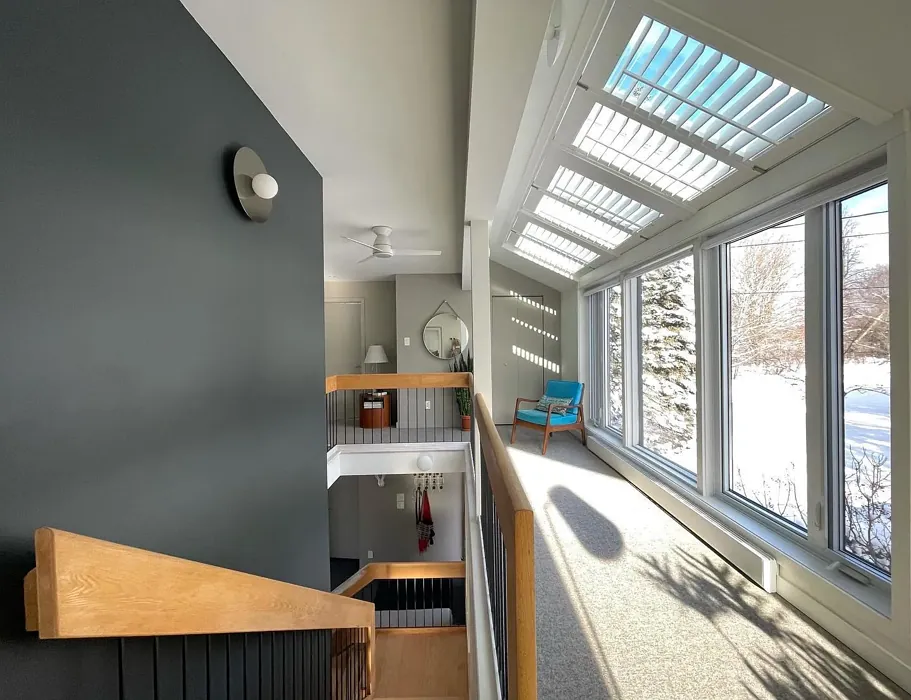
Real Room Photo of Notre Dame CSP-570
Undertones of Notre Dame ?
The undertones of Notre Dame are a key aspect of its character, leaning towards Blue. These subtle underlying hues are what give the color its depth and complexity. For example, a gray with a blue undertone will feel cooler and more modern, while one with a brown undertone will feel warmer and more traditional. It’s essential to test this paint in your home and observe it next to your existing furniture, flooring, and decor to see how these undertones interact and reveal themselves throughout the day.
HEX value: #404343
RGB code: 64, 67, 67
Is Notre Dame Cool or Warm?
Notre Dame leans toward the cool side of the spectrum, making it a fantastic choice for creating soothing spaces. Its deep gray tones can balance warmer elements in your room, allowing for a harmonious blend of textures and colors.
Understanding Color Properties and Interior Design Tips
Hue refers to a specific position on the color wheel, measured in degrees from 0 to 360. Each degree represents a different pure color:
- 0° represents red
- 120° represents green
- 240° represents blue
Saturation describes the intensity or purity of a color and is expressed as a percentage:
- At 0%, the color appears completely desaturated—essentially a shade of gray
- At 100%, the color is at its most vivid and vibrant
Lightness indicates how light or dark a color is, also expressed as a percentage:
- 0% lightness results in black
- 100% lightness results in white
Using Warm Colors in Interior Design
Warm hues—such as reds, oranges, yellows, warm beiges, and greiges—are excellent choices for creating inviting and energetic spaces. These colors are particularly well-suited for:
- Kitchens, living rooms, and bathrooms, where warmth enhances comfort and sociability
- Large rooms, where warm tones can help reduce the sense of emptiness and make the space feel more intimate
For example:
- Warm beige shades provide a cozy, inviting atmosphere, ideal for living rooms, bedrooms, and hallways.
- Warm greige (a mix of beige and gray) offers the warmth of beige with the modern appeal of gray, making it a versatile backdrop for dining areas, bedrooms, and living spaces.
However, be mindful when using warm light tones in rooms with limited natural light. These shades may appear muted or even take on an unpleasant yellowish tint. To avoid a dull or flat appearance:
- Add depth by incorporating richer tones like deep greens, charcoal, or chocolate brown
- Use textured elements such as curtains, rugs, or cushions to bring dimension to the space
Pro Tip: Achieving Harmony with Warm and Cool Color Balance
To create a well-balanced and visually interesting interior, mix warm and cool tones strategically. This contrast adds depth and harmony to your design.
- If your walls feature warm hues, introduce cool-colored accents such as blue or green furniture, artwork, or accessories to create contrast.
- For a polished look, consider using a complementary color scheme, which pairs colors opposite each other on the color wheel (e.g., red with green, orange with blue).
This thoughtful mix not only enhances visual appeal but also creates a space that feels both dynamic and cohesive.
Light Temperature Affects on Notre Dame
Natural Light
Natural daylight changes in color temperature as the sun moves across the sky. At sunrise and sunset, the light tends to have a warm, golden tone with a color temperature around 2000 Kelvin (K). As the day progresses and the sun rises higher, the light becomes cooler and more neutral. Around midday, especially when the sky is clear, natural light typically reaches its peak brightness and shifts to a cooler tone, ranging from 5500 to 6500 Kelvin. This midday light is close to what we perceive as pure white or daylight-balanced light.
These shifts in natural light can significantly influence how colors appear in a space, which is why designers often consider both the time of day and the orientation of windows when planning interior color schemes.
Artificial Light
When choosing artificial lighting, pay close attention to the color temperature, measured in Kelvin (K). This determines how warm or cool the light will appear. Lower temperatures, around 2700K, give off a warm, yellow glow often used in living rooms or bedrooms. Higher temperatures, above 5000K, create a cool, bluish light similar to daylight, commonly used in kitchens, offices, or task areas.
Use the slider to see how lighting temperature can affect the appearance of a surface or color throughout a space.


4800K
LRV of Notre Dame
The Light Reflectance Value (LRV) of Notre Dame is 7.57%, which places it in the Dark colors category. This means it does not reflect light. Understanding a paint’s LRV is crucial for predicting how it will look in your space. A higher LRV indicates a lighter color that reflects more light, making rooms feel larger and brighter. A lower LRV signifies a darker color that absorbs more light, creating a cozier, more intimate atmosphere. Always consider the natural and artificial lighting in your room when selecting a paint color based on its LRV.
Detailed Review of Notre Dame
Additional Paint Characteristics
Ideal Rooms
Bedroom, Dining Room, Home Office, Living Room
Decor Styles
Classic, Contemporary, Industrial, Modern
Coverage
Good (1–2 Coats), Touch-Up Friendly
Ease of Application
Brush Smooth, Fast-Drying, Roller-Ready
Washability
Highly Washable, Washable
VOC Level
Low VOC
Best Use
Accent Wall, Interior Walls, Trim
Room Suitability
Bedroom, Dining Room, Home Office, Living Room
Tone Tag
Cool, Deep, Moody
Finish Type
Eggshell, Matte, Satin
Paint Performance
Easy Touch-Up, High Coverage, Low Odor
Use Cases
Best for Modern Farmhouse, Best for Open Concept, Designer Favorite
Mood
Calm, Cozy, Sophisticated
Trim Pairing
Complements Cool Trim, Good with Wood Trim, Pairs with White Dove
Notre Dame is a beautifully deep hue that adds depth and sophistication to any space. Its muted tone makes it a perfect backdrop for art and decor, enhancing rather than overpowering your furnishings. When applied, it offers a smooth finish that’s easy on the eyes and great for creating an intimate atmosphere. While it may require two coats for optimal coverage, the rich color payoff is worth the extra effort. This paint works wonders in both natural and artificial lighting, adapting to the mood of the room throughout the day. Overall, Notre Dame is a stylish choice for anyone looking to elevate their home decor.
Pros & Cons of CSP-570 Notre Dame
Pros
Cons
Colors that go with Benjamin Moore Notre Dame
FAQ on CSP-570 Notre Dame
Can I use Notre Dame in a small room?
Absolutely! While Notre Dame is a darker color, it can work beautifully in small rooms if paired with ample lighting and lighter accents. To keep the room feeling inviting, consider using light-colored furniture or decor to balance the deep tone. It can create a cozy and sophisticated atmosphere, making your small space feel more intentional.
What finishes are recommended for Notre Dame?
Notre Dame looks stunning in various finishes, but we recommend using it in matte or eggshell for walls to maintain its depth and richness. For trim and accents, satin or semi-gloss finishes can provide a nice contrast while enhancing the overall elegance of the color. Experiment with different finishes to find what best suits your style and space!
Comparisons Notre Dame with other colors
Notre Dame CSP-570 vs Night Owl SW 7061
| Attribute | Notre Dame CSP-570 | Night Owl SW 7061 |
|---|---|---|
| Color Name | Notre Dame CSP-570 | Night Owl SW 7061 |
| Color | ||
| Hue | Grey | Grey |
| Brightness | Dark | Dark |
| RGB | 64, 67, 67 | 99, 101, 95 |
| LRV | 7.57% | 24% |
| Finish Type | Eggshell, Matte, Satin | Eggshell, Matte, Satin |
| Finish Options | Eggshell, Matte, Satin | Eggshell, Matte, Satin |
| Ideal Rooms | Bedroom, Dining Room, Home Office, Living Room | Bedroom, Dining Room, Hallway, Home Office, Living Room |
| Decor Styles | Classic, Contemporary, Industrial, Modern | Industrial, Minimalist, Modern, Rustic, Scandinavian |
| Coverage | Good (1–2 Coats), Touch-Up Friendly | Good (1–2 Coats), Touch-Up Friendly |
| Ease of Application | Brush Smooth, Fast-Drying, Roller-Ready | Beginner Friendly, Brush Smooth, Fast-Drying, Roller-Ready |
| Washability | Highly Washable, Washable | Scrubbable, Washable |
| Room Suitability | Bedroom, Dining Room, Home Office, Living Room | Bedroom, Dining Room, Home Office, Living Room |
| Tone | Cool, Deep, Moody | Balanced, Deep, Earthy, Muted |
| Paint Performance | Easy Touch-Up, High Coverage, Low Odor | Easy Touch-Up, Fade Resistant, High Coverage, Low Odor |
Notre Dame CSP-570 vs Urbane Bronze SW 7048
| Attribute | Notre Dame CSP-570 | Urbane Bronze SW 7048 |
|---|---|---|
| Color Name | Notre Dame CSP-570 | Urbane Bronze SW 7048 |
| Color | ||
| Hue | Grey | Grey |
| Brightness | Dark | Dark |
| RGB | 64, 67, 67 | 84, 80, 74 |
| LRV | 7.57% | 20% |
| Finish Type | Eggshell, Matte, Satin | Eggshell, Matte, Satin |
| Finish Options | Eggshell, Matte, Satin | Eggshell, Matte, Satin |
| Ideal Rooms | Bedroom, Dining Room, Home Office, Living Room | Bedroom, Dining Room, Home Office, Living Room |
| Decor Styles | Classic, Contemporary, Industrial, Modern | Contemporary, Industrial, Modern, Rustic, Transitional |
| Coverage | Good (1–2 Coats), Touch-Up Friendly | Good (1–2 Coats) |
| Ease of Application | Brush Smooth, Fast-Drying, Roller-Ready | Beginner Friendly, Brush Smooth, Roller-Ready |
| Washability | Highly Washable, Washable | Highly Washable, Washable |
| Room Suitability | Bedroom, Dining Room, Home Office, Living Room | Bedroom, Dining Room, Home Office, Living Room |
| Tone | Cool, Deep, Moody | Deep, Earthy, Warm |
| Paint Performance | Easy Touch-Up, High Coverage, Low Odor | Easy Touch-Up, Fade Resistant, High Coverage, Low Odor |
Notre Dame CSP-570 vs Succulent SW 9650
| Attribute | Notre Dame CSP-570 | Succulent SW 9650 |
|---|---|---|
| Color Name | Notre Dame CSP-570 | Succulent SW 9650 |
| Color | ||
| Hue | Grey | Grey |
| Brightness | Dark | Dark |
| RGB | 64, 67, 67 | 97, 108, 100 |
| LRV | 7.57% | 30% |
| Finish Type | Eggshell, Matte, Satin | Eggshell, Matte, Satin |
| Finish Options | Eggshell, Matte, Satin | Eggshell, Matte, Satin |
| Ideal Rooms | Bedroom, Dining Room, Home Office, Living Room | Bathroom, Bedroom, Dining Room, Entryway, Kitchen, Living Room |
| Decor Styles | Classic, Contemporary, Industrial, Modern | Bohemian, Contemporary, Eclectic, Minimalist, Modern Farmhouse |
| Coverage | Good (1–2 Coats), Touch-Up Friendly | Good (1–2 Coats), Touch-Up Friendly |
| Ease of Application | Brush Smooth, Fast-Drying, Roller-Ready | Beginner Friendly, Brush Smooth, Roller-Ready |
| Washability | Highly Washable, Washable | Highly Washable, Washable |
| Room Suitability | Bedroom, Dining Room, Home Office, Living Room | Bathroom, Bedroom, Dining Room, Kitchen, Living Room |
| Tone | Cool, Deep, Moody | Cool, Earthy, Muted |
| Paint Performance | Easy Touch-Up, High Coverage, Low Odor | Easy Touch-Up, Low Odor, Quick Drying, Scuff Resistant |
Notre Dame CSP-570 vs Grizzle Gray SW 7068
| Attribute | Notre Dame CSP-570 | Grizzle Gray SW 7068 |
|---|---|---|
| Color Name | Notre Dame CSP-570 | Grizzle Gray SW 7068 |
| Color | ||
| Hue | Grey | Grey |
| Brightness | Dark | Dark |
| RGB | 64, 67, 67 | 99, 101, 98 |
| LRV | 7.57% | 24% |
| Finish Type | Eggshell, Matte, Satin | Eggshell, Satin |
| Finish Options | Eggshell, Matte, Satin | Eggshell, Matte, Satin |
| Ideal Rooms | Bedroom, Dining Room, Home Office, Living Room | Bedroom, Dining Room, Home Office, Living Room |
| Decor Styles | Classic, Contemporary, Industrial, Modern | Industrial, Modern, Rustic, Scandinavian |
| Coverage | Good (1–2 Coats), Touch-Up Friendly | Good (1–2 Coats), Touch-Up Friendly |
| Ease of Application | Brush Smooth, Fast-Drying, Roller-Ready | Beginner Friendly, Brush Smooth, Roller-Ready |
| Washability | Highly Washable, Washable | Washable, Wipeable |
| Room Suitability | Bedroom, Dining Room, Home Office, Living Room | Bedroom, Dining Room, Home Office, Living Room |
| Tone | Cool, Deep, Moody | Balanced, Cool, Muted |
| Paint Performance | Easy Touch-Up, High Coverage, Low Odor | Easy Touch-Up, High Coverage, Low Odor |
Notre Dame CSP-570 vs Iron Ore SW 7069
| Attribute | Notre Dame CSP-570 | Iron Ore SW 7069 |
|---|---|---|
| Color Name | Notre Dame CSP-570 | Iron Ore SW 7069 |
| Color | ||
| Hue | Grey | Grey |
| Brightness | Dark | Dark |
| RGB | 64, 67, 67 | 67, 67, 65 |
| LRV | 7.57% | 6% |
| Finish Type | Eggshell, Matte, Satin | Eggshell, Matte, Satin |
| Finish Options | Eggshell, Matte, Satin | Eggshell, Matte, Satin |
| Ideal Rooms | Bedroom, Dining Room, Home Office, Living Room | Bedroom, Dining Room, Entryway, Home Office, Living Room |
| Decor Styles | Classic, Contemporary, Industrial, Modern | Contemporary, Industrial, Minimalist, Modern, Rustic |
| Coverage | Good (1–2 Coats), Touch-Up Friendly | Good (1–2 Coats), High Hide |
| Ease of Application | Brush Smooth, Fast-Drying, Roller-Ready | Brush Smooth, Fast-Drying, Roller-Ready |
| Washability | Highly Washable, Washable | Highly Washable, Washable |
| Room Suitability | Bedroom, Dining Room, Home Office, Living Room | Bedroom, Dining Room, Entryway, Home Office, Living Room |
| Tone | Cool, Deep, Moody | Balanced, Deep, Muted, Warm |
| Paint Performance | Easy Touch-Up, High Coverage, Low Odor | Easy Touch-Up, High Coverage, Low Odor |
Notre Dame CSP-570 vs Peppercorn SW 7674
| Attribute | Notre Dame CSP-570 | Peppercorn SW 7674 |
|---|---|---|
| Color Name | Notre Dame CSP-570 | Peppercorn SW 7674 |
| Color | ||
| Hue | Grey | Grey |
| Brightness | Dark | Dark |
| RGB | 64, 67, 67 | 88, 88, 88 |
| LRV | 7.57% | 10% |
| Finish Type | Eggshell, Matte, Satin | Eggshell, Matte, Satin |
| Finish Options | Eggshell, Matte, Satin | Eggshell, Matte, Satin |
| Ideal Rooms | Bedroom, Dining Room, Home Office, Living Room | Bedroom, Dining Room, Home Office, Living Room |
| Decor Styles | Classic, Contemporary, Industrial, Modern | Contemporary, Industrial, Minimalist, Modern |
| Coverage | Good (1–2 Coats), Touch-Up Friendly | Good (1–2 Coats), Touch-Up Friendly |
| Ease of Application | Brush Smooth, Fast-Drying, Roller-Ready | Beginner Friendly, Brush Smooth, Roller-Ready |
| Washability | Highly Washable, Washable | Highly Washable, Washable |
| Room Suitability | Bedroom, Dining Room, Home Office, Living Room | Bedroom, Dining Room, Home Office, Living Room |
| Tone | Cool, Deep, Moody | Balanced, Deep, Moody, Neutral |
| Paint Performance | Easy Touch-Up, High Coverage, Low Odor | Easy Touch-Up, Low Odor, Quick Drying, Scuff Resistant |
Notre Dame CSP-570 vs Slate Tile SW 7624
| Attribute | Notre Dame CSP-570 | Slate Tile SW 7624 |
|---|---|---|
| Color Name | Notre Dame CSP-570 | Slate Tile SW 7624 |
| Color | ||
| Hue | Grey | Grey |
| Brightness | Dark | Dark |
| RGB | 64, 67, 67 | 96, 110, 116 |
| LRV | 7.57% | 15% |
| Finish Type | Eggshell, Matte, Satin | Eggshell, Matte, Satin |
| Finish Options | Eggshell, Matte, Satin | Eggshell, Matte, Satin |
| Ideal Rooms | Bedroom, Dining Room, Home Office, Living Room | Bathroom, Bedroom, Home Office, Kitchen, Living Room |
| Decor Styles | Classic, Contemporary, Industrial, Modern | Industrial, Minimalist, Modern, Rustic |
| Coverage | Good (1–2 Coats), Touch-Up Friendly | Good (1–2 Coats) |
| Ease of Application | Brush Smooth, Fast-Drying, Roller-Ready | Beginner Friendly, Brush Smooth, Fast-Drying, Roller-Ready |
| Washability | Highly Washable, Washable | Scrubbable, Washable |
| Room Suitability | Bedroom, Dining Room, Home Office, Living Room | Bathroom, Bedroom, Kitchen, Living Room |
| Tone | Cool, Deep, Moody | Balanced, Cool, Muted |
| Paint Performance | Easy Touch-Up, High Coverage, Low Odor | Easy Touch-Up, High Coverage, Low Odor, Quick Drying |
Notre Dame CSP-570 vs Blustery Sky SW 9140
| Attribute | Notre Dame CSP-570 | Blustery Sky SW 9140 |
|---|---|---|
| Color Name | Notre Dame CSP-570 | Blustery Sky SW 9140 |
| Color | ||
| Hue | Grey | Grey |
| Brightness | Dark | Dark |
| RGB | 64, 67, 67 | 111, 132, 140 |
| LRV | 7.57% | 48% |
| Finish Type | Eggshell, Matte, Satin | Eggshell, Matte |
| Finish Options | Eggshell, Matte, Satin | Eggshell, Matte, Satin |
| Ideal Rooms | Bedroom, Dining Room, Home Office, Living Room | Bedroom, Dining Room, Home Office, Living Room, Nursery |
| Decor Styles | Classic, Contemporary, Industrial, Modern | Coastal, Modern Farmhouse, Scandinavian, Transitional |
| Coverage | Good (1–2 Coats), Touch-Up Friendly | Good (1–2 Coats), Touch-Up Friendly |
| Ease of Application | Brush Smooth, Fast-Drying, Roller-Ready | Beginner Friendly, Fast-Drying, Low Splatter, Roller-Ready |
| Washability | Highly Washable, Washable | Washable, Wipeable |
| Room Suitability | Bedroom, Dining Room, Home Office, Living Room | Bedroom, Home Office, Living Room, Nursery |
| Tone | Cool, Deep, Moody | Balanced, Cool, Muted |
| Paint Performance | Easy Touch-Up, High Coverage, Low Odor | Easy Touch-Up, Fade Resistant, Low Odor, Quick Drying |
Notre Dame CSP-570 vs Gauntlet Gray SW 7019
| Attribute | Notre Dame CSP-570 | Gauntlet Gray SW 7019 |
|---|---|---|
| Color Name | Notre Dame CSP-570 | Gauntlet Gray SW 7019 |
| Color | ||
| Hue | Grey | Grey |
| Brightness | Dark | Dark |
| RGB | 64, 67, 67 | 120, 115, 110 |
| LRV | 7.57% | 24% |
| Finish Type | Eggshell, Matte, Satin | Eggshell, Matte, Satin |
| Finish Options | Eggshell, Matte, Satin | Eggshell, Matte, Satin |
| Ideal Rooms | Bedroom, Dining Room, Home Office, Living Room | Bedroom, Dining Room, Hallway, Home Office, Living Room |
| Decor Styles | Classic, Contemporary, Industrial, Modern | Industrial, Modern, Rustic, Transitional |
| Coverage | Good (1–2 Coats), Touch-Up Friendly | Good (1–2 Coats), Touch-Up Friendly |
| Ease of Application | Brush Smooth, Fast-Drying, Roller-Ready | Beginner Friendly, Brush Smooth, Roller-Ready |
| Washability | Highly Washable, Washable | Scrubbable, Washable |
| Room Suitability | Bedroom, Dining Room, Home Office, Living Room | Bedroom, Dining Room, Home Office, Living Room |
| Tone | Cool, Deep, Moody | Dusty, Earthy, Muted, Warm |
| Paint Performance | Easy Touch-Up, High Coverage, Low Odor | Easy Touch-Up, High Coverage, Low Odor |
Notre Dame CSP-570 vs Cast Iron SW 6202
| Attribute | Notre Dame CSP-570 | Cast Iron SW 6202 |
|---|---|---|
| Color Name | Notre Dame CSP-570 | Cast Iron SW 6202 |
| Color | ||
| Hue | Grey | Grey |
| Brightness | Dark | Dark |
| RGB | 64, 67, 67 | 100, 100, 90 |
| LRV | 7.57% | 6% |
| Finish Type | Eggshell, Matte, Satin | Eggshell, Matte, Satin |
| Finish Options | Eggshell, Matte, Satin | Eggshell, Matte, Satin |
| Ideal Rooms | Bedroom, Dining Room, Home Office, Living Room | Bedroom, Dining Room, Hallway, Home Office, Kitchen, Living Room |
| Decor Styles | Classic, Contemporary, Industrial, Modern | Contemporary, Farmhouse, Industrial, Minimalist, Modern |
| Coverage | Good (1–2 Coats), Touch-Up Friendly | Good (1–2 Coats), High Hide, Touch-Up Friendly |
| Ease of Application | Brush Smooth, Fast-Drying, Roller-Ready | Beginner Friendly, Brush Smooth, Fast-Drying, Roller-Ready |
| Washability | Highly Washable, Washable | Highly Washable, Washable, Wipeable |
| Room Suitability | Bedroom, Dining Room, Home Office, Living Room | Bedroom, Dining Room, Home Office, Kitchen, Living Room |
| Tone | Cool, Deep, Moody | Balanced, Deep, Dusty, Earthy, Warm |
| Paint Performance | Easy Touch-Up, High Coverage, Low Odor | Easy Touch-Up, High Coverage, Low Odor, Stain Resistant |
Official Page of Benjamin Moore Notre Dame CSP-570