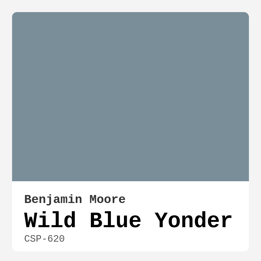
Color Preview & Key Details
| HEX Code | #798E99 |
| RGB | 121, 142, 153 |
| LRV | 26.97% |
| Undertone | Blue |
| Finish Options | Eggshell, Matte, Satin |
Imagine stepping into a room that instantly feels like a breath of fresh air. The walls are painted in a serene, soft blue, reminiscent of a clear sky, inviting tranquility and calmness into your space. That’s the magic of Wild Blue Yonder from Benjamin Moore. This color has a beautiful ability to transform your home into a sanctuary, making it perfect for those moments when you want to unwind and escape the chaos of the outside world.
Wild Blue Yonder, with its color code CSP-620, is a medium-level blue that carries subtle gray undertones. This unique blend gives it a sophisticated edge, allowing it to adapt seamlessly to a variety of decor styles, whether you’re leaning towards coastal chic, modern minimalism, or Scandinavian comfort. If you’ve been searching for that perfect hue that strikes a balance between calming and inviting, look no further.
One of the standout features of Wild Blue Yonder is its versatility. It works beautifully in a range of spaces, from a calming bedroom to an invigorating home office or a cozy nursery. The color’s inherent coolness creates an air of relaxation, making it ideal for areas where you want to promote peace and a sense of well-being. In fact, its soft tones can enhance the natural light in a room, making even small spaces feel more open and airy.
But let’s talk about how to use this gorgeous shade effectively. When applying Wild Blue Yonder, you’ll find it user-friendly, whether you’re a seasoned pro or a DIY novice. It applies smoothly with both rollers and brushes, and the washability is impressive, making it easier to maintain over time. It’s a color that not only looks beautiful but also performs well, ensuring that your efforts yield stunning results.
Now, you may be wondering how it interacts with different lighting. In natural light, Wild Blue Yonder radiates a lightness that feels ethereal, reflecting the calmness of a serene sky. However, in dimmer settings, the color deepens slightly, creating a cozy ambiance that doesn’t feel heavy or oppressive. This duality allows for flexibility in how you can use it throughout your home, adapting to the mood and function of each room.
When it comes to pairing colors, Wild Blue Yonder shines. It harmonizes beautifully with crisp whites and light grays, creating a polished and inviting atmosphere. Imagine pairing it with White Dove for trim or accents; the contrast is stunning. For a bolder statement, consider incorporating deeper colors like navy or charcoal, which can add depth and richness to your overall design scheme. This plays into the color’s versatility, allowing you to create layered looks that feel cohesive and thoughtfully curated.
While Wild Blue Yonder has many advantages, there are a couple of things to keep in mind. In low-light conditions, it can appear darker than expected, so if you’re working with a dimly lit room, you might want to test it out first. Generally, it requires a second coat for the best results, but the effort is worth it when you see the calming atmosphere it brings.
Reflecting on its broader appeal, Wild Blue Yonder is also favorable among designers and homeowners alike. Its low VOC levels make it a healthier choice for indoor air quality, which is especially important for families with children or pets. The color’s low odor and high coverage capabilities mean that you can paint with confidence, knowing you’re creating a beautiful space without compromising on air quality.
What about the mood it evokes? Wild Blue Yonder creates an atmosphere that is calm, restful, and inviting. You’ll find it’s perfect for spaces where relaxation is key, such as bedrooms and nurseries, but it can also invigorate a home office, making work feel more pleasant.
If you’re still considering whether Wild Blue Yonder is the right option for your project, think about your goals for the space. Are you aiming for a retreat-like ambiance? This color brings that serene quality effortlessly. Do you want to create a welcoming environment for guests? Wild Blue Yonder pulls them in, wrapping them in a comforting embrace.
As a designer, I often encourage clients to think about how a color makes them feel. Wild Blue Yonder encourages a sense of peace, making it a fantastic choice for anyone looking to enhance their home’s tranquility. Whether it’s for a single accent wall or the entire room, the color transforms spaces beautifully, ensuring they feel both personal and stylish.
In conclusion, Wild Blue Yonder is more than just a pretty color; it’s a versatile, calming hue that adapts to your needs and enhances your living space. Its unique qualities make it suitable for a variety of styles and applications, ensuring it remains timeless in your home. So, if you’re ready to infuse your space with a sense of peace and beauty, consider giving Wild Blue Yonder a try. You might just find that it’s the perfect backdrop for the life you want to create.
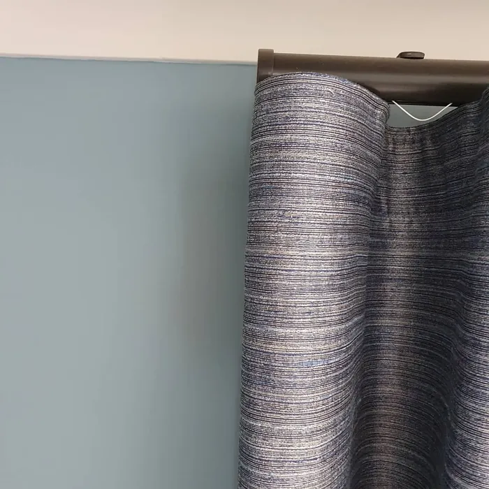
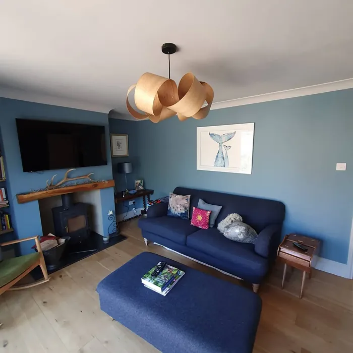
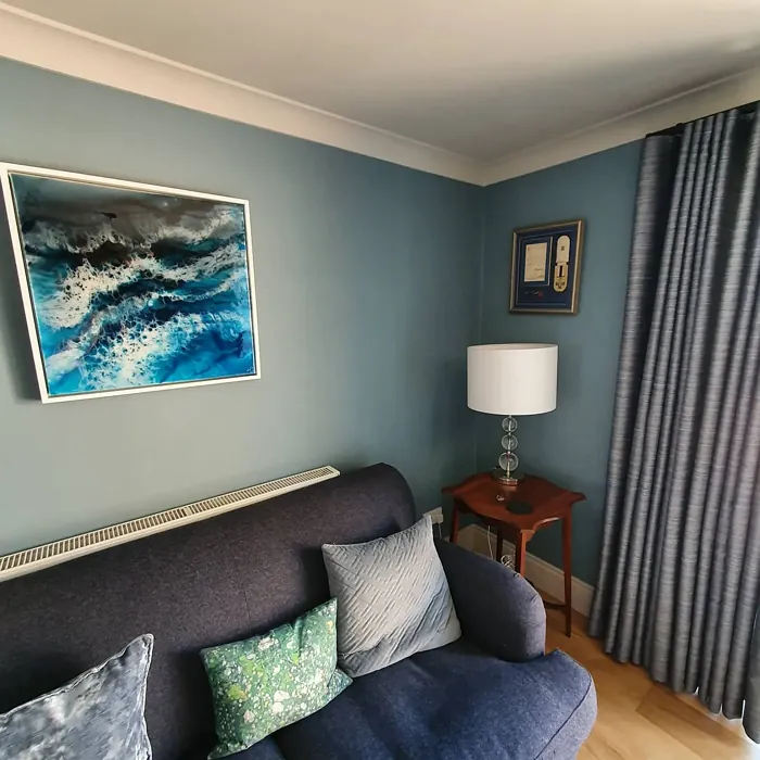
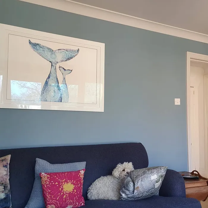
Real Room Photo of Wild Blue Yonder CSP-620
Undertones of Wild Blue Yonder ?
The delicate gray undertones in Wild Blue Yonder give it a sophisticated edge, ensuring it doesn’t come off as overly bright or juvenile. This makes it suitable for both adult spaces and children’s rooms.
HEX value: #798E99
RGB code: 121, 142, 153
Is Wild Blue Yonder Cool or Warm?
Wild Blue Yonder leans towards the cool side of the spectrum, providing a refreshing and calming effect. It’s perfect for spaces where you want to evoke a sense of peace and coolness.
Understanding Color Properties and Interior Design Tips
Hue refers to a specific position on the color wheel, measured in degrees from 0 to 360. Each degree represents a different pure color:
- 0° represents red
- 120° represents green
- 240° represents blue
Saturation describes the intensity or purity of a color and is expressed as a percentage:
- At 0%, the color appears completely desaturated—essentially a shade of gray
- At 100%, the color is at its most vivid and vibrant
Lightness indicates how light or dark a color is, also expressed as a percentage:
- 0% lightness results in black
- 100% lightness results in white
Using Warm Colors in Interior Design
Warm hues—such as reds, oranges, yellows, warm beiges, and greiges—are excellent choices for creating inviting and energetic spaces. These colors are particularly well-suited for:
- Kitchens, living rooms, and bathrooms, where warmth enhances comfort and sociability
- Large rooms, where warm tones can help reduce the sense of emptiness and make the space feel more intimate
For example:
- Warm beige shades provide a cozy, inviting atmosphere, ideal for living rooms, bedrooms, and hallways.
- Warm greige (a mix of beige and gray) offers the warmth of beige with the modern appeal of gray, making it a versatile backdrop for dining areas, bedrooms, and living spaces.
However, be mindful when using warm light tones in rooms with limited natural light. These shades may appear muted or even take on an unpleasant yellowish tint. To avoid a dull or flat appearance:
- Add depth by incorporating richer tones like deep greens, charcoal, or chocolate brown
- Use textured elements such as curtains, rugs, or cushions to bring dimension to the space
Pro Tip: Achieving Harmony with Warm and Cool Color Balance
To create a well-balanced and visually interesting interior, mix warm and cool tones strategically. This contrast adds depth and harmony to your design.
- If your walls feature warm hues, introduce cool-colored accents such as blue or green furniture, artwork, or accessories to create contrast.
- For a polished look, consider using a complementary color scheme, which pairs colors opposite each other on the color wheel (e.g., red with green, orange with blue).
This thoughtful mix not only enhances visual appeal but also creates a space that feels both dynamic and cohesive.
Light Temperature Affects on Wild Blue Yonder
Natural Light
Natural daylight changes in color temperature as the sun moves across the sky. At sunrise and sunset, the light tends to have a warm, golden tone with a color temperature around 2000 Kelvin (K). As the day progresses and the sun rises higher, the light becomes cooler and more neutral. Around midday, especially when the sky is clear, natural light typically reaches its peak brightness and shifts to a cooler tone, ranging from 5500 to 6500 Kelvin. This midday light is close to what we perceive as pure white or daylight-balanced light.
These shifts in natural light can significantly influence how colors appear in a space, which is why designers often consider both the time of day and the orientation of windows when planning interior color schemes.
Artificial Light
When choosing artificial lighting, pay close attention to the color temperature, measured in Kelvin (K). This determines how warm or cool the light will appear. Lower temperatures, around 2700K, give off a warm, yellow glow often used in living rooms or bedrooms. Higher temperatures, above 5000K, create a cool, bluish light similar to daylight, commonly used in kitchens, offices, or task areas.
Use the slider to see how lighting temperature can affect the appearance of a surface or color throughout a space.


4800K
LRV of Wild Blue Yonder
The Light Reflectance Value (LRV) of Wild Blue Yonder is around 40, which means it reflects a moderate amount of light. This makes it suitable for both bright and dimly lit spaces.
Detailed Review of Wild Blue Yonder
Additional Paint Characteristics
Ideal Rooms
Bedroom, Home Office, Living Room, Nursery
Decor Styles
Coastal, Modern, Scandinavian, Transitional
Coverage
Good (1–2 Coats)
Ease of Application
Beginner Friendly, Brush Smooth, Roller-Ready
Washability
Highly Washable, Washable
VOC Level
Low VOC
Best Use
Accent Wall, Home Office, Interior Walls, Nursery
Room Suitability
Bedroom, Home Office, Living Room, Nursery
Tone Tag
Airy, Cool, Muted
Finish Type
Eggshell, Matte
Paint Performance
Easy Touch-Up, High Coverage, Low Odor
Use Cases
Best for Low Light Rooms, Best for Rentals, Designer Favorite
Mood
Calm, Inviting, Restful
Trim Pairing
Complements Cool Trim, Matches Pure White, Pairs with White Dove
Wild Blue Yonder is truly a versatile color that can transform your space into a sanctuary of calmness. Its soft, muted tone makes it an excellent backdrop for various decor styles, from coastal chic to modern minimalist. Whether you’re looking to create a serene bedroom or an inviting living room, this color adapts beautifully. The subtle gray undertones add depth, preventing it from feeling too bright or overwhelming. It pairs well with crisp whites and natural woods, enhancing its tranquil vibe while maintaining a polished appearance. If you’re seeking a color that promotes relaxation and harmony, Wild Blue Yonder is a fantastic option that won’t disappoint.
Pros & Cons of CSP-620 Wild Blue Yonder
Pros
Cons
Colors that go with Benjamin Moore Wild Blue Yonder
FAQ on CSP-620 Wild Blue Yonder
Can Wild Blue Yonder be used in small spaces?
Absolutely! Wild Blue Yonder works wonders in small spaces by making them feel more open and airy. Its soft tones can enhance the natural light, creating a sense of spaciousness. Just be mindful of the lighting conditions, as it may appear darker in very dim areas.
How does Wild Blue Yonder pair with other colors?
Wild Blue Yonder pairs beautifully with crisp whites, light grays, and natural wood tones. For a bolder look, consider contrasting it with deeper colors like navy or charcoal. This flexibility makes it an excellent choice for creating layered color schemes that feel cohesive and inviting.
Comparisons Wild Blue Yonder with other colors
Wild Blue Yonder CSP-620 vs Dutch Tile Blue SW 0031
| Attribute | Wild Blue Yonder CSP-620 | Dutch Tile Blue SW 0031 |
|---|---|---|
| Color Name | Wild Blue Yonder CSP-620 | Dutch Tile Blue SW 0031 |
| Color | ||
| Hue | Blue | Blue |
| Brightness | Medium | Medium |
| RGB | 121, 142, 153 | 154, 171, 171 |
| LRV | 26.97% | 24% |
| Finish Type | Eggshell, Matte | Eggshell, Matte, Satin |
| Finish Options | Eggshell, Matte, Satin | Eggshell, Flat, Matte, Satin |
| Ideal Rooms | Bedroom, Home Office, Living Room, Nursery | Bathroom, Bedroom, Dining Room, Hallway, Home Office, Kitchen, Living Room |
| Decor Styles | Coastal, Modern, Scandinavian, Transitional | Coastal, Modern Farmhouse, Scandinavian, Traditional, Transitional |
| Coverage | Good (1–2 Coats) | Good (1–2 Coats) |
| Ease of Application | Beginner Friendly, Brush Smooth, Roller-Ready | Beginner Friendly, Brush Smooth, Fast-Drying, Roller-Ready |
| Washability | Highly Washable, Washable | Highly Washable, Washable |
| Room Suitability | Bedroom, Home Office, Living Room, Nursery | Bathroom, Bedroom, Dining Room, Kitchen, Living Room |
| Tone | Airy, Cool, Muted | Balanced, Cool, Muted |
| Paint Performance | Easy Touch-Up, High Coverage, Low Odor | Easy Touch-Up, High Coverage, Low Odor, Quick Drying |
Wild Blue Yonder CSP-620 vs Debonair SW 9139
| Attribute | Wild Blue Yonder CSP-620 | Debonair SW 9139 |
|---|---|---|
| Color Name | Wild Blue Yonder CSP-620 | Debonair SW 9139 |
| Color | ||
| Hue | Blue | Blue |
| Brightness | Medium | Medium |
| RGB | 121, 142, 153 | 144, 160, 166 |
| LRV | 26.97% | 30% |
| Finish Type | Eggshell, Matte | Eggshell, Matte, Satin |
| Finish Options | Eggshell, Matte, Satin | Eggshell, Matte, Satin |
| Ideal Rooms | Bedroom, Home Office, Living Room, Nursery | Bedroom, Dining Room, Home Office, Living Room |
| Decor Styles | Coastal, Modern, Scandinavian, Transitional | Coastal, Industrial, Modern, Transitional |
| Coverage | Good (1–2 Coats) | Good (1–2 Coats) |
| Ease of Application | Beginner Friendly, Brush Smooth, Roller-Ready | Beginner Friendly, Brush Smooth, Roller-Ready |
| Washability | Highly Washable, Washable | Washable, Wipeable |
| Room Suitability | Bedroom, Home Office, Living Room, Nursery | Bedroom, Dining Room, Home Office, Living Room |
| Tone | Airy, Cool, Muted | Balanced, Cool, Muted |
| Paint Performance | Easy Touch-Up, High Coverage, Low Odor | Easy Touch-Up, Low Odor, Quick Drying |
Wild Blue Yonder CSP-620 vs Stardew SW 9138
| Attribute | Wild Blue Yonder CSP-620 | Stardew SW 9138 |
|---|---|---|
| Color Name | Wild Blue Yonder CSP-620 | Stardew SW 9138 |
| Color | ||
| Hue | Blue | Blue |
| Brightness | Medium | Medium |
| RGB | 121, 142, 153 | 166, 178, 181 |
| LRV | 26.97% | 30% |
| Finish Type | Eggshell, Matte | Eggshell, Satin |
| Finish Options | Eggshell, Matte, Satin | Eggshell, Matte, Satin |
| Ideal Rooms | Bedroom, Home Office, Living Room, Nursery | Bathroom, Bedroom, Home Office, Living Room, Nursery |
| Decor Styles | Coastal, Modern, Scandinavian, Transitional | Coastal, Farmhouse, Modern, Scandinavian |
| Coverage | Good (1–2 Coats) | Good (1–2 Coats) |
| Ease of Application | Beginner Friendly, Brush Smooth, Roller-Ready | Beginner Friendly, Brush Smooth, Roller-Ready |
| Washability | Highly Washable, Washable | Highly Washable, Washable, Wipeable |
| Room Suitability | Bedroom, Home Office, Living Room, Nursery | Bathroom, Bedroom, Home Office, Living Room |
| Tone | Airy, Cool, Muted | Calm, Cool, Muted |
| Paint Performance | Easy Touch-Up, High Coverage, Low Odor | Easy Touch-Up, High Coverage, Low Odor |
Wild Blue Yonder CSP-620 vs Niebla Azul SW 9137
| Attribute | Wild Blue Yonder CSP-620 | Niebla Azul SW 9137 |
|---|---|---|
| Color Name | Wild Blue Yonder CSP-620 | Niebla Azul SW 9137 |
| Color | ||
| Hue | Blue | Blue |
| Brightness | Medium | Medium |
| RGB | 121, 142, 153 | 182, 195, 196 |
| LRV | 26.97% | 48% |
| Finish Type | Eggshell, Matte | Eggshell, Matte, Satin |
| Finish Options | Eggshell, Matte, Satin | Eggshell, Matte, Satin |
| Ideal Rooms | Bedroom, Home Office, Living Room, Nursery | Bedroom, Home Office, Living Room, Nursery |
| Decor Styles | Coastal, Modern, Scandinavian, Transitional | Coastal, Modern, Scandinavian, Transitional |
| Coverage | Good (1–2 Coats) | Good (1–2 Coats), Touch-Up Friendly |
| Ease of Application | Beginner Friendly, Brush Smooth, Roller-Ready | Beginner Friendly, Brush Smooth, Roller-Ready |
| Washability | Highly Washable, Washable | Highly Washable, Washable |
| Room Suitability | Bedroom, Home Office, Living Room, Nursery | Bedroom, Home Office, Living Room, Nursery |
| Tone | Airy, Cool, Muted | Airy, Cool, Muted |
| Paint Performance | Easy Touch-Up, High Coverage, Low Odor | Easy Touch-Up, Fade Resistant, Low Odor, Scuff Resistant |
Wild Blue Yonder CSP-620 vs Rain SW 6219
| Attribute | Wild Blue Yonder CSP-620 | Rain SW 6219 |
|---|---|---|
| Color Name | Wild Blue Yonder CSP-620 | Rain SW 6219 |
| Color | ||
| Hue | Blue | Blue |
| Brightness | Medium | Medium |
| RGB | 121, 142, 153 | 171, 190, 191 |
| LRV | 26.97% | 50% |
| Finish Type | Eggshell, Matte | Eggshell, Matte, Satin |
| Finish Options | Eggshell, Matte, Satin | Eggshell, Matte, Satin |
| Ideal Rooms | Bedroom, Home Office, Living Room, Nursery | Bathroom, Bedroom, Home Office, Living Room, Nursery |
| Decor Styles | Coastal, Modern, Scandinavian, Transitional | Coastal, Minimalist, Modern, Scandinavian, Transitional |
| Coverage | Good (1–2 Coats) | Good (1–2 Coats), Touch-Up Friendly |
| Ease of Application | Beginner Friendly, Brush Smooth, Roller-Ready | Beginner Friendly, Brush Smooth, Fast-Drying, Roller-Ready |
| Washability | Highly Washable, Washable | Scrubbable, Stain Resistant, Washable |
| Room Suitability | Bedroom, Home Office, Living Room, Nursery | Bathroom, Bedroom, Home Office, Living Room, Nursery |
| Tone | Airy, Cool, Muted | Balanced, Cool, Muted |
| Paint Performance | Easy Touch-Up, High Coverage, Low Odor | Easy Touch-Up, Low Odor, Quick Drying, Stain Resistant |
Wild Blue Yonder CSP-620 vs Morning at Sea SW 9634
| Attribute | Wild Blue Yonder CSP-620 | Morning at Sea SW 9634 |
|---|---|---|
| Color Name | Wild Blue Yonder CSP-620 | Morning at Sea SW 9634 |
| Color | ||
| Hue | Blue | Blue |
| Brightness | Medium | Medium |
| RGB | 121, 142, 153 | 130, 151, 155 |
| LRV | 26.97% | 50% |
| Finish Type | Eggshell, Matte | Eggshell, Matte |
| Finish Options | Eggshell, Matte, Satin | Eggshell, Matte, Satin |
| Ideal Rooms | Bedroom, Home Office, Living Room, Nursery | Bathroom, Bedroom, Home Office, Living Room |
| Decor Styles | Coastal, Modern, Scandinavian, Transitional | Coastal, Minimalist, Modern, Scandinavian |
| Coverage | Good (1–2 Coats) | Good (1–2 Coats), Touch-Up Friendly |
| Ease of Application | Beginner Friendly, Brush Smooth, Roller-Ready | Beginner Friendly, Brush Smooth, Roller-Ready |
| Washability | Highly Washable, Washable | Washable, Wipeable |
| Room Suitability | Bedroom, Home Office, Living Room, Nursery | Bathroom, Bedroom, Home Office, Living Room |
| Tone | Airy, Cool, Muted | Airy, Cool, Muted |
| Paint Performance | Easy Touch-Up, High Coverage, Low Odor | Easy Touch-Up, Fade Resistant, Low Odor |
Wild Blue Yonder CSP-620 vs Sleepy Blue SW 6225
| Attribute | Wild Blue Yonder CSP-620 | Sleepy Blue SW 6225 |
|---|---|---|
| Color Name | Wild Blue Yonder CSP-620 | Sleepy Blue SW 6225 |
| Color | ||
| Hue | Blue | Blue |
| Brightness | Medium | Medium |
| RGB | 121, 142, 153 | 188, 203, 206 |
| LRV | 26.97% | 50% |
| Finish Type | Eggshell, Matte | Eggshell, Matte, Satin |
| Finish Options | Eggshell, Matte, Satin | Eggshell, Matte, Satin |
| Ideal Rooms | Bedroom, Home Office, Living Room, Nursery | Bedroom, Home Office, Living Room, Nursery |
| Decor Styles | Coastal, Modern, Scandinavian, Transitional | Coastal, Minimalist, Modern Farmhouse, Scandinavian |
| Coverage | Good (1–2 Coats) | Good (1–2 Coats) |
| Ease of Application | Beginner Friendly, Brush Smooth, Roller-Ready | Beginner Friendly, Brush Smooth, Fast-Drying, Roller-Ready |
| Washability | Highly Washable, Washable | Highly Washable, Washable |
| Room Suitability | Bedroom, Home Office, Living Room, Nursery | Bedroom, Home Office, Living Room, Nursery |
| Tone | Airy, Cool, Muted | Airy, Cool, Muted |
| Paint Performance | Easy Touch-Up, High Coverage, Low Odor | Easy Touch-Up, Low Odor, Quick Drying, Scuff Resistant |
Wild Blue Yonder CSP-620 vs Lakeside SW 9683
| Attribute | Wild Blue Yonder CSP-620 | Lakeside SW 9683 |
|---|---|---|
| Color Name | Wild Blue Yonder CSP-620 | Lakeside SW 9683 |
| Color | ||
| Hue | Blue | Blue |
| Brightness | Medium | Medium |
| RGB | 121, 142, 153 | 173, 184, 192 |
| LRV | 26.97% | 24% |
| Finish Type | Eggshell, Matte | Eggshell, Matte, Satin |
| Finish Options | Eggshell, Matte, Satin | Eggshell, Matte, Satin |
| Ideal Rooms | Bedroom, Home Office, Living Room, Nursery | Bathroom, Bedroom, Home Office, Living Room |
| Decor Styles | Coastal, Modern, Scandinavian, Transitional | Coastal, Minimalist, Modern, Rustic |
| Coverage | Good (1–2 Coats) | Good (1–2 Coats) |
| Ease of Application | Beginner Friendly, Brush Smooth, Roller-Ready | Beginner Friendly, Brush Smooth, Roller-Ready |
| Washability | Highly Washable, Washable | Scrubbable, Washable |
| Room Suitability | Bedroom, Home Office, Living Room, Nursery | Bathroom, Bedroom, Home Office, Living Room |
| Tone | Airy, Cool, Muted | Balanced, Cool, Muted |
| Paint Performance | Easy Touch-Up, High Coverage, Low Odor | Easy Touch-Up, Fade Resistant, High Coverage, Low Odor |
Wild Blue Yonder CSP-620 vs Upward SW 6239
| Attribute | Wild Blue Yonder CSP-620 | Upward SW 6239 |
|---|---|---|
| Color Name | Wild Blue Yonder CSP-620 | Upward SW 6239 |
| Color | ||
| Hue | Blue | Blue |
| Brightness | Medium | Medium |
| RGB | 121, 142, 153 | 191, 201, 208 |
| LRV | 26.97% | 75% |
| Finish Type | Eggshell, Matte | Eggshell, Satin |
| Finish Options | Eggshell, Matte, Satin | Eggshell, Flat, Satin |
| Ideal Rooms | Bedroom, Home Office, Living Room, Nursery | Bedroom, Dining Room, Home Office, Living Room, Nursery |
| Decor Styles | Coastal, Modern, Scandinavian, Transitional | Coastal, Minimalist, Modern, Scandinavian |
| Coverage | Good (1–2 Coats) | Good (1–2 Coats), Touch-Up Friendly |
| Ease of Application | Beginner Friendly, Brush Smooth, Roller-Ready | Beginner Friendly, Brush Smooth, Fast-Drying, Roller-Ready |
| Washability | Highly Washable, Washable | Washable, Wipeable |
| Room Suitability | Bedroom, Home Office, Living Room, Nursery | Bedroom, Home Office, Living Room, Nursery |
| Tone | Airy, Cool, Muted | Cool, Crisp, Muted |
| Paint Performance | Easy Touch-Up, High Coverage, Low Odor | High Coverage, Low Odor, Quick Drying |
Wild Blue Yonder CSP-620 vs Aleutian SW 6241
| Attribute | Wild Blue Yonder CSP-620 | Aleutian SW 6241 |
|---|---|---|
| Color Name | Wild Blue Yonder CSP-620 | Aleutian SW 6241 |
| Color | ||
| Hue | Blue | Blue |
| Brightness | Medium | Medium |
| RGB | 121, 142, 153 | 152, 169, 183 |
| LRV | 26.97% | 24% |
| Finish Type | Eggshell, Matte | Eggshell, Matte, Satin |
| Finish Options | Eggshell, Matte, Satin | Eggshell, Matte, Satin |
| Ideal Rooms | Bedroom, Home Office, Living Room, Nursery | Bathroom, Bedroom, Home Office, Kitchen, Living Room, Nursery |
| Decor Styles | Coastal, Modern, Scandinavian, Transitional | Coastal, Minimalist, Modern, Scandinavian, Transitional |
| Coverage | Good (1–2 Coats) | Good (1–2 Coats), Touch-Up Friendly |
| Ease of Application | Beginner Friendly, Brush Smooth, Roller-Ready | Beginner Friendly, Brush Smooth, Fast-Drying, Roller-Ready |
| Washability | Highly Washable, Washable | Scrubbable, Stain Resistant, Washable |
| Room Suitability | Bedroom, Home Office, Living Room, Nursery | Bathroom, Bedroom, Home Office, Living Room, Nursery |
| Tone | Airy, Cool, Muted | Airy, Balanced, Cool, Muted |
| Paint Performance | Easy Touch-Up, High Coverage, Low Odor | Easy Touch-Up, Fade Resistant, Low Odor, Quick Drying |
Official Page of Benjamin Moore Wild Blue Yonder CSP-620