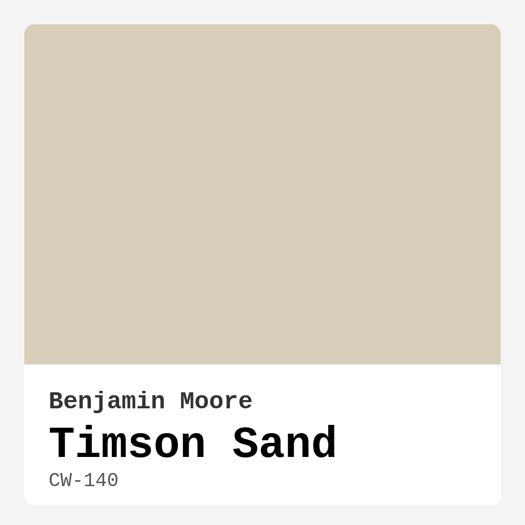
Color Preview & Key Details
| HEX Code | #D8CDB9 |
| RGB | 216, 205, 185 |
| Undertone | Red |
| Finish Options | Eggshell, Flat, Matte, Satin |
**The Ultimate Guide to Benjamin Moore’s Timson Sand (CW-140): Is This Warm, Versatile Greige Right for Your Home?**
Picture this: You’re standing in your living room, staring at the walls, and suddenly it hits you—they feel flat, uninspired, maybe even a little dated. You know you want a change, but the sea of paint swatches at the store leaves you overwhelmed. What if there was a color that could instantly warm up your space, work with your existing decor, and still feel fresh and modern? That’s where Benjamin Moore’s Timson Sand comes in.
This soft, sun-kissed beige with a hint of greige is one of those rare colors that manages to be both neutral and full of personality. Its warmth is subtle but undeniable, like the first light of morning hitting a sandy beach. And because it sits in that sweet spot between beige and gray, it plays well with almost any style—whether you’re into modern farmhouse, coastal vibes, or something more transitional.
Let’s talk about what makes Timson Sand special. First, its undertones. This color has a gentle red undertone, which gives it that cozy, inviting quality. Unlike cooler grays or stark whites, Timson Sand feels lived-in and welcoming from the moment it goes on the wall. But don’t mistake “warm” for “overbearing.” Its lightness (thanks to an LRV of 72) means it reflects plenty of light, making rooms feel brighter and more open without sacrificing that snug, enveloping feel.
One of the best things about this paint? It’s incredibly forgiving. If you’re new to DIY painting, you’ll appreciate how easy it is to work with. The coverage is excellent—most rooms only need one or two coats—and it dries quickly, so you won’t be waiting around forever to see the final result. Plus, it’s touch-up friendly, which is a lifesaver if you’ve got kids, pets, or just a habit of rearranging furniture a little too enthusiastically.
Now, where does Timson Sand shine? Pretty much everywhere. In a living room, it creates a backdrop that’s calm but not boring, letting your furniture and art take center stage. In a bedroom, it sets a restful, almost meditative mood—perfect for unwinding after a long day. Kitchens and dining rooms benefit from its warmth, making meals feel more intimate and inviting. And in a home office? It’s neutral enough to keep you focused but warm enough to stave off that sterile, corporate vibe.
Lighting matters, of course. In rooms with lots of natural light, Timson Sand glows, leaning into its sandy, sunlit side. In spaces with less light, it can feel a touch deeper, so if you’re working with a darker room, consider pairing it with crisp white trim (Benjamin Moore’s White Dove is a classic choice) to keep things balanced. And if you’re worried about it clashing with your furniture, test a sample next to your sofa, flooring, or cabinets at different times of day. You’ll quickly see how adaptable it is.
As for finishes, you’ve got options. Eggshell or satin are great for most walls—they’re durable, wipeable, and have just enough sheen to add depth without being shiny. Matte works beautifully in low-traffic areas like bedrooms, where you want that velvety, soft look. And if you’re feeling adventurous, Timson Sand also makes a stunning choice for painting furniture or creating an accent wall. Pair it with rich wood tones or cool blues (its complementary hue), and you’ve got instant sophistication.
A few things to keep in mind: While Timson Sand is versatile, its warmth means it might not be the best fit if you’re going for a stark, ultra-modern look. And because of those red undertones, it can sometimes pull slightly pink in certain lights, so sampling is key. But for most homes, it’s a slam dunk—a color that feels fresh but not trendy, cozy but not heavy, and neutral but far from bland.
So, is Timson Sand the right choice for you? If you’re craving a color that wraps your home in warmth without overwhelming it, the answer is probably yes. It’s the kind of shade that makes people walk in and say, “This feels so good,” without quite knowing why. And really, isn’t that what great design is all about?
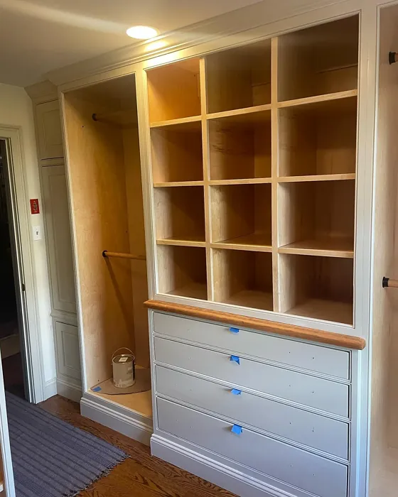
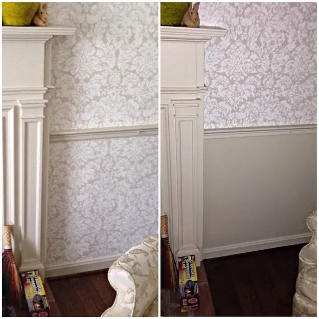
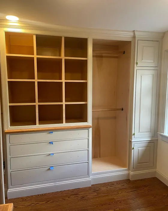
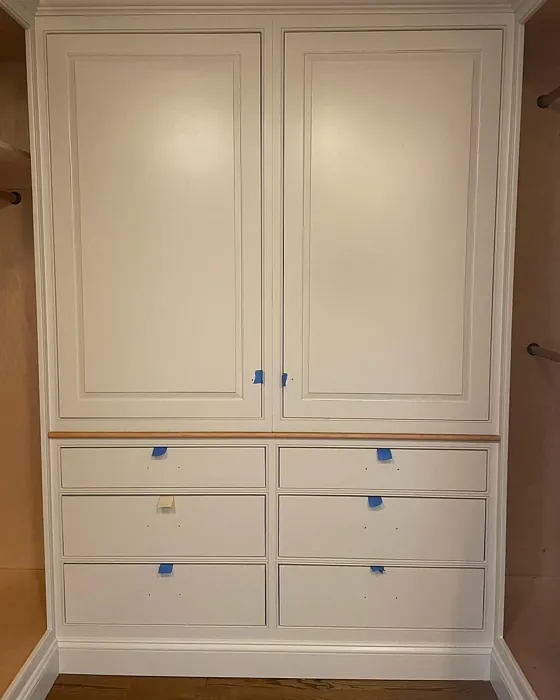
Real Room Photo of Timson Sand CW-140

Undertones of Timson Sand ?
The undertones of Timson Sand are a key aspect of its character, leaning towards Red. These subtle underlying hues are what give the color its depth and complexity. For example, a gray with a blue undertone will feel cooler and more modern, while one with a brown undertone will feel warmer and more traditional. It’s essential to test this paint in your home and observe it next to your existing furniture, flooring, and decor to see how these undertones interact and reveal themselves throughout the day.
HEX value: #D8CDB9
RGB code: 216, 205, 185
Is Timson Sand Cool or Warm?
This paint leans towards the warm spectrum, making it an inviting choice for spaces where you want to foster a sense of comfort and relaxation. Its warmth can uplift a room without being overwhelming.
Understanding Color Properties and Interior Design Tips
Hue refers to a specific position on the color wheel, measured in degrees from 0 to 360. Each degree represents a different pure color:
- 0° represents red
- 120° represents green
- 240° represents blue
Saturation describes the intensity or purity of a color and is expressed as a percentage:
- At 0%, the color appears completely desaturated—essentially a shade of gray
- At 100%, the color is at its most vivid and vibrant
Lightness indicates how light or dark a color is, also expressed as a percentage:
- 0% lightness results in black
- 100% lightness results in white
Using Warm Colors in Interior Design
Warm hues—such as reds, oranges, yellows, warm beiges, and greiges—are excellent choices for creating inviting and energetic spaces. These colors are particularly well-suited for:
- Kitchens, living rooms, and bathrooms, where warmth enhances comfort and sociability
- Large rooms, where warm tones can help reduce the sense of emptiness and make the space feel more intimate
For example:
- Warm beige shades provide a cozy, inviting atmosphere, ideal for living rooms, bedrooms, and hallways.
- Warm greige (a mix of beige and gray) offers the warmth of beige with the modern appeal of gray, making it a versatile backdrop for dining areas, bedrooms, and living spaces.
However, be mindful when using warm light tones in rooms with limited natural light. These shades may appear muted or even take on an unpleasant yellowish tint. To avoid a dull or flat appearance:
- Add depth by incorporating richer tones like deep greens, charcoal, or chocolate brown
- Use textured elements such as curtains, rugs, or cushions to bring dimension to the space
Pro Tip: Achieving Harmony with Warm and Cool Color Balance
To create a well-balanced and visually interesting interior, mix warm and cool tones strategically. This contrast adds depth and harmony to your design.
- If your walls feature warm hues, introduce cool-colored accents such as blue or green furniture, artwork, or accessories to create contrast.
- For a polished look, consider using a complementary color scheme, which pairs colors opposite each other on the color wheel (e.g., red with green, orange with blue).
This thoughtful mix not only enhances visual appeal but also creates a space that feels both dynamic and cohesive.
Light Temperature Affects on Timson Sand
Natural Light
Natural daylight changes in color temperature as the sun moves across the sky. At sunrise and sunset, the light tends to have a warm, golden tone with a color temperature around 2000 Kelvin (K). As the day progresses and the sun rises higher, the light becomes cooler and more neutral. Around midday, especially when the sky is clear, natural light typically reaches its peak brightness and shifts to a cooler tone, ranging from 5500 to 6500 Kelvin. This midday light is close to what we perceive as pure white or daylight-balanced light.
These shifts in natural light can significantly influence how colors appear in a space, which is why designers often consider both the time of day and the orientation of windows when planning interior color schemes.
Artificial Light
When choosing artificial lighting, pay close attention to the color temperature, measured in Kelvin (K). This determines how warm or cool the light will appear. Lower temperatures, around 2700K, give off a warm, yellow glow often used in living rooms or bedrooms. Higher temperatures, above 5000K, create a cool, bluish light similar to daylight, commonly used in kitchens, offices, or task areas.
Use the slider to see how lighting temperature can affect the appearance of a surface or color throughout a space.


4800K
LRV of Timson Sand
With a Light Reflectance Value (LRV) of 72, Timson Sand effectively reflects light, making it suitable for smaller or darker rooms, as it helps to open up the space while still maintaining a grounded feel.
Detailed Review of Timson Sand
Additional Paint Characteristics
Ideal Rooms
Bedroom, Dining Room, Home Office, Kitchen, Living Room, Nursery
Decor Styles
Bohemian, Coastal, Farmhouse, Modern, Transitional
Coverage
Good (1–2 Coats), Touch-Up Friendly
Ease of Application
Beginner Friendly, Brush Smooth, Fast-Drying, Roller-Ready
Washability
Washable, Wipeable
VOC Level
Low VOC
Best Use
Accent Wall, Furniture, Interior Walls
Room Suitability
Bedroom, Dining Room, Home Office, Kitchen, Living Room
Tone Tag
Earthy, Neutral, Warm
Finish Type
Eggshell, Matte, Satin
Paint Performance
Easy Touch-Up, High Coverage, Low Odor, Quick Drying
Use Cases
Best for Modern Farmhouse, Best for Rentals, Classic Favorite
Mood
Cozy, Inviting, Restful
Trim Pairing
Complements Cool Trim, Good with Wood Trim, Pairs with White Dove
Timson Sand is a beautifully balanced paint that strikes a perfect chord between warmth and neutrality. Its soft beige tone creates a cozy environment, making it an ideal choice for both contemporary and traditional spaces. The paint applies smoothly, providing excellent coverage that typically requires just one or two coats for a flawless finish. One of its standout features is its adaptability; it pairs wonderfully with various accent colors, from rich jewel tones to soft pastels. Whether you’re looking to refresh your living room or create a serene bedroom retreat, Timson Sand is a reliable choice that brings a sense of tranquility.
Pros & Cons of CW-140 Timson Sand
Pros
Cons
Colors that go with Benjamin Moore Timson Sand
FAQ on CW-140 Timson Sand
Can Timson Sand be used in high humidity areas like bathrooms?
Yes, Timson Sand can be used in bathrooms and other high humidity areas. However, for best results, it’s advisable to choose a finish like satin or eggshell, which offers better moisture resistance. This will help maintain the paint’s integrity over time, ensuring it stays looking fresh and beautiful.
How does Timson Sand compare to other beige paints?
Timson Sand stands out due to its unique warm undertones, which give it a softer, more inviting appearance than many other beige paints. Unlike some beiges that can lean too cool or gray, Timson Sand maintains a balance that works harmoniously with a range of color palettes, making it a versatile choice for various decorating styles.
Comparisons Timson Sand with other colors
Timson Sand CW-140 vs Gossamer Veil SW 9165
| Attribute | Timson Sand CW-140 | Gossamer Veil SW 9165 |
|---|---|---|
| Color Name | Timson Sand CW-140 | Gossamer Veil SW 9165 |
| Color | ||
| Hue | Greige | Greige |
| Brightness | Light | Light |
| RGB | 216, 205, 185 | 211, 206, 196 |
| LRV | N/A | 75% |
| Finish Type | Eggshell, Matte, Satin | Eggshell, Matte |
| Finish Options | Eggshell, Flat, Matte, Satin | Eggshell, Matte, Satin |
| Ideal Rooms | Bedroom, Dining Room, Home Office, Kitchen, Living Room, Nursery | Bedroom, Dining Room, Entryway, Home Office, Kitchen, Living Room |
| Decor Styles | Bohemian, Coastal, Farmhouse, Modern, Transitional | Coastal, Farmhouse, Modern, Scandinavian, Transitional |
| Coverage | Good (1–2 Coats), Touch-Up Friendly | Good (1–2 Coats), Touch-Up Friendly |
| Ease of Application | Beginner Friendly, Brush Smooth, Fast-Drying, Roller-Ready | Beginner Friendly, Brush Smooth, Fast-Drying, Roller-Ready |
| Washability | Washable, Wipeable | Washable, Wipeable |
| Room Suitability | Bedroom, Dining Room, Home Office, Kitchen, Living Room | Bathroom, Bedroom, Dining Room, Home Office, Living Room |
| Tone | Earthy, Neutral, Warm | Airy, Balanced, Muted, Warm |
| Paint Performance | Easy Touch-Up, High Coverage, Low Odor, Quick Drying | Easy Touch-Up, High Coverage, Low Odor, Quick Drying |
Timson Sand CW-140 vs Heron Plume SW 6070
| Attribute | Timson Sand CW-140 | Heron Plume SW 6070 |
|---|---|---|
| Color Name | Timson Sand CW-140 | Heron Plume SW 6070 |
| Color | ||
| Hue | Greige | Greige |
| Brightness | Light | Light |
| RGB | 216, 205, 185 | 229, 225, 216 |
| LRV | N/A | 30% |
| Finish Type | Eggshell, Matte, Satin | Eggshell, Matte, Satin |
| Finish Options | Eggshell, Flat, Matte, Satin | Eggshell, Matte, Satin |
| Ideal Rooms | Bedroom, Dining Room, Home Office, Kitchen, Living Room, Nursery | Bedroom, Dining Room, Home Office, Living Room |
| Decor Styles | Bohemian, Coastal, Farmhouse, Modern, Transitional | Coastal, Modern, Scandinavian, Transitional |
| Coverage | Good (1–2 Coats), Touch-Up Friendly | Good (1–2 Coats) |
| Ease of Application | Beginner Friendly, Brush Smooth, Fast-Drying, Roller-Ready | Beginner Friendly, Brush Smooth, Fast-Drying, Roller-Ready |
| Washability | Washable, Wipeable | Washable, Wipeable |
| Room Suitability | Bedroom, Dining Room, Home Office, Kitchen, Living Room | Bedroom, Dining Room, Home Office, Living Room |
| Tone | Earthy, Neutral, Warm | Balanced, Muted, Neutral, Warm |
| Paint Performance | Easy Touch-Up, High Coverage, Low Odor, Quick Drying | Easy Touch-Up, Low Odor, Quick Drying |
Timson Sand CW-140 vs Toque White SW 7003
| Attribute | Timson Sand CW-140 | Toque White SW 7003 |
|---|---|---|
| Color Name | Timson Sand CW-140 | Toque White SW 7003 |
| Color | ||
| Hue | Greige | Greige |
| Brightness | Light | Light |
| RGB | 216, 205, 185 | 231, 226, 218 |
| LRV | N/A | 75% |
| Finish Type | Eggshell, Matte, Satin | Eggshell, Matte, Satin |
| Finish Options | Eggshell, Flat, Matte, Satin | Eggshell, Matte, Satin |
| Ideal Rooms | Bedroom, Dining Room, Home Office, Kitchen, Living Room, Nursery | Bathroom, Bedroom, Dining Room, Home Office, Kitchen, Living Room |
| Decor Styles | Bohemian, Coastal, Farmhouse, Modern, Transitional | Coastal, Minimalist, Modern Farmhouse, Transitional |
| Coverage | Good (1–2 Coats), Touch-Up Friendly | Good (1–2 Coats), Touch-Up Friendly |
| Ease of Application | Beginner Friendly, Brush Smooth, Fast-Drying, Roller-Ready | Beginner Friendly, Brush Smooth, Roller-Ready |
| Washability | Washable, Wipeable | Washable, Wipeable |
| Room Suitability | Bedroom, Dining Room, Home Office, Kitchen, Living Room | Bathroom, Bedroom, Dining Room, Kitchen, Living Room |
| Tone | Earthy, Neutral, Warm | Neutral, Soft, Warm |
| Paint Performance | Easy Touch-Up, High Coverage, Low Odor, Quick Drying | Easy Touch-Up, High Coverage, Low Odor, Quick Drying |
Timson Sand CW-140 vs Sedate Gray SW 6169
| Attribute | Timson Sand CW-140 | Sedate Gray SW 6169 |
|---|---|---|
| Color Name | Timson Sand CW-140 | Sedate Gray SW 6169 |
| Color | ||
| Hue | Greige | Greige |
| Brightness | Light | Light |
| RGB | 216, 205, 185 | 209, 205, 191 |
| LRV | N/A | 24% |
| Finish Type | Eggshell, Matte, Satin | Eggshell, Matte, Satin |
| Finish Options | Eggshell, Flat, Matte, Satin | Eggshell, Flat, Matte, Satin |
| Ideal Rooms | Bedroom, Dining Room, Home Office, Kitchen, Living Room, Nursery | Bedroom, Dining Room, Home Office, Living Room |
| Decor Styles | Bohemian, Coastal, Farmhouse, Modern, Transitional | Farmhouse, Minimalist, Modern, Scandinavian |
| Coverage | Good (1–2 Coats), Touch-Up Friendly | Good (1–2 Coats) |
| Ease of Application | Beginner Friendly, Brush Smooth, Fast-Drying, Roller-Ready | Beginner Friendly, Brush Smooth, Roller-Ready |
| Washability | Washable, Wipeable | Scrubbable, Washable |
| Room Suitability | Bedroom, Dining Room, Home Office, Kitchen, Living Room | Bedroom, Entryway, Home Office, Living Room |
| Tone | Earthy, Neutral, Warm | Balanced, Muted, Neutral |
| Paint Performance | Easy Touch-Up, High Coverage, Low Odor, Quick Drying | Easy Touch-Up, High Coverage, Low Odor |
Timson Sand CW-140 vs Pale Oak OC-20
| Attribute | Timson Sand CW-140 | Pale Oak OC-20 |
|---|---|---|
| Color Name | Timson Sand CW-140 | Pale Oak OC-20 |
| Color | ||
| Hue | Greige | Greige |
| Brightness | Light | Light |
| RGB | 216, 205, 185 | 223, 218, 206 |
| LRV | N/A | 68.64% |
| Finish Type | Eggshell, Matte, Satin | Eggshell, Matte, Satin |
| Finish Options | Eggshell, Flat, Matte, Satin | Eggshell, Matte, Satin |
| Ideal Rooms | Bedroom, Dining Room, Home Office, Kitchen, Living Room, Nursery | Bedroom, Dining Room, Home Office, Living Room, Nursery |
| Decor Styles | Bohemian, Coastal, Farmhouse, Modern, Transitional | Coastal, Modern Farmhouse, Scandinavian, Traditional, Transitional |
| Coverage | Good (1–2 Coats), Touch-Up Friendly | Good (1–2 Coats), Touch-Up Friendly |
| Ease of Application | Beginner Friendly, Brush Smooth, Fast-Drying, Roller-Ready | Beginner Friendly, Brush Smooth, Roller-Ready |
| Washability | Washable, Wipeable | Scrubbable, Washable |
| Room Suitability | Bedroom, Dining Room, Home Office, Kitchen, Living Room | Bedroom, Dining Room, Home Office, Living Room, Nursery |
| Tone | Earthy, Neutral, Warm | Creamy, Muted, Neutral, Warm |
| Paint Performance | Easy Touch-Up, High Coverage, Low Odor, Quick Drying | High Coverage, Low Odor, Quick Drying |
Timson Sand CW-140 vs Natural Cream OC-14
| Attribute | Timson Sand CW-140 | Natural Cream OC-14 |
|---|---|---|
| Color Name | Timson Sand CW-140 | Natural Cream OC-14 |
| Color | ||
| Hue | Greige | Greige |
| Brightness | Light | Light |
| RGB | 216, 205, 185 | 218, 213, 198 |
| LRV | N/A | 64.78% |
| Finish Type | Eggshell, Matte, Satin | Eggshell, Matte, Satin |
| Finish Options | Eggshell, Flat, Matte, Satin | Eggshell, Matte, Satin |
| Ideal Rooms | Bedroom, Dining Room, Home Office, Kitchen, Living Room, Nursery | Bathroom, Bedroom, Hallway, Home Office, Kitchen, Living Room |
| Decor Styles | Bohemian, Coastal, Farmhouse, Modern, Transitional | Minimalist, Modern Farmhouse, Rustic, Scandinavian, Transitional |
| Coverage | Good (1–2 Coats), Touch-Up Friendly | Good (1–2 Coats), Touch-Up Friendly |
| Ease of Application | Beginner Friendly, Brush Smooth, Fast-Drying, Roller-Ready | Beginner Friendly, Brush Smooth, Fast-Drying, Roller-Ready |
| Washability | Washable, Wipeable | Highly Washable, Washable |
| Room Suitability | Bedroom, Dining Room, Home Office, Kitchen, Living Room | Bedroom, Entryway, Home Office, Kitchen, Living Room |
| Tone | Earthy, Neutral, Warm | Creamy, Earthy, Warm |
| Paint Performance | Easy Touch-Up, High Coverage, Low Odor, Quick Drying | Easy Touch-Up, Low Odor, Quick Drying |
Timson Sand CW-140 vs Ballet White OC-9
| Attribute | Timson Sand CW-140 | Ballet White OC-9 |
|---|---|---|
| Color Name | Timson Sand CW-140 | Ballet White OC-9 |
| Color | ||
| Hue | Greige | Greige |
| Brightness | Light | Light |
| RGB | 216, 205, 185 | 229, 224, 208 |
| LRV | N/A | 71.97% |
| Finish Type | Eggshell, Matte, Satin | Eggshell, Matte |
| Finish Options | Eggshell, Flat, Matte, Satin | Eggshell, Matte, Satin |
| Ideal Rooms | Bedroom, Dining Room, Home Office, Kitchen, Living Room, Nursery | Bedroom, Dining Room, Home Office, Kitchen, Living Room |
| Decor Styles | Bohemian, Coastal, Farmhouse, Modern, Transitional | Farmhouse, Minimalist, Modern, Scandinavian, Traditional |
| Coverage | Good (1–2 Coats), Touch-Up Friendly | Good (1–2 Coats), Touch-Up Friendly |
| Ease of Application | Beginner Friendly, Brush Smooth, Fast-Drying, Roller-Ready | Beginner Friendly, Brush Smooth, Fast-Drying, Roller-Ready |
| Washability | Washable, Wipeable | Washable, Wipeable |
| Room Suitability | Bedroom, Dining Room, Home Office, Kitchen, Living Room | Bedroom, Dining Room, Home Office, Kitchen, Living Room |
| Tone | Earthy, Neutral, Warm | Creamy, Muted, Warm |
| Paint Performance | Easy Touch-Up, High Coverage, Low Odor, Quick Drying | Easy Touch-Up, Low Odor, Quick Drying |
Timson Sand CW-140 vs Elmira White HC-84
| Attribute | Timson Sand CW-140 | Elmira White HC-84 |
|---|---|---|
| Color Name | Timson Sand CW-140 | Elmira White HC-84 |
| Color | ||
| Hue | Greige | Greige |
| Brightness | Light | Light |
| RGB | 216, 205, 185 | 219, 211, 195 |
| LRV | N/A | 64.67% |
| Finish Type | Eggshell, Matte, Satin | Eggshell, Matte, Satin |
| Finish Options | Eggshell, Flat, Matte, Satin | Eggshell, Matte, Satin |
| Ideal Rooms | Bedroom, Dining Room, Home Office, Kitchen, Living Room, Nursery | Bathroom, Bedroom, Dining Room, Home Office, Kitchen, Living Room |
| Decor Styles | Bohemian, Coastal, Farmhouse, Modern, Transitional | Coastal, Modern Farmhouse, Scandinavian, Traditional, Transitional |
| Coverage | Good (1–2 Coats), Touch-Up Friendly | Good (1–2 Coats) |
| Ease of Application | Beginner Friendly, Brush Smooth, Fast-Drying, Roller-Ready | Beginner Friendly, Brush Smooth, Fast-Drying, Roller-Ready |
| Washability | Washable, Wipeable | Highly Washable, Washable |
| Room Suitability | Bedroom, Dining Room, Home Office, Kitchen, Living Room | Bathroom, Bedroom, Dining Room, Kitchen, Living Room |
| Tone | Earthy, Neutral, Warm | Creamy, Neutral, Warm |
| Paint Performance | Easy Touch-Up, High Coverage, Low Odor, Quick Drying | High Coverage, Low Odor, Quick Drying |
Timson Sand CW-140 vs Feather Down OC-6
| Attribute | Timson Sand CW-140 | Feather Down OC-6 |
|---|---|---|
| Color Name | Timson Sand CW-140 | Feather Down OC-6 |
| Color | ||
| Hue | Greige | Greige |
| Brightness | Light | Light |
| RGB | 216, 205, 185 | 230, 224, 207 |
| LRV | N/A | 73.16% |
| Finish Type | Eggshell, Matte, Satin | Eggshell, Matte, Satin |
| Finish Options | Eggshell, Flat, Matte, Satin | Eggshell, Matte, Satin |
| Ideal Rooms | Bedroom, Dining Room, Home Office, Kitchen, Living Room, Nursery | Bedroom, Dining Room, Home Office, Living Room, Nursery |
| Decor Styles | Bohemian, Coastal, Farmhouse, Modern, Transitional | Contemporary, Farmhouse, Scandinavian, Traditional |
| Coverage | Good (1–2 Coats), Touch-Up Friendly | Good (1–2 Coats) |
| Ease of Application | Beginner Friendly, Brush Smooth, Fast-Drying, Roller-Ready | Beginner Friendly, Brush Smooth, Roller-Ready |
| Washability | Washable, Wipeable | Washable, Wipeable |
| Room Suitability | Bedroom, Dining Room, Home Office, Kitchen, Living Room | Bedroom, Dining Room, Living Room, Nursery |
| Tone | Earthy, Neutral, Warm | Creamy, Neutral, Warm |
| Paint Performance | Easy Touch-Up, High Coverage, Low Odor, Quick Drying | Easy Touch-Up, High Coverage, Low Odor |
Timson Sand CW-140 vs Natural Linen 966
| Attribute | Timson Sand CW-140 | Natural Linen 966 |
|---|---|---|
| Color Name | Timson Sand CW-140 | Natural Linen 966 |
| Color | ||
| Hue | Greige | Greige |
| Brightness | Light | Light |
| RGB | 216, 205, 185 | 215, 205, 183 |
| LRV | N/A | 59.84% |
| Finish Type | Eggshell, Matte, Satin | Eggshell, Matte, Satin |
| Finish Options | Eggshell, Flat, Matte, Satin | Eggshell, Matte, Satin |
| Ideal Rooms | Bedroom, Dining Room, Home Office, Kitchen, Living Room, Nursery | Bedroom, Dining Room, Home Office, Kitchen, Living Room |
| Decor Styles | Bohemian, Coastal, Farmhouse, Modern, Transitional | Coastal, Minimalist, Modern Farmhouse, Rustic, Traditional |
| Coverage | Good (1–2 Coats), Touch-Up Friendly | Good (1–2 Coats), Touch-Up Friendly |
| Ease of Application | Beginner Friendly, Brush Smooth, Fast-Drying, Roller-Ready | Beginner Friendly, Brush Smooth, Fast-Drying, Roller-Ready |
| Washability | Washable, Wipeable | Highly Washable, Washable, Wipeable |
| Room Suitability | Bedroom, Dining Room, Home Office, Kitchen, Living Room | Bedroom, Dining Room, Home Office, Living Room, Nursery |
| Tone | Earthy, Neutral, Warm | Earthy, Neutral, Warm |
| Paint Performance | Easy Touch-Up, High Coverage, Low Odor, Quick Drying | Easy Touch-Up, High Coverage, Low Odor, Quick Drying |
Official Page of Benjamin Moore Timson Sand CW-140