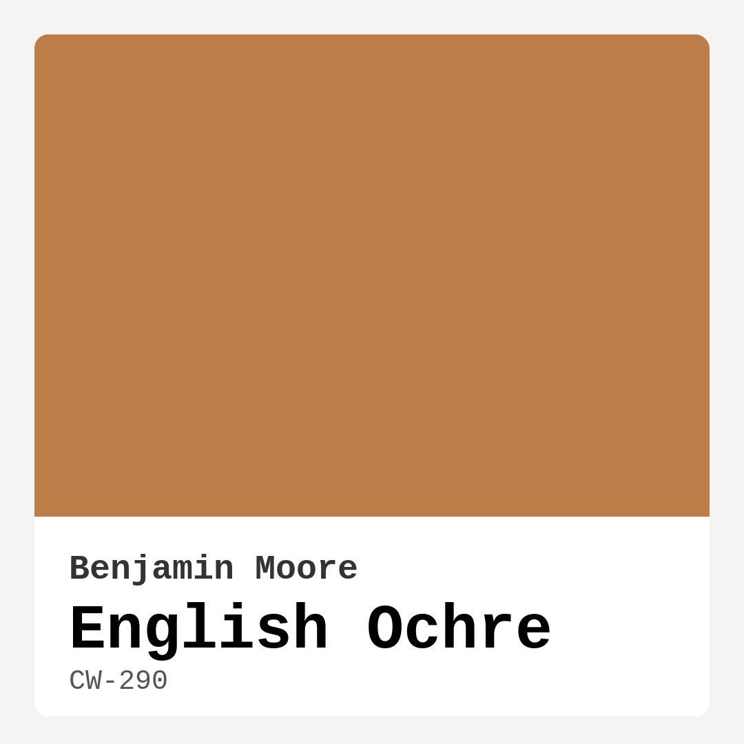
Color Preview & Key Details
| HEX Code | #BD7D48 |
| RGB | 189, 125, 72 |
| LRV | 26.32% |
| Undertone | Red |
| Finish Options | Eggshell, Flat, Matte, Satin |
Imagine stepping into a cozy living room where warmth envelops you like a soft blanket. The walls are painted in a rich, inviting hue, one that feels both classic and modern at the same time. This is the magic of English Ochre by Benjamin Moore, a paint color that can transform any space into a haven of comfort and aesthetic appeal.
English Ochre, with its hex code of #BD7D48, embodies a warm, earthy tone that brings a touch of sophistication to your interiors. Its composition is a beautiful blend of golden undertones that evoke nostalgia while remaining versatile enough to fit into contemporary decor. When you look at this color, you’re not just seeing paint; you’re experiencing a spectrum of emotions that can enhance your home’s ambiance.
One of the standout features of English Ochre is its adaptability. Whether you’re a fan of traditional, rustic, farmhouse, contemporary, or even bohemian styles, this color has a unique ability to complement them all. It serves as a perfect backdrop for your furnishings and accessories, enhancing rather than overwhelming your design choices.
Let’s talk about its practicality. English Ochre has an excellent Light Reflectance Value (LRV) of 26.32%, meaning it reflects a good amount of light while still maintaining its rich character. This makes it suitable for various lighting conditions, whether your room is bathed in natural sunlight or illuminated by soft, ambient lighting in the evening.
When you apply this color to your walls, you’ll find that it typically requires just one or two coats for full coverage, streamlining your painting project. Both beginners and seasoned DIYers will appreciate how easy it is to work with. It brushes on and rolls out smoothly, and the low VOC levels ensure that you’re making an eco-friendly choice for your home.
If you’re worried about English Ochre making smaller rooms feel even more compact, don’t be. While it’s true that this warm, vibrant hue can darken a space, it can also create a cozy and inviting atmosphere. Pair it with plenty of natural light and lighter furnishings to keep the space feeling airy and open. Thoughtful placement of mirrors and light-colored decor can help balance its warmth, making even the coziest of rooms feel spacious and welcoming.
English Ochre shines in finishes like eggshell or satin, which highlight its warm undertones and lend a subtle sheen that reflects light beautifully. If you’re after a more traditional look, go with a flat finish, especially in areas where you want to create a calm, serene environment. These finish options provide flexibility based on the mood you want to set in your space.
Consider this color for your living room, dining room, bedroom, or even your home office. It’s an ideal choice for entryways too, providing a warm welcome to anyone who steps inside. Imagine walking into a house that wraps you in warmth right from the hallway. That’s the impact English Ochre can have.
In terms of decor pairing, English Ochre complements a wide range of furnishings. Picture it against white trim, where the contrast brings out the richness of the color, or alongside brass fixtures that add a touch of elegance. Its versatility means you can mix it with both light and dark pieces, making it an excellent choice for accent walls or entire rooms.
It’s also worth noting that English Ochre has a unique undertone leaning towards red, which adds depth and complexity to its character. This quality means that the color can shift slightly depending on the lighting and surrounding decor, creating a dynamic atmosphere that evolves throughout the day. Testing the paint in your home is essential; observe it next to your existing furniture to see how the undertones interact and reveal themselves in different lighting scenarios.
As a home designer, I can confidently say that English Ochre is a favorite among many designers for its timeless appeal and ability to create a cozy and inviting mood. It’s not just about aesthetics; it’s about how a space makes you feel. This color encourages connection, conversation, and comfort, making it a perfect choice for spaces designed for gathering and relaxation.
If you’re considering sprucing up your home with English Ochre, go ahead and embrace it. The warmth it brings is unmatched, and when paired thoughtfully with the right furnishings and decor styles, it can make your home feel not just lived-in, but loved.
As you embark on your decorating journey, remember that color is not just a visual element; it’s an emotional one. English Ochre invites you to create a space that feels warm and inviting, a canvas where memories can be painted. So, grab that paintbrush and let English Ochre bring your walls to life, creating a backdrop for your unique story.
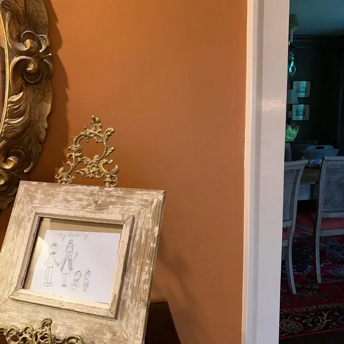
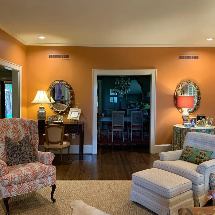
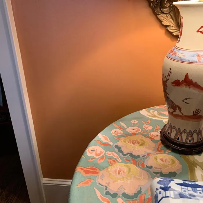
Real Room Photo of English Ochre CW-290
Undertones of English Ochre ?
The undertones of English Ochre are a key aspect of its character, leaning towards Red. These subtle underlying hues are what give the color its depth and complexity. For example, a gray with a blue undertone will feel cooler and more modern, while one with a brown undertone will feel warmer and more traditional. It’s essential to test this paint in your home and observe it next to your existing furniture, flooring, and decor to see how these undertones interact and reveal themselves throughout the day.
HEX value: #BD7D48
RGB code: 189, 125, 72
Is English Ochre Cool or Warm?
English Ochre is considered a warm paint color. This characteristic plays a huge role in the overall feel of a room. Warm colors, like this one, tend to create a cozy, inviting, and energetic atmosphere, making them great for social spaces like living rooms and dining rooms. In contrast, cool colors often evoke a sense of calm and serenity, which is why they are popular in bedrooms and bathrooms. The warmth of English Ochre means it will pair beautifully with corresponding decor elements.
Understanding Color Properties and Interior Design Tips
Hue refers to a specific position on the color wheel, measured in degrees from 0 to 360. Each degree represents a different pure color:
- 0° represents red
- 120° represents green
- 240° represents blue
Saturation describes the intensity or purity of a color and is expressed as a percentage:
- At 0%, the color appears completely desaturated—essentially a shade of gray
- At 100%, the color is at its most vivid and vibrant
Lightness indicates how light or dark a color is, also expressed as a percentage:
- 0% lightness results in black
- 100% lightness results in white
Using Warm Colors in Interior Design
Warm hues—such as reds, oranges, yellows, warm beiges, and greiges—are excellent choices for creating inviting and energetic spaces. These colors are particularly well-suited for:
- Kitchens, living rooms, and bathrooms, where warmth enhances comfort and sociability
- Large rooms, where warm tones can help reduce the sense of emptiness and make the space feel more intimate
For example:
- Warm beige shades provide a cozy, inviting atmosphere, ideal for living rooms, bedrooms, and hallways.
- Warm greige (a mix of beige and gray) offers the warmth of beige with the modern appeal of gray, making it a versatile backdrop for dining areas, bedrooms, and living spaces.
However, be mindful when using warm light tones in rooms with limited natural light. These shades may appear muted or even take on an unpleasant yellowish tint. To avoid a dull or flat appearance:
- Add depth by incorporating richer tones like deep greens, charcoal, or chocolate brown
- Use textured elements such as curtains, rugs, or cushions to bring dimension to the space
Pro Tip: Achieving Harmony with Warm and Cool Color Balance
To create a well-balanced and visually interesting interior, mix warm and cool tones strategically. This contrast adds depth and harmony to your design.
- If your walls feature warm hues, introduce cool-colored accents such as blue or green furniture, artwork, or accessories to create contrast.
- For a polished look, consider using a complementary color scheme, which pairs colors opposite each other on the color wheel (e.g., red with green, orange with blue).
This thoughtful mix not only enhances visual appeal but also creates a space that feels both dynamic and cohesive.
Light Temperature Affects on English Ochre
Natural Light
Natural daylight changes in color temperature as the sun moves across the sky. At sunrise and sunset, the light tends to have a warm, golden tone with a color temperature around 2000 Kelvin (K). As the day progresses and the sun rises higher, the light becomes cooler and more neutral. Around midday, especially when the sky is clear, natural light typically reaches its peak brightness and shifts to a cooler tone, ranging from 5500 to 6500 Kelvin. This midday light is close to what we perceive as pure white or daylight-balanced light.
These shifts in natural light can significantly influence how colors appear in a space, which is why designers often consider both the time of day and the orientation of windows when planning interior color schemes.
Artificial Light
When choosing artificial lighting, pay close attention to the color temperature, measured in Kelvin (K). This determines how warm or cool the light will appear. Lower temperatures, around 2700K, give off a warm, yellow glow often used in living rooms or bedrooms. Higher temperatures, above 5000K, create a cool, bluish light similar to daylight, commonly used in kitchens, offices, or task areas.
Use the slider to see how lighting temperature can affect the appearance of a surface or color throughout a space.


4800K
LRV of English Ochre
The Light Reflectance Value (LRV) of English Ochre is 26.32%, which places it in the Medium colors category. This means it reflect a lot of light. Understanding a paint’s LRV is crucial for predicting how it will look in your space. A higher LRV indicates a lighter color that reflects more light, making rooms feel larger and brighter. A lower LRV signifies a darker color that absorbs more light, creating a cozier, more intimate atmosphere. Always consider the natural and artificial lighting in your room when selecting a paint color based on its LRV.
Detailed Review of English Ochre
Additional Paint Characteristics
Ideal Rooms
Bedroom, Dining Room, Entryway, Home Office, Living Room
Decor Styles
Bohemian, Contemporary, Farmhouse, Rustic, Traditional
Coverage
Good (1–2 Coats), Touch-Up Friendly
Ease of Application
Beginner Friendly, Brush Smooth, Roller-Ready
Washability
Washable, Wipeable
VOC Level
Eco-Certified, Low VOC
Best Use
Accent Wall, Interior Walls, Open Concept Spaces
Room Suitability
Bedroom, Dining Room, Entryway, Home Office, Living Room
Tone Tag
Earthy, Muted, Warm
Finish Type
Eggshell, Satin
Paint Performance
Easy Touch-Up, High Coverage, Low Odor
Use Cases
Best for Open Concept, Classic Favorite, Designer Favorite
Mood
Cozy, Inviting, Warm
Trim Pairing
Complements Brass Fixtures, Pairs with White Dove
English Ochre is a paint color that seamlessly blends history and modernity. Its warm and inviting shade works beautifully in various lighting conditions, giving it a dynamic quality that can shift from cozy to sophisticated. When applied, it provides excellent coverage, typically requiring just one to two coats for a flawless finish. This makes it a great choice for DIY enthusiasts and professionals alike.
Applying English Ochre is a breeze, whether you choose to roll it on or brush it. It’s particularly forgiving, allowing for easy touch-ups when needed. The color pairs wonderfully with both light and dark furnishings, making it an ideal choice for accent walls or entire rooms. Overall, English Ochre is not just a paint; it’s an invitation to create an atmosphere that feels warm and welcoming, making it perfect for spaces designed for gathering and relaxation.
Pros & Cons of CW-290 English Ochre
Pros
Cons
Colors that go with Benjamin Moore English Ochre
FAQ on CW-290 English Ochre
Can English Ochre be used in small rooms?
Absolutely! While English Ochre is a warm color that can darken smaller spaces, it can also create a cozy and inviting atmosphere. To maximize its effect, pair it with plenty of natural light and lighter furnishings to keep the space feeling open and airy. When used thoughtfully, it can lend character and charm to even the coziest of rooms.
What finishes work best with English Ochre?
English Ochre shines in a variety of finishes, but it’s particularly stunning in eggshell or satin. These finishes enhance its warm tones while providing a subtle sheen that reflects light beautifully. For a more traditional look, consider using it in a flat finish, especially in spaces where you want to create a calm and cozy environment.
Comparisons English Ochre with other colors
English Ochre CW-290 vs Coral Clay SW 9005
| Attribute | English Ochre CW-290 | Coral Clay SW 9005 |
|---|---|---|
| Color Name | English Ochre CW-290 | Coral Clay SW 9005 |
| Color | ||
| Hue | Red | Red |
| Brightness | Medium | Medium |
| RGB | 189, 125, 72 | 191, 121, 110 |
| LRV | 26.32% | 6% |
| Finish Type | Eggshell, Satin | Eggshell, Matte, Satin |
| Finish Options | Eggshell, Flat, Matte, Satin | Eggshell, Matte, Satin |
| Ideal Rooms | Bedroom, Dining Room, Entryway, Home Office, Living Room | Bedroom, Dining Room, Home Office, Living Room |
| Decor Styles | Bohemian, Contemporary, Farmhouse, Rustic, Traditional | Bohemian, Coastal, Modern Farmhouse, Rustic |
| Coverage | Good (1–2 Coats), Touch-Up Friendly | Good (1–2 Coats) |
| Ease of Application | Beginner Friendly, Brush Smooth, Roller-Ready | Beginner Friendly, Brush Smooth, Roller-Ready |
| Washability | Washable, Wipeable | Washable, Wipeable |
| Room Suitability | Bedroom, Dining Room, Entryway, Home Office, Living Room | Bedroom, Dining Room, Home Office, Living Room |
| Tone | Earthy, Muted, Warm | Earthy, Muted, Warm |
| Paint Performance | Easy Touch-Up, High Coverage, Low Odor | Easy Touch-Up, High Coverage, Low Odor |
English Ochre CW-290 vs Baked Clay SW 6340
| Attribute | English Ochre CW-290 | Baked Clay SW 6340 |
|---|---|---|
| Color Name | English Ochre CW-290 | Baked Clay SW 6340 |
| Color | ||
| Hue | Red | Red |
| Brightness | Medium | Medium |
| RGB | 189, 125, 72 | 193, 120, 92 |
| LRV | 26.32% | 30% |
| Finish Type | Eggshell, Satin | Matte, Satin |
| Finish Options | Eggshell, Flat, Matte, Satin | Eggshell, Matte, Satin |
| Ideal Rooms | Bedroom, Dining Room, Entryway, Home Office, Living Room | Bedroom, Dining Room, Entryway, Home Office, Kitchen, Living Room |
| Decor Styles | Bohemian, Contemporary, Farmhouse, Rustic, Traditional | Bohemian, Mediterranean, Modern Farmhouse, Rustic, Transitional |
| Coverage | Good (1–2 Coats), Touch-Up Friendly | Good (1–2 Coats), Touch-Up Friendly |
| Ease of Application | Beginner Friendly, Brush Smooth, Roller-Ready | Beginner Friendly, Brush Smooth, Fast-Drying, Roller-Ready |
| Washability | Washable, Wipeable | Washable, Wipeable |
| Room Suitability | Bedroom, Dining Room, Entryway, Home Office, Living Room | Bedroom, Dining Room, Entryway, Home Office, Living Room |
| Tone | Earthy, Muted, Warm | Earthy, Muted, Warm |
| Paint Performance | Easy Touch-Up, High Coverage, Low Odor | Easy Touch-Up, Low Odor, Quick Drying |
English Ochre CW-290 vs Mellow Mauve SW 0039
| Attribute | English Ochre CW-290 | Mellow Mauve SW 0039 |
|---|---|---|
| Color Name | English Ochre CW-290 | Mellow Mauve SW 0039 |
| Color | ||
| Hue | Red | Red |
| Brightness | Medium | Medium |
| RGB | 189, 125, 72 | 196, 149, 122 |
| LRV | 26.32% | 24% |
| Finish Type | Eggshell, Satin | Eggshell, Matte, Satin |
| Finish Options | Eggshell, Flat, Matte, Satin | Eggshell, Matte, Satin |
| Ideal Rooms | Bedroom, Dining Room, Entryway, Home Office, Living Room | Bedroom, Dining Room, Kitchen, Living Room, Nursery |
| Decor Styles | Bohemian, Contemporary, Farmhouse, Rustic, Traditional | Bohemian, Modern, Rustic, Traditional |
| Coverage | Good (1–2 Coats), Touch-Up Friendly | Good (1–2 Coats), Touch-Up Friendly |
| Ease of Application | Beginner Friendly, Brush Smooth, Roller-Ready | Beginner Friendly, Brush Smooth, Roller-Ready |
| Washability | Washable, Wipeable | Scrubbable, Washable, Wipeable |
| Room Suitability | Bedroom, Dining Room, Entryway, Home Office, Living Room | Bedroom, Dining Room, Living Room, Nursery |
| Tone | Earthy, Muted, Warm | Dusty, Earthy, Muted, Warm |
| Paint Performance | Easy Touch-Up, High Coverage, Low Odor | Easy Touch-Up, Low Odor, Quick Drying |
English Ochre CW-290 vs Chivalry Copper SW 6353
| Attribute | English Ochre CW-290 | Chivalry Copper SW 6353 |
|---|---|---|
| Color Name | English Ochre CW-290 | Chivalry Copper SW 6353 |
| Color | ||
| Hue | Red | Red |
| Brightness | Medium | Medium |
| RGB | 189, 125, 72 | 212, 150, 110 |
| LRV | 26.32% | 24% |
| Finish Type | Eggshell, Satin | Eggshell, Satin |
| Finish Options | Eggshell, Flat, Matte, Satin | Eggshell, Satin, Semi-Gloss |
| Ideal Rooms | Bedroom, Dining Room, Entryway, Home Office, Living Room | Bedroom, Dining Room, Entryway, Home Office, Living Room |
| Decor Styles | Bohemian, Contemporary, Farmhouse, Rustic, Traditional | Farmhouse, Modern, Rustic, Transitional |
| Coverage | Good (1–2 Coats), Touch-Up Friendly | Good (1–2 Coats), Touch-Up Friendly |
| Ease of Application | Beginner Friendly, Brush Smooth, Roller-Ready | Beginner Friendly, Brush Smooth, Fast-Drying, Roller-Ready |
| Washability | Washable, Wipeable | Washable, Wipeable |
| Room Suitability | Bedroom, Dining Room, Entryway, Home Office, Living Room | Bedroom, Dining Room, Home Office, Living Room |
| Tone | Earthy, Muted, Warm | Earthy, Muted, Warm |
| Paint Performance | Easy Touch-Up, High Coverage, Low Odor | Easy Touch-Up, High Coverage, Low Odor, Quick Drying |
English Ochre CW-290 vs Windswept Canyon SW 9010
| Attribute | English Ochre CW-290 | Windswept Canyon SW 9010 |
|---|---|---|
| Color Name | English Ochre CW-290 | Windswept Canyon SW 9010 |
| Color | ||
| Hue | Red | Red |
| Brightness | Medium | Medium |
| RGB | 189, 125, 72 | 219, 164, 128 |
| LRV | 26.32% | 0% |
| Finish Type | Eggshell, Satin | Eggshell, Matte, Satin |
| Finish Options | Eggshell, Flat, Matte, Satin | Eggshell, Matte, Satin |
| Ideal Rooms | Bedroom, Dining Room, Entryway, Home Office, Living Room | Bedroom, Dining Room, Home Office, Kitchen, Living Room |
| Decor Styles | Bohemian, Contemporary, Farmhouse, Rustic, Traditional | Bohemian, Coastal, Modern Farmhouse, Rustic, Transitional |
| Coverage | Good (1–2 Coats), Touch-Up Friendly | Good (1–2 Coats) |
| Ease of Application | Beginner Friendly, Brush Smooth, Roller-Ready | Beginner Friendly, Brush Smooth, Fast-Drying, Roller-Ready |
| Washability | Washable, Wipeable | Highly Washable, Washable |
| Room Suitability | Bedroom, Dining Room, Entryway, Home Office, Living Room | Bedroom, Dining Room, Home Office, Kitchen, Living Room |
| Tone | Earthy, Muted, Warm | Earthy, Muted, Warm |
| Paint Performance | Easy Touch-Up, High Coverage, Low Odor | High Coverage, Low Odor, Quick Drying |
English Ochre CW-290 vs Navel SW 6887
| Attribute | English Ochre CW-290 | Navel SW 6887 |
|---|---|---|
| Color Name | English Ochre CW-290 | Navel SW 6887 |
| Color | ||
| Hue | Red | Red |
| Brightness | Medium | Medium |
| RGB | 189, 125, 72 | 236, 132, 48 |
| LRV | 26.32% | 4% |
| Finish Type | Eggshell, Satin | Satin, Semi-Gloss |
| Finish Options | Eggshell, Flat, Matte, Satin | Eggshell, Satin, Semi-Gloss |
| Ideal Rooms | Bedroom, Dining Room, Entryway, Home Office, Living Room | Dining Room, Entryway, Home Office, Kitchen, Living Room |
| Decor Styles | Bohemian, Contemporary, Farmhouse, Rustic, Traditional | Bohemian, Contemporary, Modern, Rustic |
| Coverage | Good (1–2 Coats), Touch-Up Friendly | Good (1–2 Coats), Touch-Up Friendly |
| Ease of Application | Beginner Friendly, Brush Smooth, Roller-Ready | Beginner Friendly, Brush Smooth, Fast-Drying, Roller-Ready |
| Washability | Washable, Wipeable | Washable, Wipeable |
| Room Suitability | Bedroom, Dining Room, Entryway, Home Office, Living Room | Dining Room, Home Office, Kitchen, Living Room |
| Tone | Earthy, Muted, Warm | Bold, Earthy, Warm |
| Paint Performance | Easy Touch-Up, High Coverage, Low Odor | Low Odor, Quick Drying, Scuff Resistant |
English Ochre CW-290 vs Invigorate SW 6886
| Attribute | English Ochre CW-290 | Invigorate SW 6886 |
|---|---|---|
| Color Name | English Ochre CW-290 | Invigorate SW 6886 |
| Color | ||
| Hue | Red | Red |
| Brightness | Medium | Medium |
| RGB | 189, 125, 72 | 228, 114, 55 |
| LRV | 26.32% | 40% |
| Finish Type | Eggshell, Satin | Satin, Semi-Gloss |
| Finish Options | Eggshell, Flat, Matte, Satin | Matte, Satin, Semi-Gloss |
| Ideal Rooms | Bedroom, Dining Room, Entryway, Home Office, Living Room | Dining Room, Entryway, Home Office, Kitchen, Living Room |
| Decor Styles | Bohemian, Contemporary, Farmhouse, Rustic, Traditional | Bohemian, Eclectic, Modern, Transitional |
| Coverage | Good (1–2 Coats), Touch-Up Friendly | Good (1–2 Coats), Touch-Up Friendly |
| Ease of Application | Beginner Friendly, Brush Smooth, Roller-Ready | Beginner Friendly, Brush Smooth, Fast-Drying, Roller-Ready |
| Washability | Washable, Wipeable | Highly Washable, Washable |
| Room Suitability | Bedroom, Dining Room, Entryway, Home Office, Living Room | Dining Room, Home Office, Kitchen, Living Room |
| Tone | Earthy, Muted, Warm | Bold, Earthy, Warm |
| Paint Performance | Easy Touch-Up, High Coverage, Low Odor | Easy Touch-Up, High Coverage, Low Odor, Quick Drying |
English Ochre CW-290 vs Knockout Orange SW 6885
| Attribute | English Ochre CW-290 | Knockout Orange SW 6885 |
|---|---|---|
| Color Name | English Ochre CW-290 | Knockout Orange SW 6885 |
| Color | ||
| Hue | Red | Red |
| Brightness | Medium | Medium |
| RGB | 189, 125, 72 | 225, 111, 62 |
| LRV | 26.32% | 45% |
| Finish Type | Eggshell, Satin | Matte, Satin, Semi-Gloss |
| Finish Options | Eggshell, Flat, Matte, Satin | Matte, Satin, Semi-Gloss |
| Ideal Rooms | Bedroom, Dining Room, Entryway, Home Office, Living Room | Dining Room, Home Office, Kids Room, Kitchen, Living Room |
| Decor Styles | Bohemian, Contemporary, Farmhouse, Rustic, Traditional | Contemporary, Eclectic, Industrial, Modern, Transitional |
| Coverage | Good (1–2 Coats), Touch-Up Friendly | Good (1–2 Coats), High Hide, Touch-Up Friendly |
| Ease of Application | Beginner Friendly, Brush Smooth, Roller-Ready | Beginner Friendly, Brush Smooth, Fast-Drying, Low Splatter, Roller-Ready |
| Washability | Washable, Wipeable | Scrubbable, Stain Resistant, Washable |
| Room Suitability | Bedroom, Dining Room, Entryway, Home Office, Living Room | Dining Room, Entryway, Kids Room, Kitchen, Living Room |
| Tone | Earthy, Muted, Warm | Bold, Inviting, Warm |
| Paint Performance | Easy Touch-Up, High Coverage, Low Odor | Easy Touch-Up, High Coverage, Long Lasting, Scuff Resistant |
English Ochre CW-290 vs Autumnal SW 6361
| Attribute | English Ochre CW-290 | Autumnal SW 6361 |
|---|---|---|
| Color Name | English Ochre CW-290 | Autumnal SW 6361 |
| Color | ||
| Hue | Red | Red |
| Brightness | Medium | Medium |
| RGB | 189, 125, 72 | 205, 140, 93 |
| LRV | 26.32% | 24% |
| Finish Type | Eggshell, Satin | Eggshell, Matte |
| Finish Options | Eggshell, Flat, Matte, Satin | Eggshell, Flat, Matte, Satin |
| Ideal Rooms | Bedroom, Dining Room, Entryway, Home Office, Living Room | Bedroom, Dining Room, Home Office, Living Room |
| Decor Styles | Bohemian, Contemporary, Farmhouse, Rustic, Traditional | Bohemian, Modern Farmhouse, Rustic, Traditional |
| Coverage | Good (1–2 Coats), Touch-Up Friendly | Good (1–2 Coats) |
| Ease of Application | Beginner Friendly, Brush Smooth, Roller-Ready | Beginner Friendly, Brush Smooth, Fast-Drying, Roller-Ready |
| Washability | Washable, Wipeable | Washable, Wipeable |
| Room Suitability | Bedroom, Dining Room, Entryway, Home Office, Living Room | Bedroom, Dining Room, Home Office, Living Room |
| Tone | Earthy, Muted, Warm | Earthy, Muted, Warm |
| Paint Performance | Easy Touch-Up, High Coverage, Low Odor | Easy Touch-Up, Low Odor, Quick Drying |
English Ochre CW-290 vs Outgoing Orange SW 6641
| Attribute | English Ochre CW-290 | Outgoing Orange SW 6641 |
|---|---|---|
| Color Name | English Ochre CW-290 | Outgoing Orange SW 6641 |
| Color | ||
| Hue | Red | Red |
| Brightness | Medium | Medium |
| RGB | 189, 125, 72 | 230, 149, 95 |
| LRV | 26.32% | 45% |
| Finish Type | Eggshell, Satin | Satin, Semi-Gloss |
| Finish Options | Eggshell, Flat, Matte, Satin | Eggshell, Flat, Satin, Semi-Gloss |
| Ideal Rooms | Bedroom, Dining Room, Entryway, Home Office, Living Room | Dining Room, Entryway, Kitchen, Living Room |
| Decor Styles | Bohemian, Contemporary, Farmhouse, Rustic, Traditional | Bohemian, Eclectic, Modern, Transitional |
| Coverage | Good (1–2 Coats), Touch-Up Friendly | Good (1–2 Coats), Touch-Up Friendly |
| Ease of Application | Beginner Friendly, Brush Smooth, Roller-Ready | Beginner Friendly, Brush Smooth, Fast-Drying, Roller-Ready |
| Washability | Washable, Wipeable | Highly Washable, Washable |
| Room Suitability | Bedroom, Dining Room, Entryway, Home Office, Living Room | Dining Room, Entryway, Kitchen, Living Room |
| Tone | Earthy, Muted, Warm | Bold, Warm |
| Paint Performance | Easy Touch-Up, High Coverage, Low Odor | High Coverage, Low Odor, Quick Drying |
Official Page of Benjamin Moore English Ochre CW-290