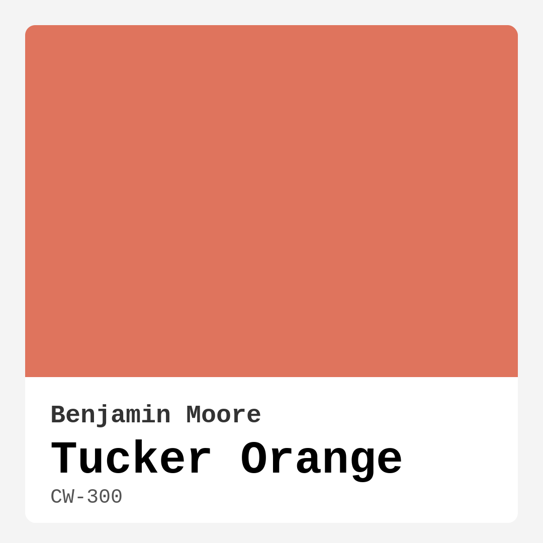
Color Preview & Key Details
| HEX Code | #DF745D |
| RGB | 223, 116, 93 |
| LRV | 29.26% |
| Undertone | Red |
| Finish Options | Eggshell, Matte, Satin |
Imagine stepping into your living room and feeling an immediate sense of warmth wash over you, a color wrapping you in comfort and creativity. That’s the magic of Tucker Orange, a captivating hue from Benjamin Moore that invites you to breathe a little deeper and smile a little wider. Its blend of soft coral and peach tones creates a stunning balance between vibrancy and serenity, making it a wonderful choice for any home looking to add a splash of life.
Tucker Orange is more than just a color; it’s an experience. With an RGB composition of 223, 116, and 93, it captures that perfect setting sun—warm and inviting, yet striking enough to stand out. The light reflection value of 29.26% means it reflects a good amount of light, adding a brightness to your space without the harshness that some colors can bring. It’s ideal for homeowners who want to create an uplifting atmosphere, whether it’s in a cozy bedroom or a lively home office.
One of the best parts about Tucker Orange is its versatility. It fits beautifully into a range of decor styles—modern, bohemian, transitional, or eclectic. This color has a unique way of adapting, allowing you to express your personality through your space. Whether you’re looking to create an accent wall that pops or paint an entire room, Tucker Orange delivers a warm, bold statement that feels both fresh and timeless.
When you apply Tucker Orange, you’ll find that it goes on smoothly and dries evenly. It’s beginner-friendly, which means even if you’re not a DIY pro, you’ll have no trouble achieving that stylish look you desire. One to two coats will usually do the trick for optimal coverage, transforming your walls into vibrant canvases that invite relaxation and creativity. Plus, its washability means you don’t have to worry too much about the little messes that can happen in high-traffic areas.
Now, you might wonder how Tucker Orange pairs with other colors. It’s quite the chameleon! For a crisp and clean look, consider teaming it up with whites like White Dove or Simply White. This combination creates a refreshing contrast that can brighten up any room. If you prefer a more muted palette, soft blues or grays can complement Tucker Orange beautifully, grounding the vibrancy with a cool touch. And let’s not forget about the warm accents! Brass fixtures or wooden elements can enhance the cozy vibe, making your space feel inviting yet sophisticated.
If you’re contemplating its use in smaller spaces, you’re in luck! Tucker Orange can bring warmth and energy without feeling overwhelming. Just pay attention to the natural light your space receives. In well-lit areas, this color can create a cheerful atmosphere that feels expansive, while in dimmer rooms, it still retains its inviting charm. Pair it with lighter trims to balance out the warmth and keep the space feeling open.
With an undertone leaning towards red, Tucker Orange’s character is rich and complex. This is where testing becomes crucial. How does it look next to your existing furniture? What about your flooring or decor? The undertones will reveal themselves throughout the day, shifting under natural and artificial lights. These subtleties are what make the color so special, and they’ll guide your final decision.
Think of how the light affects it; under bright daylight, Tucker Orange radiates energy and positivity. As the sun sets, it softens into a cozy glow, perfect for creating a welcoming ambiance as you unwind after a long day. This dynamic quality gives your space a life of its own, adapting beautifully to the time of day.
While Tucker Orange is a designer favorite, it’s essential to consider its potential cons. It may be a bit bold for conservative tastes, and like any lively color, it can show wear in high-traffic areas. Regular touch-ups may be necessary in spaces that see a lot of action. However, the vibrancy it brings can far outweigh those minor upkeep concerns.
If you’re looking for inspiration on where to use Tucker Orange, consider the living room, bedroom, dining room, or home office. It’s a fantastic choice for an accent wall that draws the eye or even as a full-room color that envelops you in warmth. Its cozy and inviting mood makes it a go-to for gathering spaces, where friends and family can feel relaxed and energized at the same time.
For those wanting to explore similar shades or create a color story, you won’t be disappointed. Colors like Coral Blush or Sunset Glow can provide beautiful alternatives or complementary options. If you’re feeling adventurous, darker shades like 2010-10 or 2169-20 can anchor the space, while lighter shades like 031 can add a soft touch to your color palette.
As you think about your next project, remember that the right color can elevate your home in ways beyond aesthetics. Tucker Orange is not just about being seen; it’s about feeling something. It’s a color that invites you to create, to gather, and to enjoy. So, take a moment to envision how this beautiful hue could transform your space. Embrace the warmth, the creativity, and the joyous atmosphere it brings, and let Tucker Orange be the heartbeat of your home.
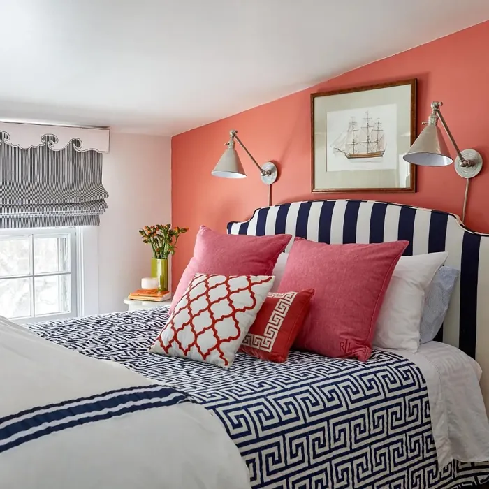
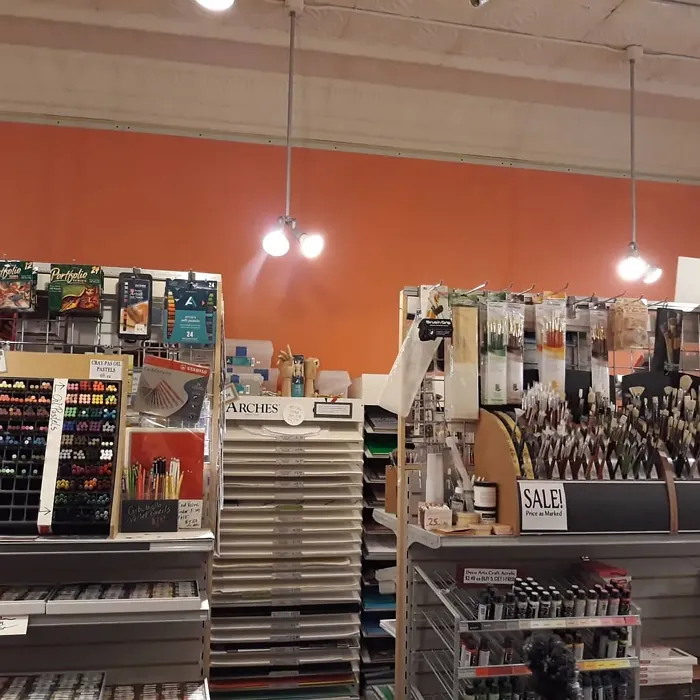
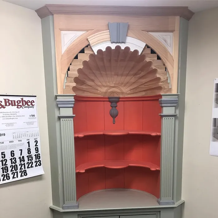
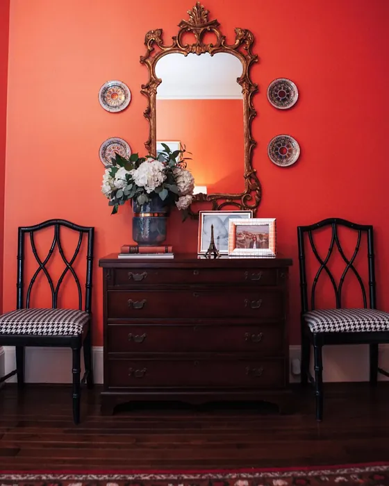
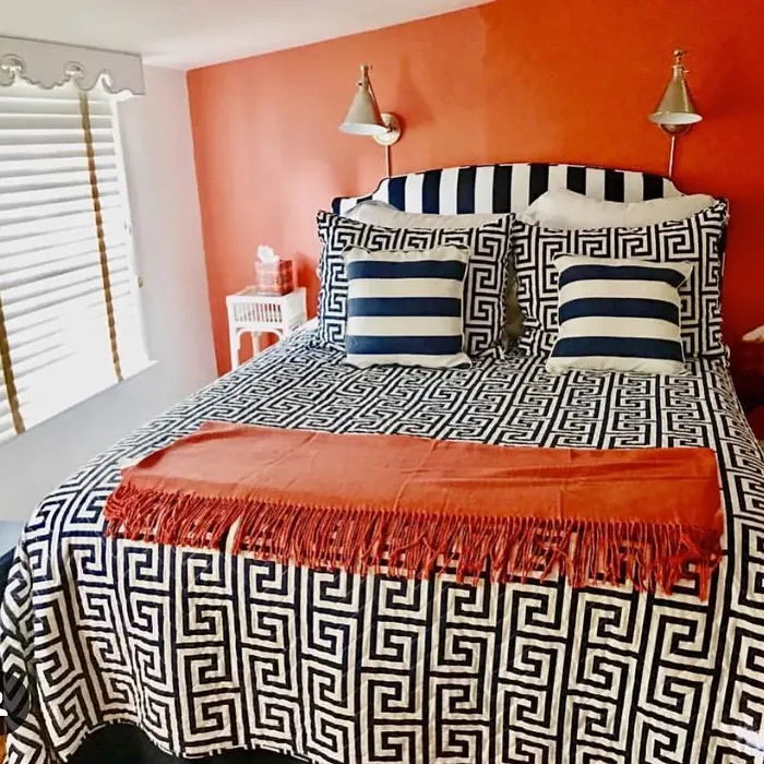
Real Room Photo of Tucker Orange CW-300
Undertones of Tucker Orange ?
The undertones of Tucker Orange are a key aspect of its character, leaning towards Red. These subtle underlying hues are what give the color its depth and complexity. For example, a gray with a blue undertone will feel cooler and more modern, while one with a brown undertone will feel warmer and more traditional. It’s essential to test this paint in your home and observe it next to your existing furniture, flooring, and decor to see how these undertones interact and reveal themselves throughout the day.
HEX value: #DF745D
RGB code: 223, 116, 93
Is Tucker Orange Cool or Warm?
Tucker Orange is distinctly warm, radiating energy and comfort. It’s perfect for spaces where you want to create a lively yet relaxed environment, making it ideal for gathering areas like living rooms or dining spaces.
Understanding Color Properties and Interior Design Tips
Hue refers to a specific position on the color wheel, measured in degrees from 0 to 360. Each degree represents a different pure color:
- 0° represents red
- 120° represents green
- 240° represents blue
Saturation describes the intensity or purity of a color and is expressed as a percentage:
- At 0%, the color appears completely desaturated—essentially a shade of gray
- At 100%, the color is at its most vivid and vibrant
Lightness indicates how light or dark a color is, also expressed as a percentage:
- 0% lightness results in black
- 100% lightness results in white
Using Warm Colors in Interior Design
Warm hues—such as reds, oranges, yellows, warm beiges, and greiges—are excellent choices for creating inviting and energetic spaces. These colors are particularly well-suited for:
- Kitchens, living rooms, and bathrooms, where warmth enhances comfort and sociability
- Large rooms, where warm tones can help reduce the sense of emptiness and make the space feel more intimate
For example:
- Warm beige shades provide a cozy, inviting atmosphere, ideal for living rooms, bedrooms, and hallways.
- Warm greige (a mix of beige and gray) offers the warmth of beige with the modern appeal of gray, making it a versatile backdrop for dining areas, bedrooms, and living spaces.
However, be mindful when using warm light tones in rooms with limited natural light. These shades may appear muted or even take on an unpleasant yellowish tint. To avoid a dull or flat appearance:
- Add depth by incorporating richer tones like deep greens, charcoal, or chocolate brown
- Use textured elements such as curtains, rugs, or cushions to bring dimension to the space
Pro Tip: Achieving Harmony with Warm and Cool Color Balance
To create a well-balanced and visually interesting interior, mix warm and cool tones strategically. This contrast adds depth and harmony to your design.
- If your walls feature warm hues, introduce cool-colored accents such as blue or green furniture, artwork, or accessories to create contrast.
- For a polished look, consider using a complementary color scheme, which pairs colors opposite each other on the color wheel (e.g., red with green, orange with blue).
This thoughtful mix not only enhances visual appeal but also creates a space that feels both dynamic and cohesive.
Light Temperature Affects on Tucker Orange
Natural Light
Natural daylight changes in color temperature as the sun moves across the sky. At sunrise and sunset, the light tends to have a warm, golden tone with a color temperature around 2000 Kelvin (K). As the day progresses and the sun rises higher, the light becomes cooler and more neutral. Around midday, especially when the sky is clear, natural light typically reaches its peak brightness and shifts to a cooler tone, ranging from 5500 to 6500 Kelvin. This midday light is close to what we perceive as pure white or daylight-balanced light.
These shifts in natural light can significantly influence how colors appear in a space, which is why designers often consider both the time of day and the orientation of windows when planning interior color schemes.
Artificial Light
When choosing artificial lighting, pay close attention to the color temperature, measured in Kelvin (K). This determines how warm or cool the light will appear. Lower temperatures, around 2700K, give off a warm, yellow glow often used in living rooms or bedrooms. Higher temperatures, above 5000K, create a cool, bluish light similar to daylight, commonly used in kitchens, offices, or task areas.
Use the slider to see how lighting temperature can affect the appearance of a surface or color throughout a space.


4800K
LRV of Tucker Orange
The Light Reflectance Value (LRV) of Tucker Orange is 29.26%, which places it in the Medium colors category. This means it reflect a lot of light. Understanding a paint’s LRV is crucial for predicting how it will look in your space. A higher LRV indicates a lighter color that reflects more light, making rooms feel larger and brighter. A lower LRV signifies a darker color that absorbs more light, creating a cozier, more intimate atmosphere. Always consider the natural and artificial lighting in your room when selecting a paint color based on its LRV.
Detailed Review of Tucker Orange
Additional Paint Characteristics
Ideal Rooms
Bedroom, Dining Room, Home Office, Living Room
Decor Styles
Bohemian, Eclectic, Modern, Transitional
Coverage
Good (1–2 Coats), Touch-Up Friendly
Ease of Application
Beginner Friendly, Brush Smooth, Roller-Ready
Washability
Washable, Wipeable
VOC Level
Low VOC
Best Use
Accent Wall, Furniture, Interior Walls
Room Suitability
Bedroom, Dining Room, Home Office, Living Room
Tone Tag
Bold, Earthy, Warm
Finish Type
Eggshell, Satin
Paint Performance
Easy Touch-Up, Low Odor, Quick Drying
Use Cases
Best for Open Concept, Best for Rentals, Designer Favorite
Mood
Cozy, Energizing, Inviting
Trim Pairing
Complements Brass Fixtures, Good with Wood Trim, Pairs with White Dove
Tucker Orange is a delightful choice for anyone looking to elevate their space with a splash of color that feels both fresh and timeless. When applied, it provides a warm and cheerful vibe that can brighten up any room. Its versatility allows it to work beautifully in various decor styles, from modern to bohemian. The application process is smooth, and the color dries evenly, reducing the chances of streaks or uneven patches. While it requires one to two coats for optimal coverage, the result is worth the effort, transforming spaces into vibrant havens that invite relaxation and creativity. Whether you’re accenting a wall or giving a room a full makeover, Tucker Orange is sure to impress.
Pros & Cons of CW-300 Tucker Orange
Pros
Cons
Colors that go with Benjamin Moore Tucker Orange
FAQ on CW-300 Tucker Orange
Is Tucker Orange suitable for small spaces?
Absolutely! Tucker Orange can bring warmth and energy to small spaces, making them feel more inviting. Just be mindful of the amount of natural light the space receives; in well-lit areas, it can create a cheerful atmosphere without feeling cramped. Consider pairing it with lighter trims to balance the warmth.
How does Tucker Orange pair with other colors?
Tucker Orange pairs beautifully with a range of colors. For a fresh look, consider combining it with whites like White Dove or Simply White. It also works well with soft blues or grays for a more muted palette. Adding accents in brass or wood can enhance its warmth, making it a versatile choice for your decor.
Comparisons Tucker Orange with other colors
Tucker Orange CW-300 vs Coral Clay SW 9005
| Attribute | Tucker Orange CW-300 | Coral Clay SW 9005 |
|---|---|---|
| Color Name | Tucker Orange CW-300 | Coral Clay SW 9005 |
| Color | ||
| Hue | Red | Red |
| Brightness | Medium | Medium |
| RGB | 223, 116, 93 | 191, 121, 110 |
| LRV | 29.26% | 6% |
| Finish Type | Eggshell, Satin | Eggshell, Matte, Satin |
| Finish Options | Eggshell, Matte, Satin | Eggshell, Matte, Satin |
| Ideal Rooms | Bedroom, Dining Room, Home Office, Living Room | Bedroom, Dining Room, Home Office, Living Room |
| Decor Styles | Bohemian, Eclectic, Modern, Transitional | Bohemian, Coastal, Modern Farmhouse, Rustic |
| Coverage | Good (1–2 Coats), Touch-Up Friendly | Good (1–2 Coats) |
| Ease of Application | Beginner Friendly, Brush Smooth, Roller-Ready | Beginner Friendly, Brush Smooth, Roller-Ready |
| Washability | Washable, Wipeable | Washable, Wipeable |
| Room Suitability | Bedroom, Dining Room, Home Office, Living Room | Bedroom, Dining Room, Home Office, Living Room |
| Tone | Bold, Earthy, Warm | Earthy, Muted, Warm |
| Paint Performance | Easy Touch-Up, Low Odor, Quick Drying | Easy Touch-Up, High Coverage, Low Odor |
Tucker Orange CW-300 vs Baked Clay SW 6340
| Attribute | Tucker Orange CW-300 | Baked Clay SW 6340 |
|---|---|---|
| Color Name | Tucker Orange CW-300 | Baked Clay SW 6340 |
| Color | ||
| Hue | Red | Red |
| Brightness | Medium | Medium |
| RGB | 223, 116, 93 | 193, 120, 92 |
| LRV | 29.26% | 30% |
| Finish Type | Eggshell, Satin | Matte, Satin |
| Finish Options | Eggshell, Matte, Satin | Eggshell, Matte, Satin |
| Ideal Rooms | Bedroom, Dining Room, Home Office, Living Room | Bedroom, Dining Room, Entryway, Home Office, Kitchen, Living Room |
| Decor Styles | Bohemian, Eclectic, Modern, Transitional | Bohemian, Mediterranean, Modern Farmhouse, Rustic, Transitional |
| Coverage | Good (1–2 Coats), Touch-Up Friendly | Good (1–2 Coats), Touch-Up Friendly |
| Ease of Application | Beginner Friendly, Brush Smooth, Roller-Ready | Beginner Friendly, Brush Smooth, Fast-Drying, Roller-Ready |
| Washability | Washable, Wipeable | Washable, Wipeable |
| Room Suitability | Bedroom, Dining Room, Home Office, Living Room | Bedroom, Dining Room, Entryway, Home Office, Living Room |
| Tone | Bold, Earthy, Warm | Earthy, Muted, Warm |
| Paint Performance | Easy Touch-Up, Low Odor, Quick Drying | Easy Touch-Up, Low Odor, Quick Drying |
Tucker Orange CW-300 vs Mellow Mauve SW 0039
| Attribute | Tucker Orange CW-300 | Mellow Mauve SW 0039 |
|---|---|---|
| Color Name | Tucker Orange CW-300 | Mellow Mauve SW 0039 |
| Color | ||
| Hue | Red | Red |
| Brightness | Medium | Medium |
| RGB | 223, 116, 93 | 196, 149, 122 |
| LRV | 29.26% | 24% |
| Finish Type | Eggshell, Satin | Eggshell, Matte, Satin |
| Finish Options | Eggshell, Matte, Satin | Eggshell, Matte, Satin |
| Ideal Rooms | Bedroom, Dining Room, Home Office, Living Room | Bedroom, Dining Room, Kitchen, Living Room, Nursery |
| Decor Styles | Bohemian, Eclectic, Modern, Transitional | Bohemian, Modern, Rustic, Traditional |
| Coverage | Good (1–2 Coats), Touch-Up Friendly | Good (1–2 Coats), Touch-Up Friendly |
| Ease of Application | Beginner Friendly, Brush Smooth, Roller-Ready | Beginner Friendly, Brush Smooth, Roller-Ready |
| Washability | Washable, Wipeable | Scrubbable, Washable, Wipeable |
| Room Suitability | Bedroom, Dining Room, Home Office, Living Room | Bedroom, Dining Room, Living Room, Nursery |
| Tone | Bold, Earthy, Warm | Dusty, Earthy, Muted, Warm |
| Paint Performance | Easy Touch-Up, Low Odor, Quick Drying | Easy Touch-Up, Low Odor, Quick Drying |
Tucker Orange CW-300 vs Chivalry Copper SW 6353
| Attribute | Tucker Orange CW-300 | Chivalry Copper SW 6353 |
|---|---|---|
| Color Name | Tucker Orange CW-300 | Chivalry Copper SW 6353 |
| Color | ||
| Hue | Red | Red |
| Brightness | Medium | Medium |
| RGB | 223, 116, 93 | 212, 150, 110 |
| LRV | 29.26% | 24% |
| Finish Type | Eggshell, Satin | Eggshell, Satin |
| Finish Options | Eggshell, Matte, Satin | Eggshell, Satin, Semi-Gloss |
| Ideal Rooms | Bedroom, Dining Room, Home Office, Living Room | Bedroom, Dining Room, Entryway, Home Office, Living Room |
| Decor Styles | Bohemian, Eclectic, Modern, Transitional | Farmhouse, Modern, Rustic, Transitional |
| Coverage | Good (1–2 Coats), Touch-Up Friendly | Good (1–2 Coats), Touch-Up Friendly |
| Ease of Application | Beginner Friendly, Brush Smooth, Roller-Ready | Beginner Friendly, Brush Smooth, Fast-Drying, Roller-Ready |
| Washability | Washable, Wipeable | Washable, Wipeable |
| Room Suitability | Bedroom, Dining Room, Home Office, Living Room | Bedroom, Dining Room, Home Office, Living Room |
| Tone | Bold, Earthy, Warm | Earthy, Muted, Warm |
| Paint Performance | Easy Touch-Up, Low Odor, Quick Drying | Easy Touch-Up, High Coverage, Low Odor, Quick Drying |
Tucker Orange CW-300 vs Windswept Canyon SW 9010
| Attribute | Tucker Orange CW-300 | Windswept Canyon SW 9010 |
|---|---|---|
| Color Name | Tucker Orange CW-300 | Windswept Canyon SW 9010 |
| Color | ||
| Hue | Red | Red |
| Brightness | Medium | Medium |
| RGB | 223, 116, 93 | 219, 164, 128 |
| LRV | 29.26% | 0% |
| Finish Type | Eggshell, Satin | Eggshell, Matte, Satin |
| Finish Options | Eggshell, Matte, Satin | Eggshell, Matte, Satin |
| Ideal Rooms | Bedroom, Dining Room, Home Office, Living Room | Bedroom, Dining Room, Home Office, Kitchen, Living Room |
| Decor Styles | Bohemian, Eclectic, Modern, Transitional | Bohemian, Coastal, Modern Farmhouse, Rustic, Transitional |
| Coverage | Good (1–2 Coats), Touch-Up Friendly | Good (1–2 Coats) |
| Ease of Application | Beginner Friendly, Brush Smooth, Roller-Ready | Beginner Friendly, Brush Smooth, Fast-Drying, Roller-Ready |
| Washability | Washable, Wipeable | Highly Washable, Washable |
| Room Suitability | Bedroom, Dining Room, Home Office, Living Room | Bedroom, Dining Room, Home Office, Kitchen, Living Room |
| Tone | Bold, Earthy, Warm | Earthy, Muted, Warm |
| Paint Performance | Easy Touch-Up, Low Odor, Quick Drying | High Coverage, Low Odor, Quick Drying |
Tucker Orange CW-300 vs Navel SW 6887
| Attribute | Tucker Orange CW-300 | Navel SW 6887 |
|---|---|---|
| Color Name | Tucker Orange CW-300 | Navel SW 6887 |
| Color | ||
| Hue | Red | Red |
| Brightness | Medium | Medium |
| RGB | 223, 116, 93 | 236, 132, 48 |
| LRV | 29.26% | 4% |
| Finish Type | Eggshell, Satin | Satin, Semi-Gloss |
| Finish Options | Eggshell, Matte, Satin | Eggshell, Satin, Semi-Gloss |
| Ideal Rooms | Bedroom, Dining Room, Home Office, Living Room | Dining Room, Entryway, Home Office, Kitchen, Living Room |
| Decor Styles | Bohemian, Eclectic, Modern, Transitional | Bohemian, Contemporary, Modern, Rustic |
| Coverage | Good (1–2 Coats), Touch-Up Friendly | Good (1–2 Coats), Touch-Up Friendly |
| Ease of Application | Beginner Friendly, Brush Smooth, Roller-Ready | Beginner Friendly, Brush Smooth, Fast-Drying, Roller-Ready |
| Washability | Washable, Wipeable | Washable, Wipeable |
| Room Suitability | Bedroom, Dining Room, Home Office, Living Room | Dining Room, Home Office, Kitchen, Living Room |
| Tone | Bold, Earthy, Warm | Bold, Earthy, Warm |
| Paint Performance | Easy Touch-Up, Low Odor, Quick Drying | Low Odor, Quick Drying, Scuff Resistant |
Tucker Orange CW-300 vs Invigorate SW 6886
| Attribute | Tucker Orange CW-300 | Invigorate SW 6886 |
|---|---|---|
| Color Name | Tucker Orange CW-300 | Invigorate SW 6886 |
| Color | ||
| Hue | Red | Red |
| Brightness | Medium | Medium |
| RGB | 223, 116, 93 | 228, 114, 55 |
| LRV | 29.26% | 40% |
| Finish Type | Eggshell, Satin | Satin, Semi-Gloss |
| Finish Options | Eggshell, Matte, Satin | Matte, Satin, Semi-Gloss |
| Ideal Rooms | Bedroom, Dining Room, Home Office, Living Room | Dining Room, Entryway, Home Office, Kitchen, Living Room |
| Decor Styles | Bohemian, Eclectic, Modern, Transitional | Bohemian, Eclectic, Modern, Transitional |
| Coverage | Good (1–2 Coats), Touch-Up Friendly | Good (1–2 Coats), Touch-Up Friendly |
| Ease of Application | Beginner Friendly, Brush Smooth, Roller-Ready | Beginner Friendly, Brush Smooth, Fast-Drying, Roller-Ready |
| Washability | Washable, Wipeable | Highly Washable, Washable |
| Room Suitability | Bedroom, Dining Room, Home Office, Living Room | Dining Room, Home Office, Kitchen, Living Room |
| Tone | Bold, Earthy, Warm | Bold, Earthy, Warm |
| Paint Performance | Easy Touch-Up, Low Odor, Quick Drying | Easy Touch-Up, High Coverage, Low Odor, Quick Drying |
Tucker Orange CW-300 vs Knockout Orange SW 6885
| Attribute | Tucker Orange CW-300 | Knockout Orange SW 6885 |
|---|---|---|
| Color Name | Tucker Orange CW-300 | Knockout Orange SW 6885 |
| Color | ||
| Hue | Red | Red |
| Brightness | Medium | Medium |
| RGB | 223, 116, 93 | 225, 111, 62 |
| LRV | 29.26% | 45% |
| Finish Type | Eggshell, Satin | Matte, Satin, Semi-Gloss |
| Finish Options | Eggshell, Matte, Satin | Matte, Satin, Semi-Gloss |
| Ideal Rooms | Bedroom, Dining Room, Home Office, Living Room | Dining Room, Home Office, Kids Room, Kitchen, Living Room |
| Decor Styles | Bohemian, Eclectic, Modern, Transitional | Contemporary, Eclectic, Industrial, Modern, Transitional |
| Coverage | Good (1–2 Coats), Touch-Up Friendly | Good (1–2 Coats), High Hide, Touch-Up Friendly |
| Ease of Application | Beginner Friendly, Brush Smooth, Roller-Ready | Beginner Friendly, Brush Smooth, Fast-Drying, Low Splatter, Roller-Ready |
| Washability | Washable, Wipeable | Scrubbable, Stain Resistant, Washable |
| Room Suitability | Bedroom, Dining Room, Home Office, Living Room | Dining Room, Entryway, Kids Room, Kitchen, Living Room |
| Tone | Bold, Earthy, Warm | Bold, Inviting, Warm |
| Paint Performance | Easy Touch-Up, Low Odor, Quick Drying | Easy Touch-Up, High Coverage, Long Lasting, Scuff Resistant |
Tucker Orange CW-300 vs Autumnal SW 6361
| Attribute | Tucker Orange CW-300 | Autumnal SW 6361 |
|---|---|---|
| Color Name | Tucker Orange CW-300 | Autumnal SW 6361 |
| Color | ||
| Hue | Red | Red |
| Brightness | Medium | Medium |
| RGB | 223, 116, 93 | 205, 140, 93 |
| LRV | 29.26% | 24% |
| Finish Type | Eggshell, Satin | Eggshell, Matte |
| Finish Options | Eggshell, Matte, Satin | Eggshell, Flat, Matte, Satin |
| Ideal Rooms | Bedroom, Dining Room, Home Office, Living Room | Bedroom, Dining Room, Home Office, Living Room |
| Decor Styles | Bohemian, Eclectic, Modern, Transitional | Bohemian, Modern Farmhouse, Rustic, Traditional |
| Coverage | Good (1–2 Coats), Touch-Up Friendly | Good (1–2 Coats) |
| Ease of Application | Beginner Friendly, Brush Smooth, Roller-Ready | Beginner Friendly, Brush Smooth, Fast-Drying, Roller-Ready |
| Washability | Washable, Wipeable | Washable, Wipeable |
| Room Suitability | Bedroom, Dining Room, Home Office, Living Room | Bedroom, Dining Room, Home Office, Living Room |
| Tone | Bold, Earthy, Warm | Earthy, Muted, Warm |
| Paint Performance | Easy Touch-Up, Low Odor, Quick Drying | Easy Touch-Up, Low Odor, Quick Drying |
Tucker Orange CW-300 vs Outgoing Orange SW 6641
| Attribute | Tucker Orange CW-300 | Outgoing Orange SW 6641 |
|---|---|---|
| Color Name | Tucker Orange CW-300 | Outgoing Orange SW 6641 |
| Color | ||
| Hue | Red | Red |
| Brightness | Medium | Medium |
| RGB | 223, 116, 93 | 230, 149, 95 |
| LRV | 29.26% | 45% |
| Finish Type | Eggshell, Satin | Satin, Semi-Gloss |
| Finish Options | Eggshell, Matte, Satin | Eggshell, Flat, Satin, Semi-Gloss |
| Ideal Rooms | Bedroom, Dining Room, Home Office, Living Room | Dining Room, Entryway, Kitchen, Living Room |
| Decor Styles | Bohemian, Eclectic, Modern, Transitional | Bohemian, Eclectic, Modern, Transitional |
| Coverage | Good (1–2 Coats), Touch-Up Friendly | Good (1–2 Coats), Touch-Up Friendly |
| Ease of Application | Beginner Friendly, Brush Smooth, Roller-Ready | Beginner Friendly, Brush Smooth, Fast-Drying, Roller-Ready |
| Washability | Washable, Wipeable | Highly Washable, Washable |
| Room Suitability | Bedroom, Dining Room, Home Office, Living Room | Dining Room, Entryway, Kitchen, Living Room |
| Tone | Bold, Earthy, Warm | Bold, Warm |
| Paint Performance | Easy Touch-Up, Low Odor, Quick Drying | High Coverage, Low Odor, Quick Drying |
Official Page of Benjamin Moore Tucker Orange CW-300