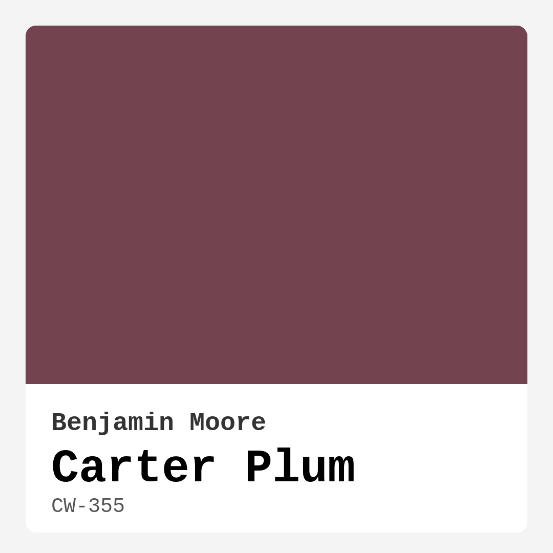
Color Preview & Key Details
| HEX Code | #734450 |
| RGB | 115, 68, 80 |
| LRV | 10.07% |
| Undertone | Red |
| Finish Options | Eggshell, Satin, Semi-Gloss |
If you’re looking for a paint color that exudes sophistication and warmth while still feeling bold and inviting, Carter Plum by Benjamin Moore might just be your perfect match. This deep, rich purple with its subtle red undertones is a chameleon of a shade—equally at home in a traditional dining room as it is in a modern bedroom or eclectic living space. Its versatility is one of its strongest assets, but there’s so much more to this color than meets the eye. Let’s dive into what makes Carter Plum special and how you can use it to transform your home.
First, let’s talk about the undertones. Carter Plum leans into its red base, giving it a warmth that keeps it from feeling too cool or stark. This makes it an excellent choice if you’re aiming for a cozy, intimate vibe. Unlike some purples that can skew overly blue or icy, this one feels grounded and luxurious. That red undertone also means it plays well with both warm and cool palettes, so whether you’re pairing it with creamy neutrals, crisp whites, or even moody blacks, it holds its own beautifully. Just be sure to test it in your space before committing—natural and artificial light can shift how those undertones come through, especially in rooms with limited sunlight.
Speaking of light, Carter Plum has a Light Reflectance Value (LRV) of 10.07%, which means it reflects very little light. In practical terms, this makes it a fantastic choice for creating a dramatic, enveloping atmosphere. Think of it like wrapping your room in a plush, velvety hug. But because it absorbs so much light, it’s best suited for spaces where you want that moody, cocoon-like feel—like a bedroom, dining room, or even a cozy home office. If you’re working with a small room, don’t let the low LRV scare you off. Instead, use it strategically: try an accent wall paired with lighter furnishings or mirrors to bounce light around and keep the space from feeling too closed in.
One of the best things about Carter Plum is how easy it is to work with. Benjamin Moore’s formula is beginner-friendly, with high coverage that often only requires one or two coats. It’s self-priming, roller-ready, and has a thick consistency that minimizes splatter—perfect if you’re DIY-ing your paint job. And because it’s highly washable and stain-resistant, it’s a great pick for high-traffic areas like living rooms or entryways where walls might take a beating. Plus, with low VOC levels, it’s an eco-conscious choice that won’t leave your home smelling like a paint factory for days.
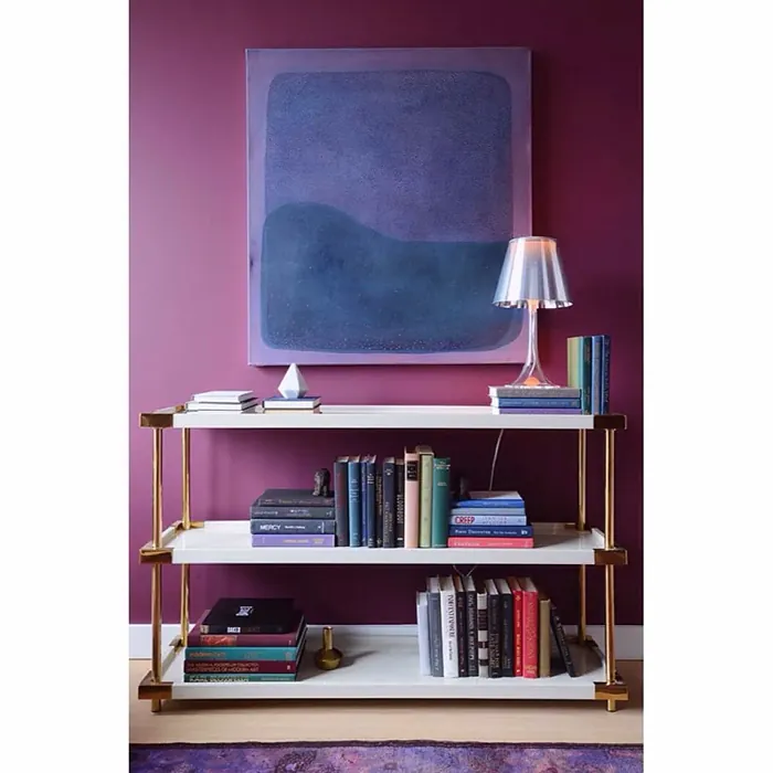
Now, let’s talk pairings. If you’re going for a classic look, crisp white trim (like Simply White or Chantilly Lace) will make Carter Plum pop while keeping things fresh. For something more modern, black trim or dark wood finishes add depth and drama. And if you want to lean into the warmth of those red undertones, brass fixtures or warm wood tones will enhance the cozy, inviting feel. Complimentary shades like soft greens (think sage or olive) can also work wonders, creating a balanced, harmonious palette that feels intentional and polished.
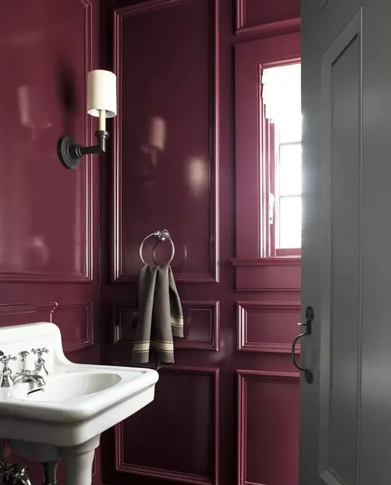
As for where to use it, the possibilities are endless. In a bedroom, it sets a romantic, restful mood—especially when paired with plush textiles and soft lighting. In a dining room, it creates an intimate, elegant backdrop for dinner parties. And in a living room, it adds a touch of luxury without feeling stuffy. It’s even striking on furniture or doors, giving a high-end, custom look without the commitment of painting an entire room.
Of course, no color is perfect for every situation. If your room gets very little natural light, Carter Plum might feel a bit too heavy unless you balance it with plenty of lamps or lighter decor. And while it’s versatile, it’s not the best fit for spaces where you want a bright, airy feel—save it for rooms where you crave depth and drama. But if you’re after a color that’s rich, sophisticated, and full of personality, Carter Plum is a standout choice.
At the end of the day, the best way to know if it’s right for you is to grab a sample and see how it looks in your space at different times of day. Paint is transformative, and a shade this dynamic will shift with the light, revealing new dimensions as the sun moves. Whether you’re going for bold and dramatic or subtle and refined, Carter Plum has the depth and versatility to deliver. So go ahead—take the plunge. Your walls (and your inner designer) will thank you.

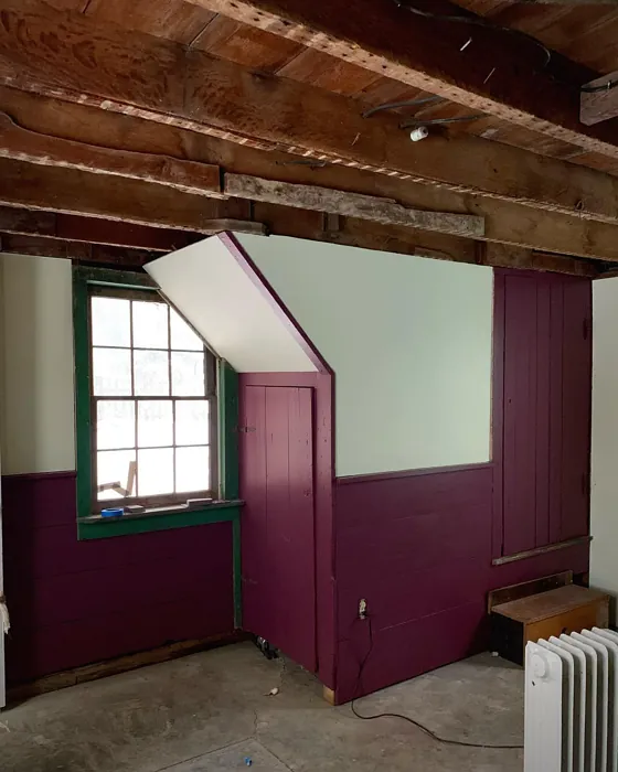
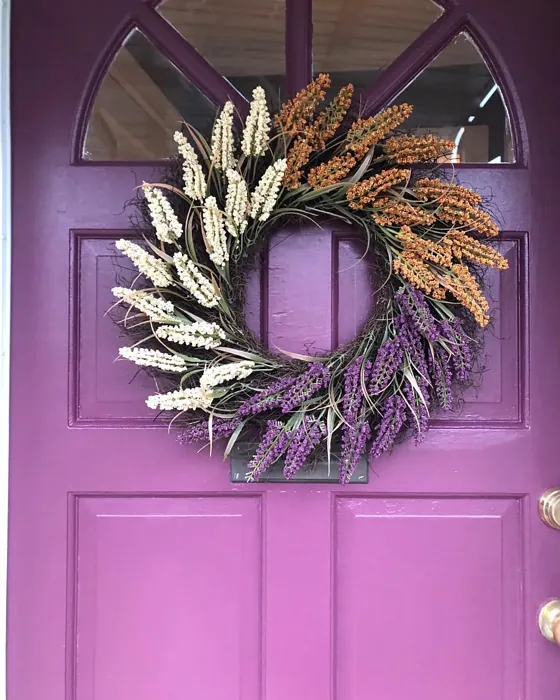
Real Room Photo of Carter Plum CW-355
Undertones of Carter Plum ?
The undertones of Carter Plum are a key aspect of its character, leaning towards Red. These subtle underlying hues are what give the color its depth and complexity. For example, a gray with a blue undertone will feel cooler and more modern, while one with a brown undertone will feel warmer and more traditional. It’s essential to test this paint in your home and observe it next to your existing furniture, flooring, and decor to see how these undertones interact and reveal themselves throughout the day.
HEX value: #734450
RGB code: 115, 68, 80
Is Carter Plum Cool or Warm?
Carter Plum sits comfortably between warm and cool, making it a balanced choice that can complement a wide range of color palettes. Its versatility is due to the blend of red and blue undertones, allowing it to adapt to different environments and light settings. Whether paired with warm woods or cool metals, it maintains its elegance and charm.
Understanding Color Properties and Interior Design Tips
Hue refers to a specific position on the color wheel, measured in degrees from 0 to 360. Each degree represents a different pure color:
- 0° represents red
- 120° represents green
- 240° represents blue
Saturation describes the intensity or purity of a color and is expressed as a percentage:
- At 0%, the color appears completely desaturated—essentially a shade of gray
- At 100%, the color is at its most vivid and vibrant
Lightness indicates how light or dark a color is, also expressed as a percentage:
- 0% lightness results in black
- 100% lightness results in white
Using Warm Colors in Interior Design
Warm hues—such as reds, oranges, yellows, warm beiges, and greiges—are excellent choices for creating inviting and energetic spaces. These colors are particularly well-suited for:
- Kitchens, living rooms, and bathrooms, where warmth enhances comfort and sociability
- Large rooms, where warm tones can help reduce the sense of emptiness and make the space feel more intimate
For example:
- Warm beige shades provide a cozy, inviting atmosphere, ideal for living rooms, bedrooms, and hallways.
- Warm greige (a mix of beige and gray) offers the warmth of beige with the modern appeal of gray, making it a versatile backdrop for dining areas, bedrooms, and living spaces.
However, be mindful when using warm light tones in rooms with limited natural light. These shades may appear muted or even take on an unpleasant yellowish tint. To avoid a dull or flat appearance:
- Add depth by incorporating richer tones like deep greens, charcoal, or chocolate brown
- Use textured elements such as curtains, rugs, or cushions to bring dimension to the space
Pro Tip: Achieving Harmony with Warm and Cool Color Balance
To create a well-balanced and visually interesting interior, mix warm and cool tones strategically. This contrast adds depth and harmony to your design.
- If your walls feature warm hues, introduce cool-colored accents such as blue or green furniture, artwork, or accessories to create contrast.
- For a polished look, consider using a complementary color scheme, which pairs colors opposite each other on the color wheel (e.g., red with green, orange with blue).
This thoughtful mix not only enhances visual appeal but also creates a space that feels both dynamic and cohesive.
Light Temperature Affects on Carter Plum
Natural Light
Natural daylight changes in color temperature as the sun moves across the sky. At sunrise and sunset, the light tends to have a warm, golden tone with a color temperature around 2000 Kelvin (K). As the day progresses and the sun rises higher, the light becomes cooler and more neutral. Around midday, especially when the sky is clear, natural light typically reaches its peak brightness and shifts to a cooler tone, ranging from 5500 to 6500 Kelvin. This midday light is close to what we perceive as pure white or daylight-balanced light.
These shifts in natural light can significantly influence how colors appear in a space, which is why designers often consider both the time of day and the orientation of windows when planning interior color schemes.
Artificial Light
When choosing artificial lighting, pay close attention to the color temperature, measured in Kelvin (K). This determines how warm or cool the light will appear. Lower temperatures, around 2700K, give off a warm, yellow glow often used in living rooms or bedrooms. Higher temperatures, above 5000K, create a cool, bluish light similar to daylight, commonly used in kitchens, offices, or task areas.
Use the slider to see how lighting temperature can affect the appearance of a surface or color throughout a space.


4800K
LRV of Carter Plum
The Light Reflectance Value (LRV) of Carter Plum is 10.07%, which places it in the Medium Dark category. This means it reflects very little light. Understanding a paint’s LRV is crucial for predicting how it will look in your space. A higher LRV indicates a lighter color that reflects more light, making rooms feel larger and brighter. A lower LRV signifies a darker color that absorbs more light, creating a cozier, more intimate atmosphere. Always consider the natural and artificial lighting in your room when selecting a paint color based on its LRV.
Detailed Review of Carter Plum
Additional Paint Characteristics
Ideal Rooms
Bedroom, Dining Room, Entryway, Home Office, Living Room
Decor Styles
Eclectic, Modern, Traditional
Coverage
Good (1–2 Coats), High Hide, Self-Priming
Ease of Application
Beginner Friendly, Brush Smooth, Low Splatter, Roller-Ready, Thick Formula
Washability
Highly Washable, Stain Resistant, Washable
VOC Level
Eco-Certified, Low VOC
Best Use
Accent Wall, Doors, Furniture, Interior Walls, Trim
Room Suitability
Bedroom, Dining Room, Living Room
Tone Tag
Balanced, Cool, Deep, Moody, Warm
Finish Type
Eggshell, Satin, Semi-Gloss
Paint Performance
Easy Touch-Up, Fade Resistant, High Coverage, Low Odor
Use Cases
Best for High Traffic Areas, Best for Low Light Rooms, Classic Favorite, Designer Favorite
Mood
Cozy, Inviting, Romantic, Sophisticated
Trim Pairing
Complements Brass Fixtures, Matches Chantilly Lace Trim, Pairs with Simply White, Works with Warm Trim
Carter Plum is a stunning color choice for anyone looking to make a bold yet sophisticated statement in their home. This rich and luxurious shade of purple is perfect for creating an inviting and cozy atmosphere. Its deep tones can make a room feel intimate and warm, while the subtle undertones add a layer of complexity that keeps it from feeling too dark or overwhelming. When used as an accent wall, it can become the focal point of a room, drawing the eye and setting the mood. It’s also versatile enough to blend seamlessly into traditional and modern decor styles alike. Pair it with lighter shades or metallic accents to really make it pop.
Pros & Cons of CW-355 Carter Plum
Pros
Cons
Colors that go with Benjamin Moore Carter Plum
FAQ on CW-355 Carter Plum
Is Carter Plum suitable for small rooms?
Carter Plum can certainly be used in small rooms, but it’s important to consider the lighting and overall decor of the space. Its deep, rich tones can make a small room feel even smaller if not balanced with ample natural or artificial light. To make the most of Carter Plum in a small room, consider using it on an accent wall or pairing it with lighter colors and reflective surfaces to open up the space. Additionally, incorporating mirrors and strategic lighting can help prevent the room from feeling too enclosed.
What trim colors pair well with Carter Plum?
Carter Plum pairs beautifully with a variety of trim colors, allowing for customization based on your style preferences. For a classic and crisp look, consider pairing it with a bright white trim such as Simply White or Chantilly Lace. If you’re aiming for a more modern or dramatic effect, black trim or dark wood finishes can complement its depth and richness. For a warmer and more inviting look, try pairing it with trim that has subtle warm undertones or brass fixtures, which will enhance the cozy feel of the space.
Comparisons Carter Plum with other colors
Carter Plum CW-355 vs Exclusive Plum SW 6263
| Attribute | Carter Plum CW-355 | Exclusive Plum SW 6263 |
|---|---|---|
| Color Name | Carter Plum CW-355 | Exclusive Plum SW 6263 |
| Color | ||
| Hue | Purple | Purple |
| Brightness | Dark | Dark |
| RGB | 115, 68, 80 | 115, 111, 120 |
| LRV | 10.07% | 15% |
| Finish Type | Eggshell, Satin, Semi-Gloss | Eggshell, Matte, Satin |
| Finish Options | Eggshell, Satin, Semi-Gloss | Eggshell, Matte, Satin |
| Ideal Rooms | Bedroom, Dining Room, Entryway, Home Office, Living Room | Bedroom, Dining Room, Home Office, Living Room |
| Decor Styles | Eclectic, Modern, Traditional | Contemporary, Eclectic, Modern, Traditional |
| Coverage | Good (1–2 Coats), High Hide, Self-Priming | Good (1–2 Coats), Touch-Up Friendly |
| Ease of Application | Beginner Friendly, Brush Smooth, Low Splatter, Roller-Ready, Thick Formula | Beginner Friendly, Brush Smooth, Fast-Drying, Roller-Ready |
| Washability | Highly Washable, Stain Resistant, Washable | Washable, Wipeable |
| Room Suitability | Bedroom, Dining Room, Living Room | Bedroom, Dining Room, Home Office, Living Room |
| Tone | Balanced, Cool, Deep, Moody, Warm | Deep, Dusty, Warm |
| Paint Performance | Easy Touch-Up, Fade Resistant, High Coverage, Low Odor | Easy Touch-Up, High Coverage, Low Odor |
Carter Plum CW-355 vs Blackberry SW 7577
| Attribute | Carter Plum CW-355 | Blackberry SW 7577 |
|---|---|---|
| Color Name | Carter Plum CW-355 | Blackberry SW 7577 |
| Color | ||
| Hue | Purple | Purple |
| Brightness | Dark | Dark |
| RGB | 115, 68, 80 | 83, 54, 64 |
| LRV | 10.07% | 5% |
| Finish Type | Eggshell, Satin, Semi-Gloss | Eggshell, Matte |
| Finish Options | Eggshell, Satin, Semi-Gloss | Eggshell, Matte, Satin |
| Ideal Rooms | Bedroom, Dining Room, Entryway, Home Office, Living Room | Bedroom, Dining Room, Home Office, Living Room |
| Decor Styles | Eclectic, Modern, Traditional | Bohemian, Contemporary, Modern, Rustic |
| Coverage | Good (1–2 Coats), High Hide, Self-Priming | Good (1–2 Coats), Touch-Up Friendly |
| Ease of Application | Beginner Friendly, Brush Smooth, Low Splatter, Roller-Ready, Thick Formula | Beginner Friendly, Brush Smooth, Roller-Ready |
| Washability | Highly Washable, Stain Resistant, Washable | Washable, Wipeable |
| Room Suitability | Bedroom, Dining Room, Living Room | Bedroom, Dining Room, Home Office, Living Room |
| Tone | Balanced, Cool, Deep, Moody, Warm | Deep, Moody, Warm |
| Paint Performance | Easy Touch-Up, Fade Resistant, High Coverage, Low Odor | Easy Touch-Up, High Coverage, Low Odor |
Carter Plum CW-355 vs Expressive Plum SW 6271
| Attribute | Carter Plum CW-355 | Expressive Plum SW 6271 |
|---|---|---|
| Color Name | Carter Plum CW-355 | Expressive Plum SW 6271 |
| Color | ||
| Hue | Purple | Purple |
| Brightness | Dark | Dark |
| RGB | 115, 68, 80 | 105, 92, 98 |
| LRV | 10.07% | 15% |
| Finish Type | Eggshell, Satin, Semi-Gloss | Eggshell, Matte, Satin |
| Finish Options | Eggshell, Satin, Semi-Gloss | Eggshell, Matte, Satin |
| Ideal Rooms | Bedroom, Dining Room, Entryway, Home Office, Living Room | Bedroom, Dining Room, Home Office, Living Room |
| Decor Styles | Eclectic, Modern, Traditional | Eclectic, Modern, Traditional, Transitional |
| Coverage | Good (1–2 Coats), High Hide, Self-Priming | Good (1–2 Coats) |
| Ease of Application | Beginner Friendly, Brush Smooth, Low Splatter, Roller-Ready, Thick Formula | Beginner Friendly, Brush Smooth, Roller-Ready |
| Washability | Highly Washable, Stain Resistant, Washable | Washable, Wipeable |
| Room Suitability | Bedroom, Dining Room, Living Room | Bedroom, Dining Room, Home Office, Living Room |
| Tone | Balanced, Cool, Deep, Moody, Warm | Deep, Muted, Warm |
| Paint Performance | Easy Touch-Up, Fade Resistant, High Coverage, Low Odor | Easy Touch-Up, High Coverage, Low Odor |
Carter Plum CW-355 vs Plum Brown SW 6272
| Attribute | Carter Plum CW-355 | Plum Brown SW 6272 |
|---|---|---|
| Color Name | Carter Plum CW-355 | Plum Brown SW 6272 |
| Color | ||
| Hue | Purple | Purple |
| Brightness | Dark | Dark |
| RGB | 115, 68, 80 | 78, 66, 71 |
| LRV | 10.07% | 6% |
| Finish Type | Eggshell, Satin, Semi-Gloss | Eggshell, Matte, Satin |
| Finish Options | Eggshell, Satin, Semi-Gloss | Eggshell, Matte, Satin |
| Ideal Rooms | Bedroom, Dining Room, Entryway, Home Office, Living Room | Bedroom, Dining Room, Home Office, Living Room |
| Decor Styles | Eclectic, Modern, Traditional | Eclectic, Modern, Rustic, Traditional |
| Coverage | Good (1–2 Coats), High Hide, Self-Priming | Good (1–2 Coats), Touch-Up Friendly |
| Ease of Application | Beginner Friendly, Brush Smooth, Low Splatter, Roller-Ready, Thick Formula | Beginner Friendly, Brush Smooth, Roller-Ready |
| Washability | Highly Washable, Stain Resistant, Washable | Washable, Wipeable |
| Room Suitability | Bedroom, Dining Room, Living Room | Bedroom, Dining Room, Home Office, Living Room |
| Tone | Balanced, Cool, Deep, Moody, Warm | Deep, Earthy, Warm |
| Paint Performance | Easy Touch-Up, Fade Resistant, High Coverage, Low Odor | Easy Touch-Up, High Coverage, Low Odor |
Carter Plum CW-355 vs Soulmate SW 6270
| Attribute | Carter Plum CW-355 | Soulmate SW 6270 |
|---|---|---|
| Color Name | Carter Plum CW-355 | Soulmate SW 6270 |
| Color | ||
| Hue | Purple | Purple |
| Brightness | Dark | Dark |
| RGB | 115, 68, 80 | 133, 119, 123 |
| LRV | 10.07% | 24% |
| Finish Type | Eggshell, Satin, Semi-Gloss | Eggshell, Matte, Satin |
| Finish Options | Eggshell, Satin, Semi-Gloss | Eggshell, Matte, Satin |
| Ideal Rooms | Bedroom, Dining Room, Entryway, Home Office, Living Room | Bedroom, Hallway, Home Office, Living Room |
| Decor Styles | Eclectic, Modern, Traditional | Bohemian, Modern, Rustic, Transitional |
| Coverage | Good (1–2 Coats), High Hide, Self-Priming | Good (1–2 Coats), Touch-Up Friendly |
| Ease of Application | Beginner Friendly, Brush Smooth, Low Splatter, Roller-Ready, Thick Formula | Beginner Friendly, Brush Smooth, Roller-Ready |
| Washability | Highly Washable, Stain Resistant, Washable | Washable, Wipeable |
| Room Suitability | Bedroom, Dining Room, Living Room | Bedroom, Hallway, Home Office, Living Room |
| Tone | Balanced, Cool, Deep, Moody, Warm | Earthy, Muted, Warm |
| Paint Performance | Easy Touch-Up, Fade Resistant, High Coverage, Low Odor | Easy Touch-Up, Low Odor, Quick Drying |
Carter Plum CW-355 vs Quixotic Plum SW 6265
| Attribute | Carter Plum CW-355 | Quixotic Plum SW 6265 |
|---|---|---|
| Color Name | Carter Plum CW-355 | Quixotic Plum SW 6265 |
| Color | ||
| Hue | Purple | Purple |
| Brightness | Dark | Dark |
| RGB | 115, 68, 80 | 74, 70, 83 |
| LRV | 10.07% | 12% |
| Finish Type | Eggshell, Satin, Semi-Gloss | Eggshell, Matte, Satin |
| Finish Options | Eggshell, Satin, Semi-Gloss | Eggshell, Matte, Satin |
| Ideal Rooms | Bedroom, Dining Room, Entryway, Home Office, Living Room | Bedroom, Dining Room, Home Office, Living Room |
| Decor Styles | Eclectic, Modern, Traditional | Bohemian, Contemporary, Eclectic, Modern, Traditional |
| Coverage | Good (1–2 Coats), High Hide, Self-Priming | Good (1–2 Coats), Touch-Up Friendly |
| Ease of Application | Beginner Friendly, Brush Smooth, Low Splatter, Roller-Ready, Thick Formula | Brush Smooth, Fast-Drying, Roller-Ready |
| Washability | Highly Washable, Stain Resistant, Washable | Highly Washable, Washable |
| Room Suitability | Bedroom, Dining Room, Living Room | Bedroom, Dining Room, Home Office, Living Room |
| Tone | Balanced, Cool, Deep, Moody, Warm | Deep, Moody, Warm |
| Paint Performance | Easy Touch-Up, Fade Resistant, High Coverage, Low Odor | High Coverage, Low Odor, Scuff Resistant |
Carter Plum CW-355 vs Midnight SW 6264
| Attribute | Carter Plum CW-355 | Midnight SW 6264 |
|---|---|---|
| Color Name | Carter Plum CW-355 | Midnight SW 6264 |
| Color | ||
| Hue | Purple | Purple |
| Brightness | Dark | Dark |
| RGB | 115, 68, 80 | 93, 89, 98 |
| LRV | 10.07% | 6% |
| Finish Type | Eggshell, Satin, Semi-Gloss | Eggshell, Matte, Satin |
| Finish Options | Eggshell, Satin, Semi-Gloss | Eggshell, Matte, Satin |
| Ideal Rooms | Bedroom, Dining Room, Entryway, Home Office, Living Room | Bedroom, Dining Room, Hallway, Home Office, Living Room |
| Decor Styles | Eclectic, Modern, Traditional | Bohemian, Contemporary, Industrial, Modern |
| Coverage | Good (1–2 Coats), High Hide, Self-Priming | Good (1–2 Coats), High Hide, Touch-Up Friendly |
| Ease of Application | Beginner Friendly, Brush Smooth, Low Splatter, Roller-Ready, Thick Formula | Beginner Friendly, Brush Smooth, Roller-Ready |
| Washability | Highly Washable, Stain Resistant, Washable | Scrubbable, Stain Resistant, Washable |
| Room Suitability | Bedroom, Dining Room, Living Room | Bedroom, Dining Room, Home Office, Living Room |
| Tone | Balanced, Cool, Deep, Moody, Warm | Balanced, Deep, Moody |
| Paint Performance | Easy Touch-Up, Fade Resistant, High Coverage, Low Odor | Easy Touch-Up, Long Lasting, Low Odor, Scuff Resistant |
Carter Plum CW-355 vs Framboise SW 6566
| Attribute | Carter Plum CW-355 | Framboise SW 6566 |
|---|---|---|
| Color Name | Carter Plum CW-355 | Framboise SW 6566 |
| Color | ||
| Hue | Purple | Purple |
| Brightness | Dark | Dark |
| RGB | 115, 68, 80 | 124, 54, 85 |
| LRV | 10.07% | 6% |
| Finish Type | Eggshell, Satin, Semi-Gloss | Matte, Satin, Semi-Gloss |
| Finish Options | Eggshell, Satin, Semi-Gloss | Matte, Satin, Semi-Gloss |
| Ideal Rooms | Bedroom, Dining Room, Entryway, Home Office, Living Room | Bedroom, Dining Room, Home Office, Living Room |
| Decor Styles | Eclectic, Modern, Traditional | Bohemian, Contemporary, Eclectic, Modern |
| Coverage | Good (1–2 Coats), High Hide, Self-Priming | Good (1–2 Coats), Touch-Up Friendly |
| Ease of Application | Beginner Friendly, Brush Smooth, Low Splatter, Roller-Ready, Thick Formula | Beginner Friendly, Brush Smooth, Fast-Drying, Roller-Ready |
| Washability | Highly Washable, Stain Resistant, Washable | Highly Washable, Washable |
| Room Suitability | Bedroom, Dining Room, Living Room | Bedroom, Dining Room, Home Office, Living Room |
| Tone | Balanced, Cool, Deep, Moody, Warm | Bold, Deep, Warm |
| Paint Performance | Easy Touch-Up, Fade Resistant, High Coverage, Low Odor | Easy Touch-Up, High Coverage, Low Odor, Quick Drying |
Carter Plum CW-355 vs Poetry Plum SW 6019
| Attribute | Carter Plum CW-355 | Poetry Plum SW 6019 |
|---|---|---|
| Color Name | Carter Plum CW-355 | Poetry Plum SW 6019 |
| Color | ||
| Hue | Purple | Purple |
| Brightness | Dark | Dark |
| RGB | 115, 68, 80 | 111, 92, 95 |
| LRV | 10.07% | 10% |
| Finish Type | Eggshell, Satin, Semi-Gloss | Eggshell, Matte, Satin |
| Finish Options | Eggshell, Satin, Semi-Gloss | Eggshell, Matte, Satin |
| Ideal Rooms | Bedroom, Dining Room, Entryway, Home Office, Living Room | Bedroom, Dining Room, Home Office, Living Room |
| Decor Styles | Eclectic, Modern, Traditional | Bohemian, Modern, Rustic, Transitional |
| Coverage | Good (1–2 Coats), High Hide, Self-Priming | Good (1–2 Coats), Touch-Up Friendly |
| Ease of Application | Beginner Friendly, Brush Smooth, Low Splatter, Roller-Ready, Thick Formula | Beginner Friendly, Brush Smooth, Roller-Ready |
| Washability | Highly Washable, Stain Resistant, Washable | Highly Washable, Washable |
| Room Suitability | Bedroom, Dining Room, Living Room | Bedroom, Dining Room, Home Office, Living Room |
| Tone | Balanced, Cool, Deep, Moody, Warm | Deep, Muted, Warm |
| Paint Performance | Easy Touch-Up, Fade Resistant, High Coverage, Low Odor | Easy Touch-Up, High Coverage, Low Odor |
Carter Plum CW-355 vs Mature Grape SW 6286
| Attribute | Carter Plum CW-355 | Mature Grape SW 6286 |
|---|---|---|
| Color Name | Carter Plum CW-355 | Mature Grape SW 6286 |
| Color | ||
| Hue | Purple | Purple |
| Brightness | Dark | Dark |
| RGB | 115, 68, 80 | 95, 63, 84 |
| LRV | 10.07% | 15% |
| Finish Type | Eggshell, Satin, Semi-Gloss | Eggshell, Matte, Satin |
| Finish Options | Eggshell, Satin, Semi-Gloss | Eggshell, Matte, Satin |
| Ideal Rooms | Bedroom, Dining Room, Entryway, Home Office, Living Room | Bedroom, Dining Room, Home Office, Living Room |
| Decor Styles | Eclectic, Modern, Traditional | Art Deco, Bohemian, Modern, Rustic |
| Coverage | Good (1–2 Coats), High Hide, Self-Priming | Good (1–2 Coats), Touch-Up Friendly |
| Ease of Application | Beginner Friendly, Brush Smooth, Low Splatter, Roller-Ready, Thick Formula | Brush Smooth, Fast-Drying, Roller-Ready |
| Washability | Highly Washable, Stain Resistant, Washable | Stain Resistant, Washable, Wipeable |
| Room Suitability | Bedroom, Dining Room, Living Room | Bedroom, Dining Room, Home Office, Living Room |
| Tone | Balanced, Cool, Deep, Moody, Warm | Deep, Earthy, Warm |
| Paint Performance | Easy Touch-Up, Fade Resistant, High Coverage, Low Odor | Easy Touch-Up, Low Odor, Stain Resistant |
Official Page of Benjamin Moore Carter Plum CW-355