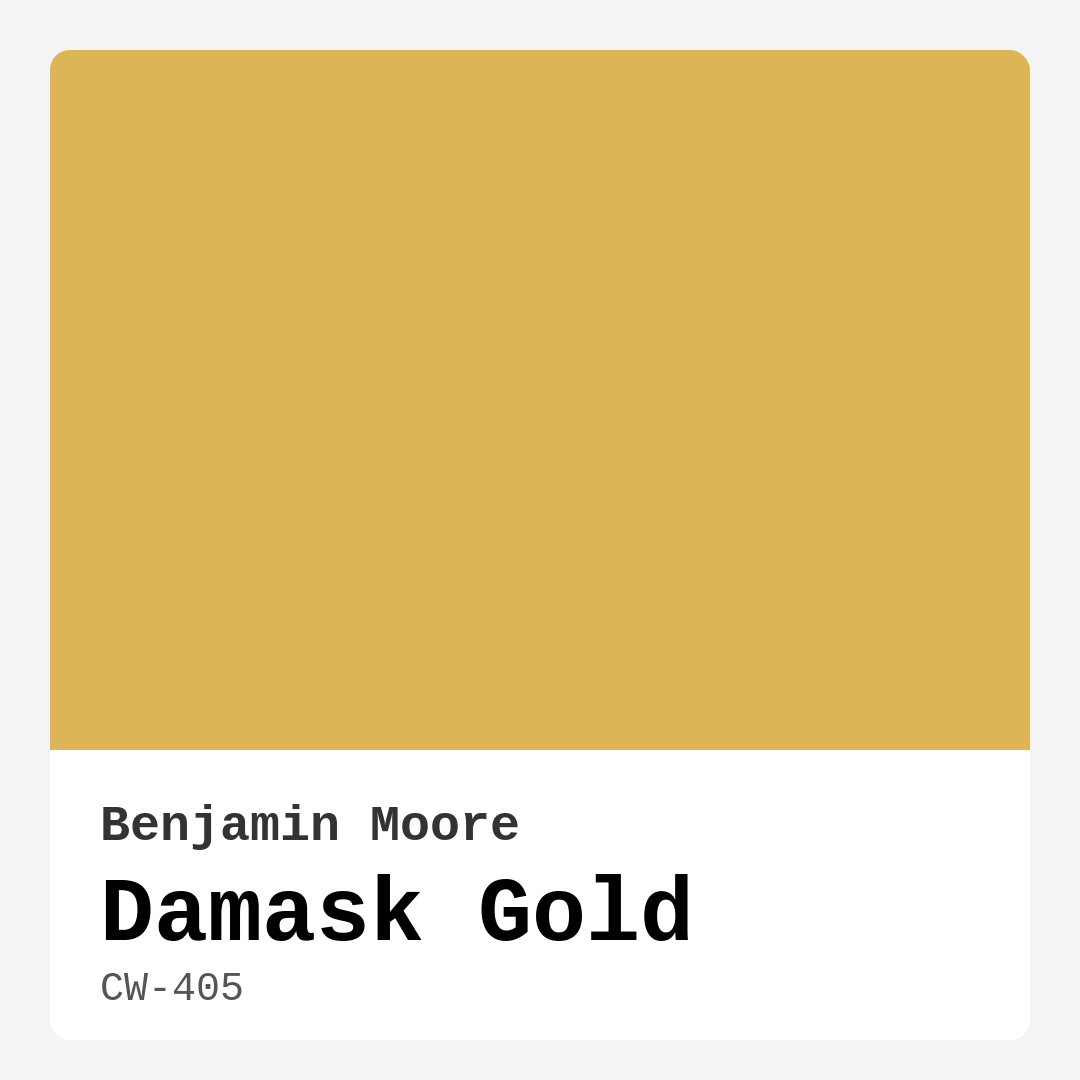
Color Preview & Key Details
| HEX Code | #DDB558 |
| RGB | 221, 181, 88 |
| LRV | 48.11% |
| Undertone | Red |
| Finish Options | Eggshell, Flat, Matte, Satin |
Imagine stepping into a room that instantly makes you feel warm and welcomed, like a cozy embrace on a chilly day. That’s the magic of Damask Gold by Benjamin Moore, a stunning hue that can transform any space into a radiant retreat. This color is more than just paint; it’s an experience, a feeling that can elevate your home’s atmosphere and make it uniquely yours.
So, what exactly is Damask Gold? It’s a rich, golden yellow shade that captures the warmth of sunshine. The color has an undertone of red, giving it depth and complexity that sets it apart from other yellows. With an LRV (Light Reflectance Value) of 48.11%, it falls into the Light Medium category, expertly reflecting half of the light that hits it. This means it’s bright enough to illuminate a room while still providing that cozy, intimate vibe that makes you want to curl up with a good book or gather around the dining table with friends.
One of the best features of Damask Gold is its versatility. It’s not just for one style of decor; it seamlessly transitions between traditional, modern, bohemian, and rustic aesthetics. Whether you’re aiming for a cheerful atmosphere in your living room or a sophisticated ambiance in your dining area, this color delivers on both fronts. Imagine it warming up a sleek, modern space or complementing the intricate details of a more traditional home. The possibilities are endless.
When considering Damask Gold for your home, think about the rooms that would benefit from its sunny disposition. Living rooms, bedrooms, dining rooms, and hallways are all ideal spaces for this inviting hue. It creates a cozy atmosphere that’s perfect for entertaining or relaxing. In a well-lit room, Damask Gold shines brilliantly, reflecting light and adding a cheerful glow. However, in softer, dimmer lighting, it reveals its richer undertones, making it a sophisticated choice for evening gatherings.
Now, let’s talk application. One of the great things about Damask Gold is how beginner-friendly it is. Whether you’re a seasoned pro or a novice DIYer, you’ll find that it glides on smoothly with a roller or brush. The coverage is impressive, usually requiring just one to two coats for a vibrant finish. Plus, it’s touch-up friendly, meaning you can easily maintain its beauty over time with minimal effort. Cleanup? A breeze, as its washable nature makes it easy to handle any accidental splatters.
When it comes to pairing Damask Gold with trims and other decor elements, you’ll want to be strategic. It works beautifully with lighter trims, like Benjamin Moore’s White Dove or Simply White, enhancing that warm, inviting feel while keeping the overall look fresh and clean. If you’re feeling bold, consider using darker trims to create a striking contrast. This can add depth and interest to your space, making Damask Gold pop even more.
You might wonder about its suitability for smaller rooms. Damask Gold can absolutely work in these spaces, but lighting plays a crucial role. In well-lit areas, it can create a warm, inviting atmosphere. However, in smaller or darker rooms, it’s essential to pair it with lighter furnishings and decor to maintain a balanced feel. It’s all about harmonizing the elements in your space.
The undertones of Damask Gold are another essential factor to consider. As a warm color with a hint of red, it can influence how the color interacts with your existing decor. For example, if you have gray furniture, a gray with a blue undertone will feel cooler and more modern against Damask Gold, while a brown undertone will create a more traditional and warm feel. Testing the paint in your space is crucial to see how these undertones reveal themselves throughout the day.
In terms of complementary colors, Damask Gold pairs beautifully with a range of shades. Lighter tones like CSP-550 or 1432 can create a soft, harmonious palette, while deeper colors like 1679 or 2062-20 can provide a dramatic contrast. These combinations can help you create a personalized color scheme that reflects your style.
Thinking about its performance? Damask Gold stands out in terms of washability and eco-friendliness, with a low VOC level. This makes it a great option not just for your home but also for the environment. You won’t have to worry about unpleasant odors while you’re painting, and its quick-drying nature means you can get back to enjoying your space sooner.
The mood that Damask Gold creates is undeniably cozy and inviting. Picture hosting dinner parties in a dining room bathed in this warm shade, or unwinding in a living room that feels like a sunlit sanctuary. It’s a color that encourages connection, conversation, and comfort.
To sum it all up, Damask Gold is a warm, radiant paint color that can transform your home into a cozy retreat. Its versatility makes it suitable for various decor styles and rooms, while its ease of application ensures a stress-free painting experience. Whether you’re looking to brighten up a living room, add warmth to a bedroom, or create a welcoming dining area, this color has you covered. By thoughtfully pairing it with the right furnishings and considering the lighting in your space, you can create a beautifully cohesive look that reflects your personal style.
So, are you ready to embrace the warmth of Damask Gold? It might just be the perfect hue to breathe new life into your home. Grab a sample, test it on your walls, and watch as it transforms your space into a warm and inviting haven. With Damask Gold, you’re not just choosing a paint color; you’re choosing a lifestyle of comfort and elegance. Happy decorating!
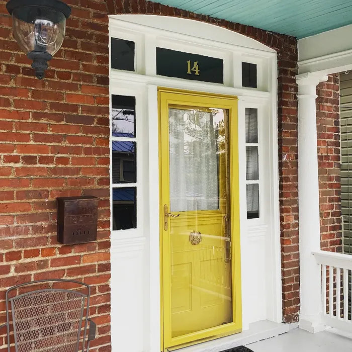
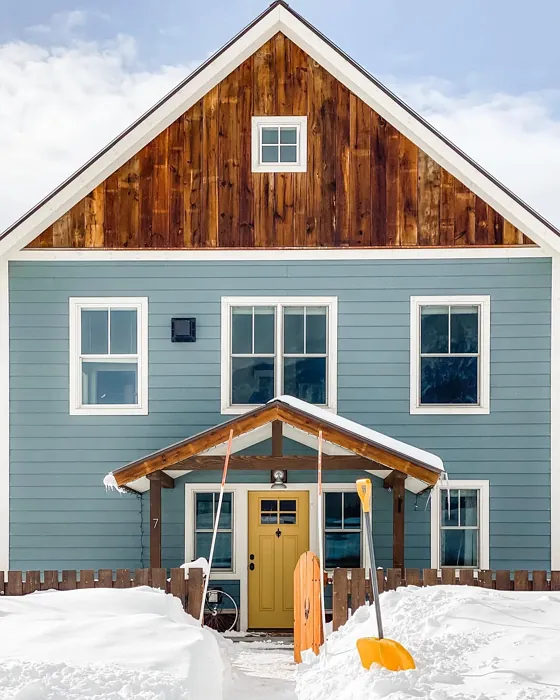
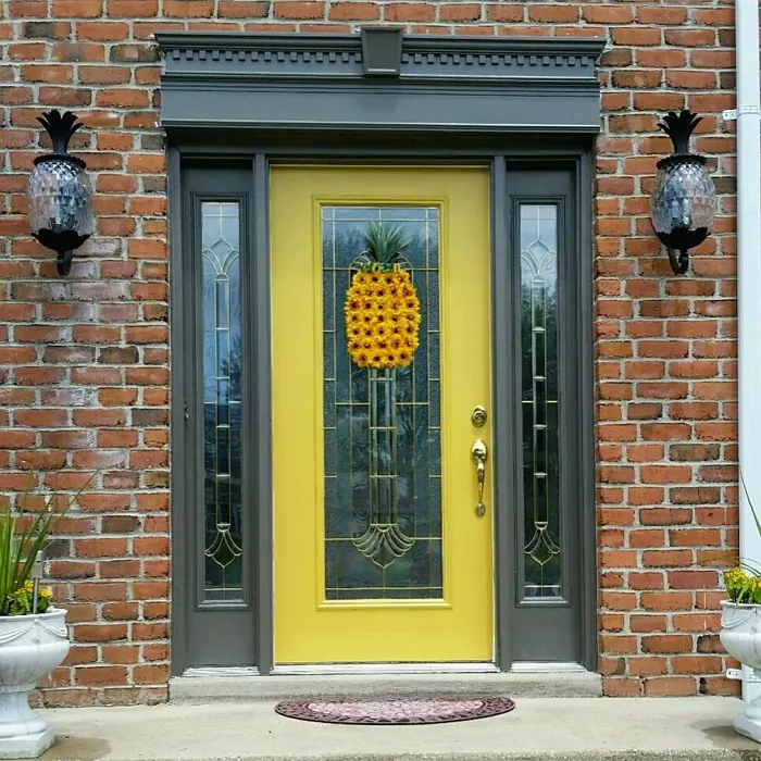
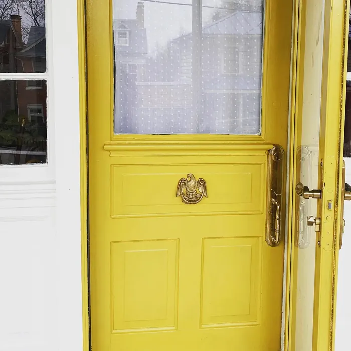
Real Room Photo of Damask Gold CW-405

Undertones of Damask Gold ?
The undertones of Damask Gold are a key aspect of its character, leaning towards Red. These subtle underlying hues are what give the color its depth and complexity. For example, a gray with a blue undertone will feel cooler and more modern, while one with a brown undertone will feel warmer and more traditional. It’s essential to test this paint in your home and observe it next to your existing furniture, flooring, and decor to see how these undertones interact and reveal themselves throughout the day.
HEX value: #DDB558
RGB code: 221, 181, 88
Is Damask Gold Cool or Warm?
Damask Gold is considered a warm paint color. This characteristic plays a huge role in the overall feel of a room. Warm colors, like this one, tend to create a cozy, inviting, and energetic atmosphere, making them great for social spaces like living rooms and dining rooms. In contrast, cool colors often evoke a sense of calm and serenity, which is why they are popular in bedrooms and bathrooms. The warmth of Damask Gold means it will pair beautifully with corresponding decor elements.
Understanding Color Properties and Interior Design Tips
Hue refers to a specific position on the color wheel, measured in degrees from 0 to 360. Each degree represents a different pure color:
- 0° represents red
- 120° represents green
- 240° represents blue
Saturation describes the intensity or purity of a color and is expressed as a percentage:
- At 0%, the color appears completely desaturated—essentially a shade of gray
- At 100%, the color is at its most vivid and vibrant
Lightness indicates how light or dark a color is, also expressed as a percentage:
- 0% lightness results in black
- 100% lightness results in white
Using Warm Colors in Interior Design
Warm hues—such as reds, oranges, yellows, warm beiges, and greiges—are excellent choices for creating inviting and energetic spaces. These colors are particularly well-suited for:
- Kitchens, living rooms, and bathrooms, where warmth enhances comfort and sociability
- Large rooms, where warm tones can help reduce the sense of emptiness and make the space feel more intimate
For example:
- Warm beige shades provide a cozy, inviting atmosphere, ideal for living rooms, bedrooms, and hallways.
- Warm greige (a mix of beige and gray) offers the warmth of beige with the modern appeal of gray, making it a versatile backdrop for dining areas, bedrooms, and living spaces.
However, be mindful when using warm light tones in rooms with limited natural light. These shades may appear muted or even take on an unpleasant yellowish tint. To avoid a dull or flat appearance:
- Add depth by incorporating richer tones like deep greens, charcoal, or chocolate brown
- Use textured elements such as curtains, rugs, or cushions to bring dimension to the space
Pro Tip: Achieving Harmony with Warm and Cool Color Balance
To create a well-balanced and visually interesting interior, mix warm and cool tones strategically. This contrast adds depth and harmony to your design.
- If your walls feature warm hues, introduce cool-colored accents such as blue or green furniture, artwork, or accessories to create contrast.
- For a polished look, consider using a complementary color scheme, which pairs colors opposite each other on the color wheel (e.g., red with green, orange with blue).
This thoughtful mix not only enhances visual appeal but also creates a space that feels both dynamic and cohesive.
Light Temperature Affects on Damask Gold
Natural Light
Natural daylight changes in color temperature as the sun moves across the sky. At sunrise and sunset, the light tends to have a warm, golden tone with a color temperature around 2000 Kelvin (K). As the day progresses and the sun rises higher, the light becomes cooler and more neutral. Around midday, especially when the sky is clear, natural light typically reaches its peak brightness and shifts to a cooler tone, ranging from 5500 to 6500 Kelvin. This midday light is close to what we perceive as pure white or daylight-balanced light.
These shifts in natural light can significantly influence how colors appear in a space, which is why designers often consider both the time of day and the orientation of windows when planning interior color schemes.
Artificial Light
When choosing artificial lighting, pay close attention to the color temperature, measured in Kelvin (K). This determines how warm or cool the light will appear. Lower temperatures, around 2700K, give off a warm, yellow glow often used in living rooms or bedrooms. Higher temperatures, above 5000K, create a cool, bluish light similar to daylight, commonly used in kitchens, offices, or task areas.
Use the slider to see how lighting temperature can affect the appearance of a surface or color throughout a space.


4800K
LRV of Damask Gold
The Light Reflectance Value (LRV) of Damask Gold is 48.11%, which places it in the Light Medium colors category. This means it reflect half of the incident light. Understanding a paint’s LRV is crucial for predicting how it will look in your space. A higher LRV indicates a lighter color that reflects more light, making rooms feel larger and brighter. A lower LRV signifies a darker color that absorbs more light, creating a cozier, more intimate atmosphere. Always consider the natural and artificial lighting in your room when selecting a paint color based on its LRV.
Detailed Review of Damask Gold
Additional Paint Characteristics
Ideal Rooms
Bedroom, Dining Room, Hallway, Living Room
Decor Styles
Bohemian, Modern, Rustic, Traditional
Coverage
Good (1–2 Coats), Touch-Up Friendly
Ease of Application
Beginner Friendly, Brush Smooth, Roller-Ready
Washability
Highly Washable, Washable
VOC Level
Eco-Certified, Low VOC
Best Use
Accent Wall, Furniture, Interior Walls, Trim
Room Suitability
Bedroom, Dining Room, Hallway, Living Room
Tone Tag
Earthy, Inviting, Warm
Finish Type
Eggshell, Satin
Paint Performance
High Coverage, Low Odor, Quick Drying
Use Cases
Best for Rentals, Best for Selling Your Home, Designer Favorite
Mood
Cozy, Inviting, Warm
Trim Pairing
Complements Cool Trim, Pairs with White Dove, Works with Warm Trim
Applying Damask Gold can be an enjoyable experience, thanks to its smooth formulation and excellent coverage. The paint glides effortlessly on surfaces, making it suitable for both novice DIYers and experienced painters alike. You’ll find that it adheres well to various substrates, ensuring a long-lasting finish. Once dry, the color remains vibrant and true, standing out beautifully in natural and artificial light. This paint is versatile enough to be used in various spaces, from cozy living rooms to elegant dining areas. It’s a reliable choice that brings a touch of sunshine into your home, creating an inviting and warm atmosphere. Plus, the ease of touch-ups means you can maintain its beauty over time with minimal effort.
Pros & Cons of CW-405 Damask Gold
Pros
Cons
Colors that go with Benjamin Moore Damask Gold
FAQ on CW-405 Damask Gold
Can Damask Gold be used in a small room?
Yes, Damask Gold can work well in small rooms, but careful consideration of lighting is essential. In well-lit areas, it can create a warm, inviting atmosphere. For smaller or darker spaces, it’s best to pair it with lighter furnishings and decor to balance the richness of the color.
How does Damask Gold pair with trim?
Damask Gold pairs beautifully with white or neutral trims, such as White Dove or Simply White. These combinations enhance the warmth of Damask Gold while creating a fresh, clean look. For a bolder aesthetic, consider pairing it with dark trims to create contrast that adds depth and interest.
Comparisons Damask Gold with other colors
Damask Gold CW-405 vs Hearts of Palm SW 6415
| Attribute | Damask Gold CW-405 | Hearts of Palm SW 6415 |
|---|---|---|
| Color Name | Damask Gold CW-405 | Hearts of Palm SW 6415 |
| Color | ||
| Hue | Yellow | Yellow |
| Brightness | Medium | Medium |
| RGB | 221, 181, 88 | 207, 194, 145 |
| LRV | 48.11% | 75% |
| Finish Type | Eggshell, Satin | Eggshell, Matte, Satin |
| Finish Options | Eggshell, Flat, Matte, Satin | Eggshell, Matte, Satin |
| Ideal Rooms | Bedroom, Dining Room, Hallway, Living Room | Bathroom, Bedroom, Dining Room, Home Office, Kitchen, Living Room |
| Decor Styles | Bohemian, Modern, Rustic, Traditional | Bohemian, Coastal, Eclectic, Modern Farmhouse, Tropical |
| Coverage | Good (1–2 Coats), Touch-Up Friendly | Good (1–2 Coats), Touch-Up Friendly |
| Ease of Application | Beginner Friendly, Brush Smooth, Roller-Ready | Beginner Friendly, Brush Smooth, Roller-Ready |
| Washability | Highly Washable, Washable | Scrubbable, Washable |
| Room Suitability | Bedroom, Dining Room, Hallway, Living Room | Bathroom, Bedroom, Dining Room, Home Office, Kitchen, Living Room |
| Tone | Earthy, Inviting, Warm | Earthy, Muted, Warm |
| Paint Performance | High Coverage, Low Odor, Quick Drying | Easy Touch-Up, Low Odor, Scuff Resistant |
Damask Gold CW-405 vs Blonde SW 6128
| Attribute | Damask Gold CW-405 | Blonde SW 6128 |
|---|---|---|
| Color Name | Damask Gold CW-405 | Blonde SW 6128 |
| Color | ||
| Hue | Yellow | Yellow |
| Brightness | Medium | Medium |
| RGB | 221, 181, 88 | 220, 189, 146 |
| LRV | 48.11% | 64% |
| Finish Type | Eggshell, Satin | Eggshell, Satin |
| Finish Options | Eggshell, Flat, Matte, Satin | Eggshell, Matte, Satin |
| Ideal Rooms | Bedroom, Dining Room, Hallway, Living Room | Bedroom, Dining Room, Home Office, Kitchen, Living Room |
| Decor Styles | Bohemian, Modern, Rustic, Traditional | Bohemian, Coastal, Modern Farmhouse, Scandinavian, Transitional |
| Coverage | Good (1–2 Coats), Touch-Up Friendly | Good (1–2 Coats), Touch-Up Friendly |
| Ease of Application | Beginner Friendly, Brush Smooth, Roller-Ready | Beginner Friendly, Fast-Drying, Roller-Ready |
| Washability | Highly Washable, Washable | Highly Washable, Washable |
| Room Suitability | Bedroom, Dining Room, Hallway, Living Room | Bedroom, Dining Room, Home Office, Kitchen, Living Room, Nursery |
| Tone | Earthy, Inviting, Warm | Earthy, Neutral, Warm |
| Paint Performance | High Coverage, Low Odor, Quick Drying | Easy Touch-Up, Fade Resistant, Low Odor, Quick Drying |
Damask Gold CW-405 vs Ruskin Room Green SW 0042
| Attribute | Damask Gold CW-405 | Ruskin Room Green SW 0042 |
|---|---|---|
| Color Name | Damask Gold CW-405 | Ruskin Room Green SW 0042 |
| Color | ||
| Hue | Yellow | Yellow |
| Brightness | Medium | Medium |
| RGB | 221, 181, 88 | 172, 161, 125 |
| LRV | 48.11% | 24% |
| Finish Type | Eggshell, Satin | Eggshell, Matte |
| Finish Options | Eggshell, Flat, Matte, Satin | Eggshell, Flat, Matte, Satin |
| Ideal Rooms | Bedroom, Dining Room, Hallway, Living Room | Bedroom, Dining Room, Home Office, Living Room |
| Decor Styles | Bohemian, Modern, Rustic, Traditional | Farmhouse, Modern, Rustic, Traditional |
| Coverage | Good (1–2 Coats), Touch-Up Friendly | Good (1–2 Coats), Touch-Up Friendly |
| Ease of Application | Beginner Friendly, Brush Smooth, Roller-Ready | Beginner Friendly, Brush Smooth, Roller-Ready |
| Washability | Highly Washable, Washable | Scrubbable, Washable |
| Room Suitability | Bedroom, Dining Room, Hallway, Living Room | Bedroom, Dining Room, Home Office, Living Room |
| Tone | Earthy, Inviting, Warm | Earthy, Muted, Warm |
| Paint Performance | High Coverage, Low Odor, Quick Drying | Easy Touch-Up, High Coverage, Low Odor |
Damask Gold CW-405 vs Bosc Pear SW 6390
| Attribute | Damask Gold CW-405 | Bosc Pear SW 6390 |
|---|---|---|
| Color Name | Damask Gold CW-405 | Bosc Pear SW 6390 |
| Color | ||
| Hue | Yellow | Yellow |
| Brightness | Medium | Medium |
| RGB | 221, 181, 88 | 192, 144, 86 |
| LRV | 48.11% | 60% |
| Finish Type | Eggshell, Satin | Satin, Semi-Gloss |
| Finish Options | Eggshell, Flat, Matte, Satin | Flat, Satin, Semi-Gloss |
| Ideal Rooms | Bedroom, Dining Room, Hallway, Living Room | Bedroom, Dining Room, Home Office, Kitchen, Living Room |
| Decor Styles | Bohemian, Modern, Rustic, Traditional | Modern Farmhouse, Rustic, Traditional, Transitional |
| Coverage | Good (1–2 Coats), Touch-Up Friendly | Good (1–2 Coats) |
| Ease of Application | Beginner Friendly, Brush Smooth, Roller-Ready | Beginner Friendly, Brush Smooth, Fast-Drying, Roller-Ready |
| Washability | Highly Washable, Washable | Highly Washable, Washable |
| Room Suitability | Bedroom, Dining Room, Hallway, Living Room | Bedroom, Dining Room, Home Office, Living Room |
| Tone | Earthy, Inviting, Warm | Balanced, Earthy, Warm |
| Paint Performance | High Coverage, Low Odor, Quick Drying | Easy Touch-Up, High Coverage, Low Odor, Quick Drying |
Damask Gold CW-405 vs Lemongrass SW 7732
| Attribute | Damask Gold CW-405 | Lemongrass SW 7732 |
|---|---|---|
| Color Name | Damask Gold CW-405 | Lemongrass SW 7732 |
| Color | ||
| Hue | Yellow | Yellow |
| Brightness | Medium | Medium |
| RGB | 221, 181, 88 | 200, 189, 152 |
| LRV | 48.11% | 48% |
| Finish Type | Eggshell, Satin | Eggshell, Matte, Satin |
| Finish Options | Eggshell, Flat, Matte, Satin | Eggshell, Matte, Satin |
| Ideal Rooms | Bedroom, Dining Room, Hallway, Living Room | Bathroom, Bedroom, Home Office, Kitchen, Living Room, Nursery |
| Decor Styles | Bohemian, Modern, Rustic, Traditional | Bohemian, Modern Farmhouse, Scandinavian, Transitional |
| Coverage | Good (1–2 Coats), Touch-Up Friendly | Good (1–2 Coats) |
| Ease of Application | Beginner Friendly, Brush Smooth, Roller-Ready | Beginner Friendly, Brush Smooth, Roller-Ready |
| Washability | Highly Washable, Washable | Highly Washable, Washable |
| Room Suitability | Bedroom, Dining Room, Hallway, Living Room | Bedroom, Home Office, Kitchen, Living Room |
| Tone | Earthy, Inviting, Warm | Earthy, Muted, Warm |
| Paint Performance | High Coverage, Low Odor, Quick Drying | Easy Touch-Up, Low Odor, Scuff Resistant |
Damask Gold CW-405 vs Garden Sage SW 7736
| Attribute | Damask Gold CW-405 | Garden Sage SW 7736 |
|---|---|---|
| Color Name | Damask Gold CW-405 | Garden Sage SW 7736 |
| Color | ||
| Hue | Yellow | Yellow |
| Brightness | Medium | Medium |
| RGB | 221, 181, 88 | 177, 165, 132 |
| LRV | 48.11% | 24% |
| Finish Type | Eggshell, Satin | Eggshell, Matte, Satin |
| Finish Options | Eggshell, Flat, Matte, Satin | Eggshell, Matte, Satin |
| Ideal Rooms | Bedroom, Dining Room, Hallway, Living Room | Bedroom, Dining Room, Home Office, Kitchen, Living Room, Nursery |
| Decor Styles | Bohemian, Modern, Rustic, Traditional | Bohemian, Cottage, Minimalist, Modern Farmhouse, Traditional |
| Coverage | Good (1–2 Coats), Touch-Up Friendly | Good (1–2 Coats), Touch-Up Friendly |
| Ease of Application | Beginner Friendly, Brush Smooth, Roller-Ready | Beginner Friendly, Brush Smooth, Roller-Ready |
| Washability | Highly Washable, Washable | Highly Washable, Washable |
| Room Suitability | Bedroom, Dining Room, Hallway, Living Room | Bedroom, Dining Room, Home Office, Kitchen, Living Room |
| Tone | Earthy, Inviting, Warm | Balanced, Earthy, Muted, Warm |
| Paint Performance | High Coverage, Low Odor, Quick Drying | Easy Touch-Up, Fade Resistant, Low Odor |
Damask Gold CW-405 vs Tassel SW 6369
| Attribute | Damask Gold CW-405 | Tassel SW 6369 |
|---|---|---|
| Color Name | Damask Gold CW-405 | Tassel SW 6369 |
| Color | ||
| Hue | Yellow | Yellow |
| Brightness | Medium | Medium |
| RGB | 221, 181, 88 | 198, 136, 74 |
| LRV | 48.11% | 45% |
| Finish Type | Eggshell, Satin | Matte, Satin |
| Finish Options | Eggshell, Flat, Matte, Satin | Matte, Satin, Semi-Gloss |
| Ideal Rooms | Bedroom, Dining Room, Hallway, Living Room | Bedroom, Dining Room, Home Office, Living Room |
| Decor Styles | Bohemian, Modern, Rustic, Traditional | Bohemian, Modern Farmhouse, Rustic, Transitional |
| Coverage | Good (1–2 Coats), Touch-Up Friendly | Good (1–2 Coats) |
| Ease of Application | Beginner Friendly, Brush Smooth, Roller-Ready | Beginner Friendly, Brush Smooth, Fast-Drying, Roller-Ready |
| Washability | Highly Washable, Washable | Scrubbable, Washable |
| Room Suitability | Bedroom, Dining Room, Hallway, Living Room | Bedroom, Dining Room, Home Office, Living Room |
| Tone | Earthy, Inviting, Warm | Earthy, Inviting, Warm |
| Paint Performance | High Coverage, Low Odor, Quick Drying | Easy Touch-Up, Low Odor, Quick Drying, Scuff Resistant |
Damask Gold CW-405 vs Sunflower SW 6678
| Attribute | Damask Gold CW-405 | Sunflower SW 6678 |
|---|---|---|
| Color Name | Damask Gold CW-405 | Sunflower SW 6678 |
| Color | ||
| Hue | Yellow | Yellow |
| Brightness | Medium | Medium |
| RGB | 221, 181, 88 | 227, 154, 51 |
| LRV | 48.11% | 75% |
| Finish Type | Eggshell, Satin | Eggshell, Satin |
| Finish Options | Eggshell, Flat, Matte, Satin | Eggshell, Satin, Semi-Gloss |
| Ideal Rooms | Bedroom, Dining Room, Hallway, Living Room | Dining Room, Entryway, Home Office, Kitchen, Living Room |
| Decor Styles | Bohemian, Modern, Rustic, Traditional | Bohemian, Eclectic, Modern Farmhouse, Traditional |
| Coverage | Good (1–2 Coats), Touch-Up Friendly | Good (1–2 Coats), Touch-Up Friendly |
| Ease of Application | Beginner Friendly, Brush Smooth, Roller-Ready | Beginner Friendly, Brush Smooth, Fast-Drying, Roller-Ready |
| Washability | Highly Washable, Washable | Highly Washable, Washable |
| Room Suitability | Bedroom, Dining Room, Hallway, Living Room | Dining Room, Entryway, Kitchen, Living Room |
| Tone | Earthy, Inviting, Warm | Bold, Earthy, Warm |
| Paint Performance | High Coverage, Low Odor, Quick Drying | Fade Resistant, High Coverage, Quick Drying |
Damask Gold CW-405 vs Bee's Wax SW 7682
| Attribute | Damask Gold CW-405 | Bee's Wax SW 7682 |
|---|---|---|
| Color Name | Damask Gold CW-405 | Bee's Wax SW 7682 |
| Color | ||
| Hue | Yellow | Yellow |
| Brightness | Medium | Medium |
| RGB | 221, 181, 88 | 234, 191, 134 |
| LRV | 48.11% | 50% |
| Finish Type | Eggshell, Satin | Eggshell, Matte, Satin |
| Finish Options | Eggshell, Flat, Matte, Satin | Eggshell, Matte, Satin |
| Ideal Rooms | Bedroom, Dining Room, Hallway, Living Room | Bedroom, Dining Room, Entryway, Kitchen, Living Room |
| Decor Styles | Bohemian, Modern, Rustic, Traditional | Bohemian, Coastal, Modern Farmhouse, Traditional, Transitional |
| Coverage | Good (1–2 Coats), Touch-Up Friendly | Good (1–2 Coats), Touch-Up Friendly |
| Ease of Application | Beginner Friendly, Brush Smooth, Roller-Ready | Beginner Friendly, Brush Smooth, Roller-Ready |
| Washability | Highly Washable, Washable | Washable, Wipeable |
| Room Suitability | Bedroom, Dining Room, Hallway, Living Room | Bedroom, Dining Room, Entryway, Kitchen, Living Room |
| Tone | Earthy, Inviting, Warm | Creamy, Earthy, Warm |
| Paint Performance | High Coverage, Low Odor, Quick Drying | Easy Touch-Up, High Coverage, Low Odor |
Damask Gold CW-405 vs Downing Straw SW 2813
| Attribute | Damask Gold CW-405 | Downing Straw SW 2813 |
|---|---|---|
| Color Name | Damask Gold CW-405 | Downing Straw SW 2813 |
| Color | ||
| Hue | Yellow | Yellow |
| Brightness | Medium | Medium |
| RGB | 221, 181, 88 | 202, 171, 125 |
| LRV | 48.11% | 48% |
| Finish Type | Eggshell, Satin | Eggshell, Matte, Satin |
| Finish Options | Eggshell, Flat, Matte, Satin | Eggshell, Matte, Satin |
| Ideal Rooms | Bedroom, Dining Room, Hallway, Living Room | Bedroom, Dining Room, Home Office, Kitchen, Living Room |
| Decor Styles | Bohemian, Modern, Rustic, Traditional | Contemporary, Eclectic, Modern Farmhouse, Rustic, Traditional |
| Coverage | Good (1–2 Coats), Touch-Up Friendly | Good (1–2 Coats), Touch-Up Friendly |
| Ease of Application | Beginner Friendly, Brush Smooth, Roller-Ready | Beginner Friendly, Brush Smooth, Roller-Ready |
| Washability | Highly Washable, Washable | Washable, Wipeable |
| Room Suitability | Bedroom, Dining Room, Hallway, Living Room | Bedroom, Dining Room, Home Office, Kitchen, Living Room |
| Tone | Earthy, Inviting, Warm | Earthy, Muted, Warm |
| Paint Performance | High Coverage, Low Odor, Quick Drying | Easy Touch-Up, High Coverage, Low Odor |
Official Page of Benjamin Moore Damask Gold CW-405