Color Preview & Key Details
| HEX Code | #BB9951 |
| RGB | 187, 153, 81 |
| LRV | 33.73% |
| Undertone | Red |
| Finish Options | Eggshell, Matte, Satin |
Imagine walking into a room that feels like a warm embrace, where the walls seem to radiate comfort and tranquility. That’s the magic of paint, and one color that truly embodies this warmth is Palace Ochre by Benjamin Moore. This stunning hue is not just a color; it’s an experience that can transform your space into a haven of cozy elegance.
Palace Ochre, with its color code CW-425, captures the essence of a golden sunset. It’s a rich, warm yellow with subtle earthy undertones that invite feelings of comfort and sophistication. The hex code #BB9951 offers a glimpse into its character—a blend of warmth that feels both regal and inviting. Picture sunlit landscapes and timeless decor, and you’ll begin to understand why this shade is such a favorite among designers and homeowners alike.
When contemplating your next home project, think about the atmosphere you want to create. Palace Ochre is perfect for making your living room, dining room, bedroom, or home office feel inviting and sophisticated. Its versatility allows it to seamlessly fit into various decor styles, be it modern farmhouse, rustic, eclectic, or traditional. This means that no matter your personal style, Palace Ochre can enhance your space.
Let’s talk application because I know that’s a key concern for many of you. The great news is that Palace Ochre is beginner-friendly and roller-ready, making it a breeze to work with. It glides on smoothly, and whether you’re using a brush or a roller, you’ll find the application process to be enjoyable rather than daunting. It’s also touch-up friendly, which is a blessing when life hits and you need to fix those little dings and scratches. Plus, it’s low VOC and eco-certified, so you can breathe easy knowing you’re making a healthier choice for your home.
The Light Reflectance Value (LRV) of Palace Ochre is 33.73%, placing it firmly in the medium color category. This means it reflects a good amount of light, helping to brighten up your space without overwhelming it. In natural light, it glows with a soft golden hue, exuding warmth and vitality. Even in dimmer settings, it retains its rich character, making it adaptable for various lighting situations. If you’re thinking of using it in a small space, it can create a cozy, inviting atmosphere. Just be mindful of the lighting and consider pairing it with lighter accents to ensure the room doesn’t feel too enclosed.
Now, let’s explore the finishes. Palace Ochre is available in matte, eggshell, and satin finishes, each offering a unique look. For a more subdued and sophisticated vibe, a matte finish can be perfect. If you’re after something that reflects a bit more light, eggshell or satin can enhance the richness of the color beautifully. The finish you choose can dramatically affect the atmosphere of the space, so think about the mood you want to achieve.
When it comes to pairing this color with trims and fixtures, you’ll find that Palace Ochre works harmoniously with white trims, especially White Dove, and complements brass fixtures beautifully. These combinations can elevate the color even further, adding depth and richness to your design. If you’re feeling adventurous, consider bringing in darker shades or complementary hues like blues to create visual interest and contrast.
One of the most delightful aspects of Palace Ochre is its undertone—a whisper of red that adds depth and complexity to the color. This undertone is what makes it stand out from other yellows, giving it a warm, inviting feel that’s perfect for social spaces. As you test the paint in your home, observe how it interacts with your existing furniture and decor. You might find that the undertones reveal themselves differently throughout the day, ensuring a dynamic and evolving atmosphere.
As you consider the overall mood that Palace Ochre can create, think about the feelings you want your home to evoke. This color is cozy, grounding, and inviting—ideal for creating a sanctuary where you can unwind after a long day. Whether you’re sprucing up a cozy reading nook or revitalizing an open-concept living space, Palace Ochre brings a calming yet uplifting effect that can enhance your everyday experience.
Let’s not forget about the practical side of things. The washability of this paint is another reason to love it. It’s wipeable and washable, so if those little fingerprints or smudges appear, you can easily clean them without losing the beauty of your walls. This makes it a great option for families or anyone who wants a beautiful space that stands up to daily life.
As we wrap up, remember that choosing a paint color is more than just picking a shade; it’s about setting the tone for your home. Palace Ochre brings warmth and elegance, making it a timeless choice that will create a welcoming atmosphere. Whether you decide to use it for an entire room or as an accent wall, this color is sure to leave a lasting impression.
So, are you ready to transform your space with the rich, inviting tones of Palace Ochre? With its versatility, ease of application, and warm, earthy appeal, it’s a color worth considering for your next home project. Dive in, embrace the warmth, and let Palace Ochre bring a touch of regal comfort to your home.
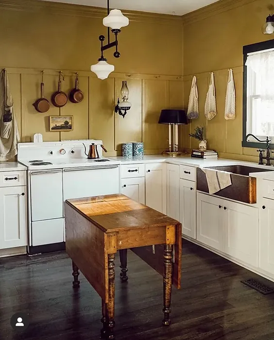
Real Room Photo of Palace Ochre CW-425
Undertones of Palace Ochre ?
The undertones of Palace Ochre are a key aspect of its character, leaning towards Red. These subtle underlying hues are what give the color its depth and complexity. For example, a gray with a blue undertone will feel cooler and more modern, while one with a brown undertone will feel warmer and more traditional. It’s essential to test this paint in your home and observe it next to your existing furniture, flooring, and decor to see how these undertones interact and reveal themselves throughout the day.
HEX value: #BB9951
RGB code: 187, 153, 81
Is Palace Ochre Cool or Warm?
Palace Ochre is considered a warm paint color. This characteristic plays a huge role in the overall feel of a room. Warm colors, like this one, tend to create a cozy, inviting, and energetic atmosphere, making them great for social spaces like living rooms and dining rooms. In contrast, cool colors often evoke a sense of calm and serenity, which is why they are popular in bedrooms and bathrooms. The warmth of Palace Ochre means it will pair beautifully with corresponding decor elements.
Understanding Color Properties and Interior Design Tips
Hue refers to a specific position on the color wheel, measured in degrees from 0 to 360. Each degree represents a different pure color:
- 0° represents red
- 120° represents green
- 240° represents blue
Saturation describes the intensity or purity of a color and is expressed as a percentage:
- At 0%, the color appears completely desaturated—essentially a shade of gray
- At 100%, the color is at its most vivid and vibrant
Lightness indicates how light or dark a color is, also expressed as a percentage:
- 0% lightness results in black
- 100% lightness results in white
Using Warm Colors in Interior Design
Warm hues—such as reds, oranges, yellows, warm beiges, and greiges—are excellent choices for creating inviting and energetic spaces. These colors are particularly well-suited for:
- Kitchens, living rooms, and bathrooms, where warmth enhances comfort and sociability
- Large rooms, where warm tones can help reduce the sense of emptiness and make the space feel more intimate
For example:
- Warm beige shades provide a cozy, inviting atmosphere, ideal for living rooms, bedrooms, and hallways.
- Warm greige (a mix of beige and gray) offers the warmth of beige with the modern appeal of gray, making it a versatile backdrop for dining areas, bedrooms, and living spaces.
However, be mindful when using warm light tones in rooms with limited natural light. These shades may appear muted or even take on an unpleasant yellowish tint. To avoid a dull or flat appearance:
- Add depth by incorporating richer tones like deep greens, charcoal, or chocolate brown
- Use textured elements such as curtains, rugs, or cushions to bring dimension to the space
Pro Tip: Achieving Harmony with Warm and Cool Color Balance
To create a well-balanced and visually interesting interior, mix warm and cool tones strategically. This contrast adds depth and harmony to your design.
- If your walls feature warm hues, introduce cool-colored accents such as blue or green furniture, artwork, or accessories to create contrast.
- For a polished look, consider using a complementary color scheme, which pairs colors opposite each other on the color wheel (e.g., red with green, orange with blue).
This thoughtful mix not only enhances visual appeal but also creates a space that feels both dynamic and cohesive.
Light Temperature Affects on Palace Ochre
Natural Light
Natural daylight changes in color temperature as the sun moves across the sky. At sunrise and sunset, the light tends to have a warm, golden tone with a color temperature around 2000 Kelvin (K). As the day progresses and the sun rises higher, the light becomes cooler and more neutral. Around midday, especially when the sky is clear, natural light typically reaches its peak brightness and shifts to a cooler tone, ranging from 5500 to 6500 Kelvin. This midday light is close to what we perceive as pure white or daylight-balanced light.
These shifts in natural light can significantly influence how colors appear in a space, which is why designers often consider both the time of day and the orientation of windows when planning interior color schemes.
Artificial Light
When choosing artificial lighting, pay close attention to the color temperature, measured in Kelvin (K). This determines how warm or cool the light will appear. Lower temperatures, around 2700K, give off a warm, yellow glow often used in living rooms or bedrooms. Higher temperatures, above 5000K, create a cool, bluish light similar to daylight, commonly used in kitchens, offices, or task areas.
Use the slider to see how lighting temperature can affect the appearance of a surface or color throughout a space.


4800K
LRV of Palace Ochre
The Light Reflectance Value (LRV) of Palace Ochre is 33.73%, which places it in the Medium colors category. This means it reflect a lot of light. Understanding a paint’s LRV is crucial for predicting how it will look in your space. A higher LRV indicates a lighter color that reflects more light, making rooms feel larger and brighter. A lower LRV signifies a darker color that absorbs more light, creating a cozier, more intimate atmosphere. Always consider the natural and artificial lighting in your room when selecting a paint color based on its LRV.
Detailed Review of Palace Ochre
Additional Paint Characteristics
Ideal Rooms
Bedroom, Dining Room, Home Office, Living Room
Decor Styles
Eclectic, Modern Farmhouse, Rustic, Traditional
Coverage
Good (1–2 Coats), Touch-Up Friendly
Ease of Application
Beginner Friendly, Brush Smooth, Roller-Ready
Washability
Washable, Wipeable
VOC Level
Eco-Certified, Low VOC
Best Use
Accent Wall, Furniture, Interior Walls
Room Suitability
Bedroom, Dining Room, Home Office, Living Room
Tone Tag
Earthy, Muted, Warm
Finish Type
Eggshell, Matte, Satin
Paint Performance
Easy Touch-Up, High Coverage, Low Odor
Use Cases
Best for Open Concept, Best for Small Spaces, Classic Favorite
Mood
Cozy, Grounding, Inviting
Trim Pairing
Complements Brass Fixtures, Pairs with White Dove, Works with Warm Trim
Palace Ochre stands out for its versatility and warmth, making it an excellent choice for both modern and traditional spaces. The application process is smooth, and the paint adheres well to various surfaces, providing a solid finish that feels both rich and inviting. When paired with natural light, this hue radiates a golden glow, bringing life to your walls. Whether you’re sprucing up a cozy nook or revitalizing a larger room, Palace Ochre offers a calming yet uplifting effect. Just a couple of coats will achieve a beautiful, consistent color that invites relaxation and warmth.
Pros & Cons of CW-425 Palace Ochre
Pros
Cons
Colors that go with Benjamin Moore Palace Ochre
FAQ on CW-425 Palace Ochre
Can Palace Ochre be used in small spaces?
Absolutely! While Palace Ochre is a warm, rich color, it can actually make small spaces feel cozy and inviting. Just be mindful of the lighting; pairing it with lighter accents or decor can help balance the warmth, ensuring the room doesn’t feel too enclosed. Consider using it in a small hallway or a cozy reading nook for a touch of warmth that enhances the overall ambiance.
What finishes work best with Palace Ochre?
For Palace Ochre, you might consider finishes like eggshell or satin, which provide a soft sheen and enhance the color’s richness. Matte finishes can give a more subdued, sophisticated look, while satin adds a slight gloss that reflects light beautifully. It really depends on the atmosphere you want to create. For a more contemporary feel, eggshell is a great choice, while satin can add a touch of elegance to more traditional spaces.
Comparisons Palace Ochre with other colors
Palace Ochre CW-425 vs Hearts of Palm SW 6415
| Attribute | Palace Ochre CW-425 | Hearts of Palm SW 6415 |
|---|---|---|
| Color Name | Palace Ochre CW-425 | Hearts of Palm SW 6415 |
| Color | ||
| Hue | Yellow | Yellow |
| Brightness | Medium | Medium |
| RGB | 187, 153, 81 | 207, 194, 145 |
| LRV | 33.73% | 75% |
| Finish Type | Eggshell, Matte, Satin | Eggshell, Matte, Satin |
| Finish Options | Eggshell, Matte, Satin | Eggshell, Matte, Satin |
| Ideal Rooms | Bedroom, Dining Room, Home Office, Living Room | Bathroom, Bedroom, Dining Room, Home Office, Kitchen, Living Room |
| Decor Styles | Eclectic, Modern Farmhouse, Rustic, Traditional | Bohemian, Coastal, Eclectic, Modern Farmhouse, Tropical |
| Coverage | Good (1–2 Coats), Touch-Up Friendly | Good (1–2 Coats), Touch-Up Friendly |
| Ease of Application | Beginner Friendly, Brush Smooth, Roller-Ready | Beginner Friendly, Brush Smooth, Roller-Ready |
| Washability | Washable, Wipeable | Scrubbable, Washable |
| Room Suitability | Bedroom, Dining Room, Home Office, Living Room | Bathroom, Bedroom, Dining Room, Home Office, Kitchen, Living Room |
| Tone | Earthy, Muted, Warm | Earthy, Muted, Warm |
| Paint Performance | Easy Touch-Up, High Coverage, Low Odor | Easy Touch-Up, Low Odor, Scuff Resistant |
Palace Ochre CW-425 vs Blonde SW 6128
| Attribute | Palace Ochre CW-425 | Blonde SW 6128 |
|---|---|---|
| Color Name | Palace Ochre CW-425 | Blonde SW 6128 |
| Color | ||
| Hue | Yellow | Yellow |
| Brightness | Medium | Medium |
| RGB | 187, 153, 81 | 220, 189, 146 |
| LRV | 33.73% | 64% |
| Finish Type | Eggshell, Matte, Satin | Eggshell, Satin |
| Finish Options | Eggshell, Matte, Satin | Eggshell, Matte, Satin |
| Ideal Rooms | Bedroom, Dining Room, Home Office, Living Room | Bedroom, Dining Room, Home Office, Kitchen, Living Room |
| Decor Styles | Eclectic, Modern Farmhouse, Rustic, Traditional | Bohemian, Coastal, Modern Farmhouse, Scandinavian, Transitional |
| Coverage | Good (1–2 Coats), Touch-Up Friendly | Good (1–2 Coats), Touch-Up Friendly |
| Ease of Application | Beginner Friendly, Brush Smooth, Roller-Ready | Beginner Friendly, Fast-Drying, Roller-Ready |
| Washability | Washable, Wipeable | Highly Washable, Washable |
| Room Suitability | Bedroom, Dining Room, Home Office, Living Room | Bedroom, Dining Room, Home Office, Kitchen, Living Room, Nursery |
| Tone | Earthy, Muted, Warm | Earthy, Neutral, Warm |
| Paint Performance | Easy Touch-Up, High Coverage, Low Odor | Easy Touch-Up, Fade Resistant, Low Odor, Quick Drying |
Palace Ochre CW-425 vs Ruskin Room Green SW 0042
| Attribute | Palace Ochre CW-425 | Ruskin Room Green SW 0042 |
|---|---|---|
| Color Name | Palace Ochre CW-425 | Ruskin Room Green SW 0042 |
| Color | ||
| Hue | Yellow | Yellow |
| Brightness | Medium | Medium |
| RGB | 187, 153, 81 | 172, 161, 125 |
| LRV | 33.73% | 24% |
| Finish Type | Eggshell, Matte, Satin | Eggshell, Matte |
| Finish Options | Eggshell, Matte, Satin | Eggshell, Flat, Matte, Satin |
| Ideal Rooms | Bedroom, Dining Room, Home Office, Living Room | Bedroom, Dining Room, Home Office, Living Room |
| Decor Styles | Eclectic, Modern Farmhouse, Rustic, Traditional | Farmhouse, Modern, Rustic, Traditional |
| Coverage | Good (1–2 Coats), Touch-Up Friendly | Good (1–2 Coats), Touch-Up Friendly |
| Ease of Application | Beginner Friendly, Brush Smooth, Roller-Ready | Beginner Friendly, Brush Smooth, Roller-Ready |
| Washability | Washable, Wipeable | Scrubbable, Washable |
| Room Suitability | Bedroom, Dining Room, Home Office, Living Room | Bedroom, Dining Room, Home Office, Living Room |
| Tone | Earthy, Muted, Warm | Earthy, Muted, Warm |
| Paint Performance | Easy Touch-Up, High Coverage, Low Odor | Easy Touch-Up, High Coverage, Low Odor |
Palace Ochre CW-425 vs Bosc Pear SW 6390
| Attribute | Palace Ochre CW-425 | Bosc Pear SW 6390 |
|---|---|---|
| Color Name | Palace Ochre CW-425 | Bosc Pear SW 6390 |
| Color | ||
| Hue | Yellow | Yellow |
| Brightness | Medium | Medium |
| RGB | 187, 153, 81 | 192, 144, 86 |
| LRV | 33.73% | 60% |
| Finish Type | Eggshell, Matte, Satin | Satin, Semi-Gloss |
| Finish Options | Eggshell, Matte, Satin | Flat, Satin, Semi-Gloss |
| Ideal Rooms | Bedroom, Dining Room, Home Office, Living Room | Bedroom, Dining Room, Home Office, Kitchen, Living Room |
| Decor Styles | Eclectic, Modern Farmhouse, Rustic, Traditional | Modern Farmhouse, Rustic, Traditional, Transitional |
| Coverage | Good (1–2 Coats), Touch-Up Friendly | Good (1–2 Coats) |
| Ease of Application | Beginner Friendly, Brush Smooth, Roller-Ready | Beginner Friendly, Brush Smooth, Fast-Drying, Roller-Ready |
| Washability | Washable, Wipeable | Highly Washable, Washable |
| Room Suitability | Bedroom, Dining Room, Home Office, Living Room | Bedroom, Dining Room, Home Office, Living Room |
| Tone | Earthy, Muted, Warm | Balanced, Earthy, Warm |
| Paint Performance | Easy Touch-Up, High Coverage, Low Odor | Easy Touch-Up, High Coverage, Low Odor, Quick Drying |
Palace Ochre CW-425 vs Lemongrass SW 7732
| Attribute | Palace Ochre CW-425 | Lemongrass SW 7732 |
|---|---|---|
| Color Name | Palace Ochre CW-425 | Lemongrass SW 7732 |
| Color | ||
| Hue | Yellow | Yellow |
| Brightness | Medium | Medium |
| RGB | 187, 153, 81 | 200, 189, 152 |
| LRV | 33.73% | 48% |
| Finish Type | Eggshell, Matte, Satin | Eggshell, Matte, Satin |
| Finish Options | Eggshell, Matte, Satin | Eggshell, Matte, Satin |
| Ideal Rooms | Bedroom, Dining Room, Home Office, Living Room | Bathroom, Bedroom, Home Office, Kitchen, Living Room, Nursery |
| Decor Styles | Eclectic, Modern Farmhouse, Rustic, Traditional | Bohemian, Modern Farmhouse, Scandinavian, Transitional |
| Coverage | Good (1–2 Coats), Touch-Up Friendly | Good (1–2 Coats) |
| Ease of Application | Beginner Friendly, Brush Smooth, Roller-Ready | Beginner Friendly, Brush Smooth, Roller-Ready |
| Washability | Washable, Wipeable | Highly Washable, Washable |
| Room Suitability | Bedroom, Dining Room, Home Office, Living Room | Bedroom, Home Office, Kitchen, Living Room |
| Tone | Earthy, Muted, Warm | Earthy, Muted, Warm |
| Paint Performance | Easy Touch-Up, High Coverage, Low Odor | Easy Touch-Up, Low Odor, Scuff Resistant |
Palace Ochre CW-425 vs Garden Sage SW 7736
| Attribute | Palace Ochre CW-425 | Garden Sage SW 7736 |
|---|---|---|
| Color Name | Palace Ochre CW-425 | Garden Sage SW 7736 |
| Color | ||
| Hue | Yellow | Yellow |
| Brightness | Medium | Medium |
| RGB | 187, 153, 81 | 177, 165, 132 |
| LRV | 33.73% | 24% |
| Finish Type | Eggshell, Matte, Satin | Eggshell, Matte, Satin |
| Finish Options | Eggshell, Matte, Satin | Eggshell, Matte, Satin |
| Ideal Rooms | Bedroom, Dining Room, Home Office, Living Room | Bedroom, Dining Room, Home Office, Kitchen, Living Room, Nursery |
| Decor Styles | Eclectic, Modern Farmhouse, Rustic, Traditional | Bohemian, Cottage, Minimalist, Modern Farmhouse, Traditional |
| Coverage | Good (1–2 Coats), Touch-Up Friendly | Good (1–2 Coats), Touch-Up Friendly |
| Ease of Application | Beginner Friendly, Brush Smooth, Roller-Ready | Beginner Friendly, Brush Smooth, Roller-Ready |
| Washability | Washable, Wipeable | Highly Washable, Washable |
| Room Suitability | Bedroom, Dining Room, Home Office, Living Room | Bedroom, Dining Room, Home Office, Kitchen, Living Room |
| Tone | Earthy, Muted, Warm | Balanced, Earthy, Muted, Warm |
| Paint Performance | Easy Touch-Up, High Coverage, Low Odor | Easy Touch-Up, Fade Resistant, Low Odor |
Palace Ochre CW-425 vs Tassel SW 6369
| Attribute | Palace Ochre CW-425 | Tassel SW 6369 |
|---|---|---|
| Color Name | Palace Ochre CW-425 | Tassel SW 6369 |
| Color | ||
| Hue | Yellow | Yellow |
| Brightness | Medium | Medium |
| RGB | 187, 153, 81 | 198, 136, 74 |
| LRV | 33.73% | 45% |
| Finish Type | Eggshell, Matte, Satin | Matte, Satin |
| Finish Options | Eggshell, Matte, Satin | Matte, Satin, Semi-Gloss |
| Ideal Rooms | Bedroom, Dining Room, Home Office, Living Room | Bedroom, Dining Room, Home Office, Living Room |
| Decor Styles | Eclectic, Modern Farmhouse, Rustic, Traditional | Bohemian, Modern Farmhouse, Rustic, Transitional |
| Coverage | Good (1–2 Coats), Touch-Up Friendly | Good (1–2 Coats) |
| Ease of Application | Beginner Friendly, Brush Smooth, Roller-Ready | Beginner Friendly, Brush Smooth, Fast-Drying, Roller-Ready |
| Washability | Washable, Wipeable | Scrubbable, Washable |
| Room Suitability | Bedroom, Dining Room, Home Office, Living Room | Bedroom, Dining Room, Home Office, Living Room |
| Tone | Earthy, Muted, Warm | Earthy, Inviting, Warm |
| Paint Performance | Easy Touch-Up, High Coverage, Low Odor | Easy Touch-Up, Low Odor, Quick Drying, Scuff Resistant |
Palace Ochre CW-425 vs Sunflower SW 6678
| Attribute | Palace Ochre CW-425 | Sunflower SW 6678 |
|---|---|---|
| Color Name | Palace Ochre CW-425 | Sunflower SW 6678 |
| Color | ||
| Hue | Yellow | Yellow |
| Brightness | Medium | Medium |
| RGB | 187, 153, 81 | 227, 154, 51 |
| LRV | 33.73% | 75% |
| Finish Type | Eggshell, Matte, Satin | Eggshell, Satin |
| Finish Options | Eggshell, Matte, Satin | Eggshell, Satin, Semi-Gloss |
| Ideal Rooms | Bedroom, Dining Room, Home Office, Living Room | Dining Room, Entryway, Home Office, Kitchen, Living Room |
| Decor Styles | Eclectic, Modern Farmhouse, Rustic, Traditional | Bohemian, Eclectic, Modern Farmhouse, Traditional |
| Coverage | Good (1–2 Coats), Touch-Up Friendly | Good (1–2 Coats), Touch-Up Friendly |
| Ease of Application | Beginner Friendly, Brush Smooth, Roller-Ready | Beginner Friendly, Brush Smooth, Fast-Drying, Roller-Ready |
| Washability | Washable, Wipeable | Highly Washable, Washable |
| Room Suitability | Bedroom, Dining Room, Home Office, Living Room | Dining Room, Entryway, Kitchen, Living Room |
| Tone | Earthy, Muted, Warm | Bold, Earthy, Warm |
| Paint Performance | Easy Touch-Up, High Coverage, Low Odor | Fade Resistant, High Coverage, Quick Drying |
Palace Ochre CW-425 vs Bee's Wax SW 7682
| Attribute | Palace Ochre CW-425 | Bee's Wax SW 7682 |
|---|---|---|
| Color Name | Palace Ochre CW-425 | Bee's Wax SW 7682 |
| Color | ||
| Hue | Yellow | Yellow |
| Brightness | Medium | Medium |
| RGB | 187, 153, 81 | 234, 191, 134 |
| LRV | 33.73% | 50% |
| Finish Type | Eggshell, Matte, Satin | Eggshell, Matte, Satin |
| Finish Options | Eggshell, Matte, Satin | Eggshell, Matte, Satin |
| Ideal Rooms | Bedroom, Dining Room, Home Office, Living Room | Bedroom, Dining Room, Entryway, Kitchen, Living Room |
| Decor Styles | Eclectic, Modern Farmhouse, Rustic, Traditional | Bohemian, Coastal, Modern Farmhouse, Traditional, Transitional |
| Coverage | Good (1–2 Coats), Touch-Up Friendly | Good (1–2 Coats), Touch-Up Friendly |
| Ease of Application | Beginner Friendly, Brush Smooth, Roller-Ready | Beginner Friendly, Brush Smooth, Roller-Ready |
| Washability | Washable, Wipeable | Washable, Wipeable |
| Room Suitability | Bedroom, Dining Room, Home Office, Living Room | Bedroom, Dining Room, Entryway, Kitchen, Living Room |
| Tone | Earthy, Muted, Warm | Creamy, Earthy, Warm |
| Paint Performance | Easy Touch-Up, High Coverage, Low Odor | Easy Touch-Up, High Coverage, Low Odor |
Palace Ochre CW-425 vs Downing Straw SW 2813
| Attribute | Palace Ochre CW-425 | Downing Straw SW 2813 |
|---|---|---|
| Color Name | Palace Ochre CW-425 | Downing Straw SW 2813 |
| Color | ||
| Hue | Yellow | Yellow |
| Brightness | Medium | Medium |
| RGB | 187, 153, 81 | 202, 171, 125 |
| LRV | 33.73% | 48% |
| Finish Type | Eggshell, Matte, Satin | Eggshell, Matte, Satin |
| Finish Options | Eggshell, Matte, Satin | Eggshell, Matte, Satin |
| Ideal Rooms | Bedroom, Dining Room, Home Office, Living Room | Bedroom, Dining Room, Home Office, Kitchen, Living Room |
| Decor Styles | Eclectic, Modern Farmhouse, Rustic, Traditional | Contemporary, Eclectic, Modern Farmhouse, Rustic, Traditional |
| Coverage | Good (1–2 Coats), Touch-Up Friendly | Good (1–2 Coats), Touch-Up Friendly |
| Ease of Application | Beginner Friendly, Brush Smooth, Roller-Ready | Beginner Friendly, Brush Smooth, Roller-Ready |
| Washability | Washable, Wipeable | Washable, Wipeable |
| Room Suitability | Bedroom, Dining Room, Home Office, Living Room | Bedroom, Dining Room, Home Office, Kitchen, Living Room |
| Tone | Earthy, Muted, Warm | Earthy, Muted, Warm |
| Paint Performance | Easy Touch-Up, High Coverage, Low Odor | Easy Touch-Up, High Coverage, Low Odor |
Official Page of Benjamin Moore Palace Ochre CW-425