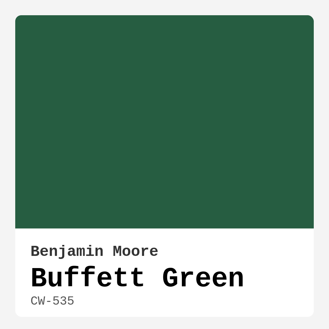
Color Preview & Key Details
| HEX Code | #265D41 |
| RGB | 38, 93, 65 |
| LRV | 10.56% |
| Undertone | Green |
| Finish Options | Eggshell, Matte, Satin |
If you’re searching for a paint color that brings the serenity of nature indoors while still feeling sophisticated and intentional, Benjamin Moore’s Buffett Green (CW-535) is a standout choice. This deep, earthy green has a way of grounding a space, making it feel both cozy and refined. Whether you’re considering it for a living room, bedroom, or home office, this shade has a versatility that adapts to modern farmhouse, traditional, and even eclectic styles with ease. Let’s dive into what makes this color so special and how you can make it work in your home.
Buffett Green is a rich, dark green with an LRV (Light Reflectance Value) of 10.56%, meaning it absorbs more light than it reflects. This gives it a lush, enveloping quality—perfect for creating an intimate atmosphere. In natural light, the color comes alive, revealing its true depth and slightly muted undertones. But in rooms with limited light, it can appear even deeper, so if you’re using it in a space without much sunlight, consider balancing it with lighter furniture, crisp white trim, or well-placed lighting. The good news? It’s a forgiving color when it comes to touch-ups and maintenance, thanks to its high washability and low VOC formula, making it a practical choice for busy households.
One of the best things about Buffett Green is its adaptability. It pairs beautifully with natural materials like wood and stone, enhancing their organic textures. If you’re going for a modern farmhouse look, try pairing it with warm wood tones and brass fixtures—it’ll feel timeless yet fresh. For a more traditional setting, layer it with creamy whites (like Benjamin Moore’s White Dove) and antique furnishings. And if your style leans bohemian or eclectic, this green acts as a lush backdrop for layered textiles, plants, and bold artwork. It’s also a fantastic choice for an accent wall, especially in open-concept spaces where you want to define a zone without closing it off.
Now, let’s talk application. Buffett Green is beginner-friendly—it rolls on smoothly, dries fast, and typically only needs one or two coats for full coverage. The finish you choose can change the vibe entirely. A matte finish gives it a soft, velvety look that’s perfect for bedrooms or cozy reading nooks. Eggshell offers a subtle sheen that works well in living rooms or dining spaces. And if you’re painting a high-traffic area like a home office, a satin finish adds durability while still keeping the color rich and inviting. Just remember, darker colors like this can highlight imperfections in your walls, so proper prep (filling holes, sanding, and priming) is key for a flawless result.
A common question is whether Buffett Green works in small rooms. The answer? Absolutely. While dark colors can sometimes make tight spaces feel smaller, this shade has a way of wrapping a room in warmth rather than shrinking it. To keep things airy, balance it with light-colored furniture, mirrors to reflect light, and plenty of layered lighting—think table lamps, sconces, and even candles. It’s all about creating contrast. And if you’re still hesitant, test it out first. Paint a large swatch on your wall and observe it at different times of day to see how the light plays with it.
If you’re wondering what colors complement Buffett Green, think earthy neutrals, warm whites, and even deep purples (its complementary hue). For trim, White Dove is a classic pairing that keeps things crisp and clean. Brass or gold accents add a touch of warmth, while black fixtures can modernize the look. And if you want to go bold, try pairing it with terracotta or mustard yellow for a vibrant, nature-inspired palette.
At the end of the day, Buffett Green is more than just a paint color—it’s a mood. It brings calm, balance, and a connection to the outdoors, making it perfect for spaces where you want to unwind or focus. Whether you’re painting an entire room or just a piece of furniture, this shade has a way of elevating the ordinary into something intentional and beautiful. So if you’re looking for a color that feels both timeless and fresh, Buffett Green might just be your perfect match. Grab a sample, see how it feels in your space, and get ready to fall in love with the depth and character it brings to your home.
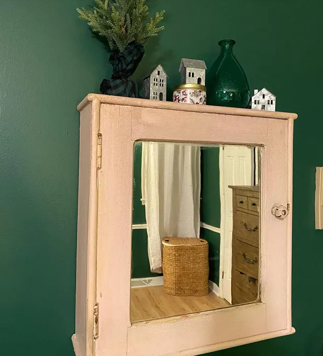
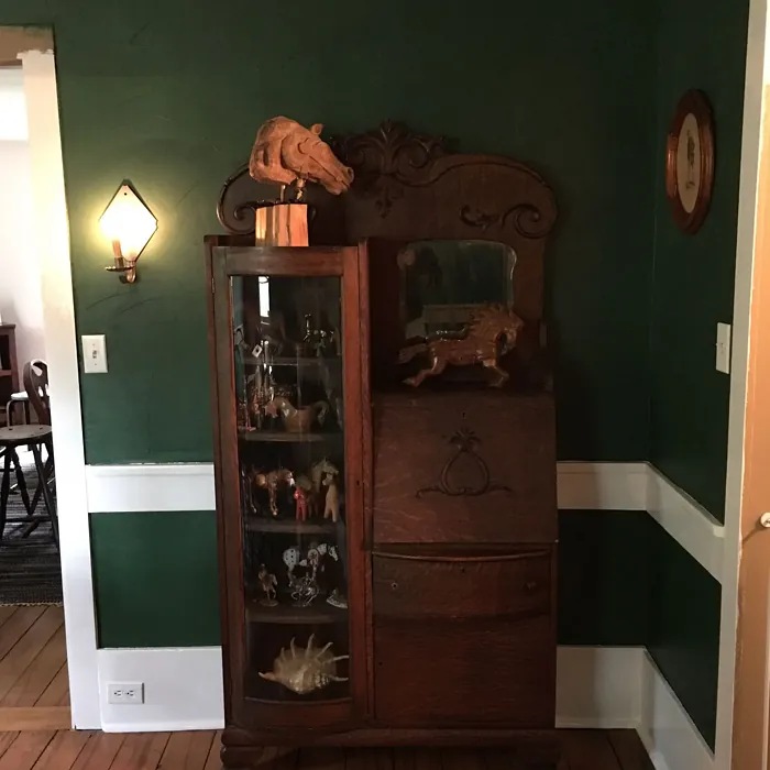
Real Room Photo of Buffett Green CW-535
Undertones of Buffett Green ?
The undertones of Buffett Green are a key aspect of its character, leaning towards Green. These subtle underlying hues are what give the color its depth and complexity. For example, a gray with a blue undertone will feel cooler and more modern, while one with a brown undertone will feel warmer and more traditional. It’s essential to test this paint in your home and observe it next to your existing furniture, flooring, and decor to see how these undertones interact and reveal themselves throughout the day.
HEX value: #265D41
RGB code: 38, 93, 65
Is Buffett Green Cool or Warm?
This color leans towards the cool spectrum, but its earthiness provides a grounding quality that makes it feel warm and inviting. It’s a perfect blend that works well in both warm and cool palettes.
Understanding Color Properties and Interior Design Tips
Hue refers to a specific position on the color wheel, measured in degrees from 0 to 360. Each degree represents a different pure color:
- 0° represents red
- 120° represents green
- 240° represents blue
Saturation describes the intensity or purity of a color and is expressed as a percentage:
- At 0%, the color appears completely desaturated—essentially a shade of gray
- At 100%, the color is at its most vivid and vibrant
Lightness indicates how light or dark a color is, also expressed as a percentage:
- 0% lightness results in black
- 100% lightness results in white
Using Warm Colors in Interior Design
Warm hues—such as reds, oranges, yellows, warm beiges, and greiges—are excellent choices for creating inviting and energetic spaces. These colors are particularly well-suited for:
- Kitchens, living rooms, and bathrooms, where warmth enhances comfort and sociability
- Large rooms, where warm tones can help reduce the sense of emptiness and make the space feel more intimate
For example:
- Warm beige shades provide a cozy, inviting atmosphere, ideal for living rooms, bedrooms, and hallways.
- Warm greige (a mix of beige and gray) offers the warmth of beige with the modern appeal of gray, making it a versatile backdrop for dining areas, bedrooms, and living spaces.
However, be mindful when using warm light tones in rooms with limited natural light. These shades may appear muted or even take on an unpleasant yellowish tint. To avoid a dull or flat appearance:
- Add depth by incorporating richer tones like deep greens, charcoal, or chocolate brown
- Use textured elements such as curtains, rugs, or cushions to bring dimension to the space
Pro Tip: Achieving Harmony with Warm and Cool Color Balance
To create a well-balanced and visually interesting interior, mix warm and cool tones strategically. This contrast adds depth and harmony to your design.
- If your walls feature warm hues, introduce cool-colored accents such as blue or green furniture, artwork, or accessories to create contrast.
- For a polished look, consider using a complementary color scheme, which pairs colors opposite each other on the color wheel (e.g., red with green, orange with blue).
This thoughtful mix not only enhances visual appeal but also creates a space that feels both dynamic and cohesive.
Light Temperature Affects on Buffett Green
Natural Light
Natural daylight changes in color temperature as the sun moves across the sky. At sunrise and sunset, the light tends to have a warm, golden tone with a color temperature around 2000 Kelvin (K). As the day progresses and the sun rises higher, the light becomes cooler and more neutral. Around midday, especially when the sky is clear, natural light typically reaches its peak brightness and shifts to a cooler tone, ranging from 5500 to 6500 Kelvin. This midday light is close to what we perceive as pure white or daylight-balanced light.
These shifts in natural light can significantly influence how colors appear in a space, which is why designers often consider both the time of day and the orientation of windows when planning interior color schemes.
Artificial Light
When choosing artificial lighting, pay close attention to the color temperature, measured in Kelvin (K). This determines how warm or cool the light will appear. Lower temperatures, around 2700K, give off a warm, yellow glow often used in living rooms or bedrooms. Higher temperatures, above 5000K, create a cool, bluish light similar to daylight, commonly used in kitchens, offices, or task areas.
Use the slider to see how lighting temperature can affect the appearance of a surface or color throughout a space.


4800K
LRV of Buffett Green
The Light Reflectance Value (LRV) of Buffett Green is 10.56%, which places it in the Medium Dark category. This means it reflects very little light. Understanding a paint’s LRV is crucial for predicting how it will look in your space. A higher LRV indicates a lighter color that reflects more light, making rooms feel larger and brighter. A lower LRV signifies a darker color that absorbs more light, creating a cozier, more intimate atmosphere. Always consider the natural and artificial lighting in your room when selecting a paint color based on its LRV.
Detailed Review of Buffett Green
Additional Paint Characteristics
Ideal Rooms
Bedroom, Dining Room, Home Office, Living Room
Decor Styles
Bohemian, Eclectic, Modern Farmhouse, Traditional
Coverage
Good (1–2 Coats), Touch-Up Friendly
Ease of Application
Beginner Friendly, Brush Smooth, Fast-Drying, Roller-Ready
Washability
Highly Washable, Washable
VOC Level
Low VOC, Ultra Low VOC
Best Use
Accent Wall, Furniture, Interior Walls
Room Suitability
Bedroom, Dining Room, Home Office, Living Room
Tone Tag
Balanced, Deep, Earthy, Muted
Finish Type
Eggshell, Matt, Satin
Paint Performance
Easy Touch-Up, High Coverage, Low Odor
Use Cases
Best for Modern Farmhouse, Best for Open Concept, Designer Favorite
Mood
Calm, Cozy, Grounding, Inviting
Trim Pairing
Complements Brass Fixtures, Pairs with White Dove, Works with Warm Trim
Buffett Green is truly a standout shade that strikes a harmonious balance between boldness and subtlety. When applied, it exudes a refined, organic feel that can transform both large and small spaces. The matte finish provides a soft, velvety texture, making it ideal for creating an inviting atmosphere. Whether used as an accent wall or enveloping an entire room, it pairs beautifully with natural materials like wood and stone, enhancing the overall aesthetic. Additionally, its versatility allows it to complement various decor styles seamlessly, making it a great choice for anyone looking to refresh their space with a timeless look. One thing to note is that the color may appear darker in dim lighting, so sampling it in your specific environment is a must. Overall, Buffett Green is a color that invites relaxation and connection to nature, making it a perfect choice for any home.
Pros & Cons of CW-535 Buffett Green
Pros
Cons
Colors that go with Benjamin Moore Buffett Green
FAQ on CW-535 Buffett Green
Can I use Buffett Green in a small room?
Absolutely! While darker colors can sometimes feel overwhelming in smaller spaces, Buffett Green is versatile enough to create an inviting atmosphere. Pair it with lighter furnishings and adequate lighting to maintain a sense of openness. It can make a small room feel cozy without being oppressive.
What finishes work best with Buffett Green?
Buffett Green shines in a matte or eggshell finish, as these provide a soft, elegant look that enhances its rich tone. However, if you’re looking for a more polished appearance, a satin finish can also work well, especially in high-traffic areas. Just consider the ambiance you want to create when choosing the finish.
Comparisons Buffett Green with other colors
Buffett Green CW-535 vs Dried Thyme SW 6186
| Attribute | Buffett Green CW-535 | Dried Thyme SW 6186 |
|---|---|---|
| Color Name | Buffett Green CW-535 | Dried Thyme SW 6186 |
| Color | ||
| Hue | Green | Green |
| Brightness | Dark | Dark |
| RGB | 38, 93, 65 | 123, 128, 112 |
| LRV | 10.56% | 24% |
| Finish Type | Eggshell, Matt, Satin | Eggshell, Satin |
| Finish Options | Eggshell, Matte, Satin | Eggshell, Matte, Satin |
| Ideal Rooms | Bedroom, Dining Room, Home Office, Living Room | Bathroom, Bedroom, Dining Room, Entryway, Home Office, Kitchen, Living Room |
| Decor Styles | Bohemian, Eclectic, Modern Farmhouse, Traditional | Bohemian, Industrial, Minimalist, Modern Farmhouse, Rustic |
| Coverage | Good (1–2 Coats), Touch-Up Friendly | Good (1–2 Coats), Touch-Up Friendly |
| Ease of Application | Beginner Friendly, Brush Smooth, Fast-Drying, Roller-Ready | Beginner Friendly, Brush Smooth, Roller-Ready |
| Washability | Highly Washable, Washable | Washable, Wipeable |
| Room Suitability | Bedroom, Dining Room, Home Office, Living Room | Bathroom, Bedroom, Dining Room, Home Office, Kitchen, Living Room |
| Tone | Balanced, Deep, Earthy, Muted | Cool, Earthy, Muted |
| Paint Performance | Easy Touch-Up, High Coverage, Low Odor | Easy Touch-Up, Low Odor, Scuff Resistant |
Buffett Green CW-535 vs Retreat SW 6207
| Attribute | Buffett Green CW-535 | Retreat SW 6207 |
|---|---|---|
| Color Name | Buffett Green CW-535 | Retreat SW 6207 |
| Color | ||
| Hue | Green | Green |
| Brightness | Dark | Dark |
| RGB | 38, 93, 65 | 122, 128, 118 |
| LRV | 10.56% | 30% |
| Finish Type | Eggshell, Matt, Satin | Eggshell, Matte, Satin |
| Finish Options | Eggshell, Matte, Satin | Eggshell, Matte, Satin |
| Ideal Rooms | Bedroom, Dining Room, Home Office, Living Room | Bathroom, Bedroom, Home Office, Kitchen, Living Room |
| Decor Styles | Bohemian, Eclectic, Modern Farmhouse, Traditional | Minimalist, Modern, Rustic, Transitional |
| Coverage | Good (1–2 Coats), Touch-Up Friendly | Good (1–2 Coats), Touch-Up Friendly |
| Ease of Application | Beginner Friendly, Brush Smooth, Fast-Drying, Roller-Ready | Beginner Friendly, Brush Smooth, Roller-Ready |
| Washability | Highly Washable, Washable | Washable, Wipeable |
| Room Suitability | Bedroom, Dining Room, Home Office, Living Room | Bathroom, Bedroom, Home Office, Living Room |
| Tone | Balanced, Deep, Earthy, Muted | Cool, Earthy, Muted |
| Paint Performance | Easy Touch-Up, High Coverage, Low Odor | Easy Touch-Up, Low Odor, Scuff Resistant |
Buffett Green CW-535 vs Rosemary SW 6187
| Attribute | Buffett Green CW-535 | Rosemary SW 6187 |
|---|---|---|
| Color Name | Buffett Green CW-535 | Rosemary SW 6187 |
| Color | ||
| Hue | Green | Green |
| Brightness | Dark | Dark |
| RGB | 38, 93, 65 | 100, 105, 92 |
| LRV | 10.56% | 45% |
| Finish Type | Eggshell, Matt, Satin | Eggshell, Matte, Satin |
| Finish Options | Eggshell, Matte, Satin | Eggshell, Matte, Satin |
| Ideal Rooms | Bedroom, Dining Room, Home Office, Living Room | Bedroom, Dining Room, Hallway, Home Office, Living Room |
| Decor Styles | Bohemian, Eclectic, Modern Farmhouse, Traditional | Bohemian, Coastal, Modern Farmhouse, Rustic |
| Coverage | Good (1–2 Coats), Touch-Up Friendly | Good (1–2 Coats), Touch-Up Friendly |
| Ease of Application | Beginner Friendly, Brush Smooth, Fast-Drying, Roller-Ready | Beginner Friendly, Brush Smooth, Roller-Ready |
| Washability | Highly Washable, Washable | Washable, Wipeable |
| Room Suitability | Bedroom, Dining Room, Home Office, Living Room | Bedroom, Dining Room, Home Office, Living Room |
| Tone | Balanced, Deep, Earthy, Muted | Earthy, Muted, Warm |
| Paint Performance | Easy Touch-Up, High Coverage, Low Odor | Fade Resistant, Low Odor, Quick Drying, Stain Resistant |
Buffett Green CW-535 vs Basil SW 6194
| Attribute | Buffett Green CW-535 | Basil SW 6194 |
|---|---|---|
| Color Name | Buffett Green CW-535 | Basil SW 6194 |
| Color | ||
| Hue | Green | Green |
| Brightness | Dark | Dark |
| RGB | 38, 93, 65 | 98, 110, 96 |
| LRV | 10.56% | 12% |
| Finish Type | Eggshell, Matt, Satin | Eggshell, Matte, Satin |
| Finish Options | Eggshell, Matte, Satin | Eggshell, Matte, Satin |
| Ideal Rooms | Bedroom, Dining Room, Home Office, Living Room | Bathroom, Bedroom, Dining Room, Home Office, Kitchen, Living Room |
| Decor Styles | Bohemian, Eclectic, Modern Farmhouse, Traditional | Bohemian, Contemporary, Modern Farmhouse, Rustic, Transitional |
| Coverage | Good (1–2 Coats), Touch-Up Friendly | Good (1–2 Coats), Touch-Up Friendly |
| Ease of Application | Beginner Friendly, Brush Smooth, Fast-Drying, Roller-Ready | Beginner Friendly, Brush Smooth, Fast-Drying, Roller-Ready |
| Washability | Highly Washable, Washable | Washable, Wipeable |
| Room Suitability | Bedroom, Dining Room, Home Office, Living Room | Bathroom, Bedroom, Dining Room, Kitchen, Living Room |
| Tone | Balanced, Deep, Earthy, Muted | Earthy, Muted, Warm |
| Paint Performance | Easy Touch-Up, High Coverage, Low Odor | Easy Touch-Up, Low Odor, Quick Drying |
Buffett Green CW-535 vs Artichoke SW 6179
| Attribute | Buffett Green CW-535 | Artichoke SW 6179 |
|---|---|---|
| Color Name | Buffett Green CW-535 | Artichoke SW 6179 |
| Color | ||
| Hue | Green | Green |
| Brightness | Dark | Dark |
| RGB | 38, 93, 65 | 127, 130, 102 |
| LRV | 10.56% | 24% |
| Finish Type | Eggshell, Matt, Satin | Eggshell, Matte, Satin |
| Finish Options | Eggshell, Matte, Satin | Eggshell, Matte, Satin |
| Ideal Rooms | Bedroom, Dining Room, Home Office, Living Room | Bedroom, Dining Room, Home Office, Living Room |
| Decor Styles | Bohemian, Eclectic, Modern Farmhouse, Traditional | Eclectic, Modern Farmhouse, Rustic, Transitional |
| Coverage | Good (1–2 Coats), Touch-Up Friendly | Good (1–2 Coats), Touch-Up Friendly |
| Ease of Application | Beginner Friendly, Brush Smooth, Fast-Drying, Roller-Ready | Beginner Friendly, Brush Smooth, Fast-Drying, Roller-Ready |
| Washability | Highly Washable, Washable | Washable, Wipeable |
| Room Suitability | Bedroom, Dining Room, Home Office, Living Room | Bedroom, Dining Room, Home Office, Living Room |
| Tone | Balanced, Deep, Earthy, Muted | Earthy, Muted, Warm |
| Paint Performance | Easy Touch-Up, High Coverage, Low Odor | Easy Touch-Up, High Coverage, Low Odor |
Buffett Green CW-535 vs Shade-Grown SW 6188
| Attribute | Buffett Green CW-535 | Shade-Grown SW 6188 |
|---|---|---|
| Color Name | Buffett Green CW-535 | Shade-Grown SW 6188 |
| Color | ||
| Hue | Green | Green |
| Brightness | Dark | Dark |
| RGB | 38, 93, 65 | 78, 81, 71 |
| LRV | 10.56% | 24% |
| Finish Type | Eggshell, Matt, Satin | Eggshell, Satin |
| Finish Options | Eggshell, Matte, Satin | Eggshell, Flat, Satin |
| Ideal Rooms | Bedroom, Dining Room, Home Office, Living Room | Bedroom, Dining Room, Home Office, Living Room |
| Decor Styles | Bohemian, Eclectic, Modern Farmhouse, Traditional | Bohemian, Modern, Rustic, Scandinavian |
| Coverage | Good (1–2 Coats), Touch-Up Friendly | Good (1–2 Coats), Touch-Up Friendly |
| Ease of Application | Beginner Friendly, Brush Smooth, Fast-Drying, Roller-Ready | Beginner Friendly, Brush Smooth, Fast-Drying, Roller-Ready |
| Washability | Highly Washable, Washable | Highly Washable, Washable |
| Room Suitability | Bedroom, Dining Room, Home Office, Living Room | Bedroom, Dining Room, Home Office, Living Room |
| Tone | Balanced, Deep, Earthy, Muted | Deep, Earthy, Muted |
| Paint Performance | Easy Touch-Up, High Coverage, Low Odor | Easy Touch-Up, High Coverage, Low Odor, Scuff Resistant |
Buffett Green CW-535 vs Foxhall Green SW 9184
| Attribute | Buffett Green CW-535 | Foxhall Green SW 9184 |
|---|---|---|
| Color Name | Buffett Green CW-535 | Foxhall Green SW 9184 |
| Color | ||
| Hue | Green | Green |
| Brightness | Dark | Dark |
| RGB | 38, 93, 65 | 69, 75, 64 |
| LRV | 10.56% | 12% |
| Finish Type | Eggshell, Matt, Satin | Eggshell, Matte, Satin |
| Finish Options | Eggshell, Matte, Satin | Eggshell, Matte, Satin |
| Ideal Rooms | Bedroom, Dining Room, Home Office, Living Room | Bedroom, Dining Room, Home Office, Living Room |
| Decor Styles | Bohemian, Eclectic, Modern Farmhouse, Traditional | Contemporary, Modern Farmhouse, Rustic, Traditional |
| Coverage | Good (1–2 Coats), Touch-Up Friendly | Good (1–2 Coats), Touch-Up Friendly |
| Ease of Application | Beginner Friendly, Brush Smooth, Fast-Drying, Roller-Ready | Beginner Friendly, Brush Smooth, Fast-Drying, Roller-Ready |
| Washability | Highly Washable, Washable | Washable, Wipeable |
| Room Suitability | Bedroom, Dining Room, Home Office, Living Room | Bedroom, Dining Room, Home Office, Living Room |
| Tone | Balanced, Deep, Earthy, Muted | Balanced, Deep, Earthy, Muted |
| Paint Performance | Easy Touch-Up, High Coverage, Low Odor | Easy Touch-Up, Fade Resistant, Low Odor, Quick Drying |
Buffett Green CW-535 vs Pewter Green SW 6208
| Attribute | Buffett Green CW-535 | Pewter Green SW 6208 |
|---|---|---|
| Color Name | Buffett Green CW-535 | Pewter Green SW 6208 |
| Color | ||
| Hue | Green | Green |
| Brightness | Dark | Dark |
| RGB | 38, 93, 65 | 94, 98, 89 |
| LRV | 10.56% | 24% |
| Finish Type | Eggshell, Matt, Satin | Eggshell, Matte, Satin |
| Finish Options | Eggshell, Matte, Satin | Eggshell, Matte, Satin |
| Ideal Rooms | Bedroom, Dining Room, Home Office, Living Room | Bedroom, Dining Room, Entryway, Home Office, Living Room |
| Decor Styles | Bohemian, Eclectic, Modern Farmhouse, Traditional | Contemporary, Modern Farmhouse, Rustic, Scandinavian, Traditional |
| Coverage | Good (1–2 Coats), Touch-Up Friendly | Good (1–2 Coats), Touch-Up Friendly |
| Ease of Application | Beginner Friendly, Brush Smooth, Fast-Drying, Roller-Ready | Beginner Friendly, Brush Smooth, Fast-Drying, Roller-Ready |
| Washability | Highly Washable, Washable | Highly Washable, Washable, Wipeable |
| Room Suitability | Bedroom, Dining Room, Home Office, Living Room | Bathroom, Bedroom, Dining Room, Kitchen, Living Room |
| Tone | Balanced, Deep, Earthy, Muted | Balanced, Cool, Earthy, Muted |
| Paint Performance | Easy Touch-Up, High Coverage, Low Odor | Easy Touch-Up, Fade Resistant, Low Odor, Quick Drying |
Buffett Green CW-535 vs Rookwood Dark Green SW 2816
| Attribute | Buffett Green CW-535 | Rookwood Dark Green SW 2816 |
|---|---|---|
| Color Name | Buffett Green CW-535 | Rookwood Dark Green SW 2816 |
| Color | ||
| Hue | Green | Green |
| Brightness | Dark | Dark |
| RGB | 38, 93, 65 | 86, 92, 74 |
| LRV | 10.56% | 6% |
| Finish Type | Eggshell, Matt, Satin | Eggshell, Matte, Satin |
| Finish Options | Eggshell, Matte, Satin | Eggshell, Matte, Satin |
| Ideal Rooms | Bedroom, Dining Room, Home Office, Living Room | Bedroom, Dining Room, Home Office, Kitchen, Living Room |
| Decor Styles | Bohemian, Eclectic, Modern Farmhouse, Traditional | Contemporary, Modern Farmhouse, Rustic, Traditional |
| Coverage | Good (1–2 Coats), Touch-Up Friendly | Good (1–2 Coats), Touch-Up Friendly |
| Ease of Application | Beginner Friendly, Brush Smooth, Fast-Drying, Roller-Ready | Beginner Friendly, Brush Smooth, Roller-Ready |
| Washability | Highly Washable, Washable | Washable, Wipeable |
| Room Suitability | Bedroom, Dining Room, Home Office, Living Room | Bedroom, Dining Room, Home Office, Living Room |
| Tone | Balanced, Deep, Earthy, Muted | Deep, Earthy, Warm |
| Paint Performance | Easy Touch-Up, High Coverage, Low Odor | Easy Touch-Up, High Coverage, Low Odor, Scuff Resistant |
Buffett Green CW-535 vs Ripe Olive SW 6209
| Attribute | Buffett Green CW-535 | Ripe Olive SW 6209 |
|---|---|---|
| Color Name | Buffett Green CW-535 | Ripe Olive SW 6209 |
| Color | ||
| Hue | Green | Green |
| Brightness | Dark | Dark |
| RGB | 38, 93, 65 | 68, 72, 61 |
| LRV | 10.56% | 15% |
| Finish Type | Eggshell, Matt, Satin | Eggshell, Matte |
| Finish Options | Eggshell, Matte, Satin | Eggshell, Matte, Satin |
| Ideal Rooms | Bedroom, Dining Room, Home Office, Living Room | Bedroom, Dining Room, Home Office, Living Room |
| Decor Styles | Bohemian, Eclectic, Modern Farmhouse, Traditional | Bohemian, Industrial, Modern Farmhouse, Rustic |
| Coverage | Good (1–2 Coats), Touch-Up Friendly | Good (1–2 Coats) |
| Ease of Application | Beginner Friendly, Brush Smooth, Fast-Drying, Roller-Ready | Beginner Friendly, Brush Smooth, Roller-Ready |
| Washability | Highly Washable, Washable | Highly Washable, Washable |
| Room Suitability | Bedroom, Dining Room, Home Office, Living Room | Bedroom, Dining Room, Home Office, Living Room |
| Tone | Balanced, Deep, Earthy, Muted | Deep, Earthy, Muted |
| Paint Performance | Easy Touch-Up, High Coverage, Low Odor | Easy Touch-Up, High Coverage, Low Odor |
Official Page of Benjamin Moore Buffett Green CW-535