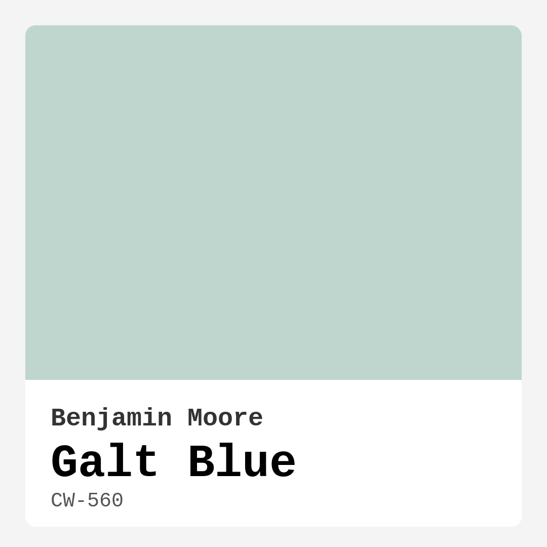
Color Preview & Key Details
| HEX Code | #BED6CD |
| RGB | 190, 214, 205 |
| LRV | 64.02% |
| Undertone | Green |
| Finish Options | Eggshell, Matte, Satin |
Imagine walking into a room that instantly makes you exhale—a space where the walls seem to breathe calmness, where the light feels soft and diffused, and where the color wraps around you like a gentle embrace. That’s the magic of Benjamin Moore’s Galt Blue. It’s not just a paint color; it’s a mood, a feeling, a backdrop for the kind of home that feels both polished and perfectly lived-in. If you’ve been searching for a hue that brings tranquility without sacrificing style, let’s talk about why Galt Blue might be the answer you’ve been looking for.
Galt Blue (CW-560) is one of those rare colors that strikes the perfect balance between blue and green, like the shallow waters of a quiet lagoon. With an LRV of 64.02%, it’s light enough to brighten a room without feeling stark, and its green undertones keep it grounded and organic. This isn’t a color that shouts for attention—it’s subtle, sophisticated, and incredibly versatile. Whether you’re leaning into coastal vibes, Scandinavian minimalism, or modern farmhouse charm, Galt Blue adapts effortlessly.
One of the first things you’ll notice about this color is how it plays with light. In a sun-drenched room, it takes on an almost ethereal quality, reflecting light beautifully to create an airy, open feel. In lower light, it deepens slightly, becoming more muted but never dull. That’s the beauty of its undertones—they add just enough depth to keep the color interesting at any time of day. If you’re working with a small space, don’t hesitate to use Galt Blue. Its lightness can make cramped rooms feel larger, while its cool serenity keeps the atmosphere inviting.
When it comes to application, Galt Blue is a dream. It covers well in one to two coats, dries quickly, and is touch-up friendly—ideal for DIYers or anyone who wants a hassle-free painting experience. I’d recommend an eggshell or satin finish for most spaces. Eggshell gives a soft, velvety look with just a hint of sheen, while satin offers a bit more durability, making it great for higher-traffic areas like hallways or kids’ rooms. Matte is also an option if you’re after a more understated, texture-rich finish, but keep in mind it’s less washable.
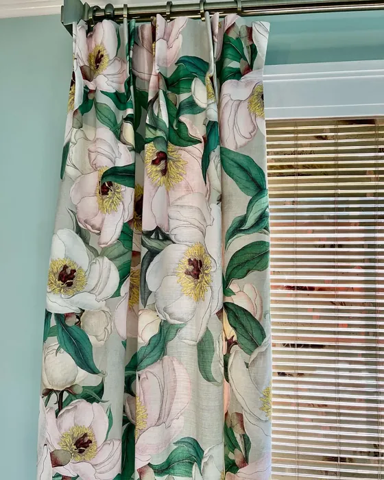
Now, let’s talk pairings. Galt Blue is a team player. It looks stunning alongside crisp whites like Benjamin Moore’s White Dove for trim and ceilings, creating a clean, fresh contrast. If you want to lean into its green undertones, try pairing it with warm wood tones or rattan furniture—think light oak floors or a woven jute rug. For a more modern look, layer in black accents or matte brass hardware. And if you’re feeling bold, its complementary red undertones mean it can handle small pops of coral or terracotta without clashing.
As for where to use it, the possibilities are endless. In a bedroom, Galt Blue promotes restful sleep, especially when paired with linen bedding and soft, neutral textiles. In a bathroom, it evokes spa-like serenity—picture it with marble countertops and plenty of greenery. A living room painted in this hue feels instantly more put-together, whether you’re going for a relaxed coastal look or something more tailored. And in a nursery? It’s gender-neutral, calming, and far more interesting than plain pastels.
Of course, no color is without its quirks. Galt Blue can lean cooler in certain lighting, so if your room gets very little natural light, test a swatch first to ensure it doesn’t feel too icy. And while it’s versatile, it does require thoughtful pairing with your existing decor. Avoid pairing it with other cool grays or blues unless you’re intentionally going for a monochromatic scheme—instead, let it shine alongside warm neutrals or earthy tones.
If you’re still on the fence, consider this: Galt Blue is the kind of color that grows with you. It’s not trendy in a way that will feel dated in a few years, nor is it so safe that it lacks personality. It’s a timeless choice, one that can evolve as your style does. So go ahead—paint a sample on your wall, live with it for a few days, and see how it makes you feel. Chances are, you’ll fall in love with the way it transforms your space into a sanctuary. After all, the best colors don’t just decorate a room; they elevate the way you live in it.
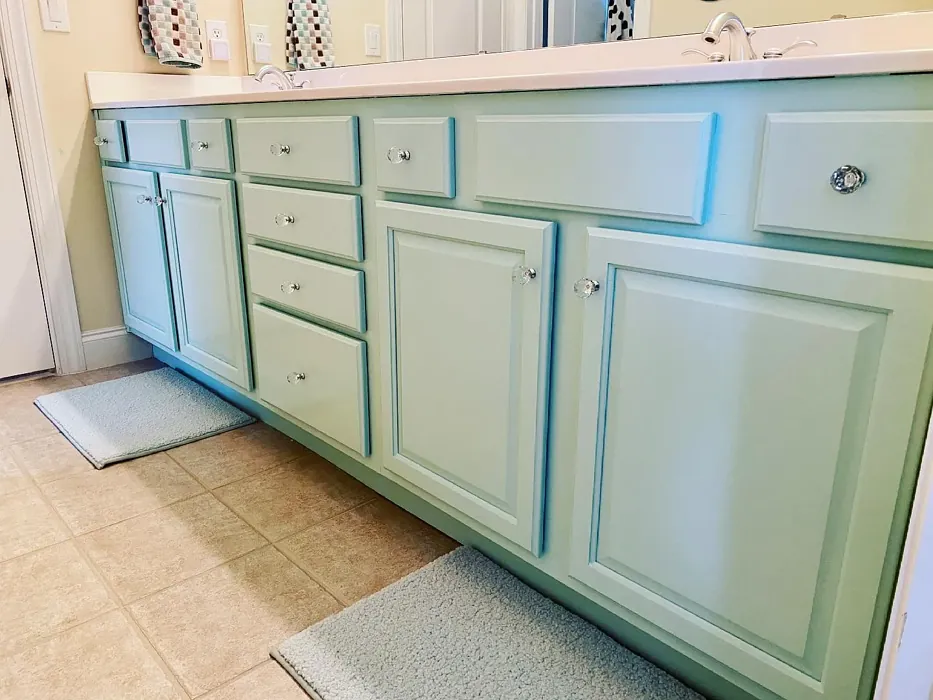
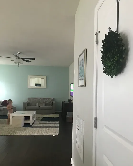
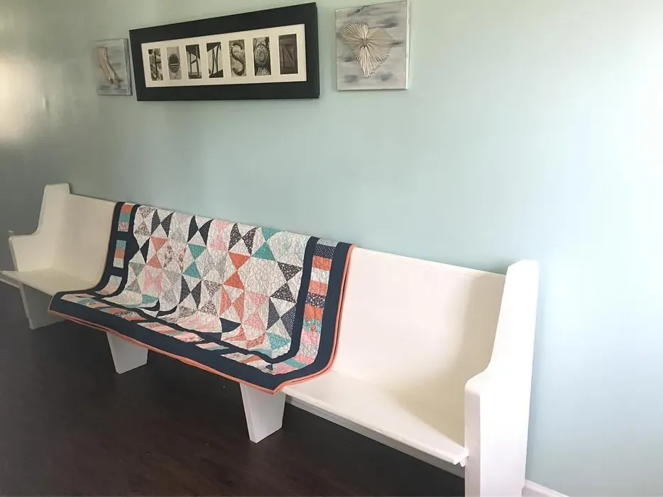
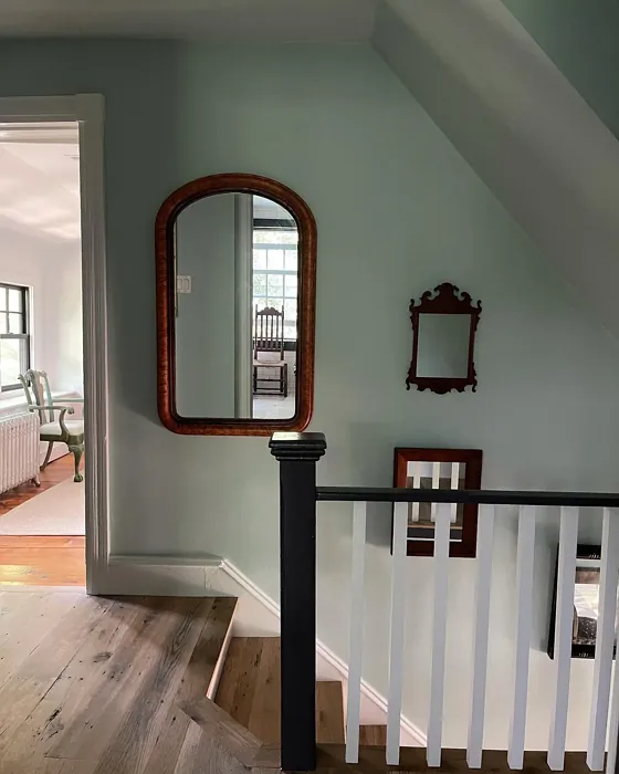
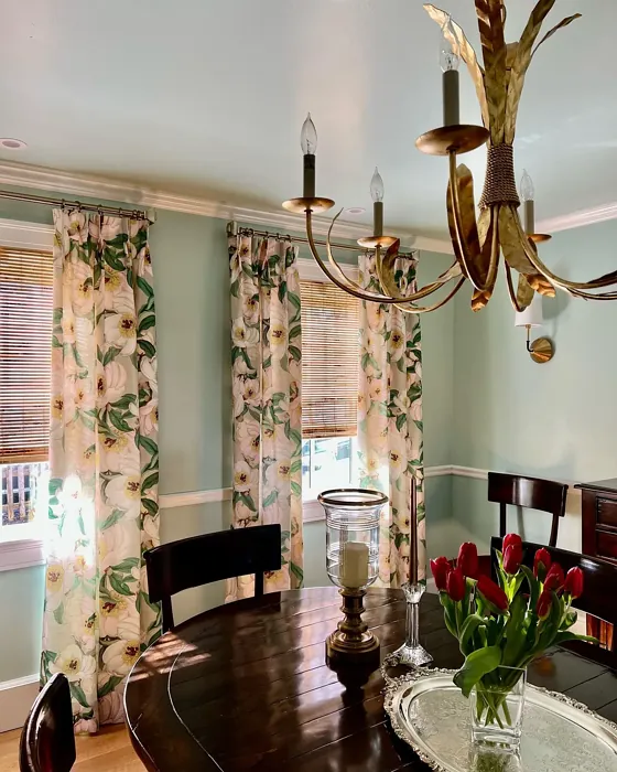
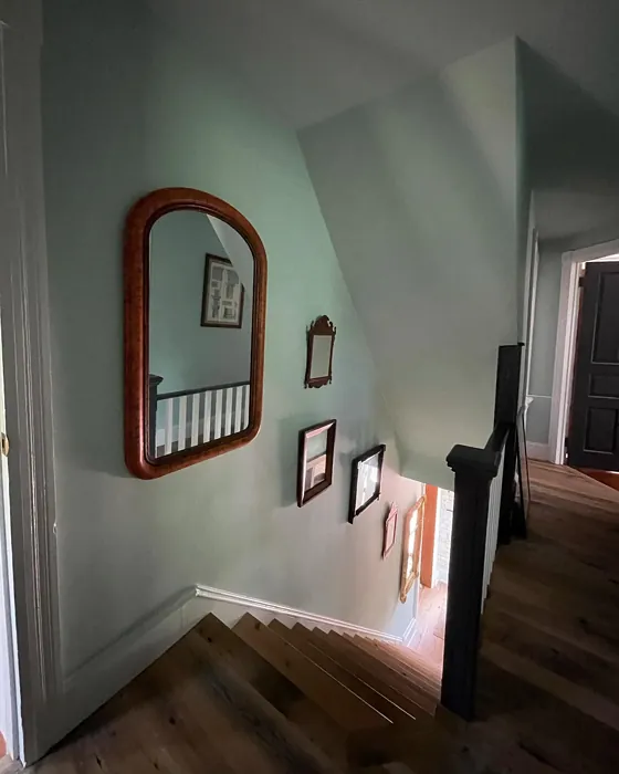
Real Room Photo of Galt Blue CW-560
Undertones of Galt Blue ?
The undertones of Galt Blue are a key aspect of its character, leaning towards Green. These subtle underlying hues are what give the color its depth and complexity. For example, a gray with a blue undertone will feel cooler and more modern, while one with a brown undertone will feel warmer and more traditional. It’s essential to test this paint in your home and observe it next to your existing furniture, flooring, and decor to see how these undertones interact and reveal themselves throughout the day.
HEX value: #BED6CD
RGB code: 190, 214, 205
Is Galt Blue Cool or Warm?
This shade leans towards the cool side of the color spectrum, but its balanced undertones ensure it feels inviting rather than cold. It’s perfect for spaces where you want to evoke a sense of tranquility.
Understanding Color Properties and Interior Design Tips
Hue refers to a specific position on the color wheel, measured in degrees from 0 to 360. Each degree represents a different pure color:
- 0° represents red
- 120° represents green
- 240° represents blue
Saturation describes the intensity or purity of a color and is expressed as a percentage:
- At 0%, the color appears completely desaturated—essentially a shade of gray
- At 100%, the color is at its most vivid and vibrant
Lightness indicates how light or dark a color is, also expressed as a percentage:
- 0% lightness results in black
- 100% lightness results in white
Using Warm Colors in Interior Design
Warm hues—such as reds, oranges, yellows, warm beiges, and greiges—are excellent choices for creating inviting and energetic spaces. These colors are particularly well-suited for:
- Kitchens, living rooms, and bathrooms, where warmth enhances comfort and sociability
- Large rooms, where warm tones can help reduce the sense of emptiness and make the space feel more intimate
For example:
- Warm beige shades provide a cozy, inviting atmosphere, ideal for living rooms, bedrooms, and hallways.
- Warm greige (a mix of beige and gray) offers the warmth of beige with the modern appeal of gray, making it a versatile backdrop for dining areas, bedrooms, and living spaces.
However, be mindful when using warm light tones in rooms with limited natural light. These shades may appear muted or even take on an unpleasant yellowish tint. To avoid a dull or flat appearance:
- Add depth by incorporating richer tones like deep greens, charcoal, or chocolate brown
- Use textured elements such as curtains, rugs, or cushions to bring dimension to the space
Pro Tip: Achieving Harmony with Warm and Cool Color Balance
To create a well-balanced and visually interesting interior, mix warm and cool tones strategically. This contrast adds depth and harmony to your design.
- If your walls feature warm hues, introduce cool-colored accents such as blue or green furniture, artwork, or accessories to create contrast.
- For a polished look, consider using a complementary color scheme, which pairs colors opposite each other on the color wheel (e.g., red with green, orange with blue).
This thoughtful mix not only enhances visual appeal but also creates a space that feels both dynamic and cohesive.
Light Temperature Affects on Galt Blue
Natural Light
Natural daylight changes in color temperature as the sun moves across the sky. At sunrise and sunset, the light tends to have a warm, golden tone with a color temperature around 2000 Kelvin (K). As the day progresses and the sun rises higher, the light becomes cooler and more neutral. Around midday, especially when the sky is clear, natural light typically reaches its peak brightness and shifts to a cooler tone, ranging from 5500 to 6500 Kelvin. This midday light is close to what we perceive as pure white or daylight-balanced light.
These shifts in natural light can significantly influence how colors appear in a space, which is why designers often consider both the time of day and the orientation of windows when planning interior color schemes.
Artificial Light
When choosing artificial lighting, pay close attention to the color temperature, measured in Kelvin (K). This determines how warm or cool the light will appear. Lower temperatures, around 2700K, give off a warm, yellow glow often used in living rooms or bedrooms. Higher temperatures, above 5000K, create a cool, bluish light similar to daylight, commonly used in kitchens, offices, or task areas.
Use the slider to see how lighting temperature can affect the appearance of a surface or color throughout a space.


4800K
LRV of Galt Blue
The Light Reflectance Value (LRV) of Galt Blue is 64.02%, which places it in the Light colors category. This means it reflect most of the incident light. Understanding a paint’s LRV is crucial for predicting how it will look in your space. A higher LRV indicates a lighter color that reflects more light, making rooms feel larger and brighter. A lower LRV signifies a darker color that absorbs more light, creating a cozier, more intimate atmosphere. Always consider the natural and artificial lighting in your room when selecting a paint color based on its LRV.
Detailed Review of Galt Blue
Additional Paint Characteristics
Ideal Rooms
Bathroom, Bedroom, Hallway, Living Room, Nursery
Decor Styles
Coastal, Minimalist, Modern, Scandinavian
Coverage
Good (1–2 Coats), Touch-Up Friendly
Ease of Application
Beginner Friendly, Brush Smooth, Fast-Drying, Roller-Ready
Washability
Highly Washable, Washable
VOC Level
Low VOC, Ultra Low VOC
Best Use
Accent Wall, Interior Walls, Living Room, Nursery
Room Suitability
Bathroom, Bedroom, Living Room, Nursery
Tone Tag
Airy, Cool, Muted
Finish Type
Eggshell, Satin
Paint Performance
Easy Touch-Up, Fade Resistant, Low Odor, Quick Drying
Use Cases
Best for Open Concept, Best for Small Spaces, Classic Favorite, Designer Favorite
Mood
Brightening, Calm, Inviting, Restful
Trim Pairing
Complements Cool Trim, Matches Pure White, Pairs with White Dove
Galt Blue is truly a standout when it comes to creating a peaceful ambiance in your home. Its gentle tone can lighten a room making it feel more spacious and airy. Whether you choose to use it in a living room or a nursery, this color promotes relaxation and calmness, making it perfect for those areas where you unwind. The versatility of Galt Blue means it pairs beautifully with a variety of decor styles, from coastal to modern. I especially appreciate how it can be used as an accent wall or a full-room color without overwhelming the senses. The application process is smooth, and you’ll find it covers well with just a couple of coats, saving you time and effort. Overall, Galt Blue brings a refreshing touch of nature indoors.
Pros & Cons of CW-560 Galt Blue
Pros
Cons
Colors that go with Benjamin Moore Galt Blue
FAQ on CW-560 Galt Blue
Can Galt Blue be used in small rooms?
Absolutely! Galt Blue works wonderfully in small spaces. Its light, airy quality can make a compact room feel larger and more open. When paired with the right decor and lighting, it can enhance the sense of space while providing a refreshing backdrop.
What finishes work best with Galt Blue?
For Galt Blue, I recommend using either an eggshell or satin finish. These finishes not only provide a soft sheen that enhances the color but also make it easier to clean and maintain. A matte finish can also work well, especially in low-traffic areas, but keep in mind that it may be less durable.
Comparisons Galt Blue with other colors
Galt Blue CW-560 vs Sea Salt SW 6204
| Attribute | Galt Blue CW-560 | Sea Salt SW 6204 |
|---|---|---|
| Color Name | Galt Blue CW-560 | Sea Salt SW 6204 |
| Color | ||
| Hue | Green | Green |
| Brightness | Light | Light |
| RGB | 190, 214, 205 | 205, 210, 202 |
| LRV | 64.02% | 64% |
| Finish Type | Eggshell, Satin | Eggshell, Satin |
| Finish Options | Eggshell, Matte, Satin | Eggshell, Matte, Satin |
| Ideal Rooms | Bathroom, Bedroom, Hallway, Living Room, Nursery | Bathroom, Bedroom, Hallway, Kitchen, Living Room |
| Decor Styles | Coastal, Minimalist, Modern, Scandinavian | Coastal, Minimalist, Modern Farmhouse, Scandinavian, Traditional |
| Coverage | Good (1–2 Coats), Touch-Up Friendly | Good (1–2 Coats), Touch-Up Friendly |
| Ease of Application | Beginner Friendly, Brush Smooth, Fast-Drying, Roller-Ready | Beginner Friendly, Brush Smooth, Fast-Drying, Roller-Ready |
| Washability | Highly Washable, Washable | Highly Washable, Washable |
| Room Suitability | Bathroom, Bedroom, Living Room, Nursery | Bathroom, Bedroom, Hallway, Kitchen, Living Room |
| Tone | Airy, Cool, Muted | Airy, Balanced, Cool, Muted |
| Paint Performance | Easy Touch-Up, Fade Resistant, Low Odor, Quick Drying | Easy Touch-Up, High Coverage, Low Odor, Quick Drying |
Galt Blue CW-560 vs Liveable Green SW 6176
| Attribute | Galt Blue CW-560 | Liveable Green SW 6176 |
|---|---|---|
| Color Name | Galt Blue CW-560 | Liveable Green SW 6176 |
| Color | ||
| Hue | Green | Green |
| Brightness | Light | Light |
| RGB | 190, 214, 205 | 206, 206, 189 |
| LRV | 64.02% | 30% |
| Finish Type | Eggshell, Satin | Eggshell, Matte, Satin |
| Finish Options | Eggshell, Matte, Satin | Eggshell, Matte, Satin |
| Ideal Rooms | Bathroom, Bedroom, Hallway, Living Room, Nursery | Bedroom, Home Office, Kitchen, Living Room, Nursery |
| Decor Styles | Coastal, Minimalist, Modern, Scandinavian | Contemporary, Modern Farmhouse, Rustic, Scandi |
| Coverage | Good (1–2 Coats), Touch-Up Friendly | Good (1–2 Coats), Touch-Up Friendly |
| Ease of Application | Beginner Friendly, Brush Smooth, Fast-Drying, Roller-Ready | Beginner Friendly, Brush Smooth, Roller-Ready |
| Washability | Highly Washable, Washable | Highly Washable, Washable |
| Room Suitability | Bathroom, Bedroom, Living Room, Nursery | Bedroom, Home Office, Living Room, Nursery |
| Tone | Airy, Cool, Muted | Balanced, Earthy, Muted |
| Paint Performance | Easy Touch-Up, Fade Resistant, Low Odor, Quick Drying | Easy Touch-Up, High Coverage, Low Odor |
Galt Blue CW-560 vs Rainwashed SW 6211
| Attribute | Galt Blue CW-560 | Rainwashed SW 6211 |
|---|---|---|
| Color Name | Galt Blue CW-560 | Rainwashed SW 6211 |
| Color | ||
| Hue | Green | Green |
| Brightness | Light | Light |
| RGB | 190, 214, 205 | 194, 205, 197 |
| LRV | 64.02% | 60% |
| Finish Type | Eggshell, Satin | Eggshell, Matte, Satin |
| Finish Options | Eggshell, Matte, Satin | Eggshell, Matte, Satin |
| Ideal Rooms | Bathroom, Bedroom, Hallway, Living Room, Nursery | Bathroom, Bedroom, Home Office, Living Room, Nursery |
| Decor Styles | Coastal, Minimalist, Modern, Scandinavian | Coastal, Farmhouse, Minimalist, Modern, Transitional |
| Coverage | Good (1–2 Coats), Touch-Up Friendly | Good (1–2 Coats), Touch-Up Friendly |
| Ease of Application | Beginner Friendly, Brush Smooth, Fast-Drying, Roller-Ready | Beginner Friendly, Brush Smooth, Fast-Drying, Roller-Ready |
| Washability | Highly Washable, Washable | Washable, Wipeable |
| Room Suitability | Bathroom, Bedroom, Living Room, Nursery | Bathroom, Bedroom, Home Office, Living Room, Nursery |
| Tone | Airy, Cool, Muted | Balanced, Cool, Muted |
| Paint Performance | Easy Touch-Up, Fade Resistant, Low Odor, Quick Drying | Easy Touch-Up, High Coverage, Low Odor |
Galt Blue CW-560 vs Filmy Green SW 6190
| Attribute | Galt Blue CW-560 | Filmy Green SW 6190 |
|---|---|---|
| Color Name | Galt Blue CW-560 | Filmy Green SW 6190 |
| Color | ||
| Hue | Green | Green |
| Brightness | Light | Light |
| RGB | 190, 214, 205 | 209, 211, 199 |
| LRV | 64.02% | 50% |
| Finish Type | Eggshell, Satin | Eggshell, Matte, Satin |
| Finish Options | Eggshell, Matte, Satin | Eggshell, Matte, Satin |
| Ideal Rooms | Bathroom, Bedroom, Hallway, Living Room, Nursery | Bedroom, Home Office, Living Room, Nursery |
| Decor Styles | Coastal, Minimalist, Modern, Scandinavian | Bohemian, Minimalist, Modern Farmhouse, Scandinavian |
| Coverage | Good (1–2 Coats), Touch-Up Friendly | Good (1–2 Coats) |
| Ease of Application | Beginner Friendly, Brush Smooth, Fast-Drying, Roller-Ready | Beginner Friendly, Brush Smooth, Roller-Ready |
| Washability | Highly Washable, Washable | Washable, Wipeable |
| Room Suitability | Bathroom, Bedroom, Living Room, Nursery | Bedroom, Home Office, Living Room, Nursery |
| Tone | Airy, Cool, Muted | Calm, Earthy, Muted |
| Paint Performance | Easy Touch-Up, Fade Resistant, Low Odor, Quick Drying | Easy Touch-Up, Low Odor, Quick Drying |
Galt Blue CW-560 vs Slow Green SW 6456
| Attribute | Galt Blue CW-560 | Slow Green SW 6456 |
|---|---|---|
| Color Name | Galt Blue CW-560 | Slow Green SW 6456 |
| Color | ||
| Hue | Green | Green |
| Brightness | Light | Light |
| RGB | 190, 214, 205 | 198, 213, 201 |
| LRV | 64.02% | 48% |
| Finish Type | Eggshell, Satin | Eggshell, Matte, Satin |
| Finish Options | Eggshell, Matte, Satin | Eggshell, Matte, Satin |
| Ideal Rooms | Bathroom, Bedroom, Hallway, Living Room, Nursery | Bedroom, Dining Room, Home Office, Living Room, Nursery |
| Decor Styles | Coastal, Minimalist, Modern, Scandinavian | Coastal, Farmhouse, Modern, Rustic, Scandinavian |
| Coverage | Good (1–2 Coats), Touch-Up Friendly | Good (1–2 Coats), Touch-Up Friendly |
| Ease of Application | Beginner Friendly, Brush Smooth, Fast-Drying, Roller-Ready | Beginner Friendly, Brush Smooth, Roller-Ready |
| Washability | Highly Washable, Washable | Highly Washable, Washable |
| Room Suitability | Bathroom, Bedroom, Living Room, Nursery | Bedroom, Dining Room, Entryway, Home Office, Living Room, Nursery |
| Tone | Airy, Cool, Muted | Balanced, Earthy, Muted |
| Paint Performance | Easy Touch-Up, Fade Resistant, Low Odor, Quick Drying | Easy Touch-Up, Fade Resistant, Low Odor |
Galt Blue CW-560 vs Acanthus SW 0029
| Attribute | Galt Blue CW-560 | Acanthus SW 0029 |
|---|---|---|
| Color Name | Galt Blue CW-560 | Acanthus SW 0029 |
| Color | ||
| Hue | Green | Green |
| Brightness | Light | Light |
| RGB | 190, 214, 205 | 205, 205, 180 |
| LRV | 64.02% | 10% |
| Finish Type | Eggshell, Satin | Eggshell, Matte, Satin |
| Finish Options | Eggshell, Matte, Satin | Eggshell, Matte, Satin |
| Ideal Rooms | Bathroom, Bedroom, Hallway, Living Room, Nursery | Bedroom, Dining Room, Home Office, Kitchen, Living Room |
| Decor Styles | Coastal, Minimalist, Modern, Scandinavian | Eclectic, Farmhouse, Modern, Traditional |
| Coverage | Good (1–2 Coats), Touch-Up Friendly | Good (1–2 Coats) |
| Ease of Application | Beginner Friendly, Brush Smooth, Fast-Drying, Roller-Ready | Beginner Friendly, Brush Smooth, Fast-Drying, Roller-Ready |
| Washability | Highly Washable, Washable | Highly Washable, Stain Resistant, Washable |
| Room Suitability | Bathroom, Bedroom, Living Room, Nursery | Bedroom, Dining Room, Home Office, Living Room |
| Tone | Airy, Cool, Muted | Balanced, Earthy, Muted |
| Paint Performance | Easy Touch-Up, Fade Resistant, Low Odor, Quick Drying | Easy Touch-Up, Low Odor, Quick Drying, Scuff Resistant |
Galt Blue CW-560 vs Topiary Tint SW 6449
| Attribute | Galt Blue CW-560 | Topiary Tint SW 6449 |
|---|---|---|
| Color Name | Galt Blue CW-560 | Topiary Tint SW 6449 |
| Color | ||
| Hue | Green | Green |
| Brightness | Light | Light |
| RGB | 190, 214, 205 | 200, 216, 196 |
| LRV | 64.02% | 30% |
| Finish Type | Eggshell, Satin | Eggshell, Matte, Satin |
| Finish Options | Eggshell, Matte, Satin | Eggshell, Matte, Satin |
| Ideal Rooms | Bathroom, Bedroom, Hallway, Living Room, Nursery | Bathroom, Bedroom, Dining Room, Home Office, Kitchen, Living Room |
| Decor Styles | Coastal, Minimalist, Modern, Scandinavian | Bohemian, Coastal, Eclectic, Modern Farmhouse, Transitional |
| Coverage | Good (1–2 Coats), Touch-Up Friendly | Good (1–2 Coats), Touch-Up Friendly |
| Ease of Application | Beginner Friendly, Brush Smooth, Fast-Drying, Roller-Ready | Beginner Friendly, Brush Smooth, Fast-Drying, Roller-Ready |
| Washability | Highly Washable, Washable | Scuff Resistant, Washable |
| Room Suitability | Bathroom, Bedroom, Living Room, Nursery | Bathroom, Bedroom, Dining Room, Kitchen, Living Room |
| Tone | Airy, Cool, Muted | Balanced, Calm, Earthy, Muted |
| Paint Performance | Easy Touch-Up, Fade Resistant, Low Odor, Quick Drying | Easy Touch-Up, Low Odor, Quick Drying, Stain Resistant |
Galt Blue CW-560 vs Waterscape SW 6470
| Attribute | Galt Blue CW-560 | Waterscape SW 6470 |
|---|---|---|
| Color Name | Galt Blue CW-560 | Waterscape SW 6470 |
| Color | ||
| Hue | Green | Green |
| Brightness | Light | Light |
| RGB | 190, 214, 205 | 191, 210, 201 |
| LRV | 64.02% | 50% |
| Finish Type | Eggshell, Satin | Eggshell, Matte |
| Finish Options | Eggshell, Matte, Satin | Eggshell, Matte, Satin |
| Ideal Rooms | Bathroom, Bedroom, Hallway, Living Room, Nursery | Bathroom, Bedroom, Home Office, Kitchen, Living Room |
| Decor Styles | Coastal, Minimalist, Modern, Scandinavian | Coastal, Minimalist, Modern, Scandinavian |
| Coverage | Good (1–2 Coats), Touch-Up Friendly | Good (1–2 Coats) |
| Ease of Application | Beginner Friendly, Brush Smooth, Fast-Drying, Roller-Ready | Beginner Friendly, Brush Smooth, Roller-Ready |
| Washability | Highly Washable, Washable | Highly Washable, Washable |
| Room Suitability | Bathroom, Bedroom, Living Room, Nursery | Bathroom, Bedroom, Home Office, Living Room |
| Tone | Airy, Cool, Muted | Airy, Cool, Muted |
| Paint Performance | Easy Touch-Up, Fade Resistant, Low Odor, Quick Drying | Easy Touch-Up, Low Odor, Quick Drying |
Galt Blue CW-560 vs Bonsai Tint SW 6436
| Attribute | Galt Blue CW-560 | Bonsai Tint SW 6436 |
|---|---|---|
| Color Name | Galt Blue CW-560 | Bonsai Tint SW 6436 |
| Color | ||
| Hue | Green | Green |
| Brightness | Light | Light |
| RGB | 190, 214, 205 | 197, 209, 178 |
| LRV | 64.02% | 64% |
| Finish Type | Eggshell, Satin | Eggshell, Matte |
| Finish Options | Eggshell, Matte, Satin | Eggshell, Matte, Satin |
| Ideal Rooms | Bathroom, Bedroom, Hallway, Living Room, Nursery | Bedroom, Home Office, Living Room, Nursery |
| Decor Styles | Coastal, Minimalist, Modern, Scandinavian | Bohemian, Minimalist, Modern, Scandinavian |
| Coverage | Good (1–2 Coats), Touch-Up Friendly | Good (1–2 Coats) |
| Ease of Application | Beginner Friendly, Brush Smooth, Fast-Drying, Roller-Ready | Beginner Friendly, Brush Smooth, Roller-Ready |
| Washability | Highly Washable, Washable | Washable, Wipeable |
| Room Suitability | Bathroom, Bedroom, Living Room, Nursery | Bedroom, Home Office, Living Room, Nursery |
| Tone | Airy, Cool, Muted | Calm, Earthy, Muted |
| Paint Performance | Easy Touch-Up, Fade Resistant, Low Odor, Quick Drying | Easy Touch-Up, Fade Resistant, Low Odor |
Galt Blue CW-560 vs Gratifying Green SW 6435
| Attribute | Galt Blue CW-560 | Gratifying Green SW 6435 |
|---|---|---|
| Color Name | Galt Blue CW-560 | Gratifying Green SW 6435 |
| Color | ||
| Hue | Green | Green |
| Brightness | Light | Light |
| RGB | 190, 214, 205 | 218, 226, 205 |
| LRV | 64.02% | 30% |
| Finish Type | Eggshell, Satin | Eggshell, Matte, Satin |
| Finish Options | Eggshell, Matte, Satin | Eggshell, Matte, Satin |
| Ideal Rooms | Bathroom, Bedroom, Hallway, Living Room, Nursery | Bedroom, Dining Room, Home Office, Living Room, Nursery |
| Decor Styles | Coastal, Minimalist, Modern, Scandinavian | Bohemian, Coastal, Minimalist, Modern Farmhouse |
| Coverage | Good (1–2 Coats), Touch-Up Friendly | Good (1–2 Coats), Touch-Up Friendly |
| Ease of Application | Beginner Friendly, Brush Smooth, Fast-Drying, Roller-Ready | Beginner Friendly, Brush Smooth, Roller-Ready |
| Washability | Highly Washable, Washable | Washable, Wipeable |
| Room Suitability | Bathroom, Bedroom, Living Room, Nursery | Bedroom, Home Office, Living Room, Nursery |
| Tone | Airy, Cool, Muted | Earthy, Muted, Warm |
| Paint Performance | Easy Touch-Up, Fade Resistant, Low Odor, Quick Drying | Easy Touch-Up, Low Odor, Quick Drying |
Official Page of Benjamin Moore Galt Blue CW-560