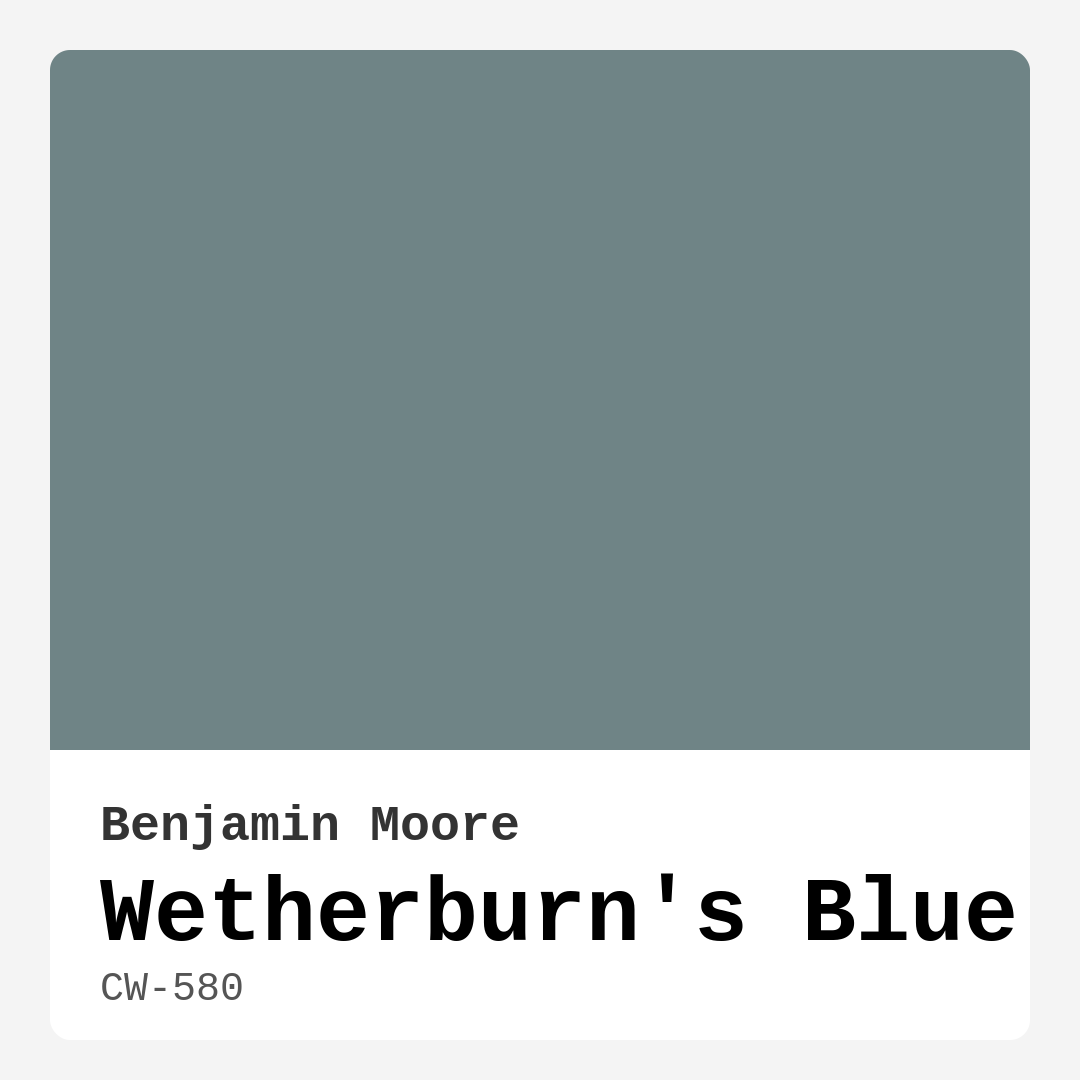
Color Preview & Key Details
| HEX Code | #6F8486 |
| RGB | 111, 132, 134 |
| LRV | 23.60% |
| Undertone | Blue |
| Finish Options | Eggshell, Matte, Satin |
If you’re searching for a paint color that effortlessly blends sophistication with serenity, let me introduce you to Wetherburn’s Blue by Benjamin Moore. This isn’t just another blue—it’s a muted, grayish-blue with a quiet elegance that transforms any room into a calming retreat. Whether you’re refreshing a bedroom, designing a home office, or giving your living room a coastal-inspired makeover, this shade has the versatility to adapt to your vision while creating a space that feels intentional and inviting.
One of the first things you’ll notice about Wetherburn’s Blue is its adaptability. With an LRV (Light Reflectance Value) of 23.60%, it sits comfortably in the medium range, meaning it reflects a fair amount of light without feeling too heavy. This makes it a fantastic choice for rooms with decent natural light, where it’ll appear soft and airy, almost like a whisper of color. But don’t let that fool you—it holds its own in low-light spaces too, though it may lean a touch darker, adding a cozy, intimate vibe. The key is to test it in your space before committing. Paint a large swatch on the wall and observe how it shifts throughout the day. You’ll see how it dances between cool and warm undertones, never feeling too stark or clinical.
Speaking of undertones, Wetherburn’s Blue leans into its blue base with a hint of green, giving it that dusty teal or slate blue quality. This subtle complexity is what makes it so special—it’s not a flat, one-note color. Pair it with crisp white trim like Benjamin Moore’s White Dove, and you’ve got a classic, timeless combo. Or, if you’re feeling bold, layer it with brass fixtures or warm wood tones to play up its balanced coolness. The contrast between the muted blue and rich metals or natural textures creates a space that feels both polished and lived-in.
When it comes to application, Wetherburn’s Blue is beginner-friendly. It covers well in one to two coats, and its touch-up-friendly formula means you won’t have to stress over minor imperfections. For the smoothest finish, opt for high-quality brushes or rollers—this isn’t the color to cut corners with cheap tools. It’s available in Matte, Eggshell, and Satin finishes, so you can choose based on your room’s needs. Eggshell is a safe bet for most walls, offering a slight sheen that’s easy to clean, while Matte delivers a more velvety, subdued look perfect for low-traffic areas like bedrooms.
Now, let’s talk about where this color shines. Imagine it in a bedroom—soft, restful, and utterly serene. It’s the kind of hue that lulls you into relaxation, especially when paired with linen bedding and natural textures. In a home office, it fosters focus without feeling sterile. And in a living room? It’s a designer favorite for a reason. It works beautifully in open-concept spaces, tying rooms together with its understated elegance. Even nurseries benefit from its calming presence, offering a gender-neutral palette that grows with your child.
If you’re worried about small spaces, don’t be. Wetherburn’s Blue can actually make a room feel larger if you balance it with lighter accents and plenty of natural light. Just avoid pairing it with heavy, dark furniture in tight quarters—opt for airy pieces and mirrors to amplify the sense of space. And if you’re considering an accent wall, this color is a stellar choice. It’s bold enough to make a statement but soft enough to avoid overwhelming the room.
As for decor styles, it’s a chameleon. Coastal? Check—it evokes the quiet depth of ocean waves. Scandinavian? Absolutely, especially when paired with minimalist furniture and clean lines. Traditional spaces benefit from its timeless appeal, while modern interiors can use it as a grounding neutral. The mood it creates is consistently calm, restful, and inviting, no matter the style.
A few practical perks: Wetherburn’s Blue is low-VOC, so it’s a great option if you’re mindful of indoor air quality. It’s also fade-resistant and washable, making it a practical choice for busy households. And if you ever want to switch things up, it plays nicely with a range of complementary shades. Think soft taupes, warm grays, or even blush pinks for a subtle contrast.
So, is Wetherburn’s Blue right for your project? If you’re after a color that’s equal parts sophisticated and soothing, the answer is probably yes. It’s the kind of shade that doesn’t just sit on your walls—it enhances them, creating a backdrop that feels intentional and alive. Test it, live with it, and see how it transforms your space. You might just find it’s the perfect balance of calm and character you’ve been searching for.

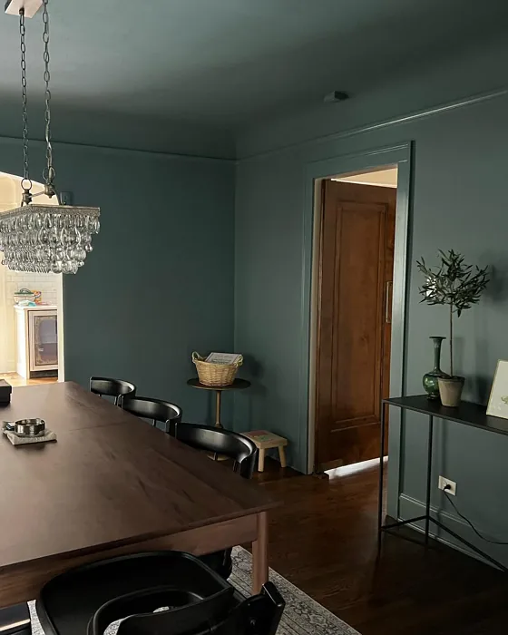
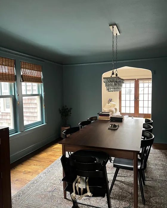
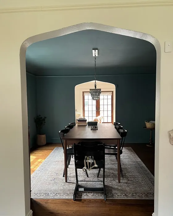
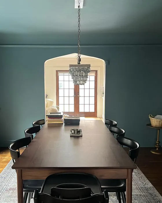
Real Room Photo of Wetherburn’s Blue CW-580

Undertones of Wetherburn’s Blue ?
The undertones of Wetherburn’s Blue are a key aspect of its character, leaning towards Blue. These subtle underlying hues are what give the color its depth and complexity. For example, a gray with a blue undertone will feel cooler and more modern, while one with a brown undertone will feel warmer and more traditional. It’s essential to test this paint in your home and observe it next to your existing furniture, flooring, and decor to see how these undertones interact and reveal themselves throughout the day.
HEX value: #6F8486
RGB code: 111, 132, 134
Is Wetherburn’s Blue Cool or Warm?
Wetherburn’s Blue leans towards a cool spectrum with its gentle gray-blue tones. While it maintains a serene vibe, it also has enough warmth to keep it from feeling too stark or cold, making it versatile for various rooms.
Understanding Color Properties and Interior Design Tips
Hue refers to a specific position on the color wheel, measured in degrees from 0 to 360. Each degree represents a different pure color:
- 0° represents red
- 120° represents green
- 240° represents blue
Saturation describes the intensity or purity of a color and is expressed as a percentage:
- At 0%, the color appears completely desaturated—essentially a shade of gray
- At 100%, the color is at its most vivid and vibrant
Lightness indicates how light or dark a color is, also expressed as a percentage:
- 0% lightness results in black
- 100% lightness results in white
Using Warm Colors in Interior Design
Warm hues—such as reds, oranges, yellows, warm beiges, and greiges—are excellent choices for creating inviting and energetic spaces. These colors are particularly well-suited for:
- Kitchens, living rooms, and bathrooms, where warmth enhances comfort and sociability
- Large rooms, where warm tones can help reduce the sense of emptiness and make the space feel more intimate
For example:
- Warm beige shades provide a cozy, inviting atmosphere, ideal for living rooms, bedrooms, and hallways.
- Warm greige (a mix of beige and gray) offers the warmth of beige with the modern appeal of gray, making it a versatile backdrop for dining areas, bedrooms, and living spaces.
However, be mindful when using warm light tones in rooms with limited natural light. These shades may appear muted or even take on an unpleasant yellowish tint. To avoid a dull or flat appearance:
- Add depth by incorporating richer tones like deep greens, charcoal, or chocolate brown
- Use textured elements such as curtains, rugs, or cushions to bring dimension to the space
Pro Tip: Achieving Harmony with Warm and Cool Color Balance
To create a well-balanced and visually interesting interior, mix warm and cool tones strategically. This contrast adds depth and harmony to your design.
- If your walls feature warm hues, introduce cool-colored accents such as blue or green furniture, artwork, or accessories to create contrast.
- For a polished look, consider using a complementary color scheme, which pairs colors opposite each other on the color wheel (e.g., red with green, orange with blue).
This thoughtful mix not only enhances visual appeal but also creates a space that feels both dynamic and cohesive.

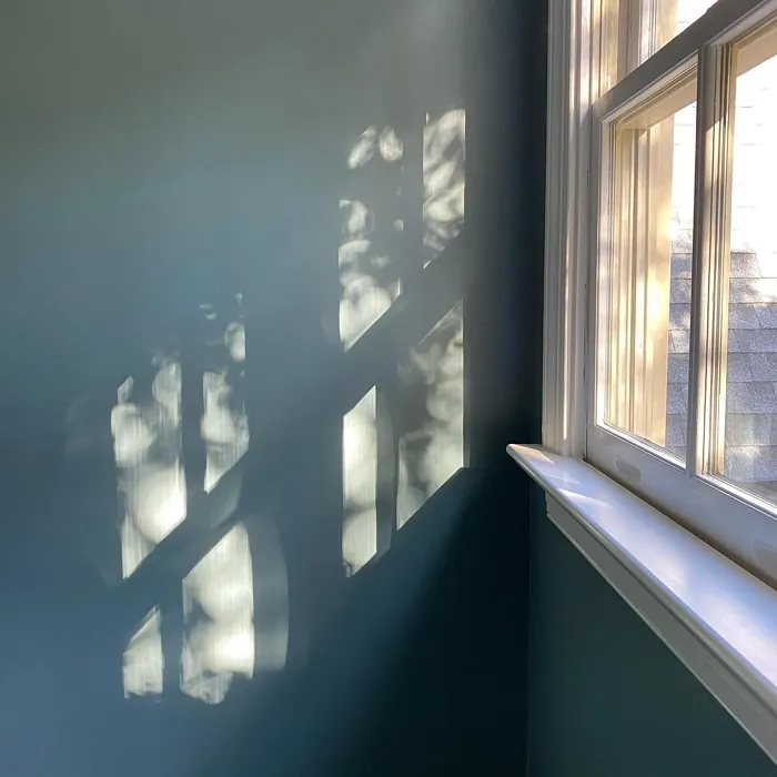
Light Temperature Affects on Wetherburn’s Blue
Natural Light
Natural daylight changes in color temperature as the sun moves across the sky. At sunrise and sunset, the light tends to have a warm, golden tone with a color temperature around 2000 Kelvin (K). As the day progresses and the sun rises higher, the light becomes cooler and more neutral. Around midday, especially when the sky is clear, natural light typically reaches its peak brightness and shifts to a cooler tone, ranging from 5500 to 6500 Kelvin. This midday light is close to what we perceive as pure white or daylight-balanced light.
These shifts in natural light can significantly influence how colors appear in a space, which is why designers often consider both the time of day and the orientation of windows when planning interior color schemes.
Artificial Light
When choosing artificial lighting, pay close attention to the color temperature, measured in Kelvin (K). This determines how warm or cool the light will appear. Lower temperatures, around 2700K, give off a warm, yellow glow often used in living rooms or bedrooms. Higher temperatures, above 5000K, create a cool, bluish light similar to daylight, commonly used in kitchens, offices, or task areas.
Use the slider to see how lighting temperature can affect the appearance of a surface or color throughout a space.


4800K
LRV of Wetherburn’s Blue
The Light Reflectance Value (LRV) of Wetherburn’s Blue is 23.60%, which places it in the Medium colors category. This means it reflect a lot of light. Understanding a paint’s LRV is crucial for predicting how it will look in your space. A higher LRV indicates a lighter color that reflects more light, making rooms feel larger and brighter. A lower LRV signifies a darker color that absorbs more light, creating a cozier, more intimate atmosphere. Always consider the natural and artificial lighting in your room when selecting a paint color based on its LRV.
Detailed Review of Wetherburn’s Blue
Additional Paint Characteristics
Ideal Rooms
Bedroom, Dining Room, Home Office, Living Room, Nursery
Decor Styles
Coastal, Modern, Scandinavian, Traditional
Coverage
Good (1–2 Coats), Touch-Up Friendly
Ease of Application
Beginner Friendly, Brush Smooth, Roller-Ready
Washability
Scrubbable, Washable
VOC Level
Low VOC
Best Use
Accent Wall, Interior Walls, Trim
Room Suitability
Bedroom, Home Office, Living Room, Nursery
Tone Tag
Balanced, Cool, Muted
Finish Type
Eggshell, Satin
Paint Performance
Easy Touch-Up, Fade Resistant, Low Odor
Use Cases
Best for Low Light Rooms, Classic Favorite, Designer Favorite
Mood
Calm, Inviting, Restful
Trim Pairing
Complements Brass Fixtures, Pairs with White Dove, Works with Warm Trim
Wetherburn’s Blue stands out due to its unique blend of muted tones that evoke a sense of peace and sophistication. When you apply it, you’ll notice how it shifts subtly with changing light, maintaining a balance between warm and cool undertones. This versatility makes it a fantastic choice for various interior styles, from coastal to more traditional settings. It’s also a great option for open spaces, as it can unify different rooms while keeping a light and airy feel. With a finish that glimmers just right under natural light, it can make a room feel more expansive and inviting. Just be sure to use good quality brushes or rollers for a smooth application that enhances its beauty.
Pros & Cons of CW-580 Wetherburn’s Blue
Pros
Cons
Colors that go with Benjamin Moore Wetherburn’s Blue
FAQ on CW-580 Wetherburn’s Blue
Can Wetherburn’s Blue be used in small spaces?
Absolutely! Wetherburn’s Blue can work wonderfully in small spaces, as its cool undertones help to create a sense of openness and calm. Just be mindful of your lighting; natural light will enhance its beauty, while low light may make it appear darker. Pair it with lighter accents to keep the space feeling airy.
What finishes are available for Wetherburn’s Blue?
Wetherburn’s Blue is available in several finishes including Matte, Eggshell, and Satin. Each finish offers a different look and feel, allowing you to choose based on your decor needs. Matte provides a more muted appearance, while Satin adds a slight sheen, making it easier to clean.
Comparisons Wetherburn’s Blue with other colors
Wetherburn's Blue CW-580 vs Naval SW 6244
| Attribute | Wetherburn's Blue CW-580 | Naval SW 6244 |
|---|---|---|
| Color Name | Wetherburn's Blue CW-580 | Naval SW 6244 |
| Color | ||
| Hue | Blue | Blue |
| Brightness | Dark | Dark |
| RGB | 111, 132, 134 | 47, 61, 76 |
| LRV | 23.60% | 4% |
| Finish Type | Eggshell, Satin | Matte, Satin, Semi-Gloss |
| Finish Options | Eggshell, Matte, Satin | Matte, Satin, Semi-Gloss |
| Ideal Rooms | Bedroom, Dining Room, Home Office, Living Room, Nursery | Bedroom, Dining Room, Hallway, Home Office, Living Room |
| Decor Styles | Coastal, Modern, Scandinavian, Traditional | Coastal, Industrial, Minimalist, Modern, Traditional |
| Coverage | Good (1–2 Coats), Touch-Up Friendly | Good (1–2 Coats), Self-Priming |
| Ease of Application | Beginner Friendly, Brush Smooth, Roller-Ready | Beginner Friendly, Brush Smooth, Roller-Ready |
| Washability | Scrubbable, Washable | Highly Washable, Washable |
| Room Suitability | Bedroom, Home Office, Living Room, Nursery | Bedroom, Dining Room, Entryway, Home Office, Living Room |
| Tone | Balanced, Cool, Muted | Cool, Deep, Moody |
| Paint Performance | Easy Touch-Up, Fade Resistant, Low Odor | Easy Touch-Up, High Coverage, Low Odor, Scuff Resistant |
Wetherburn's Blue CW-580 vs Sea Serpent SW 7615
| Attribute | Wetherburn's Blue CW-580 | Sea Serpent SW 7615 |
|---|---|---|
| Color Name | Wetherburn's Blue CW-580 | Sea Serpent SW 7615 |
| Color | ||
| Hue | Blue | Blue |
| Brightness | Dark | Dark |
| RGB | 111, 132, 134 | 62, 75, 84 |
| LRV | 23.60% | 12% |
| Finish Type | Eggshell, Satin | Eggshell, Matte, Satin |
| Finish Options | Eggshell, Matte, Satin | Eggshell, Matte, Satin |
| Ideal Rooms | Bedroom, Dining Room, Home Office, Living Room, Nursery | Bathroom, Bedroom, Home Office, Living Room |
| Decor Styles | Coastal, Modern, Scandinavian, Traditional | Coastal, Farmhouse, Industrial, Modern |
| Coverage | Good (1–2 Coats), Touch-Up Friendly | Good (1–2 Coats), Touch-Up Friendly |
| Ease of Application | Beginner Friendly, Brush Smooth, Roller-Ready | Beginner Friendly, Brush Smooth, Roller-Ready |
| Washability | Scrubbable, Washable | Highly Washable, Washable |
| Room Suitability | Bedroom, Home Office, Living Room, Nursery | Bathroom, Bedroom, Home Office, Living Room |
| Tone | Balanced, Cool, Muted | Cool, Deep, Moody |
| Paint Performance | Easy Touch-Up, Fade Resistant, Low Odor | Easy Touch-Up, High Coverage, Low Odor |
Wetherburn's Blue CW-580 vs Rain Cloud SW 9639
| Attribute | Wetherburn's Blue CW-580 | Rain Cloud SW 9639 |
|---|---|---|
| Color Name | Wetherburn's Blue CW-580 | Rain Cloud SW 9639 |
| Color | ||
| Hue | Blue | Blue |
| Brightness | Dark | Dark |
| RGB | 111, 132, 134 | 83, 97, 104 |
| LRV | 23.60% | 30% |
| Finish Type | Eggshell, Satin | Eggshell, Matte, Satin |
| Finish Options | Eggshell, Matte, Satin | Eggshell, Matte, Satin |
| Ideal Rooms | Bedroom, Dining Room, Home Office, Living Room, Nursery | Bedroom, Dining Room, Home Office, Living Room |
| Decor Styles | Coastal, Modern, Scandinavian, Traditional | Coastal, Contemporary, Minimalist, Scandinavian |
| Coverage | Good (1–2 Coats), Touch-Up Friendly | Good (1–2 Coats), Touch-Up Friendly |
| Ease of Application | Beginner Friendly, Brush Smooth, Roller-Ready | Beginner Friendly, Brush Smooth, Roller-Ready |
| Washability | Scrubbable, Washable | Highly Washable, Washable |
| Room Suitability | Bedroom, Home Office, Living Room, Nursery | Bedroom, Home Office, Living Room |
| Tone | Balanced, Cool, Muted | Balanced, Cool, Muted |
| Paint Performance | Easy Touch-Up, Fade Resistant, Low Odor | Easy Touch-Up, Fade Resistant, Low Odor |
Wetherburn's Blue CW-580 vs Indigo Batik SW 7602
| Attribute | Wetherburn's Blue CW-580 | Indigo Batik SW 7602 |
|---|---|---|
| Color Name | Wetherburn's Blue CW-580 | Indigo Batik SW 7602 |
| Color | ||
| Hue | Blue | Blue |
| Brightness | Dark | Dark |
| RGB | 111, 132, 134 | 62, 80, 99 |
| LRV | 23.60% | 10% |
| Finish Type | Eggshell, Satin | Matte, Satin |
| Finish Options | Eggshell, Matte, Satin | Eggshell, Flat, Matte, Satin |
| Ideal Rooms | Bedroom, Dining Room, Home Office, Living Room, Nursery | Bedroom, Dining Room, Home Office, Living Room |
| Decor Styles | Coastal, Modern, Scandinavian, Traditional | Bohemian, Coastal, Contemporary, Modern |
| Coverage | Good (1–2 Coats), Touch-Up Friendly | Good (1–2 Coats), Touch-Up Friendly |
| Ease of Application | Beginner Friendly, Brush Smooth, Roller-Ready | Brush Smooth, Fast-Drying, Roller-Ready |
| Washability | Scrubbable, Washable | Scrubbable, Washable, Wipeable |
| Room Suitability | Bedroom, Home Office, Living Room, Nursery | Bedroom, Dining Room, Home Office, Living Room |
| Tone | Balanced, Cool, Muted | Cool, Deep, Moody |
| Paint Performance | Easy Touch-Up, Fade Resistant, Low Odor | Easy Touch-Up, High Coverage, Low Odor, Quick Drying |
Wetherburn's Blue CW-580 vs Sea Mariner SW 9640
| Attribute | Wetherburn's Blue CW-580 | Sea Mariner SW 9640 |
|---|---|---|
| Color Name | Wetherburn's Blue CW-580 | Sea Mariner SW 9640 |
| Color | ||
| Hue | Blue | Blue |
| Brightness | Dark | Dark |
| RGB | 111, 132, 134 | 67, 74, 84 |
| LRV | 23.60% | 6% |
| Finish Type | Eggshell, Satin | Eggshell, Matte, Satin |
| Finish Options | Eggshell, Matte, Satin | Eggshell, Matte, Satin |
| Ideal Rooms | Bedroom, Dining Room, Home Office, Living Room, Nursery | Bedroom, Dining Room, Hallway, Home Office, Living Room |
| Decor Styles | Coastal, Modern, Scandinavian, Traditional | Coastal, Industrial, Minimalist, Modern |
| Coverage | Good (1–2 Coats), Touch-Up Friendly | Good (1–2 Coats) |
| Ease of Application | Beginner Friendly, Brush Smooth, Roller-Ready | Beginner Friendly, Brush Smooth, Roller-Ready |
| Washability | Scrubbable, Washable | Scrubbable, Washable |
| Room Suitability | Bedroom, Home Office, Living Room, Nursery | Bedroom, Dining Room, Home Office, Living Room |
| Tone | Balanced, Cool, Muted | Cool, Deep, Moody |
| Paint Performance | Easy Touch-Up, Fade Resistant, Low Odor | Easy Touch-Up, Low Odor, Quick Drying |
Wetherburn's Blue CW-580 vs Still Water SW 6223
| Attribute | Wetherburn's Blue CW-580 | Still Water SW 6223 |
|---|---|---|
| Color Name | Wetherburn's Blue CW-580 | Still Water SW 6223 |
| Color | ||
| Hue | Blue | Blue |
| Brightness | Dark | Dark |
| RGB | 111, 132, 134 | 74, 93, 95 |
| LRV | 23.60% | 48% |
| Finish Type | Eggshell, Satin | Eggshell, Matte, Satin |
| Finish Options | Eggshell, Matte, Satin | Eggshell, Matte, Satin |
| Ideal Rooms | Bedroom, Dining Room, Home Office, Living Room, Nursery | Bedroom, Dining Room, Home Office, Living Room, Nursery |
| Decor Styles | Coastal, Modern, Scandinavian, Traditional | Coastal, Contemporary, Farmhouse, Modern, Rustic |
| Coverage | Good (1–2 Coats), Touch-Up Friendly | Good (1–2 Coats), Touch-Up Friendly |
| Ease of Application | Beginner Friendly, Brush Smooth, Roller-Ready | Beginner Friendly, Brush Smooth, Roller-Ready |
| Washability | Scrubbable, Washable | Highly Washable, Washable |
| Room Suitability | Bedroom, Home Office, Living Room, Nursery | Bedroom, Dining Room, Home Office, Living Room |
| Tone | Balanced, Cool, Muted | Cool, Earthy, Muted |
| Paint Performance | Easy Touch-Up, Fade Resistant, Low Odor | Easy Touch-Up, Fade Resistant, Low Odor |
Wetherburn's Blue CW-580 vs Waterloo SW 9141
| Attribute | Wetherburn's Blue CW-580 | Waterloo SW 9141 |
|---|---|---|
| Color Name | Wetherburn's Blue CW-580 | Waterloo SW 9141 |
| Color | ||
| Hue | Blue | Blue |
| Brightness | Dark | Dark |
| RGB | 111, 132, 134 | 83, 104, 114 |
| LRV | 23.60% | 12% |
| Finish Type | Eggshell, Satin | Matte, Satin |
| Finish Options | Eggshell, Matte, Satin | Matte, Satin, Semi-Gloss |
| Ideal Rooms | Bedroom, Dining Room, Home Office, Living Room, Nursery | Bedroom, Dining Room, Hallway, Home Office, Living Room |
| Decor Styles | Coastal, Modern, Scandinavian, Traditional | Coastal, Industrial, Modern, Rustic |
| Coverage | Good (1–2 Coats), Touch-Up Friendly | Good (1–2 Coats), Touch-Up Friendly |
| Ease of Application | Beginner Friendly, Brush Smooth, Roller-Ready | Brush Smooth, Fast-Drying, Roller-Ready |
| Washability | Scrubbable, Washable | Scrubbable, Washable |
| Room Suitability | Bedroom, Home Office, Living Room, Nursery | Bedroom, Dining Room, Home Office, Living Room |
| Tone | Balanced, Cool, Muted | Balanced, Cool, Muted |
| Paint Performance | Easy Touch-Up, Fade Resistant, Low Odor | Easy Touch-Up, Fade Resistant, Low Odor, Quick Drying |
Wetherburn's Blue CW-580 vs Smoky Blue SW 7604
| Attribute | Wetherburn's Blue CW-580 | Smoky Blue SW 7604 |
|---|---|---|
| Color Name | Wetherburn's Blue CW-580 | Smoky Blue SW 7604 |
| Color | ||
| Hue | Blue | Blue |
| Brightness | Dark | Dark |
| RGB | 111, 132, 134 | 89, 110, 121 |
| LRV | 23.60% | 15% |
| Finish Type | Eggshell, Satin | Eggshell, Matte, Satin |
| Finish Options | Eggshell, Matte, Satin | Eggshell, Matte, Satin |
| Ideal Rooms | Bedroom, Dining Room, Home Office, Living Room, Nursery | Bathroom, Bedroom, Home Office, Kitchen, Living Room |
| Decor Styles | Coastal, Modern, Scandinavian, Traditional | Coastal, Modern, Scandinavian, Transitional |
| Coverage | Good (1–2 Coats), Touch-Up Friendly | Good (1–2 Coats), Touch-Up Friendly |
| Ease of Application | Beginner Friendly, Brush Smooth, Roller-Ready | Beginner Friendly, Brush Smooth, Roller-Ready |
| Washability | Scrubbable, Washable | Highly Washable, Washable |
| Room Suitability | Bedroom, Home Office, Living Room, Nursery | Bathroom, Bedroom, Home Office, Living Room |
| Tone | Balanced, Cool, Muted | Cool, Dusty, Muted |
| Paint Performance | Easy Touch-Up, Fade Resistant, Low Odor | High Coverage, Low Odor, Quick Drying |
Wetherburn's Blue CW-580 vs Needlepoint Navy SW 0032
| Attribute | Wetherburn's Blue CW-580 | Needlepoint Navy SW 0032 |
|---|---|---|
| Color Name | Wetherburn's Blue CW-580 | Needlepoint Navy SW 0032 |
| Color | ||
| Hue | Blue | Blue |
| Brightness | Dark | Dark |
| RGB | 111, 132, 134 | 84, 102, 112 |
| LRV | 23.60% | 4% |
| Finish Type | Eggshell, Satin | Matte, Satin, Semi-Gloss |
| Finish Options | Eggshell, Matte, Satin | Matte, Satin, Semi-Gloss |
| Ideal Rooms | Bedroom, Dining Room, Home Office, Living Room, Nursery | Bedroom, Dining Room, Entryway, Home Office, Living Room |
| Decor Styles | Coastal, Modern, Scandinavian, Traditional | Coastal, Contemporary, Modern Farmhouse, Nautical, Traditional |
| Coverage | Good (1–2 Coats), Touch-Up Friendly | Good (1–2 Coats), Touch-Up Friendly |
| Ease of Application | Beginner Friendly, Brush Smooth, Roller-Ready | Beginner Friendly, Brush Smooth, Fast-Drying, Roller-Ready |
| Washability | Scrubbable, Washable | Scrubbable, Washable |
| Room Suitability | Bedroom, Home Office, Living Room, Nursery | Bedroom, Dining Room, Home Office, Living Room |
| Tone | Balanced, Cool, Muted | Cool, Deep, Muted |
| Paint Performance | Easy Touch-Up, Fade Resistant, Low Odor | Easy Touch-Up, High Coverage, Low Odor, Quick Drying, Stain Resistant |
Wetherburn's Blue CW-580 vs Riverway SW 6222
| Attribute | Wetherburn's Blue CW-580 | Riverway SW 6222 |
|---|---|---|
| Color Name | Wetherburn's Blue CW-580 | Riverway SW 6222 |
| Color | ||
| Hue | Blue | Blue |
| Brightness | Dark | Dark |
| RGB | 111, 132, 134 | 93, 114, 116 |
| LRV | 23.60% | 24% |
| Finish Type | Eggshell, Satin | Eggshell, Satin |
| Finish Options | Eggshell, Matte, Satin | Eggshell, Matte, Satin |
| Ideal Rooms | Bedroom, Dining Room, Home Office, Living Room, Nursery | Bathroom, Bedroom, Dining Room, Home Office, Living Room |
| Decor Styles | Coastal, Modern, Scandinavian, Traditional | Coastal, Contemporary, Eclectic, Modern, Rustic |
| Coverage | Good (1–2 Coats), Touch-Up Friendly | Good (1–2 Coats), Touch-Up Friendly |
| Ease of Application | Beginner Friendly, Brush Smooth, Roller-Ready | Beginner Friendly, Brush Smooth, Fast-Drying, Low Splatter, Roller-Ready |
| Washability | Scrubbable, Washable | Highly Washable, Washable |
| Room Suitability | Bedroom, Home Office, Living Room, Nursery | Bathroom, Bedroom, Home Office, Living Room |
| Tone | Balanced, Cool, Muted | Balanced, Cool, Muted |
| Paint Performance | Easy Touch-Up, Fade Resistant, Low Odor | Easy Touch-Up, High Coverage, Low Odor, Quick Drying |
Official Page of Benjamin Moore Wetherburn’s Blue CW-580