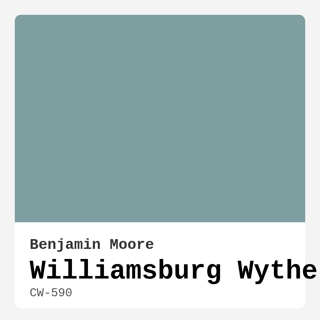
Color Preview & Key Details
| HEX Code | #7E9EA0 |
| RGB | 126, 158, 160 |
| LRV | 33.40% |
| Undertone | Blue |
| Finish Options | Eggshell, Matte, Satin |
Imagine walking into a space that instantly feels like a breath of fresh air, where tranquility washes over you the moment you cross the threshold. That’s the kind of magic you can create with Williamsburg Wythe Blue from Benjamin Moore. This serene and sophisticated hue channels the tranquil waters of the Chesapeake Bay, providing a soft blue-green that’s both inviting and elegant.
Let’s dive deep into why Wythe Blue might just be the color you’ve been searching for. Whether you’re considering a complete room makeover or simply refreshing your space, this color has a unique charm.
First off, let’s talk about versatility. Williamsburg Wythe Blue is like that friend who gets along with everyone. It complements a range of decor styles, from coastal to traditional, modern farmhouse to transitional designs. Imagine it as the perfect backdrop for your living room, bedroom, bathroom, or kitchen. Its calming nature creates a welcoming atmosphere, making it a wonderful choice for spaces where you gather with family and friends.
One of the standout features of Wythe Blue is its ability to reflect light beautifully. With a Light Reflectance Value (LRV) of approximately 33.40%, it manages to balance brightness without being overly stark. In bright daylight, it showcases its blue-green tones vibrantly, transforming a room into a lively oasis. As the sun sets, it softens into a cozy hue, promoting a restful ambiance that’s perfect for winding down after a long day.
For those of you concerned about how this color might fit into your specific space, let’s address that head-on. Can Wythe Blue work in a small room? Absolutely! This soft, muted tone can make a room feel more open and airy, especially when paired with adequate lighting. Just keep in mind that in low-light conditions, it may appear darker, so consider your room’s natural light when making a decision.
Applying Wythe Blue is a breeze, making it a winner for both seasoned painters and beginners alike. Its washability and low VOC content make for a practical choice, allowing you to create a beautiful space without worrying about strong odors. Plus, it’s roller-ready and brush smooth, so you’ll find that it goes on effortlessly. With just one to two coats, you can achieve excellent coverage, transforming your walls into a serene paradise.
Now, let’s talk finishes. For walls, I often recommend an eggshell or satin finish. These finishes strike that perfect balance between durability and a subtle sheen, allowing for easy cleaning while maintaining the soft, inviting look that Wythe Blue offers. If you’re leaning toward a cozy, matte feel, a flat finish can work too, though remember it may not be as wash-friendly.
A standout aspect of Wythe Blue is its undertone. Leaning towards a soft, muted green, this unique characteristic gives it depth and complexity. It’s not just any blue; it shifts beautifully with the light throughout the day, adding layers to your interior. This makes it an excellent choice for spaces that receive varied lighting at different times.
What about pairing colors? Wythe Blue plays nicely with a variety of shades. It looks stunning with crisp white trim, such as Benjamin Moore’s White Dove, creating a fresh, clean contrast that highlights its beauty. Natural wood trim also complements Wythe Blue beautifully, adding warmth to the overall aesthetic.
If you’re feeling adventurous with your color palette, consider complementary hues. Soft reds and muted earth tones can create a beautiful balance, while shades like CSP-415 and 2114-30 can add additional depth to your design. You can even explore lighter shades such as CSP-670 or darker counterparts like 2136-40 to play with contrast and complexity.
For those who love a good comparison, Williamsburg Wythe Blue shares similarities with Benjamin Moore’s Palladian Blue and Sherwin-Williams’ Sea Salt, both of which embody that same soft, serene vibe. This makes Wythe Blue a designer favorite, as it effortlessly transitions between different styles and periods.
In terms of mood, Wythe Blue exudes calmness and restfulness. It’s the kind of color that invites you to relax and unwind, making it perfect for bedrooms, bathrooms, or any space where you want to cultivate a peaceful atmosphere.
As we wrap up this journey into the world of Williamsburg Wythe Blue, I hope you feel inspired to bring this color into your home. Whether you’re painting an accent wall or refreshing your entire living area, Wythe Blue offers a serene touch that can elevate your space. Its versatility, ease of application, and stunning light effects make it a smart choice for any homeowner looking to create a personalized, beautiful interior. So go ahead, grab that paintbrush, and let Wythe Blue transform your home into a calming haven of elegance and style. You’ll love the results!
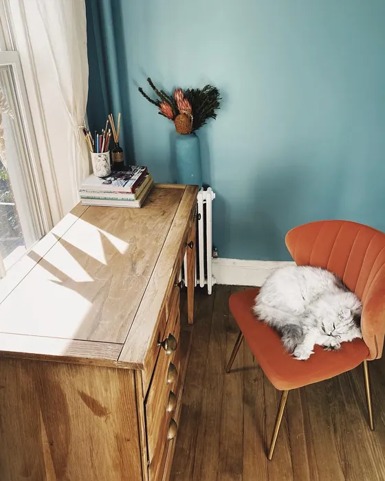
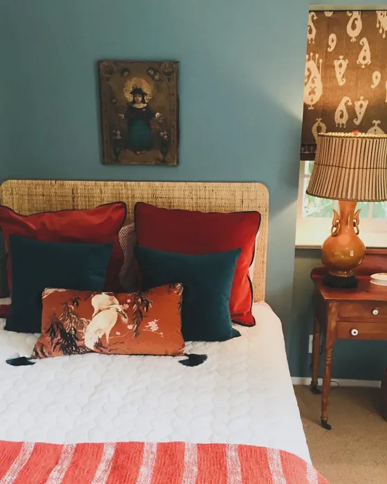
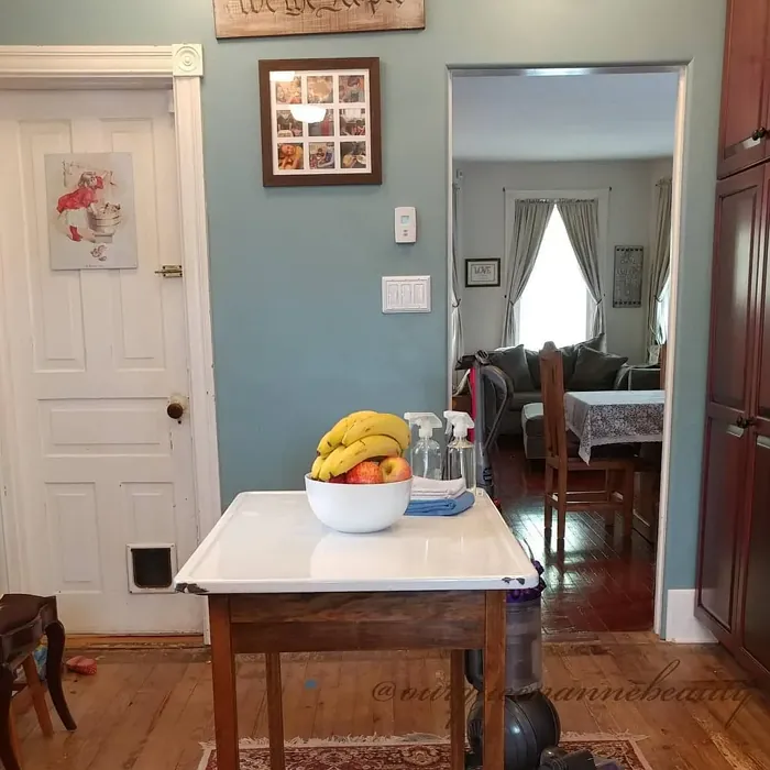
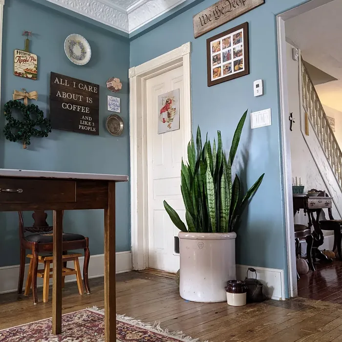
Real Room Photo of Williamsburg Wythe Blue CW-590


Undertones of Williamsburg Wythe Blue ?
Wythe Blue leans toward a soft, muted green understone, which gives it a unique character that shifts beautifully with the light throughout the day. This underlying hue adds a layer of complexity, making it more than just a simple blue.
HEX value: #7E9EA0
RGB code: 126, 158, 160
Is Williamsburg Wythe Blue Cool or Warm?
This color is cool and refreshing, making it ideal for spaces where you want to promote relaxation and calmness. Its coolness is balanced enough that it can still feel inviting, rather than stark.
Understanding Color Properties and Interior Design Tips
Hue refers to a specific position on the color wheel, measured in degrees from 0 to 360. Each degree represents a different pure color:
- 0° represents red
- 120° represents green
- 240° represents blue
Saturation describes the intensity or purity of a color and is expressed as a percentage:
- At 0%, the color appears completely desaturated—essentially a shade of gray
- At 100%, the color is at its most vivid and vibrant
Lightness indicates how light or dark a color is, also expressed as a percentage:
- 0% lightness results in black
- 100% lightness results in white
Using Warm Colors in Interior Design
Warm hues—such as reds, oranges, yellows, warm beiges, and greiges—are excellent choices for creating inviting and energetic spaces. These colors are particularly well-suited for:
- Kitchens, living rooms, and bathrooms, where warmth enhances comfort and sociability
- Large rooms, where warm tones can help reduce the sense of emptiness and make the space feel more intimate
For example:
- Warm beige shades provide a cozy, inviting atmosphere, ideal for living rooms, bedrooms, and hallways.
- Warm greige (a mix of beige and gray) offers the warmth of beige with the modern appeal of gray, making it a versatile backdrop for dining areas, bedrooms, and living spaces.
However, be mindful when using warm light tones in rooms with limited natural light. These shades may appear muted or even take on an unpleasant yellowish tint. To avoid a dull or flat appearance:
- Add depth by incorporating richer tones like deep greens, charcoal, or chocolate brown
- Use textured elements such as curtains, rugs, or cushions to bring dimension to the space
Pro Tip: Achieving Harmony with Warm and Cool Color Balance
To create a well-balanced and visually interesting interior, mix warm and cool tones strategically. This contrast adds depth and harmony to your design.
- If your walls feature warm hues, introduce cool-colored accents such as blue or green furniture, artwork, or accessories to create contrast.
- For a polished look, consider using a complementary color scheme, which pairs colors opposite each other on the color wheel (e.g., red with green, orange with blue).
This thoughtful mix not only enhances visual appeal but also creates a space that feels both dynamic and cohesive.
Light Temperature Affects on Williamsburg Wythe Blue
Natural Light
Natural daylight changes in color temperature as the sun moves across the sky. At sunrise and sunset, the light tends to have a warm, golden tone with a color temperature around 2000 Kelvin (K). As the day progresses and the sun rises higher, the light becomes cooler and more neutral. Around midday, especially when the sky is clear, natural light typically reaches its peak brightness and shifts to a cooler tone, ranging from 5500 to 6500 Kelvin. This midday light is close to what we perceive as pure white or daylight-balanced light.
These shifts in natural light can significantly influence how colors appear in a space, which is why designers often consider both the time of day and the orientation of windows when planning interior color schemes.
Artificial Light
When choosing artificial lighting, pay close attention to the color temperature, measured in Kelvin (K). This determines how warm or cool the light will appear. Lower temperatures, around 2700K, give off a warm, yellow glow often used in living rooms or bedrooms. Higher temperatures, above 5000K, create a cool, bluish light similar to daylight, commonly used in kitchens, offices, or task areas.
Use the slider to see how lighting temperature can affect the appearance of a surface or color throughout a space.


4800K
LRV of Williamsburg Wythe Blue
The Light Reflectance Value (LRV) of Wythe Blue is approximately 50, making it a balanced choice that reflects a decent amount of light without being too bright.
Detailed Review of Williamsburg Wythe Blue
Additional Paint Characteristics
Ideal Rooms
Bathroom, Bedroom, Dining Room, Kitchen, Living Room
Decor Styles
Coastal, Modern Farmhouse, Traditional, Transitional
Coverage
Good (1–2 Coats)
Ease of Application
Beginner Friendly, Brush Smooth, Roller-Ready
Washability
Highly Washable, Washable
VOC Level
Low VOC
Best Use
Accent Wall, Interior Walls
Room Suitability
Bathroom, Bedroom, Kitchen, Living Room
Tone Tag
Airy, Cool, Muted
Finish Type
Eggshell, Matte, Satin
Paint Performance
Easy Touch-Up, Low Odor, Scuff Resistant
Use Cases
Best for Low Light Rooms, Best for Rentals, Designer Favorite
Mood
Calm, Inviting, Restful
Trim Pairing
Complements Wood Trim, Pairs with White Dove
When it comes to painting with Williamsburg Wythe Blue, you’ll find it to be a delightful experience. The color goes on smoothly and provides excellent coverage with just one to two coats. Its calming blue-green tone can transform a room, making it feel airy and expansive. Whether you’re refreshing a small nook or a larger living area, this shade works remarkably well in natural light, enhancing its subtle depth. It’s particularly stunning when paired with white trim, creating a crisp contrast that highlights its beauty. Overall, if you’re looking to elevate your space with a color that embodies tranquility and style, Wythe Blue is an excellent choice.
Pros & Cons of CW-590 Williamsburg Wythe Blue
Pros
Cons
Colors that go with Benjamin Moore Williamsburg Wythe Blue
FAQ on CW-590 Williamsburg Wythe Blue
Can I use Williamsburg Wythe Blue in a small room?
Absolutely! Williamsburg Wythe Blue can work wonders in smaller spaces. Its soft, muted tone can make a room feel more open and airy, especially when paired with adequate lighting. Just be mindful of the light conditions, as the color may appear darker in dimly lit areas.
What type of finish should I choose for my walls?
For walls, an eggshell or satin finish is often recommended because it strikes a balance between durability and a subtle sheen. This allows for easy cleaning while maintaining that soft, inviting look that Wythe Blue offers. If you’re aiming for a cozy, matte feel, opt for a flat finish, but keep in mind that it may not be as wash-friendly.
Comparisons Williamsburg Wythe Blue with other colors
Williamsburg Wythe Blue CW-590 vs Dutch Tile Blue SW 0031
| Attribute | Williamsburg Wythe Blue CW-590 | Dutch Tile Blue SW 0031 |
|---|---|---|
| Color Name | Williamsburg Wythe Blue CW-590 | Dutch Tile Blue SW 0031 |
| Color | ||
| Hue | Blue | Blue |
| Brightness | Medium | Medium |
| RGB | 126, 158, 160 | 154, 171, 171 |
| LRV | 33.40% | 24% |
| Finish Type | Eggshell, Matte, Satin | Eggshell, Matte, Satin |
| Finish Options | Eggshell, Matte, Satin | Eggshell, Flat, Matte, Satin |
| Ideal Rooms | Bathroom, Bedroom, Dining Room, Kitchen, Living Room | Bathroom, Bedroom, Dining Room, Hallway, Home Office, Kitchen, Living Room |
| Decor Styles | Coastal, Modern Farmhouse, Traditional, Transitional | Coastal, Modern Farmhouse, Scandinavian, Traditional, Transitional |
| Coverage | Good (1–2 Coats) | Good (1–2 Coats) |
| Ease of Application | Beginner Friendly, Brush Smooth, Roller-Ready | Beginner Friendly, Brush Smooth, Fast-Drying, Roller-Ready |
| Washability | Highly Washable, Washable | Highly Washable, Washable |
| Room Suitability | Bathroom, Bedroom, Kitchen, Living Room | Bathroom, Bedroom, Dining Room, Kitchen, Living Room |
| Tone | Airy, Cool, Muted | Balanced, Cool, Muted |
| Paint Performance | Easy Touch-Up, Low Odor, Scuff Resistant | Easy Touch-Up, High Coverage, Low Odor, Quick Drying |
Williamsburg Wythe Blue CW-590 vs Debonair SW 9139
| Attribute | Williamsburg Wythe Blue CW-590 | Debonair SW 9139 |
|---|---|---|
| Color Name | Williamsburg Wythe Blue CW-590 | Debonair SW 9139 |
| Color | ||
| Hue | Blue | Blue |
| Brightness | Medium | Medium |
| RGB | 126, 158, 160 | 144, 160, 166 |
| LRV | 33.40% | 30% |
| Finish Type | Eggshell, Matte, Satin | Eggshell, Matte, Satin |
| Finish Options | Eggshell, Matte, Satin | Eggshell, Matte, Satin |
| Ideal Rooms | Bathroom, Bedroom, Dining Room, Kitchen, Living Room | Bedroom, Dining Room, Home Office, Living Room |
| Decor Styles | Coastal, Modern Farmhouse, Traditional, Transitional | Coastal, Industrial, Modern, Transitional |
| Coverage | Good (1–2 Coats) | Good (1–2 Coats) |
| Ease of Application | Beginner Friendly, Brush Smooth, Roller-Ready | Beginner Friendly, Brush Smooth, Roller-Ready |
| Washability | Highly Washable, Washable | Washable, Wipeable |
| Room Suitability | Bathroom, Bedroom, Kitchen, Living Room | Bedroom, Dining Room, Home Office, Living Room |
| Tone | Airy, Cool, Muted | Balanced, Cool, Muted |
| Paint Performance | Easy Touch-Up, Low Odor, Scuff Resistant | Easy Touch-Up, Low Odor, Quick Drying |
Williamsburg Wythe Blue CW-590 vs Stardew SW 9138
| Attribute | Williamsburg Wythe Blue CW-590 | Stardew SW 9138 |
|---|---|---|
| Color Name | Williamsburg Wythe Blue CW-590 | Stardew SW 9138 |
| Color | ||
| Hue | Blue | Blue |
| Brightness | Medium | Medium |
| RGB | 126, 158, 160 | 166, 178, 181 |
| LRV | 33.40% | 30% |
| Finish Type | Eggshell, Matte, Satin | Eggshell, Satin |
| Finish Options | Eggshell, Matte, Satin | Eggshell, Matte, Satin |
| Ideal Rooms | Bathroom, Bedroom, Dining Room, Kitchen, Living Room | Bathroom, Bedroom, Home Office, Living Room, Nursery |
| Decor Styles | Coastal, Modern Farmhouse, Traditional, Transitional | Coastal, Farmhouse, Modern, Scandinavian |
| Coverage | Good (1–2 Coats) | Good (1–2 Coats) |
| Ease of Application | Beginner Friendly, Brush Smooth, Roller-Ready | Beginner Friendly, Brush Smooth, Roller-Ready |
| Washability | Highly Washable, Washable | Highly Washable, Washable, Wipeable |
| Room Suitability | Bathroom, Bedroom, Kitchen, Living Room | Bathroom, Bedroom, Home Office, Living Room |
| Tone | Airy, Cool, Muted | Calm, Cool, Muted |
| Paint Performance | Easy Touch-Up, Low Odor, Scuff Resistant | Easy Touch-Up, High Coverage, Low Odor |
Williamsburg Wythe Blue CW-590 vs Niebla Azul SW 9137
| Attribute | Williamsburg Wythe Blue CW-590 | Niebla Azul SW 9137 |
|---|---|---|
| Color Name | Williamsburg Wythe Blue CW-590 | Niebla Azul SW 9137 |
| Color | ||
| Hue | Blue | Blue |
| Brightness | Medium | Medium |
| RGB | 126, 158, 160 | 182, 195, 196 |
| LRV | 33.40% | 48% |
| Finish Type | Eggshell, Matte, Satin | Eggshell, Matte, Satin |
| Finish Options | Eggshell, Matte, Satin | Eggshell, Matte, Satin |
| Ideal Rooms | Bathroom, Bedroom, Dining Room, Kitchen, Living Room | Bedroom, Home Office, Living Room, Nursery |
| Decor Styles | Coastal, Modern Farmhouse, Traditional, Transitional | Coastal, Modern, Scandinavian, Transitional |
| Coverage | Good (1–2 Coats) | Good (1–2 Coats), Touch-Up Friendly |
| Ease of Application | Beginner Friendly, Brush Smooth, Roller-Ready | Beginner Friendly, Brush Smooth, Roller-Ready |
| Washability | Highly Washable, Washable | Highly Washable, Washable |
| Room Suitability | Bathroom, Bedroom, Kitchen, Living Room | Bedroom, Home Office, Living Room, Nursery |
| Tone | Airy, Cool, Muted | Airy, Cool, Muted |
| Paint Performance | Easy Touch-Up, Low Odor, Scuff Resistant | Easy Touch-Up, Fade Resistant, Low Odor, Scuff Resistant |
Williamsburg Wythe Blue CW-590 vs Rain SW 6219
| Attribute | Williamsburg Wythe Blue CW-590 | Rain SW 6219 |
|---|---|---|
| Color Name | Williamsburg Wythe Blue CW-590 | Rain SW 6219 |
| Color | ||
| Hue | Blue | Blue |
| Brightness | Medium | Medium |
| RGB | 126, 158, 160 | 171, 190, 191 |
| LRV | 33.40% | 50% |
| Finish Type | Eggshell, Matte, Satin | Eggshell, Matte, Satin |
| Finish Options | Eggshell, Matte, Satin | Eggshell, Matte, Satin |
| Ideal Rooms | Bathroom, Bedroom, Dining Room, Kitchen, Living Room | Bathroom, Bedroom, Home Office, Living Room, Nursery |
| Decor Styles | Coastal, Modern Farmhouse, Traditional, Transitional | Coastal, Minimalist, Modern, Scandinavian, Transitional |
| Coverage | Good (1–2 Coats) | Good (1–2 Coats), Touch-Up Friendly |
| Ease of Application | Beginner Friendly, Brush Smooth, Roller-Ready | Beginner Friendly, Brush Smooth, Fast-Drying, Roller-Ready |
| Washability | Highly Washable, Washable | Scrubbable, Stain Resistant, Washable |
| Room Suitability | Bathroom, Bedroom, Kitchen, Living Room | Bathroom, Bedroom, Home Office, Living Room, Nursery |
| Tone | Airy, Cool, Muted | Balanced, Cool, Muted |
| Paint Performance | Easy Touch-Up, Low Odor, Scuff Resistant | Easy Touch-Up, Low Odor, Quick Drying, Stain Resistant |
Williamsburg Wythe Blue CW-590 vs Morning at Sea SW 9634
| Attribute | Williamsburg Wythe Blue CW-590 | Morning at Sea SW 9634 |
|---|---|---|
| Color Name | Williamsburg Wythe Blue CW-590 | Morning at Sea SW 9634 |
| Color | ||
| Hue | Blue | Blue |
| Brightness | Medium | Medium |
| RGB | 126, 158, 160 | 130, 151, 155 |
| LRV | 33.40% | 50% |
| Finish Type | Eggshell, Matte, Satin | Eggshell, Matte |
| Finish Options | Eggshell, Matte, Satin | Eggshell, Matte, Satin |
| Ideal Rooms | Bathroom, Bedroom, Dining Room, Kitchen, Living Room | Bathroom, Bedroom, Home Office, Living Room |
| Decor Styles | Coastal, Modern Farmhouse, Traditional, Transitional | Coastal, Minimalist, Modern, Scandinavian |
| Coverage | Good (1–2 Coats) | Good (1–2 Coats), Touch-Up Friendly |
| Ease of Application | Beginner Friendly, Brush Smooth, Roller-Ready | Beginner Friendly, Brush Smooth, Roller-Ready |
| Washability | Highly Washable, Washable | Washable, Wipeable |
| Room Suitability | Bathroom, Bedroom, Kitchen, Living Room | Bathroom, Bedroom, Home Office, Living Room |
| Tone | Airy, Cool, Muted | Airy, Cool, Muted |
| Paint Performance | Easy Touch-Up, Low Odor, Scuff Resistant | Easy Touch-Up, Fade Resistant, Low Odor |
Williamsburg Wythe Blue CW-590 vs Sleepy Blue SW 6225
| Attribute | Williamsburg Wythe Blue CW-590 | Sleepy Blue SW 6225 |
|---|---|---|
| Color Name | Williamsburg Wythe Blue CW-590 | Sleepy Blue SW 6225 |
| Color | ||
| Hue | Blue | Blue |
| Brightness | Medium | Medium |
| RGB | 126, 158, 160 | 188, 203, 206 |
| LRV | 33.40% | 50% |
| Finish Type | Eggshell, Matte, Satin | Eggshell, Matte, Satin |
| Finish Options | Eggshell, Matte, Satin | Eggshell, Matte, Satin |
| Ideal Rooms | Bathroom, Bedroom, Dining Room, Kitchen, Living Room | Bedroom, Home Office, Living Room, Nursery |
| Decor Styles | Coastal, Modern Farmhouse, Traditional, Transitional | Coastal, Minimalist, Modern Farmhouse, Scandinavian |
| Coverage | Good (1–2 Coats) | Good (1–2 Coats) |
| Ease of Application | Beginner Friendly, Brush Smooth, Roller-Ready | Beginner Friendly, Brush Smooth, Fast-Drying, Roller-Ready |
| Washability | Highly Washable, Washable | Highly Washable, Washable |
| Room Suitability | Bathroom, Bedroom, Kitchen, Living Room | Bedroom, Home Office, Living Room, Nursery |
| Tone | Airy, Cool, Muted | Airy, Cool, Muted |
| Paint Performance | Easy Touch-Up, Low Odor, Scuff Resistant | Easy Touch-Up, Low Odor, Quick Drying, Scuff Resistant |
Williamsburg Wythe Blue CW-590 vs Lakeside SW 9683
| Attribute | Williamsburg Wythe Blue CW-590 | Lakeside SW 9683 |
|---|---|---|
| Color Name | Williamsburg Wythe Blue CW-590 | Lakeside SW 9683 |
| Color | ||
| Hue | Blue | Blue |
| Brightness | Medium | Medium |
| RGB | 126, 158, 160 | 173, 184, 192 |
| LRV | 33.40% | 24% |
| Finish Type | Eggshell, Matte, Satin | Eggshell, Matte, Satin |
| Finish Options | Eggshell, Matte, Satin | Eggshell, Matte, Satin |
| Ideal Rooms | Bathroom, Bedroom, Dining Room, Kitchen, Living Room | Bathroom, Bedroom, Home Office, Living Room |
| Decor Styles | Coastal, Modern Farmhouse, Traditional, Transitional | Coastal, Minimalist, Modern, Rustic |
| Coverage | Good (1–2 Coats) | Good (1–2 Coats) |
| Ease of Application | Beginner Friendly, Brush Smooth, Roller-Ready | Beginner Friendly, Brush Smooth, Roller-Ready |
| Washability | Highly Washable, Washable | Scrubbable, Washable |
| Room Suitability | Bathroom, Bedroom, Kitchen, Living Room | Bathroom, Bedroom, Home Office, Living Room |
| Tone | Airy, Cool, Muted | Balanced, Cool, Muted |
| Paint Performance | Easy Touch-Up, Low Odor, Scuff Resistant | Easy Touch-Up, Fade Resistant, High Coverage, Low Odor |
Williamsburg Wythe Blue CW-590 vs Upward SW 6239
| Attribute | Williamsburg Wythe Blue CW-590 | Upward SW 6239 |
|---|---|---|
| Color Name | Williamsburg Wythe Blue CW-590 | Upward SW 6239 |
| Color | ||
| Hue | Blue | Blue |
| Brightness | Medium | Medium |
| RGB | 126, 158, 160 | 191, 201, 208 |
| LRV | 33.40% | 75% |
| Finish Type | Eggshell, Matte, Satin | Eggshell, Satin |
| Finish Options | Eggshell, Matte, Satin | Eggshell, Flat, Satin |
| Ideal Rooms | Bathroom, Bedroom, Dining Room, Kitchen, Living Room | Bedroom, Dining Room, Home Office, Living Room, Nursery |
| Decor Styles | Coastal, Modern Farmhouse, Traditional, Transitional | Coastal, Minimalist, Modern, Scandinavian |
| Coverage | Good (1–2 Coats) | Good (1–2 Coats), Touch-Up Friendly |
| Ease of Application | Beginner Friendly, Brush Smooth, Roller-Ready | Beginner Friendly, Brush Smooth, Fast-Drying, Roller-Ready |
| Washability | Highly Washable, Washable | Washable, Wipeable |
| Room Suitability | Bathroom, Bedroom, Kitchen, Living Room | Bedroom, Home Office, Living Room, Nursery |
| Tone | Airy, Cool, Muted | Cool, Crisp, Muted |
| Paint Performance | Easy Touch-Up, Low Odor, Scuff Resistant | High Coverage, Low Odor, Quick Drying |
Williamsburg Wythe Blue CW-590 vs Aleutian SW 6241
| Attribute | Williamsburg Wythe Blue CW-590 | Aleutian SW 6241 |
|---|---|---|
| Color Name | Williamsburg Wythe Blue CW-590 | Aleutian SW 6241 |
| Color | ||
| Hue | Blue | Blue |
| Brightness | Medium | Medium |
| RGB | 126, 158, 160 | 152, 169, 183 |
| LRV | 33.40% | 24% |
| Finish Type | Eggshell, Matte, Satin | Eggshell, Matte, Satin |
| Finish Options | Eggshell, Matte, Satin | Eggshell, Matte, Satin |
| Ideal Rooms | Bathroom, Bedroom, Dining Room, Kitchen, Living Room | Bathroom, Bedroom, Home Office, Kitchen, Living Room, Nursery |
| Decor Styles | Coastal, Modern Farmhouse, Traditional, Transitional | Coastal, Minimalist, Modern, Scandinavian, Transitional |
| Coverage | Good (1–2 Coats) | Good (1–2 Coats), Touch-Up Friendly |
| Ease of Application | Beginner Friendly, Brush Smooth, Roller-Ready | Beginner Friendly, Brush Smooth, Fast-Drying, Roller-Ready |
| Washability | Highly Washable, Washable | Scrubbable, Stain Resistant, Washable |
| Room Suitability | Bathroom, Bedroom, Kitchen, Living Room | Bathroom, Bedroom, Home Office, Living Room, Nursery |
| Tone | Airy, Cool, Muted | Airy, Balanced, Cool, Muted |
| Paint Performance | Easy Touch-Up, Low Odor, Scuff Resistant | Easy Touch-Up, Fade Resistant, Low Odor, Quick Drying |
Official Page of Benjamin Moore Williamsburg Wythe Blue CW-590