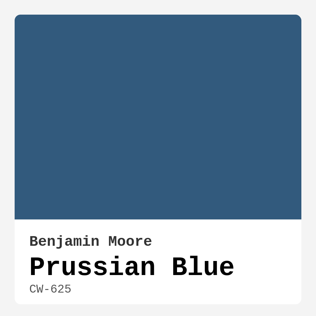
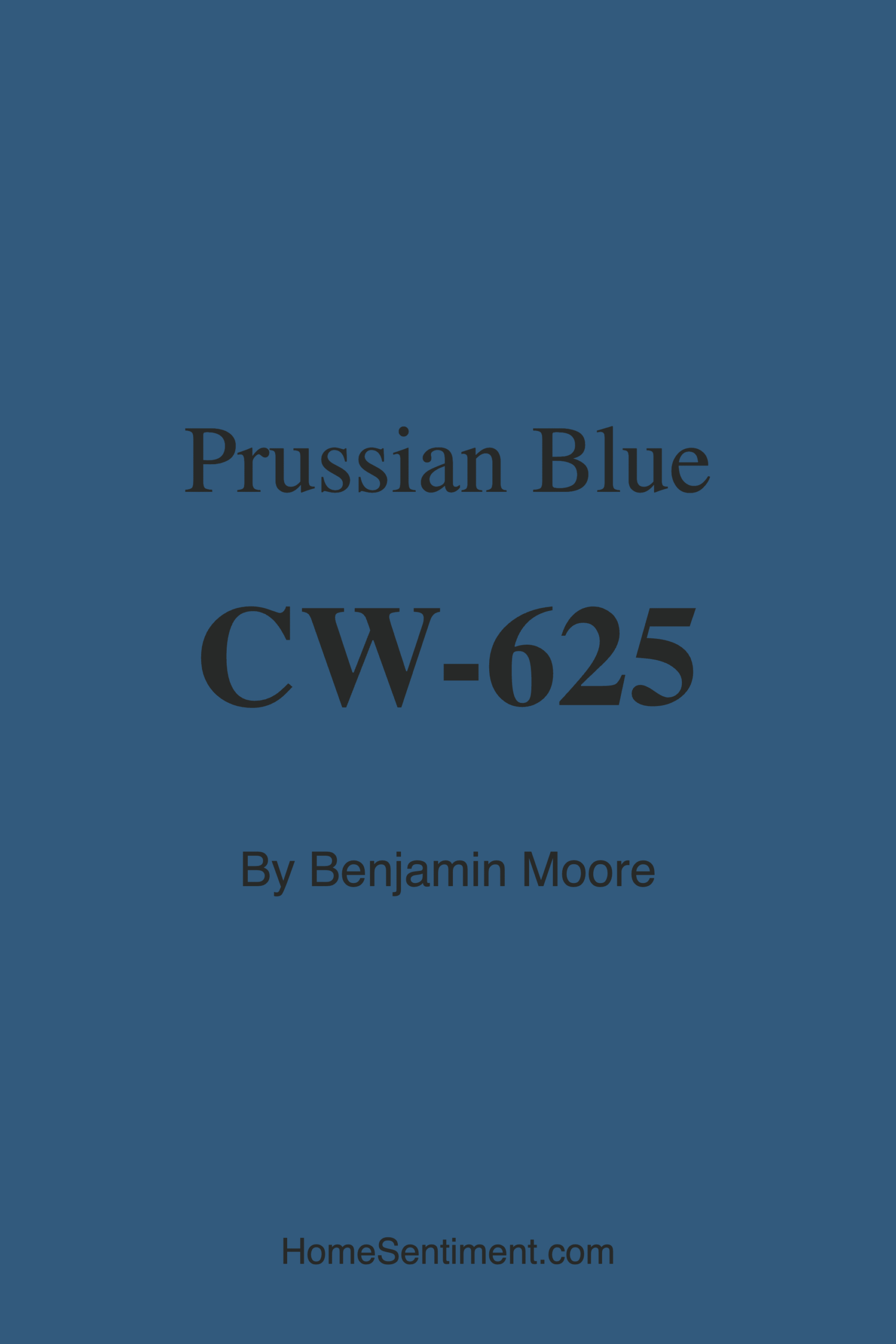
Color Preview & Key Details
| HEX Code | #325A7D |
| RGB | 50, 90, 125 |
| LRV | 12.17% |
| Undertone | Blue |
| Finish Options | Matte, Satin, Semi-Gloss |
If you’re searching for a paint color that exudes sophistication while still feeling inviting, Benjamin Moore’s Prussian Blue (CW-625) might just be your perfect match. This deep, moody blue has a timeless elegance that works in almost any space, whether you’re going for a cozy bedroom retreat, a refined living room, or a striking accent wall in your home office. The richness of this hue makes it incredibly versatile—it can anchor a room with its depth or play a supporting role when paired with lighter, brighter colors.
One of the first things you’ll notice about Prussian Blue is how it shifts with the light. In a sunlit room, it takes on a vibrant, almost nautical energy, while in softer or artificial lighting, it becomes more subdued and intimate. That adaptability is part of what makes it such a designer favorite. With an LRV (Light Reflectance Value) of just 12.17%, it’s definitely on the darker side, meaning it absorbs more light than it reflects. This makes it ideal for spaces where you want to create a sense of warmth and coziness, but it’s worth noting that in smaller rooms with limited natural light, it can feel a bit overwhelming if used on all four walls.
When it comes to application, Prussian Blue is beginner-friendly. It rolls on smoothly, and thanks to its excellent coverage, you’ll likely only need one or two coats for full opacity. The finish options—matte, satin, or semi-gloss—give you flexibility depending on the look you’re going for. A matte finish will emphasize its depth and sophistication, while a semi-gloss can add a bit of reflective sheen, making it pop in spaces like dining rooms or on statement furniture. And because it’s low-VOC, you won’t have to worry about strong fumes during or after painting.
Pairing Prussian Blue with the right colors is key to making it shine. Soft whites like Benjamin Moore’s White Dove (OC-17) keep things crisp and classic, especially on trim and ceilings. If you want to lean into its cool undertones, try pairing it with other blues or grays for a serene, monochromatic look. But don’t shy away from warmer accents—mustard yellows, blush pinks, or even rich woods can create a beautiful contrast that keeps the space from feeling too cold. Metallic finishes, like brushed brass or aged bronze, add a touch of luxury that plays well with Prussian Blue’s refined vibe.
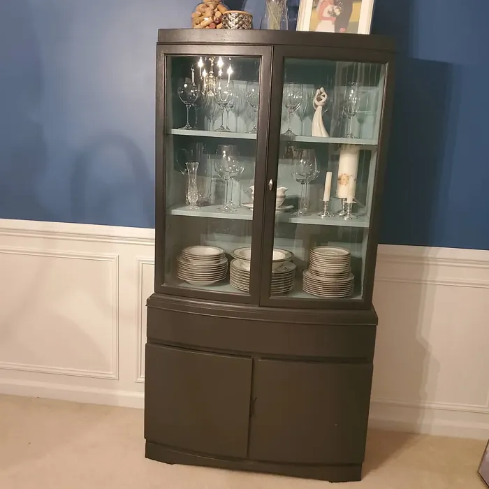
This color isn’t just for walls, either. Imagine a Prussian Blue front door making a bold first impression, or a set of kitchen cabinets in this shade adding unexpected drama to a modern farmhouse design. It’s also stunning on built-in bookshelves or an accent piece of furniture, giving a room instant character without committing to a full paint job. And if you’re worried about it feeling too dark, balance it out with plenty of natural textures—linen curtains, jute rugs, or woven baskets can soften the look and keep it grounded.
Prussian Blue works across a range of decor styles, from traditional to industrial. In a coastal-inspired space, it evokes the deep ocean, especially when paired with whites and natural fibers. For a more rustic feel, layer it with reclaimed wood and leather accents. In a contemporary setting, clean lines and minimalist decor let the color take center stage. And in an industrial space, it complements exposed brick and metal finishes beautifully.
A common question is whether this color works in bedrooms. Absolutely. Its calming, almost cocoon-like quality makes it ideal for creating a restful retreat. Pair it with crisp white bedding and warm wood tones for a balanced look, or go all-in with a monochromatic scheme using varying shades of blue for a serene, layered effect. Just be mindful of lighting—adding plenty of lamps or sconces will keep the room from feeling too dark in the evenings.
If you’re considering Prussian Blue for an exterior, it’s a fantastic choice for shutters, doors, or even an entire facade if you’re feeling bold. Its depth gives a home a stately, polished look, especially when paired with lighter stone or siding. Just make sure to use an exterior-grade paint to ensure it holds up against the elements.
At the end of the day, Prussian Blue is one of those colors that feels both classic and fresh. It’s bold enough to make a statement but neutral enough to work with a variety of styles. The best way to know if it’s right for your space? Grab a sample and test it in different lighting conditions. See how it plays with your furniture, your floors, and the natural light throughout the day. You might just find that it’s the perfect shade to bring depth, sophistication, and a touch of tranquility to your home.
Whether you’re painting a single wall or an entire room, Prussian Blue has a way of elevating a space without overpowering it. It’s a color that feels intentional—like you really thought about the mood you wanted to create. And that’s the mark of a great paint choice. So if you’re ready to add some richness to your decor, this might be the shade you’ve been looking for.
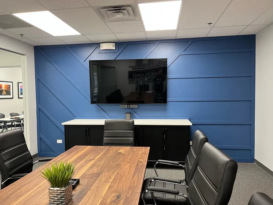
Real Room Photo of Prussian Blue CW-625
Undertones of Prussian Blue ?
The undertones of Prussian Blue are a key aspect of its character, leaning towards Blue. These subtle underlying hues are what give the color its depth and complexity. For example, a gray with a blue undertone will feel cooler and more modern, while one with a brown undertone will feel warmer and more traditional. It’s essential to test this paint in your home and observe it next to your existing furniture, flooring, and decor to see how these undertones interact and reveal themselves throughout the day.
HEX value: #325A7D
RGB code: 50, 90, 125
Is Prussian Blue Cool or Warm?
Prussian Blue is predominantly a cool color, but its rich depth allows it to harmonize beautifully with warmer tones, creating a balanced and inviting atmosphere.
Understanding Color Properties and Interior Design Tips
Hue refers to a specific position on the color wheel, measured in degrees from 0 to 360. Each degree represents a different pure color:
- 0° represents red
- 120° represents green
- 240° represents blue
Saturation describes the intensity or purity of a color and is expressed as a percentage:
- At 0%, the color appears completely desaturated—essentially a shade of gray
- At 100%, the color is at its most vivid and vibrant
Lightness indicates how light or dark a color is, also expressed as a percentage:
- 0% lightness results in black
- 100% lightness results in white
Using Warm Colors in Interior Design
Warm hues—such as reds, oranges, yellows, warm beiges, and greiges—are excellent choices for creating inviting and energetic spaces. These colors are particularly well-suited for:
- Kitchens, living rooms, and bathrooms, where warmth enhances comfort and sociability
- Large rooms, where warm tones can help reduce the sense of emptiness and make the space feel more intimate
For example:
- Warm beige shades provide a cozy, inviting atmosphere, ideal for living rooms, bedrooms, and hallways.
- Warm greige (a mix of beige and gray) offers the warmth of beige with the modern appeal of gray, making it a versatile backdrop for dining areas, bedrooms, and living spaces.
However, be mindful when using warm light tones in rooms with limited natural light. These shades may appear muted or even take on an unpleasant yellowish tint. To avoid a dull or flat appearance:
- Add depth by incorporating richer tones like deep greens, charcoal, or chocolate brown
- Use textured elements such as curtains, rugs, or cushions to bring dimension to the space
Pro Tip: Achieving Harmony with Warm and Cool Color Balance
To create a well-balanced and visually interesting interior, mix warm and cool tones strategically. This contrast adds depth and harmony to your design.
- If your walls feature warm hues, introduce cool-colored accents such as blue or green furniture, artwork, or accessories to create contrast.
- For a polished look, consider using a complementary color scheme, which pairs colors opposite each other on the color wheel (e.g., red with green, orange with blue).
This thoughtful mix not only enhances visual appeal but also creates a space that feels both dynamic and cohesive.
Light Temperature Affects on Prussian Blue
Natural Light
Natural daylight changes in color temperature as the sun moves across the sky. At sunrise and sunset, the light tends to have a warm, golden tone with a color temperature around 2000 Kelvin (K). As the day progresses and the sun rises higher, the light becomes cooler and more neutral. Around midday, especially when the sky is clear, natural light typically reaches its peak brightness and shifts to a cooler tone, ranging from 5500 to 6500 Kelvin. This midday light is close to what we perceive as pure white or daylight-balanced light.
These shifts in natural light can significantly influence how colors appear in a space, which is why designers often consider both the time of day and the orientation of windows when planning interior color schemes.
Artificial Light
When choosing artificial lighting, pay close attention to the color temperature, measured in Kelvin (K). This determines how warm or cool the light will appear. Lower temperatures, around 2700K, give off a warm, yellow glow often used in living rooms or bedrooms. Higher temperatures, above 5000K, create a cool, bluish light similar to daylight, commonly used in kitchens, offices, or task areas.
Use the slider to see how lighting temperature can affect the appearance of a surface or color throughout a space.


4800K
LRV of Prussian Blue
The Light Reflectance Value (LRV) of Prussian Blue is 12.17%, which places it in the Medium Dark category. This means it reflects very little light. Understanding a paint’s LRV is crucial for predicting how it will look in your space. A higher LRV indicates a lighter color that reflects more light, making rooms feel larger and brighter. A lower LRV signifies a darker color that absorbs more light, creating a cozier, more intimate atmosphere. Always consider the natural and artificial lighting in your room when selecting a paint color based on its LRV.
Detailed Review of Prussian Blue
Additional Paint Characteristics
Ideal Rooms
Bedroom, Dining Room, Home Office, Living Room
Decor Styles
Coastal, Contemporary, Industrial, Rustic, Traditional
Coverage
Good (1–2 Coats)
Ease of Application
Beginner Friendly, Brush Smooth, Roller-Ready
Washability
Highly Washable, Washable
VOC Level
Low VOC, Ultra Low VOC
Best Use
Accent Wall, Doors, Furniture, Interior Walls
Room Suitability
Bedroom, Dining Room, Home Office, Living Room
Tone Tag
Bold, Cool, Deep
Finish Type
Matte, Satin, Semi-Gloss
Paint Performance
Fade Resistant, High Coverage, Low Odor
Use Cases
Best for Modern Farmhouse, Classic Favorite, Designer Favorite
Mood
Calm, Cozy, Sophisticated
Trim Pairing
Complements Cool Trim, Pairs with White Dove
Prussian Blue stands out for its versatility and depth, making it an excellent choice for anyone looking to create a sophisticated atmosphere in their home. Its rich hue works exceptionally well as both an accent color and a primary wall color. When applied, it delivers a smooth, even finish that enhances the overall aesthetic of the room. One of the most appealing aspects of this color is its ability to change character depending on the lighting; it can appear serene and calming in natural light while taking on a more dramatic tone in dimmer settings. This makes it perfect for spaces where you want to create distinct moods, from cozy evenings to bright, airy afternoons. Whether you’re painting a feature wall or an entire room, Prussian Blue ensures a timeless elegance that resonates with various design preferences.
Pros & Cons of CW-625 Prussian Blue
Pros
Cons
Colors that go with Benjamin Moore Prussian Blue
FAQ on CW-625 Prussian Blue
How should I complement Prussian Blue in my decor?
To complement Prussian Blue effectively, consider pairing it with soft whites or warm neutrals for a classic look. Light woods and metallic accents can also enhance its sophistication. If you prefer bolder combinations, try using mustard yellows or muted blush tones for a contemporary twist. Experimenting with textures, such as adding soft fabrics or natural elements, can create a harmonious balance.
Is Prussian Blue suitable for exterior use?
Absolutely! Prussian Blue can be a stunning choice for exterior applications, especially on shutters or doors. It adds a touch of elegance and can make your home stand out in a positive way. Just ensure you select a high-quality exterior paint formulation to withstand the elements and maintain its beautiful hue over time.
Comparisons Prussian Blue with other colors
Prussian Blue CW-625 vs Naval SW 6244
| Attribute | Prussian Blue CW-625 | Naval SW 6244 |
|---|---|---|
| Color Name | Prussian Blue CW-625 | Naval SW 6244 |
| Color | ||
| Hue | Blue | Blue |
| Brightness | Dark | Dark |
| RGB | 50, 90, 125 | 47, 61, 76 |
| LRV | 12.17% | 4% |
| Finish Type | Matte, Satin, Semi-Gloss | Matte, Satin, Semi-Gloss |
| Finish Options | Matte, Satin, Semi-Gloss | Matte, Satin, Semi-Gloss |
| Ideal Rooms | Bedroom, Dining Room, Home Office, Living Room | Bedroom, Dining Room, Hallway, Home Office, Living Room |
| Decor Styles | Coastal, Contemporary, Industrial, Rustic, Traditional | Coastal, Industrial, Minimalist, Modern, Traditional |
| Coverage | Good (1–2 Coats) | Good (1–2 Coats), Self-Priming |
| Ease of Application | Beginner Friendly, Brush Smooth, Roller-Ready | Beginner Friendly, Brush Smooth, Roller-Ready |
| Washability | Highly Washable, Washable | Highly Washable, Washable |
| Room Suitability | Bedroom, Dining Room, Home Office, Living Room | Bedroom, Dining Room, Entryway, Home Office, Living Room |
| Tone | Bold, Cool, Deep | Cool, Deep, Moody |
| Paint Performance | Fade Resistant, High Coverage, Low Odor | Easy Touch-Up, High Coverage, Low Odor, Scuff Resistant |
Prussian Blue CW-625 vs Sea Serpent SW 7615
| Attribute | Prussian Blue CW-625 | Sea Serpent SW 7615 |
|---|---|---|
| Color Name | Prussian Blue CW-625 | Sea Serpent SW 7615 |
| Color | ||
| Hue | Blue | Blue |
| Brightness | Dark | Dark |
| RGB | 50, 90, 125 | 62, 75, 84 |
| LRV | 12.17% | 12% |
| Finish Type | Matte, Satin, Semi-Gloss | Eggshell, Matte, Satin |
| Finish Options | Matte, Satin, Semi-Gloss | Eggshell, Matte, Satin |
| Ideal Rooms | Bedroom, Dining Room, Home Office, Living Room | Bathroom, Bedroom, Home Office, Living Room |
| Decor Styles | Coastal, Contemporary, Industrial, Rustic, Traditional | Coastal, Farmhouse, Industrial, Modern |
| Coverage | Good (1–2 Coats) | Good (1–2 Coats), Touch-Up Friendly |
| Ease of Application | Beginner Friendly, Brush Smooth, Roller-Ready | Beginner Friendly, Brush Smooth, Roller-Ready |
| Washability | Highly Washable, Washable | Highly Washable, Washable |
| Room Suitability | Bedroom, Dining Room, Home Office, Living Room | Bathroom, Bedroom, Home Office, Living Room |
| Tone | Bold, Cool, Deep | Cool, Deep, Moody |
| Paint Performance | Fade Resistant, High Coverage, Low Odor | Easy Touch-Up, High Coverage, Low Odor |
Prussian Blue CW-625 vs Rain Cloud SW 9639
| Attribute | Prussian Blue CW-625 | Rain Cloud SW 9639 |
|---|---|---|
| Color Name | Prussian Blue CW-625 | Rain Cloud SW 9639 |
| Color | ||
| Hue | Blue | Blue |
| Brightness | Dark | Dark |
| RGB | 50, 90, 125 | 83, 97, 104 |
| LRV | 12.17% | 30% |
| Finish Type | Matte, Satin, Semi-Gloss | Eggshell, Matte, Satin |
| Finish Options | Matte, Satin, Semi-Gloss | Eggshell, Matte, Satin |
| Ideal Rooms | Bedroom, Dining Room, Home Office, Living Room | Bedroom, Dining Room, Home Office, Living Room |
| Decor Styles | Coastal, Contemporary, Industrial, Rustic, Traditional | Coastal, Contemporary, Minimalist, Scandinavian |
| Coverage | Good (1–2 Coats) | Good (1–2 Coats), Touch-Up Friendly |
| Ease of Application | Beginner Friendly, Brush Smooth, Roller-Ready | Beginner Friendly, Brush Smooth, Roller-Ready |
| Washability | Highly Washable, Washable | Highly Washable, Washable |
| Room Suitability | Bedroom, Dining Room, Home Office, Living Room | Bedroom, Home Office, Living Room |
| Tone | Bold, Cool, Deep | Balanced, Cool, Muted |
| Paint Performance | Fade Resistant, High Coverage, Low Odor | Easy Touch-Up, Fade Resistant, Low Odor |
Prussian Blue CW-625 vs Indigo Batik SW 7602
| Attribute | Prussian Blue CW-625 | Indigo Batik SW 7602 |
|---|---|---|
| Color Name | Prussian Blue CW-625 | Indigo Batik SW 7602 |
| Color | ||
| Hue | Blue | Blue |
| Brightness | Dark | Dark |
| RGB | 50, 90, 125 | 62, 80, 99 |
| LRV | 12.17% | 10% |
| Finish Type | Matte, Satin, Semi-Gloss | Matte, Satin |
| Finish Options | Matte, Satin, Semi-Gloss | Eggshell, Flat, Matte, Satin |
| Ideal Rooms | Bedroom, Dining Room, Home Office, Living Room | Bedroom, Dining Room, Home Office, Living Room |
| Decor Styles | Coastal, Contemporary, Industrial, Rustic, Traditional | Bohemian, Coastal, Contemporary, Modern |
| Coverage | Good (1–2 Coats) | Good (1–2 Coats), Touch-Up Friendly |
| Ease of Application | Beginner Friendly, Brush Smooth, Roller-Ready | Brush Smooth, Fast-Drying, Roller-Ready |
| Washability | Highly Washable, Washable | Scrubbable, Washable, Wipeable |
| Room Suitability | Bedroom, Dining Room, Home Office, Living Room | Bedroom, Dining Room, Home Office, Living Room |
| Tone | Bold, Cool, Deep | Cool, Deep, Moody |
| Paint Performance | Fade Resistant, High Coverage, Low Odor | Easy Touch-Up, High Coverage, Low Odor, Quick Drying |
Prussian Blue CW-625 vs Sea Mariner SW 9640
| Attribute | Prussian Blue CW-625 | Sea Mariner SW 9640 |
|---|---|---|
| Color Name | Prussian Blue CW-625 | Sea Mariner SW 9640 |
| Color | ||
| Hue | Blue | Blue |
| Brightness | Dark | Dark |
| RGB | 50, 90, 125 | 67, 74, 84 |
| LRV | 12.17% | 6% |
| Finish Type | Matte, Satin, Semi-Gloss | Eggshell, Matte, Satin |
| Finish Options | Matte, Satin, Semi-Gloss | Eggshell, Matte, Satin |
| Ideal Rooms | Bedroom, Dining Room, Home Office, Living Room | Bedroom, Dining Room, Hallway, Home Office, Living Room |
| Decor Styles | Coastal, Contemporary, Industrial, Rustic, Traditional | Coastal, Industrial, Minimalist, Modern |
| Coverage | Good (1–2 Coats) | Good (1–2 Coats) |
| Ease of Application | Beginner Friendly, Brush Smooth, Roller-Ready | Beginner Friendly, Brush Smooth, Roller-Ready |
| Washability | Highly Washable, Washable | Scrubbable, Washable |
| Room Suitability | Bedroom, Dining Room, Home Office, Living Room | Bedroom, Dining Room, Home Office, Living Room |
| Tone | Bold, Cool, Deep | Cool, Deep, Moody |
| Paint Performance | Fade Resistant, High Coverage, Low Odor | Easy Touch-Up, Low Odor, Quick Drying |
Prussian Blue CW-625 vs Still Water SW 6223
| Attribute | Prussian Blue CW-625 | Still Water SW 6223 |
|---|---|---|
| Color Name | Prussian Blue CW-625 | Still Water SW 6223 |
| Color | ||
| Hue | Blue | Blue |
| Brightness | Dark | Dark |
| RGB | 50, 90, 125 | 74, 93, 95 |
| LRV | 12.17% | 48% |
| Finish Type | Matte, Satin, Semi-Gloss | Eggshell, Matte, Satin |
| Finish Options | Matte, Satin, Semi-Gloss | Eggshell, Matte, Satin |
| Ideal Rooms | Bedroom, Dining Room, Home Office, Living Room | Bedroom, Dining Room, Home Office, Living Room, Nursery |
| Decor Styles | Coastal, Contemporary, Industrial, Rustic, Traditional | Coastal, Contemporary, Farmhouse, Modern, Rustic |
| Coverage | Good (1–2 Coats) | Good (1–2 Coats), Touch-Up Friendly |
| Ease of Application | Beginner Friendly, Brush Smooth, Roller-Ready | Beginner Friendly, Brush Smooth, Roller-Ready |
| Washability | Highly Washable, Washable | Highly Washable, Washable |
| Room Suitability | Bedroom, Dining Room, Home Office, Living Room | Bedroom, Dining Room, Home Office, Living Room |
| Tone | Bold, Cool, Deep | Cool, Earthy, Muted |
| Paint Performance | Fade Resistant, High Coverage, Low Odor | Easy Touch-Up, Fade Resistant, Low Odor |
Prussian Blue CW-625 vs Waterloo SW 9141
| Attribute | Prussian Blue CW-625 | Waterloo SW 9141 |
|---|---|---|
| Color Name | Prussian Blue CW-625 | Waterloo SW 9141 |
| Color | ||
| Hue | Blue | Blue |
| Brightness | Dark | Dark |
| RGB | 50, 90, 125 | 83, 104, 114 |
| LRV | 12.17% | 12% |
| Finish Type | Matte, Satin, Semi-Gloss | Matte, Satin |
| Finish Options | Matte, Satin, Semi-Gloss | Matte, Satin, Semi-Gloss |
| Ideal Rooms | Bedroom, Dining Room, Home Office, Living Room | Bedroom, Dining Room, Hallway, Home Office, Living Room |
| Decor Styles | Coastal, Contemporary, Industrial, Rustic, Traditional | Coastal, Industrial, Modern, Rustic |
| Coverage | Good (1–2 Coats) | Good (1–2 Coats), Touch-Up Friendly |
| Ease of Application | Beginner Friendly, Brush Smooth, Roller-Ready | Brush Smooth, Fast-Drying, Roller-Ready |
| Washability | Highly Washable, Washable | Scrubbable, Washable |
| Room Suitability | Bedroom, Dining Room, Home Office, Living Room | Bedroom, Dining Room, Home Office, Living Room |
| Tone | Bold, Cool, Deep | Balanced, Cool, Muted |
| Paint Performance | Fade Resistant, High Coverage, Low Odor | Easy Touch-Up, Fade Resistant, Low Odor, Quick Drying |
Prussian Blue CW-625 vs Smoky Blue SW 7604
| Attribute | Prussian Blue CW-625 | Smoky Blue SW 7604 |
|---|---|---|
| Color Name | Prussian Blue CW-625 | Smoky Blue SW 7604 |
| Color | ||
| Hue | Blue | Blue |
| Brightness | Dark | Dark |
| RGB | 50, 90, 125 | 89, 110, 121 |
| LRV | 12.17% | 15% |
| Finish Type | Matte, Satin, Semi-Gloss | Eggshell, Matte, Satin |
| Finish Options | Matte, Satin, Semi-Gloss | Eggshell, Matte, Satin |
| Ideal Rooms | Bedroom, Dining Room, Home Office, Living Room | Bathroom, Bedroom, Home Office, Kitchen, Living Room |
| Decor Styles | Coastal, Contemporary, Industrial, Rustic, Traditional | Coastal, Modern, Scandinavian, Transitional |
| Coverage | Good (1–2 Coats) | Good (1–2 Coats), Touch-Up Friendly |
| Ease of Application | Beginner Friendly, Brush Smooth, Roller-Ready | Beginner Friendly, Brush Smooth, Roller-Ready |
| Washability | Highly Washable, Washable | Highly Washable, Washable |
| Room Suitability | Bedroom, Dining Room, Home Office, Living Room | Bathroom, Bedroom, Home Office, Living Room |
| Tone | Bold, Cool, Deep | Cool, Dusty, Muted |
| Paint Performance | Fade Resistant, High Coverage, Low Odor | High Coverage, Low Odor, Quick Drying |
Prussian Blue CW-625 vs Needlepoint Navy SW 0032
| Attribute | Prussian Blue CW-625 | Needlepoint Navy SW 0032 |
|---|---|---|
| Color Name | Prussian Blue CW-625 | Needlepoint Navy SW 0032 |
| Color | ||
| Hue | Blue | Blue |
| Brightness | Dark | Dark |
| RGB | 50, 90, 125 | 84, 102, 112 |
| LRV | 12.17% | 4% |
| Finish Type | Matte, Satin, Semi-Gloss | Matte, Satin, Semi-Gloss |
| Finish Options | Matte, Satin, Semi-Gloss | Matte, Satin, Semi-Gloss |
| Ideal Rooms | Bedroom, Dining Room, Home Office, Living Room | Bedroom, Dining Room, Entryway, Home Office, Living Room |
| Decor Styles | Coastal, Contemporary, Industrial, Rustic, Traditional | Coastal, Contemporary, Modern Farmhouse, Nautical, Traditional |
| Coverage | Good (1–2 Coats) | Good (1–2 Coats), Touch-Up Friendly |
| Ease of Application | Beginner Friendly, Brush Smooth, Roller-Ready | Beginner Friendly, Brush Smooth, Fast-Drying, Roller-Ready |
| Washability | Highly Washable, Washable | Scrubbable, Washable |
| Room Suitability | Bedroom, Dining Room, Home Office, Living Room | Bedroom, Dining Room, Home Office, Living Room |
| Tone | Bold, Cool, Deep | Cool, Deep, Muted |
| Paint Performance | Fade Resistant, High Coverage, Low Odor | Easy Touch-Up, High Coverage, Low Odor, Quick Drying, Stain Resistant |
Prussian Blue CW-625 vs Riverway SW 6222
| Attribute | Prussian Blue CW-625 | Riverway SW 6222 |
|---|---|---|
| Color Name | Prussian Blue CW-625 | Riverway SW 6222 |
| Color | ||
| Hue | Blue | Blue |
| Brightness | Dark | Dark |
| RGB | 50, 90, 125 | 93, 114, 116 |
| LRV | 12.17% | 24% |
| Finish Type | Matte, Satin, Semi-Gloss | Eggshell, Satin |
| Finish Options | Matte, Satin, Semi-Gloss | Eggshell, Matte, Satin |
| Ideal Rooms | Bedroom, Dining Room, Home Office, Living Room | Bathroom, Bedroom, Dining Room, Home Office, Living Room |
| Decor Styles | Coastal, Contemporary, Industrial, Rustic, Traditional | Coastal, Contemporary, Eclectic, Modern, Rustic |
| Coverage | Good (1–2 Coats) | Good (1–2 Coats), Touch-Up Friendly |
| Ease of Application | Beginner Friendly, Brush Smooth, Roller-Ready | Beginner Friendly, Brush Smooth, Fast-Drying, Low Splatter, Roller-Ready |
| Washability | Highly Washable, Washable | Highly Washable, Washable |
| Room Suitability | Bedroom, Dining Room, Home Office, Living Room | Bathroom, Bedroom, Home Office, Living Room |
| Tone | Bold, Cool, Deep | Balanced, Cool, Muted |
| Paint Performance | Fade Resistant, High Coverage, Low Odor | Easy Touch-Up, High Coverage, Low Odor, Quick Drying |
Official Page of Benjamin Moore Prussian Blue CW-625