
Color Preview & Key Details
| HEX Code | #7E8181 |
| RGB | 126, 129, 129 |
| LRV | 23.24% |
| Undertone | Blue |
| Finish Options | Eggshell, Matte, Satin |
If you’re searching for a paint color that exudes sophistication without feeling overly dramatic, Benjamin Moore’s Lampblack (CW-695) might just be your perfect match. This dark gray with subtle blue undertones is a designer favorite for a reason—it’s versatile, moody, and effortlessly elegant. Whether you’re looking to transform a living room, bedroom, or home office, Lampblack brings depth and character to any space while remaining surprisingly approachable.
One of the first things you’ll notice about Lampblack is its ability to adapt. It’s not just a flat, one-note gray—its blue undertones give it a modern edge, making it feel cooler and more refined than traditional charcoal shades. Yet, there’s a whisper of warmth in there too, which keeps it from feeling sterile. This balance makes it a fantastic choice if you want a color that plays well with both warm and cool accents. Picture it paired with crisp white trim (Benjamin Moore’s White Dove is a classic choice) or warmed up with brass fixtures. The contrast is striking but never harsh.
Lighting plays a huge role in how Lampblack performs. In natural light, those blue undertones come alive, giving the color a dynamic, almost chameleon-like quality. But when the sun goes down and artificial lighting takes over, it deepens into a rich, enveloping shade that makes a room feel intimate and cozy. That’s why it’s such a great pick for low-light spaces—it doesn’t disappear or turn murky. Instead, it leans into the moodiness, creating a space that feels intentional and layered.
With a Light Reflectance Value (LRV) of 23.24%, Lampblack sits comfortably in the medium range, meaning it reflects a fair amount of light for a dark color. This is key if you’re worried about it making a room feel too small or cave-like. To keep things airy, balance it with lighter furniture, plenty of texture, and strategic lighting. An accent wall in Lampblack can be especially powerful, adding drama without overwhelming the space. Or, if you’re feeling bold, go all-in on four walls—just be sure to break up the darkness with art, mirrors, or metallic finishes that catch the light.
Application is a breeze, even if you’re a DIY beginner. The paint goes on smoothly, whether you’re using a brush or roller, and it offers excellent coverage in just one or two coats. You’ve got finish options, too—matte for a velvety, understated look, or eggshell if you want a hint of sheen to highlight the color’s depth. And because it’s low-VOC and wipeable, it’s as practical as it is beautiful. No need to stress over scuffs or smudges; a quick clean-up will have your walls looking fresh again.
Now, let’s talk pairings. Lampblack is a team player. It works beautifully with soft pastels for a modern contrast, or with deeper jewel tones like emerald green or navy for a luxe, moody vibe. If you’re into industrial or minimalist decor, this color is a natural fit—think concrete finishes, sleek metals, and clean-lined furniture. But don’t be afraid to mix styles. A rustic wood table or a plush, neutral sofa can soften its edges, proving that Lampblack is anything but limiting.
Of course, no color is without its considerations. In very small rooms, Lampblack can feel a bit heavy if not balanced properly. But that’s easily solved with thoughtful decor—lighter floors, sheer curtains, or a well-placed mirror can keep the space from feeling cramped. And while its versatility is a strength, you’ll want to test it in your home before committing. Paint a large swatch and observe it at different times of day to see how the undertones shift with your lighting.
At the end of the day, Lampblack is more than just a paint color—it’s a design tool. It can make a room feel cozy, sophisticated, or even a little edgy, depending on how you use it. Whether you’re refreshing a single wall or reimagining an entire space, this shade delivers drama without the fuss. So if you’re ready to take your interiors to the next level, Lampblack might just be the perfect place to start.

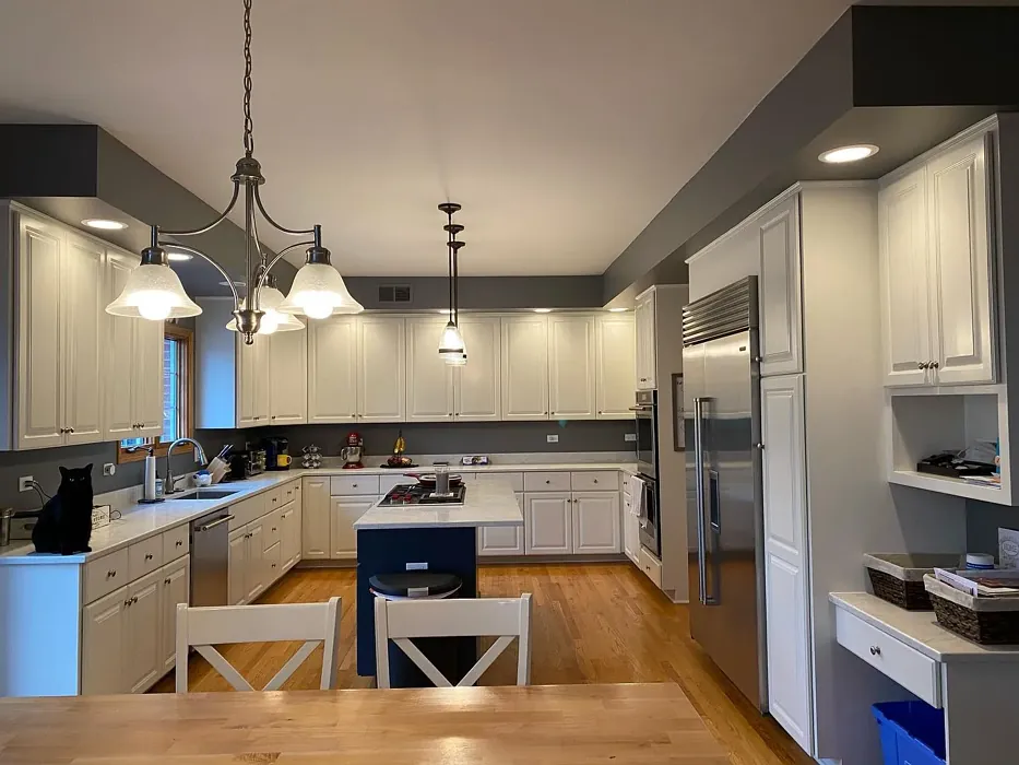
Real Room Photo of Lampblack CW-695
Undertones of Lampblack ?
The undertones of Lampblack are a key aspect of its character, leaning towards Blue. These subtle underlying hues are what give the color its depth and complexity. For example, a gray with a blue undertone will feel cooler and more modern, while one with a brown undertone will feel warmer and more traditional. It’s essential to test this paint in your home and observe it next to your existing furniture, flooring, and decor to see how these undertones interact and reveal themselves throughout the day.
HEX value: #7E8181
RGB code: 126, 129, 129
Is Lampblack Cool or Warm?
While primarily a cool gray, Lampblack’s slight warmth shines through, making it an excellent choice for spaces where you want to create a balanced feel. It can work harmoniously with both warm and cool accent colors.
Understanding Color Properties and Interior Design Tips
Hue refers to a specific position on the color wheel, measured in degrees from 0 to 360. Each degree represents a different pure color:
- 0° represents red
- 120° represents green
- 240° represents blue
Saturation describes the intensity or purity of a color and is expressed as a percentage:
- At 0%, the color appears completely desaturated—essentially a shade of gray
- At 100%, the color is at its most vivid and vibrant
Lightness indicates how light or dark a color is, also expressed as a percentage:
- 0% lightness results in black
- 100% lightness results in white
Using Warm Colors in Interior Design
Warm hues—such as reds, oranges, yellows, warm beiges, and greiges—are excellent choices for creating inviting and energetic spaces. These colors are particularly well-suited for:
- Kitchens, living rooms, and bathrooms, where warmth enhances comfort and sociability
- Large rooms, where warm tones can help reduce the sense of emptiness and make the space feel more intimate
For example:
- Warm beige shades provide a cozy, inviting atmosphere, ideal for living rooms, bedrooms, and hallways.
- Warm greige (a mix of beige and gray) offers the warmth of beige with the modern appeal of gray, making it a versatile backdrop for dining areas, bedrooms, and living spaces.
However, be mindful when using warm light tones in rooms with limited natural light. These shades may appear muted or even take on an unpleasant yellowish tint. To avoid a dull or flat appearance:
- Add depth by incorporating richer tones like deep greens, charcoal, or chocolate brown
- Use textured elements such as curtains, rugs, or cushions to bring dimension to the space
Pro Tip: Achieving Harmony with Warm and Cool Color Balance
To create a well-balanced and visually interesting interior, mix warm and cool tones strategically. This contrast adds depth and harmony to your design.
- If your walls feature warm hues, introduce cool-colored accents such as blue or green furniture, artwork, or accessories to create contrast.
- For a polished look, consider using a complementary color scheme, which pairs colors opposite each other on the color wheel (e.g., red with green, orange with blue).
This thoughtful mix not only enhances visual appeal but also creates a space that feels both dynamic and cohesive.
Light Temperature Affects on Lampblack
Natural Light
Natural daylight changes in color temperature as the sun moves across the sky. At sunrise and sunset, the light tends to have a warm, golden tone with a color temperature around 2000 Kelvin (K). As the day progresses and the sun rises higher, the light becomes cooler and more neutral. Around midday, especially when the sky is clear, natural light typically reaches its peak brightness and shifts to a cooler tone, ranging from 5500 to 6500 Kelvin. This midday light is close to what we perceive as pure white or daylight-balanced light.
These shifts in natural light can significantly influence how colors appear in a space, which is why designers often consider both the time of day and the orientation of windows when planning interior color schemes.
Artificial Light
When choosing artificial lighting, pay close attention to the color temperature, measured in Kelvin (K). This determines how warm or cool the light will appear. Lower temperatures, around 2700K, give off a warm, yellow glow often used in living rooms or bedrooms. Higher temperatures, above 5000K, create a cool, bluish light similar to daylight, commonly used in kitchens, offices, or task areas.
Use the slider to see how lighting temperature can affect the appearance of a surface or color throughout a space.


4800K
LRV of Lampblack
The Light Reflectance Value (LRV) of Lampblack is 23.24%, which places it in the Medium colors category. This means it reflect a lot of light. Understanding a paint’s LRV is crucial for predicting how it will look in your space. A higher LRV indicates a lighter color that reflects more light, making rooms feel larger and brighter. A lower LRV signifies a darker color that absorbs more light, creating a cozier, more intimate atmosphere. Always consider the natural and artificial lighting in your room when selecting a paint color based on its LRV.
Detailed Review of Lampblack
Additional Paint Characteristics
Ideal Rooms
Bedroom, Home Office, Living Room
Decor Styles
Contemporary, Industrial, Minimalist, Modern
Coverage
Good (1–2 Coats)
Ease of Application
Beginner Friendly, Brush Smooth, Roller-Ready
Washability
Washable, Wipeable
VOC Level
Low VOC
Best Use
Accent Wall, Interior Walls
Room Suitability
Bedroom, Dining Room, Home Office, Living Room
Tone Tag
Balanced, Deep, Moody
Finish Type
Eggshell, Matte
Paint Performance
Easy Touch-Up, High Coverage, Scuff Resistant
Use Cases
Best for Low Light Rooms, Designer Favorite
Mood
Cozy, Sophisticated
Trim Pairing
Complements Brass Fixtures, Pairs with White Dove, Works with Warm Trim
Lampblack is a standout choice for anyone aiming to add a touch of sophistication to their home. Its rich, dark hue creates an inviting atmosphere, making it ideal for spaces where you want to unwind or entertain. This color pairs beautifully with lighter furnishings and decor, allowing your space to feel both open and cozy. The application is smooth, whether you’re using a brush or roller, and the finish options available help you achieve the exact look you desire. Just be prepared for the color to deepen slightly as it dries, adding to its allure. Overall, Lampblack strikes a perfect balance between boldness and subtlety, making it a wise choice for both modern and traditional homes.
Pros & Cons of CW-695 Lampblack
Pros
Cons
Colors that go with Benjamin Moore Lampblack
FAQ on CW-695 Lampblack
Can Lampblack be used in small rooms?
Yes, Lampblack can be used in small rooms, but it’s essential to balance it with lighter furnishings and decor to prevent the space from feeling too closed in. Consider using it as an accent wall or pairing it with bright whites and soft pastels for a captivating contrast.
What finish should I choose for Lampblack?
The finish you choose for Lampblack depends on the look you’re going for. A matte finish offers a chic, understated elegance, while eggshell or satin can add a subtle sheen, highlighting its depth and complexity. Think about the function of the room and your personal style when deciding.
Comparisons Lampblack with other colors
Lampblack CW-695 vs Night Owl SW 7061
| Attribute | Lampblack CW-695 | Night Owl SW 7061 |
|---|---|---|
| Color Name | Lampblack CW-695 | Night Owl SW 7061 |
| Color | ||
| Hue | Grey | Grey |
| Brightness | Dark | Dark |
| RGB | 126, 129, 129 | 99, 101, 95 |
| LRV | 23.24% | 24% |
| Finish Type | Eggshell, Matte | Eggshell, Matte, Satin |
| Finish Options | Eggshell, Matte, Satin | Eggshell, Matte, Satin |
| Ideal Rooms | Bedroom, Home Office, Living Room | Bedroom, Dining Room, Hallway, Home Office, Living Room |
| Decor Styles | Contemporary, Industrial, Minimalist, Modern | Industrial, Minimalist, Modern, Rustic, Scandinavian |
| Coverage | Good (1–2 Coats) | Good (1–2 Coats), Touch-Up Friendly |
| Ease of Application | Beginner Friendly, Brush Smooth, Roller-Ready | Beginner Friendly, Brush Smooth, Fast-Drying, Roller-Ready |
| Washability | Washable, Wipeable | Scrubbable, Washable |
| Room Suitability | Bedroom, Dining Room, Home Office, Living Room | Bedroom, Dining Room, Home Office, Living Room |
| Tone | Balanced, Deep, Moody | Balanced, Deep, Earthy, Muted |
| Paint Performance | Easy Touch-Up, High Coverage, Scuff Resistant | Easy Touch-Up, Fade Resistant, High Coverage, Low Odor |
Lampblack CW-695 vs Urbane Bronze SW 7048
| Attribute | Lampblack CW-695 | Urbane Bronze SW 7048 |
|---|---|---|
| Color Name | Lampblack CW-695 | Urbane Bronze SW 7048 |
| Color | ||
| Hue | Grey | Grey |
| Brightness | Dark | Dark |
| RGB | 126, 129, 129 | 84, 80, 74 |
| LRV | 23.24% | 20% |
| Finish Type | Eggshell, Matte | Eggshell, Matte, Satin |
| Finish Options | Eggshell, Matte, Satin | Eggshell, Matte, Satin |
| Ideal Rooms | Bedroom, Home Office, Living Room | Bedroom, Dining Room, Home Office, Living Room |
| Decor Styles | Contemporary, Industrial, Minimalist, Modern | Contemporary, Industrial, Modern, Rustic, Transitional |
| Coverage | Good (1–2 Coats) | Good (1–2 Coats) |
| Ease of Application | Beginner Friendly, Brush Smooth, Roller-Ready | Beginner Friendly, Brush Smooth, Roller-Ready |
| Washability | Washable, Wipeable | Highly Washable, Washable |
| Room Suitability | Bedroom, Dining Room, Home Office, Living Room | Bedroom, Dining Room, Home Office, Living Room |
| Tone | Balanced, Deep, Moody | Deep, Earthy, Warm |
| Paint Performance | Easy Touch-Up, High Coverage, Scuff Resistant | Easy Touch-Up, Fade Resistant, High Coverage, Low Odor |
Lampblack CW-695 vs Succulent SW 9650
| Attribute | Lampblack CW-695 | Succulent SW 9650 |
|---|---|---|
| Color Name | Lampblack CW-695 | Succulent SW 9650 |
| Color | ||
| Hue | Grey | Grey |
| Brightness | Dark | Dark |
| RGB | 126, 129, 129 | 97, 108, 100 |
| LRV | 23.24% | 30% |
| Finish Type | Eggshell, Matte | Eggshell, Matte, Satin |
| Finish Options | Eggshell, Matte, Satin | Eggshell, Matte, Satin |
| Ideal Rooms | Bedroom, Home Office, Living Room | Bathroom, Bedroom, Dining Room, Entryway, Kitchen, Living Room |
| Decor Styles | Contemporary, Industrial, Minimalist, Modern | Bohemian, Contemporary, Eclectic, Minimalist, Modern Farmhouse |
| Coverage | Good (1–2 Coats) | Good (1–2 Coats), Touch-Up Friendly |
| Ease of Application | Beginner Friendly, Brush Smooth, Roller-Ready | Beginner Friendly, Brush Smooth, Roller-Ready |
| Washability | Washable, Wipeable | Highly Washable, Washable |
| Room Suitability | Bedroom, Dining Room, Home Office, Living Room | Bathroom, Bedroom, Dining Room, Kitchen, Living Room |
| Tone | Balanced, Deep, Moody | Cool, Earthy, Muted |
| Paint Performance | Easy Touch-Up, High Coverage, Scuff Resistant | Easy Touch-Up, Low Odor, Quick Drying, Scuff Resistant |
Lampblack CW-695 vs Grizzle Gray SW 7068
| Attribute | Lampblack CW-695 | Grizzle Gray SW 7068 |
|---|---|---|
| Color Name | Lampblack CW-695 | Grizzle Gray SW 7068 |
| Color | ||
| Hue | Grey | Grey |
| Brightness | Dark | Dark |
| RGB | 126, 129, 129 | 99, 101, 98 |
| LRV | 23.24% | 24% |
| Finish Type | Eggshell, Matte | Eggshell, Satin |
| Finish Options | Eggshell, Matte, Satin | Eggshell, Matte, Satin |
| Ideal Rooms | Bedroom, Home Office, Living Room | Bedroom, Dining Room, Home Office, Living Room |
| Decor Styles | Contemporary, Industrial, Minimalist, Modern | Industrial, Modern, Rustic, Scandinavian |
| Coverage | Good (1–2 Coats) | Good (1–2 Coats), Touch-Up Friendly |
| Ease of Application | Beginner Friendly, Brush Smooth, Roller-Ready | Beginner Friendly, Brush Smooth, Roller-Ready |
| Washability | Washable, Wipeable | Washable, Wipeable |
| Room Suitability | Bedroom, Dining Room, Home Office, Living Room | Bedroom, Dining Room, Home Office, Living Room |
| Tone | Balanced, Deep, Moody | Balanced, Cool, Muted |
| Paint Performance | Easy Touch-Up, High Coverage, Scuff Resistant | Easy Touch-Up, High Coverage, Low Odor |
Lampblack CW-695 vs Iron Ore SW 7069
| Attribute | Lampblack CW-695 | Iron Ore SW 7069 |
|---|---|---|
| Color Name | Lampblack CW-695 | Iron Ore SW 7069 |
| Color | ||
| Hue | Grey | Grey |
| Brightness | Dark | Dark |
| RGB | 126, 129, 129 | 67, 67, 65 |
| LRV | 23.24% | 6% |
| Finish Type | Eggshell, Matte | Eggshell, Matte, Satin |
| Finish Options | Eggshell, Matte, Satin | Eggshell, Matte, Satin |
| Ideal Rooms | Bedroom, Home Office, Living Room | Bedroom, Dining Room, Entryway, Home Office, Living Room |
| Decor Styles | Contemporary, Industrial, Minimalist, Modern | Contemporary, Industrial, Minimalist, Modern, Rustic |
| Coverage | Good (1–2 Coats) | Good (1–2 Coats), High Hide |
| Ease of Application | Beginner Friendly, Brush Smooth, Roller-Ready | Brush Smooth, Fast-Drying, Roller-Ready |
| Washability | Washable, Wipeable | Highly Washable, Washable |
| Room Suitability | Bedroom, Dining Room, Home Office, Living Room | Bedroom, Dining Room, Entryway, Home Office, Living Room |
| Tone | Balanced, Deep, Moody | Balanced, Deep, Muted, Warm |
| Paint Performance | Easy Touch-Up, High Coverage, Scuff Resistant | Easy Touch-Up, High Coverage, Low Odor |
Lampblack CW-695 vs Peppercorn SW 7674
| Attribute | Lampblack CW-695 | Peppercorn SW 7674 |
|---|---|---|
| Color Name | Lampblack CW-695 | Peppercorn SW 7674 |
| Color | ||
| Hue | Grey | Grey |
| Brightness | Dark | Dark |
| RGB | 126, 129, 129 | 88, 88, 88 |
| LRV | 23.24% | 10% |
| Finish Type | Eggshell, Matte | Eggshell, Matte, Satin |
| Finish Options | Eggshell, Matte, Satin | Eggshell, Matte, Satin |
| Ideal Rooms | Bedroom, Home Office, Living Room | Bedroom, Dining Room, Home Office, Living Room |
| Decor Styles | Contemporary, Industrial, Minimalist, Modern | Contemporary, Industrial, Minimalist, Modern |
| Coverage | Good (1–2 Coats) | Good (1–2 Coats), Touch-Up Friendly |
| Ease of Application | Beginner Friendly, Brush Smooth, Roller-Ready | Beginner Friendly, Brush Smooth, Roller-Ready |
| Washability | Washable, Wipeable | Highly Washable, Washable |
| Room Suitability | Bedroom, Dining Room, Home Office, Living Room | Bedroom, Dining Room, Home Office, Living Room |
| Tone | Balanced, Deep, Moody | Balanced, Deep, Moody, Neutral |
| Paint Performance | Easy Touch-Up, High Coverage, Scuff Resistant | Easy Touch-Up, Low Odor, Quick Drying, Scuff Resistant |
Lampblack CW-695 vs Slate Tile SW 7624
| Attribute | Lampblack CW-695 | Slate Tile SW 7624 |
|---|---|---|
| Color Name | Lampblack CW-695 | Slate Tile SW 7624 |
| Color | ||
| Hue | Grey | Grey |
| Brightness | Dark | Dark |
| RGB | 126, 129, 129 | 96, 110, 116 |
| LRV | 23.24% | 15% |
| Finish Type | Eggshell, Matte | Eggshell, Matte, Satin |
| Finish Options | Eggshell, Matte, Satin | Eggshell, Matte, Satin |
| Ideal Rooms | Bedroom, Home Office, Living Room | Bathroom, Bedroom, Home Office, Kitchen, Living Room |
| Decor Styles | Contemporary, Industrial, Minimalist, Modern | Industrial, Minimalist, Modern, Rustic |
| Coverage | Good (1–2 Coats) | Good (1–2 Coats) |
| Ease of Application | Beginner Friendly, Brush Smooth, Roller-Ready | Beginner Friendly, Brush Smooth, Fast-Drying, Roller-Ready |
| Washability | Washable, Wipeable | Scrubbable, Washable |
| Room Suitability | Bedroom, Dining Room, Home Office, Living Room | Bathroom, Bedroom, Kitchen, Living Room |
| Tone | Balanced, Deep, Moody | Balanced, Cool, Muted |
| Paint Performance | Easy Touch-Up, High Coverage, Scuff Resistant | Easy Touch-Up, High Coverage, Low Odor, Quick Drying |
Lampblack CW-695 vs Blustery Sky SW 9140
| Attribute | Lampblack CW-695 | Blustery Sky SW 9140 |
|---|---|---|
| Color Name | Lampblack CW-695 | Blustery Sky SW 9140 |
| Color | ||
| Hue | Grey | Grey |
| Brightness | Dark | Dark |
| RGB | 126, 129, 129 | 111, 132, 140 |
| LRV | 23.24% | 48% |
| Finish Type | Eggshell, Matte | Eggshell, Matte |
| Finish Options | Eggshell, Matte, Satin | Eggshell, Matte, Satin |
| Ideal Rooms | Bedroom, Home Office, Living Room | Bedroom, Dining Room, Home Office, Living Room, Nursery |
| Decor Styles | Contemporary, Industrial, Minimalist, Modern | Coastal, Modern Farmhouse, Scandinavian, Transitional |
| Coverage | Good (1–2 Coats) | Good (1–2 Coats), Touch-Up Friendly |
| Ease of Application | Beginner Friendly, Brush Smooth, Roller-Ready | Beginner Friendly, Fast-Drying, Low Splatter, Roller-Ready |
| Washability | Washable, Wipeable | Washable, Wipeable |
| Room Suitability | Bedroom, Dining Room, Home Office, Living Room | Bedroom, Home Office, Living Room, Nursery |
| Tone | Balanced, Deep, Moody | Balanced, Cool, Muted |
| Paint Performance | Easy Touch-Up, High Coverage, Scuff Resistant | Easy Touch-Up, Fade Resistant, Low Odor, Quick Drying |
Lampblack CW-695 vs Gauntlet Gray SW 7019
| Attribute | Lampblack CW-695 | Gauntlet Gray SW 7019 |
|---|---|---|
| Color Name | Lampblack CW-695 | Gauntlet Gray SW 7019 |
| Color | ||
| Hue | Grey | Grey |
| Brightness | Dark | Dark |
| RGB | 126, 129, 129 | 120, 115, 110 |
| LRV | 23.24% | 24% |
| Finish Type | Eggshell, Matte | Eggshell, Matte, Satin |
| Finish Options | Eggshell, Matte, Satin | Eggshell, Matte, Satin |
| Ideal Rooms | Bedroom, Home Office, Living Room | Bedroom, Dining Room, Hallway, Home Office, Living Room |
| Decor Styles | Contemporary, Industrial, Minimalist, Modern | Industrial, Modern, Rustic, Transitional |
| Coverage | Good (1–2 Coats) | Good (1–2 Coats), Touch-Up Friendly |
| Ease of Application | Beginner Friendly, Brush Smooth, Roller-Ready | Beginner Friendly, Brush Smooth, Roller-Ready |
| Washability | Washable, Wipeable | Scrubbable, Washable |
| Room Suitability | Bedroom, Dining Room, Home Office, Living Room | Bedroom, Dining Room, Home Office, Living Room |
| Tone | Balanced, Deep, Moody | Dusty, Earthy, Muted, Warm |
| Paint Performance | Easy Touch-Up, High Coverage, Scuff Resistant | Easy Touch-Up, High Coverage, Low Odor |
Lampblack CW-695 vs Cast Iron SW 6202
| Attribute | Lampblack CW-695 | Cast Iron SW 6202 |
|---|---|---|
| Color Name | Lampblack CW-695 | Cast Iron SW 6202 |
| Color | ||
| Hue | Grey | Grey |
| Brightness | Dark | Dark |
| RGB | 126, 129, 129 | 100, 100, 90 |
| LRV | 23.24% | 6% |
| Finish Type | Eggshell, Matte | Eggshell, Matte, Satin |
| Finish Options | Eggshell, Matte, Satin | Eggshell, Matte, Satin |
| Ideal Rooms | Bedroom, Home Office, Living Room | Bedroom, Dining Room, Hallway, Home Office, Kitchen, Living Room |
| Decor Styles | Contemporary, Industrial, Minimalist, Modern | Contemporary, Farmhouse, Industrial, Minimalist, Modern |
| Coverage | Good (1–2 Coats) | Good (1–2 Coats), High Hide, Touch-Up Friendly |
| Ease of Application | Beginner Friendly, Brush Smooth, Roller-Ready | Beginner Friendly, Brush Smooth, Fast-Drying, Roller-Ready |
| Washability | Washable, Wipeable | Highly Washable, Washable, Wipeable |
| Room Suitability | Bedroom, Dining Room, Home Office, Living Room | Bedroom, Dining Room, Home Office, Kitchen, Living Room |
| Tone | Balanced, Deep, Moody | Balanced, Deep, Dusty, Earthy, Warm |
| Paint Performance | Easy Touch-Up, High Coverage, Scuff Resistant | Easy Touch-Up, High Coverage, Low Odor, Stain Resistant |
Official Page of Benjamin Moore Lampblack CW-695