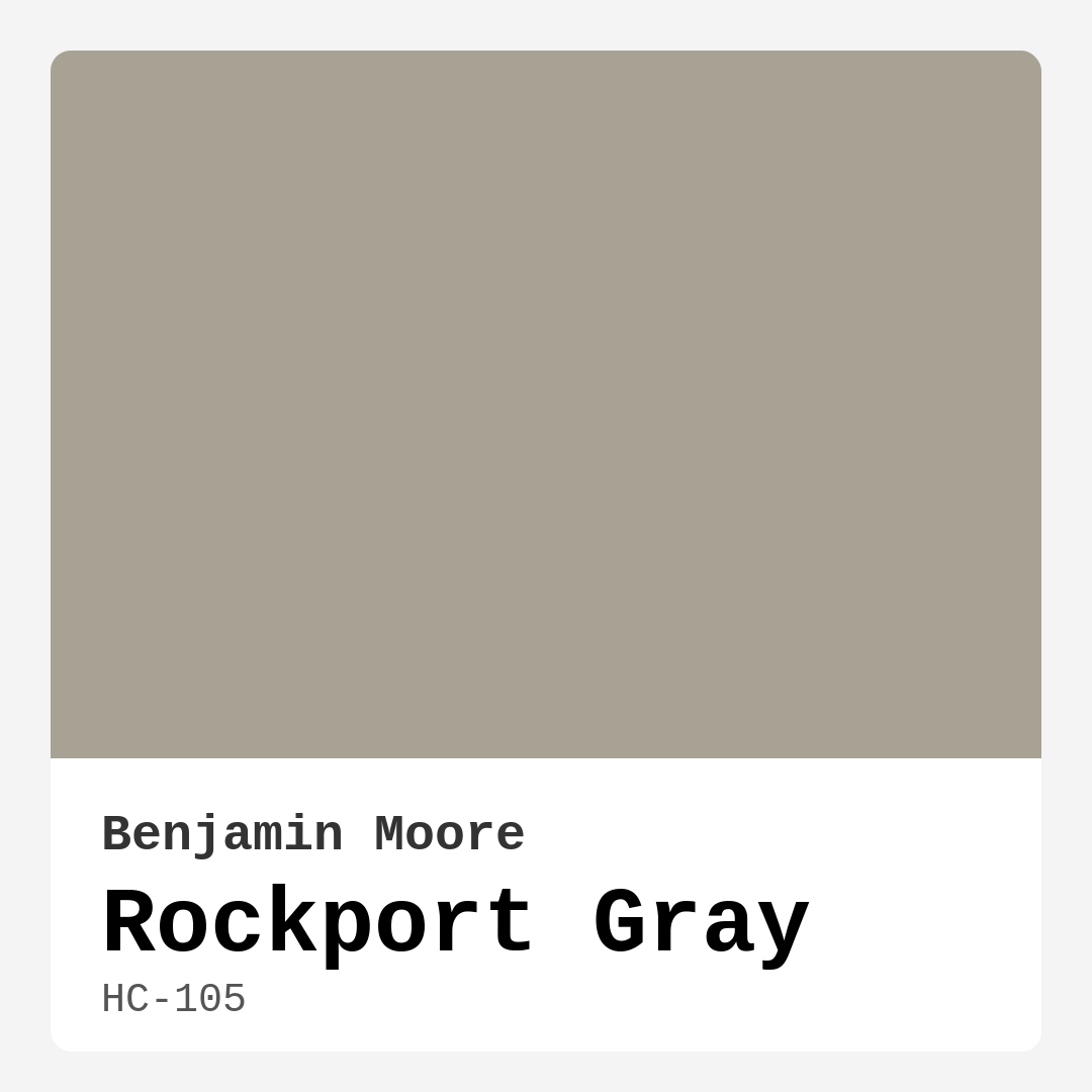
Color Preview & Key Details
| HEX Code | #A8A295 |
| RGB | 168, 162, 149 |
| LRV | 36.61% |
| Undertone | Red |
| Finish Options | Eggshell, Matte, Satin |
Have you ever stepped into a room and felt an immediate sense of calm wash over you? That’s the magic of color in home decor, and today, I want to talk about one that truly captures that feeling—Rockport Gray by Benjamin Moore. This sophisticated hue is a perfect blend of warmth and earthiness, making it a fantastic choice for anyone looking to transform their space into a serene oasis.
Rockport Gray, with its color code HC-105, is a versatile gray that adapts seamlessly to both contemporary and traditional interiors. It’s more than just a neutral; it carries a whisper of warmth that leans toward taupe, which is key in creating inviting atmospheres without making a room feel cramped or cold. Imagine walking into your living room or bedroom and being greeted by a color that feels both comforting and elegant. That’s what Rockport Gray promises.
When considering paint colors, it’s essential to think about the mood you want to create. Rockport Gray excels at evoking a cozy, calm, and grounding vibe. Its medium brightness and low Light Reflectance Value (LRV) of 36.61% mean it reflects a good amount of light, ensuring your space feels airy while still maintaining depth. In natural light, this color can appear softer and more inviting, while under artificial light, it retains an air of sophistication. This dynamic quality makes it perfect for those who want a color that transforms with the day, offering fresh perspectives at different times.
One of the standout features of Rockport Gray is its versatility. This color doesn’t play favorites when it comes to decor styles. Whether your home leans toward modern, traditional, rustic, or transitional, Rockport Gray fits right in. It serves as a beautiful backdrop, allowing your furniture and decor to shine without overwhelming them. This adaptability means you can dress your space up or down, depending on your mood or the occasion.
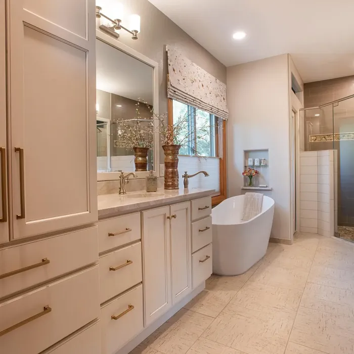
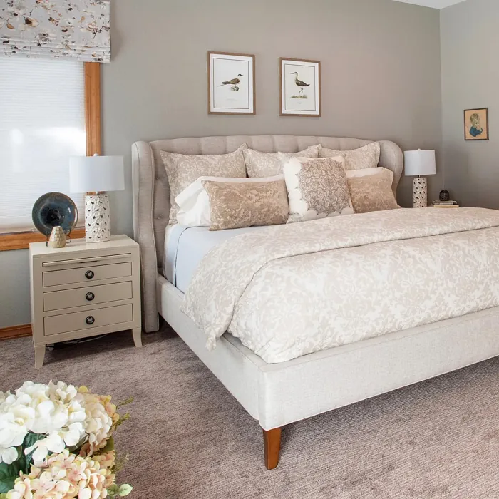
If you’re considering using Rockport Gray, think about the rooms that would benefit most from its calming presence. It’s ideal for living rooms, bedrooms, home offices, and dining rooms. After all, these are spaces where comfort and tranquility are paramount. In living rooms, it can easily complement warm wood tones and soft whites, creating an inviting environment for family gatherings or quiet evenings alike. In bedrooms, it promotes relaxation, making it a perfect choice for a restful retreat.
Now, let’s talk about application. Rockport Gray is a dream to work with. It’s beginner-friendly, meaning that even if you’re new to painting, you can achieve a professional look. The paint applies smoothly, whether you’re using a roller or a brush, and it dries quickly, allowing for efficient touch-ups. Coverage is another win; you’ll likely achieve an even finish with just one to two coats, making it a practical choice for your next project. Plus, with its washable and scrubbable finish, you don’t have to worry about wear and tear over time.
However, like any paint color, there are a few considerations to keep in mind. Rockport Gray can appear darker in low-light environments, so be mindful of your room’s lighting before committing. It’s also wise to carefully coordinate it with trim and other design elements, as the subtle undertones can change based on what they’re paired with. If you’re working with porous surfaces, you might need to apply a few extra coats for an even finish.
Feeling a bit unsure? That’s why testing is key. Grab some samples and paint patches on your walls. Observe how the color changes with the light throughout the day. This is crucial because, while Rockport Gray offers a warm embrace, the lighting can shift its appearance.
Now, let’s discuss complementary colors. Rockport Gray pairs beautifully with whites and off-whites, such as Benjamin Moore’s White Dove or Simply White. These light tones create a crisp contrast that enhances the warmth of Rockport Gray. If you’re looking to create a more cohesive palette, consider using soft blues or muted greens alongside it. These colors can add a refreshing touch and work harmoniously with the earthy undertones of Rockport Gray, allowing you to craft rooms that feel both serene and lively.
For those who are considering how this color fits into their overall design vision, think about how you can layer textures and materials. Pair Rockport Gray with warm woods, soft fabrics, or even metal accents for a richer, more inviting look. The beauty of this gray is its ability to mesh with various elements, from sleek modern furnishings to rustic barnwood accents, giving you the freedom to express your style uniquely.
If you’re in a rental space or simply prefer a classic favorite, Rockport Gray is a perfect choice. Its timeless appeal means it won’t go out of style anytime soon, and it provides a beautiful backdrop for different decor trends over time. Whether you’re looking to create an accent wall in an open concept space or want to refresh your hallway, this color shines.
In summary, Rockport Gray by Benjamin Moore is more than just paint; it’s a tool for transformation. With its warm and inviting tone, versatility across decor styles, and ease of application, it stands out as an exceptional choice for homeowners wanting to create personalized, beautiful interiors. Remember, the key to a successful design lies in the details, so take the time to explore this color in your own space, consider how it interacts with light, and see how it enhances your existing decor. I can promise you that once you take the plunge with Rockport Gray, you’ll be captivated by its charm and elegance—creating a home that feels just right for you.
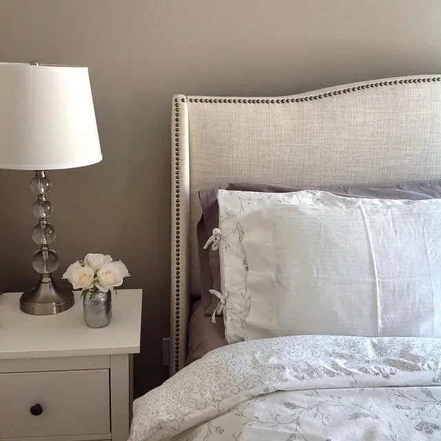
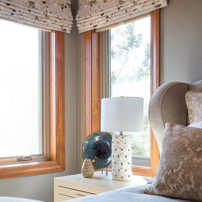
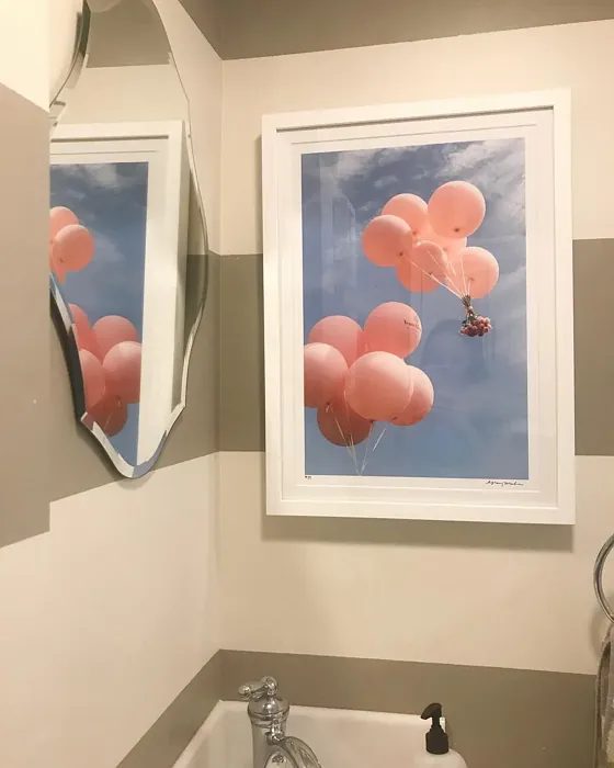
Real Room Photo of Rockport Gray HC-105
Undertones of Rockport Gray ?
Rockport Gray has a whisper of warmth that leans towards taupe, providing a gentle contrast against cooler colors. This warmth keeps the space feeling inviting, ensuring it doesn’t come off as stark or harsh. Pairing it with warmer wood tones or soft whites can highlight its beautiful understone, creating an effortlessly chic look.
HEX value: #A8A295
RGB code: 168, 162, 149
Is Rockport Gray Cool or Warm?
This color leans more towards warm, making it a versatile choice for various lighting conditions. In natural light, it can appear softer and more inviting, while in artificial light, it maintains its sophisticated charm. The warmth ensures that it complements other warm hues beautifully, creating a cohesive and harmonious environment.
Understanding Color Properties and Interior Design Tips
Hue refers to a specific position on the color wheel, measured in degrees from 0 to 360. Each degree represents a different pure color:
- 0° represents red
- 120° represents green
- 240° represents blue
Saturation describes the intensity or purity of a color and is expressed as a percentage:
- At 0%, the color appears completely desaturated—essentially a shade of gray
- At 100%, the color is at its most vivid and vibrant
Lightness indicates how light or dark a color is, also expressed as a percentage:
- 0% lightness results in black
- 100% lightness results in white
Using Warm Colors in Interior Design
Warm hues—such as reds, oranges, yellows, warm beiges, and greiges—are excellent choices for creating inviting and energetic spaces. These colors are particularly well-suited for:
- Kitchens, living rooms, and bathrooms, where warmth enhances comfort and sociability
- Large rooms, where warm tones can help reduce the sense of emptiness and make the space feel more intimate
For example:
- Warm beige shades provide a cozy, inviting atmosphere, ideal for living rooms, bedrooms, and hallways.
- Warm greige (a mix of beige and gray) offers the warmth of beige with the modern appeal of gray, making it a versatile backdrop for dining areas, bedrooms, and living spaces.
However, be mindful when using warm light tones in rooms with limited natural light. These shades may appear muted or even take on an unpleasant yellowish tint. To avoid a dull or flat appearance:
- Add depth by incorporating richer tones like deep greens, charcoal, or chocolate brown
- Use textured elements such as curtains, rugs, or cushions to bring dimension to the space
Pro Tip: Achieving Harmony with Warm and Cool Color Balance
To create a well-balanced and visually interesting interior, mix warm and cool tones strategically. This contrast adds depth and harmony to your design.
- If your walls feature warm hues, introduce cool-colored accents such as blue or green furniture, artwork, or accessories to create contrast.
- For a polished look, consider using a complementary color scheme, which pairs colors opposite each other on the color wheel (e.g., red with green, orange with blue).
This thoughtful mix not only enhances visual appeal but also creates a space that feels both dynamic and cohesive.
Light Temperature Affects on Rockport Gray
Natural Light
Natural daylight changes in color temperature as the sun moves across the sky. At sunrise and sunset, the light tends to have a warm, golden tone with a color temperature around 2000 Kelvin (K). As the day progresses and the sun rises higher, the light becomes cooler and more neutral. Around midday, especially when the sky is clear, natural light typically reaches its peak brightness and shifts to a cooler tone, ranging from 5500 to 6500 Kelvin. This midday light is close to what we perceive as pure white or daylight-balanced light.
These shifts in natural light can significantly influence how colors appear in a space, which is why designers often consider both the time of day and the orientation of windows when planning interior color schemes.
Artificial Light
When choosing artificial lighting, pay close attention to the color temperature, measured in Kelvin (K). This determines how warm or cool the light will appear. Lower temperatures, around 2700K, give off a warm, yellow glow often used in living rooms or bedrooms. Higher temperatures, above 5000K, create a cool, bluish light similar to daylight, commonly used in kitchens, offices, or task areas.
Use the slider to see how lighting temperature can affect the appearance of a surface or color throughout a space.


4800K
LRV of Rockport Gray
The Light Reflectance Value (LRV) of Rockport Gray is 45, which means it reflects a moderate amount of light. This makes it suitable for various rooms, especially those that may benefit from a bit more brightness without sacrificing depth.
Detailed Review of Rockport Gray
Additional Paint Characteristics
Ideal Rooms
Bedroom, Dining Room, Hallway, Home Office, Living Room
Decor Styles
Contemporary, Modern, Rustic, Traditional, Transitional
Coverage
Good (1–2 Coats)
Ease of Application
Beginner Friendly, Brush Smooth, Fast-Drying, Roller-Ready
Washability
Scrubbable, Washable
VOC Level
Low VOC
Best Use
Accent Wall, Interior Walls, Open Concept Spaces
Room Suitability
Bedroom, Dining Room, Home Office, Living Room
Tone Tag
Earthy, Muted, Neutral, Warm
Finish Type
Eggshell, Matte, Satin
Paint Performance
Easy Touch-Up, High Coverage, Low Odor, Quick Drying
Use Cases
Best for Modern Farmhouse, Best for Open Concept, Best for Rentals, Classic Favorite
Mood
Calm, Cozy, Grounding, Inviting
Trim Pairing
Complements Warm Trim, Matches Pure White, Pairs with White Dove
Rockport Gray stands out for its ability to evoke a sense of tranquility and elegance in any room. Its balanced tone makes it a fantastic backdrop for art or furniture without overshadowing them. This paint color is particularly effective in spaces that prioritize comfort and relaxation, such as bedrooms and living rooms. The subtle warmth in its gray base prevents it from feeling cold, making your space feel more inviting. When applied, it provides excellent coverage and a smooth finish, enhancing the overall aesthetic of the room. Whether used in a large open area or a cozy nook, Rockport Gray creates a unified look that can easily be dressed up or down with accessories.
Pros & Cons of HC-105 Rockport Gray
Pros
Cons
Colors that go with Benjamin Moore Rockport Gray
FAQ on HC-105 Rockport Gray
Can Rockport Gray be used in small spaces?
Absolutely! Rockport Gray is a great choice for small spaces as its balanced warmth brings a sense of coziness without making the area feel cramped. When paired with lighter trims or furniture, it can even enhance the perception of space. Just be mindful of the lighting; in darker areas, it might read a bit deeper, so consider testing patches before committing.
What colors pair well with Rockport Gray?
Rockport Gray pairs beautifully with whites and off-whites, such as White Dove or Simply White, to create a crisp contrast. For a more cohesive look, try it with warm wood tones or muted colors like soft blues or greens. This versatility allows you to create a range of atmospheres, from serene and calming to vibrant and lively.
Comparisons Rockport Gray with other colors
Rockport Gray HC-105 vs Repose Gray SW 7015
| Attribute | Rockport Gray HC-105 | Repose Gray SW 7015 |
|---|---|---|
| Color Name | Rockport Gray HC-105 | Repose Gray SW 7015 |
| Color | ||
| Hue | Grey | Grey |
| Brightness | Medium | Medium |
| RGB | 168, 162, 149 | 204, 201, 192 |
| LRV | 36.61% | 58% |
| Finish Type | Eggshell, Matte, Satin | Eggshell, Matte, Satin |
| Finish Options | Eggshell, Matte, Satin | Eggshell, Matte, Satin |
| Ideal Rooms | Bedroom, Dining Room, Hallway, Home Office, Living Room | Bedroom, Dining Room, Hallway, Home Office, Living Room |
| Decor Styles | Contemporary, Modern, Rustic, Traditional, Transitional | Contemporary, Farmhouse, Minimalist, Modern, Transitional |
| Coverage | Good (1–2 Coats) | Good (1–2 Coats), Touch-Up Friendly |
| Ease of Application | Beginner Friendly, Brush Smooth, Fast-Drying, Roller-Ready | Beginner Friendly, Brush Smooth, Fast-Drying, Roller-Ready |
| Washability | Scrubbable, Washable | Highly Washable, Washable |
| Room Suitability | Bedroom, Dining Room, Home Office, Living Room | Bedroom, Dining Room, Hallway, Home Office, Living Room |
| Tone | Earthy, Muted, Neutral, Warm | Muted, Neutral, Warm |
| Paint Performance | Easy Touch-Up, High Coverage, Low Odor, Quick Drying | Low Odor, Quick Drying, Scuff Resistant |
Rockport Gray HC-105 vs Light French Gray SW 0055
| Attribute | Rockport Gray HC-105 | Light French Gray SW 0055 |
|---|---|---|
| Color Name | Rockport Gray HC-105 | Light French Gray SW 0055 |
| Color | ||
| Hue | Grey | Grey |
| Brightness | Medium | Medium |
| RGB | 168, 162, 149 | 194, 192, 187 |
| LRV | 36.61% | 53% |
| Finish Type | Eggshell, Matte, Satin | Eggshell, Matte, Satin |
| Finish Options | Eggshell, Matte, Satin | Eggshell, Matte, Satin |
| Ideal Rooms | Bedroom, Dining Room, Hallway, Home Office, Living Room | Bedroom, Dining Room, Home Office, Kitchen, Living Room |
| Decor Styles | Contemporary, Modern, Rustic, Traditional, Transitional | Contemporary, Farmhouse, Modern, Scandinavian, Transitional |
| Coverage | Good (1–2 Coats) | Good (1–2 Coats), Touch-Up Friendly |
| Ease of Application | Beginner Friendly, Brush Smooth, Fast-Drying, Roller-Ready | Beginner Friendly, Brush Smooth, Roller-Ready |
| Washability | Scrubbable, Washable | Highly Washable, Washable |
| Room Suitability | Bedroom, Dining Room, Home Office, Living Room | Bedroom, Dining Room, Home Office, Kitchen, Living Room |
| Tone | Earthy, Muted, Neutral, Warm | Balanced, Muted, Neutral, Warm |
| Paint Performance | Easy Touch-Up, High Coverage, Low Odor, Quick Drying | Easy Touch-Up, High Coverage, Low Odor |
Rockport Gray HC-105 vs Wordly Gray SW 7043
| Attribute | Rockport Gray HC-105 | Wordly Gray SW 7043 |
|---|---|---|
| Color Name | Rockport Gray HC-105 | Wordly Gray SW 7043 |
| Color | ||
| Hue | Grey | Grey |
| Brightness | Medium | Medium |
| RGB | 168, 162, 149 | 206, 198, 187 |
| LRV | 36.61% | 58% |
| Finish Type | Eggshell, Matte, Satin | Eggshell, Satin |
| Finish Options | Eggshell, Matte, Satin | Eggshell, Flat, Satin |
| Ideal Rooms | Bedroom, Dining Room, Hallway, Home Office, Living Room | Bedroom, Home Office, Kitchen, Living Room |
| Decor Styles | Contemporary, Modern, Rustic, Traditional, Transitional | Minimalist, Modern, Scandi, Transitional |
| Coverage | Good (1–2 Coats) | Good (1–2 Coats) |
| Ease of Application | Beginner Friendly, Brush Smooth, Fast-Drying, Roller-Ready | Beginner Friendly, Brush Smooth, Fast-Drying, Roller-Ready |
| Washability | Scrubbable, Washable | Highly Washable, Washable |
| Room Suitability | Bedroom, Dining Room, Home Office, Living Room | Bedroom, Dining Room, Home Office, Living Room |
| Tone | Earthy, Muted, Neutral, Warm | Muted, Neutral, Warm |
| Paint Performance | Easy Touch-Up, High Coverage, Low Odor, Quick Drying | Easy Touch-Up, Low Odor, Scuff Resistant |
Rockport Gray HC-105 vs Illusive Green SW 9164
| Attribute | Rockport Gray HC-105 | Illusive Green SW 9164 |
|---|---|---|
| Color Name | Rockport Gray HC-105 | Illusive Green SW 9164 |
| Color | ||
| Hue | Grey | Grey |
| Brightness | Medium | Medium |
| RGB | 168, 162, 149 | 146, 148, 141 |
| LRV | 36.61% | 24% |
| Finish Type | Eggshell, Matte, Satin | Eggshell, Matte, Satin |
| Finish Options | Eggshell, Matte, Satin | Eggshell, Matte, Satin |
| Ideal Rooms | Bedroom, Dining Room, Hallway, Home Office, Living Room | Bedroom, Dining Room, Home Office, Living Room, Nursery |
| Decor Styles | Contemporary, Modern, Rustic, Traditional, Transitional | Coastal, Minimalist, Modern, Rustic, Scandinavian |
| Coverage | Good (1–2 Coats) | Good (1–2 Coats), Touch-Up Friendly |
| Ease of Application | Beginner Friendly, Brush Smooth, Fast-Drying, Roller-Ready | Beginner Friendly, Brush Smooth, Fast-Drying, Roller-Ready |
| Washability | Scrubbable, Washable | Highly Washable, Washable, Wipeable |
| Room Suitability | Bedroom, Dining Room, Home Office, Living Room | Bedroom, Dining Room, Home Office, Living Room, Nursery |
| Tone | Earthy, Muted, Neutral, Warm | Balanced, Earthy, Muted |
| Paint Performance | Easy Touch-Up, High Coverage, Low Odor, Quick Drying | Easy Touch-Up, Low Odor, Quick Drying, Scuff Resistant |
Rockport Gray HC-105 vs Fawn Brindle SW 7640
| Attribute | Rockport Gray HC-105 | Fawn Brindle SW 7640 |
|---|---|---|
| Color Name | Rockport Gray HC-105 | Fawn Brindle SW 7640 |
| Color | ||
| Hue | Grey | Grey |
| Brightness | Medium | Medium |
| RGB | 168, 162, 149 | 167, 160, 148 |
| LRV | 36.61% | 24% |
| Finish Type | Eggshell, Matte, Satin | Eggshell, Matte |
| Finish Options | Eggshell, Matte, Satin | Eggshell, Matte, Satin |
| Ideal Rooms | Bedroom, Dining Room, Hallway, Home Office, Living Room | Bedroom, Dining Room, Hallway, Home Office, Living Room |
| Decor Styles | Contemporary, Modern, Rustic, Traditional, Transitional | Bohemian, Minimalist, Modern Farmhouse, Transitional |
| Coverage | Good (1–2 Coats) | Good (1–2 Coats) |
| Ease of Application | Beginner Friendly, Brush Smooth, Fast-Drying, Roller-Ready | Brush Smooth, Fast-Drying, Roller-Ready |
| Washability | Scrubbable, Washable | Stain Resistant, Washable |
| Room Suitability | Bedroom, Dining Room, Home Office, Living Room | Bedroom, Dining Room, Home Office, Living Room |
| Tone | Earthy, Muted, Neutral, Warm | Earthy, Neutral, Warm |
| Paint Performance | Easy Touch-Up, High Coverage, Low Odor, Quick Drying | Easy Touch-Up, Fade Resistant, Low Odor |
Rockport Gray HC-105 vs Balanced Beige SW 7037
| Attribute | Rockport Gray HC-105 | Balanced Beige SW 7037 |
|---|---|---|
| Color Name | Rockport Gray HC-105 | Balanced Beige SW 7037 |
| Color | ||
| Hue | Grey | Grey |
| Brightness | Medium | Medium |
| RGB | 168, 162, 149 | 192, 178, 162 |
| LRV | 36.61% | 44% |
| Finish Type | Eggshell, Matte, Satin | Eggshell, Matte, Satin |
| Finish Options | Eggshell, Matte, Satin | Eggshell, Matte, Satin |
| Ideal Rooms | Bedroom, Dining Room, Hallway, Home Office, Living Room | Bedroom, Dining Room, Home Office, Kitchen, Living Room |
| Decor Styles | Contemporary, Modern, Rustic, Traditional, Transitional | Contemporary, Minimalist, Modern Farmhouse, Rustic, Transitional |
| Coverage | Good (1–2 Coats) | Good (1–2 Coats), Touch-Up Friendly |
| Ease of Application | Beginner Friendly, Brush Smooth, Fast-Drying, Roller-Ready | Beginner Friendly, Brush Smooth, Roller-Ready |
| Washability | Scrubbable, Washable | Washable, Wipeable |
| Room Suitability | Bedroom, Dining Room, Home Office, Living Room | Bedroom, Dining Room, Hallway, Kitchen, Living Room |
| Tone | Earthy, Muted, Neutral, Warm | Balanced, Earthy, Warm |
| Paint Performance | Easy Touch-Up, High Coverage, Low Odor, Quick Drying | Easy Touch-Up, High Coverage, Low Odor |
Rockport Gray HC-105 vs Mushroom SW 9587
| Attribute | Rockport Gray HC-105 | Mushroom SW 9587 |
|---|---|---|
| Color Name | Rockport Gray HC-105 | Mushroom SW 9587 |
| Color | ||
| Hue | Grey | Grey |
| Brightness | Medium | Medium |
| RGB | 168, 162, 149 | 208, 199, 183 |
| LRV | 36.61% | 24% |
| Finish Type | Eggshell, Matte, Satin | Eggshell, Satin |
| Finish Options | Eggshell, Matte, Satin | Eggshell, Flat, Matte, Satin |
| Ideal Rooms | Bedroom, Dining Room, Hallway, Home Office, Living Room | Bedroom, Dining Room, Hallway, Home Office, Living Room |
| Decor Styles | Contemporary, Modern, Rustic, Traditional, Transitional | Bohemian, Contemporary, Modern Farmhouse, Traditional |
| Coverage | Good (1–2 Coats) | Good (1–2 Coats) |
| Ease of Application | Beginner Friendly, Brush Smooth, Fast-Drying, Roller-Ready | Beginner Friendly, Brush Smooth, Roller-Ready |
| Washability | Scrubbable, Washable | Highly Washable, Washable |
| Room Suitability | Bedroom, Dining Room, Home Office, Living Room | Bedroom, Dining Room, Home Office, Living Room |
| Tone | Earthy, Muted, Neutral, Warm | Earthy, Neutral, Warm |
| Paint Performance | Easy Touch-Up, High Coverage, Low Odor, Quick Drying | Easy Touch-Up, Long Lasting, Low Odor, Scuff Resistant |
Rockport Gray HC-105 vs Silver Strand SW 7057
| Attribute | Rockport Gray HC-105 | Silver Strand SW 7057 |
|---|---|---|
| Color Name | Rockport Gray HC-105 | Silver Strand SW 7057 |
| Color | ||
| Hue | Grey | Grey |
| Brightness | Medium | Medium |
| RGB | 168, 162, 149 | 200, 203, 196 |
| LRV | 36.61% | 66% |
| Finish Type | Eggshell, Matte, Satin | Eggshell, Satin |
| Finish Options | Eggshell, Matte, Satin | Eggshell, Matte, Satin |
| Ideal Rooms | Bedroom, Dining Room, Hallway, Home Office, Living Room | Bedroom, Dining Room, Hallway, Home Office, Living Room |
| Decor Styles | Contemporary, Modern, Rustic, Traditional, Transitional | Coastal, Minimalist, Modern, Traditional, Transitional |
| Coverage | Good (1–2 Coats) | Good (1–2 Coats), Touch-Up Friendly |
| Ease of Application | Beginner Friendly, Brush Smooth, Fast-Drying, Roller-Ready | Beginner Friendly, Brush Smooth, Roller-Ready |
| Washability | Scrubbable, Washable | Highly Washable, Washable |
| Room Suitability | Bedroom, Dining Room, Home Office, Living Room | Bathroom, Bedroom, Home Office, Kitchen, Living Room |
| Tone | Earthy, Muted, Neutral, Warm | Balanced, Neutral, Warm |
| Paint Performance | Easy Touch-Up, High Coverage, Low Odor, Quick Drying | Easy Touch-Up, High Coverage, Low Odor |
Rockport Gray HC-105 vs Cadet SW 9143
| Attribute | Rockport Gray HC-105 | Cadet SW 9143 |
|---|---|---|
| Color Name | Rockport Gray HC-105 | Cadet SW 9143 |
| Color | ||
| Hue | Grey | Grey |
| Brightness | Medium | Medium |
| RGB | 168, 162, 149 | 145, 153, 156 |
| LRV | 36.61% | 12% |
| Finish Type | Eggshell, Matte, Satin | Eggshell, Matte, Satin |
| Finish Options | Eggshell, Matte, Satin | Eggshell, Matte, Satin |
| Ideal Rooms | Bedroom, Dining Room, Hallway, Home Office, Living Room | Bathroom, Bedroom, Hallway, Home Office, Kitchen, Living Room |
| Decor Styles | Contemporary, Modern, Rustic, Traditional, Transitional | Coastal, Industrial, Minimalist, Modern, Scandinavian |
| Coverage | Good (1–2 Coats) | Good (1–2 Coats), Touch-Up Friendly |
| Ease of Application | Beginner Friendly, Brush Smooth, Fast-Drying, Roller-Ready | Beginner Friendly, Brush Smooth, Roller-Ready |
| Washability | Scrubbable, Washable | Washable, Wipeable |
| Room Suitability | Bedroom, Dining Room, Home Office, Living Room | Bathroom, Bedroom, Hallway, Home Office, Living Room |
| Tone | Earthy, Muted, Neutral, Warm | Balanced, Cool, Muted |
| Paint Performance | Easy Touch-Up, High Coverage, Low Odor, Quick Drying | Easy Touch-Up, High Coverage, Low Odor |
Rockport Gray HC-105 vs Dovetail SW 7018
| Attribute | Rockport Gray HC-105 | Dovetail SW 7018 |
|---|---|---|
| Color Name | Rockport Gray HC-105 | Dovetail SW 7018 |
| Color | ||
| Hue | Grey | Grey |
| Brightness | Medium | Medium |
| RGB | 168, 162, 149 | 144, 138, 131 |
| LRV | 36.61% | 24% |
| Finish Type | Eggshell, Matte, Satin | Eggshell, Matte, Satin |
| Finish Options | Eggshell, Matte, Satin | Eggshell, Matte, Satin |
| Ideal Rooms | Bedroom, Dining Room, Hallway, Home Office, Living Room | Bedroom, Dining Room, Hallway, Home Office, Living Room |
| Decor Styles | Contemporary, Modern, Rustic, Traditional, Transitional | Minimalist, Modern Farmhouse, Rustic, Transitional |
| Coverage | Good (1–2 Coats) | Good (1–2 Coats), Touch-Up Friendly |
| Ease of Application | Beginner Friendly, Brush Smooth, Fast-Drying, Roller-Ready | Beginner Friendly, Brush Smooth, Roller-Ready |
| Washability | Scrubbable, Washable | Washable, Wipeable |
| Room Suitability | Bedroom, Dining Room, Home Office, Living Room | Bedroom, Dining Room, Home Office, Living Room |
| Tone | Earthy, Muted, Neutral, Warm | Earthy, Neutral, Warm |
| Paint Performance | Easy Touch-Up, High Coverage, Low Odor, Quick Drying | Easy Touch-Up, Fade Resistant, Low Odor |
Official Page of Benjamin Moore Rockport Gray HC-105