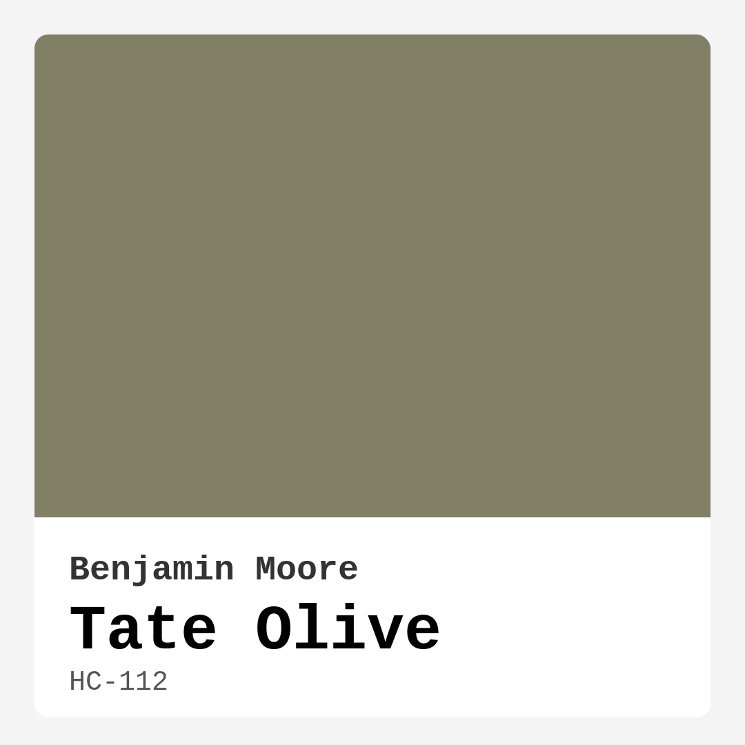
Color Preview & Key Details
| HEX Code | #818066 |
| RGB | 129, 128, 102 |
| LRV | 21.63% |
| Undertone | Yellow |
| Finish Options | Eggshell, Matte, Satin |
If you’re looking for a paint color that effortlessly bridges the gap between earthy warmth and modern sophistication, let me introduce you to Benjamin Moore’s Tate Olive (HC-112). This rich, muted olive green with subtle yellow undertones is one of those rare shades that feels both timeless and fresh—perfect for creating a space that’s inviting, grounded, and full of character. Whether you’re dreaming of a cozy bedroom retreat, a serene home office, or a dining room that exudes understated elegance, Tate Olive might just be the answer.
First, let’s talk about what makes this color so special. Tate Olive sits firmly in the green family, but it’s far from your typical bright or grassy hue. Instead, it’s a deep, earthy olive with a warmth that comes from its yellow undertones. This gives it a versatility that plays well with a range of decor styles—think modern farmhouse, bohemian, rustic, or even contemporary. The LRV (Light Reflectance Value) of 21.63% means it reflects a fair amount of light, so while it’s a darker shade, it won’t swallow up a room in shadows. Instead, it adapts beautifully to different lighting conditions, shifting from a vibrant, nature-inspired tone in daylight to a moody, intimate hue by evening.
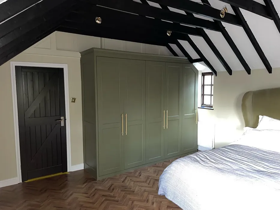
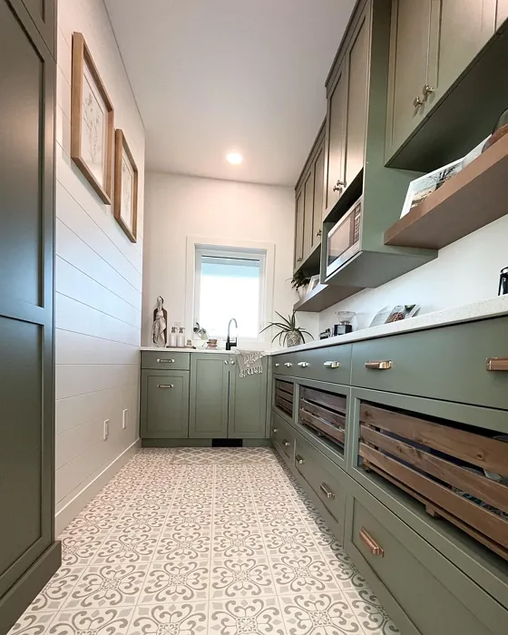
One of the biggest strengths of Tate Olive is its ability to create a sense of calm. There’s something inherently soothing about this color—it brings the outdoors in without feeling overwhelming. If you’re working with a living room or bedroom, it can instantly make the space feel cozier, especially when paired with natural textures like wood, linen, or rattan. And because it’s a muted tone, it won’t clash with bold furniture or artwork. In fact, it acts as a fantastic backdrop, allowing other elements in the room to shine while still holding its own.
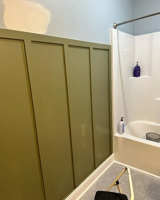
Now, let’s address the elephant in the room: can you use Tate Olive in a small space? The short answer is yes, but with some strategic planning. In rooms with limited natural light, this color can appear deeper and more intense, which might make the space feel smaller. To counteract that, consider using it on just one accent wall or balancing it with lighter trim (Benjamin Moore’s White Dove is a classic pairing). You could also keep the ceiling and adjacent walls in a soft white or cream to maintain an airy feel. If your small room gets plenty of light, though, go for it—Tate Olive can add incredible depth and personality without closing things in.
When it comes to pairing Tate Olive with other colors, the possibilities are nearly endless. For a soft, harmonious look, try combining it with warm neutrals like creamy whites, beiges, or light taupes. If you’re after something more dramatic, navy blues, charcoal grays, or even deep terracottas can create a striking contrast. And don’t overlook its complementary hues—since Tate Olive has a subtle orange undertone, touches of blue (its complementary color on the color wheel) can make it pop in the most elegant way. Think blue-toned artwork, throw pillows, or even a statement rug.
As for finishes, Tate Olive works beautifully in matte, eggshell, or satin. Matte will give you that velvety, sophisticated look, while eggshell and satin offer a bit more durability and washability—ideal for high-traffic areas like living rooms or dining spaces. And speaking of practicality, this paint is a dream to work with. It’s beginner-friendly, covers well in one to two coats, and is touch-up friendly, so you won’t have to stress about perfection. Plus, it’s low-VOC and eco-certified, making it a great choice if you’re mindful of indoor air quality.
If you’re still on the fence, here’s a pro tip: always test the color in your space before committing. Paint a large swatch on the wall and observe it at different times of day. You’ll notice how the undertones shift with the light, and that’s the best way to ensure it’s the right fit for your home. And if you love the idea of Tate Olive but want something slightly lighter or darker, Benjamin Moore offers a range of similar shades. For lighter alternatives, check out HC-110 or CSP-825, or go deeper with 1505 or 2141-30.
At the end of the day, Tate Olive is more than just a paint color—it’s a mood. It’s the kind of shade that makes a room feel lived-in and loved, like a well-worn leather chair or a favorite wool throw. Whether you’re using it to create a feature wall in your home office, coating your dining room for intimate dinners, or even refreshing a piece of furniture, this color has a way of making spaces feel intentional and inviting. So if you’re ready to bring a touch of nature-inspired elegance into your home, Tate Olive might just be your perfect match.
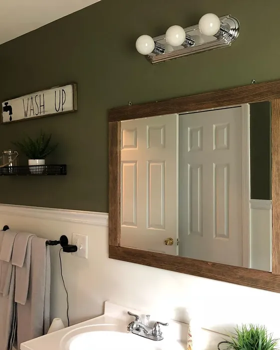
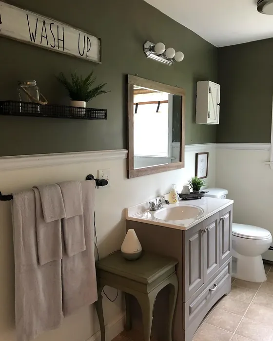
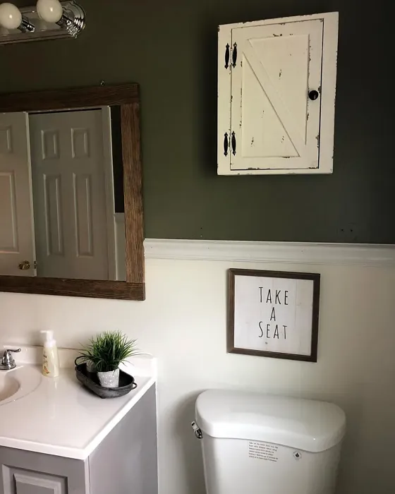
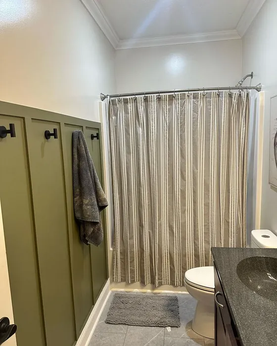
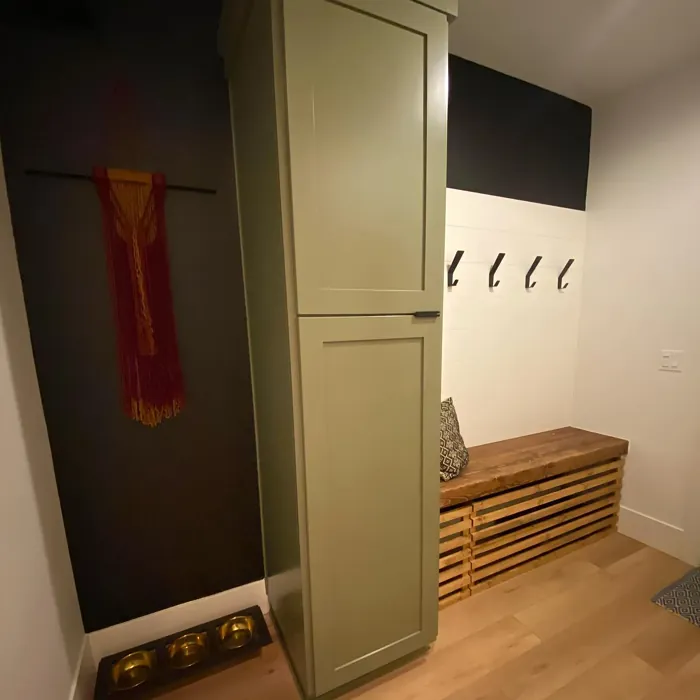
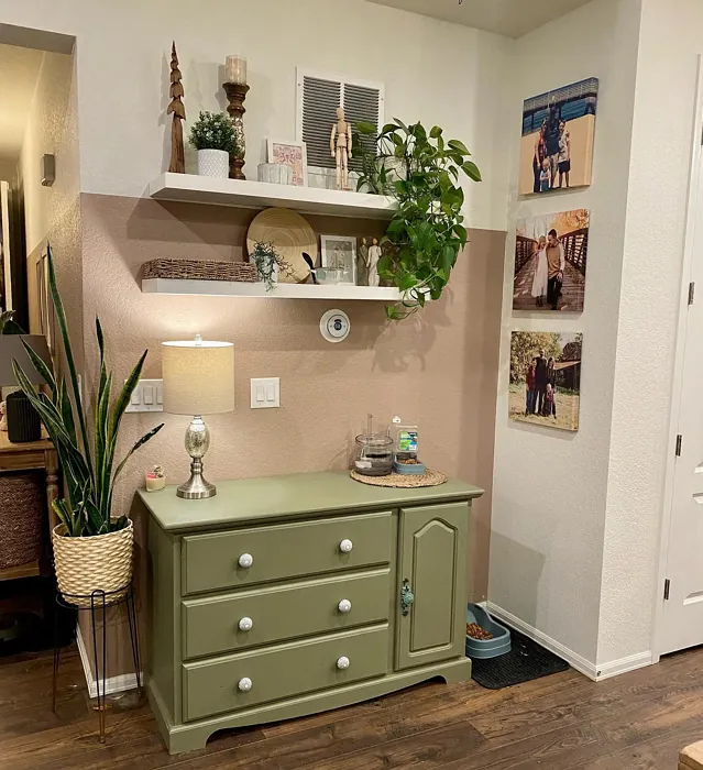
Real Room Photo of Tate Olive HC-112


Undertones of Tate Olive ?
The undertones of Tate Olive are a key aspect of its character, leaning towards Yellow. These subtle underlying hues are what give the color its depth and complexity. For example, a gray with a blue undertone will feel cooler and more modern, while one with a brown undertone will feel warmer and more traditional. It’s essential to test this paint in your home and observe it next to your existing furniture, flooring, and decor to see how these undertones interact and reveal themselves throughout the day.
HEX value: #818066
RGB code: 129, 128, 102
Is Tate Olive Cool or Warm?
Tate Olive leans more towards the warm side of the color spectrum. Its earthy tones create a welcoming vibe, making it an ideal choice for spaces intended for relaxation and comfort.
Understanding Color Properties and Interior Design Tips
Hue refers to a specific position on the color wheel, measured in degrees from 0 to 360. Each degree represents a different pure color:
- 0° represents red
- 120° represents green
- 240° represents blue
Saturation describes the intensity or purity of a color and is expressed as a percentage:
- At 0%, the color appears completely desaturated—essentially a shade of gray
- At 100%, the color is at its most vivid and vibrant
Lightness indicates how light or dark a color is, also expressed as a percentage:
- 0% lightness results in black
- 100% lightness results in white
Using Warm Colors in Interior Design
Warm hues—such as reds, oranges, yellows, warm beiges, and greiges—are excellent choices for creating inviting and energetic spaces. These colors are particularly well-suited for:
- Kitchens, living rooms, and bathrooms, where warmth enhances comfort and sociability
- Large rooms, where warm tones can help reduce the sense of emptiness and make the space feel more intimate
For example:
- Warm beige shades provide a cozy, inviting atmosphere, ideal for living rooms, bedrooms, and hallways.
- Warm greige (a mix of beige and gray) offers the warmth of beige with the modern appeal of gray, making it a versatile backdrop for dining areas, bedrooms, and living spaces.
However, be mindful when using warm light tones in rooms with limited natural light. These shades may appear muted or even take on an unpleasant yellowish tint. To avoid a dull or flat appearance:
- Add depth by incorporating richer tones like deep greens, charcoal, or chocolate brown
- Use textured elements such as curtains, rugs, or cushions to bring dimension to the space
Pro Tip: Achieving Harmony with Warm and Cool Color Balance
To create a well-balanced and visually interesting interior, mix warm and cool tones strategically. This contrast adds depth and harmony to your design.
- If your walls feature warm hues, introduce cool-colored accents such as blue or green furniture, artwork, or accessories to create contrast.
- For a polished look, consider using a complementary color scheme, which pairs colors opposite each other on the color wheel (e.g., red with green, orange with blue).
This thoughtful mix not only enhances visual appeal but also creates a space that feels both dynamic and cohesive.
Light Temperature Affects on Tate Olive
Natural Light
Natural daylight changes in color temperature as the sun moves across the sky. At sunrise and sunset, the light tends to have a warm, golden tone with a color temperature around 2000 Kelvin (K). As the day progresses and the sun rises higher, the light becomes cooler and more neutral. Around midday, especially when the sky is clear, natural light typically reaches its peak brightness and shifts to a cooler tone, ranging from 5500 to 6500 Kelvin. This midday light is close to what we perceive as pure white or daylight-balanced light.
These shifts in natural light can significantly influence how colors appear in a space, which is why designers often consider both the time of day and the orientation of windows when planning interior color schemes.
Artificial Light
When choosing artificial lighting, pay close attention to the color temperature, measured in Kelvin (K). This determines how warm or cool the light will appear. Lower temperatures, around 2700K, give off a warm, yellow glow often used in living rooms or bedrooms. Higher temperatures, above 5000K, create a cool, bluish light similar to daylight, commonly used in kitchens, offices, or task areas.
Use the slider to see how lighting temperature can affect the appearance of a surface or color throughout a space.


4800K
LRV of Tate Olive
The Light Reflectance Value (LRV) of Tate Olive is 21.63%, which places it in the Medium colors category. This means it reflect a lot of light. Understanding a paint’s LRV is crucial for predicting how it will look in your space. A higher LRV indicates a lighter color that reflects more light, making rooms feel larger and brighter. A lower LRV signifies a darker color that absorbs more light, creating a cozier, more intimate atmosphere. Always consider the natural and artificial lighting in your room when selecting a paint color based on its LRV.
Detailed Review of Tate Olive
Additional Paint Characteristics
Ideal Rooms
Bedroom, Dining Room, Entryway, Home Office, Living Room
Decor Styles
Bohemian, Contemporary, Modern Farmhouse, Rustic
Coverage
Good (1–2 Coats), Touch-Up Friendly
Ease of Application
Beginner Friendly, Brush Smooth, Roller-Ready
Washability
Scrubbable, Washable
VOC Level
Eco-Certified, Low VOC
Best Use
Accent Wall, Furniture, Interior Walls, Trim
Room Suitability
Bedroom, Dining Room, Home Office, Living Room
Tone Tag
Earthy, Muted, Warm
Finish Type
Eggshell, Matte, Satin
Paint Performance
Easy Touch-Up, Fade Resistant, High Coverage, Low Odor
Use Cases
Best for Modern Farmhouse, Best for Open Concept, Classic Favorite
Mood
Cozy, Grounding, Inviting
Trim Pairing
Complements Cool Trim, Good with Wood Trim, Pairs with White Dove
Tate Olive is an impressive choice for anyone looking to introduce a hint of greenery into their home without overwhelming the senses. This paint color strikes a beautiful balance between sophistication and warmth, making it suitable for a variety of spaces. In natural light, it showcases its rich, earthy undertones, while in artificial light, it can appear slightly muted, adding a cozy ambiance. The versatility of Tate Olive means it pairs wonderfully with both light and dark furnishings, allowing for a range of decor styles from rustic to contemporary. Overall, it’s a color that can elevate any room, making it feel inviting and grounded.
Pros & Cons of HC-112 Tate Olive
Pros
Cons
Colors that go with Benjamin Moore Tate Olive
FAQ on HC-112 Tate Olive
Can Tate Olive be used in small rooms?
While Tate Olive can certainly be used in small spaces, it’s important to consider your lighting. In darker corners, the color may appear more intense, potentially making the room feel smaller. To counteract this, consider using lighter accents or trim to create a balanced look.
How does Tate Olive pair with other colors?
Tate Olive is a versatile shade that pairs well with both warm and cool tones. It looks fantastic with neutral whites and creams for a softer contrast, or with deeper hues like navy or charcoal for a more dramatic effect. Consider using it alongside natural materials like wood and stone to enhance its earthy vibe.
Comparisons Tate Olive with other colors
Tate Olive HC-112 vs Dried Thyme SW 6186
| Attribute | Tate Olive HC-112 | Dried Thyme SW 6186 |
|---|---|---|
| Color Name | Tate Olive HC-112 | Dried Thyme SW 6186 |
| Color | ||
| Hue | Green | Green |
| Brightness | Dark | Dark |
| RGB | 129, 128, 102 | 123, 128, 112 |
| LRV | 21.63% | 24% |
| Finish Type | Eggshell, Matte, Satin | Eggshell, Satin |
| Finish Options | Eggshell, Matte, Satin | Eggshell, Matte, Satin |
| Ideal Rooms | Bedroom, Dining Room, Entryway, Home Office, Living Room | Bathroom, Bedroom, Dining Room, Entryway, Home Office, Kitchen, Living Room |
| Decor Styles | Bohemian, Contemporary, Modern Farmhouse, Rustic | Bohemian, Industrial, Minimalist, Modern Farmhouse, Rustic |
| Coverage | Good (1–2 Coats), Touch-Up Friendly | Good (1–2 Coats), Touch-Up Friendly |
| Ease of Application | Beginner Friendly, Brush Smooth, Roller-Ready | Beginner Friendly, Brush Smooth, Roller-Ready |
| Washability | Scrubbable, Washable | Washable, Wipeable |
| Room Suitability | Bedroom, Dining Room, Home Office, Living Room | Bathroom, Bedroom, Dining Room, Home Office, Kitchen, Living Room |
| Tone | Earthy, Muted, Warm | Cool, Earthy, Muted |
| Paint Performance | Easy Touch-Up, Fade Resistant, High Coverage, Low Odor | Easy Touch-Up, Low Odor, Scuff Resistant |
Tate Olive HC-112 vs Retreat SW 6207
| Attribute | Tate Olive HC-112 | Retreat SW 6207 |
|---|---|---|
| Color Name | Tate Olive HC-112 | Retreat SW 6207 |
| Color | ||
| Hue | Green | Green |
| Brightness | Dark | Dark |
| RGB | 129, 128, 102 | 122, 128, 118 |
| LRV | 21.63% | 30% |
| Finish Type | Eggshell, Matte, Satin | Eggshell, Matte, Satin |
| Finish Options | Eggshell, Matte, Satin | Eggshell, Matte, Satin |
| Ideal Rooms | Bedroom, Dining Room, Entryway, Home Office, Living Room | Bathroom, Bedroom, Home Office, Kitchen, Living Room |
| Decor Styles | Bohemian, Contemporary, Modern Farmhouse, Rustic | Minimalist, Modern, Rustic, Transitional |
| Coverage | Good (1–2 Coats), Touch-Up Friendly | Good (1–2 Coats), Touch-Up Friendly |
| Ease of Application | Beginner Friendly, Brush Smooth, Roller-Ready | Beginner Friendly, Brush Smooth, Roller-Ready |
| Washability | Scrubbable, Washable | Washable, Wipeable |
| Room Suitability | Bedroom, Dining Room, Home Office, Living Room | Bathroom, Bedroom, Home Office, Living Room |
| Tone | Earthy, Muted, Warm | Cool, Earthy, Muted |
| Paint Performance | Easy Touch-Up, Fade Resistant, High Coverage, Low Odor | Easy Touch-Up, Low Odor, Scuff Resistant |
Tate Olive HC-112 vs Rosemary SW 6187
| Attribute | Tate Olive HC-112 | Rosemary SW 6187 |
|---|---|---|
| Color Name | Tate Olive HC-112 | Rosemary SW 6187 |
| Color | ||
| Hue | Green | Green |
| Brightness | Dark | Dark |
| RGB | 129, 128, 102 | 100, 105, 92 |
| LRV | 21.63% | 45% |
| Finish Type | Eggshell, Matte, Satin | Eggshell, Matte, Satin |
| Finish Options | Eggshell, Matte, Satin | Eggshell, Matte, Satin |
| Ideal Rooms | Bedroom, Dining Room, Entryway, Home Office, Living Room | Bedroom, Dining Room, Hallway, Home Office, Living Room |
| Decor Styles | Bohemian, Contemporary, Modern Farmhouse, Rustic | Bohemian, Coastal, Modern Farmhouse, Rustic |
| Coverage | Good (1–2 Coats), Touch-Up Friendly | Good (1–2 Coats), Touch-Up Friendly |
| Ease of Application | Beginner Friendly, Brush Smooth, Roller-Ready | Beginner Friendly, Brush Smooth, Roller-Ready |
| Washability | Scrubbable, Washable | Washable, Wipeable |
| Room Suitability | Bedroom, Dining Room, Home Office, Living Room | Bedroom, Dining Room, Home Office, Living Room |
| Tone | Earthy, Muted, Warm | Earthy, Muted, Warm |
| Paint Performance | Easy Touch-Up, Fade Resistant, High Coverage, Low Odor | Fade Resistant, Low Odor, Quick Drying, Stain Resistant |
Tate Olive HC-112 vs Basil SW 6194
| Attribute | Tate Olive HC-112 | Basil SW 6194 |
|---|---|---|
| Color Name | Tate Olive HC-112 | Basil SW 6194 |
| Color | ||
| Hue | Green | Green |
| Brightness | Dark | Dark |
| RGB | 129, 128, 102 | 98, 110, 96 |
| LRV | 21.63% | 12% |
| Finish Type | Eggshell, Matte, Satin | Eggshell, Matte, Satin |
| Finish Options | Eggshell, Matte, Satin | Eggshell, Matte, Satin |
| Ideal Rooms | Bedroom, Dining Room, Entryway, Home Office, Living Room | Bathroom, Bedroom, Dining Room, Home Office, Kitchen, Living Room |
| Decor Styles | Bohemian, Contemporary, Modern Farmhouse, Rustic | Bohemian, Contemporary, Modern Farmhouse, Rustic, Transitional |
| Coverage | Good (1–2 Coats), Touch-Up Friendly | Good (1–2 Coats), Touch-Up Friendly |
| Ease of Application | Beginner Friendly, Brush Smooth, Roller-Ready | Beginner Friendly, Brush Smooth, Fast-Drying, Roller-Ready |
| Washability | Scrubbable, Washable | Washable, Wipeable |
| Room Suitability | Bedroom, Dining Room, Home Office, Living Room | Bathroom, Bedroom, Dining Room, Kitchen, Living Room |
| Tone | Earthy, Muted, Warm | Earthy, Muted, Warm |
| Paint Performance | Easy Touch-Up, Fade Resistant, High Coverage, Low Odor | Easy Touch-Up, Low Odor, Quick Drying |
Tate Olive HC-112 vs Artichoke SW 6179
| Attribute | Tate Olive HC-112 | Artichoke SW 6179 |
|---|---|---|
| Color Name | Tate Olive HC-112 | Artichoke SW 6179 |
| Color | ||
| Hue | Green | Green |
| Brightness | Dark | Dark |
| RGB | 129, 128, 102 | 127, 130, 102 |
| LRV | 21.63% | 24% |
| Finish Type | Eggshell, Matte, Satin | Eggshell, Matte, Satin |
| Finish Options | Eggshell, Matte, Satin | Eggshell, Matte, Satin |
| Ideal Rooms | Bedroom, Dining Room, Entryway, Home Office, Living Room | Bedroom, Dining Room, Home Office, Living Room |
| Decor Styles | Bohemian, Contemporary, Modern Farmhouse, Rustic | Eclectic, Modern Farmhouse, Rustic, Transitional |
| Coverage | Good (1–2 Coats), Touch-Up Friendly | Good (1–2 Coats), Touch-Up Friendly |
| Ease of Application | Beginner Friendly, Brush Smooth, Roller-Ready | Beginner Friendly, Brush Smooth, Fast-Drying, Roller-Ready |
| Washability | Scrubbable, Washable | Washable, Wipeable |
| Room Suitability | Bedroom, Dining Room, Home Office, Living Room | Bedroom, Dining Room, Home Office, Living Room |
| Tone | Earthy, Muted, Warm | Earthy, Muted, Warm |
| Paint Performance | Easy Touch-Up, Fade Resistant, High Coverage, Low Odor | Easy Touch-Up, High Coverage, Low Odor |
Tate Olive HC-112 vs Shade-Grown SW 6188
| Attribute | Tate Olive HC-112 | Shade-Grown SW 6188 |
|---|---|---|
| Color Name | Tate Olive HC-112 | Shade-Grown SW 6188 |
| Color | ||
| Hue | Green | Green |
| Brightness | Dark | Dark |
| RGB | 129, 128, 102 | 78, 81, 71 |
| LRV | 21.63% | 24% |
| Finish Type | Eggshell, Matte, Satin | Eggshell, Satin |
| Finish Options | Eggshell, Matte, Satin | Eggshell, Flat, Satin |
| Ideal Rooms | Bedroom, Dining Room, Entryway, Home Office, Living Room | Bedroom, Dining Room, Home Office, Living Room |
| Decor Styles | Bohemian, Contemporary, Modern Farmhouse, Rustic | Bohemian, Modern, Rustic, Scandinavian |
| Coverage | Good (1–2 Coats), Touch-Up Friendly | Good (1–2 Coats), Touch-Up Friendly |
| Ease of Application | Beginner Friendly, Brush Smooth, Roller-Ready | Beginner Friendly, Brush Smooth, Fast-Drying, Roller-Ready |
| Washability | Scrubbable, Washable | Highly Washable, Washable |
| Room Suitability | Bedroom, Dining Room, Home Office, Living Room | Bedroom, Dining Room, Home Office, Living Room |
| Tone | Earthy, Muted, Warm | Deep, Earthy, Muted |
| Paint Performance | Easy Touch-Up, Fade Resistant, High Coverage, Low Odor | Easy Touch-Up, High Coverage, Low Odor, Scuff Resistant |
Tate Olive HC-112 vs Foxhall Green SW 9184
| Attribute | Tate Olive HC-112 | Foxhall Green SW 9184 |
|---|---|---|
| Color Name | Tate Olive HC-112 | Foxhall Green SW 9184 |
| Color | ||
| Hue | Green | Green |
| Brightness | Dark | Dark |
| RGB | 129, 128, 102 | 69, 75, 64 |
| LRV | 21.63% | 12% |
| Finish Type | Eggshell, Matte, Satin | Eggshell, Matte, Satin |
| Finish Options | Eggshell, Matte, Satin | Eggshell, Matte, Satin |
| Ideal Rooms | Bedroom, Dining Room, Entryway, Home Office, Living Room | Bedroom, Dining Room, Home Office, Living Room |
| Decor Styles | Bohemian, Contemporary, Modern Farmhouse, Rustic | Contemporary, Modern Farmhouse, Rustic, Traditional |
| Coverage | Good (1–2 Coats), Touch-Up Friendly | Good (1–2 Coats), Touch-Up Friendly |
| Ease of Application | Beginner Friendly, Brush Smooth, Roller-Ready | Beginner Friendly, Brush Smooth, Fast-Drying, Roller-Ready |
| Washability | Scrubbable, Washable | Washable, Wipeable |
| Room Suitability | Bedroom, Dining Room, Home Office, Living Room | Bedroom, Dining Room, Home Office, Living Room |
| Tone | Earthy, Muted, Warm | Balanced, Deep, Earthy, Muted |
| Paint Performance | Easy Touch-Up, Fade Resistant, High Coverage, Low Odor | Easy Touch-Up, Fade Resistant, Low Odor, Quick Drying |
Tate Olive HC-112 vs Pewter Green SW 6208
| Attribute | Tate Olive HC-112 | Pewter Green SW 6208 |
|---|---|---|
| Color Name | Tate Olive HC-112 | Pewter Green SW 6208 |
| Color | ||
| Hue | Green | Green |
| Brightness | Dark | Dark |
| RGB | 129, 128, 102 | 94, 98, 89 |
| LRV | 21.63% | 24% |
| Finish Type | Eggshell, Matte, Satin | Eggshell, Matte, Satin |
| Finish Options | Eggshell, Matte, Satin | Eggshell, Matte, Satin |
| Ideal Rooms | Bedroom, Dining Room, Entryway, Home Office, Living Room | Bedroom, Dining Room, Entryway, Home Office, Living Room |
| Decor Styles | Bohemian, Contemporary, Modern Farmhouse, Rustic | Contemporary, Modern Farmhouse, Rustic, Scandinavian, Traditional |
| Coverage | Good (1–2 Coats), Touch-Up Friendly | Good (1–2 Coats), Touch-Up Friendly |
| Ease of Application | Beginner Friendly, Brush Smooth, Roller-Ready | Beginner Friendly, Brush Smooth, Fast-Drying, Roller-Ready |
| Washability | Scrubbable, Washable | Highly Washable, Washable, Wipeable |
| Room Suitability | Bedroom, Dining Room, Home Office, Living Room | Bathroom, Bedroom, Dining Room, Kitchen, Living Room |
| Tone | Earthy, Muted, Warm | Balanced, Cool, Earthy, Muted |
| Paint Performance | Easy Touch-Up, Fade Resistant, High Coverage, Low Odor | Easy Touch-Up, Fade Resistant, Low Odor, Quick Drying |
Tate Olive HC-112 vs Rookwood Dark Green SW 2816
| Attribute | Tate Olive HC-112 | Rookwood Dark Green SW 2816 |
|---|---|---|
| Color Name | Tate Olive HC-112 | Rookwood Dark Green SW 2816 |
| Color | ||
| Hue | Green | Green |
| Brightness | Dark | Dark |
| RGB | 129, 128, 102 | 86, 92, 74 |
| LRV | 21.63% | 6% |
| Finish Type | Eggshell, Matte, Satin | Eggshell, Matte, Satin |
| Finish Options | Eggshell, Matte, Satin | Eggshell, Matte, Satin |
| Ideal Rooms | Bedroom, Dining Room, Entryway, Home Office, Living Room | Bedroom, Dining Room, Home Office, Kitchen, Living Room |
| Decor Styles | Bohemian, Contemporary, Modern Farmhouse, Rustic | Contemporary, Modern Farmhouse, Rustic, Traditional |
| Coverage | Good (1–2 Coats), Touch-Up Friendly | Good (1–2 Coats), Touch-Up Friendly |
| Ease of Application | Beginner Friendly, Brush Smooth, Roller-Ready | Beginner Friendly, Brush Smooth, Roller-Ready |
| Washability | Scrubbable, Washable | Washable, Wipeable |
| Room Suitability | Bedroom, Dining Room, Home Office, Living Room | Bedroom, Dining Room, Home Office, Living Room |
| Tone | Earthy, Muted, Warm | Deep, Earthy, Warm |
| Paint Performance | Easy Touch-Up, Fade Resistant, High Coverage, Low Odor | Easy Touch-Up, High Coverage, Low Odor, Scuff Resistant |
Tate Olive HC-112 vs Ripe Olive SW 6209
| Attribute | Tate Olive HC-112 | Ripe Olive SW 6209 |
|---|---|---|
| Color Name | Tate Olive HC-112 | Ripe Olive SW 6209 |
| Color | ||
| Hue | Green | Green |
| Brightness | Dark | Dark |
| RGB | 129, 128, 102 | 68, 72, 61 |
| LRV | 21.63% | 15% |
| Finish Type | Eggshell, Matte, Satin | Eggshell, Matte |
| Finish Options | Eggshell, Matte, Satin | Eggshell, Matte, Satin |
| Ideal Rooms | Bedroom, Dining Room, Entryway, Home Office, Living Room | Bedroom, Dining Room, Home Office, Living Room |
| Decor Styles | Bohemian, Contemporary, Modern Farmhouse, Rustic | Bohemian, Industrial, Modern Farmhouse, Rustic |
| Coverage | Good (1–2 Coats), Touch-Up Friendly | Good (1–2 Coats) |
| Ease of Application | Beginner Friendly, Brush Smooth, Roller-Ready | Beginner Friendly, Brush Smooth, Roller-Ready |
| Washability | Scrubbable, Washable | Highly Washable, Washable |
| Room Suitability | Bedroom, Dining Room, Home Office, Living Room | Bedroom, Dining Room, Home Office, Living Room |
| Tone | Earthy, Muted, Warm | Deep, Earthy, Muted |
| Paint Performance | Easy Touch-Up, Fade Resistant, High Coverage, Low Odor | Easy Touch-Up, High Coverage, Low Odor |
Official Page of Benjamin Moore Tate Olive HC-112