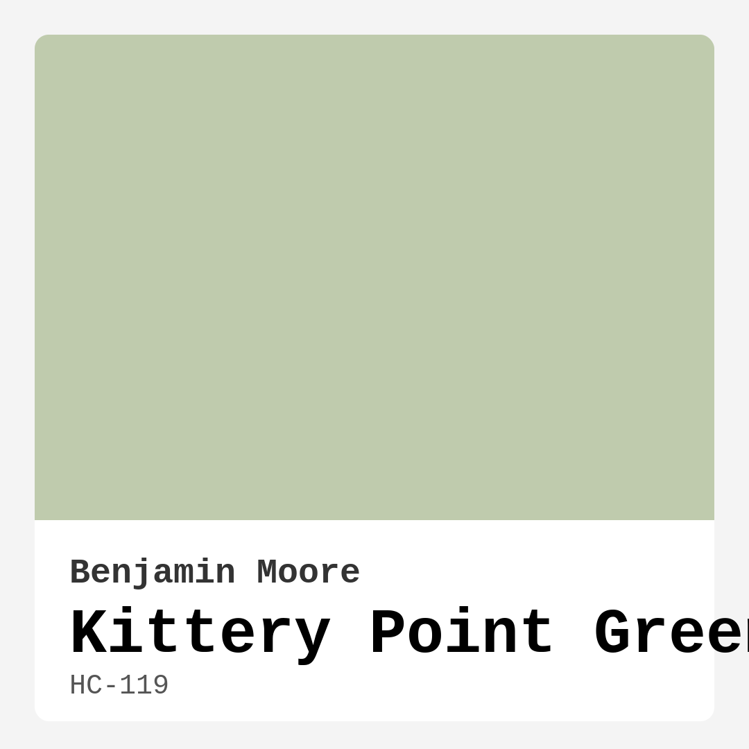
Color Preview & Key Details
| HEX Code | #BFCBAD |
| RGB | 191, 203, 173 |
| LRV | 55.98% |
| Undertone | Green |
| Finish Options | Eggshell, Matte, Satin |
Imagine stepping into a space that instantly wraps you in comfort, where the walls whisper stories of nature and tranquility. This is precisely the feeling that Kittery Point Green, a beautifully soft, muted green from Benjamin Moore, can evoke in your home. With its warm undertones and calming presence, Kittery Point Green is like a gentle embrace, making it an excellent choice for various settings—from cozy bedrooms to vibrant kitchens.
Kittery Point Green (HC-119) stands out for its inviting hue that leans into earthy tones without overwhelming a room. It’s a versatile color that promises to elevate your decor, offering a serene backdrop that harmonizes beautifully with both modern and traditional styles. The beauty of this color lies in its simplicity; it’s not just a green but a muted, sophisticated shade that reflects a sense of calm.
What makes Kittery Point Green especially captivating is its Light Reflectance Value (LRV) of 55.98%. This means it reflects a good amount of light, which is essential for ensuring that your space feels bright and airy. In natural light, this color shines with an invigorating freshness, making rooms feel larger and more open. Meanwhile, in artificial light, especially with warmer bulbs, it maintains its soft appeal, creating a cozy atmosphere that’s equally inviting.
Choosing the right paint color can be daunting, but Kittery Point Green makes the decision easier. Its versatility means it plays nicely with a variety of decor styles. Whether you’re leaning towards a coastal aesthetic with breezy whites and blues or a rustic farmhouse vibe with warm woods and textiles, Kittery Point Green will complement your vision beautifully. Imagine pairing it with crisp white trim for a fresh look, or with soft brass fixtures for a touch of elegance.
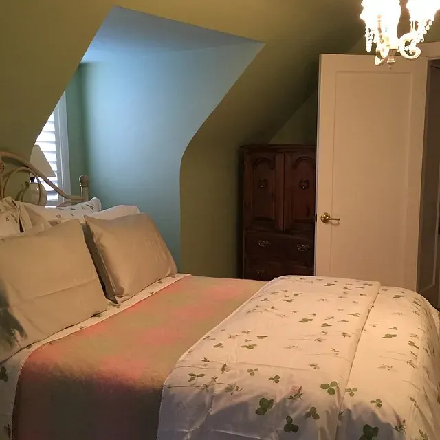
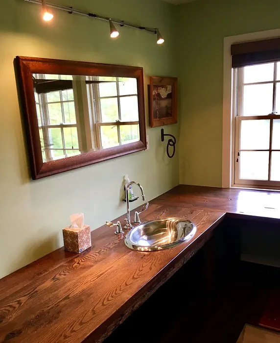
When considering Kittery Point Green for your home, think about the rooms where this color could shine. It’s an excellent choice for living rooms, bedrooms, kitchens, dining areas, and even home offices. In each of these spaces, it creates a calming environment conducive to relaxation or productivity—whichever you need. It’s particularly effective in a nursery, where its gentle hue fosters a peaceful atmosphere for little ones.
One of the standout features of Kittery Point Green is its washability and durability. This makes it suitable for high-traffic areas like living rooms and kitchens, where you want beauty without sacrificing practicality. The paint is designed to be scrubbable, ensuring that everyday wear and tear doesn’t diminish its charm. For best results, opt for a satin or eggshell finish in these spaces to provide an extra layer of protection against scuffs and stains.
But let’s talk about the nitty-gritty of application. If you’re a DIY enthusiast or new to painting, you’ll find Kittery Point Green to be beginner-friendly. It applies smoothly with either a brush or roller, allowing for good coverage in just one to two coats. Touch-ups are also a breeze, saving you time and effort in maintaining your walls.
Now, as with any color, there are a few considerations to keep in mind. Kittery Point Green may appear darker in low-light situations, so it’s crucial to assess your room’s lighting before making a final decision. A well-lit space will showcase its warmth and depth beautifully. In smaller rooms, you can successfully use this color, provided there’s adequate light. Pair it with lighter trims and decor to keep the space feeling open and airy.
When it comes to color pairing, Kittery Point Green offers plenty of options. It sits well alongside lighter shades like Benjamin Moore’s White Dove, which enhances its warmth without overpowering it. If you’re looking to add more color to the mix, consider complementary shades of blue or muted earth tones that resonate with Kittery Point Green’s natural vibe. You can also explore darker shades, like HC-118, for an accent wall, creating a striking contrast that adds depth to your space.
As you envision your project, think about the mood you want to create. Kittery Point Green has a calming, grounding effect, making it perfect for spaces where you want to unwind. It invites a sense of connection with the outdoors, providing that refreshing feeling of nature right inside your home.
Whether you’re updating a single room or embarking on a larger project, Kittery Point Green is a color that promises to transform your space. It’s not just about the color itself; it’s about the ambiance it fosters and the memories that will be created within those walls. The warmth of this hue invites conversations, laughter, and cherished moments, making it an ideal choice for any home.
So, are you ready to embrace Kittery Point Green? With its elegant yet approachable nature, this paint color can redefine your living spaces in ways you might not have imagined. Grab a sample, paint a swatch, and let this soothing hue inspire you. You might just find that Kittery Point Green is the perfect fit for your home, offering a serene retreat that feels both stylish and timeless.
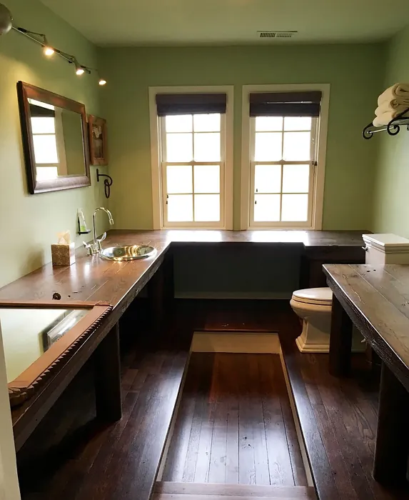
Real Room Photo of Kittery Point Green HC-119
Undertones of Kittery Point Green ?
The undertones of Kittery Point Green are a key aspect of its character, leaning towards Green. These subtle underlying hues are what give the color its depth and complexity. For example, a gray with a blue undertone will feel cooler and more modern, while one with a brown undertone will feel warmer and more traditional. It’s essential to test this paint in your home and observe it next to your existing furniture, flooring, and decor to see how these undertones interact and reveal themselves throughout the day.
HEX value: #BFCBAD
RGB code: 191, 203, 173
Is Kittery Point Green Cool or Warm?
This color leans more towards warm, earthy tones, making it inviting without being overwhelming. While it has a soft green base, the warmth in its undertones makes it feel cozy and approachable, perfect for creating a welcoming environment.
Understanding Color Properties and Interior Design Tips
Hue refers to a specific position on the color wheel, measured in degrees from 0 to 360. Each degree represents a different pure color:
- 0° represents red
- 120° represents green
- 240° represents blue
Saturation describes the intensity or purity of a color and is expressed as a percentage:
- At 0%, the color appears completely desaturated—essentially a shade of gray
- At 100%, the color is at its most vivid and vibrant
Lightness indicates how light or dark a color is, also expressed as a percentage:
- 0% lightness results in black
- 100% lightness results in white
Using Warm Colors in Interior Design
Warm hues—such as reds, oranges, yellows, warm beiges, and greiges—are excellent choices for creating inviting and energetic spaces. These colors are particularly well-suited for:
- Kitchens, living rooms, and bathrooms, where warmth enhances comfort and sociability
- Large rooms, where warm tones can help reduce the sense of emptiness and make the space feel more intimate
For example:
- Warm beige shades provide a cozy, inviting atmosphere, ideal for living rooms, bedrooms, and hallways.
- Warm greige (a mix of beige and gray) offers the warmth of beige with the modern appeal of gray, making it a versatile backdrop for dining areas, bedrooms, and living spaces.
However, be mindful when using warm light tones in rooms with limited natural light. These shades may appear muted or even take on an unpleasant yellowish tint. To avoid a dull or flat appearance:
- Add depth by incorporating richer tones like deep greens, charcoal, or chocolate brown
- Use textured elements such as curtains, rugs, or cushions to bring dimension to the space
Pro Tip: Achieving Harmony with Warm and Cool Color Balance
To create a well-balanced and visually interesting interior, mix warm and cool tones strategically. This contrast adds depth and harmony to your design.
- If your walls feature warm hues, introduce cool-colored accents such as blue or green furniture, artwork, or accessories to create contrast.
- For a polished look, consider using a complementary color scheme, which pairs colors opposite each other on the color wheel (e.g., red with green, orange with blue).
This thoughtful mix not only enhances visual appeal but also creates a space that feels both dynamic and cohesive.
Light Temperature Affects on Kittery Point Green
Natural Light
Natural daylight changes in color temperature as the sun moves across the sky. At sunrise and sunset, the light tends to have a warm, golden tone with a color temperature around 2000 Kelvin (K). As the day progresses and the sun rises higher, the light becomes cooler and more neutral. Around midday, especially when the sky is clear, natural light typically reaches its peak brightness and shifts to a cooler tone, ranging from 5500 to 6500 Kelvin. This midday light is close to what we perceive as pure white or daylight-balanced light.
These shifts in natural light can significantly influence how colors appear in a space, which is why designers often consider both the time of day and the orientation of windows when planning interior color schemes.
Artificial Light
When choosing artificial lighting, pay close attention to the color temperature, measured in Kelvin (K). This determines how warm or cool the light will appear. Lower temperatures, around 2700K, give off a warm, yellow glow often used in living rooms or bedrooms. Higher temperatures, above 5000K, create a cool, bluish light similar to daylight, commonly used in kitchens, offices, or task areas.
Use the slider to see how lighting temperature can affect the appearance of a surface or color throughout a space.


4800K
LRV of Kittery Point Green
The Light Reflectance Value (LRV) of Kittery Point Green is 55.98%, which places it in the Light colors category. This means it reflect most of the incident light. Understanding a paint’s LRV is crucial for predicting how it will look in your space. A higher LRV indicates a lighter color that reflects more light, making rooms feel larger and brighter. A lower LRV signifies a darker color that absorbs more light, creating a cozier, more intimate atmosphere. Always consider the natural and artificial lighting in your room when selecting a paint color based on its LRV.
Detailed Review of Kittery Point Green
Additional Paint Characteristics
Ideal Rooms
Bedroom, Dining Room, Home Office, Kitchen, Living Room, Nursery
Decor Styles
Coastal, Farmhouse, Modern, Rustic, Traditional
Coverage
Good (1–2 Coats), Touch-Up Friendly
Ease of Application
Beginner Friendly, Brush Smooth, Roller-Ready
Washability
Scrubbable, Washable
VOC Level
Eco-Certified, Low VOC
Best Use
Accent Wall, Interior Walls, Trim
Room Suitability
Bedroom, Dining Room, Home Office, Kitchen, Living Room
Tone Tag
Earthy, Muted, Warm
Finish Type
Eggshell, Matte, Satin
Paint Performance
Easy Touch-Up, Fade Resistant, Low Odor
Use Cases
Best for Modern Farmhouse, Best for Open Concept, Best for Small Spaces
Mood
Calm, Grounding, Inviting
Trim Pairing
Complements Brass Fixtures, Pairs with White Dove, Works with Warm Trim
Kittery Point Green is an exceptional choice for anyone looking to breathe new life into their space with a calming and sophisticated hue. This paint offers a unique blend of earthy tones that can enhance both modern and traditional decor styles. When applied, it creates a serene backdrop that allows for versatility in furnishings and accents. The finish options, including matte and satin, provide flexibility depending on the look you’re aiming for. Its washability makes it practical for high-traffic areas and family rooms, ensuring that the beauty of your walls is preserved over time. Overall, Kittery Point Green stands out for its ability to harmonize with various color palettes, making it a reliable choice for your next painting project.
Pros & Cons of HC-119 Kittery Point Green
Pros
Cons
Colors that go with Benjamin Moore Kittery Point Green
FAQ on HC-119 Kittery Point Green
Can Kittery Point Green be used in small rooms?
Absolutely! Kittery Point Green can work in small rooms, but it’s important to ensure there’s adequate light. If the space feels dim, consider pairing it with lighter trims and decor to keep the room feeling open and airy. It’s a lovely choice for a cozy feel, especially in bedrooms or reading nooks.
How does Kittery Point Green perform in high-traffic areas?
Kittery Point Green is a great option for high-traffic areas due to its washability and durability. It can withstand everyday wear and tear, making it suitable for living rooms, hallways, and kitchens. Just be sure to use the right finish, like satin or eggshell, for added protection against scuffs and stains.
Comparisons Kittery Point Green with other colors
Kittery Point Green HC-119 vs Acacia Haze SW 9132
| Attribute | Kittery Point Green HC-119 | Acacia Haze SW 9132 |
|---|---|---|
| Color Name | Kittery Point Green HC-119 | Acacia Haze SW 9132 |
| Color | ||
| Hue | Green | Green |
| Brightness | Medium | Medium |
| RGB | 191, 203, 173 | 150, 156, 146 |
| LRV | 55.98% | 30% |
| Finish Type | Eggshell, Matte, Satin | Eggshell, Satin |
| Finish Options | Eggshell, Matte, Satin | Eggshell, Matte, Satin |
| Ideal Rooms | Bedroom, Dining Room, Home Office, Kitchen, Living Room, Nursery | Bedroom, Dining Room, Home Office, Living Room, Nursery |
| Decor Styles | Coastal, Farmhouse, Modern, Rustic, Traditional | Bohemian, Coastal, Modern Farmhouse, Scandinavian |
| Coverage | Good (1–2 Coats), Touch-Up Friendly | Good (1–2 Coats), Touch-Up Friendly |
| Ease of Application | Beginner Friendly, Brush Smooth, Roller-Ready | Beginner Friendly, Brush Smooth, Roller-Ready |
| Washability | Scrubbable, Washable | Washable, Wipeable |
| Room Suitability | Bedroom, Dining Room, Home Office, Kitchen, Living Room | Bedroom, Home Office, Living Room, Nursery |
| Tone | Earthy, Muted, Warm | Balanced, Earthy, Muted |
| Paint Performance | Easy Touch-Up, Fade Resistant, Low Odor | Easy Touch-Up, High Coverage, Low Odor |
Kittery Point Green HC-119 vs Evergreen Fog SW 9130
| Attribute | Kittery Point Green HC-119 | Evergreen Fog SW 9130 |
|---|---|---|
| Color Name | Kittery Point Green HC-119 | Evergreen Fog SW 9130 |
| Color | ||
| Hue | Green | Green |
| Brightness | Medium | Medium |
| RGB | 191, 203, 173 | 149, 151, 138 |
| LRV | 55.98% | 30% |
| Finish Type | Eggshell, Matte, Satin | Eggshell, Matte, Satin |
| Finish Options | Eggshell, Matte, Satin | Eggshell, Matte, Satin |
| Ideal Rooms | Bedroom, Dining Room, Home Office, Kitchen, Living Room, Nursery | Bedroom, Dining Room, Home Office, Living Room, Nursery |
| Decor Styles | Coastal, Farmhouse, Modern, Rustic, Traditional | Coastal, Modern Farmhouse, Rustic, Scandinavian, Transitional |
| Coverage | Good (1–2 Coats), Touch-Up Friendly | Good (1–2 Coats), Touch-Up Friendly |
| Ease of Application | Beginner Friendly, Brush Smooth, Roller-Ready | Beginner Friendly, Brush Smooth, Roller-Ready |
| Washability | Scrubbable, Washable | Scrubbable, Washable |
| Room Suitability | Bedroom, Dining Room, Home Office, Kitchen, Living Room | Bedroom, Dining Room, Home Office, Living Room, Nursery |
| Tone | Earthy, Muted, Warm | Balanced, Earthy, Muted |
| Paint Performance | Easy Touch-Up, Fade Resistant, Low Odor | Easy Touch-Up, Low Odor, Scuff Resistant |
Kittery Point Green HC-119 vs Clary Sage SW 6178
| Attribute | Kittery Point Green HC-119 | Clary Sage SW 6178 |
|---|---|---|
| Color Name | Kittery Point Green HC-119 | Clary Sage SW 6178 |
| Color | ||
| Hue | Green | Green |
| Brightness | Medium | Medium |
| RGB | 191, 203, 173 | 172, 173, 151 |
| LRV | 55.98% | 24% |
| Finish Type | Eggshell, Matte, Satin | Eggshell, Matte |
| Finish Options | Eggshell, Matte, Satin | Eggshell, Matte, Satin |
| Ideal Rooms | Bedroom, Dining Room, Home Office, Kitchen, Living Room, Nursery | Bathroom, Bedroom, Home Office, Kitchen, Living Room |
| Decor Styles | Coastal, Farmhouse, Modern, Rustic, Traditional | Bohemian, Minimalist, Modern Farmhouse, Scandinavian, Traditional |
| Coverage | Good (1–2 Coats), Touch-Up Friendly | Good (1–2 Coats), Touch-Up Friendly |
| Ease of Application | Beginner Friendly, Brush Smooth, Roller-Ready | Beginner Friendly, Brush Smooth, Roller-Ready |
| Washability | Scrubbable, Washable | Washable, Wipeable |
| Room Suitability | Bedroom, Dining Room, Home Office, Kitchen, Living Room | Bathroom, Bedroom, Home Office, Kitchen, Living Room |
| Tone | Earthy, Muted, Warm | Cool, Earthy, Muted |
| Paint Performance | Easy Touch-Up, Fade Resistant, Low Odor | Easy Touch-Up, High Coverage, Low Odor |
Kittery Point Green HC-119 vs Softened Green SW 6177
| Attribute | Kittery Point Green HC-119 | Softened Green SW 6177 |
|---|---|---|
| Color Name | Kittery Point Green HC-119 | Softened Green SW 6177 |
| Color | ||
| Hue | Green | Green |
| Brightness | Medium | Medium |
| RGB | 191, 203, 173 | 187, 188, 167 |
| LRV | 55.98% | 48% |
| Finish Type | Eggshell, Matte, Satin | Eggshell, Matte, Satin |
| Finish Options | Eggshell, Matte, Satin | Eggshell, Matte, Satin |
| Ideal Rooms | Bedroom, Dining Room, Home Office, Kitchen, Living Room, Nursery | Bathroom, Bedroom, Dining Room, Home Office, Kitchen, Living Room, Nursery |
| Decor Styles | Coastal, Farmhouse, Modern, Rustic, Traditional | Coastal, Farmhouse, Minimalist, Modern, Scandinavian |
| Coverage | Good (1–2 Coats), Touch-Up Friendly | Good (1–2 Coats), Touch-Up Friendly |
| Ease of Application | Beginner Friendly, Brush Smooth, Roller-Ready | Beginner Friendly, Brush Smooth, Fast-Drying, Roller-Ready |
| Washability | Scrubbable, Washable | Washable, Wipeable |
| Room Suitability | Bedroom, Dining Room, Home Office, Kitchen, Living Room | Bathroom, Bedroom, Dining Room, Home Office, Kitchen, Living Room |
| Tone | Earthy, Muted, Warm | Calm, Earthy, Muted |
| Paint Performance | Easy Touch-Up, Fade Resistant, Low Odor | Easy Touch-Up, Fade Resistant, Low Odor, Quick Drying |
Kittery Point Green HC-119 vs Eventide SW 9643
| Attribute | Kittery Point Green HC-119 | Eventide SW 9643 |
|---|---|---|
| Color Name | Kittery Point Green HC-119 | Eventide SW 9643 |
| Color | ||
| Hue | Green | Green |
| Brightness | Medium | Medium |
| RGB | 191, 203, 173 | 163, 175, 172 |
| LRV | 55.98% | 24% |
| Finish Type | Eggshell, Matte, Satin | Eggshell, Matte, Satin |
| Finish Options | Eggshell, Matte, Satin | Eggshell, Matte, Satin |
| Ideal Rooms | Bedroom, Dining Room, Home Office, Kitchen, Living Room, Nursery | Bedroom, Home Office, Kitchen, Living Room, Nursery |
| Decor Styles | Coastal, Farmhouse, Modern, Rustic, Traditional | Coastal, Contemporary, Minimalist, Modern |
| Coverage | Good (1–2 Coats), Touch-Up Friendly | Good (1–2 Coats), Touch-Up Friendly |
| Ease of Application | Beginner Friendly, Brush Smooth, Roller-Ready | Beginner Friendly, Brush Smooth, Fast-Drying, Roller-Ready |
| Washability | Scrubbable, Washable | Washable, Wipeable |
| Room Suitability | Bedroom, Dining Room, Home Office, Kitchen, Living Room | Bedroom, Home Office, Living Room, Nursery |
| Tone | Earthy, Muted, Warm | Airy, Balanced, Cool, Muted |
| Paint Performance | Easy Touch-Up, Fade Resistant, Low Odor | Easy Touch-Up, High Coverage, Low Odor, Quick Drying |
Kittery Point Green HC-119 vs Escape Gray SW 6185
| Attribute | Kittery Point Green HC-119 | Escape Gray SW 6185 |
|---|---|---|
| Color Name | Kittery Point Green HC-119 | Escape Gray SW 6185 |
| Color | ||
| Hue | Green | Green |
| Brightness | Medium | Medium |
| RGB | 191, 203, 173 | 171, 172, 159 |
| LRV | 55.98% | 48% |
| Finish Type | Eggshell, Matte, Satin | Eggshell, Matte |
| Finish Options | Eggshell, Matte, Satin | Eggshell, Matte, Satin |
| Ideal Rooms | Bedroom, Dining Room, Home Office, Kitchen, Living Room, Nursery | Bathroom, Bedroom, Entryway, Home Office, Living Room |
| Decor Styles | Coastal, Farmhouse, Modern, Rustic, Traditional | Minimalist, Modern, Scandinavian, Transitional |
| Coverage | Good (1–2 Coats), Touch-Up Friendly | Good (1–2 Coats) |
| Ease of Application | Beginner Friendly, Brush Smooth, Roller-Ready | Beginner Friendly, Brush Smooth, Roller-Ready |
| Washability | Scrubbable, Washable | Highly Washable, Washable |
| Room Suitability | Bedroom, Dining Room, Home Office, Kitchen, Living Room | Bathroom, Bedroom, Home Office, Living Room |
| Tone | Earthy, Muted, Warm | Cool, Muted, Neutral, Warm |
| Paint Performance | Easy Touch-Up, Fade Resistant, Low Odor | Easy Touch-Up, Low Odor, Scuff Resistant |
Kittery Point Green HC-119 vs Coastal Plain SW 6192
| Attribute | Kittery Point Green HC-119 | Coastal Plain SW 6192 |
|---|---|---|
| Color Name | Kittery Point Green HC-119 | Coastal Plain SW 6192 |
| Color | ||
| Hue | Green | Green |
| Brightness | Medium | Medium |
| RGB | 191, 203, 173 | 159, 166, 148 |
| LRV | 55.98% | 66% |
| Finish Type | Eggshell, Matte, Satin | Eggshell, Satin |
| Finish Options | Eggshell, Matte, Satin | Eggshell, Satin, Semi-Gloss |
| Ideal Rooms | Bedroom, Dining Room, Home Office, Kitchen, Living Room, Nursery | Bathroom, Bedroom, Home Office, Kitchen, Living Room |
| Decor Styles | Coastal, Farmhouse, Modern, Rustic, Traditional | Bohemian, Coastal, Contemporary, Modern Farmhouse, Rustic |
| Coverage | Good (1–2 Coats), Touch-Up Friendly | Good (1–2 Coats) |
| Ease of Application | Beginner Friendly, Brush Smooth, Roller-Ready | Beginner Friendly, Brush Smooth, Fast-Drying, Roller-Ready |
| Washability | Scrubbable, Washable | Scrubbable, Washable |
| Room Suitability | Bedroom, Dining Room, Home Office, Kitchen, Living Room | Bathroom, Bedroom, Dining Room, Home Office, Kitchen, Living Room |
| Tone | Earthy, Muted, Warm | Cool, Earthy, Muted |
| Paint Performance | Easy Touch-Up, Fade Resistant, Low Odor | High Coverage, Low Odor, Quick Drying |
Kittery Point Green HC-119 vs Contented SW 6191
| Attribute | Kittery Point Green HC-119 | Contented SW 6191 |
|---|---|---|
| Color Name | Kittery Point Green HC-119 | Contented SW 6191 |
| Color | ||
| Hue | Green | Green |
| Brightness | Medium | Medium |
| RGB | 191, 203, 173 | 189, 192, 179 |
| LRV | 55.98% | 45% |
| Finish Type | Eggshell, Matte, Satin | Eggshell, Matte, Satin |
| Finish Options | Eggshell, Matte, Satin | Eggshell, Matte, Satin |
| Ideal Rooms | Bedroom, Dining Room, Home Office, Kitchen, Living Room, Nursery | Bedroom, Dining Room, Home Office, Kitchen, Living Room |
| Decor Styles | Coastal, Farmhouse, Modern, Rustic, Traditional | Contemporary, Minimalist, Modern, Scandinavian, Transitional |
| Coverage | Good (1–2 Coats), Touch-Up Friendly | Good (1–2 Coats), Touch-Up Friendly |
| Ease of Application | Beginner Friendly, Brush Smooth, Roller-Ready | Beginner Friendly, Brush Smooth, Roller-Ready |
| Washability | Scrubbable, Washable | Stain Resistant, Washable |
| Room Suitability | Bedroom, Dining Room, Home Office, Kitchen, Living Room | Bedroom, Dining Room, Home Office, Kitchen, Living Room |
| Tone | Earthy, Muted, Warm | Muted, Neutral, Warm |
| Paint Performance | Easy Touch-Up, Fade Resistant, Low Odor | Easy Touch-Up, High Coverage, Low Odor |
Kittery Point Green HC-119 vs Jade Dragon SW 9129
| Attribute | Kittery Point Green HC-119 | Jade Dragon SW 9129 |
|---|---|---|
| Color Name | Kittery Point Green HC-119 | Jade Dragon SW 9129 |
| Color | ||
| Hue | Green | Green |
| Brightness | Medium | Medium |
| RGB | 191, 203, 173 | 144, 152, 134 |
| LRV | 55.98% | 12% |
| Finish Type | Eggshell, Matte, Satin | Eggshell, Matte, Satin |
| Finish Options | Eggshell, Matte, Satin | Eggshell, Matte, Satin |
| Ideal Rooms | Bedroom, Dining Room, Home Office, Kitchen, Living Room, Nursery | Bedroom, Dining Room, Home Office, Living Room, Nursery |
| Decor Styles | Coastal, Farmhouse, Modern, Rustic, Traditional | Bohemian, Minimalist, Modern, Traditional, Transitional |
| Coverage | Good (1–2 Coats), Touch-Up Friendly | Good (1–2 Coats), Touch-Up Friendly |
| Ease of Application | Beginner Friendly, Brush Smooth, Roller-Ready | Beginner Friendly, Brush Smooth, Fast-Drying, Roller-Ready |
| Washability | Scrubbable, Washable | Highly Washable, Stain Resistant, Washable |
| Room Suitability | Bedroom, Dining Room, Home Office, Kitchen, Living Room | Bedroom, Dining Room, Home Office, Living Room, Nursery |
| Tone | Earthy, Muted, Warm | Balanced, Cool, Earthy, Muted |
| Paint Performance | Easy Touch-Up, Fade Resistant, Low Odor | Easy Touch-Up, Fade Resistant, Low Odor, Stain Resistant |
Kittery Point Green HC-119 vs Underseas SW 6214
| Attribute | Kittery Point Green HC-119 | Underseas SW 6214 |
|---|---|---|
| Color Name | Kittery Point Green HC-119 | Underseas SW 6214 |
| Color | ||
| Hue | Green | Green |
| Brightness | Medium | Medium |
| RGB | 191, 203, 173 | 124, 142, 135 |
| LRV | 55.98% | 24% |
| Finish Type | Eggshell, Matte, Satin | Eggshell, Matte, Satin |
| Finish Options | Eggshell, Matte, Satin | Eggshell, Matte, Satin |
| Ideal Rooms | Bedroom, Dining Room, Home Office, Kitchen, Living Room, Nursery | Bathroom, Bedroom, Dining Room, Hallway, Home Office, Living Room |
| Decor Styles | Coastal, Farmhouse, Modern, Rustic, Traditional | Coastal, Eclectic, Farmhouse, Modern, Scandinavian |
| Coverage | Good (1–2 Coats), Touch-Up Friendly | Good (1–2 Coats), Touch-Up Friendly |
| Ease of Application | Beginner Friendly, Brush Smooth, Roller-Ready | Beginner Friendly, Brush Smooth, Fast-Drying, Roller-Ready |
| Washability | Scrubbable, Washable | Highly Washable, Washable, Wipeable |
| Room Suitability | Bedroom, Dining Room, Home Office, Kitchen, Living Room | Bathroom, Bedroom, Dining Room, Home Office, Living Room |
| Tone | Earthy, Muted, Warm | Balanced, Cool, Earthy, Muted |
| Paint Performance | Easy Touch-Up, Fade Resistant, Low Odor | Easy Touch-Up, Fade Resistant, High Coverage, Low Odor |
Official Page of Benjamin Moore Kittery Point Green HC-119