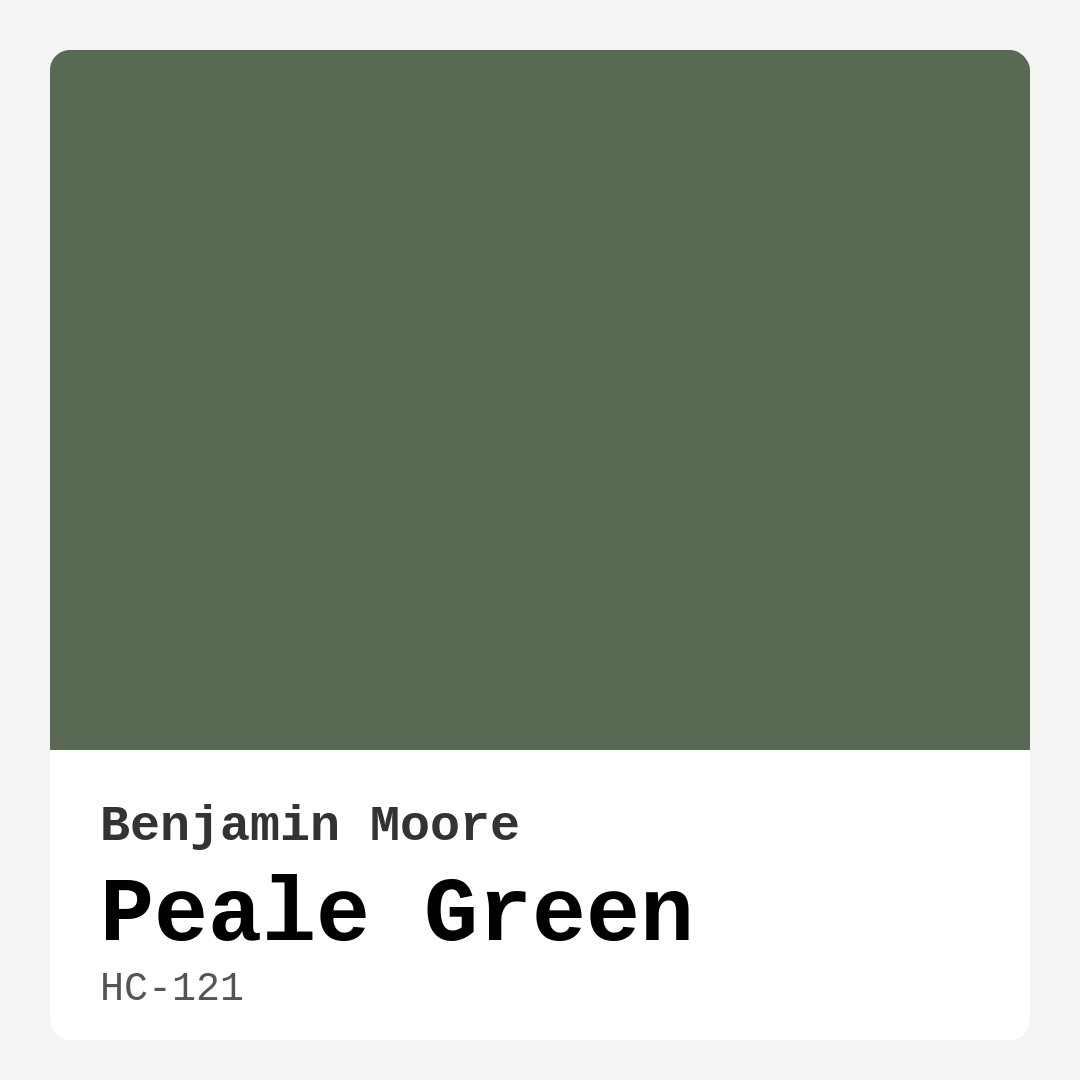
Color Preview & Key Details
| HEX Code | #586A54 |
| RGB | 88, 106, 84 |
| LRV | 14.15% |
| Undertone | Green |
| Finish Options | Eggshell, Matte, Satin |
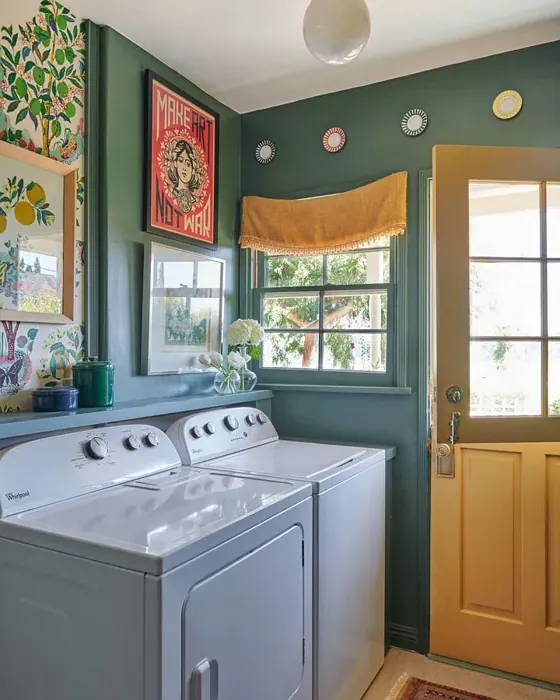
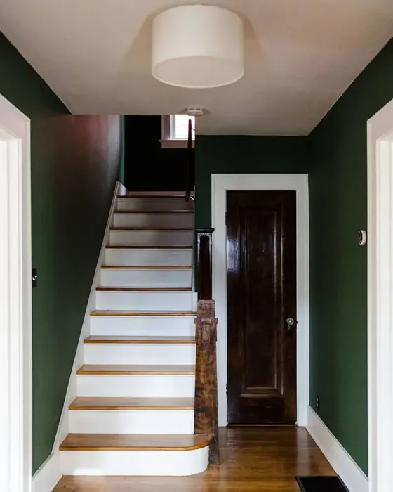
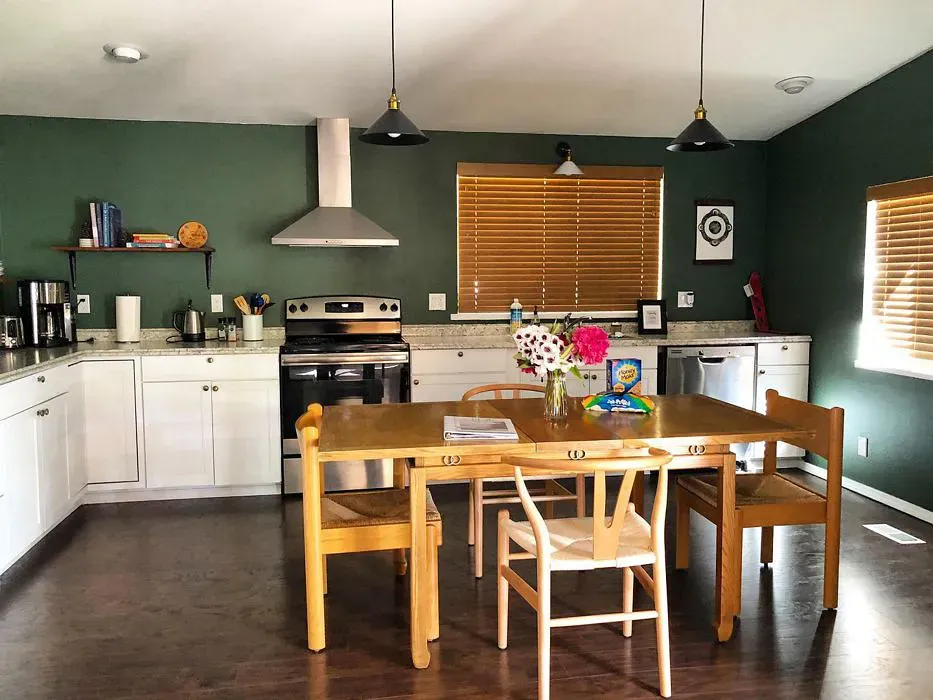
If you’re searching for a paint color that effortlessly blends sophistication with a touch of nature’s tranquility, let me introduce you to Benjamin Moore’s Peale Green (HC-121). This rich, muted green is like a breath of fresh air for your home—calming yet full of character, making it a standout choice for anyone looking to create a space that feels both grounded and inviting. Whether you’re a seasoned decorator or a first-time painter, Peale Green’s versatility and ease of application make it a dream to work with.
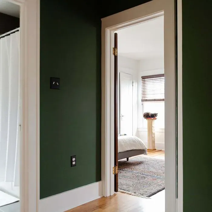
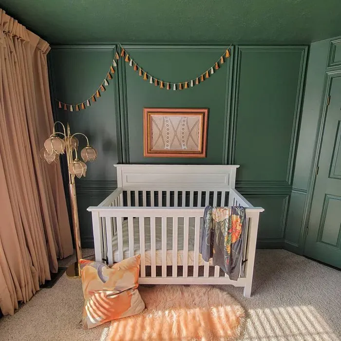
Peale Green sits beautifully in the medium-dark range with an LRV (Light Reflectance Value) of 14.15%, meaning it absorbs more light than it reflects. This gives it a cozy, intimate feel, perfect for rooms where you want to cultivate warmth and relaxation. In natural light, it has a soft, organic glow, almost like sunlight filtering through leaves. At night, under artificial lighting, it deepens into a more dramatic, enveloping shade—ideal for creating a snug atmosphere in living rooms, bedrooms, or even a moody dining space.
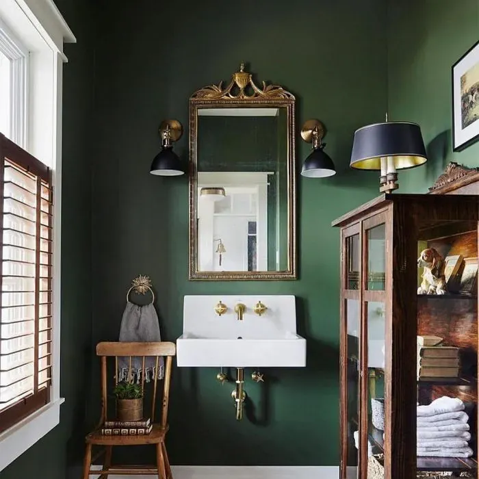
One of the things I love most about Peale Green is its earthy undertones. Unlike some greens that can feel too bold or clinical, this one has a muted, almost weathered quality that makes it incredibly adaptable. It pairs seamlessly with warm woods, crisp whites, and even brass or gold accents, giving you endless styling possibilities. If you’re worried about it feeling too dark in a small room, don’t be. Its muted nature keeps it from overwhelming the space, especially when balanced with lighter trim or furnishings.
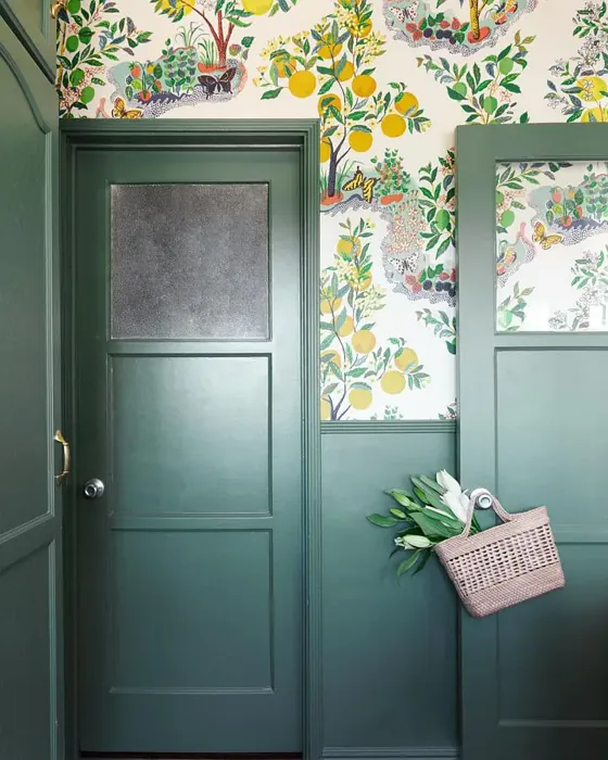
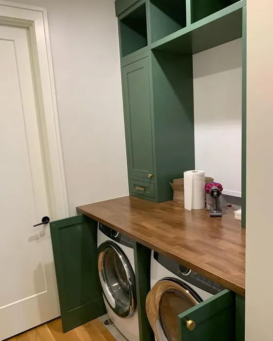
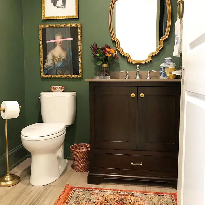
Speaking of trim, Peale Green looks stunning alongside Benjamin Moore’s White Dove—a classic, warm white that softens the depth of the green without clashing. For a more modern twist, try it with matte black hardware or sleek brass fixtures. The contrast adds just the right amount of edge. And if you’re feeling adventurous, this color works wonders on built-ins or accent furniture, bringing a touch of elegance to bookshelves, cabinets, or even a statement door.
When it comes to application, Peale Green is beginner-friendly. It covers well in one to two coats, and its low-VOC, eco-certified formula means you won’t have to deal with harsh fumes. Whether you choose a matte, eggshell, or satin finish depends on the room’s function. Matte is great for low-traffic areas like bedrooms, offering a velvety look, while eggshell or satin is more practical for spaces that need occasional wiping down, like dining rooms or home offices.
Now, let’s talk decor styles. Peale Green is a chameleon—it fits right into modern farmhouse, rustic, traditional, or even eclectic interiors. In a farmhouse setting, pair it with reclaimed wood and linen textiles for a lived-in charm. For a more polished traditional look, layer it with rich velvets and antique brass. And if eclectic is your vibe, mix in bold patterns or vibrant art to let the green act as a grounding neutral.
A common question I get is how Peale Green compares to other greens. Unlike brighter, more saturated shades, it has a subdued elegance that makes it feel timeless. It’s not as gray as Sherwin Williams’ Evergreen Fog or as sage-like as Benjamin Moore’s Saybrook Sage—it sits right in that sweet spot where warmth and coolness balance perfectly.
If you’re still on the fence, here’s a pro tip: always test the color in your space. Paint a large swatch and observe it at different times of day. Lighting plays a huge role in how Peale Green will appear, and you’ll want to make sure it harmonizes with your existing furniture and flooring.
At the end of the day, Peale Green is more than just a paint color—it’s a mood. It brings a sense of calm, connection, and understated luxury to any room. Whether you’re refreshing a single wall or transforming an entire home, this shade has the depth and flexibility to make your vision come to life. So go ahead, take the plunge. Your perfect green awaits.
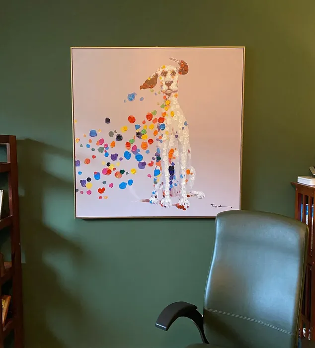
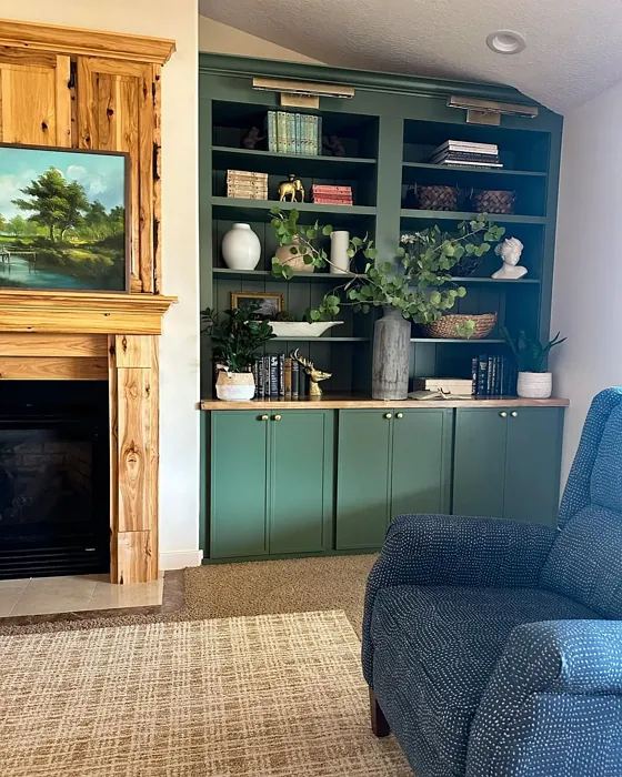
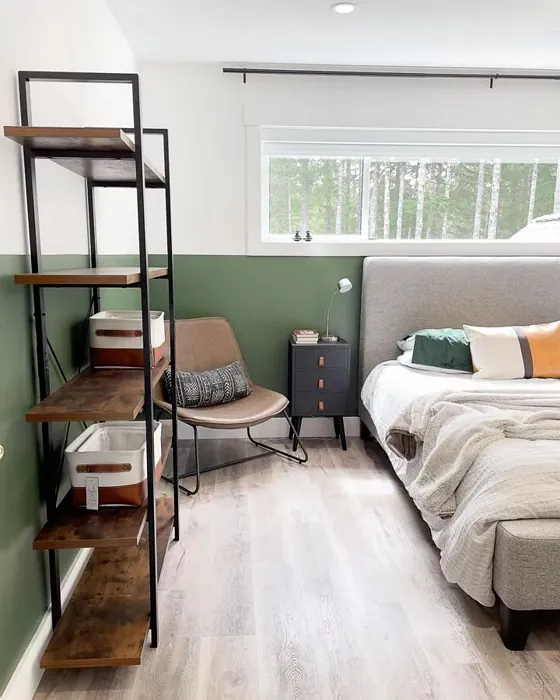
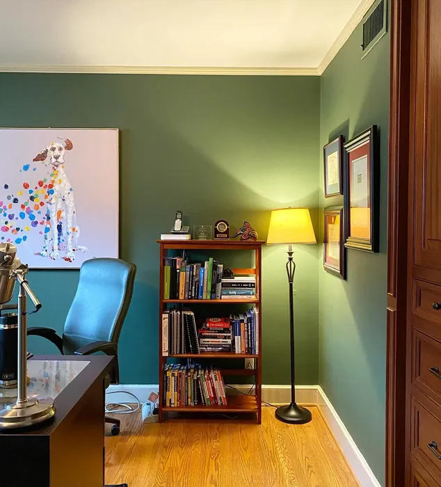
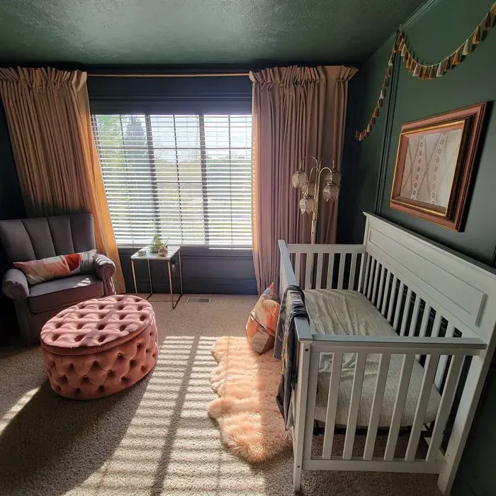
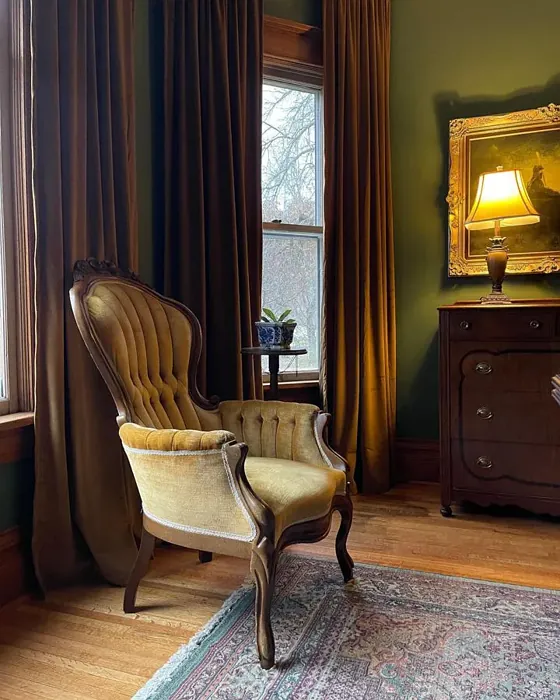
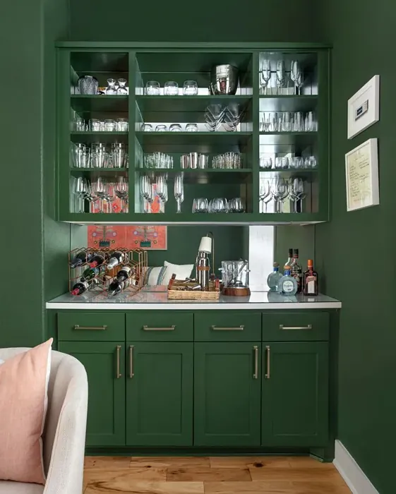
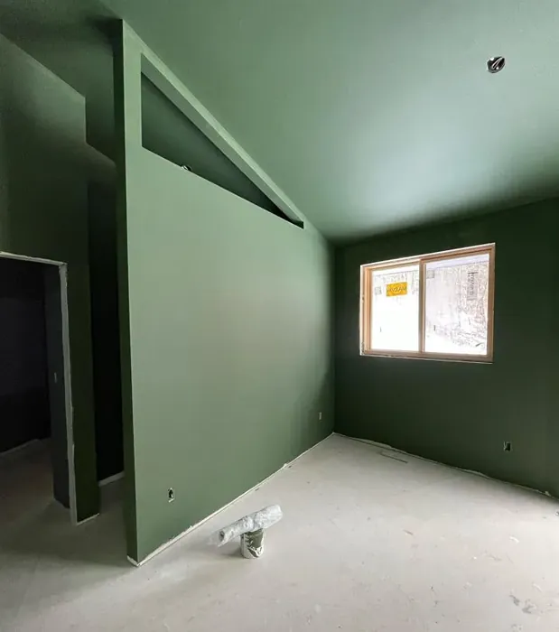
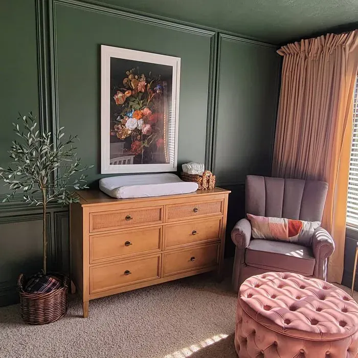
Real Room Photo of Peale Green HC-121
Undertones of Peale Green ?
The undertones of Peale Green are a key aspect of its character, leaning towards Green. These subtle underlying hues are what give the color its depth and complexity. For example, a gray with a blue undertone will feel cooler and more modern, while one with a brown undertone will feel warmer and more traditional. It’s essential to test this paint in your home and observe it next to your existing furniture, flooring, and decor to see how these undertones interact and reveal themselves throughout the day.
HEX value: #586A54
RGB code: 88, 106, 84
Is Peale Green Cool or Warm?
Peale Green leans towards a cool tone, making it a refreshing choice for spaces that need a touch of calm. However, its muted quality allows it to harmonize with warmer accents beautifully.
Understanding Color Properties and Interior Design Tips
Hue refers to a specific position on the color wheel, measured in degrees from 0 to 360. Each degree represents a different pure color:
- 0° represents red
- 120° represents green
- 240° represents blue
Saturation describes the intensity or purity of a color and is expressed as a percentage:
- At 0%, the color appears completely desaturated—essentially a shade of gray
- At 100%, the color is at its most vivid and vibrant
Lightness indicates how light or dark a color is, also expressed as a percentage:
- 0% lightness results in black
- 100% lightness results in white
Using Warm Colors in Interior Design
Warm hues—such as reds, oranges, yellows, warm beiges, and greiges—are excellent choices for creating inviting and energetic spaces. These colors are particularly well-suited for:
- Kitchens, living rooms, and bathrooms, where warmth enhances comfort and sociability
- Large rooms, where warm tones can help reduce the sense of emptiness and make the space feel more intimate
For example:
- Warm beige shades provide a cozy, inviting atmosphere, ideal for living rooms, bedrooms, and hallways.
- Warm greige (a mix of beige and gray) offers the warmth of beige with the modern appeal of gray, making it a versatile backdrop for dining areas, bedrooms, and living spaces.
However, be mindful when using warm light tones in rooms with limited natural light. These shades may appear muted or even take on an unpleasant yellowish tint. To avoid a dull or flat appearance:
- Add depth by incorporating richer tones like deep greens, charcoal, or chocolate brown
- Use textured elements such as curtains, rugs, or cushions to bring dimension to the space
Pro Tip: Achieving Harmony with Warm and Cool Color Balance
To create a well-balanced and visually interesting interior, mix warm and cool tones strategically. This contrast adds depth and harmony to your design.
- If your walls feature warm hues, introduce cool-colored accents such as blue or green furniture, artwork, or accessories to create contrast.
- For a polished look, consider using a complementary color scheme, which pairs colors opposite each other on the color wheel (e.g., red with green, orange with blue).
This thoughtful mix not only enhances visual appeal but also creates a space that feels both dynamic and cohesive.
Light Temperature Affects on Peale Green
Natural Light
Natural daylight changes in color temperature as the sun moves across the sky. At sunrise and sunset, the light tends to have a warm, golden tone with a color temperature around 2000 Kelvin (K). As the day progresses and the sun rises higher, the light becomes cooler and more neutral. Around midday, especially when the sky is clear, natural light typically reaches its peak brightness and shifts to a cooler tone, ranging from 5500 to 6500 Kelvin. This midday light is close to what we perceive as pure white or daylight-balanced light.
These shifts in natural light can significantly influence how colors appear in a space, which is why designers often consider both the time of day and the orientation of windows when planning interior color schemes.
Artificial Light
When choosing artificial lighting, pay close attention to the color temperature, measured in Kelvin (K). This determines how warm or cool the light will appear. Lower temperatures, around 2700K, give off a warm, yellow glow often used in living rooms or bedrooms. Higher temperatures, above 5000K, create a cool, bluish light similar to daylight, commonly used in kitchens, offices, or task areas.
Use the slider to see how lighting temperature can affect the appearance of a surface or color throughout a space.


4800K
LRV of Peale Green
The Light Reflectance Value (LRV) of Peale Green is 14.15%, which places it in the Medium Dark category. This means it reflects very little light. Understanding a paint’s LRV is crucial for predicting how it will look in your space. A higher LRV indicates a lighter color that reflects more light, making rooms feel larger and brighter. A lower LRV signifies a darker color that absorbs more light, creating a cozier, more intimate atmosphere. Always consider the natural and artificial lighting in your room when selecting a paint color based on its LRV.
Detailed Review of Peale Green
Additional Paint Characteristics
Ideal Rooms
Bedroom, Dining Room, Home Office, Living Room, Nursery
Decor Styles
Eclectic, Modern Farmhouse, Rustic, Traditional
Coverage
Good (1–2 Coats), Touch-Up Friendly
Ease of Application
Beginner Friendly, Brush Smooth, Roller-Ready
Washability
Stain Resistant, Washable
VOC Level
Eco-Certified, Low VOC
Best Use
Accent Wall, Furniture, Interior Walls
Room Suitability
Bedroom, Dining Room, Home Office, Living Room
Tone Tag
Earthy, Muted, Warm
Finish Type
Eggshell, Matte, Satin
Paint Performance
Fade Resistant, High Coverage, Low Odor, Scuff Resistant
Use Cases
Best for Low Light Rooms, Best for Small Spaces, Classic Favorite
Mood
Calm, Cozy, Grounding
Trim Pairing
Complements Brass Fixtures, Pairs with White Dove, Works with Warm Trim
Peale Green brings a refreshing yet grounded vibe to your space. Its muted nature makes it an excellent choice for walls, creating a serene backdrop that complements various decor styles. The color’s versatility allows it to seamlessly transition from room to room, making it ideal for an open concept layout. When applied, Peale Green offers a smooth finish with good coverage, typically requiring just one to two coats for full opacity. It pairs beautifully with warm whites and natural woods, enhancing the overall aesthetic of your home. Whether you’re looking to create a cozy reading nook or an inviting dining area, Peale Green sets the perfect tone.
Pros & Cons of HC-121 Peale Green
Pros
Cons
Colors that go with Benjamin Moore Peale Green
FAQ on HC-121 Peale Green
How does Peale Green compare to other greens?
Peale Green stands out due to its muted, earthy tone, which offers a sophisticated alternative to brighter greens. Unlike vibrant shades, Peale Green provides a calming effect, making it suitable for various settings. It harmonizes well with both warm and cool accents, allowing for flexible decor choices.
Can Peale Green be used in small rooms?
Absolutely! Peale Green can be a great choice for small rooms, as its muted tone prevents it from overwhelming the space. It also helps create an inviting atmosphere, making smaller areas feel more spacious and cozy. Just ensure to balance it with lighter trim or decor to enhance the overall brightness.
Comparisons Peale Green with other colors
Peale Green HC-121 vs Dried Thyme SW 6186
| Attribute | Peale Green HC-121 | Dried Thyme SW 6186 |
|---|---|---|
| Color Name | Peale Green HC-121 | Dried Thyme SW 6186 |
| Color | ||
| Hue | Green | Green |
| Brightness | Dark | Dark |
| RGB | 88, 106, 84 | 123, 128, 112 |
| LRV | 14.15% | 24% |
| Finish Type | Eggshell, Matte, Satin | Eggshell, Satin |
| Finish Options | Eggshell, Matte, Satin | Eggshell, Matte, Satin |
| Ideal Rooms | Bedroom, Dining Room, Home Office, Living Room, Nursery | Bathroom, Bedroom, Dining Room, Entryway, Home Office, Kitchen, Living Room |
| Decor Styles | Eclectic, Modern Farmhouse, Rustic, Traditional | Bohemian, Industrial, Minimalist, Modern Farmhouse, Rustic |
| Coverage | Good (1–2 Coats), Touch-Up Friendly | Good (1–2 Coats), Touch-Up Friendly |
| Ease of Application | Beginner Friendly, Brush Smooth, Roller-Ready | Beginner Friendly, Brush Smooth, Roller-Ready |
| Washability | Stain Resistant, Washable | Washable, Wipeable |
| Room Suitability | Bedroom, Dining Room, Home Office, Living Room | Bathroom, Bedroom, Dining Room, Home Office, Kitchen, Living Room |
| Tone | Earthy, Muted, Warm | Cool, Earthy, Muted |
| Paint Performance | Fade Resistant, High Coverage, Low Odor, Scuff Resistant | Easy Touch-Up, Low Odor, Scuff Resistant |
Peale Green HC-121 vs Retreat SW 6207
| Attribute | Peale Green HC-121 | Retreat SW 6207 |
|---|---|---|
| Color Name | Peale Green HC-121 | Retreat SW 6207 |
| Color | ||
| Hue | Green | Green |
| Brightness | Dark | Dark |
| RGB | 88, 106, 84 | 122, 128, 118 |
| LRV | 14.15% | 30% |
| Finish Type | Eggshell, Matte, Satin | Eggshell, Matte, Satin |
| Finish Options | Eggshell, Matte, Satin | Eggshell, Matte, Satin |
| Ideal Rooms | Bedroom, Dining Room, Home Office, Living Room, Nursery | Bathroom, Bedroom, Home Office, Kitchen, Living Room |
| Decor Styles | Eclectic, Modern Farmhouse, Rustic, Traditional | Minimalist, Modern, Rustic, Transitional |
| Coverage | Good (1–2 Coats), Touch-Up Friendly | Good (1–2 Coats), Touch-Up Friendly |
| Ease of Application | Beginner Friendly, Brush Smooth, Roller-Ready | Beginner Friendly, Brush Smooth, Roller-Ready |
| Washability | Stain Resistant, Washable | Washable, Wipeable |
| Room Suitability | Bedroom, Dining Room, Home Office, Living Room | Bathroom, Bedroom, Home Office, Living Room |
| Tone | Earthy, Muted, Warm | Cool, Earthy, Muted |
| Paint Performance | Fade Resistant, High Coverage, Low Odor, Scuff Resistant | Easy Touch-Up, Low Odor, Scuff Resistant |
Peale Green HC-121 vs Rosemary SW 6187
| Attribute | Peale Green HC-121 | Rosemary SW 6187 |
|---|---|---|
| Color Name | Peale Green HC-121 | Rosemary SW 6187 |
| Color | ||
| Hue | Green | Green |
| Brightness | Dark | Dark |
| RGB | 88, 106, 84 | 100, 105, 92 |
| LRV | 14.15% | 45% |
| Finish Type | Eggshell, Matte, Satin | Eggshell, Matte, Satin |
| Finish Options | Eggshell, Matte, Satin | Eggshell, Matte, Satin |
| Ideal Rooms | Bedroom, Dining Room, Home Office, Living Room, Nursery | Bedroom, Dining Room, Hallway, Home Office, Living Room |
| Decor Styles | Eclectic, Modern Farmhouse, Rustic, Traditional | Bohemian, Coastal, Modern Farmhouse, Rustic |
| Coverage | Good (1–2 Coats), Touch-Up Friendly | Good (1–2 Coats), Touch-Up Friendly |
| Ease of Application | Beginner Friendly, Brush Smooth, Roller-Ready | Beginner Friendly, Brush Smooth, Roller-Ready |
| Washability | Stain Resistant, Washable | Washable, Wipeable |
| Room Suitability | Bedroom, Dining Room, Home Office, Living Room | Bedroom, Dining Room, Home Office, Living Room |
| Tone | Earthy, Muted, Warm | Earthy, Muted, Warm |
| Paint Performance | Fade Resistant, High Coverage, Low Odor, Scuff Resistant | Fade Resistant, Low Odor, Quick Drying, Stain Resistant |
Peale Green HC-121 vs Basil SW 6194
| Attribute | Peale Green HC-121 | Basil SW 6194 |
|---|---|---|
| Color Name | Peale Green HC-121 | Basil SW 6194 |
| Color | ||
| Hue | Green | Green |
| Brightness | Dark | Dark |
| RGB | 88, 106, 84 | 98, 110, 96 |
| LRV | 14.15% | 12% |
| Finish Type | Eggshell, Matte, Satin | Eggshell, Matte, Satin |
| Finish Options | Eggshell, Matte, Satin | Eggshell, Matte, Satin |
| Ideal Rooms | Bedroom, Dining Room, Home Office, Living Room, Nursery | Bathroom, Bedroom, Dining Room, Home Office, Kitchen, Living Room |
| Decor Styles | Eclectic, Modern Farmhouse, Rustic, Traditional | Bohemian, Contemporary, Modern Farmhouse, Rustic, Transitional |
| Coverage | Good (1–2 Coats), Touch-Up Friendly | Good (1–2 Coats), Touch-Up Friendly |
| Ease of Application | Beginner Friendly, Brush Smooth, Roller-Ready | Beginner Friendly, Brush Smooth, Fast-Drying, Roller-Ready |
| Washability | Stain Resistant, Washable | Washable, Wipeable |
| Room Suitability | Bedroom, Dining Room, Home Office, Living Room | Bathroom, Bedroom, Dining Room, Kitchen, Living Room |
| Tone | Earthy, Muted, Warm | Earthy, Muted, Warm |
| Paint Performance | Fade Resistant, High Coverage, Low Odor, Scuff Resistant | Easy Touch-Up, Low Odor, Quick Drying |
Peale Green HC-121 vs Artichoke SW 6179
| Attribute | Peale Green HC-121 | Artichoke SW 6179 |
|---|---|---|
| Color Name | Peale Green HC-121 | Artichoke SW 6179 |
| Color | ||
| Hue | Green | Green |
| Brightness | Dark | Dark |
| RGB | 88, 106, 84 | 127, 130, 102 |
| LRV | 14.15% | 24% |
| Finish Type | Eggshell, Matte, Satin | Eggshell, Matte, Satin |
| Finish Options | Eggshell, Matte, Satin | Eggshell, Matte, Satin |
| Ideal Rooms | Bedroom, Dining Room, Home Office, Living Room, Nursery | Bedroom, Dining Room, Home Office, Living Room |
| Decor Styles | Eclectic, Modern Farmhouse, Rustic, Traditional | Eclectic, Modern Farmhouse, Rustic, Transitional |
| Coverage | Good (1–2 Coats), Touch-Up Friendly | Good (1–2 Coats), Touch-Up Friendly |
| Ease of Application | Beginner Friendly, Brush Smooth, Roller-Ready | Beginner Friendly, Brush Smooth, Fast-Drying, Roller-Ready |
| Washability | Stain Resistant, Washable | Washable, Wipeable |
| Room Suitability | Bedroom, Dining Room, Home Office, Living Room | Bedroom, Dining Room, Home Office, Living Room |
| Tone | Earthy, Muted, Warm | Earthy, Muted, Warm |
| Paint Performance | Fade Resistant, High Coverage, Low Odor, Scuff Resistant | Easy Touch-Up, High Coverage, Low Odor |
Peale Green HC-121 vs Shade-Grown SW 6188
| Attribute | Peale Green HC-121 | Shade-Grown SW 6188 |
|---|---|---|
| Color Name | Peale Green HC-121 | Shade-Grown SW 6188 |
| Color | ||
| Hue | Green | Green |
| Brightness | Dark | Dark |
| RGB | 88, 106, 84 | 78, 81, 71 |
| LRV | 14.15% | 24% |
| Finish Type | Eggshell, Matte, Satin | Eggshell, Satin |
| Finish Options | Eggshell, Matte, Satin | Eggshell, Flat, Satin |
| Ideal Rooms | Bedroom, Dining Room, Home Office, Living Room, Nursery | Bedroom, Dining Room, Home Office, Living Room |
| Decor Styles | Eclectic, Modern Farmhouse, Rustic, Traditional | Bohemian, Modern, Rustic, Scandinavian |
| Coverage | Good (1–2 Coats), Touch-Up Friendly | Good (1–2 Coats), Touch-Up Friendly |
| Ease of Application | Beginner Friendly, Brush Smooth, Roller-Ready | Beginner Friendly, Brush Smooth, Fast-Drying, Roller-Ready |
| Washability | Stain Resistant, Washable | Highly Washable, Washable |
| Room Suitability | Bedroom, Dining Room, Home Office, Living Room | Bedroom, Dining Room, Home Office, Living Room |
| Tone | Earthy, Muted, Warm | Deep, Earthy, Muted |
| Paint Performance | Fade Resistant, High Coverage, Low Odor, Scuff Resistant | Easy Touch-Up, High Coverage, Low Odor, Scuff Resistant |
Peale Green HC-121 vs Foxhall Green SW 9184
| Attribute | Peale Green HC-121 | Foxhall Green SW 9184 |
|---|---|---|
| Color Name | Peale Green HC-121 | Foxhall Green SW 9184 |
| Color | ||
| Hue | Green | Green |
| Brightness | Dark | Dark |
| RGB | 88, 106, 84 | 69, 75, 64 |
| LRV | 14.15% | 12% |
| Finish Type | Eggshell, Matte, Satin | Eggshell, Matte, Satin |
| Finish Options | Eggshell, Matte, Satin | Eggshell, Matte, Satin |
| Ideal Rooms | Bedroom, Dining Room, Home Office, Living Room, Nursery | Bedroom, Dining Room, Home Office, Living Room |
| Decor Styles | Eclectic, Modern Farmhouse, Rustic, Traditional | Contemporary, Modern Farmhouse, Rustic, Traditional |
| Coverage | Good (1–2 Coats), Touch-Up Friendly | Good (1–2 Coats), Touch-Up Friendly |
| Ease of Application | Beginner Friendly, Brush Smooth, Roller-Ready | Beginner Friendly, Brush Smooth, Fast-Drying, Roller-Ready |
| Washability | Stain Resistant, Washable | Washable, Wipeable |
| Room Suitability | Bedroom, Dining Room, Home Office, Living Room | Bedroom, Dining Room, Home Office, Living Room |
| Tone | Earthy, Muted, Warm | Balanced, Deep, Earthy, Muted |
| Paint Performance | Fade Resistant, High Coverage, Low Odor, Scuff Resistant | Easy Touch-Up, Fade Resistant, Low Odor, Quick Drying |
Peale Green HC-121 vs Pewter Green SW 6208
| Attribute | Peale Green HC-121 | Pewter Green SW 6208 |
|---|---|---|
| Color Name | Peale Green HC-121 | Pewter Green SW 6208 |
| Color | ||
| Hue | Green | Green |
| Brightness | Dark | Dark |
| RGB | 88, 106, 84 | 94, 98, 89 |
| LRV | 14.15% | 24% |
| Finish Type | Eggshell, Matte, Satin | Eggshell, Matte, Satin |
| Finish Options | Eggshell, Matte, Satin | Eggshell, Matte, Satin |
| Ideal Rooms | Bedroom, Dining Room, Home Office, Living Room, Nursery | Bedroom, Dining Room, Entryway, Home Office, Living Room |
| Decor Styles | Eclectic, Modern Farmhouse, Rustic, Traditional | Contemporary, Modern Farmhouse, Rustic, Scandinavian, Traditional |
| Coverage | Good (1–2 Coats), Touch-Up Friendly | Good (1–2 Coats), Touch-Up Friendly |
| Ease of Application | Beginner Friendly, Brush Smooth, Roller-Ready | Beginner Friendly, Brush Smooth, Fast-Drying, Roller-Ready |
| Washability | Stain Resistant, Washable | Highly Washable, Washable, Wipeable |
| Room Suitability | Bedroom, Dining Room, Home Office, Living Room | Bathroom, Bedroom, Dining Room, Kitchen, Living Room |
| Tone | Earthy, Muted, Warm | Balanced, Cool, Earthy, Muted |
| Paint Performance | Fade Resistant, High Coverage, Low Odor, Scuff Resistant | Easy Touch-Up, Fade Resistant, Low Odor, Quick Drying |
Peale Green HC-121 vs Rookwood Dark Green SW 2816
| Attribute | Peale Green HC-121 | Rookwood Dark Green SW 2816 |
|---|---|---|
| Color Name | Peale Green HC-121 | Rookwood Dark Green SW 2816 |
| Color | ||
| Hue | Green | Green |
| Brightness | Dark | Dark |
| RGB | 88, 106, 84 | 86, 92, 74 |
| LRV | 14.15% | 6% |
| Finish Type | Eggshell, Matte, Satin | Eggshell, Matte, Satin |
| Finish Options | Eggshell, Matte, Satin | Eggshell, Matte, Satin |
| Ideal Rooms | Bedroom, Dining Room, Home Office, Living Room, Nursery | Bedroom, Dining Room, Home Office, Kitchen, Living Room |
| Decor Styles | Eclectic, Modern Farmhouse, Rustic, Traditional | Contemporary, Modern Farmhouse, Rustic, Traditional |
| Coverage | Good (1–2 Coats), Touch-Up Friendly | Good (1–2 Coats), Touch-Up Friendly |
| Ease of Application | Beginner Friendly, Brush Smooth, Roller-Ready | Beginner Friendly, Brush Smooth, Roller-Ready |
| Washability | Stain Resistant, Washable | Washable, Wipeable |
| Room Suitability | Bedroom, Dining Room, Home Office, Living Room | Bedroom, Dining Room, Home Office, Living Room |
| Tone | Earthy, Muted, Warm | Deep, Earthy, Warm |
| Paint Performance | Fade Resistant, High Coverage, Low Odor, Scuff Resistant | Easy Touch-Up, High Coverage, Low Odor, Scuff Resistant |
Peale Green HC-121 vs Ripe Olive SW 6209
| Attribute | Peale Green HC-121 | Ripe Olive SW 6209 |
|---|---|---|
| Color Name | Peale Green HC-121 | Ripe Olive SW 6209 |
| Color | ||
| Hue | Green | Green |
| Brightness | Dark | Dark |
| RGB | 88, 106, 84 | 68, 72, 61 |
| LRV | 14.15% | 15% |
| Finish Type | Eggshell, Matte, Satin | Eggshell, Matte |
| Finish Options | Eggshell, Matte, Satin | Eggshell, Matte, Satin |
| Ideal Rooms | Bedroom, Dining Room, Home Office, Living Room, Nursery | Bedroom, Dining Room, Home Office, Living Room |
| Decor Styles | Eclectic, Modern Farmhouse, Rustic, Traditional | Bohemian, Industrial, Modern Farmhouse, Rustic |
| Coverage | Good (1–2 Coats), Touch-Up Friendly | Good (1–2 Coats) |
| Ease of Application | Beginner Friendly, Brush Smooth, Roller-Ready | Beginner Friendly, Brush Smooth, Roller-Ready |
| Washability | Stain Resistant, Washable | Highly Washable, Washable |
| Room Suitability | Bedroom, Dining Room, Home Office, Living Room | Bedroom, Dining Room, Home Office, Living Room |
| Tone | Earthy, Muted, Warm | Deep, Earthy, Muted |
| Paint Performance | Fade Resistant, High Coverage, Low Odor, Scuff Resistant | Easy Touch-Up, High Coverage, Low Odor |
Official Page of Benjamin Moore Peale Green HC-121