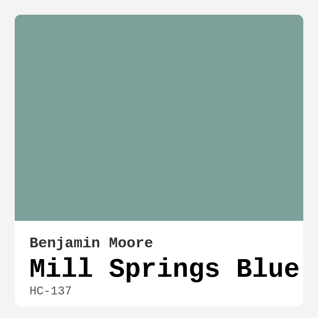
Color Preview & Key Details
| HEX Code | #7DA19A |
| RGB | 125, 161, 154 |
| LRV | 33.57% |
| Undertone | Green and Blue |
| Finish Options | Eggshell, Matte, Satin |
Imagine stepping into a room that instantly wraps you in a sense of calm—a space where the worries of the day seem to float away, replaced by an atmosphere of tranquility and peace. This is exactly what you can achieve with Mill Springs Blue by Benjamin Moore. This soothing, muted teal is more than just a pretty color; it’s a versatile shade that can transform any area of your home into a serene oasis.
Let’s dive into why Mill Springs Blue might just be the perfect choice for your next painting project.
First off, let’s talk about the color itself. Mill Springs Blue is a delightful mix of green and blue, with an LRV (Light Reflectance Value) of 33.57%. This places it squarely in the medium color range, meaning it reflects a good amount of light, allowing it to brighten spaces without being overpowering. You’ll find that in daylight, it exhibits a lively vibrancy, reminiscent of tranquil waters or clear skies. As the day transitions to evening, this shade takes on a more subdued tone, creating a cozy and inviting atmosphere.
One of the standout features of Mill Springs Blue is its calming effect. Whether you’re looking to create a peaceful bedroom, a serene living room, or a cozy home office, this color can help set the right mood. It’s particularly suited for spaces where relaxation is key, such as a nursery or a meditation corner. Imagine soft lighting illuminating this color, transforming your space into a sanctuary you can escape to after a long day.
Now, how does it pair with other colors? This is where Mill Springs Blue shines even brighter. Its muted nature means it can effortlessly blend with a variety of decor styles, from coastal to modern farmhouse, Scandinavian, or even transitional designs. Pair it with crisp white trim, like Benjamin Moore’s Simply White or White Dove, for a classic and clean look. If you’re leaning towards a more natural feel, consider using wood trim to add warmth and texture. And for those who love a touch of drama, black accents can create a striking contrast that adds depth to your space.
Worried about how it will look in a small room? Don’t be. Mill Springs Blue can work wonders in compact spaces, making them feel airy and open. When combined with lighter furniture and bright accents, it invites relaxation without feeling cramped. Just be mindful of the lighting; sufficient natural light will help maintain its vibrancy, while darker corners may require a bit more consideration.
When it comes to application, Mill Springs Blue is incredibly beginner-friendly. It’s roller-ready and brush smooth, which means you don’t have to be a pro to get a beautiful finish. Plus, it dries quickly, allowing you to enjoy your newly painted space sooner rather than later. And let’s not forget about the washability factor. This paint is highly washable and easy to touch up, making it practical for family-friendly homes or busy spaces.
Another point worth mentioning is its low VOC content. If you’re conscious about the environment or simply want to minimize indoor air pollutants, you’ll appreciate that Mill Springs Blue is eco-certified. It’s a choice you can feel good about, knowing that it contributes to a healthier home environment.
As with any color, there are considerations to keep in mind. In low light, Mill Springs Blue may appear darker, so it’s essential to test the shade in your space before committing. Additionally, while it pairs beautifully with a range of colors, be cautious with overly warm tones, as they can sometimes clash with its cool undertones.
Let’s explore some practical applications for this lovely hue. Mill Springs Blue works wonderfully as an accent color, perfect for an accent wall that draws the eye without overwhelming the room. It’s equally stunning when used on all interior walls, creating a cohesive and calming environment. You can even use it on furniture for a refreshing pop of color that complements the decor around it.
For those experimenting with color, you might want to consider some lighter shades to create depth. Colors like 690 or 689 can provide a lovely gradient effect, while darker shades like 685 or HC-136 can add sophistication and drama. Mill Springs Blue also pairs well with complementary shades, including soft reds or earthy neutrals, for those looking to add a little contrast.
Finally, the mood Mill Springs Blue evokes is nothing short of inviting. It’s calm yet vibrant, restful yet refreshing—qualities that can enhance any room’s ambiance. This color invites conversation and connection, making it ideal for living rooms and dining areas where memories are made and shared.
So, if you’re looking to create a space that feels serene, refreshing, and beautifully designed, Mill Springs Blue could be the answer. Take the time to test this color in your home; observe it in different lighting conditions and see how it interacts with your existing decor. You might just discover that Mill Springs Blue isn’t just a color; it’s the key to crafting your dream home.
In conclusion, choosing the right paint color can be a transformative experience in your home. Mill Springs Blue, with its tranquil spirit and versatility, is worthy of consideration for your next project. It invites you to embrace its soothing presence, creating spaces that feel both stylish and restorative. So, grab that paintbrush, and let Mill Springs Blue work its magic in your home!
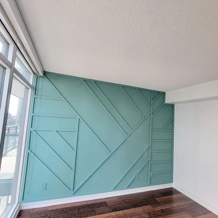
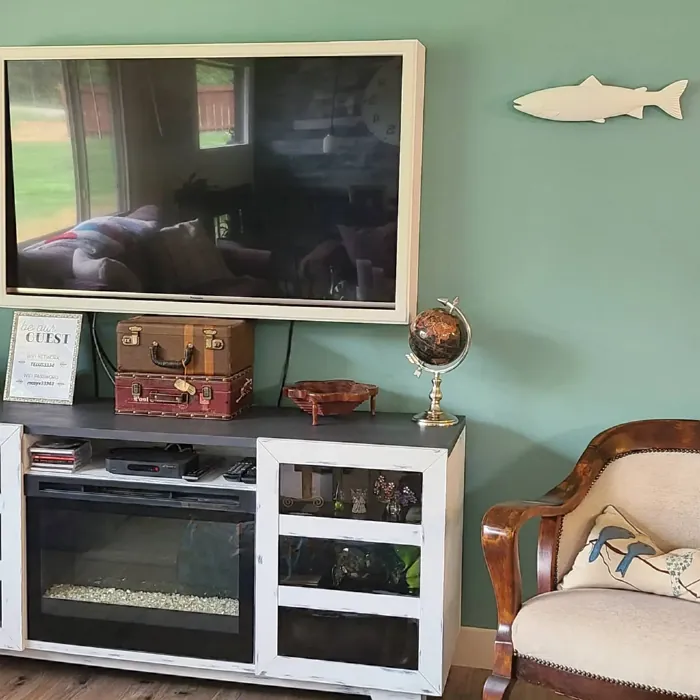
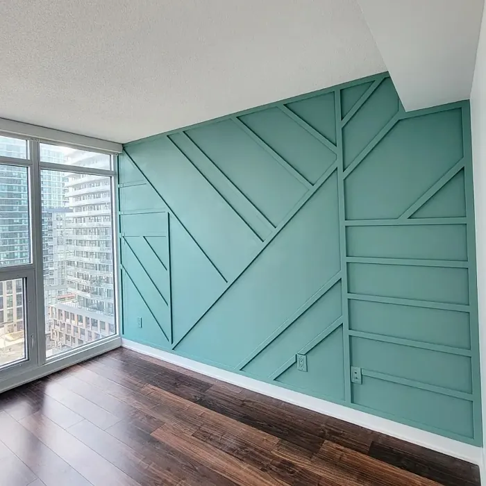
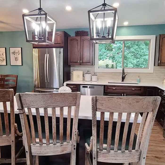
Real Room Photo of Mill Springs Blue HC-137
Undertones of Mill Springs Blue ?
The undertones of Mill Springs Blue are a key aspect of its character, leaning towards Green and Blue. These subtle underlying hues are what give the color its depth and complexity. For example, a gray with a blue undertone will feel cooler and more modern, while one with a brown undertone will feel warmer and more traditional. It’s essential to test this paint in your home and observe it next to your existing furniture, flooring, and decor to see how these undertones interact and reveal themselves throughout the day.
HEX value: #7DA19A
RGB code: 125, 161, 154
Is Mill Springs Blue Cool or Warm?
This hue leans towards the cool side of the spectrum, making it ideal for spaces that need a refreshing touch without being overly stark. The cool undertones can help balance warmer decor elements, creating an inviting atmosphere.
Understanding Color Properties and Interior Design Tips
Hue refers to a specific position on the color wheel, measured in degrees from 0 to 360. Each degree represents a different pure color:
- 0° represents red
- 120° represents green
- 240° represents blue
Saturation describes the intensity or purity of a color and is expressed as a percentage:
- At 0%, the color appears completely desaturated—essentially a shade of gray
- At 100%, the color is at its most vivid and vibrant
Lightness indicates how light or dark a color is, also expressed as a percentage:
- 0% lightness results in black
- 100% lightness results in white
Using Warm Colors in Interior Design
Warm hues—such as reds, oranges, yellows, warm beiges, and greiges—are excellent choices for creating inviting and energetic spaces. These colors are particularly well-suited for:
- Kitchens, living rooms, and bathrooms, where warmth enhances comfort and sociability
- Large rooms, where warm tones can help reduce the sense of emptiness and make the space feel more intimate
For example:
- Warm beige shades provide a cozy, inviting atmosphere, ideal for living rooms, bedrooms, and hallways.
- Warm greige (a mix of beige and gray) offers the warmth of beige with the modern appeal of gray, making it a versatile backdrop for dining areas, bedrooms, and living spaces.
However, be mindful when using warm light tones in rooms with limited natural light. These shades may appear muted or even take on an unpleasant yellowish tint. To avoid a dull or flat appearance:
- Add depth by incorporating richer tones like deep greens, charcoal, or chocolate brown
- Use textured elements such as curtains, rugs, or cushions to bring dimension to the space
Pro Tip: Achieving Harmony with Warm and Cool Color Balance
To create a well-balanced and visually interesting interior, mix warm and cool tones strategically. This contrast adds depth and harmony to your design.
- If your walls feature warm hues, introduce cool-colored accents such as blue or green furniture, artwork, or accessories to create contrast.
- For a polished look, consider using a complementary color scheme, which pairs colors opposite each other on the color wheel (e.g., red with green, orange with blue).
This thoughtful mix not only enhances visual appeal but also creates a space that feels both dynamic and cohesive.
Light Temperature Affects on Mill Springs Blue
Natural Light
Natural daylight changes in color temperature as the sun moves across the sky. At sunrise and sunset, the light tends to have a warm, golden tone with a color temperature around 2000 Kelvin (K). As the day progresses and the sun rises higher, the light becomes cooler and more neutral. Around midday, especially when the sky is clear, natural light typically reaches its peak brightness and shifts to a cooler tone, ranging from 5500 to 6500 Kelvin. This midday light is close to what we perceive as pure white or daylight-balanced light.
These shifts in natural light can significantly influence how colors appear in a space, which is why designers often consider both the time of day and the orientation of windows when planning interior color schemes.
Artificial Light
When choosing artificial lighting, pay close attention to the color temperature, measured in Kelvin (K). This determines how warm or cool the light will appear. Lower temperatures, around 2700K, give off a warm, yellow glow often used in living rooms or bedrooms. Higher temperatures, above 5000K, create a cool, bluish light similar to daylight, commonly used in kitchens, offices, or task areas.
Use the slider to see how lighting temperature can affect the appearance of a surface or color throughout a space.


4800K
LRV of Mill Springs Blue
The Light Reflectance Value (LRV) of Mill Springs Blue is 33.57%, which places it in the Medium colors category. This means it reflect a lot of light. Understanding a paint’s LRV is crucial for predicting how it will look in your space. A higher LRV indicates a lighter color that reflects more light, making rooms feel larger and brighter. A lower LRV signifies a darker color that absorbs more light, creating a cozier, more intimate atmosphere. Always consider the natural and artificial lighting in your room when selecting a paint color based on its LRV.
Detailed Review of Mill Springs Blue
Additional Paint Characteristics
Ideal Rooms
Bedroom, Dining Room, Home Office, Living Room, Nursery
Decor Styles
Coastal, Modern Farmhouse, Scandinavian, Transitional
Coverage
Good (1–2 Coats), Touch-Up Friendly
Ease of Application
Beginner Friendly, Brush Smooth, Fast-Drying, Roller-Ready
Washability
Highly Washable, Washable
VOC Level
Eco-Certified, Low VOC
Best Use
Accent Wall, Furniture, Interior Walls
Room Suitability
Bedroom, Home Office, Living Room, Nursery
Tone Tag
Cool, Earthy, Muted
Finish Type
Eggshell, Matte, Satin
Paint Performance
Easy Touch-Up, Fade Resistant, Low Odor
Use Cases
Best for Low Light Rooms, Best for Modern Farmhouse, Best for Rentals
Mood
Calm, Inviting, Restful
Trim Pairing
Complements Wood Trim, Matches Pure White, Pairs with White Dove
When it comes to versatility, Mill Springs Blue stands out. This color shines in both bright and dim light, adapting beautifully to the ambiance of your room. In natural light, it appears more vibrant, while in artificial light, it takes on a more muted tone, creating a cozy yet sophisticated feel. Its calming effect makes it an excellent choice for bedrooms or spaces where relaxation is key. Plus, it pairs wonderfully with white trim or wood accents, enhancing its appeal. Whether you’re painting an accent wall or redoing an entire room, Mill Springs Blue can elevate your home’s aesthetic effortlessly.
Pros & Cons of HC-137 Mill Springs Blue
Pros
Cons
Colors that go with Benjamin Moore Mill Springs Blue
FAQ on HC-137 Mill Springs Blue
Can Mill Springs Blue be used in a small space?
Absolutely! Mill Springs Blue can work wonders in small spaces. Its soothing tones can make a room feel larger and more open. When paired with brighter accents or lighter furniture, it can create a cozy yet airy feel that invites relaxation. Just ensure you balance it with sufficient lighting to maintain its vibrancy.
What trim colors pair best with Mill Springs Blue?
Mill Springs Blue pairs beautifully with a variety of trim colors. For a classic look, white trim, like Simply White or White Dove, creates a crisp contrast that highlights the blue’s soothing nature. If you prefer a warmer touch, natural wood trim works wonderfully, adding warmth and texture. For a bolder statement, consider black windows or accents, which can add depth and drama to your space.
Comparisons Mill Springs Blue with other colors
Mill Springs Blue HC-137 vs Acacia Haze SW 9132
| Attribute | Mill Springs Blue HC-137 | Acacia Haze SW 9132 |
|---|---|---|
| Color Name | Mill Springs Blue HC-137 | Acacia Haze SW 9132 |
| Color | ||
| Hue | Green | Green |
| Brightness | Medium | Medium |
| RGB | 125, 161, 154 | 150, 156, 146 |
| LRV | 33.57% | 30% |
| Finish Type | Eggshell, Matte, Satin | Eggshell, Satin |
| Finish Options | Eggshell, Matte, Satin | Eggshell, Matte, Satin |
| Ideal Rooms | Bedroom, Dining Room, Home Office, Living Room, Nursery | Bedroom, Dining Room, Home Office, Living Room, Nursery |
| Decor Styles | Coastal, Modern Farmhouse, Scandinavian, Transitional | Bohemian, Coastal, Modern Farmhouse, Scandinavian |
| Coverage | Good (1–2 Coats), Touch-Up Friendly | Good (1–2 Coats), Touch-Up Friendly |
| Ease of Application | Beginner Friendly, Brush Smooth, Fast-Drying, Roller-Ready | Beginner Friendly, Brush Smooth, Roller-Ready |
| Washability | Highly Washable, Washable | Washable, Wipeable |
| Room Suitability | Bedroom, Home Office, Living Room, Nursery | Bedroom, Home Office, Living Room, Nursery |
| Tone | Cool, Earthy, Muted | Balanced, Earthy, Muted |
| Paint Performance | Easy Touch-Up, Fade Resistant, Low Odor | Easy Touch-Up, High Coverage, Low Odor |
Mill Springs Blue HC-137 vs Evergreen Fog SW 9130
| Attribute | Mill Springs Blue HC-137 | Evergreen Fog SW 9130 |
|---|---|---|
| Color Name | Mill Springs Blue HC-137 | Evergreen Fog SW 9130 |
| Color | ||
| Hue | Green | Green |
| Brightness | Medium | Medium |
| RGB | 125, 161, 154 | 149, 151, 138 |
| LRV | 33.57% | 30% |
| Finish Type | Eggshell, Matte, Satin | Eggshell, Matte, Satin |
| Finish Options | Eggshell, Matte, Satin | Eggshell, Matte, Satin |
| Ideal Rooms | Bedroom, Dining Room, Home Office, Living Room, Nursery | Bedroom, Dining Room, Home Office, Living Room, Nursery |
| Decor Styles | Coastal, Modern Farmhouse, Scandinavian, Transitional | Coastal, Modern Farmhouse, Rustic, Scandinavian, Transitional |
| Coverage | Good (1–2 Coats), Touch-Up Friendly | Good (1–2 Coats), Touch-Up Friendly |
| Ease of Application | Beginner Friendly, Brush Smooth, Fast-Drying, Roller-Ready | Beginner Friendly, Brush Smooth, Roller-Ready |
| Washability | Highly Washable, Washable | Scrubbable, Washable |
| Room Suitability | Bedroom, Home Office, Living Room, Nursery | Bedroom, Dining Room, Home Office, Living Room, Nursery |
| Tone | Cool, Earthy, Muted | Balanced, Earthy, Muted |
| Paint Performance | Easy Touch-Up, Fade Resistant, Low Odor | Easy Touch-Up, Low Odor, Scuff Resistant |
Mill Springs Blue HC-137 vs Clary Sage SW 6178
| Attribute | Mill Springs Blue HC-137 | Clary Sage SW 6178 |
|---|---|---|
| Color Name | Mill Springs Blue HC-137 | Clary Sage SW 6178 |
| Color | ||
| Hue | Green | Green |
| Brightness | Medium | Medium |
| RGB | 125, 161, 154 | 172, 173, 151 |
| LRV | 33.57% | 24% |
| Finish Type | Eggshell, Matte, Satin | Eggshell, Matte |
| Finish Options | Eggshell, Matte, Satin | Eggshell, Matte, Satin |
| Ideal Rooms | Bedroom, Dining Room, Home Office, Living Room, Nursery | Bathroom, Bedroom, Home Office, Kitchen, Living Room |
| Decor Styles | Coastal, Modern Farmhouse, Scandinavian, Transitional | Bohemian, Minimalist, Modern Farmhouse, Scandinavian, Traditional |
| Coverage | Good (1–2 Coats), Touch-Up Friendly | Good (1–2 Coats), Touch-Up Friendly |
| Ease of Application | Beginner Friendly, Brush Smooth, Fast-Drying, Roller-Ready | Beginner Friendly, Brush Smooth, Roller-Ready |
| Washability | Highly Washable, Washable | Washable, Wipeable |
| Room Suitability | Bedroom, Home Office, Living Room, Nursery | Bathroom, Bedroom, Home Office, Kitchen, Living Room |
| Tone | Cool, Earthy, Muted | Cool, Earthy, Muted |
| Paint Performance | Easy Touch-Up, Fade Resistant, Low Odor | Easy Touch-Up, High Coverage, Low Odor |
Mill Springs Blue HC-137 vs Softened Green SW 6177
| Attribute | Mill Springs Blue HC-137 | Softened Green SW 6177 |
|---|---|---|
| Color Name | Mill Springs Blue HC-137 | Softened Green SW 6177 |
| Color | ||
| Hue | Green | Green |
| Brightness | Medium | Medium |
| RGB | 125, 161, 154 | 187, 188, 167 |
| LRV | 33.57% | 48% |
| Finish Type | Eggshell, Matte, Satin | Eggshell, Matte, Satin |
| Finish Options | Eggshell, Matte, Satin | Eggshell, Matte, Satin |
| Ideal Rooms | Bedroom, Dining Room, Home Office, Living Room, Nursery | Bathroom, Bedroom, Dining Room, Home Office, Kitchen, Living Room, Nursery |
| Decor Styles | Coastal, Modern Farmhouse, Scandinavian, Transitional | Coastal, Farmhouse, Minimalist, Modern, Scandinavian |
| Coverage | Good (1–2 Coats), Touch-Up Friendly | Good (1–2 Coats), Touch-Up Friendly |
| Ease of Application | Beginner Friendly, Brush Smooth, Fast-Drying, Roller-Ready | Beginner Friendly, Brush Smooth, Fast-Drying, Roller-Ready |
| Washability | Highly Washable, Washable | Washable, Wipeable |
| Room Suitability | Bedroom, Home Office, Living Room, Nursery | Bathroom, Bedroom, Dining Room, Home Office, Kitchen, Living Room |
| Tone | Cool, Earthy, Muted | Calm, Earthy, Muted |
| Paint Performance | Easy Touch-Up, Fade Resistant, Low Odor | Easy Touch-Up, Fade Resistant, Low Odor, Quick Drying |
Mill Springs Blue HC-137 vs Eventide SW 9643
| Attribute | Mill Springs Blue HC-137 | Eventide SW 9643 |
|---|---|---|
| Color Name | Mill Springs Blue HC-137 | Eventide SW 9643 |
| Color | ||
| Hue | Green | Green |
| Brightness | Medium | Medium |
| RGB | 125, 161, 154 | 163, 175, 172 |
| LRV | 33.57% | 24% |
| Finish Type | Eggshell, Matte, Satin | Eggshell, Matte, Satin |
| Finish Options | Eggshell, Matte, Satin | Eggshell, Matte, Satin |
| Ideal Rooms | Bedroom, Dining Room, Home Office, Living Room, Nursery | Bedroom, Home Office, Kitchen, Living Room, Nursery |
| Decor Styles | Coastal, Modern Farmhouse, Scandinavian, Transitional | Coastal, Contemporary, Minimalist, Modern |
| Coverage | Good (1–2 Coats), Touch-Up Friendly | Good (1–2 Coats), Touch-Up Friendly |
| Ease of Application | Beginner Friendly, Brush Smooth, Fast-Drying, Roller-Ready | Beginner Friendly, Brush Smooth, Fast-Drying, Roller-Ready |
| Washability | Highly Washable, Washable | Washable, Wipeable |
| Room Suitability | Bedroom, Home Office, Living Room, Nursery | Bedroom, Home Office, Living Room, Nursery |
| Tone | Cool, Earthy, Muted | Airy, Balanced, Cool, Muted |
| Paint Performance | Easy Touch-Up, Fade Resistant, Low Odor | Easy Touch-Up, High Coverage, Low Odor, Quick Drying |
Mill Springs Blue HC-137 vs Escape Gray SW 6185
| Attribute | Mill Springs Blue HC-137 | Escape Gray SW 6185 |
|---|---|---|
| Color Name | Mill Springs Blue HC-137 | Escape Gray SW 6185 |
| Color | ||
| Hue | Green | Green |
| Brightness | Medium | Medium |
| RGB | 125, 161, 154 | 171, 172, 159 |
| LRV | 33.57% | 48% |
| Finish Type | Eggshell, Matte, Satin | Eggshell, Matte |
| Finish Options | Eggshell, Matte, Satin | Eggshell, Matte, Satin |
| Ideal Rooms | Bedroom, Dining Room, Home Office, Living Room, Nursery | Bathroom, Bedroom, Entryway, Home Office, Living Room |
| Decor Styles | Coastal, Modern Farmhouse, Scandinavian, Transitional | Minimalist, Modern, Scandinavian, Transitional |
| Coverage | Good (1–2 Coats), Touch-Up Friendly | Good (1–2 Coats) |
| Ease of Application | Beginner Friendly, Brush Smooth, Fast-Drying, Roller-Ready | Beginner Friendly, Brush Smooth, Roller-Ready |
| Washability | Highly Washable, Washable | Highly Washable, Washable |
| Room Suitability | Bedroom, Home Office, Living Room, Nursery | Bathroom, Bedroom, Home Office, Living Room |
| Tone | Cool, Earthy, Muted | Cool, Muted, Neutral, Warm |
| Paint Performance | Easy Touch-Up, Fade Resistant, Low Odor | Easy Touch-Up, Low Odor, Scuff Resistant |
Mill Springs Blue HC-137 vs Coastal Plain SW 6192
| Attribute | Mill Springs Blue HC-137 | Coastal Plain SW 6192 |
|---|---|---|
| Color Name | Mill Springs Blue HC-137 | Coastal Plain SW 6192 |
| Color | ||
| Hue | Green | Green |
| Brightness | Medium | Medium |
| RGB | 125, 161, 154 | 159, 166, 148 |
| LRV | 33.57% | 66% |
| Finish Type | Eggshell, Matte, Satin | Eggshell, Satin |
| Finish Options | Eggshell, Matte, Satin | Eggshell, Satin, Semi-Gloss |
| Ideal Rooms | Bedroom, Dining Room, Home Office, Living Room, Nursery | Bathroom, Bedroom, Home Office, Kitchen, Living Room |
| Decor Styles | Coastal, Modern Farmhouse, Scandinavian, Transitional | Bohemian, Coastal, Contemporary, Modern Farmhouse, Rustic |
| Coverage | Good (1–2 Coats), Touch-Up Friendly | Good (1–2 Coats) |
| Ease of Application | Beginner Friendly, Brush Smooth, Fast-Drying, Roller-Ready | Beginner Friendly, Brush Smooth, Fast-Drying, Roller-Ready |
| Washability | Highly Washable, Washable | Scrubbable, Washable |
| Room Suitability | Bedroom, Home Office, Living Room, Nursery | Bathroom, Bedroom, Dining Room, Home Office, Kitchen, Living Room |
| Tone | Cool, Earthy, Muted | Cool, Earthy, Muted |
| Paint Performance | Easy Touch-Up, Fade Resistant, Low Odor | High Coverage, Low Odor, Quick Drying |
Mill Springs Blue HC-137 vs Contented SW 6191
| Attribute | Mill Springs Blue HC-137 | Contented SW 6191 |
|---|---|---|
| Color Name | Mill Springs Blue HC-137 | Contented SW 6191 |
| Color | ||
| Hue | Green | Green |
| Brightness | Medium | Medium |
| RGB | 125, 161, 154 | 189, 192, 179 |
| LRV | 33.57% | 45% |
| Finish Type | Eggshell, Matte, Satin | Eggshell, Matte, Satin |
| Finish Options | Eggshell, Matte, Satin | Eggshell, Matte, Satin |
| Ideal Rooms | Bedroom, Dining Room, Home Office, Living Room, Nursery | Bedroom, Dining Room, Home Office, Kitchen, Living Room |
| Decor Styles | Coastal, Modern Farmhouse, Scandinavian, Transitional | Contemporary, Minimalist, Modern, Scandinavian, Transitional |
| Coverage | Good (1–2 Coats), Touch-Up Friendly | Good (1–2 Coats), Touch-Up Friendly |
| Ease of Application | Beginner Friendly, Brush Smooth, Fast-Drying, Roller-Ready | Beginner Friendly, Brush Smooth, Roller-Ready |
| Washability | Highly Washable, Washable | Stain Resistant, Washable |
| Room Suitability | Bedroom, Home Office, Living Room, Nursery | Bedroom, Dining Room, Home Office, Kitchen, Living Room |
| Tone | Cool, Earthy, Muted | Muted, Neutral, Warm |
| Paint Performance | Easy Touch-Up, Fade Resistant, Low Odor | Easy Touch-Up, High Coverage, Low Odor |
Mill Springs Blue HC-137 vs Jade Dragon SW 9129
| Attribute | Mill Springs Blue HC-137 | Jade Dragon SW 9129 |
|---|---|---|
| Color Name | Mill Springs Blue HC-137 | Jade Dragon SW 9129 |
| Color | ||
| Hue | Green | Green |
| Brightness | Medium | Medium |
| RGB | 125, 161, 154 | 144, 152, 134 |
| LRV | 33.57% | 12% |
| Finish Type | Eggshell, Matte, Satin | Eggshell, Matte, Satin |
| Finish Options | Eggshell, Matte, Satin | Eggshell, Matte, Satin |
| Ideal Rooms | Bedroom, Dining Room, Home Office, Living Room, Nursery | Bedroom, Dining Room, Home Office, Living Room, Nursery |
| Decor Styles | Coastal, Modern Farmhouse, Scandinavian, Transitional | Bohemian, Minimalist, Modern, Traditional, Transitional |
| Coverage | Good (1–2 Coats), Touch-Up Friendly | Good (1–2 Coats), Touch-Up Friendly |
| Ease of Application | Beginner Friendly, Brush Smooth, Fast-Drying, Roller-Ready | Beginner Friendly, Brush Smooth, Fast-Drying, Roller-Ready |
| Washability | Highly Washable, Washable | Highly Washable, Stain Resistant, Washable |
| Room Suitability | Bedroom, Home Office, Living Room, Nursery | Bedroom, Dining Room, Home Office, Living Room, Nursery |
| Tone | Cool, Earthy, Muted | Balanced, Cool, Earthy, Muted |
| Paint Performance | Easy Touch-Up, Fade Resistant, Low Odor | Easy Touch-Up, Fade Resistant, Low Odor, Stain Resistant |
Mill Springs Blue HC-137 vs Underseas SW 6214
| Attribute | Mill Springs Blue HC-137 | Underseas SW 6214 |
|---|---|---|
| Color Name | Mill Springs Blue HC-137 | Underseas SW 6214 |
| Color | ||
| Hue | Green | Green |
| Brightness | Medium | Medium |
| RGB | 125, 161, 154 | 124, 142, 135 |
| LRV | 33.57% | 24% |
| Finish Type | Eggshell, Matte, Satin | Eggshell, Matte, Satin |
| Finish Options | Eggshell, Matte, Satin | Eggshell, Matte, Satin |
| Ideal Rooms | Bedroom, Dining Room, Home Office, Living Room, Nursery | Bathroom, Bedroom, Dining Room, Hallway, Home Office, Living Room |
| Decor Styles | Coastal, Modern Farmhouse, Scandinavian, Transitional | Coastal, Eclectic, Farmhouse, Modern, Scandinavian |
| Coverage | Good (1–2 Coats), Touch-Up Friendly | Good (1–2 Coats), Touch-Up Friendly |
| Ease of Application | Beginner Friendly, Brush Smooth, Fast-Drying, Roller-Ready | Beginner Friendly, Brush Smooth, Fast-Drying, Roller-Ready |
| Washability | Highly Washable, Washable | Highly Washable, Washable, Wipeable |
| Room Suitability | Bedroom, Home Office, Living Room, Nursery | Bathroom, Bedroom, Dining Room, Home Office, Living Room |
| Tone | Cool, Earthy, Muted | Balanced, Cool, Earthy, Muted |
| Paint Performance | Easy Touch-Up, Fade Resistant, Low Odor | Easy Touch-Up, Fade Resistant, High Coverage, Low Odor |
Official Page of Benjamin Moore Mill Springs Blue HC-137