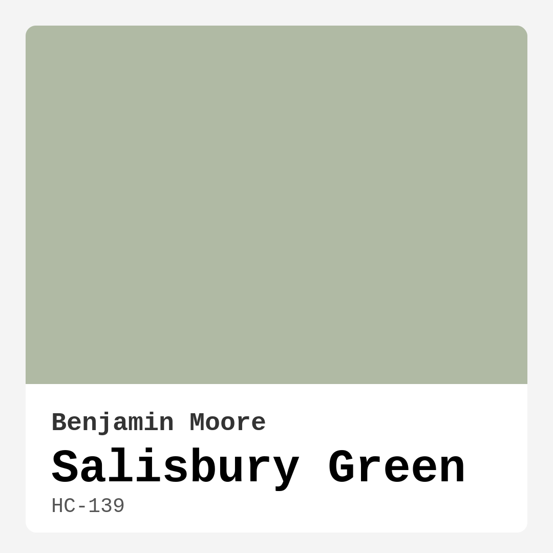
Color Preview & Key Details
| HEX Code | #B0BAA4 |
| RGB | 176, 186, 164 |
| LRV | 46.39% |
| Undertone | Green |
| Finish Options | Eggshell, Matte, Satin, Semi-Gloss |
Imagine stepping into a room that feels as serene as a walk through a lush forest, where the air is fresh, and your mind feels instantly at ease. That’s the magic of Salisbury Green, a paint color from Benjamin Moore that transports you to a tranquil oasis right in your own home. It’s more than just a color; it’s a feeling, a mood, and an invitation to create a space that resonates with comfort and calm.
Salisbury Green, with its soft, muted hue, is like a whisper of nature captured on your walls. The gentle green undertones evoke images of rolling hills and peaceful gardens, making it a perfect choice for anyone looking to enhance their living space with a touch of the outdoors. This shade isn’t just about aesthetics; it’s about fostering an atmosphere of relaxation and harmony. Whether you’re updating your living room, bedroom, or even your kitchen, Salisbury Green provides a versatile backdrop that works seamlessly with modern and traditional decor alike.
One of the standout features of Salisbury Green is how beautifully it interacts with light. With a Light Reflectance Value (LRV) of 46.39%, this color reflects half of the light that hits it, creating a soft glow that brightens your space without being overwhelming. In rooms flooded with natural light, Salisbury Green shines brightly, enhancing its refreshing qualities. Conversely, in lower light conditions, it takes on a more subdued and cozy vibe, making it a prime candidate for spaces where you want to foster intimacy and warmth.
Imagine curling up with a good book in a bedroom painted in Salisbury Green, its muted tones wrapping you in a comforting embrace. It’s also a fantastic choice for home offices, where creativity and productivity need to flourish in a calming environment. The color adapts beautifully, making it suitable for various applications—from accent walls to cabinetry—allowing your personality and style to shine through every room.
Thinking about how Salisbury Green fits with your existing decor? You’ll be pleased to know that this hue is incredibly versatile. It pairs beautifully with soft whites for a crisp, clean look, creating a refreshing contrast that feels both modern and inviting. For a more rustic atmosphere, consider combining it with muted earth tones. The warmth of Salisbury Green makes it a lovely companion to wood finishes and brass fixtures, grounding your space while adding a touch of elegance.
When it comes to complementary colors, Salisbury Green opens up a world of design possibilities. Think about using deep blues or soft whites to create a harmonious dialogue in your space. These colors can highlight the green’s earthy undertones, adding depth and interest to your design. You could even explore bolder accent shades like warm oranges or rich jewel tones to create a more dynamic palette that reflects your unique taste.
If you’re concerned about how this color will perform in smaller spaces, worry not! Salisbury Green has a knack for creating an illusion of depth and openness, which can make your room feel larger and more inviting. Just remember to ensure that your space has adequate lighting; this will allow the color to truly shine and bring out its best qualities.
Now, let’s talk about the practical aspects of using Salisbury Green in your home. This paint is beginner-friendly, featuring a smooth application that’s roller-ready and brush-friendly. It dries quickly, which means you can move on to your next project without long waits. Plus, with a low VOC formulation, you can feel good about using it in your home, knowing that it contributes to healthier indoor air quality.
But every color has its quirks, and Salisbury Green is no exception. In dim lighting, it can appear darker than expected, so it’s essential to consider your room’s lighting when making your final decision. It might also require a couple of coats for full coverage in some cases, but the results are well worth the effort.
If you’re looking to pair Salisbury Green with trim, consider using White Dove for a classic, sophisticated contrast. This combination not only highlights the soft green but also enhances the overall brightness of your space. It’s a timeless pairing that elevates the room’s sophistication while maintaining a warm and inviting atmosphere.
When you’re decorating with Salisbury Green, think about the overall mood you want to create. This color exudes calmness, making it a great choice for spaces designed for relaxation or social interaction. It invites conversation and connection, making it ideal for living rooms and dining areas where family and friends gather.
To really maximize the impact of Salisbury Green, don’t forget to test it in your home. Observe how it looks throughout the day as the light shifts. You’ll notice how the undertones reveal themselves, creating a dynamic experience that changes with the time of day. This careful consideration will ensure that the color aligns perfectly with your vision for your space.
In conclusion, Salisbury Green by Benjamin Moore is more than just a paint color; it’s a transformative element that can redefine your home’s atmosphere. Its versatility, calming presence, and ability to work with various decor styles make it a top choice for anyone looking to enhance their living space. So, if you’re ready to bring a bit of nature indoors and create a soothing environment, why not consider Salisbury Green? It could be the perfect shade to turn your house into a home that feels as welcoming as it does beautiful.
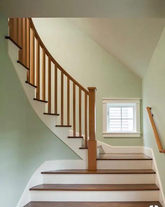
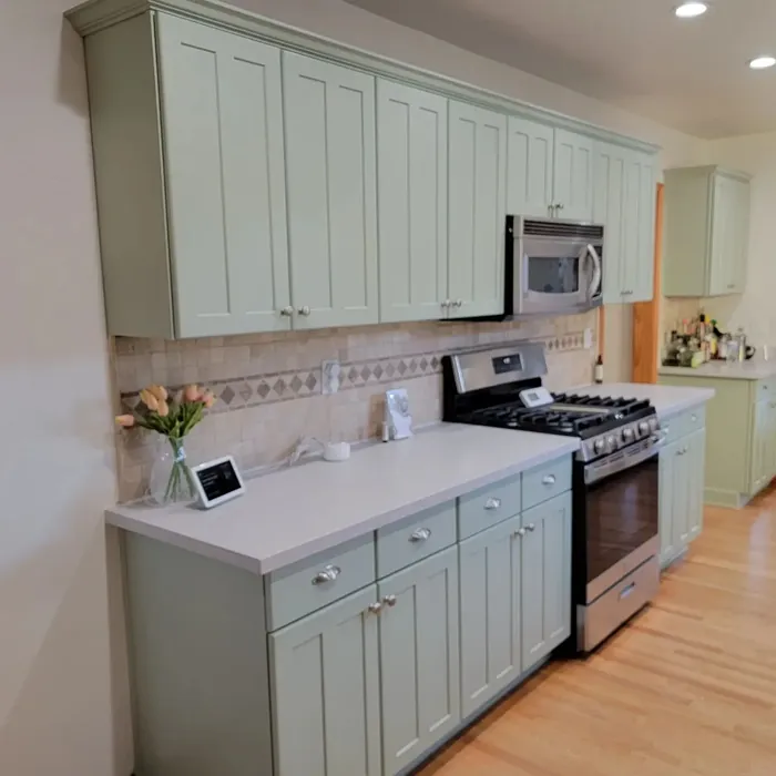
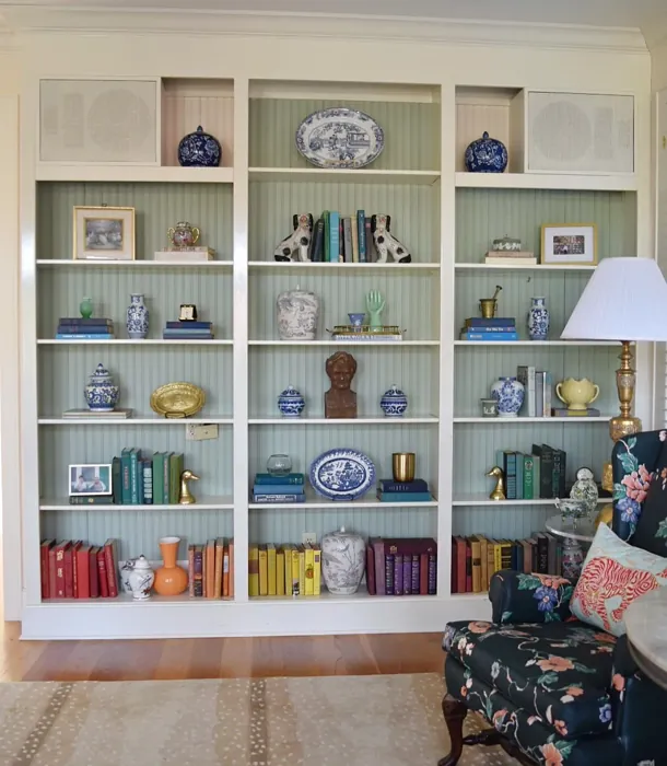
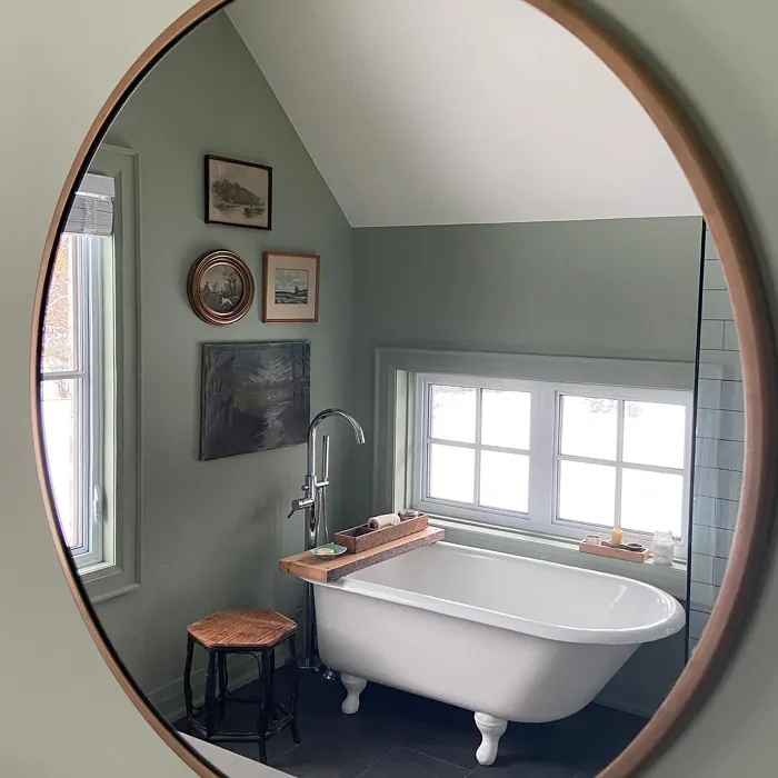
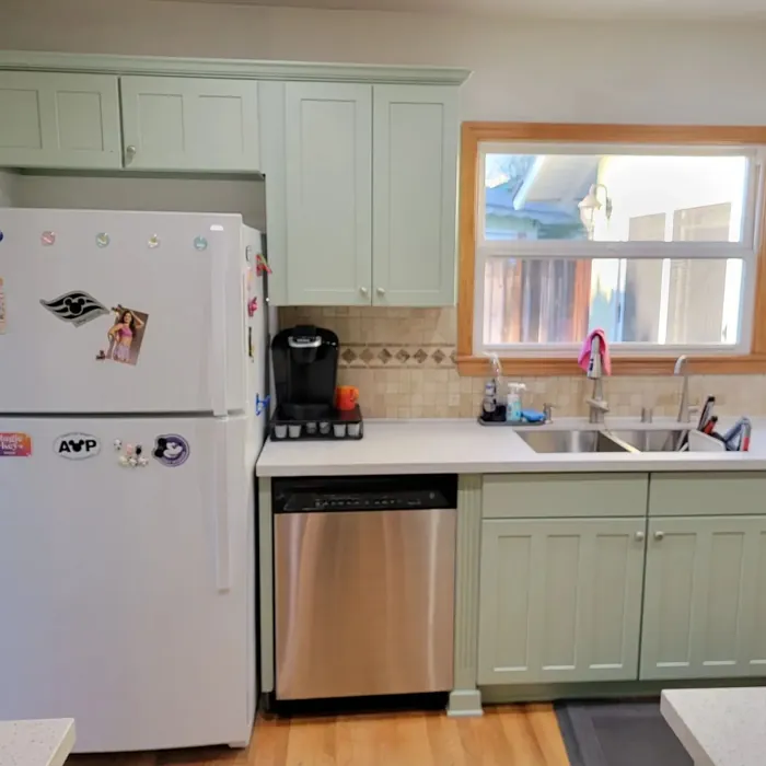
Real Room Photo of Salisbury Green HC-139
Undertones of Salisbury Green ?
The undertones of Salisbury Green are a key aspect of its character, leaning towards Green. These subtle underlying hues are what give the color its depth and complexity. For example, a gray with a blue undertone will feel cooler and more modern, while one with a brown undertone will feel warmer and more traditional. It’s essential to test this paint in your home and observe it next to your existing furniture, flooring, and decor to see how these undertones interact and reveal themselves throughout the day.
HEX value: #B0BAA4
RGB code: 176, 186, 164
Is Salisbury Green Cool or Warm?
Salisbury Green is considered a warm paint color. This characteristic plays a huge role in the overall feel of a room. Warm colors, like this one, tend to create a cozy, inviting, and energetic atmosphere, making them great for social spaces like living rooms and dining rooms. In contrast, cool colors often evoke a sense of calm and serenity, which is why they are popular in bedrooms and bathrooms. The warmth of Salisbury Green means it will pair beautifully with corresponding decor elements.
Understanding Color Properties and Interior Design Tips
Hue refers to a specific position on the color wheel, measured in degrees from 0 to 360. Each degree represents a different pure color:
- 0° represents red
- 120° represents green
- 240° represents blue
Saturation describes the intensity or purity of a color and is expressed as a percentage:
- At 0%, the color appears completely desaturated—essentially a shade of gray
- At 100%, the color is at its most vivid and vibrant
Lightness indicates how light or dark a color is, also expressed as a percentage:
- 0% lightness results in black
- 100% lightness results in white
Using Warm Colors in Interior Design
Warm hues—such as reds, oranges, yellows, warm beiges, and greiges—are excellent choices for creating inviting and energetic spaces. These colors are particularly well-suited for:
- Kitchens, living rooms, and bathrooms, where warmth enhances comfort and sociability
- Large rooms, where warm tones can help reduce the sense of emptiness and make the space feel more intimate
For example:
- Warm beige shades provide a cozy, inviting atmosphere, ideal for living rooms, bedrooms, and hallways.
- Warm greige (a mix of beige and gray) offers the warmth of beige with the modern appeal of gray, making it a versatile backdrop for dining areas, bedrooms, and living spaces.
However, be mindful when using warm light tones in rooms with limited natural light. These shades may appear muted or even take on an unpleasant yellowish tint. To avoid a dull or flat appearance:
- Add depth by incorporating richer tones like deep greens, charcoal, or chocolate brown
- Use textured elements such as curtains, rugs, or cushions to bring dimension to the space
Pro Tip: Achieving Harmony with Warm and Cool Color Balance
To create a well-balanced and visually interesting interior, mix warm and cool tones strategically. This contrast adds depth and harmony to your design.
- If your walls feature warm hues, introduce cool-colored accents such as blue or green furniture, artwork, or accessories to create contrast.
- For a polished look, consider using a complementary color scheme, which pairs colors opposite each other on the color wheel (e.g., red with green, orange with blue).
This thoughtful mix not only enhances visual appeal but also creates a space that feels both dynamic and cohesive.
Light Temperature Affects on Salisbury Green
Natural Light
Natural daylight changes in color temperature as the sun moves across the sky. At sunrise and sunset, the light tends to have a warm, golden tone with a color temperature around 2000 Kelvin (K). As the day progresses and the sun rises higher, the light becomes cooler and more neutral. Around midday, especially when the sky is clear, natural light typically reaches its peak brightness and shifts to a cooler tone, ranging from 5500 to 6500 Kelvin. This midday light is close to what we perceive as pure white or daylight-balanced light.
These shifts in natural light can significantly influence how colors appear in a space, which is why designers often consider both the time of day and the orientation of windows when planning interior color schemes.
Artificial Light
When choosing artificial lighting, pay close attention to the color temperature, measured in Kelvin (K). This determines how warm or cool the light will appear. Lower temperatures, around 2700K, give off a warm, yellow glow often used in living rooms or bedrooms. Higher temperatures, above 5000K, create a cool, bluish light similar to daylight, commonly used in kitchens, offices, or task areas.
Use the slider to see how lighting temperature can affect the appearance of a surface or color throughout a space.


4800K
LRV of Salisbury Green
The Light Reflectance Value (LRV) of Salisbury Green is 46.39%, which places it in the Light Medium colors category. This means it reflect half of the incident light. Understanding a paint’s LRV is crucial for predicting how it will look in your space. A higher LRV indicates a lighter color that reflects more light, making rooms feel larger and brighter. A lower LRV signifies a darker color that absorbs more light, creating a cozier, more intimate atmosphere. Always consider the natural and artificial lighting in your room when selecting a paint color based on its LRV.
Detailed Review of Salisbury Green
Additional Paint Characteristics
Ideal Rooms
Bedroom, Dining Room, Home Office, Kitchen, Living Room, Nursery
Decor Styles
Coastal, Modern Farmhouse, Rustic, Traditional, Transitional
Coverage
Good (1–2 Coats)
Ease of Application
Beginner Friendly, Brush Smooth, Fast-Drying, Roller-Ready
Washability
Washable, Wipeable
VOC Level
Low VOC
Best Use
Accent Wall, Cabinets, Interior Walls, Trim
Room Suitability
Bedroom, Dining Room, Home Office, Kitchen, Living Room
Tone Tag
Balanced, Earthy, Muted
Finish Type
Eggshell, Matte, Satin
Paint Performance
Easy Touch-Up, High Coverage, Low Odor
Use Cases
Best for Low Light Rooms, Best for Rentals, Classic Favorite, Designer Favorite
Mood
Calm, Grounding, Inviting
Trim Pairing
Complements Brass Fixtures, Good with Wood Trim, Pairs with White Dove
Salisbury Green is a versatile and inviting shade that blends easily with various decor styles. Its subtle green undertones create a refreshing atmosphere, making it an excellent choice for spaces where relaxation and comfort are key. Whether you’re transforming a cozy bedroom or a vibrant living room, this color adapts beautifully to the environment. One of the standout features of Salisbury Green is its ability to reflect natural light, enhancing the overall brightness of a room while maintaining a grounded feel. It’s particularly effective in spaces with ample sunlight, where it can highlight the depth of the color. Plus, its muted quality allows it to complement a variety of accent colors, from soft whites to deeper jewel tones, making it a smart choice for any design enthusiast. Overall, this paint can elevate your home’s aesthetic while providing a calming influence.
Pros & Cons of HC-139 Salisbury Green
Pros
Cons
Colors that go with Benjamin Moore Salisbury Green
FAQ on HC-139 Salisbury Green
Is Salisbury Green suitable for small spaces?
Absolutely! Salisbury Green can work wonders in small spaces. Its soft tone creates an illusion of depth and openness, making your area feel larger and more inviting. Just ensure that you have adequate lighting to help it shine.
How does this color work with other shades?
Salisbury Green pairs beautifully with a variety of colors. It complements soft whites for a crisp look, or you can use it alongside muted earth tones for a more rustic feel. Its versatility allows it to adapt, making it an excellent base for your design palette.
Comparisons Salisbury Green with other colors
Salisbury Green HC-139 vs Acacia Haze SW 9132
| Attribute | Salisbury Green HC-139 | Acacia Haze SW 9132 |
|---|---|---|
| Color Name | Salisbury Green HC-139 | Acacia Haze SW 9132 |
| Color | ||
| Hue | Green | Green |
| Brightness | Medium | Medium |
| RGB | 176, 186, 164 | 150, 156, 146 |
| LRV | 46.39% | 30% |
| Finish Type | Eggshell, Matte, Satin | Eggshell, Satin |
| Finish Options | Eggshell, Matte, Satin, Semi-Gloss | Eggshell, Matte, Satin |
| Ideal Rooms | Bedroom, Dining Room, Home Office, Kitchen, Living Room, Nursery | Bedroom, Dining Room, Home Office, Living Room, Nursery |
| Decor Styles | Coastal, Modern Farmhouse, Rustic, Traditional, Transitional | Bohemian, Coastal, Modern Farmhouse, Scandinavian |
| Coverage | Good (1–2 Coats) | Good (1–2 Coats), Touch-Up Friendly |
| Ease of Application | Beginner Friendly, Brush Smooth, Fast-Drying, Roller-Ready | Beginner Friendly, Brush Smooth, Roller-Ready |
| Washability | Washable, Wipeable | Washable, Wipeable |
| Room Suitability | Bedroom, Dining Room, Home Office, Kitchen, Living Room | Bedroom, Home Office, Living Room, Nursery |
| Tone | Balanced, Earthy, Muted | Balanced, Earthy, Muted |
| Paint Performance | Easy Touch-Up, High Coverage, Low Odor | Easy Touch-Up, High Coverage, Low Odor |
Salisbury Green HC-139 vs Evergreen Fog SW 9130
| Attribute | Salisbury Green HC-139 | Evergreen Fog SW 9130 |
|---|---|---|
| Color Name | Salisbury Green HC-139 | Evergreen Fog SW 9130 |
| Color | ||
| Hue | Green | Green |
| Brightness | Medium | Medium |
| RGB | 176, 186, 164 | 149, 151, 138 |
| LRV | 46.39% | 30% |
| Finish Type | Eggshell, Matte, Satin | Eggshell, Matte, Satin |
| Finish Options | Eggshell, Matte, Satin, Semi-Gloss | Eggshell, Matte, Satin |
| Ideal Rooms | Bedroom, Dining Room, Home Office, Kitchen, Living Room, Nursery | Bedroom, Dining Room, Home Office, Living Room, Nursery |
| Decor Styles | Coastal, Modern Farmhouse, Rustic, Traditional, Transitional | Coastal, Modern Farmhouse, Rustic, Scandinavian, Transitional |
| Coverage | Good (1–2 Coats) | Good (1–2 Coats), Touch-Up Friendly |
| Ease of Application | Beginner Friendly, Brush Smooth, Fast-Drying, Roller-Ready | Beginner Friendly, Brush Smooth, Roller-Ready |
| Washability | Washable, Wipeable | Scrubbable, Washable |
| Room Suitability | Bedroom, Dining Room, Home Office, Kitchen, Living Room | Bedroom, Dining Room, Home Office, Living Room, Nursery |
| Tone | Balanced, Earthy, Muted | Balanced, Earthy, Muted |
| Paint Performance | Easy Touch-Up, High Coverage, Low Odor | Easy Touch-Up, Low Odor, Scuff Resistant |
Salisbury Green HC-139 vs Clary Sage SW 6178
| Attribute | Salisbury Green HC-139 | Clary Sage SW 6178 |
|---|---|---|
| Color Name | Salisbury Green HC-139 | Clary Sage SW 6178 |
| Color | ||
| Hue | Green | Green |
| Brightness | Medium | Medium |
| RGB | 176, 186, 164 | 172, 173, 151 |
| LRV | 46.39% | 24% |
| Finish Type | Eggshell, Matte, Satin | Eggshell, Matte |
| Finish Options | Eggshell, Matte, Satin, Semi-Gloss | Eggshell, Matte, Satin |
| Ideal Rooms | Bedroom, Dining Room, Home Office, Kitchen, Living Room, Nursery | Bathroom, Bedroom, Home Office, Kitchen, Living Room |
| Decor Styles | Coastal, Modern Farmhouse, Rustic, Traditional, Transitional | Bohemian, Minimalist, Modern Farmhouse, Scandinavian, Traditional |
| Coverage | Good (1–2 Coats) | Good (1–2 Coats), Touch-Up Friendly |
| Ease of Application | Beginner Friendly, Brush Smooth, Fast-Drying, Roller-Ready | Beginner Friendly, Brush Smooth, Roller-Ready |
| Washability | Washable, Wipeable | Washable, Wipeable |
| Room Suitability | Bedroom, Dining Room, Home Office, Kitchen, Living Room | Bathroom, Bedroom, Home Office, Kitchen, Living Room |
| Tone | Balanced, Earthy, Muted | Cool, Earthy, Muted |
| Paint Performance | Easy Touch-Up, High Coverage, Low Odor | Easy Touch-Up, High Coverage, Low Odor |
Salisbury Green HC-139 vs Softened Green SW 6177
| Attribute | Salisbury Green HC-139 | Softened Green SW 6177 |
|---|---|---|
| Color Name | Salisbury Green HC-139 | Softened Green SW 6177 |
| Color | ||
| Hue | Green | Green |
| Brightness | Medium | Medium |
| RGB | 176, 186, 164 | 187, 188, 167 |
| LRV | 46.39% | 48% |
| Finish Type | Eggshell, Matte, Satin | Eggshell, Matte, Satin |
| Finish Options | Eggshell, Matte, Satin, Semi-Gloss | Eggshell, Matte, Satin |
| Ideal Rooms | Bedroom, Dining Room, Home Office, Kitchen, Living Room, Nursery | Bathroom, Bedroom, Dining Room, Home Office, Kitchen, Living Room, Nursery |
| Decor Styles | Coastal, Modern Farmhouse, Rustic, Traditional, Transitional | Coastal, Farmhouse, Minimalist, Modern, Scandinavian |
| Coverage | Good (1–2 Coats) | Good (1–2 Coats), Touch-Up Friendly |
| Ease of Application | Beginner Friendly, Brush Smooth, Fast-Drying, Roller-Ready | Beginner Friendly, Brush Smooth, Fast-Drying, Roller-Ready |
| Washability | Washable, Wipeable | Washable, Wipeable |
| Room Suitability | Bedroom, Dining Room, Home Office, Kitchen, Living Room | Bathroom, Bedroom, Dining Room, Home Office, Kitchen, Living Room |
| Tone | Balanced, Earthy, Muted | Calm, Earthy, Muted |
| Paint Performance | Easy Touch-Up, High Coverage, Low Odor | Easy Touch-Up, Fade Resistant, Low Odor, Quick Drying |
Salisbury Green HC-139 vs Eventide SW 9643
| Attribute | Salisbury Green HC-139 | Eventide SW 9643 |
|---|---|---|
| Color Name | Salisbury Green HC-139 | Eventide SW 9643 |
| Color | ||
| Hue | Green | Green |
| Brightness | Medium | Medium |
| RGB | 176, 186, 164 | 163, 175, 172 |
| LRV | 46.39% | 24% |
| Finish Type | Eggshell, Matte, Satin | Eggshell, Matte, Satin |
| Finish Options | Eggshell, Matte, Satin, Semi-Gloss | Eggshell, Matte, Satin |
| Ideal Rooms | Bedroom, Dining Room, Home Office, Kitchen, Living Room, Nursery | Bedroom, Home Office, Kitchen, Living Room, Nursery |
| Decor Styles | Coastal, Modern Farmhouse, Rustic, Traditional, Transitional | Coastal, Contemporary, Minimalist, Modern |
| Coverage | Good (1–2 Coats) | Good (1–2 Coats), Touch-Up Friendly |
| Ease of Application | Beginner Friendly, Brush Smooth, Fast-Drying, Roller-Ready | Beginner Friendly, Brush Smooth, Fast-Drying, Roller-Ready |
| Washability | Washable, Wipeable | Washable, Wipeable |
| Room Suitability | Bedroom, Dining Room, Home Office, Kitchen, Living Room | Bedroom, Home Office, Living Room, Nursery |
| Tone | Balanced, Earthy, Muted | Airy, Balanced, Cool, Muted |
| Paint Performance | Easy Touch-Up, High Coverage, Low Odor | Easy Touch-Up, High Coverage, Low Odor, Quick Drying |
Salisbury Green HC-139 vs Escape Gray SW 6185
| Attribute | Salisbury Green HC-139 | Escape Gray SW 6185 |
|---|---|---|
| Color Name | Salisbury Green HC-139 | Escape Gray SW 6185 |
| Color | ||
| Hue | Green | Green |
| Brightness | Medium | Medium |
| RGB | 176, 186, 164 | 171, 172, 159 |
| LRV | 46.39% | 48% |
| Finish Type | Eggshell, Matte, Satin | Eggshell, Matte |
| Finish Options | Eggshell, Matte, Satin, Semi-Gloss | Eggshell, Matte, Satin |
| Ideal Rooms | Bedroom, Dining Room, Home Office, Kitchen, Living Room, Nursery | Bathroom, Bedroom, Entryway, Home Office, Living Room |
| Decor Styles | Coastal, Modern Farmhouse, Rustic, Traditional, Transitional | Minimalist, Modern, Scandinavian, Transitional |
| Coverage | Good (1–2 Coats) | Good (1–2 Coats) |
| Ease of Application | Beginner Friendly, Brush Smooth, Fast-Drying, Roller-Ready | Beginner Friendly, Brush Smooth, Roller-Ready |
| Washability | Washable, Wipeable | Highly Washable, Washable |
| Room Suitability | Bedroom, Dining Room, Home Office, Kitchen, Living Room | Bathroom, Bedroom, Home Office, Living Room |
| Tone | Balanced, Earthy, Muted | Cool, Muted, Neutral, Warm |
| Paint Performance | Easy Touch-Up, High Coverage, Low Odor | Easy Touch-Up, Low Odor, Scuff Resistant |
Salisbury Green HC-139 vs Coastal Plain SW 6192
| Attribute | Salisbury Green HC-139 | Coastal Plain SW 6192 |
|---|---|---|
| Color Name | Salisbury Green HC-139 | Coastal Plain SW 6192 |
| Color | ||
| Hue | Green | Green |
| Brightness | Medium | Medium |
| RGB | 176, 186, 164 | 159, 166, 148 |
| LRV | 46.39% | 66% |
| Finish Type | Eggshell, Matte, Satin | Eggshell, Satin |
| Finish Options | Eggshell, Matte, Satin, Semi-Gloss | Eggshell, Satin, Semi-Gloss |
| Ideal Rooms | Bedroom, Dining Room, Home Office, Kitchen, Living Room, Nursery | Bathroom, Bedroom, Home Office, Kitchen, Living Room |
| Decor Styles | Coastal, Modern Farmhouse, Rustic, Traditional, Transitional | Bohemian, Coastal, Contemporary, Modern Farmhouse, Rustic |
| Coverage | Good (1–2 Coats) | Good (1–2 Coats) |
| Ease of Application | Beginner Friendly, Brush Smooth, Fast-Drying, Roller-Ready | Beginner Friendly, Brush Smooth, Fast-Drying, Roller-Ready |
| Washability | Washable, Wipeable | Scrubbable, Washable |
| Room Suitability | Bedroom, Dining Room, Home Office, Kitchen, Living Room | Bathroom, Bedroom, Dining Room, Home Office, Kitchen, Living Room |
| Tone | Balanced, Earthy, Muted | Cool, Earthy, Muted |
| Paint Performance | Easy Touch-Up, High Coverage, Low Odor | High Coverage, Low Odor, Quick Drying |
Salisbury Green HC-139 vs Contented SW 6191
| Attribute | Salisbury Green HC-139 | Contented SW 6191 |
|---|---|---|
| Color Name | Salisbury Green HC-139 | Contented SW 6191 |
| Color | ||
| Hue | Green | Green |
| Brightness | Medium | Medium |
| RGB | 176, 186, 164 | 189, 192, 179 |
| LRV | 46.39% | 45% |
| Finish Type | Eggshell, Matte, Satin | Eggshell, Matte, Satin |
| Finish Options | Eggshell, Matte, Satin, Semi-Gloss | Eggshell, Matte, Satin |
| Ideal Rooms | Bedroom, Dining Room, Home Office, Kitchen, Living Room, Nursery | Bedroom, Dining Room, Home Office, Kitchen, Living Room |
| Decor Styles | Coastal, Modern Farmhouse, Rustic, Traditional, Transitional | Contemporary, Minimalist, Modern, Scandinavian, Transitional |
| Coverage | Good (1–2 Coats) | Good (1–2 Coats), Touch-Up Friendly |
| Ease of Application | Beginner Friendly, Brush Smooth, Fast-Drying, Roller-Ready | Beginner Friendly, Brush Smooth, Roller-Ready |
| Washability | Washable, Wipeable | Stain Resistant, Washable |
| Room Suitability | Bedroom, Dining Room, Home Office, Kitchen, Living Room | Bedroom, Dining Room, Home Office, Kitchen, Living Room |
| Tone | Balanced, Earthy, Muted | Muted, Neutral, Warm |
| Paint Performance | Easy Touch-Up, High Coverage, Low Odor | Easy Touch-Up, High Coverage, Low Odor |
Salisbury Green HC-139 vs Jade Dragon SW 9129
| Attribute | Salisbury Green HC-139 | Jade Dragon SW 9129 |
|---|---|---|
| Color Name | Salisbury Green HC-139 | Jade Dragon SW 9129 |
| Color | ||
| Hue | Green | Green |
| Brightness | Medium | Medium |
| RGB | 176, 186, 164 | 144, 152, 134 |
| LRV | 46.39% | 12% |
| Finish Type | Eggshell, Matte, Satin | Eggshell, Matte, Satin |
| Finish Options | Eggshell, Matte, Satin, Semi-Gloss | Eggshell, Matte, Satin |
| Ideal Rooms | Bedroom, Dining Room, Home Office, Kitchen, Living Room, Nursery | Bedroom, Dining Room, Home Office, Living Room, Nursery |
| Decor Styles | Coastal, Modern Farmhouse, Rustic, Traditional, Transitional | Bohemian, Minimalist, Modern, Traditional, Transitional |
| Coverage | Good (1–2 Coats) | Good (1–2 Coats), Touch-Up Friendly |
| Ease of Application | Beginner Friendly, Brush Smooth, Fast-Drying, Roller-Ready | Beginner Friendly, Brush Smooth, Fast-Drying, Roller-Ready |
| Washability | Washable, Wipeable | Highly Washable, Stain Resistant, Washable |
| Room Suitability | Bedroom, Dining Room, Home Office, Kitchen, Living Room | Bedroom, Dining Room, Home Office, Living Room, Nursery |
| Tone | Balanced, Earthy, Muted | Balanced, Cool, Earthy, Muted |
| Paint Performance | Easy Touch-Up, High Coverage, Low Odor | Easy Touch-Up, Fade Resistant, Low Odor, Stain Resistant |
Salisbury Green HC-139 vs Underseas SW 6214
| Attribute | Salisbury Green HC-139 | Underseas SW 6214 |
|---|---|---|
| Color Name | Salisbury Green HC-139 | Underseas SW 6214 |
| Color | ||
| Hue | Green | Green |
| Brightness | Medium | Medium |
| RGB | 176, 186, 164 | 124, 142, 135 |
| LRV | 46.39% | 24% |
| Finish Type | Eggshell, Matte, Satin | Eggshell, Matte, Satin |
| Finish Options | Eggshell, Matte, Satin, Semi-Gloss | Eggshell, Matte, Satin |
| Ideal Rooms | Bedroom, Dining Room, Home Office, Kitchen, Living Room, Nursery | Bathroom, Bedroom, Dining Room, Hallway, Home Office, Living Room |
| Decor Styles | Coastal, Modern Farmhouse, Rustic, Traditional, Transitional | Coastal, Eclectic, Farmhouse, Modern, Scandinavian |
| Coverage | Good (1–2 Coats) | Good (1–2 Coats), Touch-Up Friendly |
| Ease of Application | Beginner Friendly, Brush Smooth, Fast-Drying, Roller-Ready | Beginner Friendly, Brush Smooth, Fast-Drying, Roller-Ready |
| Washability | Washable, Wipeable | Highly Washable, Washable, Wipeable |
| Room Suitability | Bedroom, Dining Room, Home Office, Kitchen, Living Room | Bathroom, Bedroom, Dining Room, Home Office, Living Room |
| Tone | Balanced, Earthy, Muted | Balanced, Cool, Earthy, Muted |
| Paint Performance | Easy Touch-Up, High Coverage, Low Odor | Easy Touch-Up, Fade Resistant, High Coverage, Low Odor |
Official Page of Benjamin Moore Salisbury Green HC-139