
Color Preview & Key Details
| HEX Code | #93A9A0 |
| RGB | 147, 169, 160 |
| LRV | 37.77% |
| Undertone | Green |
| Finish Options | Eggshell, Matte, Satin |
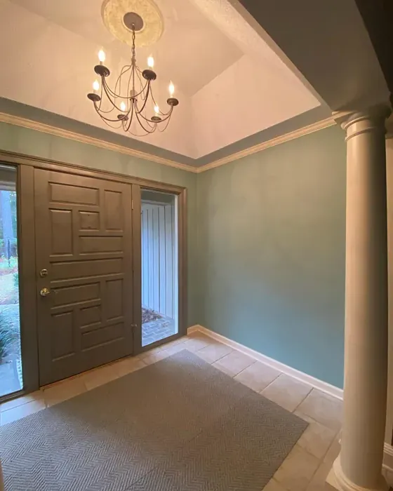
Imagine walking into a room that instantly calms your mind and soothes your spirit. The walls are painted in a beautiful hue that feels both refreshing and timeless, wrapping you in a gentle embrace. That’s the magic of Stratton Blue, a color that has earned its place among the most sought-after shades for modern and traditional homes alike.
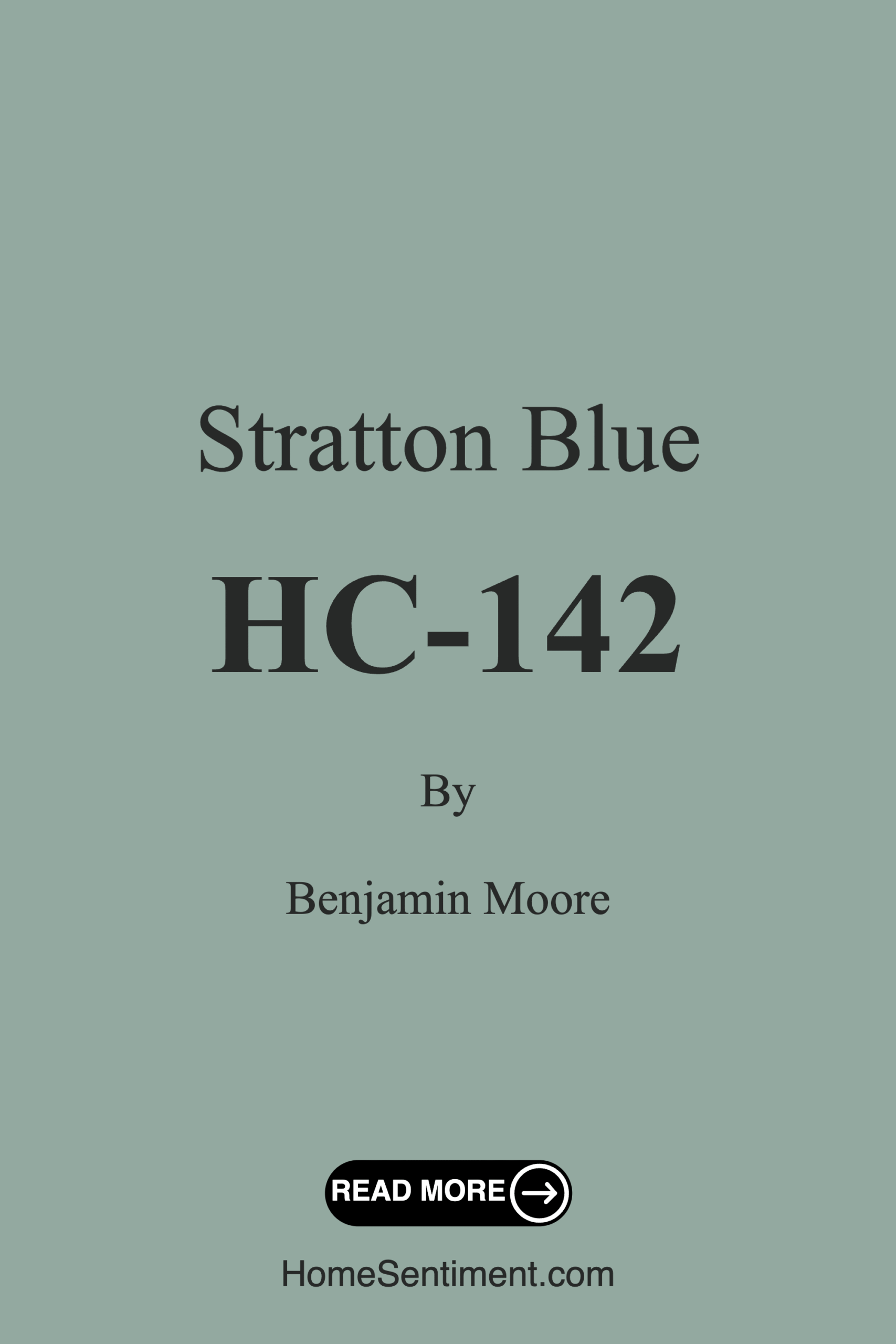
Stratton Blue, from Benjamin Moore’s Historic Color collection, is a sophisticated blend of gray and blue with a hint of green, code HC-142. This color strikes a balance that feels at once cool and warm, making it an incredibly versatile choice for various spaces in your home. Whether you’re looking to evoke a serene, coastal vibe or create a cozy, traditional atmosphere, this paint color can adapt beautifully to your vision.
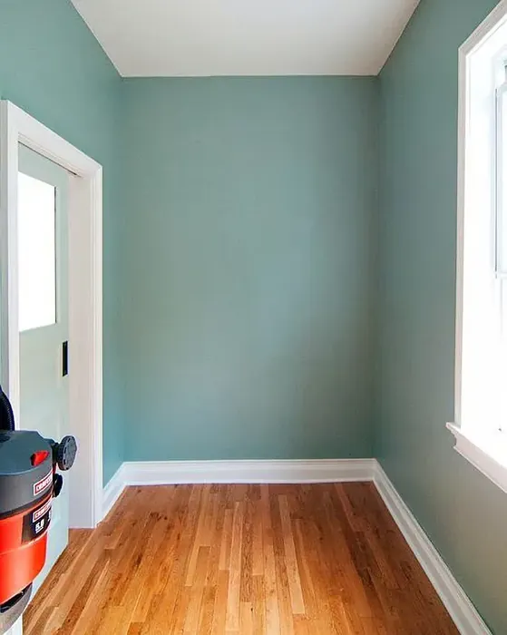
One of the standout features of Stratton Blue is its ability to reflect light. With a Light Reflectance Value (LRV) of 37.77%, it sits firmly in the medium category, providing just the right amount of brightness without overwhelming the senses. This means it can brighten up darker corners while still offering a cozy feel, making it an excellent choice for both expansive living rooms and more intimate bedrooms.
When you apply Stratton Blue, you’re not just adding color; you’re transforming the atmosphere of your room. The soothing quality of this shade can make a space feel more open and airy, ideal for smaller rooms where you want to avoid a confining feel. If you’re considering using it in a compact area, pair it with lighter furnishings and decor to maximize that airy effect. You might even want to use it as an accent color on a feature wall, allowing the rest of the room to remain bright and open.
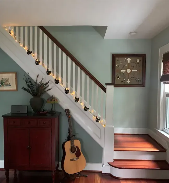
The versatility of Stratton Blue means it can seamlessly fit into various decor styles. Whether your home leans towards modern, coastal, traditional, farmhouse, or contemporary, Stratton Blue can harmonize beautifully with your existing decor. Its cool undertones make it particularly appealing in light-filled spaces, where it can shift subtly throughout the day, enhancing its character and charm. In the morning light, it can appear brighter and more vibrant, while in the evening, it softens into a muted gray, creating a cozy and inviting atmosphere.
But let’s talk a bit more about those undertones, because they are significant in defining the personality of Stratton Blue. Leaning towards green, these subtle hues add depth and complexity to the color. This is why it’s essential to test Stratton Blue in your own space, observing how it interacts with your furniture, flooring, and decor. You might find that in some settings, it appears cooler and more modern, while in others, it can take on a warmer, more traditional vibe.
One of the best things about Stratton Blue is how forgiving it is in terms of application. It’s beginner-friendly, allowing even those new to painting to achieve a smooth finish. The paint goes on easily, whether you’re using a roller or a brush, and it dries quickly, so you won’t be left waiting around for hours. Additionally, it’s wipeable and washable, making it a practical choice for busy homes where scuffs and marks are a reality.
As for the finish options, you can choose from matte, eggshell, or satin, depending on the look you want to achieve. A matte finish can offer a softer, more subdued vibe, while eggshell and satin finishes bring a bit of sheen, enhancing the color’s adaptability in different lighting conditions. The ability to choose your finish allows you to customize the mood of your space even further.
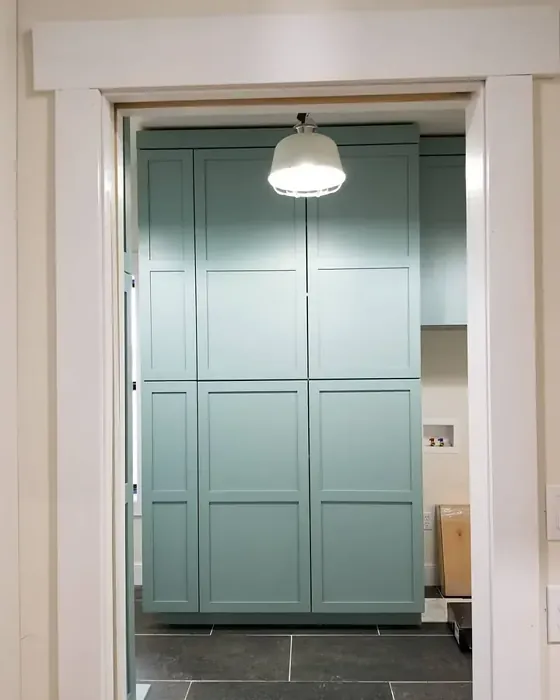
Now, let’s consider where Stratton Blue shines the most. It’s an excellent choice for living rooms, bedrooms, kitchens, bathrooms, and even home offices. In a living room, it can create a calm and inviting space perfect for entertaining or relaxing. In a bedroom, it can transform your personal retreat into a soothing sanctuary. For kitchens, it offers a refreshing backdrop that can help invigorate the space, while in bathrooms, it creates a spa-like atmosphere. And don’t underestimate its potential in a home office; the calming effect can help enhance productivity and focus.
For those of you wondering about compatibility with other colors, Stratton Blue plays well with a host of complementary shades. It pairs beautifully with crisp whites, like Benjamin Moore’s White Dove, which can add a fresh and clean contrast. If you’re looking for accent colors, consider warmer shades such as coral or muted reds to add a little pop without clashing. Earthy tones and natural materials, like wood accents, can also enhance the calming vibe of Stratton Blue, making your space feel harmonious and grounded.
If you’re contemplating using Stratton Blue on the exterior of your home, you’ll be happy to know that it works wonderfully in that context too. Its muted tones can give your home a fresh, updated look that feels both inviting and sophisticated. Pair it with white trim or natural wood accents for stunning curb appeal. Just ensure you’re using an exterior-grade paint for long-lasting durability against the elements.
However, like any color, Stratton Blue isn’t without its considerations. It may require two coats for full opacity, especially if you’re transitioning from a darker color. And while its cooler tones are appealing to many, they may not suit everyone’s taste. Additionally, in lower light, the color can appear darker, which might not be the desired effect in every room.
Ultimately, Stratton Blue is a designer favorite for a reason. It creates a calming, inviting, and restful mood that can enhance the beauty of any space. Whether you’re updating a small nook or creating a statement in an open-concept area, this color has the flexibility to meet your needs. So, if you’re looking to refresh your home with a shade that balances sophistication and tranquility, Stratton Blue might just be the perfect choice for your next project.
Before you make any decisions, grab a sample, paint a few swatches, and see how it interacts with your home’s unique light and decor. You might find that this beautiful green-tinged blue is exactly the breath of fresh air your home has been waiting for.
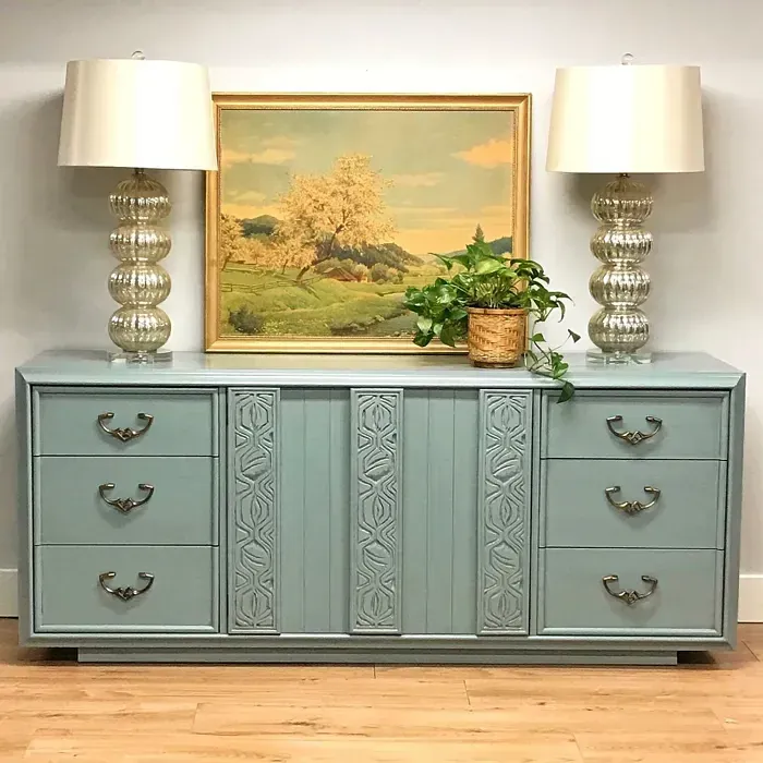
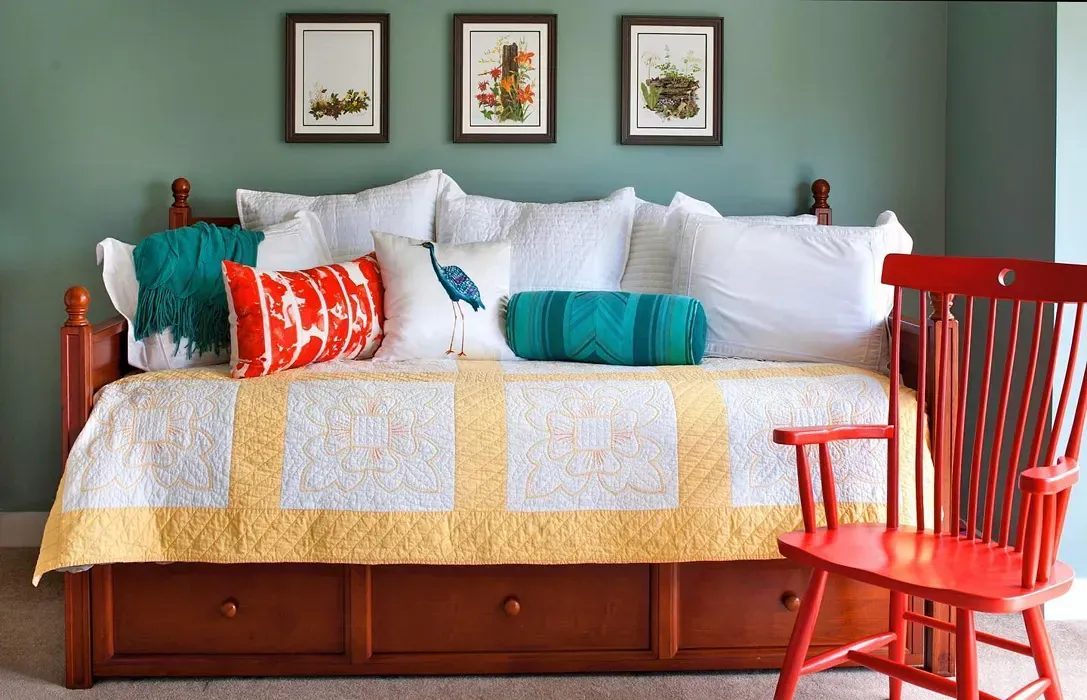
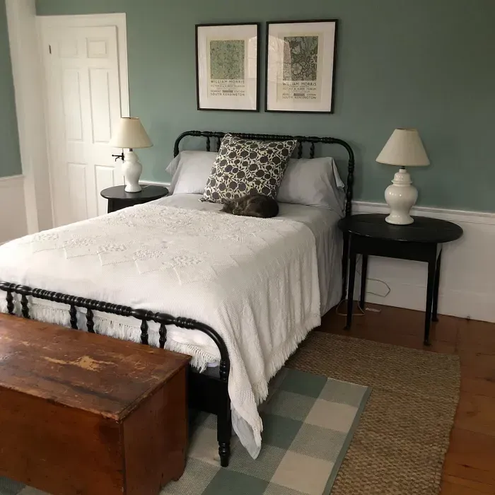
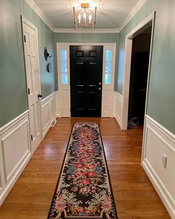
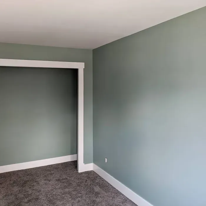
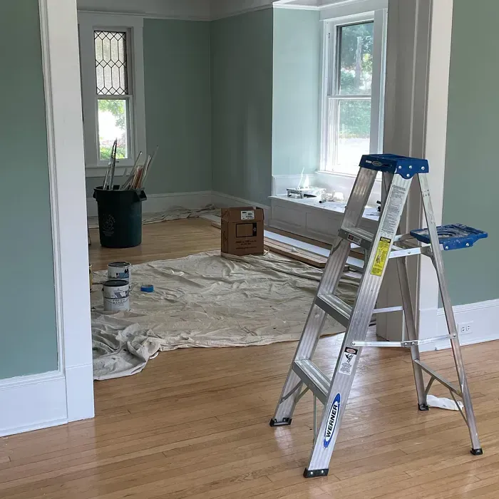
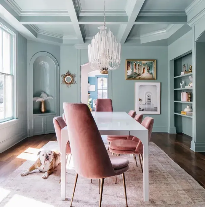
Real Room Photo of Stratton Blue HC-142


Undertones of Stratton Blue ?
The undertones of Stratton Blue are a key aspect of its character, leaning towards Green. These subtle underlying hues are what give the color its depth and complexity. For example, a gray with a blue undertone will feel cooler and more modern, while one with a brown undertone will feel warmer and more traditional. It’s essential to test this paint in your home and observe it next to your existing furniture, flooring, and decor to see how these undertones interact and reveal themselves throughout the day.
HEX value: #93A9A0
RGB code: 147, 169, 160
Is Stratton Blue Cool or Warm?
Stratton Blue leans more towards the cool side of the spectrum, but its subtle warmth allows it to harmonize with warmer tones in your decor. This balance makes it especially appealing in various lighting conditions, ensuring it feels inviting rather than chilly.
Understanding Color Properties and Interior Design Tips
Hue refers to a specific position on the color wheel, measured in degrees from 0 to 360. Each degree represents a different pure color:
- 0° represents red
- 120° represents green
- 240° represents blue
Saturation describes the intensity or purity of a color and is expressed as a percentage:
- At 0%, the color appears completely desaturated—essentially a shade of gray
- At 100%, the color is at its most vivid and vibrant
Lightness indicates how light or dark a color is, also expressed as a percentage:
- 0% lightness results in black
- 100% lightness results in white
Using Warm Colors in Interior Design
Warm hues—such as reds, oranges, yellows, warm beiges, and greiges—are excellent choices for creating inviting and energetic spaces. These colors are particularly well-suited for:
- Kitchens, living rooms, and bathrooms, where warmth enhances comfort and sociability
- Large rooms, where warm tones can help reduce the sense of emptiness and make the space feel more intimate
For example:
- Warm beige shades provide a cozy, inviting atmosphere, ideal for living rooms, bedrooms, and hallways.
- Warm greige (a mix of beige and gray) offers the warmth of beige with the modern appeal of gray, making it a versatile backdrop for dining areas, bedrooms, and living spaces.
However, be mindful when using warm light tones in rooms with limited natural light. These shades may appear muted or even take on an unpleasant yellowish tint. To avoid a dull or flat appearance:
- Add depth by incorporating richer tones like deep greens, charcoal, or chocolate brown
- Use textured elements such as curtains, rugs, or cushions to bring dimension to the space
Pro Tip: Achieving Harmony with Warm and Cool Color Balance
To create a well-balanced and visually interesting interior, mix warm and cool tones strategically. This contrast adds depth and harmony to your design.
- If your walls feature warm hues, introduce cool-colored accents such as blue or green furniture, artwork, or accessories to create contrast.
- For a polished look, consider using a complementary color scheme, which pairs colors opposite each other on the color wheel (e.g., red with green, orange with blue).
This thoughtful mix not only enhances visual appeal but also creates a space that feels both dynamic and cohesive.

Light Temperature Affects on Stratton Blue
Natural Light
Natural daylight changes in color temperature as the sun moves across the sky. At sunrise and sunset, the light tends to have a warm, golden tone with a color temperature around 2000 Kelvin (K). As the day progresses and the sun rises higher, the light becomes cooler and more neutral. Around midday, especially when the sky is clear, natural light typically reaches its peak brightness and shifts to a cooler tone, ranging from 5500 to 6500 Kelvin. This midday light is close to what we perceive as pure white or daylight-balanced light.
These shifts in natural light can significantly influence how colors appear in a space, which is why designers often consider both the time of day and the orientation of windows when planning interior color schemes.
Artificial Light
When choosing artificial lighting, pay close attention to the color temperature, measured in Kelvin (K). This determines how warm or cool the light will appear. Lower temperatures, around 2700K, give off a warm, yellow glow often used in living rooms or bedrooms. Higher temperatures, above 5000K, create a cool, bluish light similar to daylight, commonly used in kitchens, offices, or task areas.
Use the slider to see how lighting temperature can affect the appearance of a surface or color throughout a space.


4800K
LRV of Stratton Blue
The Light Reflectance Value (LRV) of Stratton Blue is 37.77%, which places it in the Medium colors category. This means it reflect a lot of light. Understanding a paint’s LRV is crucial for predicting how it will look in your space. A higher LRV indicates a lighter color that reflects more light, making rooms feel larger and brighter. A lower LRV signifies a darker color that absorbs more light, creating a cozier, more intimate atmosphere. Always consider the natural and artificial lighting in your room when selecting a paint color based on its LRV.
Detailed Review of Stratton Blue
Additional Paint Characteristics
Ideal Rooms
Bathroom, Bedroom, Hallway, Home Office, Kitchen, Living Room
Decor Styles
Coastal, Contemporary, Farmhouse, Modern, Traditional
Coverage
Good (1–2 Coats), Touch-Up Friendly
Ease of Application
Beginner Friendly, Brush Smooth, Fast-Drying, Roller-Ready
Washability
Washable, Wipeable
VOC Level
Low VOC
Best Use
Accent Wall, Furniture, Interior Walls
Room Suitability
Bathroom, Bedroom, Home Office, Kitchen, Living Room
Tone Tag
Balanced, Cool, Earthy, Muted
Finish Type
Eggshell, Matte, Satin
Paint Performance
Easy Touch-Up, Fade Resistant, Long Lasting, Low Odor
Use Cases
Best for Modern Farmhouse, Best for Open Concept, Best for Small Spaces, Designer Favorite
Mood
Calm, Inviting, Restful
Trim Pairing
Complements Cool Trim, Matches Pure White, Pairs with White Dove
Stratton Blue is like a breath of fresh air in paint form. When applied, it reveals a soft, calming presence that can transform any room into a tranquil haven. The color plays beautifully with natural light, shifting subtly from a cool blue to a more muted gray depending on the time of day. It’s perfect for those looking to create a peaceful retreat at home. However, don’t underestimate its versatility; it pairs well with both warm and cool decor elements, making it a top choice for various design styles. Whether you’re updating a small space or a large open area, Stratton Blue adapts beautifully. The finish options allow for flexibility in texture, enhancing its charm even further.
Pros & Cons of HC-142 Stratton Blue
Pros
Cons
Colors that go with Benjamin Moore Stratton Blue
FAQ on HC-142 Stratton Blue
How does Stratton Blue work in smaller spaces?
Stratton Blue can be a fantastic choice for smaller spaces, as its soothing quality can make a room feel more open and airy. To maximize its potential, consider pairing it with lighter furnishings and decor. While it may darken slightly in dim light, the overall effect is typically one of tranquility rather than confinement. If you’re worried about it feeling too heavy, you can always use it as an accent color on a feature wall, allowing the rest of the room to remain bright and open.
Is Stratton Blue suitable for exterior use?
Absolutely! Stratton Blue can work beautifully on exterior walls, especially in coastal or modern settings. Its muted tones can give your home a fresh, updated look without being too stark. Just make sure to use an exterior-grade paint for durability against the elements. This color can be particularly striking when paired with white trim or natural wood accents, creating an inviting curb appeal.
Comparisons Stratton Blue with other colors
Stratton Blue HC-142 vs Acacia Haze SW 9132
| Attribute | Stratton Blue HC-142 | Acacia Haze SW 9132 |
|---|---|---|
| Color Name | Stratton Blue HC-142 | Acacia Haze SW 9132 |
| Color | ||
| Hue | Green | Green |
| Brightness | Medium | Medium |
| RGB | 147, 169, 160 | 150, 156, 146 |
| LRV | 37.77% | 30% |
| Finish Type | Eggshell, Matte, Satin | Eggshell, Satin |
| Finish Options | Eggshell, Matte, Satin | Eggshell, Matte, Satin |
| Ideal Rooms | Bathroom, Bedroom, Hallway, Home Office, Kitchen, Living Room | Bedroom, Dining Room, Home Office, Living Room, Nursery |
| Decor Styles | Coastal, Contemporary, Farmhouse, Modern, Traditional | Bohemian, Coastal, Modern Farmhouse, Scandinavian |
| Coverage | Good (1–2 Coats), Touch-Up Friendly | Good (1–2 Coats), Touch-Up Friendly |
| Ease of Application | Beginner Friendly, Brush Smooth, Fast-Drying, Roller-Ready | Beginner Friendly, Brush Smooth, Roller-Ready |
| Washability | Washable, Wipeable | Washable, Wipeable |
| Room Suitability | Bathroom, Bedroom, Home Office, Kitchen, Living Room | Bedroom, Home Office, Living Room, Nursery |
| Tone | Balanced, Cool, Earthy, Muted | Balanced, Earthy, Muted |
| Paint Performance | Easy Touch-Up, Fade Resistant, Long Lasting, Low Odor | Easy Touch-Up, High Coverage, Low Odor |
Stratton Blue HC-142 vs Evergreen Fog SW 9130
| Attribute | Stratton Blue HC-142 | Evergreen Fog SW 9130 |
|---|---|---|
| Color Name | Stratton Blue HC-142 | Evergreen Fog SW 9130 |
| Color | ||
| Hue | Green | Green |
| Brightness | Medium | Medium |
| RGB | 147, 169, 160 | 149, 151, 138 |
| LRV | 37.77% | 30% |
| Finish Type | Eggshell, Matte, Satin | Eggshell, Matte, Satin |
| Finish Options | Eggshell, Matte, Satin | Eggshell, Matte, Satin |
| Ideal Rooms | Bathroom, Bedroom, Hallway, Home Office, Kitchen, Living Room | Bedroom, Dining Room, Home Office, Living Room, Nursery |
| Decor Styles | Coastal, Contemporary, Farmhouse, Modern, Traditional | Coastal, Modern Farmhouse, Rustic, Scandinavian, Transitional |
| Coverage | Good (1–2 Coats), Touch-Up Friendly | Good (1–2 Coats), Touch-Up Friendly |
| Ease of Application | Beginner Friendly, Brush Smooth, Fast-Drying, Roller-Ready | Beginner Friendly, Brush Smooth, Roller-Ready |
| Washability | Washable, Wipeable | Scrubbable, Washable |
| Room Suitability | Bathroom, Bedroom, Home Office, Kitchen, Living Room | Bedroom, Dining Room, Home Office, Living Room, Nursery |
| Tone | Balanced, Cool, Earthy, Muted | Balanced, Earthy, Muted |
| Paint Performance | Easy Touch-Up, Fade Resistant, Long Lasting, Low Odor | Easy Touch-Up, Low Odor, Scuff Resistant |
Stratton Blue HC-142 vs Clary Sage SW 6178
| Attribute | Stratton Blue HC-142 | Clary Sage SW 6178 |
|---|---|---|
| Color Name | Stratton Blue HC-142 | Clary Sage SW 6178 |
| Color | ||
| Hue | Green | Green |
| Brightness | Medium | Medium |
| RGB | 147, 169, 160 | 172, 173, 151 |
| LRV | 37.77% | 24% |
| Finish Type | Eggshell, Matte, Satin | Eggshell, Matte |
| Finish Options | Eggshell, Matte, Satin | Eggshell, Matte, Satin |
| Ideal Rooms | Bathroom, Bedroom, Hallway, Home Office, Kitchen, Living Room | Bathroom, Bedroom, Home Office, Kitchen, Living Room |
| Decor Styles | Coastal, Contemporary, Farmhouse, Modern, Traditional | Bohemian, Minimalist, Modern Farmhouse, Scandinavian, Traditional |
| Coverage | Good (1–2 Coats), Touch-Up Friendly | Good (1–2 Coats), Touch-Up Friendly |
| Ease of Application | Beginner Friendly, Brush Smooth, Fast-Drying, Roller-Ready | Beginner Friendly, Brush Smooth, Roller-Ready |
| Washability | Washable, Wipeable | Washable, Wipeable |
| Room Suitability | Bathroom, Bedroom, Home Office, Kitchen, Living Room | Bathroom, Bedroom, Home Office, Kitchen, Living Room |
| Tone | Balanced, Cool, Earthy, Muted | Cool, Earthy, Muted |
| Paint Performance | Easy Touch-Up, Fade Resistant, Long Lasting, Low Odor | Easy Touch-Up, High Coverage, Low Odor |
Stratton Blue HC-142 vs Softened Green SW 6177
| Attribute | Stratton Blue HC-142 | Softened Green SW 6177 |
|---|---|---|
| Color Name | Stratton Blue HC-142 | Softened Green SW 6177 |
| Color | ||
| Hue | Green | Green |
| Brightness | Medium | Medium |
| RGB | 147, 169, 160 | 187, 188, 167 |
| LRV | 37.77% | 48% |
| Finish Type | Eggshell, Matte, Satin | Eggshell, Matte, Satin |
| Finish Options | Eggshell, Matte, Satin | Eggshell, Matte, Satin |
| Ideal Rooms | Bathroom, Bedroom, Hallway, Home Office, Kitchen, Living Room | Bathroom, Bedroom, Dining Room, Home Office, Kitchen, Living Room, Nursery |
| Decor Styles | Coastal, Contemporary, Farmhouse, Modern, Traditional | Coastal, Farmhouse, Minimalist, Modern, Scandinavian |
| Coverage | Good (1–2 Coats), Touch-Up Friendly | Good (1–2 Coats), Touch-Up Friendly |
| Ease of Application | Beginner Friendly, Brush Smooth, Fast-Drying, Roller-Ready | Beginner Friendly, Brush Smooth, Fast-Drying, Roller-Ready |
| Washability | Washable, Wipeable | Washable, Wipeable |
| Room Suitability | Bathroom, Bedroom, Home Office, Kitchen, Living Room | Bathroom, Bedroom, Dining Room, Home Office, Kitchen, Living Room |
| Tone | Balanced, Cool, Earthy, Muted | Calm, Earthy, Muted |
| Paint Performance | Easy Touch-Up, Fade Resistant, Long Lasting, Low Odor | Easy Touch-Up, Fade Resistant, Low Odor, Quick Drying |
Stratton Blue HC-142 vs Eventide SW 9643
| Attribute | Stratton Blue HC-142 | Eventide SW 9643 |
|---|---|---|
| Color Name | Stratton Blue HC-142 | Eventide SW 9643 |
| Color | ||
| Hue | Green | Green |
| Brightness | Medium | Medium |
| RGB | 147, 169, 160 | 163, 175, 172 |
| LRV | 37.77% | 24% |
| Finish Type | Eggshell, Matte, Satin | Eggshell, Matte, Satin |
| Finish Options | Eggshell, Matte, Satin | Eggshell, Matte, Satin |
| Ideal Rooms | Bathroom, Bedroom, Hallway, Home Office, Kitchen, Living Room | Bedroom, Home Office, Kitchen, Living Room, Nursery |
| Decor Styles | Coastal, Contemporary, Farmhouse, Modern, Traditional | Coastal, Contemporary, Minimalist, Modern |
| Coverage | Good (1–2 Coats), Touch-Up Friendly | Good (1–2 Coats), Touch-Up Friendly |
| Ease of Application | Beginner Friendly, Brush Smooth, Fast-Drying, Roller-Ready | Beginner Friendly, Brush Smooth, Fast-Drying, Roller-Ready |
| Washability | Washable, Wipeable | Washable, Wipeable |
| Room Suitability | Bathroom, Bedroom, Home Office, Kitchen, Living Room | Bedroom, Home Office, Living Room, Nursery |
| Tone | Balanced, Cool, Earthy, Muted | Airy, Balanced, Cool, Muted |
| Paint Performance | Easy Touch-Up, Fade Resistant, Long Lasting, Low Odor | Easy Touch-Up, High Coverage, Low Odor, Quick Drying |
Stratton Blue HC-142 vs Escape Gray SW 6185
| Attribute | Stratton Blue HC-142 | Escape Gray SW 6185 |
|---|---|---|
| Color Name | Stratton Blue HC-142 | Escape Gray SW 6185 |
| Color | ||
| Hue | Green | Green |
| Brightness | Medium | Medium |
| RGB | 147, 169, 160 | 171, 172, 159 |
| LRV | 37.77% | 48% |
| Finish Type | Eggshell, Matte, Satin | Eggshell, Matte |
| Finish Options | Eggshell, Matte, Satin | Eggshell, Matte, Satin |
| Ideal Rooms | Bathroom, Bedroom, Hallway, Home Office, Kitchen, Living Room | Bathroom, Bedroom, Entryway, Home Office, Living Room |
| Decor Styles | Coastal, Contemporary, Farmhouse, Modern, Traditional | Minimalist, Modern, Scandinavian, Transitional |
| Coverage | Good (1–2 Coats), Touch-Up Friendly | Good (1–2 Coats) |
| Ease of Application | Beginner Friendly, Brush Smooth, Fast-Drying, Roller-Ready | Beginner Friendly, Brush Smooth, Roller-Ready |
| Washability | Washable, Wipeable | Highly Washable, Washable |
| Room Suitability | Bathroom, Bedroom, Home Office, Kitchen, Living Room | Bathroom, Bedroom, Home Office, Living Room |
| Tone | Balanced, Cool, Earthy, Muted | Cool, Muted, Neutral, Warm |
| Paint Performance | Easy Touch-Up, Fade Resistant, Long Lasting, Low Odor | Easy Touch-Up, Low Odor, Scuff Resistant |
Stratton Blue HC-142 vs Coastal Plain SW 6192
| Attribute | Stratton Blue HC-142 | Coastal Plain SW 6192 |
|---|---|---|
| Color Name | Stratton Blue HC-142 | Coastal Plain SW 6192 |
| Color | ||
| Hue | Green | Green |
| Brightness | Medium | Medium |
| RGB | 147, 169, 160 | 159, 166, 148 |
| LRV | 37.77% | 66% |
| Finish Type | Eggshell, Matte, Satin | Eggshell, Satin |
| Finish Options | Eggshell, Matte, Satin | Eggshell, Satin, Semi-Gloss |
| Ideal Rooms | Bathroom, Bedroom, Hallway, Home Office, Kitchen, Living Room | Bathroom, Bedroom, Home Office, Kitchen, Living Room |
| Decor Styles | Coastal, Contemporary, Farmhouse, Modern, Traditional | Bohemian, Coastal, Contemporary, Modern Farmhouse, Rustic |
| Coverage | Good (1–2 Coats), Touch-Up Friendly | Good (1–2 Coats) |
| Ease of Application | Beginner Friendly, Brush Smooth, Fast-Drying, Roller-Ready | Beginner Friendly, Brush Smooth, Fast-Drying, Roller-Ready |
| Washability | Washable, Wipeable | Scrubbable, Washable |
| Room Suitability | Bathroom, Bedroom, Home Office, Kitchen, Living Room | Bathroom, Bedroom, Dining Room, Home Office, Kitchen, Living Room |
| Tone | Balanced, Cool, Earthy, Muted | Cool, Earthy, Muted |
| Paint Performance | Easy Touch-Up, Fade Resistant, Long Lasting, Low Odor | High Coverage, Low Odor, Quick Drying |
Stratton Blue HC-142 vs Contented SW 6191
| Attribute | Stratton Blue HC-142 | Contented SW 6191 |
|---|---|---|
| Color Name | Stratton Blue HC-142 | Contented SW 6191 |
| Color | ||
| Hue | Green | Green |
| Brightness | Medium | Medium |
| RGB | 147, 169, 160 | 189, 192, 179 |
| LRV | 37.77% | 45% |
| Finish Type | Eggshell, Matte, Satin | Eggshell, Matte, Satin |
| Finish Options | Eggshell, Matte, Satin | Eggshell, Matte, Satin |
| Ideal Rooms | Bathroom, Bedroom, Hallway, Home Office, Kitchen, Living Room | Bedroom, Dining Room, Home Office, Kitchen, Living Room |
| Decor Styles | Coastal, Contemporary, Farmhouse, Modern, Traditional | Contemporary, Minimalist, Modern, Scandinavian, Transitional |
| Coverage | Good (1–2 Coats), Touch-Up Friendly | Good (1–2 Coats), Touch-Up Friendly |
| Ease of Application | Beginner Friendly, Brush Smooth, Fast-Drying, Roller-Ready | Beginner Friendly, Brush Smooth, Roller-Ready |
| Washability | Washable, Wipeable | Stain Resistant, Washable |
| Room Suitability | Bathroom, Bedroom, Home Office, Kitchen, Living Room | Bedroom, Dining Room, Home Office, Kitchen, Living Room |
| Tone | Balanced, Cool, Earthy, Muted | Muted, Neutral, Warm |
| Paint Performance | Easy Touch-Up, Fade Resistant, Long Lasting, Low Odor | Easy Touch-Up, High Coverage, Low Odor |
Stratton Blue HC-142 vs Jade Dragon SW 9129
| Attribute | Stratton Blue HC-142 | Jade Dragon SW 9129 |
|---|---|---|
| Color Name | Stratton Blue HC-142 | Jade Dragon SW 9129 |
| Color | ||
| Hue | Green | Green |
| Brightness | Medium | Medium |
| RGB | 147, 169, 160 | 144, 152, 134 |
| LRV | 37.77% | 12% |
| Finish Type | Eggshell, Matte, Satin | Eggshell, Matte, Satin |
| Finish Options | Eggshell, Matte, Satin | Eggshell, Matte, Satin |
| Ideal Rooms | Bathroom, Bedroom, Hallway, Home Office, Kitchen, Living Room | Bedroom, Dining Room, Home Office, Living Room, Nursery |
| Decor Styles | Coastal, Contemporary, Farmhouse, Modern, Traditional | Bohemian, Minimalist, Modern, Traditional, Transitional |
| Coverage | Good (1–2 Coats), Touch-Up Friendly | Good (1–2 Coats), Touch-Up Friendly |
| Ease of Application | Beginner Friendly, Brush Smooth, Fast-Drying, Roller-Ready | Beginner Friendly, Brush Smooth, Fast-Drying, Roller-Ready |
| Washability | Washable, Wipeable | Highly Washable, Stain Resistant, Washable |
| Room Suitability | Bathroom, Bedroom, Home Office, Kitchen, Living Room | Bedroom, Dining Room, Home Office, Living Room, Nursery |
| Tone | Balanced, Cool, Earthy, Muted | Balanced, Cool, Earthy, Muted |
| Paint Performance | Easy Touch-Up, Fade Resistant, Long Lasting, Low Odor | Easy Touch-Up, Fade Resistant, Low Odor, Stain Resistant |
Stratton Blue HC-142 vs Underseas SW 6214
| Attribute | Stratton Blue HC-142 | Underseas SW 6214 |
|---|---|---|
| Color Name | Stratton Blue HC-142 | Underseas SW 6214 |
| Color | ||
| Hue | Green | Green |
| Brightness | Medium | Medium |
| RGB | 147, 169, 160 | 124, 142, 135 |
| LRV | 37.77% | 24% |
| Finish Type | Eggshell, Matte, Satin | Eggshell, Matte, Satin |
| Finish Options | Eggshell, Matte, Satin | Eggshell, Matte, Satin |
| Ideal Rooms | Bathroom, Bedroom, Hallway, Home Office, Kitchen, Living Room | Bathroom, Bedroom, Dining Room, Hallway, Home Office, Living Room |
| Decor Styles | Coastal, Contemporary, Farmhouse, Modern, Traditional | Coastal, Eclectic, Farmhouse, Modern, Scandinavian |
| Coverage | Good (1–2 Coats), Touch-Up Friendly | Good (1–2 Coats), Touch-Up Friendly |
| Ease of Application | Beginner Friendly, Brush Smooth, Fast-Drying, Roller-Ready | Beginner Friendly, Brush Smooth, Fast-Drying, Roller-Ready |
| Washability | Washable, Wipeable | Highly Washable, Washable, Wipeable |
| Room Suitability | Bathroom, Bedroom, Home Office, Kitchen, Living Room | Bathroom, Bedroom, Dining Room, Home Office, Living Room |
| Tone | Balanced, Cool, Earthy, Muted | Balanced, Cool, Earthy, Muted |
| Paint Performance | Easy Touch-Up, Fade Resistant, Long Lasting, Low Odor | Easy Touch-Up, Fade Resistant, High Coverage, Low Odor |
Official Page of Benjamin Moore Stratton Blue HC-142