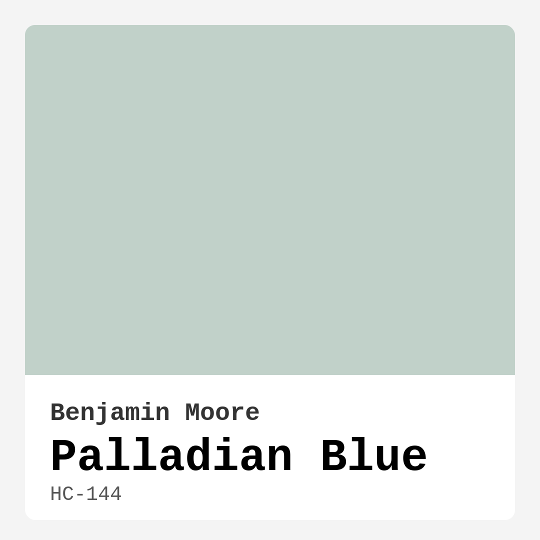
Color Preview & Key Details
| HEX Code | #C1D1C9 |
| RGB | 193, 209, 201 |
| LRV | 60.40% |
| Undertone | Green |
| Finish Options | Eggshell, Matte, Satin |
Have you ever walked into a room and immediately felt a sense of calm wash over you? That’s the magic of the right paint color—it doesn’t just cover walls; it sets the tone for your entire space. If you’ve been searching for a hue that brings serenity and sophistication to your home, let’s talk about Benjamin Moore’s Palladian Blue. This soft, green-tinged blue is like a breath of fresh air, effortlessly transforming rooms into tranquil retreats. Whether you’re redesigning a bedroom, refreshing a living room, or giving your kitchen a subtle makeover, Palladian Blue might just be the perfect choice.
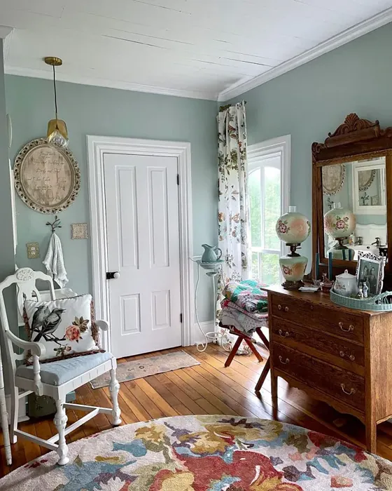
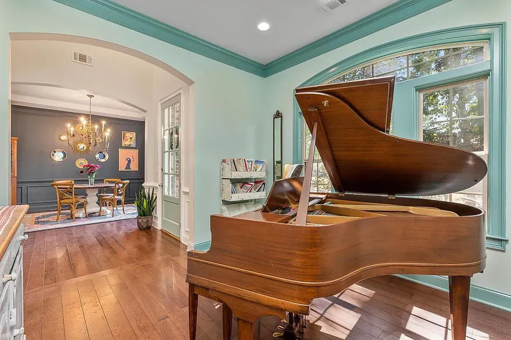
Palladian Blue (HC-144) is one of those colors that feels timeless yet fresh. Its delicate balance of blue and green undertones gives it a chameleon-like quality—it can lean more aquatic in certain lights or take on a muted, earthy vibe in others. That’s part of what makes it so versatile. Imagine it in a sunlit bedroom, where it glows like morning mist, or in a cozy reading nook, where it adds just enough depth to feel inviting without overwhelming the space. It’s a color that plays well with others, too. Pair it with crisp white trim for a clean, coastal look, or let it mingle with warm wood tones for a modern farmhouse feel.
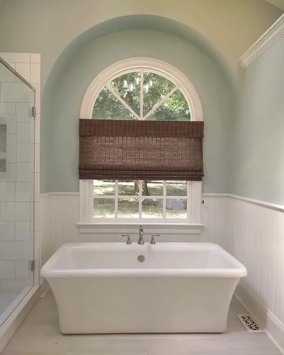
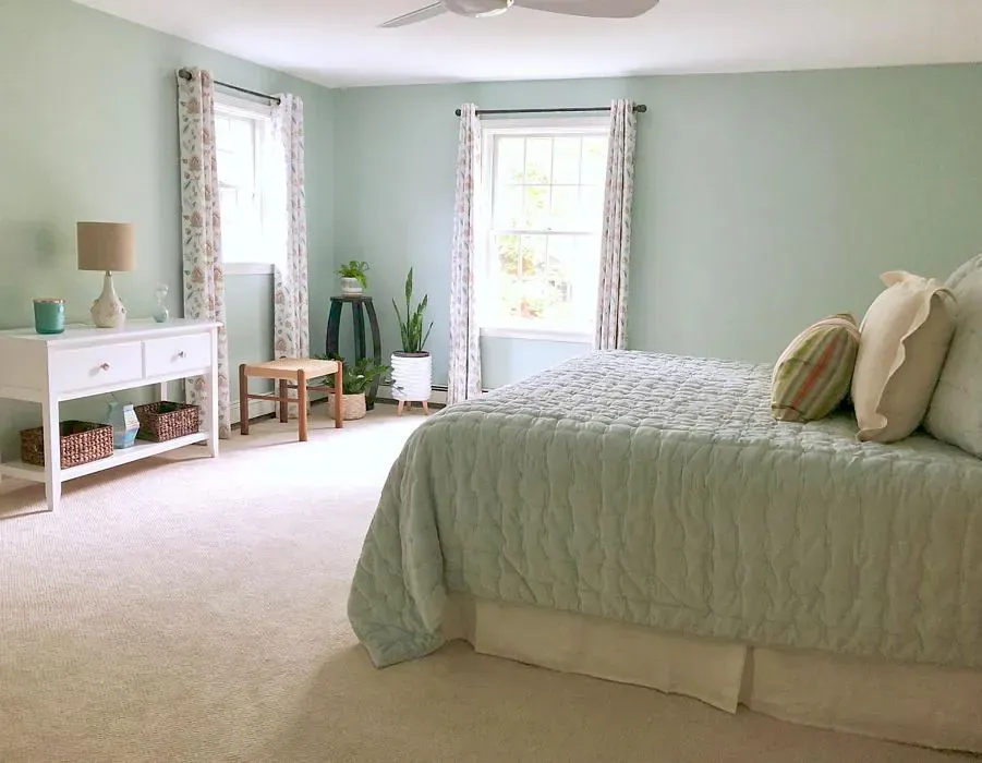
One of the biggest strengths of Palladian Blue is its ability to reflect light. With an LRV (Light Reflectance Value) of 60.40%, it sits comfortably in the “light colors” category, meaning it bounces plenty of light around a room. This makes it ideal for spaces that could use a little brightness boost—think north-facing rooms or areas with limited natural light. But don’t assume it’s only for airy, open layouts. Even in smaller rooms, like a bathroom or home office, it creates an illusion of space, making walls feel farther apart than they are. Just keep in mind that lighting matters. If your room relies heavily on artificial light, test a swatch first to see how the undertones shift.
Speaking of undertones, let’s dive a little deeper. Palladian Blue’s green base gives it a subtle warmth that keeps it from feeling too cold or sterile. Unlike some blues that can veer icy, this one has a softness to it, almost like the faded patina of vintage ceramics. That’s why it works so well in traditional settings—it feels classic without being stuffy. But it’s equally at home in modern spaces, especially when paired with sleek finishes and minimalist decor. The key is balance. If your room has a lot of cool tones (think gray floors or stainless steel), Palladian Blue will harmonize beautifully. If your space leans warm (with honey-toned wood or creamy textiles), its green undertones will bridge the gap.
Now, let’s talk application. Whether you’re a DIY novice or a seasoned painter, Palladian Blue is a dream to work with. It offers excellent coverage—most walls will only need one or two coats—and it’s touch-up friendly, so minor imperfections are easy to fix. Benjamin Moore offers it in matte, eggshell, and satin finishes, so you can choose based on your room’s needs. Matte is perfect for low-traffic areas like bedrooms, where you want a velvety look. Eggshell or satin, with their slight sheen, are better for kitchens or bathrooms, where durability and washability matter. And since it’s low-VOC, you won’t have to worry about harsh fumes during or after painting.
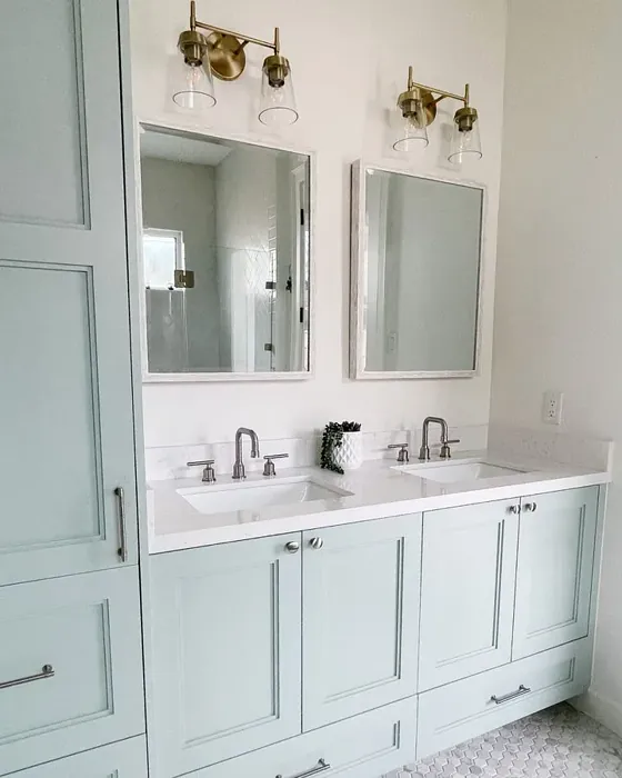
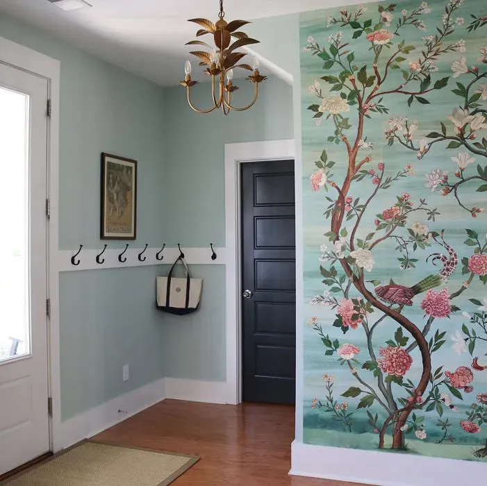
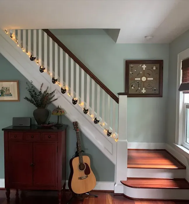
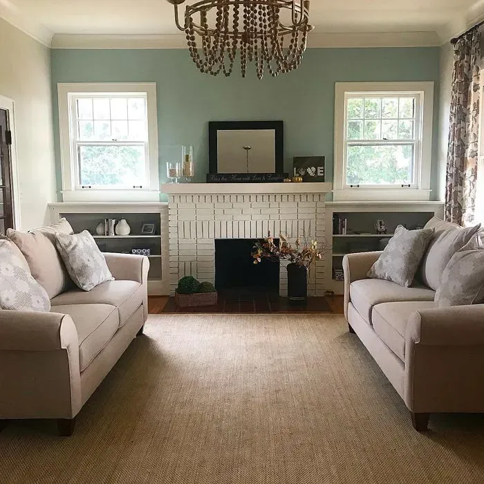
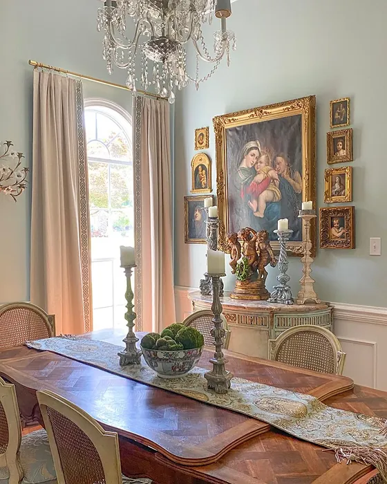
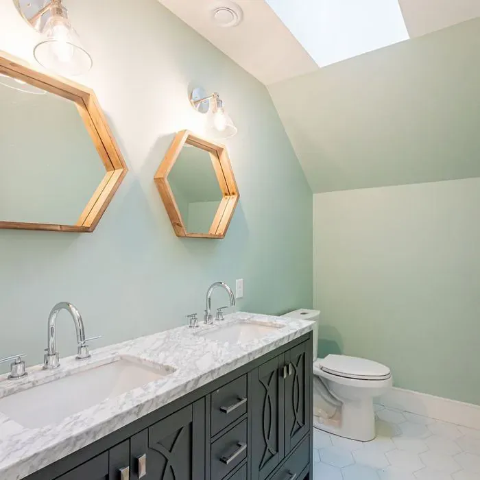
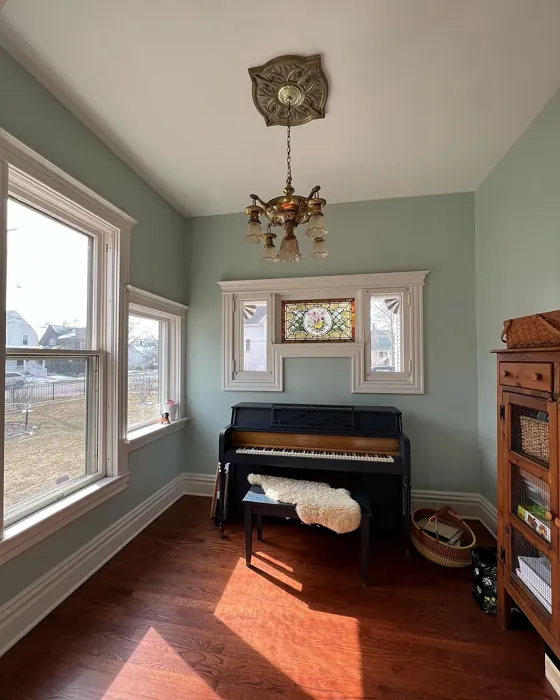
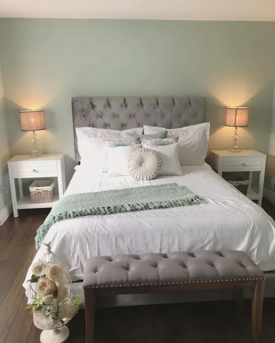
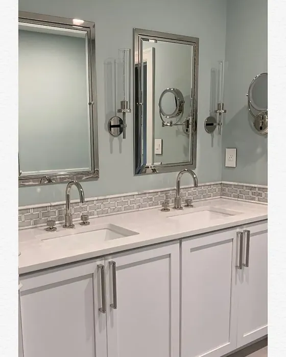
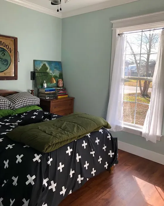
Wondering where to use it? The short answer: almost anywhere. In a bedroom, it creates a restful backdrop that pairs beautifully with linen bedding and woven textures. In a living room, it sets a serene stage for bold artwork or a statement sofa. Kitchens and bathrooms benefit from its clean, spa-like vibe—especially when paired with marble countertops or brass fixtures. Even a home office can feel more focused and calm with Palladian Blue on the walls. The only spaces I’d approach with caution are very dark or windowless rooms. Without adequate light, the color can lose its luminosity and feel flat.
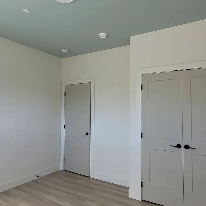
If you’re worried about committing to a full room, consider an accent wall. Palladian Blue shines as a focal point, especially when contrasted with neutral surroundings. Or, for a subtler approach, try it on cabinetry. Picture it in a kitchen with open shelving and butcher-block countertops—it’s fresh but not trendy, so you won’t tire of it quickly. And if you love the color but want to play with depth, explore its lighter and darker siblings. Benjamin Moore’s HC-147 or 701 are softer variations, while HC-143 or CSP-740 offer richer, moodier alternatives.
As for pairings, the possibilities are endless. Crisp whites like White Dove keep things bright and airy. Deep charcoals or blacks add drama and contrast. For a nature-inspired palette, combine it with sage greens, warm taupes, or natural wood finishes. And if you’re feeling adventurous, a pop of coral or terracotta (its complementary hue on the color wheel) can add unexpected energy. The key is to let Palladian Blue anchor the space while other elements bring in texture and contrast.
So, is Palladian Blue right for you? If you’re drawn to colors that feel peaceful but not boring, versatile but not generic, it’s absolutely worth a try. Order a sample, paint a large swatch, and live with it for a few days. Notice how it changes with the light, how it interacts with your furniture, how it makes you feel when you walk into the room. The best paint colors don’t just look good—they make your home feel like *yours*. And Palladian Blue? It’s the kind of color that does both.
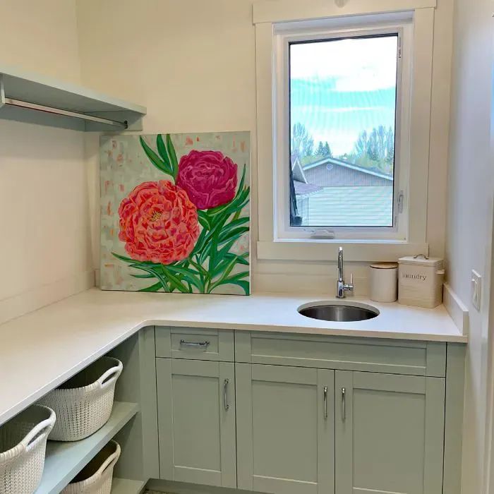
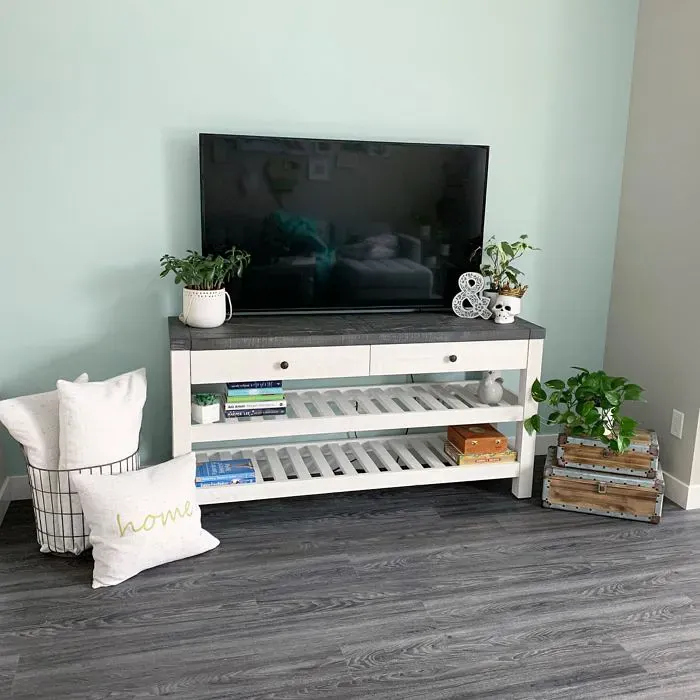
Real Room Photo of Palladian Blue HC-144
Undertones of Palladian Blue ?
The undertones of Palladian Blue are a key aspect of its character, leaning towards Green. These subtle underlying hues are what give the color its depth and complexity. For example, a gray with a blue undertone will feel cooler and more modern, while one with a brown undertone will feel warmer and more traditional. It’s essential to test this paint in your home and observe it next to your existing furniture, flooring, and decor to see how these undertones interact and reveal themselves throughout the day.
HEX value: #C1D1C9
RGB code: 193, 209, 201
Is Palladian Blue Cool or Warm?
This color leans more towards cool, but its green undertones provide a warmth that balances it out. It’s perfect for creating a calming environment without feeling too cold or sterile.
Understanding Color Properties and Interior Design Tips
Hue refers to a specific position on the color wheel, measured in degrees from 0 to 360. Each degree represents a different pure color:
- 0° represents red
- 120° represents green
- 240° represents blue
Saturation describes the intensity or purity of a color and is expressed as a percentage:
- At 0%, the color appears completely desaturated—essentially a shade of gray
- At 100%, the color is at its most vivid and vibrant
Lightness indicates how light or dark a color is, also expressed as a percentage:
- 0% lightness results in black
- 100% lightness results in white
Using Warm Colors in Interior Design
Warm hues—such as reds, oranges, yellows, warm beiges, and greiges—are excellent choices for creating inviting and energetic spaces. These colors are particularly well-suited for:
- Kitchens, living rooms, and bathrooms, where warmth enhances comfort and sociability
- Large rooms, where warm tones can help reduce the sense of emptiness and make the space feel more intimate
For example:
- Warm beige shades provide a cozy, inviting atmosphere, ideal for living rooms, bedrooms, and hallways.
- Warm greige (a mix of beige and gray) offers the warmth of beige with the modern appeal of gray, making it a versatile backdrop for dining areas, bedrooms, and living spaces.
However, be mindful when using warm light tones in rooms with limited natural light. These shades may appear muted or even take on an unpleasant yellowish tint. To avoid a dull or flat appearance:
- Add depth by incorporating richer tones like deep greens, charcoal, or chocolate brown
- Use textured elements such as curtains, rugs, or cushions to bring dimension to the space
Pro Tip: Achieving Harmony with Warm and Cool Color Balance
To create a well-balanced and visually interesting interior, mix warm and cool tones strategically. This contrast adds depth and harmony to your design.
- If your walls feature warm hues, introduce cool-colored accents such as blue or green furniture, artwork, or accessories to create contrast.
- For a polished look, consider using a complementary color scheme, which pairs colors opposite each other on the color wheel (e.g., red with green, orange with blue).
This thoughtful mix not only enhances visual appeal but also creates a space that feels both dynamic and cohesive.
Light Temperature Affects on Palladian Blue
Natural Light
Natural daylight changes in color temperature as the sun moves across the sky. At sunrise and sunset, the light tends to have a warm, golden tone with a color temperature around 2000 Kelvin (K). As the day progresses and the sun rises higher, the light becomes cooler and more neutral. Around midday, especially when the sky is clear, natural light typically reaches its peak brightness and shifts to a cooler tone, ranging from 5500 to 6500 Kelvin. This midday light is close to what we perceive as pure white or daylight-balanced light.
These shifts in natural light can significantly influence how colors appear in a space, which is why designers often consider both the time of day and the orientation of windows when planning interior color schemes.
Artificial Light
When choosing artificial lighting, pay close attention to the color temperature, measured in Kelvin (K). This determines how warm or cool the light will appear. Lower temperatures, around 2700K, give off a warm, yellow glow often used in living rooms or bedrooms. Higher temperatures, above 5000K, create a cool, bluish light similar to daylight, commonly used in kitchens, offices, or task areas.
Use the slider to see how lighting temperature can affect the appearance of a surface or color throughout a space.


4800K
LRV of Palladian Blue
The Light Reflectance Value (LRV) of Palladian Blue is 60.40%, which places it in the Light colors category. This means it reflect most of the incident light. Understanding a paint’s LRV is crucial for predicting how it will look in your space. A higher LRV indicates a lighter color that reflects more light, making rooms feel larger and brighter. A lower LRV signifies a darker color that absorbs more light, creating a cozier, more intimate atmosphere. Always consider the natural and artificial lighting in your room when selecting a paint color based on its LRV.
Detailed Review of Palladian Blue
Additional Paint Characteristics
Ideal Rooms
Bathroom, Bedroom, Dining Room, Home Office, Kitchen, Living Room, Nursery
Decor Styles
Coastal, Cottage, Modern Farmhouse, Scandinavian, Traditional
Coverage
Good (1–2 Coats), Touch-Up Friendly
Ease of Application
Beginner Friendly, Brush Smooth, Roller-Ready
Washability
Highly Washable, Washable
VOC Level
Low VOC, Ultra Low VOC
Best Use
Accent Wall, Cabinets, Interior Walls
Room Suitability
Bathroom, Bedroom, Dining Room, Home Office, Living Room
Tone Tag
Airy, Balanced, Cool, Muted
Finish Type
Eggshell, Matte, Satin
Paint Performance
Easy Touch-Up, High Coverage, Low Odor, Quick Drying
Use Cases
Best for Low Light Rooms, Best for Modern Farmhouse, Best for Rentals, Designer Favorite
Mood
Airy, Calm, Inviting, Restful
Trim Pairing
Complements Cool Trim, Good with Wood Trim, Pairs with White Dove
Palladian Blue stands out for its unique blend of softness and sophistication. When applied, it transforms spaces into serene escapes, reflecting light beautifully while maintaining depth. The color shifts subtly depending on the lighting, making it feel dynamic yet comforting. Homeowners love how it pairs effortlessly with whites and natural wood, enhancing both modern and traditional interiors. It’s particularly effective in bedrooms and living rooms, where it can evoke tranquility after a long day. However, make sure to test it in your space first, as its undertones may vary with different lighting conditions. Overall, it’s a color that feels both refreshing and timeless, making it a favorite among designers and homeowners alike.
Pros & Cons of HC-144 Palladian Blue
Pros
Cons
Colors that go with Benjamin Moore Palladian Blue
FAQ on HC-144 Palladian Blue
Can Palladian Blue be used in small spaces?
Absolutely! Palladian Blue can work wonders in small spaces by creating an illusion of openness and airiness. Its light, reflective quality helps to brighten up confined areas, making them feel larger and more inviting. Just ensure there’s enough natural light to complement its subtle undertones.
What trim colors work best with Palladian Blue?
Palladian Blue pairs beautifully with crisp whites like White Dove or Simply White, enhancing its serene vibe. For a bolder contrast, consider pairing it with darker trims like black or charcoal. Natural wood finishes also work well, adding warmth and rustic charm to the overall look.
Comparisons Palladian Blue with other colors
Palladian Blue HC-144 vs Sea Salt SW 6204
| Attribute | Palladian Blue HC-144 | Sea Salt SW 6204 |
|---|---|---|
| Color Name | Palladian Blue HC-144 | Sea Salt SW 6204 |
| Color | ||
| Hue | Green | Green |
| Brightness | Light | Light |
| RGB | 193, 209, 201 | 205, 210, 202 |
| LRV | 60.40% | 64% |
| Finish Type | Eggshell, Matte, Satin | Eggshell, Satin |
| Finish Options | Eggshell, Matte, Satin | Eggshell, Matte, Satin |
| Ideal Rooms | Bathroom, Bedroom, Dining Room, Home Office, Kitchen, Living Room, Nursery | Bathroom, Bedroom, Hallway, Kitchen, Living Room |
| Decor Styles | Coastal, Cottage, Modern Farmhouse, Scandinavian, Traditional | Coastal, Minimalist, Modern Farmhouse, Scandinavian, Traditional |
| Coverage | Good (1–2 Coats), Touch-Up Friendly | Good (1–2 Coats), Touch-Up Friendly |
| Ease of Application | Beginner Friendly, Brush Smooth, Roller-Ready | Beginner Friendly, Brush Smooth, Fast-Drying, Roller-Ready |
| Washability | Highly Washable, Washable | Highly Washable, Washable |
| Room Suitability | Bathroom, Bedroom, Dining Room, Home Office, Living Room | Bathroom, Bedroom, Hallway, Kitchen, Living Room |
| Tone | Airy, Balanced, Cool, Muted | Airy, Balanced, Cool, Muted |
| Paint Performance | Easy Touch-Up, High Coverage, Low Odor, Quick Drying | Easy Touch-Up, High Coverage, Low Odor, Quick Drying |
Palladian Blue HC-144 vs Liveable Green SW 6176
| Attribute | Palladian Blue HC-144 | Liveable Green SW 6176 |
|---|---|---|
| Color Name | Palladian Blue HC-144 | Liveable Green SW 6176 |
| Color | ||
| Hue | Green | Green |
| Brightness | Light | Light |
| RGB | 193, 209, 201 | 206, 206, 189 |
| LRV | 60.40% | 30% |
| Finish Type | Eggshell, Matte, Satin | Eggshell, Matte, Satin |
| Finish Options | Eggshell, Matte, Satin | Eggshell, Matte, Satin |
| Ideal Rooms | Bathroom, Bedroom, Dining Room, Home Office, Kitchen, Living Room, Nursery | Bedroom, Home Office, Kitchen, Living Room, Nursery |
| Decor Styles | Coastal, Cottage, Modern Farmhouse, Scandinavian, Traditional | Contemporary, Modern Farmhouse, Rustic, Scandi |
| Coverage | Good (1–2 Coats), Touch-Up Friendly | Good (1–2 Coats), Touch-Up Friendly |
| Ease of Application | Beginner Friendly, Brush Smooth, Roller-Ready | Beginner Friendly, Brush Smooth, Roller-Ready |
| Washability | Highly Washable, Washable | Highly Washable, Washable |
| Room Suitability | Bathroom, Bedroom, Dining Room, Home Office, Living Room | Bedroom, Home Office, Living Room, Nursery |
| Tone | Airy, Balanced, Cool, Muted | Balanced, Earthy, Muted |
| Paint Performance | Easy Touch-Up, High Coverage, Low Odor, Quick Drying | Easy Touch-Up, High Coverage, Low Odor |
Palladian Blue HC-144 vs Rainwashed SW 6211
| Attribute | Palladian Blue HC-144 | Rainwashed SW 6211 |
|---|---|---|
| Color Name | Palladian Blue HC-144 | Rainwashed SW 6211 |
| Color | ||
| Hue | Green | Green |
| Brightness | Light | Light |
| RGB | 193, 209, 201 | 194, 205, 197 |
| LRV | 60.40% | 60% |
| Finish Type | Eggshell, Matte, Satin | Eggshell, Matte, Satin |
| Finish Options | Eggshell, Matte, Satin | Eggshell, Matte, Satin |
| Ideal Rooms | Bathroom, Bedroom, Dining Room, Home Office, Kitchen, Living Room, Nursery | Bathroom, Bedroom, Home Office, Living Room, Nursery |
| Decor Styles | Coastal, Cottage, Modern Farmhouse, Scandinavian, Traditional | Coastal, Farmhouse, Minimalist, Modern, Transitional |
| Coverage | Good (1–2 Coats), Touch-Up Friendly | Good (1–2 Coats), Touch-Up Friendly |
| Ease of Application | Beginner Friendly, Brush Smooth, Roller-Ready | Beginner Friendly, Brush Smooth, Fast-Drying, Roller-Ready |
| Washability | Highly Washable, Washable | Washable, Wipeable |
| Room Suitability | Bathroom, Bedroom, Dining Room, Home Office, Living Room | Bathroom, Bedroom, Home Office, Living Room, Nursery |
| Tone | Airy, Balanced, Cool, Muted | Balanced, Cool, Muted |
| Paint Performance | Easy Touch-Up, High Coverage, Low Odor, Quick Drying | Easy Touch-Up, High Coverage, Low Odor |
Palladian Blue HC-144 vs Filmy Green SW 6190
| Attribute | Palladian Blue HC-144 | Filmy Green SW 6190 |
|---|---|---|
| Color Name | Palladian Blue HC-144 | Filmy Green SW 6190 |
| Color | ||
| Hue | Green | Green |
| Brightness | Light | Light |
| RGB | 193, 209, 201 | 209, 211, 199 |
| LRV | 60.40% | 50% |
| Finish Type | Eggshell, Matte, Satin | Eggshell, Matte, Satin |
| Finish Options | Eggshell, Matte, Satin | Eggshell, Matte, Satin |
| Ideal Rooms | Bathroom, Bedroom, Dining Room, Home Office, Kitchen, Living Room, Nursery | Bedroom, Home Office, Living Room, Nursery |
| Decor Styles | Coastal, Cottage, Modern Farmhouse, Scandinavian, Traditional | Bohemian, Minimalist, Modern Farmhouse, Scandinavian |
| Coverage | Good (1–2 Coats), Touch-Up Friendly | Good (1–2 Coats) |
| Ease of Application | Beginner Friendly, Brush Smooth, Roller-Ready | Beginner Friendly, Brush Smooth, Roller-Ready |
| Washability | Highly Washable, Washable | Washable, Wipeable |
| Room Suitability | Bathroom, Bedroom, Dining Room, Home Office, Living Room | Bedroom, Home Office, Living Room, Nursery |
| Tone | Airy, Balanced, Cool, Muted | Calm, Earthy, Muted |
| Paint Performance | Easy Touch-Up, High Coverage, Low Odor, Quick Drying | Easy Touch-Up, Low Odor, Quick Drying |
Palladian Blue HC-144 vs Slow Green SW 6456
| Attribute | Palladian Blue HC-144 | Slow Green SW 6456 |
|---|---|---|
| Color Name | Palladian Blue HC-144 | Slow Green SW 6456 |
| Color | ||
| Hue | Green | Green |
| Brightness | Light | Light |
| RGB | 193, 209, 201 | 198, 213, 201 |
| LRV | 60.40% | 48% |
| Finish Type | Eggshell, Matte, Satin | Eggshell, Matte, Satin |
| Finish Options | Eggshell, Matte, Satin | Eggshell, Matte, Satin |
| Ideal Rooms | Bathroom, Bedroom, Dining Room, Home Office, Kitchen, Living Room, Nursery | Bedroom, Dining Room, Home Office, Living Room, Nursery |
| Decor Styles | Coastal, Cottage, Modern Farmhouse, Scandinavian, Traditional | Coastal, Farmhouse, Modern, Rustic, Scandinavian |
| Coverage | Good (1–2 Coats), Touch-Up Friendly | Good (1–2 Coats), Touch-Up Friendly |
| Ease of Application | Beginner Friendly, Brush Smooth, Roller-Ready | Beginner Friendly, Brush Smooth, Roller-Ready |
| Washability | Highly Washable, Washable | Highly Washable, Washable |
| Room Suitability | Bathroom, Bedroom, Dining Room, Home Office, Living Room | Bedroom, Dining Room, Entryway, Home Office, Living Room, Nursery |
| Tone | Airy, Balanced, Cool, Muted | Balanced, Earthy, Muted |
| Paint Performance | Easy Touch-Up, High Coverage, Low Odor, Quick Drying | Easy Touch-Up, Fade Resistant, Low Odor |
Palladian Blue HC-144 vs Acanthus SW 0029
| Attribute | Palladian Blue HC-144 | Acanthus SW 0029 |
|---|---|---|
| Color Name | Palladian Blue HC-144 | Acanthus SW 0029 |
| Color | ||
| Hue | Green | Green |
| Brightness | Light | Light |
| RGB | 193, 209, 201 | 205, 205, 180 |
| LRV | 60.40% | 10% |
| Finish Type | Eggshell, Matte, Satin | Eggshell, Matte, Satin |
| Finish Options | Eggshell, Matte, Satin | Eggshell, Matte, Satin |
| Ideal Rooms | Bathroom, Bedroom, Dining Room, Home Office, Kitchen, Living Room, Nursery | Bedroom, Dining Room, Home Office, Kitchen, Living Room |
| Decor Styles | Coastal, Cottage, Modern Farmhouse, Scandinavian, Traditional | Eclectic, Farmhouse, Modern, Traditional |
| Coverage | Good (1–2 Coats), Touch-Up Friendly | Good (1–2 Coats) |
| Ease of Application | Beginner Friendly, Brush Smooth, Roller-Ready | Beginner Friendly, Brush Smooth, Fast-Drying, Roller-Ready |
| Washability | Highly Washable, Washable | Highly Washable, Stain Resistant, Washable |
| Room Suitability | Bathroom, Bedroom, Dining Room, Home Office, Living Room | Bedroom, Dining Room, Home Office, Living Room |
| Tone | Airy, Balanced, Cool, Muted | Balanced, Earthy, Muted |
| Paint Performance | Easy Touch-Up, High Coverage, Low Odor, Quick Drying | Easy Touch-Up, Low Odor, Quick Drying, Scuff Resistant |
Palladian Blue HC-144 vs Topiary Tint SW 6449
| Attribute | Palladian Blue HC-144 | Topiary Tint SW 6449 |
|---|---|---|
| Color Name | Palladian Blue HC-144 | Topiary Tint SW 6449 |
| Color | ||
| Hue | Green | Green |
| Brightness | Light | Light |
| RGB | 193, 209, 201 | 200, 216, 196 |
| LRV | 60.40% | 30% |
| Finish Type | Eggshell, Matte, Satin | Eggshell, Matte, Satin |
| Finish Options | Eggshell, Matte, Satin | Eggshell, Matte, Satin |
| Ideal Rooms | Bathroom, Bedroom, Dining Room, Home Office, Kitchen, Living Room, Nursery | Bathroom, Bedroom, Dining Room, Home Office, Kitchen, Living Room |
| Decor Styles | Coastal, Cottage, Modern Farmhouse, Scandinavian, Traditional | Bohemian, Coastal, Eclectic, Modern Farmhouse, Transitional |
| Coverage | Good (1–2 Coats), Touch-Up Friendly | Good (1–2 Coats), Touch-Up Friendly |
| Ease of Application | Beginner Friendly, Brush Smooth, Roller-Ready | Beginner Friendly, Brush Smooth, Fast-Drying, Roller-Ready |
| Washability | Highly Washable, Washable | Scuff Resistant, Washable |
| Room Suitability | Bathroom, Bedroom, Dining Room, Home Office, Living Room | Bathroom, Bedroom, Dining Room, Kitchen, Living Room |
| Tone | Airy, Balanced, Cool, Muted | Balanced, Calm, Earthy, Muted |
| Paint Performance | Easy Touch-Up, High Coverage, Low Odor, Quick Drying | Easy Touch-Up, Low Odor, Quick Drying, Stain Resistant |
Palladian Blue HC-144 vs Waterscape SW 6470
| Attribute | Palladian Blue HC-144 | Waterscape SW 6470 |
|---|---|---|
| Color Name | Palladian Blue HC-144 | Waterscape SW 6470 |
| Color | ||
| Hue | Green | Green |
| Brightness | Light | Light |
| RGB | 193, 209, 201 | 191, 210, 201 |
| LRV | 60.40% | 50% |
| Finish Type | Eggshell, Matte, Satin | Eggshell, Matte |
| Finish Options | Eggshell, Matte, Satin | Eggshell, Matte, Satin |
| Ideal Rooms | Bathroom, Bedroom, Dining Room, Home Office, Kitchen, Living Room, Nursery | Bathroom, Bedroom, Home Office, Kitchen, Living Room |
| Decor Styles | Coastal, Cottage, Modern Farmhouse, Scandinavian, Traditional | Coastal, Minimalist, Modern, Scandinavian |
| Coverage | Good (1–2 Coats), Touch-Up Friendly | Good (1–2 Coats) |
| Ease of Application | Beginner Friendly, Brush Smooth, Roller-Ready | Beginner Friendly, Brush Smooth, Roller-Ready |
| Washability | Highly Washable, Washable | Highly Washable, Washable |
| Room Suitability | Bathroom, Bedroom, Dining Room, Home Office, Living Room | Bathroom, Bedroom, Home Office, Living Room |
| Tone | Airy, Balanced, Cool, Muted | Airy, Cool, Muted |
| Paint Performance | Easy Touch-Up, High Coverage, Low Odor, Quick Drying | Easy Touch-Up, Low Odor, Quick Drying |
Palladian Blue HC-144 vs Bonsai Tint SW 6436
| Attribute | Palladian Blue HC-144 | Bonsai Tint SW 6436 |
|---|---|---|
| Color Name | Palladian Blue HC-144 | Bonsai Tint SW 6436 |
| Color | ||
| Hue | Green | Green |
| Brightness | Light | Light |
| RGB | 193, 209, 201 | 197, 209, 178 |
| LRV | 60.40% | 64% |
| Finish Type | Eggshell, Matte, Satin | Eggshell, Matte |
| Finish Options | Eggshell, Matte, Satin | Eggshell, Matte, Satin |
| Ideal Rooms | Bathroom, Bedroom, Dining Room, Home Office, Kitchen, Living Room, Nursery | Bedroom, Home Office, Living Room, Nursery |
| Decor Styles | Coastal, Cottage, Modern Farmhouse, Scandinavian, Traditional | Bohemian, Minimalist, Modern, Scandinavian |
| Coverage | Good (1–2 Coats), Touch-Up Friendly | Good (1–2 Coats) |
| Ease of Application | Beginner Friendly, Brush Smooth, Roller-Ready | Beginner Friendly, Brush Smooth, Roller-Ready |
| Washability | Highly Washable, Washable | Washable, Wipeable |
| Room Suitability | Bathroom, Bedroom, Dining Room, Home Office, Living Room | Bedroom, Home Office, Living Room, Nursery |
| Tone | Airy, Balanced, Cool, Muted | Calm, Earthy, Muted |
| Paint Performance | Easy Touch-Up, High Coverage, Low Odor, Quick Drying | Easy Touch-Up, Fade Resistant, Low Odor |
Palladian Blue HC-144 vs Gratifying Green SW 6435
| Attribute | Palladian Blue HC-144 | Gratifying Green SW 6435 |
|---|---|---|
| Color Name | Palladian Blue HC-144 | Gratifying Green SW 6435 |
| Color | ||
| Hue | Green | Green |
| Brightness | Light | Light |
| RGB | 193, 209, 201 | 218, 226, 205 |
| LRV | 60.40% | 30% |
| Finish Type | Eggshell, Matte, Satin | Eggshell, Matte, Satin |
| Finish Options | Eggshell, Matte, Satin | Eggshell, Matte, Satin |
| Ideal Rooms | Bathroom, Bedroom, Dining Room, Home Office, Kitchen, Living Room, Nursery | Bedroom, Dining Room, Home Office, Living Room, Nursery |
| Decor Styles | Coastal, Cottage, Modern Farmhouse, Scandinavian, Traditional | Bohemian, Coastal, Minimalist, Modern Farmhouse |
| Coverage | Good (1–2 Coats), Touch-Up Friendly | Good (1–2 Coats), Touch-Up Friendly |
| Ease of Application | Beginner Friendly, Brush Smooth, Roller-Ready | Beginner Friendly, Brush Smooth, Roller-Ready |
| Washability | Highly Washable, Washable | Washable, Wipeable |
| Room Suitability | Bathroom, Bedroom, Dining Room, Home Office, Living Room | Bedroom, Home Office, Living Room, Nursery |
| Tone | Airy, Balanced, Cool, Muted | Earthy, Muted, Warm |
| Paint Performance | Easy Touch-Up, High Coverage, Low Odor, Quick Drying | Easy Touch-Up, Low Odor, Quick Drying |
Official Page of Benjamin Moore Palladian Blue HC-144