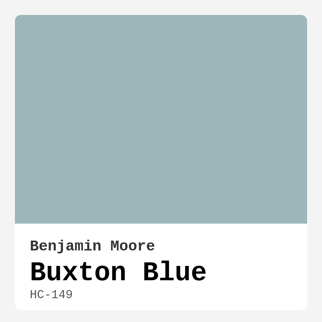
Color Preview & Key Details
| HEX Code | #9DB6BA |
| RGB | 157, 182, 186 |
| LRV | 44.97% |
| Undertone | Blue |
| Finish Options | Eggshell, Matte, Satin |
Imagine walking into a room that instantly calms your senses, wrapping you in a soft embrace of color. That’s the magic of Buxton Blue, a beautiful shade from Benjamin Moore that effortlessly merges sophistication with a serene vibe. If you’re considering a refresh for your space, this color might just be the answer you’ve been searching for.
Buxton Blue, with its cool undertones and gentle depth, is more than just a pretty color. It’s a hue that brings a refreshing energy into various settings, making it ideal for living rooms, bedrooms, dining rooms, and even home offices. Whether your decor leans towards modern, coastal, Scandinavian, or traditional styles, Buxton Blue adapts beautifully, offering versatility without compromising on style.
One of the standout features of Buxton Blue is its ability to reflect light. With a Light Reflectance Value (LRV) of 44.97%, it strikes a balance that allows it to brighten up darker spaces while retaining its rich color in well-lit areas. This means you can enjoy the tranquility it offers without worrying about the room feeling heavy or closed in. It’s perfect for creating an airy atmosphere, especially in smaller rooms where space can feel limited. Just keep in mind that in low light, the color may appear a tad darker, so pairing it with lighter trims or accents is a smart move.
When it comes to application, Buxton Blue shines. It’s beginner-friendly and provides good coverage, typically needing just one or two coats depending on your surface. You can use it in a matte finish for a contemporary look that hides imperfections, or opt for an eggshell or satin finish if you need something more durable for high-traffic areas. Each finish brings a unique character to the color, so think about the atmosphere you want to create when making your choice.
The washability of Buxton Blue is another plus. It’s easy to maintain, making it a practical option for homes with kids or pets. You can wipe down walls with a damp cloth without losing the integrity of the color. Plus, with low VOC levels, it’s a healthier choice for your home environment.
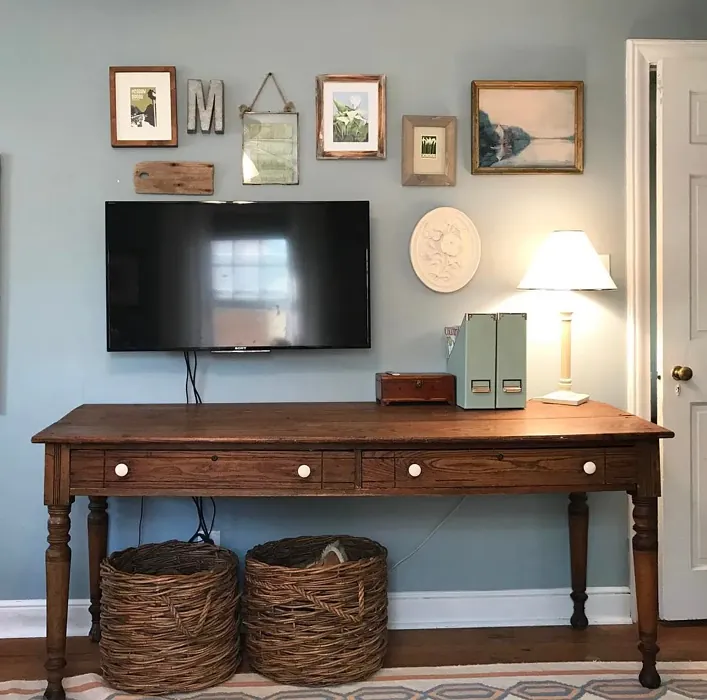
As you consider Buxton Blue, think about how it interacts with other colors in your space. This shade pairs beautifully with whites like Benjamin Moore’s White Dove, creating a crisp contrast that enhances its tranquil feel. You can also play with complementary hues like soft greys or even warm woods to create a balanced and inviting atmosphere. For those who love pops of color, consider using it alongside vibrant accessories or art pieces that can really make the space sing.
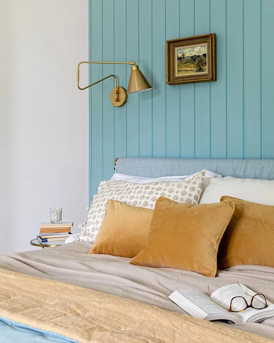
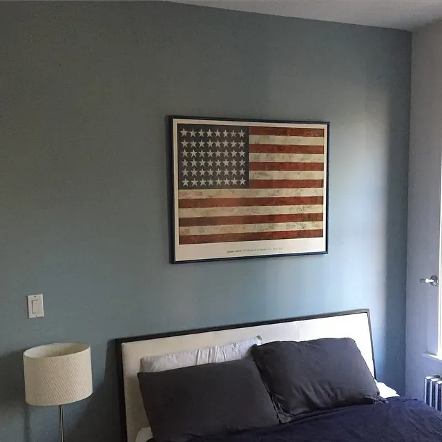
For accent walls, Buxton Blue can work wonders. It draws the eye and creates a focal point without being overpowering. Imagine a cozy reading nook painted in this serene shade, surrounded by books and soft furnishings. It invites relaxation and makes a perfect backdrop for your favorite decor pieces.
If you’re looking to sell your home, Buxton Blue is a designer favorite that can add significant appeal. Its calm and inviting nature can attract potential buyers, making them feel at home from the moment they step inside. It’s a color that resonates with many, creating a sense of comfort and familiarity that’s hard to resist.
Now, let’s talk about some practical tips for incorporating Buxton Blue into your design. Start by choosing the right room. It’s fantastic for spaces where you want a calming effect, like bedrooms and nurseries, but it also adds elegance to dining rooms and home offices. This versatility means you can use it in unexpected ways, like painting your ceiling or using it on furniture pieces for a unique touch.
When it comes to decor styles, Buxton Blue shines in a variety of settings. For a modern look, pair it with sleek, minimalist furnishings and metallic accents. If you’re leaning towards a coastal vibe, incorporate natural textures like jute rugs and driftwood decor. In a Scandinavian-inspired space, mix it with light woods and soft textiles to create a cozy yet fresh atmosphere.
As you dive into your painting project, remember that the color’s undertones play a significant role. Buxton Blue leans towards a cool hue, which means it can offset warmer tones in your furnishings. If you’re unsure about how it will look with your existing decor, grab some samples and test them in various light conditions throughout the day.
Don’t overlook the importance of lighting, either. Buxton Blue thrives in natural light, revealing its serene qualities during the day. However, under artificial lighting, it can take on slightly deeper tones, which adds a warm and inviting ambiance to evening gatherings. This adaptability makes it a winner in any lighting scenario.
If you’re concerned about how to maintain the space after painting, rest assured Buxton Blue’s performance in terms of durability and washability is impressive. It’s easy to touch up if you ever need to, which is a huge plus for busy households. The low odor and quick-drying nature also mean you can get back to enjoying your space in no time.
In conclusion, Buxton Blue is a color that embodies tranquility and sophistication, making it an excellent choice for anyone looking to elevate their home’s atmosphere. Its versatility allows it to shine across various decor styles, while its calming presence can make any space feel like a sanctuary. So, if you’re ready to create a beautiful, personalized interior, consider adding Buxton Blue to your palette. You might just find that this serene shade transforms your home into the peaceful retreat you’ve always dreamed of.
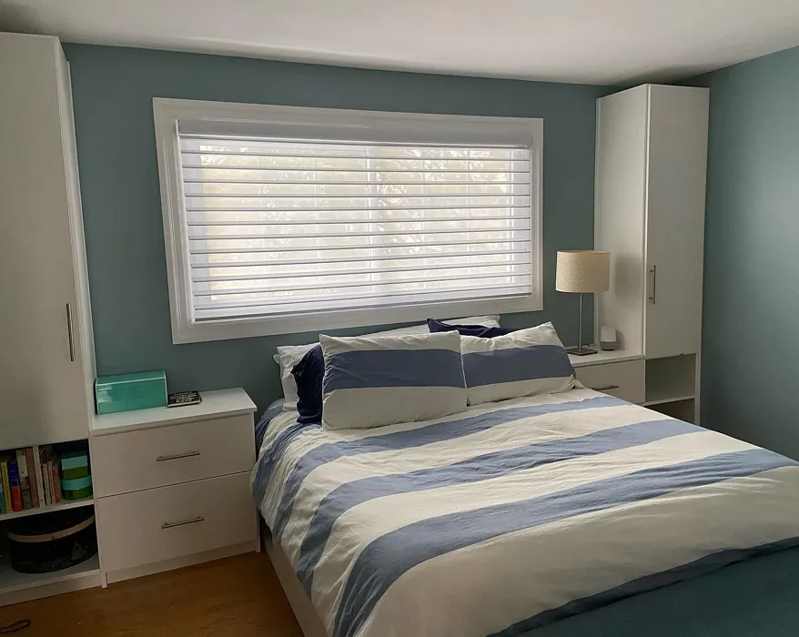
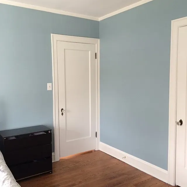
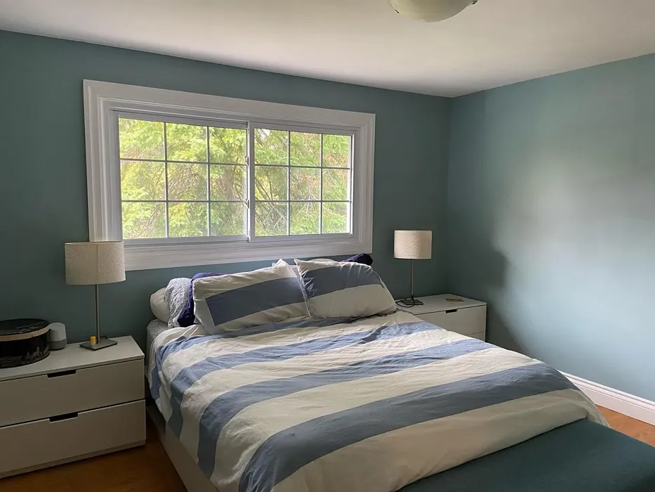
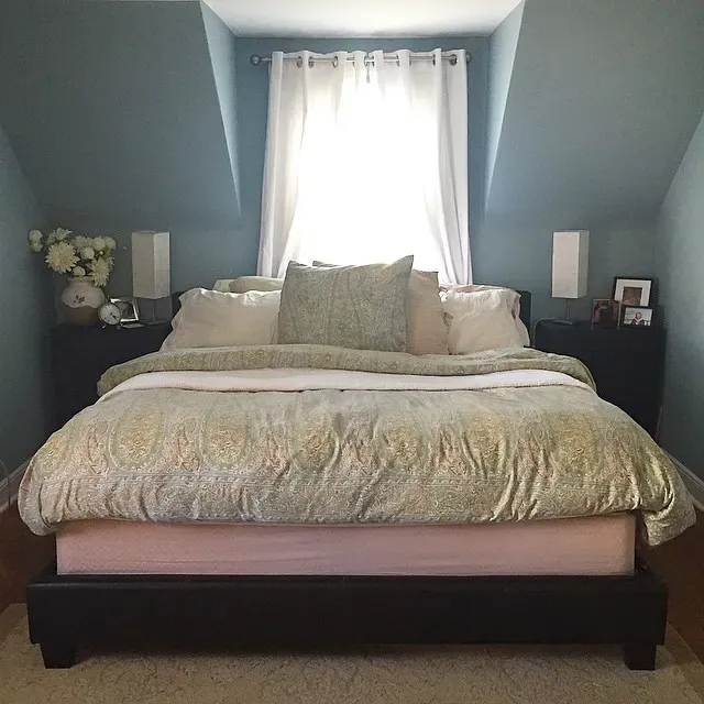
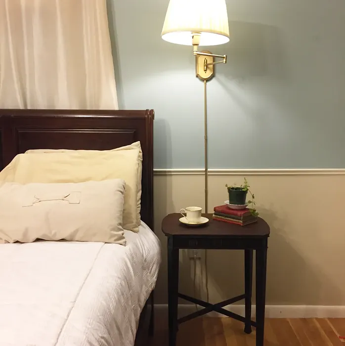
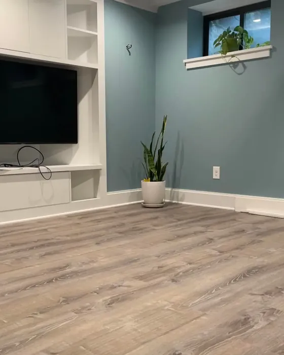
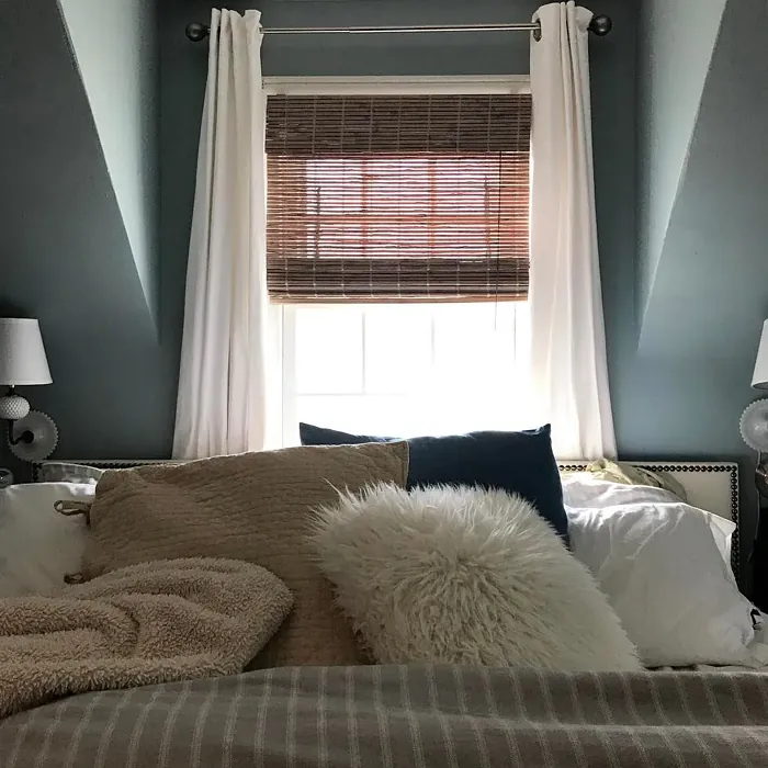
Real Room Photo of Buxton Blue HC-149
Undertones of Buxton Blue ?
Buxton Blue leans towards a cool undertone, giving it a slightly refreshing vibe that can brighten up any room. Its subtle depth adds character without overwhelming the space, making it a great choice for those who prefer a softer palette.
HEX value: #9DB6BA
RGB code: 157, 182, 186
Is Buxton Blue Cool or Warm?
This color is firmly in the cool category, with its blue-green mix that brings a tranquil and soothing atmosphere. It’s perfect for spaces where relaxation is key, effectively calming the mind and spirit.
Understanding Color Properties and Interior Design Tips
Hue refers to a specific position on the color wheel, measured in degrees from 0 to 360. Each degree represents a different pure color:
- 0° represents red
- 120° represents green
- 240° represents blue
Saturation describes the intensity or purity of a color and is expressed as a percentage:
- At 0%, the color appears completely desaturated—essentially a shade of gray
- At 100%, the color is at its most vivid and vibrant
Lightness indicates how light or dark a color is, also expressed as a percentage:
- 0% lightness results in black
- 100% lightness results in white
Using Warm Colors in Interior Design
Warm hues—such as reds, oranges, yellows, warm beiges, and greiges—are excellent choices for creating inviting and energetic spaces. These colors are particularly well-suited for:
- Kitchens, living rooms, and bathrooms, where warmth enhances comfort and sociability
- Large rooms, where warm tones can help reduce the sense of emptiness and make the space feel more intimate
For example:
- Warm beige shades provide a cozy, inviting atmosphere, ideal for living rooms, bedrooms, and hallways.
- Warm greige (a mix of beige and gray) offers the warmth of beige with the modern appeal of gray, making it a versatile backdrop for dining areas, bedrooms, and living spaces.
However, be mindful when using warm light tones in rooms with limited natural light. These shades may appear muted or even take on an unpleasant yellowish tint. To avoid a dull or flat appearance:
- Add depth by incorporating richer tones like deep greens, charcoal, or chocolate brown
- Use textured elements such as curtains, rugs, or cushions to bring dimension to the space
Pro Tip: Achieving Harmony with Warm and Cool Color Balance
To create a well-balanced and visually interesting interior, mix warm and cool tones strategically. This contrast adds depth and harmony to your design.
- If your walls feature warm hues, introduce cool-colored accents such as blue or green furniture, artwork, or accessories to create contrast.
- For a polished look, consider using a complementary color scheme, which pairs colors opposite each other on the color wheel (e.g., red with green, orange with blue).
This thoughtful mix not only enhances visual appeal but also creates a space that feels both dynamic and cohesive.
Light Temperature Affects on Buxton Blue
Natural Light
Natural daylight changes in color temperature as the sun moves across the sky. At sunrise and sunset, the light tends to have a warm, golden tone with a color temperature around 2000 Kelvin (K). As the day progresses and the sun rises higher, the light becomes cooler and more neutral. Around midday, especially when the sky is clear, natural light typically reaches its peak brightness and shifts to a cooler tone, ranging from 5500 to 6500 Kelvin. This midday light is close to what we perceive as pure white or daylight-balanced light.
These shifts in natural light can significantly influence how colors appear in a space, which is why designers often consider both the time of day and the orientation of windows when planning interior color schemes.
Artificial Light
When choosing artificial lighting, pay close attention to the color temperature, measured in Kelvin (K). This determines how warm or cool the light will appear. Lower temperatures, around 2700K, give off a warm, yellow glow often used in living rooms or bedrooms. Higher temperatures, above 5000K, create a cool, bluish light similar to daylight, commonly used in kitchens, offices, or task areas.
Use the slider to see how lighting temperature can affect the appearance of a surface or color throughout a space.


4800K
LRV of Buxton Blue
Buxton Blue has an LRV (Light Reflectance Value) of 45, positioning it in the mid-range spectrum. This means it can reflect a good amount of light while still maintaining its rich color, making it suitable for both bright and dimly lit spaces.
Detailed Review of Buxton Blue
Additional Paint Characteristics
Ideal Rooms
Bedroom, Dining Room, Home Office, Living Room, Nursery
Decor Styles
Coastal, Modern, Scandinavian, Traditional
Coverage
Good (1–2 Coats), Touch-Up Friendly
Ease of Application
Beginner Friendly, Brush Smooth, Fast-Drying, Roller-Ready
Washability
Washable, Wipeable
VOC Level
Low VOC, Ultra Low VOC
Best Use
Accent Wall, Furniture, Interior Walls
Room Suitability
Bedroom, Dining Room, Home Office, Living Room
Tone Tag
Airy, Balanced, Cool, Muted
Finish Type
Eggshell, Matte
Paint Performance
Easy Touch-Up, Low Odor, Quick Drying, Scuff Resistant
Use Cases
Best for Low Light Rooms, Best for Rentals, Best for Selling Your Home, Designer Favorite
Mood
Calm, Grounding, Inviting, Restful
Trim Pairing
Complements Cool Trim, Matches Pure White, Pairs with White Dove
Buxton Blue is a standout choice for anyone looking to infuse their space with a cool and calming hue. Its sophisticated nature makes it highly adaptable, fitting seamlessly into various decor styles from coastal to contemporary. The color can lighten up darker spaces and adds a refreshing touch to well-lit areas. Additionally, it offers good coverage which means you might get away with just two coats, depending on the surface you’re painting. The matte finish provides a modern look that minimizes imperfections while enhancing the elegance of your walls. Whether you’re aiming for a serene bedroom retreat or a stylish living area, Buxton Blue is sure to impress.
Pros & Cons of HC-149 Buxton Blue
Pros
Cons
Colors that go with Benjamin Moore Buxton Blue
FAQ on HC-149 Buxton Blue
What is the best finish for Buxton Blue?
The best finish for Buxton Blue largely depends on the space and desired effect. If you’re looking for a matte finish that hides imperfections, go for that option. However, if you’re in a high-traffic area or need something more durable, an eggshell or satin finish would be ideal due to their washability and ease of maintenance. Each finish brings its own character to the color, so consider the atmosphere you want to create when making your choice.
Can Buxton Blue be used in small spaces?
Absolutely! Buxton Blue can work wonders in smaller rooms. Its cool undertones can create the illusion of more space, making the area feel airy and open. Just be mindful of how much natural light the space receives, as it may appear darker in low-light conditions. Pairing it with lighter trims or accents can enhance the overall look and keep the space feeling bright and welcoming.
Comparisons Buxton Blue with other colors
Buxton Blue HC-149 vs Dutch Tile Blue SW 0031
| Attribute | Buxton Blue HC-149 | Dutch Tile Blue SW 0031 |
|---|---|---|
| Color Name | Buxton Blue HC-149 | Dutch Tile Blue SW 0031 |
| Color | ||
| Hue | Blue | Blue |
| Brightness | Medium | Medium |
| RGB | 157, 182, 186 | 154, 171, 171 |
| LRV | 44.97% | 24% |
| Finish Type | Eggshell, Matte | Eggshell, Matte, Satin |
| Finish Options | Eggshell, Matte, Satin | Eggshell, Flat, Matte, Satin |
| Ideal Rooms | Bedroom, Dining Room, Home Office, Living Room, Nursery | Bathroom, Bedroom, Dining Room, Hallway, Home Office, Kitchen, Living Room |
| Decor Styles | Coastal, Modern, Scandinavian, Traditional | Coastal, Modern Farmhouse, Scandinavian, Traditional, Transitional |
| Coverage | Good (1–2 Coats), Touch-Up Friendly | Good (1–2 Coats) |
| Ease of Application | Beginner Friendly, Brush Smooth, Fast-Drying, Roller-Ready | Beginner Friendly, Brush Smooth, Fast-Drying, Roller-Ready |
| Washability | Washable, Wipeable | Highly Washable, Washable |
| Room Suitability | Bedroom, Dining Room, Home Office, Living Room | Bathroom, Bedroom, Dining Room, Kitchen, Living Room |
| Tone | Airy, Balanced, Cool, Muted | Balanced, Cool, Muted |
| Paint Performance | Easy Touch-Up, Low Odor, Quick Drying, Scuff Resistant | Easy Touch-Up, High Coverage, Low Odor, Quick Drying |
Buxton Blue HC-149 vs Debonair SW 9139
| Attribute | Buxton Blue HC-149 | Debonair SW 9139 |
|---|---|---|
| Color Name | Buxton Blue HC-149 | Debonair SW 9139 |
| Color | ||
| Hue | Blue | Blue |
| Brightness | Medium | Medium |
| RGB | 157, 182, 186 | 144, 160, 166 |
| LRV | 44.97% | 30% |
| Finish Type | Eggshell, Matte | Eggshell, Matte, Satin |
| Finish Options | Eggshell, Matte, Satin | Eggshell, Matte, Satin |
| Ideal Rooms | Bedroom, Dining Room, Home Office, Living Room, Nursery | Bedroom, Dining Room, Home Office, Living Room |
| Decor Styles | Coastal, Modern, Scandinavian, Traditional | Coastal, Industrial, Modern, Transitional |
| Coverage | Good (1–2 Coats), Touch-Up Friendly | Good (1–2 Coats) |
| Ease of Application | Beginner Friendly, Brush Smooth, Fast-Drying, Roller-Ready | Beginner Friendly, Brush Smooth, Roller-Ready |
| Washability | Washable, Wipeable | Washable, Wipeable |
| Room Suitability | Bedroom, Dining Room, Home Office, Living Room | Bedroom, Dining Room, Home Office, Living Room |
| Tone | Airy, Balanced, Cool, Muted | Balanced, Cool, Muted |
| Paint Performance | Easy Touch-Up, Low Odor, Quick Drying, Scuff Resistant | Easy Touch-Up, Low Odor, Quick Drying |
Buxton Blue HC-149 vs Stardew SW 9138
| Attribute | Buxton Blue HC-149 | Stardew SW 9138 |
|---|---|---|
| Color Name | Buxton Blue HC-149 | Stardew SW 9138 |
| Color | ||
| Hue | Blue | Blue |
| Brightness | Medium | Medium |
| RGB | 157, 182, 186 | 166, 178, 181 |
| LRV | 44.97% | 30% |
| Finish Type | Eggshell, Matte | Eggshell, Satin |
| Finish Options | Eggshell, Matte, Satin | Eggshell, Matte, Satin |
| Ideal Rooms | Bedroom, Dining Room, Home Office, Living Room, Nursery | Bathroom, Bedroom, Home Office, Living Room, Nursery |
| Decor Styles | Coastal, Modern, Scandinavian, Traditional | Coastal, Farmhouse, Modern, Scandinavian |
| Coverage | Good (1–2 Coats), Touch-Up Friendly | Good (1–2 Coats) |
| Ease of Application | Beginner Friendly, Brush Smooth, Fast-Drying, Roller-Ready | Beginner Friendly, Brush Smooth, Roller-Ready |
| Washability | Washable, Wipeable | Highly Washable, Washable, Wipeable |
| Room Suitability | Bedroom, Dining Room, Home Office, Living Room | Bathroom, Bedroom, Home Office, Living Room |
| Tone | Airy, Balanced, Cool, Muted | Calm, Cool, Muted |
| Paint Performance | Easy Touch-Up, Low Odor, Quick Drying, Scuff Resistant | Easy Touch-Up, High Coverage, Low Odor |
Buxton Blue HC-149 vs Niebla Azul SW 9137
| Attribute | Buxton Blue HC-149 | Niebla Azul SW 9137 |
|---|---|---|
| Color Name | Buxton Blue HC-149 | Niebla Azul SW 9137 |
| Color | ||
| Hue | Blue | Blue |
| Brightness | Medium | Medium |
| RGB | 157, 182, 186 | 182, 195, 196 |
| LRV | 44.97% | 48% |
| Finish Type | Eggshell, Matte | Eggshell, Matte, Satin |
| Finish Options | Eggshell, Matte, Satin | Eggshell, Matte, Satin |
| Ideal Rooms | Bedroom, Dining Room, Home Office, Living Room, Nursery | Bedroom, Home Office, Living Room, Nursery |
| Decor Styles | Coastal, Modern, Scandinavian, Traditional | Coastal, Modern, Scandinavian, Transitional |
| Coverage | Good (1–2 Coats), Touch-Up Friendly | Good (1–2 Coats), Touch-Up Friendly |
| Ease of Application | Beginner Friendly, Brush Smooth, Fast-Drying, Roller-Ready | Beginner Friendly, Brush Smooth, Roller-Ready |
| Washability | Washable, Wipeable | Highly Washable, Washable |
| Room Suitability | Bedroom, Dining Room, Home Office, Living Room | Bedroom, Home Office, Living Room, Nursery |
| Tone | Airy, Balanced, Cool, Muted | Airy, Cool, Muted |
| Paint Performance | Easy Touch-Up, Low Odor, Quick Drying, Scuff Resistant | Easy Touch-Up, Fade Resistant, Low Odor, Scuff Resistant |
Buxton Blue HC-149 vs Rain SW 6219
| Attribute | Buxton Blue HC-149 | Rain SW 6219 |
|---|---|---|
| Color Name | Buxton Blue HC-149 | Rain SW 6219 |
| Color | ||
| Hue | Blue | Blue |
| Brightness | Medium | Medium |
| RGB | 157, 182, 186 | 171, 190, 191 |
| LRV | 44.97% | 50% |
| Finish Type | Eggshell, Matte | Eggshell, Matte, Satin |
| Finish Options | Eggshell, Matte, Satin | Eggshell, Matte, Satin |
| Ideal Rooms | Bedroom, Dining Room, Home Office, Living Room, Nursery | Bathroom, Bedroom, Home Office, Living Room, Nursery |
| Decor Styles | Coastal, Modern, Scandinavian, Traditional | Coastal, Minimalist, Modern, Scandinavian, Transitional |
| Coverage | Good (1–2 Coats), Touch-Up Friendly | Good (1–2 Coats), Touch-Up Friendly |
| Ease of Application | Beginner Friendly, Brush Smooth, Fast-Drying, Roller-Ready | Beginner Friendly, Brush Smooth, Fast-Drying, Roller-Ready |
| Washability | Washable, Wipeable | Scrubbable, Stain Resistant, Washable |
| Room Suitability | Bedroom, Dining Room, Home Office, Living Room | Bathroom, Bedroom, Home Office, Living Room, Nursery |
| Tone | Airy, Balanced, Cool, Muted | Balanced, Cool, Muted |
| Paint Performance | Easy Touch-Up, Low Odor, Quick Drying, Scuff Resistant | Easy Touch-Up, Low Odor, Quick Drying, Stain Resistant |
Buxton Blue HC-149 vs Morning at Sea SW 9634
| Attribute | Buxton Blue HC-149 | Morning at Sea SW 9634 |
|---|---|---|
| Color Name | Buxton Blue HC-149 | Morning at Sea SW 9634 |
| Color | ||
| Hue | Blue | Blue |
| Brightness | Medium | Medium |
| RGB | 157, 182, 186 | 130, 151, 155 |
| LRV | 44.97% | 50% |
| Finish Type | Eggshell, Matte | Eggshell, Matte |
| Finish Options | Eggshell, Matte, Satin | Eggshell, Matte, Satin |
| Ideal Rooms | Bedroom, Dining Room, Home Office, Living Room, Nursery | Bathroom, Bedroom, Home Office, Living Room |
| Decor Styles | Coastal, Modern, Scandinavian, Traditional | Coastal, Minimalist, Modern, Scandinavian |
| Coverage | Good (1–2 Coats), Touch-Up Friendly | Good (1–2 Coats), Touch-Up Friendly |
| Ease of Application | Beginner Friendly, Brush Smooth, Fast-Drying, Roller-Ready | Beginner Friendly, Brush Smooth, Roller-Ready |
| Washability | Washable, Wipeable | Washable, Wipeable |
| Room Suitability | Bedroom, Dining Room, Home Office, Living Room | Bathroom, Bedroom, Home Office, Living Room |
| Tone | Airy, Balanced, Cool, Muted | Airy, Cool, Muted |
| Paint Performance | Easy Touch-Up, Low Odor, Quick Drying, Scuff Resistant | Easy Touch-Up, Fade Resistant, Low Odor |
Buxton Blue HC-149 vs Sleepy Blue SW 6225
| Attribute | Buxton Blue HC-149 | Sleepy Blue SW 6225 |
|---|---|---|
| Color Name | Buxton Blue HC-149 | Sleepy Blue SW 6225 |
| Color | ||
| Hue | Blue | Blue |
| Brightness | Medium | Medium |
| RGB | 157, 182, 186 | 188, 203, 206 |
| LRV | 44.97% | 50% |
| Finish Type | Eggshell, Matte | Eggshell, Matte, Satin |
| Finish Options | Eggshell, Matte, Satin | Eggshell, Matte, Satin |
| Ideal Rooms | Bedroom, Dining Room, Home Office, Living Room, Nursery | Bedroom, Home Office, Living Room, Nursery |
| Decor Styles | Coastal, Modern, Scandinavian, Traditional | Coastal, Minimalist, Modern Farmhouse, Scandinavian |
| Coverage | Good (1–2 Coats), Touch-Up Friendly | Good (1–2 Coats) |
| Ease of Application | Beginner Friendly, Brush Smooth, Fast-Drying, Roller-Ready | Beginner Friendly, Brush Smooth, Fast-Drying, Roller-Ready |
| Washability | Washable, Wipeable | Highly Washable, Washable |
| Room Suitability | Bedroom, Dining Room, Home Office, Living Room | Bedroom, Home Office, Living Room, Nursery |
| Tone | Airy, Balanced, Cool, Muted | Airy, Cool, Muted |
| Paint Performance | Easy Touch-Up, Low Odor, Quick Drying, Scuff Resistant | Easy Touch-Up, Low Odor, Quick Drying, Scuff Resistant |
Buxton Blue HC-149 vs Lakeside SW 9683
| Attribute | Buxton Blue HC-149 | Lakeside SW 9683 |
|---|---|---|
| Color Name | Buxton Blue HC-149 | Lakeside SW 9683 |
| Color | ||
| Hue | Blue | Blue |
| Brightness | Medium | Medium |
| RGB | 157, 182, 186 | 173, 184, 192 |
| LRV | 44.97% | 24% |
| Finish Type | Eggshell, Matte | Eggshell, Matte, Satin |
| Finish Options | Eggshell, Matte, Satin | Eggshell, Matte, Satin |
| Ideal Rooms | Bedroom, Dining Room, Home Office, Living Room, Nursery | Bathroom, Bedroom, Home Office, Living Room |
| Decor Styles | Coastal, Modern, Scandinavian, Traditional | Coastal, Minimalist, Modern, Rustic |
| Coverage | Good (1–2 Coats), Touch-Up Friendly | Good (1–2 Coats) |
| Ease of Application | Beginner Friendly, Brush Smooth, Fast-Drying, Roller-Ready | Beginner Friendly, Brush Smooth, Roller-Ready |
| Washability | Washable, Wipeable | Scrubbable, Washable |
| Room Suitability | Bedroom, Dining Room, Home Office, Living Room | Bathroom, Bedroom, Home Office, Living Room |
| Tone | Airy, Balanced, Cool, Muted | Balanced, Cool, Muted |
| Paint Performance | Easy Touch-Up, Low Odor, Quick Drying, Scuff Resistant | Easy Touch-Up, Fade Resistant, High Coverage, Low Odor |
Buxton Blue HC-149 vs Upward SW 6239
| Attribute | Buxton Blue HC-149 | Upward SW 6239 |
|---|---|---|
| Color Name | Buxton Blue HC-149 | Upward SW 6239 |
| Color | ||
| Hue | Blue | Blue |
| Brightness | Medium | Medium |
| RGB | 157, 182, 186 | 191, 201, 208 |
| LRV | 44.97% | 75% |
| Finish Type | Eggshell, Matte | Eggshell, Satin |
| Finish Options | Eggshell, Matte, Satin | Eggshell, Flat, Satin |
| Ideal Rooms | Bedroom, Dining Room, Home Office, Living Room, Nursery | Bedroom, Dining Room, Home Office, Living Room, Nursery |
| Decor Styles | Coastal, Modern, Scandinavian, Traditional | Coastal, Minimalist, Modern, Scandinavian |
| Coverage | Good (1–2 Coats), Touch-Up Friendly | Good (1–2 Coats), Touch-Up Friendly |
| Ease of Application | Beginner Friendly, Brush Smooth, Fast-Drying, Roller-Ready | Beginner Friendly, Brush Smooth, Fast-Drying, Roller-Ready |
| Washability | Washable, Wipeable | Washable, Wipeable |
| Room Suitability | Bedroom, Dining Room, Home Office, Living Room | Bedroom, Home Office, Living Room, Nursery |
| Tone | Airy, Balanced, Cool, Muted | Cool, Crisp, Muted |
| Paint Performance | Easy Touch-Up, Low Odor, Quick Drying, Scuff Resistant | High Coverage, Low Odor, Quick Drying |
Buxton Blue HC-149 vs Aleutian SW 6241
| Attribute | Buxton Blue HC-149 | Aleutian SW 6241 |
|---|---|---|
| Color Name | Buxton Blue HC-149 | Aleutian SW 6241 |
| Color | ||
| Hue | Blue | Blue |
| Brightness | Medium | Medium |
| RGB | 157, 182, 186 | 152, 169, 183 |
| LRV | 44.97% | 24% |
| Finish Type | Eggshell, Matte | Eggshell, Matte, Satin |
| Finish Options | Eggshell, Matte, Satin | Eggshell, Matte, Satin |
| Ideal Rooms | Bedroom, Dining Room, Home Office, Living Room, Nursery | Bathroom, Bedroom, Home Office, Kitchen, Living Room, Nursery |
| Decor Styles | Coastal, Modern, Scandinavian, Traditional | Coastal, Minimalist, Modern, Scandinavian, Transitional |
| Coverage | Good (1–2 Coats), Touch-Up Friendly | Good (1–2 Coats), Touch-Up Friendly |
| Ease of Application | Beginner Friendly, Brush Smooth, Fast-Drying, Roller-Ready | Beginner Friendly, Brush Smooth, Fast-Drying, Roller-Ready |
| Washability | Washable, Wipeable | Scrubbable, Stain Resistant, Washable |
| Room Suitability | Bedroom, Dining Room, Home Office, Living Room | Bathroom, Bedroom, Home Office, Living Room, Nursery |
| Tone | Airy, Balanced, Cool, Muted | Airy, Balanced, Cool, Muted |
| Paint Performance | Easy Touch-Up, Low Odor, Quick Drying, Scuff Resistant | Easy Touch-Up, Fade Resistant, Low Odor, Quick Drying |
Official Page of Benjamin Moore Buxton Blue HC-149