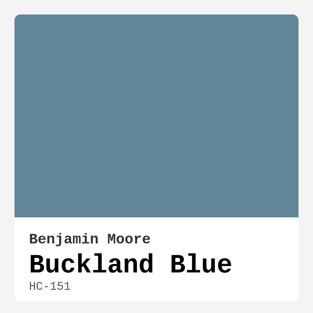
Color Preview & Key Details
| HEX Code | #618697 |
| RGB | 97, 134, 151 |
| LRV | 23.20% |
| Undertone | Blue |
| Finish Options | Eggshell, Matte, Satin |
If you’re searching for a paint color that effortlessly blends serenity with sophistication, let me introduce you to Buckland Blue by Benjamin Moore. This stunning shade, coded HC-151, is a masterful mix of blue and gray that feels like a breath of fresh air in any room. Its hex code, #618697, translates to a hue that’s both calming and deeply versatile, making it a favorite among designers and homeowners alike. Whether you’re revamping a bedroom, refreshing a living room, or adding personality to a home office, Buckland Blue has the power to transform your space into a tranquil retreat.
One of the first things you’ll notice about Buckland Blue is its ability to adapt. With an LRV (Light Reflectance Value) of 23.20%, it sits comfortably in the medium range, meaning it reflects a good amount of light without feeling too heavy. This makes it an excellent choice for rooms with ample natural light, where it can truly shine. In brighter spaces, the color takes on an airy, almost ethereal quality, while in lower light, it softens into a cozy, muted tone that still feels inviting. It’s this chameleon-like quality that makes it so appealing—you’re not just getting one color, but a shade that shifts beautifully with the time of day.
The undertones here are pure blue, which gives Buckland Blue its cool, serene personality. Unlike some blues that can feel icy or stark, this one has just enough gray to keep it grounded and sophisticated. It’s the kind of color that pairs effortlessly with a variety of decor styles, from coastal and Scandinavian to modern farmhouse and transitional. Imagine it in a bedroom with crisp white linens and natural wood accents, or in a home office paired with sleek black furniture and metallic finishes. It’s equally at home in a nursery, where its soothing vibe creates a peaceful environment, or in a kitchen where it can add a touch of unexpected elegance alongside warm brass hardware.
When it comes to application, Buckland Blue is as user-friendly as it gets. It’s beginner-friendly, brushing on smoothly and rolling out evenly, with good coverage that typically only requires one or two coats. The finish options—matte, eggshell, or satin—give you flexibility depending on the room’s needs. Matte is perfect for low-traffic areas where you want a velvety look, while eggshell and satin offer a bit more durability for spaces like kitchens or hallways. Plus, it’s wipeable and washable, so you won’t have to worry about everyday wear and tear. And because it’s low-VOC and eco-certified, you can feel good about using it in your home, especially if you’re sensitive to strong paint odors.
Now, let’s talk about pairing. Buckland Blue is incredibly versatile when it comes to trim and accents. For a classic, clean look, pair it with white trim like Benjamin Moore’s White Dove or Simply White. The contrast is timeless and lets the blue take center stage. If you’re feeling bold, try it with black windows or doors for a modern, high-contrast effect. Warm wood trim is another fantastic option, especially in rustic or farmhouse settings, where the natural tones balance the coolness of the blue. And don’t forget about complementary colors—soft creams, warm taupes, and even muted reds (its complementary hue) can add depth and interest to a space.
Of course, no color is perfect for every situation, and Buckland Blue does have a few considerations. In very small rooms with limited natural light, it can feel a bit cooler than you might expect, so it’s wise to test it first. Sampling is key—paint a large swatch on your wall and observe it at different times of day to see how it behaves in your specific lighting. And while it’s a medium shade, it can read darker in certain conditions, so if you’re working with a tight space, consider balancing it with lighter furniture and decor to keep things feeling open.
If you love Buckland Blue but want something a touch lighter or darker, Benjamin Moore offers a range of similar shades. Lighter options like Horizon or Blue Skies (its equivalents in other brands) can give you a similar vibe with a bit more brightness, while darker shades like Hale Navy or Newburyport Blue offer a moodier alternative. And if you’re looking to create a cohesive palette, explore its complementary colors—soft greens, warm neutrals, and even blush pinks can all play nicely with this blue.
At the end of the day, Buckland Blue is more than just a paint color—it’s a mood. It’s the feeling of a quiet morning by the water, the calm of a well-designed sanctuary, the effortless elegance of a space that just works. Whether you’re painting an entire room or just an accent wall, this shade has the power to elevate your home in a way that feels both intentional and inviting. So grab a sample, brush it on, and see for yourself how this beautiful blue can transform your space. You might just find it’s the perfect shade you’ve been searching for.
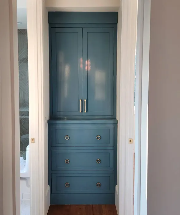
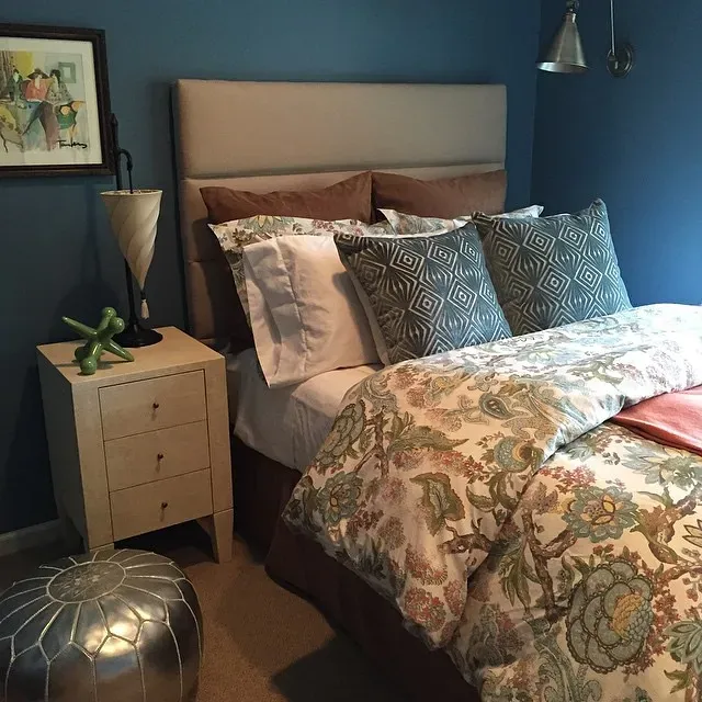
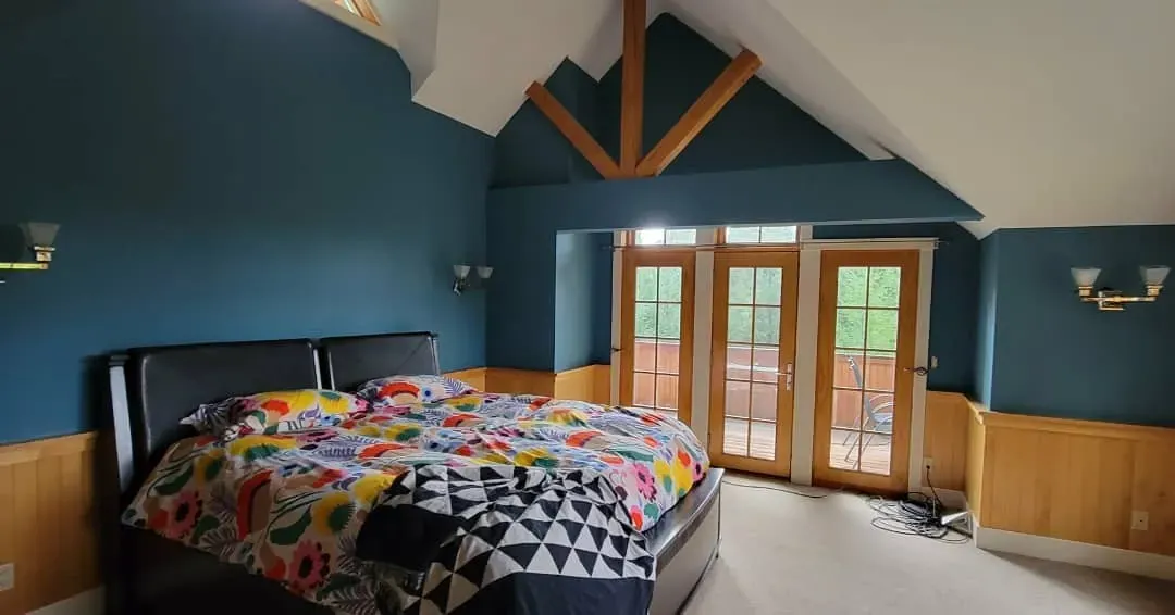
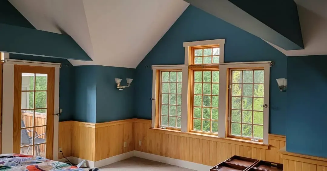
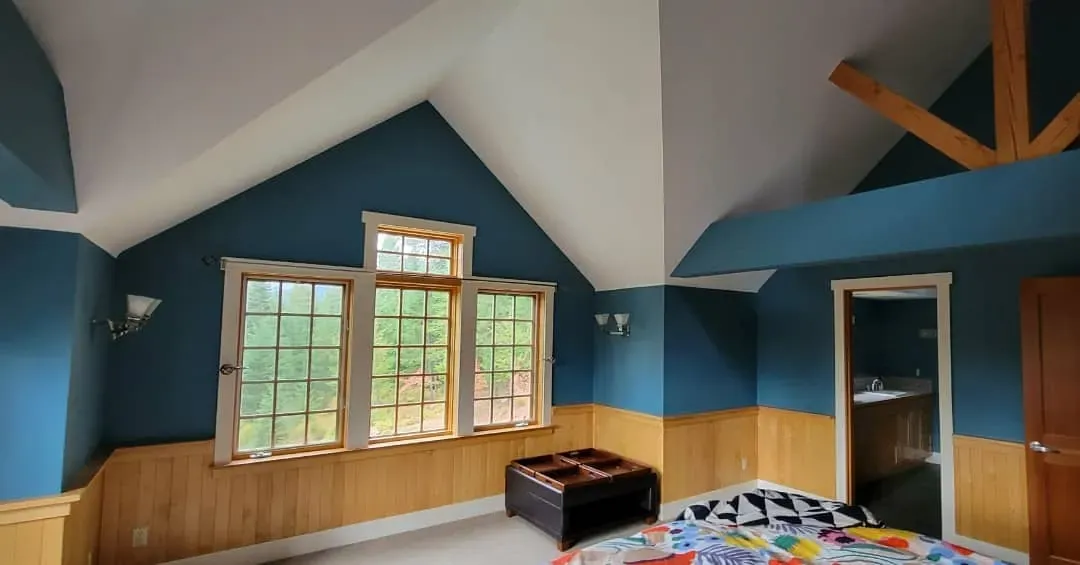
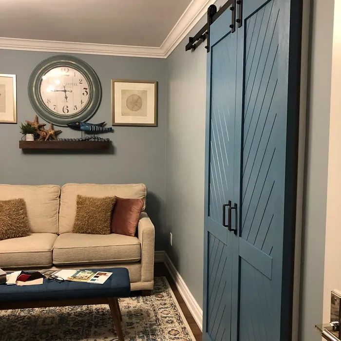
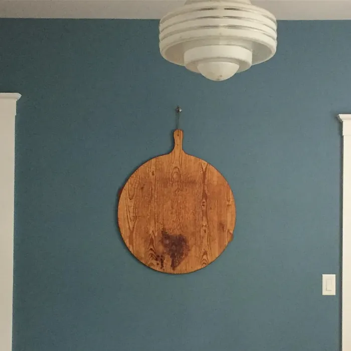
Real Room Photo of Buckland Blue HC-151
Undertones of Buckland Blue ?
The undertones of Buckland Blue are a key aspect of its character, leaning towards Blue. These subtle underlying hues are what give the color its depth and complexity. For example, a gray with a blue undertone will feel cooler and more modern, while one with a brown undertone will feel warmer and more traditional. It’s essential to test this paint in your home and observe it next to your existing furniture, flooring, and decor to see how these undertones interact and reveal themselves throughout the day.
HEX value: #618697
RGB code: 97, 134, 151
Is Buckland Blue Cool or Warm?
Buckland Blue is predominantly a cool color, which can evoke feelings of calm and serenity. Its slightly muted character makes it a great option for spaces where you want to promote relaxation and peace, such as bedrooms and reading nooks.
Understanding Color Properties and Interior Design Tips
Hue refers to a specific position on the color wheel, measured in degrees from 0 to 360. Each degree represents a different pure color:
- 0° represents red
- 120° represents green
- 240° represents blue
Saturation describes the intensity or purity of a color and is expressed as a percentage:
- At 0%, the color appears completely desaturated—essentially a shade of gray
- At 100%, the color is at its most vivid and vibrant
Lightness indicates how light or dark a color is, also expressed as a percentage:
- 0% lightness results in black
- 100% lightness results in white
Using Warm Colors in Interior Design
Warm hues—such as reds, oranges, yellows, warm beiges, and greiges—are excellent choices for creating inviting and energetic spaces. These colors are particularly well-suited for:
- Kitchens, living rooms, and bathrooms, where warmth enhances comfort and sociability
- Large rooms, where warm tones can help reduce the sense of emptiness and make the space feel more intimate
For example:
- Warm beige shades provide a cozy, inviting atmosphere, ideal for living rooms, bedrooms, and hallways.
- Warm greige (a mix of beige and gray) offers the warmth of beige with the modern appeal of gray, making it a versatile backdrop for dining areas, bedrooms, and living spaces.
However, be mindful when using warm light tones in rooms with limited natural light. These shades may appear muted or even take on an unpleasant yellowish tint. To avoid a dull or flat appearance:
- Add depth by incorporating richer tones like deep greens, charcoal, or chocolate brown
- Use textured elements such as curtains, rugs, or cushions to bring dimension to the space
Pro Tip: Achieving Harmony with Warm and Cool Color Balance
To create a well-balanced and visually interesting interior, mix warm and cool tones strategically. This contrast adds depth and harmony to your design.
- If your walls feature warm hues, introduce cool-colored accents such as blue or green furniture, artwork, or accessories to create contrast.
- For a polished look, consider using a complementary color scheme, which pairs colors opposite each other on the color wheel (e.g., red with green, orange with blue).
This thoughtful mix not only enhances visual appeal but also creates a space that feels both dynamic and cohesive.

Light Temperature Affects on Buckland Blue
Natural Light
Natural daylight changes in color temperature as the sun moves across the sky. At sunrise and sunset, the light tends to have a warm, golden tone with a color temperature around 2000 Kelvin (K). As the day progresses and the sun rises higher, the light becomes cooler and more neutral. Around midday, especially when the sky is clear, natural light typically reaches its peak brightness and shifts to a cooler tone, ranging from 5500 to 6500 Kelvin. This midday light is close to what we perceive as pure white or daylight-balanced light.
These shifts in natural light can significantly influence how colors appear in a space, which is why designers often consider both the time of day and the orientation of windows when planning interior color schemes.
Artificial Light
When choosing artificial lighting, pay close attention to the color temperature, measured in Kelvin (K). This determines how warm or cool the light will appear. Lower temperatures, around 2700K, give off a warm, yellow glow often used in living rooms or bedrooms. Higher temperatures, above 5000K, create a cool, bluish light similar to daylight, commonly used in kitchens, offices, or task areas.
Use the slider to see how lighting temperature can affect the appearance of a surface or color throughout a space.


4800K
LRV of Buckland Blue
The Light Reflectance Value (LRV) of Buckland Blue is 23.20%, which places it in the Medium colors category. This means it reflect a lot of light. Understanding a paint’s LRV is crucial for predicting how it will look in your space. A higher LRV indicates a lighter color that reflects more light, making rooms feel larger and brighter. A lower LRV signifies a darker color that absorbs more light, creating a cozier, more intimate atmosphere. Always consider the natural and artificial lighting in your room when selecting a paint color based on its LRV.
Detailed Review of Buckland Blue
Additional Paint Characteristics
Ideal Rooms
Bedroom, Dining Room, Home Office, Kitchen, Living Room, Nursery
Decor Styles
Coastal, Farmhouse, Modern, Scandinavian, Transitional
Coverage
Good (1–2 Coats), Touch-Up Friendly
Ease of Application
Beginner Friendly, Brush Smooth, Roller-Ready
Washability
Washable, Wipeable
VOC Level
Eco-Certified, Low VOC
Best Use
Accent Wall, Furniture, Interior Walls
Room Suitability
Bedroom, Home Office, Kitchen, Living Room, Nursery
Tone Tag
Balanced, Cool, Muted
Finish Type
Eggshell, Matte, Satin
Paint Performance
Fade Resistant, High Coverage, Low Odor
Use Cases
Best for Open Concept, Best for Small Spaces, Classic Favorite, Designer Favorite
Mood
Calm, Inviting, Restful
Trim Pairing
Complements Warm Trim, Good with Wood Trim, Matches Pure White, Pairs with White Dove
Buckland Blue is a stunning choice for those looking to create a calming atmosphere in their home. This color shines beautifully in natural light, bringing out its softer, cooler tones. When applied, it dries with a lovely finish, whether you opt for matte or eggshell. It works particularly well in spaces where relaxation is key, like bedrooms and home offices. One of the standout features of Buckland Blue is how well it pairs with both warm and cool accents, making it a highly adaptable choice. Just make sure to test it in different lighting conditions, as its appearance can change subtly throughout the day. Overall, Buckland Blue is a top-notch pick for anyone aiming to achieve a tranquil vibe in their living spaces.
Pros & Cons of HC-151 Buckland Blue
Pros
Cons
Colors that go with Benjamin Moore Buckland Blue
FAQ on HC-151 Buckland Blue
Can Buckland Blue be used in a small room?
Absolutely! Buckland Blue can work in small spaces, but it’s essential to ensure that the room gets enough natural light. Its cool undertones can help create an illusion of space, making it feel more open and airy. For best results, pair it with lighter furnishings and accents to maintain a bright atmosphere.
What trim colors pair well with Buckland Blue?
Buckland Blue pairs beautifully with various trim colors. For a classic look, opt for white trims like White Dove or Simply White. If you’re aiming for a more dramatic contrast, consider black windows or warm wood trim. The versatility of this blue allows you to play with different styles and finishes.
Comparisons Buckland Blue with other colors
Buckland Blue HC-151 vs Naval SW 6244
| Attribute | Buckland Blue HC-151 | Naval SW 6244 |
|---|---|---|
| Color Name | Buckland Blue HC-151 | Naval SW 6244 |
| Color | ||
| Hue | Blue | Blue |
| Brightness | Dark | Dark |
| RGB | 97, 134, 151 | 47, 61, 76 |
| LRV | 23.20% | 4% |
| Finish Type | Eggshell, Matte, Satin | Matte, Satin, Semi-Gloss |
| Finish Options | Eggshell, Matte, Satin | Matte, Satin, Semi-Gloss |
| Ideal Rooms | Bedroom, Dining Room, Home Office, Kitchen, Living Room, Nursery | Bedroom, Dining Room, Hallway, Home Office, Living Room |
| Decor Styles | Coastal, Farmhouse, Modern, Scandinavian, Transitional | Coastal, Industrial, Minimalist, Modern, Traditional |
| Coverage | Good (1–2 Coats), Touch-Up Friendly | Good (1–2 Coats), Self-Priming |
| Ease of Application | Beginner Friendly, Brush Smooth, Roller-Ready | Beginner Friendly, Brush Smooth, Roller-Ready |
| Washability | Washable, Wipeable | Highly Washable, Washable |
| Room Suitability | Bedroom, Home Office, Kitchen, Living Room, Nursery | Bedroom, Dining Room, Entryway, Home Office, Living Room |
| Tone | Balanced, Cool, Muted | Cool, Deep, Moody |
| Paint Performance | Fade Resistant, High Coverage, Low Odor | Easy Touch-Up, High Coverage, Low Odor, Scuff Resistant |
Buckland Blue HC-151 vs Sea Serpent SW 7615
| Attribute | Buckland Blue HC-151 | Sea Serpent SW 7615 |
|---|---|---|
| Color Name | Buckland Blue HC-151 | Sea Serpent SW 7615 |
| Color | ||
| Hue | Blue | Blue |
| Brightness | Dark | Dark |
| RGB | 97, 134, 151 | 62, 75, 84 |
| LRV | 23.20% | 12% |
| Finish Type | Eggshell, Matte, Satin | Eggshell, Matte, Satin |
| Finish Options | Eggshell, Matte, Satin | Eggshell, Matte, Satin |
| Ideal Rooms | Bedroom, Dining Room, Home Office, Kitchen, Living Room, Nursery | Bathroom, Bedroom, Home Office, Living Room |
| Decor Styles | Coastal, Farmhouse, Modern, Scandinavian, Transitional | Coastal, Farmhouse, Industrial, Modern |
| Coverage | Good (1–2 Coats), Touch-Up Friendly | Good (1–2 Coats), Touch-Up Friendly |
| Ease of Application | Beginner Friendly, Brush Smooth, Roller-Ready | Beginner Friendly, Brush Smooth, Roller-Ready |
| Washability | Washable, Wipeable | Highly Washable, Washable |
| Room Suitability | Bedroom, Home Office, Kitchen, Living Room, Nursery | Bathroom, Bedroom, Home Office, Living Room |
| Tone | Balanced, Cool, Muted | Cool, Deep, Moody |
| Paint Performance | Fade Resistant, High Coverage, Low Odor | Easy Touch-Up, High Coverage, Low Odor |
Buckland Blue HC-151 vs Rain Cloud SW 9639
| Attribute | Buckland Blue HC-151 | Rain Cloud SW 9639 |
|---|---|---|
| Color Name | Buckland Blue HC-151 | Rain Cloud SW 9639 |
| Color | ||
| Hue | Blue | Blue |
| Brightness | Dark | Dark |
| RGB | 97, 134, 151 | 83, 97, 104 |
| LRV | 23.20% | 30% |
| Finish Type | Eggshell, Matte, Satin | Eggshell, Matte, Satin |
| Finish Options | Eggshell, Matte, Satin | Eggshell, Matte, Satin |
| Ideal Rooms | Bedroom, Dining Room, Home Office, Kitchen, Living Room, Nursery | Bedroom, Dining Room, Home Office, Living Room |
| Decor Styles | Coastal, Farmhouse, Modern, Scandinavian, Transitional | Coastal, Contemporary, Minimalist, Scandinavian |
| Coverage | Good (1–2 Coats), Touch-Up Friendly | Good (1–2 Coats), Touch-Up Friendly |
| Ease of Application | Beginner Friendly, Brush Smooth, Roller-Ready | Beginner Friendly, Brush Smooth, Roller-Ready |
| Washability | Washable, Wipeable | Highly Washable, Washable |
| Room Suitability | Bedroom, Home Office, Kitchen, Living Room, Nursery | Bedroom, Home Office, Living Room |
| Tone | Balanced, Cool, Muted | Balanced, Cool, Muted |
| Paint Performance | Fade Resistant, High Coverage, Low Odor | Easy Touch-Up, Fade Resistant, Low Odor |
Buckland Blue HC-151 vs Indigo Batik SW 7602
| Attribute | Buckland Blue HC-151 | Indigo Batik SW 7602 |
|---|---|---|
| Color Name | Buckland Blue HC-151 | Indigo Batik SW 7602 |
| Color | ||
| Hue | Blue | Blue |
| Brightness | Dark | Dark |
| RGB | 97, 134, 151 | 62, 80, 99 |
| LRV | 23.20% | 10% |
| Finish Type | Eggshell, Matte, Satin | Matte, Satin |
| Finish Options | Eggshell, Matte, Satin | Eggshell, Flat, Matte, Satin |
| Ideal Rooms | Bedroom, Dining Room, Home Office, Kitchen, Living Room, Nursery | Bedroom, Dining Room, Home Office, Living Room |
| Decor Styles | Coastal, Farmhouse, Modern, Scandinavian, Transitional | Bohemian, Coastal, Contemporary, Modern |
| Coverage | Good (1–2 Coats), Touch-Up Friendly | Good (1–2 Coats), Touch-Up Friendly |
| Ease of Application | Beginner Friendly, Brush Smooth, Roller-Ready | Brush Smooth, Fast-Drying, Roller-Ready |
| Washability | Washable, Wipeable | Scrubbable, Washable, Wipeable |
| Room Suitability | Bedroom, Home Office, Kitchen, Living Room, Nursery | Bedroom, Dining Room, Home Office, Living Room |
| Tone | Balanced, Cool, Muted | Cool, Deep, Moody |
| Paint Performance | Fade Resistant, High Coverage, Low Odor | Easy Touch-Up, High Coverage, Low Odor, Quick Drying |
Buckland Blue HC-151 vs Sea Mariner SW 9640
| Attribute | Buckland Blue HC-151 | Sea Mariner SW 9640 |
|---|---|---|
| Color Name | Buckland Blue HC-151 | Sea Mariner SW 9640 |
| Color | ||
| Hue | Blue | Blue |
| Brightness | Dark | Dark |
| RGB | 97, 134, 151 | 67, 74, 84 |
| LRV | 23.20% | 6% |
| Finish Type | Eggshell, Matte, Satin | Eggshell, Matte, Satin |
| Finish Options | Eggshell, Matte, Satin | Eggshell, Matte, Satin |
| Ideal Rooms | Bedroom, Dining Room, Home Office, Kitchen, Living Room, Nursery | Bedroom, Dining Room, Hallway, Home Office, Living Room |
| Decor Styles | Coastal, Farmhouse, Modern, Scandinavian, Transitional | Coastal, Industrial, Minimalist, Modern |
| Coverage | Good (1–2 Coats), Touch-Up Friendly | Good (1–2 Coats) |
| Ease of Application | Beginner Friendly, Brush Smooth, Roller-Ready | Beginner Friendly, Brush Smooth, Roller-Ready |
| Washability | Washable, Wipeable | Scrubbable, Washable |
| Room Suitability | Bedroom, Home Office, Kitchen, Living Room, Nursery | Bedroom, Dining Room, Home Office, Living Room |
| Tone | Balanced, Cool, Muted | Cool, Deep, Moody |
| Paint Performance | Fade Resistant, High Coverage, Low Odor | Easy Touch-Up, Low Odor, Quick Drying |
Buckland Blue HC-151 vs Still Water SW 6223
| Attribute | Buckland Blue HC-151 | Still Water SW 6223 |
|---|---|---|
| Color Name | Buckland Blue HC-151 | Still Water SW 6223 |
| Color | ||
| Hue | Blue | Blue |
| Brightness | Dark | Dark |
| RGB | 97, 134, 151 | 74, 93, 95 |
| LRV | 23.20% | 48% |
| Finish Type | Eggshell, Matte, Satin | Eggshell, Matte, Satin |
| Finish Options | Eggshell, Matte, Satin | Eggshell, Matte, Satin |
| Ideal Rooms | Bedroom, Dining Room, Home Office, Kitchen, Living Room, Nursery | Bedroom, Dining Room, Home Office, Living Room, Nursery |
| Decor Styles | Coastal, Farmhouse, Modern, Scandinavian, Transitional | Coastal, Contemporary, Farmhouse, Modern, Rustic |
| Coverage | Good (1–2 Coats), Touch-Up Friendly | Good (1–2 Coats), Touch-Up Friendly |
| Ease of Application | Beginner Friendly, Brush Smooth, Roller-Ready | Beginner Friendly, Brush Smooth, Roller-Ready |
| Washability | Washable, Wipeable | Highly Washable, Washable |
| Room Suitability | Bedroom, Home Office, Kitchen, Living Room, Nursery | Bedroom, Dining Room, Home Office, Living Room |
| Tone | Balanced, Cool, Muted | Cool, Earthy, Muted |
| Paint Performance | Fade Resistant, High Coverage, Low Odor | Easy Touch-Up, Fade Resistant, Low Odor |
Buckland Blue HC-151 vs Waterloo SW 9141
| Attribute | Buckland Blue HC-151 | Waterloo SW 9141 |
|---|---|---|
| Color Name | Buckland Blue HC-151 | Waterloo SW 9141 |
| Color | ||
| Hue | Blue | Blue |
| Brightness | Dark | Dark |
| RGB | 97, 134, 151 | 83, 104, 114 |
| LRV | 23.20% | 12% |
| Finish Type | Eggshell, Matte, Satin | Matte, Satin |
| Finish Options | Eggshell, Matte, Satin | Matte, Satin, Semi-Gloss |
| Ideal Rooms | Bedroom, Dining Room, Home Office, Kitchen, Living Room, Nursery | Bedroom, Dining Room, Hallway, Home Office, Living Room |
| Decor Styles | Coastal, Farmhouse, Modern, Scandinavian, Transitional | Coastal, Industrial, Modern, Rustic |
| Coverage | Good (1–2 Coats), Touch-Up Friendly | Good (1–2 Coats), Touch-Up Friendly |
| Ease of Application | Beginner Friendly, Brush Smooth, Roller-Ready | Brush Smooth, Fast-Drying, Roller-Ready |
| Washability | Washable, Wipeable | Scrubbable, Washable |
| Room Suitability | Bedroom, Home Office, Kitchen, Living Room, Nursery | Bedroom, Dining Room, Home Office, Living Room |
| Tone | Balanced, Cool, Muted | Balanced, Cool, Muted |
| Paint Performance | Fade Resistant, High Coverage, Low Odor | Easy Touch-Up, Fade Resistant, Low Odor, Quick Drying |
Buckland Blue HC-151 vs Smoky Blue SW 7604
| Attribute | Buckland Blue HC-151 | Smoky Blue SW 7604 |
|---|---|---|
| Color Name | Buckland Blue HC-151 | Smoky Blue SW 7604 |
| Color | ||
| Hue | Blue | Blue |
| Brightness | Dark | Dark |
| RGB | 97, 134, 151 | 89, 110, 121 |
| LRV | 23.20% | 15% |
| Finish Type | Eggshell, Matte, Satin | Eggshell, Matte, Satin |
| Finish Options | Eggshell, Matte, Satin | Eggshell, Matte, Satin |
| Ideal Rooms | Bedroom, Dining Room, Home Office, Kitchen, Living Room, Nursery | Bathroom, Bedroom, Home Office, Kitchen, Living Room |
| Decor Styles | Coastal, Farmhouse, Modern, Scandinavian, Transitional | Coastal, Modern, Scandinavian, Transitional |
| Coverage | Good (1–2 Coats), Touch-Up Friendly | Good (1–2 Coats), Touch-Up Friendly |
| Ease of Application | Beginner Friendly, Brush Smooth, Roller-Ready | Beginner Friendly, Brush Smooth, Roller-Ready |
| Washability | Washable, Wipeable | Highly Washable, Washable |
| Room Suitability | Bedroom, Home Office, Kitchen, Living Room, Nursery | Bathroom, Bedroom, Home Office, Living Room |
| Tone | Balanced, Cool, Muted | Cool, Dusty, Muted |
| Paint Performance | Fade Resistant, High Coverage, Low Odor | High Coverage, Low Odor, Quick Drying |
Buckland Blue HC-151 vs Needlepoint Navy SW 0032
| Attribute | Buckland Blue HC-151 | Needlepoint Navy SW 0032 |
|---|---|---|
| Color Name | Buckland Blue HC-151 | Needlepoint Navy SW 0032 |
| Color | ||
| Hue | Blue | Blue |
| Brightness | Dark | Dark |
| RGB | 97, 134, 151 | 84, 102, 112 |
| LRV | 23.20% | 4% |
| Finish Type | Eggshell, Matte, Satin | Matte, Satin, Semi-Gloss |
| Finish Options | Eggshell, Matte, Satin | Matte, Satin, Semi-Gloss |
| Ideal Rooms | Bedroom, Dining Room, Home Office, Kitchen, Living Room, Nursery | Bedroom, Dining Room, Entryway, Home Office, Living Room |
| Decor Styles | Coastal, Farmhouse, Modern, Scandinavian, Transitional | Coastal, Contemporary, Modern Farmhouse, Nautical, Traditional |
| Coverage | Good (1–2 Coats), Touch-Up Friendly | Good (1–2 Coats), Touch-Up Friendly |
| Ease of Application | Beginner Friendly, Brush Smooth, Roller-Ready | Beginner Friendly, Brush Smooth, Fast-Drying, Roller-Ready |
| Washability | Washable, Wipeable | Scrubbable, Washable |
| Room Suitability | Bedroom, Home Office, Kitchen, Living Room, Nursery | Bedroom, Dining Room, Home Office, Living Room |
| Tone | Balanced, Cool, Muted | Cool, Deep, Muted |
| Paint Performance | Fade Resistant, High Coverage, Low Odor | Easy Touch-Up, High Coverage, Low Odor, Quick Drying, Stain Resistant |
Buckland Blue HC-151 vs Riverway SW 6222
| Attribute | Buckland Blue HC-151 | Riverway SW 6222 |
|---|---|---|
| Color Name | Buckland Blue HC-151 | Riverway SW 6222 |
| Color | ||
| Hue | Blue | Blue |
| Brightness | Dark | Dark |
| RGB | 97, 134, 151 | 93, 114, 116 |
| LRV | 23.20% | 24% |
| Finish Type | Eggshell, Matte, Satin | Eggshell, Satin |
| Finish Options | Eggshell, Matte, Satin | Eggshell, Matte, Satin |
| Ideal Rooms | Bedroom, Dining Room, Home Office, Kitchen, Living Room, Nursery | Bathroom, Bedroom, Dining Room, Home Office, Living Room |
| Decor Styles | Coastal, Farmhouse, Modern, Scandinavian, Transitional | Coastal, Contemporary, Eclectic, Modern, Rustic |
| Coverage | Good (1–2 Coats), Touch-Up Friendly | Good (1–2 Coats), Touch-Up Friendly |
| Ease of Application | Beginner Friendly, Brush Smooth, Roller-Ready | Beginner Friendly, Brush Smooth, Fast-Drying, Low Splatter, Roller-Ready |
| Washability | Washable, Wipeable | Highly Washable, Washable |
| Room Suitability | Bedroom, Home Office, Kitchen, Living Room, Nursery | Bathroom, Bedroom, Home Office, Living Room |
| Tone | Balanced, Cool, Muted | Balanced, Cool, Muted |
| Paint Performance | Fade Resistant, High Coverage, Low Odor | Easy Touch-Up, High Coverage, Low Odor, Quick Drying |
Official Page of Benjamin Moore Buckland Blue HC-151