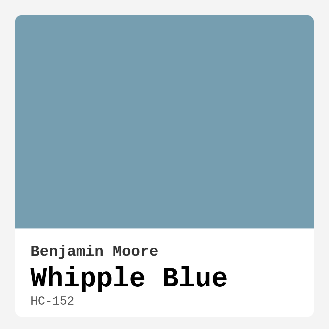
Color Preview & Key Details
| HEX Code | #769EB0 |
| RGB | 118, 158, 176 |
| LRV | 32.37% |
| Undertone | Blue |
| Finish Options | Eggshell, Flat, Matte, Satin, Semi-Gloss |
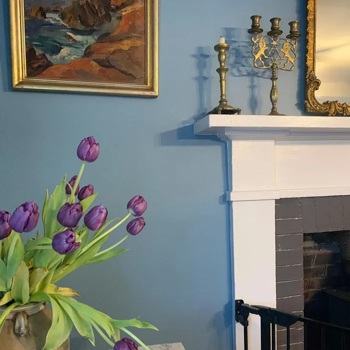
Imagine stepping into a room that instantly makes you feel at ease, as if you’ve just settled into a cozy nook by the ocean. That’s the magic of Whipple Blue by Benjamin Moore. It’s not just a color; it’s an experience, a mood, and a refreshing embrace of tranquility. This serene hue captures the essence of a clear sky, turning any space into a soothing oasis.
Whipple Blue, with its hex code #769EB0 and RGB values of 118, 158, 176, strikes a perfect balance between warmth and coolness. It’s classified as a medium color, with a Light Reflectance Value (LRV) of 32.37%, which means it reflects a good amount of light without overwhelming the senses. This makes it an excellent choice for a variety of rooms, from bedrooms to home offices, and even nurseries where a peaceful atmosphere is key.
The beauty of Whipple Blue lies not just in its color but in the feelings it evokes. It’s calming and inviting, making it an ideal backdrop for spaces meant for relaxation. Whether you’re curling up with a good book or enjoying a quiet moment after a long day, this color wraps you in a sense of calm.
Now, let’s talk about application. If you’re a DIY enthusiast or a first-time painter, you’ll find Whipple Blue to be incredibly user-friendly. It boasts a smooth application process, and it’s roller-ready, making it easy to achieve a beautiful finish with either a brush or a roller. Plus, it dries quickly, so you won’t be left waiting around for hours.
One of the standout features of this paint is its good coverage. You might only need one to two coats, which is incredibly efficient. It’s also touch-up friendly, so if you have a little mishap, you can fix it without a hitch. And let’s not forget its washability; it’s scrubbable and low VOC, making it an eco-conscious choice that’s safe for your home.
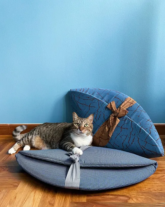
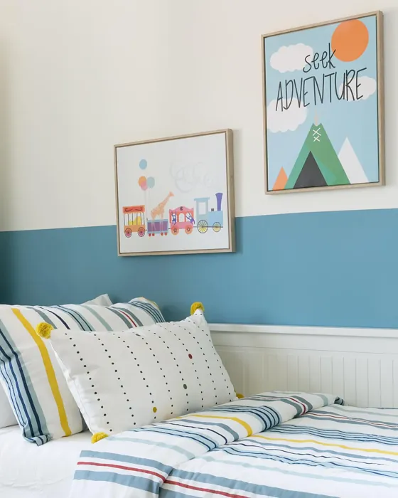
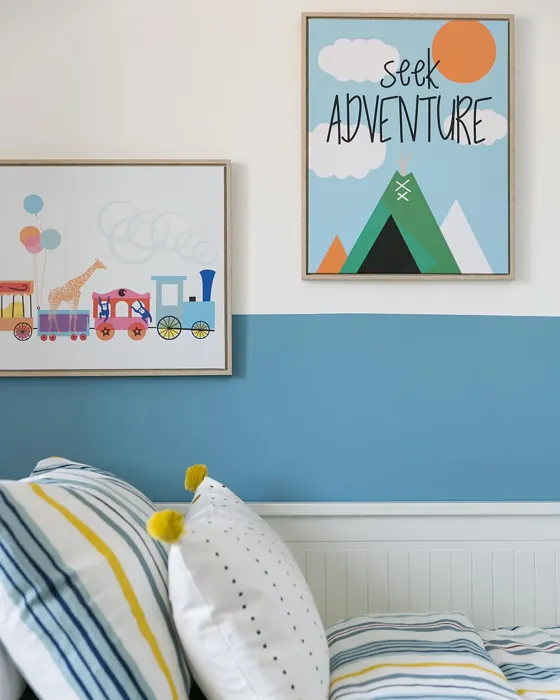
Whipple Blue shines particularly in spaces like bedrooms and nurseries, where a calming vibe is essential. Its subtle depth and cool tone can make even smaller rooms feel larger, creating an illusion of openness. Just be mindful of the natural light in your space; in dimly lit areas, it may appear slightly cooler. Pair it with lighter decor to maintain that airy, inviting feel.
When it comes to decor styles, Whipple Blue is a chameleon. It fits beautifully in coastal homes, modern farmhouses, Scandinavian designs, and even traditional settings. The undertone of this color leans towards a subtle gray, giving it a sophisticated depth that enhances its versatility. This means it can pair well with a variety of colors, from soft whites to darker accents.
Speaking of pairing, let’s chat about trim colors. Whipple Blue looks stunning with white trims like White Dove or Simply White for a clean, classic look. If you’re feeling adventurous, black windows can create a striking contrast that adds character and drama to your space. The key is to balance the coolness of Whipple Blue with warmer or neutral trim colors for a cohesive design.
You might be wondering about complementary colors. If you’re considering adding accents, shades like CSP-415 and 2114-30 work wonderfully. These complementary hues can enhance the tranquil nature of Whipple Blue, ensuring your space feels harmonious.
For those who love to play with color, Whipple Blue can also be combined with bolder shades. The cool tone allows it to coexist beautifully with warmer colors, but it does require careful pairing. For instance, mixing it with warm yellows or reds can create a dynamic visual contrast, making your space vibrant yet cohesive.
Now, let’s address a couple of frequently asked questions. Can you use Whipple Blue in a small room? Absolutely! This color can work wonders in smaller spaces. It can create an illusion of depth and openness, making the room feel larger. Just remember to pair it with lighter decor to keep that bright and airy feel.
Another common question is about what trim colors work best. As mentioned, you can opt for classic white trims for a refined look. If you want to make a bold statement, black trim can provide a striking contrast. The goal is to find a balance that complements the coolness of Whipple Blue while adding warmth or neutrality.
One of the joys of choosing Whipple Blue is its versatility. It can effortlessly transition from a serene bedroom to a lively home office. Each application reveals a different mood, yet it consistently retains that calming essence.
In terms of performance, Whipple Blue is a designer favorite for rentals because of its low odor and quick-drying qualities. It’s also fade-resistant, ensuring your walls maintain that beautiful color over time. Whether you’re refreshing a single room or revamping your entire home, this hue stands out as a reliable choice.
If you’re looking for lighter shades, consider exploring colors like 1669 or 1663. For a more dramatic look, darker shades like CW-670 and AF-520 can provide a stunning contrast. Each of these colors interacts with Whipple Blue in unique ways, allowing you to create layered and dynamic spaces.
The mood that Whipple Blue creates is calm, inviting, and restful. It brings a brightening quality to interiors, making them feel more expansive and open. The airy nature of this color is perfect for creating a serene atmosphere, especially in rooms where peace and relaxation are paramount.
In conclusion, Whipple Blue by Benjamin Moore is more than just a paint color; it’s a transformative hue that brings a sense of serenity and openness to any space. Its versatile nature allows it to adapt to various decor styles, making it a smart choice for homeowners looking to create personalized, beautiful interiors. Whether you’re painting a nursery, a cozy bedroom, or a charming living room, Whipple Blue can help you achieve that perfect balance of tranquility and style. So why not embrace this stunning shade and let it infuse your home with a refreshing touch of calm? You won’t regret it.
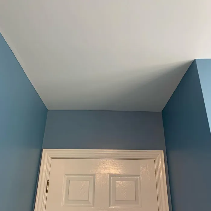
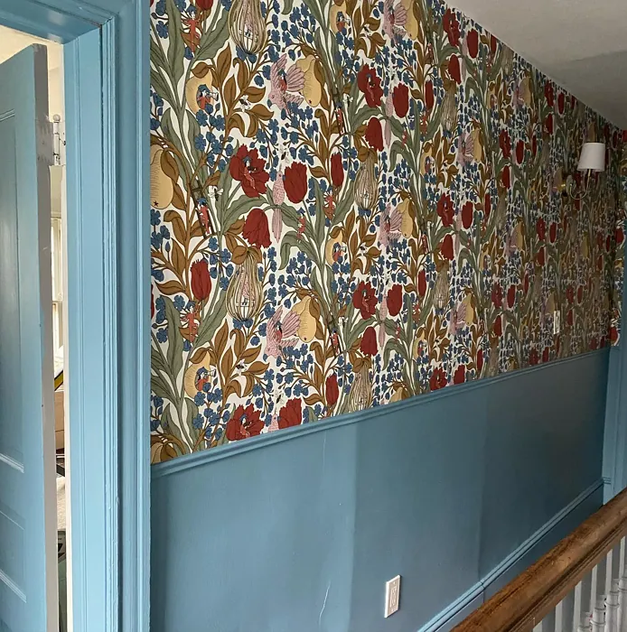
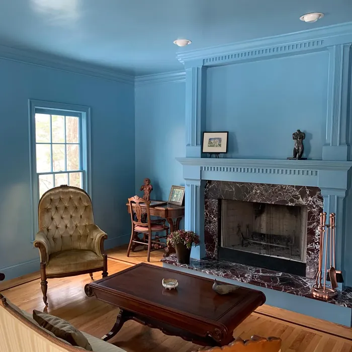
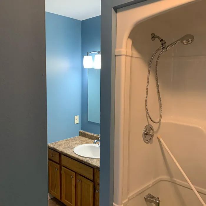
Real Room Photo of Whipple Blue HC-152
Undertones of Whipple Blue ?
The understone of Whipple Blue leans towards a subtle gray, giving it a sophisticated depth that enhances its versatility. This undertone allows it to pair beautifully with a range of other colors, from soft whites to darker, bolder accents.
HEX value: #769EB0
RGB code: 118, 158, 176
Is Whipple Blue Cool or Warm?
Whipple Blue has a distinctly cool tone, radiating a refreshing vibe that can make spaces feel larger and more open. Its coolness is perfect for creating a serene atmosphere, especially in rooms that benefit from a touch of calm.
Understanding Color Properties and Interior Design Tips
Hue refers to a specific position on the color wheel, measured in degrees from 0 to 360. Each degree represents a different pure color:
- 0° represents red
- 120° represents green
- 240° represents blue
Saturation describes the intensity or purity of a color and is expressed as a percentage:
- At 0%, the color appears completely desaturated—essentially a shade of gray
- At 100%, the color is at its most vivid and vibrant
Lightness indicates how light or dark a color is, also expressed as a percentage:
- 0% lightness results in black
- 100% lightness results in white
Using Warm Colors in Interior Design
Warm hues—such as reds, oranges, yellows, warm beiges, and greiges—are excellent choices for creating inviting and energetic spaces. These colors are particularly well-suited for:
- Kitchens, living rooms, and bathrooms, where warmth enhances comfort and sociability
- Large rooms, where warm tones can help reduce the sense of emptiness and make the space feel more intimate
For example:
- Warm beige shades provide a cozy, inviting atmosphere, ideal for living rooms, bedrooms, and hallways.
- Warm greige (a mix of beige and gray) offers the warmth of beige with the modern appeal of gray, making it a versatile backdrop for dining areas, bedrooms, and living spaces.
However, be mindful when using warm light tones in rooms with limited natural light. These shades may appear muted or even take on an unpleasant yellowish tint. To avoid a dull or flat appearance:
- Add depth by incorporating richer tones like deep greens, charcoal, or chocolate brown
- Use textured elements such as curtains, rugs, or cushions to bring dimension to the space
Pro Tip: Achieving Harmony with Warm and Cool Color Balance
To create a well-balanced and visually interesting interior, mix warm and cool tones strategically. This contrast adds depth and harmony to your design.
- If your walls feature warm hues, introduce cool-colored accents such as blue or green furniture, artwork, or accessories to create contrast.
- For a polished look, consider using a complementary color scheme, which pairs colors opposite each other on the color wheel (e.g., red with green, orange with blue).
This thoughtful mix not only enhances visual appeal but also creates a space that feels both dynamic and cohesive.
Light Temperature Affects on Whipple Blue
Natural Light
Natural daylight changes in color temperature as the sun moves across the sky. At sunrise and sunset, the light tends to have a warm, golden tone with a color temperature around 2000 Kelvin (K). As the day progresses and the sun rises higher, the light becomes cooler and more neutral. Around midday, especially when the sky is clear, natural light typically reaches its peak brightness and shifts to a cooler tone, ranging from 5500 to 6500 Kelvin. This midday light is close to what we perceive as pure white or daylight-balanced light.
These shifts in natural light can significantly influence how colors appear in a space, which is why designers often consider both the time of day and the orientation of windows when planning interior color schemes.
Artificial Light
When choosing artificial lighting, pay close attention to the color temperature, measured in Kelvin (K). This determines how warm or cool the light will appear. Lower temperatures, around 2700K, give off a warm, yellow glow often used in living rooms or bedrooms. Higher temperatures, above 5000K, create a cool, bluish light similar to daylight, commonly used in kitchens, offices, or task areas.
Use the slider to see how lighting temperature can affect the appearance of a surface or color throughout a space.


4800K
LRV of Whipple Blue
Whipple Blue has a Light Reflectance Value (LRV) of 45, which indicates it reflects a moderate amount of light. This makes it versatile enough to work in both well-lit and dimly lit spaces without losing its charm.
Detailed Review of Whipple Blue
Additional Paint Characteristics
Ideal Rooms
Bedroom, Dining Room, Home Office, Living Room, Nursery
Decor Styles
Coastal, Modern Farmhouse, Scandinavian, Traditional
Coverage
Good (1–2 Coats), Self-Priming, Touch-Up Friendly
Ease of Application
Beginner Friendly, Brush Smooth, Fast-Drying, Roller-Ready
Washability
Scrubbable, Washable
VOC Level
Eco-Certified, Low VOC
Best Use
Accent Wall, Bedroom, Interior Walls, Nursery
Room Suitability
Bedroom, Home Office, Living Room, Nursery
Tone Tag
Airy, Balanced, Cool, Muted
Finish Type
Eggshell, Satin, Semi-Gloss
Paint Performance
Easy Touch-Up, Fade Resistant, Low Odor, Quick Drying
Use Cases
Best for Low Light Rooms, Best for Rentals, Designer Favorite
Mood
Brightening, Calm, Inviting, Restful
Trim Pairing
Complements Cool Trim, Matches Pure White, Pairs with White Dove
Whipple Blue is a standout choice for anyone looking to infuse their home with a sense of tranquility. This paint offers a lovely balance between warmth and coolness, making it incredibly versatile. When applied, it showcases a gentle, airy quality that can brighten up any room while still providing a cozy feel. It’s perfect for bedrooms or nurseries where a calm atmosphere is desired. Plus, the application process is smooth, allowing for easy touch-ups and a beautiful finish. Overall, Whipple Blue is a fantastic option for those looking to create a serene environment.
Pros & Cons of HC-152 Whipple Blue
Pros
Cons
Colors that go with Benjamin Moore Whipple Blue
FAQ on HC-152 Whipple Blue
Can I use Whipple Blue in a small room?
Absolutely! Whipple Blue can actually work wonders in small spaces. Its cool tone can create an illusion of depth and openness, making a room feel larger. Just be mindful of natural light, as it may appear cooler in dimly lit areas. Pair it with lighter decor to maintain a bright and airy feel.
What trim colors pair well with Whipple Blue?
Whipple Blue pairs beautifully with various trim colors. For a classic look, consider white trims like White Dove or Simply White. If you’re feeling bold, black windows can create a striking contrast. The key is to balance the coolness of Whipple Blue with warmer or neutral trim colors for a cohesive look.
Comparisons Whipple Blue with other colors
Whipple Blue HC-152 vs Dutch Tile Blue SW 0031
| Attribute | Whipple Blue HC-152 | Dutch Tile Blue SW 0031 |
|---|---|---|
| Color Name | Whipple Blue HC-152 | Dutch Tile Blue SW 0031 |
| Color | ||
| Hue | Blue | Blue |
| Brightness | Medium | Medium |
| RGB | 118, 158, 176 | 154, 171, 171 |
| LRV | 32.37% | 24% |
| Finish Type | Eggshell, Satin, Semi-Gloss | Eggshell, Matte, Satin |
| Finish Options | Eggshell, Flat, Matte, Satin, Semi-Gloss | Eggshell, Flat, Matte, Satin |
| Ideal Rooms | Bedroom, Dining Room, Home Office, Living Room, Nursery | Bathroom, Bedroom, Dining Room, Hallway, Home Office, Kitchen, Living Room |
| Decor Styles | Coastal, Modern Farmhouse, Scandinavian, Traditional | Coastal, Modern Farmhouse, Scandinavian, Traditional, Transitional |
| Coverage | Good (1–2 Coats), Self-Priming, Touch-Up Friendly | Good (1–2 Coats) |
| Ease of Application | Beginner Friendly, Brush Smooth, Fast-Drying, Roller-Ready | Beginner Friendly, Brush Smooth, Fast-Drying, Roller-Ready |
| Washability | Scrubbable, Washable | Highly Washable, Washable |
| Room Suitability | Bedroom, Home Office, Living Room, Nursery | Bathroom, Bedroom, Dining Room, Kitchen, Living Room |
| Tone | Airy, Balanced, Cool, Muted | Balanced, Cool, Muted |
| Paint Performance | Easy Touch-Up, Fade Resistant, Low Odor, Quick Drying | Easy Touch-Up, High Coverage, Low Odor, Quick Drying |
Whipple Blue HC-152 vs Debonair SW 9139
| Attribute | Whipple Blue HC-152 | Debonair SW 9139 |
|---|---|---|
| Color Name | Whipple Blue HC-152 | Debonair SW 9139 |
| Color | ||
| Hue | Blue | Blue |
| Brightness | Medium | Medium |
| RGB | 118, 158, 176 | 144, 160, 166 |
| LRV | 32.37% | 30% |
| Finish Type | Eggshell, Satin, Semi-Gloss | Eggshell, Matte, Satin |
| Finish Options | Eggshell, Flat, Matte, Satin, Semi-Gloss | Eggshell, Matte, Satin |
| Ideal Rooms | Bedroom, Dining Room, Home Office, Living Room, Nursery | Bedroom, Dining Room, Home Office, Living Room |
| Decor Styles | Coastal, Modern Farmhouse, Scandinavian, Traditional | Coastal, Industrial, Modern, Transitional |
| Coverage | Good (1–2 Coats), Self-Priming, Touch-Up Friendly | Good (1–2 Coats) |
| Ease of Application | Beginner Friendly, Brush Smooth, Fast-Drying, Roller-Ready | Beginner Friendly, Brush Smooth, Roller-Ready |
| Washability | Scrubbable, Washable | Washable, Wipeable |
| Room Suitability | Bedroom, Home Office, Living Room, Nursery | Bedroom, Dining Room, Home Office, Living Room |
| Tone | Airy, Balanced, Cool, Muted | Balanced, Cool, Muted |
| Paint Performance | Easy Touch-Up, Fade Resistant, Low Odor, Quick Drying | Easy Touch-Up, Low Odor, Quick Drying |
Whipple Blue HC-152 vs Stardew SW 9138
| Attribute | Whipple Blue HC-152 | Stardew SW 9138 |
|---|---|---|
| Color Name | Whipple Blue HC-152 | Stardew SW 9138 |
| Color | ||
| Hue | Blue | Blue |
| Brightness | Medium | Medium |
| RGB | 118, 158, 176 | 166, 178, 181 |
| LRV | 32.37% | 30% |
| Finish Type | Eggshell, Satin, Semi-Gloss | Eggshell, Satin |
| Finish Options | Eggshell, Flat, Matte, Satin, Semi-Gloss | Eggshell, Matte, Satin |
| Ideal Rooms | Bedroom, Dining Room, Home Office, Living Room, Nursery | Bathroom, Bedroom, Home Office, Living Room, Nursery |
| Decor Styles | Coastal, Modern Farmhouse, Scandinavian, Traditional | Coastal, Farmhouse, Modern, Scandinavian |
| Coverage | Good (1–2 Coats), Self-Priming, Touch-Up Friendly | Good (1–2 Coats) |
| Ease of Application | Beginner Friendly, Brush Smooth, Fast-Drying, Roller-Ready | Beginner Friendly, Brush Smooth, Roller-Ready |
| Washability | Scrubbable, Washable | Highly Washable, Washable, Wipeable |
| Room Suitability | Bedroom, Home Office, Living Room, Nursery | Bathroom, Bedroom, Home Office, Living Room |
| Tone | Airy, Balanced, Cool, Muted | Calm, Cool, Muted |
| Paint Performance | Easy Touch-Up, Fade Resistant, Low Odor, Quick Drying | Easy Touch-Up, High Coverage, Low Odor |
Whipple Blue HC-152 vs Niebla Azul SW 9137
| Attribute | Whipple Blue HC-152 | Niebla Azul SW 9137 |
|---|---|---|
| Color Name | Whipple Blue HC-152 | Niebla Azul SW 9137 |
| Color | ||
| Hue | Blue | Blue |
| Brightness | Medium | Medium |
| RGB | 118, 158, 176 | 182, 195, 196 |
| LRV | 32.37% | 48% |
| Finish Type | Eggshell, Satin, Semi-Gloss | Eggshell, Matte, Satin |
| Finish Options | Eggshell, Flat, Matte, Satin, Semi-Gloss | Eggshell, Matte, Satin |
| Ideal Rooms | Bedroom, Dining Room, Home Office, Living Room, Nursery | Bedroom, Home Office, Living Room, Nursery |
| Decor Styles | Coastal, Modern Farmhouse, Scandinavian, Traditional | Coastal, Modern, Scandinavian, Transitional |
| Coverage | Good (1–2 Coats), Self-Priming, Touch-Up Friendly | Good (1–2 Coats), Touch-Up Friendly |
| Ease of Application | Beginner Friendly, Brush Smooth, Fast-Drying, Roller-Ready | Beginner Friendly, Brush Smooth, Roller-Ready |
| Washability | Scrubbable, Washable | Highly Washable, Washable |
| Room Suitability | Bedroom, Home Office, Living Room, Nursery | Bedroom, Home Office, Living Room, Nursery |
| Tone | Airy, Balanced, Cool, Muted | Airy, Cool, Muted |
| Paint Performance | Easy Touch-Up, Fade Resistant, Low Odor, Quick Drying | Easy Touch-Up, Fade Resistant, Low Odor, Scuff Resistant |
Whipple Blue HC-152 vs Rain SW 6219
| Attribute | Whipple Blue HC-152 | Rain SW 6219 |
|---|---|---|
| Color Name | Whipple Blue HC-152 | Rain SW 6219 |
| Color | ||
| Hue | Blue | Blue |
| Brightness | Medium | Medium |
| RGB | 118, 158, 176 | 171, 190, 191 |
| LRV | 32.37% | 50% |
| Finish Type | Eggshell, Satin, Semi-Gloss | Eggshell, Matte, Satin |
| Finish Options | Eggshell, Flat, Matte, Satin, Semi-Gloss | Eggshell, Matte, Satin |
| Ideal Rooms | Bedroom, Dining Room, Home Office, Living Room, Nursery | Bathroom, Bedroom, Home Office, Living Room, Nursery |
| Decor Styles | Coastal, Modern Farmhouse, Scandinavian, Traditional | Coastal, Minimalist, Modern, Scandinavian, Transitional |
| Coverage | Good (1–2 Coats), Self-Priming, Touch-Up Friendly | Good (1–2 Coats), Touch-Up Friendly |
| Ease of Application | Beginner Friendly, Brush Smooth, Fast-Drying, Roller-Ready | Beginner Friendly, Brush Smooth, Fast-Drying, Roller-Ready |
| Washability | Scrubbable, Washable | Scrubbable, Stain Resistant, Washable |
| Room Suitability | Bedroom, Home Office, Living Room, Nursery | Bathroom, Bedroom, Home Office, Living Room, Nursery |
| Tone | Airy, Balanced, Cool, Muted | Balanced, Cool, Muted |
| Paint Performance | Easy Touch-Up, Fade Resistant, Low Odor, Quick Drying | Easy Touch-Up, Low Odor, Quick Drying, Stain Resistant |
Whipple Blue HC-152 vs Morning at Sea SW 9634
| Attribute | Whipple Blue HC-152 | Morning at Sea SW 9634 |
|---|---|---|
| Color Name | Whipple Blue HC-152 | Morning at Sea SW 9634 |
| Color | ||
| Hue | Blue | Blue |
| Brightness | Medium | Medium |
| RGB | 118, 158, 176 | 130, 151, 155 |
| LRV | 32.37% | 50% |
| Finish Type | Eggshell, Satin, Semi-Gloss | Eggshell, Matte |
| Finish Options | Eggshell, Flat, Matte, Satin, Semi-Gloss | Eggshell, Matte, Satin |
| Ideal Rooms | Bedroom, Dining Room, Home Office, Living Room, Nursery | Bathroom, Bedroom, Home Office, Living Room |
| Decor Styles | Coastal, Modern Farmhouse, Scandinavian, Traditional | Coastal, Minimalist, Modern, Scandinavian |
| Coverage | Good (1–2 Coats), Self-Priming, Touch-Up Friendly | Good (1–2 Coats), Touch-Up Friendly |
| Ease of Application | Beginner Friendly, Brush Smooth, Fast-Drying, Roller-Ready | Beginner Friendly, Brush Smooth, Roller-Ready |
| Washability | Scrubbable, Washable | Washable, Wipeable |
| Room Suitability | Bedroom, Home Office, Living Room, Nursery | Bathroom, Bedroom, Home Office, Living Room |
| Tone | Airy, Balanced, Cool, Muted | Airy, Cool, Muted |
| Paint Performance | Easy Touch-Up, Fade Resistant, Low Odor, Quick Drying | Easy Touch-Up, Fade Resistant, Low Odor |
Whipple Blue HC-152 vs Sleepy Blue SW 6225
| Attribute | Whipple Blue HC-152 | Sleepy Blue SW 6225 |
|---|---|---|
| Color Name | Whipple Blue HC-152 | Sleepy Blue SW 6225 |
| Color | ||
| Hue | Blue | Blue |
| Brightness | Medium | Medium |
| RGB | 118, 158, 176 | 188, 203, 206 |
| LRV | 32.37% | 50% |
| Finish Type | Eggshell, Satin, Semi-Gloss | Eggshell, Matte, Satin |
| Finish Options | Eggshell, Flat, Matte, Satin, Semi-Gloss | Eggshell, Matte, Satin |
| Ideal Rooms | Bedroom, Dining Room, Home Office, Living Room, Nursery | Bedroom, Home Office, Living Room, Nursery |
| Decor Styles | Coastal, Modern Farmhouse, Scandinavian, Traditional | Coastal, Minimalist, Modern Farmhouse, Scandinavian |
| Coverage | Good (1–2 Coats), Self-Priming, Touch-Up Friendly | Good (1–2 Coats) |
| Ease of Application | Beginner Friendly, Brush Smooth, Fast-Drying, Roller-Ready | Beginner Friendly, Brush Smooth, Fast-Drying, Roller-Ready |
| Washability | Scrubbable, Washable | Highly Washable, Washable |
| Room Suitability | Bedroom, Home Office, Living Room, Nursery | Bedroom, Home Office, Living Room, Nursery |
| Tone | Airy, Balanced, Cool, Muted | Airy, Cool, Muted |
| Paint Performance | Easy Touch-Up, Fade Resistant, Low Odor, Quick Drying | Easy Touch-Up, Low Odor, Quick Drying, Scuff Resistant |
Whipple Blue HC-152 vs Lakeside SW 9683
| Attribute | Whipple Blue HC-152 | Lakeside SW 9683 |
|---|---|---|
| Color Name | Whipple Blue HC-152 | Lakeside SW 9683 |
| Color | ||
| Hue | Blue | Blue |
| Brightness | Medium | Medium |
| RGB | 118, 158, 176 | 173, 184, 192 |
| LRV | 32.37% | 24% |
| Finish Type | Eggshell, Satin, Semi-Gloss | Eggshell, Matte, Satin |
| Finish Options | Eggshell, Flat, Matte, Satin, Semi-Gloss | Eggshell, Matte, Satin |
| Ideal Rooms | Bedroom, Dining Room, Home Office, Living Room, Nursery | Bathroom, Bedroom, Home Office, Living Room |
| Decor Styles | Coastal, Modern Farmhouse, Scandinavian, Traditional | Coastal, Minimalist, Modern, Rustic |
| Coverage | Good (1–2 Coats), Self-Priming, Touch-Up Friendly | Good (1–2 Coats) |
| Ease of Application | Beginner Friendly, Brush Smooth, Fast-Drying, Roller-Ready | Beginner Friendly, Brush Smooth, Roller-Ready |
| Washability | Scrubbable, Washable | Scrubbable, Washable |
| Room Suitability | Bedroom, Home Office, Living Room, Nursery | Bathroom, Bedroom, Home Office, Living Room |
| Tone | Airy, Balanced, Cool, Muted | Balanced, Cool, Muted |
| Paint Performance | Easy Touch-Up, Fade Resistant, Low Odor, Quick Drying | Easy Touch-Up, Fade Resistant, High Coverage, Low Odor |
Whipple Blue HC-152 vs Upward SW 6239
| Attribute | Whipple Blue HC-152 | Upward SW 6239 |
|---|---|---|
| Color Name | Whipple Blue HC-152 | Upward SW 6239 |
| Color | ||
| Hue | Blue | Blue |
| Brightness | Medium | Medium |
| RGB | 118, 158, 176 | 191, 201, 208 |
| LRV | 32.37% | 75% |
| Finish Type | Eggshell, Satin, Semi-Gloss | Eggshell, Satin |
| Finish Options | Eggshell, Flat, Matte, Satin, Semi-Gloss | Eggshell, Flat, Satin |
| Ideal Rooms | Bedroom, Dining Room, Home Office, Living Room, Nursery | Bedroom, Dining Room, Home Office, Living Room, Nursery |
| Decor Styles | Coastal, Modern Farmhouse, Scandinavian, Traditional | Coastal, Minimalist, Modern, Scandinavian |
| Coverage | Good (1–2 Coats), Self-Priming, Touch-Up Friendly | Good (1–2 Coats), Touch-Up Friendly |
| Ease of Application | Beginner Friendly, Brush Smooth, Fast-Drying, Roller-Ready | Beginner Friendly, Brush Smooth, Fast-Drying, Roller-Ready |
| Washability | Scrubbable, Washable | Washable, Wipeable |
| Room Suitability | Bedroom, Home Office, Living Room, Nursery | Bedroom, Home Office, Living Room, Nursery |
| Tone | Airy, Balanced, Cool, Muted | Cool, Crisp, Muted |
| Paint Performance | Easy Touch-Up, Fade Resistant, Low Odor, Quick Drying | High Coverage, Low Odor, Quick Drying |
Whipple Blue HC-152 vs Aleutian SW 6241
| Attribute | Whipple Blue HC-152 | Aleutian SW 6241 |
|---|---|---|
| Color Name | Whipple Blue HC-152 | Aleutian SW 6241 |
| Color | ||
| Hue | Blue | Blue |
| Brightness | Medium | Medium |
| RGB | 118, 158, 176 | 152, 169, 183 |
| LRV | 32.37% | 24% |
| Finish Type | Eggshell, Satin, Semi-Gloss | Eggshell, Matte, Satin |
| Finish Options | Eggshell, Flat, Matte, Satin, Semi-Gloss | Eggshell, Matte, Satin |
| Ideal Rooms | Bedroom, Dining Room, Home Office, Living Room, Nursery | Bathroom, Bedroom, Home Office, Kitchen, Living Room, Nursery |
| Decor Styles | Coastal, Modern Farmhouse, Scandinavian, Traditional | Coastal, Minimalist, Modern, Scandinavian, Transitional |
| Coverage | Good (1–2 Coats), Self-Priming, Touch-Up Friendly | Good (1–2 Coats), Touch-Up Friendly |
| Ease of Application | Beginner Friendly, Brush Smooth, Fast-Drying, Roller-Ready | Beginner Friendly, Brush Smooth, Fast-Drying, Roller-Ready |
| Washability | Scrubbable, Washable | Scrubbable, Stain Resistant, Washable |
| Room Suitability | Bedroom, Home Office, Living Room, Nursery | Bathroom, Bedroom, Home Office, Living Room, Nursery |
| Tone | Airy, Balanced, Cool, Muted | Airy, Balanced, Cool, Muted |
| Paint Performance | Easy Touch-Up, Fade Resistant, Low Odor, Quick Drying | Easy Touch-Up, Fade Resistant, Low Odor, Quick Drying |
Official Page of Benjamin Moore Whipple Blue HC-152