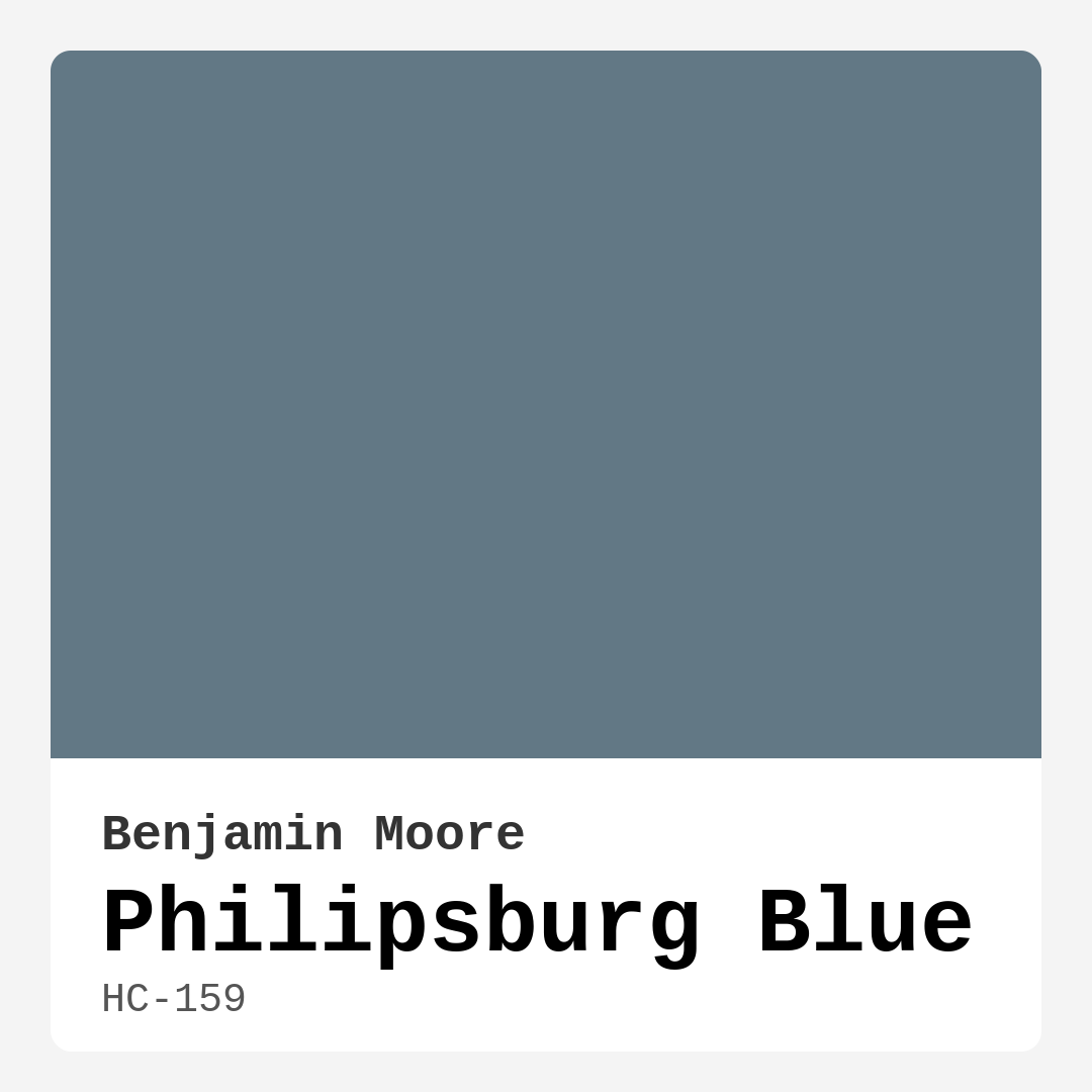
Color Preview & Key Details
| HEX Code | #627885 |
| RGB | 98, 120, 133 |
| LRV | 19.06% |
| Undertone | Blue |
| Finish Options | Matte, Satin, Semi-Gloss |
If you’re searching for a paint color that effortlessly blends sophistication with serenity, Philipsburg Blue by Benjamin Moore might just be your perfect match. This deep, moody hue—coded HC-159—sits at the intersection of teal and gray, creating a calming yet striking presence in any room. Whether you’re refreshing a bedroom, adding character to a home office, or giving your living room a designer touch, this shade delivers versatility and elegance in spades.
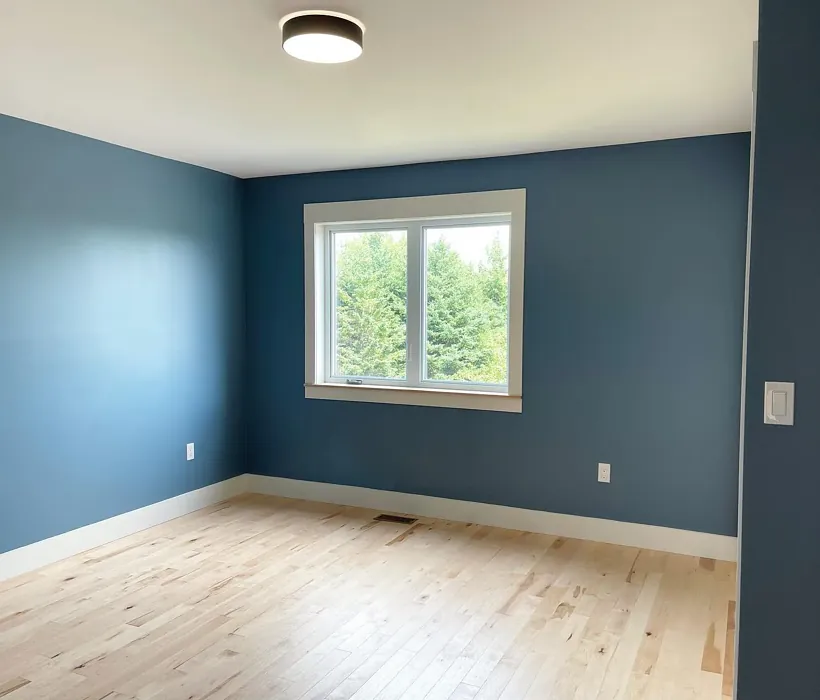
One of the first things you’ll notice about Philipsburg Blue is its ability to adapt. In natural light, the blue-green undertones shine, giving the space a fresh, airy feel. But as the light fades, it deepens into a richer, more intimate tone, making it ideal for cozy evenings. With an LRV (Light Reflectance Value) of 19.06%, it’s firmly in the medium-dark category, meaning it absorbs more light than it reflects. That makes it a fantastic choice if you’re aiming for a snug, enveloping atmosphere—just be mindful of pairing it with ample lighting in smaller or dimly lit rooms to keep it from feeling too heavy.
Application is a breeze, even if you’re a DIY beginner. The coverage is excellent, often requiring just one or two coats for a flawless finish. It’s roller-ready, brush-smooth, and fast-drying, so you won’t be stuck waiting days to admire your handiwork. Plus, it’s touch-up friendly, which is a lifesaver if you’ve got kids, pets, or just a habit of rearranging furniture. The low VOC formula means you won’t be overwhelmed by harsh fumes, making it a healthier choice for indoor spaces.
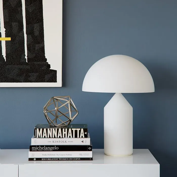
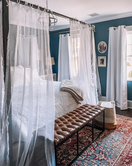
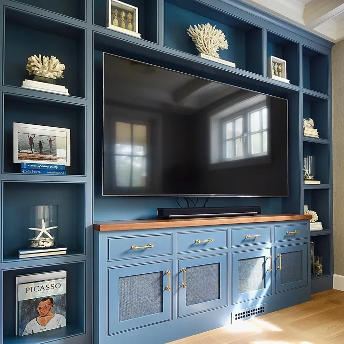
Now, let’s talk decor. Philipsburg Blue plays well with a variety of styles. In a coastal-themed room, it mimics the deep tones of the ocean, especially when paired with crisp whites and natural textures like rattan or driftwood. For a modern look, try it with sleek black accents and metallic finishes—brass fixtures, in particular, add a warm contrast that elevates the cool undertones. Bohemian spaces benefit from its muted depth, especially when layered with rich textiles and earthy tones. And if your style is transitional? This color bridges the gap between classic and contemporary effortlessly.
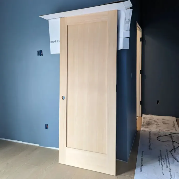
Trim pairing is where you’ll want to pay extra attention. A bright, clean white like Benjamin Moore’s White Dove keeps the look fresh and balanced, while wood trim adds warmth and organic contrast. Avoid overly cool whites, as they can clash with the blue undertones. Instead, opt for soft, neutral whites or even a warm gray for a more harmonious flow.
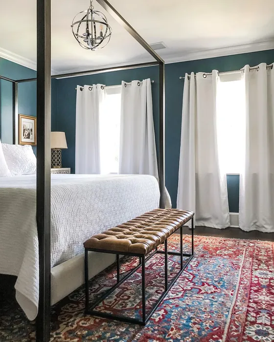
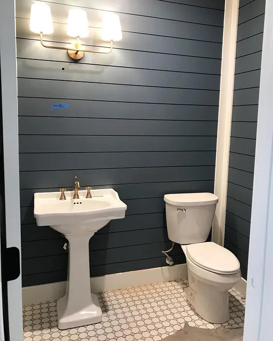
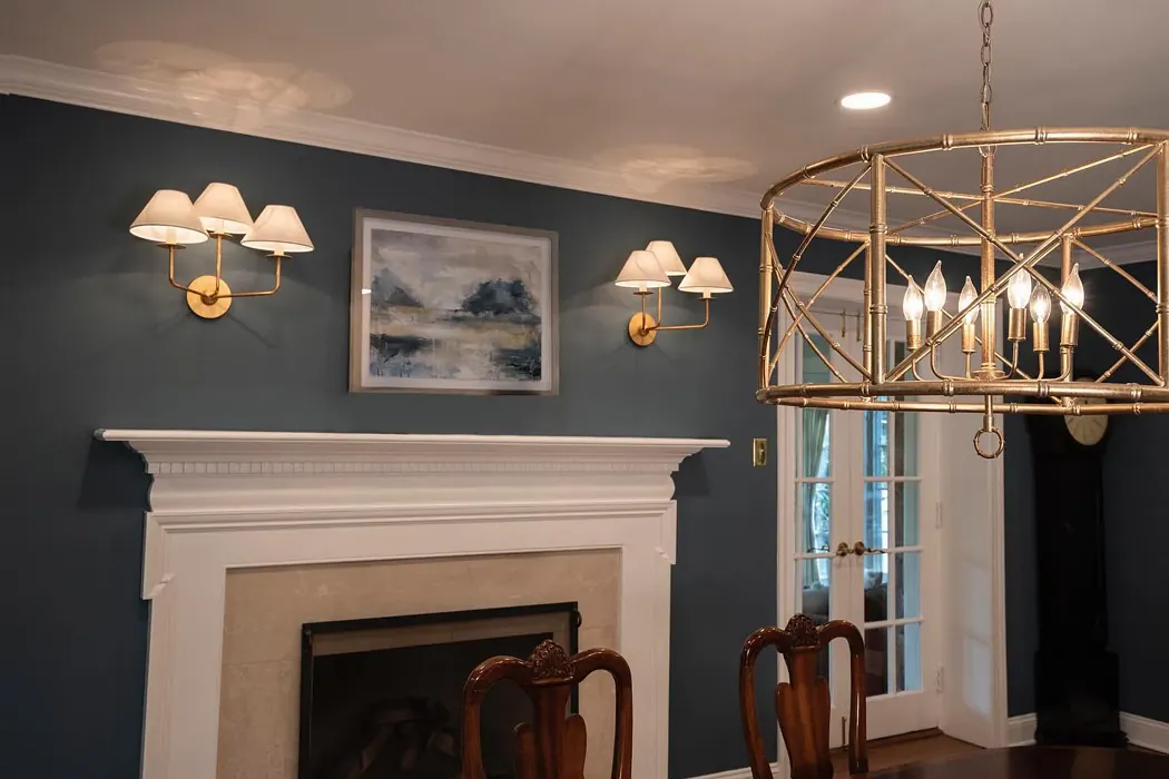
Wondering which rooms suit Philipsburg Blue best? Bedrooms are a no-brainer—its restful vibe promotes relaxation, especially when paired with soft linens and ambient lighting. Home offices benefit from its ability to foster focus without feeling sterile. In bathrooms, it creates a spa-like retreat, especially in matte or satin finishes. And in living or dining rooms, it sets a sophisticated backdrop for both lively gatherings and quiet evenings.
If you’re hesitant about committing to an all-over look, consider an accent wall. This allows you to test the waters without overwhelming the space. Or, go bold by painting furniture—a dresser, bookshelf, or even cabinetry in Philipsburg Blue adds instant character and depth.
A few pro tips: Always test a sample in your space before committing. Paint a large swatch and observe it at different times of day to see how the light plays with the undertones. And don’t forget to consider your existing decor—this color pairs beautifully with creams, taupes, and even muted reds (its complementary hue) for a dynamic contrast.
In the end, Philipsburg Blue is more than just a paint color—it’s a mood. It’s the quiet confidence of a well-designed room, the calm of a coastal breeze, and the depth of a timeless piece of art. If you’re looking for a shade that’s equal parts versatile and captivating, this might just be the one. So grab a brush, trust your instincts, and let this stunning hue transform your space into something truly special.

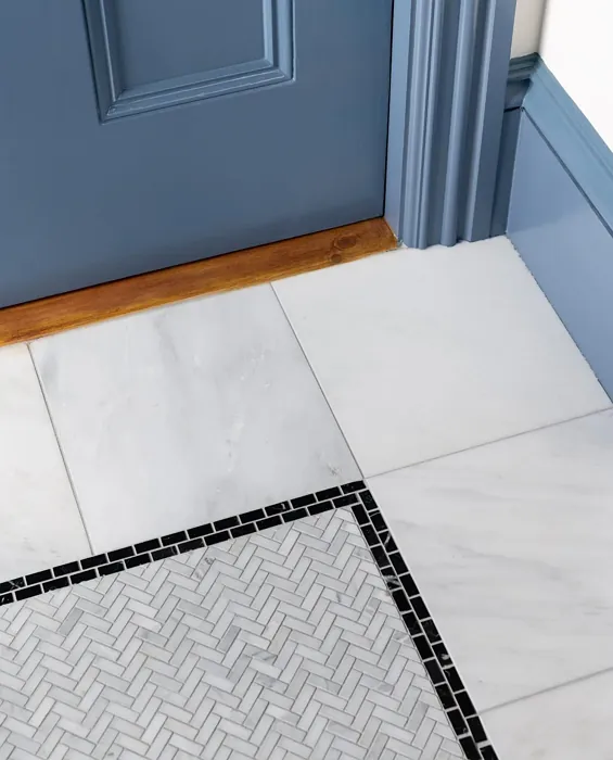
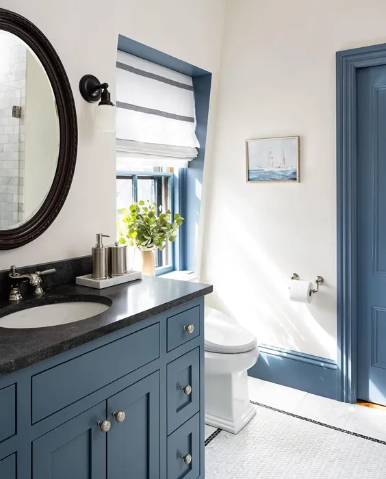
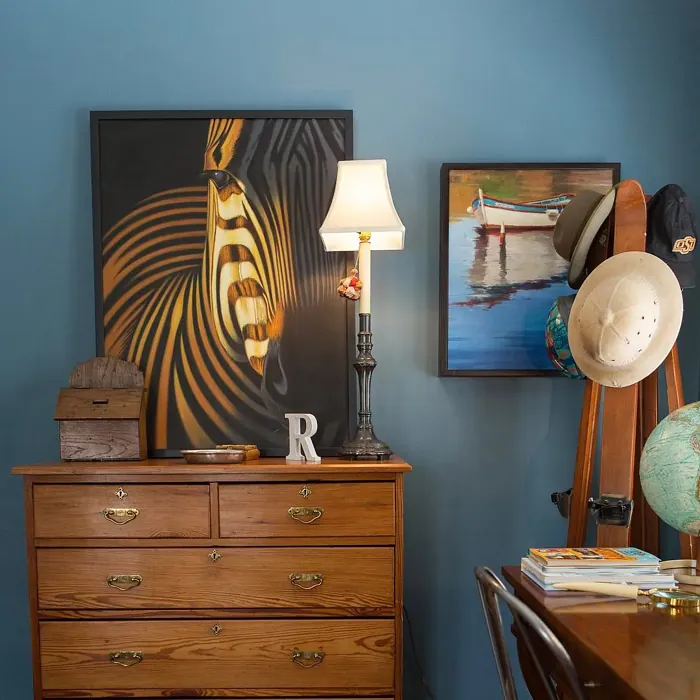
Real Room Photo of Philipsburg Blue HC-159
Undertones of Philipsburg Blue ?
The undertones of Philipsburg Blue are a key aspect of its character, leaning towards Blue. These subtle underlying hues are what give the color its depth and complexity. For example, a gray with a blue undertone will feel cooler and more modern, while one with a brown undertone will feel warmer and more traditional. It’s essential to test this paint in your home and observe it next to your existing furniture, flooring, and decor to see how these undertones interact and reveal themselves throughout the day.
HEX value: #627885
RGB code: 98, 120, 133
Is Philipsburg Blue Cool or Warm?
This color leans more towards the cool spectrum, making it ideal for creating refreshing and serene spaces. It can evoke a sense of calm, perfect for relaxation areas or tranquil bedrooms.
Understanding Color Properties and Interior Design Tips
Hue refers to a specific position on the color wheel, measured in degrees from 0 to 360. Each degree represents a different pure color:
- 0° represents red
- 120° represents green
- 240° represents blue
Saturation describes the intensity or purity of a color and is expressed as a percentage:
- At 0%, the color appears completely desaturated—essentially a shade of gray
- At 100%, the color is at its most vivid and vibrant
Lightness indicates how light or dark a color is, also expressed as a percentage:
- 0% lightness results in black
- 100% lightness results in white
Using Warm Colors in Interior Design
Warm hues—such as reds, oranges, yellows, warm beiges, and greiges—are excellent choices for creating inviting and energetic spaces. These colors are particularly well-suited for:
- Kitchens, living rooms, and bathrooms, where warmth enhances comfort and sociability
- Large rooms, where warm tones can help reduce the sense of emptiness and make the space feel more intimate
For example:
- Warm beige shades provide a cozy, inviting atmosphere, ideal for living rooms, bedrooms, and hallways.
- Warm greige (a mix of beige and gray) offers the warmth of beige with the modern appeal of gray, making it a versatile backdrop for dining areas, bedrooms, and living spaces.
However, be mindful when using warm light tones in rooms with limited natural light. These shades may appear muted or even take on an unpleasant yellowish tint. To avoid a dull or flat appearance:
- Add depth by incorporating richer tones like deep greens, charcoal, or chocolate brown
- Use textured elements such as curtains, rugs, or cushions to bring dimension to the space
Pro Tip: Achieving Harmony with Warm and Cool Color Balance
To create a well-balanced and visually interesting interior, mix warm and cool tones strategically. This contrast adds depth and harmony to your design.
- If your walls feature warm hues, introduce cool-colored accents such as blue or green furniture, artwork, or accessories to create contrast.
- For a polished look, consider using a complementary color scheme, which pairs colors opposite each other on the color wheel (e.g., red with green, orange with blue).
This thoughtful mix not only enhances visual appeal but also creates a space that feels both dynamic and cohesive.

Light Temperature Affects on Philipsburg Blue
Natural Light
Natural daylight changes in color temperature as the sun moves across the sky. At sunrise and sunset, the light tends to have a warm, golden tone with a color temperature around 2000 Kelvin (K). As the day progresses and the sun rises higher, the light becomes cooler and more neutral. Around midday, especially when the sky is clear, natural light typically reaches its peak brightness and shifts to a cooler tone, ranging from 5500 to 6500 Kelvin. This midday light is close to what we perceive as pure white or daylight-balanced light.
These shifts in natural light can significantly influence how colors appear in a space, which is why designers often consider both the time of day and the orientation of windows when planning interior color schemes.
Artificial Light
When choosing artificial lighting, pay close attention to the color temperature, measured in Kelvin (K). This determines how warm or cool the light will appear. Lower temperatures, around 2700K, give off a warm, yellow glow often used in living rooms or bedrooms. Higher temperatures, above 5000K, create a cool, bluish light similar to daylight, commonly used in kitchens, offices, or task areas.
Use the slider to see how lighting temperature can affect the appearance of a surface or color throughout a space.


4800K
LRV of Philipsburg Blue
The Light Reflectance Value (LRV) of Philipsburg Blue is 19.06%, which places it in the Medium Dark category. This means it reflects very little light. Understanding a paint’s LRV is crucial for predicting how it will look in your space. A higher LRV indicates a lighter color that reflects more light, making rooms feel larger and brighter. A lower LRV signifies a darker color that absorbs more light, creating a cozier, more intimate atmosphere. Always consider the natural and artificial lighting in your room when selecting a paint color based on its LRV.
Detailed Review of Philipsburg Blue
Additional Paint Characteristics
Ideal Rooms
Bathroom, Bedroom, Dining Room, Home Office, Living Room
Decor Styles
Bohemian, Coastal, Modern, Transitional
Coverage
Good (1–2 Coats), Touch-Up Friendly
Ease of Application
Beginner Friendly, Brush Smooth, Fast-Drying, Roller-Ready
Washability
Washable, Wipeable
VOC Level
Low VOC, Ultra Low VOC
Best Use
Accent Wall, Furniture, Interior Walls
Room Suitability
Bathroom, Bedroom, Home Office, Living Room
Tone Tag
Cool, Deep, Muted
Finish Type
Matte, Satin, Semi-Gloss
Paint Performance
Easy Touch-Up, Fade Resistant, High Coverage, Low Odor
Use Cases
Best for Rentals, Classic Favorite, Designer Favorite
Mood
Calm, Inviting, Restful
Trim Pairing
Complements Brass Fixtures, Good with Wood Trim, Pairs with White Dove
When it comes to Philipsburg Blue, you’re looking at a color that effortlessly transforms any room into a chic oasis. This paint glides on smoothly, offering an even application that’s hard to beat. The coverage is impressive, typically requiring just one to two coats for a flawless finish. Whether you’re revitalizing a cozy reading nook or adding character to an open concept space, this color adapts beautifully. Its calming undertones make it perfect for bedrooms or home offices, while the slight depth adds elegance without overwhelming the senses. Plus, it pairs wonderfully with both light and dark furniture, ensuring your decor shines.
Pros & Cons of HC-159 Philipsburg Blue
Pros
Cons
Colors that go with Benjamin Moore Philipsburg Blue
FAQ on HC-159 Philipsburg Blue
Can Philipsburg Blue work for small spaces?
Absolutely! Philipsburg Blue can create an illusion of depth and openness in small spaces. Its muted tone allows it to expand the visual boundaries without overwhelming the area. Just ensure you have adequate lighting to make the most of its calming hues.
What type of finish should I choose for Philipsburg Blue?
The finish you choose depends on the room’s function. For walls in living areas or bedrooms, a matte or eggshell finish works beautifully, providing a soft look. If you’re painting trim or cabinetry, consider a semi-gloss or satin finish for durability and easy cleaning.
Comparisons Philipsburg Blue with other colors
Philipsburg Blue HC-159 vs Naval SW 6244
| Attribute | Philipsburg Blue HC-159 | Naval SW 6244 |
|---|---|---|
| Color Name | Philipsburg Blue HC-159 | Naval SW 6244 |
| Color | ||
| Hue | Blue | Blue |
| Brightness | Dark | Dark |
| RGB | 98, 120, 133 | 47, 61, 76 |
| LRV | 19.06% | 4% |
| Finish Type | Matte, Satin, Semi-Gloss | Matte, Satin, Semi-Gloss |
| Finish Options | Matte, Satin, Semi-Gloss | Matte, Satin, Semi-Gloss |
| Ideal Rooms | Bathroom, Bedroom, Dining Room, Home Office, Living Room | Bedroom, Dining Room, Hallway, Home Office, Living Room |
| Decor Styles | Bohemian, Coastal, Modern, Transitional | Coastal, Industrial, Minimalist, Modern, Traditional |
| Coverage | Good (1–2 Coats), Touch-Up Friendly | Good (1–2 Coats), Self-Priming |
| Ease of Application | Beginner Friendly, Brush Smooth, Fast-Drying, Roller-Ready | Beginner Friendly, Brush Smooth, Roller-Ready |
| Washability | Washable, Wipeable | Highly Washable, Washable |
| Room Suitability | Bathroom, Bedroom, Home Office, Living Room | Bedroom, Dining Room, Entryway, Home Office, Living Room |
| Tone | Cool, Deep, Muted | Cool, Deep, Moody |
| Paint Performance | Easy Touch-Up, Fade Resistant, High Coverage, Low Odor | Easy Touch-Up, High Coverage, Low Odor, Scuff Resistant |
Philipsburg Blue HC-159 vs Sea Serpent SW 7615
| Attribute | Philipsburg Blue HC-159 | Sea Serpent SW 7615 |
|---|---|---|
| Color Name | Philipsburg Blue HC-159 | Sea Serpent SW 7615 |
| Color | ||
| Hue | Blue | Blue |
| Brightness | Dark | Dark |
| RGB | 98, 120, 133 | 62, 75, 84 |
| LRV | 19.06% | 12% |
| Finish Type | Matte, Satin, Semi-Gloss | Eggshell, Matte, Satin |
| Finish Options | Matte, Satin, Semi-Gloss | Eggshell, Matte, Satin |
| Ideal Rooms | Bathroom, Bedroom, Dining Room, Home Office, Living Room | Bathroom, Bedroom, Home Office, Living Room |
| Decor Styles | Bohemian, Coastal, Modern, Transitional | Coastal, Farmhouse, Industrial, Modern |
| Coverage | Good (1–2 Coats), Touch-Up Friendly | Good (1–2 Coats), Touch-Up Friendly |
| Ease of Application | Beginner Friendly, Brush Smooth, Fast-Drying, Roller-Ready | Beginner Friendly, Brush Smooth, Roller-Ready |
| Washability | Washable, Wipeable | Highly Washable, Washable |
| Room Suitability | Bathroom, Bedroom, Home Office, Living Room | Bathroom, Bedroom, Home Office, Living Room |
| Tone | Cool, Deep, Muted | Cool, Deep, Moody |
| Paint Performance | Easy Touch-Up, Fade Resistant, High Coverage, Low Odor | Easy Touch-Up, High Coverage, Low Odor |
Philipsburg Blue HC-159 vs Rain Cloud SW 9639
| Attribute | Philipsburg Blue HC-159 | Rain Cloud SW 9639 |
|---|---|---|
| Color Name | Philipsburg Blue HC-159 | Rain Cloud SW 9639 |
| Color | ||
| Hue | Blue | Blue |
| Brightness | Dark | Dark |
| RGB | 98, 120, 133 | 83, 97, 104 |
| LRV | 19.06% | 30% |
| Finish Type | Matte, Satin, Semi-Gloss | Eggshell, Matte, Satin |
| Finish Options | Matte, Satin, Semi-Gloss | Eggshell, Matte, Satin |
| Ideal Rooms | Bathroom, Bedroom, Dining Room, Home Office, Living Room | Bedroom, Dining Room, Home Office, Living Room |
| Decor Styles | Bohemian, Coastal, Modern, Transitional | Coastal, Contemporary, Minimalist, Scandinavian |
| Coverage | Good (1–2 Coats), Touch-Up Friendly | Good (1–2 Coats), Touch-Up Friendly |
| Ease of Application | Beginner Friendly, Brush Smooth, Fast-Drying, Roller-Ready | Beginner Friendly, Brush Smooth, Roller-Ready |
| Washability | Washable, Wipeable | Highly Washable, Washable |
| Room Suitability | Bathroom, Bedroom, Home Office, Living Room | Bedroom, Home Office, Living Room |
| Tone | Cool, Deep, Muted | Balanced, Cool, Muted |
| Paint Performance | Easy Touch-Up, Fade Resistant, High Coverage, Low Odor | Easy Touch-Up, Fade Resistant, Low Odor |
Philipsburg Blue HC-159 vs Indigo Batik SW 7602
| Attribute | Philipsburg Blue HC-159 | Indigo Batik SW 7602 |
|---|---|---|
| Color Name | Philipsburg Blue HC-159 | Indigo Batik SW 7602 |
| Color | ||
| Hue | Blue | Blue |
| Brightness | Dark | Dark |
| RGB | 98, 120, 133 | 62, 80, 99 |
| LRV | 19.06% | 10% |
| Finish Type | Matte, Satin, Semi-Gloss | Matte, Satin |
| Finish Options | Matte, Satin, Semi-Gloss | Eggshell, Flat, Matte, Satin |
| Ideal Rooms | Bathroom, Bedroom, Dining Room, Home Office, Living Room | Bedroom, Dining Room, Home Office, Living Room |
| Decor Styles | Bohemian, Coastal, Modern, Transitional | Bohemian, Coastal, Contemporary, Modern |
| Coverage | Good (1–2 Coats), Touch-Up Friendly | Good (1–2 Coats), Touch-Up Friendly |
| Ease of Application | Beginner Friendly, Brush Smooth, Fast-Drying, Roller-Ready | Brush Smooth, Fast-Drying, Roller-Ready |
| Washability | Washable, Wipeable | Scrubbable, Washable, Wipeable |
| Room Suitability | Bathroom, Bedroom, Home Office, Living Room | Bedroom, Dining Room, Home Office, Living Room |
| Tone | Cool, Deep, Muted | Cool, Deep, Moody |
| Paint Performance | Easy Touch-Up, Fade Resistant, High Coverage, Low Odor | Easy Touch-Up, High Coverage, Low Odor, Quick Drying |
Philipsburg Blue HC-159 vs Sea Mariner SW 9640
| Attribute | Philipsburg Blue HC-159 | Sea Mariner SW 9640 |
|---|---|---|
| Color Name | Philipsburg Blue HC-159 | Sea Mariner SW 9640 |
| Color | ||
| Hue | Blue | Blue |
| Brightness | Dark | Dark |
| RGB | 98, 120, 133 | 67, 74, 84 |
| LRV | 19.06% | 6% |
| Finish Type | Matte, Satin, Semi-Gloss | Eggshell, Matte, Satin |
| Finish Options | Matte, Satin, Semi-Gloss | Eggshell, Matte, Satin |
| Ideal Rooms | Bathroom, Bedroom, Dining Room, Home Office, Living Room | Bedroom, Dining Room, Hallway, Home Office, Living Room |
| Decor Styles | Bohemian, Coastal, Modern, Transitional | Coastal, Industrial, Minimalist, Modern |
| Coverage | Good (1–2 Coats), Touch-Up Friendly | Good (1–2 Coats) |
| Ease of Application | Beginner Friendly, Brush Smooth, Fast-Drying, Roller-Ready | Beginner Friendly, Brush Smooth, Roller-Ready |
| Washability | Washable, Wipeable | Scrubbable, Washable |
| Room Suitability | Bathroom, Bedroom, Home Office, Living Room | Bedroom, Dining Room, Home Office, Living Room |
| Tone | Cool, Deep, Muted | Cool, Deep, Moody |
| Paint Performance | Easy Touch-Up, Fade Resistant, High Coverage, Low Odor | Easy Touch-Up, Low Odor, Quick Drying |
Philipsburg Blue HC-159 vs Still Water SW 6223
| Attribute | Philipsburg Blue HC-159 | Still Water SW 6223 |
|---|---|---|
| Color Name | Philipsburg Blue HC-159 | Still Water SW 6223 |
| Color | ||
| Hue | Blue | Blue |
| Brightness | Dark | Dark |
| RGB | 98, 120, 133 | 74, 93, 95 |
| LRV | 19.06% | 48% |
| Finish Type | Matte, Satin, Semi-Gloss | Eggshell, Matte, Satin |
| Finish Options | Matte, Satin, Semi-Gloss | Eggshell, Matte, Satin |
| Ideal Rooms | Bathroom, Bedroom, Dining Room, Home Office, Living Room | Bedroom, Dining Room, Home Office, Living Room, Nursery |
| Decor Styles | Bohemian, Coastal, Modern, Transitional | Coastal, Contemporary, Farmhouse, Modern, Rustic |
| Coverage | Good (1–2 Coats), Touch-Up Friendly | Good (1–2 Coats), Touch-Up Friendly |
| Ease of Application | Beginner Friendly, Brush Smooth, Fast-Drying, Roller-Ready | Beginner Friendly, Brush Smooth, Roller-Ready |
| Washability | Washable, Wipeable | Highly Washable, Washable |
| Room Suitability | Bathroom, Bedroom, Home Office, Living Room | Bedroom, Dining Room, Home Office, Living Room |
| Tone | Cool, Deep, Muted | Cool, Earthy, Muted |
| Paint Performance | Easy Touch-Up, Fade Resistant, High Coverage, Low Odor | Easy Touch-Up, Fade Resistant, Low Odor |
Philipsburg Blue HC-159 vs Waterloo SW 9141
| Attribute | Philipsburg Blue HC-159 | Waterloo SW 9141 |
|---|---|---|
| Color Name | Philipsburg Blue HC-159 | Waterloo SW 9141 |
| Color | ||
| Hue | Blue | Blue |
| Brightness | Dark | Dark |
| RGB | 98, 120, 133 | 83, 104, 114 |
| LRV | 19.06% | 12% |
| Finish Type | Matte, Satin, Semi-Gloss | Matte, Satin |
| Finish Options | Matte, Satin, Semi-Gloss | Matte, Satin, Semi-Gloss |
| Ideal Rooms | Bathroom, Bedroom, Dining Room, Home Office, Living Room | Bedroom, Dining Room, Hallway, Home Office, Living Room |
| Decor Styles | Bohemian, Coastal, Modern, Transitional | Coastal, Industrial, Modern, Rustic |
| Coverage | Good (1–2 Coats), Touch-Up Friendly | Good (1–2 Coats), Touch-Up Friendly |
| Ease of Application | Beginner Friendly, Brush Smooth, Fast-Drying, Roller-Ready | Brush Smooth, Fast-Drying, Roller-Ready |
| Washability | Washable, Wipeable | Scrubbable, Washable |
| Room Suitability | Bathroom, Bedroom, Home Office, Living Room | Bedroom, Dining Room, Home Office, Living Room |
| Tone | Cool, Deep, Muted | Balanced, Cool, Muted |
| Paint Performance | Easy Touch-Up, Fade Resistant, High Coverage, Low Odor | Easy Touch-Up, Fade Resistant, Low Odor, Quick Drying |
Philipsburg Blue HC-159 vs Smoky Blue SW 7604
| Attribute | Philipsburg Blue HC-159 | Smoky Blue SW 7604 |
|---|---|---|
| Color Name | Philipsburg Blue HC-159 | Smoky Blue SW 7604 |
| Color | ||
| Hue | Blue | Blue |
| Brightness | Dark | Dark |
| RGB | 98, 120, 133 | 89, 110, 121 |
| LRV | 19.06% | 15% |
| Finish Type | Matte, Satin, Semi-Gloss | Eggshell, Matte, Satin |
| Finish Options | Matte, Satin, Semi-Gloss | Eggshell, Matte, Satin |
| Ideal Rooms | Bathroom, Bedroom, Dining Room, Home Office, Living Room | Bathroom, Bedroom, Home Office, Kitchen, Living Room |
| Decor Styles | Bohemian, Coastal, Modern, Transitional | Coastal, Modern, Scandinavian, Transitional |
| Coverage | Good (1–2 Coats), Touch-Up Friendly | Good (1–2 Coats), Touch-Up Friendly |
| Ease of Application | Beginner Friendly, Brush Smooth, Fast-Drying, Roller-Ready | Beginner Friendly, Brush Smooth, Roller-Ready |
| Washability | Washable, Wipeable | Highly Washable, Washable |
| Room Suitability | Bathroom, Bedroom, Home Office, Living Room | Bathroom, Bedroom, Home Office, Living Room |
| Tone | Cool, Deep, Muted | Cool, Dusty, Muted |
| Paint Performance | Easy Touch-Up, Fade Resistant, High Coverage, Low Odor | High Coverage, Low Odor, Quick Drying |
Philipsburg Blue HC-159 vs Needlepoint Navy SW 0032
| Attribute | Philipsburg Blue HC-159 | Needlepoint Navy SW 0032 |
|---|---|---|
| Color Name | Philipsburg Blue HC-159 | Needlepoint Navy SW 0032 |
| Color | ||
| Hue | Blue | Blue |
| Brightness | Dark | Dark |
| RGB | 98, 120, 133 | 84, 102, 112 |
| LRV | 19.06% | 4% |
| Finish Type | Matte, Satin, Semi-Gloss | Matte, Satin, Semi-Gloss |
| Finish Options | Matte, Satin, Semi-Gloss | Matte, Satin, Semi-Gloss |
| Ideal Rooms | Bathroom, Bedroom, Dining Room, Home Office, Living Room | Bedroom, Dining Room, Entryway, Home Office, Living Room |
| Decor Styles | Bohemian, Coastal, Modern, Transitional | Coastal, Contemporary, Modern Farmhouse, Nautical, Traditional |
| Coverage | Good (1–2 Coats), Touch-Up Friendly | Good (1–2 Coats), Touch-Up Friendly |
| Ease of Application | Beginner Friendly, Brush Smooth, Fast-Drying, Roller-Ready | Beginner Friendly, Brush Smooth, Fast-Drying, Roller-Ready |
| Washability | Washable, Wipeable | Scrubbable, Washable |
| Room Suitability | Bathroom, Bedroom, Home Office, Living Room | Bedroom, Dining Room, Home Office, Living Room |
| Tone | Cool, Deep, Muted | Cool, Deep, Muted |
| Paint Performance | Easy Touch-Up, Fade Resistant, High Coverage, Low Odor | Easy Touch-Up, High Coverage, Low Odor, Quick Drying, Stain Resistant |
Philipsburg Blue HC-159 vs Riverway SW 6222
| Attribute | Philipsburg Blue HC-159 | Riverway SW 6222 |
|---|---|---|
| Color Name | Philipsburg Blue HC-159 | Riverway SW 6222 |
| Color | ||
| Hue | Blue | Blue |
| Brightness | Dark | Dark |
| RGB | 98, 120, 133 | 93, 114, 116 |
| LRV | 19.06% | 24% |
| Finish Type | Matte, Satin, Semi-Gloss | Eggshell, Satin |
| Finish Options | Matte, Satin, Semi-Gloss | Eggshell, Matte, Satin |
| Ideal Rooms | Bathroom, Bedroom, Dining Room, Home Office, Living Room | Bathroom, Bedroom, Dining Room, Home Office, Living Room |
| Decor Styles | Bohemian, Coastal, Modern, Transitional | Coastal, Contemporary, Eclectic, Modern, Rustic |
| Coverage | Good (1–2 Coats), Touch-Up Friendly | Good (1–2 Coats), Touch-Up Friendly |
| Ease of Application | Beginner Friendly, Brush Smooth, Fast-Drying, Roller-Ready | Beginner Friendly, Brush Smooth, Fast-Drying, Low Splatter, Roller-Ready |
| Washability | Washable, Wipeable | Highly Washable, Washable |
| Room Suitability | Bathroom, Bedroom, Home Office, Living Room | Bathroom, Bedroom, Home Office, Living Room |
| Tone | Cool, Deep, Muted | Balanced, Cool, Muted |
| Paint Performance | Easy Touch-Up, Fade Resistant, High Coverage, Low Odor | Easy Touch-Up, High Coverage, Low Odor, Quick Drying |
Official Page of Benjamin Moore Philipsburg Blue HC-159