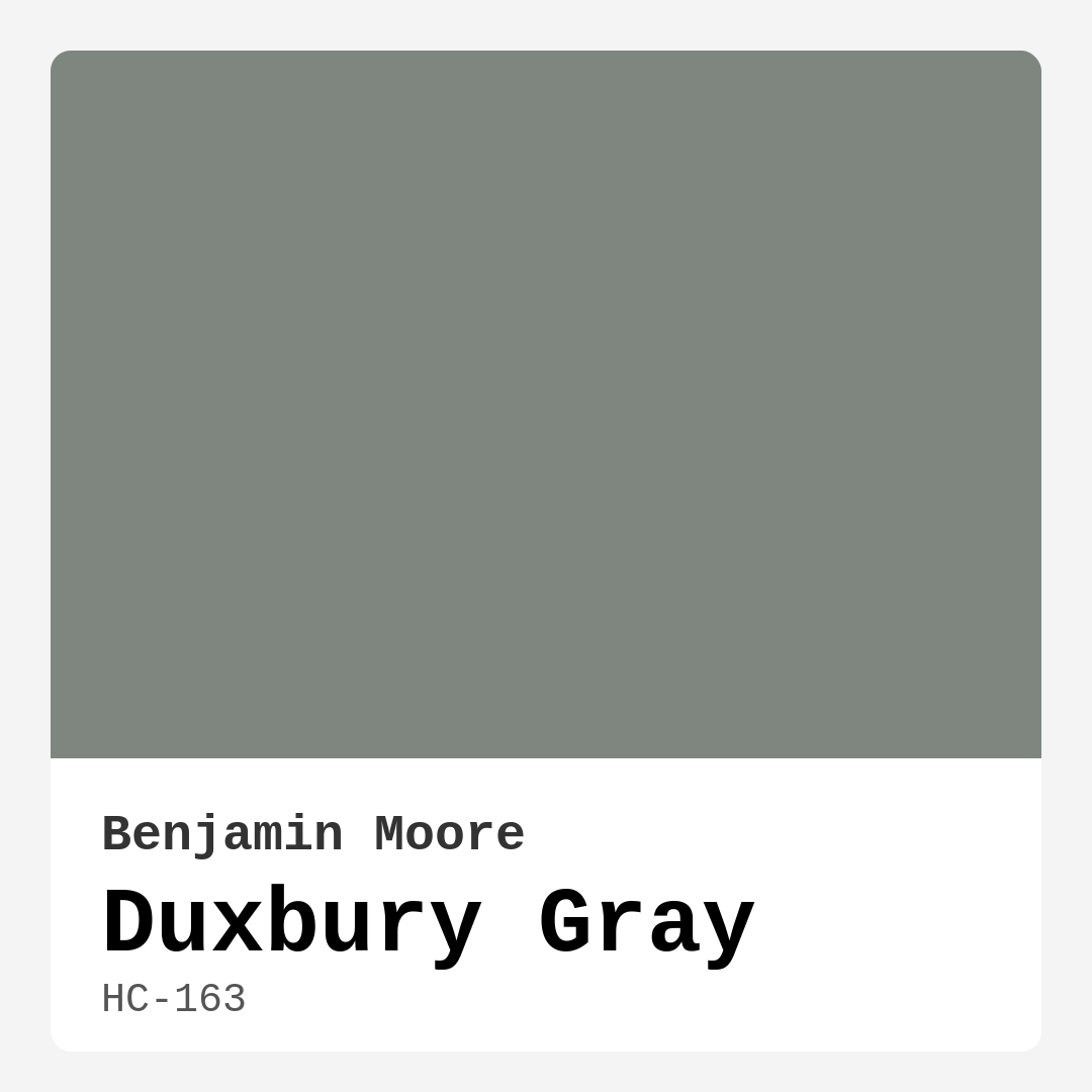
Color Preview & Key Details
| HEX Code | #7F867F |
| RGB | 127, 134, 127 |
| LRV | 23.60% |
| Undertone | Green |
| Finish Options | Eggshell, Flat, Matte, Satin |
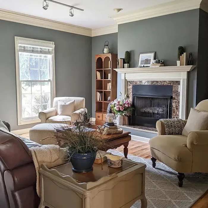
If you’re searching for a paint color that effortlessly balances sophistication and versatility, let me introduce you to Benjamin Moore’s Duxbury Gray (HC-163). This isn’t just another gray—it’s a chameleon of a shade, adapting to your space with a quiet elegance that feels both timeless and fresh. Whether you’re refreshing a living room, designing a serene bedroom, or crafting a cozy home office, Duxbury Gray might just be the perfect backdrop for your vision.
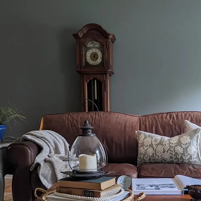
At first glance, Duxbury Gray reads as a classic, muted gray, but look closer, and you’ll notice its subtle green undertones. These undertones give it depth and warmth, preventing it from feeling sterile or cold. It’s the kind of color that plays well with others, complementing both modern and traditional decor styles. Imagine it in a farmhouse dining room with rustic wood furniture or a coastal-inspired bedroom with crisp white linens—it’s adaptable enough to suit either scenario beautifully.
One of the standout qualities of Duxbury Gray is its ability to reflect light. With an LRV (Light Reflectance Value) of 23.60%, it sits comfortably in the medium range, meaning it won’t swallow up light in a room but still offers enough depth to create a cozy atmosphere. In spaces flooded with natural light, the color takes on an airy, almost ethereal quality. As the sun sets, it shifts subtly, revealing its warmer, earthier side. This dynamic nature makes it a fascinating choice for rooms where you spend a lot of time, as it keeps the space feeling alive and engaging.
Now, let’s talk about application. If you’re a DIY enthusiast, you’ll appreciate how beginner-friendly this paint is. It covers well—often in just one or two coats—and it’s touch-up friendly, so minor mistakes won’t turn into major headaches. The finish options are flexible too. For walls, I’d recommend eggshell or satin; both are durable and easy to clean, making them ideal for high-traffic areas like living rooms or hallways. If you’re using it on trim, a satin finish will give you that slight sheen that catches the eye without being too glossy.
Worried about maintenance? Don’t be. Duxbury Gray is highly washable, so it’s a practical choice for homes with kids or pets. Scuffs and smudges wipe away easily, keeping your walls looking fresh. Plus, it’s low-VOC, which means fewer fumes during application and a healthier environment once it’s dry.
Of course, no color is perfect for every situation. Duxbury Gray’s green undertones are part of its charm, but they can clash with certain colors if you’re not careful. If your room has strong red or orange accents, for example, the green might become more noticeable, creating a slightly discordant effect. Always test a sample in your space before committing. Paint a large swatch on the wall and observe it at different times of day to see how it interacts with your lighting and existing decor.
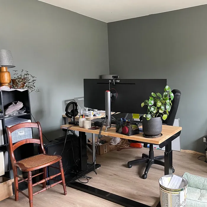
Speaking of testing, let’s address a common question: Can Duxbury Gray work in small rooms? Absolutely. Its muted tone helps create depth, making a small room feel more expansive. Just be mindful of lighting—if the space is poorly lit, the color might appear darker than you’d like. Pairing it with lighter trim, like Benjamin Moore’s White Dove, can help balance the effect and keep the room feeling open.
Another frequent concern is how it holds up in high-traffic areas. The good news is, Duxbury Gray is durable. Its washability makes it a solid choice for hallways, kitchens, or even kids’ rooms. For extra resilience, opt for a satin finish, which stands up better to wear and tear than flat or matte options.
When it comes to pairing Duxbury Gray with other colors, the possibilities are nearly endless. It works beautifully with crisp whites, soft blues, and even warm neutrals like taupe or beige. For a bit of contrast, try pairing it with deeper shades like navy or charcoal. If you want to highlight its green undertones, introduce accents in sage or olive. And if you’re feeling bold, a pop of complementary purple—think lavender or plum—can create a striking, sophisticated contrast.
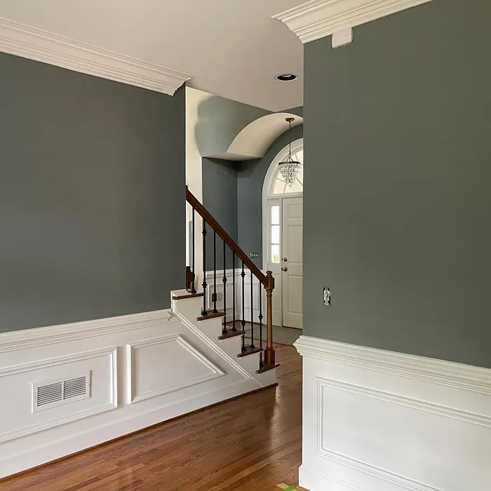
Trim pairing is another area where Duxbury Gray shines. It looks stunning with pure white trim for a clean, modern look, but it also pairs well with warmer off-whites if you prefer a cozier vibe. For a more dramatic effect, consider using it on an accent wall with the rest of the room in a lighter shade. This creates depth and draws the eye without overwhelming the space.
So, who is Duxbury Gray for? If you love colors that feel refined but not stuffy, calming but not boring, this might be your perfect match. It’s ideal for anyone who wants a neutral that’s anything but basic. Whether your style leans modern farmhouse, coastal chic, or classic traditional, Duxbury Gray can adapt to your vision.
Before you grab a brush, here’s my final tip: Always, always test the color in your home. Lighting, furniture, and even the direction your windows face can dramatically affect how a color looks. Paint a sample on a few different walls and live with it for a couple of days. You’ll quickly see if it’s the right fit for your space.
Duxbury Gray is more than just a paint color—it’s a mood. It’s the quiet confidence of a well-designed room, the backdrop that lets your furniture and decor shine. If you’re looking for a shade that’s equal parts versatile and distinctive, this might just be the one. So go ahead, give it a try. Your walls will thank you.
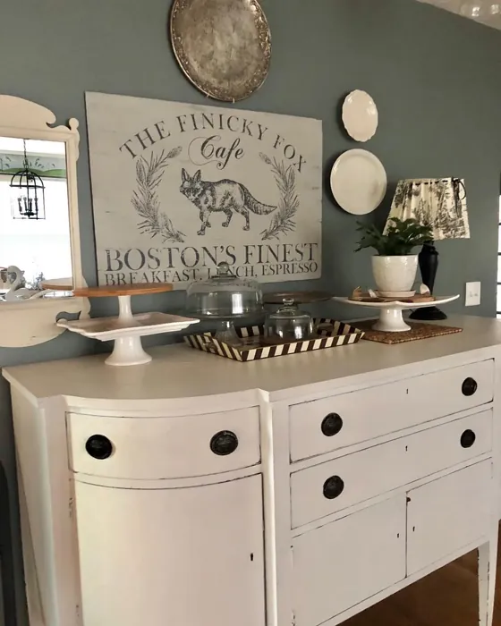
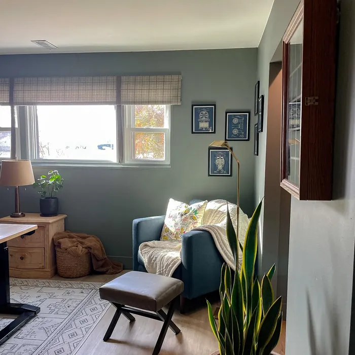
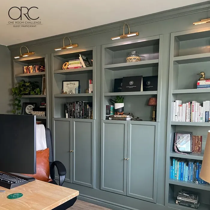
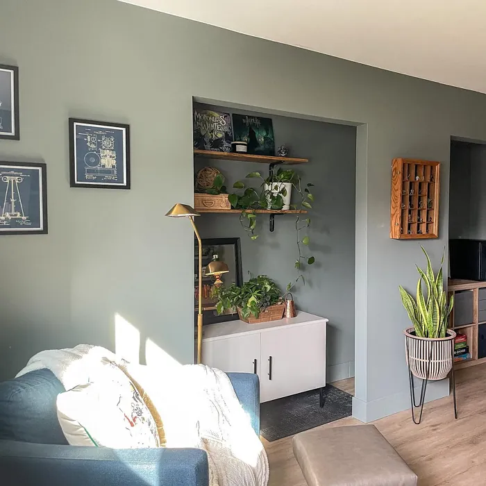
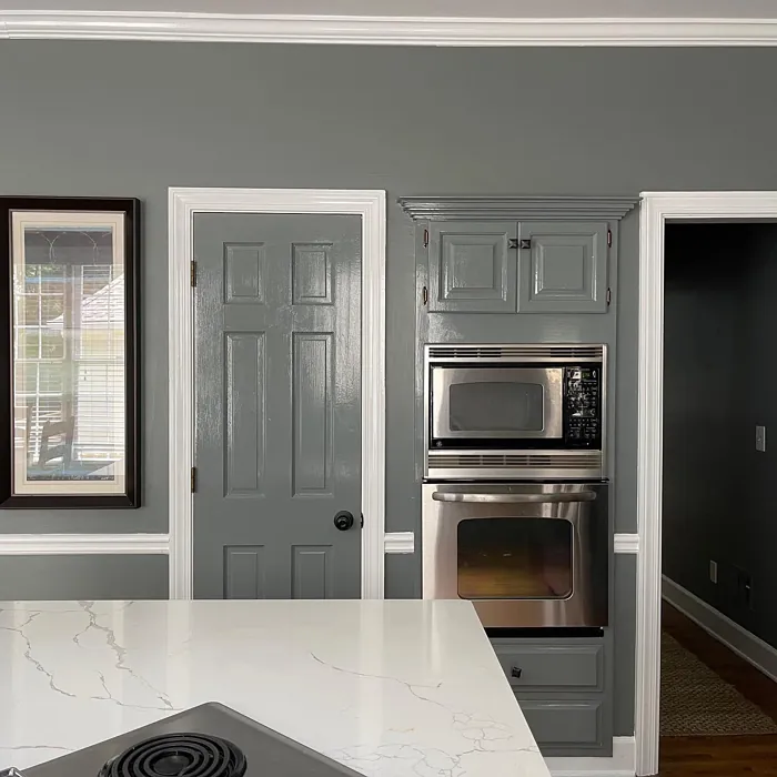
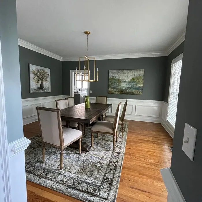
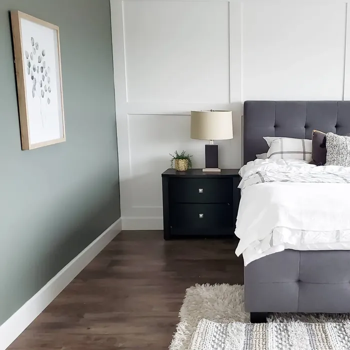
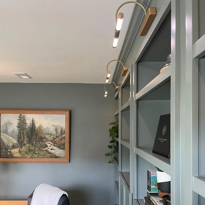
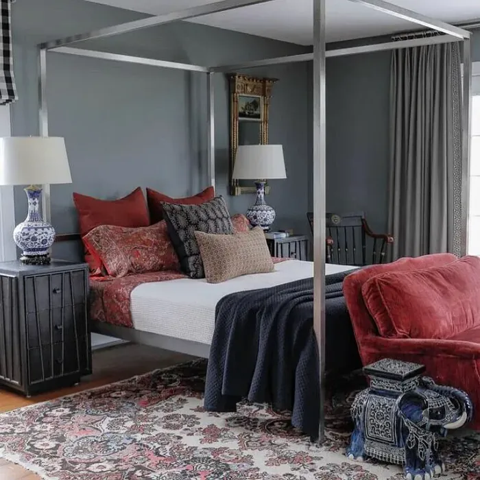
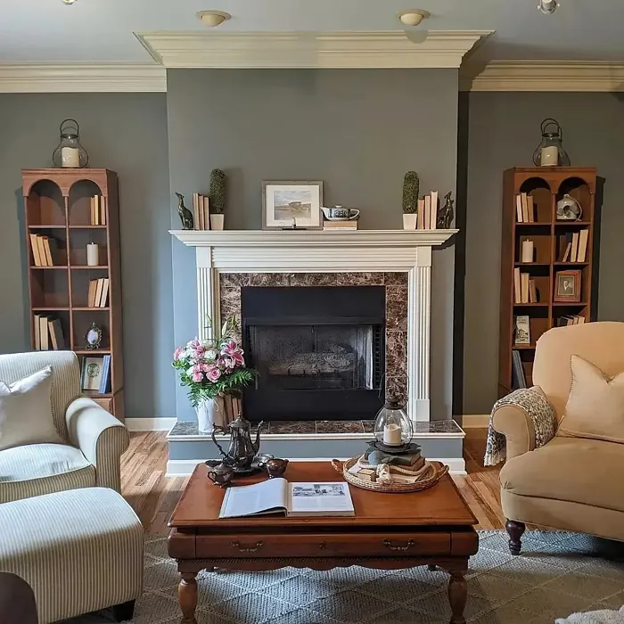
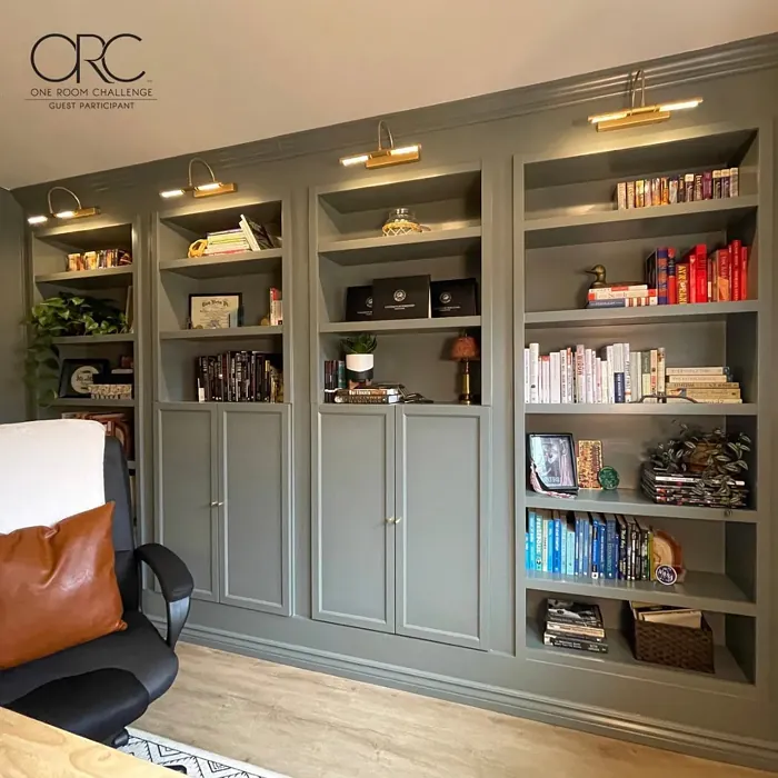
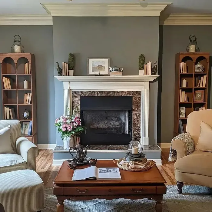
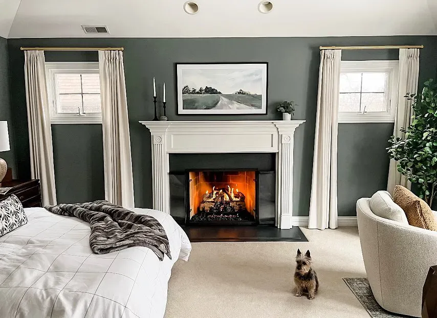
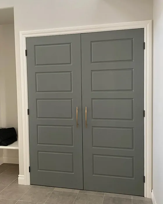
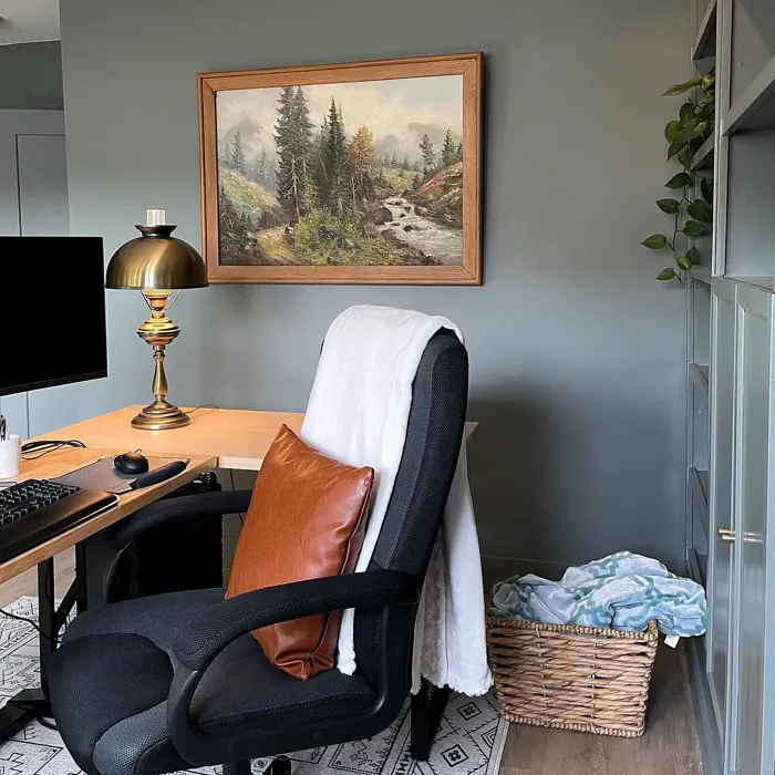
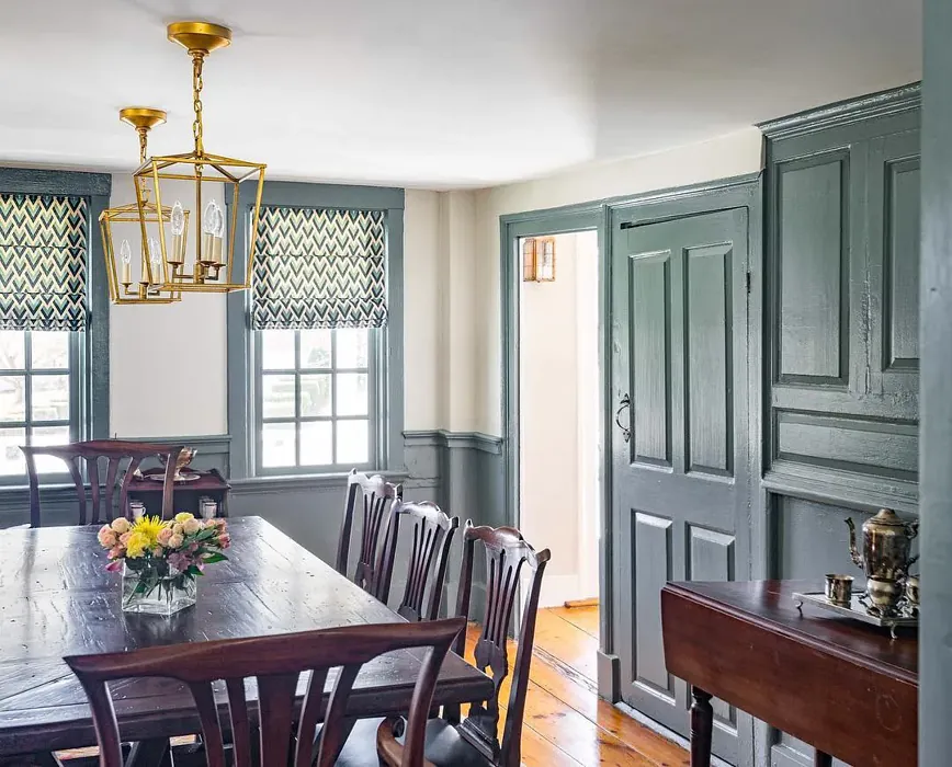
Real Room Photo of Duxbury Gray HC-163
Undertones of Duxbury Gray ?
The undertones of Duxbury Gray are a key aspect of its character, leaning towards Green. These subtle underlying hues are what give the color its depth and complexity. For example, a gray with a blue undertone will feel cooler and more modern, while one with a brown undertone will feel warmer and more traditional. It’s essential to test this paint in your home and observe it next to your existing furniture, flooring, and decor to see how these undertones interact and reveal themselves throughout the day.
HEX value: #7F867F
RGB code: 127, 134, 127
Is Duxbury Gray Cool or Warm?
While primarily a gray, Duxbury Gray leans slightly towards the cool side, thanks to its muted green undertones. This makes it a refreshing choice for spaces that need an airy feel, while still feeling grounded and inviting.
Understanding Color Properties and Interior Design Tips
Hue refers to a specific position on the color wheel, measured in degrees from 0 to 360. Each degree represents a different pure color:
- 0° represents red
- 120° represents green
- 240° represents blue
Saturation describes the intensity or purity of a color and is expressed as a percentage:
- At 0%, the color appears completely desaturated—essentially a shade of gray
- At 100%, the color is at its most vivid and vibrant
Lightness indicates how light or dark a color is, also expressed as a percentage:
- 0% lightness results in black
- 100% lightness results in white
Using Warm Colors in Interior Design
Warm hues—such as reds, oranges, yellows, warm beiges, and greiges—are excellent choices for creating inviting and energetic spaces. These colors are particularly well-suited for:
- Kitchens, living rooms, and bathrooms, where warmth enhances comfort and sociability
- Large rooms, where warm tones can help reduce the sense of emptiness and make the space feel more intimate
For example:
- Warm beige shades provide a cozy, inviting atmosphere, ideal for living rooms, bedrooms, and hallways.
- Warm greige (a mix of beige and gray) offers the warmth of beige with the modern appeal of gray, making it a versatile backdrop for dining areas, bedrooms, and living spaces.
However, be mindful when using warm light tones in rooms with limited natural light. These shades may appear muted or even take on an unpleasant yellowish tint. To avoid a dull or flat appearance:
- Add depth by incorporating richer tones like deep greens, charcoal, or chocolate brown
- Use textured elements such as curtains, rugs, or cushions to bring dimension to the space
Pro Tip: Achieving Harmony with Warm and Cool Color Balance
To create a well-balanced and visually interesting interior, mix warm and cool tones strategically. This contrast adds depth and harmony to your design.
- If your walls feature warm hues, introduce cool-colored accents such as blue or green furniture, artwork, or accessories to create contrast.
- For a polished look, consider using a complementary color scheme, which pairs colors opposite each other on the color wheel (e.g., red with green, orange with blue).
This thoughtful mix not only enhances visual appeal but also creates a space that feels both dynamic and cohesive.
Light Temperature Affects on Duxbury Gray
Natural Light
Natural daylight changes in color temperature as the sun moves across the sky. At sunrise and sunset, the light tends to have a warm, golden tone with a color temperature around 2000 Kelvin (K). As the day progresses and the sun rises higher, the light becomes cooler and more neutral. Around midday, especially when the sky is clear, natural light typically reaches its peak brightness and shifts to a cooler tone, ranging from 5500 to 6500 Kelvin. This midday light is close to what we perceive as pure white or daylight-balanced light.
These shifts in natural light can significantly influence how colors appear in a space, which is why designers often consider both the time of day and the orientation of windows when planning interior color schemes.
Artificial Light
When choosing artificial lighting, pay close attention to the color temperature, measured in Kelvin (K). This determines how warm or cool the light will appear. Lower temperatures, around 2700K, give off a warm, yellow glow often used in living rooms or bedrooms. Higher temperatures, above 5000K, create a cool, bluish light similar to daylight, commonly used in kitchens, offices, or task areas.
Use the slider to see how lighting temperature can affect the appearance of a surface or color throughout a space.


4800K
LRV of Duxbury Gray
The Light Reflectance Value (LRV) of Duxbury Gray is 23.60%, which places it in the Medium colors category. This means it reflect a lot of light. Understanding a paint’s LRV is crucial for predicting how it will look in your space. A higher LRV indicates a lighter color that reflects more light, making rooms feel larger and brighter. A lower LRV signifies a darker color that absorbs more light, creating a cozier, more intimate atmosphere. Always consider the natural and artificial lighting in your room when selecting a paint color based on its LRV.
Detailed Review of Duxbury Gray
Additional Paint Characteristics
Ideal Rooms
Bedroom, Dining Room, Home Office, Living Room
Decor Styles
Coastal, Farmhouse, Modern, Traditional
Coverage
Good (1–2 Coats), Touch-Up Friendly
Ease of Application
Beginner Friendly, Brush Smooth, Roller-Ready
Washability
Highly Washable, Washable
VOC Level
Low VOC
Best Use
Accent Wall, Interior Walls, Trim
Room Suitability
Bedroom, Dining Room, Home Office, Living Room
Tone Tag
Balanced, Earthy, Muted
Finish Type
Eggshell, Satin
Paint Performance
Easy Touch-Up, High Coverage, Low Odor
Use Cases
Best for Modern Farmhouse, Best for Small Spaces, Classic Favorite
Mood
Calm, Cozy, Inviting
Trim Pairing
Complements Cool Trim, Matches Pure White, Pairs with White Dove
Duxbury Gray is a color that embodies sophistication while remaining approachable. Its soft, muted tone makes it ideal for creating a serene environment, perfect for spaces where you want to relax or focus. This paint performs well across various surfaces, providing excellent coverage and a smooth finish. One of its standout features is its versatility; it complements a wide range of furniture styles and color palettes. Whether you’re aiming for a cozy living room or a chic bedroom, Duxbury Gray can serve as a flawless backdrop. As a bonus, it pairs beautifully with both light and dark trim, making it a great choice for any home.
Pros & Cons of HC-163 Duxbury Gray
Pros
Cons
Colors that go with Benjamin Moore Duxbury Gray
FAQ on HC-163 Duxbury Gray
Can Duxbury Gray be used in small rooms?
Absolutely! Duxbury Gray can work wonderfully in small spaces. Its muted tone helps create an illusion of depth, making the room feel more expansive. Just ensure you have adequate lighting to prevent it from appearing too dark. Pairing it with lighter trim can also enhance the sense of space.
How does Duxbury Gray perform in high-traffic areas?
Duxbury Gray is quite durable and holds up well in high-traffic areas. Its washable nature means you can easily clean scuffs and marks, maintaining its sophisticated appearance. For ultimate durability, consider adding a satin or eggshell finish, as these are more resistant to wear and tear.
Comparisons Duxbury Gray with other colors
Duxbury Gray HC-163 vs Night Owl SW 7061
| Attribute | Duxbury Gray HC-163 | Night Owl SW 7061 |
|---|---|---|
| Color Name | Duxbury Gray HC-163 | Night Owl SW 7061 |
| Color | ||
| Hue | Grey | Grey |
| Brightness | Dark | Dark |
| RGB | 127, 134, 127 | 99, 101, 95 |
| LRV | 23.60% | 24% |
| Finish Type | Eggshell, Satin | Eggshell, Matte, Satin |
| Finish Options | Eggshell, Flat, Matte, Satin | Eggshell, Matte, Satin |
| Ideal Rooms | Bedroom, Dining Room, Home Office, Living Room | Bedroom, Dining Room, Hallway, Home Office, Living Room |
| Decor Styles | Coastal, Farmhouse, Modern, Traditional | Industrial, Minimalist, Modern, Rustic, Scandinavian |
| Coverage | Good (1–2 Coats), Touch-Up Friendly | Good (1–2 Coats), Touch-Up Friendly |
| Ease of Application | Beginner Friendly, Brush Smooth, Roller-Ready | Beginner Friendly, Brush Smooth, Fast-Drying, Roller-Ready |
| Washability | Highly Washable, Washable | Scrubbable, Washable |
| Room Suitability | Bedroom, Dining Room, Home Office, Living Room | Bedroom, Dining Room, Home Office, Living Room |
| Tone | Balanced, Earthy, Muted | Balanced, Deep, Earthy, Muted |
| Paint Performance | Easy Touch-Up, High Coverage, Low Odor | Easy Touch-Up, Fade Resistant, High Coverage, Low Odor |
Duxbury Gray HC-163 vs Urbane Bronze SW 7048
| Attribute | Duxbury Gray HC-163 | Urbane Bronze SW 7048 |
|---|---|---|
| Color Name | Duxbury Gray HC-163 | Urbane Bronze SW 7048 |
| Color | ||
| Hue | Grey | Grey |
| Brightness | Dark | Dark |
| RGB | 127, 134, 127 | 84, 80, 74 |
| LRV | 23.60% | 20% |
| Finish Type | Eggshell, Satin | Eggshell, Matte, Satin |
| Finish Options | Eggshell, Flat, Matte, Satin | Eggshell, Matte, Satin |
| Ideal Rooms | Bedroom, Dining Room, Home Office, Living Room | Bedroom, Dining Room, Home Office, Living Room |
| Decor Styles | Coastal, Farmhouse, Modern, Traditional | Contemporary, Industrial, Modern, Rustic, Transitional |
| Coverage | Good (1–2 Coats), Touch-Up Friendly | Good (1–2 Coats) |
| Ease of Application | Beginner Friendly, Brush Smooth, Roller-Ready | Beginner Friendly, Brush Smooth, Roller-Ready |
| Washability | Highly Washable, Washable | Highly Washable, Washable |
| Room Suitability | Bedroom, Dining Room, Home Office, Living Room | Bedroom, Dining Room, Home Office, Living Room |
| Tone | Balanced, Earthy, Muted | Deep, Earthy, Warm |
| Paint Performance | Easy Touch-Up, High Coverage, Low Odor | Easy Touch-Up, Fade Resistant, High Coverage, Low Odor |
Duxbury Gray HC-163 vs Succulent SW 9650
| Attribute | Duxbury Gray HC-163 | Succulent SW 9650 |
|---|---|---|
| Color Name | Duxbury Gray HC-163 | Succulent SW 9650 |
| Color | ||
| Hue | Grey | Grey |
| Brightness | Dark | Dark |
| RGB | 127, 134, 127 | 97, 108, 100 |
| LRV | 23.60% | 30% |
| Finish Type | Eggshell, Satin | Eggshell, Matte, Satin |
| Finish Options | Eggshell, Flat, Matte, Satin | Eggshell, Matte, Satin |
| Ideal Rooms | Bedroom, Dining Room, Home Office, Living Room | Bathroom, Bedroom, Dining Room, Entryway, Kitchen, Living Room |
| Decor Styles | Coastal, Farmhouse, Modern, Traditional | Bohemian, Contemporary, Eclectic, Minimalist, Modern Farmhouse |
| Coverage | Good (1–2 Coats), Touch-Up Friendly | Good (1–2 Coats), Touch-Up Friendly |
| Ease of Application | Beginner Friendly, Brush Smooth, Roller-Ready | Beginner Friendly, Brush Smooth, Roller-Ready |
| Washability | Highly Washable, Washable | Highly Washable, Washable |
| Room Suitability | Bedroom, Dining Room, Home Office, Living Room | Bathroom, Bedroom, Dining Room, Kitchen, Living Room |
| Tone | Balanced, Earthy, Muted | Cool, Earthy, Muted |
| Paint Performance | Easy Touch-Up, High Coverage, Low Odor | Easy Touch-Up, Low Odor, Quick Drying, Scuff Resistant |
Duxbury Gray HC-163 vs Grizzle Gray SW 7068
| Attribute | Duxbury Gray HC-163 | Grizzle Gray SW 7068 |
|---|---|---|
| Color Name | Duxbury Gray HC-163 | Grizzle Gray SW 7068 |
| Color | ||
| Hue | Grey | Grey |
| Brightness | Dark | Dark |
| RGB | 127, 134, 127 | 99, 101, 98 |
| LRV | 23.60% | 24% |
| Finish Type | Eggshell, Satin | Eggshell, Satin |
| Finish Options | Eggshell, Flat, Matte, Satin | Eggshell, Matte, Satin |
| Ideal Rooms | Bedroom, Dining Room, Home Office, Living Room | Bedroom, Dining Room, Home Office, Living Room |
| Decor Styles | Coastal, Farmhouse, Modern, Traditional | Industrial, Modern, Rustic, Scandinavian |
| Coverage | Good (1–2 Coats), Touch-Up Friendly | Good (1–2 Coats), Touch-Up Friendly |
| Ease of Application | Beginner Friendly, Brush Smooth, Roller-Ready | Beginner Friendly, Brush Smooth, Roller-Ready |
| Washability | Highly Washable, Washable | Washable, Wipeable |
| Room Suitability | Bedroom, Dining Room, Home Office, Living Room | Bedroom, Dining Room, Home Office, Living Room |
| Tone | Balanced, Earthy, Muted | Balanced, Cool, Muted |
| Paint Performance | Easy Touch-Up, High Coverage, Low Odor | Easy Touch-Up, High Coverage, Low Odor |
Duxbury Gray HC-163 vs Iron Ore SW 7069
| Attribute | Duxbury Gray HC-163 | Iron Ore SW 7069 |
|---|---|---|
| Color Name | Duxbury Gray HC-163 | Iron Ore SW 7069 |
| Color | ||
| Hue | Grey | Grey |
| Brightness | Dark | Dark |
| RGB | 127, 134, 127 | 67, 67, 65 |
| LRV | 23.60% | 6% |
| Finish Type | Eggshell, Satin | Eggshell, Matte, Satin |
| Finish Options | Eggshell, Flat, Matte, Satin | Eggshell, Matte, Satin |
| Ideal Rooms | Bedroom, Dining Room, Home Office, Living Room | Bedroom, Dining Room, Entryway, Home Office, Living Room |
| Decor Styles | Coastal, Farmhouse, Modern, Traditional | Contemporary, Industrial, Minimalist, Modern, Rustic |
| Coverage | Good (1–2 Coats), Touch-Up Friendly | Good (1–2 Coats), High Hide |
| Ease of Application | Beginner Friendly, Brush Smooth, Roller-Ready | Brush Smooth, Fast-Drying, Roller-Ready |
| Washability | Highly Washable, Washable | Highly Washable, Washable |
| Room Suitability | Bedroom, Dining Room, Home Office, Living Room | Bedroom, Dining Room, Entryway, Home Office, Living Room |
| Tone | Balanced, Earthy, Muted | Balanced, Deep, Muted, Warm |
| Paint Performance | Easy Touch-Up, High Coverage, Low Odor | Easy Touch-Up, High Coverage, Low Odor |
Duxbury Gray HC-163 vs Peppercorn SW 7674
| Attribute | Duxbury Gray HC-163 | Peppercorn SW 7674 |
|---|---|---|
| Color Name | Duxbury Gray HC-163 | Peppercorn SW 7674 |
| Color | ||
| Hue | Grey | Grey |
| Brightness | Dark | Dark |
| RGB | 127, 134, 127 | 88, 88, 88 |
| LRV | 23.60% | 10% |
| Finish Type | Eggshell, Satin | Eggshell, Matte, Satin |
| Finish Options | Eggshell, Flat, Matte, Satin | Eggshell, Matte, Satin |
| Ideal Rooms | Bedroom, Dining Room, Home Office, Living Room | Bedroom, Dining Room, Home Office, Living Room |
| Decor Styles | Coastal, Farmhouse, Modern, Traditional | Contemporary, Industrial, Minimalist, Modern |
| Coverage | Good (1–2 Coats), Touch-Up Friendly | Good (1–2 Coats), Touch-Up Friendly |
| Ease of Application | Beginner Friendly, Brush Smooth, Roller-Ready | Beginner Friendly, Brush Smooth, Roller-Ready |
| Washability | Highly Washable, Washable | Highly Washable, Washable |
| Room Suitability | Bedroom, Dining Room, Home Office, Living Room | Bedroom, Dining Room, Home Office, Living Room |
| Tone | Balanced, Earthy, Muted | Balanced, Deep, Moody, Neutral |
| Paint Performance | Easy Touch-Up, High Coverage, Low Odor | Easy Touch-Up, Low Odor, Quick Drying, Scuff Resistant |
Duxbury Gray HC-163 vs Slate Tile SW 7624
| Attribute | Duxbury Gray HC-163 | Slate Tile SW 7624 |
|---|---|---|
| Color Name | Duxbury Gray HC-163 | Slate Tile SW 7624 |
| Color | ||
| Hue | Grey | Grey |
| Brightness | Dark | Dark |
| RGB | 127, 134, 127 | 96, 110, 116 |
| LRV | 23.60% | 15% |
| Finish Type | Eggshell, Satin | Eggshell, Matte, Satin |
| Finish Options | Eggshell, Flat, Matte, Satin | Eggshell, Matte, Satin |
| Ideal Rooms | Bedroom, Dining Room, Home Office, Living Room | Bathroom, Bedroom, Home Office, Kitchen, Living Room |
| Decor Styles | Coastal, Farmhouse, Modern, Traditional | Industrial, Minimalist, Modern, Rustic |
| Coverage | Good (1–2 Coats), Touch-Up Friendly | Good (1–2 Coats) |
| Ease of Application | Beginner Friendly, Brush Smooth, Roller-Ready | Beginner Friendly, Brush Smooth, Fast-Drying, Roller-Ready |
| Washability | Highly Washable, Washable | Scrubbable, Washable |
| Room Suitability | Bedroom, Dining Room, Home Office, Living Room | Bathroom, Bedroom, Kitchen, Living Room |
| Tone | Balanced, Earthy, Muted | Balanced, Cool, Muted |
| Paint Performance | Easy Touch-Up, High Coverage, Low Odor | Easy Touch-Up, High Coverage, Low Odor, Quick Drying |
Duxbury Gray HC-163 vs Blustery Sky SW 9140
| Attribute | Duxbury Gray HC-163 | Blustery Sky SW 9140 |
|---|---|---|
| Color Name | Duxbury Gray HC-163 | Blustery Sky SW 9140 |
| Color | ||
| Hue | Grey | Grey |
| Brightness | Dark | Dark |
| RGB | 127, 134, 127 | 111, 132, 140 |
| LRV | 23.60% | 48% |
| Finish Type | Eggshell, Satin | Eggshell, Matte |
| Finish Options | Eggshell, Flat, Matte, Satin | Eggshell, Matte, Satin |
| Ideal Rooms | Bedroom, Dining Room, Home Office, Living Room | Bedroom, Dining Room, Home Office, Living Room, Nursery |
| Decor Styles | Coastal, Farmhouse, Modern, Traditional | Coastal, Modern Farmhouse, Scandinavian, Transitional |
| Coverage | Good (1–2 Coats), Touch-Up Friendly | Good (1–2 Coats), Touch-Up Friendly |
| Ease of Application | Beginner Friendly, Brush Smooth, Roller-Ready | Beginner Friendly, Fast-Drying, Low Splatter, Roller-Ready |
| Washability | Highly Washable, Washable | Washable, Wipeable |
| Room Suitability | Bedroom, Dining Room, Home Office, Living Room | Bedroom, Home Office, Living Room, Nursery |
| Tone | Balanced, Earthy, Muted | Balanced, Cool, Muted |
| Paint Performance | Easy Touch-Up, High Coverage, Low Odor | Easy Touch-Up, Fade Resistant, Low Odor, Quick Drying |
Duxbury Gray HC-163 vs Gauntlet Gray SW 7019
| Attribute | Duxbury Gray HC-163 | Gauntlet Gray SW 7019 |
|---|---|---|
| Color Name | Duxbury Gray HC-163 | Gauntlet Gray SW 7019 |
| Color | ||
| Hue | Grey | Grey |
| Brightness | Dark | Dark |
| RGB | 127, 134, 127 | 120, 115, 110 |
| LRV | 23.60% | 24% |
| Finish Type | Eggshell, Satin | Eggshell, Matte, Satin |
| Finish Options | Eggshell, Flat, Matte, Satin | Eggshell, Matte, Satin |
| Ideal Rooms | Bedroom, Dining Room, Home Office, Living Room | Bedroom, Dining Room, Hallway, Home Office, Living Room |
| Decor Styles | Coastal, Farmhouse, Modern, Traditional | Industrial, Modern, Rustic, Transitional |
| Coverage | Good (1–2 Coats), Touch-Up Friendly | Good (1–2 Coats), Touch-Up Friendly |
| Ease of Application | Beginner Friendly, Brush Smooth, Roller-Ready | Beginner Friendly, Brush Smooth, Roller-Ready |
| Washability | Highly Washable, Washable | Scrubbable, Washable |
| Room Suitability | Bedroom, Dining Room, Home Office, Living Room | Bedroom, Dining Room, Home Office, Living Room |
| Tone | Balanced, Earthy, Muted | Dusty, Earthy, Muted, Warm |
| Paint Performance | Easy Touch-Up, High Coverage, Low Odor | Easy Touch-Up, High Coverage, Low Odor |
Duxbury Gray HC-163 vs Cast Iron SW 6202
| Attribute | Duxbury Gray HC-163 | Cast Iron SW 6202 |
|---|---|---|
| Color Name | Duxbury Gray HC-163 | Cast Iron SW 6202 |
| Color | ||
| Hue | Grey | Grey |
| Brightness | Dark | Dark |
| RGB | 127, 134, 127 | 100, 100, 90 |
| LRV | 23.60% | 6% |
| Finish Type | Eggshell, Satin | Eggshell, Matte, Satin |
| Finish Options | Eggshell, Flat, Matte, Satin | Eggshell, Matte, Satin |
| Ideal Rooms | Bedroom, Dining Room, Home Office, Living Room | Bedroom, Dining Room, Hallway, Home Office, Kitchen, Living Room |
| Decor Styles | Coastal, Farmhouse, Modern, Traditional | Contemporary, Farmhouse, Industrial, Minimalist, Modern |
| Coverage | Good (1–2 Coats), Touch-Up Friendly | Good (1–2 Coats), High Hide, Touch-Up Friendly |
| Ease of Application | Beginner Friendly, Brush Smooth, Roller-Ready | Beginner Friendly, Brush Smooth, Fast-Drying, Roller-Ready |
| Washability | Highly Washable, Washable | Highly Washable, Washable, Wipeable |
| Room Suitability | Bedroom, Dining Room, Home Office, Living Room | Bedroom, Dining Room, Home Office, Kitchen, Living Room |
| Tone | Balanced, Earthy, Muted | Balanced, Deep, Dusty, Earthy, Warm |
| Paint Performance | Easy Touch-Up, High Coverage, Low Odor | Easy Touch-Up, High Coverage, Low Odor, Stain Resistant |
Official Page of Benjamin Moore Duxbury Gray HC-163