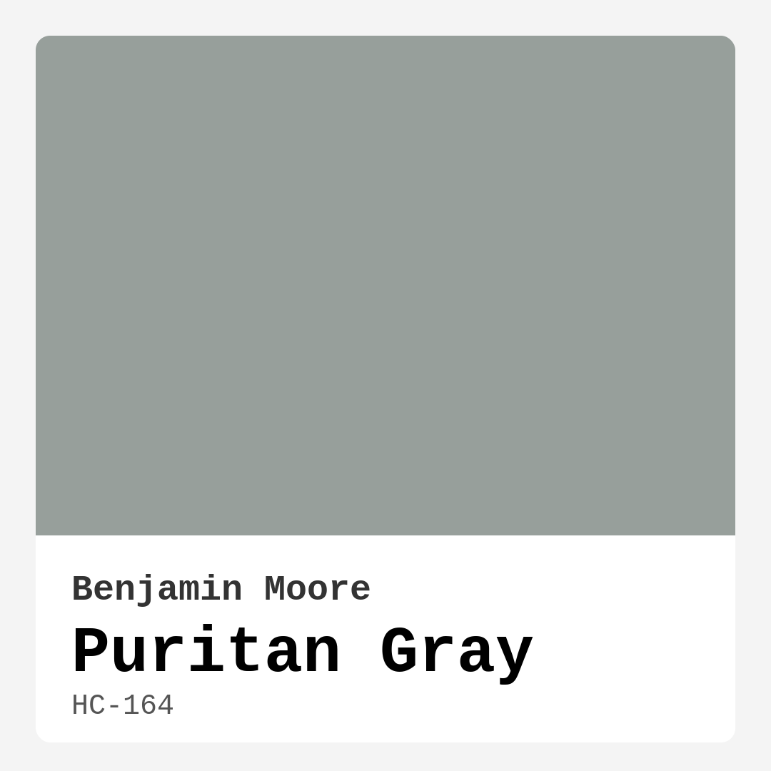
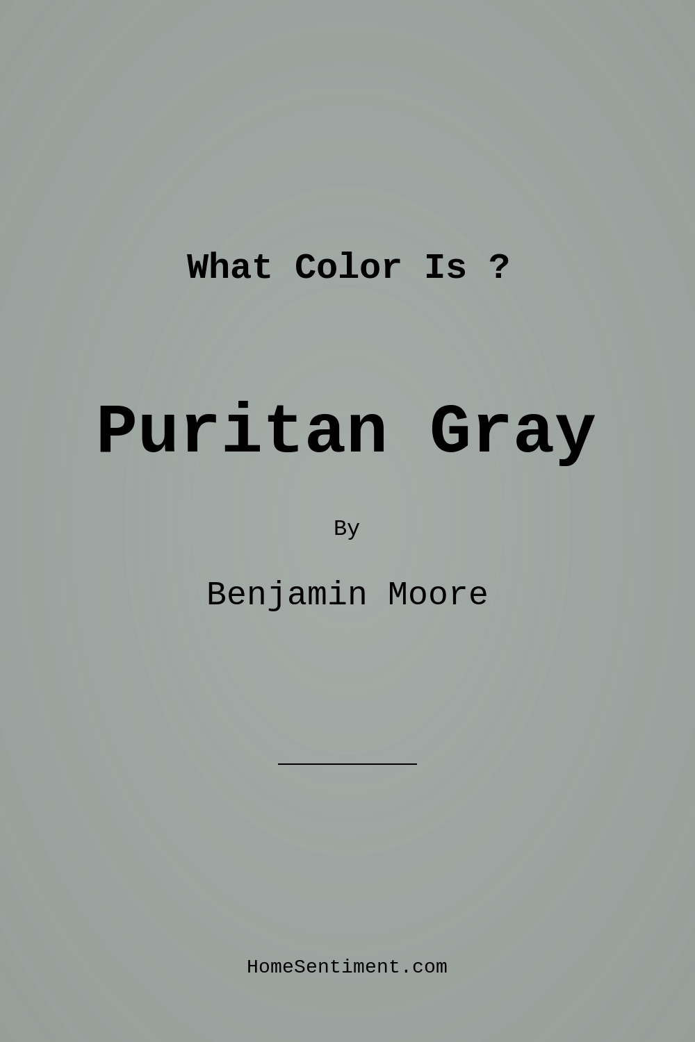
Color Preview & Key Details
| HEX Code | #979F9B |
| RGB | 151, 159, 155 |
| LRV | 34.29% |
| Undertone | Green |
| Finish Options | Eggshell, Matte, Satin |
Imagine walking into a room and feeling an immediate sense of calm wash over you. The walls are a gentle, muted gray that somehow feels both warm and cool, inviting you to sink into the comfort of the space. That’s the magic of Puritan Gray by Benjamin Moore, a color that elevates interiors and creates a serene atmosphere.
Puritan Gray (HC-164) is not just any gray; it’s a sophisticated blend with subtle green undertones that breathe life into your walls. This hue strikes a delicate balance, making it versatile enough to fit into modern, traditional, contemporary, or farmhouse aesthetics. The muted tone has a unique charm that makes it a favorite among homeowners and designers alike.
One of the standout features of Puritan Gray is its ability to reflect light beautifully. With a Light Reflectance Value (LRV) of around 34.29%, it manages to brighten spaces without feeling stark or cold. This means it works wonderfully in both well-lit areas and dimmer corners, adapting gracefully to the light available. Whether you’re basking in the sun’s glow or enjoying the coziness of evening light, Puritan Gray shifts slightly, creating a backdrop that feels alive and vibrant throughout the day.
Choosing paint colors can often feel overwhelming, but Puritan Gray simplifies the decision-making process. It offers a perfect canvas for your favorite decor pieces, whether they are bold or subdued. When paired with whites like White Dove or Simply White, it creates a stunning contrast that feels both classic and fresh. This color also harmonizes beautifully with natural wood tones, deep blues, and soft pastels, allowing you to create a cohesive look throughout your home.
Are you contemplating using Puritan Gray in a small space? Absolutely, this color is an excellent choice! Its balanced undertones help create an illusion of depth, making rooms feel larger than they are. Pair it with lighter furnishings or decor to further enhance this effect, and watch as your cozy nook transforms into an inviting retreat.
If you’re worried about how it will look in different lighting, let me put your mind at ease. Puritan Gray carries soft green undertones that subtly influence its appearance, especially as the day progresses. In bright sunlight, it tends to appear lighter and airier, while in the softer hues of the evening, it deepens just enough to offer a cozy embrace. This adaptability makes it a fantastic choice for any room, from a serene bedroom to a lively home office.
When it comes to application, Puritan Gray shines with its beginner-friendly nature. It’s easy to apply, whether you’re using a brush or a roller, and you’ll find that it adheres smoothly to surfaces, providing a flawless finish that enhances your space’s overall aesthetic. Its excellent coverage means you’ll likely only need one or two coats, making your project more efficient. Plus, touch-ups are a breeze thanks to its washability and low VOC levels, which contribute to a healthier indoor environment.
While there’s so much to love about Puritan Gray, it’s essential to consider its nuances. In certain light settings, it can lean toward the cooler side, particularly if your space lacks ample natural light. To avoid this, ensure your lighting—whether through fixtures or natural light—complements the color’s unique undertones. Adding warm accent pieces or decor can also help to create a more balanced feel in the space.
Now, let’s talk about where this lovely hue can best be utilized. Puritan Gray is ideal for numerous rooms, including living rooms, bedrooms, dining rooms, and home offices. Its calm and inviting nature creates a restful environment that is perfect for unwinding after a long day or sparking creativity in your work-from-home setup. Plus, it makes a lovely accent wall if you’re looking to add a touch of sophistication without overwhelming the space.
When you’re thinking of a color palette, consider the complementary shades that pair beautifully with Puritan Gray. Soft reds or rich earthy tones can create a stunning contrast, while light pastel colors will keep the atmosphere light and airy. Mixing in brass fixtures or natural wood trim can elevate the overall look, enhancing the warmth of this muted gray.
If you’re still on the fence about color choices, you might want to look at some of its equivalents, such as Gray Owl from Benjamin Moore or Sherwin-Williams’ Repose Gray. These colors share similar qualities and can provide a broader sense of what you might like. However, Puritan Gray stands out with its unique undertone, making it a designer favorite for those looking to add a touch of elegance with a tranquil vibe.
Ultimately, the decision to choose Puritan Gray for your home is about embracing a calming atmosphere that feels welcoming and stylish. Its versatility allows it to adapt to various decor styles effortlessly, while its sophisticated undertones bring a level of depth that few colors can match. Whether you’re embarking on a full home makeover or just refreshing a room, consider Puritan Gray. It’s more than just paint; it’s an invitation to create a space that reflects your style and nurtures your spirit.
So, are you ready to take the plunge into the world of Puritan Gray? Your walls are waiting for a touch of elegance that only this beautiful hue can provide.
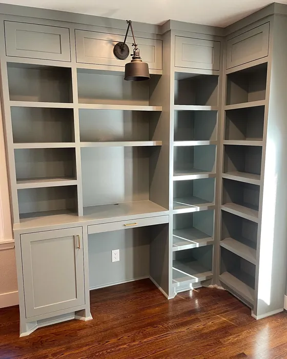
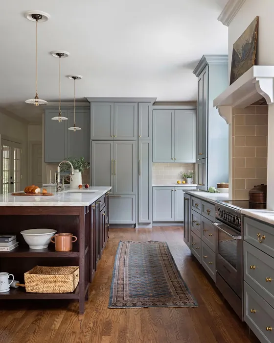
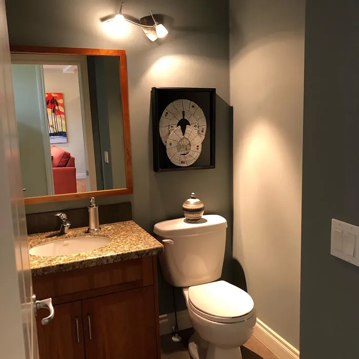
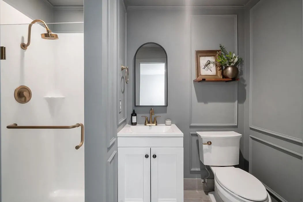
Real Room Photo of Puritan Gray HC-164
Undertones of Puritan Gray ?
Puritan Gray carries soft green undertones that subtly influence its appearance, especially in varying light conditions. This feature allows it to shift slightly, creating a dynamic backdrop that feels alive throughout the day. It pairs beautifully with both warm and cool color palettes, making it incredibly adaptable.
HEX value: #979F9B
RGB code: 151, 159, 155
Is Puritan Gray Cool or Warm?
This color leans slightly towards the cool side due to its green undertones but remains balanced enough to warm up a space. It’s perfect for creating a calm and inviting environment, suitable for both contemporary and traditional designs.
Understanding Color Properties and Interior Design Tips
Hue refers to a specific position on the color wheel, measured in degrees from 0 to 360. Each degree represents a different pure color:
- 0° represents red
- 120° represents green
- 240° represents blue
Saturation describes the intensity or purity of a color and is expressed as a percentage:
- At 0%, the color appears completely desaturated—essentially a shade of gray
- At 100%, the color is at its most vivid and vibrant
Lightness indicates how light or dark a color is, also expressed as a percentage:
- 0% lightness results in black
- 100% lightness results in white
Using Warm Colors in Interior Design
Warm hues—such as reds, oranges, yellows, warm beiges, and greiges—are excellent choices for creating inviting and energetic spaces. These colors are particularly well-suited for:
- Kitchens, living rooms, and bathrooms, where warmth enhances comfort and sociability
- Large rooms, where warm tones can help reduce the sense of emptiness and make the space feel more intimate
For example:
- Warm beige shades provide a cozy, inviting atmosphere, ideal for living rooms, bedrooms, and hallways.
- Warm greige (a mix of beige and gray) offers the warmth of beige with the modern appeal of gray, making it a versatile backdrop for dining areas, bedrooms, and living spaces.
However, be mindful when using warm light tones in rooms with limited natural light. These shades may appear muted or even take on an unpleasant yellowish tint. To avoid a dull or flat appearance:
- Add depth by incorporating richer tones like deep greens, charcoal, or chocolate brown
- Use textured elements such as curtains, rugs, or cushions to bring dimension to the space
Pro Tip: Achieving Harmony with Warm and Cool Color Balance
To create a well-balanced and visually interesting interior, mix warm and cool tones strategically. This contrast adds depth and harmony to your design.
- If your walls feature warm hues, introduce cool-colored accents such as blue or green furniture, artwork, or accessories to create contrast.
- For a polished look, consider using a complementary color scheme, which pairs colors opposite each other on the color wheel (e.g., red with green, orange with blue).
This thoughtful mix not only enhances visual appeal but also creates a space that feels both dynamic and cohesive.
Light Temperature Affects on Puritan Gray
Natural Light
Natural daylight changes in color temperature as the sun moves across the sky. At sunrise and sunset, the light tends to have a warm, golden tone with a color temperature around 2000 Kelvin (K). As the day progresses and the sun rises higher, the light becomes cooler and more neutral. Around midday, especially when the sky is clear, natural light typically reaches its peak brightness and shifts to a cooler tone, ranging from 5500 to 6500 Kelvin. This midday light is close to what we perceive as pure white or daylight-balanced light.
These shifts in natural light can significantly influence how colors appear in a space, which is why designers often consider both the time of day and the orientation of windows when planning interior color schemes.
Artificial Light
When choosing artificial lighting, pay close attention to the color temperature, measured in Kelvin (K). This determines how warm or cool the light will appear. Lower temperatures, around 2700K, give off a warm, yellow glow often used in living rooms or bedrooms. Higher temperatures, above 5000K, create a cool, bluish light similar to daylight, commonly used in kitchens, offices, or task areas.
Use the slider to see how lighting temperature can affect the appearance of a surface or color throughout a space.


4800K
LRV of Puritan Gray
The Light Reflectance Value (LRV) of Puritan Gray is around 40, meaning it reflects a moderate amount of light. This makes it suitable for both well-lit and dim spaces, ensuring it doesn’t overpower smaller areas.
Detailed Review of Puritan Gray
Additional Paint Characteristics
Ideal Rooms
Bedroom, Dining Room, Hallway, Home Office, Living Room
Decor Styles
Contemporary, Farmhouse, Modern, Traditional
Coverage
Good (1–2 Coats), Touch-Up Friendly
Ease of Application
Beginner Friendly, Brush Smooth, Roller-Ready
Washability
Highly Washable, Washable
VOC Level
Low VOC, Ultra Low VOC
Best Use
Accent Wall, Interior Walls, Trim
Room Suitability
Bedroom, Dining Room, Home Office, Living Room
Tone Tag
Balanced, Cool, Muted
Finish Type
Eggshell, Matte
Paint Performance
Easy Touch-Up, High Coverage, Low Odor
Use Cases
Best for Modern Farmhouse, Best for Small Spaces, Designer Favorite
Mood
Calm, Inviting, Restful
Trim Pairing
Complements Brass Fixtures, Good with Wood Trim, Pairs with White Dove
Puritan Gray is a stunning choice if you’re looking to create a serene atmosphere in your home. Its muted hue works wonderfully across various rooms, providing a backdrop that allows furniture and decor to shine. The subtle green undertones add depth, making it a great fit for both natural and artificial light settings. Whether you’re decorating a cozy living room or a restful bedroom, Puritan Gray offers the perfect blend of elegance and comfort. It’s versatile enough to complement both warm and cool accents, making it a favorite among decorators. Installation is straightforward, and you’ll find it adheres well to surfaces, providing a smooth finish that enhances your space’s overall aesthetic.
Pros & Cons of HC-164 Puritan Gray
Pros
Cons
Colors that go with Benjamin Moore Puritan Gray
FAQ on HC-164 Puritan Gray
Can Puritan Gray be used in small spaces?
Absolutely! Puritan Gray is a fantastic choice for small spaces. Its balanced undertones help to create an illusion of depth, making rooms feel larger and more inviting. Pair it with lighter furnishings or decor to enhance this effect further.
What colors pair well with Puritan Gray?
Puritan Gray pairs beautifully with whites, especially shades like White Dove or Simply White. It also harmonizes well with natural wood tones, deep blues, and soft pastels, allowing you to create a cohesive and stylish look throughout your home.
Comparisons Puritan Gray with other colors
Puritan Gray HC-164 vs Repose Gray SW 7015
| Attribute | Puritan Gray HC-164 | Repose Gray SW 7015 |
|---|---|---|
| Color Name | Puritan Gray HC-164 | Repose Gray SW 7015 |
| Color | ||
| Hue | Grey | Grey |
| Brightness | Medium | Medium |
| RGB | 151, 159, 155 | 204, 201, 192 |
| LRV | 34.29% | 58% |
| Finish Type | Eggshell, Matte | Eggshell, Matte, Satin |
| Finish Options | Eggshell, Matte, Satin | Eggshell, Matte, Satin |
| Ideal Rooms | Bedroom, Dining Room, Hallway, Home Office, Living Room | Bedroom, Dining Room, Hallway, Home Office, Living Room |
| Decor Styles | Contemporary, Farmhouse, Modern, Traditional | Contemporary, Farmhouse, Minimalist, Modern, Transitional |
| Coverage | Good (1–2 Coats), Touch-Up Friendly | Good (1–2 Coats), Touch-Up Friendly |
| Ease of Application | Beginner Friendly, Brush Smooth, Roller-Ready | Beginner Friendly, Brush Smooth, Fast-Drying, Roller-Ready |
| Washability | Highly Washable, Washable | Highly Washable, Washable |
| Room Suitability | Bedroom, Dining Room, Home Office, Living Room | Bedroom, Dining Room, Hallway, Home Office, Living Room |
| Tone | Balanced, Cool, Muted | Muted, Neutral, Warm |
| Paint Performance | Easy Touch-Up, High Coverage, Low Odor | Low Odor, Quick Drying, Scuff Resistant |
Puritan Gray HC-164 vs Light French Gray SW 0055
| Attribute | Puritan Gray HC-164 | Light French Gray SW 0055 |
|---|---|---|
| Color Name | Puritan Gray HC-164 | Light French Gray SW 0055 |
| Color | ||
| Hue | Grey | Grey |
| Brightness | Medium | Medium |
| RGB | 151, 159, 155 | 194, 192, 187 |
| LRV | 34.29% | 53% |
| Finish Type | Eggshell, Matte | Eggshell, Matte, Satin |
| Finish Options | Eggshell, Matte, Satin | Eggshell, Matte, Satin |
| Ideal Rooms | Bedroom, Dining Room, Hallway, Home Office, Living Room | Bedroom, Dining Room, Home Office, Kitchen, Living Room |
| Decor Styles | Contemporary, Farmhouse, Modern, Traditional | Contemporary, Farmhouse, Modern, Scandinavian, Transitional |
| Coverage | Good (1–2 Coats), Touch-Up Friendly | Good (1–2 Coats), Touch-Up Friendly |
| Ease of Application | Beginner Friendly, Brush Smooth, Roller-Ready | Beginner Friendly, Brush Smooth, Roller-Ready |
| Washability | Highly Washable, Washable | Highly Washable, Washable |
| Room Suitability | Bedroom, Dining Room, Home Office, Living Room | Bedroom, Dining Room, Home Office, Kitchen, Living Room |
| Tone | Balanced, Cool, Muted | Balanced, Muted, Neutral, Warm |
| Paint Performance | Easy Touch-Up, High Coverage, Low Odor | Easy Touch-Up, High Coverage, Low Odor |
Puritan Gray HC-164 vs Wordly Gray SW 7043
| Attribute | Puritan Gray HC-164 | Wordly Gray SW 7043 |
|---|---|---|
| Color Name | Puritan Gray HC-164 | Wordly Gray SW 7043 |
| Color | ||
| Hue | Grey | Grey |
| Brightness | Medium | Medium |
| RGB | 151, 159, 155 | 206, 198, 187 |
| LRV | 34.29% | 58% |
| Finish Type | Eggshell, Matte | Eggshell, Satin |
| Finish Options | Eggshell, Matte, Satin | Eggshell, Flat, Satin |
| Ideal Rooms | Bedroom, Dining Room, Hallway, Home Office, Living Room | Bedroom, Home Office, Kitchen, Living Room |
| Decor Styles | Contemporary, Farmhouse, Modern, Traditional | Minimalist, Modern, Scandi, Transitional |
| Coverage | Good (1–2 Coats), Touch-Up Friendly | Good (1–2 Coats) |
| Ease of Application | Beginner Friendly, Brush Smooth, Roller-Ready | Beginner Friendly, Brush Smooth, Fast-Drying, Roller-Ready |
| Washability | Highly Washable, Washable | Highly Washable, Washable |
| Room Suitability | Bedroom, Dining Room, Home Office, Living Room | Bedroom, Dining Room, Home Office, Living Room |
| Tone | Balanced, Cool, Muted | Muted, Neutral, Warm |
| Paint Performance | Easy Touch-Up, High Coverage, Low Odor | Easy Touch-Up, Low Odor, Scuff Resistant |
Puritan Gray HC-164 vs Illusive Green SW 9164
| Attribute | Puritan Gray HC-164 | Illusive Green SW 9164 |
|---|---|---|
| Color Name | Puritan Gray HC-164 | Illusive Green SW 9164 |
| Color | ||
| Hue | Grey | Grey |
| Brightness | Medium | Medium |
| RGB | 151, 159, 155 | 146, 148, 141 |
| LRV | 34.29% | 24% |
| Finish Type | Eggshell, Matte | Eggshell, Matte, Satin |
| Finish Options | Eggshell, Matte, Satin | Eggshell, Matte, Satin |
| Ideal Rooms | Bedroom, Dining Room, Hallway, Home Office, Living Room | Bedroom, Dining Room, Home Office, Living Room, Nursery |
| Decor Styles | Contemporary, Farmhouse, Modern, Traditional | Coastal, Minimalist, Modern, Rustic, Scandinavian |
| Coverage | Good (1–2 Coats), Touch-Up Friendly | Good (1–2 Coats), Touch-Up Friendly |
| Ease of Application | Beginner Friendly, Brush Smooth, Roller-Ready | Beginner Friendly, Brush Smooth, Fast-Drying, Roller-Ready |
| Washability | Highly Washable, Washable | Highly Washable, Washable, Wipeable |
| Room Suitability | Bedroom, Dining Room, Home Office, Living Room | Bedroom, Dining Room, Home Office, Living Room, Nursery |
| Tone | Balanced, Cool, Muted | Balanced, Earthy, Muted |
| Paint Performance | Easy Touch-Up, High Coverage, Low Odor | Easy Touch-Up, Low Odor, Quick Drying, Scuff Resistant |
Puritan Gray HC-164 vs Fawn Brindle SW 7640
| Attribute | Puritan Gray HC-164 | Fawn Brindle SW 7640 |
|---|---|---|
| Color Name | Puritan Gray HC-164 | Fawn Brindle SW 7640 |
| Color | ||
| Hue | Grey | Grey |
| Brightness | Medium | Medium |
| RGB | 151, 159, 155 | 167, 160, 148 |
| LRV | 34.29% | 24% |
| Finish Type | Eggshell, Matte | Eggshell, Matte |
| Finish Options | Eggshell, Matte, Satin | Eggshell, Matte, Satin |
| Ideal Rooms | Bedroom, Dining Room, Hallway, Home Office, Living Room | Bedroom, Dining Room, Hallway, Home Office, Living Room |
| Decor Styles | Contemporary, Farmhouse, Modern, Traditional | Bohemian, Minimalist, Modern Farmhouse, Transitional |
| Coverage | Good (1–2 Coats), Touch-Up Friendly | Good (1–2 Coats) |
| Ease of Application | Beginner Friendly, Brush Smooth, Roller-Ready | Brush Smooth, Fast-Drying, Roller-Ready |
| Washability | Highly Washable, Washable | Stain Resistant, Washable |
| Room Suitability | Bedroom, Dining Room, Home Office, Living Room | Bedroom, Dining Room, Home Office, Living Room |
| Tone | Balanced, Cool, Muted | Earthy, Neutral, Warm |
| Paint Performance | Easy Touch-Up, High Coverage, Low Odor | Easy Touch-Up, Fade Resistant, Low Odor |
Puritan Gray HC-164 vs Balanced Beige SW 7037
| Attribute | Puritan Gray HC-164 | Balanced Beige SW 7037 |
|---|---|---|
| Color Name | Puritan Gray HC-164 | Balanced Beige SW 7037 |
| Color | ||
| Hue | Grey | Grey |
| Brightness | Medium | Medium |
| RGB | 151, 159, 155 | 192, 178, 162 |
| LRV | 34.29% | 44% |
| Finish Type | Eggshell, Matte | Eggshell, Matte, Satin |
| Finish Options | Eggshell, Matte, Satin | Eggshell, Matte, Satin |
| Ideal Rooms | Bedroom, Dining Room, Hallway, Home Office, Living Room | Bedroom, Dining Room, Home Office, Kitchen, Living Room |
| Decor Styles | Contemporary, Farmhouse, Modern, Traditional | Contemporary, Minimalist, Modern Farmhouse, Rustic, Transitional |
| Coverage | Good (1–2 Coats), Touch-Up Friendly | Good (1–2 Coats), Touch-Up Friendly |
| Ease of Application | Beginner Friendly, Brush Smooth, Roller-Ready | Beginner Friendly, Brush Smooth, Roller-Ready |
| Washability | Highly Washable, Washable | Washable, Wipeable |
| Room Suitability | Bedroom, Dining Room, Home Office, Living Room | Bedroom, Dining Room, Hallway, Kitchen, Living Room |
| Tone | Balanced, Cool, Muted | Balanced, Earthy, Warm |
| Paint Performance | Easy Touch-Up, High Coverage, Low Odor | Easy Touch-Up, High Coverage, Low Odor |
Puritan Gray HC-164 vs Mushroom SW 9587
| Attribute | Puritan Gray HC-164 | Mushroom SW 9587 |
|---|---|---|
| Color Name | Puritan Gray HC-164 | Mushroom SW 9587 |
| Color | ||
| Hue | Grey | Grey |
| Brightness | Medium | Medium |
| RGB | 151, 159, 155 | 208, 199, 183 |
| LRV | 34.29% | 24% |
| Finish Type | Eggshell, Matte | Eggshell, Satin |
| Finish Options | Eggshell, Matte, Satin | Eggshell, Flat, Matte, Satin |
| Ideal Rooms | Bedroom, Dining Room, Hallway, Home Office, Living Room | Bedroom, Dining Room, Hallway, Home Office, Living Room |
| Decor Styles | Contemporary, Farmhouse, Modern, Traditional | Bohemian, Contemporary, Modern Farmhouse, Traditional |
| Coverage | Good (1–2 Coats), Touch-Up Friendly | Good (1–2 Coats) |
| Ease of Application | Beginner Friendly, Brush Smooth, Roller-Ready | Beginner Friendly, Brush Smooth, Roller-Ready |
| Washability | Highly Washable, Washable | Highly Washable, Washable |
| Room Suitability | Bedroom, Dining Room, Home Office, Living Room | Bedroom, Dining Room, Home Office, Living Room |
| Tone | Balanced, Cool, Muted | Earthy, Neutral, Warm |
| Paint Performance | Easy Touch-Up, High Coverage, Low Odor | Easy Touch-Up, Long Lasting, Low Odor, Scuff Resistant |
Puritan Gray HC-164 vs Silver Strand SW 7057
| Attribute | Puritan Gray HC-164 | Silver Strand SW 7057 |
|---|---|---|
| Color Name | Puritan Gray HC-164 | Silver Strand SW 7057 |
| Color | ||
| Hue | Grey | Grey |
| Brightness | Medium | Medium |
| RGB | 151, 159, 155 | 200, 203, 196 |
| LRV | 34.29% | 66% |
| Finish Type | Eggshell, Matte | Eggshell, Satin |
| Finish Options | Eggshell, Matte, Satin | Eggshell, Matte, Satin |
| Ideal Rooms | Bedroom, Dining Room, Hallway, Home Office, Living Room | Bedroom, Dining Room, Hallway, Home Office, Living Room |
| Decor Styles | Contemporary, Farmhouse, Modern, Traditional | Coastal, Minimalist, Modern, Traditional, Transitional |
| Coverage | Good (1–2 Coats), Touch-Up Friendly | Good (1–2 Coats), Touch-Up Friendly |
| Ease of Application | Beginner Friendly, Brush Smooth, Roller-Ready | Beginner Friendly, Brush Smooth, Roller-Ready |
| Washability | Highly Washable, Washable | Highly Washable, Washable |
| Room Suitability | Bedroom, Dining Room, Home Office, Living Room | Bathroom, Bedroom, Home Office, Kitchen, Living Room |
| Tone | Balanced, Cool, Muted | Balanced, Neutral, Warm |
| Paint Performance | Easy Touch-Up, High Coverage, Low Odor | Easy Touch-Up, High Coverage, Low Odor |
Puritan Gray HC-164 vs Cadet SW 9143
| Attribute | Puritan Gray HC-164 | Cadet SW 9143 |
|---|---|---|
| Color Name | Puritan Gray HC-164 | Cadet SW 9143 |
| Color | ||
| Hue | Grey | Grey |
| Brightness | Medium | Medium |
| RGB | 151, 159, 155 | 145, 153, 156 |
| LRV | 34.29% | 12% |
| Finish Type | Eggshell, Matte | Eggshell, Matte, Satin |
| Finish Options | Eggshell, Matte, Satin | Eggshell, Matte, Satin |
| Ideal Rooms | Bedroom, Dining Room, Hallway, Home Office, Living Room | Bathroom, Bedroom, Hallway, Home Office, Kitchen, Living Room |
| Decor Styles | Contemporary, Farmhouse, Modern, Traditional | Coastal, Industrial, Minimalist, Modern, Scandinavian |
| Coverage | Good (1–2 Coats), Touch-Up Friendly | Good (1–2 Coats), Touch-Up Friendly |
| Ease of Application | Beginner Friendly, Brush Smooth, Roller-Ready | Beginner Friendly, Brush Smooth, Roller-Ready |
| Washability | Highly Washable, Washable | Washable, Wipeable |
| Room Suitability | Bedroom, Dining Room, Home Office, Living Room | Bathroom, Bedroom, Hallway, Home Office, Living Room |
| Tone | Balanced, Cool, Muted | Balanced, Cool, Muted |
| Paint Performance | Easy Touch-Up, High Coverage, Low Odor | Easy Touch-Up, High Coverage, Low Odor |
Puritan Gray HC-164 vs Dovetail SW 7018
| Attribute | Puritan Gray HC-164 | Dovetail SW 7018 |
|---|---|---|
| Color Name | Puritan Gray HC-164 | Dovetail SW 7018 |
| Color | ||
| Hue | Grey | Grey |
| Brightness | Medium | Medium |
| RGB | 151, 159, 155 | 144, 138, 131 |
| LRV | 34.29% | 24% |
| Finish Type | Eggshell, Matte | Eggshell, Matte, Satin |
| Finish Options | Eggshell, Matte, Satin | Eggshell, Matte, Satin |
| Ideal Rooms | Bedroom, Dining Room, Hallway, Home Office, Living Room | Bedroom, Dining Room, Hallway, Home Office, Living Room |
| Decor Styles | Contemporary, Farmhouse, Modern, Traditional | Minimalist, Modern Farmhouse, Rustic, Transitional |
| Coverage | Good (1–2 Coats), Touch-Up Friendly | Good (1–2 Coats), Touch-Up Friendly |
| Ease of Application | Beginner Friendly, Brush Smooth, Roller-Ready | Beginner Friendly, Brush Smooth, Roller-Ready |
| Washability | Highly Washable, Washable | Washable, Wipeable |
| Room Suitability | Bedroom, Dining Room, Home Office, Living Room | Bedroom, Dining Room, Home Office, Living Room |
| Tone | Balanced, Cool, Muted | Earthy, Neutral, Warm |
| Paint Performance | Easy Touch-Up, High Coverage, Low Odor | Easy Touch-Up, Fade Resistant, Low Odor |
Official Page of Benjamin Moore Puritan Gray HC-164