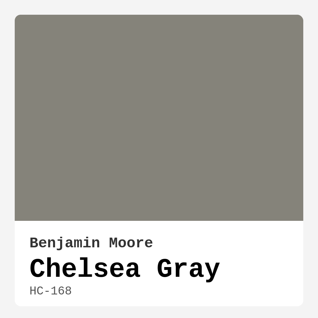
Color Preview & Key Details
| HEX Code | #85837A |
| RGB | 133, 131, 122 |
| LRV | 22.72% |
| Undertone | Yellow |
| Finish Options | Eggshell, Matte, Satin |
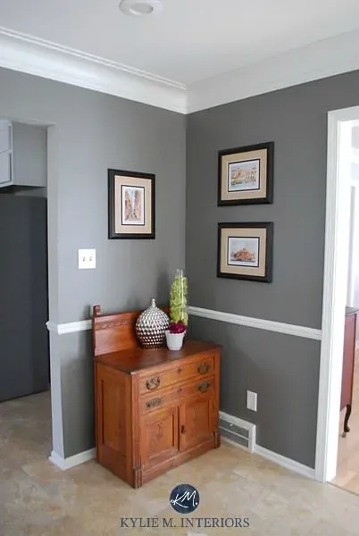
If you’re searching for a paint color that effortlessly balances sophistication and warmth, let me introduce you to Benjamin Moore’s Chelsea Gray (HC-168). This isn’t just another gray—it’s a chameleon of a shade, adapting to your space with a quiet elegance that feels both timeless and fresh. Whether you’re refreshing a living room, designing a cozy bedroom, or adding depth to a home office, Chelsea Gray has the versatility to make your vision come to life.
One of the first things you’ll notice about Chelsea Gray is its warmth. Unlike cooler grays that can feel stark or sterile, this shade carries subtle yellow undertones that give it a grounded, inviting quality. It’s the kind of gray that feels like a warm hug—perfect for spaces where you want to unwind or entertain without sacrificing style. The muted tone keeps it from feeling overwhelming, even in smaller rooms, though it’s worth noting that its darker brightness (with an LRV of 22.72%) means it absorbs a fair amount of light. If you’re working with a compact space, consider using it on an accent wall or pairing it with lighter furnishings to keep the room feeling airy.
Application is a breeze with Chelsea Gray, thanks to its excellent coverage and beginner-friendly formula. Most projects will only need one or two coats, and the paint is touch-up friendly, so minor imperfections won’t leave you frustrated. Choose from matte, eggshell, or satin finishes depending on the look you’re going for. Matte offers a modern, velvety feel, while eggshell and satin provide a subtle sheen that’s easy to clean—ideal for high-traffic areas like living rooms or dining spaces. Just keep in mind that in high-touch spots (like trim or doors), fingerprints might show more easily, so a satin finish could be your best bet for durability.
Chelsea Gray shines in a variety of decor styles, from modern farmhouse to transitional and classic interiors. Pair it with crisp white trim like Benjamin Moore’s White Dove for a clean, polished look, or let it play off natural wood tones for a rustic yet refined vibe. If you’re feeling adventurous, complementary shades like soft blues (think Benjamin Moore’s CSP-535) or warm neutrals (such as AF-580) can add dimension without clashing. This gray also plays well with metallic accents—brass or gold finishes bring out its warmth, while brushed nickel or chrome keep it cool and contemporary.
Lighting plays a huge role in how Chelsea Gray performs. In a sun-drenched room, it’ll appear lighter and more neutral, almost like a soft taupe. As the light fades, though, it deepens into a richer, more dramatic tone that adds instant sophistication. If your space lacks natural light, don’t shy away—just balance it with plenty of warm artificial lighting and reflective surfaces (think mirrors or glossy furniture) to keep it from feeling too heavy.
Wondering how it stacks up against other grays? Chelsea Gray stands out for its warmth. While shades like Sherwin Williams’ Repose Gray lean cooler, this one feels cozier, making it a better fit for spaces where comfort is key. It’s also more versatile than you might expect—it can anchor a moody, dramatic room or serve as a neutral backdrop for bold artwork and colorful textiles.
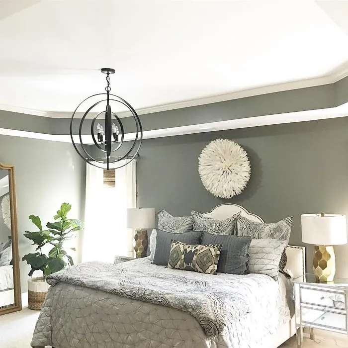
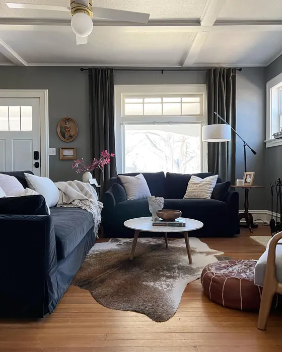
As for rooms, it’s a star in living rooms and bedrooms, where its inviting tone sets the right mood. In a dining room, it creates an intimate atmosphere that makes meals feel special, and in a home office, it adds just enough gravitas without feeling oppressive. For trim, it pairs beautifully with both white and wood finishes, giving you flexibility depending on your style.
A few pro tips: Always test Chelsea Gray in your space before committing. Paint a large swatch and observe it at different times of day to see how the undertones shift. If you’re worried about it darkening a small room, use it strategically—on lower cabinets in a kitchen, for example, or as an accent wall behind a bed. And don’t forget to play with texture. Pairing it with linen curtains, a chunky knit throw, or a sleek leather sofa can elevate the entire look.
At the end of the day, Chelsea Gray is more than just paint—it’s a design tool that brings warmth, depth, and versatility to your home. Whether you’re a DIY newbie or a seasoned decorator, this shade makes it easy to create a space that feels polished and personal. So grab a sample, imagine the possibilities, and get ready to fall in love with one of Benjamin Moore’s most enduring classics.
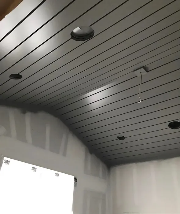
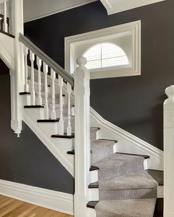
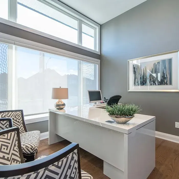
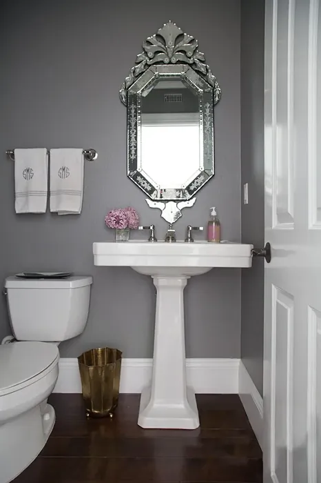
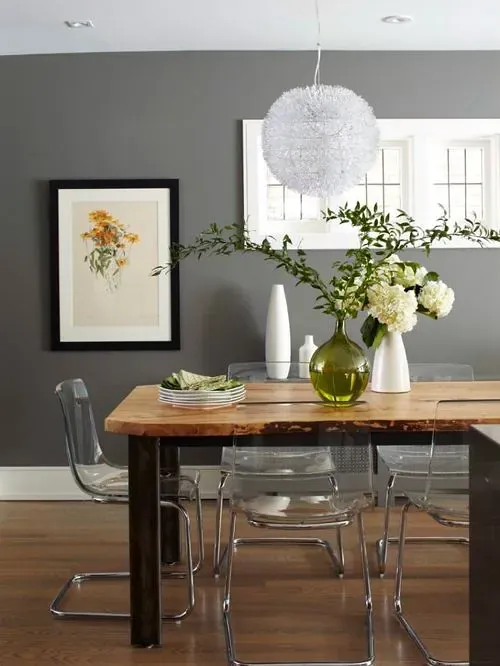
Real Room Photo of Chelsea Gray HC-168


Undertones of Chelsea Gray ?
The undertones of Chelsea Gray are a key aspect of its character, leaning towards Yellow. These subtle underlying hues are what give the color its depth and complexity. For example, a gray with a blue undertone will feel cooler and more modern, while one with a brown undertone will feel warmer and more traditional. It’s essential to test this paint in your home and observe it next to your existing furniture, flooring, and decor to see how these undertones interact and reveal themselves throughout the day.
HEX value: #85837A
RGB code: 133, 131, 122
Is Chelsea Gray Cool or Warm?
This color leans towards the warm side of the spectrum, making it inviting and comfortable, perfect for spaces meant for relaxation and gatherings.
Understanding Color Properties and Interior Design Tips
Hue refers to a specific position on the color wheel, measured in degrees from 0 to 360. Each degree represents a different pure color:
- 0° represents red
- 120° represents green
- 240° represents blue
Saturation describes the intensity or purity of a color and is expressed as a percentage:
- At 0%, the color appears completely desaturated—essentially a shade of gray
- At 100%, the color is at its most vivid and vibrant
Lightness indicates how light or dark a color is, also expressed as a percentage:
- 0% lightness results in black
- 100% lightness results in white
Using Warm Colors in Interior Design
Warm hues—such as reds, oranges, yellows, warm beiges, and greiges—are excellent choices for creating inviting and energetic spaces. These colors are particularly well-suited for:
- Kitchens, living rooms, and bathrooms, where warmth enhances comfort and sociability
- Large rooms, where warm tones can help reduce the sense of emptiness and make the space feel more intimate
For example:
- Warm beige shades provide a cozy, inviting atmosphere, ideal for living rooms, bedrooms, and hallways.
- Warm greige (a mix of beige and gray) offers the warmth of beige with the modern appeal of gray, making it a versatile backdrop for dining areas, bedrooms, and living spaces.
However, be mindful when using warm light tones in rooms with limited natural light. These shades may appear muted or even take on an unpleasant yellowish tint. To avoid a dull or flat appearance:
- Add depth by incorporating richer tones like deep greens, charcoal, or chocolate brown
- Use textured elements such as curtains, rugs, or cushions to bring dimension to the space
Pro Tip: Achieving Harmony with Warm and Cool Color Balance
To create a well-balanced and visually interesting interior, mix warm and cool tones strategically. This contrast adds depth and harmony to your design.
- If your walls feature warm hues, introduce cool-colored accents such as blue or green furniture, artwork, or accessories to create contrast.
- For a polished look, consider using a complementary color scheme, which pairs colors opposite each other on the color wheel (e.g., red with green, orange with blue).
This thoughtful mix not only enhances visual appeal but also creates a space that feels both dynamic and cohesive.
Light Temperature Affects on Chelsea Gray
Natural Light
Natural daylight changes in color temperature as the sun moves across the sky. At sunrise and sunset, the light tends to have a warm, golden tone with a color temperature around 2000 Kelvin (K). As the day progresses and the sun rises higher, the light becomes cooler and more neutral. Around midday, especially when the sky is clear, natural light typically reaches its peak brightness and shifts to a cooler tone, ranging from 5500 to 6500 Kelvin. This midday light is close to what we perceive as pure white or daylight-balanced light.
These shifts in natural light can significantly influence how colors appear in a space, which is why designers often consider both the time of day and the orientation of windows when planning interior color schemes.
Artificial Light
When choosing artificial lighting, pay close attention to the color temperature, measured in Kelvin (K). This determines how warm or cool the light will appear. Lower temperatures, around 2700K, give off a warm, yellow glow often used in living rooms or bedrooms. Higher temperatures, above 5000K, create a cool, bluish light similar to daylight, commonly used in kitchens, offices, or task areas.
Use the slider to see how lighting temperature can affect the appearance of a surface or color throughout a space.


4800K
LRV of Chelsea Gray
The Light Reflectance Value (LRV) of Chelsea Gray is 22.72%, which places it in the Medium colors category. This means it reflect a lot of light. Understanding a paint’s LRV is crucial for predicting how it will look in your space. A higher LRV indicates a lighter color that reflects more light, making rooms feel larger and brighter. A lower LRV signifies a darker color that absorbs more light, creating a cozier, more intimate atmosphere. Always consider the natural and artificial lighting in your room when selecting a paint color based on its LRV.
Detailed Review of Chelsea Gray
Additional Paint Characteristics
Ideal Rooms
Bedroom, Dining Room, Home Office, Living Room
Decor Styles
Classic, Farmhouse, Modern, Transitional
Coverage
Good (1–2 Coats), Touch-Up Friendly
Ease of Application
Beginner Friendly, Brush Smooth, Roller-Ready
Washability
Washable, Wipeable
VOC Level
Low VOC
Best Use
Accent Wall, Interior Walls, Trim
Room Suitability
Bedroom, Dining Room, Home Office, Living Room
Tone Tag
Balanced, Muted, Warm
Finish Type
Eggshell, Matte, Satin
Paint Performance
Easy Touch-Up, High Coverage, Low Odor
Use Cases
Best for Modern Farmhouse, Classic Favorite, Designer Favorite
Mood
Cozy, Inviting, Sophisticated
Trim Pairing
Complements Cool Trim, Good with Wood Trim, Pairs with White Dove
Chelsea Gray is a beautiful choice for anyone wanting to elevate their space. Its balanced hue works well in both light and dark rooms, making it adaptable to various lighting conditions. This paint glides on smoothly and provides excellent coverage, typically requiring just one or two coats. Its warm undertones ensure it feels inviting, while its muted tone prevents it from overwhelming smaller spaces. The finish options of matte, eggshell, and satin allow you to customize the look to suit your style, whether you prefer a sleek modern feel or a more traditional aesthetic. Overall, Chelsea Gray marries elegance with functionality, making it a standout choice for homeowners and designers alike.
Pros & Cons of HC-168 Chelsea Gray
Pros
Cons
Colors that go with Benjamin Moore Chelsea Gray
FAQ on HC-168 Chelsea Gray
Is Chelsea Gray suitable for small rooms?
Absolutely! Chelsea Gray can be used in small rooms to create a cozy and sophisticated ambiance. While it may darken the space slightly, its warm undertones help maintain an inviting atmosphere. To maximize light, consider pairing it with lighter accents or using it on an accent wall to add depth without overwhelming the room.
How does Chelsea Gray compare to other gray shades?
Chelsea Gray stands out due to its unique blend of warm undertones that give it a soft, inviting quality. Compared to cooler grays, it feels more grounded and works beautifully in both modern and traditional settings. This makes it a great alternative to more stark grays, especially in spaces where warmth and comfort are desired.
Comparisons Chelsea Gray with other colors
Chelsea Gray HC-168 vs Night Owl SW 7061
| Attribute | Chelsea Gray HC-168 | Night Owl SW 7061 |
|---|---|---|
| Color Name | Chelsea Gray HC-168 | Night Owl SW 7061 |
| Color | ||
| Hue | Grey | Grey |
| Brightness | Dark | Dark |
| RGB | 133, 131, 122 | 99, 101, 95 |
| LRV | 22.72% | 24% |
| Finish Type | Eggshell, Matte, Satin | Eggshell, Matte, Satin |
| Finish Options | Eggshell, Matte, Satin | Eggshell, Matte, Satin |
| Ideal Rooms | Bedroom, Dining Room, Home Office, Living Room | Bedroom, Dining Room, Hallway, Home Office, Living Room |
| Decor Styles | Classic, Farmhouse, Modern, Transitional | Industrial, Minimalist, Modern, Rustic, Scandinavian |
| Coverage | Good (1–2 Coats), Touch-Up Friendly | Good (1–2 Coats), Touch-Up Friendly |
| Ease of Application | Beginner Friendly, Brush Smooth, Roller-Ready | Beginner Friendly, Brush Smooth, Fast-Drying, Roller-Ready |
| Washability | Washable, Wipeable | Scrubbable, Washable |
| Room Suitability | Bedroom, Dining Room, Home Office, Living Room | Bedroom, Dining Room, Home Office, Living Room |
| Tone | Balanced, Muted, Warm | Balanced, Deep, Earthy, Muted |
| Paint Performance | Easy Touch-Up, High Coverage, Low Odor | Easy Touch-Up, Fade Resistant, High Coverage, Low Odor |
Chelsea Gray HC-168 vs Urbane Bronze SW 7048
| Attribute | Chelsea Gray HC-168 | Urbane Bronze SW 7048 |
|---|---|---|
| Color Name | Chelsea Gray HC-168 | Urbane Bronze SW 7048 |
| Color | ||
| Hue | Grey | Grey |
| Brightness | Dark | Dark |
| RGB | 133, 131, 122 | 84, 80, 74 |
| LRV | 22.72% | 20% |
| Finish Type | Eggshell, Matte, Satin | Eggshell, Matte, Satin |
| Finish Options | Eggshell, Matte, Satin | Eggshell, Matte, Satin |
| Ideal Rooms | Bedroom, Dining Room, Home Office, Living Room | Bedroom, Dining Room, Home Office, Living Room |
| Decor Styles | Classic, Farmhouse, Modern, Transitional | Contemporary, Industrial, Modern, Rustic, Transitional |
| Coverage | Good (1–2 Coats), Touch-Up Friendly | Good (1–2 Coats) |
| Ease of Application | Beginner Friendly, Brush Smooth, Roller-Ready | Beginner Friendly, Brush Smooth, Roller-Ready |
| Washability | Washable, Wipeable | Highly Washable, Washable |
| Room Suitability | Bedroom, Dining Room, Home Office, Living Room | Bedroom, Dining Room, Home Office, Living Room |
| Tone | Balanced, Muted, Warm | Deep, Earthy, Warm |
| Paint Performance | Easy Touch-Up, High Coverage, Low Odor | Easy Touch-Up, Fade Resistant, High Coverage, Low Odor |
Chelsea Gray HC-168 vs Succulent SW 9650
| Attribute | Chelsea Gray HC-168 | Succulent SW 9650 |
|---|---|---|
| Color Name | Chelsea Gray HC-168 | Succulent SW 9650 |
| Color | ||
| Hue | Grey | Grey |
| Brightness | Dark | Dark |
| RGB | 133, 131, 122 | 97, 108, 100 |
| LRV | 22.72% | 30% |
| Finish Type | Eggshell, Matte, Satin | Eggshell, Matte, Satin |
| Finish Options | Eggshell, Matte, Satin | Eggshell, Matte, Satin |
| Ideal Rooms | Bedroom, Dining Room, Home Office, Living Room | Bathroom, Bedroom, Dining Room, Entryway, Kitchen, Living Room |
| Decor Styles | Classic, Farmhouse, Modern, Transitional | Bohemian, Contemporary, Eclectic, Minimalist, Modern Farmhouse |
| Coverage | Good (1–2 Coats), Touch-Up Friendly | Good (1–2 Coats), Touch-Up Friendly |
| Ease of Application | Beginner Friendly, Brush Smooth, Roller-Ready | Beginner Friendly, Brush Smooth, Roller-Ready |
| Washability | Washable, Wipeable | Highly Washable, Washable |
| Room Suitability | Bedroom, Dining Room, Home Office, Living Room | Bathroom, Bedroom, Dining Room, Kitchen, Living Room |
| Tone | Balanced, Muted, Warm | Cool, Earthy, Muted |
| Paint Performance | Easy Touch-Up, High Coverage, Low Odor | Easy Touch-Up, Low Odor, Quick Drying, Scuff Resistant |
Chelsea Gray HC-168 vs Grizzle Gray SW 7068
| Attribute | Chelsea Gray HC-168 | Grizzle Gray SW 7068 |
|---|---|---|
| Color Name | Chelsea Gray HC-168 | Grizzle Gray SW 7068 |
| Color | ||
| Hue | Grey | Grey |
| Brightness | Dark | Dark |
| RGB | 133, 131, 122 | 99, 101, 98 |
| LRV | 22.72% | 24% |
| Finish Type | Eggshell, Matte, Satin | Eggshell, Satin |
| Finish Options | Eggshell, Matte, Satin | Eggshell, Matte, Satin |
| Ideal Rooms | Bedroom, Dining Room, Home Office, Living Room | Bedroom, Dining Room, Home Office, Living Room |
| Decor Styles | Classic, Farmhouse, Modern, Transitional | Industrial, Modern, Rustic, Scandinavian |
| Coverage | Good (1–2 Coats), Touch-Up Friendly | Good (1–2 Coats), Touch-Up Friendly |
| Ease of Application | Beginner Friendly, Brush Smooth, Roller-Ready | Beginner Friendly, Brush Smooth, Roller-Ready |
| Washability | Washable, Wipeable | Washable, Wipeable |
| Room Suitability | Bedroom, Dining Room, Home Office, Living Room | Bedroom, Dining Room, Home Office, Living Room |
| Tone | Balanced, Muted, Warm | Balanced, Cool, Muted |
| Paint Performance | Easy Touch-Up, High Coverage, Low Odor | Easy Touch-Up, High Coverage, Low Odor |
Chelsea Gray HC-168 vs Iron Ore SW 7069
| Attribute | Chelsea Gray HC-168 | Iron Ore SW 7069 |
|---|---|---|
| Color Name | Chelsea Gray HC-168 | Iron Ore SW 7069 |
| Color | ||
| Hue | Grey | Grey |
| Brightness | Dark | Dark |
| RGB | 133, 131, 122 | 67, 67, 65 |
| LRV | 22.72% | 6% |
| Finish Type | Eggshell, Matte, Satin | Eggshell, Matte, Satin |
| Finish Options | Eggshell, Matte, Satin | Eggshell, Matte, Satin |
| Ideal Rooms | Bedroom, Dining Room, Home Office, Living Room | Bedroom, Dining Room, Entryway, Home Office, Living Room |
| Decor Styles | Classic, Farmhouse, Modern, Transitional | Contemporary, Industrial, Minimalist, Modern, Rustic |
| Coverage | Good (1–2 Coats), Touch-Up Friendly | Good (1–2 Coats), High Hide |
| Ease of Application | Beginner Friendly, Brush Smooth, Roller-Ready | Brush Smooth, Fast-Drying, Roller-Ready |
| Washability | Washable, Wipeable | Highly Washable, Washable |
| Room Suitability | Bedroom, Dining Room, Home Office, Living Room | Bedroom, Dining Room, Entryway, Home Office, Living Room |
| Tone | Balanced, Muted, Warm | Balanced, Deep, Muted, Warm |
| Paint Performance | Easy Touch-Up, High Coverage, Low Odor | Easy Touch-Up, High Coverage, Low Odor |
Chelsea Gray HC-168 vs Peppercorn SW 7674
| Attribute | Chelsea Gray HC-168 | Peppercorn SW 7674 |
|---|---|---|
| Color Name | Chelsea Gray HC-168 | Peppercorn SW 7674 |
| Color | ||
| Hue | Grey | Grey |
| Brightness | Dark | Dark |
| RGB | 133, 131, 122 | 88, 88, 88 |
| LRV | 22.72% | 10% |
| Finish Type | Eggshell, Matte, Satin | Eggshell, Matte, Satin |
| Finish Options | Eggshell, Matte, Satin | Eggshell, Matte, Satin |
| Ideal Rooms | Bedroom, Dining Room, Home Office, Living Room | Bedroom, Dining Room, Home Office, Living Room |
| Decor Styles | Classic, Farmhouse, Modern, Transitional | Contemporary, Industrial, Minimalist, Modern |
| Coverage | Good (1–2 Coats), Touch-Up Friendly | Good (1–2 Coats), Touch-Up Friendly |
| Ease of Application | Beginner Friendly, Brush Smooth, Roller-Ready | Beginner Friendly, Brush Smooth, Roller-Ready |
| Washability | Washable, Wipeable | Highly Washable, Washable |
| Room Suitability | Bedroom, Dining Room, Home Office, Living Room | Bedroom, Dining Room, Home Office, Living Room |
| Tone | Balanced, Muted, Warm | Balanced, Deep, Moody, Neutral |
| Paint Performance | Easy Touch-Up, High Coverage, Low Odor | Easy Touch-Up, Low Odor, Quick Drying, Scuff Resistant |
Chelsea Gray HC-168 vs Slate Tile SW 7624
| Attribute | Chelsea Gray HC-168 | Slate Tile SW 7624 |
|---|---|---|
| Color Name | Chelsea Gray HC-168 | Slate Tile SW 7624 |
| Color | ||
| Hue | Grey | Grey |
| Brightness | Dark | Dark |
| RGB | 133, 131, 122 | 96, 110, 116 |
| LRV | 22.72% | 15% |
| Finish Type | Eggshell, Matte, Satin | Eggshell, Matte, Satin |
| Finish Options | Eggshell, Matte, Satin | Eggshell, Matte, Satin |
| Ideal Rooms | Bedroom, Dining Room, Home Office, Living Room | Bathroom, Bedroom, Home Office, Kitchen, Living Room |
| Decor Styles | Classic, Farmhouse, Modern, Transitional | Industrial, Minimalist, Modern, Rustic |
| Coverage | Good (1–2 Coats), Touch-Up Friendly | Good (1–2 Coats) |
| Ease of Application | Beginner Friendly, Brush Smooth, Roller-Ready | Beginner Friendly, Brush Smooth, Fast-Drying, Roller-Ready |
| Washability | Washable, Wipeable | Scrubbable, Washable |
| Room Suitability | Bedroom, Dining Room, Home Office, Living Room | Bathroom, Bedroom, Kitchen, Living Room |
| Tone | Balanced, Muted, Warm | Balanced, Cool, Muted |
| Paint Performance | Easy Touch-Up, High Coverage, Low Odor | Easy Touch-Up, High Coverage, Low Odor, Quick Drying |
Chelsea Gray HC-168 vs Blustery Sky SW 9140
| Attribute | Chelsea Gray HC-168 | Blustery Sky SW 9140 |
|---|---|---|
| Color Name | Chelsea Gray HC-168 | Blustery Sky SW 9140 |
| Color | ||
| Hue | Grey | Grey |
| Brightness | Dark | Dark |
| RGB | 133, 131, 122 | 111, 132, 140 |
| LRV | 22.72% | 48% |
| Finish Type | Eggshell, Matte, Satin | Eggshell, Matte |
| Finish Options | Eggshell, Matte, Satin | Eggshell, Matte, Satin |
| Ideal Rooms | Bedroom, Dining Room, Home Office, Living Room | Bedroom, Dining Room, Home Office, Living Room, Nursery |
| Decor Styles | Classic, Farmhouse, Modern, Transitional | Coastal, Modern Farmhouse, Scandinavian, Transitional |
| Coverage | Good (1–2 Coats), Touch-Up Friendly | Good (1–2 Coats), Touch-Up Friendly |
| Ease of Application | Beginner Friendly, Brush Smooth, Roller-Ready | Beginner Friendly, Fast-Drying, Low Splatter, Roller-Ready |
| Washability | Washable, Wipeable | Washable, Wipeable |
| Room Suitability | Bedroom, Dining Room, Home Office, Living Room | Bedroom, Home Office, Living Room, Nursery |
| Tone | Balanced, Muted, Warm | Balanced, Cool, Muted |
| Paint Performance | Easy Touch-Up, High Coverage, Low Odor | Easy Touch-Up, Fade Resistant, Low Odor, Quick Drying |
Chelsea Gray HC-168 vs Gauntlet Gray SW 7019
| Attribute | Chelsea Gray HC-168 | Gauntlet Gray SW 7019 |
|---|---|---|
| Color Name | Chelsea Gray HC-168 | Gauntlet Gray SW 7019 |
| Color | ||
| Hue | Grey | Grey |
| Brightness | Dark | Dark |
| RGB | 133, 131, 122 | 120, 115, 110 |
| LRV | 22.72% | 24% |
| Finish Type | Eggshell, Matte, Satin | Eggshell, Matte, Satin |
| Finish Options | Eggshell, Matte, Satin | Eggshell, Matte, Satin |
| Ideal Rooms | Bedroom, Dining Room, Home Office, Living Room | Bedroom, Dining Room, Hallway, Home Office, Living Room |
| Decor Styles | Classic, Farmhouse, Modern, Transitional | Industrial, Modern, Rustic, Transitional |
| Coverage | Good (1–2 Coats), Touch-Up Friendly | Good (1–2 Coats), Touch-Up Friendly |
| Ease of Application | Beginner Friendly, Brush Smooth, Roller-Ready | Beginner Friendly, Brush Smooth, Roller-Ready |
| Washability | Washable, Wipeable | Scrubbable, Washable |
| Room Suitability | Bedroom, Dining Room, Home Office, Living Room | Bedroom, Dining Room, Home Office, Living Room |
| Tone | Balanced, Muted, Warm | Dusty, Earthy, Muted, Warm |
| Paint Performance | Easy Touch-Up, High Coverage, Low Odor | Easy Touch-Up, High Coverage, Low Odor |
Chelsea Gray HC-168 vs Cast Iron SW 6202
| Attribute | Chelsea Gray HC-168 | Cast Iron SW 6202 |
|---|---|---|
| Color Name | Chelsea Gray HC-168 | Cast Iron SW 6202 |
| Color | ||
| Hue | Grey | Grey |
| Brightness | Dark | Dark |
| RGB | 133, 131, 122 | 100, 100, 90 |
| LRV | 22.72% | 6% |
| Finish Type | Eggshell, Matte, Satin | Eggshell, Matte, Satin |
| Finish Options | Eggshell, Matte, Satin | Eggshell, Matte, Satin |
| Ideal Rooms | Bedroom, Dining Room, Home Office, Living Room | Bedroom, Dining Room, Hallway, Home Office, Kitchen, Living Room |
| Decor Styles | Classic, Farmhouse, Modern, Transitional | Contemporary, Farmhouse, Industrial, Minimalist, Modern |
| Coverage | Good (1–2 Coats), Touch-Up Friendly | Good (1–2 Coats), High Hide, Touch-Up Friendly |
| Ease of Application | Beginner Friendly, Brush Smooth, Roller-Ready | Beginner Friendly, Brush Smooth, Fast-Drying, Roller-Ready |
| Washability | Washable, Wipeable | Highly Washable, Washable, Wipeable |
| Room Suitability | Bedroom, Dining Room, Home Office, Living Room | Bedroom, Dining Room, Home Office, Kitchen, Living Room |
| Tone | Balanced, Muted, Warm | Balanced, Deep, Dusty, Earthy, Warm |
| Paint Performance | Easy Touch-Up, High Coverage, Low Odor | Easy Touch-Up, High Coverage, Low Odor, Stain Resistant |
Official Page of Benjamin Moore Chelsea Gray HC-168