
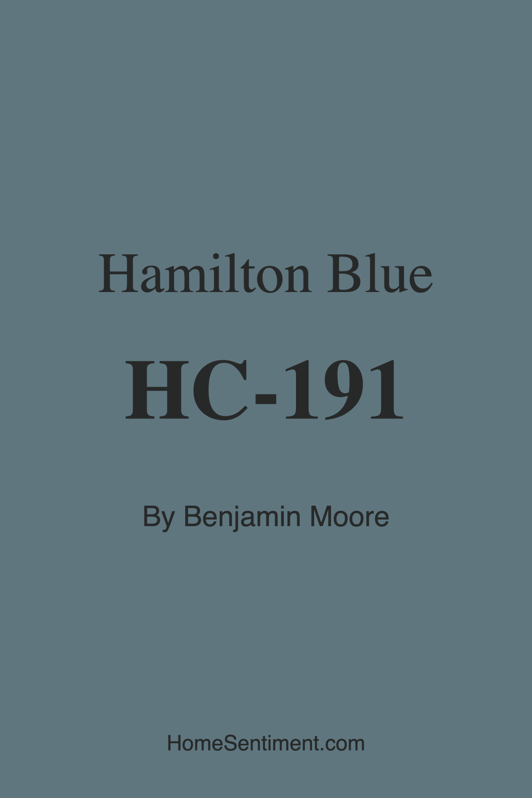
Color Preview & Key Details
| HEX Code | #5F767F |
| RGB | 95, 118, 127 |
| LRV | 18.25% |
| Undertone | Blue |
| Finish Options | Eggshell, Matte, Satin |
If you’re searching for a paint color that effortlessly balances sophistication with serenity, let me introduce you to Benjamin Moore’s Hamilton Blue (HC-191). This isn’t just another blue—it’s a muted, soft blue-green with a depth that feels both calming and grounding. Picture the quiet stillness of the ocean at dusk, or the soft haze of a misty morning. That’s the kind of atmosphere Hamilton Blue brings to a room. Whether you’re refreshing a living room, designing a tranquil bedroom, or creating a focused home office, this color has the versatility to adapt while making a statement.
One of the first things you’ll notice about Hamilton Blue is its LRV (Light Reflectance Value) of 18.25%, which places it firmly in the medium-dark category. What does that mean for your space? It reflects very little light, giving it a cozy, intimate feel—perfect for rooms where you want to unwind. But don’t let that scare you off if you’re working with a smaller area. Even in tight spaces, this color can feel expansive when paired with the right lighting and accents. Just keep in mind that in low-light rooms, it’ll appear darker and moodier, so consider layering in warm whites or soft creams to keep things balanced.
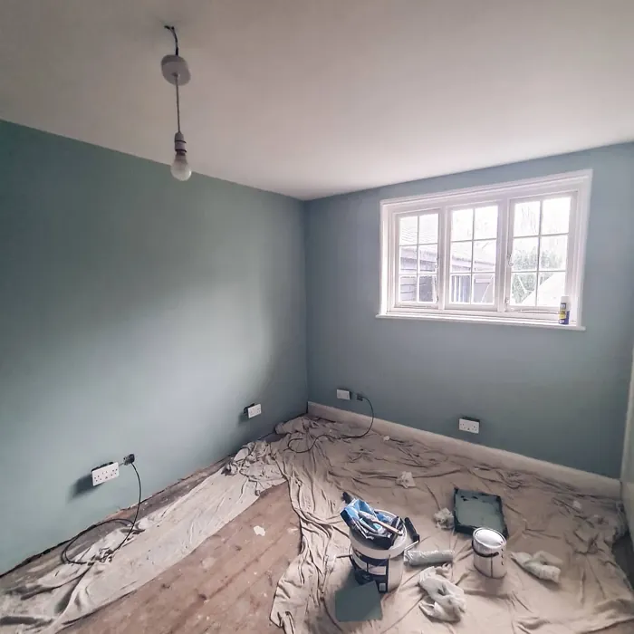
The undertones here are where Hamilton Blue really shines. It leans into its blue-green base with a cool, muted elegance, but it’s not so icy that it feels unwelcoming. Instead, it strikes a beautiful middle ground—cool enough to feel refreshing but balanced enough to play nicely with warmer tones. If your room gets plenty of natural light, you’ll see those blue-green hues come alive, almost like the color shifts subtly throughout the day. In artificial light, it softens into something richer and more subdued, making it a fantastic choice for bedrooms where you want a peaceful retreat.
When it comes to application, Hamilton Blue is a dream. It’s beginner-friendly, with smooth coverage that typically only needs one or two coats for full opacity. Whether you’re rolling it on or brushing it out, the finish stays even and consistent. Benjamin Moore offers it in matte, eggshell, and satin finishes, but I’d lean toward eggshell or satin for most spaces. These finishes enhance the color’s depth while making it practical for everyday life—think wipeable surfaces in a kitchen or durable walls in a hallway. And because it’s low-VOC, you won’t have to worry about harsh fumes during or after painting.
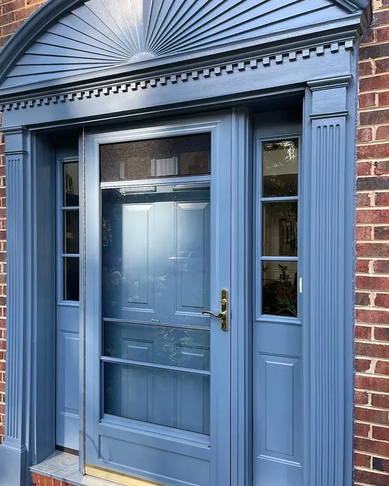
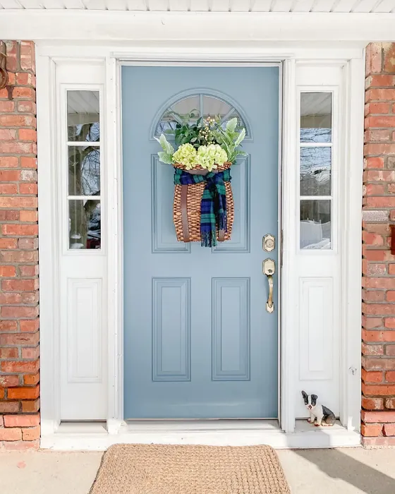
Now, let’s talk about where this color works best. Hamilton Blue is a natural fit for living rooms, especially if you’re aiming for a coastal or Scandinavian vibe. Pair it with crisp white trim (Benjamin Moore’s White Dove is a classic choice) and natural wood accents for a look that’s fresh yet timeless. In a bedroom, it creates a soothing backdrop—imagine it with linen bedding, brass fixtures, and a few woven textures for warmth. It’s also a standout in bathrooms, where its watery undertones can make the space feel like a spa-like oasis. And if you’re designing a home office? It’s just muted enough to keep distractions at bay while still feeling inviting.
Wondering how to accessorize a room painted in Hamilton Blue? Stick with complementary shades like soft creams, warm grays, or even blush pinks to keep things harmonious. For a bolder contrast, try pairing it with deep reds or burnt oranges—the cool-warm dynamic is striking without feeling overwhelming. And don’t shy away from metallics. Brass, in particular, looks stunning against this color, adding a touch of luxury without competing for attention.
As for furniture, Hamilton Blue plays well with both modern and traditional pieces. A mid-century sofa in warm leather? Perfect. A sleek, contemporary coffee table? Equally at home. Even if you’re working with existing furniture, this color has a chameleon-like quality that adapts to your style. And if you’re feeling adventurous, consider using it on built-ins or even a statement piece of furniture. A bookshelf or dresser in Hamilton Blue can add just the right amount of depth to a neutral room.
Of course, no color is without its considerations. Hamilton Blue’s darker LRV means it’s not the best choice if you’re trying to brighten up a cave-like room with no windows. And while it’s versatile, it’s worth testing a sample in your space to see how the undertones interact with your flooring or fixed elements. Paint a large swatch and observe it at different times of day—you might be surprised how much it changes from morning to night.
At the end of the day, Hamilton Blue is one of those colors that feels both classic and current. It’s not trendy in a way that’ll feel dated in a few years, but it’s also fresh enough to keep your space feeling modern. Whether you’re painting an entire room or just an accent wall, it’s a color that invites you to slow down and breathe. And isn’t that what we all want from our homes? A place that feels like a sanctuary, where the walls don’t just look good—they make you feel good, too.
So if you’re on the fence, grab a sample and give it a try. Hamilton Blue might just be the missing piece in your home’s story.
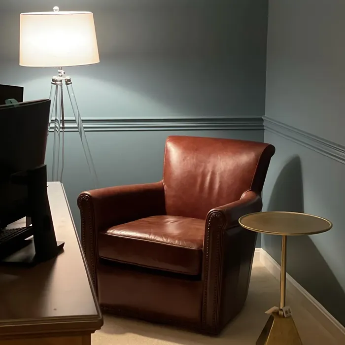
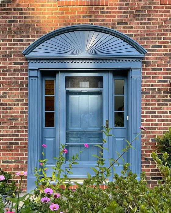
Real Room Photo of Hamilton Blue HC-191
Undertones of Hamilton Blue ?
The undertones of Hamilton Blue are a key aspect of its character, leaning towards Blue. These subtle underlying hues are what give the color its depth and complexity. For example, a gray with a blue undertone will feel cooler and more modern, while one with a brown undertone will feel warmer and more traditional. It’s essential to test this paint in your home and observe it next to your existing furniture, flooring, and decor to see how these undertones interact and reveal themselves throughout the day.
HEX value: #5F767F
RGB code: 95, 118, 127
Is Hamilton Blue Cool or Warm?
Overall, Hamilton Blue leans more towards the cool side of the spectrum due to its calming blue and green undertones. However, it maintains a balanced feel that can complement warmer hues effectively, providing a refreshing contrast in your space.
Understanding Color Properties and Interior Design Tips
Hue refers to a specific position on the color wheel, measured in degrees from 0 to 360. Each degree represents a different pure color:
- 0° represents red
- 120° represents green
- 240° represents blue
Saturation describes the intensity or purity of a color and is expressed as a percentage:
- At 0%, the color appears completely desaturated—essentially a shade of gray
- At 100%, the color is at its most vivid and vibrant
Lightness indicates how light or dark a color is, also expressed as a percentage:
- 0% lightness results in black
- 100% lightness results in white
Using Warm Colors in Interior Design
Warm hues—such as reds, oranges, yellows, warm beiges, and greiges—are excellent choices for creating inviting and energetic spaces. These colors are particularly well-suited for:
- Kitchens, living rooms, and bathrooms, where warmth enhances comfort and sociability
- Large rooms, where warm tones can help reduce the sense of emptiness and make the space feel more intimate
For example:
- Warm beige shades provide a cozy, inviting atmosphere, ideal for living rooms, bedrooms, and hallways.
- Warm greige (a mix of beige and gray) offers the warmth of beige with the modern appeal of gray, making it a versatile backdrop for dining areas, bedrooms, and living spaces.
However, be mindful when using warm light tones in rooms with limited natural light. These shades may appear muted or even take on an unpleasant yellowish tint. To avoid a dull or flat appearance:
- Add depth by incorporating richer tones like deep greens, charcoal, or chocolate brown
- Use textured elements such as curtains, rugs, or cushions to bring dimension to the space
Pro Tip: Achieving Harmony with Warm and Cool Color Balance
To create a well-balanced and visually interesting interior, mix warm and cool tones strategically. This contrast adds depth and harmony to your design.
- If your walls feature warm hues, introduce cool-colored accents such as blue or green furniture, artwork, or accessories to create contrast.
- For a polished look, consider using a complementary color scheme, which pairs colors opposite each other on the color wheel (e.g., red with green, orange with blue).
This thoughtful mix not only enhances visual appeal but also creates a space that feels both dynamic and cohesive.
Light Temperature Affects on Hamilton Blue
Natural Light
Natural daylight changes in color temperature as the sun moves across the sky. At sunrise and sunset, the light tends to have a warm, golden tone with a color temperature around 2000 Kelvin (K). As the day progresses and the sun rises higher, the light becomes cooler and more neutral. Around midday, especially when the sky is clear, natural light typically reaches its peak brightness and shifts to a cooler tone, ranging from 5500 to 6500 Kelvin. This midday light is close to what we perceive as pure white or daylight-balanced light.
These shifts in natural light can significantly influence how colors appear in a space, which is why designers often consider both the time of day and the orientation of windows when planning interior color schemes.
Artificial Light
When choosing artificial lighting, pay close attention to the color temperature, measured in Kelvin (K). This determines how warm or cool the light will appear. Lower temperatures, around 2700K, give off a warm, yellow glow often used in living rooms or bedrooms. Higher temperatures, above 5000K, create a cool, bluish light similar to daylight, commonly used in kitchens, offices, or task areas.
Use the slider to see how lighting temperature can affect the appearance of a surface or color throughout a space.


4800K
LRV of Hamilton Blue
The Light Reflectance Value (LRV) of Hamilton Blue is 18.25%, which places it in the Medium Dark category. This means it reflects very little light. Understanding a paint’s LRV is crucial for predicting how it will look in your space. A higher LRV indicates a lighter color that reflects more light, making rooms feel larger and brighter. A lower LRV signifies a darker color that absorbs more light, creating a cozier, more intimate atmosphere. Always consider the natural and artificial lighting in your room when selecting a paint color based on its LRV.
Detailed Review of Hamilton Blue
Additional Paint Characteristics
Ideal Rooms
Bathroom, Bedroom, Dining Room, Home Office, Living Room
Decor Styles
Coastal, Modern, Scandinavian, Traditional
Coverage
Good (1–2 Coats)
Ease of Application
Beginner Friendly, Brush Smooth, Roller-Ready
Washability
Highly Washable, Washable
VOC Level
Low VOC
Best Use
Accent Wall, Furniture, Interior Walls
Room Suitability
Bathroom, Bedroom, Home Office, Living Room
Tone Tag
Balanced, Cool, Muted
Finish Type
Eggshell, Satin
Paint Performance
Easy Touch-Up, Fade Resistant, Low Odor
Use Cases
Best for Rentals, Classic Favorite, Designer Favorite
Mood
Calm, Grounding, Inviting
Trim Pairing
Complements Brass Fixtures, Good with Wood Trim, Pairs with White Dove
Hamilton Blue offers a refreshing take on classic blue hues. Its balanced undertones make it versatile enough for a range of spaces, from a cozy living room to a calming bedroom. When applied, it presents an elegant finish that enhances natural light, creating a soothing ambiance. This paint’s application is smooth, ensuring an even coat with minimal effort. It’s suitable for various surfaces, including drywall and wood, making it a favorite among DIY enthusiasts and professionals alike. If you’re looking to transform your space into a tranquil retreat, Hamilton Blue is a compelling choice that won’t disappoint.
Pros & Cons of HC-191 Hamilton Blue
Pros
Cons
Colors that go with Benjamin Moore Hamilton Blue
FAQ on HC-191 Hamilton Blue
Can Hamilton Blue be used in small spaces?
Absolutely! While Hamilton Blue has a depth that can make it feel more substantial, its cool and calming tones can actually help small spaces feel more open and inviting. Just be mindful of the lighting — in darker areas, it may appear a bit more muted, so consider pairing it with brighter accents to keep the space feeling airy.
What finishes work best with Hamilton Blue?
For Hamilton Blue, finishes like eggshell or satin are highly recommended. These finishes not only complement the color’s serene vibe but also enhance its washability and durability. If you’re considering using it in high-traffic areas or on trim, a satin finish will provide just the right amount of sheen while remaining practical.
Comparisons Hamilton Blue with other colors
Hamilton Blue HC-191 vs Naval SW 6244
| Attribute | Hamilton Blue HC-191 | Naval SW 6244 |
|---|---|---|
| Color Name | Hamilton Blue HC-191 | Naval SW 6244 |
| Color | ||
| Hue | Blue | Blue |
| Brightness | Dark | Dark |
| RGB | 95, 118, 127 | 47, 61, 76 |
| LRV | 18.25% | 4% |
| Finish Type | Eggshell, Satin | Matte, Satin, Semi-Gloss |
| Finish Options | Eggshell, Matte, Satin | Matte, Satin, Semi-Gloss |
| Ideal Rooms | Bathroom, Bedroom, Dining Room, Home Office, Living Room | Bedroom, Dining Room, Hallway, Home Office, Living Room |
| Decor Styles | Coastal, Modern, Scandinavian, Traditional | Coastal, Industrial, Minimalist, Modern, Traditional |
| Coverage | Good (1–2 Coats) | Good (1–2 Coats), Self-Priming |
| Ease of Application | Beginner Friendly, Brush Smooth, Roller-Ready | Beginner Friendly, Brush Smooth, Roller-Ready |
| Washability | Highly Washable, Washable | Highly Washable, Washable |
| Room Suitability | Bathroom, Bedroom, Home Office, Living Room | Bedroom, Dining Room, Entryway, Home Office, Living Room |
| Tone | Balanced, Cool, Muted | Cool, Deep, Moody |
| Paint Performance | Easy Touch-Up, Fade Resistant, Low Odor | Easy Touch-Up, High Coverage, Low Odor, Scuff Resistant |
Hamilton Blue HC-191 vs Sea Serpent SW 7615
| Attribute | Hamilton Blue HC-191 | Sea Serpent SW 7615 |
|---|---|---|
| Color Name | Hamilton Blue HC-191 | Sea Serpent SW 7615 |
| Color | ||
| Hue | Blue | Blue |
| Brightness | Dark | Dark |
| RGB | 95, 118, 127 | 62, 75, 84 |
| LRV | 18.25% | 12% |
| Finish Type | Eggshell, Satin | Eggshell, Matte, Satin |
| Finish Options | Eggshell, Matte, Satin | Eggshell, Matte, Satin |
| Ideal Rooms | Bathroom, Bedroom, Dining Room, Home Office, Living Room | Bathroom, Bedroom, Home Office, Living Room |
| Decor Styles | Coastal, Modern, Scandinavian, Traditional | Coastal, Farmhouse, Industrial, Modern |
| Coverage | Good (1–2 Coats) | Good (1–2 Coats), Touch-Up Friendly |
| Ease of Application | Beginner Friendly, Brush Smooth, Roller-Ready | Beginner Friendly, Brush Smooth, Roller-Ready |
| Washability | Highly Washable, Washable | Highly Washable, Washable |
| Room Suitability | Bathroom, Bedroom, Home Office, Living Room | Bathroom, Bedroom, Home Office, Living Room |
| Tone | Balanced, Cool, Muted | Cool, Deep, Moody |
| Paint Performance | Easy Touch-Up, Fade Resistant, Low Odor | Easy Touch-Up, High Coverage, Low Odor |
Hamilton Blue HC-191 vs Rain Cloud SW 9639
| Attribute | Hamilton Blue HC-191 | Rain Cloud SW 9639 |
|---|---|---|
| Color Name | Hamilton Blue HC-191 | Rain Cloud SW 9639 |
| Color | ||
| Hue | Blue | Blue |
| Brightness | Dark | Dark |
| RGB | 95, 118, 127 | 83, 97, 104 |
| LRV | 18.25% | 30% |
| Finish Type | Eggshell, Satin | Eggshell, Matte, Satin |
| Finish Options | Eggshell, Matte, Satin | Eggshell, Matte, Satin |
| Ideal Rooms | Bathroom, Bedroom, Dining Room, Home Office, Living Room | Bedroom, Dining Room, Home Office, Living Room |
| Decor Styles | Coastal, Modern, Scandinavian, Traditional | Coastal, Contemporary, Minimalist, Scandinavian |
| Coverage | Good (1–2 Coats) | Good (1–2 Coats), Touch-Up Friendly |
| Ease of Application | Beginner Friendly, Brush Smooth, Roller-Ready | Beginner Friendly, Brush Smooth, Roller-Ready |
| Washability | Highly Washable, Washable | Highly Washable, Washable |
| Room Suitability | Bathroom, Bedroom, Home Office, Living Room | Bedroom, Home Office, Living Room |
| Tone | Balanced, Cool, Muted | Balanced, Cool, Muted |
| Paint Performance | Easy Touch-Up, Fade Resistant, Low Odor | Easy Touch-Up, Fade Resistant, Low Odor |
Hamilton Blue HC-191 vs Indigo Batik SW 7602
| Attribute | Hamilton Blue HC-191 | Indigo Batik SW 7602 |
|---|---|---|
| Color Name | Hamilton Blue HC-191 | Indigo Batik SW 7602 |
| Color | ||
| Hue | Blue | Blue |
| Brightness | Dark | Dark |
| RGB | 95, 118, 127 | 62, 80, 99 |
| LRV | 18.25% | 10% |
| Finish Type | Eggshell, Satin | Matte, Satin |
| Finish Options | Eggshell, Matte, Satin | Eggshell, Flat, Matte, Satin |
| Ideal Rooms | Bathroom, Bedroom, Dining Room, Home Office, Living Room | Bedroom, Dining Room, Home Office, Living Room |
| Decor Styles | Coastal, Modern, Scandinavian, Traditional | Bohemian, Coastal, Contemporary, Modern |
| Coverage | Good (1–2 Coats) | Good (1–2 Coats), Touch-Up Friendly |
| Ease of Application | Beginner Friendly, Brush Smooth, Roller-Ready | Brush Smooth, Fast-Drying, Roller-Ready |
| Washability | Highly Washable, Washable | Scrubbable, Washable, Wipeable |
| Room Suitability | Bathroom, Bedroom, Home Office, Living Room | Bedroom, Dining Room, Home Office, Living Room |
| Tone | Balanced, Cool, Muted | Cool, Deep, Moody |
| Paint Performance | Easy Touch-Up, Fade Resistant, Low Odor | Easy Touch-Up, High Coverage, Low Odor, Quick Drying |
Hamilton Blue HC-191 vs Sea Mariner SW 9640
| Attribute | Hamilton Blue HC-191 | Sea Mariner SW 9640 |
|---|---|---|
| Color Name | Hamilton Blue HC-191 | Sea Mariner SW 9640 |
| Color | ||
| Hue | Blue | Blue |
| Brightness | Dark | Dark |
| RGB | 95, 118, 127 | 67, 74, 84 |
| LRV | 18.25% | 6% |
| Finish Type | Eggshell, Satin | Eggshell, Matte, Satin |
| Finish Options | Eggshell, Matte, Satin | Eggshell, Matte, Satin |
| Ideal Rooms | Bathroom, Bedroom, Dining Room, Home Office, Living Room | Bedroom, Dining Room, Hallway, Home Office, Living Room |
| Decor Styles | Coastal, Modern, Scandinavian, Traditional | Coastal, Industrial, Minimalist, Modern |
| Coverage | Good (1–2 Coats) | Good (1–2 Coats) |
| Ease of Application | Beginner Friendly, Brush Smooth, Roller-Ready | Beginner Friendly, Brush Smooth, Roller-Ready |
| Washability | Highly Washable, Washable | Scrubbable, Washable |
| Room Suitability | Bathroom, Bedroom, Home Office, Living Room | Bedroom, Dining Room, Home Office, Living Room |
| Tone | Balanced, Cool, Muted | Cool, Deep, Moody |
| Paint Performance | Easy Touch-Up, Fade Resistant, Low Odor | Easy Touch-Up, Low Odor, Quick Drying |
Hamilton Blue HC-191 vs Still Water SW 6223
| Attribute | Hamilton Blue HC-191 | Still Water SW 6223 |
|---|---|---|
| Color Name | Hamilton Blue HC-191 | Still Water SW 6223 |
| Color | ||
| Hue | Blue | Blue |
| Brightness | Dark | Dark |
| RGB | 95, 118, 127 | 74, 93, 95 |
| LRV | 18.25% | 48% |
| Finish Type | Eggshell, Satin | Eggshell, Matte, Satin |
| Finish Options | Eggshell, Matte, Satin | Eggshell, Matte, Satin |
| Ideal Rooms | Bathroom, Bedroom, Dining Room, Home Office, Living Room | Bedroom, Dining Room, Home Office, Living Room, Nursery |
| Decor Styles | Coastal, Modern, Scandinavian, Traditional | Coastal, Contemporary, Farmhouse, Modern, Rustic |
| Coverage | Good (1–2 Coats) | Good (1–2 Coats), Touch-Up Friendly |
| Ease of Application | Beginner Friendly, Brush Smooth, Roller-Ready | Beginner Friendly, Brush Smooth, Roller-Ready |
| Washability | Highly Washable, Washable | Highly Washable, Washable |
| Room Suitability | Bathroom, Bedroom, Home Office, Living Room | Bedroom, Dining Room, Home Office, Living Room |
| Tone | Balanced, Cool, Muted | Cool, Earthy, Muted |
| Paint Performance | Easy Touch-Up, Fade Resistant, Low Odor | Easy Touch-Up, Fade Resistant, Low Odor |
Hamilton Blue HC-191 vs Waterloo SW 9141
| Attribute | Hamilton Blue HC-191 | Waterloo SW 9141 |
|---|---|---|
| Color Name | Hamilton Blue HC-191 | Waterloo SW 9141 |
| Color | ||
| Hue | Blue | Blue |
| Brightness | Dark | Dark |
| RGB | 95, 118, 127 | 83, 104, 114 |
| LRV | 18.25% | 12% |
| Finish Type | Eggshell, Satin | Matte, Satin |
| Finish Options | Eggshell, Matte, Satin | Matte, Satin, Semi-Gloss |
| Ideal Rooms | Bathroom, Bedroom, Dining Room, Home Office, Living Room | Bedroom, Dining Room, Hallway, Home Office, Living Room |
| Decor Styles | Coastal, Modern, Scandinavian, Traditional | Coastal, Industrial, Modern, Rustic |
| Coverage | Good (1–2 Coats) | Good (1–2 Coats), Touch-Up Friendly |
| Ease of Application | Beginner Friendly, Brush Smooth, Roller-Ready | Brush Smooth, Fast-Drying, Roller-Ready |
| Washability | Highly Washable, Washable | Scrubbable, Washable |
| Room Suitability | Bathroom, Bedroom, Home Office, Living Room | Bedroom, Dining Room, Home Office, Living Room |
| Tone | Balanced, Cool, Muted | Balanced, Cool, Muted |
| Paint Performance | Easy Touch-Up, Fade Resistant, Low Odor | Easy Touch-Up, Fade Resistant, Low Odor, Quick Drying |
Hamilton Blue HC-191 vs Smoky Blue SW 7604
| Attribute | Hamilton Blue HC-191 | Smoky Blue SW 7604 |
|---|---|---|
| Color Name | Hamilton Blue HC-191 | Smoky Blue SW 7604 |
| Color | ||
| Hue | Blue | Blue |
| Brightness | Dark | Dark |
| RGB | 95, 118, 127 | 89, 110, 121 |
| LRV | 18.25% | 15% |
| Finish Type | Eggshell, Satin | Eggshell, Matte, Satin |
| Finish Options | Eggshell, Matte, Satin | Eggshell, Matte, Satin |
| Ideal Rooms | Bathroom, Bedroom, Dining Room, Home Office, Living Room | Bathroom, Bedroom, Home Office, Kitchen, Living Room |
| Decor Styles | Coastal, Modern, Scandinavian, Traditional | Coastal, Modern, Scandinavian, Transitional |
| Coverage | Good (1–2 Coats) | Good (1–2 Coats), Touch-Up Friendly |
| Ease of Application | Beginner Friendly, Brush Smooth, Roller-Ready | Beginner Friendly, Brush Smooth, Roller-Ready |
| Washability | Highly Washable, Washable | Highly Washable, Washable |
| Room Suitability | Bathroom, Bedroom, Home Office, Living Room | Bathroom, Bedroom, Home Office, Living Room |
| Tone | Balanced, Cool, Muted | Cool, Dusty, Muted |
| Paint Performance | Easy Touch-Up, Fade Resistant, Low Odor | High Coverage, Low Odor, Quick Drying |
Hamilton Blue HC-191 vs Needlepoint Navy SW 0032
| Attribute | Hamilton Blue HC-191 | Needlepoint Navy SW 0032 |
|---|---|---|
| Color Name | Hamilton Blue HC-191 | Needlepoint Navy SW 0032 |
| Color | ||
| Hue | Blue | Blue |
| Brightness | Dark | Dark |
| RGB | 95, 118, 127 | 84, 102, 112 |
| LRV | 18.25% | 4% |
| Finish Type | Eggshell, Satin | Matte, Satin, Semi-Gloss |
| Finish Options | Eggshell, Matte, Satin | Matte, Satin, Semi-Gloss |
| Ideal Rooms | Bathroom, Bedroom, Dining Room, Home Office, Living Room | Bedroom, Dining Room, Entryway, Home Office, Living Room |
| Decor Styles | Coastal, Modern, Scandinavian, Traditional | Coastal, Contemporary, Modern Farmhouse, Nautical, Traditional |
| Coverage | Good (1–2 Coats) | Good (1–2 Coats), Touch-Up Friendly |
| Ease of Application | Beginner Friendly, Brush Smooth, Roller-Ready | Beginner Friendly, Brush Smooth, Fast-Drying, Roller-Ready |
| Washability | Highly Washable, Washable | Scrubbable, Washable |
| Room Suitability | Bathroom, Bedroom, Home Office, Living Room | Bedroom, Dining Room, Home Office, Living Room |
| Tone | Balanced, Cool, Muted | Cool, Deep, Muted |
| Paint Performance | Easy Touch-Up, Fade Resistant, Low Odor | Easy Touch-Up, High Coverage, Low Odor, Quick Drying, Stain Resistant |
Hamilton Blue HC-191 vs Riverway SW 6222
| Attribute | Hamilton Blue HC-191 | Riverway SW 6222 |
|---|---|---|
| Color Name | Hamilton Blue HC-191 | Riverway SW 6222 |
| Color | ||
| Hue | Blue | Blue |
| Brightness | Dark | Dark |
| RGB | 95, 118, 127 | 93, 114, 116 |
| LRV | 18.25% | 24% |
| Finish Type | Eggshell, Satin | Eggshell, Satin |
| Finish Options | Eggshell, Matte, Satin | Eggshell, Matte, Satin |
| Ideal Rooms | Bathroom, Bedroom, Dining Room, Home Office, Living Room | Bathroom, Bedroom, Dining Room, Home Office, Living Room |
| Decor Styles | Coastal, Modern, Scandinavian, Traditional | Coastal, Contemporary, Eclectic, Modern, Rustic |
| Coverage | Good (1–2 Coats) | Good (1–2 Coats), Touch-Up Friendly |
| Ease of Application | Beginner Friendly, Brush Smooth, Roller-Ready | Beginner Friendly, Brush Smooth, Fast-Drying, Low Splatter, Roller-Ready |
| Washability | Highly Washable, Washable | Highly Washable, Washable |
| Room Suitability | Bathroom, Bedroom, Home Office, Living Room | Bathroom, Bedroom, Home Office, Living Room |
| Tone | Balanced, Cool, Muted | Balanced, Cool, Muted |
| Paint Performance | Easy Touch-Up, Fade Resistant, Low Odor | Easy Touch-Up, High Coverage, Low Odor, Quick Drying |
Official Page of Benjamin Moore Hamilton Blue HC-191