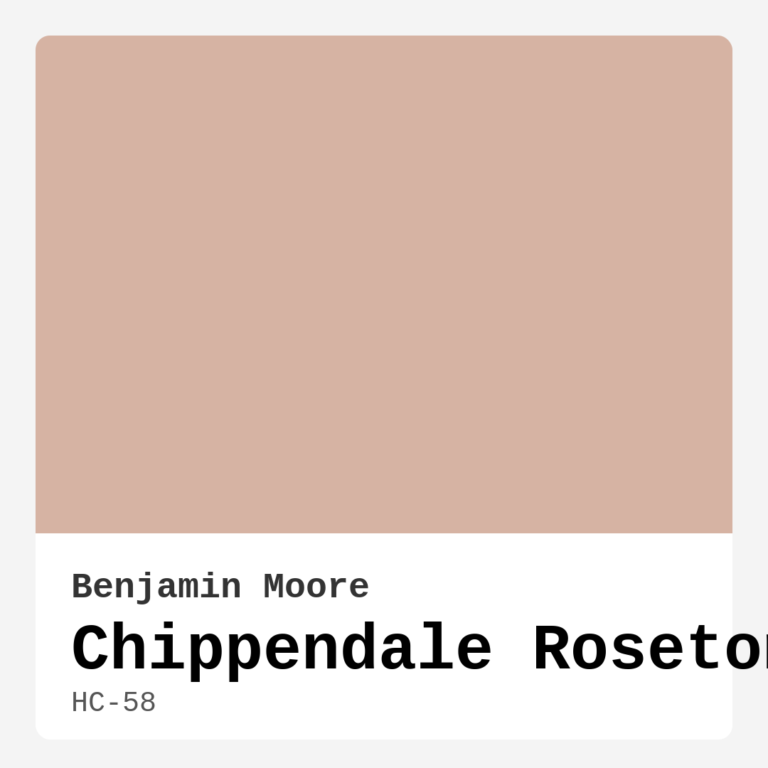
Color Preview & Key Details
| HEX Code | #D6B3A3 |
| RGB | 214, 179, 163 |
| LRV | 48.67% |
| Undertone | Red |
| Finish Options | Eggshell, Matte, Satin |
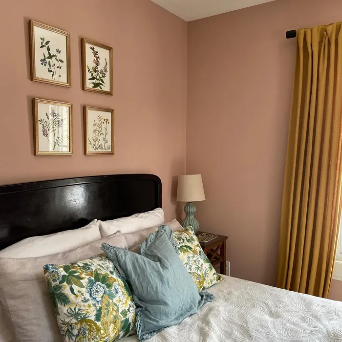
Have you ever walked into a room and felt instantly at ease, as if you were enveloped in a warm hug? That’s the magic of color, and today let’s dive into a hue that embodies that comforting essence perfectly: Chippendale Rosetone by Benjamin Moore. This beautiful soft pinkish-taupe color has a way of transforming spaces into serene sanctuaries.
Chippendale Rosetone, known by its color code HC-58, is one of those rare colors that feels timeless yet contemporary. Its warmth and charm are like a gentle whisper, inviting you to relax and enjoy the space around you. Whether you’re considering a complete overhaul of your living room or simply an accent wall in your home office, this color can weave its magic in various ways.
The moment you apply Chippendale Rosetone, you’ll notice its delicate warmth. With a Light Reflectance Value (LRV) of 48.67%, it strikes a perfect balance—reflecting about half of the incoming light. This makes it ideal for spaces where you want to feel cozy but not closed in. It’s perfect for living rooms, bedrooms, nurseries, and even dining areas where you want to create a welcoming atmosphere.
One of the standout features of this paint is its nuanced undertone, leaning towards red. This gives it a unique depth, allowing it to interact beautifully with the light throughout the day. In bright daylight, it showcases its softer, more delicate hues, while in the evening, the color deepens, creating a rich, intimate vibe. That makes it a fantastic choice for spaces where you unwind after a long day—imagine coming home to a soothing, rosy glow in your bedroom!
You might be wondering how Chippendale Rosetone compares to other colors. What sets it apart from standard pinks or taupes is its sophisticated blend that can adapt to various decor styles. It easily complements traditional, farmhouse, rustic, modern, and eclectic interiors alike. This versatility means you can use it in almost any room without feeling like it clashes with your existing decor.
Now, let’s talk about application. One of the best things about Chippendale Rosetone is that it’s beginner-friendly. It goes on smooth, whether you’re using a brush or a roller, and it’s also touch-up friendly, which is a real bonus if you’re a DIY enthusiast. It’s low VOC, which means you can breathe easy knowing that you’re not compromising indoor air quality. Plus, it’s wipeable and washable, allowing you to maintain that lovely finish without a fuss.
When it comes to pairing this color, the options are plentiful. Whites and creams, like White Dove, make for excellent trim choices, providing a fresh contrast that adds a touch of brightness against the warm tones of Chippendale Rosetone. For those looking to incorporate metallics, brass fixtures harmonize beautifully with this hue, creating a sense of elegance and warmth.
Thinking about how it would work in a small space? You’re in luck. Chippendale Rosetone has an inviting quality that can make any smaller area feel more spacious and airy. It’s perfect for creating that illusion of openness. Just be mindful of your decor choices—lighter furnishings and good lighting will help enhance its cheerful qualities.
And while it’s all sunshine and roses, there are a couple of things to keep in mind. Depending on your lighting and surrounding colors, Chippendale Rosetone can appear differently than you might expect, so it’s wise to test a sample before committing to a whole room. Occasionally, it may require multiple coats for full coverage, but the effort is usually worth it for the stunning results.
In terms of comparable colors, think of Soft Pink from Benjamin Moore or Sherwin-Williams’ Rose Quartz. While these shades are beautiful in their own right, Chippendale Rosetone stands out for its sophisticated blend that feels decidedly more refined. It offers a more nuanced alternative to traditional pastels, making it suitable for both modern and classic interiors.
As we wrap up our exploration of Chippendale Rosetone, I hope you’re inspired to consider this lovely hue for your home. It provides a warm, inviting backdrop that fosters a sense of comfort and restfulness. Whether you decide to use it in your living room, as an accent in your bedroom, or even in a nursery, this color has the potential to create a cozy haven that reflects your personal style.
Remember, color is a powerful tool in home design. It can set the mood, alter perceptions of space, and influence how you feel in your surroundings. Chippendale Rosetone does all this and more, standing as a testament to the beauty of thoughtful design. So grab a sample, test it out in your space, and see how it transforms your home into a haven of comfort and style. You’re in for a delightful surprise!
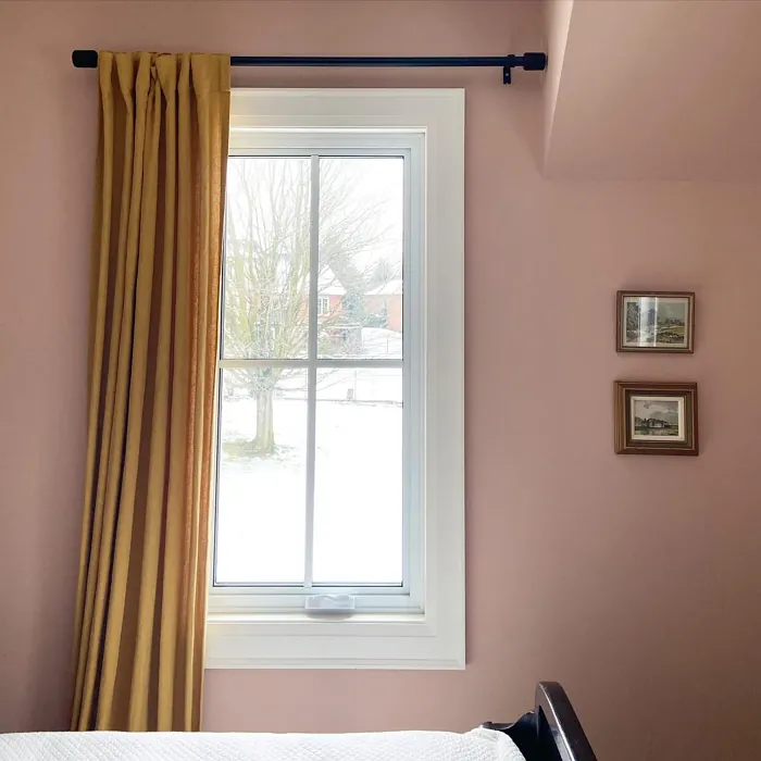
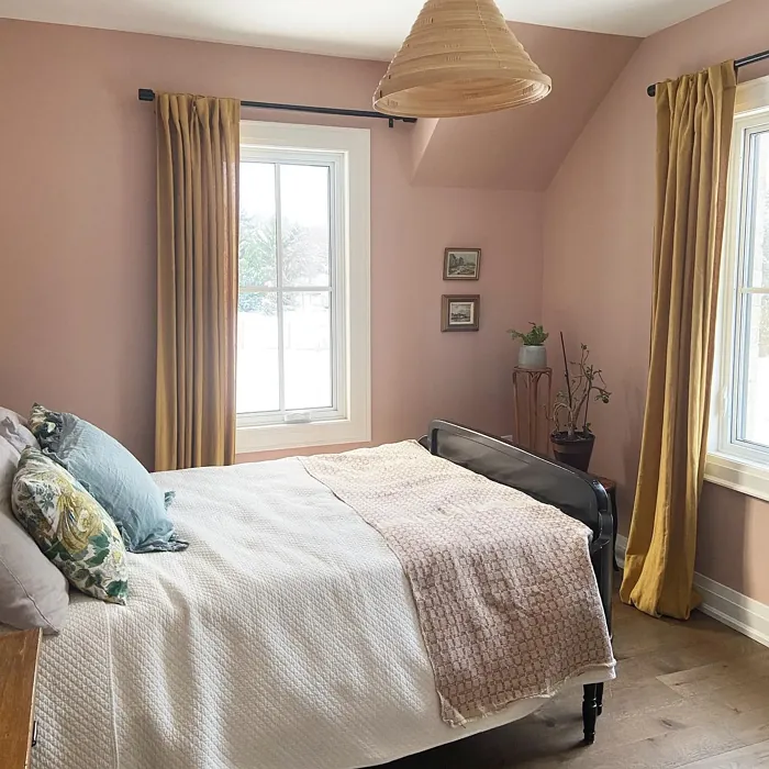
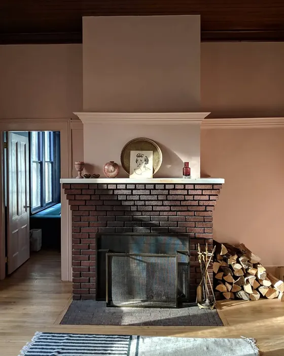
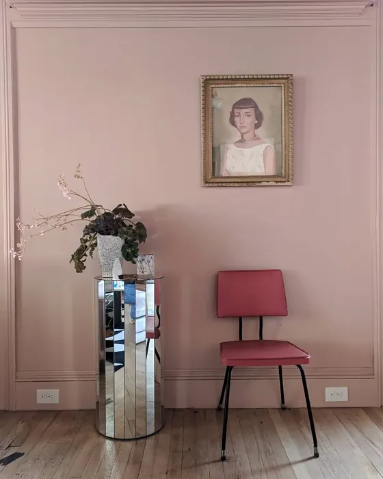
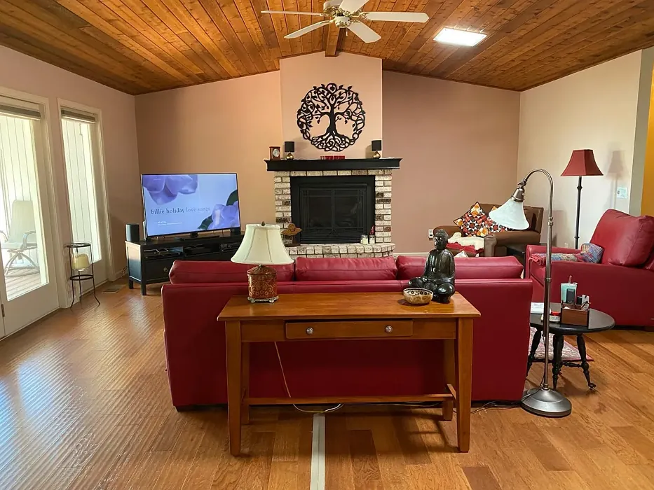
Real Room Photo of Chippendale Rosetone HC-58
Undertones of Chippendale Rosetone ?
The undertones of Chippendale Rosetone are a key aspect of its character, leaning towards Red. These subtle underlying hues are what give the color its depth and complexity. For example, a gray with a blue undertone will feel cooler and more modern, while one with a brown undertone will feel warmer and more traditional. It’s essential to test this paint in your home and observe it next to your existing furniture, flooring, and decor to see how these undertones interact and reveal themselves throughout the day.
HEX value: #D6B3A3
RGB code: 214, 179, 163
Is Chippendale Rosetone Cool or Warm?
This color leans decidedly warm, evoking feelings of comfort and serenity. Its warm undertones make it an excellent choice for creating inviting spaces that feel cozy and lived-in.
Understanding Color Properties and Interior Design Tips
Hue refers to a specific position on the color wheel, measured in degrees from 0 to 360. Each degree represents a different pure color:
- 0° represents red
- 120° represents green
- 240° represents blue
Saturation describes the intensity or purity of a color and is expressed as a percentage:
- At 0%, the color appears completely desaturated—essentially a shade of gray
- At 100%, the color is at its most vivid and vibrant
Lightness indicates how light or dark a color is, also expressed as a percentage:
- 0% lightness results in black
- 100% lightness results in white
Using Warm Colors in Interior Design
Warm hues—such as reds, oranges, yellows, warm beiges, and greiges—are excellent choices for creating inviting and energetic spaces. These colors are particularly well-suited for:
- Kitchens, living rooms, and bathrooms, where warmth enhances comfort and sociability
- Large rooms, where warm tones can help reduce the sense of emptiness and make the space feel more intimate
For example:
- Warm beige shades provide a cozy, inviting atmosphere, ideal for living rooms, bedrooms, and hallways.
- Warm greige (a mix of beige and gray) offers the warmth of beige with the modern appeal of gray, making it a versatile backdrop for dining areas, bedrooms, and living spaces.
However, be mindful when using warm light tones in rooms with limited natural light. These shades may appear muted or even take on an unpleasant yellowish tint. To avoid a dull or flat appearance:
- Add depth by incorporating richer tones like deep greens, charcoal, or chocolate brown
- Use textured elements such as curtains, rugs, or cushions to bring dimension to the space
Pro Tip: Achieving Harmony with Warm and Cool Color Balance
To create a well-balanced and visually interesting interior, mix warm and cool tones strategically. This contrast adds depth and harmony to your design.
- If your walls feature warm hues, introduce cool-colored accents such as blue or green furniture, artwork, or accessories to create contrast.
- For a polished look, consider using a complementary color scheme, which pairs colors opposite each other on the color wheel (e.g., red with green, orange with blue).
This thoughtful mix not only enhances visual appeal but also creates a space that feels both dynamic and cohesive.
Light Temperature Affects on Chippendale Rosetone
Natural Light
Natural daylight changes in color temperature as the sun moves across the sky. At sunrise and sunset, the light tends to have a warm, golden tone with a color temperature around 2000 Kelvin (K). As the day progresses and the sun rises higher, the light becomes cooler and more neutral. Around midday, especially when the sky is clear, natural light typically reaches its peak brightness and shifts to a cooler tone, ranging from 5500 to 6500 Kelvin. This midday light is close to what we perceive as pure white or daylight-balanced light.
These shifts in natural light can significantly influence how colors appear in a space, which is why designers often consider both the time of day and the orientation of windows when planning interior color schemes.
Artificial Light
When choosing artificial lighting, pay close attention to the color temperature, measured in Kelvin (K). This determines how warm or cool the light will appear. Lower temperatures, around 2700K, give off a warm, yellow glow often used in living rooms or bedrooms. Higher temperatures, above 5000K, create a cool, bluish light similar to daylight, commonly used in kitchens, offices, or task areas.
Use the slider to see how lighting temperature can affect the appearance of a surface or color throughout a space.


4800K
LRV of Chippendale Rosetone
The Light Reflectance Value (LRV) of Chippendale Rosetone is 48.67%, which places it in the Light Medium colors category. This means it reflect half of the incident light. Understanding a paint’s LRV is crucial for predicting how it will look in your space. A higher LRV indicates a lighter color that reflects more light, making rooms feel larger and brighter. A lower LRV signifies a darker color that absorbs more light, creating a cozier, more intimate atmosphere. Always consider the natural and artificial lighting in your room when selecting a paint color based on its LRV.
Detailed Review of Chippendale Rosetone
Additional Paint Characteristics
Ideal Rooms
Bedroom, Home Office, Kitchen, Living Room, Nursery
Decor Styles
Eclectic, Farmhouse, Modern, Rustic, Traditional
Coverage
Good (1–2 Coats), Touch-Up Friendly
Ease of Application
Beginner Friendly, Brush Smooth, Roller-Ready
Washability
Washable, Wipeable
VOC Level
Eco-Certified, Low VOC
Best Use
Accent Wall, Bedroom, Interior Walls, Nursery
Room Suitability
Bedroom, Dining Room, Home Office, Living Room, Nursery
Tone Tag
Earthy, Muted, Warm
Finish Type
Eggshell, Matte
Paint Performance
Easy Touch-Up, Low Odor, Quick Drying, Scuff Resistant
Use Cases
Best for Rentals, Best for Small Spaces, Classic Favorite
Mood
Cozy, Inviting, Restful
Trim Pairing
Complements Brass Fixtures, Pairs with White Dove, Works with Warm Trim
Chippendale Rosetone stands out as a beautifully understated choice for those looking to infuse their home with a touch of elegance. The color is soft and inviting, creating a vibe that’s both warm and sophisticated. Whether you’re painting an entire room or using it as an accent, it transforms spaces effortlessly. One of its best features is its ability to adapt to different lighting conditions; it can appear softer in natural light while taking on a more pronounced hue in the evening. This makes it a great choice for living rooms or bedrooms where you want to create a warm, welcoming environment. However, it’s worth noting that depending on the lighting and surrounding colors, the undertones may shift, so always test a sample before committing.
Pros & Cons of HC-58 Chippendale Rosetone
Pros
Cons
Colors that go with Benjamin Moore Chippendale Rosetone
FAQ on HC-58 Chippendale Rosetone
How does Chippendale Rosetone compare to other similar colors?
Chippendale Rosetone stands out for its unique blend of warm taupe and soft pink, giving it a nuanced appearance that sets it apart from standard pinks or taupes. Unlike bolder shades, this color’s subtlety makes it versatile, allowing it to pair well with a variety of other colors, from whites to deeper earth tones. Many users find it offers a more sophisticated alternative to traditional pastel colors, making it suitable for both modern and classic interiors.
Is Chippendale Rosetone suitable for small spaces?
Absolutely! Chippendale Rosetone is a fantastic choice for small spaces. Its warm tones can make a room feel more inviting and spacious, creating an illusion of a larger area. When paired with good lighting and lighter furnishings, it can brighten up a small room, making it feel airy and comfortable. Just be cautious with the overall decor to ensure it doesn’t overwhelm the space.
Comparisons Chippendale Rosetone with other colors
Chippendale Rosetone HC-58 vs Realist Beige SW 6078
| Attribute | Chippendale Rosetone HC-58 | Realist Beige SW 6078 |
|---|---|---|
| Color Name | Chippendale Rosetone HC-58 | Realist Beige SW 6078 |
| Color | ||
| Hue | Pink | Pink |
| Brightness | Medium | Medium |
| RGB | 214, 179, 163 | 211, 200, 189 |
| LRV | 48.67% | 34% |
| Finish Type | Eggshell, Matte | Eggshell, Matte, Satin |
| Finish Options | Eggshell, Matte, Satin | Eggshell, Matte, Satin |
| Ideal Rooms | Bedroom, Home Office, Kitchen, Living Room, Nursery | Bedroom, Dining Room, Entryway, Home Office, Kitchen, Living Room |
| Decor Styles | Eclectic, Farmhouse, Modern, Rustic, Traditional | Contemporary, Minimalist, Modern Farmhouse, Rustic, Traditional |
| Coverage | Good (1–2 Coats), Touch-Up Friendly | Good (1–2 Coats), Touch-Up Friendly |
| Ease of Application | Beginner Friendly, Brush Smooth, Roller-Ready | Beginner Friendly, Brush Smooth, Fast-Drying, Roller-Ready |
| Washability | Washable, Wipeable | Washable, Wipeable |
| Room Suitability | Bedroom, Dining Room, Home Office, Living Room, Nursery | Bedroom, Dining Room, Home Office, Kitchen, Living Room |
| Tone | Earthy, Muted, Warm | Earthy, Neutral, Warm |
| Paint Performance | Easy Touch-Up, Low Odor, Quick Drying, Scuff Resistant | High Coverage, Low Odor, Quick Drying |
Chippendale Rosetone HC-58 vs Rosaline Pearl SW 9077
| Attribute | Chippendale Rosetone HC-58 | Rosaline Pearl SW 9077 |
|---|---|---|
| Color Name | Chippendale Rosetone HC-58 | Rosaline Pearl SW 9077 |
| Color | ||
| Hue | Pink | Pink |
| Brightness | Medium | Medium |
| RGB | 214, 179, 163 | 163, 136, 135 |
| LRV | 48.67% | 69% |
| Finish Type | Eggshell, Matte | Eggshell, Matte |
| Finish Options | Eggshell, Matte, Satin | Eggshell, Matte, Satin |
| Ideal Rooms | Bedroom, Home Office, Kitchen, Living Room, Nursery | Bedroom, Dining Room, Home Office, Living Room |
| Decor Styles | Eclectic, Farmhouse, Modern, Rustic, Traditional | Bohemian, Contemporary, Modern, Transitional |
| Coverage | Good (1–2 Coats), Touch-Up Friendly | Good (1–2 Coats) |
| Ease of Application | Beginner Friendly, Brush Smooth, Roller-Ready | Beginner Friendly, Brush Smooth, Fast-Drying, Roller-Ready |
| Washability | Washable, Wipeable | Washable, Wipeable |
| Room Suitability | Bedroom, Dining Room, Home Office, Living Room, Nursery | Bedroom, Dining Room, Home Office, Living Room |
| Tone | Earthy, Muted, Warm | Dusty, Muted, Warm |
| Paint Performance | Easy Touch-Up, Low Odor, Quick Drying, Scuff Resistant | Easy Touch-Up, Fade Resistant, Low Odor |
Chippendale Rosetone HC-58 vs Cabbage Rose SW 0003
| Attribute | Chippendale Rosetone HC-58 | Cabbage Rose SW 0003 |
|---|---|---|
| Color Name | Chippendale Rosetone HC-58 | Cabbage Rose SW 0003 |
| Color | ||
| Hue | Pink | Pink |
| Brightness | Medium | Medium |
| RGB | 214, 179, 163 | 197, 159, 145 |
| LRV | 48.67% | 15% |
| Finish Type | Eggshell, Matte | Eggshell, Matte, Satin |
| Finish Options | Eggshell, Matte, Satin | Eggshell, Matte, Satin |
| Ideal Rooms | Bedroom, Home Office, Kitchen, Living Room, Nursery | Bedroom, Dining Room, Hallway, Living Room, Nursery |
| Decor Styles | Eclectic, Farmhouse, Modern, Rustic, Traditional | Cottage, Modern Farmhouse, Romantic, Shabby Chic, Vintage |
| Coverage | Good (1–2 Coats), Touch-Up Friendly | Good (1–2 Coats), Touch-Up Friendly |
| Ease of Application | Beginner Friendly, Brush Smooth, Roller-Ready | Beginner Friendly, Brush Smooth, Roller-Ready |
| Washability | Washable, Wipeable | Washable, Wipeable |
| Room Suitability | Bedroom, Dining Room, Home Office, Living Room, Nursery | Bedroom, Dining Room, Hallway, Living Room, Nursery |
| Tone | Earthy, Muted, Warm | Earthy, Muted, Warm |
| Paint Performance | Easy Touch-Up, Low Odor, Quick Drying, Scuff Resistant | Easy Touch-Up, Low Odor |
Chippendale Rosetone HC-58 vs Sashay Sand SW 6051
| Attribute | Chippendale Rosetone HC-58 | Sashay Sand SW 6051 |
|---|---|---|
| Color Name | Chippendale Rosetone HC-58 | Sashay Sand SW 6051 |
| Color | ||
| Hue | Pink | Pink |
| Brightness | Medium | Medium |
| RGB | 214, 179, 163 | 207, 180, 168 |
| LRV | 48.67% | 64% |
| Finish Type | Eggshell, Matte | Eggshell, Matte, Satin |
| Finish Options | Eggshell, Matte, Satin | Eggshell, Matte, Satin |
| Ideal Rooms | Bedroom, Home Office, Kitchen, Living Room, Nursery | Bedroom, Dining Room, Home Office, Kitchen, Living Room |
| Decor Styles | Eclectic, Farmhouse, Modern, Rustic, Traditional | Bohemian, Contemporary, Modern Farmhouse, Scandinavian, Transitional |
| Coverage | Good (1–2 Coats), Touch-Up Friendly | Good (1–2 Coats), Touch-Up Friendly |
| Ease of Application | Beginner Friendly, Brush Smooth, Roller-Ready | Beginner Friendly, Fast-Drying, Roller-Ready |
| Washability | Washable, Wipeable | Highly Washable, Washable |
| Room Suitability | Bedroom, Dining Room, Home Office, Living Room, Nursery | Bedroom, Dining Room, Home Office, Kitchen, Living Room |
| Tone | Earthy, Muted, Warm | Earthy, Muted, Warm |
| Paint Performance | Easy Touch-Up, Low Odor, Quick Drying, Scuff Resistant | Easy Touch-Up, Low Odor, Quick Drying, Scuff Resistant |
Chippendale Rosetone HC-58 vs Touch of Sand SW 9085
| Attribute | Chippendale Rosetone HC-58 | Touch of Sand SW 9085 |
|---|---|---|
| Color Name | Chippendale Rosetone HC-58 | Touch of Sand SW 9085 |
| Color | ||
| Hue | Pink | Pink |
| Brightness | Medium | Medium |
| RGB | 214, 179, 163 | 213, 199, 186 |
| LRV | 48.67% | 66% |
| Finish Type | Eggshell, Matte | Eggshell, Matte, Satin |
| Finish Options | Eggshell, Matte, Satin | Eggshell, Matte, Satin |
| Ideal Rooms | Bedroom, Home Office, Kitchen, Living Room, Nursery | Bathroom, Bedroom, Dining Room, Home Office, Kitchen, Living Room |
| Decor Styles | Eclectic, Farmhouse, Modern, Rustic, Traditional | Bohemian, Coastal, Contemporary, Modern Farmhouse, Rustic |
| Coverage | Good (1–2 Coats), Touch-Up Friendly | Good (1–2 Coats), Touch-Up Friendly |
| Ease of Application | Beginner Friendly, Brush Smooth, Roller-Ready | Beginner Friendly, Brush Smooth, Fast-Drying, Roller-Ready |
| Washability | Washable, Wipeable | Washable, Wipeable |
| Room Suitability | Bedroom, Dining Room, Home Office, Living Room, Nursery | Bathroom, Bedroom, Dining Room, Home Office, Kitchen, Living Room |
| Tone | Earthy, Muted, Warm | Earthy, Muted, Neutral, Warm |
| Paint Performance | Easy Touch-Up, Low Odor, Quick Drying, Scuff Resistant | Easy Touch-Up, Low Odor, Quick Drying, Scuff Resistant |
Chippendale Rosetone HC-58 vs Pink Shadow SW 0070
| Attribute | Chippendale Rosetone HC-58 | Pink Shadow SW 0070 |
|---|---|---|
| Color Name | Chippendale Rosetone HC-58 | Pink Shadow SW 0070 |
| Color | ||
| Hue | Pink | Pink |
| Brightness | Medium | Medium |
| RGB | 214, 179, 163 | 222, 195, 185 |
| LRV | 48.67% | 45% |
| Finish Type | Eggshell, Matte | Eggshell, Matte, Satin |
| Finish Options | Eggshell, Matte, Satin | Eggshell, Matte, Satin |
| Ideal Rooms | Bedroom, Home Office, Kitchen, Living Room, Nursery | Bedroom, Dining Room, Home Office, Living Room, Nursery |
| Decor Styles | Eclectic, Farmhouse, Modern, Rustic, Traditional | Bohemian, Minimalist, Modern Farmhouse, Scandinavian, Traditional |
| Coverage | Good (1–2 Coats), Touch-Up Friendly | Good (1–2 Coats) |
| Ease of Application | Beginner Friendly, Brush Smooth, Roller-Ready | Beginner Friendly, Brush Smooth, Fast-Drying, Roller-Ready |
| Washability | Washable, Wipeable | Washable, Wipeable |
| Room Suitability | Bedroom, Dining Room, Home Office, Living Room, Nursery | Bedroom, Dining Room, Living Room, Nursery |
| Tone | Earthy, Muted, Warm | Muted, Pastel, Warm |
| Paint Performance | Easy Touch-Up, Low Odor, Quick Drying, Scuff Resistant | Easy Touch-Up, High Coverage, Low Odor |
Chippendale Rosetone HC-58 vs Hushed Auburn SW 9080
| Attribute | Chippendale Rosetone HC-58 | Hushed Auburn SW 9080 |
|---|---|---|
| Color Name | Chippendale Rosetone HC-58 | Hushed Auburn SW 9080 |
| Color | ||
| Hue | Pink | Pink |
| Brightness | Medium | Medium |
| RGB | 214, 179, 163 | 168, 133, 122 |
| LRV | 48.67% | 12% |
| Finish Type | Eggshell, Matte | Eggshell, Matte, Satin |
| Finish Options | Eggshell, Matte, Satin | Eggshell, Matte, Satin |
| Ideal Rooms | Bedroom, Home Office, Kitchen, Living Room, Nursery | Bedroom, Dining Room, Home Office, Living Room |
| Decor Styles | Eclectic, Farmhouse, Modern, Rustic, Traditional | Contemporary, Modern Farmhouse, Rustic, Transitional |
| Coverage | Good (1–2 Coats), Touch-Up Friendly | Good (1–2 Coats), Touch-Up Friendly |
| Ease of Application | Beginner Friendly, Brush Smooth, Roller-Ready | Beginner Friendly, Brush Smooth, Fast-Drying, Roller-Ready |
| Washability | Washable, Wipeable | Washable, Wipeable |
| Room Suitability | Bedroom, Dining Room, Home Office, Living Room, Nursery | Bedroom, Dining Room, Home Office, Living Room |
| Tone | Earthy, Muted, Warm | Earthy, Muted, Warm |
| Paint Performance | Easy Touch-Up, Low Odor, Quick Drying, Scuff Resistant | Easy Touch-Up, High Coverage, Low Odor |
Chippendale Rosetone HC-58 vs Likeable Sand SW 6058
| Attribute | Chippendale Rosetone HC-58 | Likeable Sand SW 6058 |
|---|---|---|
| Color Name | Chippendale Rosetone HC-58 | Likeable Sand SW 6058 |
| Color | ||
| Hue | Pink | Pink |
| Brightness | Medium | Medium |
| RGB | 214, 179, 163 | 209, 183, 168 |
| LRV | 48.67% | 61% |
| Finish Type | Eggshell, Matte | Eggshell, Matte, Satin |
| Finish Options | Eggshell, Matte, Satin | Eggshell, Matte, Satin |
| Ideal Rooms | Bedroom, Home Office, Kitchen, Living Room, Nursery | Bedroom, Dining Room, Home Office, Kitchen, Living Room |
| Decor Styles | Eclectic, Farmhouse, Modern, Rustic, Traditional | Bohemian, Coastal, Contemporary, Modern Farmhouse, Rustic |
| Coverage | Good (1–2 Coats), Touch-Up Friendly | Good (1–2 Coats), Touch-Up Friendly |
| Ease of Application | Beginner Friendly, Brush Smooth, Roller-Ready | Beginner Friendly, Brush Smooth, Fast-Drying, Roller-Ready |
| Washability | Washable, Wipeable | Washable, Wipeable |
| Room Suitability | Bedroom, Dining Room, Home Office, Living Room, Nursery | Bedroom, Dining Room, Home Office, Kitchen, Living Room |
| Tone | Earthy, Muted, Warm | Earthy, Muted, Warm |
| Paint Performance | Easy Touch-Up, Low Odor, Quick Drying, Scuff Resistant | Easy Touch-Up, Low Odor, Quick Drying |
Chippendale Rosetone HC-58 vs Glamour SW 6031
| Attribute | Chippendale Rosetone HC-58 | Glamour SW 6031 |
|---|---|---|
| Color Name | Chippendale Rosetone HC-58 | Glamour SW 6031 |
| Color | ||
| Hue | Pink | Pink |
| Brightness | Medium | Medium |
| RGB | 214, 179, 163 | 182, 160, 154 |
| LRV | 48.67% | 30% |
| Finish Type | Eggshell, Matte | Eggshell, Matte, Satin |
| Finish Options | Eggshell, Matte, Satin | Eggshell, Matte, Satin |
| Ideal Rooms | Bedroom, Home Office, Kitchen, Living Room, Nursery | Bedroom, Dining Room, Home Office, Living Room |
| Decor Styles | Eclectic, Farmhouse, Modern, Rustic, Traditional | Bohemian, Classic, Modern, Transitional |
| Coverage | Good (1–2 Coats), Touch-Up Friendly | Good (1–2 Coats) |
| Ease of Application | Beginner Friendly, Brush Smooth, Roller-Ready | Beginner Friendly, Brush Smooth, Fast-Drying, Roller-Ready |
| Washability | Washable, Wipeable | Scrubbable, Washable |
| Room Suitability | Bedroom, Dining Room, Home Office, Living Room, Nursery | Bedroom, Dining Room, Home Office, Living Room |
| Tone | Earthy, Muted, Warm | Balanced, Neutral, Warm |
| Paint Performance | Easy Touch-Up, Low Odor, Quick Drying, Scuff Resistant | Easy Touch-Up, Low Odor, Quick Drying |
Chippendale Rosetone HC-58 vs Temperate Taupe SW 6037
| Attribute | Chippendale Rosetone HC-58 | Temperate Taupe SW 6037 |
|---|---|---|
| Color Name | Chippendale Rosetone HC-58 | Temperate Taupe SW 6037 |
| Color | ||
| Hue | Pink | Pink |
| Brightness | Medium | Medium |
| RGB | 214, 179, 163 | 191, 177, 170 |
| LRV | 48.67% | 34% |
| Finish Type | Eggshell, Matte | Eggshell, Matte, Satin |
| Finish Options | Eggshell, Matte, Satin | Eggshell, Matte, Satin |
| Ideal Rooms | Bedroom, Home Office, Kitchen, Living Room, Nursery | Bedroom, Dining Room, Home Office, Kitchen, Living Room |
| Decor Styles | Eclectic, Farmhouse, Modern, Rustic, Traditional | Bohemian, Modern Farmhouse, Rustic, Transitional |
| Coverage | Good (1–2 Coats), Touch-Up Friendly | Good (1–2 Coats), Touch-Up Friendly |
| Ease of Application | Beginner Friendly, Brush Smooth, Roller-Ready | Beginner Friendly, Brush Smooth, Fast-Drying, Roller-Ready |
| Washability | Washable, Wipeable | Highly Washable, Washable |
| Room Suitability | Bedroom, Dining Room, Home Office, Living Room, Nursery | Bedroom, Dining Room, Home Office, Living Room |
| Tone | Earthy, Muted, Warm | Earthy, Neutral, Warm |
| Paint Performance | Easy Touch-Up, Low Odor, Quick Drying, Scuff Resistant | Long Lasting, Low Odor, Quick Drying, Scuff Resistant |
Official Page of Benjamin Moore Chippendale Rosetone HC-58