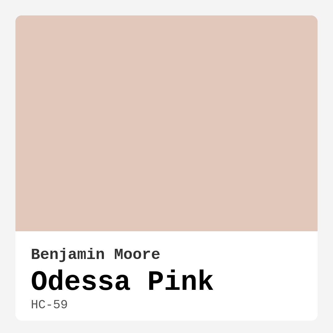
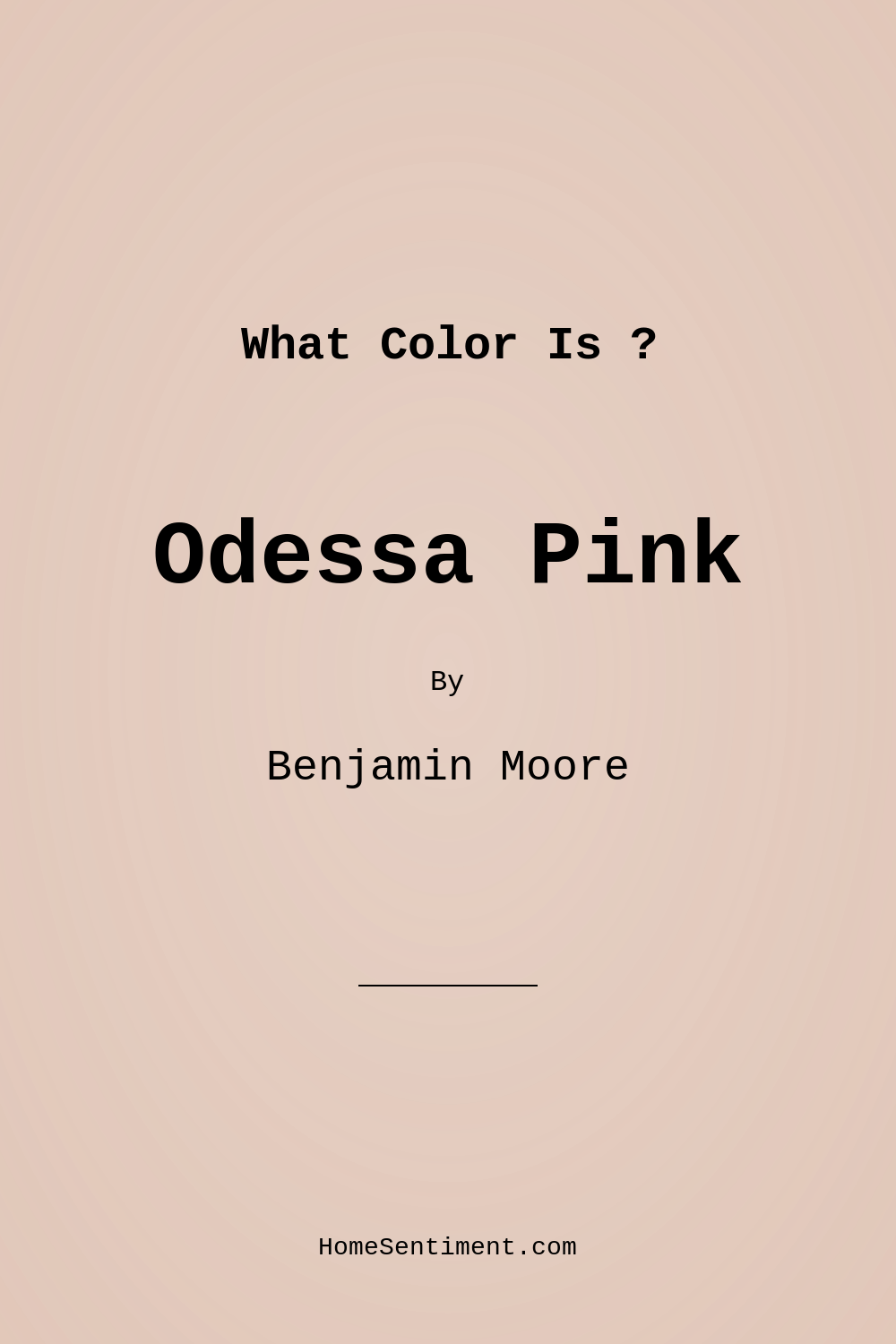
Color Preview & Key Details
| HEX Code | #E2C8BA |
| RGB | 226, 200, 186 |
| LRV | 59.46% |
| Undertone | Red |
| Finish Options | Eggshell, Flat, Matte, Satin |
Imagine walking into a room that instantly makes you feel at ease—soft, warm, and effortlessly elegant. That’s the magic of Benjamin Moore’s Odessa Pink (HC-59). This isn’t your typical bubblegum pink or a bold statement shade. It’s a muted, sophisticated hue with just enough warmth to transform a space into a cozy sanctuary. Whether you’re refreshing a bedroom, designing a nursery, or giving your living room a subtle makeover, Odessa Pink might be the perfect choice. But how do you know if it’s right for your home? Let’s dive in.
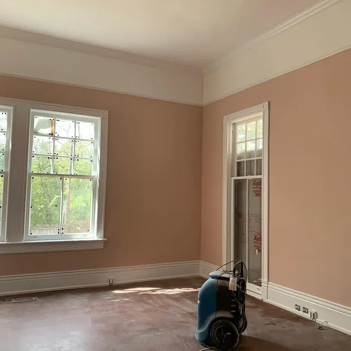
Odessa Pink is one of those colors that feels timeless yet fresh. With its delicate blend of pink and beige undertones, it straddles the line between neutral and playful, making it incredibly versatile. It’s light enough to keep a room feeling airy (thanks to its LRV of 59.46%, meaning it reflects plenty of light) but has enough depth to add warmth, especially in spaces with less natural light. If you’ve ever painted a room only to realize the color looks completely different by midday, you’ll appreciate how Odessa Pink maintains its gentle charm throughout the day. In bright light, it feels soft and ethereal; in dimmer settings, it leans into its earthy undertones, creating a snug, enveloping vibe.
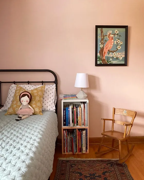
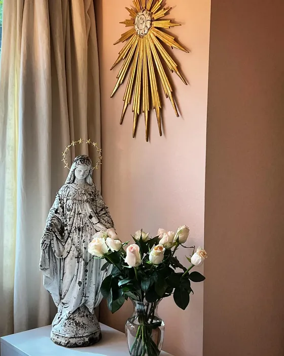
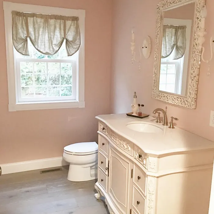
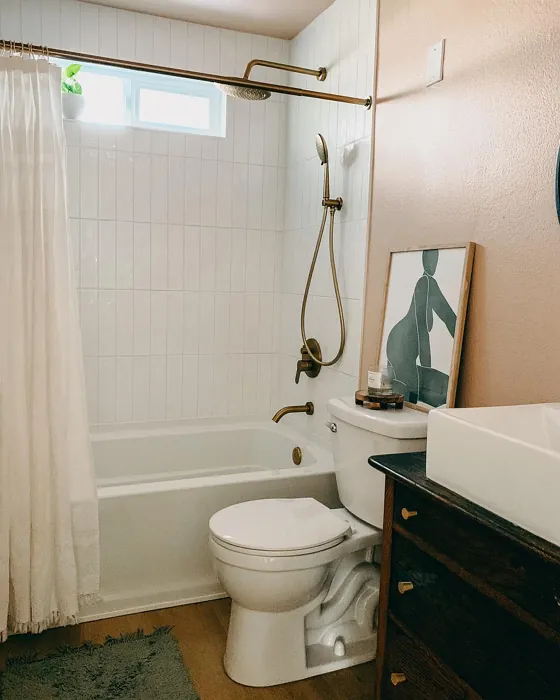
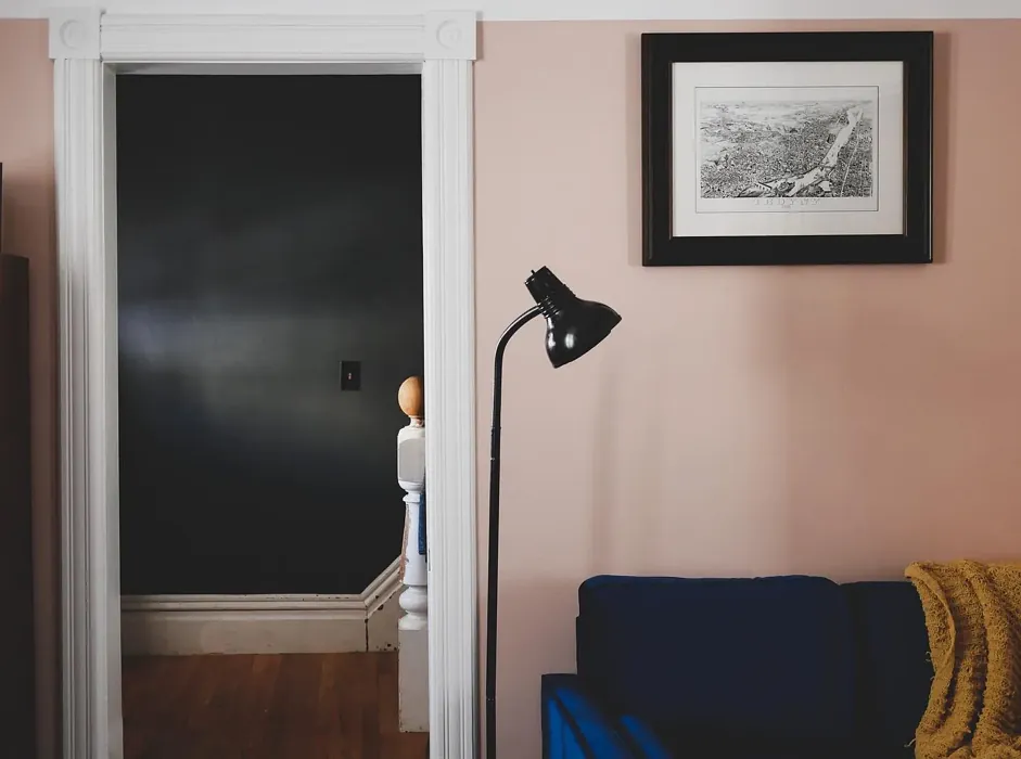
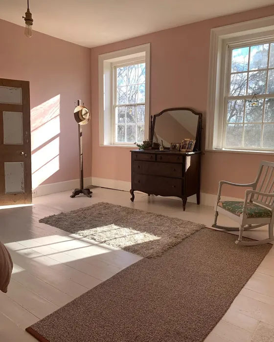
One of the biggest strengths of this color is its adaptability. It plays well with a range of decor styles—think modern minimalism, bohemian eclecticism, or even shabby chic. Pair it with crisp white trim (Benjamin Moore’s White Dove is a classic match) for a clean, polished look, or let it mingle with brass fixtures and warm wood tones to amplify its cozy appeal. If you’re feeling adventurous, try it alongside complementary greens (like Benjamin Moore’s HC-145) for a subtle contrast that feels organic and balanced. The red undertones in Odessa Pink give it just enough warmth to avoid feeling cold or sterile, which is why it works so well in bedrooms and nurseries where comfort is key.
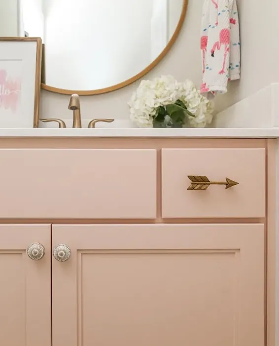
Application is a breeze, even if you’re a DIY beginner. The paint covers well in one to two coats, and its touch-up-friendly formula means you won’t stress over minor scuffs or marks. Opt for an eggshell or satin finish to highlight its soft glow—these sheens add a hint of luminosity without being too shiny. Flat finishes can work too, especially in low-traffic areas where durability isn’t a concern. And because it’s low-VOC and eco-certified, you can breathe easy knowing it’s a safe choice for your home.
Of course, no color is perfect for every scenario. Odessa Pink’s warmth means it might not be the best fit if you’re aiming for a cool, stark modern aesthetic. And while it’s light, it’s not a true neutral—those red undertones will interact with your existing decor, so it’s always wise to test a sample on your walls first. Lighting can dramatically affect how it reads: north-facing rooms might pull out its beige side, while south-facing spaces will emphasize its pinkness. But if you’re after a color that feels inviting, restful, and just a little bit special, those nuances are part of what makes it so compelling.
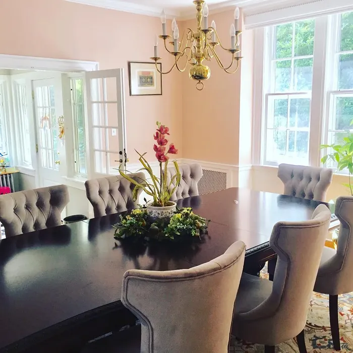
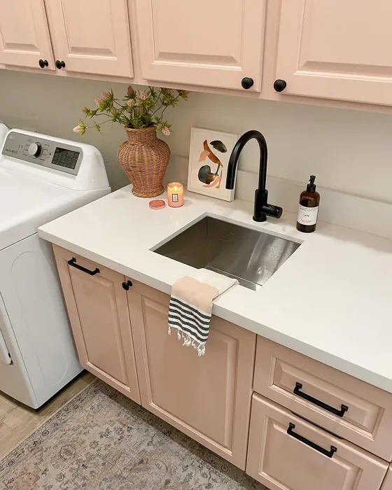
So, where does Odessa Pink shine brightest? Picture it in a bedroom, where its soothing vibe encourages relaxation, or in a home office, where it adds warmth without distraction. It’s a gorgeous choice for nurseries, offering a gentle alternative to pastels. And in living or dining rooms, it creates an inviting backdrop for everything from sleek mid-century furniture to layered boho textures. Even renters can embrace it—its muted tone is easy to live with, and it won’t clash with most lease-friendly decor.
At the end of the day, Odessa Pink is more than just a paint color. It’s a mood—a way to infuse your space with understated elegance and comfort. If you’ve been searching for a hue that feels both fresh and timeless, warm but not overwhelming, this might be your answer. Grab a sample, paint a swatch, and see how it transforms in your light. You might just fall in love with the way it makes your home feel.
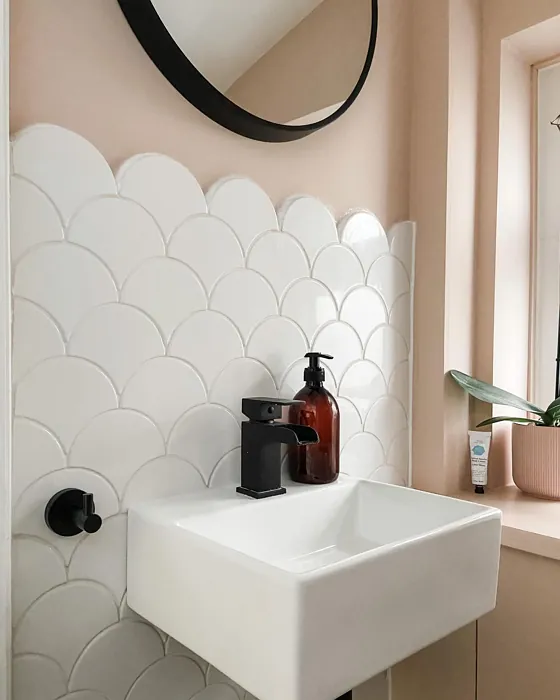
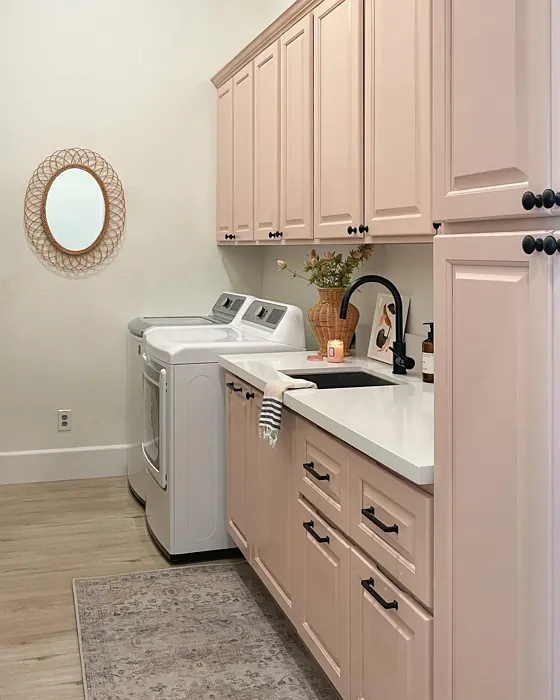
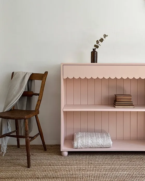
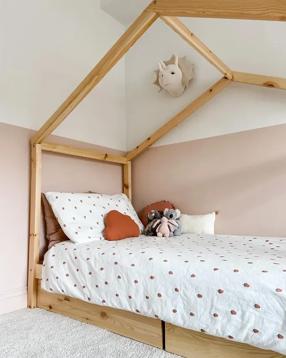
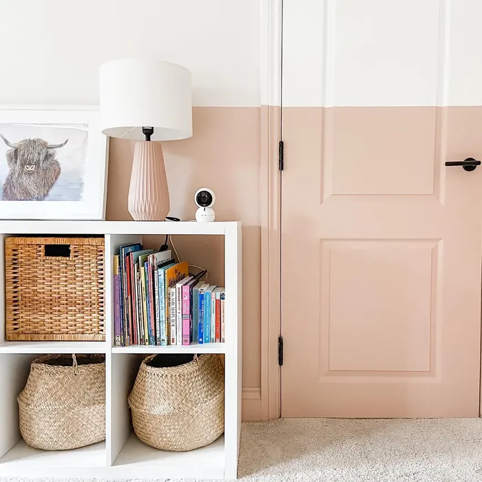
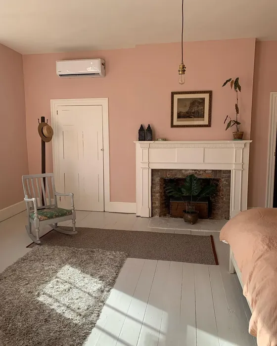
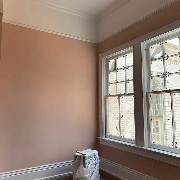
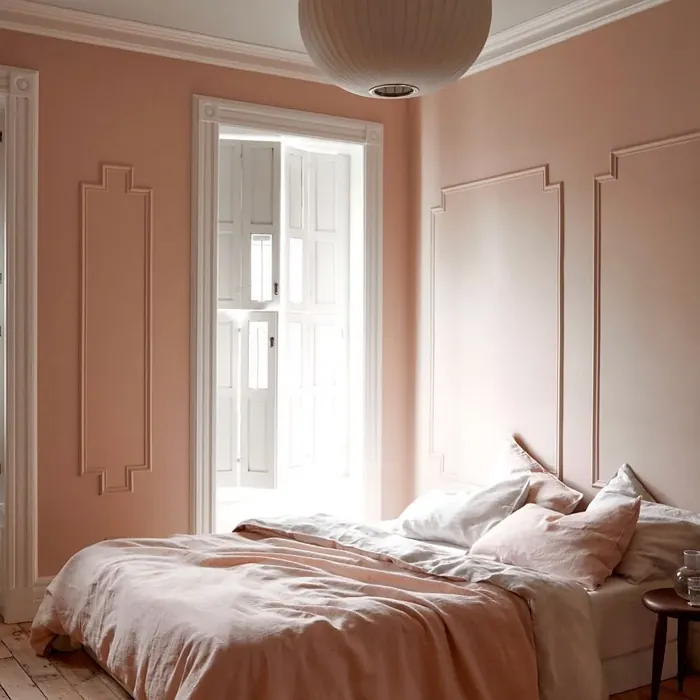
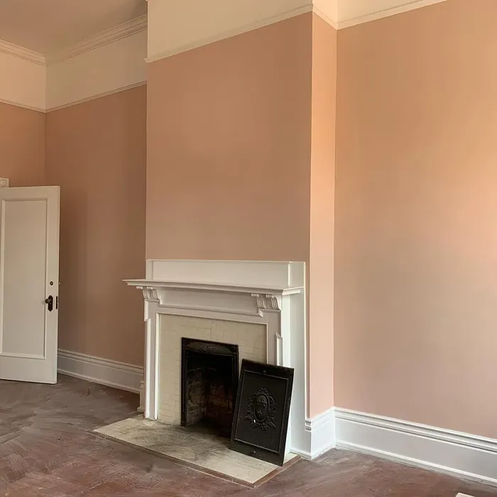
Real Room Photo of Odessa Pink HC-59

Undertones of Odessa Pink ?
The undertones of Odessa Pink are a key aspect of its character, leaning towards Red. These subtle underlying hues are what give the color its depth and complexity. For example, a gray with a blue undertone will feel cooler and more modern, while one with a brown undertone will feel warmer and more traditional. It’s essential to test this paint in your home and observe it next to your existing furniture, flooring, and decor to see how these undertones interact and reveal themselves throughout the day.
HEX value: #E2C8BA
RGB code: 226, 200, 186
Is Odessa Pink Cool or Warm?
This color is undeniably warm, with its beige undertones softening the pink hue. It creates a friendly and inviting atmosphere, making it suitable for both personal spaces and entertaining areas.
Understanding Color Properties and Interior Design Tips
Hue refers to a specific position on the color wheel, measured in degrees from 0 to 360. Each degree represents a different pure color:
- 0° represents red
- 120° represents green
- 240° represents blue
Saturation describes the intensity or purity of a color and is expressed as a percentage:
- At 0%, the color appears completely desaturated—essentially a shade of gray
- At 100%, the color is at its most vivid and vibrant
Lightness indicates how light or dark a color is, also expressed as a percentage:
- 0% lightness results in black
- 100% lightness results in white
Using Warm Colors in Interior Design
Warm hues—such as reds, oranges, yellows, warm beiges, and greiges—are excellent choices for creating inviting and energetic spaces. These colors are particularly well-suited for:
- Kitchens, living rooms, and bathrooms, where warmth enhances comfort and sociability
- Large rooms, where warm tones can help reduce the sense of emptiness and make the space feel more intimate
For example:
- Warm beige shades provide a cozy, inviting atmosphere, ideal for living rooms, bedrooms, and hallways.
- Warm greige (a mix of beige and gray) offers the warmth of beige with the modern appeal of gray, making it a versatile backdrop for dining areas, bedrooms, and living spaces.
However, be mindful when using warm light tones in rooms with limited natural light. These shades may appear muted or even take on an unpleasant yellowish tint. To avoid a dull or flat appearance:
- Add depth by incorporating richer tones like deep greens, charcoal, or chocolate brown
- Use textured elements such as curtains, rugs, or cushions to bring dimension to the space
Pro Tip: Achieving Harmony with Warm and Cool Color Balance
To create a well-balanced and visually interesting interior, mix warm and cool tones strategically. This contrast adds depth and harmony to your design.
- If your walls feature warm hues, introduce cool-colored accents such as blue or green furniture, artwork, or accessories to create contrast.
- For a polished look, consider using a complementary color scheme, which pairs colors opposite each other on the color wheel (e.g., red with green, orange with blue).
This thoughtful mix not only enhances visual appeal but also creates a space that feels both dynamic and cohesive.
Light Temperature Affects on Odessa Pink
Natural Light
Natural daylight changes in color temperature as the sun moves across the sky. At sunrise and sunset, the light tends to have a warm, golden tone with a color temperature around 2000 Kelvin (K). As the day progresses and the sun rises higher, the light becomes cooler and more neutral. Around midday, especially when the sky is clear, natural light typically reaches its peak brightness and shifts to a cooler tone, ranging from 5500 to 6500 Kelvin. This midday light is close to what we perceive as pure white or daylight-balanced light.
These shifts in natural light can significantly influence how colors appear in a space, which is why designers often consider both the time of day and the orientation of windows when planning interior color schemes.
Artificial Light
When choosing artificial lighting, pay close attention to the color temperature, measured in Kelvin (K). This determines how warm or cool the light will appear. Lower temperatures, around 2700K, give off a warm, yellow glow often used in living rooms or bedrooms. Higher temperatures, above 5000K, create a cool, bluish light similar to daylight, commonly used in kitchens, offices, or task areas.
Use the slider to see how lighting temperature can affect the appearance of a surface or color throughout a space.


4800K
LRV of Odessa Pink
The Light Reflectance Value (LRV) of Odessa Pink is 59.46%, which places it in the Light colors category. This means it reflect most of the incident light. Understanding a paint’s LRV is crucial for predicting how it will look in your space. A higher LRV indicates a lighter color that reflects more light, making rooms feel larger and brighter. A lower LRV signifies a darker color that absorbs more light, creating a cozier, more intimate atmosphere. Always consider the natural and artificial lighting in your room when selecting a paint color based on its LRV.
Detailed Review of Odessa Pink
Additional Paint Characteristics
Ideal Rooms
Bedroom, Dining Room, Home Office, Living Room, Nursery
Decor Styles
Bohemian, Modern, Shabby Chic, Transitional
Coverage
Good (1–2 Coats), Touch-Up Friendly
Ease of Application
Beginner Friendly, Brush Smooth, Roller-Ready
Washability
Stain Resistant, Washable
VOC Level
Eco-Certified, Low VOC
Best Use
Accent Wall, Bedroom, Interior Walls, Nursery
Room Suitability
Bedroom, Home Office, Living Room, Nursery
Tone Tag
Cozy, Earthy, Muted, Warm
Finish Type
Eggshell, Satin
Paint Performance
Easy Touch-Up, Low Odor, Scuff Resistant
Use Cases
Best for Rentals, Best for Small Spaces, Designer Favorite
Mood
Cozy, Inviting, Restful
Trim Pairing
Complements Brass Fixtures, Pairs with White Dove, Works with Warm Trim
Odessa Pink is a stunning choice for anyone looking to infuse a space with warmth and charm. Its soft, muted tone creates a welcoming environment, making it perfect for bedrooms and living areas. When applied, it offers a smooth finish that enhances the light in your room, reflecting beautifully throughout the day. While it generally covers well with one to two coats, it’s advisable to test a small area first to ensure the perfect match with your lighting conditions. This color’s versatility allows it to meld seamlessly with various decor styles, from modern to bohemian, while its tranquil vibe promotes relaxation and comfort. If you’re after a shade that feels both fresh and timeless, Odessa Pink is a fantastic pick.
Pros & Cons of HC-59 Odessa Pink
Pros
Cons
Colors that go with Benjamin Moore Odessa Pink
FAQ on HC-59 Odessa Pink
Can Odessa Pink be used in small spaces?
Absolutely! Odessa Pink is ideal for small spaces as its warm tones create a cozy feel without overwhelming the area. Just be mindful of the lighting; in brighter light, it will reflect beautifully, making the space feel open and inviting. In lower light, it can add depth and warmth, ensuring a comfortable ambiance.
What finishes work best with Odessa Pink?
For Odessa Pink, finishes like eggshell or satin work wonders. They enhance the soft quality of the paint while providing just enough sheen to highlight its warm undertones. If you’re looking for a more classic look, a flat finish can also be lovely, especially in low-traffic areas.
Comparisons Odessa Pink with other colors
Odessa Pink HC-59 vs Malted Milk SW 6057
| Attribute | Odessa Pink HC-59 | Malted Milk SW 6057 |
|---|---|---|
| Color Name | Odessa Pink HC-59 | Malted Milk SW 6057 |
| Color | ||
| Hue | Pink | Pink |
| Brightness | Light | Light |
| RGB | 226, 200, 186 | 222, 202, 189 |
| LRV | 59.46% | 74% |
| Finish Type | Eggshell, Satin | Eggshell, Satin |
| Finish Options | Eggshell, Flat, Matte, Satin | Eggshell, Matte, Satin |
| Ideal Rooms | Bedroom, Dining Room, Home Office, Living Room, Nursery | Bedroom, Dining Room, Kitchen, Living Room, Nursery |
| Decor Styles | Bohemian, Modern, Shabby Chic, Transitional | Coastal, Farmhouse, Modern, Scandinavian, Transitional |
| Coverage | Good (1–2 Coats), Touch-Up Friendly | Good (1–2 Coats), Touch-Up Friendly |
| Ease of Application | Beginner Friendly, Brush Smooth, Roller-Ready | Beginner Friendly, Brush Smooth, Fast-Drying, Roller-Ready |
| Washability | Stain Resistant, Washable | Washable, Wipeable |
| Room Suitability | Bedroom, Home Office, Living Room, Nursery | Bedroom, Dining Room, Kitchen, Living Room, Nursery |
| Tone | Cozy, Earthy, Muted, Warm | Creamy, Neutral, Warm |
| Paint Performance | Easy Touch-Up, Low Odor, Scuff Resistant | High Coverage, Low Odor, Quick Drying |
Odessa Pink HC-59 vs Intimate White SW 6322
| Attribute | Odessa Pink HC-59 | Intimate White SW 6322 |
|---|---|---|
| Color Name | Odessa Pink HC-59 | Intimate White SW 6322 |
| Color | ||
| Hue | Pink | Pink |
| Brightness | Light | Light |
| RGB | 226, 200, 186 | 240, 225, 216 |
| LRV | 59.46% | 75% |
| Finish Type | Eggshell, Satin | Eggshell, Matte, Satin |
| Finish Options | Eggshell, Flat, Matte, Satin | Eggshell, Matte, Satin |
| Ideal Rooms | Bedroom, Dining Room, Home Office, Living Room, Nursery | Bedroom, Hallway, Home Office, Living Room, Nursery |
| Decor Styles | Bohemian, Modern, Shabby Chic, Transitional | Farmhouse, Minimalist, Modern, Traditional |
| Coverage | Good (1–2 Coats), Touch-Up Friendly | Good (1–2 Coats) |
| Ease of Application | Beginner Friendly, Brush Smooth, Roller-Ready | Beginner Friendly, Brush Smooth, Roller-Ready |
| Washability | Stain Resistant, Washable | Highly Washable, Washable |
| Room Suitability | Bedroom, Home Office, Living Room, Nursery | Bedroom, Hallway, Living Room, Nursery |
| Tone | Cozy, Earthy, Muted, Warm | Creamy, Muted, Warm |
| Paint Performance | Easy Touch-Up, Low Odor, Scuff Resistant | Easy Touch-Up, Fade Resistant, Low Odor |
Odessa Pink HC-59 vs Abalone Shell SW 6050
| Attribute | Odessa Pink HC-59 | Abalone Shell SW 6050 |
|---|---|---|
| Color Name | Odessa Pink HC-59 | Abalone Shell SW 6050 |
| Color | ||
| Hue | Pink | Pink |
| Brightness | Light | Light |
| RGB | 226, 200, 186 | 219, 199, 189 |
| LRV | 59.46% | 30% |
| Finish Type | Eggshell, Satin | Eggshell, Matte, Satin |
| Finish Options | Eggshell, Flat, Matte, Satin | Eggshell, Matte, Satin |
| Ideal Rooms | Bedroom, Dining Room, Home Office, Living Room, Nursery | Bedroom, Dining Room, Home Office, Living Room |
| Decor Styles | Bohemian, Modern, Shabby Chic, Transitional | Coastal, Farmhouse, Minimalist, Modern, Traditional |
| Coverage | Good (1–2 Coats), Touch-Up Friendly | Good (1–2 Coats), Touch-Up Friendly |
| Ease of Application | Beginner Friendly, Brush Smooth, Roller-Ready | Beginner Friendly, Brush Smooth, Fast-Drying, Roller-Ready |
| Washability | Stain Resistant, Washable | Washable, Wipeable |
| Room Suitability | Bedroom, Home Office, Living Room, Nursery | Bedroom, Dining Room, Home Office, Living Room |
| Tone | Cozy, Earthy, Muted, Warm | Balanced, Muted, Warm |
| Paint Performance | Easy Touch-Up, Low Odor, Scuff Resistant | Easy Touch-Up, Fade Resistant, Low Odor, Quick Drying |
Odessa Pink HC-59 vs White Truffle SW 6029
| Attribute | Odessa Pink HC-59 | White Truffle SW 6029 |
|---|---|---|
| Color Name | Odessa Pink HC-59 | White Truffle SW 6029 |
| Color | ||
| Hue | Pink | Pink |
| Brightness | Light | Light |
| RGB | 226, 200, 186 | 215, 200, 194 |
| LRV | 59.46% | 48% |
| Finish Type | Eggshell, Satin | Eggshell, Satin |
| Finish Options | Eggshell, Flat, Matte, Satin | Eggshell, Flat, Matte, Satin |
| Ideal Rooms | Bedroom, Dining Room, Home Office, Living Room, Nursery | Bedroom, Dining Room, Hallway, Kitchen, Living Room |
| Decor Styles | Bohemian, Modern, Shabby Chic, Transitional | Eclectic, Farmhouse, Modern, Traditional |
| Coverage | Good (1–2 Coats), Touch-Up Friendly | Good (1–2 Coats), Touch-Up Friendly |
| Ease of Application | Beginner Friendly, Brush Smooth, Roller-Ready | Beginner Friendly, Brush Smooth, Roller-Ready |
| Washability | Stain Resistant, Washable | Washable, Wipeable |
| Room Suitability | Bedroom, Home Office, Living Room, Nursery | Bedroom, Dining Room, Hallway, Living Room |
| Tone | Cozy, Earthy, Muted, Warm | Earthy, Neutral, Warm |
| Paint Performance | Easy Touch-Up, Low Odor, Scuff Resistant | Easy Touch-Up, Low Odor, Scuff Resistant |
Odessa Pink HC-59 vs Faint Coral SW 6329
| Attribute | Odessa Pink HC-59 | Faint Coral SW 6329 |
|---|---|---|
| Color Name | Odessa Pink HC-59 | Faint Coral SW 6329 |
| Color | ||
| Hue | Pink | Pink |
| Brightness | Light | Light |
| RGB | 226, 200, 186 | 238, 222, 213 |
| LRV | 59.46% | 66% |
| Finish Type | Eggshell, Satin | Eggshell, Matte, Satin |
| Finish Options | Eggshell, Flat, Matte, Satin | Eggshell, Matte, Satin |
| Ideal Rooms | Bedroom, Dining Room, Home Office, Living Room, Nursery | Bedroom, Dining Room, Hallway, Living Room, Nursery |
| Decor Styles | Bohemian, Modern, Shabby Chic, Transitional | Bohemian, Coastal, Modern Farmhouse, Scandinavian, Vintage |
| Coverage | Good (1–2 Coats), Touch-Up Friendly | Good (1–2 Coats), Touch-Up Friendly |
| Ease of Application | Beginner Friendly, Brush Smooth, Roller-Ready | Beginner Friendly, Brush Smooth, Fast-Drying, Roller-Ready |
| Washability | Stain Resistant, Washable | Washable, Wipeable |
| Room Suitability | Bedroom, Home Office, Living Room, Nursery | Bedroom, Dining Room, Hallway, Living Room, Nursery |
| Tone | Cozy, Earthy, Muted, Warm | Airy, Muted, Pastel, Warm |
| Paint Performance | Easy Touch-Up, Low Odor, Scuff Resistant | Easy Touch-Up, Low Odor, Quick Drying |
Odessa Pink HC-59 vs Romance SW 6323
| Attribute | Odessa Pink HC-59 | Romance SW 6323 |
|---|---|---|
| Color Name | Odessa Pink HC-59 | Romance SW 6323 |
| Color | ||
| Hue | Pink | Pink |
| Brightness | Light | Light |
| RGB | 226, 200, 186 | 235, 207, 195 |
| LRV | 59.46% | 69% |
| Finish Type | Eggshell, Satin | Eggshell, Matte |
| Finish Options | Eggshell, Flat, Matte, Satin | Eggshell, Flat, Matte, Satin |
| Ideal Rooms | Bedroom, Dining Room, Home Office, Living Room, Nursery | Bedroom, Dining Room, Living Room, Nursery |
| Decor Styles | Bohemian, Modern, Shabby Chic, Transitional | Bohemian, Modern, Shabby Chic, Vintage |
| Coverage | Good (1–2 Coats), Touch-Up Friendly | Good (1–2 Coats), Touch-Up Friendly |
| Ease of Application | Beginner Friendly, Brush Smooth, Roller-Ready | Beginner Friendly, Brush Smooth, Fast-Drying, Roller-Ready |
| Washability | Stain Resistant, Washable | Washable, Wipeable |
| Room Suitability | Bedroom, Home Office, Living Room, Nursery | Bedroom, Dining Room, Living Room, Nursery |
| Tone | Cozy, Earthy, Muted, Warm | Pastel, Soft, Warm |
| Paint Performance | Easy Touch-Up, Low Odor, Scuff Resistant | Easy Touch-Up, Low Odor, Quick Drying |
Odessa Pink HC-59 vs Innocence SW 6302
| Attribute | Odessa Pink HC-59 | Innocence SW 6302 |
|---|---|---|
| Color Name | Odessa Pink HC-59 | Innocence SW 6302 |
| Color | ||
| Hue | Pink | Pink |
| Brightness | Light | Light |
| RGB | 226, 200, 186 | 235, 209, 207 |
| LRV | 59.46% | 75% |
| Finish Type | Eggshell, Satin | Eggshell, Matte |
| Finish Options | Eggshell, Flat, Matte, Satin | Eggshell, Matte, Satin |
| Ideal Rooms | Bedroom, Dining Room, Home Office, Living Room, Nursery | Bedroom, Dining Room, Living Room, Nursery |
| Decor Styles | Bohemian, Modern, Shabby Chic, Transitional | Bohemian, Modern Farmhouse, Scandinavian, Shabby Chic |
| Coverage | Good (1–2 Coats), Touch-Up Friendly | Good (1–2 Coats), Touch-Up Friendly |
| Ease of Application | Beginner Friendly, Brush Smooth, Roller-Ready | Beginner Friendly, Brush Smooth, Roller-Ready |
| Washability | Stain Resistant, Washable | Washable, Wipeable |
| Room Suitability | Bedroom, Home Office, Living Room, Nursery | Bedroom, Dining Room, Living Room, Nursery |
| Tone | Cozy, Earthy, Muted, Warm | Pastel, Soft, Warm |
| Paint Performance | Easy Touch-Up, Low Odor, Scuff Resistant | Easy Touch-Up, Fade Resistant, Low Odor |
Odessa Pink HC-59 vs Angelic SW 6602
| Attribute | Odessa Pink HC-59 | Angelic SW 6602 |
|---|---|---|
| Color Name | Odessa Pink HC-59 | Angelic SW 6602 |
| Color | ||
| Hue | Pink | Pink |
| Brightness | Light | Light |
| RGB | 226, 200, 186 | 242, 220, 215 |
| LRV | 59.46% | 75% |
| Finish Type | Eggshell, Satin | Eggshell, Satin |
| Finish Options | Eggshell, Flat, Matte, Satin | Eggshell, Flat, Matte, Satin |
| Ideal Rooms | Bedroom, Dining Room, Home Office, Living Room, Nursery | Bedroom, Dining Room, Home Office, Living Room, Nursery |
| Decor Styles | Bohemian, Modern, Shabby Chic, Transitional | Bohemian, Farmhouse, Modern, Transitional |
| Coverage | Good (1–2 Coats), Touch-Up Friendly | Good (1–2 Coats), Touch-Up Friendly |
| Ease of Application | Beginner Friendly, Brush Smooth, Roller-Ready | Beginner Friendly, Brush Smooth, Roller-Ready |
| Washability | Stain Resistant, Washable | Washable, Wipeable |
| Room Suitability | Bedroom, Home Office, Living Room, Nursery | Bedroom, Home Office, Living Room, Nursery |
| Tone | Cozy, Earthy, Muted, Warm | Airy, Pastel, Warm |
| Paint Performance | Easy Touch-Up, Low Odor, Scuff Resistant | Easy Touch-Up, Fade Resistant, Low Odor |
Odessa Pink HC-59 vs Rosy Outlook SW 6316
| Attribute | Odessa Pink HC-59 | Rosy Outlook SW 6316 |
|---|---|---|
| Color Name | Odessa Pink HC-59 | Rosy Outlook SW 6316 |
| Color | ||
| Hue | Pink | Pink |
| Brightness | Light | Light |
| RGB | 226, 200, 186 | 235, 206, 203 |
| LRV | 59.46% | 45% |
| Finish Type | Eggshell, Satin | Eggshell, Matte, Satin |
| Finish Options | Eggshell, Flat, Matte, Satin | Eggshell, Matte, Satin |
| Ideal Rooms | Bedroom, Dining Room, Home Office, Living Room, Nursery | Bedroom, Home Office, Living Room, Nursery |
| Decor Styles | Bohemian, Modern, Shabby Chic, Transitional | Bohemian, Cottage, Modern, Traditional |
| Coverage | Good (1–2 Coats), Touch-Up Friendly | Good (1–2 Coats), Touch-Up Friendly |
| Ease of Application | Beginner Friendly, Brush Smooth, Roller-Ready | Beginner Friendly, Brush Smooth, Roller-Ready |
| Washability | Stain Resistant, Washable | Scuff Resistant, Washable, Wipeable |
| Room Suitability | Bedroom, Home Office, Living Room, Nursery | Bedroom, Home Office, Living Room, Nursery |
| Tone | Cozy, Earthy, Muted, Warm | Muted, Pastel, Warm |
| Paint Performance | Easy Touch-Up, Low Odor, Scuff Resistant | High Coverage, Low Odor, Quick Drying |
Odessa Pink HC-59 vs Demure SW 6295
| Attribute | Odessa Pink HC-59 | Demure SW 6295 |
|---|---|---|
| Color Name | Odessa Pink HC-59 | Demure SW 6295 |
| Color | ||
| Hue | Pink | Pink |
| Brightness | Light | Light |
| RGB | 226, 200, 186 | 232, 212, 213 |
| LRV | 59.46% | 50% |
| Finish Type | Eggshell, Satin | Eggshell, Matte |
| Finish Options | Eggshell, Flat, Matte, Satin | Eggshell, Matte, Satin |
| Ideal Rooms | Bedroom, Dining Room, Home Office, Living Room, Nursery | Bedroom, Home Office, Living Room, Nursery |
| Decor Styles | Bohemian, Modern, Shabby Chic, Transitional | Minimalist, Modern, Shabby Chic, Transitional |
| Coverage | Good (1–2 Coats), Touch-Up Friendly | Good (1–2 Coats), Touch-Up Friendly |
| Ease of Application | Beginner Friendly, Brush Smooth, Roller-Ready | Beginner Friendly, Brush Smooth, Roller-Ready |
| Washability | Stain Resistant, Washable | Washable, Wipeable |
| Room Suitability | Bedroom, Home Office, Living Room, Nursery | Bedroom, Home Office, Living Room, Nursery |
| Tone | Cozy, Earthy, Muted, Warm | Muted, Pastel, Warm |
| Paint Performance | Easy Touch-Up, Low Odor, Scuff Resistant | Easy Touch-Up, Low Odor, Quick Drying |
Official Page of Benjamin Moore Odessa Pink HC-59