
Color Preview & Key Details
| HEX Code | #F1D9C6 |
| RGB | 241, 217, 198 |
| LRV | 70.51% |
| Undertone | Red |
| Finish Options | Eggshell, Matte, Satin |
Imagine walking into a room that instantly wraps you in warmth—soft, elegant, and just a little nostalgic. That’s the magic of Benjamin Moore’s Queen Anne Pink (HC-60). It’s not just a paint color; it’s a mood. Whether you’re dreaming of a cozy bedroom retreat, a charming nursery, or a living room that feels like a hug, this delicate pink hue might be the perfect choice. But before you grab a brush, let’s dive into everything you need to know to decide if it’s right for your space.
Queen Anne Pink is a masterclass in subtlety. With its muted, dusty rose undertones and a light reflectance value (LRV) of 70.51%, it’s a color that plays beautifully with light. In a sun-drenched room, it feels airy and ethereal. As the light fades, it deepens into a richer, almost blush-like tone. That adaptability makes it a fantastic pick for rooms where the lighting changes throughout the day—think living rooms with big windows or bedrooms where you want a soft glow in the evening.
One of the standout features of this color is its warmth. The red undertones give it a comforting, inviting quality that’s hard to replicate with cooler pinks. It’s the kind of hue that makes a space feel lived-in and loved, whether you’re pairing it with crisp white trim (try Benjamin Moore’s White Dove for a classic look) or rich brass fixtures that add a touch of vintage glam. And because it’s so versatile, it works across a range of styles—shabby chic, modern farmhouse, even traditional interiors with heirloom furniture.
Application is a breeze, even if you’re a DIY beginner. Queen Anne Pink has excellent coverage, usually needing just one or two coats, and it’s touch-up friendly. Stick to a matte or eggshell finish for walls to lean into its soft, velvety texture, or go for satin on trim if you want a subtle sheen. Just be mindful of streaks—take your time cutting in edges and use a high-quality roller for an even finish.
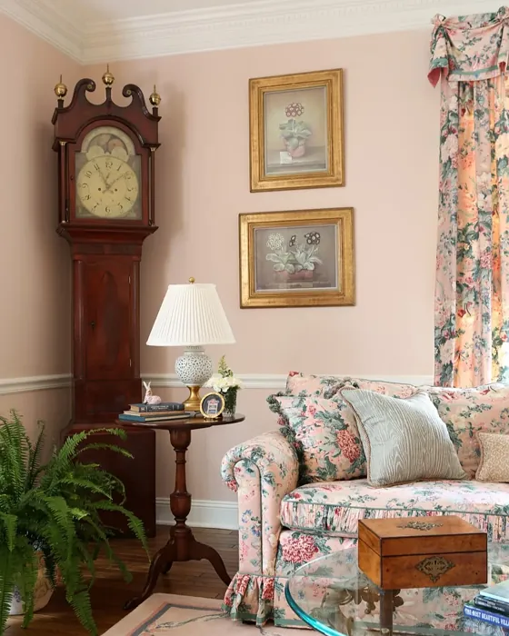
Now, let’s talk rooms. This color shines in intimate spaces. A bedroom painted in Queen Anne Pink feels like a sanctuary, especially when layered with linen bedding and warm wood tones. In a nursery, it’s gender-neutral and soothing, far from the saccharine pinks of decades past. Dining rooms and home offices benefit from its ability to create a relaxed yet refined atmosphere. But if you’re considering it for a large, open space, proceed with caution. Its softness might get lost without bold accents or contrasting colors to ground it.
Pairing is key. For a harmonious look, lean into its complementary shades—think muted greens (like Benjamin Moore’s HC-151) or deep, earthy browns. If you’re craving contrast, crisp black-and-white patterns or navy blues make it pop. And don’t forget texture. A chunky knit throw, a weathered wood table, or a sleek metal lamp can elevate the color from pretty to purposeful.
A few practical perks: Queen Anne Pink is low-VOC and eco-certified, so it’s a safe bet for homes with kids or pets. It’s also washable and scuff-resistant, which means it’ll hold up beautifully in high-traffic areas. And if you’re a renter? It’s light enough to cover easily when it’s time to move out, but distinctive enough to make your temporary space feel like home.
Still on the fence? Grab a sample. Paint a large swatch on your wall and live with it for a few days. Notice how it changes in morning light versus evening lamplight. See how it plays with your furniture and flooring. Because here’s the thing—Queen Anne Pink isn’t just a color. It’s a feeling. And if it’s the feeling you want your home to have, you won’t regret giving it a try.
So, what’s next? Picture your space. Imagine the walls wrapped in this gentle, warm hue. See how it makes you feel. If it’s a resounding “yes,” then you’ve found your color. And if not? That’s okay too. The perfect shade is out there—but for those who love a touch of vintage charm with modern ease, Queen Anne Pink might just be it.
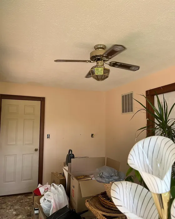
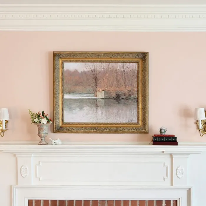
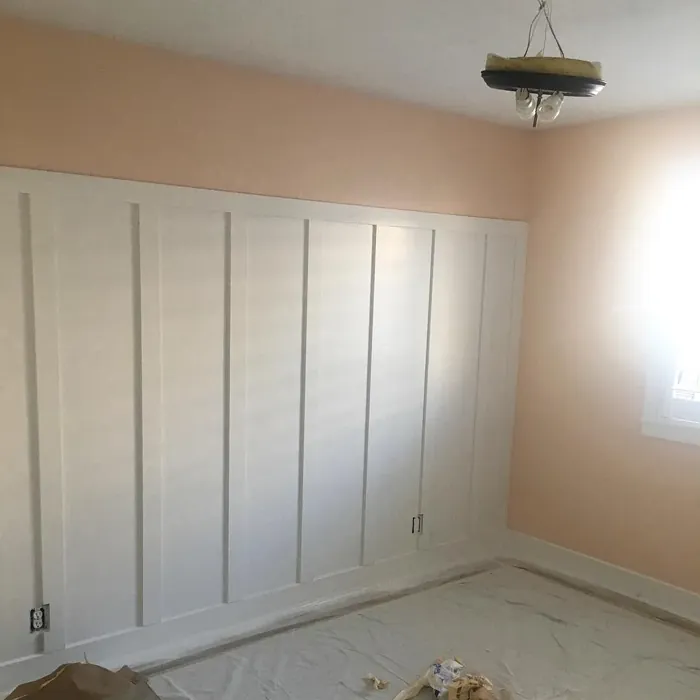
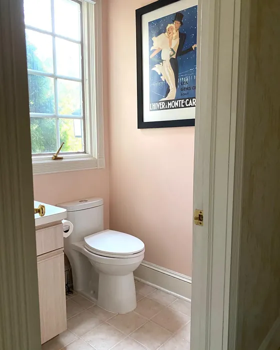
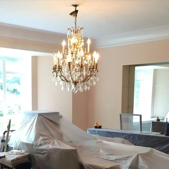
Real Room Photo of Queen Anne Pink HC-60
Undertones of Queen Anne Pink ?
The undertones of Queen Anne Pink are a key aspect of its character, leaning towards Red. These subtle underlying hues are what give the color its depth and complexity. For example, a gray with a blue undertone will feel cooler and more modern, while one with a brown undertone will feel warmer and more traditional. It’s essential to test this paint in your home and observe it next to your existing furniture, flooring, and decor to see how these undertones interact and reveal themselves throughout the day.
HEX value: #F1D9C6
RGB code: 241, 217, 198
Is Queen Anne Pink Cool or Warm?
This color leans warm, making it feel inviting and cozy in various settings. Its warmth can enhance natural light, creating a cheerful ambiance that feels nurturing and comforting.
Understanding Color Properties and Interior Design Tips
Hue refers to a specific position on the color wheel, measured in degrees from 0 to 360. Each degree represents a different pure color:
- 0° represents red
- 120° represents green
- 240° represents blue
Saturation describes the intensity or purity of a color and is expressed as a percentage:
- At 0%, the color appears completely desaturated—essentially a shade of gray
- At 100%, the color is at its most vivid and vibrant
Lightness indicates how light or dark a color is, also expressed as a percentage:
- 0% lightness results in black
- 100% lightness results in white
Using Warm Colors in Interior Design
Warm hues—such as reds, oranges, yellows, warm beiges, and greiges—are excellent choices for creating inviting and energetic spaces. These colors are particularly well-suited for:
- Kitchens, living rooms, and bathrooms, where warmth enhances comfort and sociability
- Large rooms, where warm tones can help reduce the sense of emptiness and make the space feel more intimate
For example:
- Warm beige shades provide a cozy, inviting atmosphere, ideal for living rooms, bedrooms, and hallways.
- Warm greige (a mix of beige and gray) offers the warmth of beige with the modern appeal of gray, making it a versatile backdrop for dining areas, bedrooms, and living spaces.
However, be mindful when using warm light tones in rooms with limited natural light. These shades may appear muted or even take on an unpleasant yellowish tint. To avoid a dull or flat appearance:
- Add depth by incorporating richer tones like deep greens, charcoal, or chocolate brown
- Use textured elements such as curtains, rugs, or cushions to bring dimension to the space
Pro Tip: Achieving Harmony with Warm and Cool Color Balance
To create a well-balanced and visually interesting interior, mix warm and cool tones strategically. This contrast adds depth and harmony to your design.
- If your walls feature warm hues, introduce cool-colored accents such as blue or green furniture, artwork, or accessories to create contrast.
- For a polished look, consider using a complementary color scheme, which pairs colors opposite each other on the color wheel (e.g., red with green, orange with blue).
This thoughtful mix not only enhances visual appeal but also creates a space that feels both dynamic and cohesive.
Light Temperature Affects on Queen Anne Pink
Natural Light
Natural daylight changes in color temperature as the sun moves across the sky. At sunrise and sunset, the light tends to have a warm, golden tone with a color temperature around 2000 Kelvin (K). As the day progresses and the sun rises higher, the light becomes cooler and more neutral. Around midday, especially when the sky is clear, natural light typically reaches its peak brightness and shifts to a cooler tone, ranging from 5500 to 6500 Kelvin. This midday light is close to what we perceive as pure white or daylight-balanced light.
These shifts in natural light can significantly influence how colors appear in a space, which is why designers often consider both the time of day and the orientation of windows when planning interior color schemes.
Artificial Light
When choosing artificial lighting, pay close attention to the color temperature, measured in Kelvin (K). This determines how warm or cool the light will appear. Lower temperatures, around 2700K, give off a warm, yellow glow often used in living rooms or bedrooms. Higher temperatures, above 5000K, create a cool, bluish light similar to daylight, commonly used in kitchens, offices, or task areas.
Use the slider to see how lighting temperature can affect the appearance of a surface or color throughout a space.


4800K
LRV of Queen Anne Pink
The Light Reflectance Value (LRV) of Queen Anne Pink is 70.51%, which places it in the Light colors category. This means it reflect most of the incident light. Understanding a paint’s LRV is crucial for predicting how it will look in your space. A higher LRV indicates a lighter color that reflects more light, making rooms feel larger and brighter. A lower LRV signifies a darker color that absorbs more light, creating a cozier, more intimate atmosphere. Always consider the natural and artificial lighting in your room when selecting a paint color based on its LRV.
Detailed Review of Queen Anne Pink
Additional Paint Characteristics
Ideal Rooms
Bedroom, Dining Room, Home Office, Living Room, Nursery
Decor Styles
Farmhouse, Modern, Shabby Chic, Traditional, Vintage
Coverage
Good (1–2 Coats), Touch-Up Friendly
Ease of Application
Beginner Friendly, Brush Smooth, Roller-Ready
Washability
Washable, Wipeable
VOC Level
Eco-Certified, Low VOC
Best Use
Accent Wall, Bedroom, Interior Walls, Living Room, Nursery
Room Suitability
Bedroom, Dining Room, Home Office, Living Room, Nursery
Tone Tag
Dusty, Muted, Soft, Warm
Finish Type
Eggshell, Matte, Satin
Paint Performance
Easy Touch-Up, Low Odor, Scuff Resistant
Use Cases
Best for Rentals, Best for Small Spaces, Classic Favorite
Mood
Cozy, Inviting, Restful
Trim Pairing
Complements Brass Fixtures, Matches Pure White, Pairs with White Dove
Queen Anne Pink is an inviting choice for anyone looking to add a touch of warmth and sophistication to their home. Its subtle pink undertones are perfect for creating a cozy atmosphere, especially in living rooms and bedrooms. The color works beautifully in both natural and artificial light, enhancing the sense of space without overwhelming it. When applied, it offers a smooth finish, which adds to its overall appeal. Whether you’re going for a vintage vibe or a more modern aesthetic, this color adapts seamlessly. Just keep in mind it may require two coats for optimal coverage, especially if you’re painting over a darker color. Overall, it’s a delightful option for those wanting to create a soft, welcoming environment.
Pros & Cons of HC-60 Queen Anne Pink
Pros
Cons
Colors that go with Benjamin Moore Queen Anne Pink
FAQ on HC-60 Queen Anne Pink
Can I use Queen Anne Pink in a small room?
Definitely! Queen Anne Pink can make small rooms feel cozy and inviting. Its lighter undertones help in reflecting light, which can create an illusion of space. Just be mindful of the overall decor to ensure it complements the color well.
What finishes work best with Queen Anne Pink?
This color looks great in a variety of finishes. Matte and eggshell finishes are perfect for walls, creating a soft look, while satin can be used for trim to add a touch of elegance. Depending on the effect you want, you can mix and match finishes to create visual interest.
Comparisons Queen Anne Pink with other colors
Queen Anne Pink HC-60 vs Malted Milk SW 6057
| Attribute | Queen Anne Pink HC-60 | Malted Milk SW 6057 |
|---|---|---|
| Color Name | Queen Anne Pink HC-60 | Malted Milk SW 6057 |
| Color | ||
| Hue | Pink | Pink |
| Brightness | Light | Light |
| RGB | 241, 217, 198 | 222, 202, 189 |
| LRV | 70.51% | 74% |
| Finish Type | Eggshell, Matte, Satin | Eggshell, Satin |
| Finish Options | Eggshell, Matte, Satin | Eggshell, Matte, Satin |
| Ideal Rooms | Bedroom, Dining Room, Home Office, Living Room, Nursery | Bedroom, Dining Room, Kitchen, Living Room, Nursery |
| Decor Styles | Farmhouse, Modern, Shabby Chic, Traditional, Vintage | Coastal, Farmhouse, Modern, Scandinavian, Transitional |
| Coverage | Good (1–2 Coats), Touch-Up Friendly | Good (1–2 Coats), Touch-Up Friendly |
| Ease of Application | Beginner Friendly, Brush Smooth, Roller-Ready | Beginner Friendly, Brush Smooth, Fast-Drying, Roller-Ready |
| Washability | Washable, Wipeable | Washable, Wipeable |
| Room Suitability | Bedroom, Dining Room, Home Office, Living Room, Nursery | Bedroom, Dining Room, Kitchen, Living Room, Nursery |
| Tone | Dusty, Muted, Soft, Warm | Creamy, Neutral, Warm |
| Paint Performance | Easy Touch-Up, Low Odor, Scuff Resistant | High Coverage, Low Odor, Quick Drying |
Queen Anne Pink HC-60 vs Intimate White SW 6322
| Attribute | Queen Anne Pink HC-60 | Intimate White SW 6322 |
|---|---|---|
| Color Name | Queen Anne Pink HC-60 | Intimate White SW 6322 |
| Color | ||
| Hue | Pink | Pink |
| Brightness | Light | Light |
| RGB | 241, 217, 198 | 240, 225, 216 |
| LRV | 70.51% | 75% |
| Finish Type | Eggshell, Matte, Satin | Eggshell, Matte, Satin |
| Finish Options | Eggshell, Matte, Satin | Eggshell, Matte, Satin |
| Ideal Rooms | Bedroom, Dining Room, Home Office, Living Room, Nursery | Bedroom, Hallway, Home Office, Living Room, Nursery |
| Decor Styles | Farmhouse, Modern, Shabby Chic, Traditional, Vintage | Farmhouse, Minimalist, Modern, Traditional |
| Coverage | Good (1–2 Coats), Touch-Up Friendly | Good (1–2 Coats) |
| Ease of Application | Beginner Friendly, Brush Smooth, Roller-Ready | Beginner Friendly, Brush Smooth, Roller-Ready |
| Washability | Washable, Wipeable | Highly Washable, Washable |
| Room Suitability | Bedroom, Dining Room, Home Office, Living Room, Nursery | Bedroom, Hallway, Living Room, Nursery |
| Tone | Dusty, Muted, Soft, Warm | Creamy, Muted, Warm |
| Paint Performance | Easy Touch-Up, Low Odor, Scuff Resistant | Easy Touch-Up, Fade Resistant, Low Odor |
Queen Anne Pink HC-60 vs Abalone Shell SW 6050
| Attribute | Queen Anne Pink HC-60 | Abalone Shell SW 6050 |
|---|---|---|
| Color Name | Queen Anne Pink HC-60 | Abalone Shell SW 6050 |
| Color | ||
| Hue | Pink | Pink |
| Brightness | Light | Light |
| RGB | 241, 217, 198 | 219, 199, 189 |
| LRV | 70.51% | 30% |
| Finish Type | Eggshell, Matte, Satin | Eggshell, Matte, Satin |
| Finish Options | Eggshell, Matte, Satin | Eggshell, Matte, Satin |
| Ideal Rooms | Bedroom, Dining Room, Home Office, Living Room, Nursery | Bedroom, Dining Room, Home Office, Living Room |
| Decor Styles | Farmhouse, Modern, Shabby Chic, Traditional, Vintage | Coastal, Farmhouse, Minimalist, Modern, Traditional |
| Coverage | Good (1–2 Coats), Touch-Up Friendly | Good (1–2 Coats), Touch-Up Friendly |
| Ease of Application | Beginner Friendly, Brush Smooth, Roller-Ready | Beginner Friendly, Brush Smooth, Fast-Drying, Roller-Ready |
| Washability | Washable, Wipeable | Washable, Wipeable |
| Room Suitability | Bedroom, Dining Room, Home Office, Living Room, Nursery | Bedroom, Dining Room, Home Office, Living Room |
| Tone | Dusty, Muted, Soft, Warm | Balanced, Muted, Warm |
| Paint Performance | Easy Touch-Up, Low Odor, Scuff Resistant | Easy Touch-Up, Fade Resistant, Low Odor, Quick Drying |
Queen Anne Pink HC-60 vs White Truffle SW 6029
| Attribute | Queen Anne Pink HC-60 | White Truffle SW 6029 |
|---|---|---|
| Color Name | Queen Anne Pink HC-60 | White Truffle SW 6029 |
| Color | ||
| Hue | Pink | Pink |
| Brightness | Light | Light |
| RGB | 241, 217, 198 | 215, 200, 194 |
| LRV | 70.51% | 48% |
| Finish Type | Eggshell, Matte, Satin | Eggshell, Satin |
| Finish Options | Eggshell, Matte, Satin | Eggshell, Flat, Matte, Satin |
| Ideal Rooms | Bedroom, Dining Room, Home Office, Living Room, Nursery | Bedroom, Dining Room, Hallway, Kitchen, Living Room |
| Decor Styles | Farmhouse, Modern, Shabby Chic, Traditional, Vintage | Eclectic, Farmhouse, Modern, Traditional |
| Coverage | Good (1–2 Coats), Touch-Up Friendly | Good (1–2 Coats), Touch-Up Friendly |
| Ease of Application | Beginner Friendly, Brush Smooth, Roller-Ready | Beginner Friendly, Brush Smooth, Roller-Ready |
| Washability | Washable, Wipeable | Washable, Wipeable |
| Room Suitability | Bedroom, Dining Room, Home Office, Living Room, Nursery | Bedroom, Dining Room, Hallway, Living Room |
| Tone | Dusty, Muted, Soft, Warm | Earthy, Neutral, Warm |
| Paint Performance | Easy Touch-Up, Low Odor, Scuff Resistant | Easy Touch-Up, Low Odor, Scuff Resistant |
Queen Anne Pink HC-60 vs Faint Coral SW 6329
| Attribute | Queen Anne Pink HC-60 | Faint Coral SW 6329 |
|---|---|---|
| Color Name | Queen Anne Pink HC-60 | Faint Coral SW 6329 |
| Color | ||
| Hue | Pink | Pink |
| Brightness | Light | Light |
| RGB | 241, 217, 198 | 238, 222, 213 |
| LRV | 70.51% | 66% |
| Finish Type | Eggshell, Matte, Satin | Eggshell, Matte, Satin |
| Finish Options | Eggshell, Matte, Satin | Eggshell, Matte, Satin |
| Ideal Rooms | Bedroom, Dining Room, Home Office, Living Room, Nursery | Bedroom, Dining Room, Hallway, Living Room, Nursery |
| Decor Styles | Farmhouse, Modern, Shabby Chic, Traditional, Vintage | Bohemian, Coastal, Modern Farmhouse, Scandinavian, Vintage |
| Coverage | Good (1–2 Coats), Touch-Up Friendly | Good (1–2 Coats), Touch-Up Friendly |
| Ease of Application | Beginner Friendly, Brush Smooth, Roller-Ready | Beginner Friendly, Brush Smooth, Fast-Drying, Roller-Ready |
| Washability | Washable, Wipeable | Washable, Wipeable |
| Room Suitability | Bedroom, Dining Room, Home Office, Living Room, Nursery | Bedroom, Dining Room, Hallway, Living Room, Nursery |
| Tone | Dusty, Muted, Soft, Warm | Airy, Muted, Pastel, Warm |
| Paint Performance | Easy Touch-Up, Low Odor, Scuff Resistant | Easy Touch-Up, Low Odor, Quick Drying |
Queen Anne Pink HC-60 vs Romance SW 6323
| Attribute | Queen Anne Pink HC-60 | Romance SW 6323 |
|---|---|---|
| Color Name | Queen Anne Pink HC-60 | Romance SW 6323 |
| Color | ||
| Hue | Pink | Pink |
| Brightness | Light | Light |
| RGB | 241, 217, 198 | 235, 207, 195 |
| LRV | 70.51% | 69% |
| Finish Type | Eggshell, Matte, Satin | Eggshell, Matte |
| Finish Options | Eggshell, Matte, Satin | Eggshell, Flat, Matte, Satin |
| Ideal Rooms | Bedroom, Dining Room, Home Office, Living Room, Nursery | Bedroom, Dining Room, Living Room, Nursery |
| Decor Styles | Farmhouse, Modern, Shabby Chic, Traditional, Vintage | Bohemian, Modern, Shabby Chic, Vintage |
| Coverage | Good (1–2 Coats), Touch-Up Friendly | Good (1–2 Coats), Touch-Up Friendly |
| Ease of Application | Beginner Friendly, Brush Smooth, Roller-Ready | Beginner Friendly, Brush Smooth, Fast-Drying, Roller-Ready |
| Washability | Washable, Wipeable | Washable, Wipeable |
| Room Suitability | Bedroom, Dining Room, Home Office, Living Room, Nursery | Bedroom, Dining Room, Living Room, Nursery |
| Tone | Dusty, Muted, Soft, Warm | Pastel, Soft, Warm |
| Paint Performance | Easy Touch-Up, Low Odor, Scuff Resistant | Easy Touch-Up, Low Odor, Quick Drying |
Queen Anne Pink HC-60 vs Innocence SW 6302
| Attribute | Queen Anne Pink HC-60 | Innocence SW 6302 |
|---|---|---|
| Color Name | Queen Anne Pink HC-60 | Innocence SW 6302 |
| Color | ||
| Hue | Pink | Pink |
| Brightness | Light | Light |
| RGB | 241, 217, 198 | 235, 209, 207 |
| LRV | 70.51% | 75% |
| Finish Type | Eggshell, Matte, Satin | Eggshell, Matte |
| Finish Options | Eggshell, Matte, Satin | Eggshell, Matte, Satin |
| Ideal Rooms | Bedroom, Dining Room, Home Office, Living Room, Nursery | Bedroom, Dining Room, Living Room, Nursery |
| Decor Styles | Farmhouse, Modern, Shabby Chic, Traditional, Vintage | Bohemian, Modern Farmhouse, Scandinavian, Shabby Chic |
| Coverage | Good (1–2 Coats), Touch-Up Friendly | Good (1–2 Coats), Touch-Up Friendly |
| Ease of Application | Beginner Friendly, Brush Smooth, Roller-Ready | Beginner Friendly, Brush Smooth, Roller-Ready |
| Washability | Washable, Wipeable | Washable, Wipeable |
| Room Suitability | Bedroom, Dining Room, Home Office, Living Room, Nursery | Bedroom, Dining Room, Living Room, Nursery |
| Tone | Dusty, Muted, Soft, Warm | Pastel, Soft, Warm |
| Paint Performance | Easy Touch-Up, Low Odor, Scuff Resistant | Easy Touch-Up, Fade Resistant, Low Odor |
Queen Anne Pink HC-60 vs Angelic SW 6602
| Attribute | Queen Anne Pink HC-60 | Angelic SW 6602 |
|---|---|---|
| Color Name | Queen Anne Pink HC-60 | Angelic SW 6602 |
| Color | ||
| Hue | Pink | Pink |
| Brightness | Light | Light |
| RGB | 241, 217, 198 | 242, 220, 215 |
| LRV | 70.51% | 75% |
| Finish Type | Eggshell, Matte, Satin | Eggshell, Satin |
| Finish Options | Eggshell, Matte, Satin | Eggshell, Flat, Matte, Satin |
| Ideal Rooms | Bedroom, Dining Room, Home Office, Living Room, Nursery | Bedroom, Dining Room, Home Office, Living Room, Nursery |
| Decor Styles | Farmhouse, Modern, Shabby Chic, Traditional, Vintage | Bohemian, Farmhouse, Modern, Transitional |
| Coverage | Good (1–2 Coats), Touch-Up Friendly | Good (1–2 Coats), Touch-Up Friendly |
| Ease of Application | Beginner Friendly, Brush Smooth, Roller-Ready | Beginner Friendly, Brush Smooth, Roller-Ready |
| Washability | Washable, Wipeable | Washable, Wipeable |
| Room Suitability | Bedroom, Dining Room, Home Office, Living Room, Nursery | Bedroom, Home Office, Living Room, Nursery |
| Tone | Dusty, Muted, Soft, Warm | Airy, Pastel, Warm |
| Paint Performance | Easy Touch-Up, Low Odor, Scuff Resistant | Easy Touch-Up, Fade Resistant, Low Odor |
Queen Anne Pink HC-60 vs Rosy Outlook SW 6316
| Attribute | Queen Anne Pink HC-60 | Rosy Outlook SW 6316 |
|---|---|---|
| Color Name | Queen Anne Pink HC-60 | Rosy Outlook SW 6316 |
| Color | ||
| Hue | Pink | Pink |
| Brightness | Light | Light |
| RGB | 241, 217, 198 | 235, 206, 203 |
| LRV | 70.51% | 45% |
| Finish Type | Eggshell, Matte, Satin | Eggshell, Matte, Satin |
| Finish Options | Eggshell, Matte, Satin | Eggshell, Matte, Satin |
| Ideal Rooms | Bedroom, Dining Room, Home Office, Living Room, Nursery | Bedroom, Home Office, Living Room, Nursery |
| Decor Styles | Farmhouse, Modern, Shabby Chic, Traditional, Vintage | Bohemian, Cottage, Modern, Traditional |
| Coverage | Good (1–2 Coats), Touch-Up Friendly | Good (1–2 Coats), Touch-Up Friendly |
| Ease of Application | Beginner Friendly, Brush Smooth, Roller-Ready | Beginner Friendly, Brush Smooth, Roller-Ready |
| Washability | Washable, Wipeable | Scuff Resistant, Washable, Wipeable |
| Room Suitability | Bedroom, Dining Room, Home Office, Living Room, Nursery | Bedroom, Home Office, Living Room, Nursery |
| Tone | Dusty, Muted, Soft, Warm | Muted, Pastel, Warm |
| Paint Performance | Easy Touch-Up, Low Odor, Scuff Resistant | High Coverage, Low Odor, Quick Drying |
Queen Anne Pink HC-60 vs Demure SW 6295
| Attribute | Queen Anne Pink HC-60 | Demure SW 6295 |
|---|---|---|
| Color Name | Queen Anne Pink HC-60 | Demure SW 6295 |
| Color | ||
| Hue | Pink | Pink |
| Brightness | Light | Light |
| RGB | 241, 217, 198 | 232, 212, 213 |
| LRV | 70.51% | 50% |
| Finish Type | Eggshell, Matte, Satin | Eggshell, Matte |
| Finish Options | Eggshell, Matte, Satin | Eggshell, Matte, Satin |
| Ideal Rooms | Bedroom, Dining Room, Home Office, Living Room, Nursery | Bedroom, Home Office, Living Room, Nursery |
| Decor Styles | Farmhouse, Modern, Shabby Chic, Traditional, Vintage | Minimalist, Modern, Shabby Chic, Transitional |
| Coverage | Good (1–2 Coats), Touch-Up Friendly | Good (1–2 Coats), Touch-Up Friendly |
| Ease of Application | Beginner Friendly, Brush Smooth, Roller-Ready | Beginner Friendly, Brush Smooth, Roller-Ready |
| Washability | Washable, Wipeable | Washable, Wipeable |
| Room Suitability | Bedroom, Dining Room, Home Office, Living Room, Nursery | Bedroom, Home Office, Living Room, Nursery |
| Tone | Dusty, Muted, Soft, Warm | Muted, Pastel, Warm |
| Paint Performance | Easy Touch-Up, Low Odor, Scuff Resistant | Easy Touch-Up, Low Odor, Quick Drying |
Official Page of Benjamin Moore Queen Anne Pink HC-60