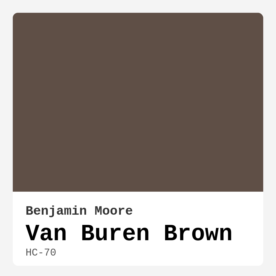
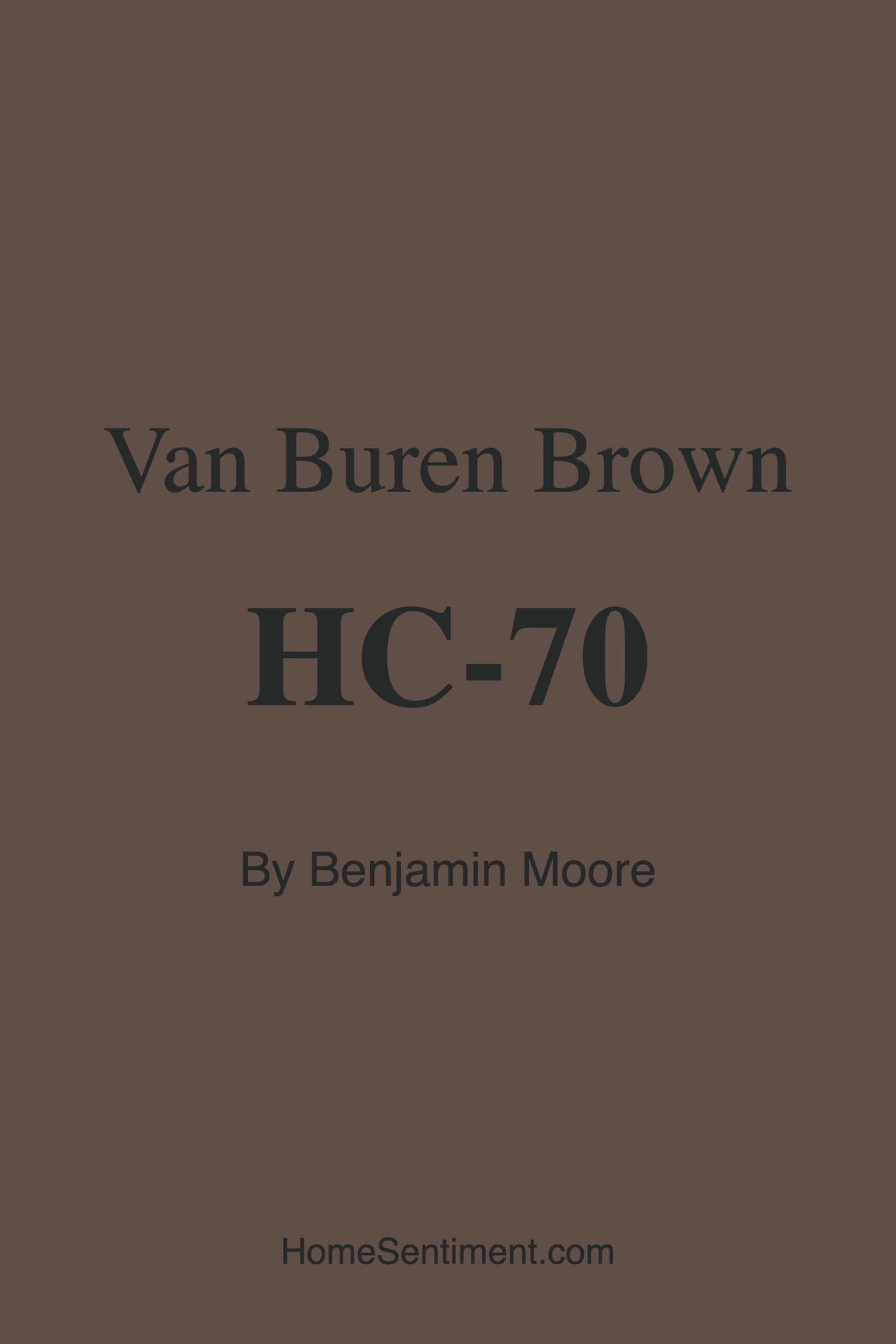
Color Preview & Key Details
| HEX Code | #5F4F46 |
| RGB | 95, 79, 70 |
| LRV | 9.52% |
| Undertone | Red |
| Finish Options | Eggshell, Matte, Satin |
If you’re searching for a paint color that brings warmth, depth, and a touch of sophistication to your home, let’s talk about Benjamin Moore’s Van Buren Brown (HC-70). This rich, earthy hue is more than just a beige—it’s a statement. With its dark, warm undertones and a red hue that adds complexity, it’s the kind of color that transforms a room from ordinary to inviting. Whether you’re designing a cozy living room, a serene bedroom, or a stylish home office, Van Buren Brown has the versatility to fit seamlessly into your vision.
One of the first things you’ll notice about Van Buren Brown is its depth. With a Light Reflectance Value (LRV) of just 9.52%, this color sits firmly in the dark category, meaning it absorbs light rather than reflecting it. That’s not a bad thing—it’s what gives the color its cozy, enveloping feel. In a sunlit room, the warmth of the red undertones shines through, creating a space that feels grounded and elegant. In lower light, it takes on a more muted, intimate quality, perfect for creating a relaxing retreat. Just keep in mind that in smaller or darker rooms, you might want to balance it with lighter accents or trim to keep the space from feeling too closed in.
When it comes to application, Van Buren Brown is a dream to work with. It’s roller-ready, brushes on smoothly, and dries fast, so you won’t be waiting around forever to see the final result. Coverage is solid—you’ll likely need two coats for full richness, but the payoff is worth it. And because it’s low-VOC and ultra low-VOC, you won’t have to worry about harsh fumes lingering in your home. Once it’s up, maintenance is a breeze. The finish options—matte, eggshell, or satin—all hold up well to cleaning, so whether you choose a wipeable eggshell for a kid-friendly space or a luxe matte for a sophisticated vibe, you’re covered.
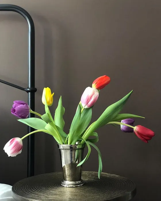
Now, let’s talk about where this color truly shines. Van Buren Brown is a natural fit for living rooms and dining rooms, where its warm, inviting tone sets the stage for gatherings. Picture it on an accent wall behind a sleek leather sofa or enveloping a dining nook with a rustic wood table—it’s a color that plays well with both modern and traditional decor. In bedrooms, it creates a cocoon-like effect, especially when paired with soft textiles and warm lighting. And if you’re designing a home office, it adds just the right amount of gravitas without feeling oppressive.
Pairing Van Buren Brown with the right accents is key to making it sing. For trim, Benjamin Moore’s White Dove is a classic choice that keeps things crisp and balanced. If you’re working with wood trim, especially in warmer tones like oak or walnut, the combination feels effortlessly elegant. Metal finishes? Brass or gold fixtures add a touch of luxury, while black hardware keeps it modern. And if you want to play up the red undertones, deep greens (its complementary hue) make for a stunning contrast—think emerald throw pillows or a forest-green velvet armchair.
Of course, no color is perfect for every situation. Van Buren Brown’s depth means it can make small spaces feel cozier, which might be a pro or a con depending on your goal. If you’re worried about it feeling too heavy, try using it on a single accent wall or even on furniture—a Van Buren Brown bookshelf or sideboard can add warmth without overwhelming. And while it’s versatile, it’s worth testing a sample in your space to see how the undertones interact with your lighting and existing decor. Colors can shift dramatically from swatch to wall, and Van Buren Brown is no exception.
So, is Van Buren Brown right for your project? If you’re after a color that’s warm, sophisticated, and full of character, the answer is probably yes. It’s a designer favorite for a reason—it works in modern farmhouse settings, industrial lofts, and traditional homes alike. It creates a mood that’s cozy, inviting, and grounding, making it ideal for spaces where you want to feel at ease. Whether you’re painting an entire room or just adding a few strategic touches, Van Buren Brown is a color that delivers.
At the end of the day, the best way to know if a color is right for you is to see it in your space. Grab a sample, paint a small section, and live with it for a few days. Notice how it changes with the light, how it plays with your furniture, how it makes you feel. Because the perfect color isn’t just about trends or rules—it’s about how it makes your home feel like yours. And if Van Buren Brown speaks to you, it might just be the perfect shade to bring your vision to life.
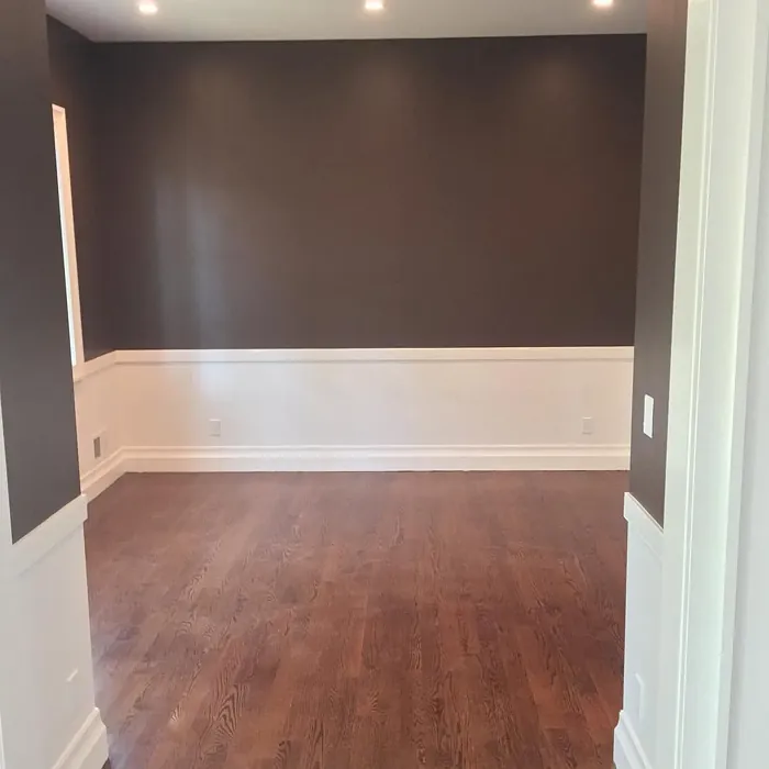
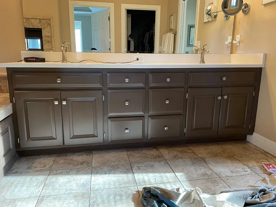
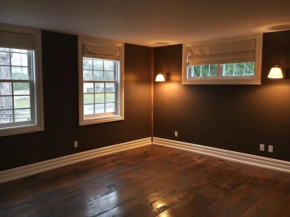
Real Room Photo of Van Buren Brown HC-70
Undertones of Van Buren Brown ?
The undertones of Van Buren Brown are a key aspect of its character, leaning towards Red. These subtle underlying hues are what give the color its depth and complexity. For example, a gray with a blue undertone will feel cooler and more modern, while one with a brown undertone will feel warmer and more traditional. It’s essential to test this paint in your home and observe it next to your existing furniture, flooring, and decor to see how these undertones interact and reveal themselves throughout the day.
HEX value: #5F4F46
RGB code: 95, 79, 70
Is Van Buren Brown Cool or Warm?
Van Buren Brown leans towards the warm side of the spectrum, providing a sense of comfort and coziness. Its warm undertones make it particularly effective in creating inviting spaces, perfect for relaxation and social gatherings.
Understanding Color Properties and Interior Design Tips
Hue refers to a specific position on the color wheel, measured in degrees from 0 to 360. Each degree represents a different pure color:
- 0° represents red
- 120° represents green
- 240° represents blue
Saturation describes the intensity or purity of a color and is expressed as a percentage:
- At 0%, the color appears completely desaturated—essentially a shade of gray
- At 100%, the color is at its most vivid and vibrant
Lightness indicates how light or dark a color is, also expressed as a percentage:
- 0% lightness results in black
- 100% lightness results in white
Using Warm Colors in Interior Design
Warm hues—such as reds, oranges, yellows, warm beiges, and greiges—are excellent choices for creating inviting and energetic spaces. These colors are particularly well-suited for:
- Kitchens, living rooms, and bathrooms, where warmth enhances comfort and sociability
- Large rooms, where warm tones can help reduce the sense of emptiness and make the space feel more intimate
For example:
- Warm beige shades provide a cozy, inviting atmosphere, ideal for living rooms, bedrooms, and hallways.
- Warm greige (a mix of beige and gray) offers the warmth of beige with the modern appeal of gray, making it a versatile backdrop for dining areas, bedrooms, and living spaces.
However, be mindful when using warm light tones in rooms with limited natural light. These shades may appear muted or even take on an unpleasant yellowish tint. To avoid a dull or flat appearance:
- Add depth by incorporating richer tones like deep greens, charcoal, or chocolate brown
- Use textured elements such as curtains, rugs, or cushions to bring dimension to the space
Pro Tip: Achieving Harmony with Warm and Cool Color Balance
To create a well-balanced and visually interesting interior, mix warm and cool tones strategically. This contrast adds depth and harmony to your design.
- If your walls feature warm hues, introduce cool-colored accents such as blue or green furniture, artwork, or accessories to create contrast.
- For a polished look, consider using a complementary color scheme, which pairs colors opposite each other on the color wheel (e.g., red with green, orange with blue).
This thoughtful mix not only enhances visual appeal but also creates a space that feels both dynamic and cohesive.
Light Temperature Affects on Van Buren Brown
Natural Light
Natural daylight changes in color temperature as the sun moves across the sky. At sunrise and sunset, the light tends to have a warm, golden tone with a color temperature around 2000 Kelvin (K). As the day progresses and the sun rises higher, the light becomes cooler and more neutral. Around midday, especially when the sky is clear, natural light typically reaches its peak brightness and shifts to a cooler tone, ranging from 5500 to 6500 Kelvin. This midday light is close to what we perceive as pure white or daylight-balanced light.
These shifts in natural light can significantly influence how colors appear in a space, which is why designers often consider both the time of day and the orientation of windows when planning interior color schemes.
Artificial Light
When choosing artificial lighting, pay close attention to the color temperature, measured in Kelvin (K). This determines how warm or cool the light will appear. Lower temperatures, around 2700K, give off a warm, yellow glow often used in living rooms or bedrooms. Higher temperatures, above 5000K, create a cool, bluish light similar to daylight, commonly used in kitchens, offices, or task areas.
Use the slider to see how lighting temperature can affect the appearance of a surface or color throughout a space.


4800K
LRV of Van Buren Brown
The Light Reflectance Value (LRV) of Van Buren Brown is 9.52%, which places it in the Dark colors category. This means it does not reflect light. Understanding a paint’s LRV is crucial for predicting how it will look in your space. A higher LRV indicates a lighter color that reflects more light, making rooms feel larger and brighter. A lower LRV signifies a darker color that absorbs more light, creating a cozier, more intimate atmosphere. Always consider the natural and artificial lighting in your room when selecting a paint color based on its LRV.
Detailed Review of Van Buren Brown
Additional Paint Characteristics
Ideal Rooms
Bedroom, Dining Room, Hallway, Home Office, Living Room
Decor Styles
Industrial, Modern, Rustic, Traditional
Coverage
Good (1–2 Coats), Touch-Up Friendly
Ease of Application
Brush Smooth, Fast-Drying, Roller-Ready
Washability
Scrubbable, Washable, Wipeable
VOC Level
Low VOC, Ultra Low VOC
Best Use
Accent Wall, Furniture, Interior Walls
Room Suitability
Bedroom, Dining Room, Home Office, Living Room
Tone Tag
Deep, Earthy, Warm
Finish Type
Eggshell, Matte, Satin
Paint Performance
High Coverage, Low Odor, Scuff Resistant
Use Cases
Best for Cozy Spaces, Best for Modern Farmhouse, Designer Favorite
Mood
Cozy, Grounding, Inviting
Trim Pairing
Complements Brass Fixtures, Good with Wood Trim, Pairs with White Dove
Van Buren Brown is a standout choice if you’re looking to add a touch of sophistication to your home. Its warm, earthy tone works wonders in both modern and traditional settings, effortlessly complementing a variety of decor styles. The color shines particularly well in spaces with natural light, enhancing its rich depth and character. When applied, it provides a smooth finish, making it suitable for both walls and furniture. While it may require a second coat for full coverage, the results are well worth it. This color not only stands out but also creates a cozy atmosphere, making it ideal for gathering spaces like living rooms and dining areas. Whether you’re revamping a room or looking for an accent color, Van Buren Brown is versatile enough to fit your needs.
Pros & Cons of HC-70 Van Buren Brown
Pros
Cons
Colors that go with Benjamin Moore Van Buren Brown
FAQ on HC-70 Van Buren Brown
Can Van Buren Brown be used in small rooms?
Yes, Van Buren Brown can be used in small rooms, but it’s essential to consider the amount of natural light the space receives. In well-lit areas, this color can create an inviting ambiance. However, in smaller or darker spaces, it may make the area feel a bit more confined. To counter this, consider pairing it with lighter accents or decor to brighten the room.
What finishes work best with Van Buren Brown?
Van Buren Brown looks great in various finishes, but for a more sophisticated look, consider using a satin or eggshell finish. These finishes provide a subtle sheen that enhances the color’s richness while still being easy to clean. For a more dramatic effect, a matte finish can create a cozy, enveloping feel, especially in living areas or bedrooms.
Comparisons Van Buren Brown with other colors
Van Buren Brown HC-70 vs Griffin SW 7026
| Attribute | Van Buren Brown HC-70 | Griffin SW 7026 |
|---|---|---|
| Color Name | Van Buren Brown HC-70 | Griffin SW 7026 |
| Color | ||
| Hue | Beige | Beige |
| Brightness | Dark | Dark |
| RGB | 95, 79, 70 | 111, 100, 89 |
| LRV | 9.52% | 24% |
| Finish Type | Eggshell, Matte, Satin | Eggshell, Matte |
| Finish Options | Eggshell, Matte, Satin | Eggshell, Matte, Satin |
| Ideal Rooms | Bedroom, Dining Room, Hallway, Home Office, Living Room | Bathroom, Bedroom, Dining Room, Home Office, Living Room |
| Decor Styles | Industrial, Modern, Rustic, Traditional | Contemporary, Modern, Rustic, Transitional |
| Coverage | Good (1–2 Coats), Touch-Up Friendly | Good (1–2 Coats), Touch-Up Friendly |
| Ease of Application | Brush Smooth, Fast-Drying, Roller-Ready | Beginner Friendly, Brush Smooth, Roller-Ready |
| Washability | Scrubbable, Washable, Wipeable | Washable, Wipeable |
| Room Suitability | Bedroom, Dining Room, Home Office, Living Room | Bedroom, Dining Room, Home Office, Living Room |
| Tone | Deep, Earthy, Warm | Earthy, Muted, Warm |
| Paint Performance | High Coverage, Low Odor, Scuff Resistant | Easy Touch-Up, Fade Resistant, Low Odor |
Van Buren Brown HC-70 vs Warm Stone SW 7032
| Attribute | Van Buren Brown HC-70 | Warm Stone SW 7032 |
|---|---|---|
| Color Name | Van Buren Brown HC-70 | Warm Stone SW 7032 |
| Color | ||
| Hue | Beige | Beige |
| Brightness | Dark | Dark |
| RGB | 95, 79, 70 | 136, 123, 108 |
| LRV | 9.52% | 58% |
| Finish Type | Eggshell, Matte, Satin | Eggshell, Matte, Satin |
| Finish Options | Eggshell, Matte, Satin | Eggshell, Matte, Satin |
| Ideal Rooms | Bedroom, Dining Room, Hallway, Home Office, Living Room | Bedroom, Dining Room, Home Office, Kitchen, Living Room |
| Decor Styles | Industrial, Modern, Rustic, Traditional | Contemporary, Modern Farmhouse, Rustic, Transitional |
| Coverage | Good (1–2 Coats), Touch-Up Friendly | Good (1–2 Coats), Touch-Up Friendly |
| Ease of Application | Brush Smooth, Fast-Drying, Roller-Ready | Beginner Friendly, Brush Smooth, Roller-Ready |
| Washability | Scrubbable, Washable, Wipeable | Washable, Wipeable |
| Room Suitability | Bedroom, Dining Room, Home Office, Living Room | Bedroom, Dining Room, Home Office, Living Room |
| Tone | Deep, Earthy, Warm | Earthy, Muted, Warm |
| Paint Performance | High Coverage, Low Odor, Scuff Resistant | Easy Touch-Up, High Coverage, Low Odor, Quick Drying, Scuff Resistant |
Van Buren Brown HC-70 vs Black Fox SW 7020
| Attribute | Van Buren Brown HC-70 | Black Fox SW 7020 |
|---|---|---|
| Color Name | Van Buren Brown HC-70 | Black Fox SW 7020 |
| Color | ||
| Hue | Beige | Beige |
| Brightness | Dark | Dark |
| RGB | 95, 79, 70 | 79, 72, 66 |
| LRV | 9.52% | 5% |
| Finish Type | Eggshell, Matte, Satin | Eggshell, Matte, Satin |
| Finish Options | Eggshell, Matte, Satin | Eggshell, Matte, Satin |
| Ideal Rooms | Bedroom, Dining Room, Hallway, Home Office, Living Room | Bedroom, Dining Room, Hallway, Home Office, Living Room |
| Decor Styles | Industrial, Modern, Rustic, Traditional | Bohemian, Industrial, Modern, Rustic, Transitional |
| Coverage | Good (1–2 Coats), Touch-Up Friendly | Good (1–2 Coats), Touch-Up Friendly |
| Ease of Application | Brush Smooth, Fast-Drying, Roller-Ready | Brush Smooth, Fast-Drying, Roller-Ready |
| Washability | Scrubbable, Washable, Wipeable | Washable, Wipeable |
| Room Suitability | Bedroom, Dining Room, Home Office, Living Room | Bedroom, Dining Room, Hallway, Home Office, Living Room |
| Tone | Deep, Earthy, Warm | Deep, Earthy, Warm |
| Paint Performance | High Coverage, Low Odor, Scuff Resistant | Easy Touch-Up, High Coverage, Low Odor |
Van Buren Brown HC-70 vs Anonymous SW 7046
| Attribute | Van Buren Brown HC-70 | Anonymous SW 7046 |
|---|---|---|
| Color Name | Van Buren Brown HC-70 | Anonymous SW 7046 |
| Color | ||
| Hue | Beige | Beige |
| Brightness | Dark | Dark |
| RGB | 95, 79, 70 | 129, 122, 110 |
| LRV | 9.52% | 22% |
| Finish Type | Eggshell, Matte, Satin | Eggshell, Matte, Satin |
| Finish Options | Eggshell, Matte, Satin | Eggshell, Matte, Satin |
| Ideal Rooms | Bedroom, Dining Room, Hallway, Home Office, Living Room | Bathroom, Bedroom, Dining Room, Home Office, Living Room |
| Decor Styles | Industrial, Modern, Rustic, Traditional | Industrial, Modern, Rustic, Transitional |
| Coverage | Good (1–2 Coats), Touch-Up Friendly | Good (1–2 Coats), Touch-Up Friendly |
| Ease of Application | Brush Smooth, Fast-Drying, Roller-Ready | Beginner Friendly, Brush Smooth, Roller-Ready |
| Washability | Scrubbable, Washable, Wipeable | Highly Washable, Washable |
| Room Suitability | Bedroom, Dining Room, Home Office, Living Room | Bedroom, Dining Room, Home Office, Living Room |
| Tone | Deep, Earthy, Warm | Balanced, Earthy, Muted |
| Paint Performance | High Coverage, Low Odor, Scuff Resistant | Easy Touch-Up, Low Odor, Quick Drying |
Van Buren Brown HC-70 vs Porpoise SW 7047
| Attribute | Van Buren Brown HC-70 | Porpoise SW 7047 |
|---|---|---|
| Color Name | Van Buren Brown HC-70 | Porpoise SW 7047 |
| Color | ||
| Hue | Beige | Beige |
| Brightness | Dark | Dark |
| RGB | 95, 79, 70 | 107, 100, 91 |
| LRV | 9.52% | 30% |
| Finish Type | Eggshell, Matte, Satin | Eggshell, Satin |
| Finish Options | Eggshell, Matte, Satin | Eggshell, Satin, Semi-Gloss |
| Ideal Rooms | Bedroom, Dining Room, Hallway, Home Office, Living Room | Bedroom, Dining Room, Hallway, Home Office, Living Room |
| Decor Styles | Industrial, Modern, Rustic, Traditional | Industrial, Modern, Scandinavian, Transitional |
| Coverage | Good (1–2 Coats), Touch-Up Friendly | Good (1–2 Coats) |
| Ease of Application | Brush Smooth, Fast-Drying, Roller-Ready | Beginner Friendly, Brush Smooth, Fast-Drying, Roller-Ready |
| Washability | Scrubbable, Washable, Wipeable | Highly Washable, Washable |
| Room Suitability | Bedroom, Dining Room, Home Office, Living Room | Bedroom, Dining Room, Home Office, Living Room |
| Tone | Deep, Earthy, Warm | Earthy, Muted, Warm |
| Paint Performance | High Coverage, Low Odor, Scuff Resistant | Easy Touch-Up, Fade Resistant, High Coverage, Low Odor |
Van Buren Brown HC-70 vs Virtual Taupe SW 7039
| Attribute | Van Buren Brown HC-70 | Virtual Taupe SW 7039 |
|---|---|---|
| Color Name | Van Buren Brown HC-70 | Virtual Taupe SW 7039 |
| Color | ||
| Hue | Beige | Beige |
| Brightness | Dark | Dark |
| RGB | 95, 79, 70 | 138, 122, 106 |
| LRV | 9.52% | 24% |
| Finish Type | Eggshell, Matte, Satin | Eggshell, Satin |
| Finish Options | Eggshell, Matte, Satin | Eggshell, Flat, Matte, Satin, Semi-Gloss |
| Ideal Rooms | Bedroom, Dining Room, Hallway, Home Office, Living Room | Bedroom, Dining Room, Home Office, Living Room |
| Decor Styles | Industrial, Modern, Rustic, Traditional | Contemporary, Modern Farmhouse, Scandinavian, Transitional |
| Coverage | Good (1–2 Coats), Touch-Up Friendly | Good (1–2 Coats), Touch-Up Friendly |
| Ease of Application | Brush Smooth, Fast-Drying, Roller-Ready | Brush Smooth, Fast-Drying, Roller-Ready |
| Washability | Scrubbable, Washable, Wipeable | Scrubbable, Washable |
| Room Suitability | Bedroom, Dining Room, Home Office, Living Room | Bedroom, Dining Room, Home Office, Living Room |
| Tone | Deep, Earthy, Warm | Earthy, Muted, Warm |
| Paint Performance | High Coverage, Low Odor, Scuff Resistant | Easy Touch-Up, High Coverage, Low Odor |
Van Buren Brown HC-70 vs Polished Mahogany SW 2838
| Attribute | Van Buren Brown HC-70 | Polished Mahogany SW 2838 |
|---|---|---|
| Color Name | Van Buren Brown HC-70 | Polished Mahogany SW 2838 |
| Color | ||
| Hue | Beige | Beige |
| Brightness | Dark | Dark |
| RGB | 95, 79, 70 | 67, 39, 34 |
| LRV | 9.52% | 6% |
| Finish Type | Eggshell, Matte, Satin | Matte, Satin |
| Finish Options | Eggshell, Matte, Satin | Eggshell, Matte, Satin |
| Ideal Rooms | Bedroom, Dining Room, Hallway, Home Office, Living Room | Bedroom, Dining Room, Home Office, Living Room |
| Decor Styles | Industrial, Modern, Rustic, Traditional | Bohemian, Contemporary, Industrial, Rustic, Traditional |
| Coverage | Good (1–2 Coats), Touch-Up Friendly | Good (1–2 Coats) |
| Ease of Application | Brush Smooth, Fast-Drying, Roller-Ready | Beginner Friendly, Brush Smooth, Fast-Drying, Roller-Ready |
| Washability | Scrubbable, Washable, Wipeable | Washable, Wipeable |
| Room Suitability | Bedroom, Dining Room, Home Office, Living Room | Bedroom, Dining Room, Hallway, Home Office, Living Room |
| Tone | Deep, Earthy, Warm | Deep, Earthy, Warm |
| Paint Performance | High Coverage, Low Odor, Scuff Resistant | High Coverage, Low Odor, Stain Resistant |
Van Buren Brown HC-70 vs Sealskin SW 7675
| Attribute | Van Buren Brown HC-70 | Sealskin SW 7675 |
|---|---|---|
| Color Name | Van Buren Brown HC-70 | Sealskin SW 7675 |
| Color | ||
| Hue | Beige | Beige |
| Brightness | Dark | Dark |
| RGB | 95, 79, 70 | 72, 66, 60 |
| LRV | 9.52% | 4% |
| Finish Type | Eggshell, Matte, Satin | Eggshell, Matte, Satin |
| Finish Options | Eggshell, Matte, Satin | Eggshell, Matte, Satin |
| Ideal Rooms | Bedroom, Dining Room, Hallway, Home Office, Living Room | Bedroom, Dining Room, Home Office, Living Room |
| Decor Styles | Industrial, Modern, Rustic, Traditional | Bohemian, Contemporary, Industrial, Modern, Rustic |
| Coverage | Good (1–2 Coats), Touch-Up Friendly | Good (1–2 Coats), Touch-Up Friendly |
| Ease of Application | Brush Smooth, Fast-Drying, Roller-Ready | Beginner Friendly, Brush Smooth, Roller-Ready |
| Washability | Scrubbable, Washable, Wipeable | Washable, Wipeable |
| Room Suitability | Bedroom, Dining Room, Home Office, Living Room | Bedroom, Dining Room, Home Office, Living Room |
| Tone | Deep, Earthy, Warm | Deep, Earthy, Warm |
| Paint Performance | High Coverage, Low Odor, Scuff Resistant | Easy Touch-Up, Fade Resistant, High Coverage, Low Odor |
Van Buren Brown HC-70 vs Muddled Basil SW 7745
| Attribute | Van Buren Brown HC-70 | Muddled Basil SW 7745 |
|---|---|---|
| Color Name | Van Buren Brown HC-70 | Muddled Basil SW 7745 |
| Color | ||
| Hue | Beige | Beige |
| Brightness | Dark | Dark |
| RGB | 95, 79, 70 | 90, 82, 67 |
| LRV | 9.52% | 12% |
| Finish Type | Eggshell, Matte, Satin | Eggshell, Matte |
| Finish Options | Eggshell, Matte, Satin | Eggshell, Matte, Satin |
| Ideal Rooms | Bedroom, Dining Room, Hallway, Home Office, Living Room | Bedroom, Dining Room, Home Office, Living Room |
| Decor Styles | Industrial, Modern, Rustic, Traditional | Bohemian, Contemporary, Industrial, Modern Farmhouse, Rustic |
| Coverage | Good (1–2 Coats), Touch-Up Friendly | Good (1–2 Coats) |
| Ease of Application | Brush Smooth, Fast-Drying, Roller-Ready | Beginner Friendly, Brush Smooth, Fast-Drying, Roller-Ready |
| Washability | Scrubbable, Washable, Wipeable | Washable, Wipeable |
| Room Suitability | Bedroom, Dining Room, Home Office, Living Room | Bedroom, Dining Room, Home Office, Living Room |
| Tone | Deep, Earthy, Warm | Earthy, Muted, Warm |
| Paint Performance | High Coverage, Low Odor, Scuff Resistant | High Coverage, Low Odor, Quick Drying, Scuff Resistant |
Van Buren Brown HC-70 vs Backdrop SW 7025
| Attribute | Van Buren Brown HC-70 | Backdrop SW 7025 |
|---|---|---|
| Color Name | Van Buren Brown HC-70 | Backdrop SW 7025 |
| Color | ||
| Hue | Beige | Beige |
| Brightness | Dark | Dark |
| RGB | 95, 79, 70 | 134, 122, 111 |
| LRV | 9.52% | 48% |
| Finish Type | Eggshell, Matte, Satin | Eggshell, Matte, Satin |
| Finish Options | Eggshell, Matte, Satin | Eggshell, Matte, Satin |
| Ideal Rooms | Bedroom, Dining Room, Hallway, Home Office, Living Room | Bedroom, Dining Room, Home Office, Living Room |
| Decor Styles | Industrial, Modern, Rustic, Traditional | Bohemian, Modern Farmhouse, Scandinavian, Transitional |
| Coverage | Good (1–2 Coats), Touch-Up Friendly | Good (1–2 Coats), Touch-Up Friendly |
| Ease of Application | Brush Smooth, Fast-Drying, Roller-Ready | Beginner Friendly, Brush Smooth, Fast-Drying, Roller-Ready |
| Washability | Scrubbable, Washable, Wipeable | Scrubbable, Washable |
| Room Suitability | Bedroom, Dining Room, Home Office, Living Room | Bedroom, Dining Room, Home Office, Living Room |
| Tone | Deep, Earthy, Warm | Earthy, Muted, Warm |
| Paint Performance | High Coverage, Low Odor, Scuff Resistant | Easy Touch-Up, High Coverage, Low Odor, Stain Resistant |
Official Page of Benjamin Moore Van Buren Brown HC-70