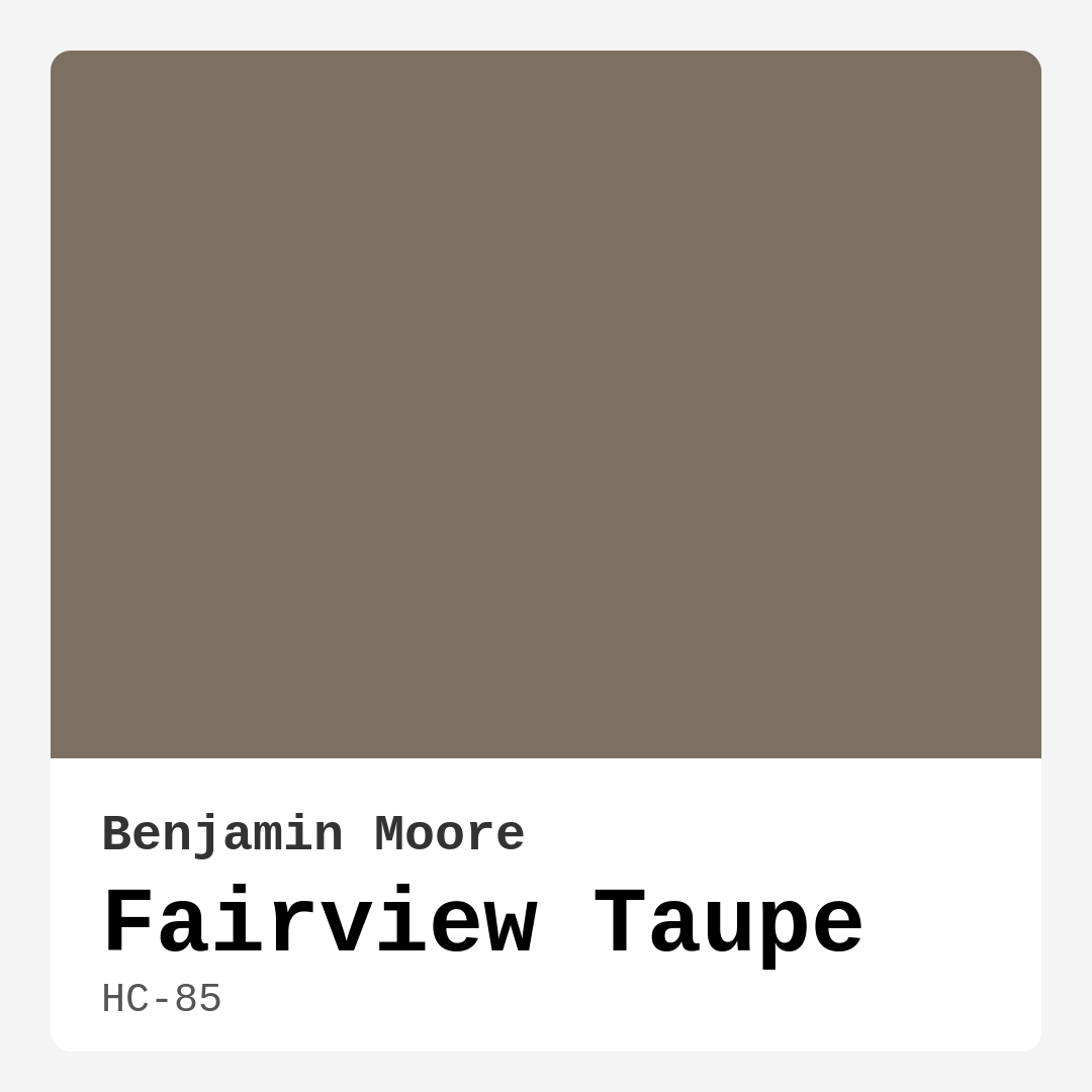
Color Preview & Key Details
| HEX Code | #7C7161 |
| RGB | 124, 113, 97 |
| LRV | 17.98% |
| Undertone | Red |
| Finish Options | Eggshell, Matte, Satin |
If you’re searching for a paint color that effortlessly balances warmth and sophistication, Benjamin Moore’s Fairview Taupe (HC-85) deserves your attention. This rich, earthy shade is a masterful blend of gray and brown with subtle red undertones, making it a versatile choice for nearly any room in your home. Whether you’re aiming for a cozy bedroom retreat, an inviting living room, or a refined home office, this color has the depth and character to elevate your space without overwhelming it.
Fairview Taupe is part of Benjamin Moore’s Historical Collection, which means it’s been carefully curated for its timeless appeal. With an LRV (Light Reflectance Value) of 17.98%, it sits in the medium-dark range, meaning it absorbs more light than it reflects. This gives it a grounding, intimate quality—perfect for creating a snug atmosphere in larger rooms or adding warmth to smaller spaces. Just keep in mind that in low-light areas, it can appear darker than expected, so testing a swatch in your space is always a smart move.
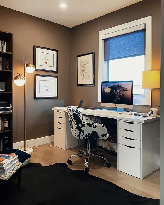
One of the standout qualities of Fairview Taupe is its adaptability. It plays well with a variety of decor styles, from modern farmhouse to transitional and even contemporary. Its warm, muted tone makes it a fantastic backdrop for both light and dark furniture, allowing your decor to shine while still holding its own. Pair it with crisp white trim like Benjamin Moore’s White Dove for a classic, clean look, or let it mingle with natural wood finishes for a rustic, organic feel. Brass fixtures and warm metallics also complement its earthy undertones beautifully, adding a touch of elegance.
When it comes to application, Fairview Taupe is beginner-friendly. It offers excellent coverage, often needing just one or two coats for a flawless finish. The low-VOC, eco-certified formula means you won’t have to worry about harsh fumes, making it a great choice for families or anyone sensitive to strong odors. Plus, its washable and scrubbable finish (available in matte, eggshell, or satin) ensures it holds up well in high-traffic areas like hallways or living rooms.
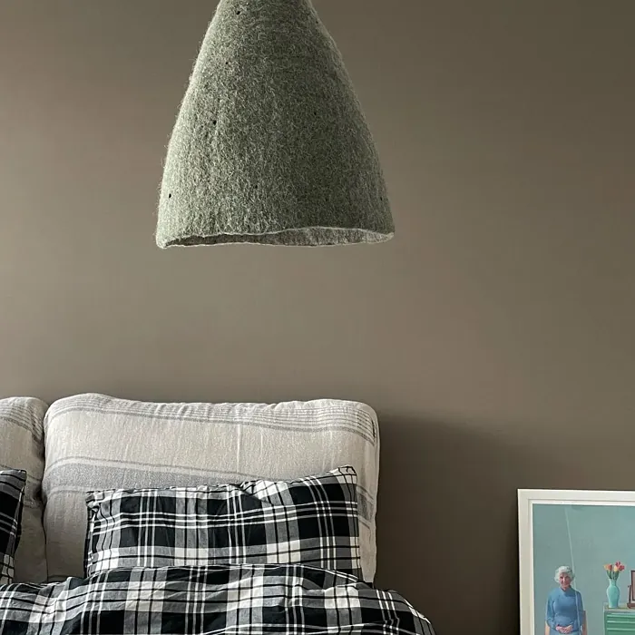
Lighting plays a huge role in how this color presents itself. In natural light, the red undertones come forward, giving it a soft, inviting glow. Under artificial lighting, it deepens slightly, creating a cozy, enveloping effect—ideal for spaces where you want to unwind. If your room gets a lot of bright sunlight, Fairview Taupe might feel a bit heavy, so consider using it in north-facing rooms or spaces where you want to dial down the brightness for a more balanced look.
Wondering how to pair it with other colors? Fairview Taupe’s complementary hue is blue, which means shades like Benjamin Moore’s Hale Navy or Palladian Blue can create a striking contrast. For a more harmonious palette, try layering it with lighter taupes, warm whites, or even deep greens. If you’re feeling bold, an accent wall in a darker shade like Benjamin Moore’s Chelsea Gray can add drama while keeping the overall vibe cohesive.
Small spaces can absolutely handle this color. Its warmth makes cramped rooms feel inviting rather than closed-in, especially when paired with ample lighting and lighter furnishings. Just avoid using it in already dim areas unless you’re going for a moody, cocoon-like effect. And if you’re worried about committing to a full room, start with an accent wall or even a piece of furniture—Fairview Taupe works beautifully on built-ins, cabinets, or even a statement bookshelf.
At its core, Fairview Taupe is more than just a paint color—it’s a mood. It brings a sense of calm, grounding, and understated elegance to any space. Whether you’re refreshing a rental or designing your forever home, this shade has the versatility and timeless appeal to stand the test of trends. So grab a sample, paint a test patch, and see how it transforms your space. You might just find it’s the perfect backdrop for the home you’ve always envisioned.
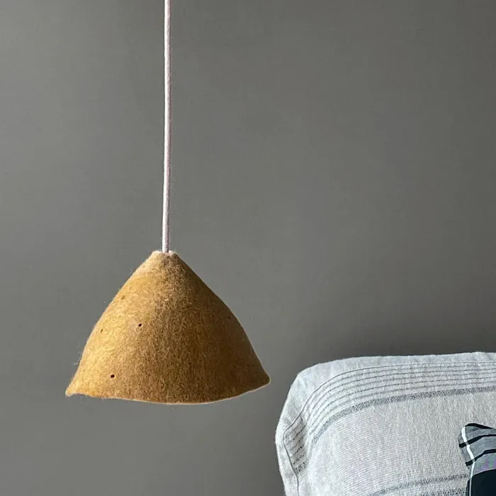
Real Room Photo of Fairview Taupe HC-85
Undertones of Fairview Taupe ?
The undertones of Fairview Taupe are a key aspect of its character, leaning towards Red. These subtle underlying hues are what give the color its depth and complexity. For example, a gray with a blue undertone will feel cooler and more modern, while one with a brown undertone will feel warmer and more traditional. It’s essential to test this paint in your home and observe it next to your existing furniture, flooring, and decor to see how these undertones interact and reveal themselves throughout the day.
HEX value: #7C7161
RGB code: 124, 113, 97
Is Fairview Taupe Cool or Warm?
Fairview Taupe is predominantly warm, radiating a cozy vibe that invites relaxation. Its balance of gray tones ensures it remains neutral enough to suit various decor styles, making it a go-to for those who appreciate a warm yet understated elegance.
Understanding Color Properties and Interior Design Tips
Hue refers to a specific position on the color wheel, measured in degrees from 0 to 360. Each degree represents a different pure color:
- 0° represents red
- 120° represents green
- 240° represents blue
Saturation describes the intensity or purity of a color and is expressed as a percentage:
- At 0%, the color appears completely desaturated—essentially a shade of gray
- At 100%, the color is at its most vivid and vibrant
Lightness indicates how light or dark a color is, also expressed as a percentage:
- 0% lightness results in black
- 100% lightness results in white
Using Warm Colors in Interior Design
Warm hues—such as reds, oranges, yellows, warm beiges, and greiges—are excellent choices for creating inviting and energetic spaces. These colors are particularly well-suited for:
- Kitchens, living rooms, and bathrooms, where warmth enhances comfort and sociability
- Large rooms, where warm tones can help reduce the sense of emptiness and make the space feel more intimate
For example:
- Warm beige shades provide a cozy, inviting atmosphere, ideal for living rooms, bedrooms, and hallways.
- Warm greige (a mix of beige and gray) offers the warmth of beige with the modern appeal of gray, making it a versatile backdrop for dining areas, bedrooms, and living spaces.
However, be mindful when using warm light tones in rooms with limited natural light. These shades may appear muted or even take on an unpleasant yellowish tint. To avoid a dull or flat appearance:
- Add depth by incorporating richer tones like deep greens, charcoal, or chocolate brown
- Use textured elements such as curtains, rugs, or cushions to bring dimension to the space
Pro Tip: Achieving Harmony with Warm and Cool Color Balance
To create a well-balanced and visually interesting interior, mix warm and cool tones strategically. This contrast adds depth and harmony to your design.
- If your walls feature warm hues, introduce cool-colored accents such as blue or green furniture, artwork, or accessories to create contrast.
- For a polished look, consider using a complementary color scheme, which pairs colors opposite each other on the color wheel (e.g., red with green, orange with blue).
This thoughtful mix not only enhances visual appeal but also creates a space that feels both dynamic and cohesive.
Light Temperature Affects on Fairview Taupe
Natural Light
Natural daylight changes in color temperature as the sun moves across the sky. At sunrise and sunset, the light tends to have a warm, golden tone with a color temperature around 2000 Kelvin (K). As the day progresses and the sun rises higher, the light becomes cooler and more neutral. Around midday, especially when the sky is clear, natural light typically reaches its peak brightness and shifts to a cooler tone, ranging from 5500 to 6500 Kelvin. This midday light is close to what we perceive as pure white or daylight-balanced light.
These shifts in natural light can significantly influence how colors appear in a space, which is why designers often consider both the time of day and the orientation of windows when planning interior color schemes.
Artificial Light
When choosing artificial lighting, pay close attention to the color temperature, measured in Kelvin (K). This determines how warm or cool the light will appear. Lower temperatures, around 2700K, give off a warm, yellow glow often used in living rooms or bedrooms. Higher temperatures, above 5000K, create a cool, bluish light similar to daylight, commonly used in kitchens, offices, or task areas.
Use the slider to see how lighting temperature can affect the appearance of a surface or color throughout a space.


4800K
LRV of Fairview Taupe
The Light Reflectance Value (LRV) of Fairview Taupe is 17.98%, which places it in the Medium Dark category. This means it reflects very little light. Understanding a paint’s LRV is crucial for predicting how it will look in your space. A higher LRV indicates a lighter color that reflects more light, making rooms feel larger and brighter. A lower LRV signifies a darker color that absorbs more light, creating a cozier, more intimate atmosphere. Always consider the natural and artificial lighting in your room when selecting a paint color based on its LRV.
Detailed Review of Fairview Taupe
Additional Paint Characteristics
Ideal Rooms
Bedroom, Dining Room, Hallway, Home Office, Living Room
Decor Styles
Contemporary, Modern Farmhouse, Rustic, Transitional
Coverage
Good (1–2 Coats)
Ease of Application
Beginner Friendly, Brush Smooth, Roller-Ready
Washability
Scrubbable, Washable
VOC Level
Eco-Certified, Low VOC
Best Use
Accent Wall, Furniture, Interior Walls
Room Suitability
Bedroom, Dining Room, Home Office, Living Room
Tone Tag
Earthy, Muted, Warm
Finish Type
Eggshell, Matte, Satin
Paint Performance
Easy Touch-Up, High Coverage, Low Odor
Use Cases
Best for Open Concept, Best for Rentals, Classic Favorite, Designer Favorite
Mood
Cozy, Grounding, Inviting
Trim Pairing
Complements Brass Fixtures, Good with Wood Trim, Pairs with White Dove
Fairview Taupe is a stunning choice for anyone looking to add a touch of warmth to their home. Its nuanced tones make it incredibly versatile, fitting seamlessly into both traditional and modern decor. When applied, it offers a smooth finish that enhances the room’s natural light, creating an inviting atmosphere. Whether you’re painting an accent wall or a full room, this color has excellent coverage, requiring only one to two coats for a beautiful finish. It pairs wonderfully with both light and dark furniture, making it an excellent choice for various design aesthetics. Overall, Fairview Taupe is not just a color; it’s a statement.
Pros & Cons of HC-85 Fairview Taupe
Pros
Cons
Colors that go with Benjamin Moore Fairview Taupe
FAQ on HC-85 Fairview Taupe
Can Fairview Taupe be used in small spaces?
Absolutely! Fairview Taupe can enhance small spaces by adding warmth without overwhelming the room. Its moderate LRV helps maintain an open feel, making it ideal for cozy areas like a small bedroom or an intimate dining nook. Just be mindful of lighting to ensure the color appears as intended.
What trim colors work best with Fairview Taupe?
Fairview Taupe pairs beautifully with a variety of trim colors. For a classic look, consider pairing it with crisp white trims like White Dove or Simply White. If you’re aiming for a more rustic feel, warm wood tones can complement this taupe wonderfully, enhancing its earthy qualities.
Comparisons Fairview Taupe with other colors
Fairview Taupe HC-85 vs Griffin SW 7026
| Attribute | Fairview Taupe HC-85 | Griffin SW 7026 |
|---|---|---|
| Color Name | Fairview Taupe HC-85 | Griffin SW 7026 |
| Color | ||
| Hue | Beige | Beige |
| Brightness | Dark | Dark |
| RGB | 124, 113, 97 | 111, 100, 89 |
| LRV | 17.98% | 24% |
| Finish Type | Eggshell, Matte, Satin | Eggshell, Matte |
| Finish Options | Eggshell, Matte, Satin | Eggshell, Matte, Satin |
| Ideal Rooms | Bedroom, Dining Room, Hallway, Home Office, Living Room | Bathroom, Bedroom, Dining Room, Home Office, Living Room |
| Decor Styles | Contemporary, Modern Farmhouse, Rustic, Transitional | Contemporary, Modern, Rustic, Transitional |
| Coverage | Good (1–2 Coats) | Good (1–2 Coats), Touch-Up Friendly |
| Ease of Application | Beginner Friendly, Brush Smooth, Roller-Ready | Beginner Friendly, Brush Smooth, Roller-Ready |
| Washability | Scrubbable, Washable | Washable, Wipeable |
| Room Suitability | Bedroom, Dining Room, Home Office, Living Room | Bedroom, Dining Room, Home Office, Living Room |
| Tone | Earthy, Muted, Warm | Earthy, Muted, Warm |
| Paint Performance | Easy Touch-Up, High Coverage, Low Odor | Easy Touch-Up, Fade Resistant, Low Odor |
Fairview Taupe HC-85 vs Warm Stone SW 7032
| Attribute | Fairview Taupe HC-85 | Warm Stone SW 7032 |
|---|---|---|
| Color Name | Fairview Taupe HC-85 | Warm Stone SW 7032 |
| Color | ||
| Hue | Beige | Beige |
| Brightness | Dark | Dark |
| RGB | 124, 113, 97 | 136, 123, 108 |
| LRV | 17.98% | 58% |
| Finish Type | Eggshell, Matte, Satin | Eggshell, Matte, Satin |
| Finish Options | Eggshell, Matte, Satin | Eggshell, Matte, Satin |
| Ideal Rooms | Bedroom, Dining Room, Hallway, Home Office, Living Room | Bedroom, Dining Room, Home Office, Kitchen, Living Room |
| Decor Styles | Contemporary, Modern Farmhouse, Rustic, Transitional | Contemporary, Modern Farmhouse, Rustic, Transitional |
| Coverage | Good (1–2 Coats) | Good (1–2 Coats), Touch-Up Friendly |
| Ease of Application | Beginner Friendly, Brush Smooth, Roller-Ready | Beginner Friendly, Brush Smooth, Roller-Ready |
| Washability | Scrubbable, Washable | Washable, Wipeable |
| Room Suitability | Bedroom, Dining Room, Home Office, Living Room | Bedroom, Dining Room, Home Office, Living Room |
| Tone | Earthy, Muted, Warm | Earthy, Muted, Warm |
| Paint Performance | Easy Touch-Up, High Coverage, Low Odor | Easy Touch-Up, High Coverage, Low Odor, Quick Drying, Scuff Resistant |
Fairview Taupe HC-85 vs Black Fox SW 7020
| Attribute | Fairview Taupe HC-85 | Black Fox SW 7020 |
|---|---|---|
| Color Name | Fairview Taupe HC-85 | Black Fox SW 7020 |
| Color | ||
| Hue | Beige | Beige |
| Brightness | Dark | Dark |
| RGB | 124, 113, 97 | 79, 72, 66 |
| LRV | 17.98% | 5% |
| Finish Type | Eggshell, Matte, Satin | Eggshell, Matte, Satin |
| Finish Options | Eggshell, Matte, Satin | Eggshell, Matte, Satin |
| Ideal Rooms | Bedroom, Dining Room, Hallway, Home Office, Living Room | Bedroom, Dining Room, Hallway, Home Office, Living Room |
| Decor Styles | Contemporary, Modern Farmhouse, Rustic, Transitional | Bohemian, Industrial, Modern, Rustic, Transitional |
| Coverage | Good (1–2 Coats) | Good (1–2 Coats), Touch-Up Friendly |
| Ease of Application | Beginner Friendly, Brush Smooth, Roller-Ready | Brush Smooth, Fast-Drying, Roller-Ready |
| Washability | Scrubbable, Washable | Washable, Wipeable |
| Room Suitability | Bedroom, Dining Room, Home Office, Living Room | Bedroom, Dining Room, Hallway, Home Office, Living Room |
| Tone | Earthy, Muted, Warm | Deep, Earthy, Warm |
| Paint Performance | Easy Touch-Up, High Coverage, Low Odor | Easy Touch-Up, High Coverage, Low Odor |
Fairview Taupe HC-85 vs Anonymous SW 7046
| Attribute | Fairview Taupe HC-85 | Anonymous SW 7046 |
|---|---|---|
| Color Name | Fairview Taupe HC-85 | Anonymous SW 7046 |
| Color | ||
| Hue | Beige | Beige |
| Brightness | Dark | Dark |
| RGB | 124, 113, 97 | 129, 122, 110 |
| LRV | 17.98% | 22% |
| Finish Type | Eggshell, Matte, Satin | Eggshell, Matte, Satin |
| Finish Options | Eggshell, Matte, Satin | Eggshell, Matte, Satin |
| Ideal Rooms | Bedroom, Dining Room, Hallway, Home Office, Living Room | Bathroom, Bedroom, Dining Room, Home Office, Living Room |
| Decor Styles | Contemporary, Modern Farmhouse, Rustic, Transitional | Industrial, Modern, Rustic, Transitional |
| Coverage | Good (1–2 Coats) | Good (1–2 Coats), Touch-Up Friendly |
| Ease of Application | Beginner Friendly, Brush Smooth, Roller-Ready | Beginner Friendly, Brush Smooth, Roller-Ready |
| Washability | Scrubbable, Washable | Highly Washable, Washable |
| Room Suitability | Bedroom, Dining Room, Home Office, Living Room | Bedroom, Dining Room, Home Office, Living Room |
| Tone | Earthy, Muted, Warm | Balanced, Earthy, Muted |
| Paint Performance | Easy Touch-Up, High Coverage, Low Odor | Easy Touch-Up, Low Odor, Quick Drying |
Fairview Taupe HC-85 vs Porpoise SW 7047
| Attribute | Fairview Taupe HC-85 | Porpoise SW 7047 |
|---|---|---|
| Color Name | Fairview Taupe HC-85 | Porpoise SW 7047 |
| Color | ||
| Hue | Beige | Beige |
| Brightness | Dark | Dark |
| RGB | 124, 113, 97 | 107, 100, 91 |
| LRV | 17.98% | 30% |
| Finish Type | Eggshell, Matte, Satin | Eggshell, Satin |
| Finish Options | Eggshell, Matte, Satin | Eggshell, Satin, Semi-Gloss |
| Ideal Rooms | Bedroom, Dining Room, Hallway, Home Office, Living Room | Bedroom, Dining Room, Hallway, Home Office, Living Room |
| Decor Styles | Contemporary, Modern Farmhouse, Rustic, Transitional | Industrial, Modern, Scandinavian, Transitional |
| Coverage | Good (1–2 Coats) | Good (1–2 Coats) |
| Ease of Application | Beginner Friendly, Brush Smooth, Roller-Ready | Beginner Friendly, Brush Smooth, Fast-Drying, Roller-Ready |
| Washability | Scrubbable, Washable | Highly Washable, Washable |
| Room Suitability | Bedroom, Dining Room, Home Office, Living Room | Bedroom, Dining Room, Home Office, Living Room |
| Tone | Earthy, Muted, Warm | Earthy, Muted, Warm |
| Paint Performance | Easy Touch-Up, High Coverage, Low Odor | Easy Touch-Up, Fade Resistant, High Coverage, Low Odor |
Fairview Taupe HC-85 vs Virtual Taupe SW 7039
| Attribute | Fairview Taupe HC-85 | Virtual Taupe SW 7039 |
|---|---|---|
| Color Name | Fairview Taupe HC-85 | Virtual Taupe SW 7039 |
| Color | ||
| Hue | Beige | Beige |
| Brightness | Dark | Dark |
| RGB | 124, 113, 97 | 138, 122, 106 |
| LRV | 17.98% | 24% |
| Finish Type | Eggshell, Matte, Satin | Eggshell, Satin |
| Finish Options | Eggshell, Matte, Satin | Eggshell, Flat, Matte, Satin, Semi-Gloss |
| Ideal Rooms | Bedroom, Dining Room, Hallway, Home Office, Living Room | Bedroom, Dining Room, Home Office, Living Room |
| Decor Styles | Contemporary, Modern Farmhouse, Rustic, Transitional | Contemporary, Modern Farmhouse, Scandinavian, Transitional |
| Coverage | Good (1–2 Coats) | Good (1–2 Coats), Touch-Up Friendly |
| Ease of Application | Beginner Friendly, Brush Smooth, Roller-Ready | Brush Smooth, Fast-Drying, Roller-Ready |
| Washability | Scrubbable, Washable | Scrubbable, Washable |
| Room Suitability | Bedroom, Dining Room, Home Office, Living Room | Bedroom, Dining Room, Home Office, Living Room |
| Tone | Earthy, Muted, Warm | Earthy, Muted, Warm |
| Paint Performance | Easy Touch-Up, High Coverage, Low Odor | Easy Touch-Up, High Coverage, Low Odor |
Fairview Taupe HC-85 vs Polished Mahogany SW 2838
| Attribute | Fairview Taupe HC-85 | Polished Mahogany SW 2838 |
|---|---|---|
| Color Name | Fairview Taupe HC-85 | Polished Mahogany SW 2838 |
| Color | ||
| Hue | Beige | Beige |
| Brightness | Dark | Dark |
| RGB | 124, 113, 97 | 67, 39, 34 |
| LRV | 17.98% | 6% |
| Finish Type | Eggshell, Matte, Satin | Matte, Satin |
| Finish Options | Eggshell, Matte, Satin | Eggshell, Matte, Satin |
| Ideal Rooms | Bedroom, Dining Room, Hallway, Home Office, Living Room | Bedroom, Dining Room, Home Office, Living Room |
| Decor Styles | Contemporary, Modern Farmhouse, Rustic, Transitional | Bohemian, Contemporary, Industrial, Rustic, Traditional |
| Coverage | Good (1–2 Coats) | Good (1–2 Coats) |
| Ease of Application | Beginner Friendly, Brush Smooth, Roller-Ready | Beginner Friendly, Brush Smooth, Fast-Drying, Roller-Ready |
| Washability | Scrubbable, Washable | Washable, Wipeable |
| Room Suitability | Bedroom, Dining Room, Home Office, Living Room | Bedroom, Dining Room, Hallway, Home Office, Living Room |
| Tone | Earthy, Muted, Warm | Deep, Earthy, Warm |
| Paint Performance | Easy Touch-Up, High Coverage, Low Odor | High Coverage, Low Odor, Stain Resistant |
Fairview Taupe HC-85 vs Sealskin SW 7675
| Attribute | Fairview Taupe HC-85 | Sealskin SW 7675 |
|---|---|---|
| Color Name | Fairview Taupe HC-85 | Sealskin SW 7675 |
| Color | ||
| Hue | Beige | Beige |
| Brightness | Dark | Dark |
| RGB | 124, 113, 97 | 72, 66, 60 |
| LRV | 17.98% | 4% |
| Finish Type | Eggshell, Matte, Satin | Eggshell, Matte, Satin |
| Finish Options | Eggshell, Matte, Satin | Eggshell, Matte, Satin |
| Ideal Rooms | Bedroom, Dining Room, Hallway, Home Office, Living Room | Bedroom, Dining Room, Home Office, Living Room |
| Decor Styles | Contemporary, Modern Farmhouse, Rustic, Transitional | Bohemian, Contemporary, Industrial, Modern, Rustic |
| Coverage | Good (1–2 Coats) | Good (1–2 Coats), Touch-Up Friendly |
| Ease of Application | Beginner Friendly, Brush Smooth, Roller-Ready | Beginner Friendly, Brush Smooth, Roller-Ready |
| Washability | Scrubbable, Washable | Washable, Wipeable |
| Room Suitability | Bedroom, Dining Room, Home Office, Living Room | Bedroom, Dining Room, Home Office, Living Room |
| Tone | Earthy, Muted, Warm | Deep, Earthy, Warm |
| Paint Performance | Easy Touch-Up, High Coverage, Low Odor | Easy Touch-Up, Fade Resistant, High Coverage, Low Odor |
Fairview Taupe HC-85 vs Muddled Basil SW 7745
| Attribute | Fairview Taupe HC-85 | Muddled Basil SW 7745 |
|---|---|---|
| Color Name | Fairview Taupe HC-85 | Muddled Basil SW 7745 |
| Color | ||
| Hue | Beige | Beige |
| Brightness | Dark | Dark |
| RGB | 124, 113, 97 | 90, 82, 67 |
| LRV | 17.98% | 12% |
| Finish Type | Eggshell, Matte, Satin | Eggshell, Matte |
| Finish Options | Eggshell, Matte, Satin | Eggshell, Matte, Satin |
| Ideal Rooms | Bedroom, Dining Room, Hallway, Home Office, Living Room | Bedroom, Dining Room, Home Office, Living Room |
| Decor Styles | Contemporary, Modern Farmhouse, Rustic, Transitional | Bohemian, Contemporary, Industrial, Modern Farmhouse, Rustic |
| Coverage | Good (1–2 Coats) | Good (1–2 Coats) |
| Ease of Application | Beginner Friendly, Brush Smooth, Roller-Ready | Beginner Friendly, Brush Smooth, Fast-Drying, Roller-Ready |
| Washability | Scrubbable, Washable | Washable, Wipeable |
| Room Suitability | Bedroom, Dining Room, Home Office, Living Room | Bedroom, Dining Room, Home Office, Living Room |
| Tone | Earthy, Muted, Warm | Earthy, Muted, Warm |
| Paint Performance | Easy Touch-Up, High Coverage, Low Odor | High Coverage, Low Odor, Quick Drying, Scuff Resistant |
Fairview Taupe HC-85 vs Backdrop SW 7025
| Attribute | Fairview Taupe HC-85 | Backdrop SW 7025 |
|---|---|---|
| Color Name | Fairview Taupe HC-85 | Backdrop SW 7025 |
| Color | ||
| Hue | Beige | Beige |
| Brightness | Dark | Dark |
| RGB | 124, 113, 97 | 134, 122, 111 |
| LRV | 17.98% | 48% |
| Finish Type | Eggshell, Matte, Satin | Eggshell, Matte, Satin |
| Finish Options | Eggshell, Matte, Satin | Eggshell, Matte, Satin |
| Ideal Rooms | Bedroom, Dining Room, Hallway, Home Office, Living Room | Bedroom, Dining Room, Home Office, Living Room |
| Decor Styles | Contemporary, Modern Farmhouse, Rustic, Transitional | Bohemian, Modern Farmhouse, Scandinavian, Transitional |
| Coverage | Good (1–2 Coats) | Good (1–2 Coats), Touch-Up Friendly |
| Ease of Application | Beginner Friendly, Brush Smooth, Roller-Ready | Beginner Friendly, Brush Smooth, Fast-Drying, Roller-Ready |
| Washability | Scrubbable, Washable | Scrubbable, Washable |
| Room Suitability | Bedroom, Dining Room, Home Office, Living Room | Bedroom, Dining Room, Home Office, Living Room |
| Tone | Earthy, Muted, Warm | Earthy, Muted, Warm |
| Paint Performance | Easy Touch-Up, High Coverage, Low Odor | Easy Touch-Up, High Coverage, Low Odor, Stain Resistant |
Official Page of Benjamin Moore Fairview Taupe HC-85