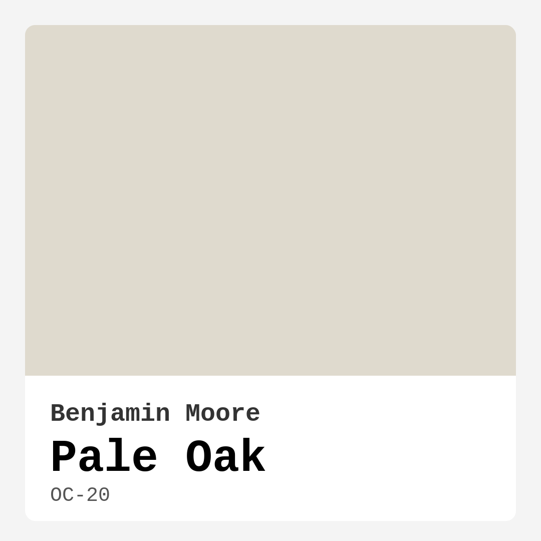
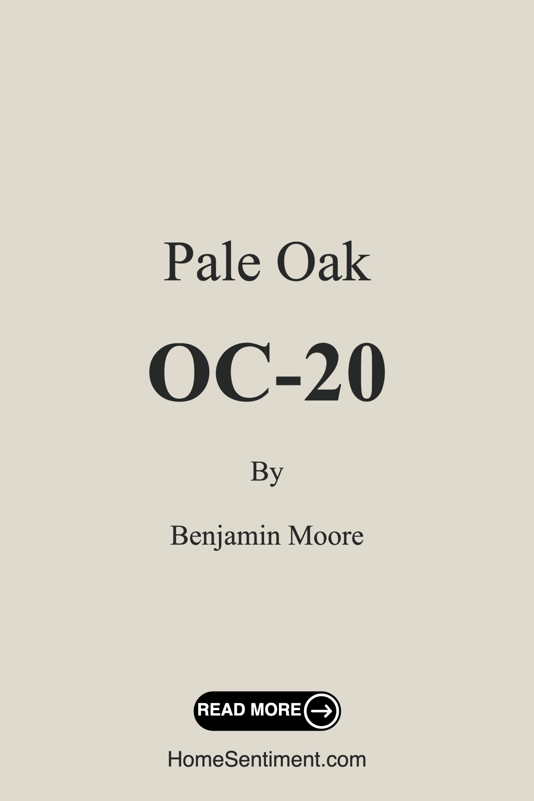
Color Preview & Key Details
| HEX Code | #DFDACE |
| RGB | 223, 218, 206 |
| LRV | 68.64% |
| Undertone | Red |
| Finish Options | Eggshell, Matte, Satin |
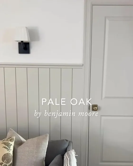
Ever walked into a room and immediately felt at ease? Like the walls were giving you a gentle hug? That’s the magic of the right paint color—and if you’re searching for that perfect balance of warmth and sophistication, let’s talk about Benjamin Moore’s Pale Oak (OC-20). This isn’t just another beige or gray; it’s a chameleon of a shade that adapts to your space, your light, and your style. Whether you’re refreshing a single room or reimagining your entire home, Pale Oak might just be the secret weapon you’ve been missing.
Pale Oak is what I’d call a “quiet superstar.” It’s a soft, creamy greige with a whisper of warmth, thanks to its subtle red undertones. Unlike cooler grays that can feel sterile, this hue wraps a room in comfort without veering into yellow or pink territory. It’s neutral enough to play well with almost any decor but has enough depth to keep things interesting. Imagine it as the ideal backdrop—a canvas that lets your furniture, art, and textiles shine while adding its own understated elegance.
Let’s talk about light, because that’s where Pale Oak truly shines. With an LRV (Light Reflectance Value) of 68.64%, it reflects most of the light that hits it, making rooms feel airy and bright. In spaces flooded with natural light, it’ll look like a soft, warm glow. In dimmer rooms, it holds its own, leaning into its cozy side without feeling heavy. Just be mindful: if your room gets very little light, test a swatch first. While it won’t turn cave-like, it might read slightly deeper than expected.
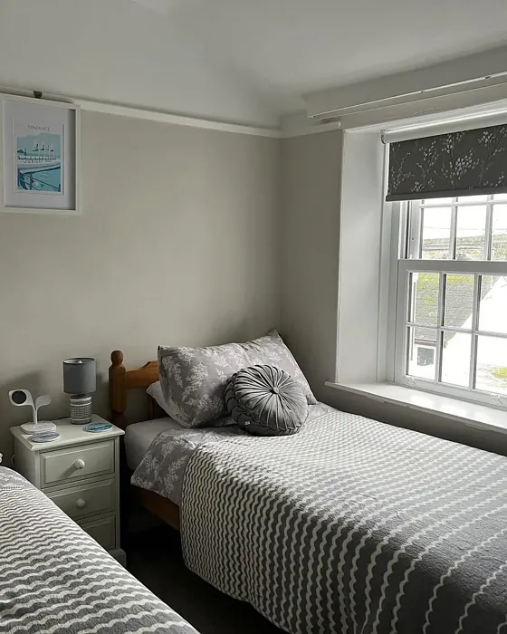
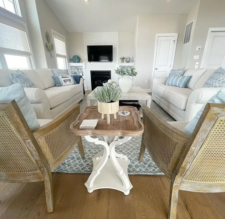
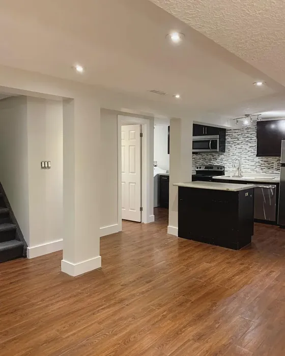
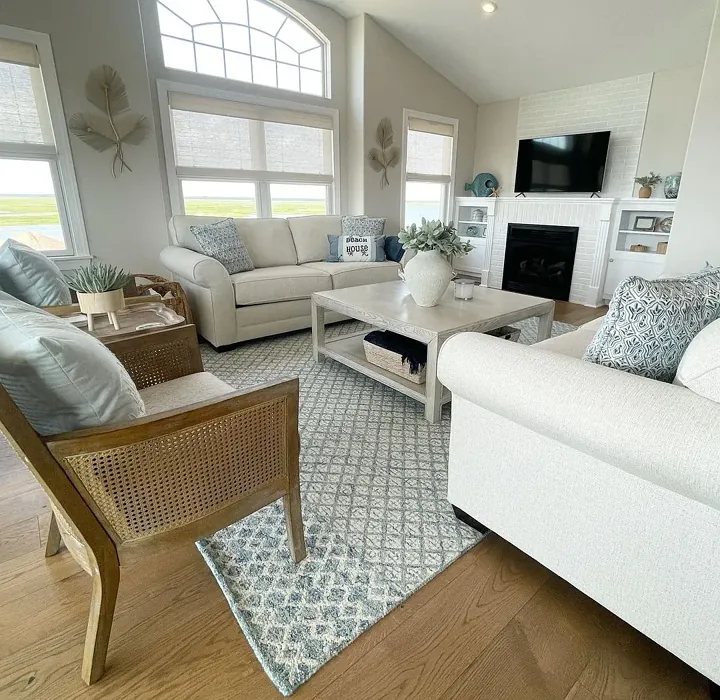
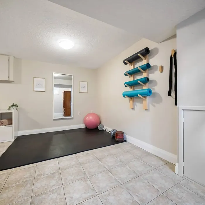
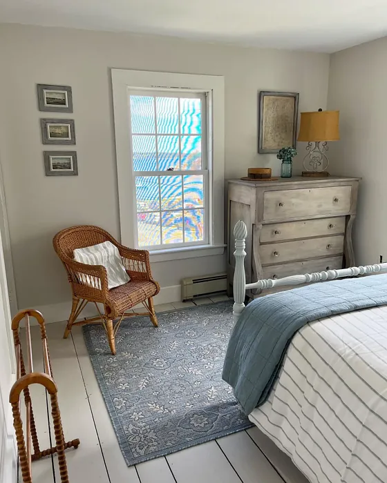
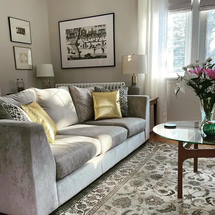
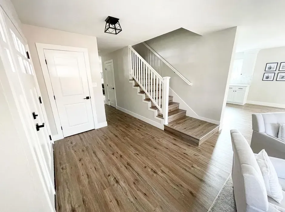
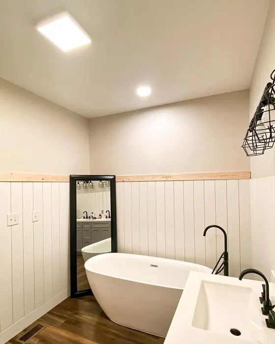
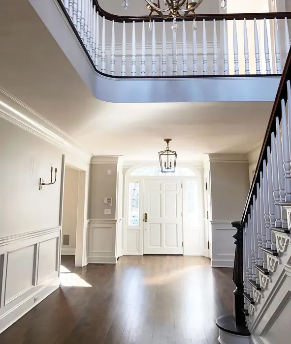
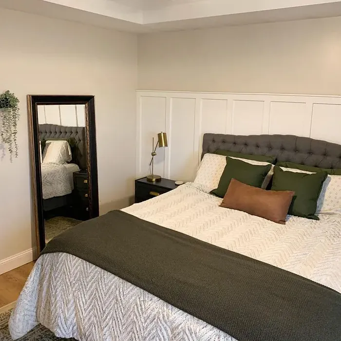
Now, where does Pale Oak work best? Pretty much anywhere you want to feel relaxed and uplifted at the same time. Living rooms? Absolutely—it’s a dream for open-concept spaces where you need flow without monotony. Bedrooms? Perfect. That warm neutrality creates a restful retreat. Home offices? Yes, especially if you pair it with crisp white trim for a clean, focused vibe. Even nurseries and dining rooms benefit from its versatility. It’s like the Swiss Army knife of paint colors: reliable, adaptable, and always stylish.
Application is a breeze, which is great news if you’re DIY-ing. Pale Oak covers well in one to two coats, and it’s forgiving with touch-ups. Whether you choose matte for a velvety look, eggshell for a subtle sheen, or satin for easy cleaning, it lays down smoothly. And since it’s low-VOC, you won’t have to deal with harsh fumes—a win for your lungs and your timeline.
Pairing Pale Oak with other colors is where the fun begins. Its warmth loves crisp whites like Benjamin Moore’s White Dove for trim, creating a classic, fresh contrast. For a bit of drama, try deeper shades from its complementary palette, like muted blues or soft greens. Brass fixtures? They’ll pop beautifully against its creamy base. And if you’re feeling adventurous, layer in textures—think linen curtains, a jute rug, or a weathered wood coffee table. Pale Oak plays well with organic materials, enhancing that “lived-in but luxurious” feel.
Of course, no color is perfect for every scenario. Pale Oak’s warmth means it might clash with cooler-toned furniture or flooring. If your space has a lot of blue-gray undertones, test a sample to avoid a muddled look. And while it’s a champ in most lighting, rooms with very little natural light might benefit from a lighter shade in the same family, like OC-23 or OC-24.
Here’s the thing about Pale Oak: it’s more than a color. It’s a mood. It’s the feeling of sunlight filtering through linen curtains, of a cozy Sunday morning with nowhere to be. It’s timeless without being boring, warm without being overwhelming. Whether you’re going for modern farmhouse, Scandinavian simplicity, or transitional elegance, this shade bridges the gap between trend and tradition.
So, should you use Pale Oak in your home? If you want a color that’s easy to live with, endlessly adaptable, and quietly beautiful, the answer is a resounding yes. Grab a sample, paint a big swatch, and watch how it transforms with the light. You might just find yourself falling in love—one creamy, inviting wall at a time.
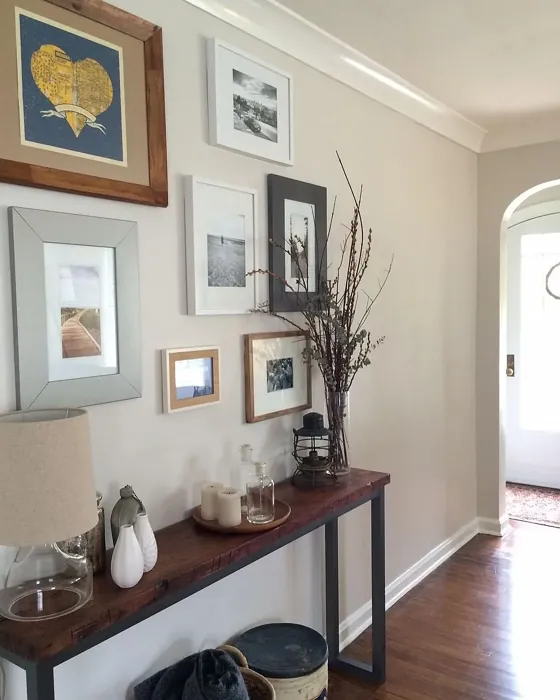
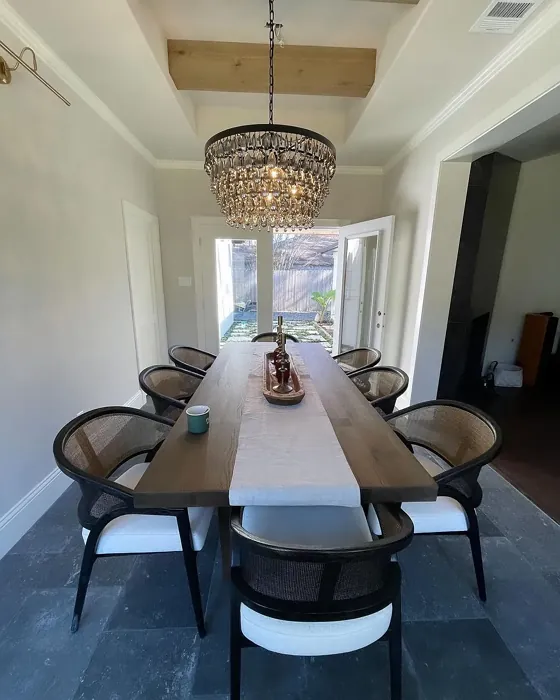
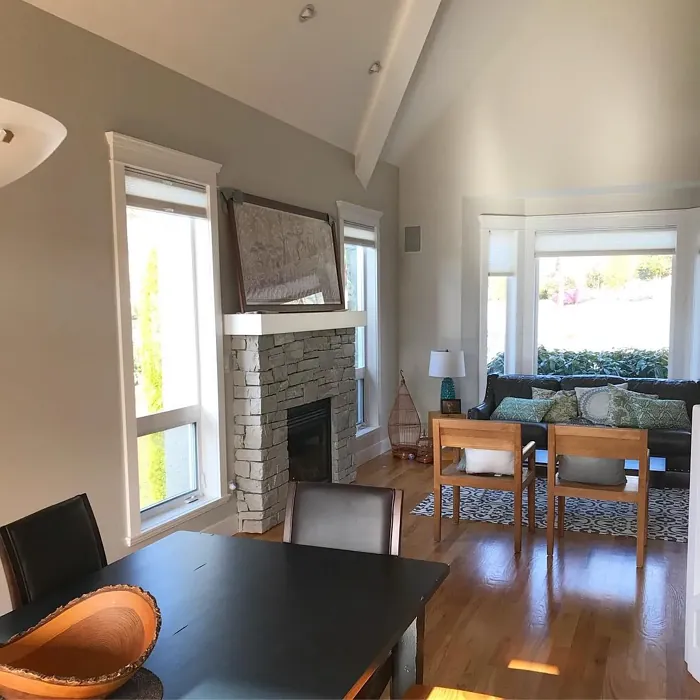
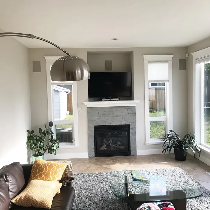
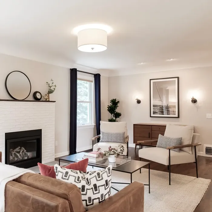
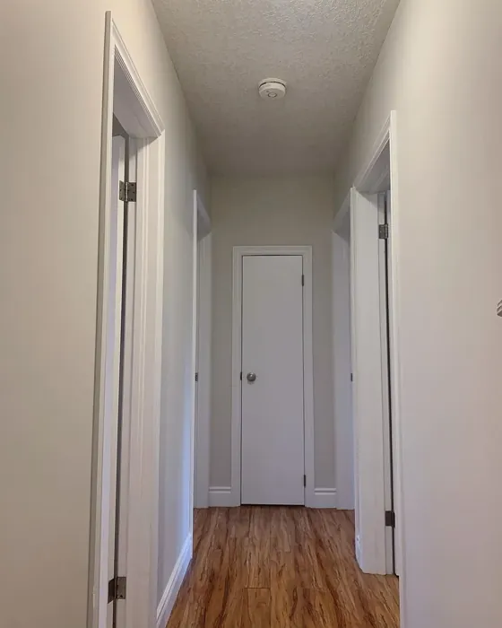
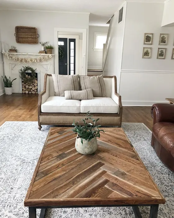
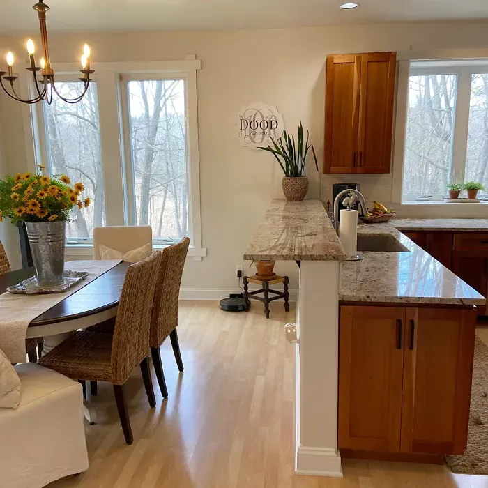
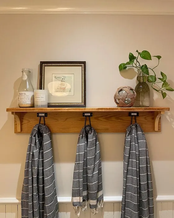
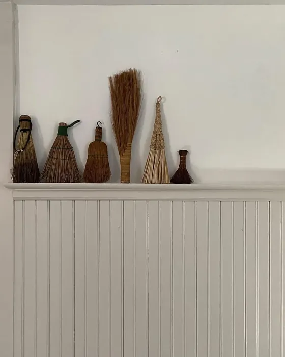
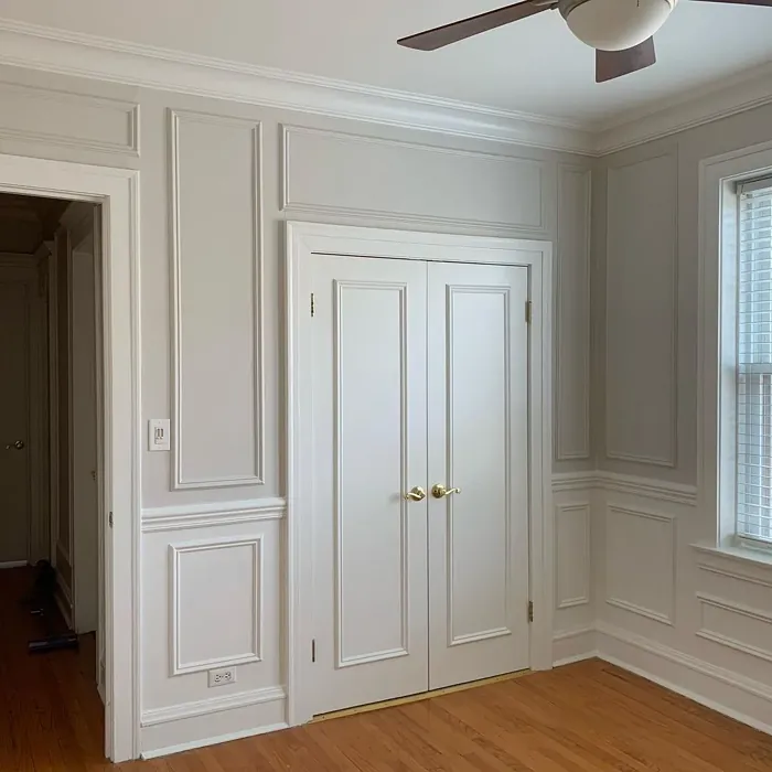
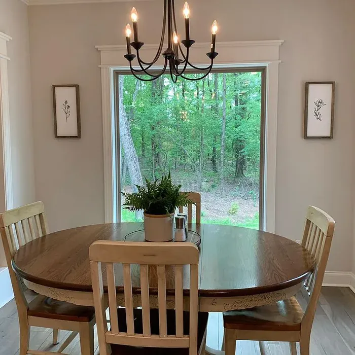
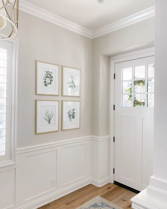
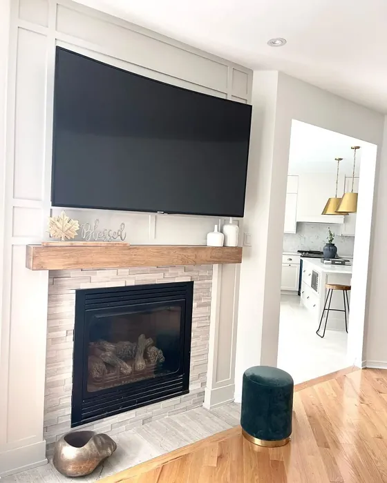
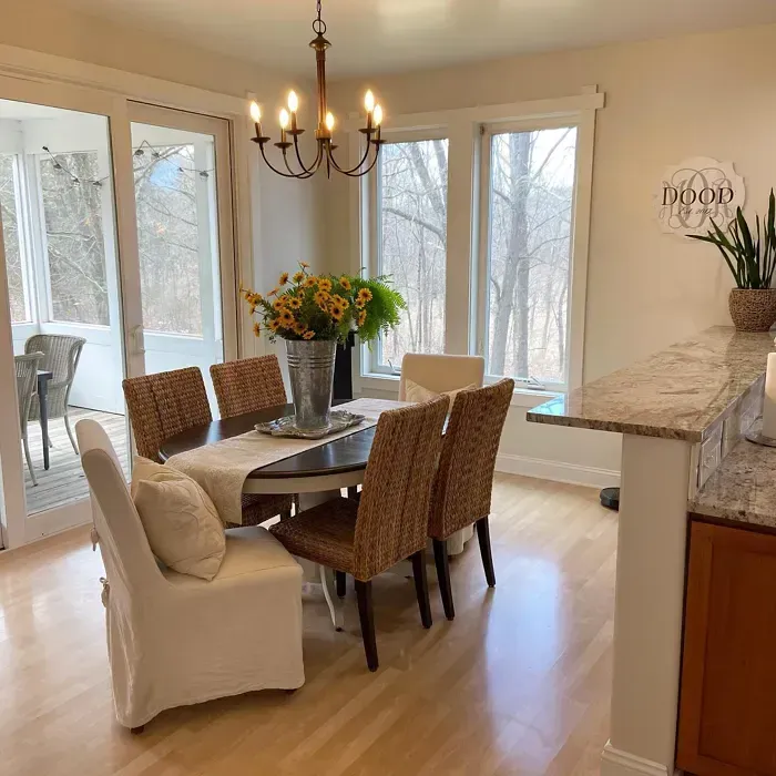
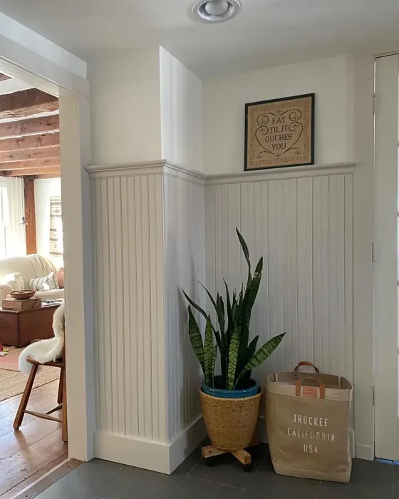
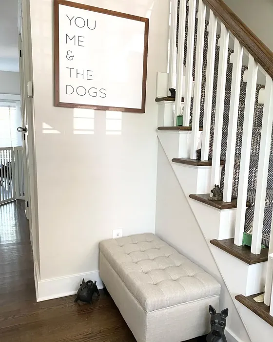
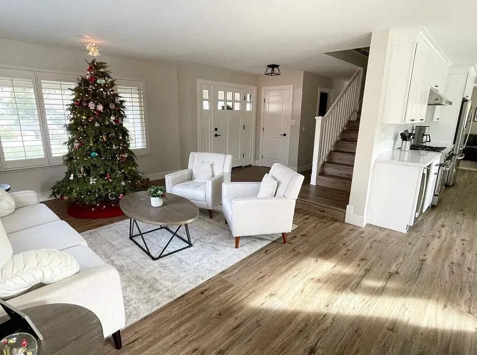
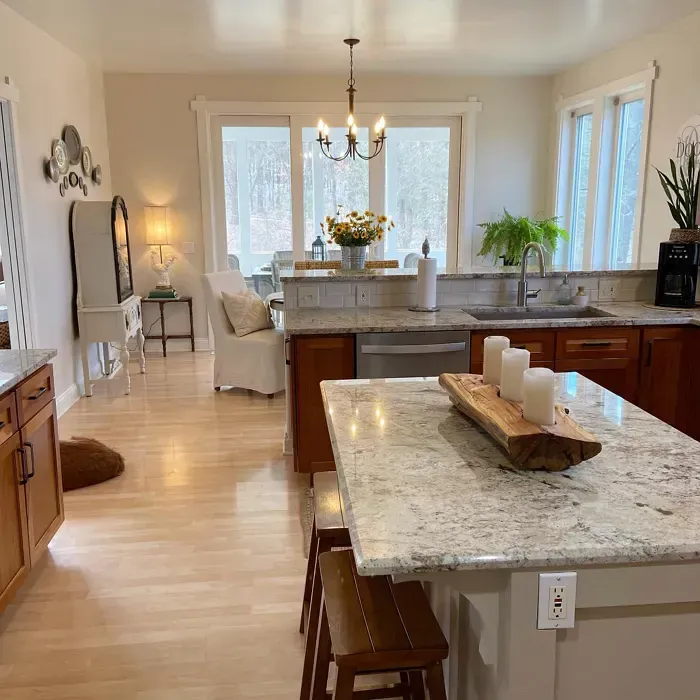
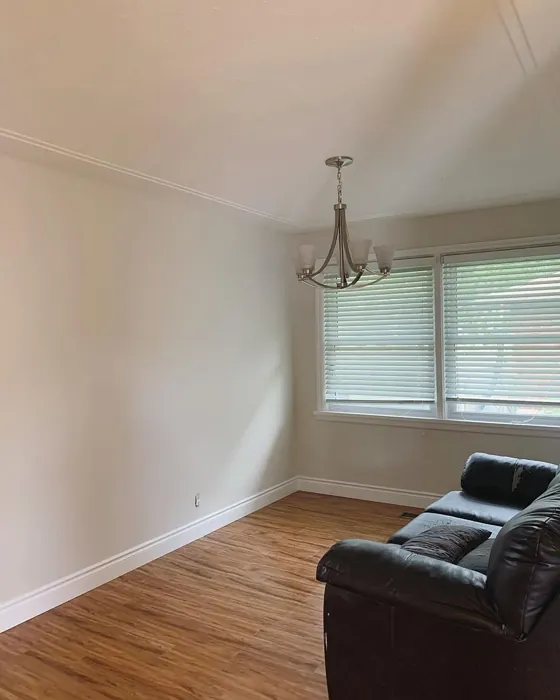
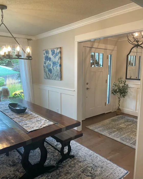
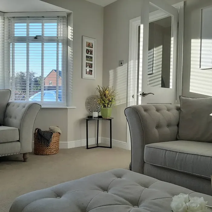
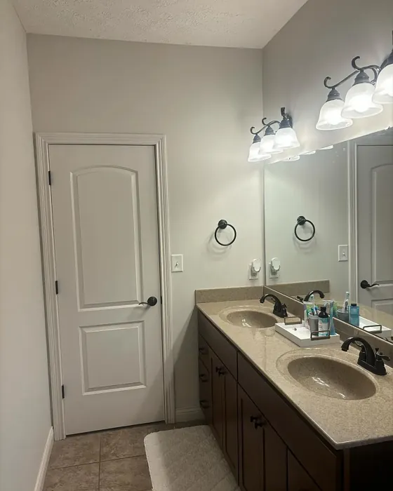
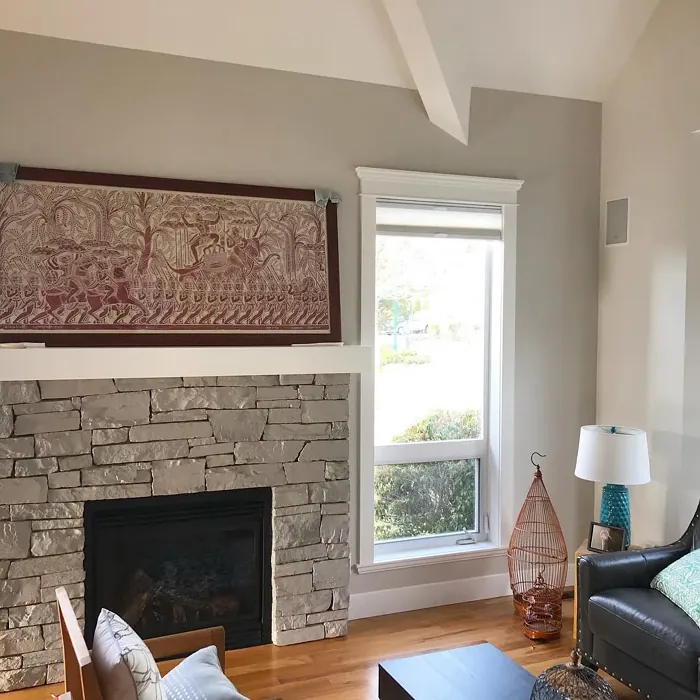
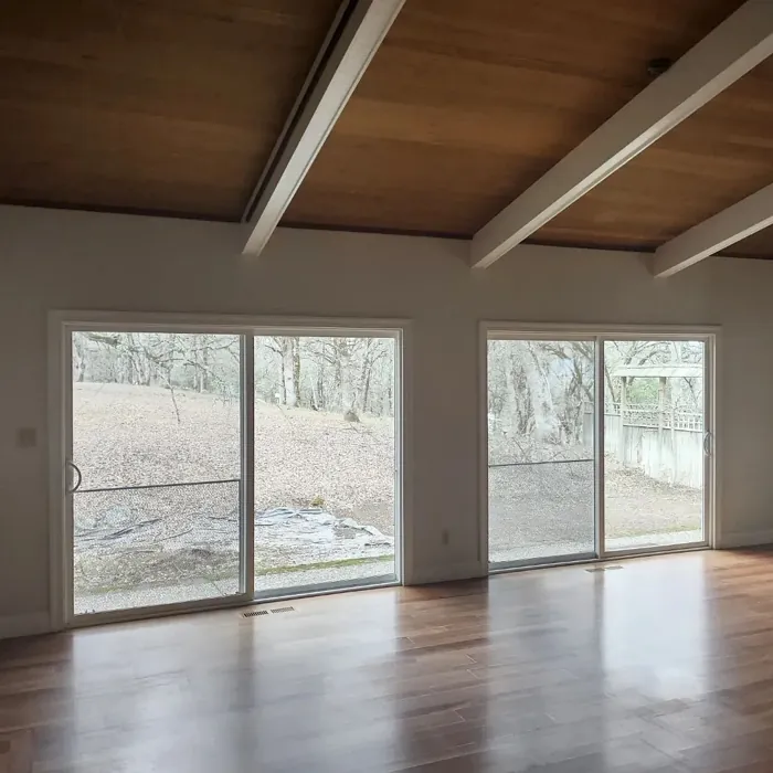
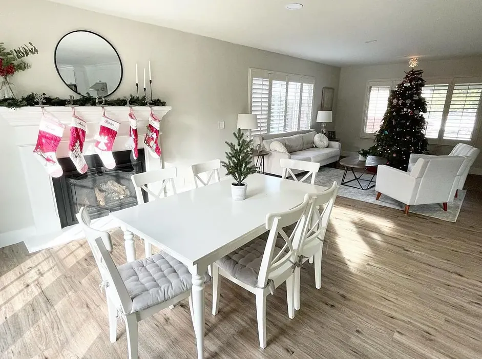
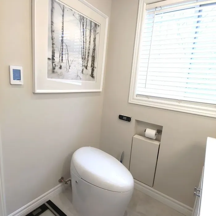
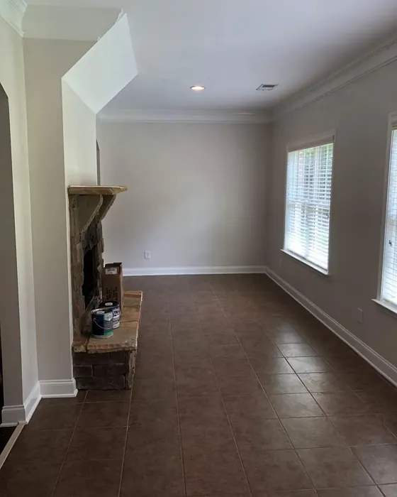
Real Room Photo of Pale Oak OC-20


Undertones of Pale Oak ?
The undertones of Pale Oak are a key aspect of its character, leaning towards Red. These subtle underlying hues are what give the color its depth and complexity. For example, a gray with a blue undertone will feel cooler and more modern, while one with a brown undertone will feel warmer and more traditional. It’s essential to test this paint in your home and observe it next to your existing furniture, flooring, and decor to see how these undertones interact and reveal themselves throughout the day.
HEX value: #DFDACE
RGB code: 223, 218, 206
Is Pale Oak Cool or Warm?
Pale Oak is predominantly warm, making it an inviting choice for spaces meant for relaxation and gathering. Its warmth can soften the harshness of cooler colors often found in modern decor.
Understanding Color Properties and Interior Design Tips
Hue refers to a specific position on the color wheel, measured in degrees from 0 to 360. Each degree represents a different pure color:
- 0° represents red
- 120° represents green
- 240° represents blue
Saturation describes the intensity or purity of a color and is expressed as a percentage:
- At 0%, the color appears completely desaturated—essentially a shade of gray
- At 100%, the color is at its most vivid and vibrant
Lightness indicates how light or dark a color is, also expressed as a percentage:
- 0% lightness results in black
- 100% lightness results in white
Using Warm Colors in Interior Design
Warm hues—such as reds, oranges, yellows, warm beiges, and greiges—are excellent choices for creating inviting and energetic spaces. These colors are particularly well-suited for:
- Kitchens, living rooms, and bathrooms, where warmth enhances comfort and sociability
- Large rooms, where warm tones can help reduce the sense of emptiness and make the space feel more intimate
For example:
- Warm beige shades provide a cozy, inviting atmosphere, ideal for living rooms, bedrooms, and hallways.
- Warm greige (a mix of beige and gray) offers the warmth of beige with the modern appeal of gray, making it a versatile backdrop for dining areas, bedrooms, and living spaces.
However, be mindful when using warm light tones in rooms with limited natural light. These shades may appear muted or even take on an unpleasant yellowish tint. To avoid a dull or flat appearance:
- Add depth by incorporating richer tones like deep greens, charcoal, or chocolate brown
- Use textured elements such as curtains, rugs, or cushions to bring dimension to the space
Pro Tip: Achieving Harmony with Warm and Cool Color Balance
To create a well-balanced and visually interesting interior, mix warm and cool tones strategically. This contrast adds depth and harmony to your design.
- If your walls feature warm hues, introduce cool-colored accents such as blue or green furniture, artwork, or accessories to create contrast.
- For a polished look, consider using a complementary color scheme, which pairs colors opposite each other on the color wheel (e.g., red with green, orange with blue).
This thoughtful mix not only enhances visual appeal but also creates a space that feels both dynamic and cohesive.
Light Temperature Affects on Pale Oak
Natural Light
Natural daylight changes in color temperature as the sun moves across the sky. At sunrise and sunset, the light tends to have a warm, golden tone with a color temperature around 2000 Kelvin (K). As the day progresses and the sun rises higher, the light becomes cooler and more neutral. Around midday, especially when the sky is clear, natural light typically reaches its peak brightness and shifts to a cooler tone, ranging from 5500 to 6500 Kelvin. This midday light is close to what we perceive as pure white or daylight-balanced light.
These shifts in natural light can significantly influence how colors appear in a space, which is why designers often consider both the time of day and the orientation of windows when planning interior color schemes.
Artificial Light
When choosing artificial lighting, pay close attention to the color temperature, measured in Kelvin (K). This determines how warm or cool the light will appear. Lower temperatures, around 2700K, give off a warm, yellow glow often used in living rooms or bedrooms. Higher temperatures, above 5000K, create a cool, bluish light similar to daylight, commonly used in kitchens, offices, or task areas.
Use the slider to see how lighting temperature can affect the appearance of a surface or color throughout a space.


4800K
LRV of Pale Oak
The Light Reflectance Value (LRV) of Pale Oak is 68.64%, which places it in the Light colors category. This means it reflect most of the incident light. Understanding a paint’s LRV is crucial for predicting how it will look in your space. A higher LRV indicates a lighter color that reflects more light, making rooms feel larger and brighter. A lower LRV signifies a darker color that absorbs more light, creating a cozier, more intimate atmosphere. Always consider the natural and artificial lighting in your room when selecting a paint color based on its LRV.
Detailed Review of Pale Oak
Additional Paint Characteristics
Ideal Rooms
Bedroom, Dining Room, Home Office, Living Room, Nursery
Decor Styles
Coastal, Modern Farmhouse, Scandinavian, Traditional, Transitional
Coverage
Good (1–2 Coats), Touch-Up Friendly
Ease of Application
Beginner Friendly, Brush Smooth, Roller-Ready
Washability
Scrubbable, Washable
VOC Level
Low VOC, Ultra Low VOC
Best Use
Accent Wall, Ceiling, Interior Walls
Room Suitability
Bedroom, Dining Room, Home Office, Living Room, Nursery
Tone Tag
Creamy, Muted, Neutral, Warm
Finish Type
Eggshell, Matte, Satin
Paint Performance
High Coverage, Low Odor, Quick Drying
Use Cases
Best for Open Concept, Best for Rentals, Classic Favorite, Designer Favorite
Mood
Cozy, Inviting, Restful, Warm
Trim Pairing
Complements Brass Fixtures, Matches Pure White, Pairs with White Dove
Pale Oak is truly a standout option for anyone looking to refresh their home. Its warm undertones make it an ideal backdrop for a variety of decor styles, from farmhouse chic to modern minimalism. When applied, it has a soft, enveloping quality that makes spaces feel grounded yet airy. It’s particularly effective in larger rooms where natural light can play off its gentle hue, enhancing the overall ambiance.
Application is straightforward, whether you’re using a brush or roller, and you’ll find that it levels out beautifully, reducing the need for multiple coats. The color remains consistent across different lighting conditions, making it a reliable choice for open concept spaces. Overall, Pale Oak is not just a color; it’s a mood-setter that invites you to relax and enjoy your surroundings.
Pros & Cons of OC-20 Pale Oak
Pros
Cons
Colors that go with Benjamin Moore Pale Oak
FAQ on OC-20 Pale Oak
What surfaces can I use Pale Oak on?
Pale Oak is suitable for a variety of surfaces, including drywall, wood, and previously painted areas. It adheres well and provides a smooth finish, making it an excellent choice for walls, ceilings, and even furniture. Just make sure to prep the surface properly for the best results.
Can I use Pale Oak in a small room?
Yes, using Pale Oak in a small room can create a warm, inviting atmosphere. While it might appear a bit darker in low light, its soft tones can make the space feel cozy without being oppressive. To enhance the feeling of space, consider pairing it with lighter trims or accent colors.
Comparisons Pale Oak with other colors
Pale Oak OC-20 vs Gossamer Veil SW 9165
| Attribute | Pale Oak OC-20 | Gossamer Veil SW 9165 |
|---|---|---|
| Color Name | Pale Oak OC-20 | Gossamer Veil SW 9165 |
| Color | ||
| Hue | Greige | Greige |
| Brightness | Light | Light |
| RGB | 223, 218, 206 | 211, 206, 196 |
| LRV | 68.64% | 75% |
| Finish Type | Eggshell, Matte, Satin | Eggshell, Matte |
| Finish Options | Eggshell, Matte, Satin | Eggshell, Matte, Satin |
| Ideal Rooms | Bedroom, Dining Room, Home Office, Living Room, Nursery | Bedroom, Dining Room, Entryway, Home Office, Kitchen, Living Room |
| Decor Styles | Coastal, Modern Farmhouse, Scandinavian, Traditional, Transitional | Coastal, Farmhouse, Modern, Scandinavian, Transitional |
| Coverage | Good (1–2 Coats), Touch-Up Friendly | Good (1–2 Coats), Touch-Up Friendly |
| Ease of Application | Beginner Friendly, Brush Smooth, Roller-Ready | Beginner Friendly, Brush Smooth, Fast-Drying, Roller-Ready |
| Washability | Scrubbable, Washable | Washable, Wipeable |
| Room Suitability | Bedroom, Dining Room, Home Office, Living Room, Nursery | Bathroom, Bedroom, Dining Room, Home Office, Living Room |
| Tone | Creamy, Muted, Neutral, Warm | Airy, Balanced, Muted, Warm |
| Paint Performance | High Coverage, Low Odor, Quick Drying | Easy Touch-Up, High Coverage, Low Odor, Quick Drying |
Pale Oak OC-20 vs Heron Plume SW 6070
| Attribute | Pale Oak OC-20 | Heron Plume SW 6070 |
|---|---|---|
| Color Name | Pale Oak OC-20 | Heron Plume SW 6070 |
| Color | ||
| Hue | Greige | Greige |
| Brightness | Light | Light |
| RGB | 223, 218, 206 | 229, 225, 216 |
| LRV | 68.64% | 30% |
| Finish Type | Eggshell, Matte, Satin | Eggshell, Matte, Satin |
| Finish Options | Eggshell, Matte, Satin | Eggshell, Matte, Satin |
| Ideal Rooms | Bedroom, Dining Room, Home Office, Living Room, Nursery | Bedroom, Dining Room, Home Office, Living Room |
| Decor Styles | Coastal, Modern Farmhouse, Scandinavian, Traditional, Transitional | Coastal, Modern, Scandinavian, Transitional |
| Coverage | Good (1–2 Coats), Touch-Up Friendly | Good (1–2 Coats) |
| Ease of Application | Beginner Friendly, Brush Smooth, Roller-Ready | Beginner Friendly, Brush Smooth, Fast-Drying, Roller-Ready |
| Washability | Scrubbable, Washable | Washable, Wipeable |
| Room Suitability | Bedroom, Dining Room, Home Office, Living Room, Nursery | Bedroom, Dining Room, Home Office, Living Room |
| Tone | Creamy, Muted, Neutral, Warm | Balanced, Muted, Neutral, Warm |
| Paint Performance | High Coverage, Low Odor, Quick Drying | Easy Touch-Up, Low Odor, Quick Drying |
Pale Oak OC-20 vs Toque White SW 7003
| Attribute | Pale Oak OC-20 | Toque White SW 7003 |
|---|---|---|
| Color Name | Pale Oak OC-20 | Toque White SW 7003 |
| Color | ||
| Hue | Greige | Greige |
| Brightness | Light | Light |
| RGB | 223, 218, 206 | 231, 226, 218 |
| LRV | 68.64% | 75% |
| Finish Type | Eggshell, Matte, Satin | Eggshell, Matte, Satin |
| Finish Options | Eggshell, Matte, Satin | Eggshell, Matte, Satin |
| Ideal Rooms | Bedroom, Dining Room, Home Office, Living Room, Nursery | Bathroom, Bedroom, Dining Room, Home Office, Kitchen, Living Room |
| Decor Styles | Coastal, Modern Farmhouse, Scandinavian, Traditional, Transitional | Coastal, Minimalist, Modern Farmhouse, Transitional |
| Coverage | Good (1–2 Coats), Touch-Up Friendly | Good (1–2 Coats), Touch-Up Friendly |
| Ease of Application | Beginner Friendly, Brush Smooth, Roller-Ready | Beginner Friendly, Brush Smooth, Roller-Ready |
| Washability | Scrubbable, Washable | Washable, Wipeable |
| Room Suitability | Bedroom, Dining Room, Home Office, Living Room, Nursery | Bathroom, Bedroom, Dining Room, Kitchen, Living Room |
| Tone | Creamy, Muted, Neutral, Warm | Neutral, Soft, Warm |
| Paint Performance | High Coverage, Low Odor, Quick Drying | Easy Touch-Up, High Coverage, Low Odor, Quick Drying |
Pale Oak OC-20 vs Sedate Gray SW 6169
| Attribute | Pale Oak OC-20 | Sedate Gray SW 6169 |
|---|---|---|
| Color Name | Pale Oak OC-20 | Sedate Gray SW 6169 |
| Color | ||
| Hue | Greige | Greige |
| Brightness | Light | Light |
| RGB | 223, 218, 206 | 209, 205, 191 |
| LRV | 68.64% | 24% |
| Finish Type | Eggshell, Matte, Satin | Eggshell, Matte, Satin |
| Finish Options | Eggshell, Matte, Satin | Eggshell, Flat, Matte, Satin |
| Ideal Rooms | Bedroom, Dining Room, Home Office, Living Room, Nursery | Bedroom, Dining Room, Home Office, Living Room |
| Decor Styles | Coastal, Modern Farmhouse, Scandinavian, Traditional, Transitional | Farmhouse, Minimalist, Modern, Scandinavian |
| Coverage | Good (1–2 Coats), Touch-Up Friendly | Good (1–2 Coats) |
| Ease of Application | Beginner Friendly, Brush Smooth, Roller-Ready | Beginner Friendly, Brush Smooth, Roller-Ready |
| Washability | Scrubbable, Washable | Scrubbable, Washable |
| Room Suitability | Bedroom, Dining Room, Home Office, Living Room, Nursery | Bedroom, Entryway, Home Office, Living Room |
| Tone | Creamy, Muted, Neutral, Warm | Balanced, Muted, Neutral |
| Paint Performance | High Coverage, Low Odor, Quick Drying | Easy Touch-Up, High Coverage, Low Odor |
Pale Oak OC-20 vs Natural Cream OC-14
| Attribute | Pale Oak OC-20 | Natural Cream OC-14 |
|---|---|---|
| Color Name | Pale Oak OC-20 | Natural Cream OC-14 |
| Color | ||
| Hue | Greige | Greige |
| Brightness | Light | Light |
| RGB | 223, 218, 206 | 218, 213, 198 |
| LRV | 68.64% | 64.78% |
| Finish Type | Eggshell, Matte, Satin | Eggshell, Matte, Satin |
| Finish Options | Eggshell, Matte, Satin | Eggshell, Matte, Satin |
| Ideal Rooms | Bedroom, Dining Room, Home Office, Living Room, Nursery | Bathroom, Bedroom, Hallway, Home Office, Kitchen, Living Room |
| Decor Styles | Coastal, Modern Farmhouse, Scandinavian, Traditional, Transitional | Minimalist, Modern Farmhouse, Rustic, Scandinavian, Transitional |
| Coverage | Good (1–2 Coats), Touch-Up Friendly | Good (1–2 Coats), Touch-Up Friendly |
| Ease of Application | Beginner Friendly, Brush Smooth, Roller-Ready | Beginner Friendly, Brush Smooth, Fast-Drying, Roller-Ready |
| Washability | Scrubbable, Washable | Highly Washable, Washable |
| Room Suitability | Bedroom, Dining Room, Home Office, Living Room, Nursery | Bedroom, Entryway, Home Office, Kitchen, Living Room |
| Tone | Creamy, Muted, Neutral, Warm | Creamy, Earthy, Warm |
| Paint Performance | High Coverage, Low Odor, Quick Drying | Easy Touch-Up, Low Odor, Quick Drying |
Pale Oak OC-20 vs Ballet White OC-9
| Attribute | Pale Oak OC-20 | Ballet White OC-9 |
|---|---|---|
| Color Name | Pale Oak OC-20 | Ballet White OC-9 |
| Color | ||
| Hue | Greige | Greige |
| Brightness | Light | Light |
| RGB | 223, 218, 206 | 229, 224, 208 |
| LRV | 68.64% | 71.97% |
| Finish Type | Eggshell, Matte, Satin | Eggshell, Matte |
| Finish Options | Eggshell, Matte, Satin | Eggshell, Matte, Satin |
| Ideal Rooms | Bedroom, Dining Room, Home Office, Living Room, Nursery | Bedroom, Dining Room, Home Office, Kitchen, Living Room |
| Decor Styles | Coastal, Modern Farmhouse, Scandinavian, Traditional, Transitional | Farmhouse, Minimalist, Modern, Scandinavian, Traditional |
| Coverage | Good (1–2 Coats), Touch-Up Friendly | Good (1–2 Coats), Touch-Up Friendly |
| Ease of Application | Beginner Friendly, Brush Smooth, Roller-Ready | Beginner Friendly, Brush Smooth, Fast-Drying, Roller-Ready |
| Washability | Scrubbable, Washable | Washable, Wipeable |
| Room Suitability | Bedroom, Dining Room, Home Office, Living Room, Nursery | Bedroom, Dining Room, Home Office, Kitchen, Living Room |
| Tone | Creamy, Muted, Neutral, Warm | Creamy, Muted, Warm |
| Paint Performance | High Coverage, Low Odor, Quick Drying | Easy Touch-Up, Low Odor, Quick Drying |
Pale Oak OC-20 vs Elmira White HC-84
| Attribute | Pale Oak OC-20 | Elmira White HC-84 |
|---|---|---|
| Color Name | Pale Oak OC-20 | Elmira White HC-84 |
| Color | ||
| Hue | Greige | Greige |
| Brightness | Light | Light |
| RGB | 223, 218, 206 | 219, 211, 195 |
| LRV | 68.64% | 64.67% |
| Finish Type | Eggshell, Matte, Satin | Eggshell, Matte, Satin |
| Finish Options | Eggshell, Matte, Satin | Eggshell, Matte, Satin |
| Ideal Rooms | Bedroom, Dining Room, Home Office, Living Room, Nursery | Bathroom, Bedroom, Dining Room, Home Office, Kitchen, Living Room |
| Decor Styles | Coastal, Modern Farmhouse, Scandinavian, Traditional, Transitional | Coastal, Modern Farmhouse, Scandinavian, Traditional, Transitional |
| Coverage | Good (1–2 Coats), Touch-Up Friendly | Good (1–2 Coats) |
| Ease of Application | Beginner Friendly, Brush Smooth, Roller-Ready | Beginner Friendly, Brush Smooth, Fast-Drying, Roller-Ready |
| Washability | Scrubbable, Washable | Highly Washable, Washable |
| Room Suitability | Bedroom, Dining Room, Home Office, Living Room, Nursery | Bathroom, Bedroom, Dining Room, Kitchen, Living Room |
| Tone | Creamy, Muted, Neutral, Warm | Creamy, Neutral, Warm |
| Paint Performance | High Coverage, Low Odor, Quick Drying | High Coverage, Low Odor, Quick Drying |
Pale Oak OC-20 vs Feather Down OC-6
| Attribute | Pale Oak OC-20 | Feather Down OC-6 |
|---|---|---|
| Color Name | Pale Oak OC-20 | Feather Down OC-6 |
| Color | ||
| Hue | Greige | Greige |
| Brightness | Light | Light |
| RGB | 223, 218, 206 | 230, 224, 207 |
| LRV | 68.64% | 73.16% |
| Finish Type | Eggshell, Matte, Satin | Eggshell, Matte, Satin |
| Finish Options | Eggshell, Matte, Satin | Eggshell, Matte, Satin |
| Ideal Rooms | Bedroom, Dining Room, Home Office, Living Room, Nursery | Bedroom, Dining Room, Home Office, Living Room, Nursery |
| Decor Styles | Coastal, Modern Farmhouse, Scandinavian, Traditional, Transitional | Contemporary, Farmhouse, Scandinavian, Traditional |
| Coverage | Good (1–2 Coats), Touch-Up Friendly | Good (1–2 Coats) |
| Ease of Application | Beginner Friendly, Brush Smooth, Roller-Ready | Beginner Friendly, Brush Smooth, Roller-Ready |
| Washability | Scrubbable, Washable | Washable, Wipeable |
| Room Suitability | Bedroom, Dining Room, Home Office, Living Room, Nursery | Bedroom, Dining Room, Living Room, Nursery |
| Tone | Creamy, Muted, Neutral, Warm | Creamy, Neutral, Warm |
| Paint Performance | High Coverage, Low Odor, Quick Drying | Easy Touch-Up, High Coverage, Low Odor |
Pale Oak OC-20 vs Natural Linen 966
| Attribute | Pale Oak OC-20 | Natural Linen 966 |
|---|---|---|
| Color Name | Pale Oak OC-20 | Natural Linen 966 |
| Color | ||
| Hue | Greige | Greige |
| Brightness | Light | Light |
| RGB | 223, 218, 206 | 215, 205, 183 |
| LRV | 68.64% | 59.84% |
| Finish Type | Eggshell, Matte, Satin | Eggshell, Matte, Satin |
| Finish Options | Eggshell, Matte, Satin | Eggshell, Matte, Satin |
| Ideal Rooms | Bedroom, Dining Room, Home Office, Living Room, Nursery | Bedroom, Dining Room, Home Office, Kitchen, Living Room |
| Decor Styles | Coastal, Modern Farmhouse, Scandinavian, Traditional, Transitional | Coastal, Minimalist, Modern Farmhouse, Rustic, Traditional |
| Coverage | Good (1–2 Coats), Touch-Up Friendly | Good (1–2 Coats), Touch-Up Friendly |
| Ease of Application | Beginner Friendly, Brush Smooth, Roller-Ready | Beginner Friendly, Brush Smooth, Fast-Drying, Roller-Ready |
| Washability | Scrubbable, Washable | Highly Washable, Washable, Wipeable |
| Room Suitability | Bedroom, Dining Room, Home Office, Living Room, Nursery | Bedroom, Dining Room, Home Office, Living Room, Nursery |
| Tone | Creamy, Muted, Neutral, Warm | Earthy, Neutral, Warm |
| Paint Performance | High Coverage, Low Odor, Quick Drying | Easy Touch-Up, High Coverage, Low Odor, Quick Drying |
Pale Oak OC-20 vs Jute AF-80
| Attribute | Pale Oak OC-20 | Jute AF-80 |
|---|---|---|
| Color Name | Pale Oak OC-20 | Jute AF-80 |
| Color | ||
| Hue | Greige | Greige |
| Brightness | Light | Light |
| RGB | 223, 218, 206 | 217, 210, 190 |
| LRV | 68.64% | 63.30% |
| Finish Type | Eggshell, Matte, Satin | Eggshell, Matte, Satin |
| Finish Options | Eggshell, Matte, Satin | Eggshell, Matte, Satin |
| Ideal Rooms | Bedroom, Dining Room, Home Office, Living Room, Nursery | Bedroom, Dining Room, Home Office, Living Room, Nursery |
| Decor Styles | Coastal, Modern Farmhouse, Scandinavian, Traditional, Transitional | Bohemian, Eclectic, Modern Farmhouse, Scandinavian, Traditional |
| Coverage | Good (1–2 Coats), Touch-Up Friendly | Good (1–2 Coats), Touch-Up Friendly |
| Ease of Application | Beginner Friendly, Brush Smooth, Roller-Ready | Beginner Friendly, Brush Smooth, Fast-Drying, Roller-Ready |
| Washability | Scrubbable, Washable | Washable, Wipeable |
| Room Suitability | Bedroom, Dining Room, Home Office, Living Room, Nursery | Bedroom, Dining Room, Home Office, Living Room, Nursery |
| Tone | Creamy, Muted, Neutral, Warm | Earthy, Neutral, Warm |
| Paint Performance | High Coverage, Low Odor, Quick Drying | Easy Touch-Up, Low Odor, Quick Drying |
Official Page of Benjamin Moore Pale Oak OC-20