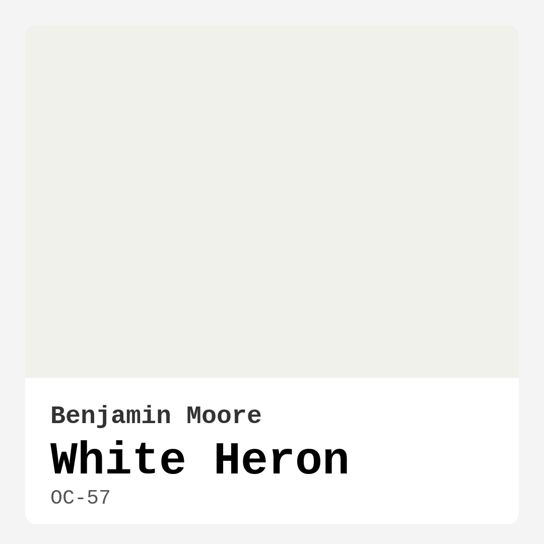
Color Preview & Key Details
| HEX Code | #F0F1EA |
| RGB | 240, 241, 234 |
| LRV | 86.69% |
| Undertone | Yellow |
| Finish Options | Eggshell, Matte, Satin |
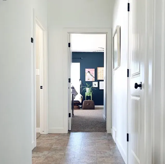
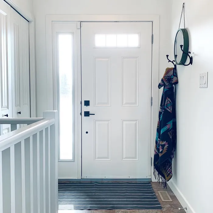
You walk into your living room, coffee in hand, and pause. Something feels off. The walls are just… there. They don’t sing. They don’t wrap you in warmth or make the space feel like *yours*. Maybe they’re too stark, too cold, or just a little *blah*. If that sounds familiar, let’s talk about a color that might be the missing piece: Benjamin Moore’s White Heron (OC-57).
This isn’t your typical off-white. White Heron has a whisper of warmth, a softness that makes rooms feel effortlessly elegant without veering into clinical territory. It’s the kind of color that plays well with others—whether you’re into modern minimalism, cozy farmhouse vibes, or something in between. And because it reflects light beautifully (thanks to its 86.69% LRV), it’s a genius pick for smaller spaces or rooms that crave a little extra brightness.
So, what makes White Heron special? Let’s start with its undertones. There’s a hint of yellow here, but it’s subtle. It won’t scream “buttery” or “golden” on your walls. Instead, it adds just enough warmth to keep things inviting. Pair it with crisp white trim like White Dove for a classic look, or let it mingle with cooler tones if you prefer a more contemporary feel. The versatility is unreal.
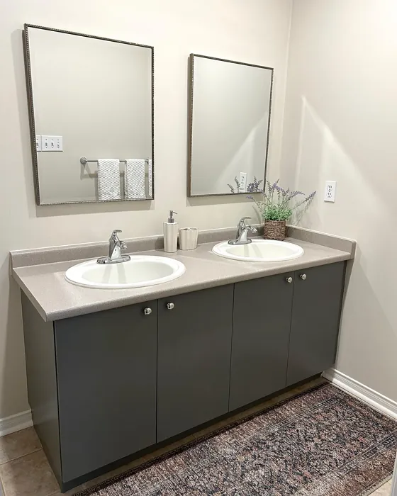
Application is a breeze, even if you’re a DIY newbie. With good coverage in one to two coats and a forgiving, fast-drying formula, you won’t be stuck waiting days to finish your project. Choose a matte finish for a velvety, sophisticated look in low-traffic areas like bedrooms, or go for eggshell or satin in spaces like kitchens and bathrooms where washability matters.
Now, let’s talk lighting. In a sun-drenched room, White Heron glows. It amplifies natural light without feeling harsh. In darker spaces or under artificial lighting, that warmth keeps things cozy rather than dingy. But here’s a pro tip: always test it first. Grab a sample and paint a large swatch near your furniture and flooring. Watch how it shifts throughout the day. You’ll see why designers adore this color—it adapts.
As for pairings, think earthy greens, soft blues, or even muted oranges for accents. It’s a neutral that loves color but won’t fight it. In a nursery, it’s serene; in a home office, it’s quietly focused. And if you’re renting? It’s a landlord-friendly shade that still feels personal.
Of course, no color is perfect. Lighter shades like this can show scuffs more easily, so keep a touch-up kit handy. And while it’s beginner-friendly, remember that lighting can tweak its appearance—north-facing rooms might pull out more of its subtle coolness, while south-facing ones will emphasize the warmth.
At the end of the day, White Heron is for anyone who wants their walls to do more than just exist. It’s for the person who craves a backdrop that’s calm but not boring, warm but not overwhelming. It’s the color that says, “This is home.” So, next time you’re staring at those lackluster walls, imagine them in White Heron. You might just find the upgrade you’ve been waiting for.

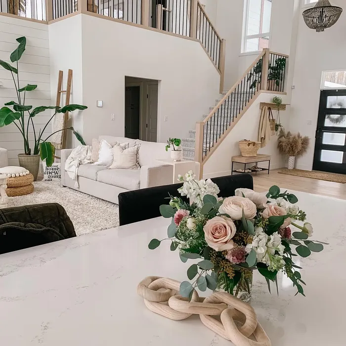
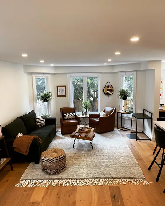
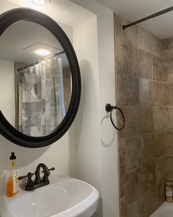
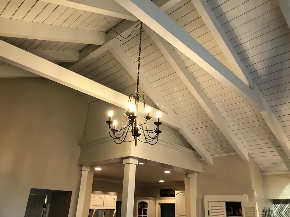
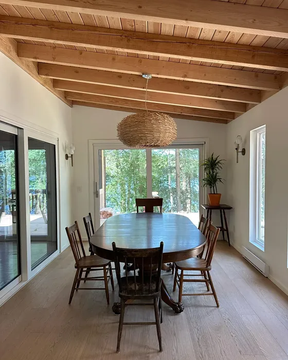
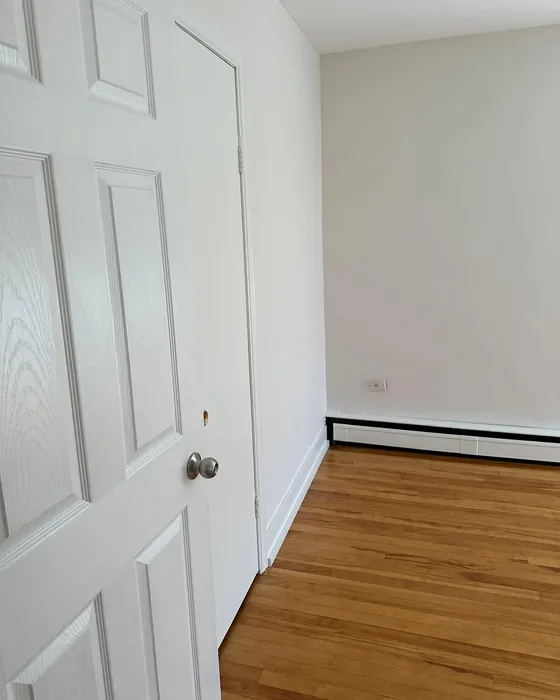
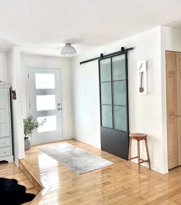
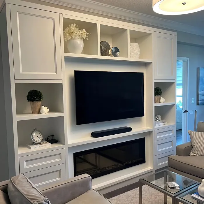
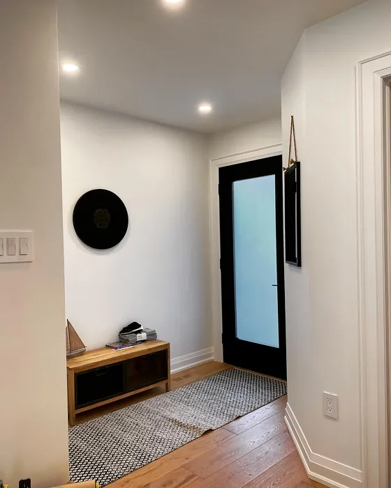
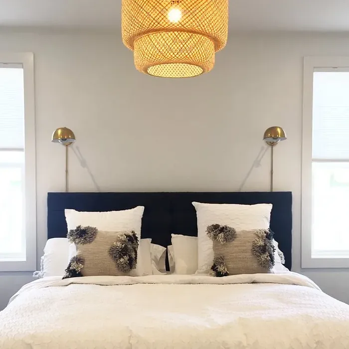
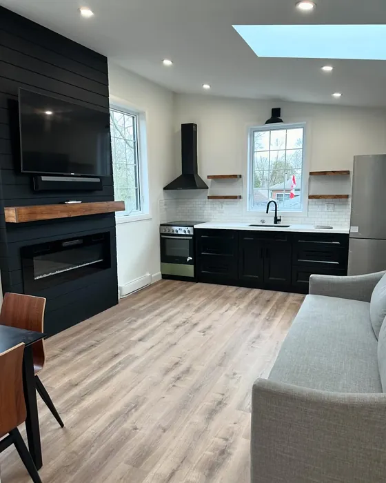
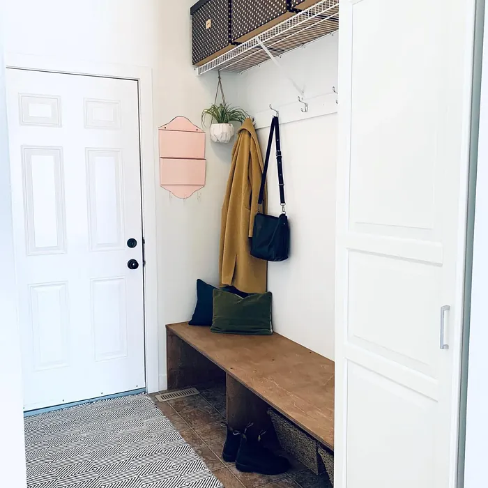
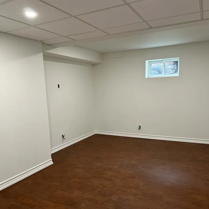
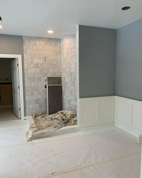
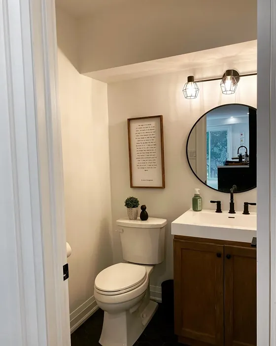
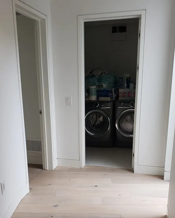
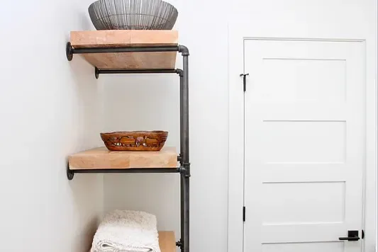
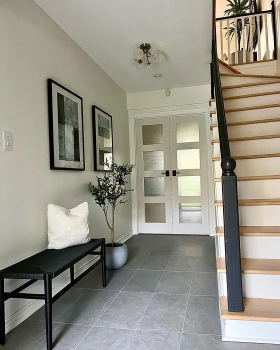
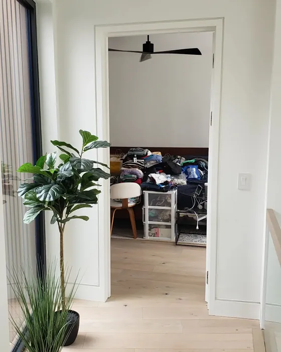
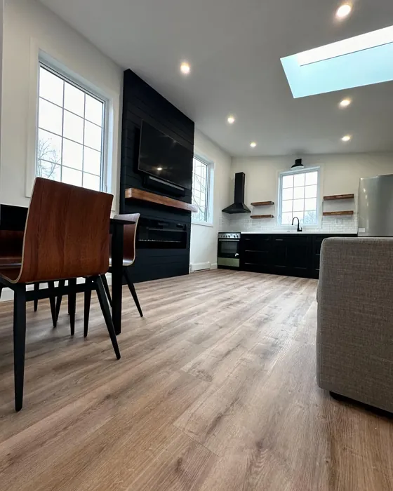
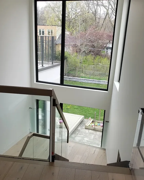
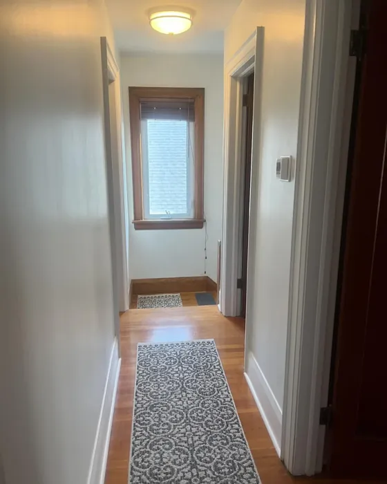
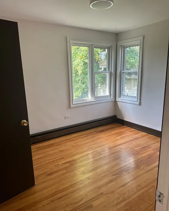
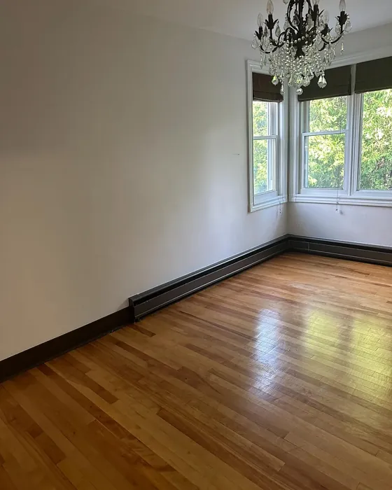
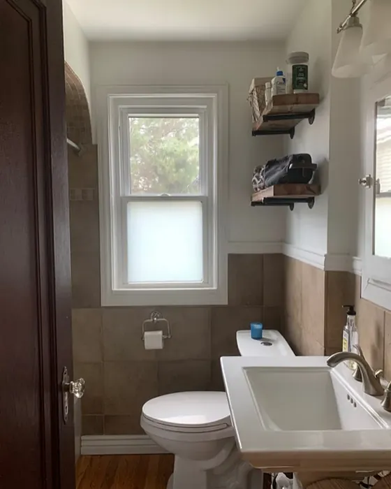
Real Room Photo of White Heron OC-57


Undertones of White Heron ?
The undertones of White Heron are a key aspect of its character, leaning towards Yellow. These subtle underlying hues are what give the color its depth and complexity. For example, a gray with a blue undertone will feel cooler and more modern, while one with a brown undertone will feel warmer and more traditional. It’s essential to test this paint in your home and observe it next to your existing furniture, flooring, and decor to see how these undertones interact and reveal themselves throughout the day.
HEX value: #F0F1EA
RGB code: 240, 241, 234
Is White Heron Cool or Warm?
This color leans slightly warm but remains neutral enough to be classified as balanced. It’s perfect for anyone who wants to avoid the harshness of pure white while still retaining a clean aesthetic.
Understanding Color Properties and Interior Design Tips
Hue refers to a specific position on the color wheel, measured in degrees from 0 to 360. Each degree represents a different pure color:
- 0° represents red
- 120° represents green
- 240° represents blue
Saturation describes the intensity or purity of a color and is expressed as a percentage:
- At 0%, the color appears completely desaturated—essentially a shade of gray
- At 100%, the color is at its most vivid and vibrant
Lightness indicates how light or dark a color is, also expressed as a percentage:
- 0% lightness results in black
- 100% lightness results in white
Using Warm Colors in Interior Design
Warm hues—such as reds, oranges, yellows, warm beiges, and greiges—are excellent choices for creating inviting and energetic spaces. These colors are particularly well-suited for:
- Kitchens, living rooms, and bathrooms, where warmth enhances comfort and sociability
- Large rooms, where warm tones can help reduce the sense of emptiness and make the space feel more intimate
For example:
- Warm beige shades provide a cozy, inviting atmosphere, ideal for living rooms, bedrooms, and hallways.
- Warm greige (a mix of beige and gray) offers the warmth of beige with the modern appeal of gray, making it a versatile backdrop for dining areas, bedrooms, and living spaces.
However, be mindful when using warm light tones in rooms with limited natural light. These shades may appear muted or even take on an unpleasant yellowish tint. To avoid a dull or flat appearance:
- Add depth by incorporating richer tones like deep greens, charcoal, or chocolate brown
- Use textured elements such as curtains, rugs, or cushions to bring dimension to the space
Pro Tip: Achieving Harmony with Warm and Cool Color Balance
To create a well-balanced and visually interesting interior, mix warm and cool tones strategically. This contrast adds depth and harmony to your design.
- If your walls feature warm hues, introduce cool-colored accents such as blue or green furniture, artwork, or accessories to create contrast.
- For a polished look, consider using a complementary color scheme, which pairs colors opposite each other on the color wheel (e.g., red with green, orange with blue).
This thoughtful mix not only enhances visual appeal but also creates a space that feels both dynamic and cohesive.

Light Temperature Affects on White Heron
Natural Light
Natural daylight changes in color temperature as the sun moves across the sky. At sunrise and sunset, the light tends to have a warm, golden tone with a color temperature around 2000 Kelvin (K). As the day progresses and the sun rises higher, the light becomes cooler and more neutral. Around midday, especially when the sky is clear, natural light typically reaches its peak brightness and shifts to a cooler tone, ranging from 5500 to 6500 Kelvin. This midday light is close to what we perceive as pure white or daylight-balanced light.
These shifts in natural light can significantly influence how colors appear in a space, which is why designers often consider both the time of day and the orientation of windows when planning interior color schemes.
Artificial Light
When choosing artificial lighting, pay close attention to the color temperature, measured in Kelvin (K). This determines how warm or cool the light will appear. Lower temperatures, around 2700K, give off a warm, yellow glow often used in living rooms or bedrooms. Higher temperatures, above 5000K, create a cool, bluish light similar to daylight, commonly used in kitchens, offices, or task areas.
Use the slider to see how lighting temperature can affect the appearance of a surface or color throughout a space.


4800K
LRV of White Heron
The Light Reflectance Value (LRV) of White Heron is 86.69%, which places it in the White colors category. This means it reflect all light. Understanding a paint’s LRV is crucial for predicting how it will look in your space. A higher LRV indicates a lighter color that reflects more light, making rooms feel larger and brighter. A lower LRV signifies a darker color that absorbs more light, creating a cozier, more intimate atmosphere. Always consider the natural and artificial lighting in your room when selecting a paint color based on its LRV.
Detailed Review of White Heron
Additional Paint Characteristics
Ideal Rooms
Bathroom, Bedroom, Dining Room, Home Office, Kitchen, Living Room, Nursery
Decor Styles
Farmhouse, Minimalist, Modern, Scandinavian, Transitional
Coverage
Good (1–2 Coats)
Ease of Application
Beginner Friendly, Brush Smooth, Fast-Drying, Roller-Ready
Washability
Highly Washable, Washable
VOC Level
Low VOC
Best Use
Accent Wall, Ceiling, Interior Walls, Trim
Room Suitability
Bathroom, Bedroom, Dining Room, Home Office, Kitchen, Living Room, Nursery
Tone Tag
Airy, Balanced, Neutral, Warm
Finish Type
Eggshell, Matte, Satin
Paint Performance
Easy Touch-Up, High Coverage, Low Odor, Quick Drying
Use Cases
Best for Rentals, Best for Small Spaces, Classic Favorite, Designer Favorite
Mood
Brightening, Calm, Cozy, Inviting
Trim Pairing
Complements Cool Trim, Pairs with White Dove, Works with Warm Trim
White Heron is a stunning choice if you’re looking for an off-white that adds warmth without overwhelming your space. This color has a lovely softness that pairs beautifully with natural light, enhancing the overall feel of a room. It works exceptionally well in both modern and traditional settings, allowing for versatility in decor. When applied, it consistently delivers good coverage, typically requiring just one to two coats. Whether you’re looking to refresh a living area or create a tranquil bedroom, White Heron delivers a soothing ambiance that can easily be complemented with various accent colors and decor styles. Its understated elegance ensures that it won’t overpower your furnishings but instead serves as a perfect canvas for your design vision.
Pros & Cons of OC-57 White Heron
Pros
Cons
Colors that go with Benjamin Moore White Heron
FAQ on OC-57 White Heron
How does White Heron compare to other off-white paints?
White Heron stands out among off-whites for its unique blend of warmth and neutrality. Unlike some stark whites, it adds a cozy touch to rooms without feeling too yellow or beige. This makes it highly adaptable, fitting well with a variety of decor styles, from modern to traditional. It’s perfect for those who want a bright look without the harshness that pure whites can bring.
Is White Heron suitable for small spaces?
Absolutely! White Heron is an excellent choice for small spaces. Its high light reflectance helps to open up areas, making them feel larger and more inviting. The warmth of the color also creates a cozy atmosphere, which can make small rooms feel more comfortable and welcoming. Pair it with mirrors or light furnishings for an airy vibe.
Comparisons White Heron with other colors
White Heron OC-57 vs Sea Salt SW 6204
| Attribute | White Heron OC-57 | Sea Salt SW 6204 |
|---|---|---|
| Color Name | White Heron OC-57 | Sea Salt SW 6204 |
| Color | ||
| Hue | Green | Green |
| Brightness | Light | Light |
| RGB | 240, 241, 234 | 205, 210, 202 |
| LRV | 86.69% | 64% |
| Finish Type | Eggshell, Matte, Satin | Eggshell, Satin |
| Finish Options | Eggshell, Matte, Satin | Eggshell, Matte, Satin |
| Ideal Rooms | Bathroom, Bedroom, Dining Room, Home Office, Kitchen, Living Room, Nursery | Bathroom, Bedroom, Hallway, Kitchen, Living Room |
| Decor Styles | Farmhouse, Minimalist, Modern, Scandinavian, Transitional | Coastal, Minimalist, Modern Farmhouse, Scandinavian, Traditional |
| Coverage | Good (1–2 Coats) | Good (1–2 Coats), Touch-Up Friendly |
| Ease of Application | Beginner Friendly, Brush Smooth, Fast-Drying, Roller-Ready | Beginner Friendly, Brush Smooth, Fast-Drying, Roller-Ready |
| Washability | Highly Washable, Washable | Highly Washable, Washable |
| Room Suitability | Bathroom, Bedroom, Dining Room, Home Office, Kitchen, Living Room, Nursery | Bathroom, Bedroom, Hallway, Kitchen, Living Room |
| Tone | Airy, Balanced, Neutral, Warm | Airy, Balanced, Cool, Muted |
| Paint Performance | Easy Touch-Up, High Coverage, Low Odor, Quick Drying | Easy Touch-Up, High Coverage, Low Odor, Quick Drying |
White Heron OC-57 vs Liveable Green SW 6176
| Attribute | White Heron OC-57 | Liveable Green SW 6176 |
|---|---|---|
| Color Name | White Heron OC-57 | Liveable Green SW 6176 |
| Color | ||
| Hue | Green | Green |
| Brightness | Light | Light |
| RGB | 240, 241, 234 | 206, 206, 189 |
| LRV | 86.69% | 30% |
| Finish Type | Eggshell, Matte, Satin | Eggshell, Matte, Satin |
| Finish Options | Eggshell, Matte, Satin | Eggshell, Matte, Satin |
| Ideal Rooms | Bathroom, Bedroom, Dining Room, Home Office, Kitchen, Living Room, Nursery | Bedroom, Home Office, Kitchen, Living Room, Nursery |
| Decor Styles | Farmhouse, Minimalist, Modern, Scandinavian, Transitional | Contemporary, Modern Farmhouse, Rustic, Scandi |
| Coverage | Good (1–2 Coats) | Good (1–2 Coats), Touch-Up Friendly |
| Ease of Application | Beginner Friendly, Brush Smooth, Fast-Drying, Roller-Ready | Beginner Friendly, Brush Smooth, Roller-Ready |
| Washability | Highly Washable, Washable | Highly Washable, Washable |
| Room Suitability | Bathroom, Bedroom, Dining Room, Home Office, Kitchen, Living Room, Nursery | Bedroom, Home Office, Living Room, Nursery |
| Tone | Airy, Balanced, Neutral, Warm | Balanced, Earthy, Muted |
| Paint Performance | Easy Touch-Up, High Coverage, Low Odor, Quick Drying | Easy Touch-Up, High Coverage, Low Odor |
White Heron OC-57 vs Rainwashed SW 6211
| Attribute | White Heron OC-57 | Rainwashed SW 6211 |
|---|---|---|
| Color Name | White Heron OC-57 | Rainwashed SW 6211 |
| Color | ||
| Hue | Green | Green |
| Brightness | Light | Light |
| RGB | 240, 241, 234 | 194, 205, 197 |
| LRV | 86.69% | 60% |
| Finish Type | Eggshell, Matte, Satin | Eggshell, Matte, Satin |
| Finish Options | Eggshell, Matte, Satin | Eggshell, Matte, Satin |
| Ideal Rooms | Bathroom, Bedroom, Dining Room, Home Office, Kitchen, Living Room, Nursery | Bathroom, Bedroom, Home Office, Living Room, Nursery |
| Decor Styles | Farmhouse, Minimalist, Modern, Scandinavian, Transitional | Coastal, Farmhouse, Minimalist, Modern, Transitional |
| Coverage | Good (1–2 Coats) | Good (1–2 Coats), Touch-Up Friendly |
| Ease of Application | Beginner Friendly, Brush Smooth, Fast-Drying, Roller-Ready | Beginner Friendly, Brush Smooth, Fast-Drying, Roller-Ready |
| Washability | Highly Washable, Washable | Washable, Wipeable |
| Room Suitability | Bathroom, Bedroom, Dining Room, Home Office, Kitchen, Living Room, Nursery | Bathroom, Bedroom, Home Office, Living Room, Nursery |
| Tone | Airy, Balanced, Neutral, Warm | Balanced, Cool, Muted |
| Paint Performance | Easy Touch-Up, High Coverage, Low Odor, Quick Drying | Easy Touch-Up, High Coverage, Low Odor |
White Heron OC-57 vs Filmy Green SW 6190
| Attribute | White Heron OC-57 | Filmy Green SW 6190 |
|---|---|---|
| Color Name | White Heron OC-57 | Filmy Green SW 6190 |
| Color | ||
| Hue | Green | Green |
| Brightness | Light | Light |
| RGB | 240, 241, 234 | 209, 211, 199 |
| LRV | 86.69% | 50% |
| Finish Type | Eggshell, Matte, Satin | Eggshell, Matte, Satin |
| Finish Options | Eggshell, Matte, Satin | Eggshell, Matte, Satin |
| Ideal Rooms | Bathroom, Bedroom, Dining Room, Home Office, Kitchen, Living Room, Nursery | Bedroom, Home Office, Living Room, Nursery |
| Decor Styles | Farmhouse, Minimalist, Modern, Scandinavian, Transitional | Bohemian, Minimalist, Modern Farmhouse, Scandinavian |
| Coverage | Good (1–2 Coats) | Good (1–2 Coats) |
| Ease of Application | Beginner Friendly, Brush Smooth, Fast-Drying, Roller-Ready | Beginner Friendly, Brush Smooth, Roller-Ready |
| Washability | Highly Washable, Washable | Washable, Wipeable |
| Room Suitability | Bathroom, Bedroom, Dining Room, Home Office, Kitchen, Living Room, Nursery | Bedroom, Home Office, Living Room, Nursery |
| Tone | Airy, Balanced, Neutral, Warm | Calm, Earthy, Muted |
| Paint Performance | Easy Touch-Up, High Coverage, Low Odor, Quick Drying | Easy Touch-Up, Low Odor, Quick Drying |
White Heron OC-57 vs Slow Green SW 6456
| Attribute | White Heron OC-57 | Slow Green SW 6456 |
|---|---|---|
| Color Name | White Heron OC-57 | Slow Green SW 6456 |
| Color | ||
| Hue | Green | Green |
| Brightness | Light | Light |
| RGB | 240, 241, 234 | 198, 213, 201 |
| LRV | 86.69% | 48% |
| Finish Type | Eggshell, Matte, Satin | Eggshell, Matte, Satin |
| Finish Options | Eggshell, Matte, Satin | Eggshell, Matte, Satin |
| Ideal Rooms | Bathroom, Bedroom, Dining Room, Home Office, Kitchen, Living Room, Nursery | Bedroom, Dining Room, Home Office, Living Room, Nursery |
| Decor Styles | Farmhouse, Minimalist, Modern, Scandinavian, Transitional | Coastal, Farmhouse, Modern, Rustic, Scandinavian |
| Coverage | Good (1–2 Coats) | Good (1–2 Coats), Touch-Up Friendly |
| Ease of Application | Beginner Friendly, Brush Smooth, Fast-Drying, Roller-Ready | Beginner Friendly, Brush Smooth, Roller-Ready |
| Washability | Highly Washable, Washable | Highly Washable, Washable |
| Room Suitability | Bathroom, Bedroom, Dining Room, Home Office, Kitchen, Living Room, Nursery | Bedroom, Dining Room, Entryway, Home Office, Living Room, Nursery |
| Tone | Airy, Balanced, Neutral, Warm | Balanced, Earthy, Muted |
| Paint Performance | Easy Touch-Up, High Coverage, Low Odor, Quick Drying | Easy Touch-Up, Fade Resistant, Low Odor |
White Heron OC-57 vs Acanthus SW 0029
| Attribute | White Heron OC-57 | Acanthus SW 0029 |
|---|---|---|
| Color Name | White Heron OC-57 | Acanthus SW 0029 |
| Color | ||
| Hue | Green | Green |
| Brightness | Light | Light |
| RGB | 240, 241, 234 | 205, 205, 180 |
| LRV | 86.69% | 10% |
| Finish Type | Eggshell, Matte, Satin | Eggshell, Matte, Satin |
| Finish Options | Eggshell, Matte, Satin | Eggshell, Matte, Satin |
| Ideal Rooms | Bathroom, Bedroom, Dining Room, Home Office, Kitchen, Living Room, Nursery | Bedroom, Dining Room, Home Office, Kitchen, Living Room |
| Decor Styles | Farmhouse, Minimalist, Modern, Scandinavian, Transitional | Eclectic, Farmhouse, Modern, Traditional |
| Coverage | Good (1–2 Coats) | Good (1–2 Coats) |
| Ease of Application | Beginner Friendly, Brush Smooth, Fast-Drying, Roller-Ready | Beginner Friendly, Brush Smooth, Fast-Drying, Roller-Ready |
| Washability | Highly Washable, Washable | Highly Washable, Stain Resistant, Washable |
| Room Suitability | Bathroom, Bedroom, Dining Room, Home Office, Kitchen, Living Room, Nursery | Bedroom, Dining Room, Home Office, Living Room |
| Tone | Airy, Balanced, Neutral, Warm | Balanced, Earthy, Muted |
| Paint Performance | Easy Touch-Up, High Coverage, Low Odor, Quick Drying | Easy Touch-Up, Low Odor, Quick Drying, Scuff Resistant |
White Heron OC-57 vs Topiary Tint SW 6449
| Attribute | White Heron OC-57 | Topiary Tint SW 6449 |
|---|---|---|
| Color Name | White Heron OC-57 | Topiary Tint SW 6449 |
| Color | ||
| Hue | Green | Green |
| Brightness | Light | Light |
| RGB | 240, 241, 234 | 200, 216, 196 |
| LRV | 86.69% | 30% |
| Finish Type | Eggshell, Matte, Satin | Eggshell, Matte, Satin |
| Finish Options | Eggshell, Matte, Satin | Eggshell, Matte, Satin |
| Ideal Rooms | Bathroom, Bedroom, Dining Room, Home Office, Kitchen, Living Room, Nursery | Bathroom, Bedroom, Dining Room, Home Office, Kitchen, Living Room |
| Decor Styles | Farmhouse, Minimalist, Modern, Scandinavian, Transitional | Bohemian, Coastal, Eclectic, Modern Farmhouse, Transitional |
| Coverage | Good (1–2 Coats) | Good (1–2 Coats), Touch-Up Friendly |
| Ease of Application | Beginner Friendly, Brush Smooth, Fast-Drying, Roller-Ready | Beginner Friendly, Brush Smooth, Fast-Drying, Roller-Ready |
| Washability | Highly Washable, Washable | Scuff Resistant, Washable |
| Room Suitability | Bathroom, Bedroom, Dining Room, Home Office, Kitchen, Living Room, Nursery | Bathroom, Bedroom, Dining Room, Kitchen, Living Room |
| Tone | Airy, Balanced, Neutral, Warm | Balanced, Calm, Earthy, Muted |
| Paint Performance | Easy Touch-Up, High Coverage, Low Odor, Quick Drying | Easy Touch-Up, Low Odor, Quick Drying, Stain Resistant |
White Heron OC-57 vs Waterscape SW 6470
| Attribute | White Heron OC-57 | Waterscape SW 6470 |
|---|---|---|
| Color Name | White Heron OC-57 | Waterscape SW 6470 |
| Color | ||
| Hue | Green | Green |
| Brightness | Light | Light |
| RGB | 240, 241, 234 | 191, 210, 201 |
| LRV | 86.69% | 50% |
| Finish Type | Eggshell, Matte, Satin | Eggshell, Matte |
| Finish Options | Eggshell, Matte, Satin | Eggshell, Matte, Satin |
| Ideal Rooms | Bathroom, Bedroom, Dining Room, Home Office, Kitchen, Living Room, Nursery | Bathroom, Bedroom, Home Office, Kitchen, Living Room |
| Decor Styles | Farmhouse, Minimalist, Modern, Scandinavian, Transitional | Coastal, Minimalist, Modern, Scandinavian |
| Coverage | Good (1–2 Coats) | Good (1–2 Coats) |
| Ease of Application | Beginner Friendly, Brush Smooth, Fast-Drying, Roller-Ready | Beginner Friendly, Brush Smooth, Roller-Ready |
| Washability | Highly Washable, Washable | Highly Washable, Washable |
| Room Suitability | Bathroom, Bedroom, Dining Room, Home Office, Kitchen, Living Room, Nursery | Bathroom, Bedroom, Home Office, Living Room |
| Tone | Airy, Balanced, Neutral, Warm | Airy, Cool, Muted |
| Paint Performance | Easy Touch-Up, High Coverage, Low Odor, Quick Drying | Easy Touch-Up, Low Odor, Quick Drying |
White Heron OC-57 vs Bonsai Tint SW 6436
| Attribute | White Heron OC-57 | Bonsai Tint SW 6436 |
|---|---|---|
| Color Name | White Heron OC-57 | Bonsai Tint SW 6436 |
| Color | ||
| Hue | Green | Green |
| Brightness | Light | Light |
| RGB | 240, 241, 234 | 197, 209, 178 |
| LRV | 86.69% | 64% |
| Finish Type | Eggshell, Matte, Satin | Eggshell, Matte |
| Finish Options | Eggshell, Matte, Satin | Eggshell, Matte, Satin |
| Ideal Rooms | Bathroom, Bedroom, Dining Room, Home Office, Kitchen, Living Room, Nursery | Bedroom, Home Office, Living Room, Nursery |
| Decor Styles | Farmhouse, Minimalist, Modern, Scandinavian, Transitional | Bohemian, Minimalist, Modern, Scandinavian |
| Coverage | Good (1–2 Coats) | Good (1–2 Coats) |
| Ease of Application | Beginner Friendly, Brush Smooth, Fast-Drying, Roller-Ready | Beginner Friendly, Brush Smooth, Roller-Ready |
| Washability | Highly Washable, Washable | Washable, Wipeable |
| Room Suitability | Bathroom, Bedroom, Dining Room, Home Office, Kitchen, Living Room, Nursery | Bedroom, Home Office, Living Room, Nursery |
| Tone | Airy, Balanced, Neutral, Warm | Calm, Earthy, Muted |
| Paint Performance | Easy Touch-Up, High Coverage, Low Odor, Quick Drying | Easy Touch-Up, Fade Resistant, Low Odor |
White Heron OC-57 vs Gratifying Green SW 6435
| Attribute | White Heron OC-57 | Gratifying Green SW 6435 |
|---|---|---|
| Color Name | White Heron OC-57 | Gratifying Green SW 6435 |
| Color | ||
| Hue | Green | Green |
| Brightness | Light | Light |
| RGB | 240, 241, 234 | 218, 226, 205 |
| LRV | 86.69% | 30% |
| Finish Type | Eggshell, Matte, Satin | Eggshell, Matte, Satin |
| Finish Options | Eggshell, Matte, Satin | Eggshell, Matte, Satin |
| Ideal Rooms | Bathroom, Bedroom, Dining Room, Home Office, Kitchen, Living Room, Nursery | Bedroom, Dining Room, Home Office, Living Room, Nursery |
| Decor Styles | Farmhouse, Minimalist, Modern, Scandinavian, Transitional | Bohemian, Coastal, Minimalist, Modern Farmhouse |
| Coverage | Good (1–2 Coats) | Good (1–2 Coats), Touch-Up Friendly |
| Ease of Application | Beginner Friendly, Brush Smooth, Fast-Drying, Roller-Ready | Beginner Friendly, Brush Smooth, Roller-Ready |
| Washability | Highly Washable, Washable | Washable, Wipeable |
| Room Suitability | Bathroom, Bedroom, Dining Room, Home Office, Kitchen, Living Room, Nursery | Bedroom, Home Office, Living Room, Nursery |
| Tone | Airy, Balanced, Neutral, Warm | Earthy, Muted, Warm |
| Paint Performance | Easy Touch-Up, High Coverage, Low Odor, Quick Drying | Easy Touch-Up, Low Odor, Quick Drying |
Official Page of Benjamin Moore White Heron OC-57