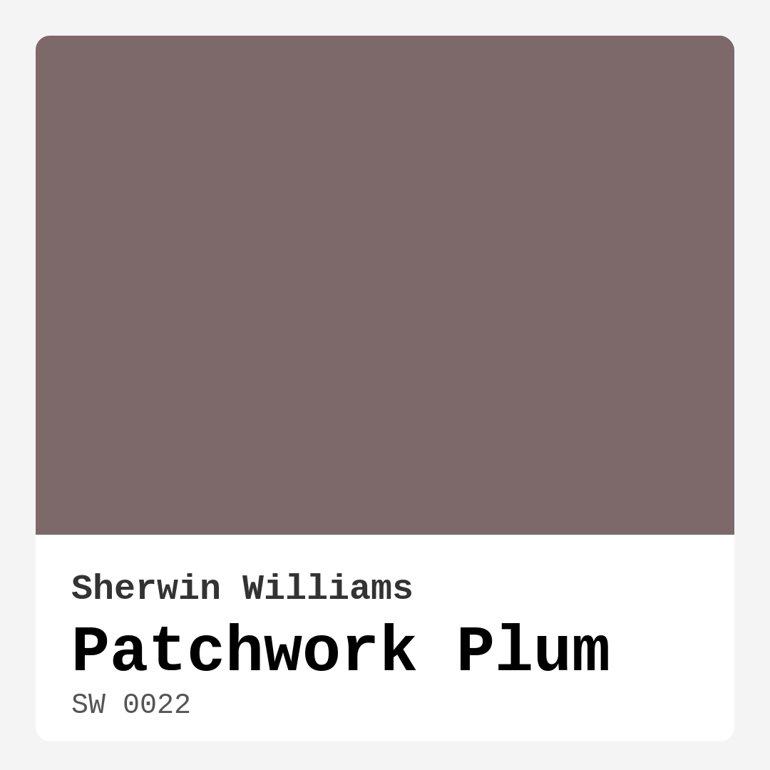
Color Preview & Key Details
| HEX Code | #7E696A |
| RGB | 126, 105, 106 |
| LRV | 10% |
| Undertone | Red |
| Finish Options | Eggshell, Matte, Satin |
Imagine walking into a room that instantly wraps you in warmth and sophistication. You’re greeted by the rich, muted hue of Patchwork Plum, a color that doesn’t just coat the walls but also sets the mood for the entire space. This isn’t just paint; it’s a transformative element that can turn a simple room into a cozy retreat.
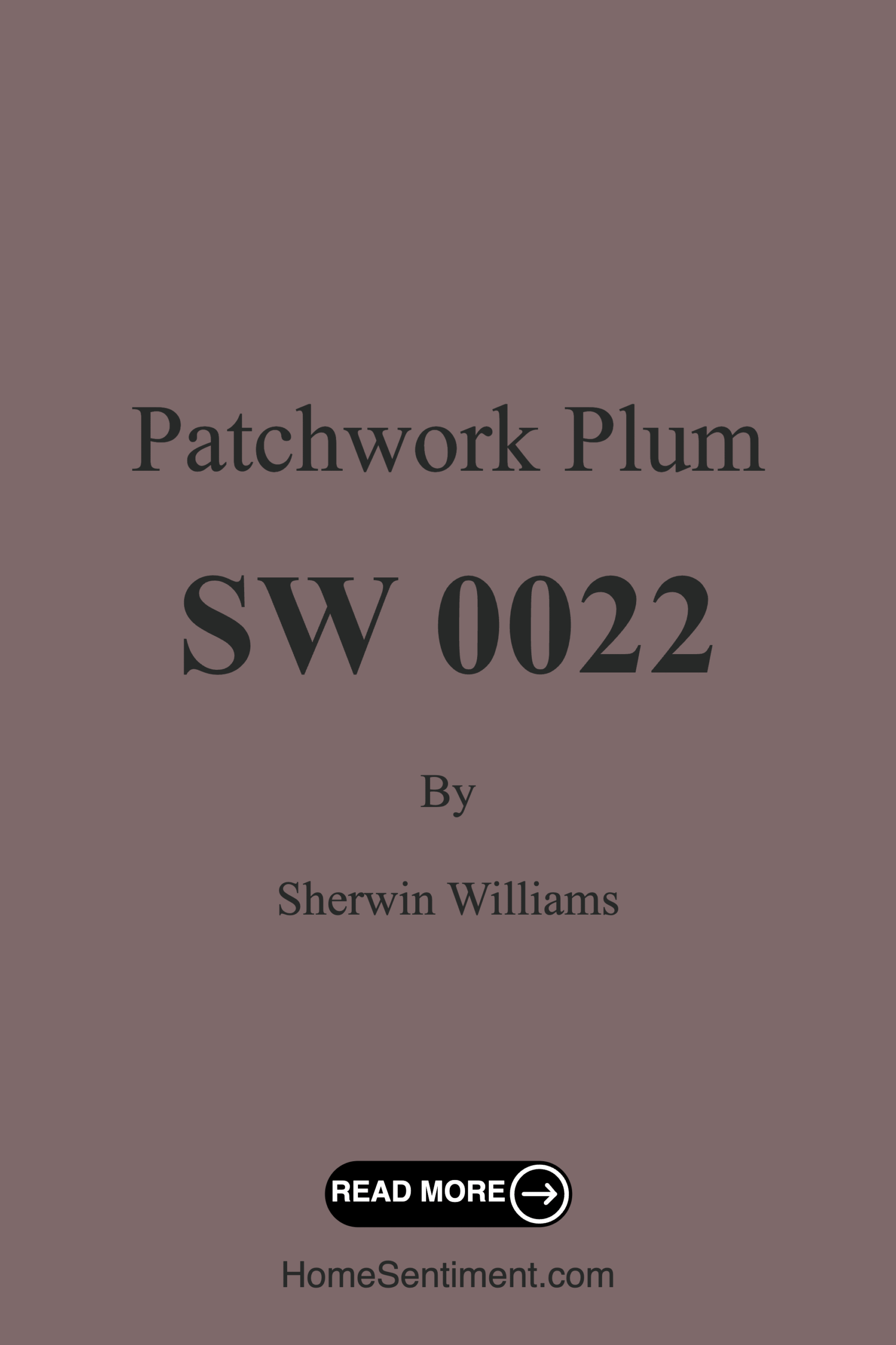
Patchwork Plum, Sherwin Williams’ SW 0022, is a dark, earthy tone with a warm plum undertone that embodies elegance without being overpowering. Whether you’re considering a refresh for your living room, bedroom, dining room, or home office, this color stands ready to enhance your space beautifully. It’s that perfect blend of boldness and subtlety, making it a favorite for homeowners looking to elevate their decor.
Let’s dive deeper into what makes Patchwork Plum such a fantastic choice. First, its warmth is undeniable. It creates an inviting atmosphere, perfect for gathering spaces where you want to encourage conversation and relaxation. The red undertones in this color add depth, giving it a richness that can adapt depending on the lighting. In bright natural light, the plum tones pop, adding a lively touch, while in softer light, the color exudes a calming presence—perfect for winding down after a long day.
One of the best aspects of Patchwork Plum is its versatility. It seamlessly fits into a variety of decor styles. Whether your home leans towards modern farmhouse, rustic, eclectic, or transitional, this color can adapt beautifully. Picture it alongside natural wood elements or contemporary finishes, and you’ll see just how dynamic it can be. The muted nature of the hue means it can act as a neutral backdrop, allowing your furniture and decor to shine.
When applying this color, you’ll find it beginner-friendly, with a smooth application that rolls on easily and brushes out beautifully. If you’re planning on touch-ups down the line, you’ll appreciate how forgiving it is. Patchwork Plum is designed to be touch-up friendly, making it perfect for those DIY enthusiasts who love to refresh their spaces regularly.
But let’s talk about lighting, because it’s critical to how any paint color performs. With an LRV (Light Reflectance Value) of 10%, Patchwork Plum falls into the dark colors category, meaning it doesn’t reflect much light. This characteristic can make smaller spaces feel cozier but may also darken them if used excessively. If you’re considering this color for a small room, think about using it as an accent rather than an all-over hue. Pair it with lighter tones and ensure you have good lighting to maintain an airy feel.
For the finish, your choice will depend on the room’s functionality. An eggshell or satin finish works wonderfully for living areas and bedrooms, providing a soft sheen that’s easy to clean. In dining areas or kitchens, a satin finish will not only enhance the color but also offer better resistance to stains, making it practical for high-use spaces.
As you consider how Patchwork Plum fits into your home, think about its complementary shades. Colors like SW 6224, SW 9137, and SW 9633 pair beautifully with it, adding layers and depth to your design. These colors can help you create a harmonious palette that feels cohesive and well thought out.
Now, let’s address the practical side. Patchwork Plum is low in VOCs, which means it’s better for indoor air quality—a huge plus for anyone concerned about health impacts from paint. And with a washable formula, you won’t have to worry too much about maintenance. Just a simple wipe can keep this rich hue looking fresh, making it suitable for families and busy lifestyles.
If you’re still on the fence, here’s a quick tip: always test the color in your space before committing. The way Patchwork Plum interacts with your existing furniture, flooring, and lighting can reveal different aspects of its personality. You might find that the color’s undertones shift throughout the day, and it’s essential to see how it feels in different conditions.
When it comes to mood, Patchwork Plum brings a cozy, inviting vibe that’s grounding without feeling heavy. It’s ideal for creating a sanctuary, encouraging relaxation and comfort. Imagine curling up with a book in a living room painted in this hue, surrounded by warm wood accents and soft textiles. It beckons you to unwind.
As a final thought, consider the trim pairing. White Dove is a lovely choice that can brighten the space while maintaining a sophisticated contrast against Patchwork Plum. Brass fixtures will also complement this color beautifully, enhancing its warmth and richness.
In summary, Patchwork Plum is not just a paint color; it’s an opportunity to create a space that feels uniquely yours. Whether you’re looking to craft a warm living room, a sophisticated dining area, or a comforting bedroom, this hue can do it all. With its versatility, ease of application, and low maintenance, it’s easy to see why so many designers and homeowners alike are falling in love with this rich, earthy color. Embrace the warmth of Patchwork Plum and let it transform your home into a cozy retreat that reflects your personal style.
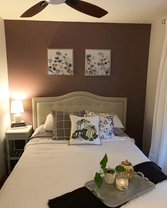
Real Room Photo of Patchwork Plum SW 0022
Undertones of Patchwork Plum ?
The undertones of Patchwork Plum are a key aspect of its character, leaning towards Red. These subtle underlying hues are what give the color its depth and complexity. For example, a gray with a blue undertone will feel cooler and more modern, while one with a brown undertone will feel warmer and more traditional. It’s essential to test this paint in your home and observe it next to your existing furniture, flooring, and decor to see how these undertones interact and reveal themselves throughout the day.
HEX value: #7E696A
RGB code: 126, 105, 106
Is Patchwork Plum Cool or Warm?
Patchwork Plum is considered a warm paint color. This characteristic plays a huge role in the overall feel of a room. Warm colors, like this one, tend to create a cozy, inviting, and energetic atmosphere, making them great for social spaces like living rooms and dining rooms. In contrast, cool colors often evoke a sense of calm and serenity, which is why they are popular in bedrooms and bathrooms. The warmth of Patchwork Plum means it will pair beautifully with corresponding decor elements.
Understanding Color Properties and Interior Design Tips
Hue refers to a specific position on the color wheel, measured in degrees from 0 to 360. Each degree represents a different pure color:
- 0° represents red
- 120° represents green
- 240° represents blue
Saturation describes the intensity or purity of a color and is expressed as a percentage:
- At 0%, the color appears completely desaturated—essentially a shade of gray
- At 100%, the color is at its most vivid and vibrant
Lightness indicates how light or dark a color is, also expressed as a percentage:
- 0% lightness results in black
- 100% lightness results in white
Using Warm Colors in Interior Design
Warm hues—such as reds, oranges, yellows, warm beiges, and greiges—are excellent choices for creating inviting and energetic spaces. These colors are particularly well-suited for:
- Kitchens, living rooms, and bathrooms, where warmth enhances comfort and sociability
- Large rooms, where warm tones can help reduce the sense of emptiness and make the space feel more intimate
For example:
- Warm beige shades provide a cozy, inviting atmosphere, ideal for living rooms, bedrooms, and hallways.
- Warm greige (a mix of beige and gray) offers the warmth of beige with the modern appeal of gray, making it a versatile backdrop for dining areas, bedrooms, and living spaces.
However, be mindful when using warm light tones in rooms with limited natural light. These shades may appear muted or even take on an unpleasant yellowish tint. To avoid a dull or flat appearance:
- Add depth by incorporating richer tones like deep greens, charcoal, or chocolate brown
- Use textured elements such as curtains, rugs, or cushions to bring dimension to the space
Pro Tip: Achieving Harmony with Warm and Cool Color Balance
To create a well-balanced and visually interesting interior, mix warm and cool tones strategically. This contrast adds depth and harmony to your design.
- If your walls feature warm hues, introduce cool-colored accents such as blue or green furniture, artwork, or accessories to create contrast.
- For a polished look, consider using a complementary color scheme, which pairs colors opposite each other on the color wheel (e.g., red with green, orange with blue).
This thoughtful mix not only enhances visual appeal but also creates a space that feels both dynamic and cohesive.
Light Temperature Affects on Patchwork Plum
Natural Light
Natural daylight changes in color temperature as the sun moves across the sky. At sunrise and sunset, the light tends to have a warm, golden tone with a color temperature around 2000 Kelvin (K). As the day progresses and the sun rises higher, the light becomes cooler and more neutral. Around midday, especially when the sky is clear, natural light typically reaches its peak brightness and shifts to a cooler tone, ranging from 5500 to 6500 Kelvin. This midday light is close to what we perceive as pure white or daylight-balanced light.
These shifts in natural light can significantly influence how colors appear in a space, which is why designers often consider both the time of day and the orientation of windows when planning interior color schemes.
Artificial Light
When choosing artificial lighting, pay close attention to the color temperature, measured in Kelvin (K). This determines how warm or cool the light will appear. Lower temperatures, around 2700K, give off a warm, yellow glow often used in living rooms or bedrooms. Higher temperatures, above 5000K, create a cool, bluish light similar to daylight, commonly used in kitchens, offices, or task areas.
Use the slider to see how lighting temperature can affect the appearance of a surface or color throughout a space.


4800K
LRV of Patchwork Plum
The Light Reflectance Value (LRV) of Patchwork Plum is 10%, which places it in the Dark colors category. This means it does not reflect light. Understanding a paint’s LRV is crucial for predicting how it will look in your space. A higher LRV indicates a lighter color that reflects more light, making rooms feel larger and brighter. A lower LRV signifies a darker color that absorbs more light, creating a cozier, more intimate atmosphere. Always consider the natural and artificial lighting in your room when selecting a paint color based on its LRV.
Detailed Review of Patchwork Plum
Additional Paint Characteristics
Ideal Rooms
Bedroom, Dining Room, Home Office, Living Room
Decor Styles
Eclectic, Modern Farmhouse, Rustic, Transitional
Coverage
Good (1–2 Coats), Touch-Up Friendly
Ease of Application
Beginner Friendly, Brush Smooth, Roll-Ready
Washability
Washable, Wipeable
VOC Level
Eco-Certified, Low VOC
Best Use
Accent Wall, Furniture, Interior Walls
Room Suitability
Bedroom, Dining Room, Home Office, Living Room
Tone Tag
Earthy, Muted, Warm
Finish Type
Eggshell, Matte, Satin
Paint Performance
Easy Touch-Up, Fade Resistant, Low Odor
Use Cases
Best for Modern Farmhouse, Classic Favorite, Designer Favorite
Mood
Cozy, Grounding, Inviting
Trim Pairing
Complements Brass Fixtures, Pairs with White Dove, Works with Warm Trim
Using Patchwork Plum in your home can transform your space into a cozy retreat. This color pairs beautifully with both natural wood elements and contemporary finishes, making it versatile enough for various decor styles. When applied, it offers a smooth finish that enhances the depth of the hue, creating an inviting atmosphere. Depending on the lighting, Patchwork Plum can shift from a warm earthy tone to a more vibrant plum, making it a dynamic choice. Ensure to test a small area first, as the color can appear different in various lights. Overall, it’s a fantastic option for creating a warm and sophisticated vibe in any room.
Pros & Cons of SW 0022 Patchwork Plum
Pros
Cons
Colors that go with Sherwin Williams Patchwork Plum
FAQ on SW 0022 Patchwork Plum
Is Patchwork Plum suitable for small rooms?
While Patchwork Plum can create a cozy atmosphere, it may darken smaller spaces if used excessively. To maintain a light and airy feeling, consider using it as an accent color or pairing it with lighter tones. Additionally, using good lighting can help balance the warmth of the color, making it a more viable choice for smaller areas.
What finish should I choose for Patchwork Plum?
The best finish for Patchwork Plum depends on the room’s function. For living areas and bedrooms, an eggshell or satin finish will provide a soft sheen that’s easy to clean while retaining warmth. In areas like dining rooms or kitchens, a satin finish can be more practical, as it’s more resistant to stains and easier to wipe down.
Comparisons Patchwork Plum with other colors
Patchwork Plum SW 0022 vs Exclusive Plum SW 6263
| Attribute | Patchwork Plum SW 0022 | Exclusive Plum SW 6263 |
|---|---|---|
| Color Name | Patchwork Plum SW 0022 | Exclusive Plum SW 6263 |
| Color | ||
| Hue | Purple | Purple |
| Brightness | Dark | Dark |
| RGB | 126, 105, 106 | 115, 111, 120 |
| LRV | 10% | 15% |
| Finish Type | Eggshell, Matte, Satin | Eggshell, Matte, Satin |
| Finish Options | Eggshell, Matte, Satin | Eggshell, Matte, Satin |
| Ideal Rooms | Bedroom, Dining Room, Home Office, Living Room | Bedroom, Dining Room, Home Office, Living Room |
| Decor Styles | Eclectic, Modern Farmhouse, Rustic, Transitional | Contemporary, Eclectic, Modern, Traditional |
| Coverage | Good (1–2 Coats), Touch-Up Friendly | Good (1–2 Coats), Touch-Up Friendly |
| Ease of Application | Beginner Friendly, Brush Smooth, Roll-Ready | Beginner Friendly, Brush Smooth, Fast-Drying, Roller-Ready |
| Washability | Washable, Wipeable | Washable, Wipeable |
| Room Suitability | Bedroom, Dining Room, Home Office, Living Room | Bedroom, Dining Room, Home Office, Living Room |
| Tone | Earthy, Muted, Warm | Deep, Dusty, Warm |
| Paint Performance | Easy Touch-Up, Fade Resistant, Low Odor | Easy Touch-Up, High Coverage, Low Odor |
Patchwork Plum SW 0022 vs Blackberry SW 7577
| Attribute | Patchwork Plum SW 0022 | Blackberry SW 7577 |
|---|---|---|
| Color Name | Patchwork Plum SW 0022 | Blackberry SW 7577 |
| Color | ||
| Hue | Purple | Purple |
| Brightness | Dark | Dark |
| RGB | 126, 105, 106 | 83, 54, 64 |
| LRV | 10% | 5% |
| Finish Type | Eggshell, Matte, Satin | Eggshell, Matte |
| Finish Options | Eggshell, Matte, Satin | Eggshell, Matte, Satin |
| Ideal Rooms | Bedroom, Dining Room, Home Office, Living Room | Bedroom, Dining Room, Home Office, Living Room |
| Decor Styles | Eclectic, Modern Farmhouse, Rustic, Transitional | Bohemian, Contemporary, Modern, Rustic |
| Coverage | Good (1–2 Coats), Touch-Up Friendly | Good (1–2 Coats), Touch-Up Friendly |
| Ease of Application | Beginner Friendly, Brush Smooth, Roll-Ready | Beginner Friendly, Brush Smooth, Roller-Ready |
| Washability | Washable, Wipeable | Washable, Wipeable |
| Room Suitability | Bedroom, Dining Room, Home Office, Living Room | Bedroom, Dining Room, Home Office, Living Room |
| Tone | Earthy, Muted, Warm | Deep, Moody, Warm |
| Paint Performance | Easy Touch-Up, Fade Resistant, Low Odor | Easy Touch-Up, High Coverage, Low Odor |
Patchwork Plum SW 0022 vs Expressive Plum SW 6271
| Attribute | Patchwork Plum SW 0022 | Expressive Plum SW 6271 |
|---|---|---|
| Color Name | Patchwork Plum SW 0022 | Expressive Plum SW 6271 |
| Color | ||
| Hue | Purple | Purple |
| Brightness | Dark | Dark |
| RGB | 126, 105, 106 | 105, 92, 98 |
| LRV | 10% | 15% |
| Finish Type | Eggshell, Matte, Satin | Eggshell, Matte, Satin |
| Finish Options | Eggshell, Matte, Satin | Eggshell, Matte, Satin |
| Ideal Rooms | Bedroom, Dining Room, Home Office, Living Room | Bedroom, Dining Room, Home Office, Living Room |
| Decor Styles | Eclectic, Modern Farmhouse, Rustic, Transitional | Eclectic, Modern, Traditional, Transitional |
| Coverage | Good (1–2 Coats), Touch-Up Friendly | Good (1–2 Coats) |
| Ease of Application | Beginner Friendly, Brush Smooth, Roll-Ready | Beginner Friendly, Brush Smooth, Roller-Ready |
| Washability | Washable, Wipeable | Washable, Wipeable |
| Room Suitability | Bedroom, Dining Room, Home Office, Living Room | Bedroom, Dining Room, Home Office, Living Room |
| Tone | Earthy, Muted, Warm | Deep, Muted, Warm |
| Paint Performance | Easy Touch-Up, Fade Resistant, Low Odor | Easy Touch-Up, High Coverage, Low Odor |
Patchwork Plum SW 0022 vs Plum Brown SW 6272
| Attribute | Patchwork Plum SW 0022 | Plum Brown SW 6272 |
|---|---|---|
| Color Name | Patchwork Plum SW 0022 | Plum Brown SW 6272 |
| Color | ||
| Hue | Purple | Purple |
| Brightness | Dark | Dark |
| RGB | 126, 105, 106 | 78, 66, 71 |
| LRV | 10% | 6% |
| Finish Type | Eggshell, Matte, Satin | Eggshell, Matte, Satin |
| Finish Options | Eggshell, Matte, Satin | Eggshell, Matte, Satin |
| Ideal Rooms | Bedroom, Dining Room, Home Office, Living Room | Bedroom, Dining Room, Home Office, Living Room |
| Decor Styles | Eclectic, Modern Farmhouse, Rustic, Transitional | Eclectic, Modern, Rustic, Traditional |
| Coverage | Good (1–2 Coats), Touch-Up Friendly | Good (1–2 Coats), Touch-Up Friendly |
| Ease of Application | Beginner Friendly, Brush Smooth, Roll-Ready | Beginner Friendly, Brush Smooth, Roller-Ready |
| Washability | Washable, Wipeable | Washable, Wipeable |
| Room Suitability | Bedroom, Dining Room, Home Office, Living Room | Bedroom, Dining Room, Home Office, Living Room |
| Tone | Earthy, Muted, Warm | Deep, Earthy, Warm |
| Paint Performance | Easy Touch-Up, Fade Resistant, Low Odor | Easy Touch-Up, High Coverage, Low Odor |
Patchwork Plum SW 0022 vs Soulmate SW 6270
| Attribute | Patchwork Plum SW 0022 | Soulmate SW 6270 |
|---|---|---|
| Color Name | Patchwork Plum SW 0022 | Soulmate SW 6270 |
| Color | ||
| Hue | Purple | Purple |
| Brightness | Dark | Dark |
| RGB | 126, 105, 106 | 133, 119, 123 |
| LRV | 10% | 24% |
| Finish Type | Eggshell, Matte, Satin | Eggshell, Matte, Satin |
| Finish Options | Eggshell, Matte, Satin | Eggshell, Matte, Satin |
| Ideal Rooms | Bedroom, Dining Room, Home Office, Living Room | Bedroom, Hallway, Home Office, Living Room |
| Decor Styles | Eclectic, Modern Farmhouse, Rustic, Transitional | Bohemian, Modern, Rustic, Transitional |
| Coverage | Good (1–2 Coats), Touch-Up Friendly | Good (1–2 Coats), Touch-Up Friendly |
| Ease of Application | Beginner Friendly, Brush Smooth, Roll-Ready | Beginner Friendly, Brush Smooth, Roller-Ready |
| Washability | Washable, Wipeable | Washable, Wipeable |
| Room Suitability | Bedroom, Dining Room, Home Office, Living Room | Bedroom, Hallway, Home Office, Living Room |
| Tone | Earthy, Muted, Warm | Earthy, Muted, Warm |
| Paint Performance | Easy Touch-Up, Fade Resistant, Low Odor | Easy Touch-Up, Low Odor, Quick Drying |
Patchwork Plum SW 0022 vs Quixotic Plum SW 6265
| Attribute | Patchwork Plum SW 0022 | Quixotic Plum SW 6265 |
|---|---|---|
| Color Name | Patchwork Plum SW 0022 | Quixotic Plum SW 6265 |
| Color | ||
| Hue | Purple | Purple |
| Brightness | Dark | Dark |
| RGB | 126, 105, 106 | 74, 70, 83 |
| LRV | 10% | 12% |
| Finish Type | Eggshell, Matte, Satin | Eggshell, Matte, Satin |
| Finish Options | Eggshell, Matte, Satin | Eggshell, Matte, Satin |
| Ideal Rooms | Bedroom, Dining Room, Home Office, Living Room | Bedroom, Dining Room, Home Office, Living Room |
| Decor Styles | Eclectic, Modern Farmhouse, Rustic, Transitional | Bohemian, Contemporary, Eclectic, Modern, Traditional |
| Coverage | Good (1–2 Coats), Touch-Up Friendly | Good (1–2 Coats), Touch-Up Friendly |
| Ease of Application | Beginner Friendly, Brush Smooth, Roll-Ready | Brush Smooth, Fast-Drying, Roller-Ready |
| Washability | Washable, Wipeable | Highly Washable, Washable |
| Room Suitability | Bedroom, Dining Room, Home Office, Living Room | Bedroom, Dining Room, Home Office, Living Room |
| Tone | Earthy, Muted, Warm | Deep, Moody, Warm |
| Paint Performance | Easy Touch-Up, Fade Resistant, Low Odor | High Coverage, Low Odor, Scuff Resistant |
Patchwork Plum SW 0022 vs Midnight SW 6264
| Attribute | Patchwork Plum SW 0022 | Midnight SW 6264 |
|---|---|---|
| Color Name | Patchwork Plum SW 0022 | Midnight SW 6264 |
| Color | ||
| Hue | Purple | Purple |
| Brightness | Dark | Dark |
| RGB | 126, 105, 106 | 93, 89, 98 |
| LRV | 10% | 6% |
| Finish Type | Eggshell, Matte, Satin | Eggshell, Matte, Satin |
| Finish Options | Eggshell, Matte, Satin | Eggshell, Matte, Satin |
| Ideal Rooms | Bedroom, Dining Room, Home Office, Living Room | Bedroom, Dining Room, Hallway, Home Office, Living Room |
| Decor Styles | Eclectic, Modern Farmhouse, Rustic, Transitional | Bohemian, Contemporary, Industrial, Modern |
| Coverage | Good (1–2 Coats), Touch-Up Friendly | Good (1–2 Coats), High Hide, Touch-Up Friendly |
| Ease of Application | Beginner Friendly, Brush Smooth, Roll-Ready | Beginner Friendly, Brush Smooth, Roller-Ready |
| Washability | Washable, Wipeable | Scrubbable, Stain Resistant, Washable |
| Room Suitability | Bedroom, Dining Room, Home Office, Living Room | Bedroom, Dining Room, Home Office, Living Room |
| Tone | Earthy, Muted, Warm | Balanced, Deep, Moody |
| Paint Performance | Easy Touch-Up, Fade Resistant, Low Odor | Easy Touch-Up, Long Lasting, Low Odor, Scuff Resistant |
Patchwork Plum SW 0022 vs Framboise SW 6566
| Attribute | Patchwork Plum SW 0022 | Framboise SW 6566 |
|---|---|---|
| Color Name | Patchwork Plum SW 0022 | Framboise SW 6566 |
| Color | ||
| Hue | Purple | Purple |
| Brightness | Dark | Dark |
| RGB | 126, 105, 106 | 124, 54, 85 |
| LRV | 10% | 6% |
| Finish Type | Eggshell, Matte, Satin | Matte, Satin, Semi-Gloss |
| Finish Options | Eggshell, Matte, Satin | Matte, Satin, Semi-Gloss |
| Ideal Rooms | Bedroom, Dining Room, Home Office, Living Room | Bedroom, Dining Room, Home Office, Living Room |
| Decor Styles | Eclectic, Modern Farmhouse, Rustic, Transitional | Bohemian, Contemporary, Eclectic, Modern |
| Coverage | Good (1–2 Coats), Touch-Up Friendly | Good (1–2 Coats), Touch-Up Friendly |
| Ease of Application | Beginner Friendly, Brush Smooth, Roll-Ready | Beginner Friendly, Brush Smooth, Fast-Drying, Roller-Ready |
| Washability | Washable, Wipeable | Highly Washable, Washable |
| Room Suitability | Bedroom, Dining Room, Home Office, Living Room | Bedroom, Dining Room, Home Office, Living Room |
| Tone | Earthy, Muted, Warm | Bold, Deep, Warm |
| Paint Performance | Easy Touch-Up, Fade Resistant, Low Odor | Easy Touch-Up, High Coverage, Low Odor, Quick Drying |
Patchwork Plum SW 0022 vs Poetry Plum SW 6019
| Attribute | Patchwork Plum SW 0022 | Poetry Plum SW 6019 |
|---|---|---|
| Color Name | Patchwork Plum SW 0022 | Poetry Plum SW 6019 |
| Color | ||
| Hue | Purple | Purple |
| Brightness | Dark | Dark |
| RGB | 126, 105, 106 | 111, 92, 95 |
| LRV | 10% | 10% |
| Finish Type | Eggshell, Matte, Satin | Eggshell, Matte, Satin |
| Finish Options | Eggshell, Matte, Satin | Eggshell, Matte, Satin |
| Ideal Rooms | Bedroom, Dining Room, Home Office, Living Room | Bedroom, Dining Room, Home Office, Living Room |
| Decor Styles | Eclectic, Modern Farmhouse, Rustic, Transitional | Bohemian, Modern, Rustic, Transitional |
| Coverage | Good (1–2 Coats), Touch-Up Friendly | Good (1–2 Coats), Touch-Up Friendly |
| Ease of Application | Beginner Friendly, Brush Smooth, Roll-Ready | Beginner Friendly, Brush Smooth, Roller-Ready |
| Washability | Washable, Wipeable | Highly Washable, Washable |
| Room Suitability | Bedroom, Dining Room, Home Office, Living Room | Bedroom, Dining Room, Home Office, Living Room |
| Tone | Earthy, Muted, Warm | Deep, Muted, Warm |
| Paint Performance | Easy Touch-Up, Fade Resistant, Low Odor | Easy Touch-Up, High Coverage, Low Odor |
Patchwork Plum SW 0022 vs Mature Grape SW 6286
| Attribute | Patchwork Plum SW 0022 | Mature Grape SW 6286 |
|---|---|---|
| Color Name | Patchwork Plum SW 0022 | Mature Grape SW 6286 |
| Color | ||
| Hue | Purple | Purple |
| Brightness | Dark | Dark |
| RGB | 126, 105, 106 | 95, 63, 84 |
| LRV | 10% | 15% |
| Finish Type | Eggshell, Matte, Satin | Eggshell, Matte, Satin |
| Finish Options | Eggshell, Matte, Satin | Eggshell, Matte, Satin |
| Ideal Rooms | Bedroom, Dining Room, Home Office, Living Room | Bedroom, Dining Room, Home Office, Living Room |
| Decor Styles | Eclectic, Modern Farmhouse, Rustic, Transitional | Art Deco, Bohemian, Modern, Rustic |
| Coverage | Good (1–2 Coats), Touch-Up Friendly | Good (1–2 Coats), Touch-Up Friendly |
| Ease of Application | Beginner Friendly, Brush Smooth, Roll-Ready | Brush Smooth, Fast-Drying, Roller-Ready |
| Washability | Washable, Wipeable | Stain Resistant, Washable, Wipeable |
| Room Suitability | Bedroom, Dining Room, Home Office, Living Room | Bedroom, Dining Room, Home Office, Living Room |
| Tone | Earthy, Muted, Warm | Deep, Earthy, Warm |
| Paint Performance | Easy Touch-Up, Fade Resistant, Low Odor | Easy Touch-Up, Low Odor, Stain Resistant |
Official Page of Sherwin Williams Patchwork Plum SW 0022