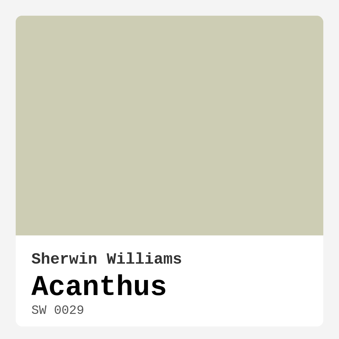
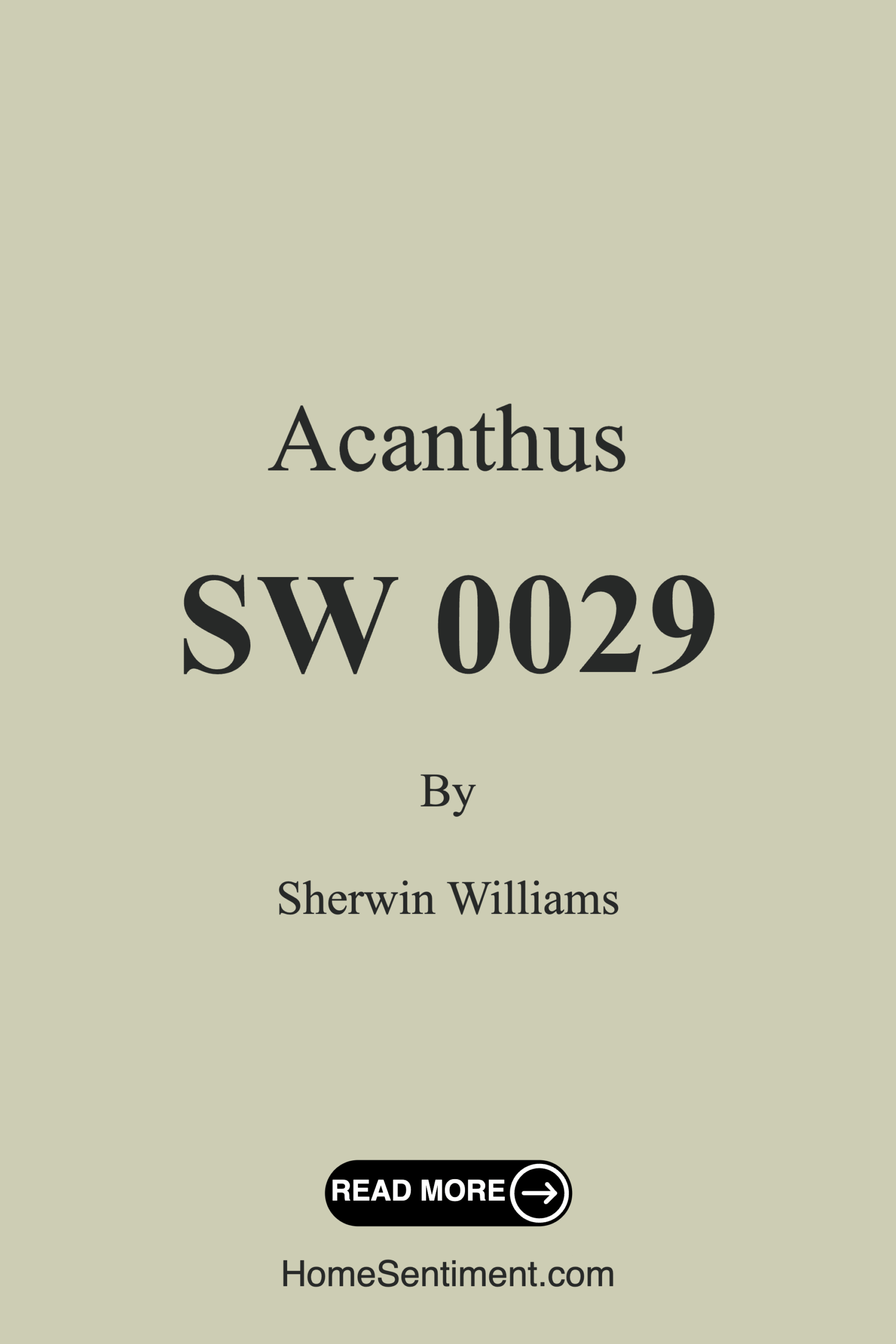
Color Preview & Key Details
| HEX Code | #CDCDB4 |
| RGB | 205, 205, 180 |
| LRV | 10% |
| Undertone | Yellow |
| Finish Options | Eggshell, Matte, Satin |
Picture this: you walk into a room that instantly wraps you in a serene embrace, where the color on the walls feels like a gentle hug from nature itself. That’s the magic of Acanthus by Sherwin Williams. This soft, muted hue is a delightful nod to the elegance of the acanthus plant, known for its intricate leaf patterns. But what exactly makes Acanthus a standout choice for your home? Let’s explore this stunning color and see if it’s the right fit for your next project.
Acanthus is classified as a light green, yet it carries a subtle yellow undertone that warms it up beautifully. This unique balance gives it sophistication, making it versatile enough for various decor styles, whether you lean towards modern, traditional, farmhouse, or even eclectic designs. Its richness is apparent without being overpowering, making it an ideal choice for spaces where you want to foster relaxation and calmness.
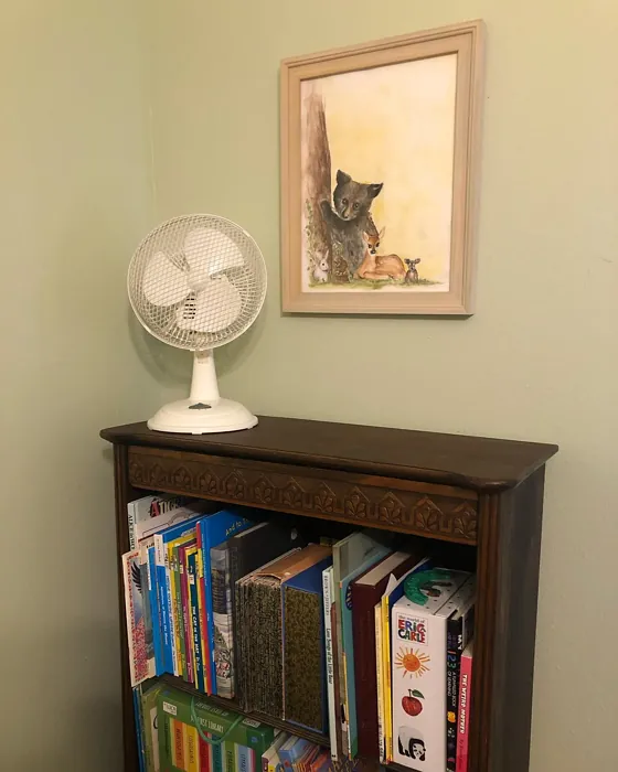
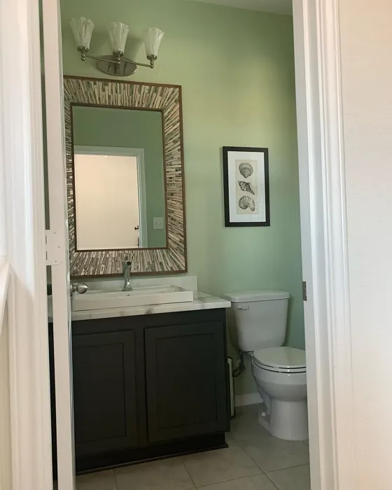
One of the standout features of Acanthus is its ability to work well in multiple rooms. Think about your living room, bedroom, dining room, or even your home office. Each of these spaces can benefit from Acanthus’s calming influence. Imagine walking into a cozy bedroom painted in Acanthus, where the soft green creates a tranquil environment, perfect for unwinding after a long day. Or consider an airy dining room, where this hue complements family gatherings and intimate dinners, enhancing the warmth around the table.
When it comes to application, Acanthus shines. It’s beginner-friendly, allowing even novice DIYers to achieve a smooth finish with minimal fuss. Whether you choose to use a roller or a brush, you’ll find that Acanthus goes on easily, making the painting process feel like a breeze. Plus, it dries quickly, so you won’t be left waiting around for hours before putting your furniture back in place.
One of my favorite aspects of Acanthus is its washability. Life happens—spills, smudges, and little fingerprints can mar even the most carefully maintained walls. With Acanthus, you don’t need to worry. This paint is highly washable and stain-resistant, making clean-up a cinch. So whether it’s your home office or the busy hallway, you can maintain a fresh look without the constant stress of upkeep.
However, it’s essential to consider the lighting in your space. Acanthus has a Light Reflectance Value (LRV) of just 10%, categorizing it as a dark color. This means it doesn’t reflect much light, creating a cozy and intimate atmosphere. While this can be wonderful in certain settings, it’s crucial to ensure your room has adequate natural light to fully appreciate Acanthus’s beauty. In dimly lit spaces, the color may lean cooler, so testing it with your existing lighting is a smart move before fully committing.
Now, let’s talk about how Acanthus interacts with other colors. Its muted, earthy tone pairs beautifully with a range of complementary shades. Think about soft whites, like White Dove, or even deeper hues that can create striking contrasts. Colors like SW 6543, SW 9073, and SW 6551 can enhance Acanthus’s charm and bring a balanced palette to your space.
If you’re contemplating how it’ll look next to your furniture or decor, keep in mind that Acanthus’s yellow undertone helps it harmonize with warm wood finishes, creating a balanced and inviting environment. Imagine a wooden dining table against Acanthus walls, where the natural elements breathe life into the space.
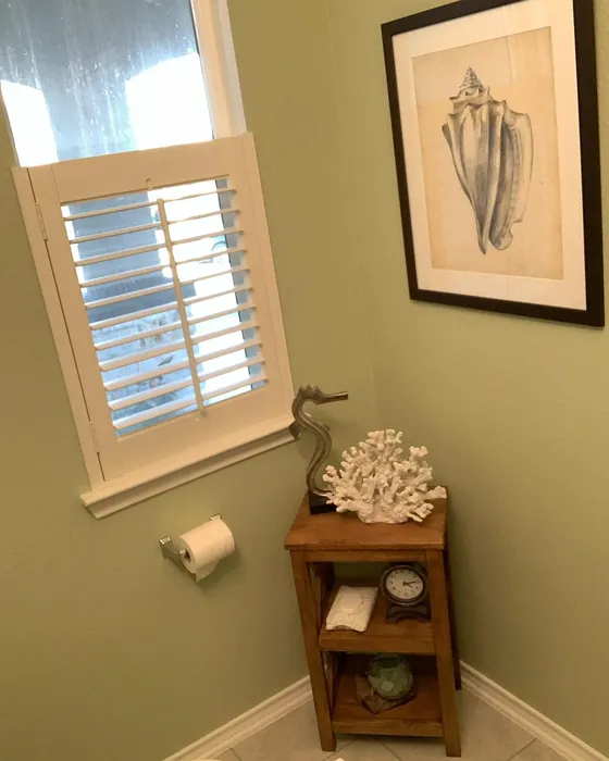
For those of you who might be hesitant about using Acanthus in smaller areas, I can assure you—it’s a fantastic choice. This soft hue can make a small space feel more expansive while still enveloping it in warmth. Adequate lighting is key, but once you have that sorted, Acanthus will create an inviting ambiance, making any small nook feel like a cozy retreat.
Choosing the right finish is another crucial aspect when considering Acanthus. Each finish—eggshell, satin, or matte—comes with its own benefits. For areas like the living room or bedroom, an eggshell or satin finish is ideal, offering a slight sheen that adds depth without being too flashy. In high-traffic areas like kitchens or hallways, a satin finish provides durability while still allowing for easy cleaning.
The mood Acanthus evokes is calm, inviting, and restful. It’s perfect for settings where you want to unwind or gather with loved ones. Whether you’re curling up with a good book in your home office or hosting a dinner party in your dining room, Acanthus sets the stage for memorable moments.
As you start to envision how Acanthus might fit into your home, don’t forget to explore its lighter and darker companions. Lighter shades like SW 7747 or SW 0013 can be used to create a layered look, while darker shades can provide depth and contrast, enriching your overall design.
When it comes to popular equivalent colors, you might find inspiration in Farrow & Ball’s ‘Pigeon’ or Sherwin-Williams’ own ‘Sea Salt.’ These hues share similar qualities and can help you expand your color palette if you’re looking for something a bit different yet equally soothing.
If you’re ready to take the plunge, here’s a pro tip: always test paint colors in your space before committing. Acanthus may look different depending on the light, time of day, and surrounding decor. Get a sample, apply it to your walls, and observe how it interacts with your existing furnishings throughout the day. This simple step can save you from potential regret and ensure you’re absolutely in love with your choice.
In conclusion, Acanthus is more than just a paint color; it’s a versatile tool for creating a serene, inviting home. With its elegant charm, ease of application, and exceptional washability, it checks all the boxes for a homeowner looking to enhance their space. So, as you embark on your next decorating adventure, consider inviting Acanthus into your home. It might just be the calming presence you’ve been searching for.
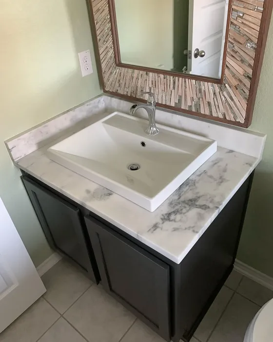
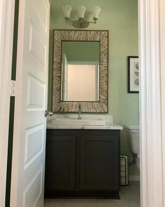
Real Room Photo of Acanthus SW 0029

Undertones of Acanthus ?
The undertones of Acanthus are a key aspect of its character, leaning towards Yellow. These subtle underlying hues are what give the color its depth and complexity. For example, a gray with a blue undertone will feel cooler and more modern, while one with a brown undertone will feel warmer and more traditional. It’s essential to test this paint in your home and observe it next to your existing furniture, flooring, and decor to see how these undertones interact and reveal themselves throughout the day.
HEX value: #CDCDB4
RGB code: 205, 205, 180
Is Acanthus Cool or Warm?
While Acanthus is primarily a cool color, its earthy qualities lend it a warmth that can adapt to various lighting conditions. In bright spaces, it leans towards a fresh, airy feel, while in lower light, it can evoke a cozy, grounded atmosphere. It’s this unique balance that makes it so appealing.
Understanding Color Properties and Interior Design Tips
Hue refers to a specific position on the color wheel, measured in degrees from 0 to 360. Each degree represents a different pure color:
- 0° represents red
- 120° represents green
- 240° represents blue
Saturation describes the intensity or purity of a color and is expressed as a percentage:
- At 0%, the color appears completely desaturated—essentially a shade of gray
- At 100%, the color is at its most vivid and vibrant
Lightness indicates how light or dark a color is, also expressed as a percentage:
- 0% lightness results in black
- 100% lightness results in white
Using Warm Colors in Interior Design
Warm hues—such as reds, oranges, yellows, warm beiges, and greiges—are excellent choices for creating inviting and energetic spaces. These colors are particularly well-suited for:
- Kitchens, living rooms, and bathrooms, where warmth enhances comfort and sociability
- Large rooms, where warm tones can help reduce the sense of emptiness and make the space feel more intimate
For example:
- Warm beige shades provide a cozy, inviting atmosphere, ideal for living rooms, bedrooms, and hallways.
- Warm greige (a mix of beige and gray) offers the warmth of beige with the modern appeal of gray, making it a versatile backdrop for dining areas, bedrooms, and living spaces.
However, be mindful when using warm light tones in rooms with limited natural light. These shades may appear muted or even take on an unpleasant yellowish tint. To avoid a dull or flat appearance:
- Add depth by incorporating richer tones like deep greens, charcoal, or chocolate brown
- Use textured elements such as curtains, rugs, or cushions to bring dimension to the space
Pro Tip: Achieving Harmony with Warm and Cool Color Balance
To create a well-balanced and visually interesting interior, mix warm and cool tones strategically. This contrast adds depth and harmony to your design.
- If your walls feature warm hues, introduce cool-colored accents such as blue or green furniture, artwork, or accessories to create contrast.
- For a polished look, consider using a complementary color scheme, which pairs colors opposite each other on the color wheel (e.g., red with green, orange with blue).
This thoughtful mix not only enhances visual appeal but also creates a space that feels both dynamic and cohesive.
Light Temperature Affects on Acanthus
Natural Light
Natural daylight changes in color temperature as the sun moves across the sky. At sunrise and sunset, the light tends to have a warm, golden tone with a color temperature around 2000 Kelvin (K). As the day progresses and the sun rises higher, the light becomes cooler and more neutral. Around midday, especially when the sky is clear, natural light typically reaches its peak brightness and shifts to a cooler tone, ranging from 5500 to 6500 Kelvin. This midday light is close to what we perceive as pure white or daylight-balanced light.
These shifts in natural light can significantly influence how colors appear in a space, which is why designers often consider both the time of day and the orientation of windows when planning interior color schemes.
Artificial Light
When choosing artificial lighting, pay close attention to the color temperature, measured in Kelvin (K). This determines how warm or cool the light will appear. Lower temperatures, around 2700K, give off a warm, yellow glow often used in living rooms or bedrooms. Higher temperatures, above 5000K, create a cool, bluish light similar to daylight, commonly used in kitchens, offices, or task areas.
Use the slider to see how lighting temperature can affect the appearance of a surface or color throughout a space.


4800K
LRV of Acanthus
The Light Reflectance Value (LRV) of Acanthus is 10%, which places it in the Dark colors category. This means it does not reflect light. Understanding a paint’s LRV is crucial for predicting how it will look in your space. A higher LRV indicates a lighter color that reflects more light, making rooms feel larger and brighter. A lower LRV signifies a darker color that absorbs more light, creating a cozier, more intimate atmosphere. Always consider the natural and artificial lighting in your room when selecting a paint color based on its LRV.
Detailed Review of Acanthus
Additional Paint Characteristics
Ideal Rooms
Bedroom, Dining Room, Home Office, Kitchen, Living Room
Decor Styles
Eclectic, Farmhouse, Modern, Traditional
Coverage
Good (1–2 Coats)
Ease of Application
Beginner Friendly, Brush Smooth, Fast-Drying, Roller-Ready
Washability
Highly Washable, Stain Resistant, Washable
VOC Level
Eco-Certified, Low VOC
Best Use
Accent Wall, Interior Walls, Trim
Room Suitability
Bedroom, Dining Room, Home Office, Living Room
Tone Tag
Balanced, Earthy, Muted
Finish Type
Eggshell, Matte, Satin
Paint Performance
Easy Touch-Up, Low Odor, Quick Drying, Scuff Resistant
Use Cases
Best for Modern Farmhouse, Best for Open Concept, Designer Favorite
Mood
Calm, Inviting, Restful
Trim Pairing
Complements Cool Trim, Good with Wood Trim, Pairs with White Dove
Acanthus stands out for its sophisticated charm and versatility. The soft, earthy green tone offers a refreshing alternative to more traditional neutrals, making it perfect for spaces where relaxation is key. Whether you’re painting an accent wall or an entire room, Acanthus maintains a calm presence that can complement bold decor or enhance subtle designs. It’s particularly effective in spaces with plenty of natural light, where it can reveal its full depth and character. However, in dimly lit areas, it may appear a bit cooler, so consider testing it out before committing to a full application. Overall, Acanthus is a fantastic choice for anyone looking to create a serene and welcoming environment.
Pros & Cons of SW 0029 Acanthus
Pros
Cons
Colors that go with Sherwin Williams Acanthus
FAQ on SW 0029 Acanthus
Can Acanthus be used in a small space?
Absolutely! Acanthus is a fantastic choice for small spaces. Its soft, muted tone can help create the illusion of a larger area while maintaining an inviting atmosphere. Just make sure to pair it with adequate lighting to enhance its warmth and depth.
What finish is best for Acanthus?
The best finish for Acanthus really depends on the room’s function. Eggshell or satin finishes are great for living areas and bedrooms, as they offer a slight sheen while being easy to clean. For high-traffic areas, consider a satin finish for added durability.
Comparisons Acanthus with other colors
Acanthus SW 0029 vs Sea Salt SW 6204
| Attribute | Acanthus SW 0029 | Sea Salt SW 6204 |
|---|---|---|
| Color Name | Acanthus SW 0029 | Sea Salt SW 6204 |
| Color | ||
| Hue | Green | Green |
| Brightness | Light | Light |
| RGB | 205, 205, 180 | 205, 210, 202 |
| LRV | 10% | 64% |
| Finish Type | Eggshell, Matte, Satin | Eggshell, Satin |
| Finish Options | Eggshell, Matte, Satin | Eggshell, Matte, Satin |
| Ideal Rooms | Bedroom, Dining Room, Home Office, Kitchen, Living Room | Bathroom, Bedroom, Hallway, Kitchen, Living Room |
| Decor Styles | Eclectic, Farmhouse, Modern, Traditional | Coastal, Minimalist, Modern Farmhouse, Scandinavian, Traditional |
| Coverage | Good (1–2 Coats) | Good (1–2 Coats), Touch-Up Friendly |
| Ease of Application | Beginner Friendly, Brush Smooth, Fast-Drying, Roller-Ready | Beginner Friendly, Brush Smooth, Fast-Drying, Roller-Ready |
| Washability | Highly Washable, Stain Resistant, Washable | Highly Washable, Washable |
| Room Suitability | Bedroom, Dining Room, Home Office, Living Room | Bathroom, Bedroom, Hallway, Kitchen, Living Room |
| Tone | Balanced, Earthy, Muted | Airy, Balanced, Cool, Muted |
| Paint Performance | Easy Touch-Up, Low Odor, Quick Drying, Scuff Resistant | Easy Touch-Up, High Coverage, Low Odor, Quick Drying |
Acanthus SW 0029 vs Liveable Green SW 6176
| Attribute | Acanthus SW 0029 | Liveable Green SW 6176 |
|---|---|---|
| Color Name | Acanthus SW 0029 | Liveable Green SW 6176 |
| Color | ||
| Hue | Green | Green |
| Brightness | Light | Light |
| RGB | 205, 205, 180 | 206, 206, 189 |
| LRV | 10% | 30% |
| Finish Type | Eggshell, Matte, Satin | Eggshell, Matte, Satin |
| Finish Options | Eggshell, Matte, Satin | Eggshell, Matte, Satin |
| Ideal Rooms | Bedroom, Dining Room, Home Office, Kitchen, Living Room | Bedroom, Home Office, Kitchen, Living Room, Nursery |
| Decor Styles | Eclectic, Farmhouse, Modern, Traditional | Contemporary, Modern Farmhouse, Rustic, Scandi |
| Coverage | Good (1–2 Coats) | Good (1–2 Coats), Touch-Up Friendly |
| Ease of Application | Beginner Friendly, Brush Smooth, Fast-Drying, Roller-Ready | Beginner Friendly, Brush Smooth, Roller-Ready |
| Washability | Highly Washable, Stain Resistant, Washable | Highly Washable, Washable |
| Room Suitability | Bedroom, Dining Room, Home Office, Living Room | Bedroom, Home Office, Living Room, Nursery |
| Tone | Balanced, Earthy, Muted | Balanced, Earthy, Muted |
| Paint Performance | Easy Touch-Up, Low Odor, Quick Drying, Scuff Resistant | Easy Touch-Up, High Coverage, Low Odor |
Acanthus SW 0029 vs Rainwashed SW 6211
| Attribute | Acanthus SW 0029 | Rainwashed SW 6211 |
|---|---|---|
| Color Name | Acanthus SW 0029 | Rainwashed SW 6211 |
| Color | ||
| Hue | Green | Green |
| Brightness | Light | Light |
| RGB | 205, 205, 180 | 194, 205, 197 |
| LRV | 10% | 60% |
| Finish Type | Eggshell, Matte, Satin | Eggshell, Matte, Satin |
| Finish Options | Eggshell, Matte, Satin | Eggshell, Matte, Satin |
| Ideal Rooms | Bedroom, Dining Room, Home Office, Kitchen, Living Room | Bathroom, Bedroom, Home Office, Living Room, Nursery |
| Decor Styles | Eclectic, Farmhouse, Modern, Traditional | Coastal, Farmhouse, Minimalist, Modern, Transitional |
| Coverage | Good (1–2 Coats) | Good (1–2 Coats), Touch-Up Friendly |
| Ease of Application | Beginner Friendly, Brush Smooth, Fast-Drying, Roller-Ready | Beginner Friendly, Brush Smooth, Fast-Drying, Roller-Ready |
| Washability | Highly Washable, Stain Resistant, Washable | Washable, Wipeable |
| Room Suitability | Bedroom, Dining Room, Home Office, Living Room | Bathroom, Bedroom, Home Office, Living Room, Nursery |
| Tone | Balanced, Earthy, Muted | Balanced, Cool, Muted |
| Paint Performance | Easy Touch-Up, Low Odor, Quick Drying, Scuff Resistant | Easy Touch-Up, High Coverage, Low Odor |
Acanthus SW 0029 vs Filmy Green SW 6190
| Attribute | Acanthus SW 0029 | Filmy Green SW 6190 |
|---|---|---|
| Color Name | Acanthus SW 0029 | Filmy Green SW 6190 |
| Color | ||
| Hue | Green | Green |
| Brightness | Light | Light |
| RGB | 205, 205, 180 | 209, 211, 199 |
| LRV | 10% | 50% |
| Finish Type | Eggshell, Matte, Satin | Eggshell, Matte, Satin |
| Finish Options | Eggshell, Matte, Satin | Eggshell, Matte, Satin |
| Ideal Rooms | Bedroom, Dining Room, Home Office, Kitchen, Living Room | Bedroom, Home Office, Living Room, Nursery |
| Decor Styles | Eclectic, Farmhouse, Modern, Traditional | Bohemian, Minimalist, Modern Farmhouse, Scandinavian |
| Coverage | Good (1–2 Coats) | Good (1–2 Coats) |
| Ease of Application | Beginner Friendly, Brush Smooth, Fast-Drying, Roller-Ready | Beginner Friendly, Brush Smooth, Roller-Ready |
| Washability | Highly Washable, Stain Resistant, Washable | Washable, Wipeable |
| Room Suitability | Bedroom, Dining Room, Home Office, Living Room | Bedroom, Home Office, Living Room, Nursery |
| Tone | Balanced, Earthy, Muted | Calm, Earthy, Muted |
| Paint Performance | Easy Touch-Up, Low Odor, Quick Drying, Scuff Resistant | Easy Touch-Up, Low Odor, Quick Drying |
Acanthus SW 0029 vs Slow Green SW 6456
| Attribute | Acanthus SW 0029 | Slow Green SW 6456 |
|---|---|---|
| Color Name | Acanthus SW 0029 | Slow Green SW 6456 |
| Color | ||
| Hue | Green | Green |
| Brightness | Light | Light |
| RGB | 205, 205, 180 | 198, 213, 201 |
| LRV | 10% | 48% |
| Finish Type | Eggshell, Matte, Satin | Eggshell, Matte, Satin |
| Finish Options | Eggshell, Matte, Satin | Eggshell, Matte, Satin |
| Ideal Rooms | Bedroom, Dining Room, Home Office, Kitchen, Living Room | Bedroom, Dining Room, Home Office, Living Room, Nursery |
| Decor Styles | Eclectic, Farmhouse, Modern, Traditional | Coastal, Farmhouse, Modern, Rustic, Scandinavian |
| Coverage | Good (1–2 Coats) | Good (1–2 Coats), Touch-Up Friendly |
| Ease of Application | Beginner Friendly, Brush Smooth, Fast-Drying, Roller-Ready | Beginner Friendly, Brush Smooth, Roller-Ready |
| Washability | Highly Washable, Stain Resistant, Washable | Highly Washable, Washable |
| Room Suitability | Bedroom, Dining Room, Home Office, Living Room | Bedroom, Dining Room, Entryway, Home Office, Living Room, Nursery |
| Tone | Balanced, Earthy, Muted | Balanced, Earthy, Muted |
| Paint Performance | Easy Touch-Up, Low Odor, Quick Drying, Scuff Resistant | Easy Touch-Up, Fade Resistant, Low Odor |
Acanthus SW 0029 vs Topiary Tint SW 6449
| Attribute | Acanthus SW 0029 | Topiary Tint SW 6449 |
|---|---|---|
| Color Name | Acanthus SW 0029 | Topiary Tint SW 6449 |
| Color | ||
| Hue | Green | Green |
| Brightness | Light | Light |
| RGB | 205, 205, 180 | 200, 216, 196 |
| LRV | 10% | 30% |
| Finish Type | Eggshell, Matte, Satin | Eggshell, Matte, Satin |
| Finish Options | Eggshell, Matte, Satin | Eggshell, Matte, Satin |
| Ideal Rooms | Bedroom, Dining Room, Home Office, Kitchen, Living Room | Bathroom, Bedroom, Dining Room, Home Office, Kitchen, Living Room |
| Decor Styles | Eclectic, Farmhouse, Modern, Traditional | Bohemian, Coastal, Eclectic, Modern Farmhouse, Transitional |
| Coverage | Good (1–2 Coats) | Good (1–2 Coats), Touch-Up Friendly |
| Ease of Application | Beginner Friendly, Brush Smooth, Fast-Drying, Roller-Ready | Beginner Friendly, Brush Smooth, Fast-Drying, Roller-Ready |
| Washability | Highly Washable, Stain Resistant, Washable | Scuff Resistant, Washable |
| Room Suitability | Bedroom, Dining Room, Home Office, Living Room | Bathroom, Bedroom, Dining Room, Kitchen, Living Room |
| Tone | Balanced, Earthy, Muted | Balanced, Calm, Earthy, Muted |
| Paint Performance | Easy Touch-Up, Low Odor, Quick Drying, Scuff Resistant | Easy Touch-Up, Low Odor, Quick Drying, Stain Resistant |
Acanthus SW 0029 vs Waterscape SW 6470
| Attribute | Acanthus SW 0029 | Waterscape SW 6470 |
|---|---|---|
| Color Name | Acanthus SW 0029 | Waterscape SW 6470 |
| Color | ||
| Hue | Green | Green |
| Brightness | Light | Light |
| RGB | 205, 205, 180 | 191, 210, 201 |
| LRV | 10% | 50% |
| Finish Type | Eggshell, Matte, Satin | Eggshell, Matte |
| Finish Options | Eggshell, Matte, Satin | Eggshell, Matte, Satin |
| Ideal Rooms | Bedroom, Dining Room, Home Office, Kitchen, Living Room | Bathroom, Bedroom, Home Office, Kitchen, Living Room |
| Decor Styles | Eclectic, Farmhouse, Modern, Traditional | Coastal, Minimalist, Modern, Scandinavian |
| Coverage | Good (1–2 Coats) | Good (1–2 Coats) |
| Ease of Application | Beginner Friendly, Brush Smooth, Fast-Drying, Roller-Ready | Beginner Friendly, Brush Smooth, Roller-Ready |
| Washability | Highly Washable, Stain Resistant, Washable | Highly Washable, Washable |
| Room Suitability | Bedroom, Dining Room, Home Office, Living Room | Bathroom, Bedroom, Home Office, Living Room |
| Tone | Balanced, Earthy, Muted | Airy, Cool, Muted |
| Paint Performance | Easy Touch-Up, Low Odor, Quick Drying, Scuff Resistant | Easy Touch-Up, Low Odor, Quick Drying |
Acanthus SW 0029 vs Bonsai Tint SW 6436
| Attribute | Acanthus SW 0029 | Bonsai Tint SW 6436 |
|---|---|---|
| Color Name | Acanthus SW 0029 | Bonsai Tint SW 6436 |
| Color | ||
| Hue | Green | Green |
| Brightness | Light | Light |
| RGB | 205, 205, 180 | 197, 209, 178 |
| LRV | 10% | 64% |
| Finish Type | Eggshell, Matte, Satin | Eggshell, Matte |
| Finish Options | Eggshell, Matte, Satin | Eggshell, Matte, Satin |
| Ideal Rooms | Bedroom, Dining Room, Home Office, Kitchen, Living Room | Bedroom, Home Office, Living Room, Nursery |
| Decor Styles | Eclectic, Farmhouse, Modern, Traditional | Bohemian, Minimalist, Modern, Scandinavian |
| Coverage | Good (1–2 Coats) | Good (1–2 Coats) |
| Ease of Application | Beginner Friendly, Brush Smooth, Fast-Drying, Roller-Ready | Beginner Friendly, Brush Smooth, Roller-Ready |
| Washability | Highly Washable, Stain Resistant, Washable | Washable, Wipeable |
| Room Suitability | Bedroom, Dining Room, Home Office, Living Room | Bedroom, Home Office, Living Room, Nursery |
| Tone | Balanced, Earthy, Muted | Calm, Earthy, Muted |
| Paint Performance | Easy Touch-Up, Low Odor, Quick Drying, Scuff Resistant | Easy Touch-Up, Fade Resistant, Low Odor |
Acanthus SW 0029 vs Gratifying Green SW 6435
| Attribute | Acanthus SW 0029 | Gratifying Green SW 6435 |
|---|---|---|
| Color Name | Acanthus SW 0029 | Gratifying Green SW 6435 |
| Color | ||
| Hue | Green | Green |
| Brightness | Light | Light |
| RGB | 205, 205, 180 | 218, 226, 205 |
| LRV | 10% | 30% |
| Finish Type | Eggshell, Matte, Satin | Eggshell, Matte, Satin |
| Finish Options | Eggshell, Matte, Satin | Eggshell, Matte, Satin |
| Ideal Rooms | Bedroom, Dining Room, Home Office, Kitchen, Living Room | Bedroom, Dining Room, Home Office, Living Room, Nursery |
| Decor Styles | Eclectic, Farmhouse, Modern, Traditional | Bohemian, Coastal, Minimalist, Modern Farmhouse |
| Coverage | Good (1–2 Coats) | Good (1–2 Coats), Touch-Up Friendly |
| Ease of Application | Beginner Friendly, Brush Smooth, Fast-Drying, Roller-Ready | Beginner Friendly, Brush Smooth, Roller-Ready |
| Washability | Highly Washable, Stain Resistant, Washable | Washable, Wipeable |
| Room Suitability | Bedroom, Dining Room, Home Office, Living Room | Bedroom, Home Office, Living Room, Nursery |
| Tone | Balanced, Earthy, Muted | Earthy, Muted, Warm |
| Paint Performance | Easy Touch-Up, Low Odor, Quick Drying, Scuff Resistant | Easy Touch-Up, Low Odor, Quick Drying |
Acanthus SW 0029 vs Fleeting Green SW 6455
| Attribute | Acanthus SW 0029 | Fleeting Green SW 6455 |
|---|---|---|
| Color Name | Acanthus SW 0029 | Fleeting Green SW 6455 |
| Color | ||
| Hue | Green | Green |
| Brightness | Light | Light |
| RGB | 205, 205, 180 | 216, 226, 216 |
| LRV | 10% | 64% |
| Finish Type | Eggshell, Matte, Satin | Eggshell, Matte |
| Finish Options | Eggshell, Matte, Satin | Eggshell, Matte, Satin |
| Ideal Rooms | Bedroom, Dining Room, Home Office, Kitchen, Living Room | Bathroom, Bedroom, Home Office, Living Room, Nursery |
| Decor Styles | Eclectic, Farmhouse, Modern, Traditional | Coastal, Farmhouse, Minimalist, Modern, Scandinavian |
| Coverage | Good (1–2 Coats) | Good (1–2 Coats), Touch-Up Friendly |
| Ease of Application | Beginner Friendly, Brush Smooth, Fast-Drying, Roller-Ready | Beginner Friendly, Brush Smooth, Roller-Ready |
| Washability | Highly Washable, Stain Resistant, Washable | Washable, Wipeable |
| Room Suitability | Bedroom, Dining Room, Home Office, Living Room | Bathroom, Bedroom, Home Office, Living Room, Nursery |
| Tone | Balanced, Earthy, Muted | Airy, Balanced, Cool, Muted |
| Paint Performance | Easy Touch-Up, Low Odor, Quick Drying, Scuff Resistant | Easy Touch-Up, Low Odor, Quick Drying |
Official Page of Sherwin Williams Acanthus SW 0029