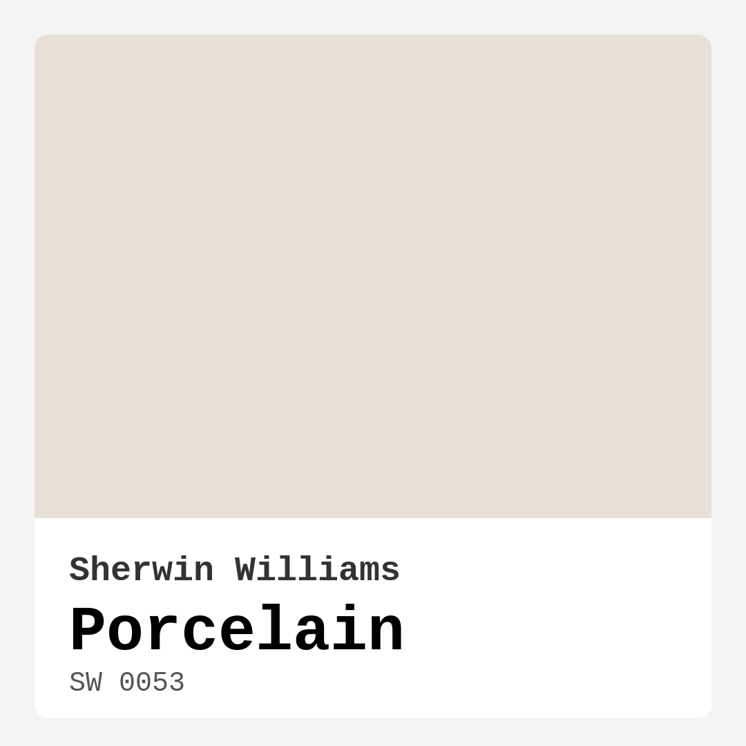
Color Preview & Key Details
| HEX Code | #E9E0D5 |
| RGB | 233, 224, 213 |
| LRV | 74% |
| Undertone | Red |
| Finish Options | Eggshell, Matte, Satin |
Imagine walking into a space where the walls seem to whisper tranquility and elegance. You take a deep breath and feel a wave of calm wash over you. This is the magic of Porcelain, a stunning shade from Sherwin Williams that redefines the essence of peaceful interiors. Let’s dive deep into why this color might just be the perfect choice for your next home project.
Porcelain, with its inviting hue (SW 0053), mirrors the beauty of fine china. It’s a soft, muted beige that doesn’t demand attention but rather enhances your space with an understated elegance. The lightness of this color—reflected in its Light Reflectance Value (LRV) of 74%—means it beautifully captures and reflects light, making rooms feel larger and more open.
One of the standout features of Porcelain is its versatility. You can effortlessly integrate it into various decor styles, from modern and minimalist to classic and transitional. Whether you’re styling a cozy living room, a serene bedroom, or an inviting dining space, Porcelain offers a perfect backdrop that allows your furniture and decor to shine. Picture your dining room bathed in this soft hue—imagine how it subtly complements wooden tables or bright brass fixtures, creating a harmonious balance of warmth and sophistication.
The beauty of Porcelain lies not just in its appearance, but also in its practicalities. It’s incredibly beginner-friendly to apply, whether you’re using a brush or roller. That means you can tackle a weekend project without feeling overwhelmed. It dries quickly, so you won’t be stuck waiting around for paint to cure. Plus, its high washability means that everyday marks and dirt can be wiped away with ease. This makes it a fantastic choice for high-traffic areas, provided you opt for a satin or eggshell finish to enhance durability.
Now, let’s talk about undertones. The subtle red undertones in Porcelain add a layer of complexity that’s often overlooked. This warmth makes it feel inviting, yet it retains a sense of sophistication. When selecting paint, always consider how these undertones interact with your existing decor. For instance, if your room has cool-toned furniture, Porcelain can create a refreshing contrast that brings balance to the space.
Lighting plays a crucial role in how a paint color appears. In bright, sunlit rooms, Porcelain takes on an ethereal quality, appearing almost creamy and light. Conversely, in dimmer settings, it introduces a cozy depth that feels intimate and restful. This quality is ideal for bedrooms and home offices, where you want to create an atmosphere conducive to relaxation or focused productivity.
If you’re considering Porcelain but are worried about it being too light, remember that it pairs beautifully with a range of darker and bolder shades. For instance, complementing it with deeper hues like Sherwin Williams SW 7625 or SW 9110 can create an eye-catching contrast that adds drama without overwhelming the space. You might also explore lighter shades like SW 7001 or SW 6091 for a subtle layering effect that makes everything feel cohesive.
When it comes to practicality, Porcelain stands out with its low VOC levels, making it an eco-friendly choice that’s better for your home environment. You can feel good about your decision, knowing you’re contributing to a healthier living space. It’s perfect for those who are sensitive to odors, as it offers a low-odor experience during application.
One potential drawback to keep in mind is that, like many lighter shades, Porcelain might show dirt or marks more readily than darker colors. However, this can easily be managed with regular maintenance and touch-ups—thanks to its easy touch-up properties. Consider this a small trade-off for the calming atmosphere it creates.
For those living in rentals, Porcelain is a classic favorite that can elevate any space without making a bold statement. It’s neutral enough to please a wide range of tastes while still allowing your personality to shine through with accent colors and decor choices. Think of it as a canvas ready for your creative flair.
In rooms where you want to cultivate a mood of calm and serenity, Porcelain is your go-to. Its warm, creamy tone invites relaxation, making it particularly fitting for bedrooms, living rooms, kitchens, and dining areas. Imagine winding down after a long day, surrounded by the soft embrace of this inviting color.
When it comes to pairing, consider bright whites like White Dove for trim and moldings to elevate the overall look. The contrast can add a crispness that enhances the calmness of Porcelain while adding a touch of modern elegance.
Ultimately, using Porcelain in your home is about embracing the beauty of simplicity. It’s a color that allows for expression without shouting for attention. Whether you’re creating a serene retreat or a stylish entertaining space, this color can adapt to your vision, making it a timeless choice that can grow with your design style.
As you think about your next project, don’t just view Porcelain as another paint option. Instead, see it as a transformative element that can breathe new life into your home. From its serene qualities to its practical benefits, Porcelain is not just a color; it’s a lifestyle choice that reflects your personal taste and enhances your everyday experiences.
So, are you ready to embrace the elegance and tranquility of Porcelain? With its versatile nature and calming presence, it just might be the perfect palette for your next home adventure.

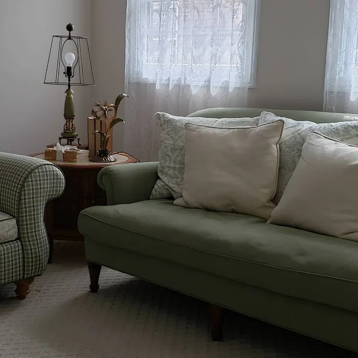
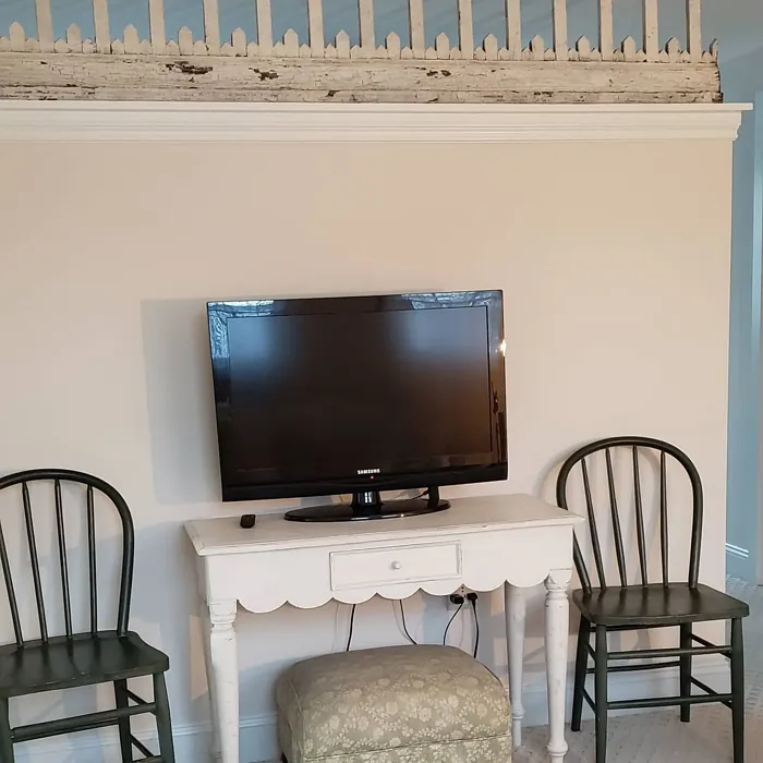
Real Room Photo of Porcelain SW 0053
Undertones of Porcelain ?
The undertones of Porcelain are a key aspect of its character, leaning towards Red. These subtle underlying hues are what give the color its depth and complexity. For example, a gray with a blue undertone will feel cooler and more modern, while one with a brown undertone will feel warmer and more traditional. It’s essential to test this paint in your home and observe it next to your existing furniture, flooring, and decor to see how these undertones interact and reveal themselves throughout the day.
HEX value: #E9E0D5
RGB code: 233, 224, 213
Is Porcelain Cool or Warm?
This color is predominantly warm, but it maintains a balance that makes it versatile for different color schemes. It’s perfect for spaces filled with natural light, where it can shine beautifully.
Understanding Color Properties and Interior Design Tips
Hue refers to a specific position on the color wheel, measured in degrees from 0 to 360. Each degree represents a different pure color:
- 0° represents red
- 120° represents green
- 240° represents blue
Saturation describes the intensity or purity of a color and is expressed as a percentage:
- At 0%, the color appears completely desaturated—essentially a shade of gray
- At 100%, the color is at its most vivid and vibrant
Lightness indicates how light or dark a color is, also expressed as a percentage:
- 0% lightness results in black
- 100% lightness results in white
Using Warm Colors in Interior Design
Warm hues—such as reds, oranges, yellows, warm beiges, and greiges—are excellent choices for creating inviting and energetic spaces. These colors are particularly well-suited for:
- Kitchens, living rooms, and bathrooms, where warmth enhances comfort and sociability
- Large rooms, where warm tones can help reduce the sense of emptiness and make the space feel more intimate
For example:
- Warm beige shades provide a cozy, inviting atmosphere, ideal for living rooms, bedrooms, and hallways.
- Warm greige (a mix of beige and gray) offers the warmth of beige with the modern appeal of gray, making it a versatile backdrop for dining areas, bedrooms, and living spaces.
However, be mindful when using warm light tones in rooms with limited natural light. These shades may appear muted or even take on an unpleasant yellowish tint. To avoid a dull or flat appearance:
- Add depth by incorporating richer tones like deep greens, charcoal, or chocolate brown
- Use textured elements such as curtains, rugs, or cushions to bring dimension to the space
Pro Tip: Achieving Harmony with Warm and Cool Color Balance
To create a well-balanced and visually interesting interior, mix warm and cool tones strategically. This contrast adds depth and harmony to your design.
- If your walls feature warm hues, introduce cool-colored accents such as blue or green furniture, artwork, or accessories to create contrast.
- For a polished look, consider using a complementary color scheme, which pairs colors opposite each other on the color wheel (e.g., red with green, orange with blue).
This thoughtful mix not only enhances visual appeal but also creates a space that feels both dynamic and cohesive.
Light Temperature Affects on Porcelain
Natural Light
Natural daylight changes in color temperature as the sun moves across the sky. At sunrise and sunset, the light tends to have a warm, golden tone with a color temperature around 2000 Kelvin (K). As the day progresses and the sun rises higher, the light becomes cooler and more neutral. Around midday, especially when the sky is clear, natural light typically reaches its peak brightness and shifts to a cooler tone, ranging from 5500 to 6500 Kelvin. This midday light is close to what we perceive as pure white or daylight-balanced light.
These shifts in natural light can significantly influence how colors appear in a space, which is why designers often consider both the time of day and the orientation of windows when planning interior color schemes.
Artificial Light
When choosing artificial lighting, pay close attention to the color temperature, measured in Kelvin (K). This determines how warm or cool the light will appear. Lower temperatures, around 2700K, give off a warm, yellow glow often used in living rooms or bedrooms. Higher temperatures, above 5000K, create a cool, bluish light similar to daylight, commonly used in kitchens, offices, or task areas.
Use the slider to see how lighting temperature can affect the appearance of a surface or color throughout a space.


4800K
LRV of Porcelain
The Light Reflectance Value (LRV) of Porcelain is 74%, which places it in the Light category. This means it Reflects a high amount of light. Understanding a paint’s LRV is crucial for predicting how it will look in your space. A higher LRV indicates a lighter color that reflects more light, making rooms feel larger and brighter. A lower LRV signifies a darker color that absorbs more light, creating a cozier, more intimate atmosphere. Always consider the natural and artificial lighting in your room when selecting a paint color based on its LRV.
Detailed Review of Porcelain
Additional Paint Characteristics
Ideal Rooms
Bedroom, Dining Room, Home Office, Kitchen, Living Room
Decor Styles
Classic, Minimalist, Modern, Transitional
Coverage
Good (1–2 Coats)
Ease of Application
Beginner Friendly, Brush Smooth, Fast-Drying, Roller-Ready
Washability
Highly Washable, Washable
VOC Level
Eco-Certified, Low VOC
Best Use
Doors, Interior Walls, Trim
Room Suitability
Bedroom, Dining Room, Home Office, Living Room
Tone Tag
Creamy, Neutral, Warm
Finish Type
Eggshell, Matte, Satin
Paint Performance
Easy Touch-Up, Low Odor, Quick Drying
Use Cases
Best for Open Concept, Best for Rentals, Classic Favorite
Mood
Calm, Inviting, Restful
Trim Pairing
Complements Brass Fixtures, Pairs with White Dove
Porcelain, with its HEX code #E9E0D5, stands out for its ability to create a calm and inviting atmosphere. This soft, creamy hue is perfect for those who appreciate understated elegance. It works well in both natural and artificial light, bringing warmth into spaces while maintaining a level of sophistication. Whether you use it in a cozy bedroom or a chic living room, Porcelain acts as a versatile backdrop that complements various decor styles. It’s also easy to pair with bolder accent colors, allowing for personal expression without clashing. Overall, it’s a fantastic choice for anyone looking to refresh their home with a light, airy feel that feels both timeless and modern.
Pros & Cons of SW 0053 Porcelain
Pros
Cons
Colors that go with Sherwin Williams Porcelain
FAQ on SW 0053 Porcelain
Can Porcelain be used in high-traffic areas?
Yes, Porcelain is quite durable and has a high washability rating, making it suitable for high-traffic areas, provided it’s applied with the right finish. For these spaces, consider using a satin or eggshell finish to enhance durability.
How does Porcelain compare to off-white shades?
Porcelain is a unique take on off-white, offering more warmth and depth. Unlike stark whites, it carries enough character to create a cozy atmosphere while still maintaining the fresh, clean look typical of lighter colors.
Comparisons Porcelain with other colors
Porcelain SW 0053 vs Natural Linen SW 9109
| Attribute | Porcelain SW 0053 | Natural Linen SW 9109 |
|---|---|---|
| Color Name | Porcelain SW 0053 | Natural Linen SW 9109 |
| Color | ||
| Hue | Beige | Beige |
| Brightness | Light | Light |
| RGB | 233, 224, 213 | 223, 211, 195 |
| LRV | 74% | 74% |
| Finish Type | Eggshell, Matte, Satin | Eggshell, Matte, Satin |
| Finish Options | Eggshell, Matte, Satin | Eggshell, Matte, Satin |
| Ideal Rooms | Bedroom, Dining Room, Home Office, Kitchen, Living Room | Bedroom, Dining Room, Hallway, Home Office, Kitchen, Living Room |
| Decor Styles | Classic, Minimalist, Modern, Transitional | Bohemian, Modern Farmhouse, Scandinavian, Transitional |
| Coverage | Good (1–2 Coats) | Good (1–2 Coats), Touch-Up Friendly |
| Ease of Application | Beginner Friendly, Brush Smooth, Fast-Drying, Roller-Ready | Beginner Friendly, Brush Smooth, Fast-Drying, Roller-Ready |
| Washability | Highly Washable, Washable | Highly Washable, Washable, Wipeable |
| Room Suitability | Bedroom, Dining Room, Home Office, Living Room | Bedroom, Dining Room, Home Office, Kitchen, Living Room |
| Tone | Creamy, Neutral, Warm | Earthy, Neutral, Warm |
| Paint Performance | Easy Touch-Up, Low Odor, Quick Drying | Easy Touch-Up, Low Odor, Quick Drying, Scuff Resistant |
Porcelain SW 0053 vs Alabaster SW 7008
| Attribute | Porcelain SW 0053 | Alabaster SW 7008 |
|---|---|---|
| Color Name | Porcelain SW 0053 | Alabaster SW 7008 |
| Color | ||
| Hue | Beige | Beige |
| Brightness | Light | Light |
| RGB | 233, 224, 213 | 237, 234, 224 |
| LRV | 74% | 82% |
| Finish Type | Eggshell, Matte, Satin | Eggshell, Matte, Satin |
| Finish Options | Eggshell, Matte, Satin | Eggshell, Matte, Satin |
| Ideal Rooms | Bedroom, Dining Room, Home Office, Kitchen, Living Room | Bathroom, Bedroom, Dining Room, Entryway, Home Office, Kitchen, Living Room, Nursery |
| Decor Styles | Classic, Minimalist, Modern, Transitional | Coastal, Contemporary, Minimalist, Modern Farmhouse, Traditional, Transitional |
| Coverage | Good (1–2 Coats) | Good (1–2 Coats), Touch-Up Friendly |
| Ease of Application | Beginner Friendly, Brush Smooth, Fast-Drying, Roller-Ready | Beginner Friendly, Brush Smooth, Fast-Drying, Low Splatter, Roller-Ready |
| Washability | Highly Washable, Washable | Washable, Wipeable |
| Room Suitability | Bedroom, Dining Room, Home Office, Living Room | Bathroom, Bedroom, Dining Room, Hallway, Home Office, Kitchen, Living Room, Nursery |
| Tone | Creamy, Neutral, Warm | Creamy, Neutral, Warm |
| Paint Performance | Easy Touch-Up, Low Odor, Quick Drying | Easy Touch-Up, High Coverage, Low Odor, Quick Drying |
Porcelain SW 0053 vs White Duck SW 7010
| Attribute | Porcelain SW 0053 | White Duck SW 7010 |
|---|---|---|
| Color Name | Porcelain SW 0053 | White Duck SW 7010 |
| Color | ||
| Hue | Beige | Beige |
| Brightness | Light | Light |
| RGB | 233, 224, 213 | 229, 223, 210 |
| LRV | 74% | 75% |
| Finish Type | Eggshell, Matte, Satin | Eggshell, Matte, Satin |
| Finish Options | Eggshell, Matte, Satin | Eggshell, Matte, Satin |
| Ideal Rooms | Bedroom, Dining Room, Home Office, Kitchen, Living Room | Bedroom, Dining Room, Home Office, Kitchen, Living Room, Nursery |
| Decor Styles | Classic, Minimalist, Modern, Transitional | Farmhouse, Modern, Scandinavian, Traditional, Transitional |
| Coverage | Good (1–2 Coats) | Good (1–2 Coats), Touch-Up Friendly |
| Ease of Application | Beginner Friendly, Brush Smooth, Fast-Drying, Roller-Ready | Beginner Friendly, Brush Smooth, Fast-Drying, Roller-Ready |
| Washability | Highly Washable, Washable | Highly Washable, Washable |
| Room Suitability | Bedroom, Dining Room, Home Office, Living Room | Bedroom, Dining Room, Home Office, Kitchen, Living Room |
| Tone | Creamy, Neutral, Warm | Creamy, Neutral, Warm |
| Paint Performance | Easy Touch-Up, Low Odor, Quick Drying | Easy Touch-Up, Fade Resistant, Low Odor, Quick Drying |
Porcelain SW 0053 vs Greek Villa SW 7551
| Attribute | Porcelain SW 0053 | Greek Villa SW 7551 |
|---|---|---|
| Color Name | Porcelain SW 0053 | Greek Villa SW 7551 |
| Color | ||
| Hue | Beige | Beige |
| Brightness | Light | Light |
| RGB | 233, 224, 213 | 240, 236, 226 |
| LRV | 74% | 82% |
| Finish Type | Eggshell, Matte, Satin | Eggshell, Satin |
| Finish Options | Eggshell, Matte, Satin | Eggshell, Flat, Satin |
| Ideal Rooms | Bedroom, Dining Room, Home Office, Kitchen, Living Room | Bedroom, Dining Room, Hallway, Home Office, Kitchen, Living Room |
| Decor Styles | Classic, Minimalist, Modern, Transitional | Coastal, Minimalist, Modern Farmhouse, Traditional, Transitional |
| Coverage | Good (1–2 Coats) | Good (1–2 Coats), Touch-Up Friendly |
| Ease of Application | Beginner Friendly, Brush Smooth, Fast-Drying, Roller-Ready | Beginner Friendly, Brush Smooth, Roller-Ready |
| Washability | Highly Washable, Washable | Washable, Wipeable |
| Room Suitability | Bedroom, Dining Room, Home Office, Living Room | Bedroom, Dining Room, Hallway, Kitchen, Living Room |
| Tone | Creamy, Neutral, Warm | Creamy, Neutral, Warm |
| Paint Performance | Easy Touch-Up, Low Odor, Quick Drying | Easy Touch-Up, High Coverage, Low Odor, Quick Drying |
Porcelain SW 0053 vs City Loft SW 7631
| Attribute | Porcelain SW 0053 | City Loft SW 7631 |
|---|---|---|
| Color Name | Porcelain SW 0053 | City Loft SW 7631 |
| Color | ||
| Hue | Beige | Beige |
| Brightness | Light | Light |
| RGB | 233, 224, 213 | 223, 218, 209 |
| LRV | 74% | 66% |
| Finish Type | Eggshell, Matte, Satin | Eggshell, Matte, Satin |
| Finish Options | Eggshell, Matte, Satin | Eggshell, Matte, Satin |
| Ideal Rooms | Bedroom, Dining Room, Home Office, Kitchen, Living Room | Bedroom, Hallway, Home Office, Kitchen, Living Room |
| Decor Styles | Classic, Minimalist, Modern, Transitional | Minimalist, Modern, Scandinavian, Transitional |
| Coverage | Good (1–2 Coats) | Good (1–2 Coats), Touch-Up Friendly |
| Ease of Application | Beginner Friendly, Brush Smooth, Fast-Drying, Roller-Ready | Beginner Friendly, Brush Smooth, Fast-Drying, Low Splatter, Roller-Ready |
| Washability | Highly Washable, Washable | Highly Washable, Washable |
| Room Suitability | Bedroom, Dining Room, Home Office, Living Room | Bedroom, Hallway, Home Office, Living Room |
| Tone | Creamy, Neutral, Warm | Balanced, Muted, Neutral, Warm |
| Paint Performance | Easy Touch-Up, Low Odor, Quick Drying | Easy Touch-Up, High Coverage, Low Odor, Quick Drying, Scuff Resistant |
Porcelain SW 0053 vs Shoji White SW 7042
| Attribute | Porcelain SW 0053 | Shoji White SW 7042 |
|---|---|---|
| Color Name | Porcelain SW 0053 | Shoji White SW 7042 |
| Color | ||
| Hue | Beige | Beige |
| Brightness | Light | Light |
| RGB | 233, 224, 213 | 230, 223, 211 |
| LRV | 74% | 74% |
| Finish Type | Eggshell, Matte, Satin | Eggshell, Matte, Satin |
| Finish Options | Eggshell, Matte, Satin | Eggshell, Matte, Satin |
| Ideal Rooms | Bedroom, Dining Room, Home Office, Kitchen, Living Room | Bedroom, Dining Room, Home Office, Living Room, Nursery |
| Decor Styles | Classic, Minimalist, Modern, Transitional | Farmhouse, Japanese, Minimalist, Modern, Transitional |
| Coverage | Good (1–2 Coats) | Good (1–2 Coats), Touch-Up Friendly |
| Ease of Application | Beginner Friendly, Brush Smooth, Fast-Drying, Roller-Ready | Beginner Friendly, Brush Smooth, Roller-Ready |
| Washability | Highly Washable, Washable | Washable, Wipeable |
| Room Suitability | Bedroom, Dining Room, Home Office, Living Room | Bedroom, Dining Room, Home Office, Living Room, Nursery |
| Tone | Creamy, Neutral, Warm | Creamy, Neutral, Warm |
| Paint Performance | Easy Touch-Up, Low Odor, Quick Drying | Easy Touch-Up, High Coverage, Low Odor |
Porcelain SW 0053 vs Neutral Ground SW 7568
| Attribute | Porcelain SW 0053 | Neutral Ground SW 7568 |
|---|---|---|
| Color Name | Porcelain SW 0053 | Neutral Ground SW 7568 |
| Color | ||
| Hue | Beige | Beige |
| Brightness | Light | Light |
| RGB | 233, 224, 213 | 226, 218, 202 |
| LRV | 74% | 40% |
| Finish Type | Eggshell, Matte, Satin | Eggshell, Matte, Satin |
| Finish Options | Eggshell, Matte, Satin | Eggshell, Matte, Satin |
| Ideal Rooms | Bedroom, Dining Room, Home Office, Kitchen, Living Room | Bedroom, Dining Room, Hallway, Home Office, Kitchen, Living Room |
| Decor Styles | Classic, Minimalist, Modern, Transitional | Farmhouse, Modern, Scandinavian, Traditional, Transitional |
| Coverage | Good (1–2 Coats) | Good (1–2 Coats) |
| Ease of Application | Beginner Friendly, Brush Smooth, Fast-Drying, Roller-Ready | Beginner Friendly, Brush Smooth, Roller-Ready |
| Washability | Highly Washable, Washable | Highly Washable, Washable |
| Room Suitability | Bedroom, Dining Room, Home Office, Living Room | Bedroom, Dining Room, Home Office, Kitchen, Living Room |
| Tone | Creamy, Neutral, Warm | Earthy, Neutral, Warm |
| Paint Performance | Easy Touch-Up, Low Odor, Quick Drying | Easy Touch-Up, Low Odor, Quick Drying, Scuff Resistant |
Porcelain SW 0053 vs Limewash SW 9589
| Attribute | Porcelain SW 0053 | Limewash SW 9589 |
|---|---|---|
| Color Name | Porcelain SW 0053 | Limewash SW 9589 |
| Color | ||
| Hue | Beige | Beige |
| Brightness | Light | Light |
| RGB | 233, 224, 213 | 219, 213, 203 |
| LRV | 74% | 75% |
| Finish Type | Eggshell, Matte, Satin | Flat, Matte |
| Finish Options | Eggshell, Matte, Satin | Flat, Matte |
| Ideal Rooms | Bedroom, Dining Room, Home Office, Kitchen, Living Room | Bedroom, Dining Room, Hallway, Kitchen, Living Room |
| Decor Styles | Classic, Minimalist, Modern, Transitional | Bohemian, Contemporary, Modern Farmhouse, Rustic |
| Coverage | Good (1–2 Coats) | Good (1–2 Coats), Touch-Up Friendly |
| Ease of Application | Beginner Friendly, Brush Smooth, Fast-Drying, Roller-Ready | Beginner Friendly, Brush Smooth, Roller-Ready, Thin Formula |
| Washability | Highly Washable, Washable | Washable, Wipeable |
| Room Suitability | Bedroom, Dining Room, Home Office, Living Room | Bathroom, Bedroom, Dining Room, Kitchen, Living Room |
| Tone | Creamy, Neutral, Warm | Earthy, Muted, Warm |
| Paint Performance | Easy Touch-Up, Low Odor, Quick Drying | Easy Touch-Up, Long Lasting, Low Odor |
Porcelain SW 0053 vs Creamy SW 7012
| Attribute | Porcelain SW 0053 | Creamy SW 7012 |
|---|---|---|
| Color Name | Porcelain SW 0053 | Creamy SW 7012 |
| Color | ||
| Hue | Beige | Beige |
| Brightness | Light | Light |
| RGB | 233, 224, 213 | 239, 232, 219 |
| LRV | 74% | 75% |
| Finish Type | Eggshell, Matte, Satin | Eggshell, Satin |
| Finish Options | Eggshell, Matte, Satin | Eggshell, Flat, Satin |
| Ideal Rooms | Bedroom, Dining Room, Home Office, Kitchen, Living Room | Bedroom, Dining Room, Hallway, Home Office, Kitchen, Living Room |
| Decor Styles | Classic, Minimalist, Modern, Transitional | Contemporary, Minimalist, Modern Farmhouse, Rustic, Traditional |
| Coverage | Good (1–2 Coats) | Good (1–2 Coats), Touch-Up Friendly |
| Ease of Application | Beginner Friendly, Brush Smooth, Fast-Drying, Roller-Ready | Beginner Friendly, Fast-Drying, Low Splatter |
| Washability | Highly Washable, Washable | Washable, Wipeable |
| Room Suitability | Bedroom, Dining Room, Home Office, Living Room | Bedroom, Dining Room, Hallway, Kitchen, Living Room |
| Tone | Creamy, Neutral, Warm | Creamy, Neutral, Warm |
| Paint Performance | Easy Touch-Up, Low Odor, Quick Drying | High Coverage, Low Odor, Quick Drying |
Porcelain SW 0053 vs White Sesame SW 9586
| Attribute | Porcelain SW 0053 | White Sesame SW 9586 |
|---|---|---|
| Color Name | Porcelain SW 0053 | White Sesame SW 9586 |
| Color | ||
| Hue | Beige | Beige |
| Brightness | Light | Light |
| RGB | 233, 224, 213 | 227, 219, 205 |
| LRV | 74% | 75% |
| Finish Type | Eggshell, Matte, Satin | Eggshell, Matte, Satin |
| Finish Options | Eggshell, Matte, Satin | Eggshell, Matte, Satin |
| Ideal Rooms | Bedroom, Dining Room, Home Office, Kitchen, Living Room | Bedroom, Home Office, Kitchen, Living Room, Nursery |
| Decor Styles | Classic, Minimalist, Modern, Transitional | Minimalist, Modern Farmhouse, Rustic, Scandinavian, Transitional |
| Coverage | Good (1–2 Coats) | Good (1–2 Coats), Touch-Up Friendly |
| Ease of Application | Beginner Friendly, Brush Smooth, Fast-Drying, Roller-Ready | Beginner Friendly, Brush Smooth, Roller-Ready |
| Washability | Highly Washable, Washable | Highly Washable, Washable |
| Room Suitability | Bedroom, Dining Room, Home Office, Living Room | Bedroom, Dining Room, Home Office, Living Room, Nursery |
| Tone | Creamy, Neutral, Warm | Creamy, Earthy, Neutral, Warm |
| Paint Performance | Easy Touch-Up, Low Odor, Quick Drying | Easy Touch-Up, High Coverage, Low Odor, Quick Drying |
Official Page of Sherwin Williams Porcelain SW 0053