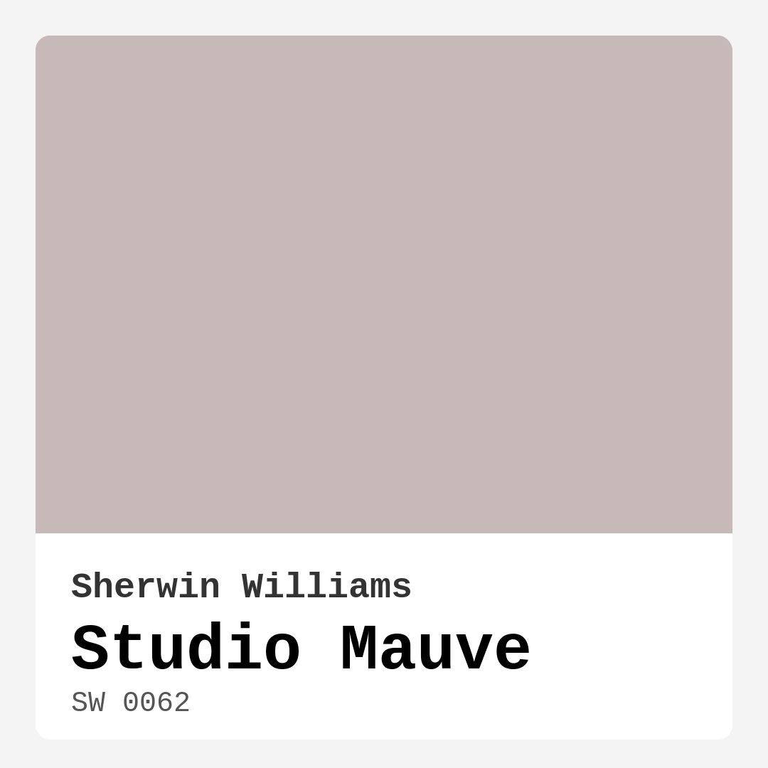
Color Preview & Key Details
| HEX Code | #C6B9B8 |
| RGB | 198, 185, 184 |
| LRV | 15% |
| Undertone | Red |
| Finish Options | Eggshell, Matte, Satin |
Imagine stepping into a room where the walls wrap you in warmth, inviting you to relax and unwind. That’s the magic of Studio Mauve, a captivating color from Sherwin Williams that redefines the essence of home decor. With its soft, muted mauve tone, this color brings an elegance and sophistication to any space, creating a cozy atmosphere that feels both modern and timeless.
Studio Mauve (SW 0062) sits comfortably in the pink hue family, with a warm undertone of red that adds complexity and depth. The color’s hex code is #C6B9B8, and it boasts an LRV (Light Reflectance Value) of 15%, marking it as a medium dark shade. This means it reflects very little light, perfect for those seeking a more intimate and inviting feel in their interiors.
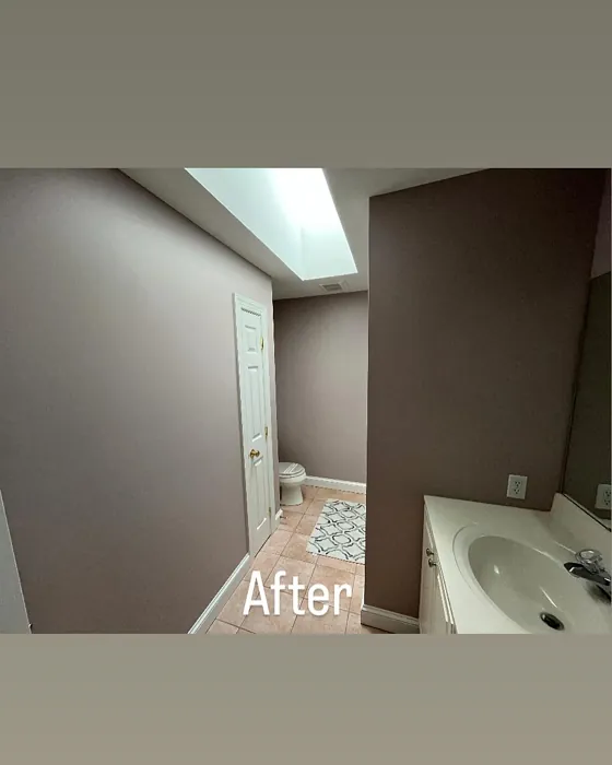
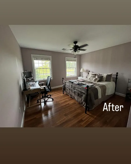
When you think about where to use Studio Mauve, the possibilities are almost endless. It shines in a living room, where it can act as a beautiful backdrop for gatherings or quiet evenings. In the bedroom, this color creates a serene sanctuary that invites rest and relaxation. Picture this hue in a home office, transforming your workspace into a calm and inspiring environment, or even in a nursery, where its soft warmth can help create a nurturing atmosphere for little ones. Dining rooms can also benefit from the cozy elegance of Studio Mauve, setting the perfect tone for meals shared with family and friends.
One of the standout features of Studio Mauve is its versatility. It harmonizes beautifully with various decor styles, whether you lean toward modern, bohemian, transitional, vintage, or eclectic. This makes it a designer favorite, as it can seamlessly blend into existing aesthetics or serve as a fresh foundation for new designs.
Applying Studio Mauve is a breeze, thanks to its beginner-friendly nature. The paint goes on smoothly with rollers and brushes, drying quickly to a soft, matte finish that enhances its enchanting colors. While it may require two coats for optimal coverage, the result is a rich, inviting hue that transforms walls into works of art. Plus, it’s easy to touch up, ensuring that your space always looks its best.
Now, let’s talk about how Studio Mauve interacts with light. In bright spaces, it reveals its soft pink undertones, creating an airy feel. However, in dim light, its muted quality takes center stage, wrapping the room in a cozy embrace. This duality allows for flexibility in different spaces, inviting you to play with lighting to see how the color evolves throughout the day.
Choosing the right trim color to accompany Studio Mauve can elevate your space even further. Crisp white trims, like White Dove or Simply White, provide a modern contrast that brightens the overall look. For those looking for a more organic feel, natural wood finishes work beautifully, adding warmth and texture that complements the mauve tones. If you want to make a bold statement, consider pairing Studio Mauve with black accents, like fixtures or windows, creating a striking visual that enhances the elegance of your chosen color.
Some may wonder if Studio Mauve is suitable for smaller rooms. Absolutely! This color can work wonders in compact spaces, especially when paired with plenty of light-colored accents and furnishings. Just be mindful of the lighting in the room; ensuring that natural light can flow in will help prevent the color from feeling too dark or overwhelming.
The washability of Studio Mauve is another fantastic feature, making it a practical choice for everyday living. It’s wipeable and washable, allowing for easy maintenance, which is essential in homes where children or pets might leave their mark.
As you consider incorporating Studio Mauve into your home, remember that its warm, muted, and dusty tones can evoke a variety of moods. Imagine a cozy evening with soft lighting, where the walls gently cradle you in a sense of calm. This color is not just about aesthetic appeal; it’s about creating an atmosphere that resonates with how you want to feel in your space.
With so many complementary shades available, you can create a cohesive color palette that enhances the beauty of Studio Mauve. Colors like SW 6224, SW 9137, and SW 9633 pair beautifully, allowing you to explore different combinations for accents or furnishings without losing the essence of your primary color choice.
Testing paint colors in your space is always a smart move. Studio Mauve’s undertones can change based on the surrounding decor, lighting, and even the time of day. Take the time to observe how it interacts with your existing furniture and decor, and don’t hesitate to test it out on a small section of the wall to see how it feels in your space.
In conclusion, Studio Mauve is more than just a color; it’s a gateway to creating a home that feels uniquely yours. It embodies warmth and sophistication, harmonizing effortlessly with various styles while offering a cozy, inviting ambiance. Whether it’s used on interior walls, as an accent color, or even on furniture, Studio Mauve promises to transform your space into something truly special. So, why not take the plunge and embrace this enchanting hue? Your home deserves it.
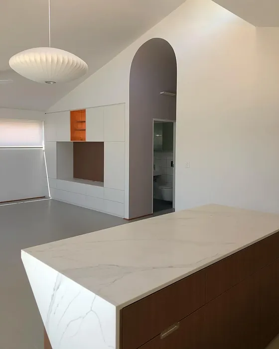
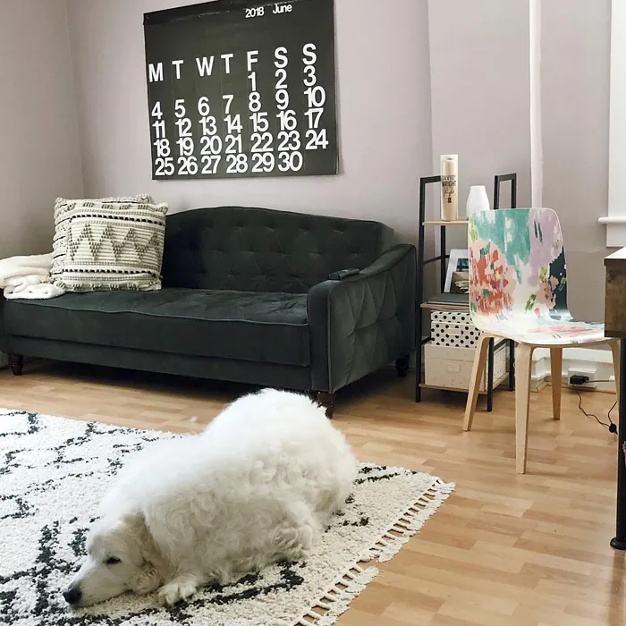
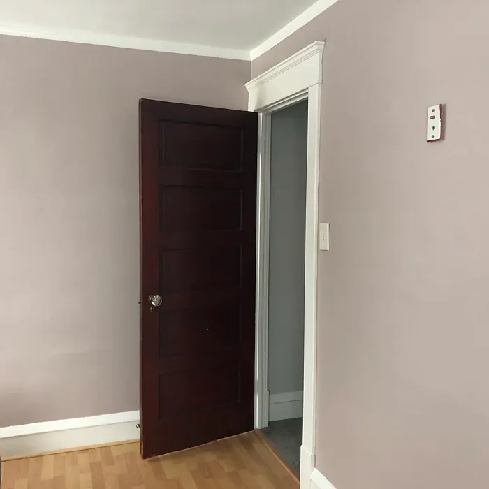
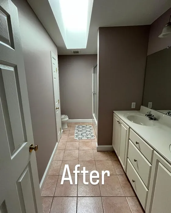
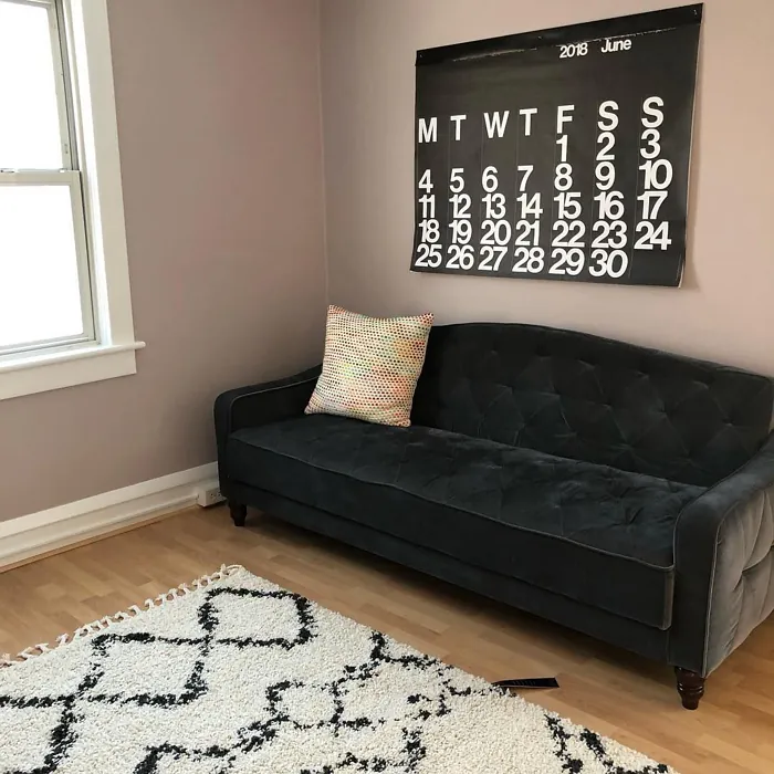
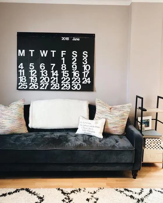
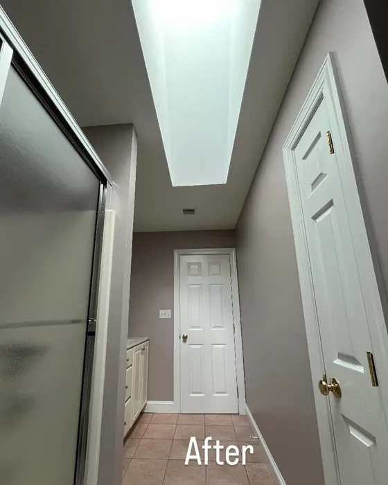
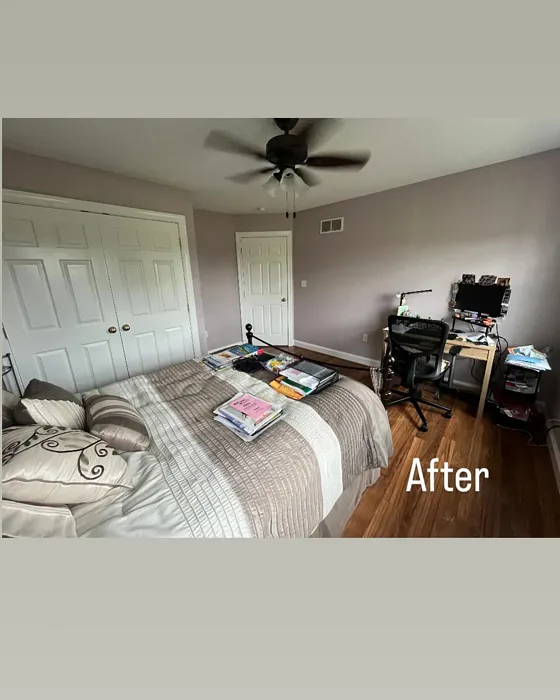
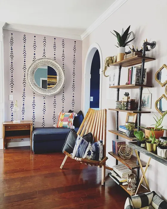
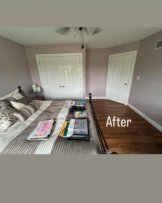
Real Room Photo of Studio Mauve SW 0062
Undertones of Studio Mauve ?
The undertones of Studio Mauve are a key aspect of its character, leaning towards Red. These subtle underlying hues are what give the color its depth and complexity. For example, a gray with a blue undertone will feel cooler and more modern, while one with a brown undertone will feel warmer and more traditional. It’s essential to test this paint in your home and observe it next to your existing furniture, flooring, and decor to see how these undertones interact and reveal themselves throughout the day.
HEX value: #C6B9B8
RGB code: 198, 185, 184
Is Studio Mauve Cool or Warm?
Studio Mauve leans towards a warm tone thanks to its pinkish hue, yet it maintains a balanced neutrality. This makes it suitable for spaces that need a welcoming feel without overwhelming brightness, allowing for an inviting atmosphere that feels just right.
Understanding Color Properties and Interior Design Tips
Hue refers to a specific position on the color wheel, measured in degrees from 0 to 360. Each degree represents a different pure color:
- 0° represents red
- 120° represents green
- 240° represents blue
Saturation describes the intensity or purity of a color and is expressed as a percentage:
- At 0%, the color appears completely desaturated—essentially a shade of gray
- At 100%, the color is at its most vivid and vibrant
Lightness indicates how light or dark a color is, also expressed as a percentage:
- 0% lightness results in black
- 100% lightness results in white
Using Warm Colors in Interior Design
Warm hues—such as reds, oranges, yellows, warm beiges, and greiges—are excellent choices for creating inviting and energetic spaces. These colors are particularly well-suited for:
- Kitchens, living rooms, and bathrooms, where warmth enhances comfort and sociability
- Large rooms, where warm tones can help reduce the sense of emptiness and make the space feel more intimate
For example:
- Warm beige shades provide a cozy, inviting atmosphere, ideal for living rooms, bedrooms, and hallways.
- Warm greige (a mix of beige and gray) offers the warmth of beige with the modern appeal of gray, making it a versatile backdrop for dining areas, bedrooms, and living spaces.
However, be mindful when using warm light tones in rooms with limited natural light. These shades may appear muted or even take on an unpleasant yellowish tint. To avoid a dull or flat appearance:
- Add depth by incorporating richer tones like deep greens, charcoal, or chocolate brown
- Use textured elements such as curtains, rugs, or cushions to bring dimension to the space
Pro Tip: Achieving Harmony with Warm and Cool Color Balance
To create a well-balanced and visually interesting interior, mix warm and cool tones strategically. This contrast adds depth and harmony to your design.
- If your walls feature warm hues, introduce cool-colored accents such as blue or green furniture, artwork, or accessories to create contrast.
- For a polished look, consider using a complementary color scheme, which pairs colors opposite each other on the color wheel (e.g., red with green, orange with blue).
This thoughtful mix not only enhances visual appeal but also creates a space that feels both dynamic and cohesive.
Light Temperature Affects on Studio Mauve
Natural Light
Natural daylight changes in color temperature as the sun moves across the sky. At sunrise and sunset, the light tends to have a warm, golden tone with a color temperature around 2000 Kelvin (K). As the day progresses and the sun rises higher, the light becomes cooler and more neutral. Around midday, especially when the sky is clear, natural light typically reaches its peak brightness and shifts to a cooler tone, ranging from 5500 to 6500 Kelvin. This midday light is close to what we perceive as pure white or daylight-balanced light.
These shifts in natural light can significantly influence how colors appear in a space, which is why designers often consider both the time of day and the orientation of windows when planning interior color schemes.
Artificial Light
When choosing artificial lighting, pay close attention to the color temperature, measured in Kelvin (K). This determines how warm or cool the light will appear. Lower temperatures, around 2700K, give off a warm, yellow glow often used in living rooms or bedrooms. Higher temperatures, above 5000K, create a cool, bluish light similar to daylight, commonly used in kitchens, offices, or task areas.
Use the slider to see how lighting temperature can affect the appearance of a surface or color throughout a space.


4800K
LRV of Studio Mauve
The Light Reflectance Value (LRV) of Studio Mauve is 15%, which places it in the Medium Dark category. This means it reflects very little light. Understanding a paint’s LRV is crucial for predicting how it will look in your space. A higher LRV indicates a lighter color that reflects more light, making rooms feel larger and brighter. A lower LRV signifies a darker color that absorbs more light, creating a cozier, more intimate atmosphere. Always consider the natural and artificial lighting in your room when selecting a paint color based on its LRV.
Detailed Review of Studio Mauve
Additional Paint Characteristics
Ideal Rooms
Bedroom, Dining Room, Home Office, Living Room, Nursery
Decor Styles
Bohemian, Eclectic, Modern, Transitional, Vintage
Coverage
Good (1–2 Coats), Touch-Up Friendly
Ease of Application
Beginner Friendly, Brush Smooth, Fast-Drying, Roller-Ready
Washability
Washable, Wipeable
VOC Level
Eco-Certified, Low VOC
Best Use
Accent Wall, Furniture, Interior Walls, Small Spaces
Room Suitability
Bedroom, Dining Room, Home Office, Living Room, Nursery
Tone Tag
Dusty, Muted, Warm
Finish Type
Eggshell, Matte, Satin
Paint Performance
Easy Touch-Up, Low Odor, Quick Drying
Use Cases
Best for Small Spaces, Classic Favorite, Designer Favorite
Mood
Calm, Cozy, Inviting
Trim Pairing
Complements Brass Fixtures, Good with Wood Trim, Pairs with White Dove
Studio Mauve is truly a standout choice if you’re looking for a color that feels both contemporary and timeless. Its subtle hue allows it to blend seamlessly into various decor styles, whether you’re aiming for a chic modern look or a cozy vintage vibe. The paint applies smoothly and dries with a soft finish that enchants under natural light. While it may require two coats for optimal coverage, the results are absolutely worth it, resulting in a rich, luminous wall that feels inviting and sophisticated. Pair it with white trim or natural wood accents for a stunning contrast that enhances its warm undertones.
Pros & Cons of SW 0062 Studio Mauve
Pros
Cons
Colors that go with Sherwin Williams Studio Mauve
FAQ on SW 0062 Studio Mauve
Can I use Studio Mauve in a small room?
Absolutely! Studio Mauve can work beautifully in small rooms, but be mindful of lighting. In well-lit spaces, it creates a warm and inviting atmosphere. To prevent it from feeling too dark, consider pairing it with plenty of light-colored accents or furniture, and let in as much natural light as possible.
What trim colors pair well with Studio Mauve?
Studio Mauve pairs wonderfully with white trim colors like White Dove or Simply White for a fresh, modern look. For a more rustic feel, it also complements natural wood finishes beautifully. If you’re going for a bolder contrast, black windows or fixtures create a striking visual that enhances the elegance of the mauve tone.
Comparisons Studio Mauve with other colors
Studio Mauve SW 0062 vs Realist Beige SW 6078
| Attribute | Studio Mauve SW 0062 | Realist Beige SW 6078 |
|---|---|---|
| Color Name | Studio Mauve SW 0062 | Realist Beige SW 6078 |
| Color | ||
| Hue | Pink | Pink |
| Brightness | Medium | Medium |
| RGB | 198, 185, 184 | 211, 200, 189 |
| LRV | 15% | 34% |
| Finish Type | Eggshell, Matte, Satin | Eggshell, Matte, Satin |
| Finish Options | Eggshell, Matte, Satin | Eggshell, Matte, Satin |
| Ideal Rooms | Bedroom, Dining Room, Home Office, Living Room, Nursery | Bedroom, Dining Room, Entryway, Home Office, Kitchen, Living Room |
| Decor Styles | Bohemian, Eclectic, Modern, Transitional, Vintage | Contemporary, Minimalist, Modern Farmhouse, Rustic, Traditional |
| Coverage | Good (1–2 Coats), Touch-Up Friendly | Good (1–2 Coats), Touch-Up Friendly |
| Ease of Application | Beginner Friendly, Brush Smooth, Fast-Drying, Roller-Ready | Beginner Friendly, Brush Smooth, Fast-Drying, Roller-Ready |
| Washability | Washable, Wipeable | Washable, Wipeable |
| Room Suitability | Bedroom, Dining Room, Home Office, Living Room, Nursery | Bedroom, Dining Room, Home Office, Kitchen, Living Room |
| Tone | Dusty, Muted, Warm | Earthy, Neutral, Warm |
| Paint Performance | Easy Touch-Up, Low Odor, Quick Drying | High Coverage, Low Odor, Quick Drying |
Studio Mauve SW 0062 vs Rosaline Pearl SW 9077
| Attribute | Studio Mauve SW 0062 | Rosaline Pearl SW 9077 |
|---|---|---|
| Color Name | Studio Mauve SW 0062 | Rosaline Pearl SW 9077 |
| Color | ||
| Hue | Pink | Pink |
| Brightness | Medium | Medium |
| RGB | 198, 185, 184 | 163, 136, 135 |
| LRV | 15% | 69% |
| Finish Type | Eggshell, Matte, Satin | Eggshell, Matte |
| Finish Options | Eggshell, Matte, Satin | Eggshell, Matte, Satin |
| Ideal Rooms | Bedroom, Dining Room, Home Office, Living Room, Nursery | Bedroom, Dining Room, Home Office, Living Room |
| Decor Styles | Bohemian, Eclectic, Modern, Transitional, Vintage | Bohemian, Contemporary, Modern, Transitional |
| Coverage | Good (1–2 Coats), Touch-Up Friendly | Good (1–2 Coats) |
| Ease of Application | Beginner Friendly, Brush Smooth, Fast-Drying, Roller-Ready | Beginner Friendly, Brush Smooth, Fast-Drying, Roller-Ready |
| Washability | Washable, Wipeable | Washable, Wipeable |
| Room Suitability | Bedroom, Dining Room, Home Office, Living Room, Nursery | Bedroom, Dining Room, Home Office, Living Room |
| Tone | Dusty, Muted, Warm | Dusty, Muted, Warm |
| Paint Performance | Easy Touch-Up, Low Odor, Quick Drying | Easy Touch-Up, Fade Resistant, Low Odor |
Studio Mauve SW 0062 vs Cabbage Rose SW 0003
| Attribute | Studio Mauve SW 0062 | Cabbage Rose SW 0003 |
|---|---|---|
| Color Name | Studio Mauve SW 0062 | Cabbage Rose SW 0003 |
| Color | ||
| Hue | Pink | Pink |
| Brightness | Medium | Medium |
| RGB | 198, 185, 184 | 197, 159, 145 |
| LRV | 15% | 15% |
| Finish Type | Eggshell, Matte, Satin | Eggshell, Matte, Satin |
| Finish Options | Eggshell, Matte, Satin | Eggshell, Matte, Satin |
| Ideal Rooms | Bedroom, Dining Room, Home Office, Living Room, Nursery | Bedroom, Dining Room, Hallway, Living Room, Nursery |
| Decor Styles | Bohemian, Eclectic, Modern, Transitional, Vintage | Cottage, Modern Farmhouse, Romantic, Shabby Chic, Vintage |
| Coverage | Good (1–2 Coats), Touch-Up Friendly | Good (1–2 Coats), Touch-Up Friendly |
| Ease of Application | Beginner Friendly, Brush Smooth, Fast-Drying, Roller-Ready | Beginner Friendly, Brush Smooth, Roller-Ready |
| Washability | Washable, Wipeable | Washable, Wipeable |
| Room Suitability | Bedroom, Dining Room, Home Office, Living Room, Nursery | Bedroom, Dining Room, Hallway, Living Room, Nursery |
| Tone | Dusty, Muted, Warm | Earthy, Muted, Warm |
| Paint Performance | Easy Touch-Up, Low Odor, Quick Drying | Easy Touch-Up, Low Odor |
Studio Mauve SW 0062 vs Sashay Sand SW 6051
| Attribute | Studio Mauve SW 0062 | Sashay Sand SW 6051 |
|---|---|---|
| Color Name | Studio Mauve SW 0062 | Sashay Sand SW 6051 |
| Color | ||
| Hue | Pink | Pink |
| Brightness | Medium | Medium |
| RGB | 198, 185, 184 | 207, 180, 168 |
| LRV | 15% | 64% |
| Finish Type | Eggshell, Matte, Satin | Eggshell, Matte, Satin |
| Finish Options | Eggshell, Matte, Satin | Eggshell, Matte, Satin |
| Ideal Rooms | Bedroom, Dining Room, Home Office, Living Room, Nursery | Bedroom, Dining Room, Home Office, Kitchen, Living Room |
| Decor Styles | Bohemian, Eclectic, Modern, Transitional, Vintage | Bohemian, Contemporary, Modern Farmhouse, Scandinavian, Transitional |
| Coverage | Good (1–2 Coats), Touch-Up Friendly | Good (1–2 Coats), Touch-Up Friendly |
| Ease of Application | Beginner Friendly, Brush Smooth, Fast-Drying, Roller-Ready | Beginner Friendly, Fast-Drying, Roller-Ready |
| Washability | Washable, Wipeable | Highly Washable, Washable |
| Room Suitability | Bedroom, Dining Room, Home Office, Living Room, Nursery | Bedroom, Dining Room, Home Office, Kitchen, Living Room |
| Tone | Dusty, Muted, Warm | Earthy, Muted, Warm |
| Paint Performance | Easy Touch-Up, Low Odor, Quick Drying | Easy Touch-Up, Low Odor, Quick Drying, Scuff Resistant |
Studio Mauve SW 0062 vs Touch of Sand SW 9085
| Attribute | Studio Mauve SW 0062 | Touch of Sand SW 9085 |
|---|---|---|
| Color Name | Studio Mauve SW 0062 | Touch of Sand SW 9085 |
| Color | ||
| Hue | Pink | Pink |
| Brightness | Medium | Medium |
| RGB | 198, 185, 184 | 213, 199, 186 |
| LRV | 15% | 66% |
| Finish Type | Eggshell, Matte, Satin | Eggshell, Matte, Satin |
| Finish Options | Eggshell, Matte, Satin | Eggshell, Matte, Satin |
| Ideal Rooms | Bedroom, Dining Room, Home Office, Living Room, Nursery | Bathroom, Bedroom, Dining Room, Home Office, Kitchen, Living Room |
| Decor Styles | Bohemian, Eclectic, Modern, Transitional, Vintage | Bohemian, Coastal, Contemporary, Modern Farmhouse, Rustic |
| Coverage | Good (1–2 Coats), Touch-Up Friendly | Good (1–2 Coats), Touch-Up Friendly |
| Ease of Application | Beginner Friendly, Brush Smooth, Fast-Drying, Roller-Ready | Beginner Friendly, Brush Smooth, Fast-Drying, Roller-Ready |
| Washability | Washable, Wipeable | Washable, Wipeable |
| Room Suitability | Bedroom, Dining Room, Home Office, Living Room, Nursery | Bathroom, Bedroom, Dining Room, Home Office, Kitchen, Living Room |
| Tone | Dusty, Muted, Warm | Earthy, Muted, Neutral, Warm |
| Paint Performance | Easy Touch-Up, Low Odor, Quick Drying | Easy Touch-Up, Low Odor, Quick Drying, Scuff Resistant |
Studio Mauve SW 0062 vs Pink Shadow SW 0070
| Attribute | Studio Mauve SW 0062 | Pink Shadow SW 0070 |
|---|---|---|
| Color Name | Studio Mauve SW 0062 | Pink Shadow SW 0070 |
| Color | ||
| Hue | Pink | Pink |
| Brightness | Medium | Medium |
| RGB | 198, 185, 184 | 222, 195, 185 |
| LRV | 15% | 45% |
| Finish Type | Eggshell, Matte, Satin | Eggshell, Matte, Satin |
| Finish Options | Eggshell, Matte, Satin | Eggshell, Matte, Satin |
| Ideal Rooms | Bedroom, Dining Room, Home Office, Living Room, Nursery | Bedroom, Dining Room, Home Office, Living Room, Nursery |
| Decor Styles | Bohemian, Eclectic, Modern, Transitional, Vintage | Bohemian, Minimalist, Modern Farmhouse, Scandinavian, Traditional |
| Coverage | Good (1–2 Coats), Touch-Up Friendly | Good (1–2 Coats) |
| Ease of Application | Beginner Friendly, Brush Smooth, Fast-Drying, Roller-Ready | Beginner Friendly, Brush Smooth, Fast-Drying, Roller-Ready |
| Washability | Washable, Wipeable | Washable, Wipeable |
| Room Suitability | Bedroom, Dining Room, Home Office, Living Room, Nursery | Bedroom, Dining Room, Living Room, Nursery |
| Tone | Dusty, Muted, Warm | Muted, Pastel, Warm |
| Paint Performance | Easy Touch-Up, Low Odor, Quick Drying | Easy Touch-Up, High Coverage, Low Odor |
Studio Mauve SW 0062 vs Hushed Auburn SW 9080
| Attribute | Studio Mauve SW 0062 | Hushed Auburn SW 9080 |
|---|---|---|
| Color Name | Studio Mauve SW 0062 | Hushed Auburn SW 9080 |
| Color | ||
| Hue | Pink | Pink |
| Brightness | Medium | Medium |
| RGB | 198, 185, 184 | 168, 133, 122 |
| LRV | 15% | 12% |
| Finish Type | Eggshell, Matte, Satin | Eggshell, Matte, Satin |
| Finish Options | Eggshell, Matte, Satin | Eggshell, Matte, Satin |
| Ideal Rooms | Bedroom, Dining Room, Home Office, Living Room, Nursery | Bedroom, Dining Room, Home Office, Living Room |
| Decor Styles | Bohemian, Eclectic, Modern, Transitional, Vintage | Contemporary, Modern Farmhouse, Rustic, Transitional |
| Coverage | Good (1–2 Coats), Touch-Up Friendly | Good (1–2 Coats), Touch-Up Friendly |
| Ease of Application | Beginner Friendly, Brush Smooth, Fast-Drying, Roller-Ready | Beginner Friendly, Brush Smooth, Fast-Drying, Roller-Ready |
| Washability | Washable, Wipeable | Washable, Wipeable |
| Room Suitability | Bedroom, Dining Room, Home Office, Living Room, Nursery | Bedroom, Dining Room, Home Office, Living Room |
| Tone | Dusty, Muted, Warm | Earthy, Muted, Warm |
| Paint Performance | Easy Touch-Up, Low Odor, Quick Drying | Easy Touch-Up, High Coverage, Low Odor |
Studio Mauve SW 0062 vs Likeable Sand SW 6058
| Attribute | Studio Mauve SW 0062 | Likeable Sand SW 6058 |
|---|---|---|
| Color Name | Studio Mauve SW 0062 | Likeable Sand SW 6058 |
| Color | ||
| Hue | Pink | Pink |
| Brightness | Medium | Medium |
| RGB | 198, 185, 184 | 209, 183, 168 |
| LRV | 15% | 61% |
| Finish Type | Eggshell, Matte, Satin | Eggshell, Matte, Satin |
| Finish Options | Eggshell, Matte, Satin | Eggshell, Matte, Satin |
| Ideal Rooms | Bedroom, Dining Room, Home Office, Living Room, Nursery | Bedroom, Dining Room, Home Office, Kitchen, Living Room |
| Decor Styles | Bohemian, Eclectic, Modern, Transitional, Vintage | Bohemian, Coastal, Contemporary, Modern Farmhouse, Rustic |
| Coverage | Good (1–2 Coats), Touch-Up Friendly | Good (1–2 Coats), Touch-Up Friendly |
| Ease of Application | Beginner Friendly, Brush Smooth, Fast-Drying, Roller-Ready | Beginner Friendly, Brush Smooth, Fast-Drying, Roller-Ready |
| Washability | Washable, Wipeable | Washable, Wipeable |
| Room Suitability | Bedroom, Dining Room, Home Office, Living Room, Nursery | Bedroom, Dining Room, Home Office, Kitchen, Living Room |
| Tone | Dusty, Muted, Warm | Earthy, Muted, Warm |
| Paint Performance | Easy Touch-Up, Low Odor, Quick Drying | Easy Touch-Up, Low Odor, Quick Drying |
Studio Mauve SW 0062 vs Glamour SW 6031
| Attribute | Studio Mauve SW 0062 | Glamour SW 6031 |
|---|---|---|
| Color Name | Studio Mauve SW 0062 | Glamour SW 6031 |
| Color | ||
| Hue | Pink | Pink |
| Brightness | Medium | Medium |
| RGB | 198, 185, 184 | 182, 160, 154 |
| LRV | 15% | 30% |
| Finish Type | Eggshell, Matte, Satin | Eggshell, Matte, Satin |
| Finish Options | Eggshell, Matte, Satin | Eggshell, Matte, Satin |
| Ideal Rooms | Bedroom, Dining Room, Home Office, Living Room, Nursery | Bedroom, Dining Room, Home Office, Living Room |
| Decor Styles | Bohemian, Eclectic, Modern, Transitional, Vintage | Bohemian, Classic, Modern, Transitional |
| Coverage | Good (1–2 Coats), Touch-Up Friendly | Good (1–2 Coats) |
| Ease of Application | Beginner Friendly, Brush Smooth, Fast-Drying, Roller-Ready | Beginner Friendly, Brush Smooth, Fast-Drying, Roller-Ready |
| Washability | Washable, Wipeable | Scrubbable, Washable |
| Room Suitability | Bedroom, Dining Room, Home Office, Living Room, Nursery | Bedroom, Dining Room, Home Office, Living Room |
| Tone | Dusty, Muted, Warm | Balanced, Neutral, Warm |
| Paint Performance | Easy Touch-Up, Low Odor, Quick Drying | Easy Touch-Up, Low Odor, Quick Drying |
Studio Mauve SW 0062 vs Temperate Taupe SW 6037
| Attribute | Studio Mauve SW 0062 | Temperate Taupe SW 6037 |
|---|---|---|
| Color Name | Studio Mauve SW 0062 | Temperate Taupe SW 6037 |
| Color | ||
| Hue | Pink | Pink |
| Brightness | Medium | Medium |
| RGB | 198, 185, 184 | 191, 177, 170 |
| LRV | 15% | 34% |
| Finish Type | Eggshell, Matte, Satin | Eggshell, Matte, Satin |
| Finish Options | Eggshell, Matte, Satin | Eggshell, Matte, Satin |
| Ideal Rooms | Bedroom, Dining Room, Home Office, Living Room, Nursery | Bedroom, Dining Room, Home Office, Kitchen, Living Room |
| Decor Styles | Bohemian, Eclectic, Modern, Transitional, Vintage | Bohemian, Modern Farmhouse, Rustic, Transitional |
| Coverage | Good (1–2 Coats), Touch-Up Friendly | Good (1–2 Coats), Touch-Up Friendly |
| Ease of Application | Beginner Friendly, Brush Smooth, Fast-Drying, Roller-Ready | Beginner Friendly, Brush Smooth, Fast-Drying, Roller-Ready |
| Washability | Washable, Wipeable | Highly Washable, Washable |
| Room Suitability | Bedroom, Dining Room, Home Office, Living Room, Nursery | Bedroom, Dining Room, Home Office, Living Room |
| Tone | Dusty, Muted, Warm | Earthy, Neutral, Warm |
| Paint Performance | Easy Touch-Up, Low Odor, Quick Drying | Long Lasting, Low Odor, Quick Drying, Scuff Resistant |
Official Page of Sherwin Williams Studio Mauve SW 0062