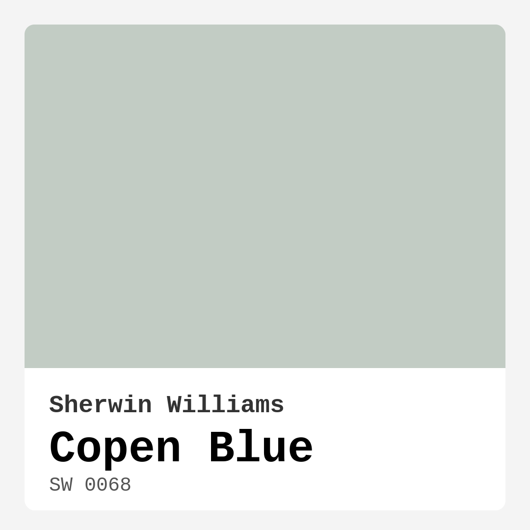
Color Preview & Key Details
| HEX Code | #C2CCC4 |
| RGB | 194, 204, 196 |
| LRV | 24% |
| Undertone | Green |
| Finish Options | Eggshell, Flat, Matte, Satin |
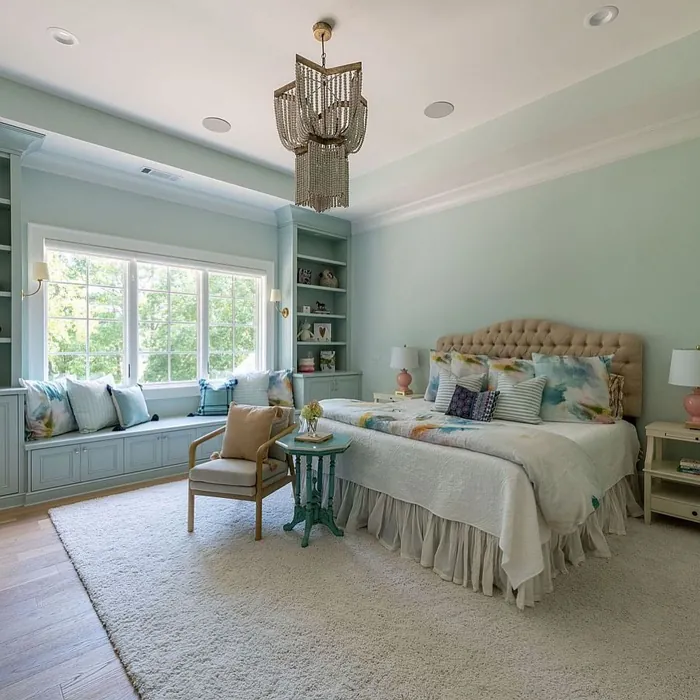
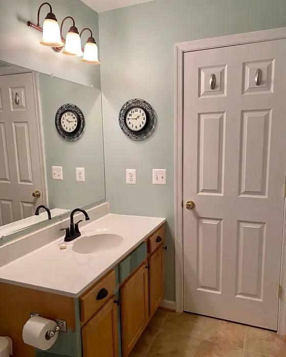
Have you ever walked into a room and felt an instant sense of calm? It’s like the air is lighter, the atmosphere more inviting. That’s what Copen Blue can do. This delightful paint color from Sherwin Williams effortlessly blends serenity with a modern twist, making it a fantastic option for any homeowner looking to refresh their space.
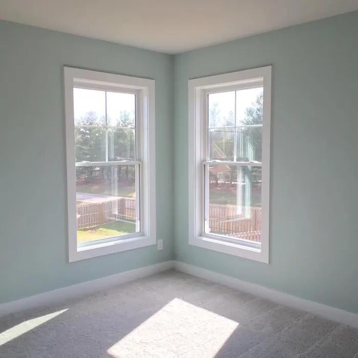
Copen Blue, with its color code SW 0068, is a beautiful soft hue that leans towards the green side of the spectrum, reminiscent of tranquil Scandinavian landscapes. The gentle, muted tone feels both cool and refreshing, and it brings a sense of tranquility to any environment. Imagine stepping into your living room or bedroom and being greeted by a calming wash of this paint—a perfect way to unwind after a long day.
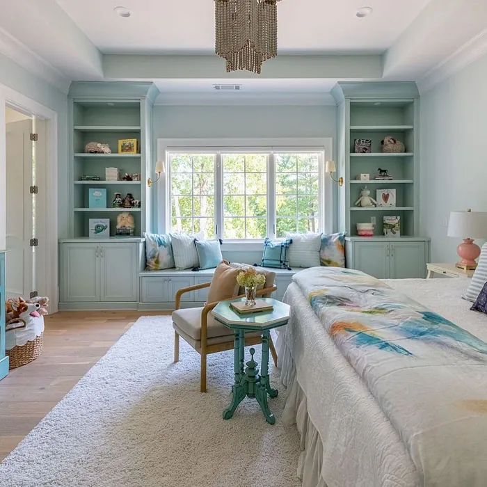
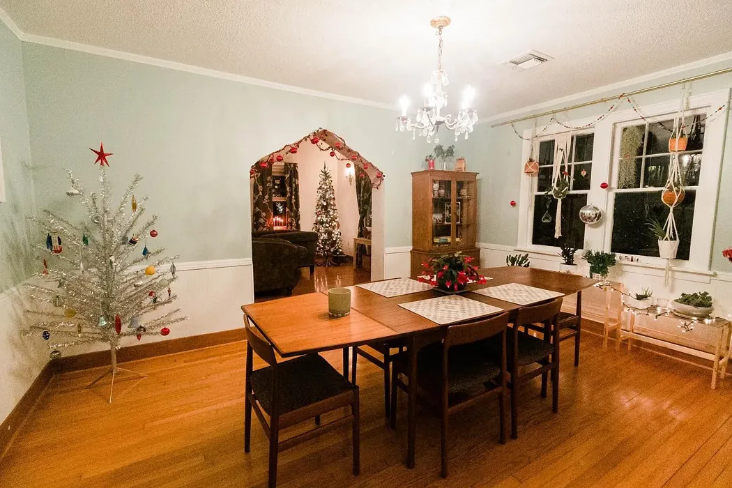
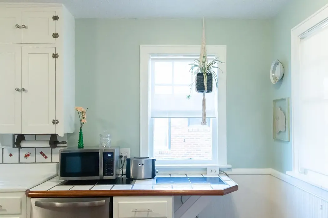
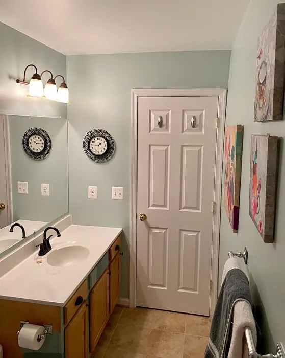
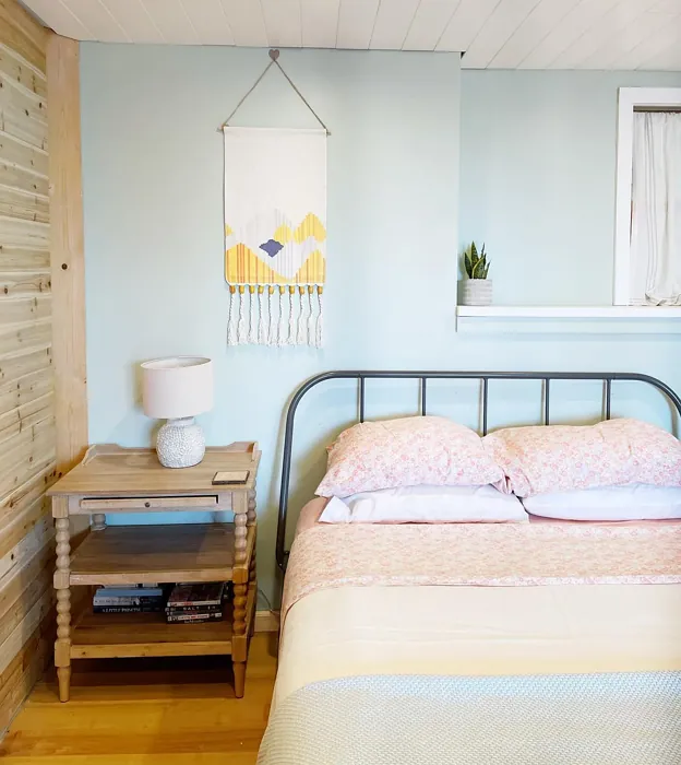
One of the things I love about Copen Blue is its versatility. It’s not just another pretty color; it works beautifully in various decor styles. Whether your home leans toward Scandinavian minimalism, modern aesthetics, or coastal vibes, Copen Blue fits right in. It’s ideal for living rooms, bedrooms, kitchens, bathrooms, and even home offices. This color can help create inviting atmospheres while still maintaining a chic, modern edge.
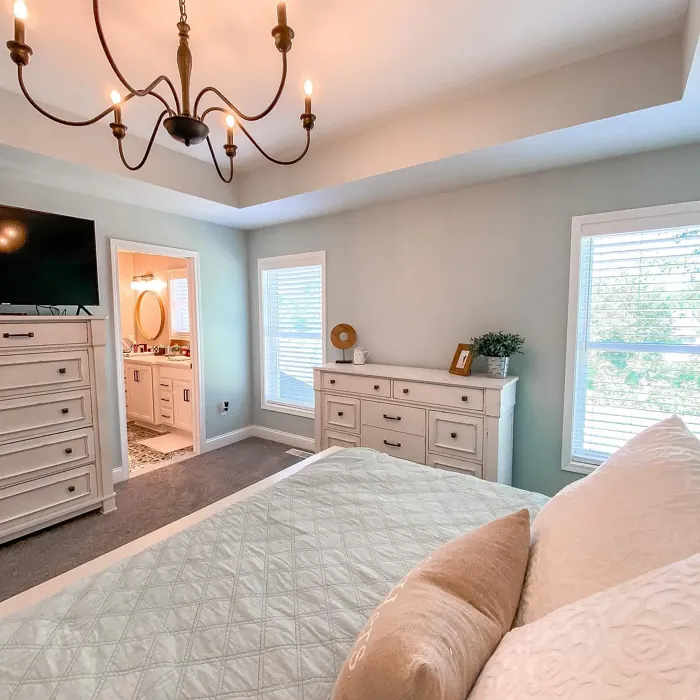
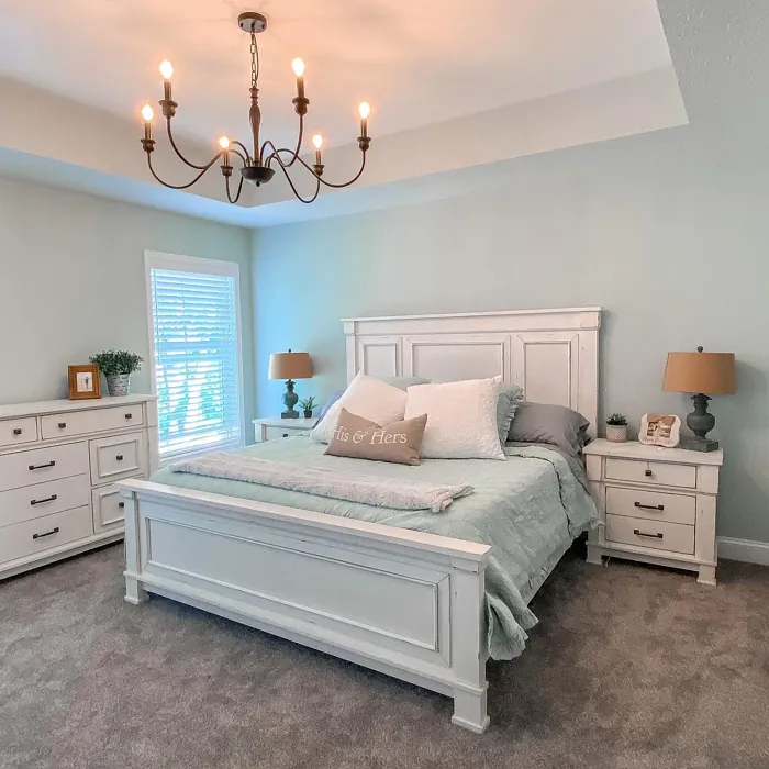
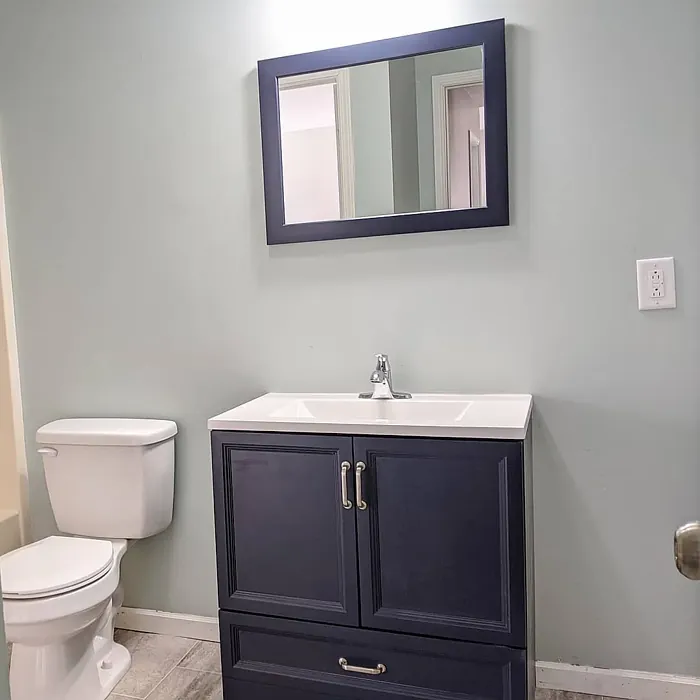
When it comes to applying Copen Blue, you’ll find that it’s a dream to work with. With an LRV of 24%, it’s classified as medium dark, which means it reflects very little light. This characteristic makes it excellent for creating intimate spaces but also means you need to pay attention to your room’s lighting. During the day, natural light will bring out its soft blue-green nature, making rooms feel brighter and more expansive. Under artificial lighting, it retains its calming qualities, ensuring that your tranquility isn’t compromised in the evening.
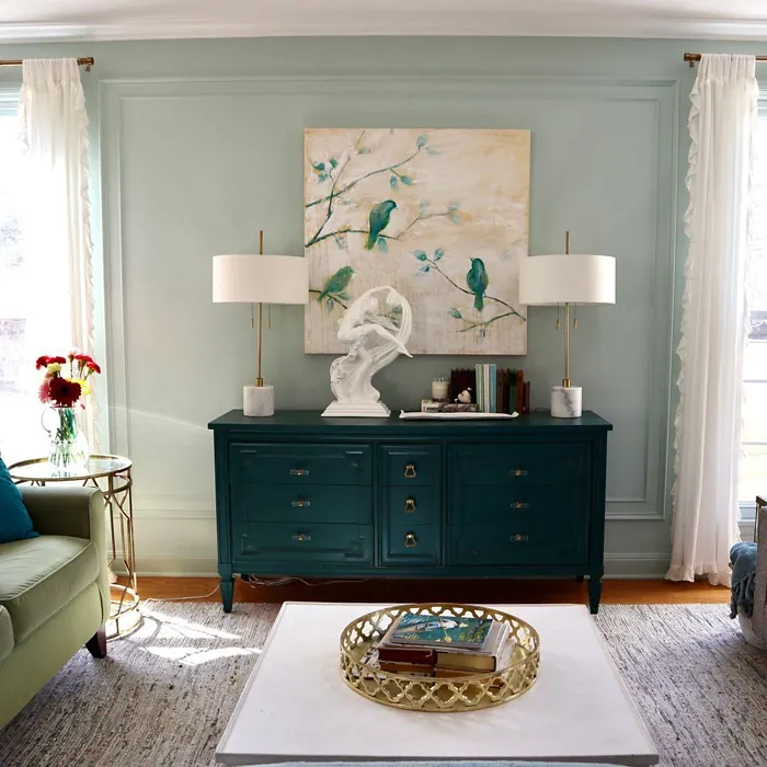
As you consider where to use Copen Blue, think about how it interacts with other elements in your home. The undertones are a key aspect of its character. With a gentle green undertone, it adds depth and complexity that can vary throughout the day depending on the light. This means it’s crucial to test the paint in your space—observe how it looks next to your existing furniture and flooring. You might find it pairs beautifully with natural wood tones or crisp white trims, which can enhance the airy feel of a room.
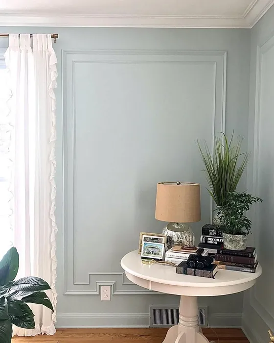
Speaking of trims, Copen Blue lends itself well to a variety of trim colors. For a clean, modern look, pairing it with white trim—like Sherwin Williams’ White Dove or Simply White—creates a fresh contrast that feels timeless. If you’re aiming for a more rustic vibe, natural wood trim adds warmth and texture, creating a lovely balance against the coolness of the blue.
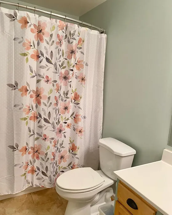
Now, let’s talk finishes. Copen Blue comes in several options: flat, matte, eggshell, and satin. Each finish offers a different look and feel, allowing you to choose what best fits your style and the room’s purpose. A matte finish gives a soft, chalky look that can feel relaxed and casual, while satin introduces a subtle sheen that reflects light beautifully, making it ideal for kitchens or bathrooms.
Another element that sets Copen Blue apart is its washability. Yes, you read that right! This color is not only visually stunning but also practical. It’s wipeable, washable, and scrubbable, making it an excellent choice for high-traffic areas or homes with kids and pets. You won’t have to stress about scuffs or stains ruining your serene oasis.
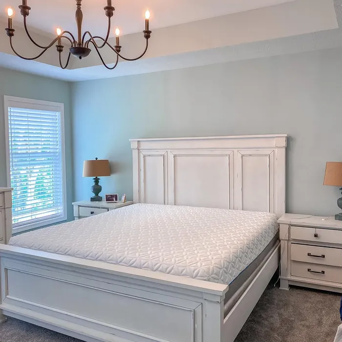
If you’re considering Copen Blue but hesitant about its cooler appearance in certain lighting, don’t worry. It’s all about how you use it. Proper lighting is essential to showcasing its beauty, especially in darker spaces. To make the most of this color, focus on strategic lighting choices, such as warm white bulbs, which can help to soften any coolness.
For those who might be working with smaller areas, Copen Blue is your friend. It can make spaces feel larger and more open, perfect for cozy nooks or even a refreshing bathroom retreat. Its lightness and airy vibe can turn a small room into a calm escape, creating a sense of freedom and openness.
When thinking about complementary shades, Copen Blue works well with various colors. Pair it with deep purples for a dramatic contrast, or go for neutrals to keep things subtle. If you’re feeling adventurous, shades like SW 6555, SW 0074, or SW 9069 can provide beautiful pops of color that enhance Copen Blue’s tranquility without overwhelming the space.
As you embark on your painting journey, keep in mind that Copen Blue is touch-up friendly. If you’re a DIY enthusiast or just a beginner, you’ll find it easy to apply with a roller or brush. It glides on smoothly, providing good coverage in just one to two coats, making your project that much simpler.
In summary, Copen Blue is more than just a color; it’s a mood, an atmosphere, and a statement. If you’re looking to create a space that feels calm and inviting, this soft, serene hue could be your perfect match.
So, whether you’re painting an entire room or just an accent wall, this color promises to bring tranquility and a modern touch to your home. With its versatility, ease of application, and beautiful finish, Copen Blue is undoubtedly a designer favorite and one that you should consider for your next home project. Happy painting!
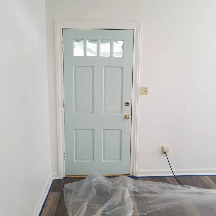
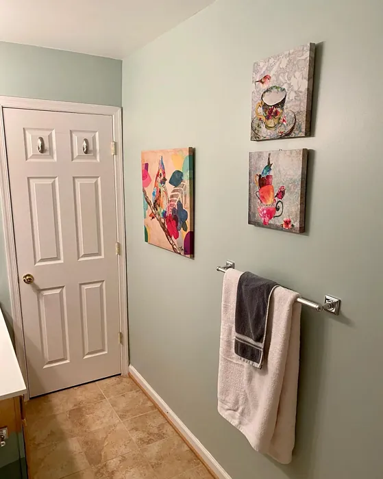
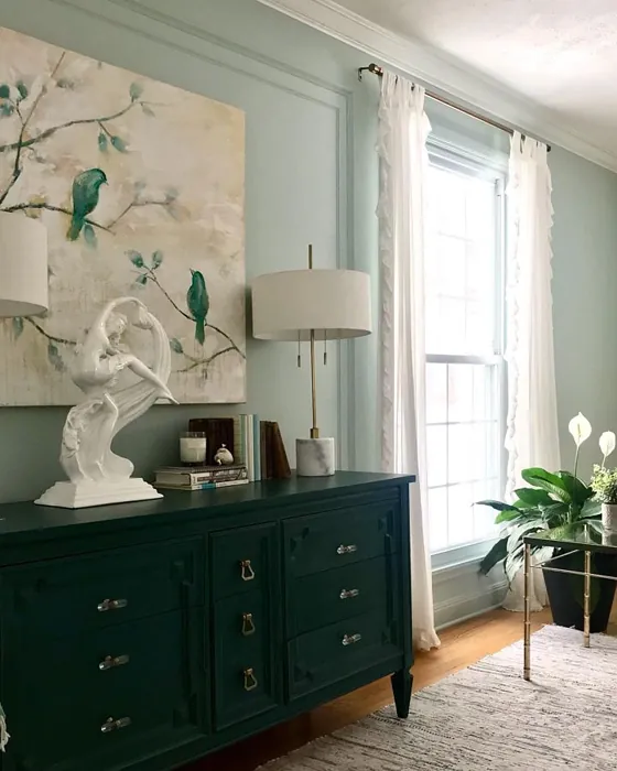
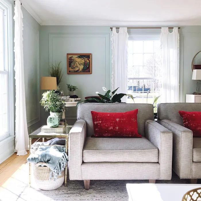
Real Room Photo of Copen Blue SW 0068
Undertones of Copen Blue ?
The undertones of Copen Blue are a key aspect of its character, leaning towards Green. These subtle underlying hues are what give the color its depth and complexity. For example, a gray with a blue undertone will feel cooler and more modern, while one with a brown undertone will feel warmer and more traditional. It’s essential to test this paint in your home and observe it next to your existing furniture, flooring, and decor to see how these undertones interact and reveal themselves throughout the day.
HEX value: #C2CCC4
RGB code: 194, 204, 196
Is Copen Blue Cool or Warm?
This paint leans cool, making it an ideal choice for spaces that benefit from a refreshing ambiance. Its coolness can help to brighten up darker rooms, providing an uplifting vibe that feels both modern and tranquil.
Understanding Color Properties and Interior Design Tips
Hue refers to a specific position on the color wheel, measured in degrees from 0 to 360. Each degree represents a different pure color:
- 0° represents red
- 120° represents green
- 240° represents blue
Saturation describes the intensity or purity of a color and is expressed as a percentage:
- At 0%, the color appears completely desaturated—essentially a shade of gray
- At 100%, the color is at its most vivid and vibrant
Lightness indicates how light or dark a color is, also expressed as a percentage:
- 0% lightness results in black
- 100% lightness results in white
Using Warm Colors in Interior Design
Warm hues—such as reds, oranges, yellows, warm beiges, and greiges—are excellent choices for creating inviting and energetic spaces. These colors are particularly well-suited for:
- Kitchens, living rooms, and bathrooms, where warmth enhances comfort and sociability
- Large rooms, where warm tones can help reduce the sense of emptiness and make the space feel more intimate
For example:
- Warm beige shades provide a cozy, inviting atmosphere, ideal for living rooms, bedrooms, and hallways.
- Warm greige (a mix of beige and gray) offers the warmth of beige with the modern appeal of gray, making it a versatile backdrop for dining areas, bedrooms, and living spaces.
However, be mindful when using warm light tones in rooms with limited natural light. These shades may appear muted or even take on an unpleasant yellowish tint. To avoid a dull or flat appearance:
- Add depth by incorporating richer tones like deep greens, charcoal, or chocolate brown
- Use textured elements such as curtains, rugs, or cushions to bring dimension to the space
Pro Tip: Achieving Harmony with Warm and Cool Color Balance
To create a well-balanced and visually interesting interior, mix warm and cool tones strategically. This contrast adds depth and harmony to your design.
- If your walls feature warm hues, introduce cool-colored accents such as blue or green furniture, artwork, or accessories to create contrast.
- For a polished look, consider using a complementary color scheme, which pairs colors opposite each other on the color wheel (e.g., red with green, orange with blue).
This thoughtful mix not only enhances visual appeal but also creates a space that feels both dynamic and cohesive.
Light Temperature Affects on Copen Blue
Natural Light
Natural daylight changes in color temperature as the sun moves across the sky. At sunrise and sunset, the light tends to have a warm, golden tone with a color temperature around 2000 Kelvin (K). As the day progresses and the sun rises higher, the light becomes cooler and more neutral. Around midday, especially when the sky is clear, natural light typically reaches its peak brightness and shifts to a cooler tone, ranging from 5500 to 6500 Kelvin. This midday light is close to what we perceive as pure white or daylight-balanced light.
These shifts in natural light can significantly influence how colors appear in a space, which is why designers often consider both the time of day and the orientation of windows when planning interior color schemes.
Artificial Light
When choosing artificial lighting, pay close attention to the color temperature, measured in Kelvin (K). This determines how warm or cool the light will appear. Lower temperatures, around 2700K, give off a warm, yellow glow often used in living rooms or bedrooms. Higher temperatures, above 5000K, create a cool, bluish light similar to daylight, commonly used in kitchens, offices, or task areas.
Use the slider to see how lighting temperature can affect the appearance of a surface or color throughout a space.


4800K
LRV of Copen Blue
The Light Reflectance Value (LRV) of Copen Blue is 24%, which places it in the Medium Dark category. This means it reflects very little light. Understanding a paint’s LRV is crucial for predicting how it will look in your space. A higher LRV indicates a lighter color that reflects more light, making rooms feel larger and brighter. A lower LRV signifies a darker color that absorbs more light, creating a cozier, more intimate atmosphere. Always consider the natural and artificial lighting in your room when selecting a paint color based on its LRV.
Detailed Review of Copen Blue
Additional Paint Characteristics
Ideal Rooms
Bathroom, Bedroom, Home Office, Kitchen, Living Room
Decor Styles
Coastal, Minimalist, Modern, Scandinavian, Transitional
Coverage
Good (1–2 Coats), Touch-Up Friendly
Ease of Application
Beginner Friendly, Brush Smooth, Roller-Ready
Washability
Scrubbable, Washable, Wipeable
VOC Level
Eco-Certified, Low VOC
Best Use
Accent Wall, Interior Walls, Small Spaces
Room Suitability
Bathroom, Bedroom, Home Office, Kitchen, Living Room
Tone Tag
Airy, Cool, Muted
Finish Type
Eggshell, Matte, Satin
Paint Performance
Easy Touch-Up, Low Odor, Stain Resistant
Use Cases
Best for Rentals, Best for Small Spaces, Designer Favorite
Mood
Calm, Inviting, Restful
Trim Pairing
Complements Brass Fixtures, Good with Wood Trim, Pairs with White Dove
Copen Blue is a stunning choice for those looking to introduce a calm and refreshing hue into their home. Its HEX code, #C2CCC4, reveals a color that strikes a balance between blue and green with a whisper of gray, giving it a unique versatility. This makes it suitable for various decor styles, from coastal to modern minimalist.
When applying Copen Blue, you’ll find it glides on smoothly, offering good coverage in just one to two coats. It pairs beautifully with natural wood tones and white trim, enhancing the airy feel of a room. Plus, its muted quality allows it to complement bolder accent colors without overwhelming them. Whether you’re painting an accent wall or an entire room, Copen Blue is sure to create a serene and inviting space.
Pros & Cons of SW 0068 Copen Blue
Pros
Cons
Colors that go with Sherwin Williams Copen Blue
FAQ on SW 0068 Copen Blue
Is Copen Blue suitable for small spaces?
Absolutely! Copen Blue is a fantastic choice for small spaces due to its lightness and airy feel. It can make a room appear larger and more open, especially when paired with strategic lighting and reflective surfaces. Use it in a bathroom or a cozy nook to create a refreshing retreat.
What trim colors work best with Copen Blue?
Copen Blue pairs beautifully with a variety of trim colors. For a clean and modern look, white trim—like White Dove or Simply White—works wonderfully. If you want a more rustic feel, natural wood trim can add warmth and texture, creating a charming contrast.
Comparisons Copen Blue with other colors
Copen Blue SW 0068 vs Acacia Haze SW 9132
| Attribute | Copen Blue SW 0068 | Acacia Haze SW 9132 |
|---|---|---|
| Color Name | Copen Blue SW 0068 | Acacia Haze SW 9132 |
| Color | ||
| Hue | Green | Green |
| Brightness | Medium | Medium |
| RGB | 194, 204, 196 | 150, 156, 146 |
| LRV | 24% | 30% |
| Finish Type | Eggshell, Matte, Satin | Eggshell, Satin |
| Finish Options | Eggshell, Flat, Matte, Satin | Eggshell, Matte, Satin |
| Ideal Rooms | Bathroom, Bedroom, Home Office, Kitchen, Living Room | Bedroom, Dining Room, Home Office, Living Room, Nursery |
| Decor Styles | Coastal, Minimalist, Modern, Scandinavian, Transitional | Bohemian, Coastal, Modern Farmhouse, Scandinavian |
| Coverage | Good (1–2 Coats), Touch-Up Friendly | Good (1–2 Coats), Touch-Up Friendly |
| Ease of Application | Beginner Friendly, Brush Smooth, Roller-Ready | Beginner Friendly, Brush Smooth, Roller-Ready |
| Washability | Scrubbable, Washable, Wipeable | Washable, Wipeable |
| Room Suitability | Bathroom, Bedroom, Home Office, Kitchen, Living Room | Bedroom, Home Office, Living Room, Nursery |
| Tone | Airy, Cool, Muted | Balanced, Earthy, Muted |
| Paint Performance | Easy Touch-Up, Low Odor, Stain Resistant | Easy Touch-Up, High Coverage, Low Odor |
Copen Blue SW 0068 vs Evergreen Fog SW 9130
| Attribute | Copen Blue SW 0068 | Evergreen Fog SW 9130 |
|---|---|---|
| Color Name | Copen Blue SW 0068 | Evergreen Fog SW 9130 |
| Color | ||
| Hue | Green | Green |
| Brightness | Medium | Medium |
| RGB | 194, 204, 196 | 149, 151, 138 |
| LRV | 24% | 30% |
| Finish Type | Eggshell, Matte, Satin | Eggshell, Matte, Satin |
| Finish Options | Eggshell, Flat, Matte, Satin | Eggshell, Matte, Satin |
| Ideal Rooms | Bathroom, Bedroom, Home Office, Kitchen, Living Room | Bedroom, Dining Room, Home Office, Living Room, Nursery |
| Decor Styles | Coastal, Minimalist, Modern, Scandinavian, Transitional | Coastal, Modern Farmhouse, Rustic, Scandinavian, Transitional |
| Coverage | Good (1–2 Coats), Touch-Up Friendly | Good (1–2 Coats), Touch-Up Friendly |
| Ease of Application | Beginner Friendly, Brush Smooth, Roller-Ready | Beginner Friendly, Brush Smooth, Roller-Ready |
| Washability | Scrubbable, Washable, Wipeable | Scrubbable, Washable |
| Room Suitability | Bathroom, Bedroom, Home Office, Kitchen, Living Room | Bedroom, Dining Room, Home Office, Living Room, Nursery |
| Tone | Airy, Cool, Muted | Balanced, Earthy, Muted |
| Paint Performance | Easy Touch-Up, Low Odor, Stain Resistant | Easy Touch-Up, Low Odor, Scuff Resistant |
Copen Blue SW 0068 vs Clary Sage SW 6178
| Attribute | Copen Blue SW 0068 | Clary Sage SW 6178 |
|---|---|---|
| Color Name | Copen Blue SW 0068 | Clary Sage SW 6178 |
| Color | ||
| Hue | Green | Green |
| Brightness | Medium | Medium |
| RGB | 194, 204, 196 | 172, 173, 151 |
| LRV | 24% | 24% |
| Finish Type | Eggshell, Matte, Satin | Eggshell, Matte |
| Finish Options | Eggshell, Flat, Matte, Satin | Eggshell, Matte, Satin |
| Ideal Rooms | Bathroom, Bedroom, Home Office, Kitchen, Living Room | Bathroom, Bedroom, Home Office, Kitchen, Living Room |
| Decor Styles | Coastal, Minimalist, Modern, Scandinavian, Transitional | Bohemian, Minimalist, Modern Farmhouse, Scandinavian, Traditional |
| Coverage | Good (1–2 Coats), Touch-Up Friendly | Good (1–2 Coats), Touch-Up Friendly |
| Ease of Application | Beginner Friendly, Brush Smooth, Roller-Ready | Beginner Friendly, Brush Smooth, Roller-Ready |
| Washability | Scrubbable, Washable, Wipeable | Washable, Wipeable |
| Room Suitability | Bathroom, Bedroom, Home Office, Kitchen, Living Room | Bathroom, Bedroom, Home Office, Kitchen, Living Room |
| Tone | Airy, Cool, Muted | Cool, Earthy, Muted |
| Paint Performance | Easy Touch-Up, Low Odor, Stain Resistant | Easy Touch-Up, High Coverage, Low Odor |
Copen Blue SW 0068 vs Softened Green SW 6177
| Attribute | Copen Blue SW 0068 | Softened Green SW 6177 |
|---|---|---|
| Color Name | Copen Blue SW 0068 | Softened Green SW 6177 |
| Color | ||
| Hue | Green | Green |
| Brightness | Medium | Medium |
| RGB | 194, 204, 196 | 187, 188, 167 |
| LRV | 24% | 48% |
| Finish Type | Eggshell, Matte, Satin | Eggshell, Matte, Satin |
| Finish Options | Eggshell, Flat, Matte, Satin | Eggshell, Matte, Satin |
| Ideal Rooms | Bathroom, Bedroom, Home Office, Kitchen, Living Room | Bathroom, Bedroom, Dining Room, Home Office, Kitchen, Living Room, Nursery |
| Decor Styles | Coastal, Minimalist, Modern, Scandinavian, Transitional | Coastal, Farmhouse, Minimalist, Modern, Scandinavian |
| Coverage | Good (1–2 Coats), Touch-Up Friendly | Good (1–2 Coats), Touch-Up Friendly |
| Ease of Application | Beginner Friendly, Brush Smooth, Roller-Ready | Beginner Friendly, Brush Smooth, Fast-Drying, Roller-Ready |
| Washability | Scrubbable, Washable, Wipeable | Washable, Wipeable |
| Room Suitability | Bathroom, Bedroom, Home Office, Kitchen, Living Room | Bathroom, Bedroom, Dining Room, Home Office, Kitchen, Living Room |
| Tone | Airy, Cool, Muted | Calm, Earthy, Muted |
| Paint Performance | Easy Touch-Up, Low Odor, Stain Resistant | Easy Touch-Up, Fade Resistant, Low Odor, Quick Drying |
Copen Blue SW 0068 vs Eventide SW 9643
| Attribute | Copen Blue SW 0068 | Eventide SW 9643 |
|---|---|---|
| Color Name | Copen Blue SW 0068 | Eventide SW 9643 |
| Color | ||
| Hue | Green | Green |
| Brightness | Medium | Medium |
| RGB | 194, 204, 196 | 163, 175, 172 |
| LRV | 24% | 24% |
| Finish Type | Eggshell, Matte, Satin | Eggshell, Matte, Satin |
| Finish Options | Eggshell, Flat, Matte, Satin | Eggshell, Matte, Satin |
| Ideal Rooms | Bathroom, Bedroom, Home Office, Kitchen, Living Room | Bedroom, Home Office, Kitchen, Living Room, Nursery |
| Decor Styles | Coastal, Minimalist, Modern, Scandinavian, Transitional | Coastal, Contemporary, Minimalist, Modern |
| Coverage | Good (1–2 Coats), Touch-Up Friendly | Good (1–2 Coats), Touch-Up Friendly |
| Ease of Application | Beginner Friendly, Brush Smooth, Roller-Ready | Beginner Friendly, Brush Smooth, Fast-Drying, Roller-Ready |
| Washability | Scrubbable, Washable, Wipeable | Washable, Wipeable |
| Room Suitability | Bathroom, Bedroom, Home Office, Kitchen, Living Room | Bedroom, Home Office, Living Room, Nursery |
| Tone | Airy, Cool, Muted | Airy, Balanced, Cool, Muted |
| Paint Performance | Easy Touch-Up, Low Odor, Stain Resistant | Easy Touch-Up, High Coverage, Low Odor, Quick Drying |
Copen Blue SW 0068 vs Escape Gray SW 6185
| Attribute | Copen Blue SW 0068 | Escape Gray SW 6185 |
|---|---|---|
| Color Name | Copen Blue SW 0068 | Escape Gray SW 6185 |
| Color | ||
| Hue | Green | Green |
| Brightness | Medium | Medium |
| RGB | 194, 204, 196 | 171, 172, 159 |
| LRV | 24% | 48% |
| Finish Type | Eggshell, Matte, Satin | Eggshell, Matte |
| Finish Options | Eggshell, Flat, Matte, Satin | Eggshell, Matte, Satin |
| Ideal Rooms | Bathroom, Bedroom, Home Office, Kitchen, Living Room | Bathroom, Bedroom, Entryway, Home Office, Living Room |
| Decor Styles | Coastal, Minimalist, Modern, Scandinavian, Transitional | Minimalist, Modern, Scandinavian, Transitional |
| Coverage | Good (1–2 Coats), Touch-Up Friendly | Good (1–2 Coats) |
| Ease of Application | Beginner Friendly, Brush Smooth, Roller-Ready | Beginner Friendly, Brush Smooth, Roller-Ready |
| Washability | Scrubbable, Washable, Wipeable | Highly Washable, Washable |
| Room Suitability | Bathroom, Bedroom, Home Office, Kitchen, Living Room | Bathroom, Bedroom, Home Office, Living Room |
| Tone | Airy, Cool, Muted | Cool, Muted, Neutral, Warm |
| Paint Performance | Easy Touch-Up, Low Odor, Stain Resistant | Easy Touch-Up, Low Odor, Scuff Resistant |
Copen Blue SW 0068 vs Coastal Plain SW 6192
| Attribute | Copen Blue SW 0068 | Coastal Plain SW 6192 |
|---|---|---|
| Color Name | Copen Blue SW 0068 | Coastal Plain SW 6192 |
| Color | ||
| Hue | Green | Green |
| Brightness | Medium | Medium |
| RGB | 194, 204, 196 | 159, 166, 148 |
| LRV | 24% | 66% |
| Finish Type | Eggshell, Matte, Satin | Eggshell, Satin |
| Finish Options | Eggshell, Flat, Matte, Satin | Eggshell, Satin, Semi-Gloss |
| Ideal Rooms | Bathroom, Bedroom, Home Office, Kitchen, Living Room | Bathroom, Bedroom, Home Office, Kitchen, Living Room |
| Decor Styles | Coastal, Minimalist, Modern, Scandinavian, Transitional | Bohemian, Coastal, Contemporary, Modern Farmhouse, Rustic |
| Coverage | Good (1–2 Coats), Touch-Up Friendly | Good (1–2 Coats) |
| Ease of Application | Beginner Friendly, Brush Smooth, Roller-Ready | Beginner Friendly, Brush Smooth, Fast-Drying, Roller-Ready |
| Washability | Scrubbable, Washable, Wipeable | Scrubbable, Washable |
| Room Suitability | Bathroom, Bedroom, Home Office, Kitchen, Living Room | Bathroom, Bedroom, Dining Room, Home Office, Kitchen, Living Room |
| Tone | Airy, Cool, Muted | Cool, Earthy, Muted |
| Paint Performance | Easy Touch-Up, Low Odor, Stain Resistant | High Coverage, Low Odor, Quick Drying |
Copen Blue SW 0068 vs Contented SW 6191
| Attribute | Copen Blue SW 0068 | Contented SW 6191 |
|---|---|---|
| Color Name | Copen Blue SW 0068 | Contented SW 6191 |
| Color | ||
| Hue | Green | Green |
| Brightness | Medium | Medium |
| RGB | 194, 204, 196 | 189, 192, 179 |
| LRV | 24% | 45% |
| Finish Type | Eggshell, Matte, Satin | Eggshell, Matte, Satin |
| Finish Options | Eggshell, Flat, Matte, Satin | Eggshell, Matte, Satin |
| Ideal Rooms | Bathroom, Bedroom, Home Office, Kitchen, Living Room | Bedroom, Dining Room, Home Office, Kitchen, Living Room |
| Decor Styles | Coastal, Minimalist, Modern, Scandinavian, Transitional | Contemporary, Minimalist, Modern, Scandinavian, Transitional |
| Coverage | Good (1–2 Coats), Touch-Up Friendly | Good (1–2 Coats), Touch-Up Friendly |
| Ease of Application | Beginner Friendly, Brush Smooth, Roller-Ready | Beginner Friendly, Brush Smooth, Roller-Ready |
| Washability | Scrubbable, Washable, Wipeable | Stain Resistant, Washable |
| Room Suitability | Bathroom, Bedroom, Home Office, Kitchen, Living Room | Bedroom, Dining Room, Home Office, Kitchen, Living Room |
| Tone | Airy, Cool, Muted | Muted, Neutral, Warm |
| Paint Performance | Easy Touch-Up, Low Odor, Stain Resistant | Easy Touch-Up, High Coverage, Low Odor |
Copen Blue SW 0068 vs Jade Dragon SW 9129
| Attribute | Copen Blue SW 0068 | Jade Dragon SW 9129 |
|---|---|---|
| Color Name | Copen Blue SW 0068 | Jade Dragon SW 9129 |
| Color | ||
| Hue | Green | Green |
| Brightness | Medium | Medium |
| RGB | 194, 204, 196 | 144, 152, 134 |
| LRV | 24% | 12% |
| Finish Type | Eggshell, Matte, Satin | Eggshell, Matte, Satin |
| Finish Options | Eggshell, Flat, Matte, Satin | Eggshell, Matte, Satin |
| Ideal Rooms | Bathroom, Bedroom, Home Office, Kitchen, Living Room | Bedroom, Dining Room, Home Office, Living Room, Nursery |
| Decor Styles | Coastal, Minimalist, Modern, Scandinavian, Transitional | Bohemian, Minimalist, Modern, Traditional, Transitional |
| Coverage | Good (1–2 Coats), Touch-Up Friendly | Good (1–2 Coats), Touch-Up Friendly |
| Ease of Application | Beginner Friendly, Brush Smooth, Roller-Ready | Beginner Friendly, Brush Smooth, Fast-Drying, Roller-Ready |
| Washability | Scrubbable, Washable, Wipeable | Highly Washable, Stain Resistant, Washable |
| Room Suitability | Bathroom, Bedroom, Home Office, Kitchen, Living Room | Bedroom, Dining Room, Home Office, Living Room, Nursery |
| Tone | Airy, Cool, Muted | Balanced, Cool, Earthy, Muted |
| Paint Performance | Easy Touch-Up, Low Odor, Stain Resistant | Easy Touch-Up, Fade Resistant, Low Odor, Stain Resistant |
Copen Blue SW 0068 vs Underseas SW 6214
| Attribute | Copen Blue SW 0068 | Underseas SW 6214 |
|---|---|---|
| Color Name | Copen Blue SW 0068 | Underseas SW 6214 |
| Color | ||
| Hue | Green | Green |
| Brightness | Medium | Medium |
| RGB | 194, 204, 196 | 124, 142, 135 |
| LRV | 24% | 24% |
| Finish Type | Eggshell, Matte, Satin | Eggshell, Matte, Satin |
| Finish Options | Eggshell, Flat, Matte, Satin | Eggshell, Matte, Satin |
| Ideal Rooms | Bathroom, Bedroom, Home Office, Kitchen, Living Room | Bathroom, Bedroom, Dining Room, Hallway, Home Office, Living Room |
| Decor Styles | Coastal, Minimalist, Modern, Scandinavian, Transitional | Coastal, Eclectic, Farmhouse, Modern, Scandinavian |
| Coverage | Good (1–2 Coats), Touch-Up Friendly | Good (1–2 Coats), Touch-Up Friendly |
| Ease of Application | Beginner Friendly, Brush Smooth, Roller-Ready | Beginner Friendly, Brush Smooth, Fast-Drying, Roller-Ready |
| Washability | Scrubbable, Washable, Wipeable | Highly Washable, Washable, Wipeable |
| Room Suitability | Bathroom, Bedroom, Home Office, Kitchen, Living Room | Bathroom, Bedroom, Dining Room, Home Office, Living Room |
| Tone | Airy, Cool, Muted | Balanced, Cool, Earthy, Muted |
| Paint Performance | Easy Touch-Up, Low Odor, Stain Resistant | Easy Touch-Up, Fade Resistant, High Coverage, Low Odor |
Official Page of Sherwin Williams Copen Blue SW 0068