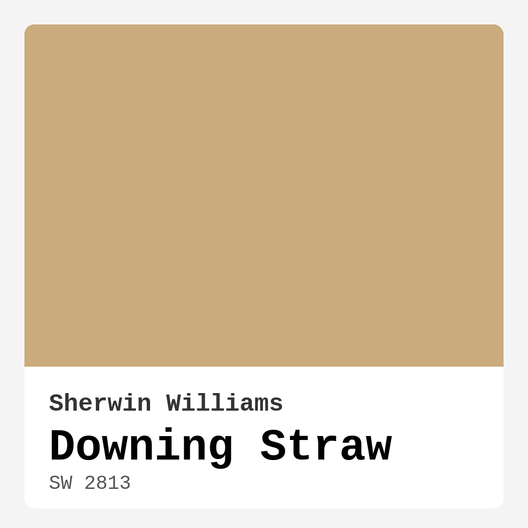
Color Preview & Key Details
| HEX Code | #CAAB7D |
| RGB | 202, 171, 125 |
| LRV | 48% |
| Undertone | Red |
| Finish Options | Eggshell, Matte, Satin |
Imagine stepping into a room that feels like a warm hug—soft, inviting, and just the right amount of vibrant. That’s the magic of Downing Straw by Sherwin Williams. This color isn’t just a shade; it’s an experience that can transform your space into a haven, radiating comfort and sophistication at the same time.
Let’s dive into what makes Downing Straw such a beloved choice among homeowners and designers alike. With its warm yellow hue, it strikes a perfect balance between cheerful and earthy, making it not just versatile but also timeless. You might wonder if this color is right for your home, and I’m here to guide you through that decision.
First, let’s talk about how Downing Straw feels. It’s a medium yellow, rich enough to provide a cozy atmosphere without overwhelming your senses. If you love the idea of yellow but find the pure yellows a bit too bright or intense, this hue offers a more muted, grounded option. The red undertone adds depth, allowing it to blend beautifully with various color palettes and styles.
Now, think about the spaces where you want this warmth to shine. Downing Straw is ideal for living rooms, bedrooms, kitchens, dining rooms, and even home offices. Whether you’re aiming for a modern farmhouse vibe or something more eclectic, this color fits right in. It can serve as the backdrop for vibrant decor or complement a more subdued aesthetic. The key is in how you pair it with other colors.
When you’re working with Downing Straw, consider complementary shades to enhance its beauty. Colors like white, soft blues, or warm grays can create a lovely contrast, allowing the yellow to pop while keeping the overall feel balanced. Think about white trim or brass fixtures; these accents will make the color sing in your home, adding a touch of elegance without detracting from its earthy warmth.
One of the fantastic features of Downing Straw is its versatility across different light conditions. In natural light, it glows with an inviting radiance, making your space feel brighter and more open. But in lower light, it softens beautifully, creating a cozy atmosphere. This quality makes it an excellent choice for spaces that experience varying light throughout the day.
You may be wondering about the practical aspects of using Downing Straw. The Light Reflectance Value (LRV) of this color is 48%, placing it firmly in the medium category. This means it reflects a moderate amount of light, enough to brighten your room without washing it out. When considering paint colors, always remember to evaluate how they’ll look in your unique space, taking into account the natural light and existing decor.
For those who love to take on DIY projects, you’ll find that Downing Straw is beginner-friendly. Its application is smooth, whether you’re rolling it on or brushing it. You’ll appreciate how it covers well with just one or two coats, making your painting experience efficient and satisfying. Plus, it’s touch-up friendly, so if life happens and you need to refresh a spot now and then, you can do so with ease.
What about upkeep? Downing Straw boasts washability, which is a huge plus for busy households. With a simple wipe down, you can keep your walls looking fresh and clean. And with its low VOC content, it’s also a healthier choice for your home environment, allowing you to breathe easy while enjoying your beautifully painted space.
That said, every color has its challenges. Some may find Downing Straw a bit too warm for their taste, especially if they prefer cooler tones. Additionally, careful pairing with other colors is essential. Its earthiness means it can clash if not balanced with the right shades, so take the time to consider your overall color scheme.
Now, let’s talk about how Downing Straw can alter the mood of your space. The inviting warmth of this hue creates an atmosphere of comfort and relaxation, perfect for unwinding after a long day or hosting friends and family. It’s a color that encourages connection, making it ideal for common areas like living rooms and dining spaces.
If you’re contemplating using Downing Straw in smaller rooms, don’t hesitate. It can create a spacious feel while maintaining that cozy atmosphere. By reflecting a good amount of light, it can visually expand smaller areas without sacrificing warmth. Just remember to test it in your home’s specific lighting to see how it interacts with your existing elements.
To really appreciate Downing Straw, try pairing it with some lighter or darker shades. For lighter options, consider soft creams or muted greens to maintain that earthy vibe. If you’re leaning toward darker shades, colors like deep navy or charcoal can create a striking contrast, enhancing the warmth of Downing Straw while adding depth to your space.
Ultimately, choosing a paint color is about personal expression and creating a space that feels uniquely yours. Downing Straw is more than just a color; it’s a palette for your life, a backdrop for your moments.
So, as you ponder your next home decor project, think about this warm, earthy yellow. Picture it enveloping your rooms in a cozy embrace, inviting you to relax, entertain, and enjoy every moment. With its versatility, ease of use, and mood-enhancing qualities, Downing Straw might just be the perfect choice for your next transformation.
As you embark on this journey of color, trust your instincts and remember that every hue tells a story. Let Downing Straw be a part of yours. Happy decorating!
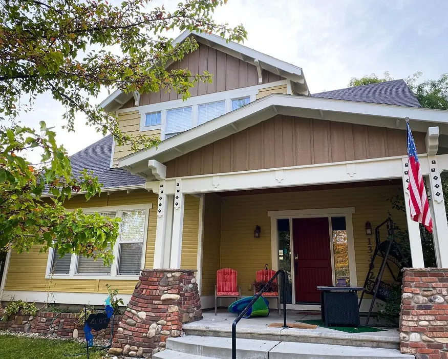
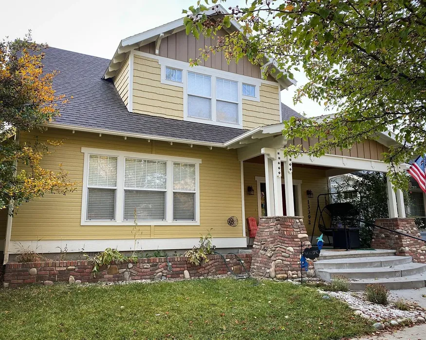
Real Room Photo of Downing Straw SW 2813
Undertones of Downing Straw ?
The undertones of Downing Straw are a key aspect of its character, leaning towards Red. These subtle underlying hues are what give the color its depth and complexity. For example, a gray with a blue undertone will feel cooler and more modern, while one with a brown undertone will feel warmer and more traditional. It’s essential to test this paint in your home and observe it next to your existing furniture, flooring, and decor to see how these undertones interact and reveal themselves throughout the day.
HEX value: #CAAB7D
RGB code: 202, 171, 125
Is Downing Straw Cool or Warm?
Downing Straw is decidedly warm, providing a cozy hug of color that can brighten up even the dreariest of days. Its warmth makes it particularly appealing in spaces where comfort is key.
Understanding Color Properties and Interior Design Tips
Hue refers to a specific position on the color wheel, measured in degrees from 0 to 360. Each degree represents a different pure color:
- 0° represents red
- 120° represents green
- 240° represents blue
Saturation describes the intensity or purity of a color and is expressed as a percentage:
- At 0%, the color appears completely desaturated—essentially a shade of gray
- At 100%, the color is at its most vivid and vibrant
Lightness indicates how light or dark a color is, also expressed as a percentage:
- 0% lightness results in black
- 100% lightness results in white
Using Warm Colors in Interior Design
Warm hues—such as reds, oranges, yellows, warm beiges, and greiges—are excellent choices for creating inviting and energetic spaces. These colors are particularly well-suited for:
- Kitchens, living rooms, and bathrooms, where warmth enhances comfort and sociability
- Large rooms, where warm tones can help reduce the sense of emptiness and make the space feel more intimate
For example:
- Warm beige shades provide a cozy, inviting atmosphere, ideal for living rooms, bedrooms, and hallways.
- Warm greige (a mix of beige and gray) offers the warmth of beige with the modern appeal of gray, making it a versatile backdrop for dining areas, bedrooms, and living spaces.
However, be mindful when using warm light tones in rooms with limited natural light. These shades may appear muted or even take on an unpleasant yellowish tint. To avoid a dull or flat appearance:
- Add depth by incorporating richer tones like deep greens, charcoal, or chocolate brown
- Use textured elements such as curtains, rugs, or cushions to bring dimension to the space
Pro Tip: Achieving Harmony with Warm and Cool Color Balance
To create a well-balanced and visually interesting interior, mix warm and cool tones strategically. This contrast adds depth and harmony to your design.
- If your walls feature warm hues, introduce cool-colored accents such as blue or green furniture, artwork, or accessories to create contrast.
- For a polished look, consider using a complementary color scheme, which pairs colors opposite each other on the color wheel (e.g., red with green, orange with blue).
This thoughtful mix not only enhances visual appeal but also creates a space that feels both dynamic and cohesive.
Light Temperature Affects on Downing Straw
Natural Light
Natural daylight changes in color temperature as the sun moves across the sky. At sunrise and sunset, the light tends to have a warm, golden tone with a color temperature around 2000 Kelvin (K). As the day progresses and the sun rises higher, the light becomes cooler and more neutral. Around midday, especially when the sky is clear, natural light typically reaches its peak brightness and shifts to a cooler tone, ranging from 5500 to 6500 Kelvin. This midday light is close to what we perceive as pure white or daylight-balanced light.
These shifts in natural light can significantly influence how colors appear in a space, which is why designers often consider both the time of day and the orientation of windows when planning interior color schemes.
Artificial Light
When choosing artificial lighting, pay close attention to the color temperature, measured in Kelvin (K). This determines how warm or cool the light will appear. Lower temperatures, around 2700K, give off a warm, yellow glow often used in living rooms or bedrooms. Higher temperatures, above 5000K, create a cool, bluish light similar to daylight, commonly used in kitchens, offices, or task areas.
Use the slider to see how lighting temperature can affect the appearance of a surface or color throughout a space.


4800K
LRV of Downing Straw
The Light Reflectance Value (LRV) of Downing Straw is 48%, which places it in the Medium category. This means it Reflects a moderate amount of light. Understanding a paint’s LRV is crucial for predicting how it will look in your space. A higher LRV indicates a lighter color that reflects more light, making rooms feel larger and brighter. A lower LRV signifies a darker color that absorbs more light, creating a cozier, more intimate atmosphere. Always consider the natural and artificial lighting in your room when selecting a paint color based on its LRV.
Detailed Review of Downing Straw
Additional Paint Characteristics
Ideal Rooms
Bedroom, Dining Room, Home Office, Kitchen, Living Room
Decor Styles
Contemporary, Eclectic, Modern Farmhouse, Rustic, Traditional
Coverage
Good (1–2 Coats), Touch-Up Friendly
Ease of Application
Beginner Friendly, Brush Smooth, Roller-Ready
Washability
Washable, Wipeable
VOC Level
Low VOC
Best Use
Accent Wall, Interior Walls, Open Concept Spaces
Room Suitability
Bedroom, Dining Room, Home Office, Kitchen, Living Room
Tone Tag
Earthy, Muted, Warm
Finish Type
Eggshell, Matte, Satin
Paint Performance
Easy Touch-Up, High Coverage, Low Odor
Use Cases
Best for Modern Farmhouse, Best for Open Concept, Classic Favorite
Mood
Cozy, Inviting, Warm
Trim Pairing
Complements Brass Fixtures, Matches Wood Trim, Pairs with White Dove
Downing Straw is truly a standout when it comes to paint options. Its warm yellow tone adds a cheerful vibe to any room, without overwhelming the senses. Whether you’re revamping your living space or just looking for a subtle refresh, this color shines brightly. The earthiness in its undertones gives it a grounded quality, making it suitable for cozy interiors yet versatile enough to pair with bolder colors. It’s perfect for accent walls or as a main color in a room. Users often rave about its ability to create an inviting atmosphere that feels both contemporary and classic, ensuring your home feels warm and welcoming.
Pros & Cons of SW 2813 Downing Straw
Pros
Cons
Colors that go with Sherwin Williams Downing Straw
FAQ on SW 2813 Downing Straw
Is Downing Straw suitable for small rooms?
Absolutely! Downing Straw can make small rooms feel more spacious while maintaining a warm and inviting atmosphere. Its balanced undertones help it adapt well to various light conditions, making it a great choice for cozy spaces.
How does Downing Straw compare to pure yellows?
Downing Straw offers a more muted, earthy take on yellow compared to pure yellows, which can often feel too bright or overwhelming. Its warmth and depth allow it to blend seamlessly with a variety of colors and decor styles.
Comparisons Downing Straw with other colors
Downing Straw SW 2813 vs Hearts of Palm SW 6415
| Attribute | Downing Straw SW 2813 | Hearts of Palm SW 6415 |
|---|---|---|
| Color Name | Downing Straw SW 2813 | Hearts of Palm SW 6415 |
| Color | ||
| Hue | Yellow | Yellow |
| Brightness | Medium | Medium |
| RGB | 202, 171, 125 | 207, 194, 145 |
| LRV | 48% | 75% |
| Finish Type | Eggshell, Matte, Satin | Eggshell, Matte, Satin |
| Finish Options | Eggshell, Matte, Satin | Eggshell, Matte, Satin |
| Ideal Rooms | Bedroom, Dining Room, Home Office, Kitchen, Living Room | Bathroom, Bedroom, Dining Room, Home Office, Kitchen, Living Room |
| Decor Styles | Contemporary, Eclectic, Modern Farmhouse, Rustic, Traditional | Bohemian, Coastal, Eclectic, Modern Farmhouse, Tropical |
| Coverage | Good (1–2 Coats), Touch-Up Friendly | Good (1–2 Coats), Touch-Up Friendly |
| Ease of Application | Beginner Friendly, Brush Smooth, Roller-Ready | Beginner Friendly, Brush Smooth, Roller-Ready |
| Washability | Washable, Wipeable | Scrubbable, Washable |
| Room Suitability | Bedroom, Dining Room, Home Office, Kitchen, Living Room | Bathroom, Bedroom, Dining Room, Home Office, Kitchen, Living Room |
| Tone | Earthy, Muted, Warm | Earthy, Muted, Warm |
| Paint Performance | Easy Touch-Up, High Coverage, Low Odor | Easy Touch-Up, Low Odor, Scuff Resistant |
Downing Straw SW 2813 vs Blonde SW 6128
| Attribute | Downing Straw SW 2813 | Blonde SW 6128 |
|---|---|---|
| Color Name | Downing Straw SW 2813 | Blonde SW 6128 |
| Color | ||
| Hue | Yellow | Yellow |
| Brightness | Medium | Medium |
| RGB | 202, 171, 125 | 220, 189, 146 |
| LRV | 48% | 64% |
| Finish Type | Eggshell, Matte, Satin | Eggshell, Satin |
| Finish Options | Eggshell, Matte, Satin | Eggshell, Matte, Satin |
| Ideal Rooms | Bedroom, Dining Room, Home Office, Kitchen, Living Room | Bedroom, Dining Room, Home Office, Kitchen, Living Room |
| Decor Styles | Contemporary, Eclectic, Modern Farmhouse, Rustic, Traditional | Bohemian, Coastal, Modern Farmhouse, Scandinavian, Transitional |
| Coverage | Good (1–2 Coats), Touch-Up Friendly | Good (1–2 Coats), Touch-Up Friendly |
| Ease of Application | Beginner Friendly, Brush Smooth, Roller-Ready | Beginner Friendly, Fast-Drying, Roller-Ready |
| Washability | Washable, Wipeable | Highly Washable, Washable |
| Room Suitability | Bedroom, Dining Room, Home Office, Kitchen, Living Room | Bedroom, Dining Room, Home Office, Kitchen, Living Room, Nursery |
| Tone | Earthy, Muted, Warm | Earthy, Neutral, Warm |
| Paint Performance | Easy Touch-Up, High Coverage, Low Odor | Easy Touch-Up, Fade Resistant, Low Odor, Quick Drying |
Downing Straw SW 2813 vs Ruskin Room Green SW 0042
| Attribute | Downing Straw SW 2813 | Ruskin Room Green SW 0042 |
|---|---|---|
| Color Name | Downing Straw SW 2813 | Ruskin Room Green SW 0042 |
| Color | ||
| Hue | Yellow | Yellow |
| Brightness | Medium | Medium |
| RGB | 202, 171, 125 | 172, 161, 125 |
| LRV | 48% | 24% |
| Finish Type | Eggshell, Matte, Satin | Eggshell, Matte |
| Finish Options | Eggshell, Matte, Satin | Eggshell, Flat, Matte, Satin |
| Ideal Rooms | Bedroom, Dining Room, Home Office, Kitchen, Living Room | Bedroom, Dining Room, Home Office, Living Room |
| Decor Styles | Contemporary, Eclectic, Modern Farmhouse, Rustic, Traditional | Farmhouse, Modern, Rustic, Traditional |
| Coverage | Good (1–2 Coats), Touch-Up Friendly | Good (1–2 Coats), Touch-Up Friendly |
| Ease of Application | Beginner Friendly, Brush Smooth, Roller-Ready | Beginner Friendly, Brush Smooth, Roller-Ready |
| Washability | Washable, Wipeable | Scrubbable, Washable |
| Room Suitability | Bedroom, Dining Room, Home Office, Kitchen, Living Room | Bedroom, Dining Room, Home Office, Living Room |
| Tone | Earthy, Muted, Warm | Earthy, Muted, Warm |
| Paint Performance | Easy Touch-Up, High Coverage, Low Odor | Easy Touch-Up, High Coverage, Low Odor |
Downing Straw SW 2813 vs Bosc Pear SW 6390
| Attribute | Downing Straw SW 2813 | Bosc Pear SW 6390 |
|---|---|---|
| Color Name | Downing Straw SW 2813 | Bosc Pear SW 6390 |
| Color | ||
| Hue | Yellow | Yellow |
| Brightness | Medium | Medium |
| RGB | 202, 171, 125 | 192, 144, 86 |
| LRV | 48% | 60% |
| Finish Type | Eggshell, Matte, Satin | Satin, Semi-Gloss |
| Finish Options | Eggshell, Matte, Satin | Flat, Satin, Semi-Gloss |
| Ideal Rooms | Bedroom, Dining Room, Home Office, Kitchen, Living Room | Bedroom, Dining Room, Home Office, Kitchen, Living Room |
| Decor Styles | Contemporary, Eclectic, Modern Farmhouse, Rustic, Traditional | Modern Farmhouse, Rustic, Traditional, Transitional |
| Coverage | Good (1–2 Coats), Touch-Up Friendly | Good (1–2 Coats) |
| Ease of Application | Beginner Friendly, Brush Smooth, Roller-Ready | Beginner Friendly, Brush Smooth, Fast-Drying, Roller-Ready |
| Washability | Washable, Wipeable | Highly Washable, Washable |
| Room Suitability | Bedroom, Dining Room, Home Office, Kitchen, Living Room | Bedroom, Dining Room, Home Office, Living Room |
| Tone | Earthy, Muted, Warm | Balanced, Earthy, Warm |
| Paint Performance | Easy Touch-Up, High Coverage, Low Odor | Easy Touch-Up, High Coverage, Low Odor, Quick Drying |
Downing Straw SW 2813 vs Lemongrass SW 7732
| Attribute | Downing Straw SW 2813 | Lemongrass SW 7732 |
|---|---|---|
| Color Name | Downing Straw SW 2813 | Lemongrass SW 7732 |
| Color | ||
| Hue | Yellow | Yellow |
| Brightness | Medium | Medium |
| RGB | 202, 171, 125 | 200, 189, 152 |
| LRV | 48% | 48% |
| Finish Type | Eggshell, Matte, Satin | Eggshell, Matte, Satin |
| Finish Options | Eggshell, Matte, Satin | Eggshell, Matte, Satin |
| Ideal Rooms | Bedroom, Dining Room, Home Office, Kitchen, Living Room | Bathroom, Bedroom, Home Office, Kitchen, Living Room, Nursery |
| Decor Styles | Contemporary, Eclectic, Modern Farmhouse, Rustic, Traditional | Bohemian, Modern Farmhouse, Scandinavian, Transitional |
| Coverage | Good (1–2 Coats), Touch-Up Friendly | Good (1–2 Coats) |
| Ease of Application | Beginner Friendly, Brush Smooth, Roller-Ready | Beginner Friendly, Brush Smooth, Roller-Ready |
| Washability | Washable, Wipeable | Highly Washable, Washable |
| Room Suitability | Bedroom, Dining Room, Home Office, Kitchen, Living Room | Bedroom, Home Office, Kitchen, Living Room |
| Tone | Earthy, Muted, Warm | Earthy, Muted, Warm |
| Paint Performance | Easy Touch-Up, High Coverage, Low Odor | Easy Touch-Up, Low Odor, Scuff Resistant |
Downing Straw SW 2813 vs Garden Sage SW 7736
| Attribute | Downing Straw SW 2813 | Garden Sage SW 7736 |
|---|---|---|
| Color Name | Downing Straw SW 2813 | Garden Sage SW 7736 |
| Color | ||
| Hue | Yellow | Yellow |
| Brightness | Medium | Medium |
| RGB | 202, 171, 125 | 177, 165, 132 |
| LRV | 48% | 24% |
| Finish Type | Eggshell, Matte, Satin | Eggshell, Matte, Satin |
| Finish Options | Eggshell, Matte, Satin | Eggshell, Matte, Satin |
| Ideal Rooms | Bedroom, Dining Room, Home Office, Kitchen, Living Room | Bedroom, Dining Room, Home Office, Kitchen, Living Room, Nursery |
| Decor Styles | Contemporary, Eclectic, Modern Farmhouse, Rustic, Traditional | Bohemian, Cottage, Minimalist, Modern Farmhouse, Traditional |
| Coverage | Good (1–2 Coats), Touch-Up Friendly | Good (1–2 Coats), Touch-Up Friendly |
| Ease of Application | Beginner Friendly, Brush Smooth, Roller-Ready | Beginner Friendly, Brush Smooth, Roller-Ready |
| Washability | Washable, Wipeable | Highly Washable, Washable |
| Room Suitability | Bedroom, Dining Room, Home Office, Kitchen, Living Room | Bedroom, Dining Room, Home Office, Kitchen, Living Room |
| Tone | Earthy, Muted, Warm | Balanced, Earthy, Muted, Warm |
| Paint Performance | Easy Touch-Up, High Coverage, Low Odor | Easy Touch-Up, Fade Resistant, Low Odor |
Downing Straw SW 2813 vs Tassel SW 6369
| Attribute | Downing Straw SW 2813 | Tassel SW 6369 |
|---|---|---|
| Color Name | Downing Straw SW 2813 | Tassel SW 6369 |
| Color | ||
| Hue | Yellow | Yellow |
| Brightness | Medium | Medium |
| RGB | 202, 171, 125 | 198, 136, 74 |
| LRV | 48% | 45% |
| Finish Type | Eggshell, Matte, Satin | Matte, Satin |
| Finish Options | Eggshell, Matte, Satin | Matte, Satin, Semi-Gloss |
| Ideal Rooms | Bedroom, Dining Room, Home Office, Kitchen, Living Room | Bedroom, Dining Room, Home Office, Living Room |
| Decor Styles | Contemporary, Eclectic, Modern Farmhouse, Rustic, Traditional | Bohemian, Modern Farmhouse, Rustic, Transitional |
| Coverage | Good (1–2 Coats), Touch-Up Friendly | Good (1–2 Coats) |
| Ease of Application | Beginner Friendly, Brush Smooth, Roller-Ready | Beginner Friendly, Brush Smooth, Fast-Drying, Roller-Ready |
| Washability | Washable, Wipeable | Scrubbable, Washable |
| Room Suitability | Bedroom, Dining Room, Home Office, Kitchen, Living Room | Bedroom, Dining Room, Home Office, Living Room |
| Tone | Earthy, Muted, Warm | Earthy, Inviting, Warm |
| Paint Performance | Easy Touch-Up, High Coverage, Low Odor | Easy Touch-Up, Low Odor, Quick Drying, Scuff Resistant |
Downing Straw SW 2813 vs Sunflower SW 6678
| Attribute | Downing Straw SW 2813 | Sunflower SW 6678 |
|---|---|---|
| Color Name | Downing Straw SW 2813 | Sunflower SW 6678 |
| Color | ||
| Hue | Yellow | Yellow |
| Brightness | Medium | Medium |
| RGB | 202, 171, 125 | 227, 154, 51 |
| LRV | 48% | 75% |
| Finish Type | Eggshell, Matte, Satin | Eggshell, Satin |
| Finish Options | Eggshell, Matte, Satin | Eggshell, Satin, Semi-Gloss |
| Ideal Rooms | Bedroom, Dining Room, Home Office, Kitchen, Living Room | Dining Room, Entryway, Home Office, Kitchen, Living Room |
| Decor Styles | Contemporary, Eclectic, Modern Farmhouse, Rustic, Traditional | Bohemian, Eclectic, Modern Farmhouse, Traditional |
| Coverage | Good (1–2 Coats), Touch-Up Friendly | Good (1–2 Coats), Touch-Up Friendly |
| Ease of Application | Beginner Friendly, Brush Smooth, Roller-Ready | Beginner Friendly, Brush Smooth, Fast-Drying, Roller-Ready |
| Washability | Washable, Wipeable | Highly Washable, Washable |
| Room Suitability | Bedroom, Dining Room, Home Office, Kitchen, Living Room | Dining Room, Entryway, Kitchen, Living Room |
| Tone | Earthy, Muted, Warm | Bold, Earthy, Warm |
| Paint Performance | Easy Touch-Up, High Coverage, Low Odor | Fade Resistant, High Coverage, Quick Drying |
Downing Straw SW 2813 vs Bee's Wax SW 7682
| Attribute | Downing Straw SW 2813 | Bee's Wax SW 7682 |
|---|---|---|
| Color Name | Downing Straw SW 2813 | Bee's Wax SW 7682 |
| Color | ||
| Hue | Yellow | Yellow |
| Brightness | Medium | Medium |
| RGB | 202, 171, 125 | 234, 191, 134 |
| LRV | 48% | 50% |
| Finish Type | Eggshell, Matte, Satin | Eggshell, Matte, Satin |
| Finish Options | Eggshell, Matte, Satin | Eggshell, Matte, Satin |
| Ideal Rooms | Bedroom, Dining Room, Home Office, Kitchen, Living Room | Bedroom, Dining Room, Entryway, Kitchen, Living Room |
| Decor Styles | Contemporary, Eclectic, Modern Farmhouse, Rustic, Traditional | Bohemian, Coastal, Modern Farmhouse, Traditional, Transitional |
| Coverage | Good (1–2 Coats), Touch-Up Friendly | Good (1–2 Coats), Touch-Up Friendly |
| Ease of Application | Beginner Friendly, Brush Smooth, Roller-Ready | Beginner Friendly, Brush Smooth, Roller-Ready |
| Washability | Washable, Wipeable | Washable, Wipeable |
| Room Suitability | Bedroom, Dining Room, Home Office, Kitchen, Living Room | Bedroom, Dining Room, Entryway, Kitchen, Living Room |
| Tone | Earthy, Muted, Warm | Creamy, Earthy, Warm |
| Paint Performance | Easy Touch-Up, High Coverage, Low Odor | Easy Touch-Up, High Coverage, Low Odor |
Downing Straw SW 2813 vs Peristyle Brass SW 0043
| Attribute | Downing Straw SW 2813 | Peristyle Brass SW 0043 |
|---|---|---|
| Color Name | Downing Straw SW 2813 | Peristyle Brass SW 0043 |
| Color | ||
| Hue | Yellow | Yellow |
| Brightness | Medium | Medium |
| RGB | 202, 171, 125 | 174, 144, 94 |
| LRV | 48% | 50% |
| Finish Type | Eggshell, Matte, Satin | Matte, Satin, Semi-Gloss |
| Finish Options | Eggshell, Matte, Satin | Matte, Satin, Semi-Gloss |
| Ideal Rooms | Bedroom, Dining Room, Home Office, Kitchen, Living Room | Bedroom, Dining Room, Entryway, Home Office, Living Room |
| Decor Styles | Contemporary, Eclectic, Modern Farmhouse, Rustic, Traditional | Modern Farmhouse, Rustic, Traditional, Transitional |
| Coverage | Good (1–2 Coats), Touch-Up Friendly | Good (1–2 Coats), Touch-Up Friendly |
| Ease of Application | Beginner Friendly, Brush Smooth, Roller-Ready | Beginner Friendly, Brush Smooth, Fast-Drying, Roller-Ready |
| Washability | Washable, Wipeable | Washable, Wipeable |
| Room Suitability | Bedroom, Dining Room, Home Office, Kitchen, Living Room | Bedroom, Dining Room, Hallway, Living Room |
| Tone | Earthy, Muted, Warm | Earthy, Muted, Warm |
| Paint Performance | Easy Touch-Up, High Coverage, Low Odor | Easy Touch-Up, High Coverage, Low Odor, Quick Drying |
Official Page of Sherwin Williams Downing Straw SW 2813