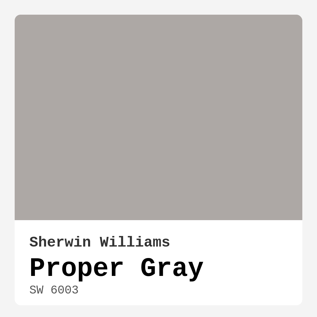
Color Preview & Key Details
| HEX Code | #ADA8A5 |
| RGB | 173, 168, 165 |
| LRV | 30% |
| Undertone | Red |
| Finish Options | Eggshell, Matte, Satin |
Imagine stepping into a room that instantly makes you feel at ease, wrapping you in a warm embrace of sophistication. That’s the enchanting power of Proper Gray by Sherwin Williams. This delightful hue isn’t just a paint color; it’s an invitation to create a serene, stylish sanctuary within your home. Whether you’re reimagining your living room, bedroom, or even your dining area, Proper Gray can be the perfect backdrop that enhances your decor and elevates your space.
Let’s talk about what makes Proper Gray so special. This medium gray has a unique warmth that makes it inviting without feeling heavy. Its subtle red undertones give it depth, allowing you to pair it beautifully with both warm and cool accents. When you look at Proper Gray, you’ll notice it leans towards a cozy, balanced tone rather than a stark, cold gray. It’s this quality that allows it to transcend various decor styles, from modern and contemporary to rustic and farmhouse aesthetics.
In terms of application, Proper Gray is a dream for DIY enthusiasts. It goes on smoothly and provides excellent coverage, often requiring just one or two coats. If you’re like many homeowners who might find painting a daunting task, I assure you, Proper Gray is beginner-friendly. The finish options of matte, eggshell, and satin give you the flexibility to choose what best suits your space and personal style. For those flawless walls in high-traffic areas like kitchens or bathrooms, an eggshell or satin finish would serve you well. On the other hand, if you crave that sophisticated, modern look, you might opt for the matte finish, which beautifully minimizes imperfections.
One of the standout features of Proper Gray is its light reflectance value (LRV) of 30%. This puts it in the medium dark category, meaning it absorbs more light than it reflects. While this might sound like a drawback, it actually creates an atmosphere that is calm and inviting. The way it interacts with natural light is magical. During the day, it can appear lighter and more airy, while in the evening, it deepens into a richer, more profound gray. This quality makes it perfect for creating cozy environments in bedrooms or restful corners of your home.
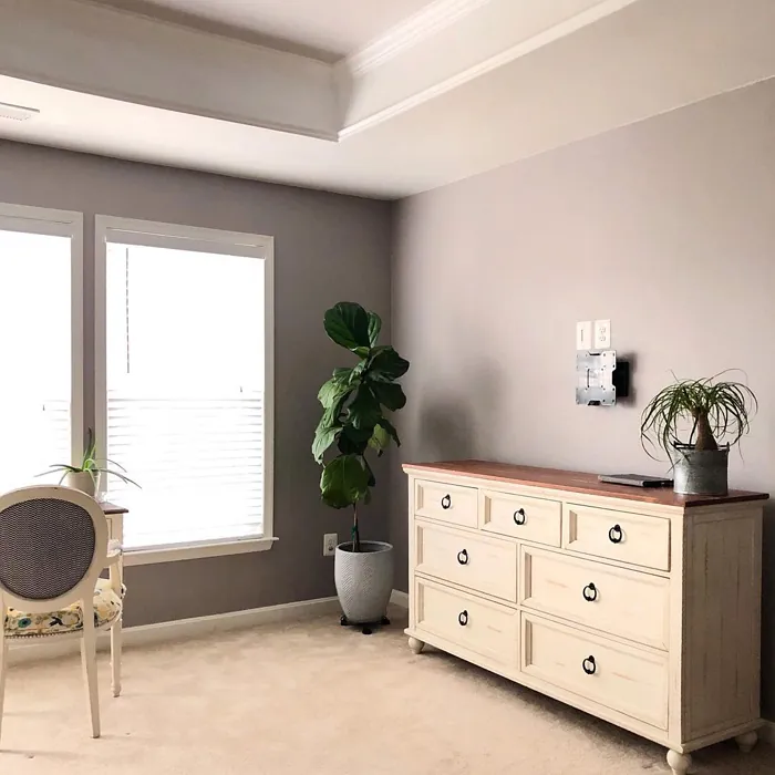
When you’re considering Proper Gray for your space, think about the rooms where it will shine the most. It’s perfect for living rooms, where you entertain and unwind. A Proper Gray wall can serve as a serene backdrop, allowing your furniture and decor to pop without overwhelming the senses. In bedrooms, it creates a tranquil retreat, perfect for relaxation and restorative sleep. Hallways and home offices also benefit from its calming effects, promoting a sense of focus and clarity.
But you might wonder, can Proper Gray work in a small room? Absolutely! While it may appear darker in smaller spaces, its warm undertones can create a cozy atmosphere. Pair it with lighter accents—think white trim, light furniture, or even bright artwork—to keep the room feeling open and airy. This clever contrast can enhance the sense of space and depth, making your small room feel just right.
Choosing complementary colors can be another adventure altogether. Proper Gray pairs incredibly well with a variety of shades. If you’re looking for a harmonious look, consider accents in greens, blues, or even warm woods. White Dove is a fantastic trim color that elevates Proper Gray, providing a clean and crisp contrast. If you want to infuse a bit of personality, brass fixtures stand out beautifully against Proper Gray, adding a touch of warmth and elegance.
Now, let’s address a common concern: how to avoid clashing colors. With Proper Gray’s subtle undertones, it requires careful pairing to truly shine. While it works well with a range of colors, it’s essential to test it alongside your existing decor. Don’t hesitate to bring home some samples and see how they interact with your furnishings and flooring throughout the day. This step can reveal how the undertones of Proper Gray will express themselves in your unique space.
You might also be curious about the washability and performance of Proper Gray. With its low VOC formulation, it’s not only safer for your home environment but also easier to maintain. The paint is wipeable and washable, so you can keep your walls looking fresh and clean without much hassle. This quality is particularly beneficial in family spaces and high-traffic areas.
If you’re still on the fence about whether Proper Gray is the right choice for your project, consider its versatility. It can serve as an accent wall in a modern farmhouse setting or blend seamlessly in an open-concept home that embraces a contemporary style. The options are truly endless. It’s a color that feels timeless, so you won’t have to worry about it going out of style anytime soon.
As you embark on your painting journey, remember that Proper Gray is more than just a color; it’s an opportunity to create an atmosphere that resonates with warmth and elegance. It’s about crafting a space that feels like your personal haven, where every corner invites you to relax and unwind.
In conclusion, Proper Gray is an exceptional choice for anyone looking to elevate their space with a color that balances warmth and sophistication. It’s adaptable to various rooms and decor styles, making it a reliable option for both seasoned designers and first-time DIYers. So, grab that paintbrush and get ready to transform your home with the inviting charm of Proper Gray. You won’t regret it!

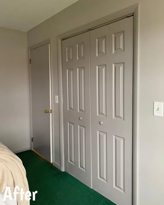
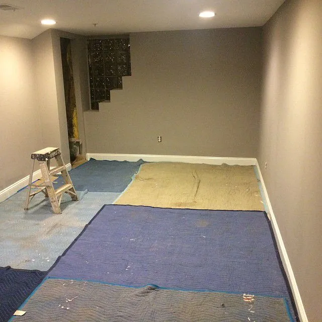
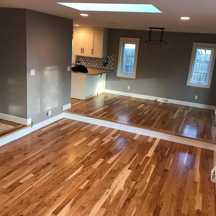
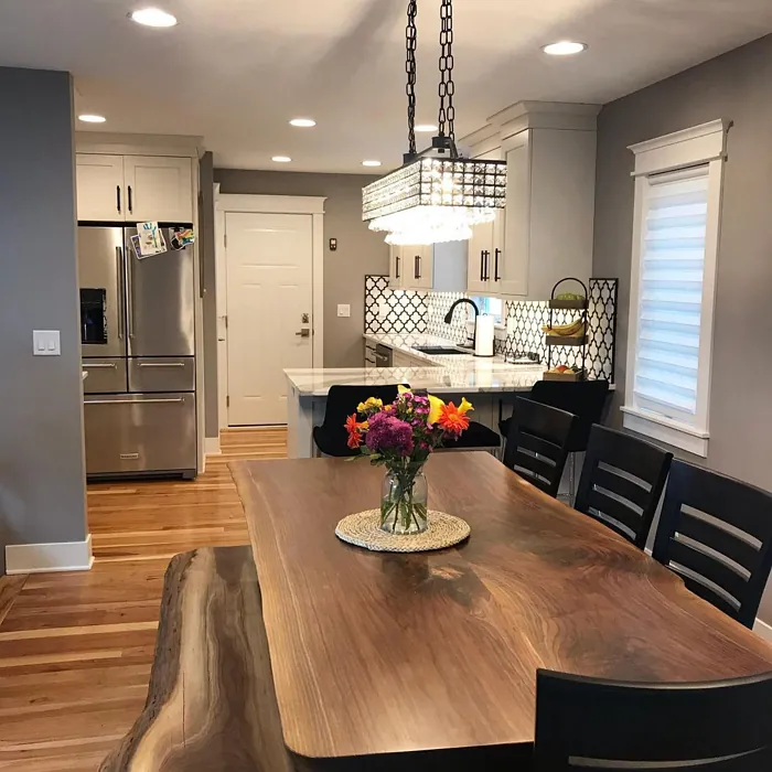
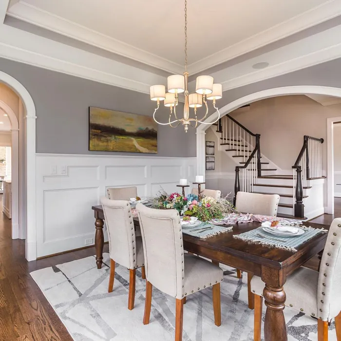
Real Room Photo of Proper Gray SW 6003
Undertones of Proper Gray ?
The undertones of Proper Gray are a key aspect of its character, leaning towards Red. These subtle underlying hues are what give the color its depth and complexity. For example, a gray with a blue undertone will feel cooler and more modern, while one with a brown undertone will feel warmer and more traditional. It’s essential to test this paint in your home and observe it next to your existing furniture, flooring, and decor to see how these undertones interact and reveal themselves throughout the day.
HEX value: #ADA8A5
RGB code: 173, 168, 165
Is Proper Gray Cool or Warm?
This color strikes a balanced tone, leaning slightly warm. It’s not overtly beige but rather a refined gray that feels inviting and comfortable, perfect for creating a welcoming environment.
Understanding Color Properties and Interior Design Tips
Hue refers to a specific position on the color wheel, measured in degrees from 0 to 360. Each degree represents a different pure color:
- 0° represents red
- 120° represents green
- 240° represents blue
Saturation describes the intensity or purity of a color and is expressed as a percentage:
- At 0%, the color appears completely desaturated—essentially a shade of gray
- At 100%, the color is at its most vivid and vibrant
Lightness indicates how light or dark a color is, also expressed as a percentage:
- 0% lightness results in black
- 100% lightness results in white
Using Warm Colors in Interior Design
Warm hues—such as reds, oranges, yellows, warm beiges, and greiges—are excellent choices for creating inviting and energetic spaces. These colors are particularly well-suited for:
- Kitchens, living rooms, and bathrooms, where warmth enhances comfort and sociability
- Large rooms, where warm tones can help reduce the sense of emptiness and make the space feel more intimate
For example:
- Warm beige shades provide a cozy, inviting atmosphere, ideal for living rooms, bedrooms, and hallways.
- Warm greige (a mix of beige and gray) offers the warmth of beige with the modern appeal of gray, making it a versatile backdrop for dining areas, bedrooms, and living spaces.
However, be mindful when using warm light tones in rooms with limited natural light. These shades may appear muted or even take on an unpleasant yellowish tint. To avoid a dull or flat appearance:
- Add depth by incorporating richer tones like deep greens, charcoal, or chocolate brown
- Use textured elements such as curtains, rugs, or cushions to bring dimension to the space
Pro Tip: Achieving Harmony with Warm and Cool Color Balance
To create a well-balanced and visually interesting interior, mix warm and cool tones strategically. This contrast adds depth and harmony to your design.
- If your walls feature warm hues, introduce cool-colored accents such as blue or green furniture, artwork, or accessories to create contrast.
- For a polished look, consider using a complementary color scheme, which pairs colors opposite each other on the color wheel (e.g., red with green, orange with blue).
This thoughtful mix not only enhances visual appeal but also creates a space that feels both dynamic and cohesive.
Light Temperature Affects on Proper Gray
Natural Light
Natural daylight changes in color temperature as the sun moves across the sky. At sunrise and sunset, the light tends to have a warm, golden tone with a color temperature around 2000 Kelvin (K). As the day progresses and the sun rises higher, the light becomes cooler and more neutral. Around midday, especially when the sky is clear, natural light typically reaches its peak brightness and shifts to a cooler tone, ranging from 5500 to 6500 Kelvin. This midday light is close to what we perceive as pure white or daylight-balanced light.
These shifts in natural light can significantly influence how colors appear in a space, which is why designers often consider both the time of day and the orientation of windows when planning interior color schemes.
Artificial Light
When choosing artificial lighting, pay close attention to the color temperature, measured in Kelvin (K). This determines how warm or cool the light will appear. Lower temperatures, around 2700K, give off a warm, yellow glow often used in living rooms or bedrooms. Higher temperatures, above 5000K, create a cool, bluish light similar to daylight, commonly used in kitchens, offices, or task areas.
Use the slider to see how lighting temperature can affect the appearance of a surface or color throughout a space.


4800K
LRV of Proper Gray
The Light Reflectance Value (LRV) of Proper Gray is 30%, which places it in the Medium Dark category. This means it reflects very little light. Understanding a paint’s LRV is crucial for predicting how it will look in your space. A higher LRV indicates a lighter color that reflects more light, making rooms feel larger and brighter. A lower LRV signifies a darker color that absorbs more light, creating a cozier, more intimate atmosphere. Always consider the natural and artificial lighting in your room when selecting a paint color based on its LRV.
Detailed Review of Proper Gray
Additional Paint Characteristics
Ideal Rooms
Bedroom, Dining Room, Hallway, Home Office, Living Room
Decor Styles
Contemporary, Farmhouse, Modern, Rustic, Transitional
Coverage
Good (1–2 Coats), Touch-Up Friendly
Ease of Application
Beginner Friendly, Brush Smooth, Roller-Ready
Washability
Washable, Wipeable
VOC Level
Low VOC
Best Use
Accent Wall, Interior Walls
Room Suitability
Bedroom, Dining Room, Hallway, Home Office, Living Room
Tone Tag
Balanced, Neutral, Warm
Finish Type
Eggshell, Matte, Satin
Paint Performance
Easy Touch-Up, High Coverage, Low Odor
Use Cases
Best for Modern Farmhouse, Best for Open Concept, Best for Small Spaces
Mood
Calm, Inviting, Restful
Trim Pairing
Complements Brass Fixtures, Good with Wood Trim, Pairs with White Dove
Proper Gray is a standout choice for anyone wanting to create a calming yet stylish atmosphere in their home. Its subtle warmth gives it an inviting quality, making it suitable for various rooms, from the living room to the bedroom. The paint applies smoothly, providing good coverage with just one or two coats, which is particularly beneficial for DIY projects.
This color pairs beautifully with both warm and cool tones, allowing for flexibility in decor choices. Whether you’re looking to complement natural wood finishes or sleek modern furnishings, Proper Gray fits right in. The matte finish offers a sophisticated look that minimizes imperfections on walls, while the eggshell option gives a slight sheen, enhancing the light in a room. Overall, Proper Gray is an excellent choice for anyone looking to elevate their space without overwhelming it.
Pros & Cons of SW 6003 Proper Gray
Pros
Cons
Colors that go with Sherwin Williams Proper Gray
FAQ on SW 6003 Proper Gray
Can Proper Gray be used in a small room?
Absolutely! Proper Gray works well in small rooms, provided you pair it with lighter accents to keep the space feeling open. Its warm undertones can actually create a cozy atmosphere without making the room feel cramped. To enhance the light, consider using white trim or lighter furniture to balance the depth of the gray.
What finish should I choose for Proper Gray?
Choosing the right finish depends on the look you want to achieve. If you’re aiming for a sophisticated, modern feel, the matte finish is a great option as it minimizes wall imperfections. For areas that may require more durability, like kitchens or bathrooms, an eggshell or satin finish could be better, as they provide a bit more washability and sheen.
Comparisons Proper Gray with other colors
Proper Gray SW 6003 vs Repose Gray SW 7015
| Attribute | Proper Gray SW 6003 | Repose Gray SW 7015 |
|---|---|---|
| Color Name | Proper Gray SW 6003 | Repose Gray SW 7015 |
| Color | ||
| Hue | Grey | Grey |
| Brightness | Medium | Medium |
| RGB | 173, 168, 165 | 204, 201, 192 |
| LRV | 30% | 58% |
| Finish Type | Eggshell, Matte, Satin | Eggshell, Matte, Satin |
| Finish Options | Eggshell, Matte, Satin | Eggshell, Matte, Satin |
| Ideal Rooms | Bedroom, Dining Room, Hallway, Home Office, Living Room | Bedroom, Dining Room, Hallway, Home Office, Living Room |
| Decor Styles | Contemporary, Farmhouse, Modern, Rustic, Transitional | Contemporary, Farmhouse, Minimalist, Modern, Transitional |
| Coverage | Good (1–2 Coats), Touch-Up Friendly | Good (1–2 Coats), Touch-Up Friendly |
| Ease of Application | Beginner Friendly, Brush Smooth, Roller-Ready | Beginner Friendly, Brush Smooth, Fast-Drying, Roller-Ready |
| Washability | Washable, Wipeable | Highly Washable, Washable |
| Room Suitability | Bedroom, Dining Room, Hallway, Home Office, Living Room | Bedroom, Dining Room, Hallway, Home Office, Living Room |
| Tone | Balanced, Neutral, Warm | Muted, Neutral, Warm |
| Paint Performance | Easy Touch-Up, High Coverage, Low Odor | Low Odor, Quick Drying, Scuff Resistant |
Proper Gray SW 6003 vs Light French Gray SW 0055
| Attribute | Proper Gray SW 6003 | Light French Gray SW 0055 |
|---|---|---|
| Color Name | Proper Gray SW 6003 | Light French Gray SW 0055 |
| Color | ||
| Hue | Grey | Grey |
| Brightness | Medium | Medium |
| RGB | 173, 168, 165 | 194, 192, 187 |
| LRV | 30% | 53% |
| Finish Type | Eggshell, Matte, Satin | Eggshell, Matte, Satin |
| Finish Options | Eggshell, Matte, Satin | Eggshell, Matte, Satin |
| Ideal Rooms | Bedroom, Dining Room, Hallway, Home Office, Living Room | Bedroom, Dining Room, Home Office, Kitchen, Living Room |
| Decor Styles | Contemporary, Farmhouse, Modern, Rustic, Transitional | Contemporary, Farmhouse, Modern, Scandinavian, Transitional |
| Coverage | Good (1–2 Coats), Touch-Up Friendly | Good (1–2 Coats), Touch-Up Friendly |
| Ease of Application | Beginner Friendly, Brush Smooth, Roller-Ready | Beginner Friendly, Brush Smooth, Roller-Ready |
| Washability | Washable, Wipeable | Highly Washable, Washable |
| Room Suitability | Bedroom, Dining Room, Hallway, Home Office, Living Room | Bedroom, Dining Room, Home Office, Kitchen, Living Room |
| Tone | Balanced, Neutral, Warm | Balanced, Muted, Neutral, Warm |
| Paint Performance | Easy Touch-Up, High Coverage, Low Odor | Easy Touch-Up, High Coverage, Low Odor |
Proper Gray SW 6003 vs Wordly Gray SW 7043
| Attribute | Proper Gray SW 6003 | Wordly Gray SW 7043 |
|---|---|---|
| Color Name | Proper Gray SW 6003 | Wordly Gray SW 7043 |
| Color | ||
| Hue | Grey | Grey |
| Brightness | Medium | Medium |
| RGB | 173, 168, 165 | 206, 198, 187 |
| LRV | 30% | 58% |
| Finish Type | Eggshell, Matte, Satin | Eggshell, Satin |
| Finish Options | Eggshell, Matte, Satin | Eggshell, Flat, Satin |
| Ideal Rooms | Bedroom, Dining Room, Hallway, Home Office, Living Room | Bedroom, Home Office, Kitchen, Living Room |
| Decor Styles | Contemporary, Farmhouse, Modern, Rustic, Transitional | Minimalist, Modern, Scandi, Transitional |
| Coverage | Good (1–2 Coats), Touch-Up Friendly | Good (1–2 Coats) |
| Ease of Application | Beginner Friendly, Brush Smooth, Roller-Ready | Beginner Friendly, Brush Smooth, Fast-Drying, Roller-Ready |
| Washability | Washable, Wipeable | Highly Washable, Washable |
| Room Suitability | Bedroom, Dining Room, Hallway, Home Office, Living Room | Bedroom, Dining Room, Home Office, Living Room |
| Tone | Balanced, Neutral, Warm | Muted, Neutral, Warm |
| Paint Performance | Easy Touch-Up, High Coverage, Low Odor | Easy Touch-Up, Low Odor, Scuff Resistant |
Proper Gray SW 6003 vs Illusive Green SW 9164
| Attribute | Proper Gray SW 6003 | Illusive Green SW 9164 |
|---|---|---|
| Color Name | Proper Gray SW 6003 | Illusive Green SW 9164 |
| Color | ||
| Hue | Grey | Grey |
| Brightness | Medium | Medium |
| RGB | 173, 168, 165 | 146, 148, 141 |
| LRV | 30% | 24% |
| Finish Type | Eggshell, Matte, Satin | Eggshell, Matte, Satin |
| Finish Options | Eggshell, Matte, Satin | Eggshell, Matte, Satin |
| Ideal Rooms | Bedroom, Dining Room, Hallway, Home Office, Living Room | Bedroom, Dining Room, Home Office, Living Room, Nursery |
| Decor Styles | Contemporary, Farmhouse, Modern, Rustic, Transitional | Coastal, Minimalist, Modern, Rustic, Scandinavian |
| Coverage | Good (1–2 Coats), Touch-Up Friendly | Good (1–2 Coats), Touch-Up Friendly |
| Ease of Application | Beginner Friendly, Brush Smooth, Roller-Ready | Beginner Friendly, Brush Smooth, Fast-Drying, Roller-Ready |
| Washability | Washable, Wipeable | Highly Washable, Washable, Wipeable |
| Room Suitability | Bedroom, Dining Room, Hallway, Home Office, Living Room | Bedroom, Dining Room, Home Office, Living Room, Nursery |
| Tone | Balanced, Neutral, Warm | Balanced, Earthy, Muted |
| Paint Performance | Easy Touch-Up, High Coverage, Low Odor | Easy Touch-Up, Low Odor, Quick Drying, Scuff Resistant |
Proper Gray SW 6003 vs Fawn Brindle SW 7640
| Attribute | Proper Gray SW 6003 | Fawn Brindle SW 7640 |
|---|---|---|
| Color Name | Proper Gray SW 6003 | Fawn Brindle SW 7640 |
| Color | ||
| Hue | Grey | Grey |
| Brightness | Medium | Medium |
| RGB | 173, 168, 165 | 167, 160, 148 |
| LRV | 30% | 24% |
| Finish Type | Eggshell, Matte, Satin | Eggshell, Matte |
| Finish Options | Eggshell, Matte, Satin | Eggshell, Matte, Satin |
| Ideal Rooms | Bedroom, Dining Room, Hallway, Home Office, Living Room | Bedroom, Dining Room, Hallway, Home Office, Living Room |
| Decor Styles | Contemporary, Farmhouse, Modern, Rustic, Transitional | Bohemian, Minimalist, Modern Farmhouse, Transitional |
| Coverage | Good (1–2 Coats), Touch-Up Friendly | Good (1–2 Coats) |
| Ease of Application | Beginner Friendly, Brush Smooth, Roller-Ready | Brush Smooth, Fast-Drying, Roller-Ready |
| Washability | Washable, Wipeable | Stain Resistant, Washable |
| Room Suitability | Bedroom, Dining Room, Hallway, Home Office, Living Room | Bedroom, Dining Room, Home Office, Living Room |
| Tone | Balanced, Neutral, Warm | Earthy, Neutral, Warm |
| Paint Performance | Easy Touch-Up, High Coverage, Low Odor | Easy Touch-Up, Fade Resistant, Low Odor |
Proper Gray SW 6003 vs Balanced Beige SW 7037
| Attribute | Proper Gray SW 6003 | Balanced Beige SW 7037 |
|---|---|---|
| Color Name | Proper Gray SW 6003 | Balanced Beige SW 7037 |
| Color | ||
| Hue | Grey | Grey |
| Brightness | Medium | Medium |
| RGB | 173, 168, 165 | 192, 178, 162 |
| LRV | 30% | 44% |
| Finish Type | Eggshell, Matte, Satin | Eggshell, Matte, Satin |
| Finish Options | Eggshell, Matte, Satin | Eggshell, Matte, Satin |
| Ideal Rooms | Bedroom, Dining Room, Hallway, Home Office, Living Room | Bedroom, Dining Room, Home Office, Kitchen, Living Room |
| Decor Styles | Contemporary, Farmhouse, Modern, Rustic, Transitional | Contemporary, Minimalist, Modern Farmhouse, Rustic, Transitional |
| Coverage | Good (1–2 Coats), Touch-Up Friendly | Good (1–2 Coats), Touch-Up Friendly |
| Ease of Application | Beginner Friendly, Brush Smooth, Roller-Ready | Beginner Friendly, Brush Smooth, Roller-Ready |
| Washability | Washable, Wipeable | Washable, Wipeable |
| Room Suitability | Bedroom, Dining Room, Hallway, Home Office, Living Room | Bedroom, Dining Room, Hallway, Kitchen, Living Room |
| Tone | Balanced, Neutral, Warm | Balanced, Earthy, Warm |
| Paint Performance | Easy Touch-Up, High Coverage, Low Odor | Easy Touch-Up, High Coverage, Low Odor |
Proper Gray SW 6003 vs Mushroom SW 9587
| Attribute | Proper Gray SW 6003 | Mushroom SW 9587 |
|---|---|---|
| Color Name | Proper Gray SW 6003 | Mushroom SW 9587 |
| Color | ||
| Hue | Grey | Grey |
| Brightness | Medium | Medium |
| RGB | 173, 168, 165 | 208, 199, 183 |
| LRV | 30% | 24% |
| Finish Type | Eggshell, Matte, Satin | Eggshell, Satin |
| Finish Options | Eggshell, Matte, Satin | Eggshell, Flat, Matte, Satin |
| Ideal Rooms | Bedroom, Dining Room, Hallway, Home Office, Living Room | Bedroom, Dining Room, Hallway, Home Office, Living Room |
| Decor Styles | Contemporary, Farmhouse, Modern, Rustic, Transitional | Bohemian, Contemporary, Modern Farmhouse, Traditional |
| Coverage | Good (1–2 Coats), Touch-Up Friendly | Good (1–2 Coats) |
| Ease of Application | Beginner Friendly, Brush Smooth, Roller-Ready | Beginner Friendly, Brush Smooth, Roller-Ready |
| Washability | Washable, Wipeable | Highly Washable, Washable |
| Room Suitability | Bedroom, Dining Room, Hallway, Home Office, Living Room | Bedroom, Dining Room, Home Office, Living Room |
| Tone | Balanced, Neutral, Warm | Earthy, Neutral, Warm |
| Paint Performance | Easy Touch-Up, High Coverage, Low Odor | Easy Touch-Up, Long Lasting, Low Odor, Scuff Resistant |
Proper Gray SW 6003 vs Silver Strand SW 7057
| Attribute | Proper Gray SW 6003 | Silver Strand SW 7057 |
|---|---|---|
| Color Name | Proper Gray SW 6003 | Silver Strand SW 7057 |
| Color | ||
| Hue | Grey | Grey |
| Brightness | Medium | Medium |
| RGB | 173, 168, 165 | 200, 203, 196 |
| LRV | 30% | 66% |
| Finish Type | Eggshell, Matte, Satin | Eggshell, Satin |
| Finish Options | Eggshell, Matte, Satin | Eggshell, Matte, Satin |
| Ideal Rooms | Bedroom, Dining Room, Hallway, Home Office, Living Room | Bedroom, Dining Room, Hallway, Home Office, Living Room |
| Decor Styles | Contemporary, Farmhouse, Modern, Rustic, Transitional | Coastal, Minimalist, Modern, Traditional, Transitional |
| Coverage | Good (1–2 Coats), Touch-Up Friendly | Good (1–2 Coats), Touch-Up Friendly |
| Ease of Application | Beginner Friendly, Brush Smooth, Roller-Ready | Beginner Friendly, Brush Smooth, Roller-Ready |
| Washability | Washable, Wipeable | Highly Washable, Washable |
| Room Suitability | Bedroom, Dining Room, Hallway, Home Office, Living Room | Bathroom, Bedroom, Home Office, Kitchen, Living Room |
| Tone | Balanced, Neutral, Warm | Balanced, Neutral, Warm |
| Paint Performance | Easy Touch-Up, High Coverage, Low Odor | Easy Touch-Up, High Coverage, Low Odor |
Proper Gray SW 6003 vs Cadet SW 9143
| Attribute | Proper Gray SW 6003 | Cadet SW 9143 |
|---|---|---|
| Color Name | Proper Gray SW 6003 | Cadet SW 9143 |
| Color | ||
| Hue | Grey | Grey |
| Brightness | Medium | Medium |
| RGB | 173, 168, 165 | 145, 153, 156 |
| LRV | 30% | 12% |
| Finish Type | Eggshell, Matte, Satin | Eggshell, Matte, Satin |
| Finish Options | Eggshell, Matte, Satin | Eggshell, Matte, Satin |
| Ideal Rooms | Bedroom, Dining Room, Hallway, Home Office, Living Room | Bathroom, Bedroom, Hallway, Home Office, Kitchen, Living Room |
| Decor Styles | Contemporary, Farmhouse, Modern, Rustic, Transitional | Coastal, Industrial, Minimalist, Modern, Scandinavian |
| Coverage | Good (1–2 Coats), Touch-Up Friendly | Good (1–2 Coats), Touch-Up Friendly |
| Ease of Application | Beginner Friendly, Brush Smooth, Roller-Ready | Beginner Friendly, Brush Smooth, Roller-Ready |
| Washability | Washable, Wipeable | Washable, Wipeable |
| Room Suitability | Bedroom, Dining Room, Hallway, Home Office, Living Room | Bathroom, Bedroom, Hallway, Home Office, Living Room |
| Tone | Balanced, Neutral, Warm | Balanced, Cool, Muted |
| Paint Performance | Easy Touch-Up, High Coverage, Low Odor | Easy Touch-Up, High Coverage, Low Odor |
Proper Gray SW 6003 vs Dovetail SW 7018
| Attribute | Proper Gray SW 6003 | Dovetail SW 7018 |
|---|---|---|
| Color Name | Proper Gray SW 6003 | Dovetail SW 7018 |
| Color | ||
| Hue | Grey | Grey |
| Brightness | Medium | Medium |
| RGB | 173, 168, 165 | 144, 138, 131 |
| LRV | 30% | 24% |
| Finish Type | Eggshell, Matte, Satin | Eggshell, Matte, Satin |
| Finish Options | Eggshell, Matte, Satin | Eggshell, Matte, Satin |
| Ideal Rooms | Bedroom, Dining Room, Hallway, Home Office, Living Room | Bedroom, Dining Room, Hallway, Home Office, Living Room |
| Decor Styles | Contemporary, Farmhouse, Modern, Rustic, Transitional | Minimalist, Modern Farmhouse, Rustic, Transitional |
| Coverage | Good (1–2 Coats), Touch-Up Friendly | Good (1–2 Coats), Touch-Up Friendly |
| Ease of Application | Beginner Friendly, Brush Smooth, Roller-Ready | Beginner Friendly, Brush Smooth, Roller-Ready |
| Washability | Washable, Wipeable | Washable, Wipeable |
| Room Suitability | Bedroom, Dining Room, Hallway, Home Office, Living Room | Bedroom, Dining Room, Home Office, Living Room |
| Tone | Balanced, Neutral, Warm | Earthy, Neutral, Warm |
| Paint Performance | Easy Touch-Up, High Coverage, Low Odor | Easy Touch-Up, Fade Resistant, Low Odor |
Official Page of Sherwin Williams Proper Gray SW 6003