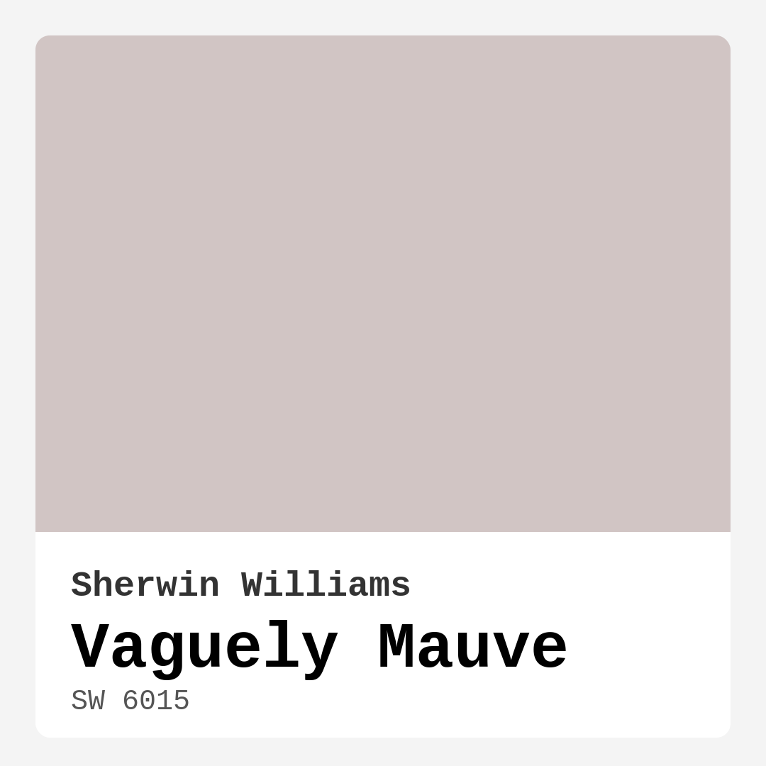
Color Preview & Key Details
| HEX Code | #D1C5C4 |
| RGB | 209, 197, 196 |
| LRV | 24% |
| Undertone | Red |
| Finish Options | Eggshell, Flat, Satin |
Imagine stepping into a room that feels both cozy and elegant, like a soft embrace at the end of a long day. That’s the magic of Vaguely Mauve, a stunning paint color from Sherwin Williams that strikes an exquisite balance between warmth and neutrality. It’s a hue that whispers sophistication while inviting you to kick off your shoes and unwind.
Let’s dive into what makes Vaguely Mauve such an appealing choice for your home. This soft, muted pink with a hint of gray creates an atmosphere that feels calming and refined. It’s perfect for those looking to add a touch of warmth without overwhelming their senses. Picture it gracing the walls of your living room, bedroom, or even your home office — each space transformed into a serene sanctuary.
One of the standout characteristics of Vaguely Mauve is its versatility. This color can seamlessly adapt to various decor styles. Whether you’re leaning towards a modern minimalist aesthetic or a cozy Scandinavian vibe, Vaguely Mauve fits beautifully. It pairs well with natural wood tones, whites, and even bolder accents, making it a designer favorite that can effortlessly enhance the beauty of your existing decor.
Now, let’s talk about its application. If you’re a DIY enthusiast, you’ll appreciate how beginner-friendly Vaguely Mauve is. It goes on smoothly, leveling out well with both brush and roller, making it perfect for a smooth finish. Plus, it’s touch-up friendly, so those little nicks and scratches won’t be an issue. And with its low VOC formula, you won’t have to worry about lingering odors while you transform your space.
When it comes to lighting, Vaguely Mauve has a unique quality. With a light reflectance value (LRV) of 24%, it absorbs more light than it reflects, creating a medium dark ambiance that can feel both intimate and expansive, depending on the time of day. In bright daylight, you’ll see its lovely pink tones shine through, casting a cozy glow. As evening sets in, the color takes on a more sophisticated, muted appearance, enhancing the overall mood of the space. This dynamic quality makes it an exciting choice for varied lighting environments.
One thing to keep in mind is how Vaguely Mauve’s undertones work. With a subtle red hue underlining its character, it’s essential to consider how this interacts with your existing furnishings and decor. Test the color in your home, observing how it shifts throughout the day. You might find it leans more pink or gray depending on the light, which is part of its charm.
Vaguely Mauve isn’t just a pretty face; it’s also practical. It’s washable and highly durable, which means it can stand up to the wear and tear of everyday life. This is particularly important if you’re considering it in high-traffic areas. While it’s perfect for living rooms and bedrooms, be mindful of how it might perform in spaces that see a lot of action.
Are you wondering if Vaguely Mauve can work in smaller spaces? Absolutely! Its soft, muted tone can make a room feel more open and airy while still adding that touch of warmth. To maximize this effect, pair it with bright trim or accents, which can enhance the sense of space even further.
Now, let’s talk about color pairings. Vaguely Mauve looks stunning alongside crisp whites like White Dove and can bring out the beauty of brass fixtures, creating a warm yet chic ambiance. If you’re considering accent walls or furniture pieces, this color can serve as a beautiful backdrop for bolder colors, allowing for a balanced and harmonious space.
For those who love the idea of a cohesive color palette, consider complementary shades. Colors like SW 6224 or SW 9137 can create a stunning contrast, while still letting Vaguely Mauve take center stage. Whether you’re designing a serene bedroom or a lively dining room, this color can adapt to various moods and styles.
If you’re currently on the fence about this color, thinking about how it might fit into your home decor could help. Imagine a cozy reading nook with Vaguely Mauve walls, soft textiles, and warm lighting. Or picture a dining room where this hue serves as the backdrop for lively conversations, beautifully accented by natural wood and metallic decor.
As we move into trends for 2025, Vaguely Mauve is already making waves in the design community. Its soft, inviting nature resonates with those looking for calm in a chaotic world. It’s not just a color; it’s a mood — cozy, calm, and undeniably inviting.
So, is Vaguely Mauve right for your project? If you’re seeking a paint color that offers both elegance and warmth, this might just be your perfect match. With its versatility across decor styles and its ability to adapt to various lighting conditions, it’s a choice you won’t regret.
In conclusion, Vaguely Mauve from Sherwin Williams isn’t just a color; it’s an experience waiting to unfold in your space. It invites you in, wraps you in comfort, and provides a beautiful backdrop for your life’s moments. Whether you’re a seasoned designer or a first-time painter, this color is ready to work its magic in your home. So grab that paintbrush and let Vaguely Mauve transform your space into a haven of tranquility and style.
Real Room Photo of Vaguely Mauve SW 6015


Undertones of Vaguely Mauve ?
The undertones of Vaguely Mauve are a key aspect of its character, leaning towards Red. These subtle underlying hues are what give the color its depth and complexity. For example, a gray with a blue undertone will feel cooler and more modern, while one with a brown undertone will feel warmer and more traditional. It’s essential to test this paint in your home and observe it next to your existing furniture, flooring, and decor to see how these undertones interact and reveal themselves throughout the day.
HEX value: #D1C5C4
RGB code: 209, 197, 196
Is Vaguely Mauve Cool or Warm?
Vaguely Mauve is primarily a warm color, thanks to its pink undertones. However, the gray element keeps it grounded and versatile, allowing it to work well with both warm and cool accents. This makes it a fantastic choice for those looking to create a balanced, harmonious space.
Understanding Color Properties and Interior Design Tips
Hue refers to a specific position on the color wheel, measured in degrees from 0 to 360. Each degree represents a different pure color:
- 0° represents red
- 120° represents green
- 240° represents blue
Saturation describes the intensity or purity of a color and is expressed as a percentage:
- At 0%, the color appears completely desaturated—essentially a shade of gray
- At 100%, the color is at its most vivid and vibrant
Lightness indicates how light or dark a color is, also expressed as a percentage:
- 0% lightness results in black
- 100% lightness results in white
Using Warm Colors in Interior Design
Warm hues—such as reds, oranges, yellows, warm beiges, and greiges—are excellent choices for creating inviting and energetic spaces. These colors are particularly well-suited for:
- Kitchens, living rooms, and bathrooms, where warmth enhances comfort and sociability
- Large rooms, where warm tones can help reduce the sense of emptiness and make the space feel more intimate
For example:
- Warm beige shades provide a cozy, inviting atmosphere, ideal for living rooms, bedrooms, and hallways.
- Warm greige (a mix of beige and gray) offers the warmth of beige with the modern appeal of gray, making it a versatile backdrop for dining areas, bedrooms, and living spaces.
However, be mindful when using warm light tones in rooms with limited natural light. These shades may appear muted or even take on an unpleasant yellowish tint. To avoid a dull or flat appearance:
- Add depth by incorporating richer tones like deep greens, charcoal, or chocolate brown
- Use textured elements such as curtains, rugs, or cushions to bring dimension to the space
Pro Tip: Achieving Harmony with Warm and Cool Color Balance
To create a well-balanced and visually interesting interior, mix warm and cool tones strategically. This contrast adds depth and harmony to your design.
- If your walls feature warm hues, introduce cool-colored accents such as blue or green furniture, artwork, or accessories to create contrast.
- For a polished look, consider using a complementary color scheme, which pairs colors opposite each other on the color wheel (e.g., red with green, orange with blue).
This thoughtful mix not only enhances visual appeal but also creates a space that feels both dynamic and cohesive.
Light Temperature Affects on Vaguely Mauve
Natural Light
Natural daylight changes in color temperature as the sun moves across the sky. At sunrise and sunset, the light tends to have a warm, golden tone with a color temperature around 2000 Kelvin (K). As the day progresses and the sun rises higher, the light becomes cooler and more neutral. Around midday, especially when the sky is clear, natural light typically reaches its peak brightness and shifts to a cooler tone, ranging from 5500 to 6500 Kelvin. This midday light is close to what we perceive as pure white or daylight-balanced light.
These shifts in natural light can significantly influence how colors appear in a space, which is why designers often consider both the time of day and the orientation of windows when planning interior color schemes.
Artificial Light
When choosing artificial lighting, pay close attention to the color temperature, measured in Kelvin (K). This determines how warm or cool the light will appear. Lower temperatures, around 2700K, give off a warm, yellow glow often used in living rooms or bedrooms. Higher temperatures, above 5000K, create a cool, bluish light similar to daylight, commonly used in kitchens, offices, or task areas.
Use the slider to see how lighting temperature can affect the appearance of a surface or color throughout a space.


4800K
LRV of Vaguely Mauve
The Light Reflectance Value (LRV) of Vaguely Mauve is 24%, which places it in the Medium Dark category. This means it reflects very little light. Understanding a paint’s LRV is crucial for predicting how it will look in your space. A higher LRV indicates a lighter color that reflects more light, making rooms feel larger and brighter. A lower LRV signifies a darker color that absorbs more light, creating a cozier, more intimate atmosphere. Always consider the natural and artificial lighting in your room when selecting a paint color based on its LRV.
Detailed Review of Vaguely Mauve
Additional Paint Characteristics
Ideal Rooms
Bedroom, Dining Room, Home Office, Living Room
Decor Styles
Minimalist, Modern, Scandinavian, Transitional
Coverage
Good (1–2 Coats), Touch-Up Friendly
Ease of Application
Beginner Friendly, Brush Smooth, Roller-Ready
Washability
Highly Washable, Washable
VOC Level
Low VOC, Ultra Low VOC
Best Use
Accent Wall, Interior Walls
Room Suitability
Bedroom, Dining Room, Home Office, Living Room
Tone Tag
Balanced, Dusty, Muted, Warm
Finish Type
Eggshell, Satin
Paint Performance
Easy Touch-Up, High Coverage, Low Odor
Use Cases
Best for Small Spaces, Designer Favorite, Trending in 2025
Mood
Calm, Cozy, Inviting, Restful
Trim Pairing
Complements Brass Fixtures, Matches Pure White, Pairs with White Dove
Vaguely Mauve is a paint color that strikes the perfect balance between warmth and neutrality. Its soft, muted appearance makes it an excellent choice for a variety of spaces, particularly those that aim for a cozy yet sophisticated vibe. When applied, the color tends to adapt beautifully to different lighting conditions, appearing more pink or gray depending on the time of day. This versatility means it can effortlessly complement a range of decor styles, from modern minimalism to cozy farmhouse aesthetics. In terms of application, it goes on smoothly and levels out well, making it user-friendly for DIYers and professionals alike. Overall, Vaguely Mauve is a color that invites comfort while maintaining an air of elegance.
Pros & Cons of SW 6015 Vaguely Mauve
Pros
Cons
Colors that go with Sherwin Williams Vaguely Mauve
FAQ on SW 6015 Vaguely Mauve
Can Vaguely Mauve be used in small spaces?
Absolutely! Vaguely Mauve is a fantastic choice for small spaces. Its soft, muted tone can make a room feel more open and airy while adding a touch of warmth. Just be mindful of the lighting, as it can shift the color perception. Pair it with bright trim or accents to enhance the sense of space.
How does Vaguely Mauve work with different decor styles?
Vaguely Mauve is incredibly versatile and works beautifully across various decor styles. Whether you’re going for a modern minimalist look or a cozy farmhouse feel, this color can adapt. It pairs well with natural wood tones, whites, and even bold colors when used as an accent, making it a designer favorite.
Comparisons Vaguely Mauve with other colors
Vaguely Mauve SW 6015 vs Realist Beige SW 6078
| Attribute | Vaguely Mauve SW 6015 | Realist Beige SW 6078 |
|---|---|---|
| Color Name | Vaguely Mauve SW 6015 | Realist Beige SW 6078 |
| Color | ||
| Hue | Pink | Pink |
| Brightness | Medium | Medium |
| RGB | 209, 197, 196 | 211, 200, 189 |
| LRV | 24% | 34% |
| Finish Type | Eggshell, Satin | Eggshell, Matte, Satin |
| Finish Options | Eggshell, Flat, Satin | Eggshell, Matte, Satin |
| Ideal Rooms | Bedroom, Dining Room, Home Office, Living Room | Bedroom, Dining Room, Entryway, Home Office, Kitchen, Living Room |
| Decor Styles | Minimalist, Modern, Scandinavian, Transitional | Contemporary, Minimalist, Modern Farmhouse, Rustic, Traditional |
| Coverage | Good (1–2 Coats), Touch-Up Friendly | Good (1–2 Coats), Touch-Up Friendly |
| Ease of Application | Beginner Friendly, Brush Smooth, Roller-Ready | Beginner Friendly, Brush Smooth, Fast-Drying, Roller-Ready |
| Washability | Highly Washable, Washable | Washable, Wipeable |
| Room Suitability | Bedroom, Dining Room, Home Office, Living Room | Bedroom, Dining Room, Home Office, Kitchen, Living Room |
| Tone | Balanced, Dusty, Muted, Warm | Earthy, Neutral, Warm |
| Paint Performance | Easy Touch-Up, High Coverage, Low Odor | High Coverage, Low Odor, Quick Drying |
Vaguely Mauve SW 6015 vs Rosaline Pearl SW 9077
| Attribute | Vaguely Mauve SW 6015 | Rosaline Pearl SW 9077 |
|---|---|---|
| Color Name | Vaguely Mauve SW 6015 | Rosaline Pearl SW 9077 |
| Color | ||
| Hue | Pink | Pink |
| Brightness | Medium | Medium |
| RGB | 209, 197, 196 | 163, 136, 135 |
| LRV | 24% | 69% |
| Finish Type | Eggshell, Satin | Eggshell, Matte |
| Finish Options | Eggshell, Flat, Satin | Eggshell, Matte, Satin |
| Ideal Rooms | Bedroom, Dining Room, Home Office, Living Room | Bedroom, Dining Room, Home Office, Living Room |
| Decor Styles | Minimalist, Modern, Scandinavian, Transitional | Bohemian, Contemporary, Modern, Transitional |
| Coverage | Good (1–2 Coats), Touch-Up Friendly | Good (1–2 Coats) |
| Ease of Application | Beginner Friendly, Brush Smooth, Roller-Ready | Beginner Friendly, Brush Smooth, Fast-Drying, Roller-Ready |
| Washability | Highly Washable, Washable | Washable, Wipeable |
| Room Suitability | Bedroom, Dining Room, Home Office, Living Room | Bedroom, Dining Room, Home Office, Living Room |
| Tone | Balanced, Dusty, Muted, Warm | Dusty, Muted, Warm |
| Paint Performance | Easy Touch-Up, High Coverage, Low Odor | Easy Touch-Up, Fade Resistant, Low Odor |
Vaguely Mauve SW 6015 vs Cabbage Rose SW 0003
| Attribute | Vaguely Mauve SW 6015 | Cabbage Rose SW 0003 |
|---|---|---|
| Color Name | Vaguely Mauve SW 6015 | Cabbage Rose SW 0003 |
| Color | ||
| Hue | Pink | Pink |
| Brightness | Medium | Medium |
| RGB | 209, 197, 196 | 197, 159, 145 |
| LRV | 24% | 15% |
| Finish Type | Eggshell, Satin | Eggshell, Matte, Satin |
| Finish Options | Eggshell, Flat, Satin | Eggshell, Matte, Satin |
| Ideal Rooms | Bedroom, Dining Room, Home Office, Living Room | Bedroom, Dining Room, Hallway, Living Room, Nursery |
| Decor Styles | Minimalist, Modern, Scandinavian, Transitional | Cottage, Modern Farmhouse, Romantic, Shabby Chic, Vintage |
| Coverage | Good (1–2 Coats), Touch-Up Friendly | Good (1–2 Coats), Touch-Up Friendly |
| Ease of Application | Beginner Friendly, Brush Smooth, Roller-Ready | Beginner Friendly, Brush Smooth, Roller-Ready |
| Washability | Highly Washable, Washable | Washable, Wipeable |
| Room Suitability | Bedroom, Dining Room, Home Office, Living Room | Bedroom, Dining Room, Hallway, Living Room, Nursery |
| Tone | Balanced, Dusty, Muted, Warm | Earthy, Muted, Warm |
| Paint Performance | Easy Touch-Up, High Coverage, Low Odor | Easy Touch-Up, Low Odor |
Vaguely Mauve SW 6015 vs Sashay Sand SW 6051
| Attribute | Vaguely Mauve SW 6015 | Sashay Sand SW 6051 |
|---|---|---|
| Color Name | Vaguely Mauve SW 6015 | Sashay Sand SW 6051 |
| Color | ||
| Hue | Pink | Pink |
| Brightness | Medium | Medium |
| RGB | 209, 197, 196 | 207, 180, 168 |
| LRV | 24% | 64% |
| Finish Type | Eggshell, Satin | Eggshell, Matte, Satin |
| Finish Options | Eggshell, Flat, Satin | Eggshell, Matte, Satin |
| Ideal Rooms | Bedroom, Dining Room, Home Office, Living Room | Bedroom, Dining Room, Home Office, Kitchen, Living Room |
| Decor Styles | Minimalist, Modern, Scandinavian, Transitional | Bohemian, Contemporary, Modern Farmhouse, Scandinavian, Transitional |
| Coverage | Good (1–2 Coats), Touch-Up Friendly | Good (1–2 Coats), Touch-Up Friendly |
| Ease of Application | Beginner Friendly, Brush Smooth, Roller-Ready | Beginner Friendly, Fast-Drying, Roller-Ready |
| Washability | Highly Washable, Washable | Highly Washable, Washable |
| Room Suitability | Bedroom, Dining Room, Home Office, Living Room | Bedroom, Dining Room, Home Office, Kitchen, Living Room |
| Tone | Balanced, Dusty, Muted, Warm | Earthy, Muted, Warm |
| Paint Performance | Easy Touch-Up, High Coverage, Low Odor | Easy Touch-Up, Low Odor, Quick Drying, Scuff Resistant |
Vaguely Mauve SW 6015 vs Touch of Sand SW 9085
| Attribute | Vaguely Mauve SW 6015 | Touch of Sand SW 9085 |
|---|---|---|
| Color Name | Vaguely Mauve SW 6015 | Touch of Sand SW 9085 |
| Color | ||
| Hue | Pink | Pink |
| Brightness | Medium | Medium |
| RGB | 209, 197, 196 | 213, 199, 186 |
| LRV | 24% | 66% |
| Finish Type | Eggshell, Satin | Eggshell, Matte, Satin |
| Finish Options | Eggshell, Flat, Satin | Eggshell, Matte, Satin |
| Ideal Rooms | Bedroom, Dining Room, Home Office, Living Room | Bathroom, Bedroom, Dining Room, Home Office, Kitchen, Living Room |
| Decor Styles | Minimalist, Modern, Scandinavian, Transitional | Bohemian, Coastal, Contemporary, Modern Farmhouse, Rustic |
| Coverage | Good (1–2 Coats), Touch-Up Friendly | Good (1–2 Coats), Touch-Up Friendly |
| Ease of Application | Beginner Friendly, Brush Smooth, Roller-Ready | Beginner Friendly, Brush Smooth, Fast-Drying, Roller-Ready |
| Washability | Highly Washable, Washable | Washable, Wipeable |
| Room Suitability | Bedroom, Dining Room, Home Office, Living Room | Bathroom, Bedroom, Dining Room, Home Office, Kitchen, Living Room |
| Tone | Balanced, Dusty, Muted, Warm | Earthy, Muted, Neutral, Warm |
| Paint Performance | Easy Touch-Up, High Coverage, Low Odor | Easy Touch-Up, Low Odor, Quick Drying, Scuff Resistant |
Vaguely Mauve SW 6015 vs Pink Shadow SW 0070
| Attribute | Vaguely Mauve SW 6015 | Pink Shadow SW 0070 |
|---|---|---|
| Color Name | Vaguely Mauve SW 6015 | Pink Shadow SW 0070 |
| Color | ||
| Hue | Pink | Pink |
| Brightness | Medium | Medium |
| RGB | 209, 197, 196 | 222, 195, 185 |
| LRV | 24% | 45% |
| Finish Type | Eggshell, Satin | Eggshell, Matte, Satin |
| Finish Options | Eggshell, Flat, Satin | Eggshell, Matte, Satin |
| Ideal Rooms | Bedroom, Dining Room, Home Office, Living Room | Bedroom, Dining Room, Home Office, Living Room, Nursery |
| Decor Styles | Minimalist, Modern, Scandinavian, Transitional | Bohemian, Minimalist, Modern Farmhouse, Scandinavian, Traditional |
| Coverage | Good (1–2 Coats), Touch-Up Friendly | Good (1–2 Coats) |
| Ease of Application | Beginner Friendly, Brush Smooth, Roller-Ready | Beginner Friendly, Brush Smooth, Fast-Drying, Roller-Ready |
| Washability | Highly Washable, Washable | Washable, Wipeable |
| Room Suitability | Bedroom, Dining Room, Home Office, Living Room | Bedroom, Dining Room, Living Room, Nursery |
| Tone | Balanced, Dusty, Muted, Warm | Muted, Pastel, Warm |
| Paint Performance | Easy Touch-Up, High Coverage, Low Odor | Easy Touch-Up, High Coverage, Low Odor |
Vaguely Mauve SW 6015 vs Hushed Auburn SW 9080
| Attribute | Vaguely Mauve SW 6015 | Hushed Auburn SW 9080 |
|---|---|---|
| Color Name | Vaguely Mauve SW 6015 | Hushed Auburn SW 9080 |
| Color | ||
| Hue | Pink | Pink |
| Brightness | Medium | Medium |
| RGB | 209, 197, 196 | 168, 133, 122 |
| LRV | 24% | 12% |
| Finish Type | Eggshell, Satin | Eggshell, Matte, Satin |
| Finish Options | Eggshell, Flat, Satin | Eggshell, Matte, Satin |
| Ideal Rooms | Bedroom, Dining Room, Home Office, Living Room | Bedroom, Dining Room, Home Office, Living Room |
| Decor Styles | Minimalist, Modern, Scandinavian, Transitional | Contemporary, Modern Farmhouse, Rustic, Transitional |
| Coverage | Good (1–2 Coats), Touch-Up Friendly | Good (1–2 Coats), Touch-Up Friendly |
| Ease of Application | Beginner Friendly, Brush Smooth, Roller-Ready | Beginner Friendly, Brush Smooth, Fast-Drying, Roller-Ready |
| Washability | Highly Washable, Washable | Washable, Wipeable |
| Room Suitability | Bedroom, Dining Room, Home Office, Living Room | Bedroom, Dining Room, Home Office, Living Room |
| Tone | Balanced, Dusty, Muted, Warm | Earthy, Muted, Warm |
| Paint Performance | Easy Touch-Up, High Coverage, Low Odor | Easy Touch-Up, High Coverage, Low Odor |
Vaguely Mauve SW 6015 vs Likeable Sand SW 6058
| Attribute | Vaguely Mauve SW 6015 | Likeable Sand SW 6058 |
|---|---|---|
| Color Name | Vaguely Mauve SW 6015 | Likeable Sand SW 6058 |
| Color | ||
| Hue | Pink | Pink |
| Brightness | Medium | Medium |
| RGB | 209, 197, 196 | 209, 183, 168 |
| LRV | 24% | 61% |
| Finish Type | Eggshell, Satin | Eggshell, Matte, Satin |
| Finish Options | Eggshell, Flat, Satin | Eggshell, Matte, Satin |
| Ideal Rooms | Bedroom, Dining Room, Home Office, Living Room | Bedroom, Dining Room, Home Office, Kitchen, Living Room |
| Decor Styles | Minimalist, Modern, Scandinavian, Transitional | Bohemian, Coastal, Contemporary, Modern Farmhouse, Rustic |
| Coverage | Good (1–2 Coats), Touch-Up Friendly | Good (1–2 Coats), Touch-Up Friendly |
| Ease of Application | Beginner Friendly, Brush Smooth, Roller-Ready | Beginner Friendly, Brush Smooth, Fast-Drying, Roller-Ready |
| Washability | Highly Washable, Washable | Washable, Wipeable |
| Room Suitability | Bedroom, Dining Room, Home Office, Living Room | Bedroom, Dining Room, Home Office, Kitchen, Living Room |
| Tone | Balanced, Dusty, Muted, Warm | Earthy, Muted, Warm |
| Paint Performance | Easy Touch-Up, High Coverage, Low Odor | Easy Touch-Up, Low Odor, Quick Drying |
Vaguely Mauve SW 6015 vs Glamour SW 6031
| Attribute | Vaguely Mauve SW 6015 | Glamour SW 6031 |
|---|---|---|
| Color Name | Vaguely Mauve SW 6015 | Glamour SW 6031 |
| Color | ||
| Hue | Pink | Pink |
| Brightness | Medium | Medium |
| RGB | 209, 197, 196 | 182, 160, 154 |
| LRV | 24% | 30% |
| Finish Type | Eggshell, Satin | Eggshell, Matte, Satin |
| Finish Options | Eggshell, Flat, Satin | Eggshell, Matte, Satin |
| Ideal Rooms | Bedroom, Dining Room, Home Office, Living Room | Bedroom, Dining Room, Home Office, Living Room |
| Decor Styles | Minimalist, Modern, Scandinavian, Transitional | Bohemian, Classic, Modern, Transitional |
| Coverage | Good (1–2 Coats), Touch-Up Friendly | Good (1–2 Coats) |
| Ease of Application | Beginner Friendly, Brush Smooth, Roller-Ready | Beginner Friendly, Brush Smooth, Fast-Drying, Roller-Ready |
| Washability | Highly Washable, Washable | Scrubbable, Washable |
| Room Suitability | Bedroom, Dining Room, Home Office, Living Room | Bedroom, Dining Room, Home Office, Living Room |
| Tone | Balanced, Dusty, Muted, Warm | Balanced, Neutral, Warm |
| Paint Performance | Easy Touch-Up, High Coverage, Low Odor | Easy Touch-Up, Low Odor, Quick Drying |
Vaguely Mauve SW 6015 vs Temperate Taupe SW 6037
| Attribute | Vaguely Mauve SW 6015 | Temperate Taupe SW 6037 |
|---|---|---|
| Color Name | Vaguely Mauve SW 6015 | Temperate Taupe SW 6037 |
| Color | ||
| Hue | Pink | Pink |
| Brightness | Medium | Medium |
| RGB | 209, 197, 196 | 191, 177, 170 |
| LRV | 24% | 34% |
| Finish Type | Eggshell, Satin | Eggshell, Matte, Satin |
| Finish Options | Eggshell, Flat, Satin | Eggshell, Matte, Satin |
| Ideal Rooms | Bedroom, Dining Room, Home Office, Living Room | Bedroom, Dining Room, Home Office, Kitchen, Living Room |
| Decor Styles | Minimalist, Modern, Scandinavian, Transitional | Bohemian, Modern Farmhouse, Rustic, Transitional |
| Coverage | Good (1–2 Coats), Touch-Up Friendly | Good (1–2 Coats), Touch-Up Friendly |
| Ease of Application | Beginner Friendly, Brush Smooth, Roller-Ready | Beginner Friendly, Brush Smooth, Fast-Drying, Roller-Ready |
| Washability | Highly Washable, Washable | Highly Washable, Washable |
| Room Suitability | Bedroom, Dining Room, Home Office, Living Room | Bedroom, Dining Room, Home Office, Living Room |
| Tone | Balanced, Dusty, Muted, Warm | Earthy, Neutral, Warm |
| Paint Performance | Easy Touch-Up, High Coverage, Low Odor | Long Lasting, Low Odor, Quick Drying, Scuff Resistant |
Official Page of Sherwin Williams Vaguely Mauve SW 6015